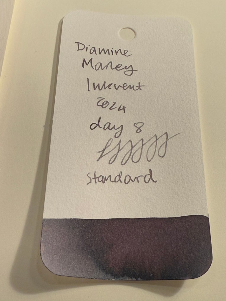
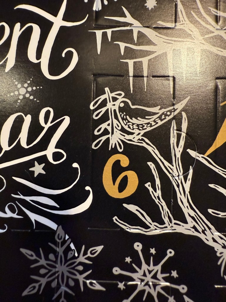
Diamine Inkvent 2024 Day 10
This is the Diamine Inkvent 2024 Day 10 door:

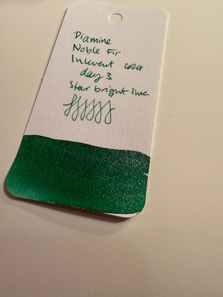
Day 10’s in is Diamine Chilly Nights, a blue-black “Star Bright” ink, which means shimmer, a lot of shimmer. I used a Lamy AL Star fine nibbed pen to test out this ink.

The base ink offers some nice shading, though you can barely see it because there’s so much silver shimmer going on. Here’s a close up of the Col-O-Ring swab:

It looks like there’s a hint of red sheen to this ink, which isn’t surprising as it’s a dark and pretty saturated ink, but again – the masses of silver shimmer mask all other properties of the ink. However, that’s not necessarily a bad thing: Diamine Chilly Nights definitely has a wow effect to it, and it’s a stunningly beautiful ink.

You can see the letters glowing with shimmer here:

Here’s a writing sample on original Tomoe River Paper. You can see a hint of shading and sheening here:

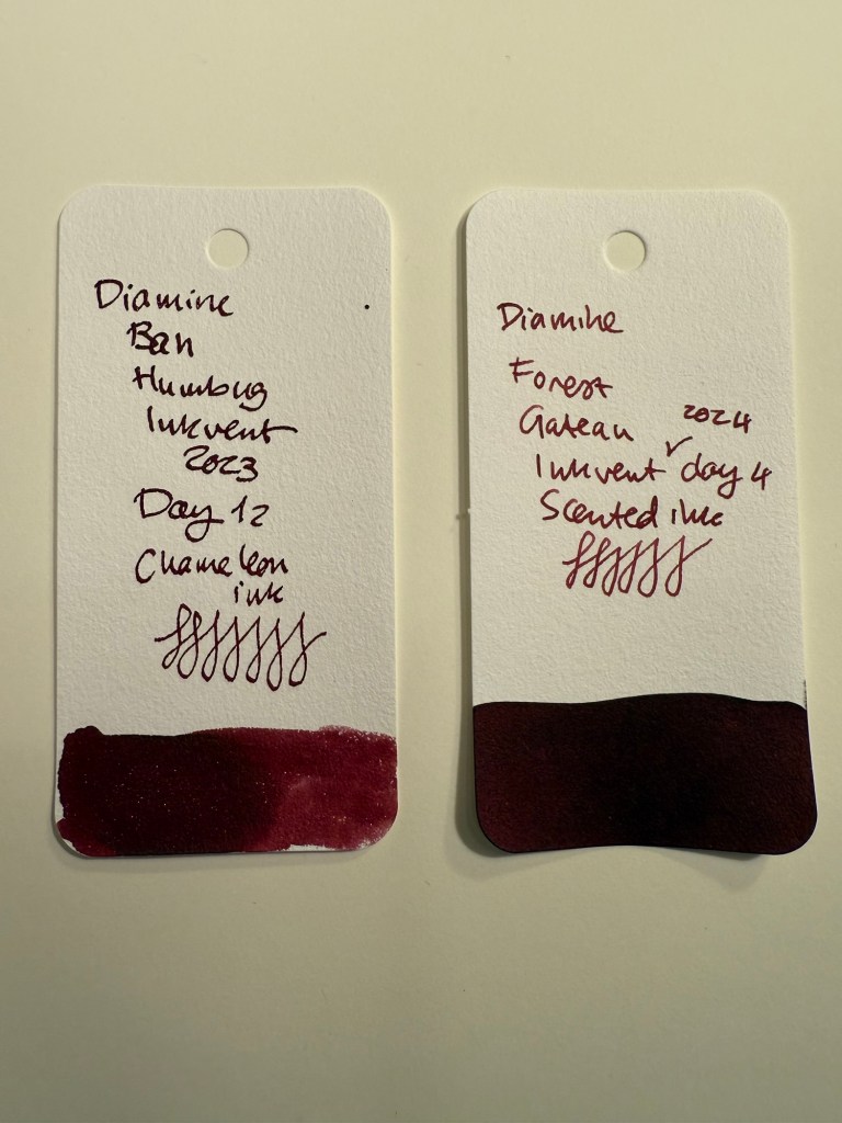
And from a different angle you can see the dazzle of the shimmer effect. Compare it to yesterday’s Diamine Wishing Tree directly above it – that one’s a Chameleon ink. You can barely see the shimmer effect on Wishing Tree and you absolutely can’t miss it on Diamine Chilly Nights.

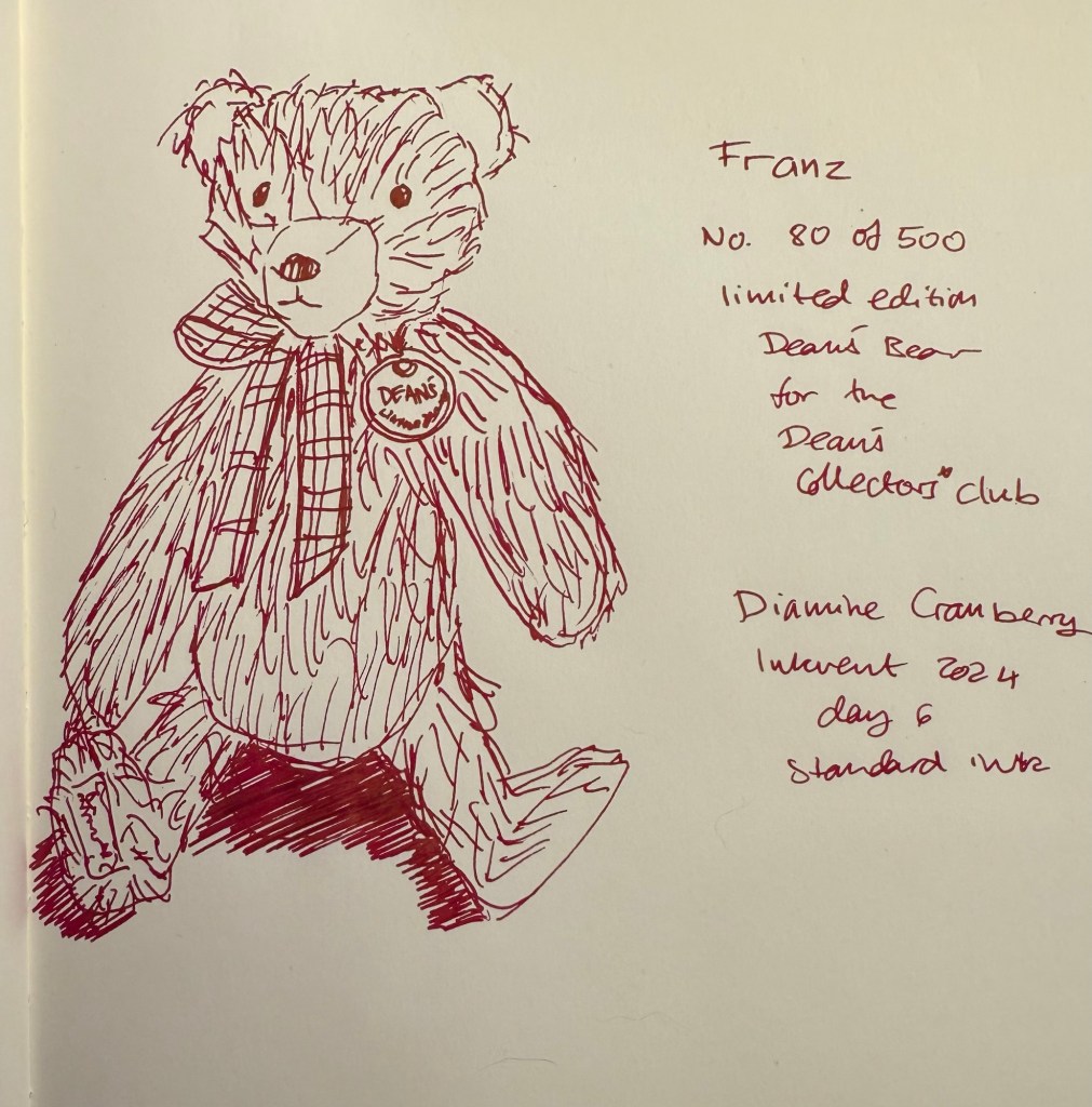
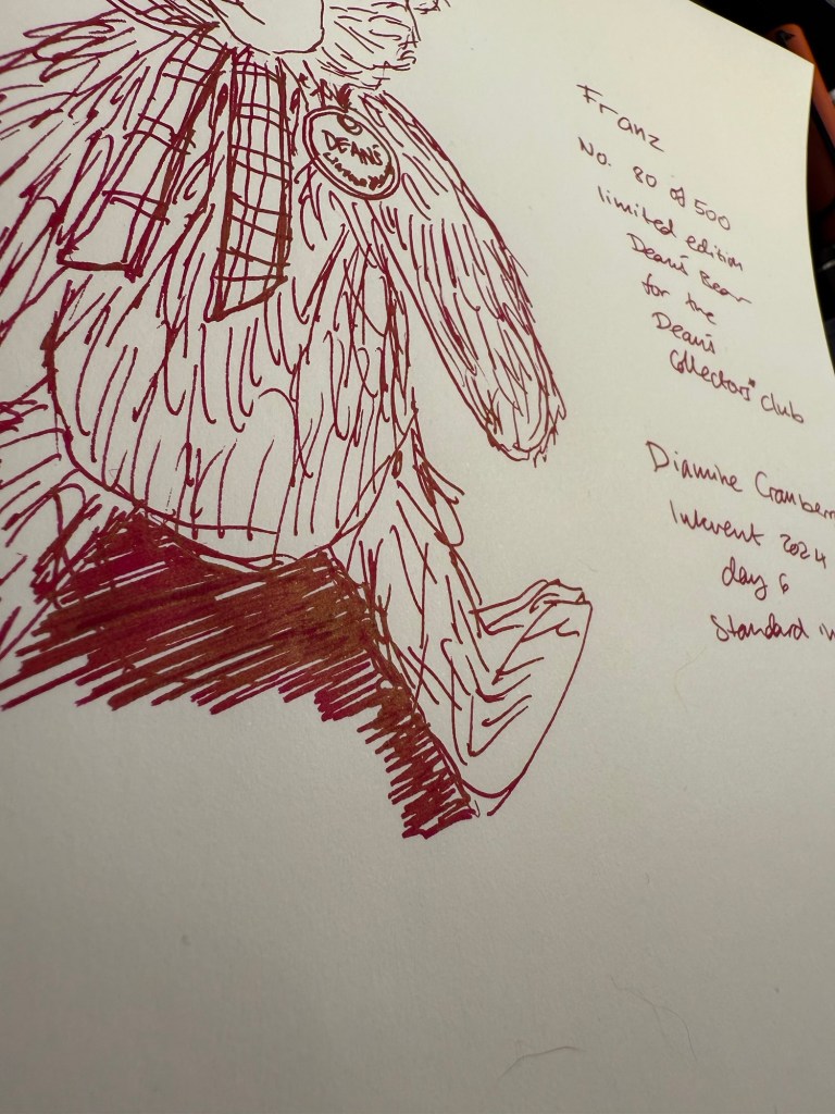
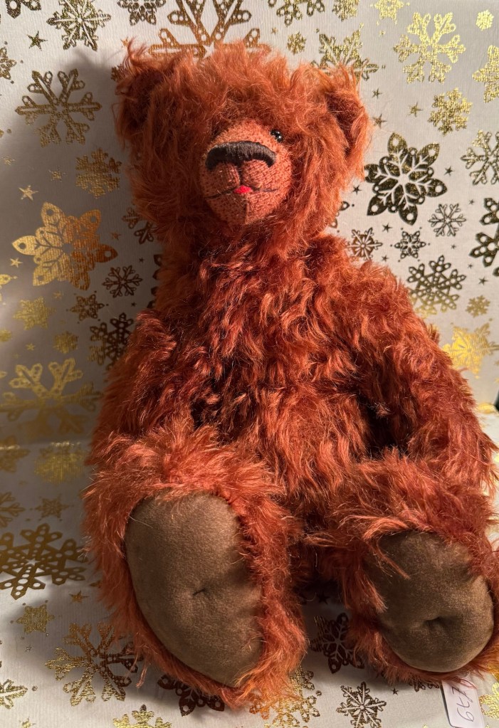
I flipped the nib around for the fine lines on today’s bear sketch. Teaberry is an unusually shaped bear but there are quite a few Charlie Bears that come in this style. I had to shade the lamp to get a decent photo due to the glint from all the glitter.

This is Teaberry the bear. If you watched the “Wicked” movie you’d understand me when I say that she would fit perfectly on Glinda’s bed.

Diamine Chilly Nights is a stunning, if impractical ink. It’s perfect for the season: a readable ink with a big wow effect, which makes it perfect for greeting cards. I don’t see myself using it regularly, but it definitely works as a “special occasion” ink.
What do you think of Teaberry, today’s bear? And would you buy a full bottle of Diamine Chilly Nights?