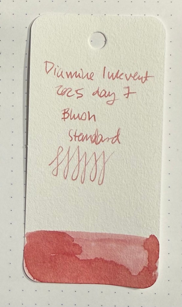
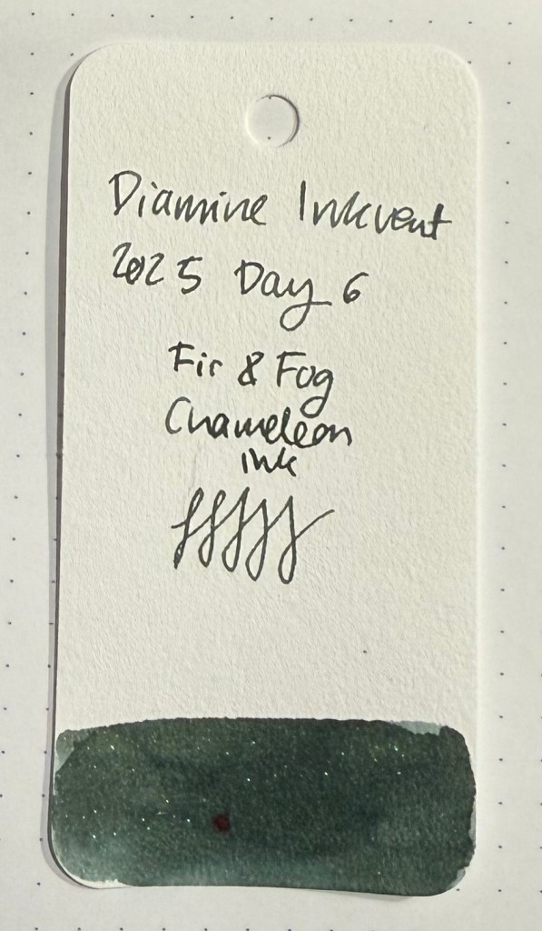
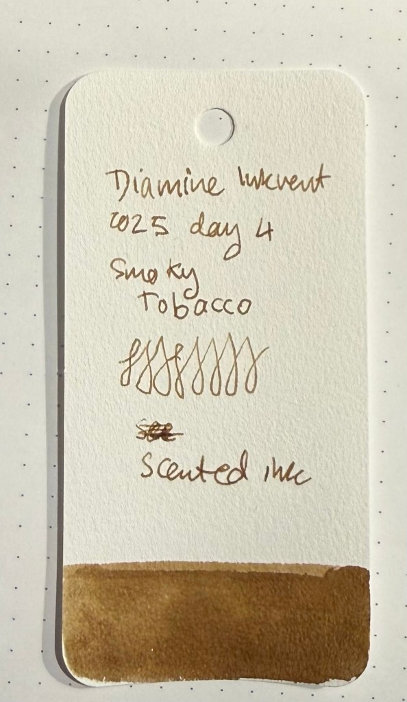
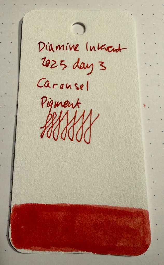
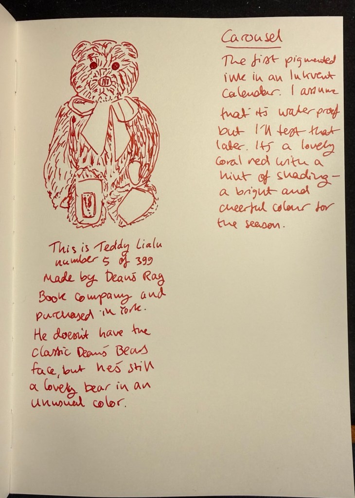
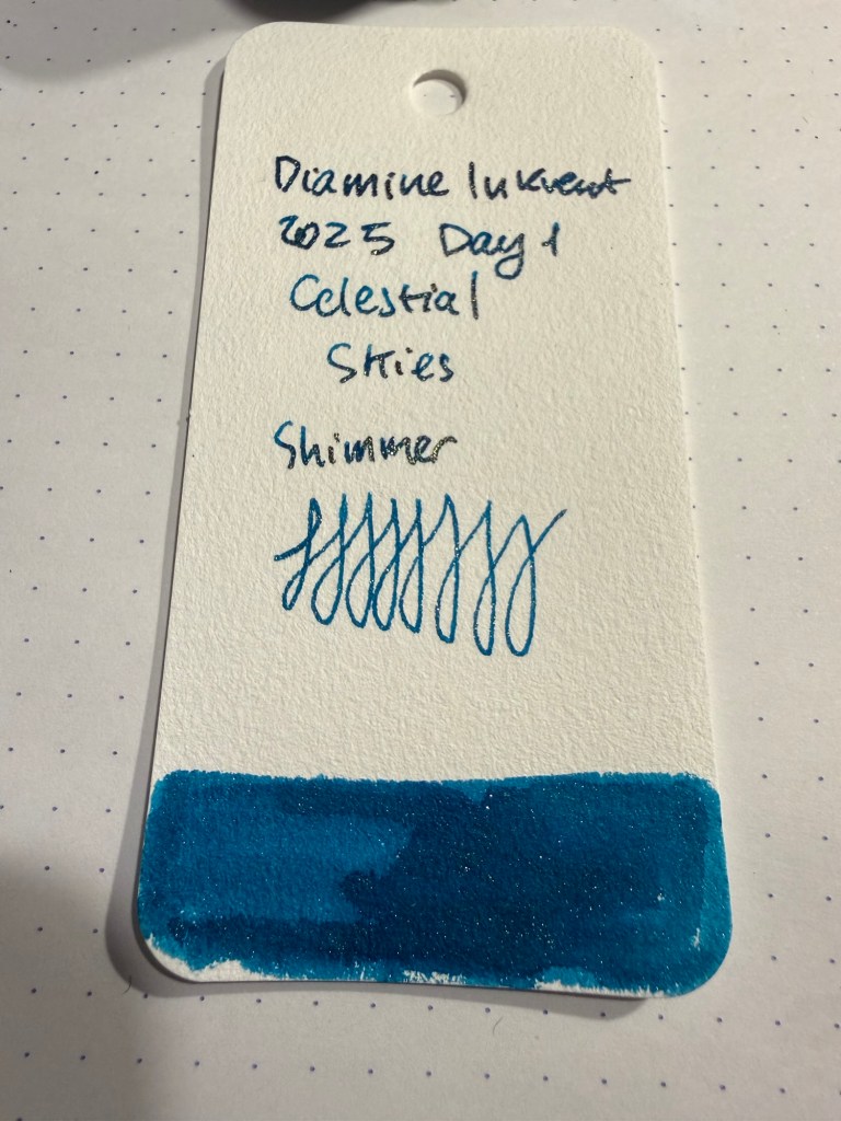
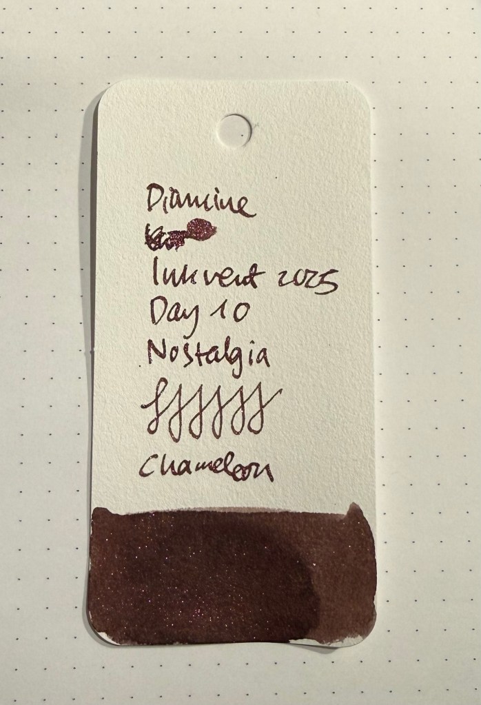
Diamine Inkvent 2025 Day 10
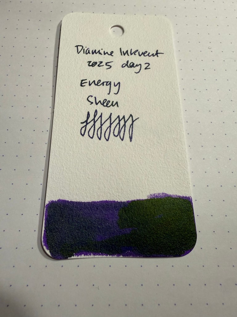
Day 10’s ink is Diamine Nostalgia, a maroon chameleon ink with some shading. I used a TWSBI GO with a 1.1 nib to test out this ink, and it really showed off both the chameleon shimmer and the ink’s shading properties well.
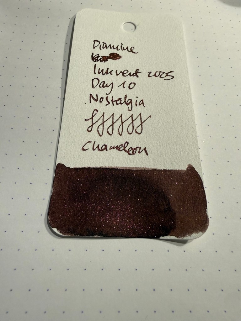
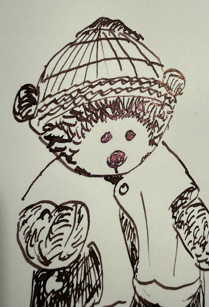
There’s gold, copper, pink and red chameleon shimmer in this ink, and the effect is quite fetching. There are angles where you see little to no shimmer, and others where all the lines shine. An ink full of surprises.
The chameleon shimmer lightens Diamine Nostalgia, at least in certain angles, and the base maroon colour is warm and attractive. I think this combination works really well, as brown inks can be either very interesting or very flat and boring. Diamine Nostalgia has depth and interest because of the combination of the base colour, the shading and the chameleon effect.
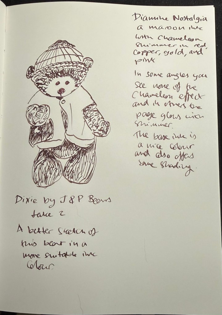
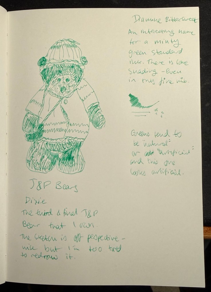
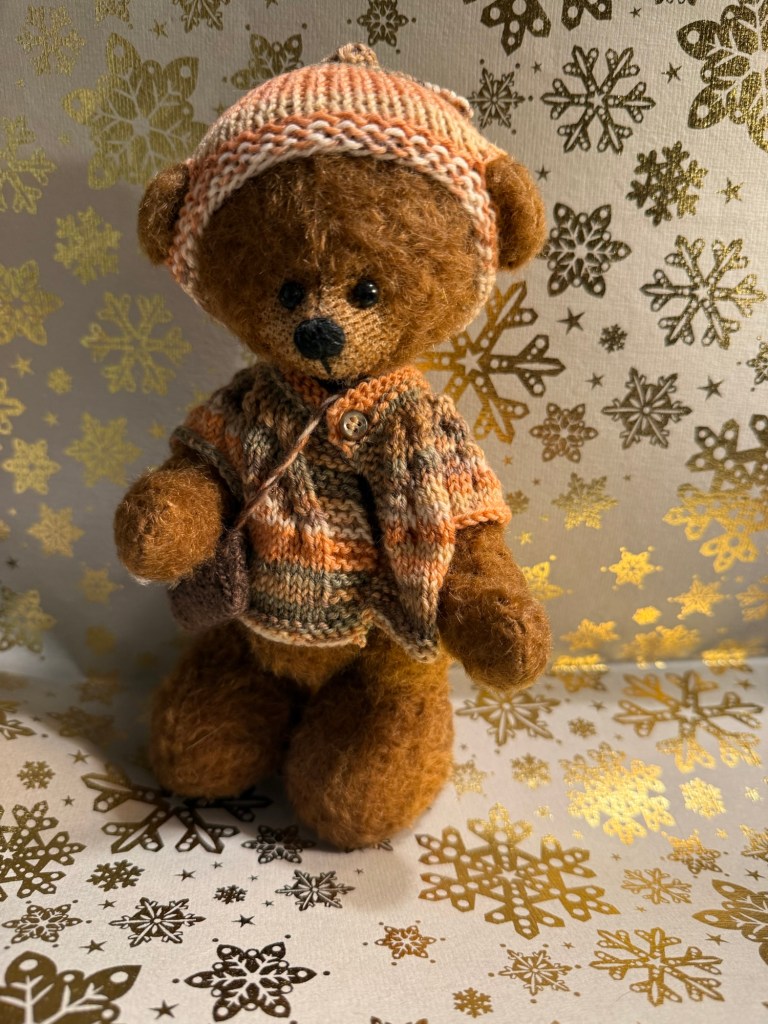
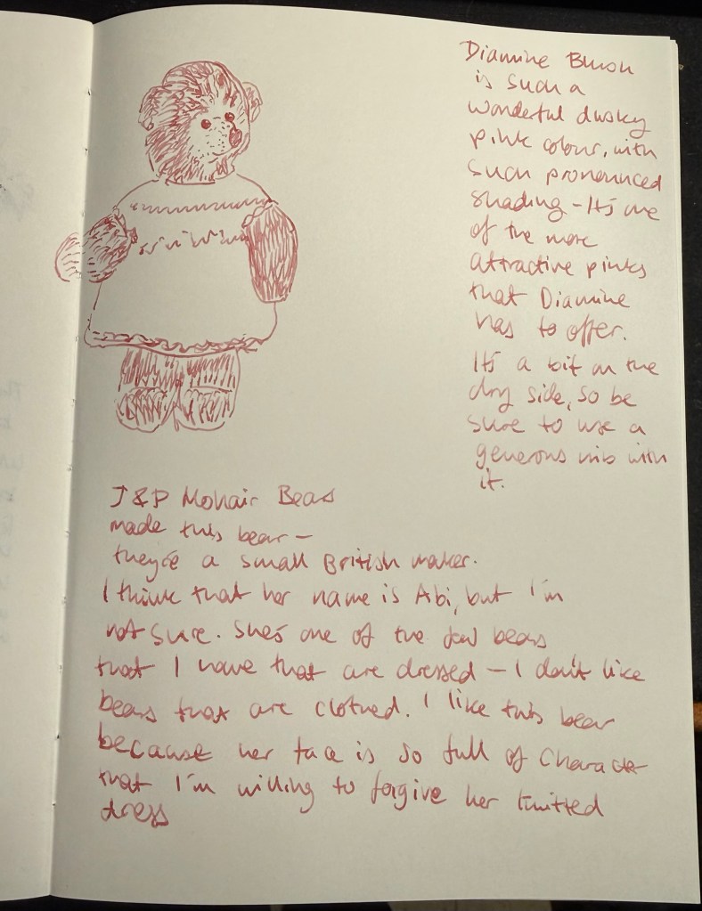
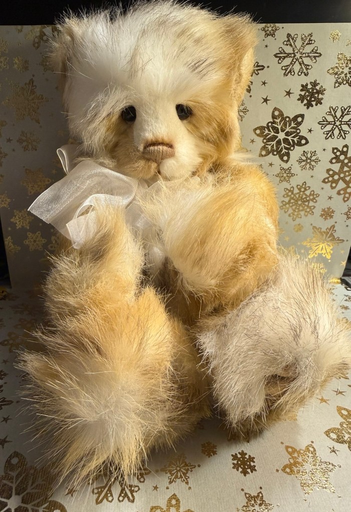
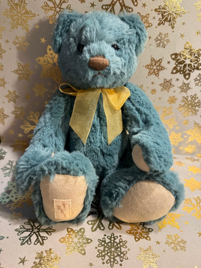
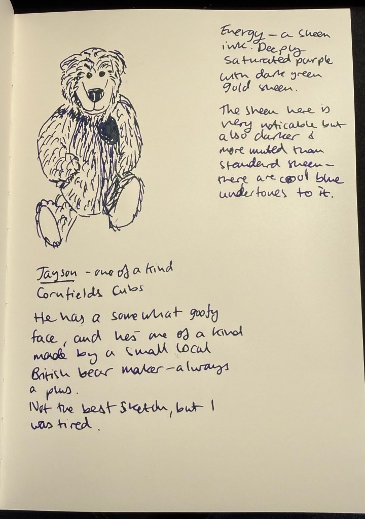
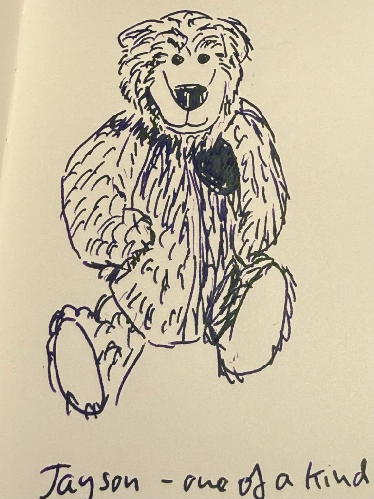
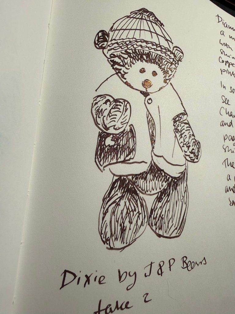
I redrew yesterday’s bear. Dixie, as I didn’t like my sketch yesterday. I like today’s sketch more. Look how Dixie’s nose glows in this angle:
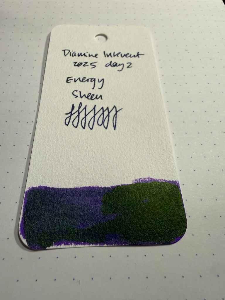
Closeup of the chameleon effect:
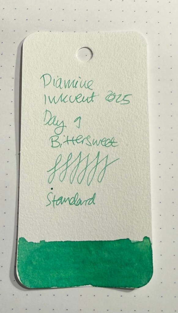
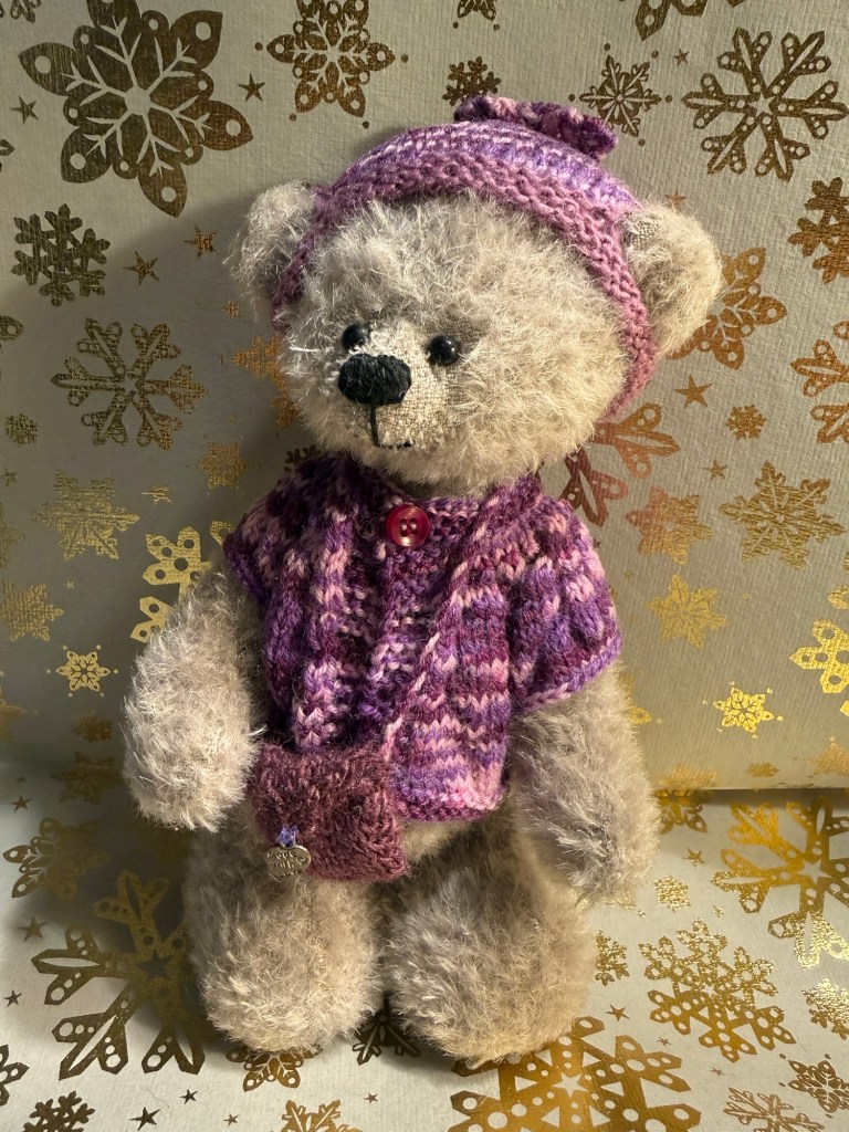
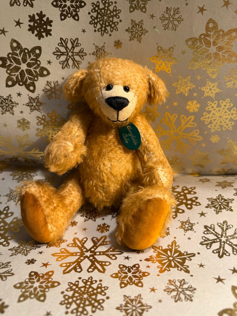
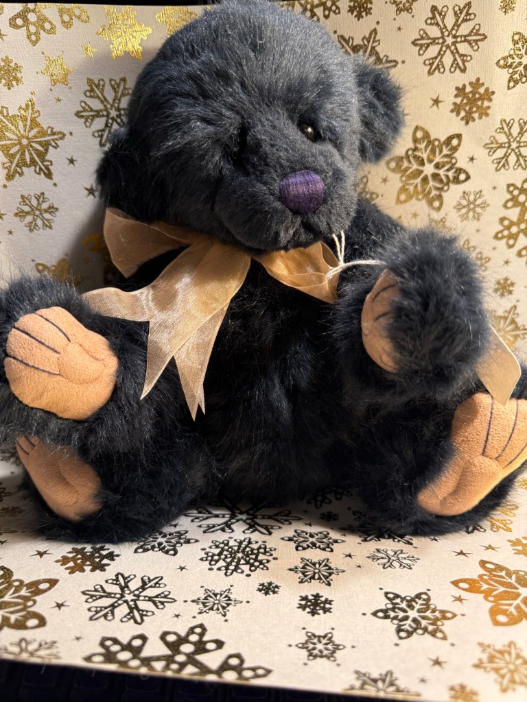
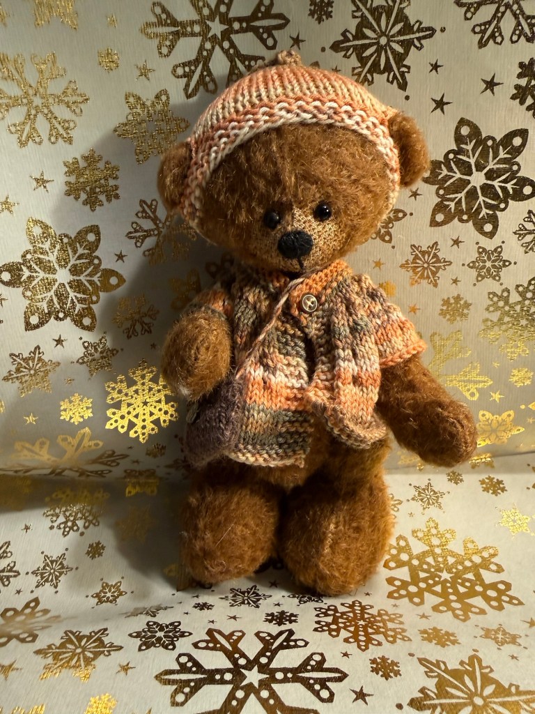
Today’s bear is Dixie from J&P bears – the same bear as yesterday, just reposed and redrawn.
I like Diamine Nostalgia – I think that it’s a good addition to the calendar, that it has a great (and appropriate) name, and that it will likely work fantastically well on cream coloured paper. What do you think?