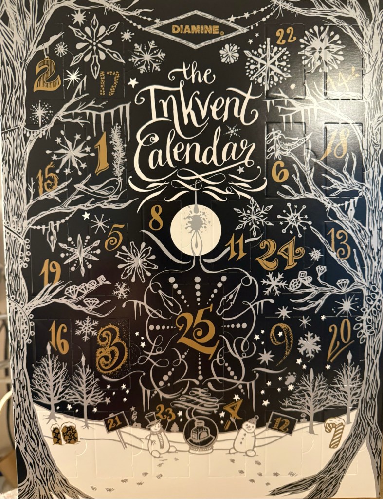
As I have done every year since Diamine started issuing their Inkvent calendars, I will be reviewing each of the inks in the calendar, publishing one post per day for 25 days, and then a summary post looking back at the calendar as a whole. As a reminder, there are 24 doors with 12ml bottles of fountain pen ink behind them, and one 30ml bottle of ink behind door 25. All of the inks in the Inkvent calendar are new for the calendar, and they will all likely be issued in full “black edition” glass bottles sometime mid 2025.
The Diamine Black Edition 2024 Inkvent Calendar
This year’s calendar is the Black edition. You can find my review of the 2019 Blue edition starting here, the 2021 Red edition starting here, the 2022 Green edition starting here, and the 2023 Purple edition starting here.
This year I will be using a Rhodia lined notebook for my writing samples (it’s a fairly standard fountain pen friendly paper that should be a good baseline for the ink), a Midori MD Cotton notebook for the bear sketches that I will be doing (the MD Cotton is a more expensive alternative to the Rhodia, but features better paper), and a Col-O-Ring for the ink swabs. I tried to use dip pens at the start of the first sample, to save me needing to fill and clean up 25 fountain pens, but as I didn’t like the ink flow with my dip nibs, I will be filling up 25 fountain pens again this year. It’s a mammoth undertaking, and as I have taken a break from posting for a while, I’m a bit daunted by the prospect.
But we do hard things because they’re worth doing, and in this case they will help me get back to a regular posting schedule and a regular sketching schedule.
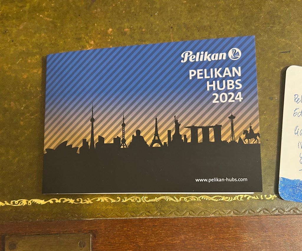
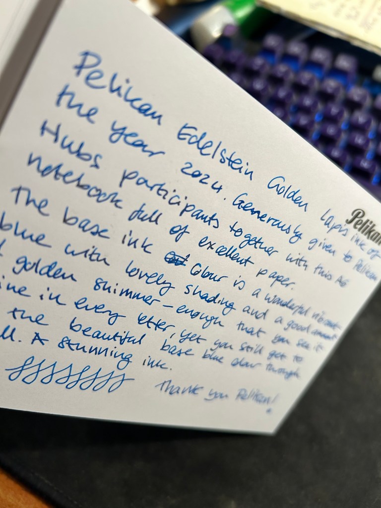
Yesterday Pelikan celebrated their annual Pelikan Hubs event, and we had a local Pelikan Hub. Since 2014 the German pen company has invited its fans to gather in groups all around the world and for one evening celebrate their love of Pelikan fountain pens and ink. The events are well organized, with a local volunteer in each country organizing the Hub location and orchestrating the event. And every year Pelikan gives Hub participants a generous gift for their participation.
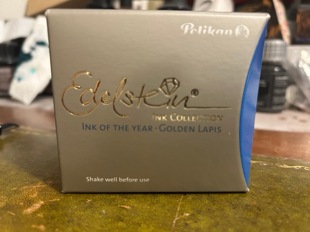
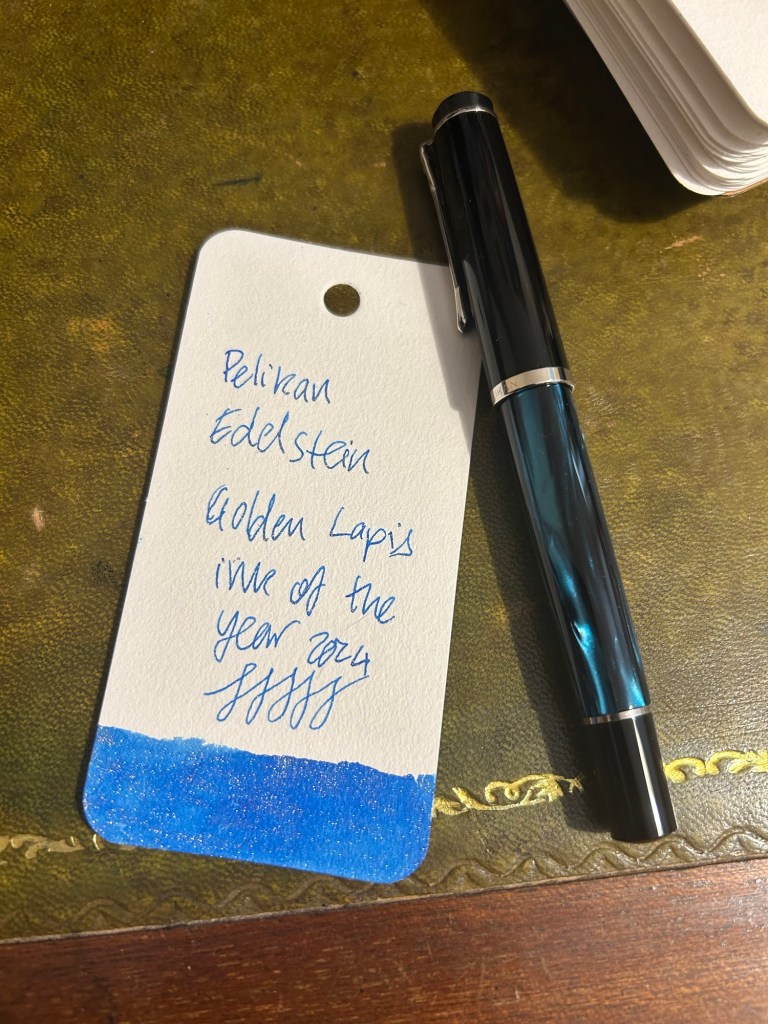
This year was no different, and Pelikan Hub participants got a full sized bottle of Pelikan’s premium ink collection, Edelstein, in the Ink of the Year 2024 colour: Golden Lapis.
Pelikan Edelstein Ink of the Year Golden Lapis
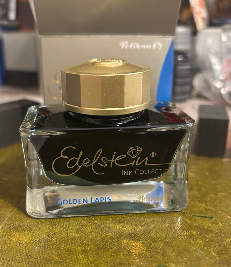
As is customary with luxury inks, the bottle is a glass work of art:
Edelstein ink bottle.
The extra thick base and wide opening work well with Pelikan Souveran pens which tend to be wider barrelled and often difficult to impossible to fill with certain ink maker’s narrow and tall ink bottles. With certain Sailor ink bottles and Diamine’s 30ml plastic bottles there’s a risk of your M400 or M800 not fitting into the bottle or of tipping the bottle while trying to fill the pen with ink. There’s no risk of that with Edelstein bottle design, though when the ink level runs very low its likely you’ll need to get creative when trying to fill your pens with ink.
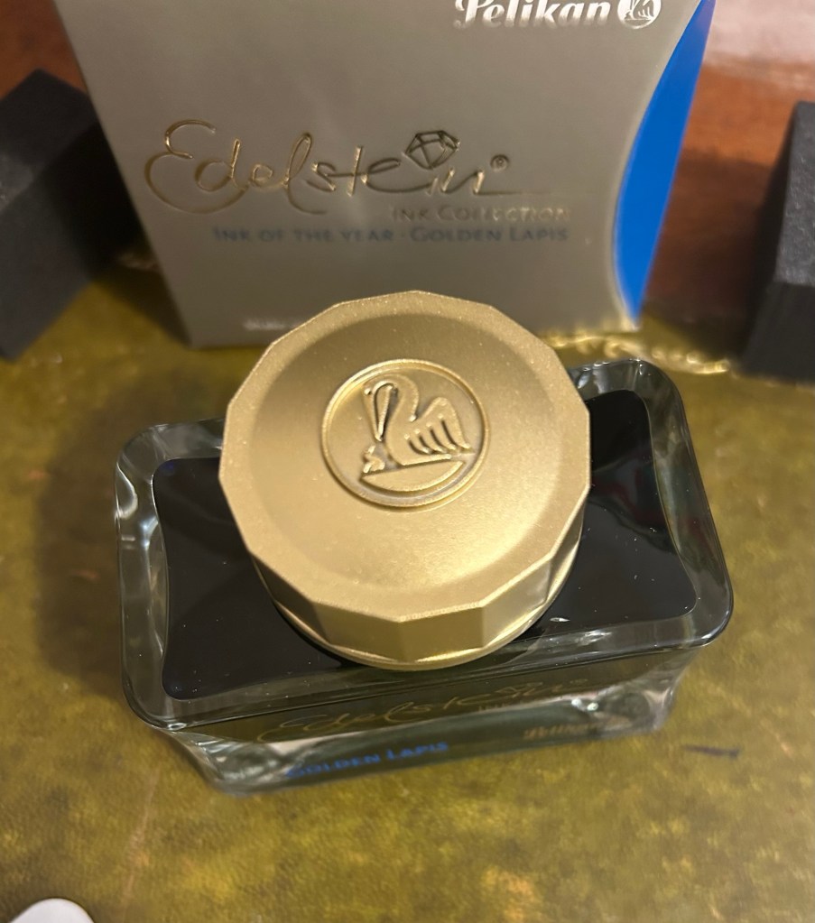
The golden cap has the modern Pelikan logo on it, with a Pelican and one chick:
The Edelstein cap
I filled a Pelikan M205 Petrol Marbled EF pen with the ink and used it for the swab and writing sample below. Here’s Golden Lapis on a Col-O-Ring card:
Pelikan Edelstein Golden Lapis ink swab
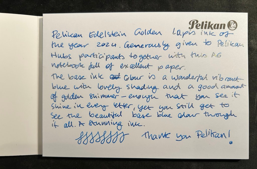
We got a nice A6 writing pad with bristol thick fountain pen friendly paper in it as part of the Pelikan Hub 2024 gifts. The paper is great though I wish there wasn’t a Pelikan logo on each page mostly because it takes so much space. The paper is thick enough for both sides of it to be useful, so it’s a shame to have to flip the page over and write only on one side if you want the full A6 page to yourself.
The A6 notepad that we received as part of the Pelikan Hub
Pelikan Edelstein Golden Lapis is a gorgeous ink, period. The base rich, turquoise-y blue reminds me of Pilot Iroshizuku Asa Gao and that is high praise. The colour is rich, vibrant and has a good amount of shading that sets it apart from standard blues. To this fantastic base ink Pelikan added lots of fine, golden shimmer, and the result is stunning. Viewed directly from above the shimmer is present but subtle, oftentimes taking on the look of sheen:
Writing sample on the Pelikan A6 pad
But tilt the page slightly and the amount of gold in each letter makes the page glow:
Tilt it to the other side and the shimmer “vanishes”, which allows you to see the lovely blue ink’s colour shading much better:
Pelikan Edelstein Golden Lapis is a spectacular ink that manages to be unique in a market overflowing with blue inks with gold shimmer. The combination of the base colour, its shading properties, and the good spread of the shimmer make this an ink worth having in your collection if you’re a shimmer ink fan.
As for the Hub I participated in: it was fantastically well organized and I had a lot of fun meeting other fountain pen enthusiasts and seeing the pens they brought.
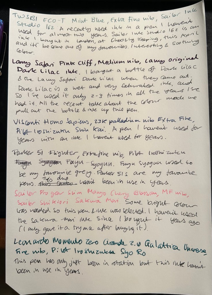
August is going to be a month of pens and inks that I haven’t used in a good long while. While I still have a small amount of ink in four of my July pens (the Kanelea, the TWSBI ECO-T Saffron, the Big I Design Fountain EDC and the Schon Design Faceted Pocket 6), they will all be written dry by the end of next week at the latest. It was time for a new lineup, and this is this month’s assortment:
Writing sample of August’s pens
The TWSBI ECO-T is one of my favourite TWSBI designs, and so I have a few of them. The TWSBI ECO-T Mint Blue hasn’t been in use for about two years, so I decided to pull it out and use the Sailor Studio 162 with it, just for colour matching reasons. The 162 is an ink that I’ve used a few months ago but I really like it, so I felt like giving it another month in rotation.
The Lamy Safari Pink Cliff is a recent purchase that I made in Paris last April. I’ve only now inked it up as I wasn’t sure what ink to use with it — until all the discussion about the new (and not as great) Lamy Dark Lilac ink made me want to use the original Lamy Dark Lilac ink. I purchased a bottle of Dark Lilac and the Dark Lilac Safari back when they first came out, but I haven’t used the ink very much. It’s wet and very saturated and so it works best with only a handful of paper options that I have. Still, it’s a very attractive ink.
Visconti Homo Sapiens — this is the original Homo Sapiens, the one that created quite a splash when it came out. At the time it was my most expensive fountain pens, and it’s still one of my most precious pens. I bought it at Mora Stylos in Paris and had it customized with the special initial badges on the finial. I got Pilot Iroshizuku Shin Kai as a gift with my purchase, and though I love this ink I haven’t used it in a while simply because I misplaced it behind another rarely used ink.
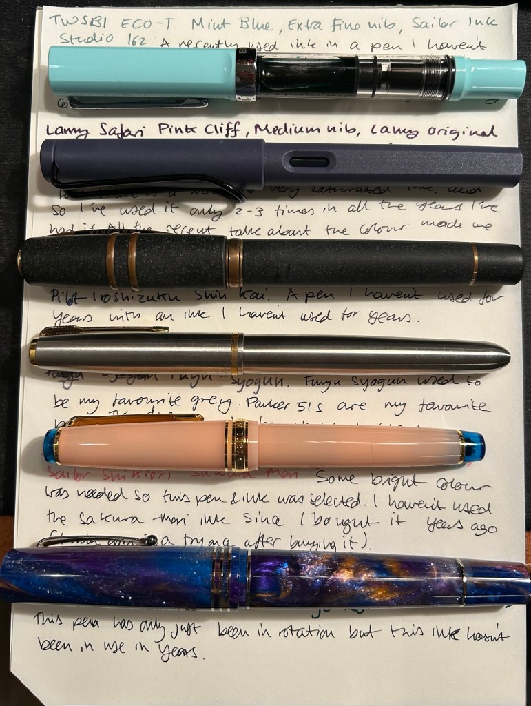
The pens from top to bottom- TWSBI ECO T Mint Blue, Lamy Safari Pink Cliff, Visconti Homo Sapiens, Parker 51 Flighter, Sailor Pro Gear Slim Manyo Cherry Blossom, Leonardo Momento Zero Grande 2,0 Galattica Universe
Vintage Parker 51 pens are my absolute favourites, to the point where I have a hard time seeing one in the wild and not buying it. This Parker 51 Flighter hasn’t been in use in years, but in the spirit of “use the good china” I’ve inked it up. Pilot Iroshizuku Fuyu Syogun used to be my favourite grey ink — and then Diamine came out with a series of excellent grey inks and Sailor came out with the 123. I haven’t used it in years, so I dusted off the bottle and decided to give it another try.
The Sailor Pro Gear Slim Many Cherry Blossom has been in rotation relatively recently, but the ink inside it, the Sailor Shikiori Sakura Mori, is one I haven’t used in years. I don’t have or use many pink inks, but I decided I needed something to brighten up this lineup, and the Sakura Mori ink is relatively readable. It also perfectly matches this pen, which is a nice bonus.
Leonardo Momento Zero Grande 2.0 Galattica Universe is also a relatively recently purchased pen that has been in rotation not too long ago. I just love the Momento Zero so much that I decided I wanted to ink one up, and so I chose the Pilot Iroshizuku Syo Ro to ink it up with. I haven’t used this inks in years, and I love teal inks so it was about time.
What have you got inked up for this month? Anything new? Old favourites or long forgotten pens or inks?
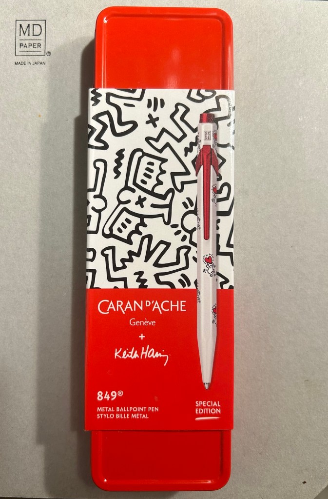
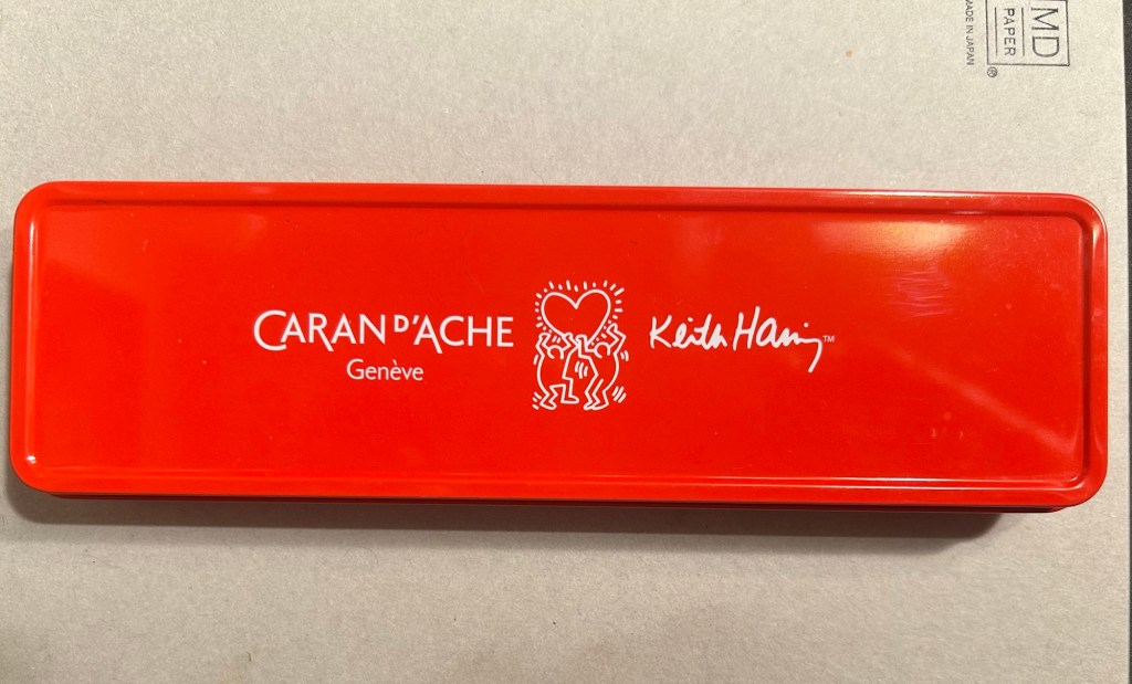
The Caran d’Ache 849 ballpoint is a classic which I have already reviewed in the past. While I rarely use ballpoints, I have several of these pens (all with gel refills that I have swapped instead of the Caran d’Ache Goliath ballpoint ones). Why? Because of their excellent limited edition designs.
While I was in London in April I picked up two new limited edition 849s – The Keith Haring edition in red and white, and the latest 849 Nespresso collaboration.
The box
The Keith Haring edition comes in black and in red and white. I think that the red and white edition is nicer, and it appears that so do other 849 fans: the black edition is still widely available but most places have long sold out of the red and white edition.
The box is very nice, and makes for a nice gift pack.
Outer box
Inside the box you also get to see some of Haring’s work.
Inside the box
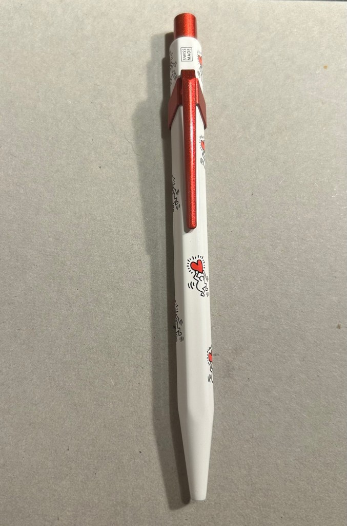
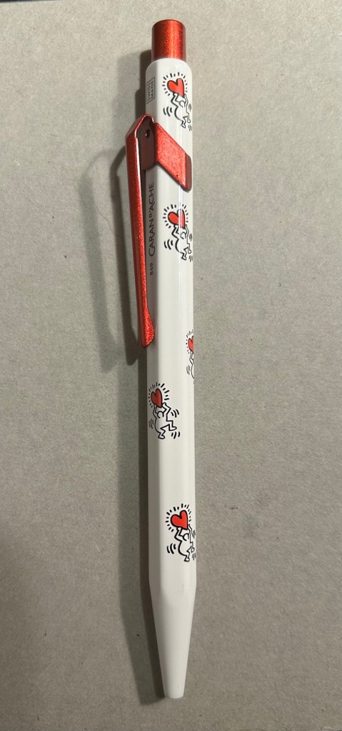
The pen itself is white, with a sparkly red knock and clip. The paint on these feels like lacquer, and the look is sleek and bold. There are dancing people holding red hearts all over the pen (so you get some Keith Haring artwork, but it’s not overcrowding the pen), and the pen body’s finish is the standard 849 glossy finish.
The Keith Haring 849
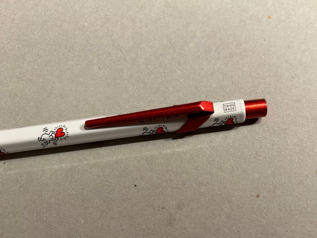
The knock and clip are probably the most striking thing about this pen. Surprisingly Caran d’Ache didn’t put any Haring branding on the pen, not even hidden with their branding under the clip.
You can see the branding on top.
The paint on the clip and knock look like someone poured them out of red glitter paint, and then waited until they set. All in all the result, together with the Keith Haring artwork and the included box, is one of the best 849 gift pens I have seen.
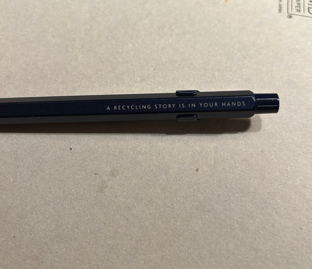
The Caran d’Ache Nespresso Kazaar edition, the 6th Caran d’Ache and Nespresso shared edition, is a bit different than previous editions. Unlike previous editions that featured a silver clip and knock, the Kazaar edition is monochrome. The dark blue pen has a clip and knock in matching colours, and the result is much better than previous pens in this series.
The Kazaar 849
As usual the pen is made at least in part from aluminium from Nespresso Capsules. The pen body has a bit of a matte texture to it, which makes it slightly easier to grip. It comes by default with the excellent Goliath refill, this time in black (the Keith Haring 849 also came with a black Goliath refill).
The pen touts its recycled origins.
The 849 Nespresso came in the same sort of recycled cardboard box that previouseditionscame in. It makes for a good gift pen, even though some may find the dark navy blue colour a bit… boring.
Swiss made. The colour matching on the knock, clip and pen body is superb.
If you like the idea of the 849 Nespresso but don’t much like the colour of the Kazaar one, I’d recommend waiting for the next edition. I have a feeling that it too will feature monochrome hardware, and it might be in a brighter colour as Nespresso are starting to run out of drab capsule colours.
The Goliath refill in action
Note to those who prefer gel ink refills and plan to swap the 849 refill out: the tolerances on these 849 pens are a bit weird. There are 849’s in which you can easily swap the refill for any Parker style refill with no issue, and those in which if you swap the refill you find that the knock won’t properly engage it. This is something worth taking into account if you plan on swapping the refill in the pen – there’s a risk that it won’t work with the specific pen you own. I’d recommend in this case to try swapping the refill before you purchase the pen if possible, or resign yourself to using a ballpoint. The Caran d’Ache Goliath refills are several cuts above what you get in a standard, disposable ballpoint, so the loss shouldn’t be too great.
What about you? Do you like the 849? Do you swap its refill?
April was a travel month which meant that I cleaned out all of my fountain pens apart from the Big Idea Design Fountain EDC that I took with me on my travels. So in the beginning of May I inked up five more fountain pens, many of them with new inks that I bought during my trip.
The Big Idea Design Fountain EDC is still a troublesome writer, but I keep reaching for it, so it’s still in the rotation with its second cartridge of Diamine Autumn Oak. Diamine Autumn Oak is a reddish orange with a lot of shading and it’s dark enough to be readable even with a fine nibbed pen.
There are two Franklin Christophs currently in my rotation (I misspelled the brand name in the writing sample, my apologies), and I am using them to compare the Sailor Studio 123 ink to the 224 ink. 224 is slightly more bluish and has less of a pink tint to it, but both are so similar that if you’re looking for 123 and it’s out of stock, you could use 224 and likely not notice the difference. I’ve been using these pens so much that I wrote the Sparkling Rock dry already, and the Thomas Hall Tibaldi edition is well on its way to joining it.
The Momento Zero Mother of Pearl is a gorgeous pen with a gorgeous, springy nib, and a joy to write with. Sailor studio 162, which I purchased on a whim at Choosing Keeping in London, is now one of my favourite inks. It’s a very unique shade of green/teal that makes me want to fill the same pen with it the minute I write it dry.
The Lamy Safari Savannah has Pilot Iroshizuku Kosumosu ink in it because I wanted something bright after all the muted greys and greens. The issue is that previously the pen had a shimmer ink in it and I apparently didn’t clean out all the particles, so I now have a shimmer version of Kosumosu. The result is fetching so I don’t mind this accident, but I will have to properly dismantle the pen and give it a thorough cleaning once I write it dry. It’s about halfway full now.
I like Rohrer and Klingner inks so when I saw the limited edition Ebony iron gall ink at Choosing Keeping, I immediately bought it. It’s very well behaved for an iron gall ink, but it’s not really a saturated black. I prefer darker blacks, but I’m getting used to the shading that Ebony provides.
A slightly late addition to the flock is the Leondardo Momento Zero Grande 2.0 Galattica Universe fountain pen, which arrived just in time for my birthday. It’s a stunning pen, and this photo does not do it justice. I knew I wanted a turquoise ink in it, and I haven’t used Bungo Box’s June Bride Something Blue in a while, so that’s the ink I chose. It was difficult to fill the pen from the flat Sailor shaped bottle, and I didn’t get a full piston-full of ink in it because of the awkward shape of the bottle. Lesson learned for next time.
With One Week 100 People I’ve been using my fountain pens much more to sketch with, and I fell in love with them again as sketching tools. There’s something about the expressiveness of the line that they bring in that reminds me of pencil more than of fineliner pens when it comes to sketching – a combination of their varying line width and the varying ink shade.
I’ve also purchased more fountain pens than I planned, buying two Franklin Christoph pens from the pen models that they’re retiring: A model 46 in Polar Ice with an extra fine nib and a pocket 66 Italian Ice with a flex extra fine nib. These two join the Leonardo Momento Zero Grande 2.0 Galattica that I purchased from Pen Chalet last month, and the Leonardo Momento Zero Nuvola rose gold that finally arrived this month after I purchased it from Fontoplumo and it was stolen during transit. Fontoplumo were wonderful, and replaced the pen immediately, so I intend to purchase from them again.
I haven’t purchased so many new fountain pens since before the pandemic, but the Leonardo Nuvola was a gift to myself to celebrate two years from chemo, and the Galattica was a gift to myself for surviving a hellish month with my father in hospital. The Franklin Christophs were unexpected purchases made only because they were retiring these models and I was curious about these materials (I already have an Antique Glass model 66 and I love it).
Writing samplesThe pens
So far the biggest success in terms of nib has been the flex extra fine Franklin Christoph Pocket 66 Italian Ice. The nib has only a slight springiness to it, and I wouldn’t call it a flexible nib in the true sense of the word, but it works well for both sketching and writing. Diamine Earl Grey is one of my favourite inks (a bluish grey with tons of character that is legible even with very fine nibbed pens), so I didn’t hesitate filling an eyedropper pen with it. As eyedroppers have such a tremendous ink capacity, you always need to take into account just how much you love the ink you use in them.
The Leonardo Momento Zero Nuvola was a surprise in terms of the resin on the pen body (I was already familiar with LMZs fantastic fine flex nibs, and great pen and converter design). I was expecting a light blue pen with white “cloud” blotches and black outlines. In reality the black outlines are in a semi transparent brown resin, the white is more off-white/cream, and there’s real depth to the design. A very unusual resin that is both classic and unexpectedly unique.
Caran d’Ache discontinued their ultra-expensive and ultra-sought-after ink series “Colours of the Earth” in 2013 and I managed to get a bottle of the entire series besides Carbon right after they announced they wouldn’t be making them (I had bottles of Amazon, Safron and Sunset before they were discontinued because those were the ones that interested me the most). These inks are well over 10 years old and still fantastic, though the Amazon (the green ink) has darkened a bit and so lost some of its depth. The Caran d’Ache bottles are both gorgeous to look at and terribly designed.
Diamine Coral is the most optimistic of inks, a brightly bright coral ink that glows on the page and works best in generous nibs. I felt like a pick-me-up so I filled the Woodshed pen with it.
I made some interesting eexperiments with notebooks and tried a few new pencils, but this post is getting a little out of hand and so I’ll write about those in a separate post.
Did you use any interesting stationery last month?
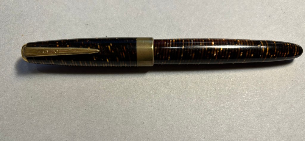
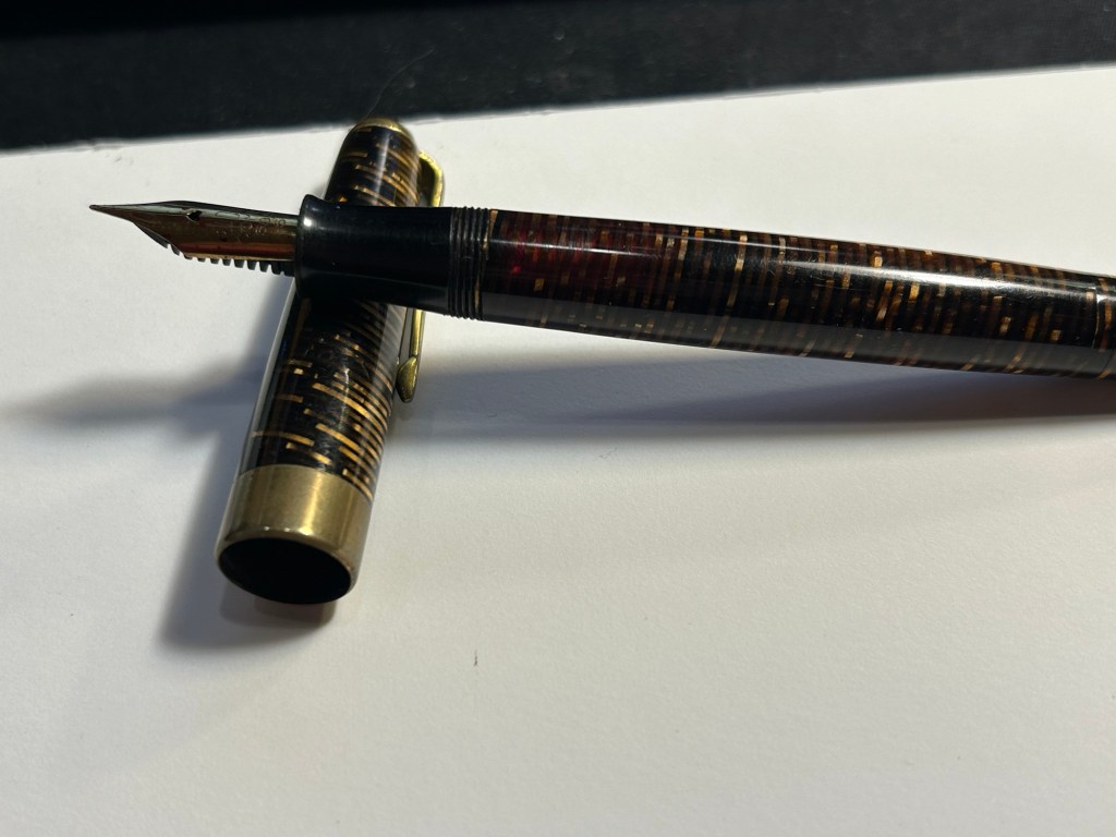
In April 2010 back when I was relatively new to collecting vintage fountain pens, I purchased a vintage Radius Comet on the Fountain Pen Network. The body was brown laminated celluloid, just like Parker striped Vacumatics, and you could see the ink levels through the stripes, just like with a Parker Vacumatic, and it had a jewel on the cap, just like a Parker Vacumatic. It was, however, a piston filler, unlike the Parker Vacumatic, and it had a superflex gold nib, also unlike a Parker Vacumatic. So even though I had never heard of the brand before and there was very little information about them to be found, I took the risk and bought the pen. It cost €120 shipped.
Radius Comet
The pen was obviously user-grade, as there was brassing and tarnishing on the hardware, a lot of micro-scratches on the body, and some ambering in parts of the celluloid. It’s still a good looking pen, though.
The stripes had darkened with time, but some still have their original glow
The design of the clip and the jewel on the end of the cap was clearly influenced by the ultra popular Parker Vacumatic.
The jewel on top, a clear copy of the Parker design.
Even though the celluloid has darkened and ambered with time, you can still clearly see the ink levels through the stripes. As a piston filler it has an impressive ink capacity, which works well with the flex nib, as it can lay down a good amount of ink when fully flexed.
You can see the ink levels through the stripes.
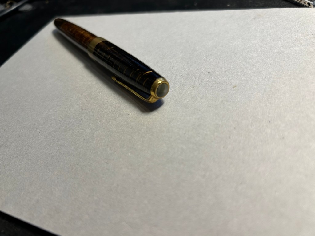
It works perfectly – the filling system is and always was a joy to use, and the nib… Well, the literally don’t make nibs like this any more:
The nib
When you apply no pressure it’s a wonderfully smooth fine nib, but when fully flexed it goes up to broad/double broad territory. The feed keeps up with the ink flow with ease, and I’ve never had a hard start with it, ever.
Writing sample on Midori MD paper with Diamine Amaranth
Leonardo has revived the brand in recent years, and now you can buy a brand new Radius with a cartridge/converter system, resin body and (obviously non-flexible) steel nib for around €150, not including shipping. No modern pen manufacturer is capable of creating a pen like the vintage Radius or any of its contemporaries, neither in body material, nibs or filling systems at the price that they were once made. It’s a question of both volume and lost knowledge and tooling, which means that the vintage and new Radius pens have very little to do with each other beyond having the same brand name.
Buying vintage is always a risk in a way buying modern pens isn’t, but the value for money still cannot be beaten. I might buy a modern Radius at some point in the future (I like their designs and I’m curious about the pens), but I have no doubt that in terms of looks, nib and filling system it won’t be able to hold a candle to its well-worn and well-loved vintage namesake.
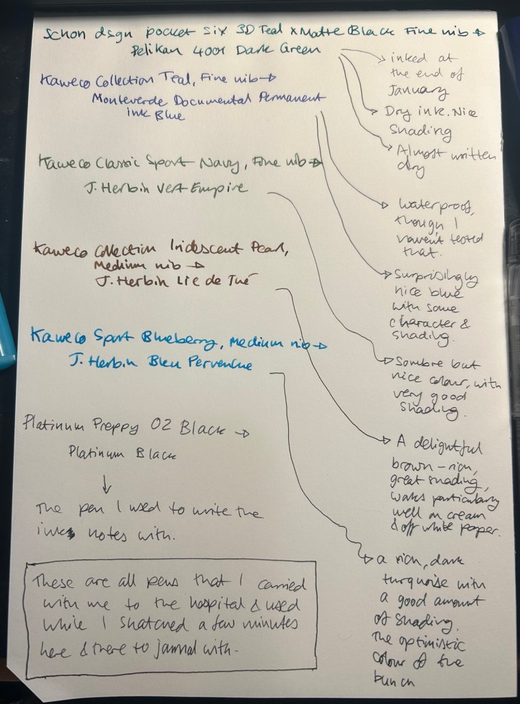
I started the month ready to spend the first half of it in hospital, with my dad. So the fountain pens I chose were all expendable pocketable pens that I was willing to have stolen (apart from the Schon Design Pocket 6 which was a leftover from January and never left my desk). So that meant I inked 4 Kaweco Sport fountain pens using various ink cartridges that I had on hand.
The portable lineup:
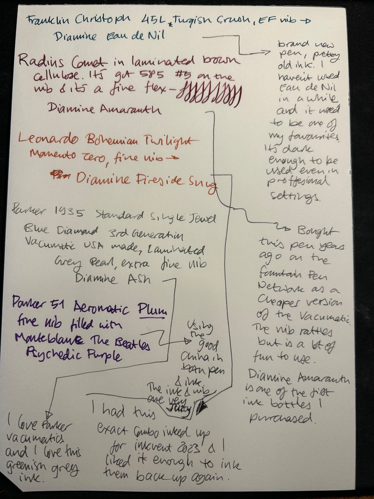
Once my dad got out of hospital and back home, I decided to celebrate by “shopping” from my collection. I inked up a Parker 51 Plum (use the good china!), a Parker Vacumatic, a Franklin Christoph 45L Turqish (spelled like that on their site) Crush that I had purchased but hadn’t inked before, and a vintage Radius Comet (because I heard that the brand was being revived).
The Franklin Christoph EF nib isn’t the best companion to the Eau de Nil as the ink tends to dry in the nib, causing hard start issues. The Radius is a flexible nib of the vintage kind, which means it’s really flexible and not just springy. It also rattles, which makes me not carry it around with me — it stays at home at my desk. The Leonardo is a beautiful pen with a beautiful ink that I refilled immediately — the only Inkvent 2023 ink I did that with. The two vintage Parkers are phenomenal, as usual. The extra fine nib on the vacumatic somehow really well with Diamine Ash, though I was worried at first that the combination would be too light to be readable. The Parker 51 Aeromatic is a treat to use. It’s the rare Plum colour, and it’s got a fantastic nib (as all 51’s have) which pairs very nicely with the Monteblanc The Beatles Psychedelic Purple.
In terms of paper I’ve been using Kokuyo A4 KB paper which I cut to half size (so A5) to manage my daily to do list. The paper is relatively cheap and very fountain pen friendly. I’m also able to use both sides of the page despite there being some show through.
Kokuyo A4 KB paper cut in half to A5 size. This is why standards are great.
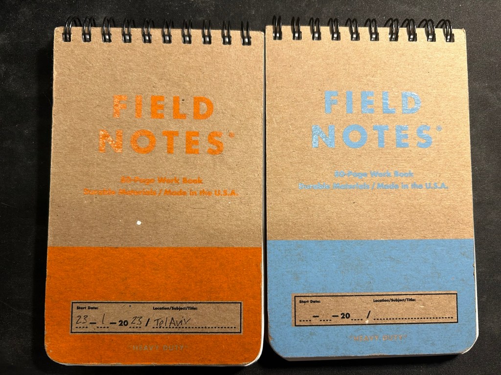
I’ve got a Field Notes Heavy duty on my desk at home and at work, and I just bought a new stock of them. These are where I jot down quick notes, phone call details, doodles during boring meetings. When they’re filled up they get tossed out as nothing in them is permanent — everything important in them moves to somewhere else as I work my way through them.
Field Notes Heavy Duty pocket spiral bound reporter notebooks
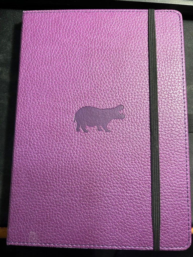
I have finally found a use for my Dingbats notebooks (beyond giving them away as gifts, as I have in the past): this lined purple hippo one is my blog notebook. I discovered that I have a much easier, much quicker time writing blog posts if I first draft them on paper, and this is where I do it in. I’ll likely write a dedicated post to this notebook soon.
Dingbats Puple Hippo A5 lined notebook
Apart from them I still use the notebooks I used last month.
Pencils
I’ve been using the Drehgriffel Nr. 2 as my daily driver. I use pencils extensively to plan, as my plans tend to change, and there’s something about this solid little mechanical pencil that makes me want to use it.
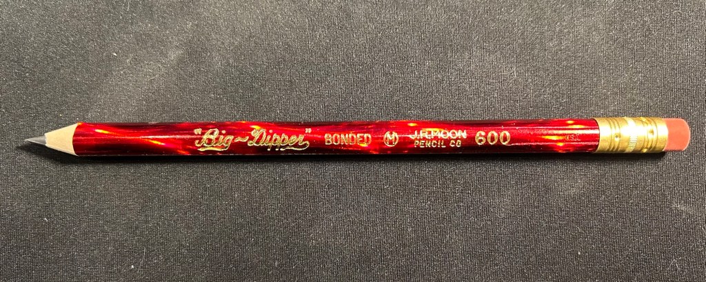
Apart from that I brought two pencils into the rotation, to try to use. One is from my last purchase from the late and great C.W. Pencils Enterprise, and it’s the “Big Dipper” J.R. Moon Pencil Co 600. It’s an oversized pencil, the kind of pencil that kids who are learning to write are expected to use. I’ve been having pretty significant neuropathy in my hands lately and I thought that this would be nice and easy to use, as after all it’s designed for kids just learning to develop their fine motor skills. So far it’s been a disappointment – the eraser and ferrule make it very top heavy, and I’ve been having a hard time manipulating it. I can’t imagine kids using this pencil and having an easy time with it. I like the over the top red foil with gold writing look though, so I haven’t given up on it yet.
Big Dipper J.R. Moon 600
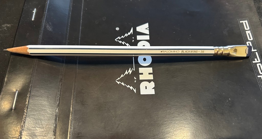
The second pencil is a Blackwing Volumes 56, the baseball themed one. The core is soft and dark, and I’ve been using it for quick and loose sketches. I’m trying to ease into one week 100 people by training myself to work faster than I normally would.
Blackwing Volumes 56
What did you use in February? Any planner changes? Pencil revelations? Pen preferences?
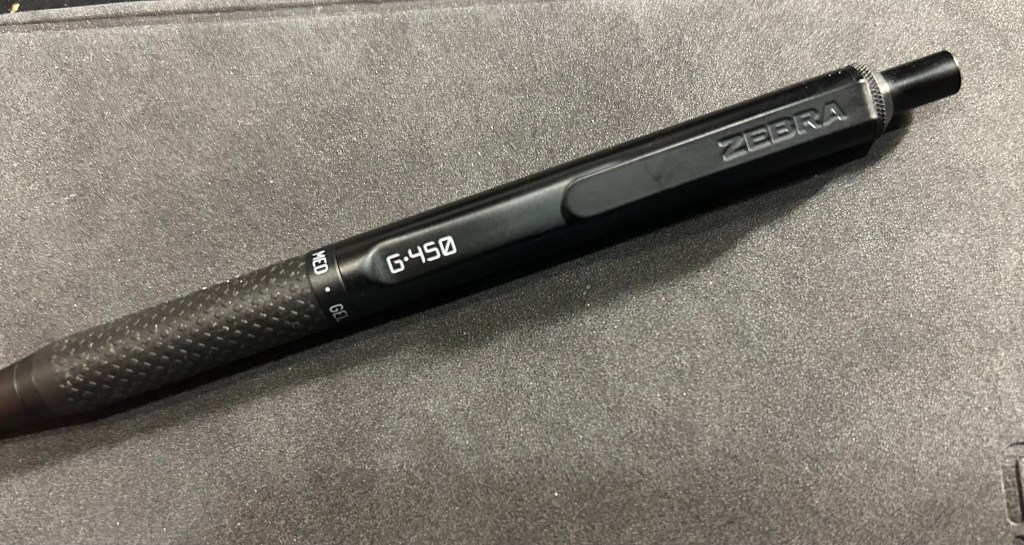
Never have I ever fallen in love with a standard pen faster than the Zebra G-450. Even the Uni-ball Signo RT 0.5 took a bit of time until it became my favourite, and I had much less experience with gel ink pens at the time. I liked the Zebra G-450 so much that after writing a few pages with it, I put in an order for two more packs, just so I’ll have backups and multiples of it.
So, what’s so special about this pen?
Zebra G-450
First of all, the Zebra G-450 looks like it was designed to be a prop in the Jason Bourne movies. It doesn’t have the “I’M A TACTICAL PEN, LOOK AT ALL THE WEAPON LIKE APPLICATIONS YOU CAN GET WITH ME” look of tactical pens. I find that look childish, and I find that it makes for very uncomfortable to write with pens. The G-450 is nothing like that: it’s sleek, features a durable and hefty-without-being-heavy brass body, knurling on the top, a very well designed rubber grip, and very Jason Bourne like fonts.
G-450
The G-450 has a well designed and solid clip, with a step down/cutout right in front of it that adds interest to the pen silhouette and makes it easier to clip onto things.
Step down, clip and fonts
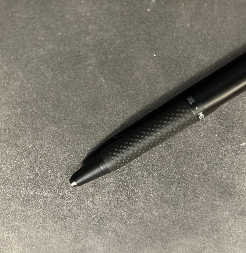
I love the console like fonts in white, and I really love the grip. It isn’t mushy like a silicon grip, but it is softer than the pen body, and with the raised pattern on it, gives you a rock solid grip on the pen. The ring on top of the grip announces that this is gel pen, with a medium (0.7) tip. The pen cone has an extra small taper towards the tip, adding interest and perhaps also helping stabilize the refill. There’s no clicking, jiggling or noise from the tip as you write with the G-450.
Grip closeup.
The click mechanism is solid. The clicker (is it called that? let’s assume it is) stays extended at all times, even when the tip is engaged, and it has a very satisfying click. There’s a red jewel with Japanese writing in silver on the end cap, and it adds a nice and subtle splash of colour to the pen.
end-cap closeup
All this is wonderful, but it’s the refill that makes it all sing. It’s dark, super smooth, and it dries almost instantly. Yes, even on Stalogy paper, even on Rhodia and other fountain pen friendly paper, it just dries as soon as you write with it. This is a perfect lefty pen (I’m not a lefty) and it’s perfect for jotting things down in a rush. It will write a bold, clear line, and not smudge.
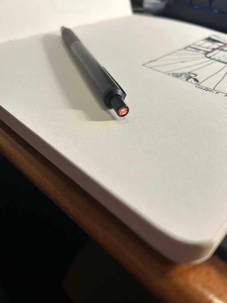
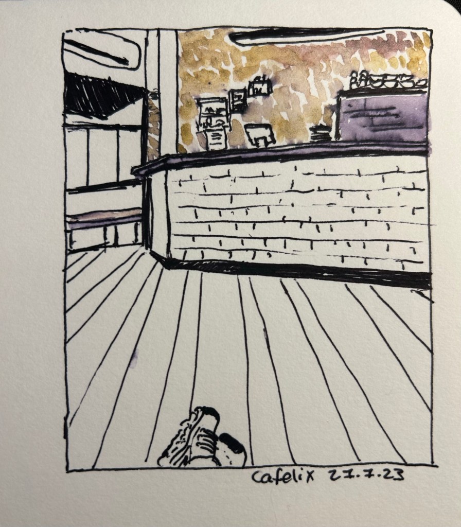
I sketched a local cafe with the Zebra G-450, on Stillman and Birn Alpha paper. I then “opened” up the lines using a waterbrush, as the the Zebra G-450’s fast drying refill isn’t waterproof (as is to be expected with gel ink pens). The result was a nice greyish purple that you can see on the coffee machine on the right. The coloured graphite was provided by the Derwent Inktense paint set, but that’s a review for a different day. Suffice to say that while the Zebra G-450 isn’t a sketching pen, it will work well as one in a pinch, as long as you like thick lines, and don’t mind it not being waterproof.
Rarely have I encountered a pen that I wholly like after just a day of use. I love the G-450’s aesthetic, its refill and its feel in the hand enough to immediately add it to my daily carry. I used Zebra’s wonderful G-301 pen daily for years, and I can see the G-450 easily replace it on merits of the refill alone. Sometimes a pen just ticks all the boxes for you, and this one clearly does for me. I recommend giving it a try if you possibly can. Who knows, maybe it will become a new favourite for you as well.
I don’t normally celebrate this blog’s anniversary, but I decided to answer The Well Appointed Desk’s 21 Pen Questions and The Gentlemen Stationer’s 5 More Pen Questions to celebrate this year. You’ll see that my answers skew towards vintage pens and sket
#21PenQuestions
1: What is the pen they’ll have to pry out of your cold dead hands? My very first Parker 51 (an aerometric black one that’s worth very little but is still my favourite). I love writing with it, and it was such a significant purchase at the time. It was the first vintage pen that I bought, I got it from the Fountain Pen Network without having tried a Parker 51 or a gold nibbed pen or a vintage pen before, and it was so expensive for me at the time. I’m so glad that I took that leap of faith, and that it worked out so well.
My first ever Parker 51
2: What’s your guilty pleasure pen? My Nakaya Cigar Piccolo Negoro Kise Hon Kataji black/red with elastic flexible medium rhodium nib. It’s a joy to use but it was so expensive to purchase, I had to wait so long for the pen to be made and then I had to go release it from customs myself because they wouldn’t believe its price, so it never leaves my house. I bought it years ago from Mora Stylos in Paris.
My Nakaya
3: What’s the pen you wish existed? I’m curious about how a red Lamy 2000 would look. If it’s anything like I think it would then I want one.
4: What pen would you give to a new enthusiast? It depends on the person but either a Lamy Safari or a Pilot Metropolitan. If they were remotely interested in vintage pens, I’d have them try the magic that is the Parker 51. If they are an artist, then a Sailor Fude De Mannen with a bottle of De Atramentis Document ink.
5: What pen do you want to get along with but it just never clicked? Pocket pens, particularly the Kaweco series. I use them sparingly because it’s such a hassle to uncap and post them each time I want to use them. The same goes for the Schon Design Pocket 6. I have two of them, they’re great, but they’re too much of a hassle to use regularly.
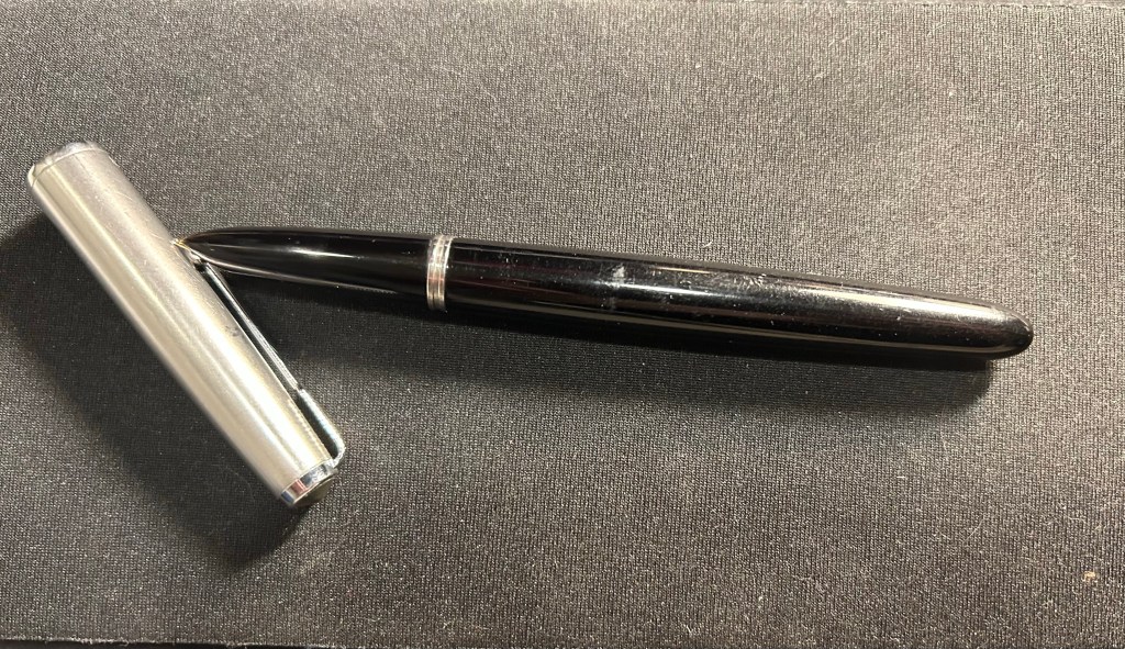
6: What pen do you keep only because it’s pretty? I have some vintage pens that I daren’t use, the prime example being a retractable Waterman that I’m afraid to fill. You are supposed to pour the ink directly into where the nib is extracted from, and I can’t bring myself to do it.
Retractable vintage Waterman
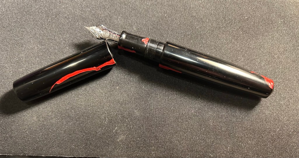
7: What pen (or stationery product) did you buy because everyone else did? My worst pen ever, the remade Conklin Crescent filler. I bought it because people on the Fountain Pen Network went wild when they came out, and it is plasticky garbage that fell apart after one use, is horrible to fill and use, and was an utter waste of money. I’m now writing with a vintage Conklin crescent filler and A. The filling mechanism looks cool but isn’t practical (hard to fill, hard to clean), B. The Conklin flexy gold nib is amazing. C. It’s made of BCHR so it stinks to high heaven and has aged poorly. But I couldn’t care less because the nib is amazing.
8: What pen (or stationery product) is over your head or just baffles you? The plotter. It looks like a less well made Filofax for much more money, and I don’t get the hype. I also don’t get $400 steel nibbed cartridge-converter pens with over-hyped advertising. I don’t care how pretty the box or the site or the story is — it’s a $250 pen, tops.
9: What pen (or stationery product) surprised you? The Stalogy 365 B6 notebook. I wasn’t expecting them to become my main journaling notebook, but I like the paper and the size. Also the Retro51 tornado, which I thought was a gift shop pen but turned out to be pretty good, even though I don’t love the refill.
10: What pen doesn’t really work for you but you keep it because it’s a collectible?
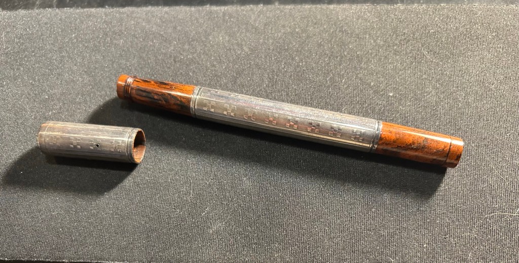
I have a few vintage lever filler fountain pens from Waterman and Parker that I rarely use because they’re such a hassle to fill and even more of a hassle to clean out.
Gorgeous lever fillers (and two propelling pencils) that I never fill. Retractable Waterman on the right.
11: What is your favorite sparkly pen (or ink)? I rarely use sparkly ink outside of Inkvent testing (I’m foolish enough to fill entire pens to test the ink instead of just dip testing them), and I have two sparkly pens only (both by Franklin Christoph) as I’m not a fan of the genre. That being said, between my Sedona Spa and Sparkling Rock I prefer the Sparkling Rock.
12: Which nib do you love — but hate the pen? Conklin Crescent filler. I also have some flex nibs on vintage button fillers (which I hate) that I keep for the nib alone.
13: What pen (or stationery product) gives you the willies? Noodler’s Bay State Blue. Because of the ink and because of the company.
14: What’s your favorite pen for long form writing? Parker 51, Lamy 2000 or a Pelikan with a fine nib. They’re all excellent writers, and the Lamy 2000 and Pelikan have giant ink capacities. The Parker 51 just makes me want to write more and more with it.
15: What pen (or stationery product) do you love in theory but not in practice? The traveler’s notebook. I love setting them up but I never use them because the format (both pocket and regular size) just doesn’t work for me. It’s too small and too narrow.
16: What pen (or stationery product) would you never let someone else use? I tend to not loan my pens out because they walk off my desk, to a point where I no longer keep any pens in the office (they all live in Sinclair bags and travel with me everywhere). If it’s at a pen gathering then I have no problem letting people try out my pens.
17: What pen (or stationery product) would you never use for yourself?
Lined notebooks where the lines don’t reach the end of the page. I loath them.
18: What pen (or stationery product) could you NOT bring yourself to buy? A Sailor King of Pen, because of the size and the price (and I’ve been eyeing one since they’ve been significantly cheaper). I actually tried one out and it felt ridiculous in my small hands.
19: What’s your favorite vintage pen? Parker pens, particularly the 51s but also the striped Vacumatics. But I have a hard time not buying every Parker 51 that crosses my path. I love the nibs, the sleek look, how reliable they are and how easy they are to fill and clean out.
20: What is your favorite EDC/pocket pen? Schon Design Patina faceted pocket 6. I love the design, the facets and the colours.
21: What’s the pen (or stationery product) that got away? Retro51 Pink Robots. I was a Pen Addict member when it came out but I didn’t get it in time as I was distracted by my mom’s cancer diagnosis and treatment at the time. When I got cancer I wanted it even more, but I haven’t been able to get one. If you’re reading this and you have one for sale for a reasonable price, let me know.
#5MorePenQuestions
Why do pens and stationery continue to play such an important role in your life, especially in an age when everything is supposed to be going paperless and digital? I started using fountain pens as a way of dealing with my carpal tunnel issues. Then I started sketching with them, and then I really got into vintage fountain pens. I always used paper and pens/pencils both for my sketches, and because I process and recall information much better on paper. Beyond the practicality of it all, I love my pens, pencils and notebooks as objects. I love their designs, the feel of using them, their history and the way they gather meaning as objects for me.
What do you view as the key benefit of writing by hand? I think best when I write by hand. I enjoy the physicality of the process, and the way that it helps me slow down, focus, see things more clearly. I also remember things best when I write them down, even if I don’t go back to reading my notes later on.
What is your favourite thing about the pen/stationery hobby? That it affords me an immediate connection with the past. Most of my family was wiped out in the Holocaust. I don’t have a family history. I don’t have heirlooms. Using vintage fountain pens, real survivors (in my eyes), brings me so much joy – particularly when I know that I’ve “rescued” them from being tossed away or gathering dust in a drawer. I love researching them, trying to imagine their past, wondering who their previous owners were, and what they were like. It’s part of why I have no problem buying vintage fountain pens with names engraved on them.
What is your least favourite thing about the pen/stationery hobby? The way that I’m treated as a woman in local fountain pen circles, and in vintage fountain pen circles. The assumption is that I don’t belong, and I must be buying a pen for my boyfriend or something, that I’m a “fake” fountain pen enthusiast. I tried joining the local fountain pen group but they were so hostile (yes, even after I gave out free bottles of fountain pen ink, showed my collection and proved my knowledge) that I left, never to return. It’s the same when I visit vintage fountain pen dealers for the first time, and I’ve gotten used to it, but it still annoys me.
If you could choose one combination of stationery items to use for the rest of your life, exclusively, what would those be and why? A Parker 51 Aerometric fountain pen with a fine or medium nib; Waterman Blue-Black/Mysterious Blue; Midori MD Cotton Paper (blank) in a pad or notepad. I think that the Parker 51 is self explanatory at this point 🙂 Waterman Blue-Black has a lot interesting shading, and even some teal in it, and some red sheen. It’s also very easy to clean out of pens, which is always a plus for me. The Midori MD Cotton Paper is very well behaved with fountain pens, and ink doesn’t take hours to dry on it. I also like its minimalistic aesthetic.