OneWeek100People 2021: Day 5

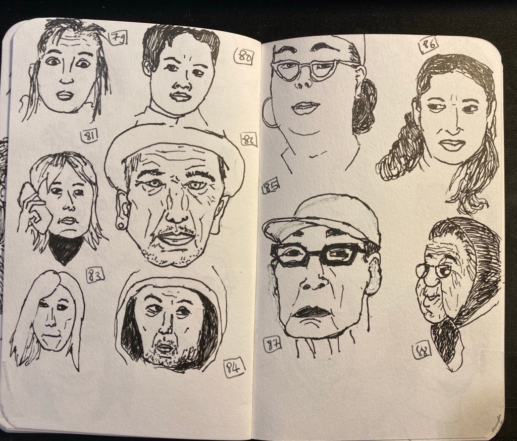
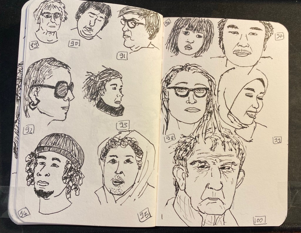
Day five of the One Week 100 People challenge, the final day of the challenge. I made it, using only pen and ink, and focusing on portraits the whole way through! It was tough but rewarding, and if I’d change one thing about it is get a better ink than Platinum Carbon. It kept drying up on me, and for the last four drawings I switched to a Lamy Safari fine with Noodler’s Black. That also wasn’t ideal, but it was better than the Platinum. I really want to test out the De Atramentis Document inks, but with shipping rates and reliability being what they are I’m stuck with three equally poor alternatives: Noodler’s Black, Platinum Carbon Ink and Rohrer and Klingner SketchINK. They all dry up in the nib and are hard starters, and the best of the bunch in terms of flow (Noodler’s) is the least waterproof of them all.

Anyway, I really recommend the One Week 100 People Challenge to anyone who wants to improve their people drawing skills, and I plan on doing it again next year.

Oranges, Bananas and maison kayser

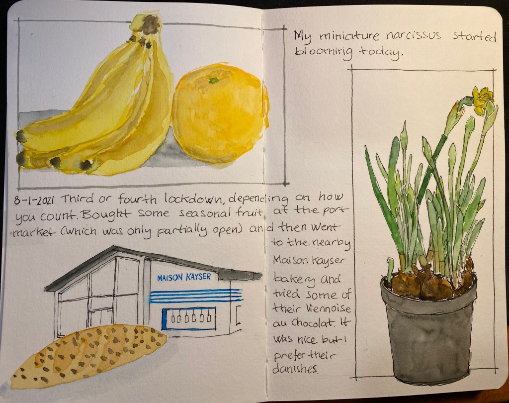
A sketch of an orange, a banana, a narcissus flowering, Maison Kayser and a Viennoise au Chocolat
Bananas, orange, narcissus and Viennoise – an eclectic page

This page, created for Liz Steel‘s Sketchbook Design course, is about secondary sketches and borders, and has a little hidden colour block in it. The original spread was a little lacklustre and disjointed. The Viennoise in the corner looked particularly sad. Adding a secondary sketch of the Maison Kayser bakery (where I bought it), with a touch of blue and bluish grey to the background really brought it to life.

The bananas and orange got a shadow which serves more as a grey colour block, making their warm colours more prominent. Adding borders in Noodler’s Lexington Grey (to the bananas and orange watercolour) and Noodler’s Black (to the narcissus) was the final touch that pulled this page together.

I’m enjoying the course very much, even though the past two weeks have been personally hectic. I’ve been working on a short story to submit to a competition (got it done in time and accepted), and some bad news regarding the health of a family member have meant less sketching time than I would have liked. Hopefully the coming weeks will be better.

By the way, the local branch of Maison Kayser, in Tel Aviv’s port (I haven’t visited the Rothschild one yet), is excellent. Their vanilla chocolate chip danish, sandwiches, and baguettes are sublime, and it’s a fun place to visit. They had the misfortune of opening after the pandemic started, but they seem to be managing well, so I think we’ll be seeing them around for a good while yet.

Drawn on a Stillman & Birn Beta, with Lamy fountain pens, Noodler’s ink and Schminke watercolours.

Sketchbook Design Goals

My sketchbook design course goals, and a drawing of the Phoenix community garden in London.

The first week of Liz Steel’s Sketchbook Design course is underway, and so far I’m having a blast and drawing much more than I used to. I’m also learning a lot not just from Liz, but also from the other participants in the course. One of exercises this week was to create a page with our Sketchbook Design course goals, and here is mine. I also drew the Phoenix Community Garden in London’s West End to accompany my goals. Hopefully I’ll be able to return to it later this year.

Tools used: Stillman & Birn A5 Beta, Lamy Safari pens with J. Herbin Bleu Pervenche and Noodler’s Black, Schmincke watercolours.

Zebra Mildliner Review and Journal Comic

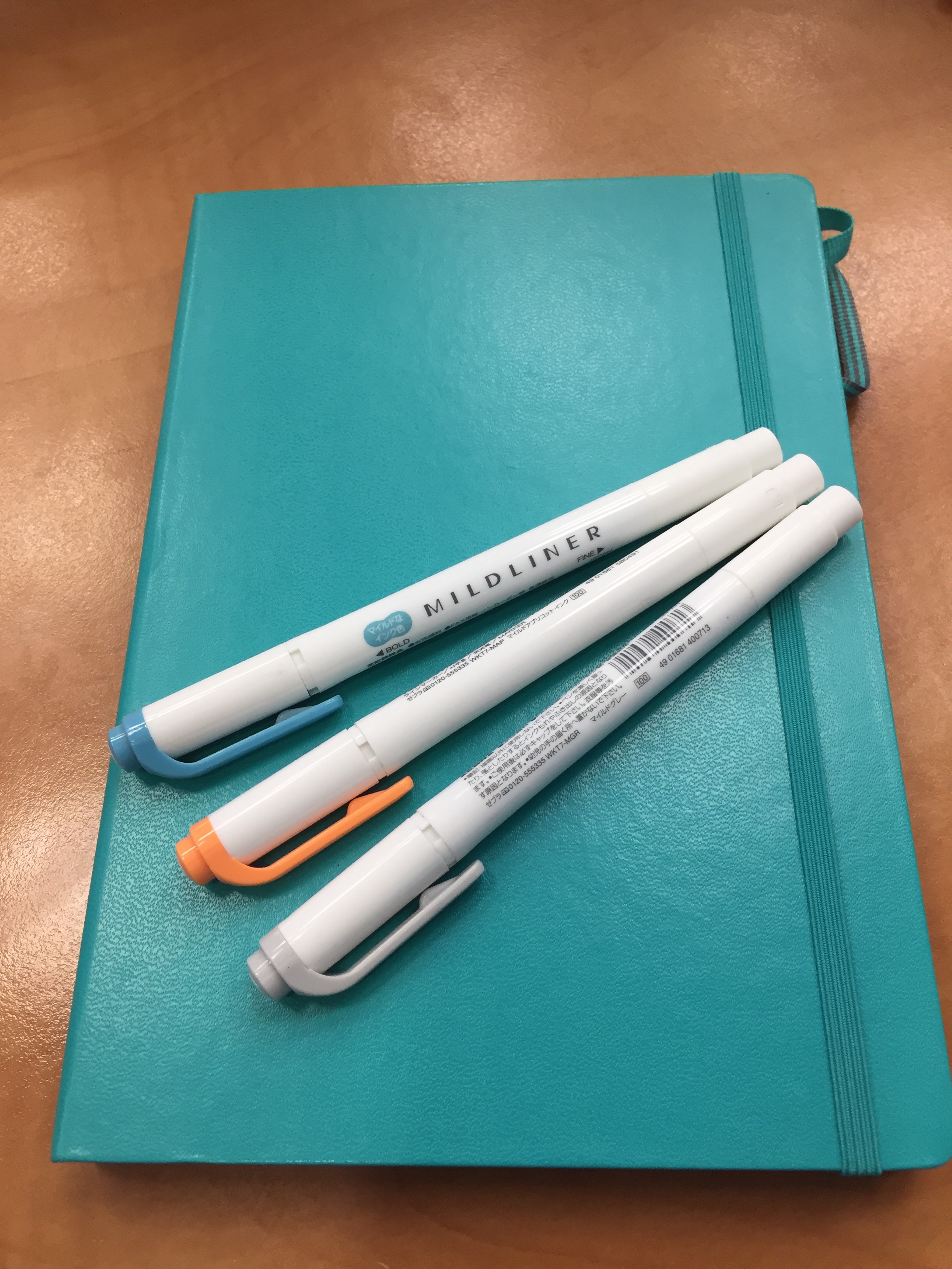
I love highlighters, so long as they’re not the blindingly neon ones, as I find them distracting. So when JetPens first offered the Zebra Mildliner Double-Sided highlighters, I had to give them a try. Theoretically, like all highlighters, they are supposed to help you organize your notes. In reality they just add a little colour to my usual mess.

Highlighter pen bodies tend to be on the chunkier side, oftentimes square shaped. The Zebra Mildliners are just slightly thicker than usual pens, and very light. If for some reason you have hours of highlighting ahead of you, these ought to be pretty comfortable to use.

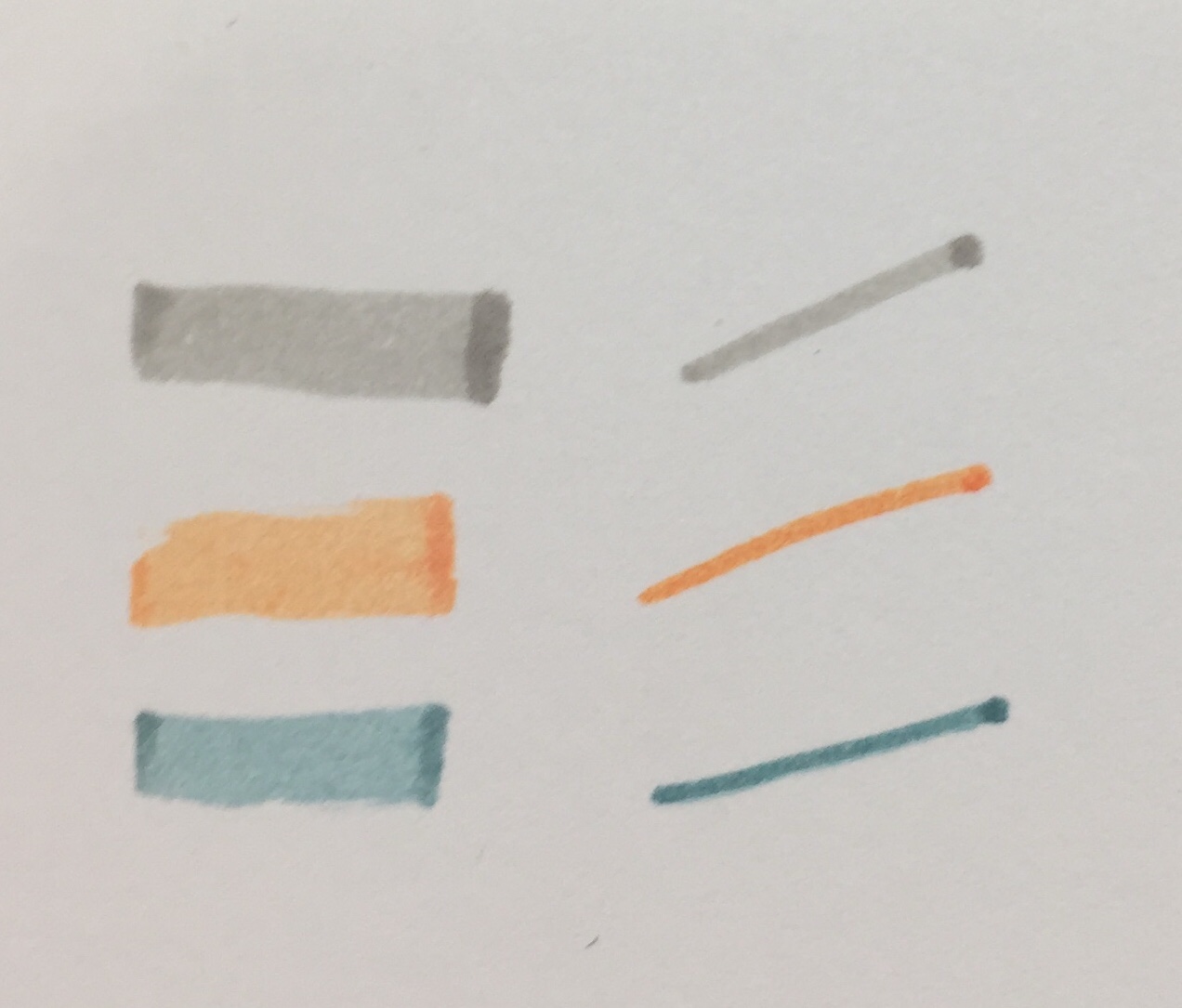
As their name suggests, these highlighters are double-sided. One size is a small chisel tip, and the other is an even smaller bullet tip. I had a hard time achieving coverage with the chisel tip in one go, but I’m not a stickler for these sort of things so it didn’t matter much to me. I was more interested in the Zebra Mildliner’s muted, and rather original colour palette.

This is a close up of the three Mildliner colours that I got: Mild Grey, Mild Orange and Mild Smoke Blue.  None of these colours are standard: the orange looks more like a peach than a traditional orange, the mild smoke blue looks like a muted teal or a light blue black, and I’ve never heard of a gray highlighter before. It sounds like an oxymoron: grey highlighter. But here it is, and it’s pretty cool (no pun intended, plus it’s a warm grey anyway).

Apart from having fun with these in the journal comic above, I tried these on a variety of pens and inks. I’ve been using these highlighters for over six months now, but I don’t highlight over anything but gel pens normally. As expected, these behaved the best with fineliners (see the comics above) and with ballpoint pen. This being Clairefontaine paper may have made the Uniball Signo gel refill drying times long enough for the highlighter to smudge the text a bit even after a full minute. The Ohto Flash Dry is just a miracle refill, but the Noodler’s Lexington Grey just floored me. I never expected to see a fountain pen ink stand up to highlighter so well, so quickly, especially with such a broad nib and on this paper. Phenomenal.

The Zebra Mildliner Double-Sided highlighters come in 15 colours. I don’t recommend buying them all; find yourself a “standard” colour, a “wild” colour, and another that’s your favourite. Despite what I personally may think, you can have too many highlighters.

Work in Progress: the Embassy

Lost daylight while I drew this, so I couldn’t complete it in time. Will go back to I add watercolour, hopefully soon.

Drawn on a Moleskine A4 watercolour notebook, with a Sailor Fude 55 degree nib fountain pen filled with Noodler’s Lexington grey. This is the first time I’ve used the Sailor Fude pen, and it is taking some getting used to. Depending on the angle you hold it, it either creates thick, brush-like lines, medium lines, or extra fine lines (when flipped over and used upside down).

Bad Belted Kingfisher: an ink review

Bad Belted Kingfisher

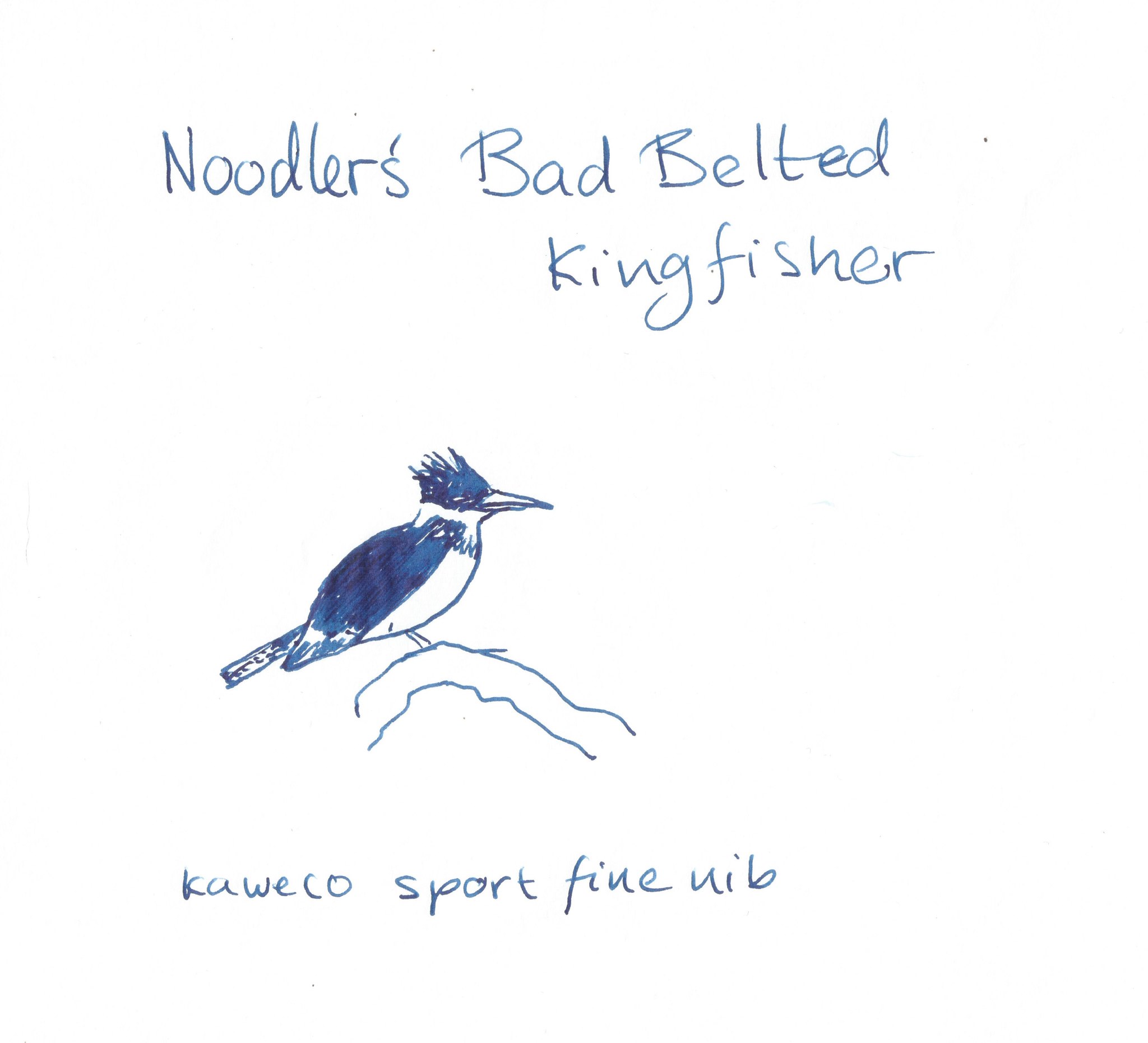
This is Noodler’s Bad Belted Kingfisher.

Right off the bat it scores points for having a badass name. But if you were expecting it to be a kingfisher blue, you might be disappointed. Like its namesake, a bird that only American pen addicts are likely to be familiar with, this ink has less turquoise and teal tendencies, and more royal blue, even slightly blue-black ones.

Its depth of colour means that if you are looking a “shader”, then you will find better options around, although it does show some variation between deep, deep blue, and deep blue. On Tomoe River Paper. In bright light. With certain nibs. But the variation does exist.

The kingfisher, bad boy as he is, is not too picky when it comes to paper. Field notes, Moleskine — he’ll handle the lot of them, without feathering or too much bleed-through. So this ink is crappy paper certified, providing you forgo your gushing double broad italic fountain pen and stick to something more conservative, like a European fine nib, or a Japanese medium. There are limits, after all, to even the best of inks.

When it comes to the cool and oftentimes wacky Noodler’s properties, BBK did not get much love. It is not quick drying (but dries in a few seconds even on Rhodia paper, so not much to complain about there), freeze resistant, lubricated, fluorescent, sparkly, ghosty or scented. What it is water resistant, and part of the Warden series.

Now when it comes to water resistance and fountain pen inks it is important to remember:

  1. No  water resistance until the ink is not completely dry. That can take hours on certain types of paper.
  2. Water resistant is NOT waterproof. Rinsing it out with water will create a mess. Putting it in the washing machine will create a mess. Rubbing a wet finger to test if it is really waterproof (it isn’t) will create a mess.

Water resistant means that if you drop a few drops of water on it after the ink has dried, then you will still be able to read what you wrote after the water dried. That is the only thing promised on the tin (er… bottle).

So, about the Warden aspects of this ink… If you are interested, you are welcome to read about it here.

The ink was developed in the good old days of 2011, when the possibility of someone forging bank documents with ink was still a thing (?). These days, I’d just focus on BBK’s colour rather than its Warden superpowers.

So we are left with a middle of the road ink in terms of properties, with Noodler’s signature cheap price and good-looking bottle, with a colour that is nice, but is no Bungo Box 4B. There is no fun in it — no sheen, no hidden hue, no interesting shading, no cool property. In a field so crowded with great blue and blue-black inks, the kingfisher just doesn’t stand out.

Which is a shame, considering its name. Such a brightly-coloured bird deserves better treatment in ink, does it not?