Moleskine Pokémon Pikachu Limited Edition Notebook Review

Pikachu! I choose you!

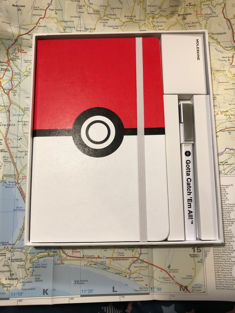
This is the final large format Moleskine Pokémon limited edition notebook that I haven’t reviewed, and I think that it’s the one that Pokémon fans will most gravitate towards. Why? Because it’s Pikachu, and because it is so well designed.

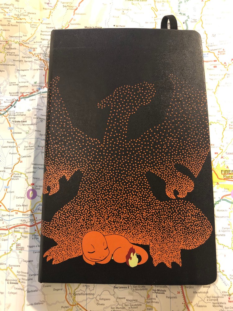
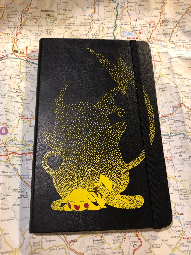
Like the Charmander edition cover, the Pikachu notebook front cover shows Pikachu dreaming of when he’ll be all grown up and kicking ass as Raichu. It’s a lovely, cute design.

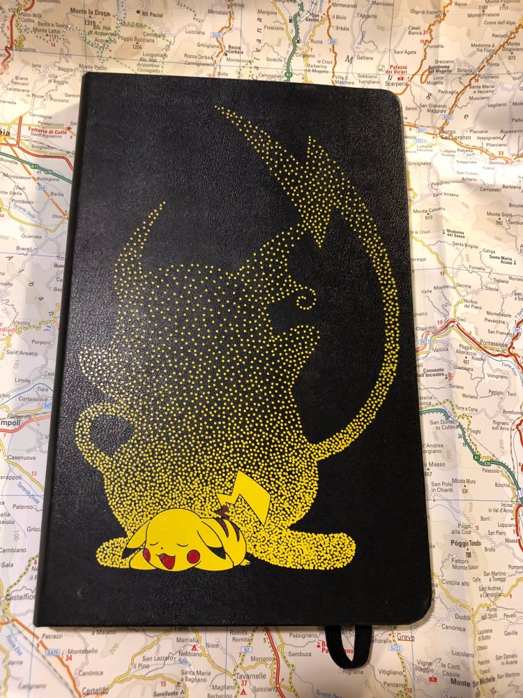
I would have liked the elastic closure to be yellow, but it works in black too, and I guess that black is more pragmatic in that it doesn’t show dirt that much.

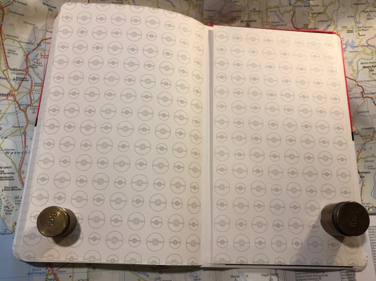
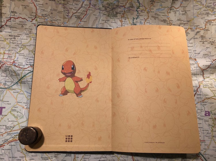
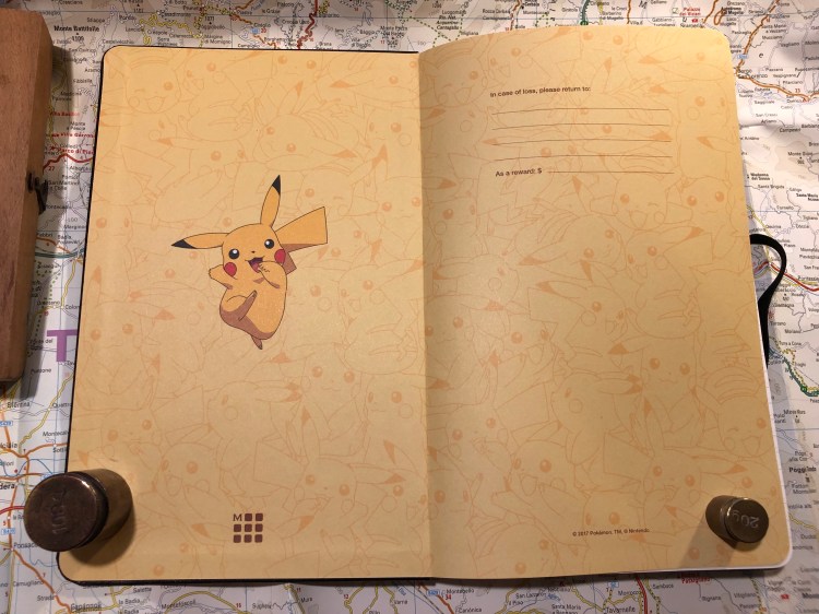
Pikachu is super skipping happy on the front endpapers, and the background of banana coloured Pikachus works really well. You can’t have enough Pikachus after all, as any Pokémon GO player will tell you.

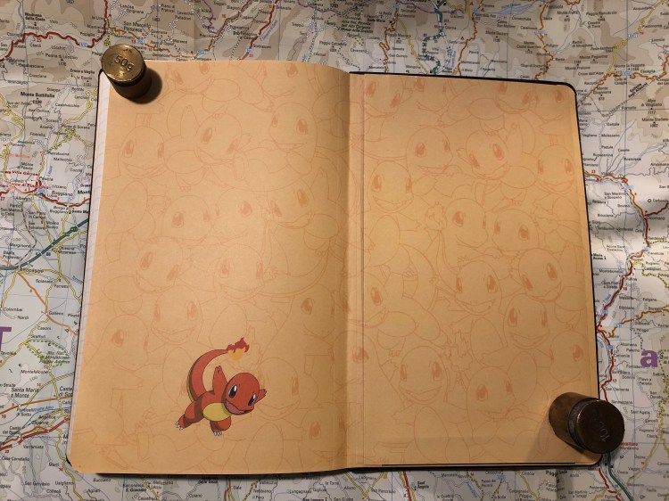
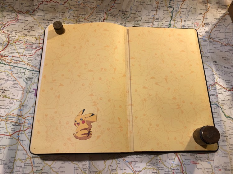
The back endpaper has the same background, and Pikachu resting from jumping around and fighting I guess. They probably posed him like this so you can see his stripes and tails, but I would have preferred him an an action pose with lightning maybe. Then again, it’s cute, and Pikachu is all about the cute. For those wondering, the background print is aligned on the back pocket of the notebook, and the webbing on the side of the back pocket is black.

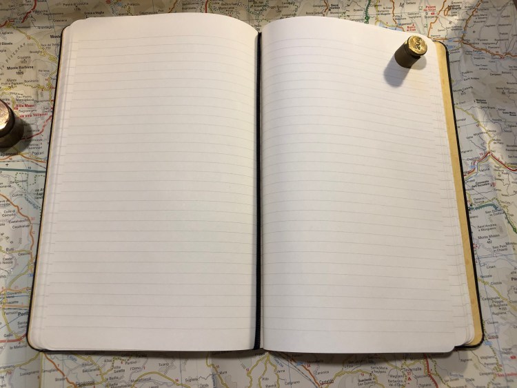
The pages are lined (I love Moleskine’s lined notebook line width, as it’s perfect for my handwriting size) and the ribbon bookmark is black, which works, but I would have liked a yellow one instead.

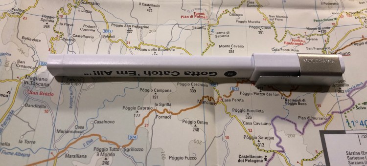
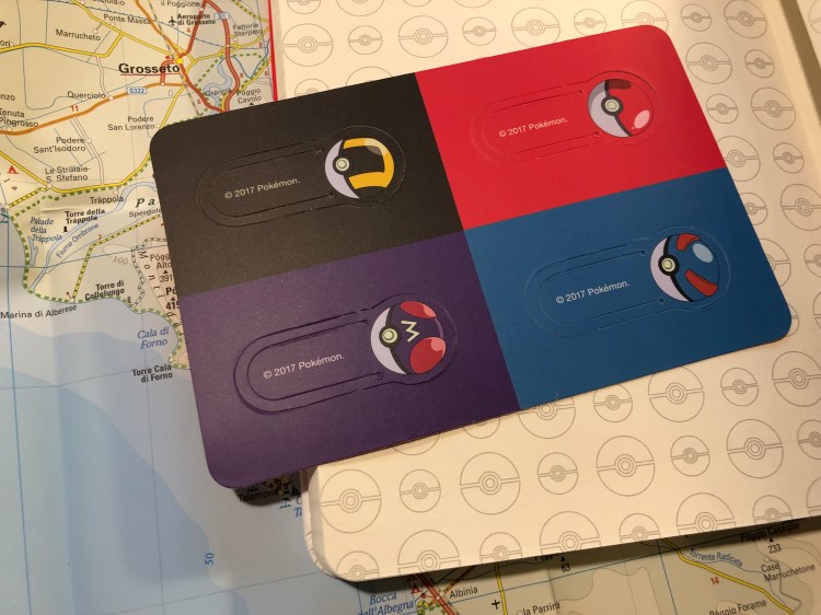
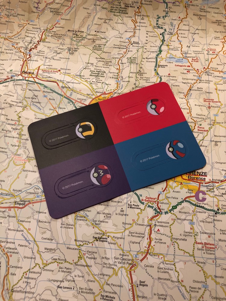
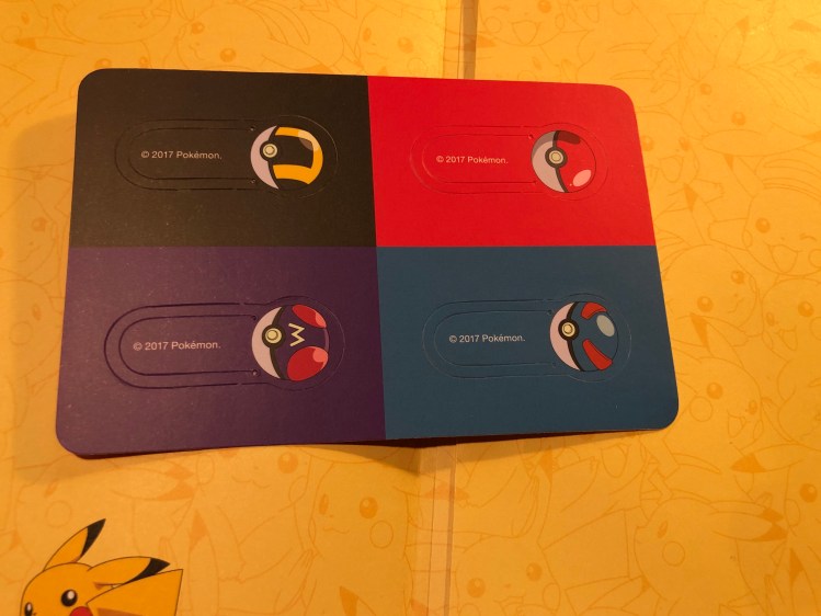
As in the Pokéball edition and the Charmander edition you get cardboard bookmarks instead of stickers as the little add-on in the notebook’s back pocket. These are really well designed and I’m going to hazard a guess that Moleskine would have preferred to make stickers for these editions, but they were limited by their contract with Nintendo. Nintendo sells a lot of Pokémon branded merchandise, and there’s probably a contract somewhere that gives some sticker company rights for the Pokémon brand.

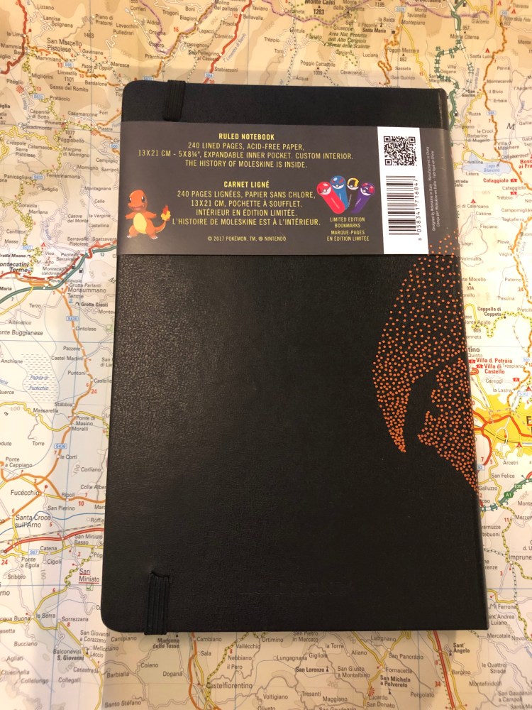
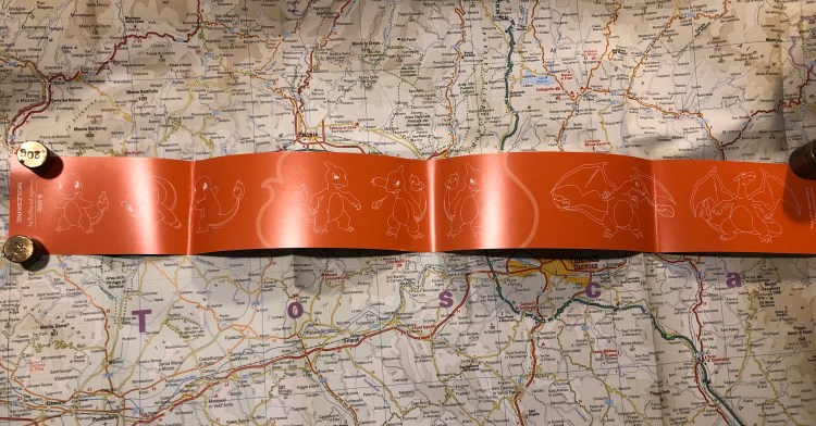
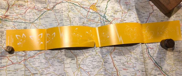
I accidentally tore the paper sleeve, and so the b-side on this one is pretty much ruined, but like the Charmander edition it’s Pikachu in all his evolutions: Pichu, Pikachu and Raichu.

Should you get this for the Pokémon fan in your life? Yes you should. All three notebooks in this series (and the pocket notebooks which I will not review) are excellent. This would be a great way to get someone to consider journalling, or keeping notes on a trip or during an interesting or difficult time in their life. These are now pretty heavily discounted all over the place, so they’re also kind of a nice little treat to buy for yourself.

Pika! Pika!

Mark One and Ohto Flash Dry Review

After waiting for over two months, my Mark One (purchased post Kickstarter) finally arrived. The pen, by Studio Neat, is made of aluminium and features a ceramic finish and a custom click mechanism. It also comes with a Schmidt P8126 rollerball refill (the same kind that Retro51 uses in their pens), which is absolutely horrible, so I switched it with an OhtoFlash Dry 0.5 gel ink refill instead.


The pen comes in a cork box that is very pretty, but not really functional. If you have tons of spare room on your desk you can reuse it as a pen tray for the Mark One, but as I don’t the box will just go to recycling. I would have preferred a simpler box, of the kind that TWSBI or Lamy uses, but this is a great box if you plan to give someone the Mark One as a gift.

The Mark One box is held closed by a piece of cardboard that doubles as an instruction sheet for the pen. That’s a nice idea, and the sheet is well designed and clear.

The box without the sheet doesn’t have a sealing mechanism (it’s just two pieces of cork), so it’s not really built to be a pen case, just a pen tray.

I chose the white and copper Mark One, which is very popular based on the waiting times on the Studio Neat website.

The pen is very comfortable to hold and use for long periods of time. It looks heavy but is super light, and the ceramic finish makes it very grippy. The wide barrel helps ensure that you don’t slip into “death grip” mode even if you have a tendency to.

The click mechanism is excellent and very solid and satisfying to use. It’s also very far from silent. The pen tip doesn’t rattle, and the pen looks as gorgeous as the pictures make it appear.

The Ohto Flash Dry 0.5 gel ink refill (PG-105NP)  is a needle point, parker refill that dries in a flash. It’s very dark and produces a line that is slightly wider than the Uniball 0.5 gel ink refills, but it somehow doesn’t smudge. Even on Moleskine, Rhodia and Tomoe River paper the OHTO Flash Dry dries almost instantaneously. It’s a left hand writer’s dream, and an excellent gel ink refill in and of itself. I have no idea why this refill hasn’t gotten more reviews, since there are so few parker style gel ink refills to begin with, not to mention good ones or ones that dry in a second or less. Maybe it’s because I don’t think it’s the kind of refill that’s widely available. It is, however, totally worth the price and effort.

Here’s a sample from my journal (which is a Moleskine). New Moleskines don’t have the spidering problem that they used to have, and there is no spreading or smudging with this pen/ink combo. The show through is a more significant than with a Uniball UMR-85 refill (the Signo 207), but the line is also wider and a good deal darker.

Here’s a writing sample on a Field Notes, where the first line (“Mark One”) was written with the original refill, and the rest with the Ohto Flash Dry.

Here’s the refill, which is available at JetPens and CultPens (I am not an affiliate of either):

I highly recommend the Mark One, as it’s a beautiful pen that’s just a joy to use. I would recommend switching the Schmidt refill out for the Ohto Flash Dry 0.5, or just using the Flash Dry in any parker compatible pen that you’ve got. It’s one of the best refills out there, especially if you’re left handed or tend to smudge your writing.

How I Use My Notebooks: Running Planner

The thing that you learn very quickly about running is that no matter which Couch to 5k plan you started with, if you want to have any hope of persisting with your running you are going to have to tailor make your own running plan.

I make a fresh plan every three months or so, and I always create it in my current Moleskine journal. In the spirit of showcasing notebooks in use, that are not created for Instagram, this is my latest running plan:

Things are penciled in with an H pencil, and I ink them in with gel ink pens as they happen. Green highlighted blocks show me where things went according to plan, and other blocks represent where things had to change due to injuries or circumstances.

I’ve been running for 8 years now, and I have around 6 years of running plans in all my previous notebooks, each one looking pretty much the same: messy and functional.

Moleskine Wonder Woman Blue Notebook Review

It’s the Moleskine of Truth! No, it’s actually just the Moleskine Wonder Woman Blue limited edition notebook. This is a brand new edition for Spring 2019, and there’s a red one too (expect a review later on).

The notebook with the wrapper on makes you think that there will be a red element on the cover, but the print on it is only in black and yellow on the blue background.

There’s a quote on the back of the notebook (there’s a different one on the red notebook), and it’s lovely. Go, Diana!

Now we come to the biggest issue I had with this notebook: it has some printing quality control issues. If you look closely you can see that on the yellow lasso print there are tiny bits of paper stuck to the cover. It feels as if there was a sticker there and someone removed it with bits left behind. They aren’t sticky and they are very easily removed with a wet wipe, but that’s not something I enjoy dealing with when unwrapping a brand new notebook. It’s only on the yellow parts of the print, so it is probably a leftover of the printing process, but it shouldn’t have slipped through.

The front cover unwrapped:

I understand the design aesthetic here, but I don’t agree with it. It would have been nicer if it was black, yellow and red and it would have been even nicer if Diana (Wonder Woman) was in full colour. As it is, the lasso is more attention grabbing and vivid than she is, and it’s not the main point. This isn’t the “Lasso of Truth” limited edition notebook, is it?

Here’s the unwrapped back cover, which is a little plain compared to what Moleskine have done for Batman in past limited editions.

The front end paper plays with the lasso of truth design element, and again, I really wish that Diana was more represented in this edition. Maybe her doing her thing, or even a comic book page. She deserves the same excellent design that Moleskine made for Batman and Star Wars.

This is better! The back end page is where it is. You see Wonder woman using her lasso which… is mysteriously cut out mid back-pocket. What? Why? If only they hadn’t done that, or at least if it would have vanished into the pocket. It just looks weird here. I get that it disappears into the page so that it looks like she’s shutting the notebook’s cover, very clever and comic book-like, but take a step back and just look at the page layout. It’s… not good.

Inside are lined pages and a blue ribbon. The paper is the newer kind, so there’s no weird spidering, it’s good for gel ink pens, ballpoint, pencil, and certain fountain pens and inks (Noodler’s Black works with every fountain pen, all else needs testing, but generally speaking fine and extra fine nibs and inks that aren’t overly saturated or wet will work fine. The paper is thin, so there will be show through).

This edition comes with some nice stickers, and it would have been great if they would have been part of the cover or end paper design, but I’m not complaining, you’re complaining!

The best thing about this edition is the B-side of the wrapper, which explains what Wonder Woman’s stuff does. Of course the Lasso of Truth is there, it’s the Lasso of Truth edition, didn’t we already go over that?

The Wonder Woman fan in your life is probably going to love this edition, even though Moleksine can and does do better. It’s fun, it’s unusually colourful (most Moleskine limited editions feature black covers. They’re like Ford that way), and it will probably be on deeply discounted sale soon, so stock up then for gifting or as an everyday notebook.

Moleskine Limited Edition Pokémon Box Review

I was going to  write a review of the Moleskine Pikachu Pokémon limited edition notebook first, but I forgot that I gifted someone the copy that I had. After a bit of internal debate, I decided to write about the highlight of the Moleskine Pokémon limited edition set, the Pokéball Box, first, and order another copy of the Pikachu notebook for later review. As these make such great gifts, I suspect that this copy too won’t make it into my rotation but instead be snagged by a friend.

Last spring I was visiting London with my family, staying right next to a Moleskine store (my poor, poor wallet) and trying to take my luggage allowance into account (notebooks are heavy, and Moleskines are easily purchasable online after all), when I first saw these. At the time, I wasn’t into Pokémon, I hadn’t played the Nintendo games, and the Pokémon GO craze passed over me without leaving its mark. I thought I was safe. Then I saw this box at the store.

Such a simple design, but so effective

I left London without purchasing the box, but I kept thinking about it. As my family left on a flight two days after me and it turned out that they had weight to spare, they asked me if there’s anything I wanted from the Moleskine store. I considered for a while, and then asked for the Pokémon box. They ended up buying all three notebooks for me.

It’s been almost a year since then, and I’ve been swept into Pokémon GO as a way to handle my anxiety while dealing with my mom’s illness, and so when I photographed this box today, it was no longer an abstract thing that I had very little emotional ties to. The design, however, has not changed.

Unlike many other Moleskine limited edition boxes, this one comes with a Moleskine pen. The tradition started a few years ago with the Writing Box, and this year it’s part of the Basquiat box.

This isn’t a review of the Moleskine rollerball, but of the Pokémon box, so I’ll just point out two things: Strangely enough the logo on the clip is set so the Moleskine logo isn’t aligned with the Gotta Catch ‘Em All! logo. When one of them is right side up, the other isn’t. Also, the Gotta Catch ‘Em All is printed only on one side of the pen, which is disappointing. If you clip it to a notebook there’s a 50/50 chance that you won’t see the logo, unless you make sure the cap is positioned so the clip isn’t on the side of the logo.

The other thing that’s disappointing here is the choice of the body colour of the pen. Red would have been so much more functional, as the white is going to look grimy and tarnished just about the moment you start using it.

The pen uncapped. Now imagine in it bright red. So much better, right?

Inside the notebook you are greeted with a whole lot of Pokéballs, both on the front and back endpapers.

Front endpaper
Back end paper

The design even continues into the inner lining of the back pocket:

This edition comes with four Pokéball bookmarks, like the other Moleskine Pokémon limited editions.

All in all it’s a nice box, but in terms of design, it’s all in the cover. The endpapers are bland in my opinion, and they could have done a much better job on the pen. The initial price on these was pretty high, but as it’s now dropped somewhat, I still think that they make a great gift for the Pokémon lover in your life, though you might want to consider the other Moleskine Pokémon notebooks.

Moleskine Pokémon Charmander Limited Edition Review

Moleskine’s Pokémon limited edition notebooks are some of the most attractive and colourful ones that the company has come out with in recent years. Even if you aren’t a fan of the franchise you might want to pick one of these up, just for their design. Also, if you’re looking for a gift for the Pokémon fan in your life, look no further. Even if they aren’t a notebook fan they’re bound to love these gems.

The cover design, with the paper wrapper still on, is fantastic. You can see little Charmander dreaming of when he’ll be all grown up and a Charizard. It’s cute, perfectly aligned with the wrapper, and the colour contrast with the black background really make Chaemander pop.

Dreaming Charmander
The back cover. I love how understated Moleskine’s logo is.


The cover looks great even without the wrapper, which is a thing because Moleskine has created designs in the past that look much better with the wrapper on than they do unwrapped. The only thing that could make this cover better is if dream Charizard was embossed on the cover, adding a little texture to it. On the other hand, that would have almost certainly made the design less durable over time, so I guess that’s it’s good that Moleskine went for a simple print this time.

Inside the front cover you are greeted by a multitude of very happy Charmanders, and that design continues in the back.

Just look at the perfect alignment of the print on the back pocket. Also, way to go Moleksine for fully embracing the cute.


Instead of the usual specially designed sticker set, this edition gets Pokéball bookmarks. Again, these are super well designed, but like all bookmarks of this type, they’re not likely to hold up to much use.

The B-side of the wrapper shows the various evolutions of Charmander (Charmeleon, Charizard), which is nice, if not Moleskine’s best B-side idea yet.

There are two more notebooks in the Moleskine Pokémon limited edition set and I’ll review those later on. Meanwhile, if you’re looking for a cool gift (that costs less than a Nintendo Switch) for the Pokémon lover in your life, this is definitely it.

Moleskine Spring 2019 Catalog

Chronicle Books has uploaded Moleskine’s Spring 2019 catalog and it is interesting.

Here’s a break down of what’s new and changed this season, as well as my take on some of their decisions. Some of these notebooks are already available, others will become available over the next few months. Pour yourself a cup of coffee, open the catalog, and dive in:

Classic Notebooks

  • Of the seasonal colours, I’m pretty sure Reef Blue and Daisy Pink will do well. It’s nice to see Scarlet Red, Sapphire Blue and Myrtle Green join their regular lineups. In the past black was pretty much their only offering, with an occasional red thrown in, but it looks like regular colour options are here to stay.
  • I’m curious about their new “medium” size, between the pocket and the large. There’s no sizing info in the catalog for this option and it appears to be available only in the hardcover notebooks. My guess is that it will be in the “Two-Go” size, which I think is a pretty useful size (11.5×18 cm or 4 1/2×7”).
  • Sad to see that they still haven’t brought back the reporter notebooks in squared paper, and how little love in general squared paper gets from Moleskine.
  • Great to see the new dotted (dot grid) options. These ought to be popular, and Moleskine didn’t dip their toe in with just pocket and large black hardcover notebooks, but is offering them in all their core colours and in what will likely be their best selling seasonal colour, Reef Blue. As is stands, dotted paper is getting more love than squared paper, which is not surprising. Squared paper is niche outside the stationery blogger/podcaster world.
  • Classic notebooks expanded” is a new offering from Moleskine — a large hardcover or softcover notebook that has almost twice as many pages as a regular large Moleskine, with two ribbons instead of one. This may seem a bit unwieldy, but I use a large Moleskine daily planner as a meeting notebook and because of its size it’s still pretty convenient to use. If you plan on using your notebook a lot (as a daily journal for a year perhaps?) this may be a good option to check out.

Non-Standard Cover Material Notebooks

  • Leather notebooks – these aren’t available everywhere (Barnes and Noble have them), and I haven’t tried them, but they’re still on offering, with or without a box. I’d recommend that you spend your money elsewhere, unless you’re really looking for a corporate executive gift to put the company logo on.
  • Two-Go notebooks are still on offer, with four colour options (added last year) and in an excellent size, with thicker than usual paper and a surprisingly useful albeit non-standard blank-and-ruled format. If you haven’t given these a try I highly recommend them. They can handle fountain pens pretty well.
  • Blend notebooks, with their tactile, super fun and durable fabric covers now come in four new colours that promise to blend better in office settings than their current (and still produced) camouflage Blend offering. Black, Green, Blue and Beige are offered in a woven, slightly distressed look with contrasting elastic closure, as usual only in large size and with ruled pages. Definitely worth trying out if you haven’t had a chance to give their fabric covers a spin.
  • Denim notebooks, which first came out as a super popular and a very well designed limited edition offering, are now part of the regular lineup, sort of. The limited edition notebooks are still more attractive in my opinion, with their white contrasting branding label on the back and their white print on the front, but these notebooks, in Antwerp Blue and Prussian Blue (pocket and large, ruled only) are a great way to get some of that denim feel in your life without trying to get a hold of overpriced LE notebooks on the secondary market. Of the fabric covered notebooks that Moleskine (and Baron Fig) offer these feel the best, and I recommend these over the Blend notebooks for that reason.

I’m not a planner person, so I’m not going to go over Moleskine’s extensive planner collection.

Limited Edition Notebooks

  • This is where Moleskine excels beyond all current competition, and in my opinion they’re starting this year stronger than they finished last year.
  • Fall-Winter 2018 limited edition notebooks, Looney Tunes, Super Mario, 007, Astro Boy and Harry Potter are still available, though the very attractive Harry Potter notebooks (especially The Marauders’ Map edition) are starting to be harder to find.
  • Spring-Summer 2019 limited edition notebooks are Lord of the Rings, Basquiat, Wonder Woman, Bob Dylan and Gundam. Each is designed to appeal to a different demographic, and I think that they really nailed it this time.
  • This is not the first time that Moleskine is tackling the Lord of the Rings in a limited edition, but this edition is much, much more attractive and well designed than their previous rather lackluster attempt years ago. The covers, endpapers and special insert all seem spectacular, and this is one edition that I’ve already preordered and plan to review. The “geek” edition, this notebook is designed to appeal to the same people that bought the Harry Potter and Alice editions
  • Basquiat limited edition notebooks are for the hipstery crowd that liked the Kieth Haring limited editions, Dr Seuss editions and probably also enjoyed the Monopoly limited edition, but in an ironic way. These are extra expensive but they’ll probably be popular, considering Basquiat’s success on Uniqlo t-shirts. They’re offered in plain and ruled paper, though I wish Moleskine would have stepped up and offered a sketchbook Basquiat edition. In terms of the boxed set, this one comes with a pen (the regular editions come with stickers), so it’s probably a better deal than the slightly lackluster LotR boxed edition (comes with nothing, will sell like hotcakes, because LotR).
  • Wonder Woman is the comic book edition, and as usual it is the most colourful one, and where Molskine allowed themselves more creative freedom. Bold red and blue action packed covers that really celebrate the character in drawings and text, what more could you want? Ruled only, comes with stickers.
  • Bob Dylan limited edition notebooks are aimed at music lovers, as the Beatles, Rolling Stones and Blue Note editions were before them. These are really reminiscent of the Blue Note limited editions, and like other music themed limited editions, are pretty tame, design-wise. If you’re a Dylan lover, you’ll likely love this edition, and it will make for a great gift, especially around father’s day. Is it surprising then that these come out in April? Ruled only, comes with some pretty dull stickers. The numbered boxed edition is the best designed of the bunch in my opinion. These too are relatively expensive limited editions, though of course expect a difference between RRP and what you actually pay online and anywhere but the official Moleskine stores.
  • Gundam is the anime edition, and as usual is more subdued than the comic book edition, but still pretty colourful. Ruled only, comes with stickers.

Journals

  • I’ve no idea why Moleskine calls their Cahier and Volant offerings “journals” and not notebooks, but I guess you have to differentiate them somehow.
  • Cahiers, formerly available only in Kraft Brown and Black have been expanded to include Cranberry Red (a darker shade of red than the Scarlet Red, likely because of printing limitations) and Myrtle Green, but that’s not that new. What’s new is the three new seasonal colours, Brisk Blue (a darker shade of Reef Blue), Kinetic Pink, and Tender Yellow. I’d stay away from the yellow, as it will turn dirty and blah in about a day’s use, but the other colours are solid and fun. Kraft Brown is the most fun to decorate and make your own (with black in second place), but the other colours seem pretty vibrant for cardboard covers.
  • It is worth saying that of all of Moleskine’s offerings, the Cahiers got the most paper love in recent years, which is a very good thing as the old paper used in these notebooks was garbage. Not acid-free and super thin, it turned yellow and brittle with age very, very quickly. Now the Cahiers use the same paper as the regular notebooks, and they even got some dotted paper love.
  • Subject Cahiers, a new offering that is geared for academic note-taking (Cornell Notes anyone?), and is offered only in large and extra-large. If I was still working on my degree this would be something that I would probably look into using.
  • Volants have become more colourful as time has passed, with Moleskine moving them from a light and dark shade of the same colour to complimentary colours instead. They also got stickers to boost, but still only come in plain and ruled paper. They are the only notebook left that Moleskine offer in extra small, which is both not surprising and a bit of a shame.

There’s nothing new in the Pro Collection and I don’t use any of these business focused notebooks (I like to build my own meeting notes formats), and so I won’t go over these.

Art Notebooks

  • Moleskine’s art collection has gone through a significant overhaul in recent years, all for the better. The sketchbook paper is less pronouncedly ivory coloured, and the paper has less coating on it, which means that it can now take things like light washes, fountain pens, rollerballs, etc without them beading up on it.
  • The sketchbook also got some love in the form of new colours (Red and Sapphire Blue), which is always nice.
  • The recently added sketch album (which is a landscape formatted notebook with cahier covers) is now available in Kraft Brown, which is awesome, because they’re so fun to customize.
  • There’s also a sketch pad, which has less pages and I completely don’t understand. It appears to be a more expensive way to get a sketch album with less pages. Huh?
  • The ever popular (and justly so) Watercolour Album got recently expanded into a Watercolour Notebook (standard format, as opposed to the landscape album format). Now the Watercolour Notebook has been expanded to include the pocket, A4 and A3 size. This is a must buy for me, and will probably be pretty popular amongst urban sketchers.
  • The Music Notebook got a surprising new addition, a Music Cahier in extra large. Moleskine is one of the few stationery companies to offer this layout, and good for them for expanding it.
  • The Japanese Album and Storyboard notebooks are niche products and so unsurprisingly, got no love.

Themed Notebooks

  • Not much is new in this area. There are no new Passion Journals, no new City Notebooks and not much new with the Voyageur.
  • What is new is a Travel Kit, that contains the Ocean Blue Voyageur, a pen and a luggage tag. The Voyageur appears to be more popular than the Travel Journal, so I wonder how long before the Travel Journal is phased out.

As for the rest (the non notebook stuff), here my interest wanes, and this post has been long enough as it is. The catalog is 151 pages long, and full of eye candy, so even if you aren’t a Moleskine fan, take a look.

Pentel Fude Touch Brush Sign Pen Review

I planned to review the Sharpie brush pen, after spending the best part of a week with it, but as it turns out, I forgot it at the office. I’ve been using the Pentel Fude Touch Brush Sign Pen instead, so here’s a review of this boring little brush pen instead.

Today’s journal comic/review, drawn on a Moleskine Star Wars crawl text blank notebook. This paper is smooth, although not Rhodia smooth, but the pen still really dragged on it. It was worse on any sort of paper with even the slightest tooth, making it super not fun to use.

The brush pen tip is pretty firm, which means that you get a medium amount of line variation, but that it’s very easy to control. If you’re starting out in the wild world of brush pens, either for drawing or lettering, this tip grade is probably the best for you.

The black ink is black, and not greyish or brownish, and completely not waterproof, which can be a good thing (if you want to “stretch” it or use it for shading, as wet it produces a good 50% cool grey), or a terrible thing (if you want to combine it with watercolours).

A closeup of a D&D character group drawing that I did with the Pentel Fude Brush Sign Pen. 

The pen body itself looks and feels cheap and plasticy, which isn’t too unusual in the disposable brush pen market. Why do all these companies have a thing for a dark pen body with pronounced gold lettered marketing splashed all over it? Pentel’s also put sparkles in its, body, just for some extra garish fun.


The pen is torpedo shaped with facets along the body that somewhat help keep the pen from rolling. It’s borderline too thin to use for long periods of time without cramping, but  otherwise it’s comfortable to hold and use.

The Pentel Fude Brush Sign Pen would be a good beginners’ brush pen if there wasn’t so much competition at the same price. As it is, buy a Zebra brush pen, which allows for greater line variation, or a Kuretake brush pen, which is also waterproof, or add a little more and get the experience of two brush pens in one with the Pilot Futayaku. As it is, this Pentel pen lacks enough line variation to make it fun and interesting to use, and it isn’t cheap enough to justify buying it over the competition.

Moleskine Large Dotted Hardcover Notebook

So it appears that Moleskine has finally hopped on the dot grid bandwagon, releasing several of their classic collection notebooks in dot grid, even going as far as creating dot grid versions of some of their seasonal colours (gasp!). Next thing you know they’ll be releasing limited edition notebooks in squared and dot grid paper, and then where will we be? (Don’t worry, it’s not going to happen).

The classic Moleskine collection consists of their hardcover and softcover notebooks, in pocket, large and extra large. Currently the dot grid is offered in black covers, both in hardcover and softcover, and in underwater blue (such a pretty seasonal colour) and beige in softcover. However, it apparently was enough of a success for them to issue the dot grid option in all their classic collection core colours (black, red, blue sapphire, and myrtle green), and in seasonal reef blue (both hardcover and softcover). These colours will start being available in February-March, so it may be worth waiting a little while before purchasing (although some of the hardcover core colour options already seem available).

Now to the review. I got the classic large black hardcover notebook, as it’s probably Moleskine’s best selling notebook, and what people have in mind when they say “Molekine”.

Dotted paper gets a new band colour – blue.

First thing’s first, Moleksine have listened to customer feedback and significantly strengthened their notebooks’ elastic bands. They’re a little thicker and wider, and there’s little chance that they’ll turn into the floppy mess that some of their earlier elastic closures turned into after a few months of use.

The sleeve also has a B-Side, this one is pretty travel oriented, and I love it because maps!

Phileas Fogg would have been proud.

Which brings us to the paper. The dot grid pattern is medium grey, dark enough to be visible, light enough to not be too distracting. It also is very precisely aligned on all pages, if those kind of things bother you.

The “In case of loss” endpaper, with the Moleskine logo, a relatively recent addition.

How does the paper perform? Better than you’d expect. Gel, ballpoint and pencil work well with the paper, but even fountain pen inks, including pretty saturated messes like the Montblanc psychedelic purple work pretty well. There’s no more weird spidering, as there used to be and the spreading is minimal (better than Baron Fig, well above average). If you don’t insist on super saturated inks, you’ll be able to enjoy using fountain pens in this notebook.

A closeup of my writing samples. Montblanc purple has behaved this way on Rhodia paper too, so I blame the ink, not the notebook:

Show through is better than tomoe river paper, but not as good as Rhodia (I’ve had mixed results with Baron Fig, so I’m not using them for comparison here). Again, the only real problem was with the Montblanc ink, which is a problematic ink in general, so I’m not using it for comparison. I’d find this notebook to be usable on both sides of the page, but again, that comes down to preference.

Moleskine seems to be making an effort not only to come up with innovative limited editions, but also to give their regular line-up a bit of a refresh (with new added colours) and boost (with new dotted paper, better quality paper, and a fix for their elastic closure problems). That’s a move in the right direction, and one that I plan to enjoy.

I still need to figure out what’s going on with that Montblanc ink, though…

Night Work

Journal comic created with a Sharpie brush pen on a Moleskine Star Wars crawl text limited edition blank notebook.