Diamine Inkvent 2021 Day 3

Caveat: this year’s Inkvent appears to have elusive ink colours. I suggest reading my description of the inks and not going by the photos alone, and comparing my results with those of other reviewers.
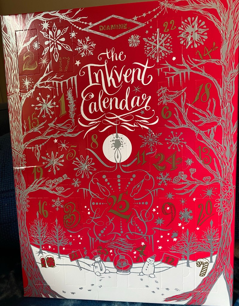
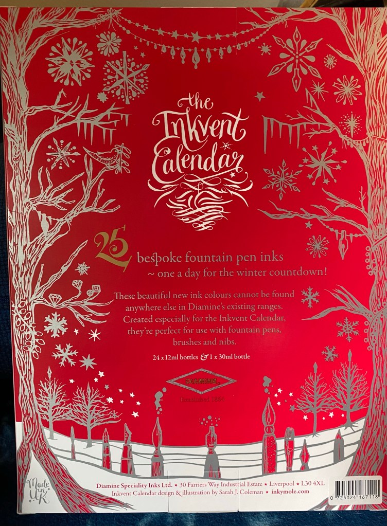
The Diamine Inkvent calendar is an advent calendar with 24 tiny (12ml) bottles of fountain pen ink behind 24 doors, and a larger, 30ml, bottle of ink behind the 25th door. All the inks are limited edition, and, at the moment, only available through this calendar.

Day 3’s ink is Diamine Ash, a standard neutral to slightly warm grey. Another surprising choice in what looks to be a very surprising calendar. I’m really enjoying the diversity of colour in this year’s Inkvent compared to the 2019 one.

Here’s a Col-o-Ring swab of Diamine Ash. The ink shades beautifully, and goes down with a distinctive green tone that largely vanishes once it dries.

I used a Lamy Safari Savannah with a medium nib to test this ink out.

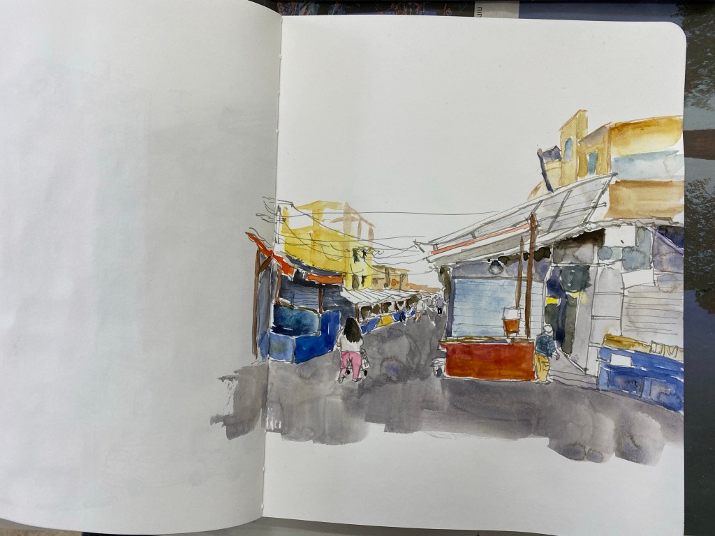
I thought an owl sketch would be appropriate for this ink. It shades wonderfully, and it’s definitely not too light a grey to be useful.

This was drawn on a Kanso Sasshi 3.5” x 5.5” Tomoe River Paper notebook (the notebooks I have were bought in 2016, and so they contain the old Tomoe River paper).
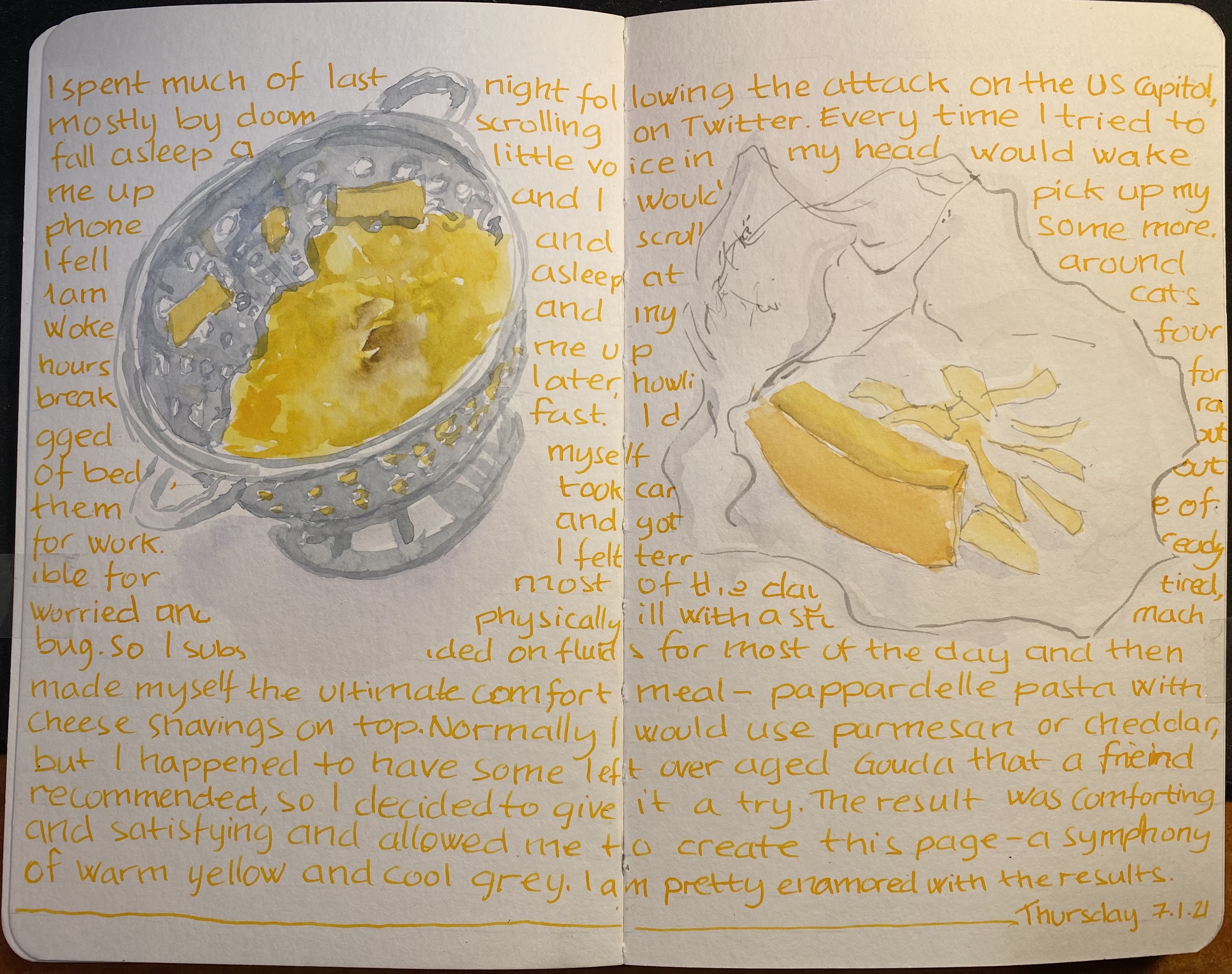
Finally, I wrote a page in my Midori Journal:

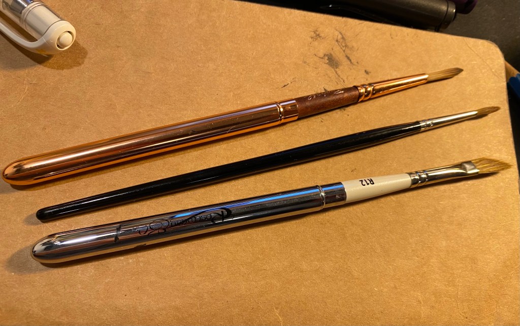
I don’t have an ink in this shade of grey, even though I have a sizeable amount of grey ink bottles. The ink has a green hue to it that largely disappears once it dries, and I wonder if I applied a water wash to it if it would make its reappearance. Something for me to try out once I can use brushes again. As it is, Diamine Ash is an ink that I would consider buying a full bottle of.