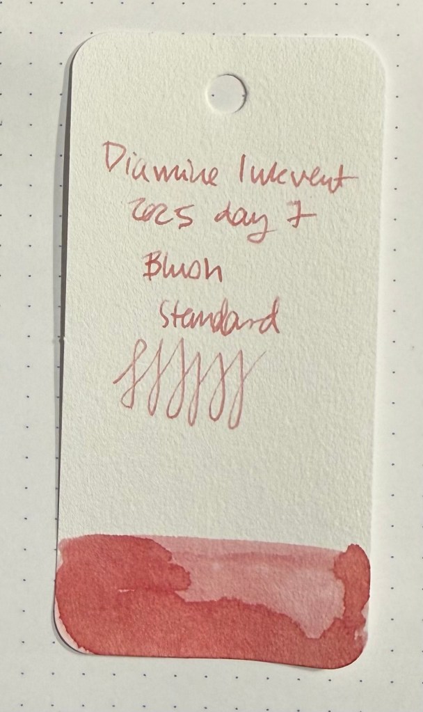
Day 7’s ink is Diamine Blush, a standard blush pink. This ink is a “super-shader” and the colour is lovely – a dusky pink that will work wonderfully well for greeting cards.
Col-o-ring swab
Whoever named this ink did a fantastic job – Blush perfectly describes the ink colour and the intense amount of shading that you get. It was a lot of fun sketching with this ink, and if it was waterproof it would be an interesting addition to my sketching rotation. As it is, it’s a very attractive ink that I’m pretty sure will be easy enough to clean out and well behaved enough to be safely used in vintage pens. It is slightly on the dry side, so take that into account when selecting a nib to go with it. I used a fine Lamy AL-Star nib.
Writing and sketching sample.
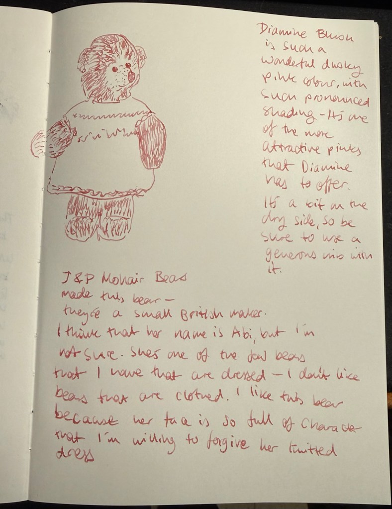
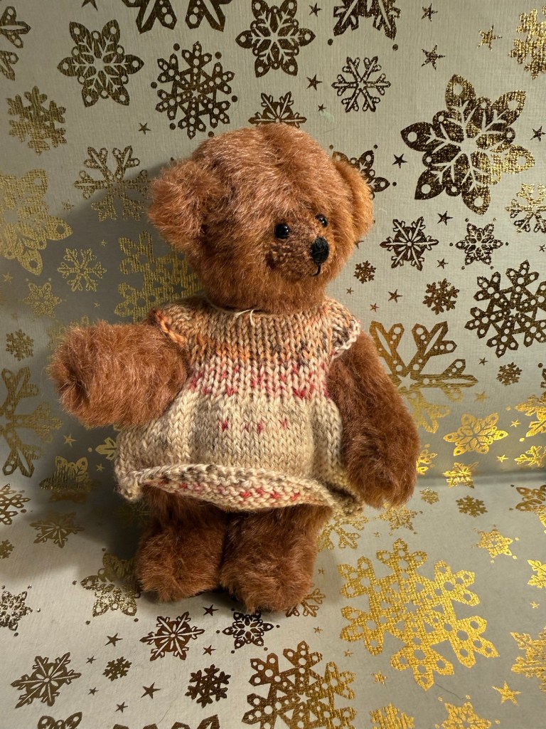
I think that today’s bear is called Abi – her tag was a little confusing. In any case she’s a British bear, made by J&P Mohair Bears – a small maker – and purchased in Stonegate Bears in York. I don’t like bears that are clothed, but I liked this bear’s face enough to overlook her knitted dress.
The bear
Diamine Blush is a wonderful ink, and a good addition to Diamine’s pink ink lineup. I don’t see myself purchasing a full bottle of it, but I will enjoy this sample while it lasts.
On Friday we went to an Urban Sketchers outing in Jaffa. It was celebrating local designers, and there were street performances as well as open studios and an arts and crafts market. The weather was hot and sunny, and the place was pretty packed with people and full of interesting old buildings. The main trouble I had was focusing on what to draw, as there were so many subjects.
I took a new sketchbook, a Pith Oroblanco in A4 size, and an A5 portrait Etchr Labs 100% cotton watercolour sketchbook. I don’t normally work in such a large format, but I decided to challenge myself to use the Oroblanco as much as possible. The 170gsm paper is identical to the one in the smaller Pith Kabosu, and so is great for mixed media and light washes. The Etchr Labs sketchbook is the best watercolour sketchbook that I’ve ever used – the paper works wonderfully with washes, and is very forgiving for mistakes and reworking.
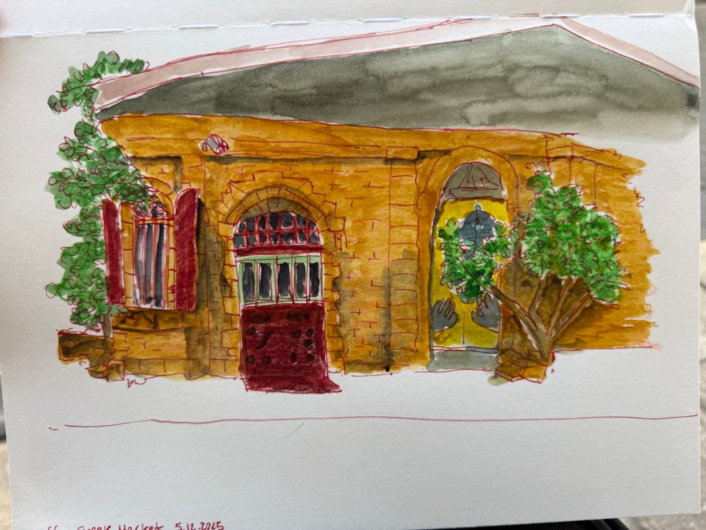
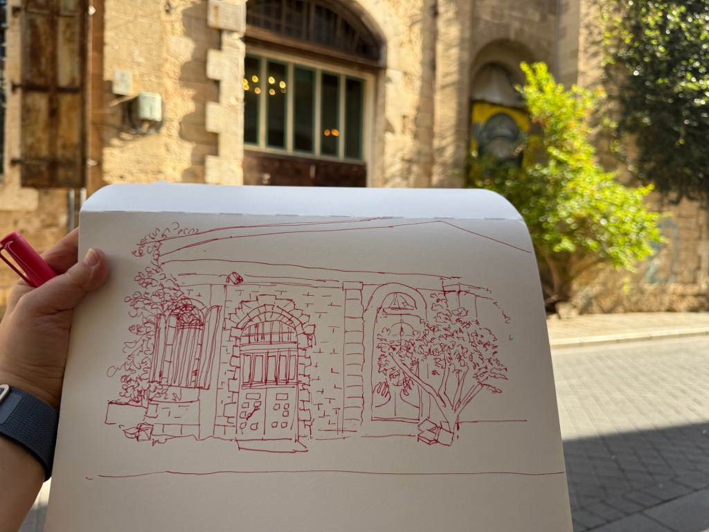
I started out 30 minutes before the official start time, and sketched a local building. I liked the combination of the beautiful old stone building together with the graffiti and the semi wild trees and shrubs. Inspired by Liz Steel’s Patreon sketching community (I just joined it) and December’s theme of “Red” I selected to sketch this building with Diamine Inkvent 2025 Day 3’s Carousel – a red ink – and to highlight the rust colour in the shutters and door. I had enough time to finish the line sketch before going to say hello to Marina, our local chapter head and the organizer of this sketchwalk (a wonderful person and artist). I took reference photos just in case, and then returned and quickly finished the sketch:
First sketch on a Pith Oroblanco
To avoid having to lay down a large wash I used Caran d’Ache Neocolor II to lay in most of the base colour – except for the roof bit (where you can see why laying down a large wash on this paper was problematic).
Initial sketch.
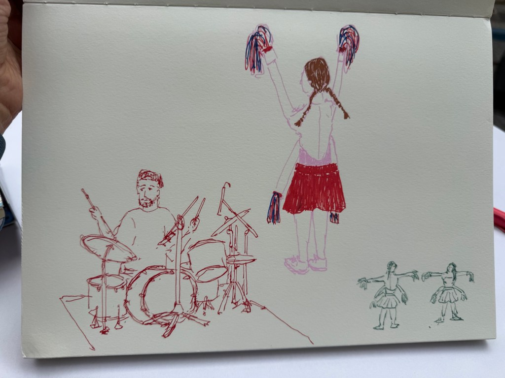
I then went in search for the music performance that was supposed to take place in an adjacent street. I managed to sketch the drummer as he was doing a sound check, but then he left and two girls in peculiar 4 armed cheerleader outfits came out and did a sort of otherworldly dance-march. They kept moving but I did manage to capture them. I used Diamine Carousel in a Lamy Safari medium nib for the drummer, and Posca markers for the cheerleader. The tiny cheerleader thumbnail was sketched with a TWSBI Eco 1.1 fountain pen and De Atramentis Document Ink Green Grey.
Quick, loose sketches
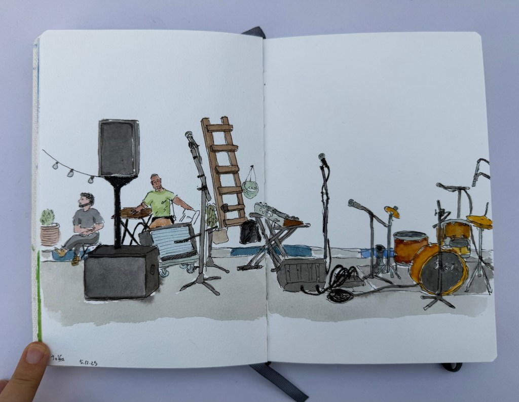
I then settled in to prepare to sketch the musicians when they returned. There was a Flamenco dancer in a nearby stage, but the place was too crowded for me to get a good viewing angle of her dancing so I spent the time creating a detailed fountain pen and watercolour sketch of the location where the musicians were supposed to play in. I was hoping to add them in once they started, but their show was delayed and i had to get back to the throwdown. I did get a sketch of their instruments and some local viewers, but I rushed in the end and didn’t get a chance to get proper shadows in. Oh well.
Watercolour sketch
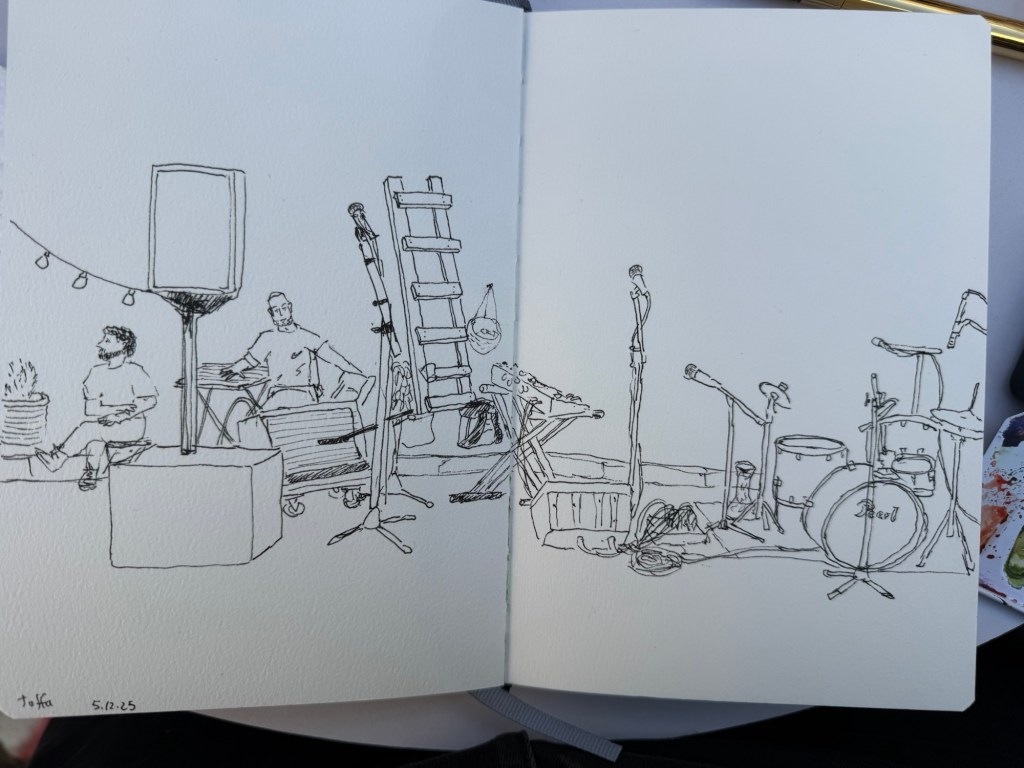
The line work was done with a Platinum Preppy 0.3 filled with De Atramentis Document Ink Black on an Etchr sketchbook:
Ink sketch
There was a lady there that was clearly on her first every Sketchwalk, and my heart went to her. Seeing her struggle made me realize that there are so many things that are obvious to me as a seasoned “sketchwalker” that aren’t obvious to people going out with an Urban Sketchers chapter for the first time. Here are a few useful tips:
Say hello. Sketchwalks start at a meeting point and usually end in the same one. Come a few minutes early and talk to people – they’re usually nice and friendly and share many of your interests. Say hello and introduce yourself to the organizers, and thank them for organizing the walk – it’s a lot of work! If there’s a local special event that’s taking place during the walk, be sure to get the details of the time and place and be there. Even if you don’t end up sketching the event, there is bound to be something else interesting going on, and you’ll help represent the chapter. If you come in late and miss the initial gathering, find a sketcher in the area and politely ask when and where the end meeting is. It’s usually posted in advance, but it is worth double checking.
There’s a throwdown in the end of sketchwalk, and group photo. Even if you don’t like your picture taken, bring your sketches to the throwdown. It’s a great way to see great sketches in a large range of styles, and get inspiration from wonderful artists. Do not compare your work to others. Be generous and specific with complements (“The way you caught the energy between the dancers is amazing!”, “The colour choices are phenomenal – that building really comes to life!” is better than “that’s so pretty!” Although, of course saying a sketch is beautiful is also nice). Take photos not just of your work, but of other’s work that inspires you, especially of those that do work in a style that’s far from your own. Learning and experimentation is part of the Urban Sketchers experience.
Thank the organizers. I know I said that before, it’s worth repeating.
Never ever critique another artist’s work. It’s not that kind of an artistic gathering.
Bring less. We all fail at this (I did too, of course), but the less stuff you bring the more fun you’ll have. Choose one or two sketchbooks, at least one in a size and format you are comfortable with. Bring only the supplies you know you’ll use, not those that you might need. It’s OK to bring something new with you, but if you do I suggest that you force yourself to actually use it, and start the first sketch with it.
Do not bring an easel, particularly not to your first sketchwalk. You want to be mobile and flexible. The best way to get the most out of a sketchwalk is to change locations at least 2-3 times. The idea is to work quickly and loosely and to capture a location from several angles and with different focuses (that’s why it’s called a sketch walk). There will be those that choose to stick to one location, but having an easel tends to force you into a single location, as does having too much gear.
Bring a stool. It doesn’t have to be the most comfortable one in the world, but it does have to be portable. That will allow you to sketch wherever you like, and not just where there’s a free bench or table.
Take reference photos, in case you don’t get to finish a sketch or the lighting changes, or a white van decides to park in front of the building that you were just sketching.
Talk to people. Share art supplies. Ask questions about their process – unless you see that are too absorbed in their work to answer. But people usually are kind and enjoy sharing information and tools with other sketchers. That being said, bring all the gear that you’ll actually need.
If you’re just starting out sketchwalking, use smaller formats (no larger than A5), sketchbooks and not loose paper, and supplies that are portable and well known to you. That will allow you to work faster, and it will give you a chance to get more comfortable with working on location.
Sketchwalks usually last 3 hours. That’s both a lot of time and not enough time. Keep an eye on the clock, take into account that it takes time to warm up, and be kind to yourself, especially during the first 30 minutes. I usually take the first hour to work very quickly and loosely, and leave the last hour, hour and a half to work on a more detailed, well composed piece. Take breaks – sketchwalks are in urban environments so there’s usually a place to grab a coffee and snack (which you can and should sketch – it’s an Urban Sketcher’s tradition!). It’s not a race – the point is to enjoy yourself. I usually take a few minutes to stroll around, getting a feel for the location and the options before I settle in and get to work.
Bring water and weather appropriate gear. Be a responsible adult and check the weather before you go. Bring a hat and sunscreen, coat, umbrella, etc depending on the weather.
Post to social media, and tag your local chapter. There’s usually a Facebook group, and an Instagram account for the USK chapter. If the sketchwalk involved a local business, museum or organization, be sure to tag them too. You are an ambassador to the community now. Represent this wonderful organization with pride.
If you go on Urban Sketcher Sketchwalks and have tips for newcomers, I would love it if you could reply with them.
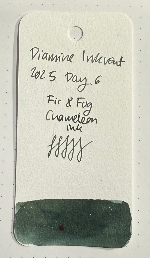
Day 6’s ink is Diamine Fir & Fog, a chameleon ink. The base ink colour is an attractive dark grey grey, which is very evocative of fir trees in the fog. The chameleon effect is subtle but lovely – shimmers range from green, through blue and silver, to pink. What you see depends on the lighting conditions, the angle at which you view the paper, and the width of the nib. I used a generous Lamy Safari medium nib.
Col-o-ring swab
The base ink, without the chameleon effect, would have been excellent as an Inkvent ink in and of itself. It’s a muted and characterful green that offers a good amount of shading and interest and is dark enough to be used not just for holiday correspondence or for journaling. The chameleon effect isn’t in your face, over the top shimmer. It’s more like a little secret that only those in the know get to experience.
Writing and sketching sample
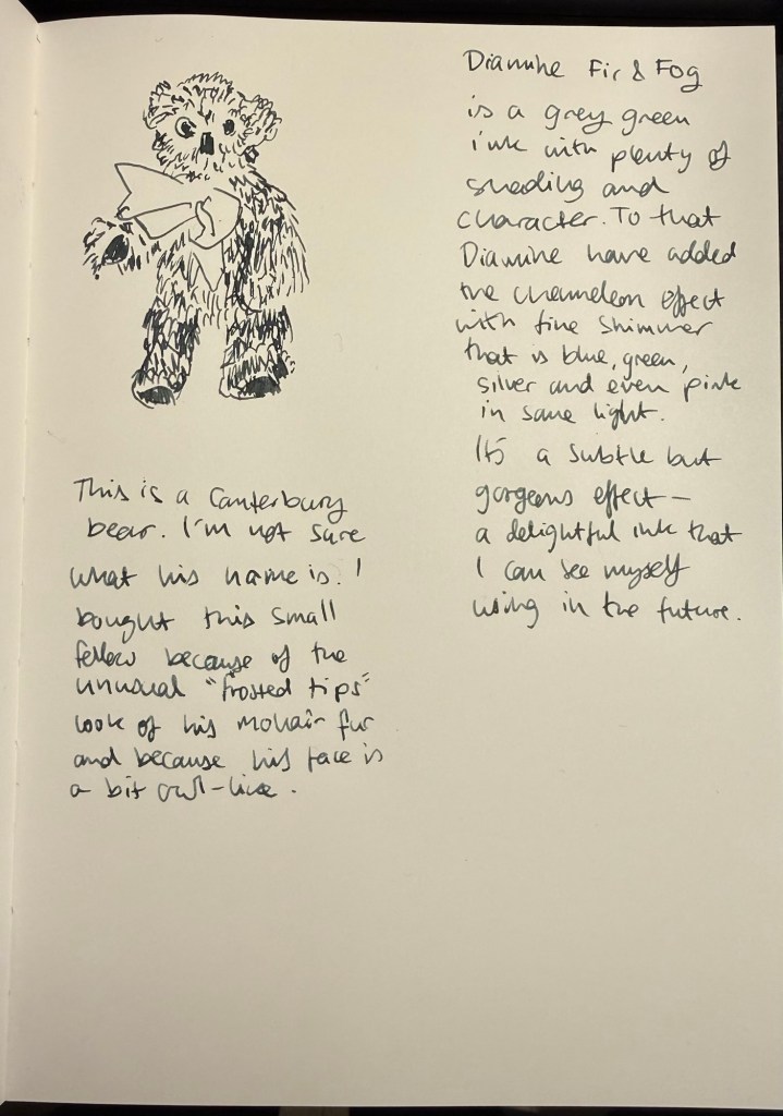
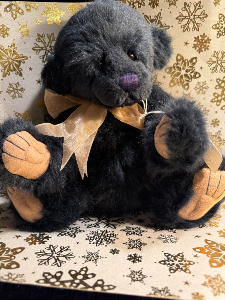
Today’s bear is a Canterbury Bear with no name. I like his “frosted tips” fur and his owl-like face (and the fact that he’s from a small maker), which is why I purchased him.
The Bear
Diamine Fir & Fog is a wonderful ink, a great addition to the Inkvent calendar, and definitely an ink that I would consider purchasing a full bottle of in the future. I think it’s a great wintery ink, and it would look even better on cream coloured paper.
What do you think of Fir & Fog? Did you catch the chameleon effect?
Day 5’s ink is Diamine Marie Rose, a standard ink that looks like a thousand island dressing. Apparently Marie Rose is a British seafood or cocktail sauce. I never heard of it before, likely because I don’t eat seafood. In any case the ink colour is unique and beautiful, with plenty of interesting shading.
Col-o-ring swab.
Although Marie Rose is a light ink, it’s dark enough to be readable, and would work particularly well in thin papered notebooks, as there’s bound to be no ghosting or bleed-through.
Writing and sketching sample.
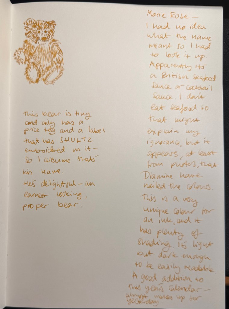
Today’s bear comes with very little information, beyond a price tag and an embroidered tag with the name “SHULTZ” on it. He’s tiny (about the size of a Col-o-ring) but full of character, and proper bear.
The bear
I like Diamine Marie Rose and I’d see myself using it in the future. It’s a light and optimistic ink that’s well behaved, interesting and unique. It makes up a bit for yesterday’s disaster ink.
What do you think? Do you see yourself buying a bottle of Marie Rose ink?
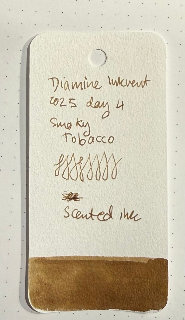
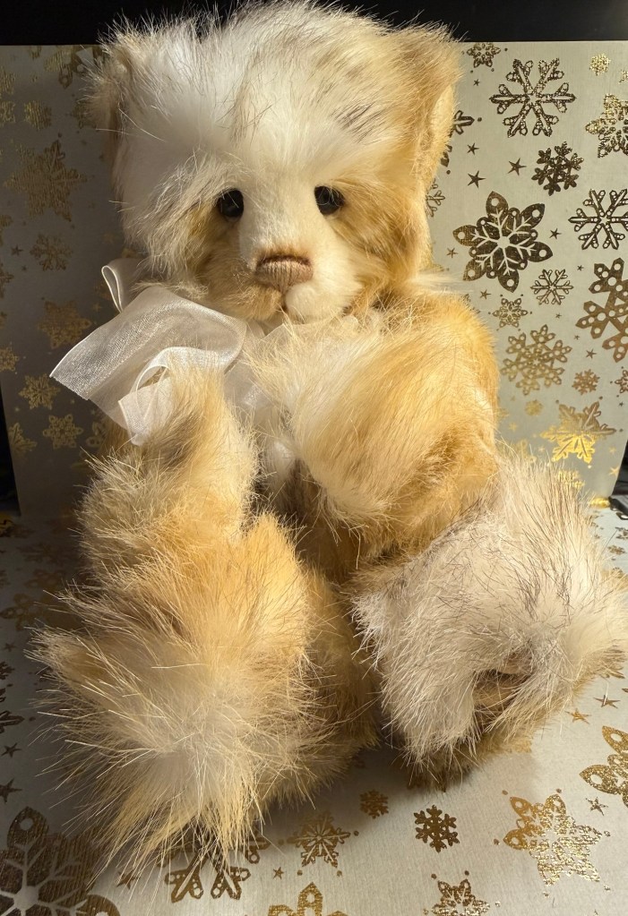
Day 4’s ink is Diamine Smoky Tobacco. It’s a scented sepia ink and I loathe it with every fiber of my being. I hate that it’s named after tobacco, I hate that it’s a scented ink, I hate that it stinks to high heaven, I don’t like the ink’s flow and I’m not a fan of the colour. I have no idea what Diamine were thinking naming an ink after Tobacco and then having it reek of stale Tobacco but it’s a terrible idea and a terrible ink. It went straight to the trash can after this review, and the pen is about to be thoroughly cleaned out.
Col-o-ring swab
The issue is that this ink stinks so much that it actually made my whole notebook smell like it had been in a smokers house for the past few years. I am considering ripping the page out and throwing it to the garbage. If it still smells this badly in a day or two that’s what I’ll do.
Writing and sketching sample
Today’s bear is one of the prettiest in my collection. Her name is Zelda and she’s a Charlie Bear. Her body is so, so heavy but her mohair fur is as soft as it looks. It’s like stroking clouds.
Today’s bear
I am so angry at Diamine for naming an ink after Tobacco, and then going out of their way to give us the full Tobacco experience. Here’s hoping that tomorrow’s ink is better, and that this is the last of Diamine’s scented inks, at least for this year’s Inkvent. Otherwise we might be getting a “dead rat carcass in the chimney” ink, or a “rotting wreath” one.
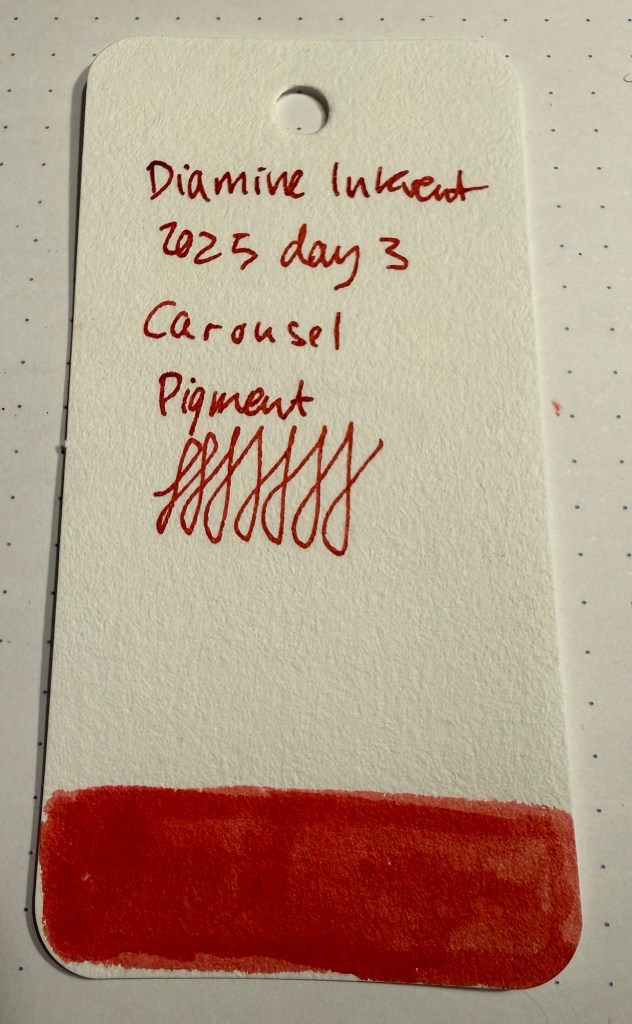
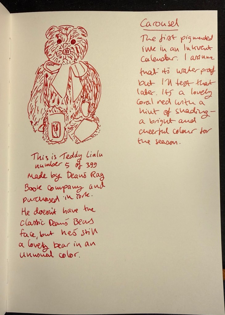
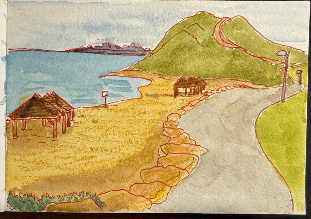
Day 3’s ink is Diamine Carousel. It’s a red pigment ink – which should mean that it’s waterproof, something that I will test later on.
Col-o-ring swab
Carousel is an orangey/coral red ink that flowed well in my Lamy Safari medium nib. There’s a bit of shading with this ink, which surprised me. I wasn’t expecting any shading because it’s a pigmented ink, and from my experience they tend to be “flatter”. In any case Carousel is a bright and cheerful colour, perfect for the season.
Sketch and writing sample.
I had to check if Diamine Carousel is waterproof, so I sketched one of the beaches near my apartment. I then waited for the ink to completely dry, and painted over it with watercolours. It worked perfectly, as you can see, and I actually like the effect of sketching with such a peculiar colour of ink.
Watercolour sketch
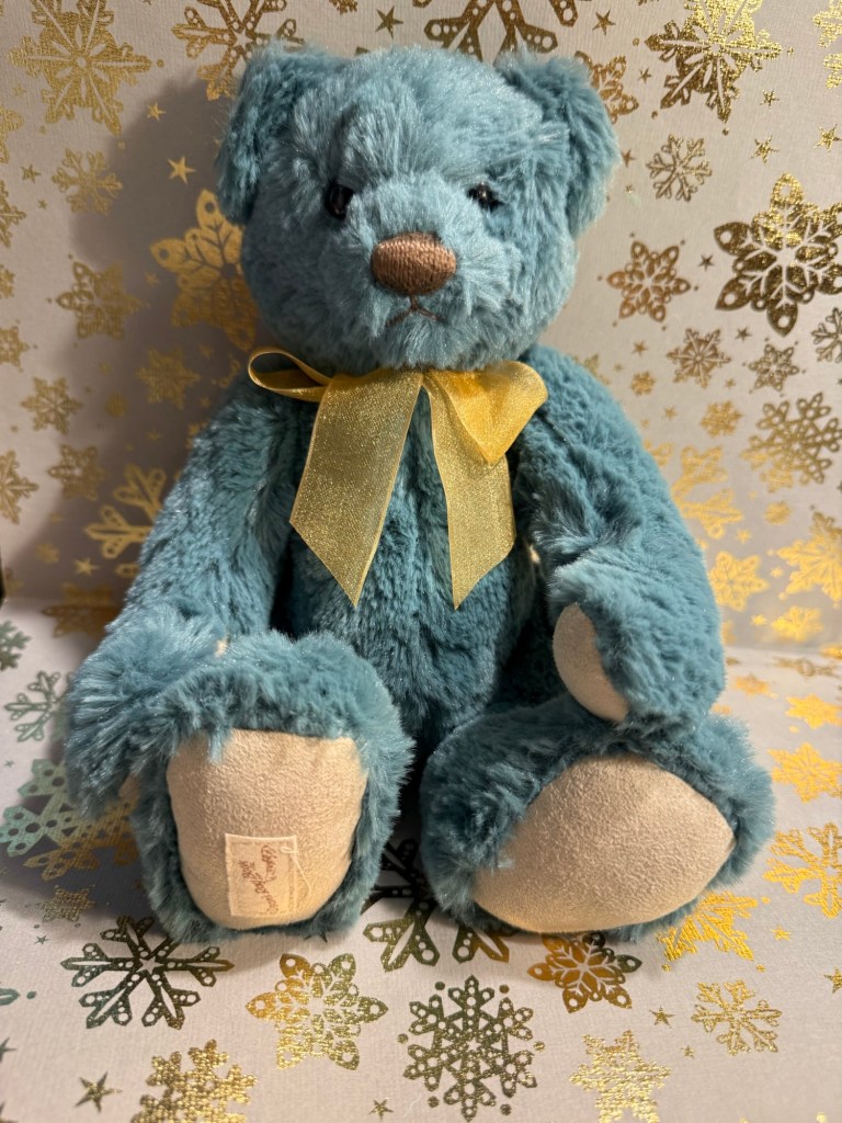
Today’s bear is Lialu, and he’s a Dean’s bear, and another one of the few blue bears that I own. Look what a serious little fellow he is:
Today’s bear – very dignified and distinguished
Diamine Carousel is a fun ink that’s completely waterproof when dry, and a joy to sketch with. I will certainly enjoy sketching with it, and time will tell if I’ll be adding it to my waterproof ink collection later next year. For scenes with lots of greens I think it would work particularly well, as it makes greens pop.
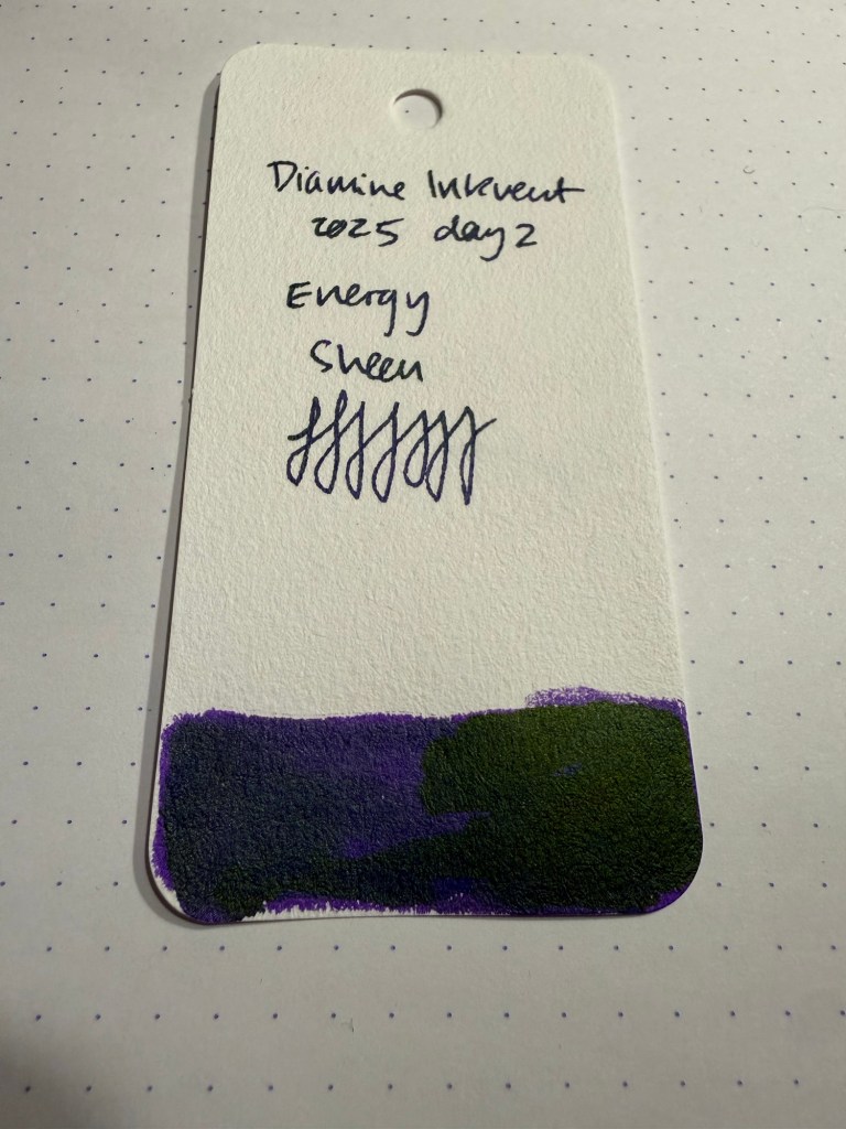
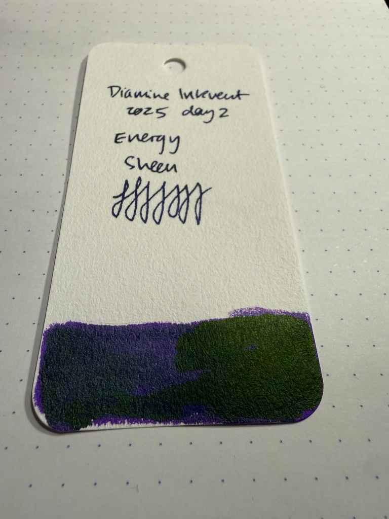
Day 2’s ink is Diamine Energy, a purple ink with golden green sheen. I used a Lamy Safari with a medium nib to test this ink out. The ink is very saturated, as I’d expect from a sheening ink, but there’s so much green sheen on it that it makes the ink look dusty.
Col-o-ring swab
Energy can be mistaken for a black ink in certain angles and from a distance, which is a bit of a shame as the base purple colour is gorgeous.
Close up on the colour and the sheen
The sheen is interesting – there’s a cooler, bluish undertone to it that makes it more dusky and more muted than the standard golden green sheen that usually appears in dark purple inks.
Writing sample
The ink has a generous flow, and it will likely sheen even on relatively absorbent paper. I didn’t test it on Tomoe River Paper but I’m guessing that you’d likely not even see the base purple colour there.
A closeup of the sheen in this ink
There is an issue with such a dark, saturated and wet ink: ghosting and bleed-through. Both occurred here, to the point where I’m likely to just dump this ink out rather than use it for writing. This is an ink that is either for those willing to use only one side of the page, or those using very thick paper.
Visible show through and bleed through
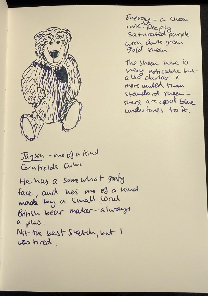
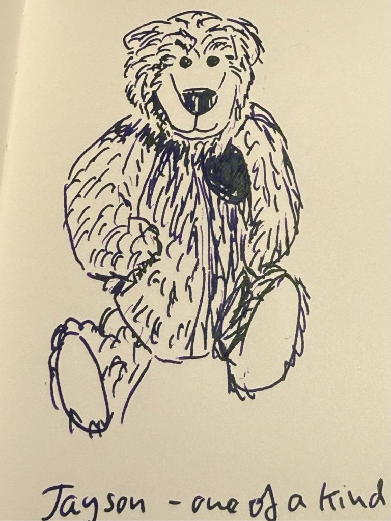
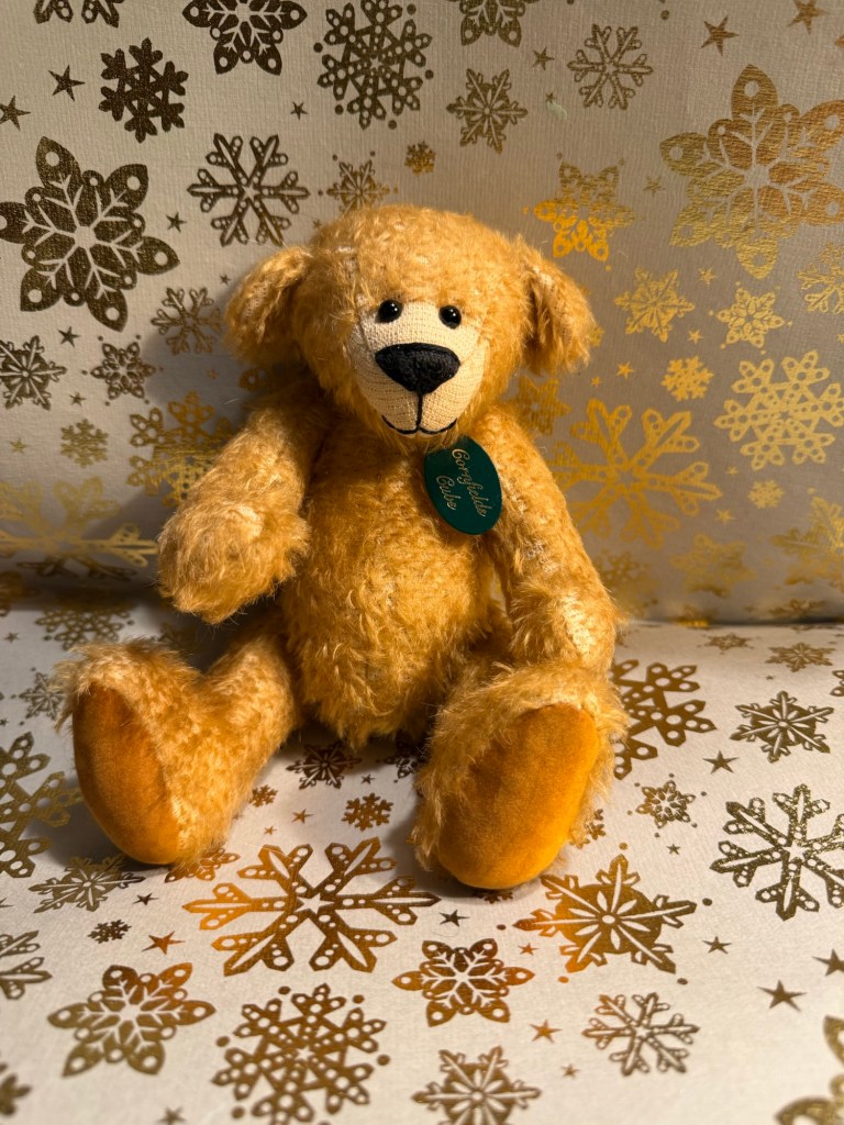
Today’s bear is Jayson. He’s literally one-of-a-kind – an artist bear made by Cornfield Cubs. He’s got a bit of a goofy face, which is why I bought him.
The bear
Diamine Energy is an interesting ink. I like the original name, though I don’t think it really fits the Christmas/holiday/winter theme of the Inkvent calendar. I wouldn’t buy a bottle of this ink because the sheen is too much for my liking and the ghosting and bleed-through make it impractical. What do you think?
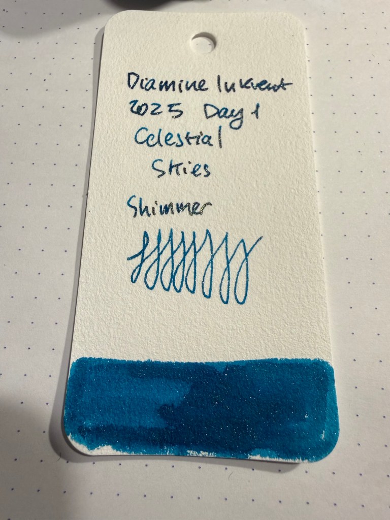
Day 1’s ink is Diamine Celestial Skies. It’s a dark, saturated teal shimmer ink with plenty of red sheen on the proper paper. It’s a festive start for the Teal Edition calendar, and I love how rich and regal this ink looks on the page.
Col-o-Ring swab. I used a Lamy Al Star with a broad nib to test this ink
The ink has a silvery green shimmer that looks golden under certain lighting conditions and in certain angles. It has a generous flow, and I do see myself contemplating purchasing a full bottle of it when Diamine starts selling Teal Edition inks sometime in the middle of next year. With the shimmer, the sheen and a good amount of shading, plus the wonderful base ink colour, this ink will never be boring.
Writing and sketching sample.
I think I have only three blue bears, and Finn here is one of them. Once I saw the ink colour I decided he’d be a nice bear to start off this year’s Inkvent reviews with. He’s five years old, though he doesn’t look it, and I love his pensive face and outreaching “hug me” paws.
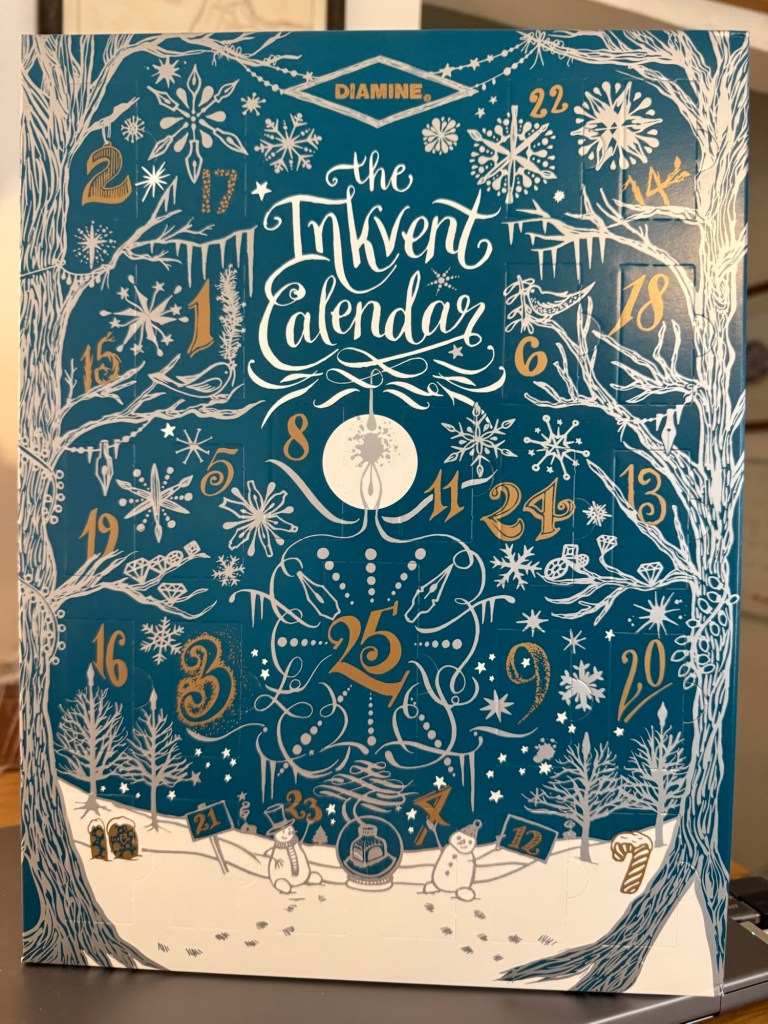
As the year comes to a close, it’s time for this year’s Diamine Inkvent. This year’s calendar is the Teal Edition – one of my favourite colours. I am guessing that it will include some version of Diamine’s new Forever pigmented inks. It will likely also include shimmer, chameleon, sheening and super sheening inks, scented inks (alas) and likely also a few surprises. I have done as much as possible to not read about the inks in it in advance – the surprise is most of the fun.
My Diamine Teal Edition Inkvent calendar.
I have been reviewing the Diamine Inkvent calendar since it was first issued, and it’s been a huge undertaking, and a fun one. You can find my review of the 2019 Blue edition starting here, the 2021 Red edition starting here, the 2022 Green edition starting here, the 2023 Purple edition starting here, and the 2024 Black edition starting here.
This year I’ve decided to streamline things a bit. I’m very busy, and my calendar arrived very, very late due to shipping issues so I haven’t really had a head start creating the review posts, and they take a LOT of time and effort. To cut down on the overhead I will not be photographing the individual doors or bottles – they aren’t really interesting. I will be creating a writing sample and a teddy bear sketch for each ink – using teddy bears from my collection as models. This year, however, the sketch and the writing sample will be done in a single notebook – the Apica Premium C.D Notebook. It has very fountain pen friendly paper that does a good job of showing off individual ink properties.
Apica Premium C.D. Notebook
Like in previous years, I will be using my trusty Col-o-ring to swatch and sample each ink. I will also be actually filling fountain pens instead of just using dip pens to test the inks. I think that it’s provides more insight into how an ink behaves in a pen, particularly in terms of flow. Unlike in previous years I have a brand new ultrasonic cleaner, so hopefully the pen cleanup won’t be too bad…
Col-o-ring (no 2025 inks are swabbed here yet)
Have a great Inkvent to all who celebrate! I can’t wait to dig into this year’s calendar and see what Diamine came up with.
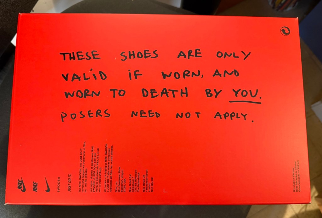
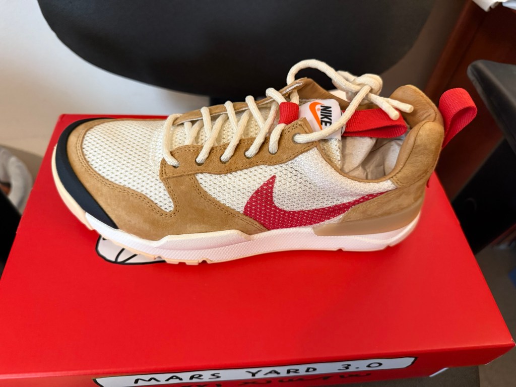
My Tom Sachs Nikecraft Mars Yard 3.0 sneakers arrived! I worked so hard to earn these and they were so expensive that for a moment I wondered if I’d ever wear them. But then I saw the bottom of the box:
Perfection.
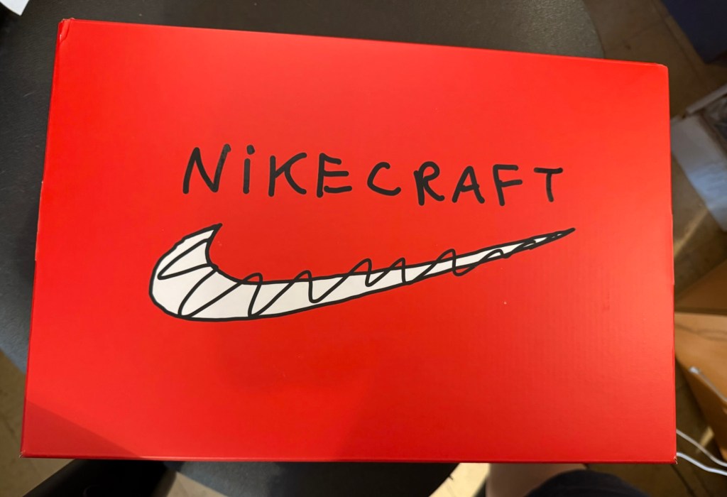
The box is so well designed:
Box lidBox side
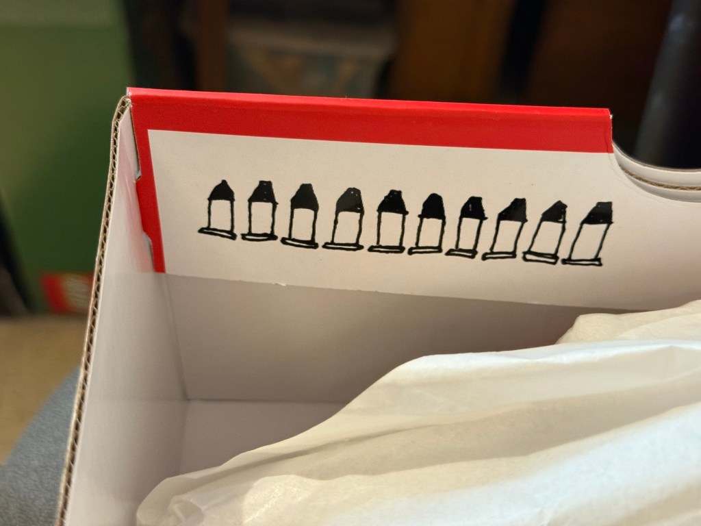
There are even hidden ten bullets:
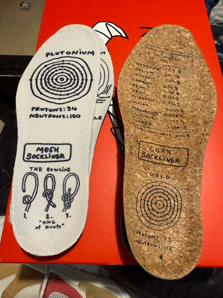
There are two sets of sockliners that come with these shoes, one made of cork and one made of mesh:
And here are the shoes themselves:
Mars Yard 3.0
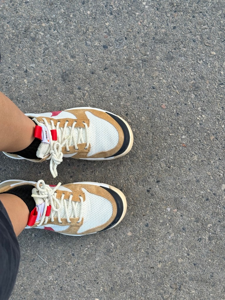
Yes, I am wearing them, and yes, they are very comfortable. They aren’t in any way loud or attention grabbing, but that’s part of why I like them so much.
Not a poser.
I’m nearing the end of reading “Helmet for My Pillow” by Robert Leckie. It’s a powerful narrative, but I think that “With the Old Breed” packed more punch. I also went to the Pelikan Hubs 2025 and you can read all about that here. I’ve now only got Pelikans inked up (and one Platinum Preppy), which is an interesting experience.
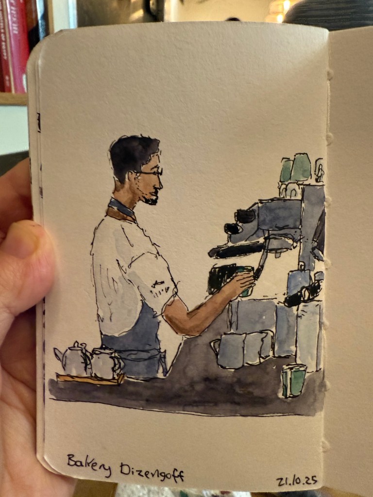
I sketched a new barista at my favourite cafe. The customers kept cutting off the view so I gave up on sketching the rest of the counter at some point. I was using my arttoolkit palette, which is ultra portable and contains a different set of paints than what I’m used to using. The notebook is a Stillman and Birn pocket Beta:
I went to develop film last week, and also went to an artist’s open house and splurged on a new painting. Have good art on your walls. It makes a difference.