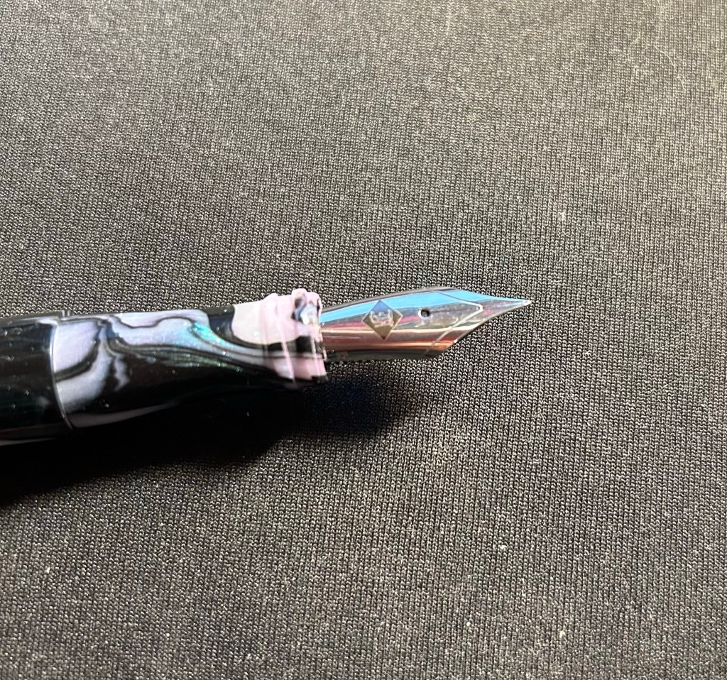
I like inks that are on the teal/turquoise range so I almost always have a pen inked up with something in that shade (I currently have three – this Robert Oster Peppermint, Robert Oster Fire and Ice and a Graf von Faber Castell Turquoise). I sketched this white rhino without considering the background — which was just plain rock face, and so something that I should have changed up.
White Rhino sketch in Peppermint
The pen body is from Woodshed Pens, and the nib is a Franklin Christoph fine. I like this combination, as it allows some sheen and shading to appear and yet is still relatively quick drying.
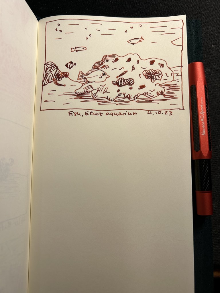
Diamine Monaco Red is a dark red/maroon like colour that has darkened even more in my Kaweco AC Sport Carbon red fountain pen. The fine nib still shows the significant shading this ink has. Google photos brought up this aquarium photo from Epctot’s “The Seas” aquarium so I decided to sketch it even though it was much better suited for watercolours. The fish in the foreground looked so worried that I thought it was worth a try.
I’m not a fan of red inks, but Diamine Monaco Red seems to be dark enough and well behaved enough for me to enjoy it. There’s also something particularly satisfying with crossing to-do list items with red ink: this thing is DONE.
Day 3 of Inktober is for pelicans, and I resisted the urge and didn’t sketch this pelican with a Pelican. Instead I sketched it with a Kaweco Sport in frosted blueberry with a medium nib and a Graf von Faber Castell turquoise ink cartridge.
Pelican, Animal Kingdom, Disney World, Florida
We have flocks of pelicans passing in the country on their yearly migration, and they are impressively big and impressively loud birds when disturbed. I have a penchant for turquoise and teal inks, so you’ll see quite a lot of this hue during the coming weeks. I like the shade and shading of the Graf von Faber Castell turqoise, so I may yet buy more cartridges once this pack runs out.
I’ve recently switched out most of my fountain pens and inks for a new batch, so here’s a quick overview of them (from top to bottom):
Currently inked writing sample
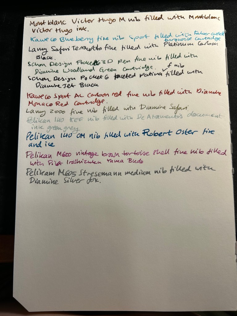
Montblanc Victor Hugo medium nib filled with Montblanc Victor Hugo ink. I bought this at Mora Stylos just before they closed, mainly because the design is based on the Notre Dame de Paris, which I adore. It’s a weird design and quite a hefty pen, but I enjoyed the nib, despite it being a medium. The ink, also limited edition (but knowing Montblanc is likely a relabeled existing ink) is a nice, warm brown with a good amount of shading. As I post this I’ve written this pen dry.
Kaweco Sport Frosted Blueberry fine nib filled with a Graf von Faber-Castell turquoise cartridge. This is the only fountain pen that I took with me on my recent trip to the US, and I used it on the plane (not during takeoff and landing).
Lamy Safari Terracotta fine nib filled with Platinum Carbon ink. I wanted a waterproof ink for my sketches, and I haven’t used Platinum Carbon for ages. The Safari Terracotta is the perfect coloured pen for this season.
Schon Design Pocket Six 3D Teal x Matte Black pen with a fine nib filled with a Diamine Woodland Green cartridge. This pen is already been written dry by the time I’ll post this.
Schon Design Pocket Six Faceted Patina fine nib filled with a Diamine Jet Black cartridge. Schon Design pens made me enjoy pocket fountain pens, and Diamine Jet Black is proving to be a solid, dark black ink (not greyish or brownish).
Kaweco Sport AL Carbon Red fine nib filled with a Diamine Monaco Red cartridge. The perfect pen and ink match. I don’t normally use red inks, but Monaco Red skews towards the raspberry side of things, and is very pleasant.
Lamy 2000 fine nib filled with Diamine Safari. Before I filled a flock of Pelikans, this was supposed to be my workhorse pen. Diamine Safari is great for sneaking unusually coloured inks into serious office settings without drawing attention to yourself.
Pelikan 140 KEF nib filled with De Atramentis green grey document ink. Another sketching combo, perfect for watercolours when I want my line work to melt into the background. KEF stands for Kugelspitze Extra Fine – or Ball-tip extra fine. It’s a very forgiving and rather firm gold extra fine nib. I inked this up on the Friday of the Pelikan hubs even though I didn’t go to a hub. The 140 is a piston filler from the 1950s with a gold nib that was dirt cheap and is an utter workhorse. It’s user grade due to the brassing, but brassing adds character.
Pelikan 140 OM nib filled with Robert Oster Fire and Ice – Pelikan stopped making OM nibs in 2014 because they’re scratchy and unpleasant to write with if you don’t hold them at the right angle. But at the right angle this nib is phenomenal, and it works great with inks that shade and sheen – and Robert Oster Fire and Ice is definitely one of those. You can see a visible sheen at the edges of each letter, and it makes them all glow. I inked this to celebrate the Pelikan hubs.
Pelikan M600 brown tortoise shell fine nib inked with Pilot Iroshizuku Yama-Budo. This is a vintage M600 from the 1980s, with West Germany printed on the band. It’s a lovely workhorse, like all Pelikan Souveräns, and the Yama Bodu ink manages to shade even with the Pelikan fine nib. Also inked for the Pelikan hubs.
Pelikan M605 Stresemann medium nib filled with Diamine Silver Fox. I haven’t had a grey ink in rotation for a while, and Silver Fox is an interesting and dark grey with plenty of shading, particularly with a juicy Pelikan medium nib. Also inked for the Pelikan hubs.
I don’t normally celebrate this blog’s anniversary, but I decided to answer The Well Appointed Desk’s 21 Pen Questions and The Gentlemen Stationer’s 5 More Pen Questions to celebrate this year. You’ll see that my answers skew towards vintage pens and sket
#21PenQuestions
1: What is the pen they’ll have to pry out of your cold dead hands? My very first Parker 51 (an aerometric black one that’s worth very little but is still my favourite). I love writing with it, and it was such a significant purchase at the time. It was the first vintage pen that I bought, I got it from the Fountain Pen Network without having tried a Parker 51 or a gold nibbed pen or a vintage pen before, and it was so expensive for me at the time. I’m so glad that I took that leap of faith, and that it worked out so well.
My first ever Parker 51
2: What’s your guilty pleasure pen? My Nakaya Cigar Piccolo Negoro Kise Hon Kataji black/red with elastic flexible medium rhodium nib. It’s a joy to use but it was so expensive to purchase, I had to wait so long for the pen to be made and then I had to go release it from customs myself because they wouldn’t believe its price, so it never leaves my house. I bought it years ago from Mora Stylos in Paris.
My Nakaya
3: What’s the pen you wish existed? I’m curious about how a red Lamy 2000 would look. If it’s anything like I think it would then I want one.
4: What pen would you give to a new enthusiast? It depends on the person but either a Lamy Safari or a Pilot Metropolitan. If they were remotely interested in vintage pens, I’d have them try the magic that is the Parker 51. If they are an artist, then a Sailor Fude De Mannen with a bottle of De Atramentis Document ink.
5: What pen do you want to get along with but it just never clicked? Pocket pens, particularly the Kaweco series. I use them sparingly because it’s such a hassle to uncap and post them each time I want to use them. The same goes for the Schon Design Pocket 6. I have two of them, they’re great, but they’re too much of a hassle to use regularly.
6: What pen do you keep only because it’s pretty? I have some vintage pens that I daren’t use, the prime example being a retractable Waterman that I’m afraid to fill. You are supposed to pour the ink directly into where the nib is extracted from, and I can’t bring myself to do it.
Retractable vintage Waterman
7: What pen (or stationery product) did you buy because everyone else did? My worst pen ever, the remade Conklin Crescent filler. I bought it because people on the Fountain Pen Network went wild when they came out, and it is plasticky garbage that fell apart after one use, is horrible to fill and use, and was an utter waste of money. I’m now writing with a vintage Conklin crescent filler and A. The filling mechanism looks cool but isn’t practical (hard to fill, hard to clean), B. The Conklin flexy gold nib is amazing. C. It’s made of BCHR so it stinks to high heaven and has aged poorly. But I couldn’t care less because the nib is amazing.
8: What pen (or stationery product) is over your head or just baffles you? The plotter. It looks like a less well made Filofax for much more money, and I don’t get the hype. I also don’t get $400 steel nibbed cartridge-converter pens with over-hyped advertising. I don’t care how pretty the box or the site or the story is — it’s a $250 pen, tops.
9: What pen (or stationery product) surprised you? The Stalogy 365 B6 notebook. I wasn’t expecting them to become my main journaling notebook, but I like the paper and the size. Also the Retro51 tornado, which I thought was a gift shop pen but turned out to be pretty good, even though I don’t love the refill.
10: What pen doesn’t really work for you but you keep it because it’s a collectible?
I have a few vintage lever filler fountain pens from Waterman and Parker that I rarely use because they’re such a hassle to fill and even more of a hassle to clean out.
Gorgeous lever fillers (and two propelling pencils) that I never fill. Retractable Waterman on the right.
11: What is your favorite sparkly pen (or ink)? I rarely use sparkly ink outside of Inkvent testing (I’m foolish enough to fill entire pens to test the ink instead of just dip testing them), and I have two sparkly pens only (both by Franklin Christoph) as I’m not a fan of the genre. That being said, between my Sedona Spa and Sparkling Rock I prefer the Sparkling Rock.
12: Which nib do you love — but hate the pen? Conklin Crescent filler. I also have some flex nibs on vintage button fillers (which I hate) that I keep for the nib alone.
13: What pen (or stationery product) gives you the willies? Noodler’s Bay State Blue. Because of the ink and because of the company.
14: What’s your favorite pen for long form writing? Parker 51, Lamy 2000 or a Pelikan with a fine nib. They’re all excellent writers, and the Lamy 2000 and Pelikan have giant ink capacities. The Parker 51 just makes me want to write more and more with it.
15: What pen (or stationery product) do you love in theory but not in practice? The traveler’s notebook. I love setting them up but I never use them because the format (both pocket and regular size) just doesn’t work for me. It’s too small and too narrow.
16: What pen (or stationery product) would you never let someone else use? I tend to not loan my pens out because they walk off my desk, to a point where I no longer keep any pens in the office (they all live in Sinclair bags and travel with me everywhere). If it’s at a pen gathering then I have no problem letting people try out my pens.
17: What pen (or stationery product) would you never use for yourself?
Lined notebooks where the lines don’t reach the end of the page. I loath them.
18: What pen (or stationery product) could you NOT bring yourself to buy? A Sailor King of Pen, because of the size and the price (and I’ve been eyeing one since they’ve been significantly cheaper). I actually tried one out and it felt ridiculous in my small hands.
19: What’s your favorite vintage pen? Parker pens, particularly the 51s but also the striped Vacumatics. But I have a hard time not buying every Parker 51 that crosses my path. I love the nibs, the sleek look, how reliable they are and how easy they are to fill and clean out.
20: What is your favorite EDC/pocket pen? Schon Design Patina faceted pocket 6. I love the design, the facets and the colours.
21: What’s the pen (or stationery product) that got away? Retro51 Pink Robots. I was a Pen Addict member when it came out but I didn’t get it in time as I was distracted by my mom’s cancer diagnosis and treatment at the time. When I got cancer I wanted it even more, but I haven’t been able to get one. If you’re reading this and you have one for sale for a reasonable price, let me know.
#5MorePenQuestions
Why do pens and stationery continue to play such an important role in your life, especially in an age when everything is supposed to be going paperless and digital? I started using fountain pens as a way of dealing with my carpal tunnel issues. Then I started sketching with them, and then I really got into vintage fountain pens. I always used paper and pens/pencils both for my sketches, and because I process and recall information much better on paper. Beyond the practicality of it all, I love my pens, pencils and notebooks as objects. I love their designs, the feel of using them, their history and the way they gather meaning as objects for me.
What do you view as the key benefit of writing by hand? I think best when I write by hand. I enjoy the physicality of the process, and the way that it helps me slow down, focus, see things more clearly. I also remember things best when I write them down, even if I don’t go back to reading my notes later on.
What is your favourite thing about the pen/stationery hobby? That it affords me an immediate connection with the past. Most of my family was wiped out in the Holocaust. I don’t have a family history. I don’t have heirlooms. Using vintage fountain pens, real survivors (in my eyes), brings me so much joy – particularly when I know that I’ve “rescued” them from being tossed away or gathering dust in a drawer. I love researching them, trying to imagine their past, wondering who their previous owners were, and what they were like. It’s part of why I have no problem buying vintage fountain pens with names engraved on them.
What is your least favourite thing about the pen/stationery hobby? The way that I’m treated as a woman in local fountain pen circles, and in vintage fountain pen circles. The assumption is that I don’t belong, and I must be buying a pen for my boyfriend or something, that I’m a “fake” fountain pen enthusiast. I tried joining the local fountain pen group but they were so hostile (yes, even after I gave out free bottles of fountain pen ink, showed my collection and proved my knowledge) that I left, never to return. It’s the same when I visit vintage fountain pen dealers for the first time, and I’ve gotten used to it, but it still annoys me.
If you could choose one combination of stationery items to use for the rest of your life, exclusively, what would those be and why? A Parker 51 Aerometric fountain pen with a fine or medium nib; Waterman Blue-Black/Mysterious Blue; Midori MD Cotton Paper (blank) in a pad or notepad. I think that the Parker 51 is self explanatory at this point 🙂 Waterman Blue-Black has a lot interesting shading, and even some teal in it, and some red sheen. It’s also very easy to clean out of pens, which is always a plus for me. The Midori MD Cotton Paper is very well behaved with fountain pens, and ink doesn’t take hours to dry on it. I also like its minimalistic aesthetic.
Long time no update, so I decided that it’s about time to write one up.
Reading
I’ve been in a terrible reading rut, and I blame the book that I’m currently reading: “The Books of Jacob” by Olga Tokarczuk, a 912 (!) page historical epic about Jacob Frank and his followers. I’m halfway through, and I’ve decided to put it aside for now and train my brain to enjoy reading again with some lighter and more fun material.
The book itself is masterfully written and researched, with the narrative made out of a carefully pieced together mosaic of characters, voices and narrative styles. I just cannot handle the subject matter right now. As my rights are being taken away by religious, power hungry fanatics, I don’t want to spend my free time reading about religious, power hungry fanatics. It has reached a point where I balk at the idea of reading again, and that’s just not healthy. I hate giving up on books like that, especially good books, but if I want to actually read again and not just beat myself up for not reading, I’m going to have to start reading something else.
Health
I went through a CPET (Cardiopulmonary Exercise Testing) last week and it was pretty intense. My lungs aren’t working well in high intensity since my chemo, and so a lung specialist sent me to get this test, to see whether my heart or my lungs are the issue.
It started with a spirometry test (which is a simple test done to check your lung capacity and performance), and then went on to the CPET itself. I was hooked up to an EKG and pre-test measurements were taken. Then I was fitted with a special mask and filter that recorded my air intake and CO2 levels. Finally I was put on a special stationary bike, attached to a blood pressure monitor and a blood oxygen level monitor, and told to pedal without stopping until I felt chest pain or was about to faint, or until I was told to stop. As the technician calmly told me, they have a lot of people fainting during this test, which is why they do it on a bike and not a treadmill. I said it was intense, right?
Anyway, I pedalled for my life, with the bike’s resistance being constantly raised, and me gradually getting out of breath. The point was to see why, so I didn’t stop until the technician stopped me, at which point a little over 10 minutes of constant intense exercise had gone by and I was drenched in sweat and panting. H
ere’s hoping that I get some useful insights from the results. In the meanwhile I’m still running 5 times a week, just not as fast as I would like.
Pens and Ink
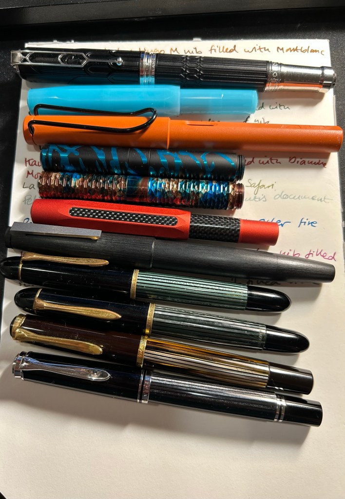
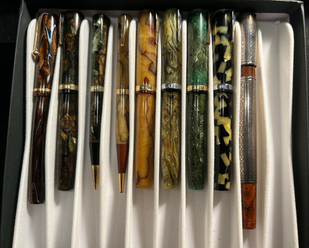
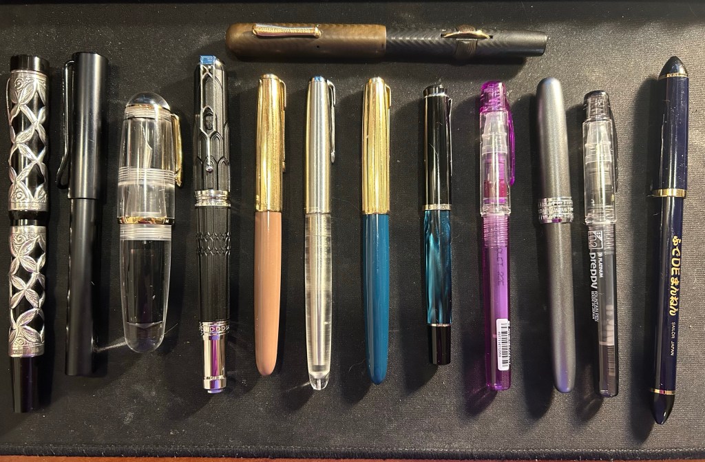
I wrote most of my pens dry and filled in a new batch, this time consisting of mostly vintage pens. There are also two expensive pens in this rotation, a few old ink favourites and some completely new to me inks, and a weird selection of colours.
Writing samples
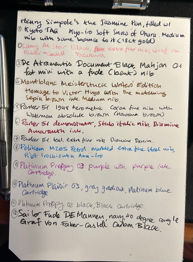
The Henry Simpole Jasmin Pen is one of the most expensive fountain pens I own, and one that doesn’t leave the house because I can never ever replace it. It’s a Conway Stewart button filler with a bouncy 18K gold nib, with silver overlay created by Henry for it. The late Henry’s birthday was on the 4th of July, and so to commemorate him and his work I inked this pen up. I chose the Kyo-iro ink because it’s an interesting dusky purple that I haven’t had enough time with. Like the Jasmine Pen (bought in Portobello Road market), I bought the ink in London (at Choosing Keeping).
The Lamy AL Star isn’t interesting, but the ink in it is new to me. The Graf von Faber-Castell Yozakura is a pale and shading pink that I normally would never have purchased, because it’s so light it’s almost unreadable. It was deeply discounted during the closeout of a local pen shop, and I came in late and had very little to buy to show my support. I probably should have inked a much wider nibbed pen with this, but I have a big bottle of it, so there’s always another time.
In the Mahjon Q1’s case the pen and nib are interesting, the nib is not. This is one of two pens (the other being the Sailor Fude in the end) which I inked solely for sketching purposes. It’s a weirdly shaped pocket eyedropper fountain pen that I bought with a fude (bent) nib. I’ll probably review it at some time in the future.
The Montblanc Victor Hugo was a pen that I bought at the end of last year, during my last visit to Mora Stylos. This was an impulse buy, something that would never have happened if not for the display that Montblanc used to sell this pen. I love the Notre Dame de Paris, I’ve visited her and sketched her many times, and my heart broke when she burnt down. She’s a survivor, and seeing this pen displayed in a diorama of the Notre Dame in all her white glory, I just had to buy it. The ink was a gift that Mr. Mora gave me with the pen.
Parker 51 pens. The cocoa and the teal were all purchases made in the local flea market, and the cocoa is part of a set (with a pencil) and the earliest of the bunch (from 1948, a first generation Aerometric). The teal was in pretty bad shape, and took me a while to flush out. The demonstrator Parker 51 is from Mora Stylos, has a gorgeous stub italic nib, and is likely one of the Argentinian, aftermarket demonstrators. The Parker 51 is my favourite pen, and I have a hard time not buying all of them.
The Pelikan M205 Petrol was a Black Friday purchase, and I haven’t inked it until now. The nib is great, the pen is great, and Iroshizuku Ama-Iro turquoise ink is quickly becoming one of my favourites. Such an optimistic, summery colour.
The Platinums include two Preppy’s that I’m trying out, after being disappointed with their durability in the past. The Plaisir is the pen that’s been inked the longest of the bunch.
The Sailor fude is filled with a new ink to me, the Graf von Faber-Castell Carbon Black. The ink was purchased in the same closeout sale as the pink Yozakura, and I’m planning on testing it out as a non-waterproof sketching ink.
I wrote the Conklin Lever filler on top dry just as I was planning this post, so it’s here for reference only. I purchased it at Mora Stylos, it’s from 1919 and it’s in user grade condition (cap discolouration, significant brassing, the imprint isn’t in perfect condition). The lever filling mechanism is infuriating to use, both for filling and for cleaning the pen, but there nib is magnificent. It’s a true flex nib, going from medium to triple broad with no effort or railroading, and it’s a joy to use. The fact that I enjoyed it so much, coupled with its tiny ink capacity, meant that it took me about a week to write it dry. I used Waterman Serenity Blue in it, and that ink once again proved its worth in troublesome vintage pens. It’s a great shade of blue that is very pen safe and super easy to clean out of pens (think the opposite to Bay State Blue). A must have for anyone dabbling in vintage pens IMHO.
The pens, from left to right, matching the order of the writing samples with an added guest on top
Other Stuff
I’m working on an adventure for a 30+ tabletop roleplaying convention at the end of the month. I may publish something here about how I write adventures for conventions.
In the meanwhile my D&D 5E game, set in a university like setting and a university town next to it, is progressing nicely. It’s the most complex campaign that I have ever written, but it’s wonderful to see the players rush around in this world, having the time of their lives exploring, interacting and trying to break stuff. D&D is a pure joy and a wonderful escape from the pretty dark reality we live in these days.
Speaking of both dark reality and things that cheer me up:
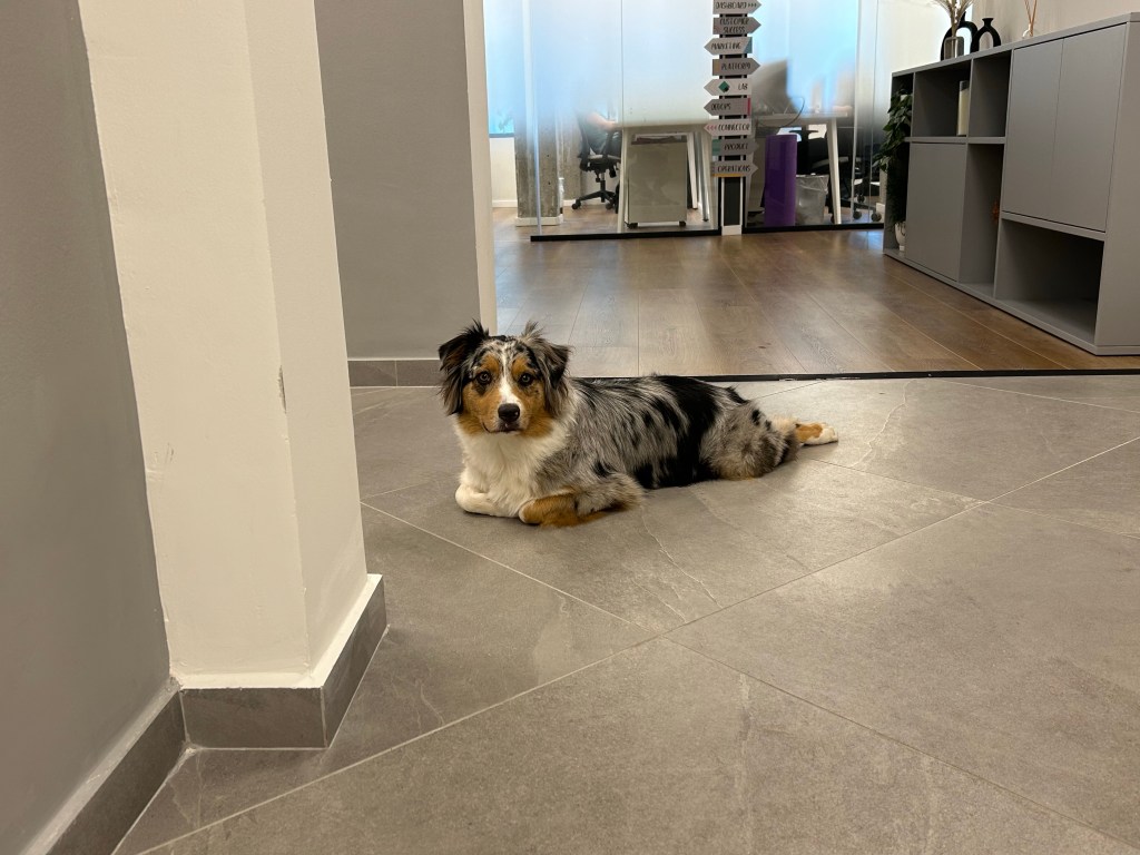
It’s week 27 of the pro-democracy protests, and we’re still showing up in numbers (that are growing again). It’s great seeing whole families show up, including the dogs, to say no to stripping the judicial branch of its oversight powers.
I’ve been sketching people’s dogs, and it’s a pure delight to try and capture their personality with each sketch. Plus, it’s making people happy, which is a good thing.
I’ve managed to help a few people get back to running, and that’s always a joy. Go get some exercise. Do something you enjoy, and even 10 minutes is enough. As Dr. Jen Gutner says, exercise is like finding money in the street: if you find $10 lying around, you’re not going to leave them there because they aren’t $100. Invest a little in yourself, because you’re worth taking 10 minutes a day for.
I was about to write a post about my currently inked pens, when I realized that I hadn’t finished writing up and publishing this post. Such is the state of my blogging backlog that things have been languishing in it since May.
My April London-Paris trip was the first one I made where I had nowhere to buy vintage fountain pens from. Henry the Pen Man (Henry Simpole) had passed away, and Mora Stylos in Paris had closed his shop in the end of December 2022. Would I even buy any fountain pens?
The answer is of course, yes. None of these pens are rare or expensive, but they are fountain pens nonetheless.
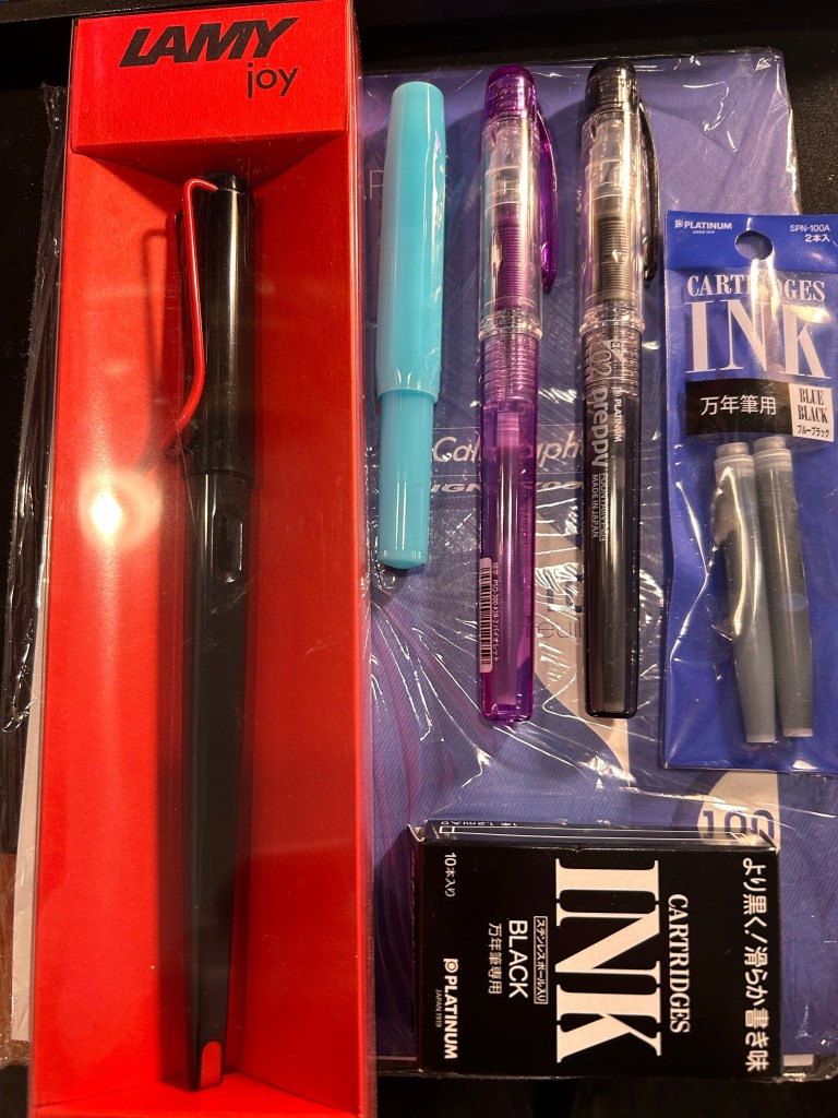
The haul: Lamy Joy, Kaweco Sport, Platinum Preppy pens and Platinum ink cartridges, on top of much needed blotting paper.
I had one thing that was a “must buy” for this trip, and I almost didn’t find it: blotting paper. I’m using a Stalogy notebook as my journal these days, and with some juicy ink and nib combinations a piece of blotting paper is necessary. Alas, I was unable to find any in London: not in Choosing Keeping or in Present and Correct or in any bookstore, stationery store or antique/vintage/flea market that I looked in.
Here Paris came to my rescue, with its fabulous Latin Quarter stationery and art supply shops. I found blotting paper, and then got carried away and added a few cheap fountain pens and ink cartridges to my bag.
I already have a Lamy Joy, and they make for great sketching pens, but I wanted one in black and red and to try and sketch with the included 1.5 nib instead of automatically switching it out for a fine or extra fine. There’s a charm to sketches made with bold, thick lines, after all.
The Kaweco Sport in Blueberry was just an impulse buy, because I liked the colour and I have cartridges languishing around that I want to start using. The Platinum Preppies though, there’s a bit of a story there. I bought a few Platinum Preppies in my very early days with fountain pens, and I purchased o-rings and silicon grease with them, intending to convert them to eye-dropper pens. They all cracked. Immediately. After the first use. One of them was even cracked before I used it.
I’m very gentle with my fountain pens, so I was very disappointed with the plastic quality on these, especially after I learned on the Fountain Pen Network that this was a common occurrence. Well, as I couldn’t care less for the ink cartridges supplied with this pens, I didn’t use them. For me the Platinum Preppy was trash.
Time passed and the Preppy kept getting recommended as a great beginner fountain pen, to my bafflement. It cracks, so why recommend it? Then again, I stopped seeing reports of cracked Preppies. Could Platinum have changed the plastic? Were they all using boring old Platinum blue cartridges and ignoring the cracks?
So when I saw a bunch of Preppies in a Paris art supply store (the wonderful Rougier & Plé) I decided to take a closer look. Wow! They come with purple ink now! And there’s a black ink one too… I decided to give them a try and add a few ink cartridges to my purchase too. The Platinum cartridges are proprietary ones, but I do have a Plaisir, so if all my Preppies crack, I can always use them with the metal-bodied Platinum Plaisir.
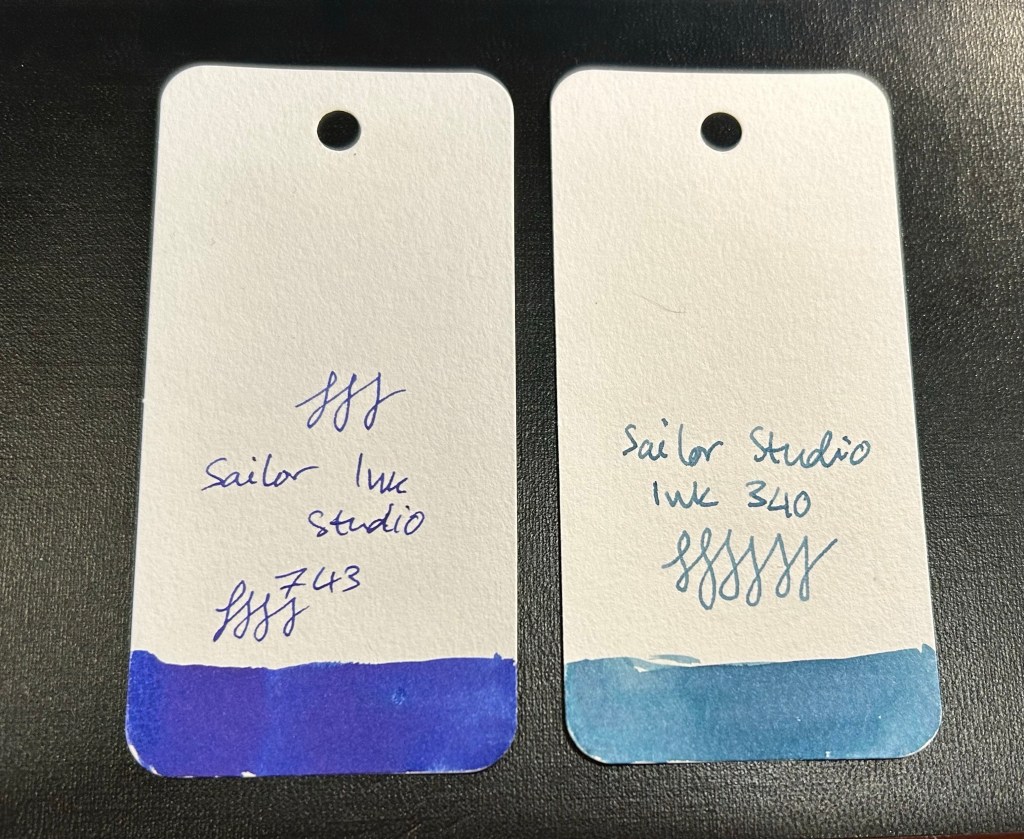
Sailor Studio fountain pen inks
I also purchased two Sailor Studio inks at “Choosing Keeping” in London. The Sailor Studio 340 is a calm greyish powder blue and the 743 is an electric purply blue, and I love them both. These are expensive inks, and so they’re a rare treat for me, one that I indulge in rarely.
I’ve been putting off writing this post because of all the planning systems I discussed, this Bullet Journalling (BuJo) is such a big topic and the system that I’ve used the most and the longest, apart from GTD. This will be the last post in this series as I’m planning on starting another series of posts on a different “how I use my notebooks” kind of topic. The previous posts are here: Chronodex, Weekly Planners, Daily Planners, Filofax, GTD and Friends.
So, Bullet Journalling was started by Ryder Carroll as a very utilitarian, relatively simple, glorified to do list combined with a calendar and some forward planning. At first glance it looked like another GTD system, and it’s clear that they share a common ancestry. This is the first video that Ryder Carroll published on the topic. He’s using a Moleskine squared large notebook here (he’ll switch to a Leuchtturm once he hears about the brand from the Pen Addict podcast, and he’ll land a collaboration deal with them later on), and there are no Instagram worthy spreads, metaphysical musings on how BuJo can transform you into a more enlightened human being, or attempts to upsell anything. It’s like the early days of Moleskinerie and 43folders posts – a guy finds a way to manage his to do list that works for him, and may work for others and so he shares it. Ryder Carroll knows how to explain complex things succinctly and clearly, and the video is beautifully made. It gained a lot of traction at the time, although it’s clear that Carroll prefers that you don’t watch that version of the BuJo explanation.
This is version of bullet journalling is what I started using, and what I still sort of use to this day. Why sort of use? Well, because the basis of the system is a daily to do list with a monthly calendar (and a monthly review), an index and a set of “collections” which are basically project to do lists. I still use the daily to do list and “collection” lists, so I sort of bullet journal. But I also sort of don’t – because none of this is new or unique. To do lists with checkboxes written out on notebooks, with project lists alongside them? There’s a monster list of those. You can’t get a book deal and a stationery collaboration based on that, right?
The official Leuchtturm1917 Bullet Journal
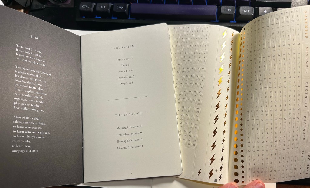
Wrong. About a year passes from the original video, and Carroll signs a deal with Leuchtturm1917 and suddenly there’s an official Bullet Journal and a new video. Stuff gets added to the system. A future log. A whole set of new symbols instead of checkboxes. There’s an added aura of importance and self improvement sprinkled on top. This system will help you be a better person, not just a more productive one.
The included pamphlet – with a poem about BuJo no less – and sticker sheet
This is where the Bullet Journal system starts taking a problematic turn for me (and others, gathering by the comments to the videos). It starts becoming an Instagram thing. People spend hours making gorgeous, Instagram worthy monthly spreads. They spend money on templates, markers, stickers, and notebook bling for this. There’s an army of BuJo influencers. It’s no longer a “getting things done” system, it’s a “make pretty planner pages” system. Carroll inflates the system’s importance and “holistic” approach more and more. Out of curiosity I bought the second edition of the official Leuchtturm1917 Bullet Journal. My PTSD makes planning a real struggle now, and I was at the point where I was willing to try anything. Well, for quite a bit of money you get an overly thick notebook full of Leuchtturm paper, which is tolerably useful with fountain pens. Don’t expect Tomoe River levels of fountain pen friendliness, as there is spreading, and it doesn’t show off the full properties of all your cool inks. Then again, it’s not really meant for that. There’s also an added 12 (!) page manual about the system and a large sheet of planner stickers (and three ribbon bookmarks). There’s also stuff printed on the end papers that shows you how you can divide the dot grid page using the supplied markings. If you create tables often, I guess it’s useful. What I mostly feel using it is that it’s a lot.
Index page
Have you ever tried to write an essay using Microsoft Word? Have you ever been able to do that without futzing with the formatting, the alignment, the spacing, etc? Word is a program created with printing in mind, and it shows. Writing applications like Scrivener supply you with full screen blank canvases that contain zero formatting prompts because that’s how you get the actual writing done. What the Leuchtturm1917 Bullet Journal does is give you all the tools you need to distract yourself from actually planning your stuff as quickly and efficiently as possible so you can move on to get them done. It’s full of calls to design pages, and I had a hard time at first training my brain to ignore the noise that the notebook came with. Ignore the wide margins, the little division markings, the pages with titles, the stickers and the pamphlet.
Future log
But back to the Bullet Journal system itself: stripped of its self-importance and its need to preen for Likes and Favs, is it still useful as a planning system?
Let’s take a look at it part by part:
Index – I didn’t keep one. I think I might have tried this during the first month, but I gave up quickly on this. It’s too much hassle for very little gain. How many times a month do you actually need to find something in your notebook, and when do you not just flip through it? There were many GTD systems with indexes and indexing systems, and I never found the indexes useful.
Monthly log – I keep a version of this separately on a small “Rebel Plans” pad from the Well Appointed Desk. It contains a monthly calendar that’s shaped like a calendar (and not a list of days), with important days in the month circled in a different colour, with basic monthly goals and big monthly milestones/events marked on it. I keep it before my eyes constantly as I work, and so having it tucked away in a notebook doesn’t work for me. I also find listing on paper the events of the day for the entire month a waste of time. That’s what digital calendars are for, and they’re much better than paper ones for it.
Future log – a new invention made for the official bullet journal notebook. I tried using it and found it to be useless for me. If you want true long term goal tracking, I suggest you try the theme system journal or something of the kind.
Daily log – this is the heart of the system, and it works because it’s a to do list. See also my post about GTD. I fluctuate between using the dash-plus annotation system and simple checkboxes, but you can use whatever works for you, of course. The important part is, of course, defining your tasks properly – actionable, doable in a short amount of time, and something that you can and should be doing.
Reflections – these are just a rebranding of GTD reviews. These work well if you do them, but it’s been my experience that it’s very easy to stop doing them because who wants to review what you didn’t get to complete as planned?
So there’s good stuff in Bullet Journal if you are able to strip it down from its anxiety inducing beauty contest trends. The question is, will you be able to ignore all the Bullet Journal page design noise and make use of this as a pragmatic planning system, or will you get carried away and start decorating pages and comparing monthly spreads with people who do this for a living, as you buy yet another template and another BuJo perfect pen? I’ll leave you to answer that one for yourself.
Three ribbon bookmarks and divider markings closeup. You can also see the white margin all around the dot grid page.
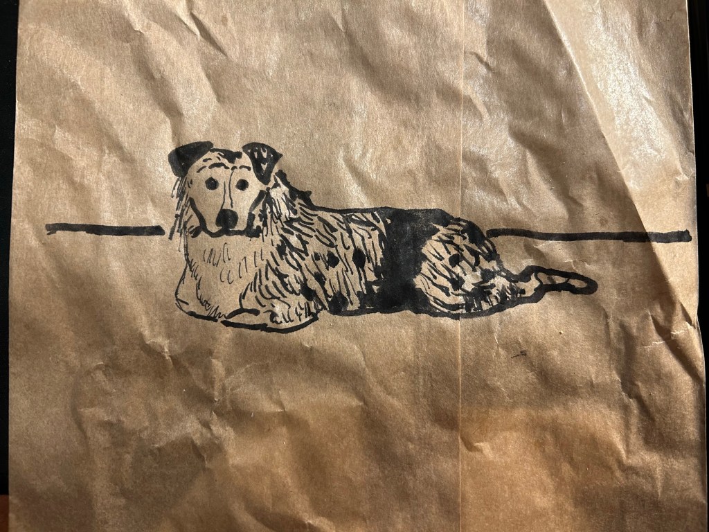
This is a 5 minute sketch of Belle, the Australian sheepdog. It was done with a Sailor Fude 40 degree fountain pen and Graf Von Faber-Castell carbon black ink on a paper bag that held my sandwich.
This review has been languishing in my drafts for the past two months, as life (and particularly work) has gotten so hectic. As I wrote the Franklin Christoph x Stilo e Stile 03 Sparkling Rock dry today, I thought that it was about time to finish this review and publish it.
The outer box
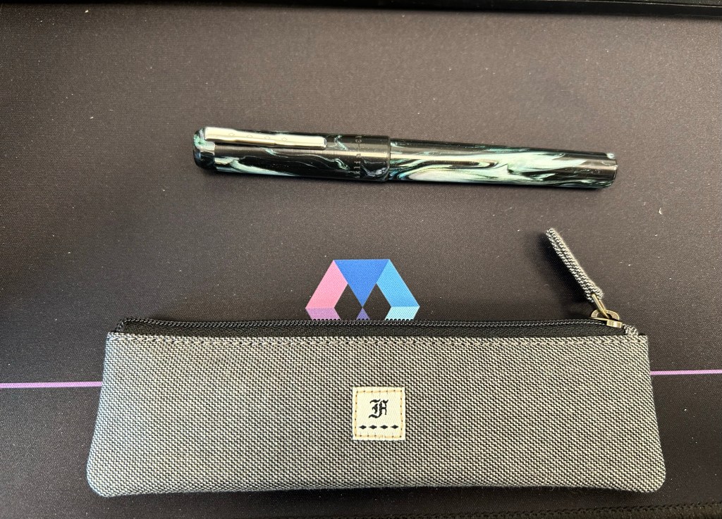
I don’t write much about packaging since I don’t care much for it, unless it is clearly overdone and something that unnecessarily added to the price. Franklin Christoph’s packaging is one of my favourites as the outer box is simple and elegant enough to be sent as a gift to someone, without being flashy. But what makes it even better is that many of their pens come with a pen pouch. These pouches are fantastic, and the one that I got features a velvety interior that protects the pens from scratches, and a grey, denim-y like external fabric that I really like.
Pen and pouch.
This collaboration between Franklin Christoph and Italian pen store Stilo e Stile is a model 3 pen with a gorgeous black, white and green resin with chatoyance, sparkle and a great deal of depth to it. Photos flatten it out and do it no justice. It’s a breathtaking material.
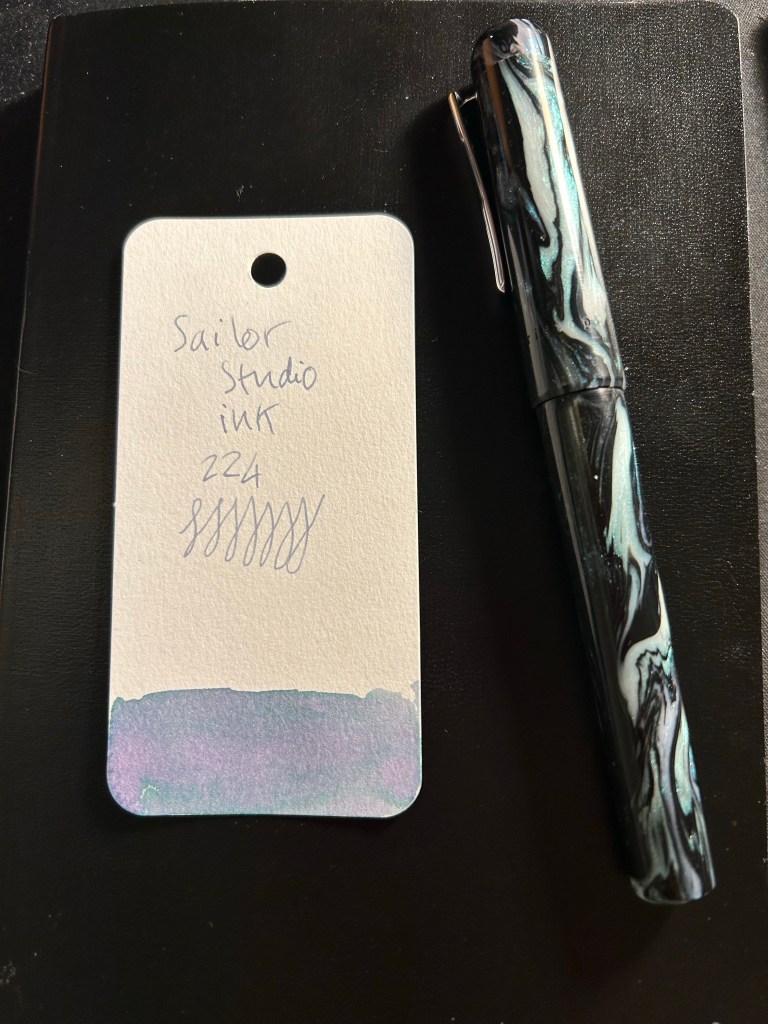
I purchased an extra-fine nibbed pen, and used it for writing and a bit of sketching using the Sailor Studio 224. The 224 grows a bit darker with time, but still features a lot shading and some gorgeous dual colouring. I was worried that it would be too light to be readable, but that was not the case.
Pen and Ink: Sailor Studio 224 ink sample written with the 03 Sparkling Rock
I have a few Franklin Christoph pens and I love the pens that they make, but this is the first Franklin Christoph pen that I have that has a pen clip. So while the model 03 is as well made and well balanced as the other Franklin Christoph’s I’ve tried, I did notice that the finial above the clip had a tendency to screw itself a bit loose sometimes. It never got to the point where it screwed off and got lost, and I doubt that it will, so it wasn’t really an issue, just something that I noticed. The clip is secured to the cap with a screw, and is robust and springy, and completely unaffected by the state of the finial.
Closeup on the finial and clip. My camera has issues with photographing the pen material.
This is the Sparkling Rock 03 as I used it, uncapped and unposted (you can technically post it, but I don’t see why as it’s long enough and clearly better balanced to be written unposted), and it is perfectly sized to be comfortable for long writing sessions. Unless you grip your pen with your fingers right on top of the nib, the two ridges in the end won’t bother you. I found them useful as they helped me position my hand better.
03 Sparkling Rock
The nib unit is a standard number 6 nib, and screws out easily, for both cleaning and swapping out. The pen itself, like all Franklin Christophes, is a cartridge-converter, and comes with a good quality converter.
Franklin-Christoph nib
This brings me to the reason for this review: in a pen market that features ever increasing limited-editions in ever increasing prices, Franklin Christoph offers a refreshing alternative. You can go to their website, find a variety of pen shapes in a variety of resins, know that you are getting a very good quality pen that will be a breeze to clean and maintain, and in many cases to convert to an eyedropper if you so please. And the prices aren’t eye watering. You can even splurge on an interesting nib grind, allow yourself to experiment a little, knowing that in the worst case you can easily swap out a nib on your own. It’s the ultimate fountain pen for those venturing out of the beginner pen group and wanting to experience something better, without paying gold nib prices or going the vintage route. It’s also very tempting to collect more and more of them, as you try out different shapes, sizes and resins, which explains why there are quite a few members in the 50th pen club (after buying 49 FCs you get the 50th, personalized, and for free).