Diamine Inkvent Calendar is an advent calendar with a tiny (7ml) bottle of ink behind 24 windows, and a larger, 30ml, bottle of ink behind the 25th window. All the inks are limited edition, and only available through this calendar. You can read more about the calendar here.
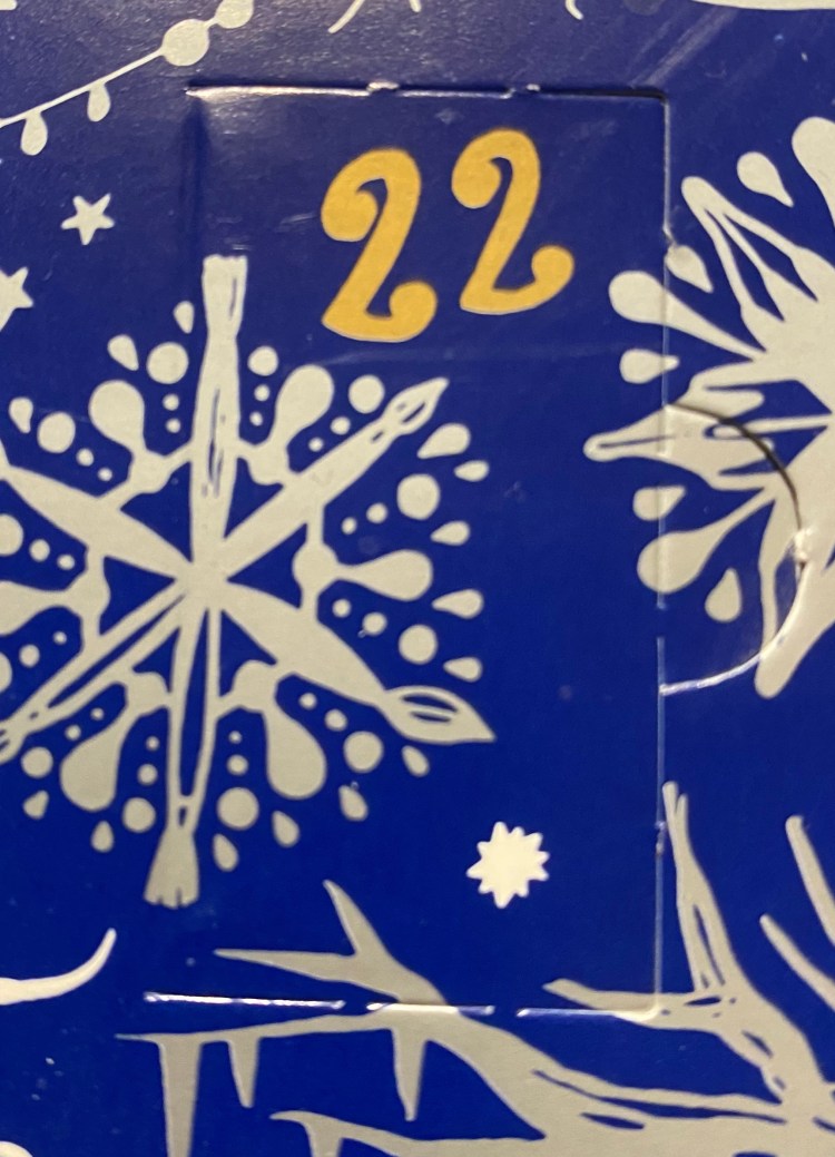
Only 3 days left to the Diamine Inkvent calendar, and after yesterday’s wonderful Fire Embers I can’t wait to see what’s behind door 22.
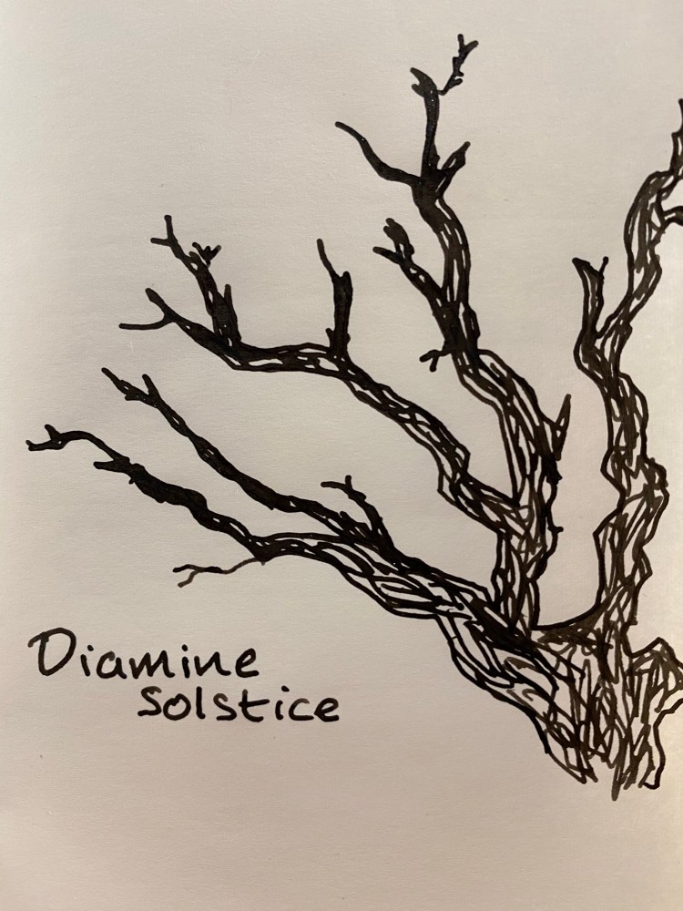
Day 22 is Diamine Solstice a black ink with green shimmer. This is a charming combination, as the basic black ink is deep and saturated, and the green shimmer makes it come to life.
This looks like a fairly normal black, but tilt the page a bit and…
Party time! Subtle yet satisfying.
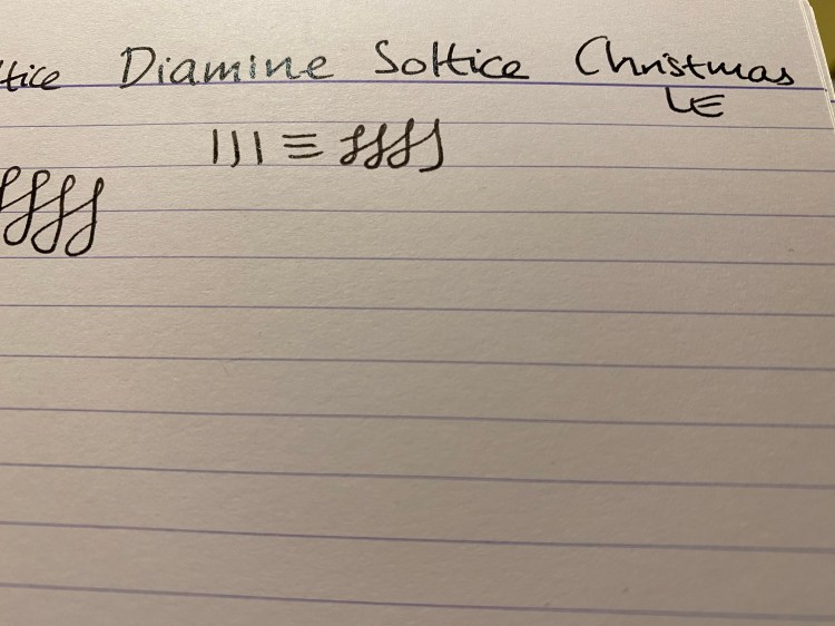
Here it is on Clairefontaine paper:
I love the combination, and I hope that Diamine will offer Solstice as part of their regular lineup.
Diamine Inkvent Calendar is an advent calendar with a tiny (7ml) bottle of ink behind 24 windows, and a larger, 30ml, bottle of ink behind the 25th window. All the inks are limited edition, and only available through this calendar. You can read more about the calendar here.
It’s day 18 and there’s just a week more left to the Diamine Inkvent Calendar. What’s behind today’s door?
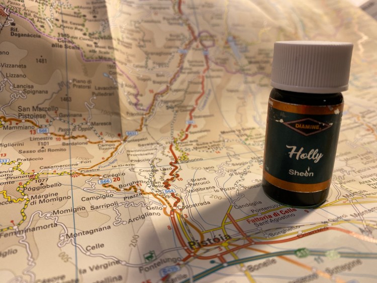
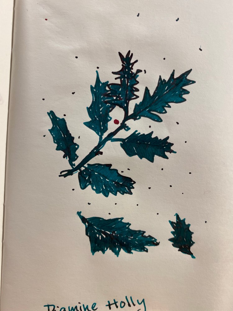
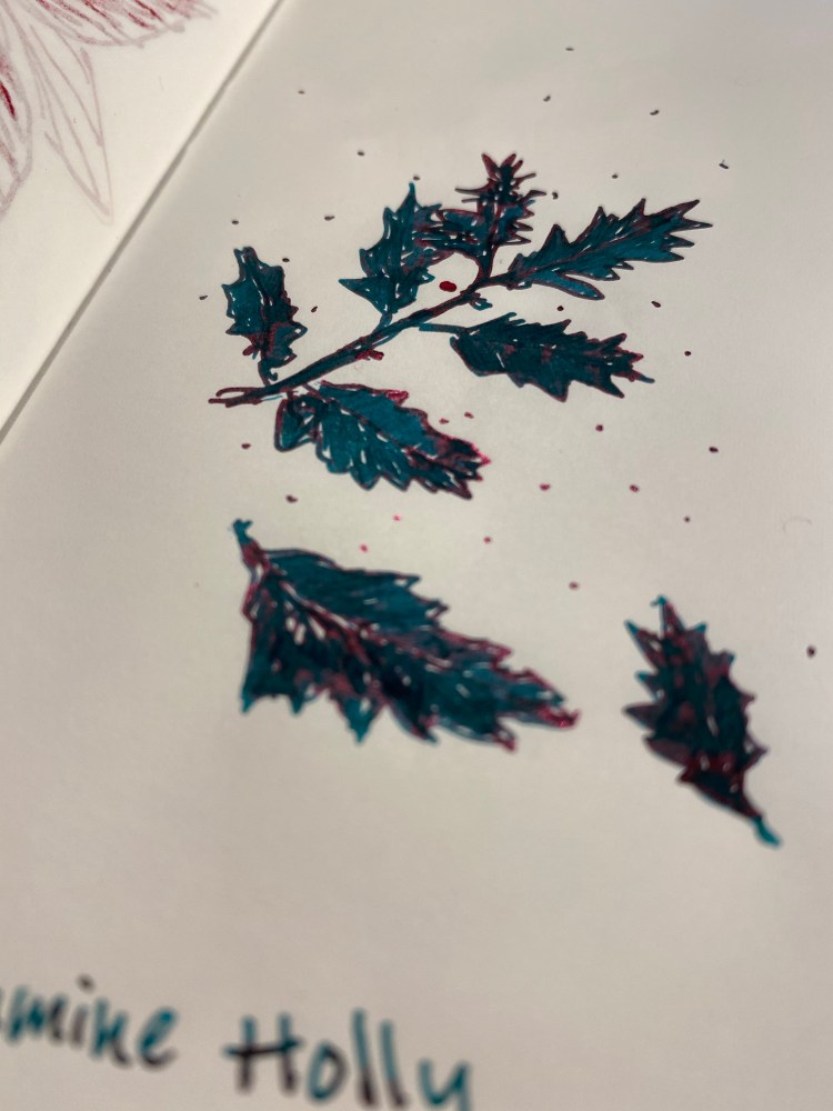
Day 18’s ink is Diamine Holly, a dark green ink with blue undertones with sheen. It’s more green than Diamine Seasons Greetings and has a more standard (and less pronounced) red sheen.
The base colour is beautiful, and I’m only slightly biased because I love teal and blue-green inks. It shades and sheens less than Diamine Seasons Greetings, but you can see more of the base colour because of that, and that’s a bonus in this case.
Where the ink pools, the deep red sheen glows, which means you want to take your time and write slooowly with this ink, preferably with a juicy nib and on Tomoe River paper. This is a great ink for writing greeting cards with, and just to give yourself some holiday cheer.
Diamine Inkvent Calendar is an advent calendar with a tiny (7ml) bottle of ink behind 24 windows, and a larger, 30ml, bottle of ink behind the 25th window. All the inks are limited edition, and only available through this calendar. You can read more about the calendar here.
It’s day 17, and the calendar is full of stars and there’s a nib snowflake on it. This bodes well, right? It’s going to be a phenomenal new ink today, I can feel it.
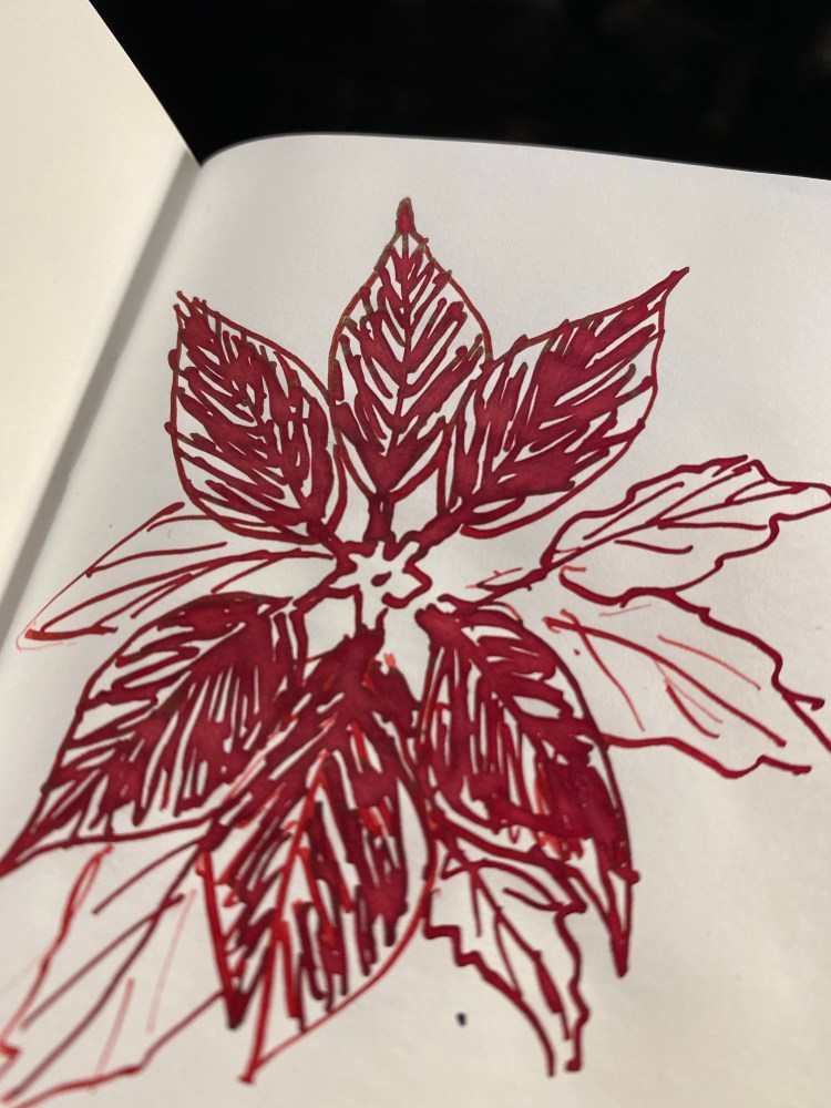
Annd it’s another burgundy red. Day 17’s ink is Diamine Poinsettia and it’s so similar to Diamine Noel that I would have trouble telling the two apart if I saw swabs of them both side by side.
Diamine Poinsettia is a standard ink that shades really well. It will benefit from a broad or italic nib, and Tomoe River paper will of course bring out its best properties.
So much shading, and even outlining.
Despite not being labeled a sheen ink, there is some green-gold sheen present, as you can see at the top of the uppermost petal.
Now compare that to this:
This is Diamine Noel, another burgundy red that’s labeled as a “sheen” ink. While there’s a little more sheen present here, there isn’t an extraordinary amount, and it’s offset by having a slightly darker shade and so less colour variation than Diamine Poinsettia.
I really don’t understand why both of these inks are in the calendar. Diamine could have easily kept just Diamine Poinsettia and given us a festive orange or purple instead.
Diamine Inkvent Calendar is an advent calendar with a tiny (7ml) bottle of ink behind 24 windows, and a larger, 30ml, bottle of ink behind the 25th window. All the inks are limited edition, and only available through this calendar. You can read more about the calendar here.
It’s day 16, and we’re going back to the weird and wild part of the calendar.
Day 16’s ink is Diamine Seasons Greetings and its a gem. It’s a dark teal green with a ton of shading and purple sheen.
Look how pretty it is! It’s such a beautiful and unique colour, it deserves the widest possible italic nib you own and Tomoe River paper to enjoy it to the fullest.
Look at that sheen! If that isn’t festive, I don’t know what is. I would totally buy a 30ml bottle of this ink.
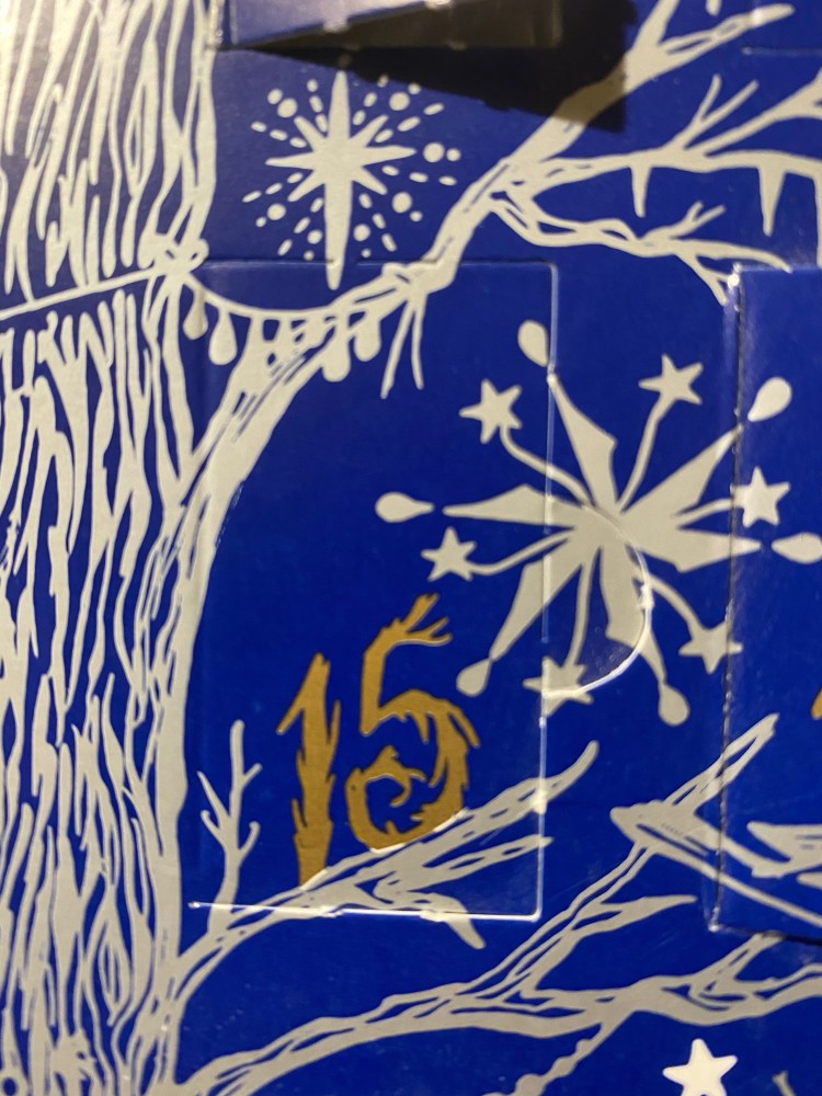
Diamine Inkvent Calendar is an advent calendar with a tiny (7ml) bottle of ink behind 24 windows, and a larger, 30ml, bottle of ink behind the 25th window. All the inks are limited edition, and only available through this calendar. You can read more about the calendar here.
Day 15 is perched on a branch and looks a bit like it. I can’t say this enough: I really love the design of this calendar. It’s so well thought out, beautiful and clever.
Day 15’s ink is Diamine Festive Cheer, a deep, royal blue ink with a purple-golden sheen. It offers less shading and less sheen than Diamine Polar Glow.
It’s a beautiful ink, but it’s a little underwhelming when compared to Diamine Polar Glow, and even the lighter Diamine Jack Frost.
This is a saturated colour, so as much as I trust Diamine, I’m hesitant to use it in vintage pens, just from a cleaning out and staining perspective, but it’s still a nice ink that will probably one of the first ones I finish from the set, just because it’s a pretty practical colour.
Diamine Inkvent Calendar is an advent calendar with a tiny (7ml) bottle of ink behind 24 windows, and a larger, 30ml, bottle of ink behind the 25th window. All the inks are limited edition, and only available through this calendar. You can read more about the calendar here.
It’s day 10 in the Diamine Inkvent Calendar, and so far there hasn’t been a truly weird ink in the bunch. That’s about to change…
Day 10’s ink is Diamine Winter Miracle, a sheen and shimmer dark purple ink. Now, purple is notoriously difficult to photograph, but if you look at photos of Winter Miracle and say to yourself, “huh, it looks almost black”, that’s not a photography issue. Diamine Winter Miracle is a super saturated, deep, dark eggplant purple with some shimmer (much less than Gold Star) and a significant amount of green sheen. It looks like black with an attitude.
You can see some of the silver shimmer on the top, but it’s understated compared to Diamine Gold Star.
Tomoe river paper makes this ink look wild, especially when viewed at an angle to the light.
So much sheen!
Winter Miracle was so unusual that I went ahead and filled a Pelikan Pelikano Up with it. The medium Pelikan nib (that’s a broad for every other maker) really shows off this interesting and unique ink, and it’s dark enough to pass as black at a cursory glance. I even wrote down next year’s resolutions with it.
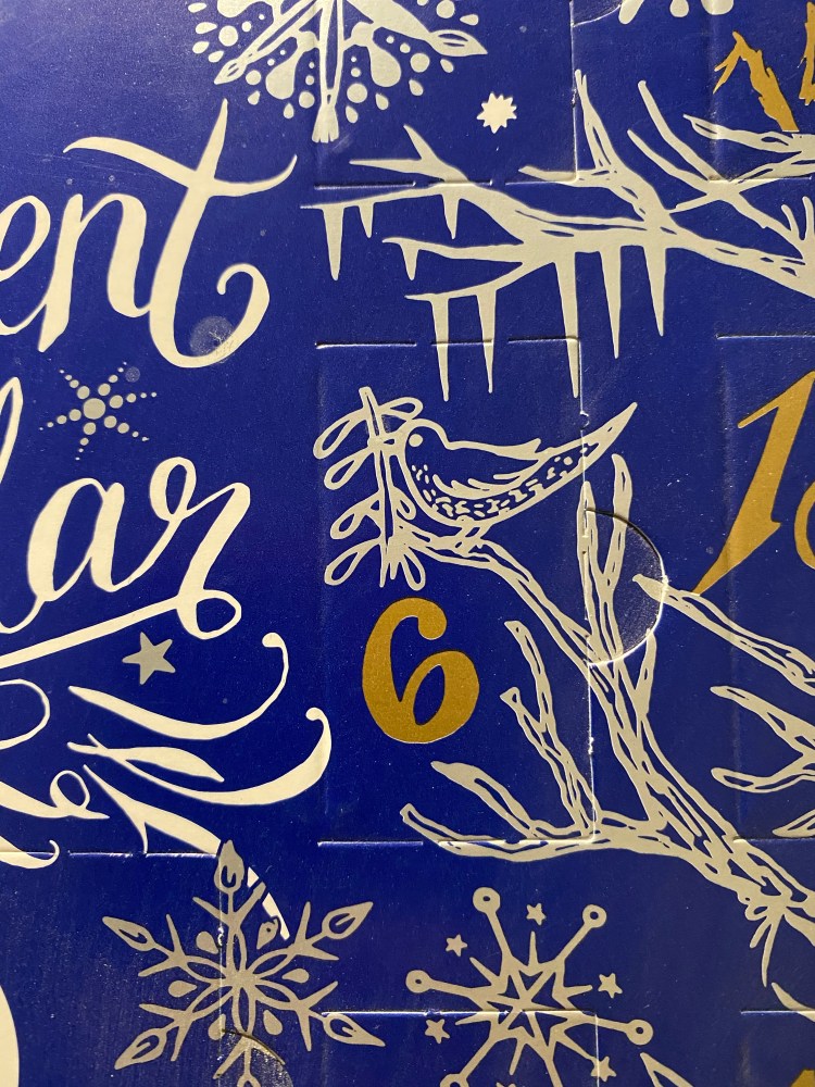
Diamine Inkvent Calendar is an advent calendar with a tiny (7ml) bottle of ink behind 24 windows, and a larger, 30ml, bottle of ink behind the 25th window. All the inks are limited edition, and only available through this calendar. You can read more about the calendar here.
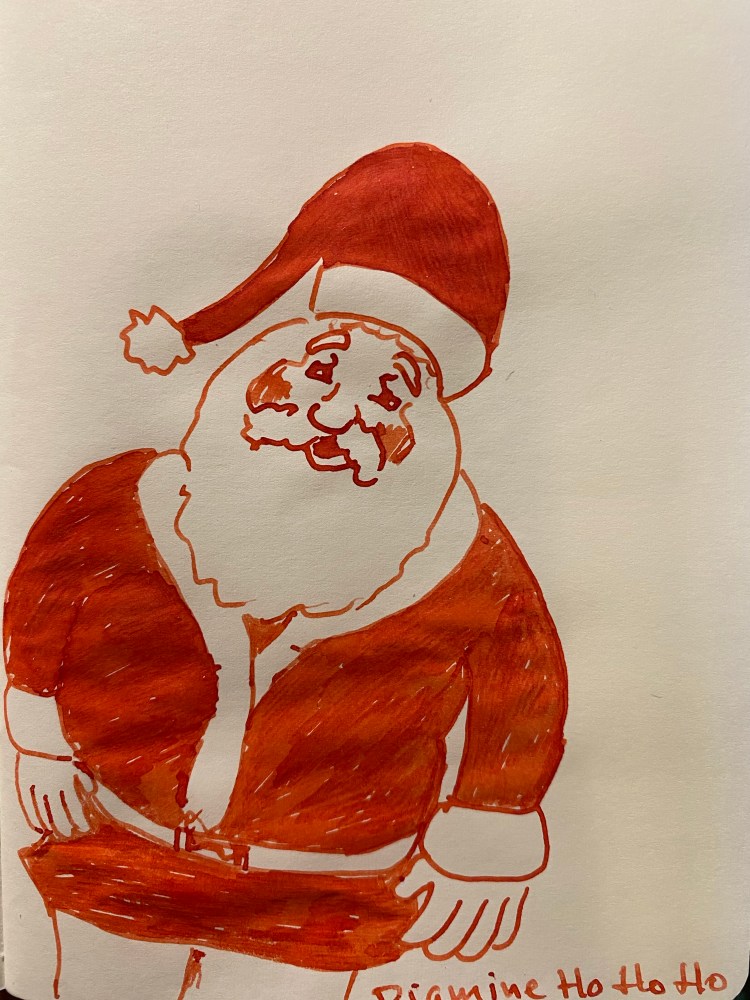
Day 6’s door has a bonus bird, which is nice. It also has the best named ink of the bunch so far. Allow me to introduce you to:
Diamine Ho Ho Ho! This delightfully named ink is a orangey-red that shades beautifully.
Like all the rest of the Inkvent reviews, this was drawn on a Kanso Sasshi 3.5” x 5.5” Tomoe River Paper notebook, which really makes the best properties of each ink shine. Here it’s the shading, that goes from a dark orange to fire engine red, and is really warm and cheery.
This was drawn using a Pelikan Pelikano medium (which should be called a broad, but it’s Pelikan, so hey), and you can see the shading in almost every stroke above. I tried not to draw over the same place twice, just so you can get a better feeling for the shading properties of this ink.
The above was written on Clairefontaine paper, so you can see that the ink shades on it as well. This is a terribly impractical ink for day to day use (you can’t even mark papers with it, it’s too cheerful and bright for that), but it’s an excellent ink for Christmas cards or Christmas themed art.
Diamine Inkvent Calendar is an advent calendar with a tiny (7ml) bottle of ink behind 24 windows, and a larger, 30ml, bottle of ink behind the 25th window. All the inks are limited edition, and only available through this calendar. You can read more about the calendar here.
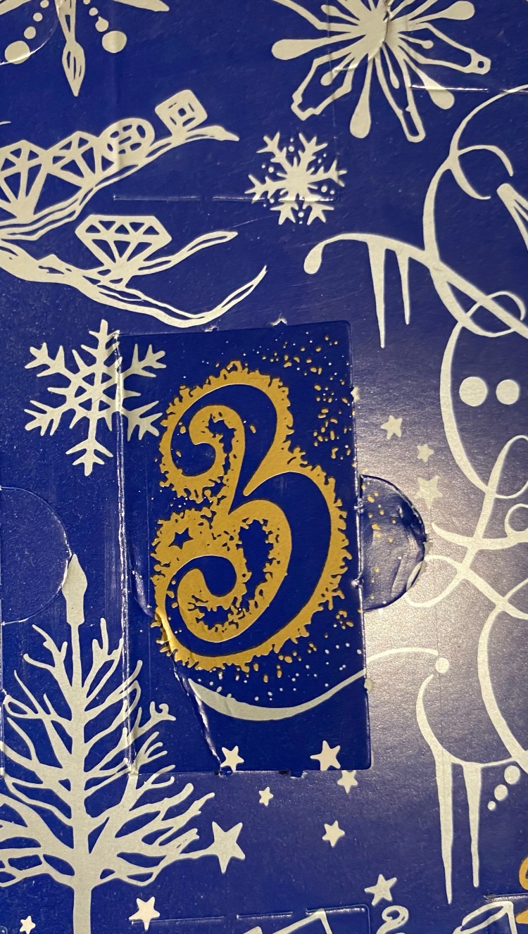
Don’t you just love the design on these? Diamine did a fabulous job with the packaging of this calendar.
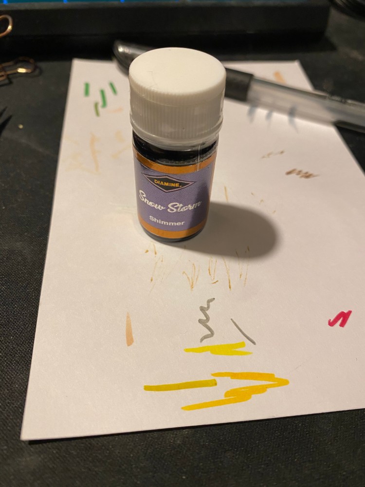
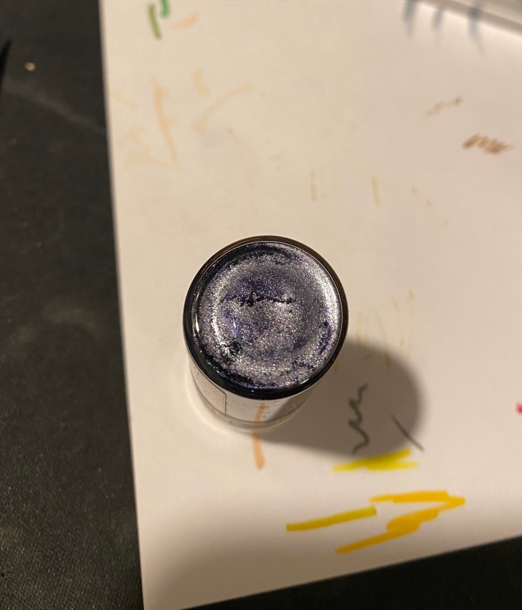
Day 3’s limited edition Christmas ink is Snow Storm. It’s a shimmer ink, with a lot of silver particles, much more than day 1’s Blue Peppermint. This is how the bottom of the bottle looked like when I took it out from it’s little nook:
This is definitely an ink that you’d want to thoroughly shake before using.
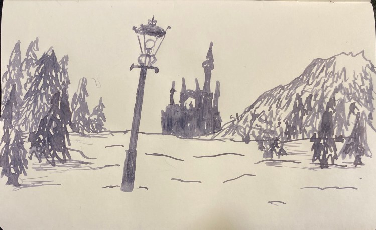
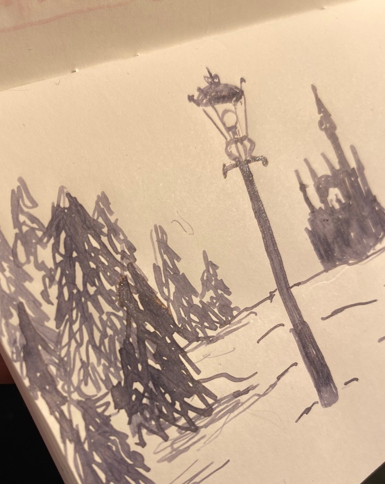
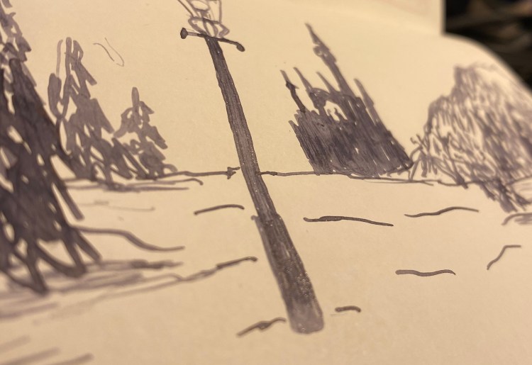
Lantern Waste, “The Lion, the Witch, and the Wardrobe”, C.S. Lewis.
Diamine Snow Storm is a grey ink that looks a lot like Diamine Graphite, if you dumped a whole sack of silver glitter on it. It also shades and outlines like mad. Diamine certainly went all out on this one.
Look at all that glitter. There’s so much of it, it sheens.
This was drawn on a Kanso Sasshi 3.5” x 5.5” Tomoe River Paper notebook using a vintage Swan broad italic nib (dipped in the ink, because boy did I not want to clean this ink out of a lever filler), and this combination shows the properties of this ink beautifully. Diamine really proves that grey doesn’t have to be boring .
I’m not a big fan of shimmering ink, but Diamine Snow Storm is so wild, with it’s shading, outlining and silver particles, that it makes me smile. It would be a good replacement for silver gel ink pens, when it comes time to write greeting cards.
Diamine Inkvent Calendar is an advent calendar with a tiny (7ml) bottle of ink behind 24 windows, and a larger, 30ml, bottle of ink behind the 25th window. All the inks are limited edition, and only available through this calendar. You can read more about the calendar here.
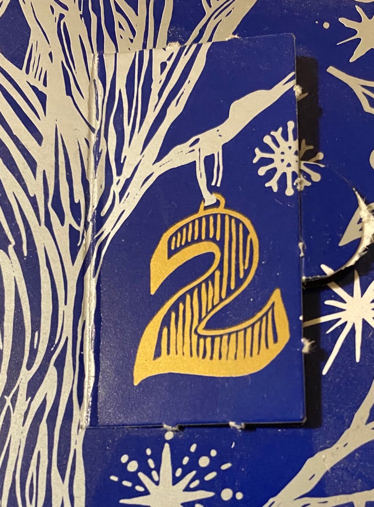
So what’s behind door number 2?
Day 2’s limited edition ink is Diamine Candy Cane. It’s a standard ink, midway between Diamine Amaranth and Diamine Coral, both excellent and unique pink inks. This ink shades a lot, even in a fine Lamy Safari (Coral) pen. It’s a dark enough pink to be readable, but still not something that I would recommend for an office setting. It’s great for personal correspondence, Christmas cards, and journalling.
The bottle is so tiny and cute.
The bottle is made of glass and is delightful, but a bit impractical for use. You need a cartridge converter or a syringe to fill a pen with this ink, or you can just use it with a dip pen or a brush.
Look at that shading! Yes, this was drawn on a Kanso Sasshi 3.5” x 5.5” Tomoe River Paper notebook, and Tomoe River paper makes everything pop, but even on “regular” Rhodia paper you can notice the shading. That’s not always true for such bright and light shades, like pink or coral.
If you enjoy the looks of this ink, I think that there’s a good chance that you’ll love Diamine Coral (it’s such an optimistic colour) or Diamine Amaranth (which is also a delicious looking ink, but darker than Diamine Candy Cane).
The Waterman Phileas was my first fountain pen, one that I bought after careful research on eBay, shortly after they were discontinued. It cost me £15 at the time, a small fortune for me, and the most I had ever spent on a pen. My RSI was at its worst, and I had to take a lot of notes (I was still in the university), so I splurged mostly out of desperation. Internet research brought up fountain pens as something that could possibly help with my RSI, and so I decided to give it a try. I found the Fountain Pen Network and combed the boards for information about fountain pens for newbies like me. Two pens kept coming up as good first fountain pens to buy: the Lamy Safari, and the Waterman Phileas. It was relatively newly discontinued by Waterman, and so I could find it easily and buy it NOS from a reputable seller. It’s been over 11 years since I bought it, and it’s still one of my favourite pens, and one of my most frequently used ones.
Look how pretty this pen is!
The Waterman Phileas is named after Phileas Fogg, Jules Verne’s “Around the World in 80 Days” protagonist. It comes in blue, green, red and black, and is cartridge converter pen with a large two-tone steel nib. The nib and pen have an art deco look to them, and the pen is also designed to look somewhat like a cigar. It’s a classic “fountain pen” look that makes it appear more expensive than it is, and it’s part of the reason why you’ll see it popping up in various commercials, even to this day. It’s a very beautiful and elegant pen that just looks classy.
Unlike it’s cheaper sibling, the Waterman Kultur, the Phileas has a brass insert in the body, which means that it has got some heft to it, weighing (filled, with a converter) 24g, as opposed to the Lamy AL-Star’s 22g (filled, with a converter). The weight is perfectly balanced for writing, especially for beginners, since it encourages you to lay off putting pressure on the pen. The pen let you feel that it’s putting the pressure on for you.
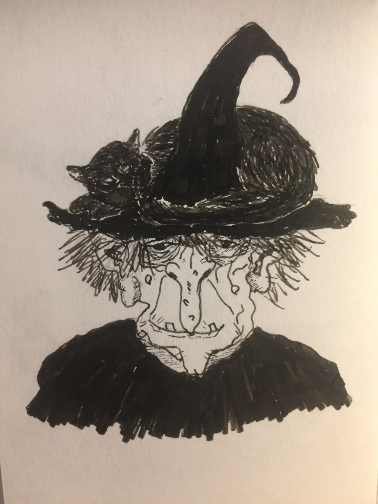
The look of the Phileas is phenomenal, especially for the price, but it’s the nib that made me fall in love with it specifically and with fountain pens in general. I chose the extra fine nib, and it is nothing short of magical. Take a look for yourself:
From hairline to European fine – the Phileas line variation at work.
Yes, that’s line variation. No, it doesn’t come from applying pressure to the nib. It works like a less extreme Sailor Zoom nib: vary your writing angle just a bit and it will go from 0.4 mm lines to 0.7 mm ones. The nib is also smooth, but gives a little feedback, which reminds me a little of the feedback you get from using a really good pencil. Couple that with the fact that the Phileas is a cartridge converter (with a sizeable converter), and so very easy to clean, and you’ll understand why this is still my favourite sketching fountain pen.
Drawn with a Phileas, except for the witch’s cloak and hat.
The Phileas accepts long international cartridges, and Waterman is one of the few makers that make those cartridges. They excellent (especially the blue-black) and very convenient when travelling with your fountain pen.
Look at that nib! It’s hard to photograph, but it’s such a great design.
Which brings me back to the beginning of my story. It’s 2019 and I have a substantial collection of fountain pens, most of them costing well over 10 times what the Waterman Phileas cost me. None of them are 10 times the Phileas as a pen. I could have stopped here, but the Phileas has proven to be a gateway into fountain pen madness for many people over the years. It’s a pen to fall in love with, in a way that I haven’t ever fallen in love with my Lamy’s, good-though-they-are. Its design is classic and timeless, and its quality is unparalleled for the price (yes, even today).
SO WHY HAS WATERMAN DISCONTINUED IT? WHY? WHY?
This should have been their Lamy Safari, TWSBI Eco or Pilot Metropolitan – a more classic version of the beginner’s fountain pen, as opposed to the other’s more modern design. It boggles my mind that they not only discontinued the Phileas, but also it’s cheaper cousin, the Kultur. What on earth are they doing over there? Do they not want new people to fall in love with their pens? It’s the same weird move with their ink line (their refusal to jump on the limited edition/shimmer/sheen ink bandwagon), but even more baffling. YOU WOULD SELL THESE WATERMAN!
So frustrating.
Anyway – if you can get your hands on a Waterman Phileas for a reasonable price, I highly recommend it. It’s a charming pen that will never go out of style.