Zebra 301 A Ballpoint Pen Review
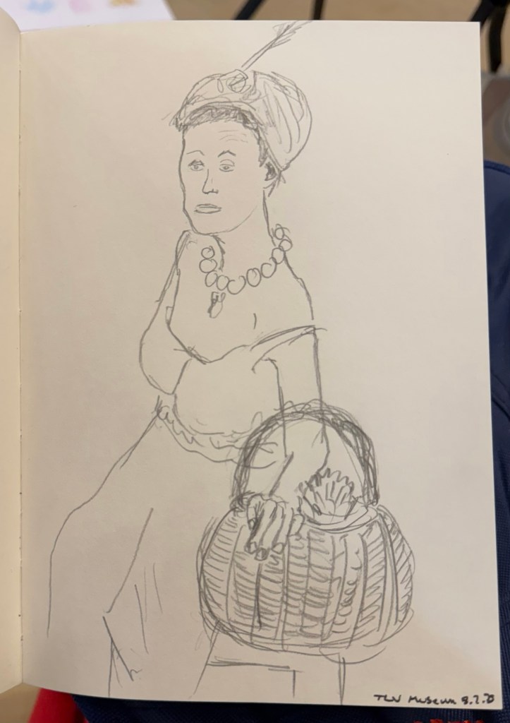
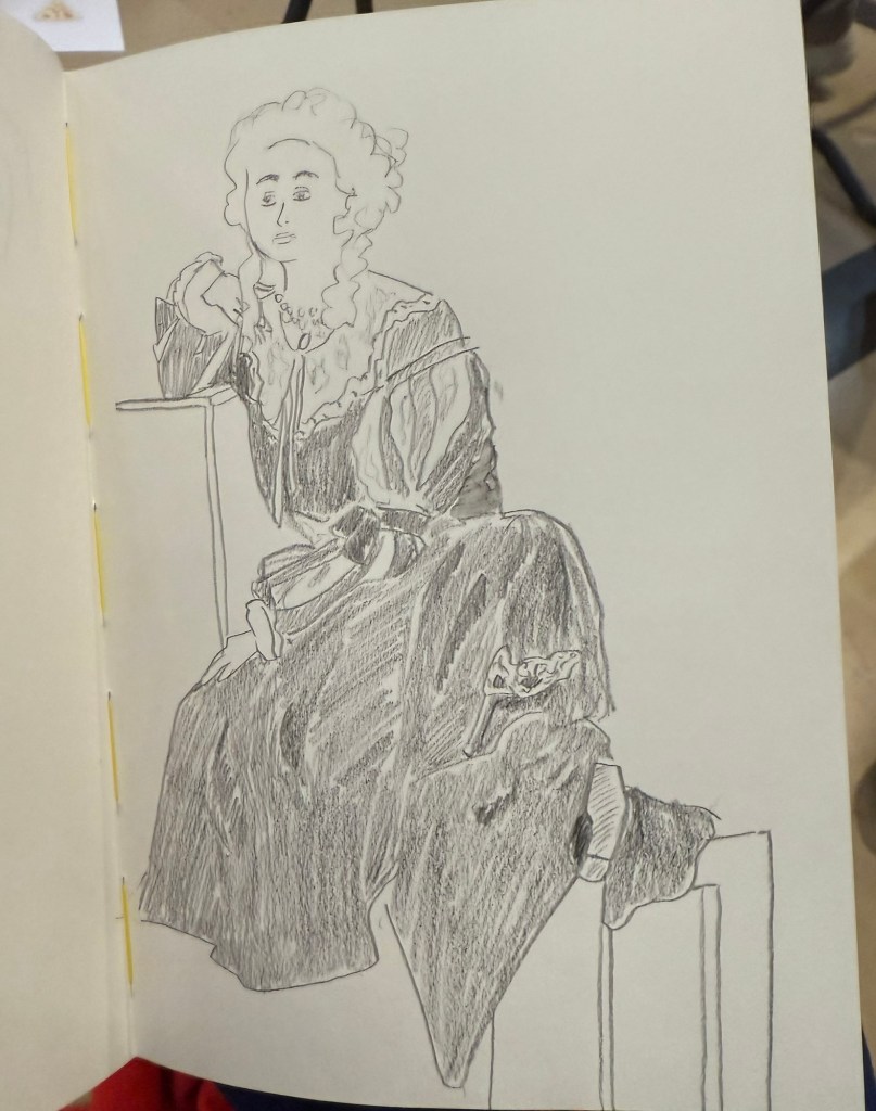
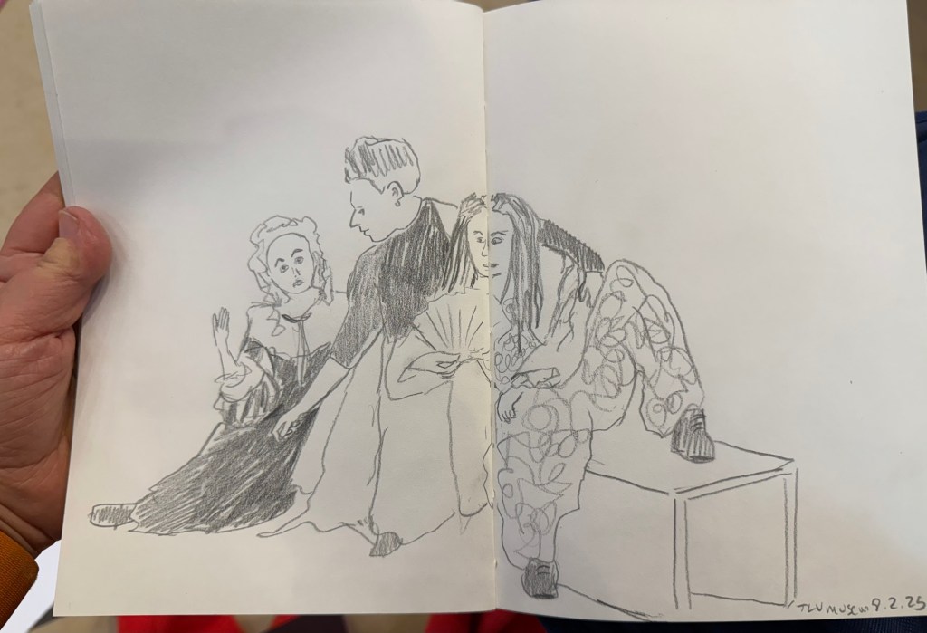
I mostly use fountain pens when I write. If not fountain pens then gel ink pens. I rarely write in pencil, but I often sketch with pencils, and sometimes when I plan, I pencil things in. Pencil is great for writing impermanence, even though pencil marks last longer than pen ones – unless erased.
Yet there’s always a ballpoint on my desk and in my bag. I don’t like writing with ballpoint – the lines are as dark as I prefer, even with hybrid ballpoints like Uniball Jetstreams, and they oftentimes streak and blob. So why do I have a ballpoint at hand at all times?

Because ballpoint pens are a useful tool. The ink is waterproof , they’re good for signing things, and they’re robust enough to handle being tossed into a bag or a pocket. Ballpoint pens are also good for sketching – you can get a decent amount of shading and character with them (providing you don’t use a Jetstream).
One of the best bang for your buck ballpoints is this pen:

So why do I like the Zebra 301 A BP 0.7?
- It’s made from aluminium, so it’s light and ultra durable. It also wears really well.
- I love the pen body design and colour.
- The grip and click mechanism are good: well designed and well made. You get a decisive click from this pen, and the plastic grip has enough texture to it to make writing as comfortable as possible without all the lint gathering, stickiness and durability issues of softer grips.
- No tip wiggle.
- It comes with a good, dependable, black refill that is replaceable.

I like the Zebra 301 A BP enough that I bought a large box of them and I frequently give them away as gifts. People like getting nice pens and if you’re used to cheap, plasticky, disposable ballpoints it’s nice getting a pen that’s a grade or two above what you find in the office supply cabinet.

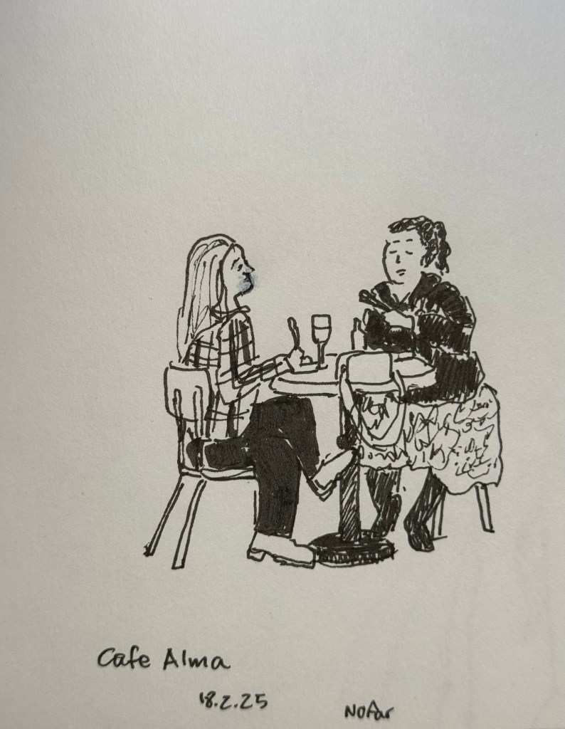
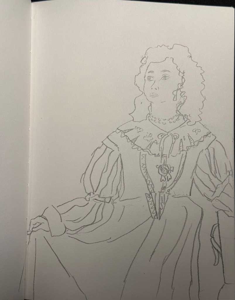
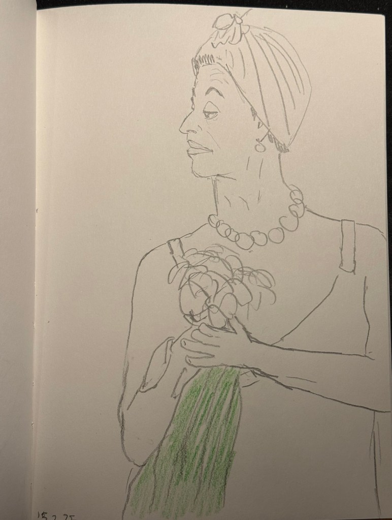
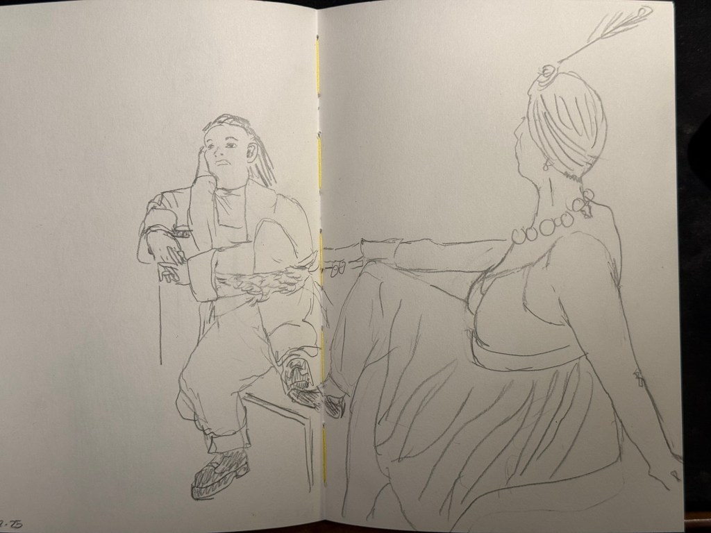
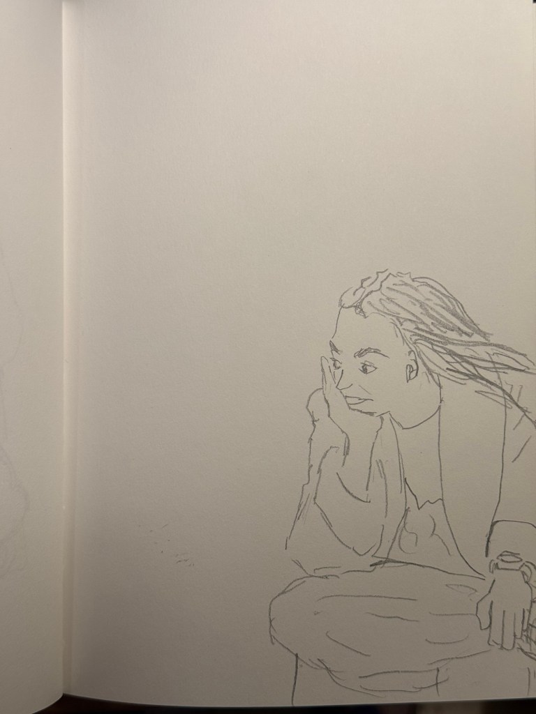
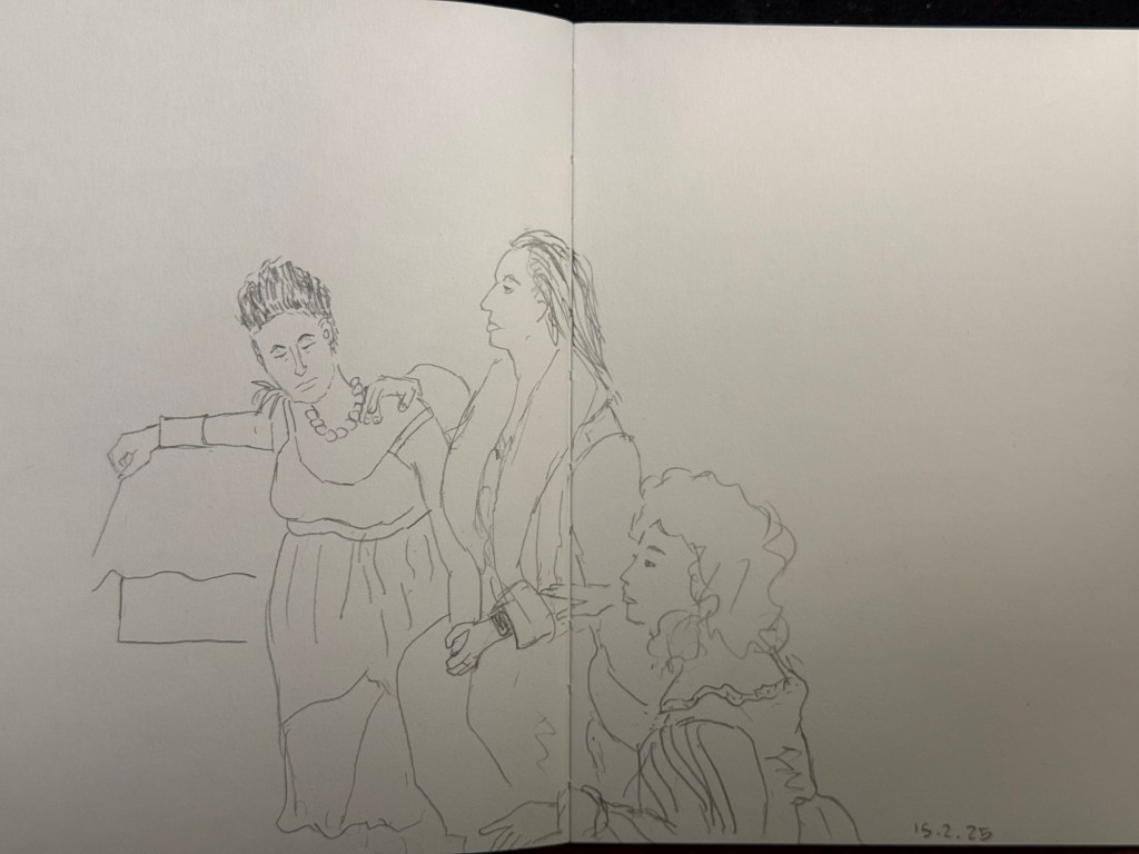
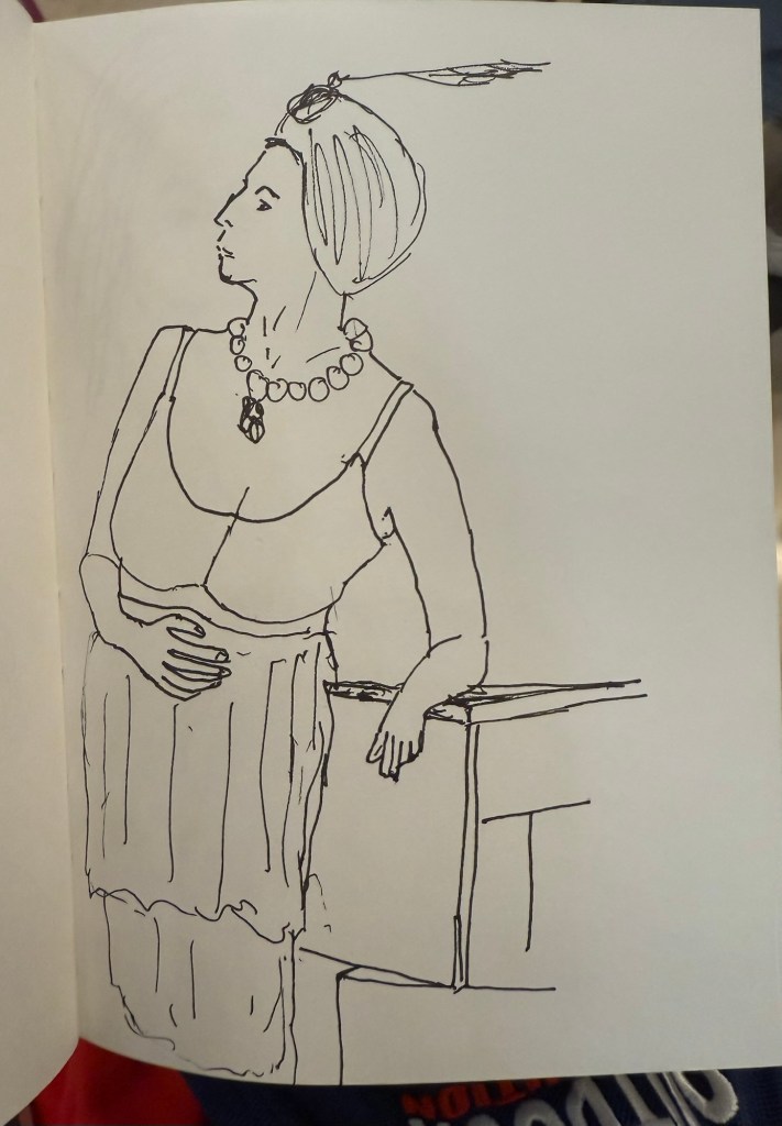
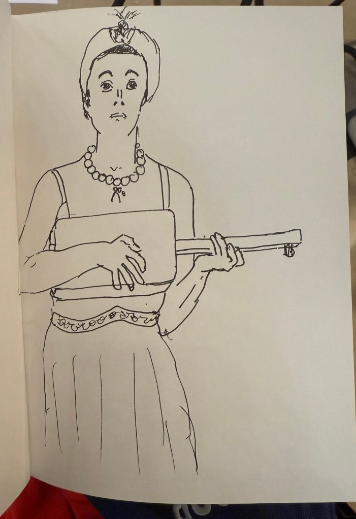
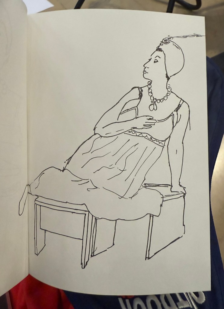
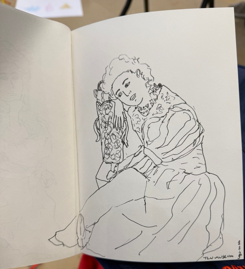
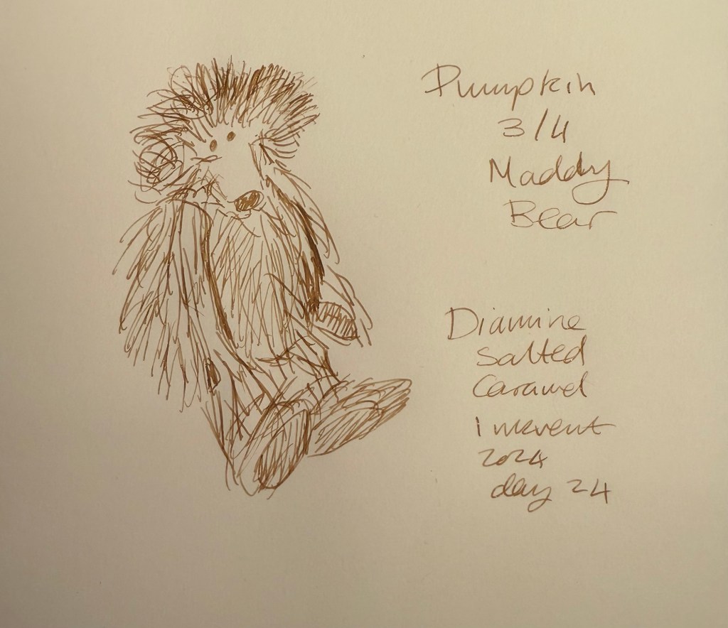
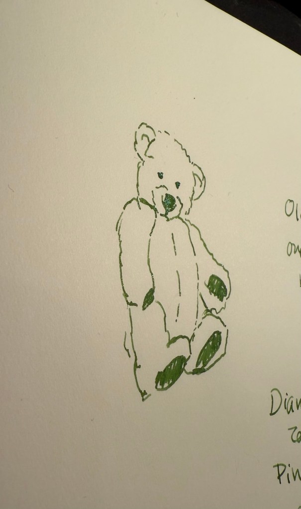
Here’s a quick sketch done with a Zebra 301A BP 0.7 on a Field Notes Sketchbook. Ballpoint pen sketching isn’t my favourite technique, but it is a very useful technique for quick urban sketching.