Paris London 2025 Part 2
In September I traveled to Paris and London. See part 1 of my travelogue here.
I went to see two plays in The Globe theatre in London. The first was a one night only performance of Midsummer Night’s Dream that was a reenactment of how the actors in Shakespeare’s time would have performed a play. The actors didn’t rehearse the play beforehand, and they didn’t have the full text of the play to work with, just their lines and their cues and staging directions. They practiced the dances alone, and they had no idea what their fellow actors would do during the performance. Now this is Midsummer Night’s Dream so all the actors and everyone in the audience knew exactly how the story unfolds, but the lack of rehearsals made this a very live performance.
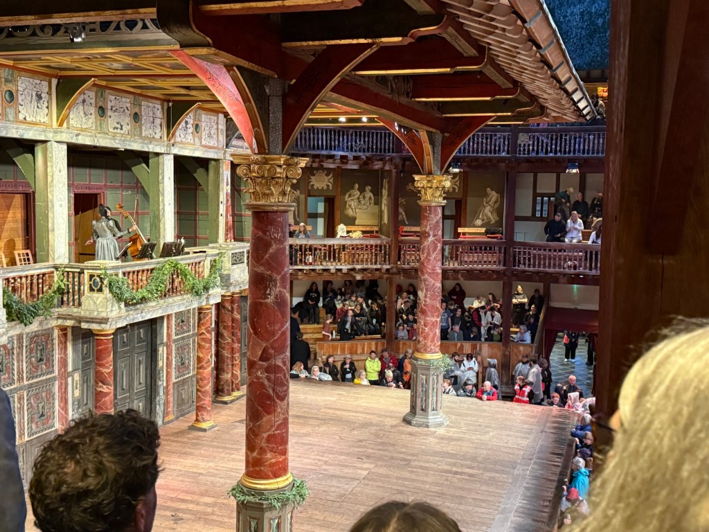
The play was sold out in minutes and I’m glad that I managed to get tickets at all. It was an amazing experience. As this was a one night performance the stage was the bare Globe stage – nowhere to hide as the audience surrounds the actors practically from all sides. There was a lady on stage in period costume, sitting with the full text and helping actors in the very few times that they fumbled. The energy was beyond description. It was the most electric staging of Shakespeare that I have ever seen. Everybody was “on” all the time because they weren’t entirely sure what would come next.
It was a raw performance – I later saw another, standard Shakespeare play there and it was much more polished because it was clearly rehearsed and performed several times before we saw it. Yet that was what made this performance so special – the actors’ reaction to their fellow actors was genuine and unvarnished. They were having fun, improvising, owning the text in a way they normally never do. The highlight was the play within the play at the end – seeing the actors laugh to the point where they had trouble saying their lines because Bottom was so very, very hilariously over the top was amazing.

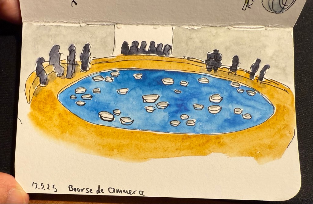
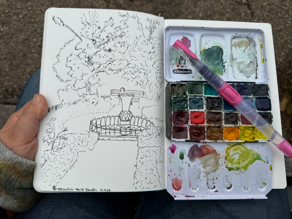
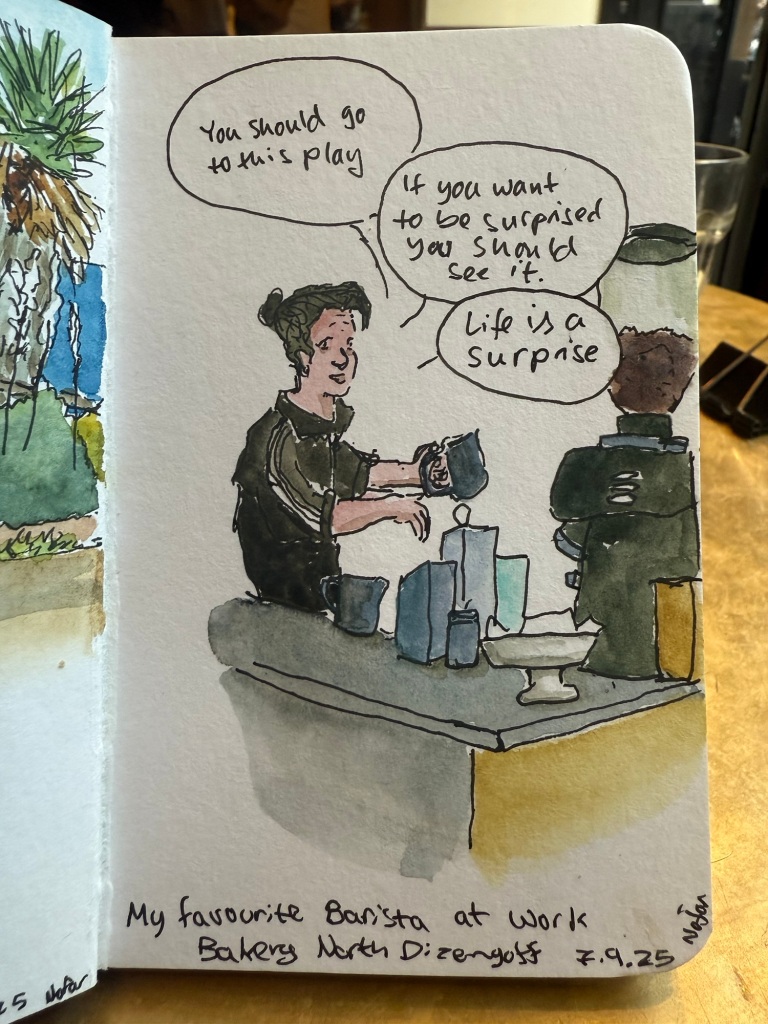
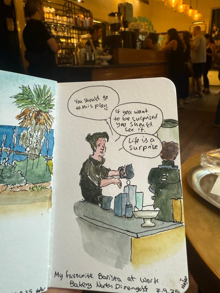
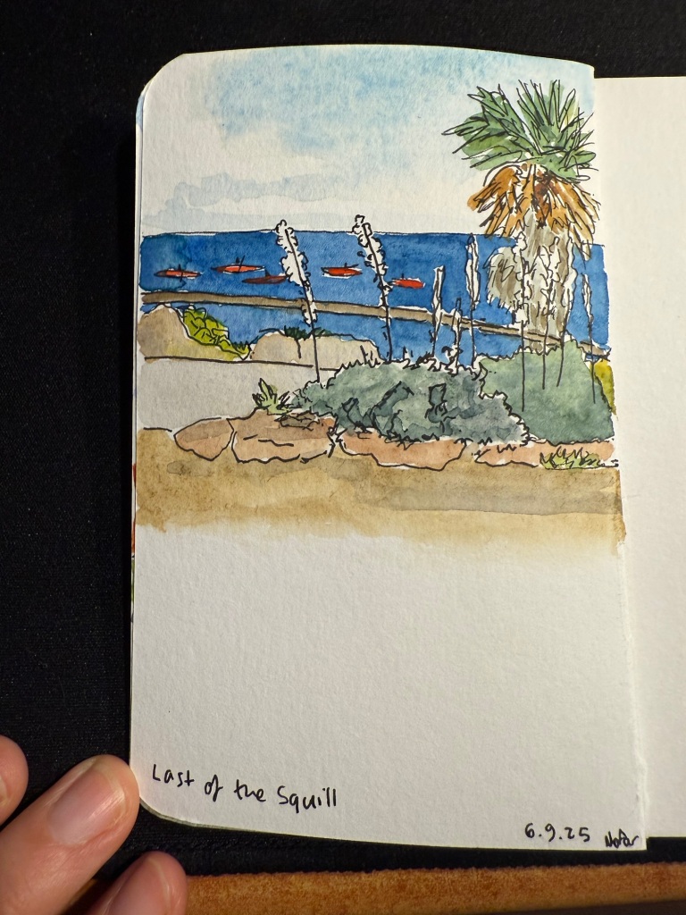
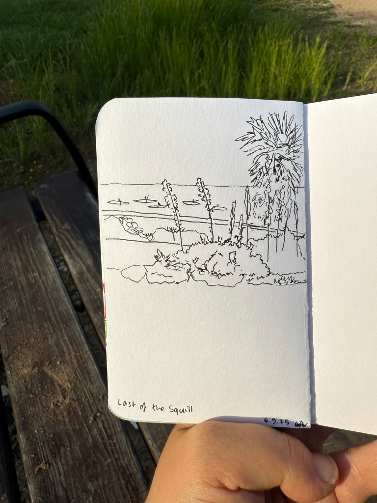
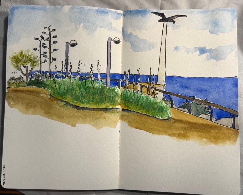
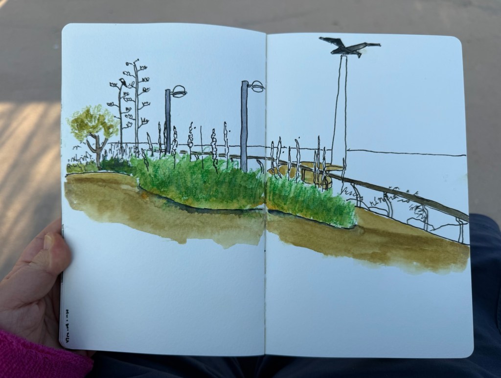
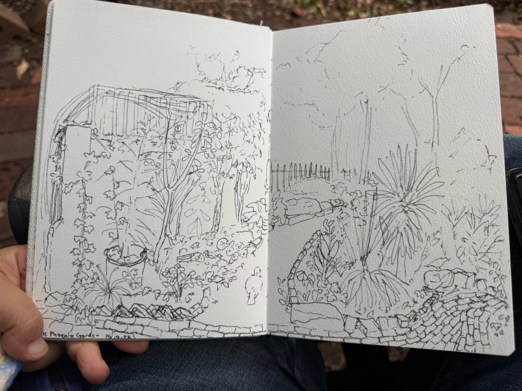
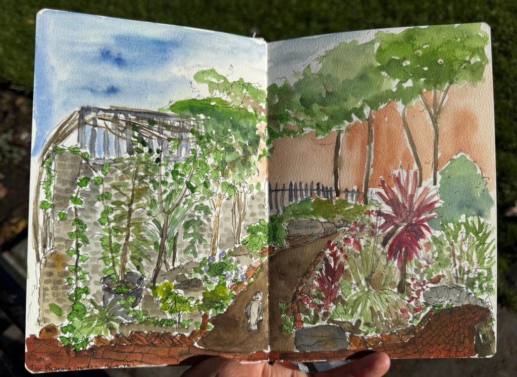
One of my favourite places in London is the Phoenix community garden. I spent a lot of time there, and sketched it several times. This was my first and longest sketch of the garden, done on the wonderful Etchr Lab cold pressed watercolour sketchbook:
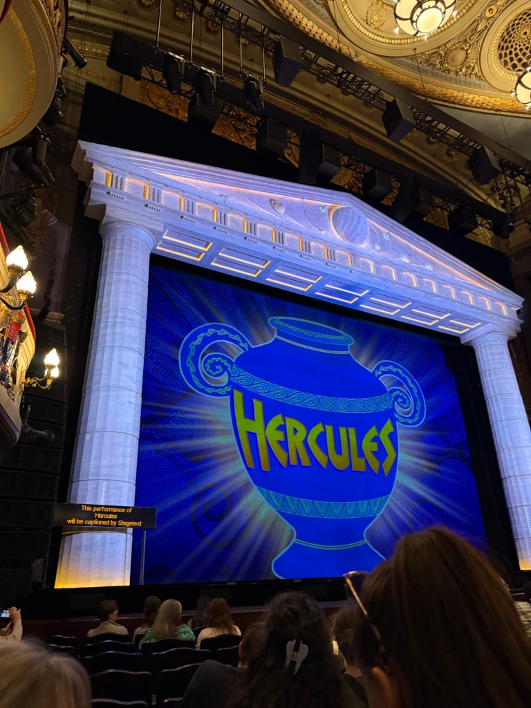
We went to see Disney’s Hercules – a new musical in West End. I wasn’t expecting much as I’m not a fan of the movie, but the musical was one of the best that we saw in the London. The production is stunning, the music is great, the actors were talented – particularly Megara – and the only minus is that Hades was a bit over the top even by the movie standards. They would do better to cut down on the amount of his jokes because they lose their impact otherwise. The Disney merch machine was out in full force that night, and I was one of only a handful that didn’t leave with something from their store.
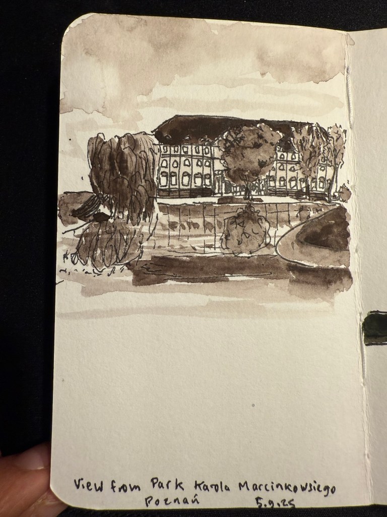
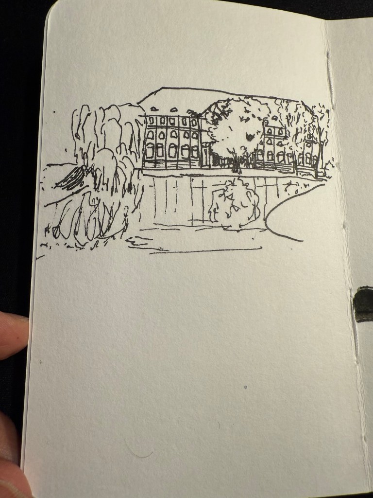
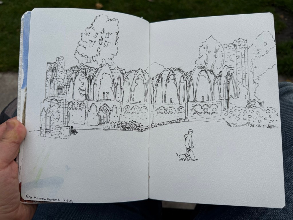
We spent a day in York, and I started it with a sketch of the York Museum grounds, also in my Etchr Labs watercolour sketchbook:

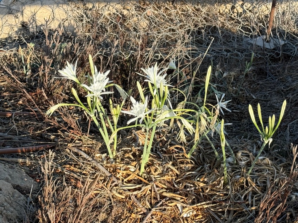
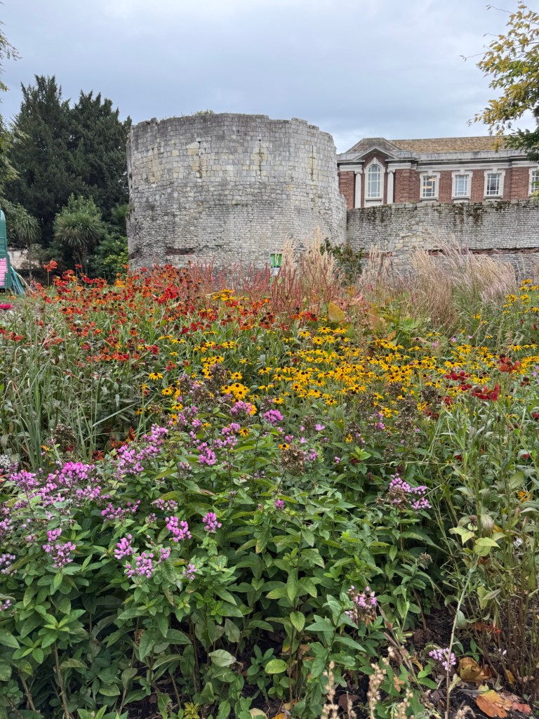
York is full of wonderful bits of history that are just layered freely on each other:
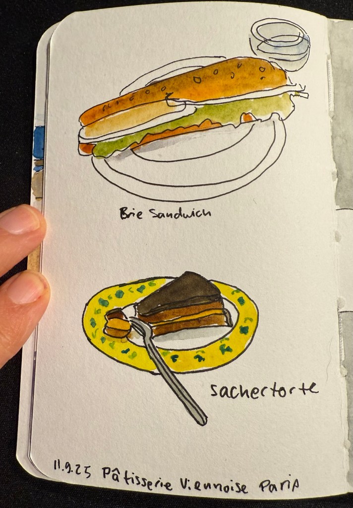
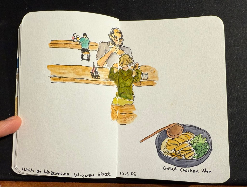
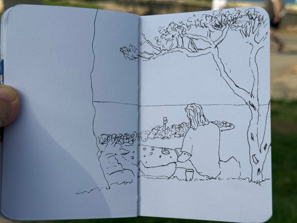
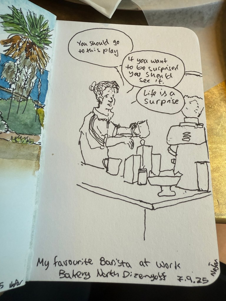
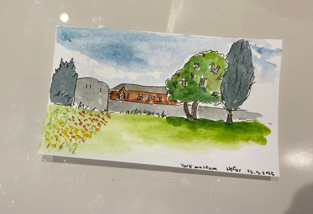
I did a very quick sketch of this scene later on, on an Exacompta Bristol card:
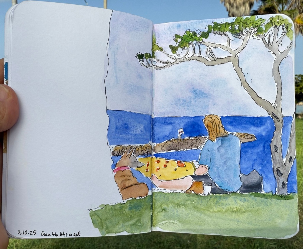
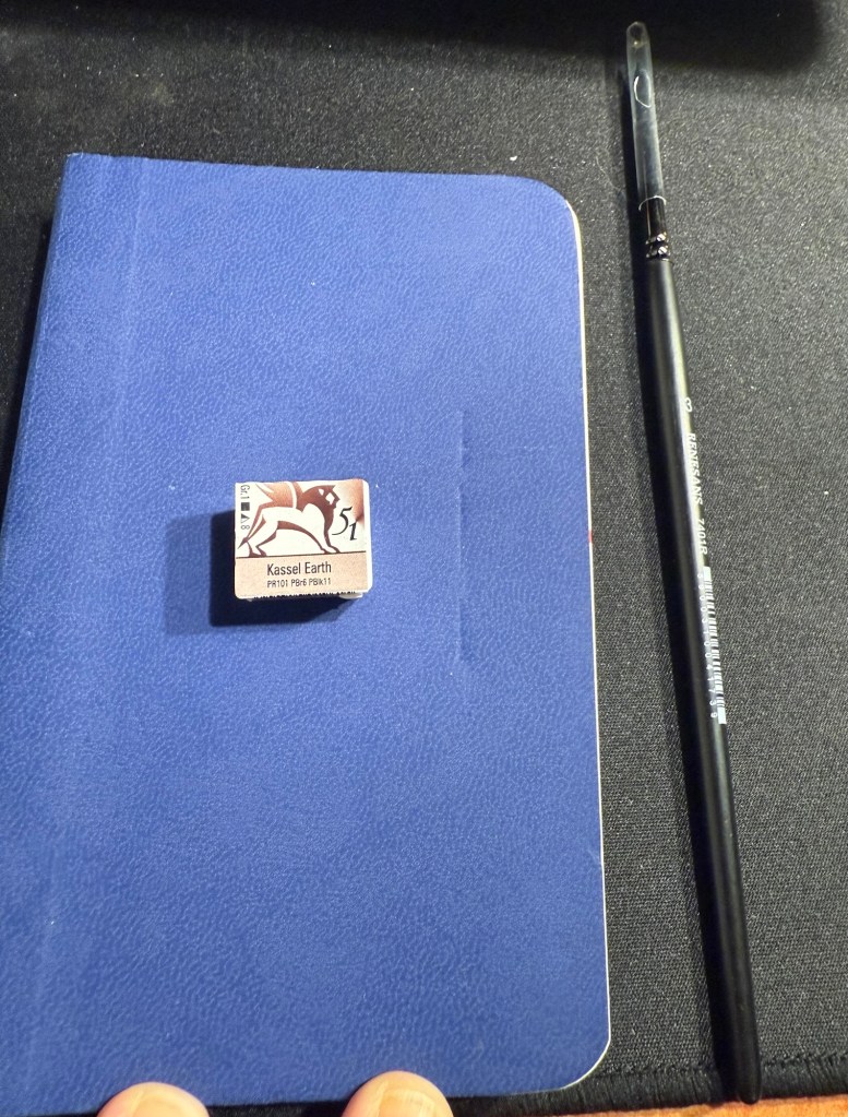
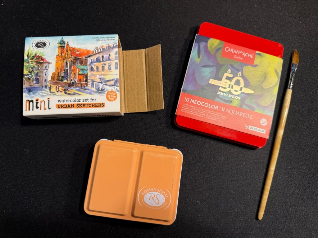
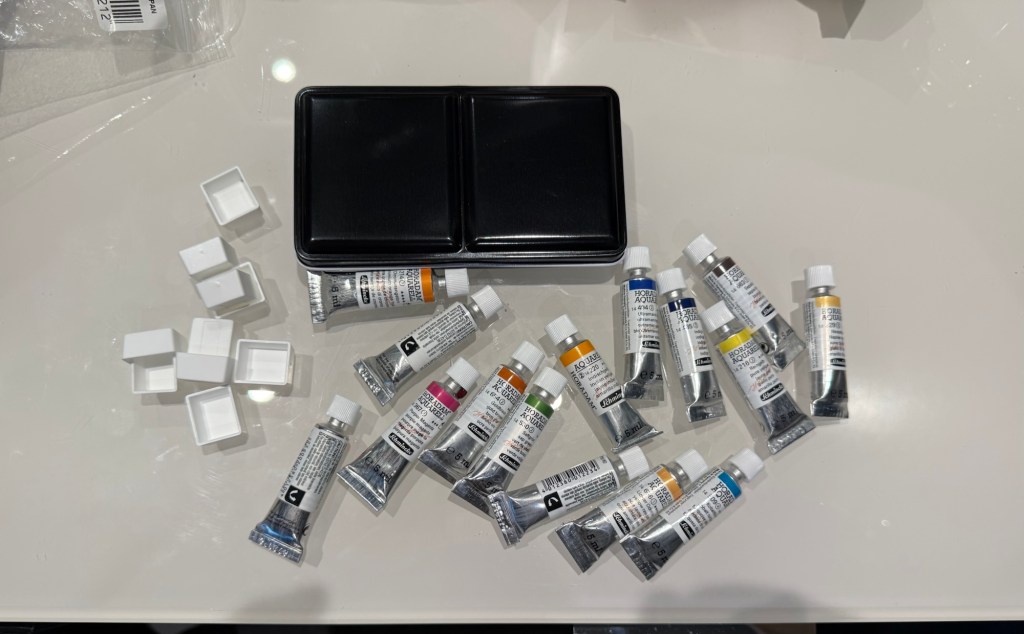
I also bought a decent amount of watercolour paints – enough to build out two new palettes that I want to try.
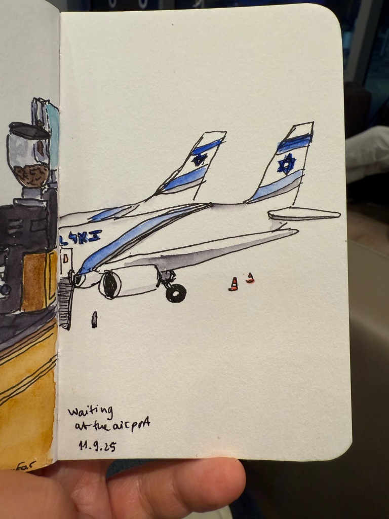
This post is getting long and photo heavy, so I will be completing this trip journal in two additional posts.
Edit: you can read part 3 here.