Property Damage: A Deleter Neopiko Line 3 Review

Property Damage

I have been using the Deleter Neopiko Line 3 felt tip pens for a while now as my journal comics pens, just to try them out. I didn’t bother buying all of the lineup (pro tip: you never need all of the tip sizes in felt tip pens), instead choosing to focus on the tip sizes that I would use the most.

The cat logo is cute.

First thing first: the barrel design. These are wide enough and light enough to be comfortable for long use, but otherwise the Neopiko Line 3 has a terrible design.

You can’t tell which pen is which without looking at the cap, which is a fatal design flaw in these kinds of pens. I normally use several felt tip pens at the same time, and can oftentimes accidentally cap one pen with another one’s cap. That’s no big deal with the Staedtler, Copic or Faber Castell felt tip pens, as you just look at the pen body when using them to know which is which, but you just can’t afford to make this mistake with the Deleter Neopiko’s. You won’t mix up the 2.0 with the 0.2, but try telling between the 0.3 and the 0.5 when you’re in the middle of a drawing.

Another design drawback is also related to the cap: it’s requires a lot of force to use. This means that you can’t easily cap it with one hand, and if you draw to any extent with felt tips you know how bad that is.

These two choices on Deleter’s part meant that when I was using these pens I had to change my drawing method, working not panel by panel as I usually would, but pen by pen. You’ll see what I mean in a moment, when I review each individual pen.

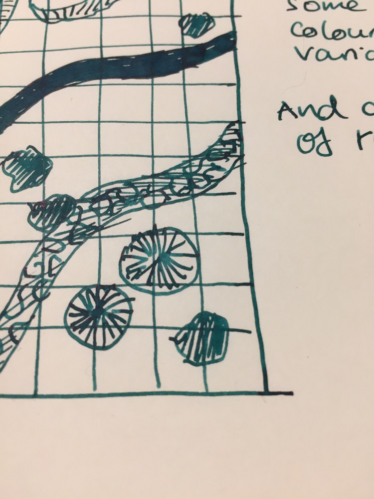
The Deleter Neopiko Line 3 comes in the following tip sizes: 0.03, 0.05, 0.1, 0.2, 0.3, 0.5, 0.8, 1.0, 2.0, and Brush. These are pretty common tip choices in this kind of pens, with perhaps only the 2.0 tip size being unique to Deleter. I recommend not buying the 0.03 or 0.05 because they are much too fine (in any maker), and skipping the 0.2, as these pens do allow for some line variation (as all felt tips do), so you won’t be able to tell the difference between the 0.2 and the 0.3 in use.

To showcase the pens in use, I decided to create a journal comic and show step by step how and when I use each of these pens.

The Deleter Neopiko Line 3 2.0 pen is what made me try out this pen lineup. It’s a fun and unique tip size that’s just perfect for comic borders or if you like big, bold lines in your drawings. This is the only pen in the Neopiko line 3 lineup that I recommend buying, despite the barrel design flaws.

The 0.8 tip size got very little use in my first journal comics with this set. Normally I would use this tip size for the panel borders, but I was using the 2.0 for that, so I had to remind myself to use it in other places. This is my least favourite of the lineup, as it was scratchy and gritty, and offered a lot of resistance, especially when drawing vertical or rounded lines. It was as if the tip had split, although in reality it hadn’t.

The 0.5 Deleter Neopiko Line 3 (wow to Japanese companies like long names for their products) is one of their most useful tip sizes. You can basically do with the 0.5 and the 0.1 for very fine detail, and the 2.0 for absolute fun, and you’re set for 99.9% of what you’d need for comic line work.

The 0.3 Neopiko is the second most useful pen in this lineup, and one that I used probably the most. If you don’t draw super small, it can probably even replace the need for a 0.1 tip pen for you.

As you can see, the 0.1 Neopiko Line 3 didn’t get much use in this comic, but when you need it, you need it. This is as fine as I would go, though, as already the tip is tiny and fragile, liable to break with too much pressure.

The Deleter Neopiko Line 3 brush pen is useful for filling in black areas, and not so much as a brush pen. It’s very firm, offering very little line variation or brush-like qualities. The only reason to buy it is to get big areas filled with black that is identical in shade to your other line work.

So, is the Deleter Neopiko Line 3 a contender against the Staedtler pigment liner? No, not even close. It is, however, worth giving the 2.0 a go, and if your drawing method is already a pen size by pen size one, then you might want to give these a go. They are waterproof, marker and eraser proof (once dry), and archival.

Franklin Christoph Antique Glass Model 66 and Robert Oster River of Fire Review

Every once in a while Franklin Christoph comes out with a batch of their pens in “Antique Glass”, a clear acrylic with a bit of a green tint to it that makes it look like an old coke bottle. The material is both minimalist and beautiful. It allows you to show off the ink that you’re using while still having a pen that has more character than a run-of-the-mill demonstrator. Franklin Christoph’s pens and the nibs that they use are excellent and very well priced. The result is that these limited runs having a waiting list (from which a 100 names are drawn), and there’s a good chance that you won’t be able to even get on that. I had to wait for two years until I was able to purchase mine.

The wait is worth it though.

img_0226

The Franklin Christoph Model 66 is a long and sleek pen that can’t be posted. The pen is light but still substantial, because of the extra acrylic in the finial. I was worried at first that it would be top heavy, but the Model 66 is perfectly balanced, and one of my favourite pens for long writing sessions.

img_0221

The Model 66 is a demonstrator pen that is built to be eye-droppered. Yes, you can use the supplied converter or cartridges, but what’s the point of having a pen that looks like this if not to eye dropper it? Franklin Christoph even supply the requisite o-rings and silicone grease, making it super easy to transform it into an eye dropper.

img_0224

The pen body is made of smooth acrylic on the outside, but is pebble textured on the inside. The result shows off the ink colour and the pen colour even more, but it also means that staining inks have even more surface area to stain. I decided early on to use only turquoise, teal, blue and green inks in this pen, as even if they stained the pen it would work well with its “natural hue”.

img_0225

You can see the greenish “antique glass” tint best in the cap.

In terms of design, this is a desk pen and is designed as one, so it has one flat side which keeps it from rolling off the table even though it’s a clipless pen.

There’s a wide variety of Jowo nibs that you can order with your pen, and I decided to pay a little extra for a Mike Masuyama medium italic nib. The nib is buttery smooth, and the feed keeps up with flow. This italic isn’t super sharp, which is a plus for me, and together with the large ink capacity that an eye-dropper pen offers, it’s writing heaven.

img_0223

The Franklin Christoph Model 66 Antique Glass with a Mike Masuyama medium italic (what a mouthful) is build to show off interesting inks. Although I would never use shimmering inks in it, it’s great for inks that shade or sheen. And Robert Oster is the king of sheening inks.

The River of Fire is a dark teal ink that has significant red sheen and a good amount of shading.

I felt like drawing a D&D map here, I don’t know why.

As usual with inks of this kind, the paper and nib affect how much sheen or shading you see. This nib is perfect for that, and the paper I used here is Tomoe River Paper, which brings out the best in every ink.

You can see a bit of the properties of the ink here, particularly the shading, but this ink really does have a lot of sheen. It’s just difficult to photograph, so you can only see a bit of the golden red that happens where the ink pools.

This is such a pretty ink. Look how much variation and interest it offers:

So, if you can get on one of the Franklin Christoph antique glass waiting lists, I highly recommend it. As for the Robert Oster River of Fire, I think that it’s a gorgeous ink, but it’s not unique enough in Robert Oster’s large ink offering. If you have something in the turquoise or teal shade in their lineup, then there’s probably no need to buy the River of Fire. If yo don’t then I recommend this ink since it’s wild and yet dark enough to “pass” in an office setting.


Tel Aviv Pride Parade 2019

Went to the Tel Aviv Pride Parade 2019 with the wonderful Tel Aviv Urban Sketchers group. Met a lot of lovely, joyful people in the crowd, and managed to draw two watercolour sketches before the heat and crowds got to me.

People were so kind with their remarks and the vibe and music was just awesome. Tel Aviv Pride is just one more reason to love my city.

Beautiful, happy people:

Happy Pride day!