Diamine Inkvent Calendar is an advent calendar with a tiny (7ml) bottle of ink behind 24 windows, and a larger, 30ml, bottle of ink behind the 25th window. All the inks are limited edition, and only available through this calendar. You can read more about the calendar here.
Don’t you just love the design on these? Diamine did a fabulous job with the packaging of this calendar.
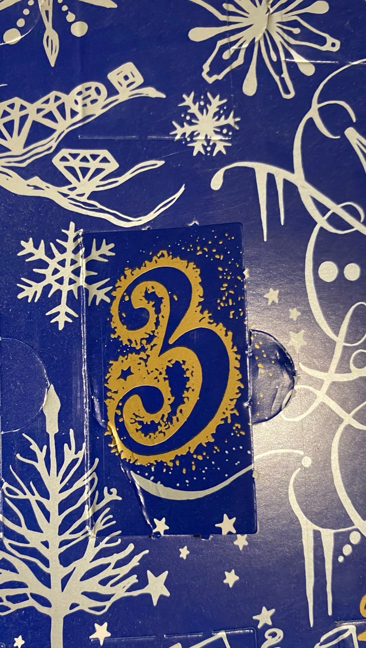
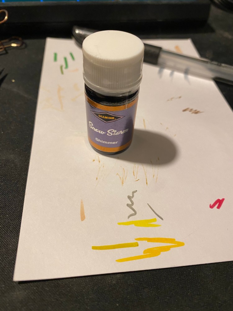
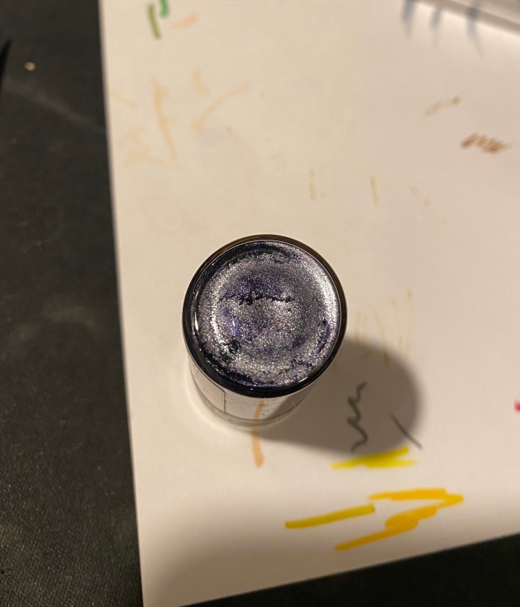
Day 3’s limited edition Christmas ink is Snow Storm. It’s a shimmer ink, with a lot of silver particles, much more than day 1’s Blue Peppermint. This is how the bottom of the bottle looked like when I took it out from it’s little nook:
This is definitely an ink that you’d want to thoroughly shake before using.
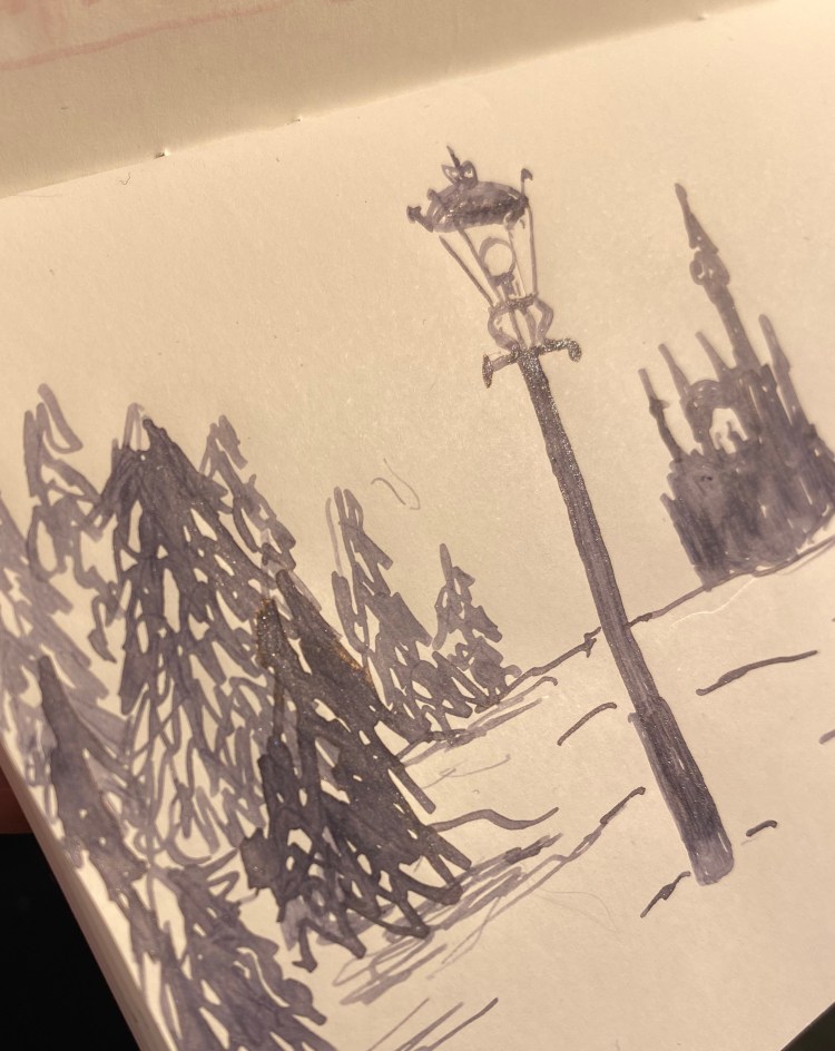
Lantern Waste, “The Lion, the Witch, and the Wardrobe”, C.S. Lewis.
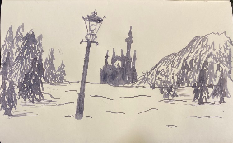
Diamine Snow Storm is a grey ink that looks a lot like Diamine Graphite, if you dumped a whole sack of silver glitter on it. It also shades and outlines like mad. Diamine certainly went all out on this one.
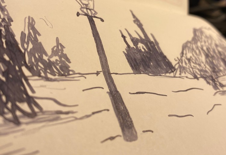
Look at all that glitter. There’s so much of it, it sheens.
This was drawn on a Kanso Sasshi 3.5” x 5.5” Tomoe River Paper notebook using a vintage Swan broad italic nib (dipped in the ink, because boy did I not want to clean this ink out of a lever filler), and this combination shows the properties of this ink beautifully. Diamine really proves that grey doesn’t have to be boring .
I’m not a big fan of shimmering ink, but Diamine Snow Storm is so wild, with it’s shading, outlining and silver particles, that it makes me smile. It would be a good replacement for silver gel ink pens, when it comes time to write greeting cards.
Diamine Inkvent Calendar is an advent calendar with a tiny (7ml) bottle of ink behind 24 windows, and a larger, 30ml, bottle of ink behind the 25th window. All the inks are limited edition, and only available through this calendar. You can read more about the calendar here.
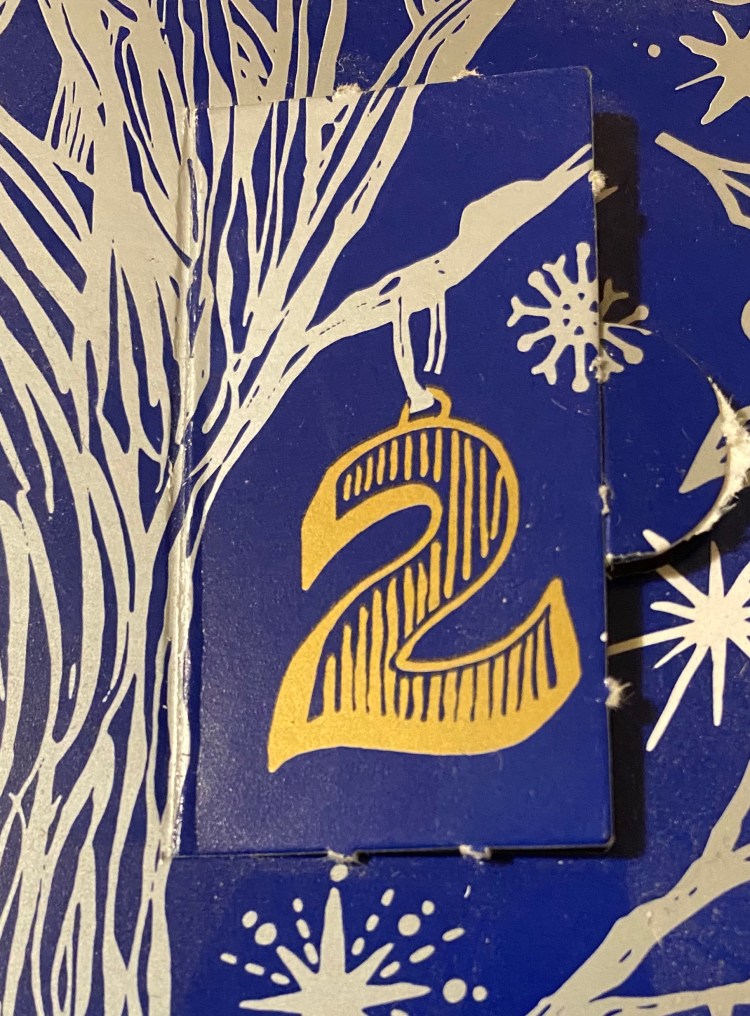
So what’s behind door number 2?
Day 2’s limited edition ink is Diamine Candy Cane. It’s a standard ink, midway between Diamine Amaranth and Diamine Coral, both excellent and unique pink inks. This ink shades a lot, even in a fine Lamy Safari (Coral) pen. It’s a dark enough pink to be readable, but still not something that I would recommend for an office setting. It’s great for personal correspondence, Christmas cards, and journalling.
The bottle is so tiny and cute.
The bottle is made of glass and is delightful, but a bit impractical for use. You need a cartridge converter or a syringe to fill a pen with this ink, or you can just use it with a dip pen or a brush.
Look at that shading! Yes, this was drawn on a Kanso Sasshi 3.5” x 5.5” Tomoe River Paper notebook, and Tomoe River paper makes everything pop, but even on “regular” Rhodia paper you can notice the shading. That’s not always true for such bright and light shades, like pink or coral.
If you enjoy the looks of this ink, I think that there’s a good chance that you’ll love Diamine Coral (it’s such an optimistic colour) or Diamine Amaranth (which is also a delicious looking ink, but darker than Diamine Candy Cane).
Diamine Inkvent Calendar is an advent calendar with a tiny (7ml) bottle of ink behind 24 windows, and a larger, 30ml, bottle of ink behind the 25th window. All the inks are limited edition, and only available through this calendar, which I already feel is going to be a shame. I want more of today’s Blue Peppermint ink, and we’re only on day one. You can read more about the calendar here.
This was drawn on a Kanso Sasshi 3.5” x 5.5” Tomoe River Paper notebook, using a Lamy AL-Star Pacific fine nib fountain pen. Peppermint Blue shades a lot, even not on Tomoe River Paper, and it shimmers (which I just can’t seem to capture) with silver sparkles. It seemed appropriate for today’s topic.
The bottle is tiny and very cute. This is an ink that I’d love to see in Diamine’s regular lineup (or even available for purchase as a seasonal 30ml bottle), and it’s very winter appropriate.
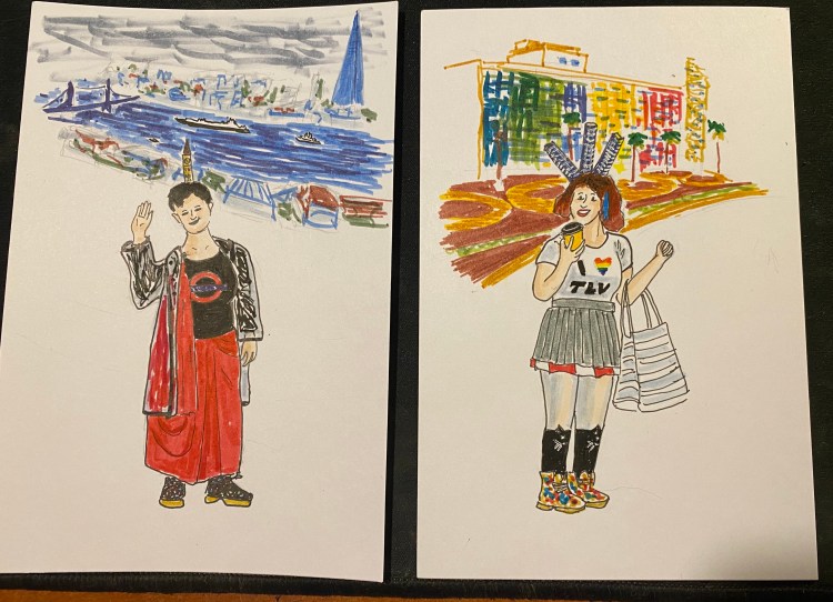
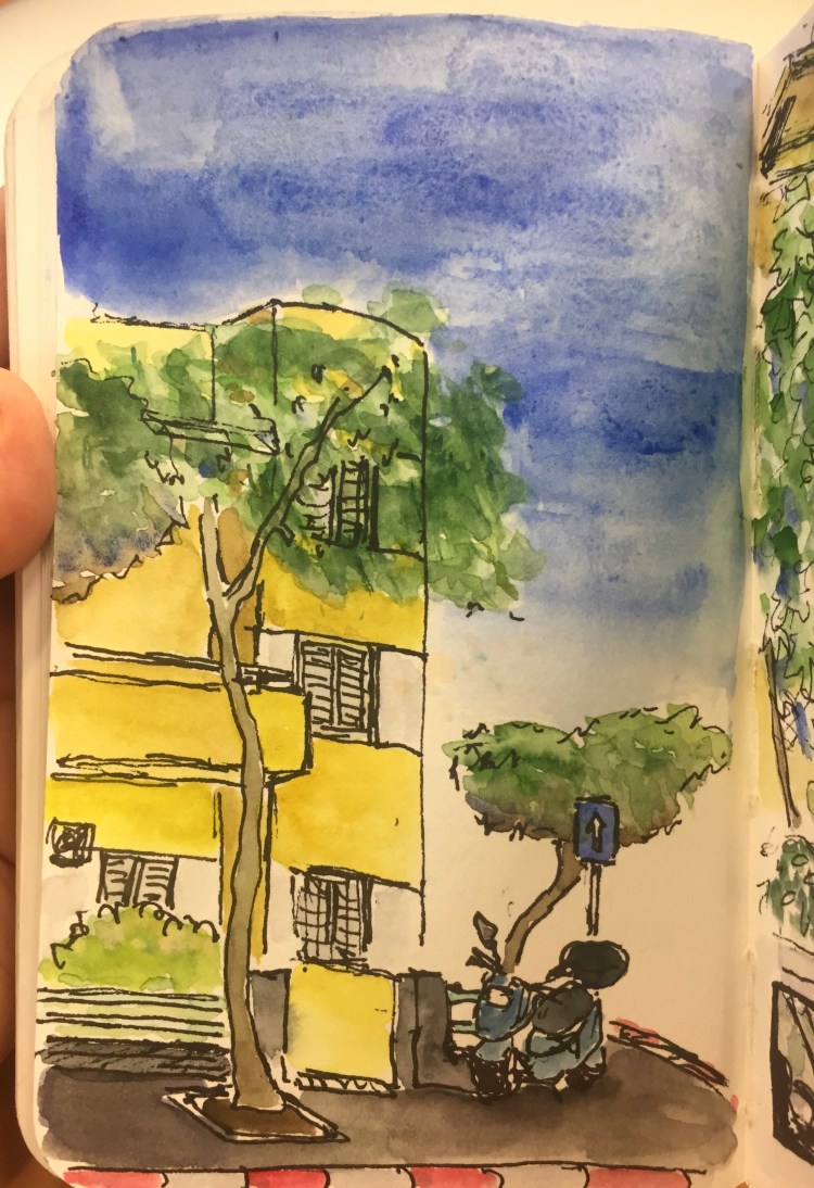
A 10 minute sketch of a Bauhaus building in Tel Aviv, and less than 5 minutes of watercolour. This proved to me that I have time to draw even when I’m super busy.
After I reviewed the Waterman Phileas I noticed that I have hardly reviewed the writing/drawing tools that I use most. So I making it a point to start to rectify that, at least a little bit.
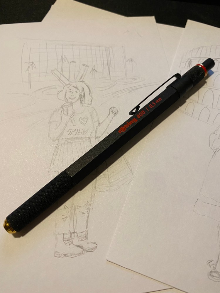
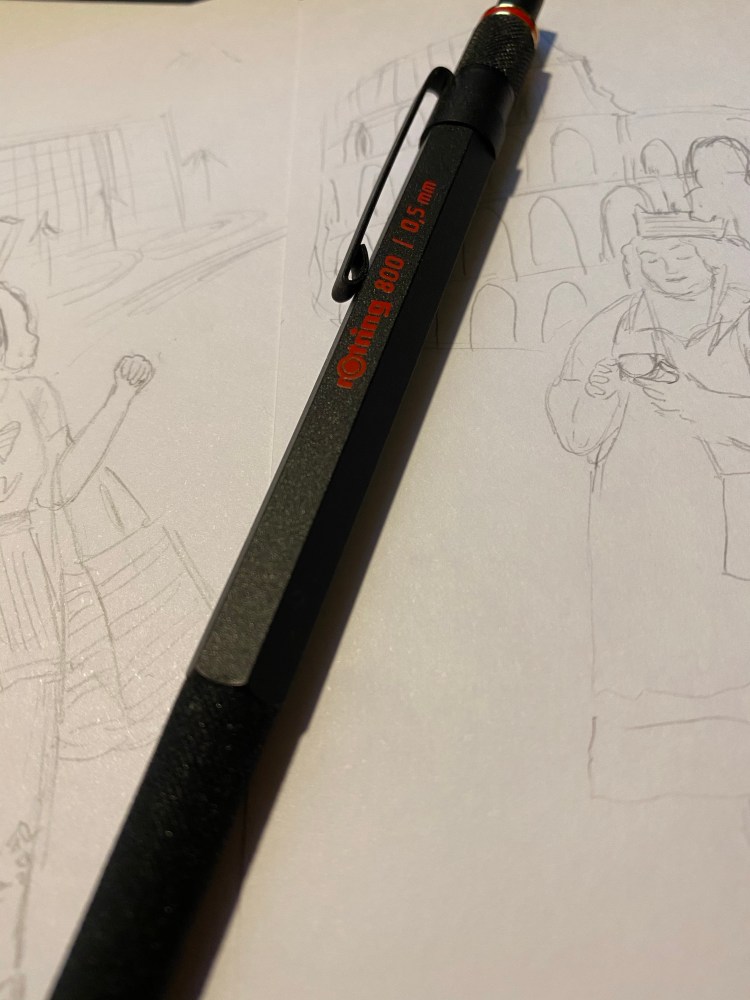
The Rotring 800 is Rotring’s high end drafting pencil, and it costs significantly more than its popular counterpart, the Rotring 600. It’s also my preferred drafting pencil, and the one pencil that’s a constant in my drawing kit. While I own the Rotring 600, and I agree that it’s a very good drafting pencil, I’ve abandoned it entirely for it’s more big brother, the Rotring 800.
This is a handsome, elegant drafting pencil.
The Rotring 600 and 800 are both full metal (brass) bodied drafting pencils. This means that they were built for drafting (architectural plans) and sketching, not so much for writing. You can use a drafting pencil for writing, but they’re not built for that (that’s what mechanical pencils are for). Drafting pencils are metal bodied with a knurled grip, a lead grade indicator, and a sleeve that both protects the lead and allows you to more easily use it with rulers and templates, and to get a better view of what you’re drawing.
Herein we get to the problem: both the Rotring 600 and the Rotring 800 are almost perfect drafting pencils. Each one has a significant flaw, which means that you have to decide when purchasing what are you willing to live without.
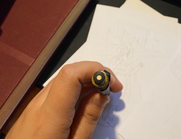
Retractable tip
I think that the Rotring 800 is a slightly more good looking drafting pencil than the Rotring 600, and it weighs more than the 800. That’s nice, but that’s not “$20 more” nice. The reason to buy the Rotring 800 is the retractable tip. That’s it. The Rotring 600’s non-retractable, sharp-yet-delicate tip makes carrying it around an issue. It can bend and it can do damage – piercing through case fabric, clothes, and I wouldn’t carry it in my pocket (ouch!).
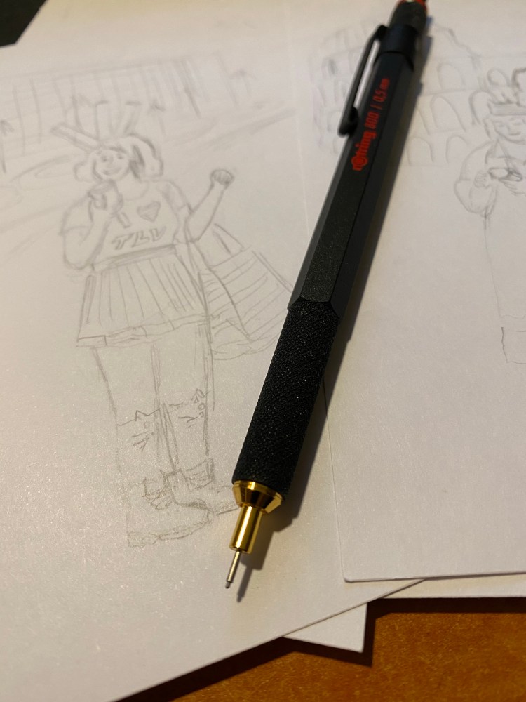
Retractable tip extended. The tip allows for precision work, and prevents the lead from breaking.
I carry my Rotring 800 in a Nock Co Sinclair, together with the rest of my sketching kit, and I really needed the retractable tip. For that I had to pay extra, and I also had to give up on a crucial drafting pencil feature that the Rotring 600 has and the Rotring 800 doesn’t have: the lead grade indicator. This is a basic feature of drafting pencils, and I have no idea why Rotring didn’t add it here. It doesn’t bother me too much as I don’t switch lead grades that often, but it’s still a baffling choice on Rotring’s part.
I love the texture on the pen grip and the pen itself: it’s beautiful and functional at the same time. This is a pencil that will not budge from your hands as you’re working with it. Also, the added weight of the retractable mechanism means that it’s perfectly balanced and you need to apply zero pressure on the lead.
There’s an eraser beneath this cap. I wouldn’t use it.
The Rotring 800 is a handsome, heavy and expensive drafting pencil. If you’re just getting to know drafting pencils the Pentel Graph Gear 1000 is what I’d recommend (it’s cheaper, lighter, has a great design, more tip sizes, and a lead indicator), as it really works as an excellent mechanical pencil as well as a drafting pencil. The Rotring is what I use because it aggravates my RSI least (YMMV),the added weight lets me work faster and yet retain control over my line, and I really needed the retractable tip (I ruined a Rotring 600’s tip). If you’re wondering whether to purchase a Rotring 800 (or 600) I highly recommend testing it out first, especially if you have small hands or have a “non-standard” way of holding a pencil, since you may find its weight uncomfortable.
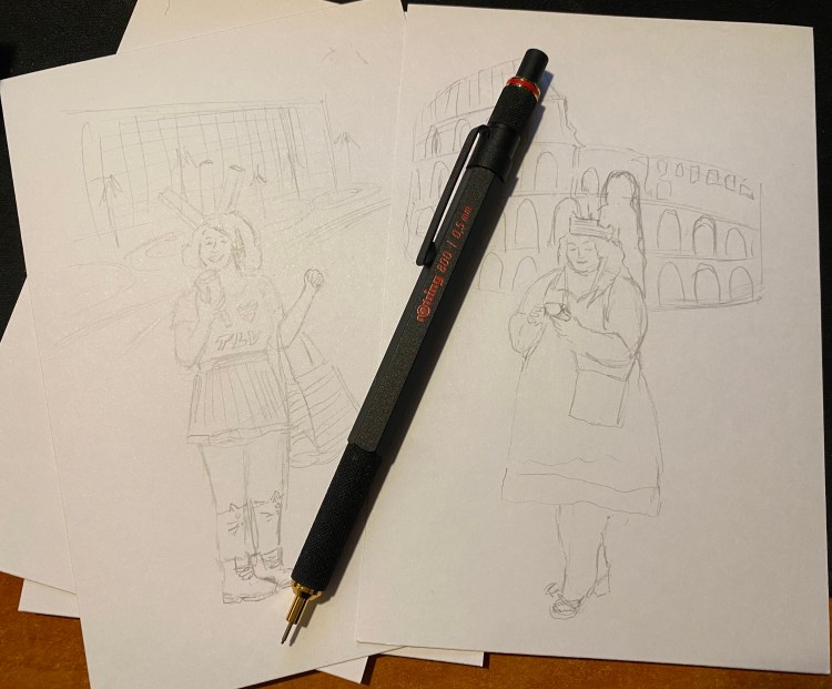
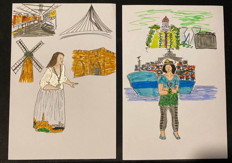
This time in pen and markers. The actresses from the wonderful play “The Mystery of the Lost City Guardian (of Doom)” strike again. I still don’t know what to do with Jerusalem’s background, but I’ll figure something out.
The Waterman Phileas was my first fountain pen, one that I bought after careful research on eBay, shortly after they were discontinued. It cost me £15 at the time, a small fortune for me, and the most I had ever spent on a pen. My RSI was at its worst, and I had to take a lot of notes (I was still in the university), so I splurged mostly out of desperation. Internet research brought up fountain pens as something that could possibly help with my RSI, and so I decided to give it a try. I found the Fountain Pen Network and combed the boards for information about fountain pens for newbies like me. Two pens kept coming up as good first fountain pens to buy: the Lamy Safari, and the Waterman Phileas. It was relatively newly discontinued by Waterman, and so I could find it easily and buy it NOS from a reputable seller. It’s been over 11 years since I bought it, and it’s still one of my favourite pens, and one of my most frequently used ones.
Look how pretty this pen is!
The Waterman Phileas is named after Phileas Fogg, Jules Verne’s “Around the World in 80 Days” protagonist. It comes in blue, green, red and black, and is cartridge converter pen with a large two-tone steel nib. The nib and pen have an art deco look to them, and the pen is also designed to look somewhat like a cigar. It’s a classic “fountain pen” look that makes it appear more expensive than it is, and it’s part of the reason why you’ll see it popping up in various commercials, even to this day. It’s a very beautiful and elegant pen that just looks classy.
Unlike it’s cheaper sibling, the Waterman Kultur, the Phileas has a brass insert in the body, which means that it has got some heft to it, weighing (filled, with a converter) 24g, as opposed to the Lamy AL-Star’s 22g (filled, with a converter). The weight is perfectly balanced for writing, especially for beginners, since it encourages you to lay off putting pressure on the pen. The pen let you feel that it’s putting the pressure on for you.
The look of the Phileas is phenomenal, especially for the price, but it’s the nib that made me fall in love with it specifically and with fountain pens in general. I chose the extra fine nib, and it is nothing short of magical. Take a look for yourself:
From hairline to European fine – the Phileas line variation at work.
Yes, that’s line variation. No, it doesn’t come from applying pressure to the nib. It works like a less extreme Sailor Zoom nib: vary your writing angle just a bit and it will go from 0.4 mm lines to 0.7 mm ones. The nib is also smooth, but gives a little feedback, which reminds me a little of the feedback you get from using a really good pencil. Couple that with the fact that the Phileas is a cartridge converter (with a sizeable converter), and so very easy to clean, and you’ll understand why this is still my favourite sketching fountain pen.
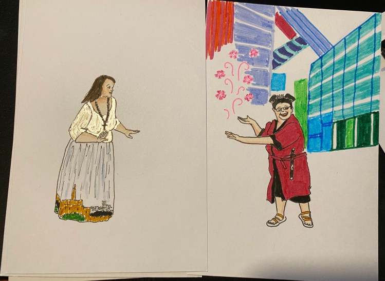
Drawn with a Phileas, except for the witch’s cloak and hat.
The Phileas accepts long international cartridges, and Waterman is one of the few makers that make those cartridges. They excellent (especially the blue-black) and very convenient when travelling with your fountain pen.
Look at that nib! It’s hard to photograph, but it’s such a great design.
Which brings me back to the beginning of my story. It’s 2019 and I have a substantial collection of fountain pens, most of them costing well over 10 times what the Waterman Phileas cost me. None of them are 10 times the Phileas as a pen. I could have stopped here, but the Phileas has proven to be a gateway into fountain pen madness for many people over the years. It’s a pen to fall in love with, in a way that I haven’t ever fallen in love with my Lamy’s, good-though-they-are. Its design is classic and timeless, and its quality is unparalleled for the price (yes, even today).
SO WHY HAS WATERMAN DISCONTINUED IT? WHY? WHY?
This should have been their Lamy Safari, TWSBI Eco or Pilot Metropolitan – a more classic version of the beginner’s fountain pen, as opposed to the other’s more modern design. It boggles my mind that they not only discontinued the Phileas, but also it’s cheaper cousin, the Kultur. What on earth are they doing over there? Do they not want new people to fall in love with their pens? It’s the same weird move with their ink line (their refusal to jump on the limited edition/shimmer/sheen ink bandwagon), but even more baffling. YOU WOULD SELL THESE WATERMAN!
So frustrating.
Anyway – if you can get your hands on a Waterman Phileas for a reasonable price, I highly recommend it. It’s a charming pen that will never go out of style.