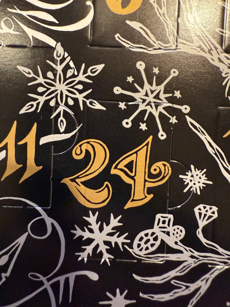
Diamine Inkvent 2024 Summary

For the introduction post to 2024’s Inkvent, see this post.

Diamine Inkvent 2024 Black Edition is the fifth edition of their Inkvent calendars, and I’m sorry to say that it’s by far the worst. Partly it’s 2023’s Inkvent Purple Edition’s fault, as it’s the strongest of the Inkvent calendars to date and so it created high expectations for the Black Edition. But there were several things that went wrong with this year’s calendar that made it an overall disappointing experience:

  • There are four previous Inkvent calendars, and there’s only so many ink shades in the world. The black edition featured a lot of inks that were pretty similar to ones seen in earlier Inkvent calendars.
  • This year’s “special effect” was “Extreme Sheen” and it just doesn’t have the same impact as effects like Chameleon and Star Bright that we saw in previous calendars.
  • The “Extreme Sheen” effect didn’t improve all the inks it was applied to.
  • Almost a third of the inks in this calendar were in the “dark and bland” range: grey, brown, black. There’s only so much joy a brown ink can spark.
  • There were very few bright inks and not all the bright were great (see Lemon & Lime and Fruit Cocktail discussed below).
  • A good number of the inks had very little festive appeal. This wouldn’t have been a big deal if Diamine hadn’t set the festive bar so high: they deliberately name their inks for festive or wintery things. Previous Inkvent calendars did much better in this regard (the first ones, the Blue Edition and Red Edition took this a bit too far), so it’s hard not to be disappointed in the Black Edition’s performance on this front.

Here’s all this year’s inks in order (read further on for a breakdown of each group and buying recommendations):
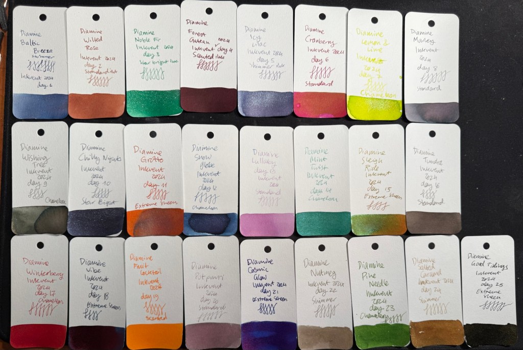
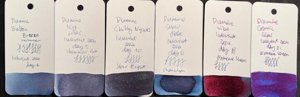
All the 2024 Inkvent Col-O-Ring ink swabs

Blues

There were six blue inks in this year’s Inkvent:

  • Two shimmer inks, Diamine Baltic Breeze and Diamine Icy Lilac. These are nice inks that are very similar to one another and similar to previous blue shimmer inks from past Inkvents. These go into the “nice but not exciting” category, and score decently on festive appeal.
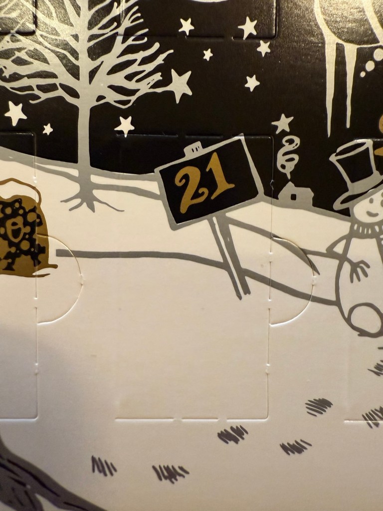
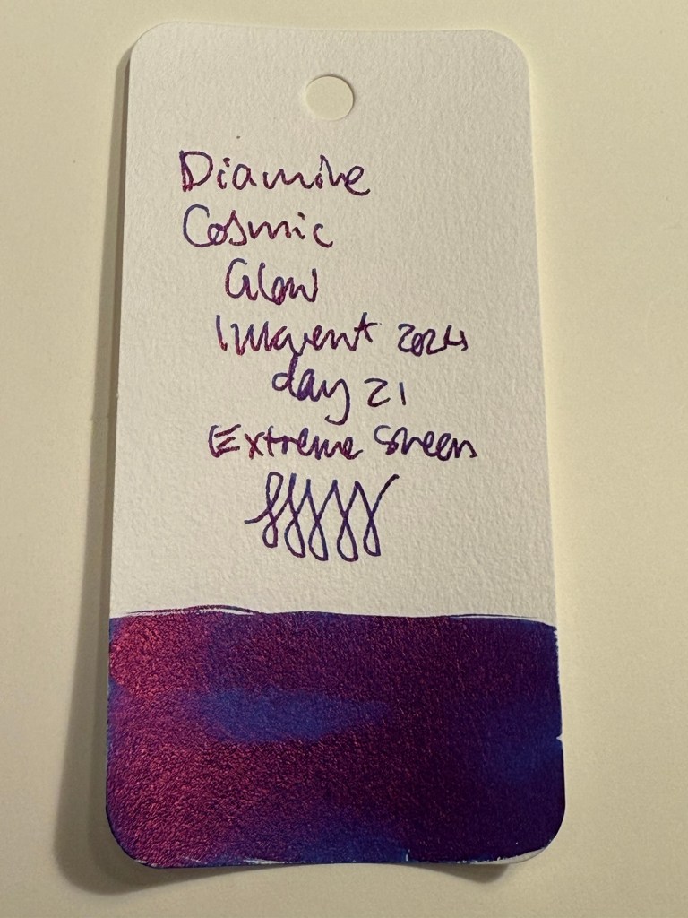
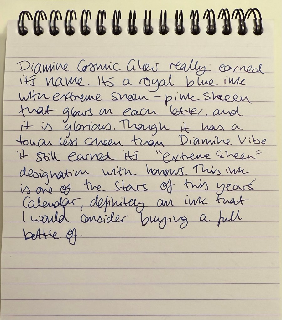
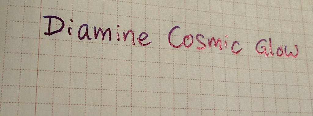
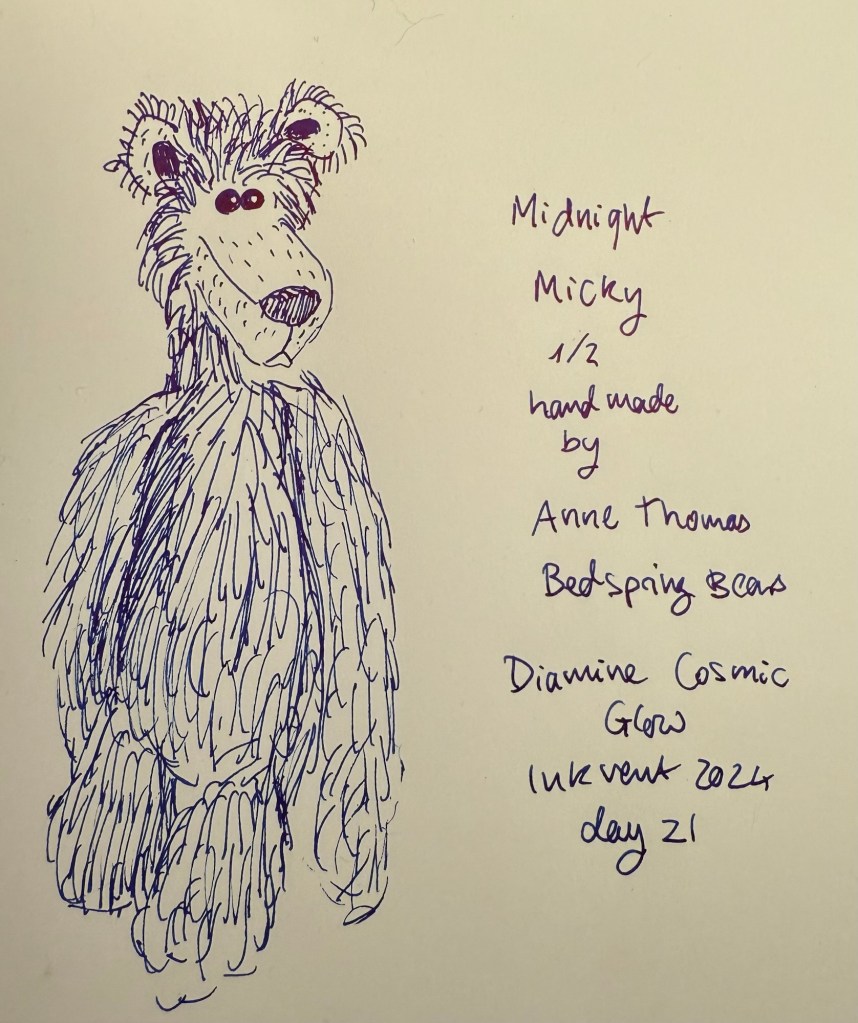
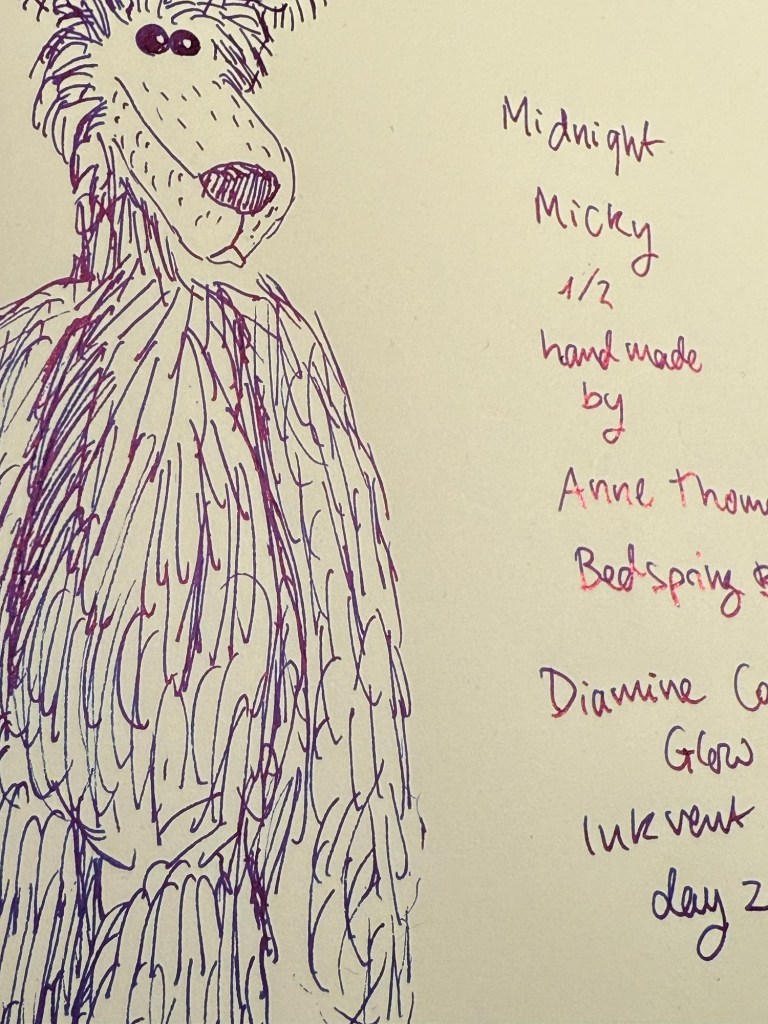
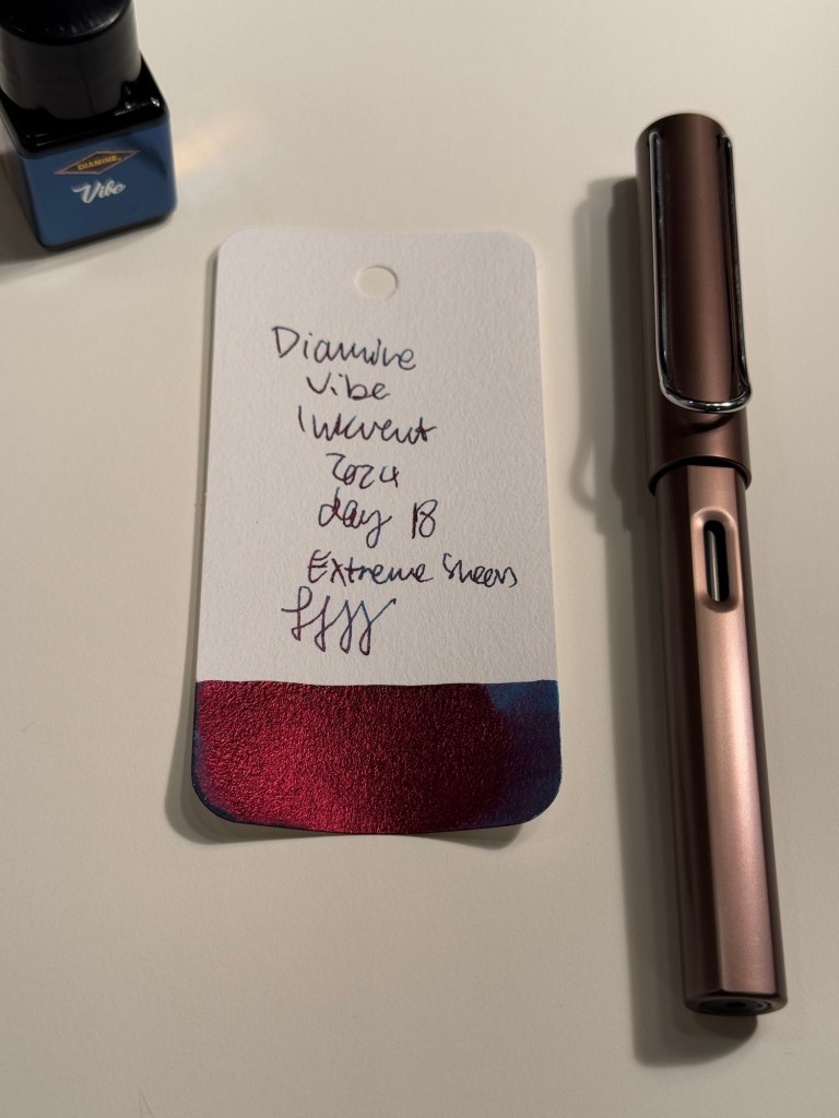
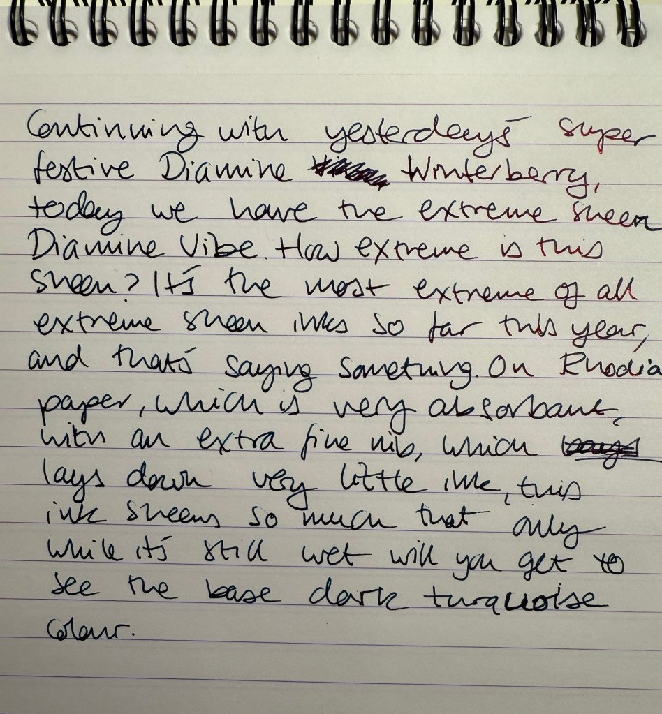
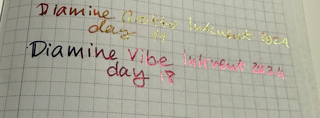
  • Two “Extreme Sheen” inks, Diamine Vibe and Diamine Cosmic Glow. These feature the new effect for this year’s Inkvent and feature it well. Overall these are two of the strongest inks in this year’s calendar in terms of “wow” effect, even though they’re not exactly holiday themed.
  • One chameleon ink, Diamine Snow Globe. The chameleon effect is always nice and interesting, but the base blue ink is nothing new, and it also goes into the “nice by not exciting” category.
  • One Star Bright ink, one of only two Star Bright inks in the calendar, Diamine Chilly Nights. The fact that there are only two Star Bright inks in this calendar contributed to this year’s Inkvent being so underwhelming. There is no greater wow effect than a Star Bright ink on a dark ink, and Diamine Chilly Nights really delivers on that front. The base blue black is very nice, and if you enjoy using shimmer inks then Diamine Chilly Nights is definitely an ink to consider.

All in all the blues in this year’s Inkvent were the strongest overall group by far.
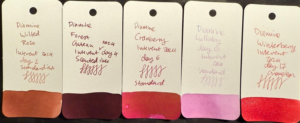
All the blue Inkvent Col-O-Ring ink swabs

Pinks and Reds

There were five pink and red inks in this year’s Inkvent:

  • Three standard inks, Diamine Wilted Rose, Diamine Cranberry and Diamine Lullaby. Diamine Wilted Rose is a nice and interesting “antique” rose colour, Cranberry is a decent but not overly unique ink, and Diamine Lullaby is on the “barely readable” spectrum. Of these three the standout ink is Diamine Wilted Rose, and it’s not a “star” ink by any measure.
  • One scented ink, Diamine Forest Gateau. I loath scented inks so I won’t elaborate on this one.
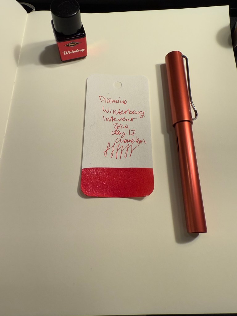
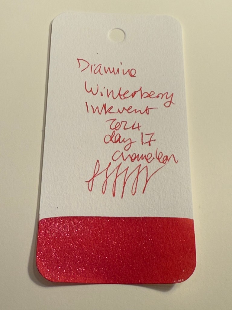
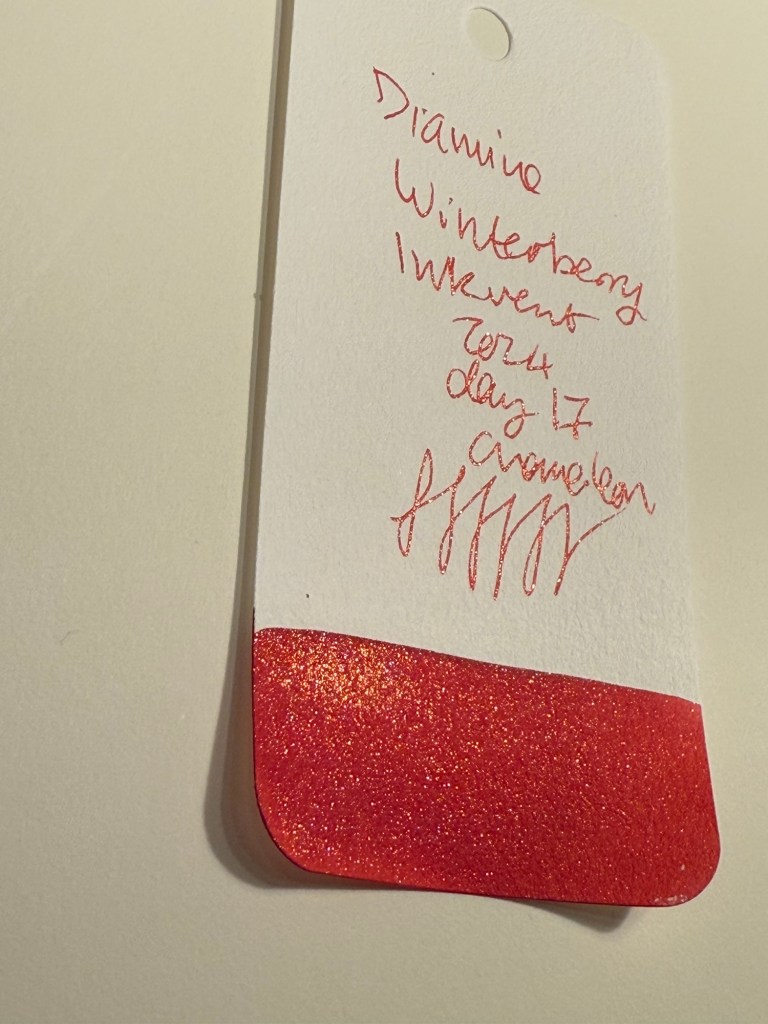
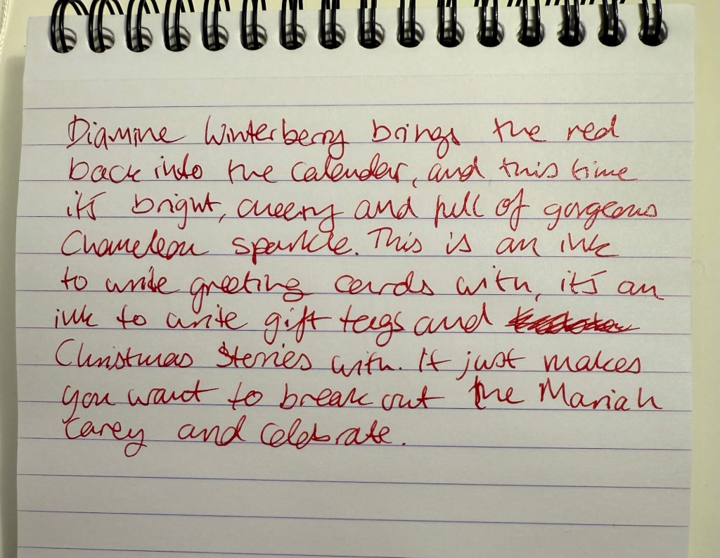
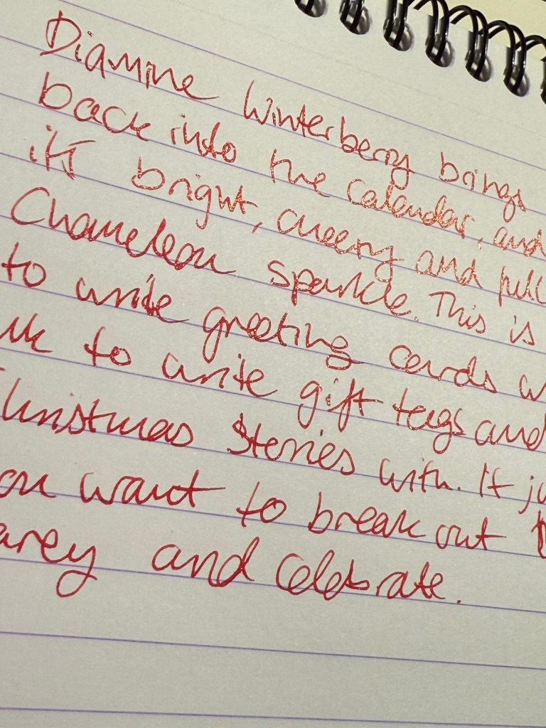
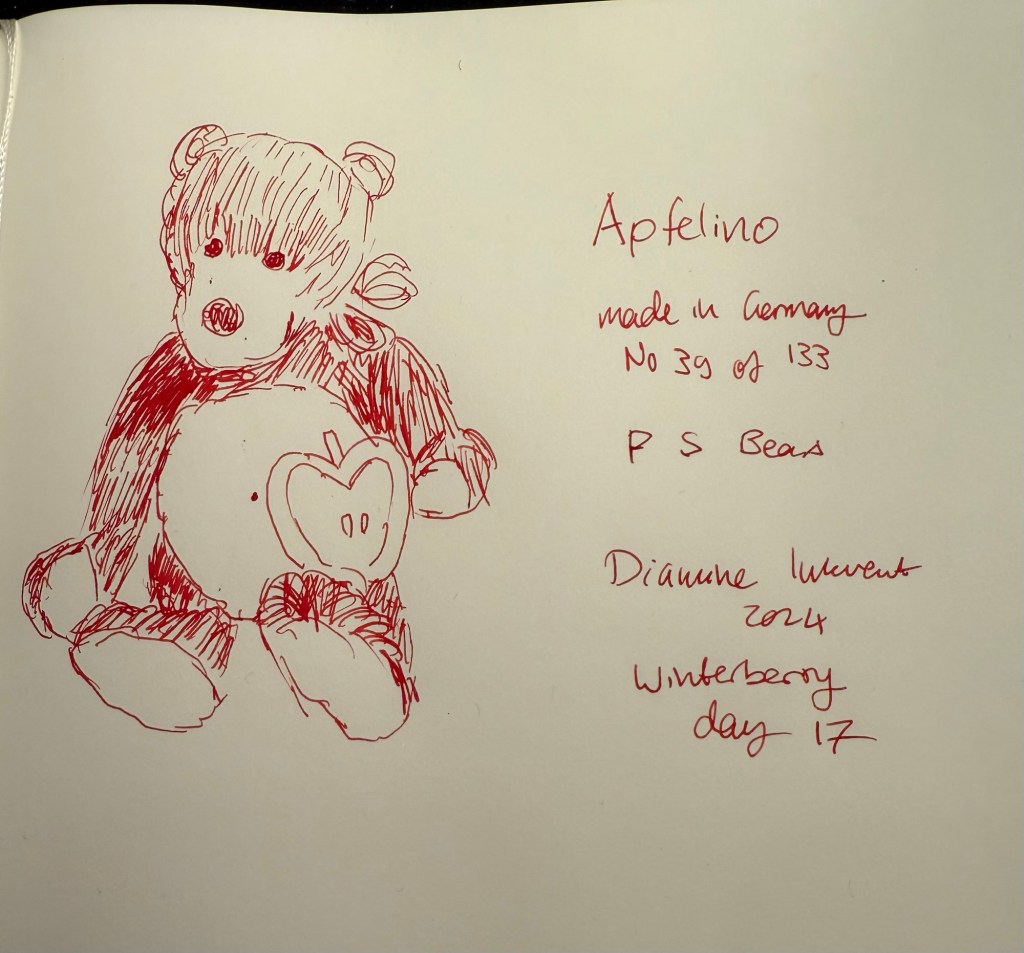
  • One chameleon ink, Diamine Winterberry. This is the standout ink in this group, one of the few bright and festive inks in this calendar, and a great ink to buy if you’re looking for a “Christmas greeting cards” ink. A breath of fresh air among the washed out and dark colours of this year’s calendar.
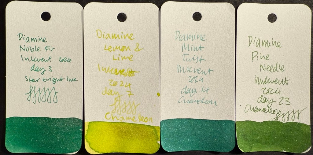
All the red and pink Inkvent Col-O-Ring ink swabs

Greens

There were only four greens in this year’s Inkvent:

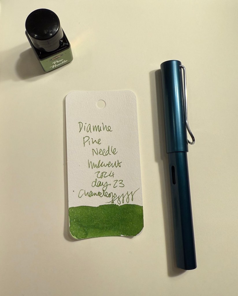
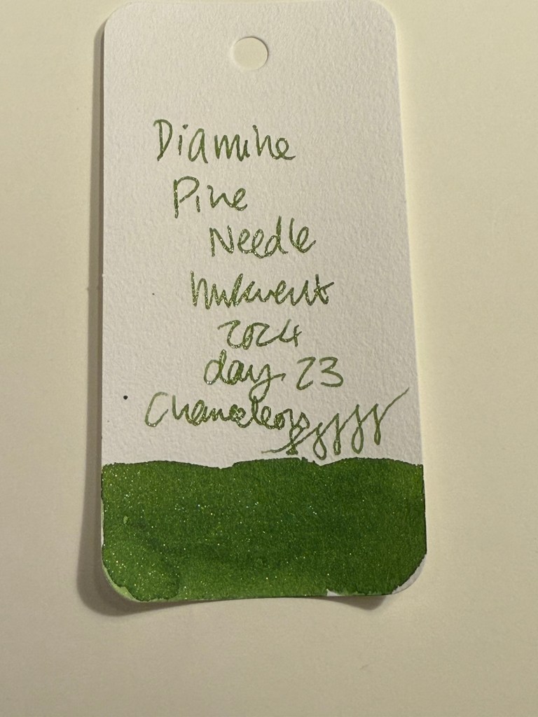
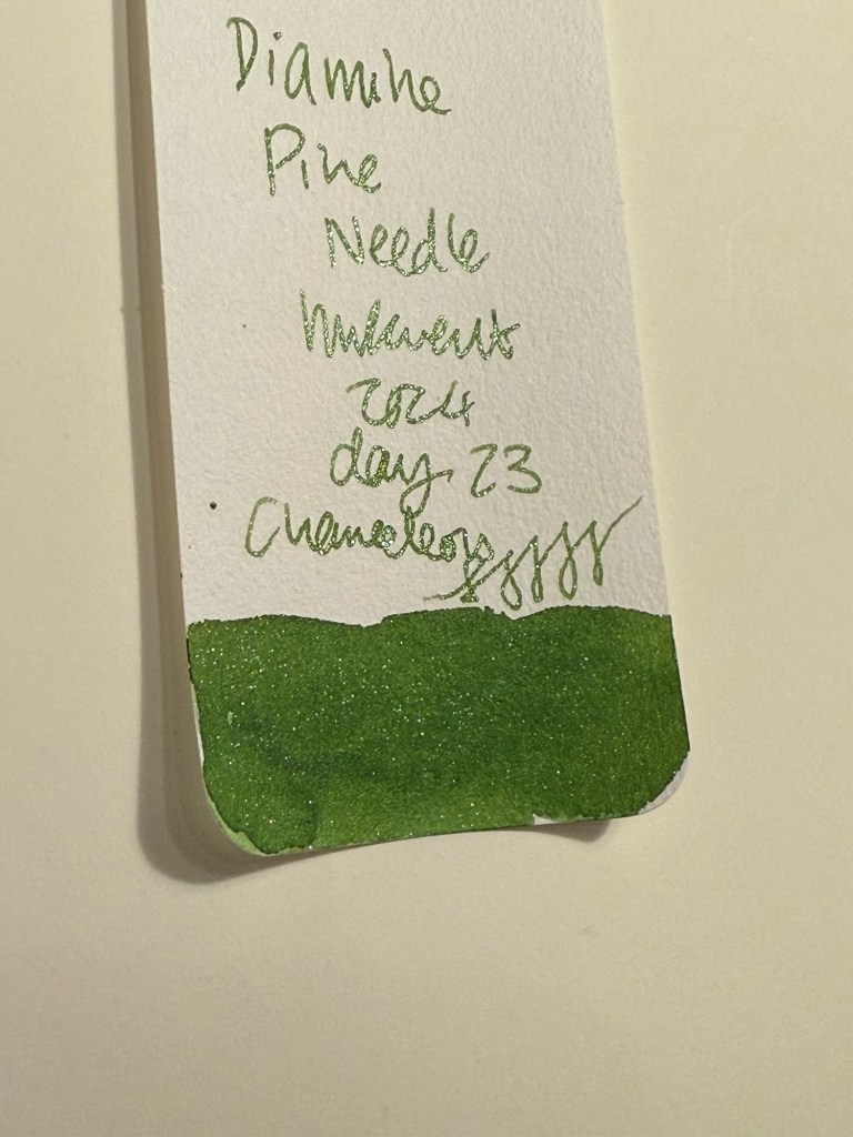
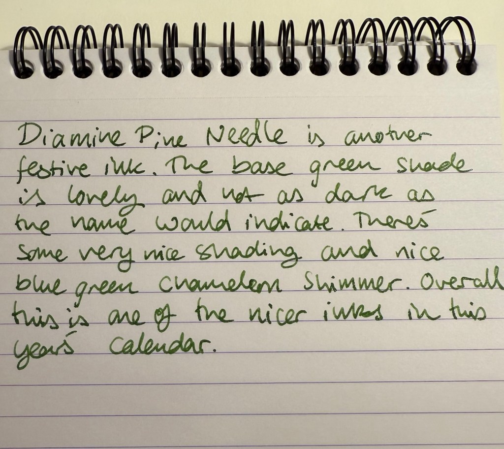
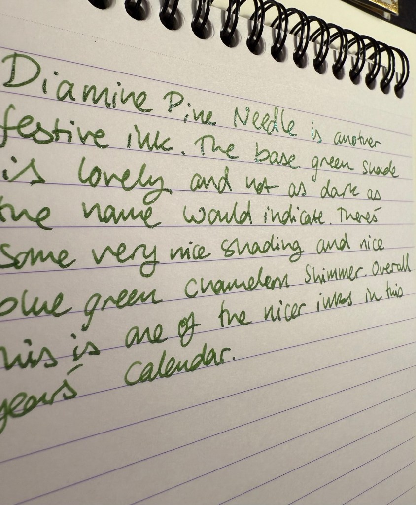
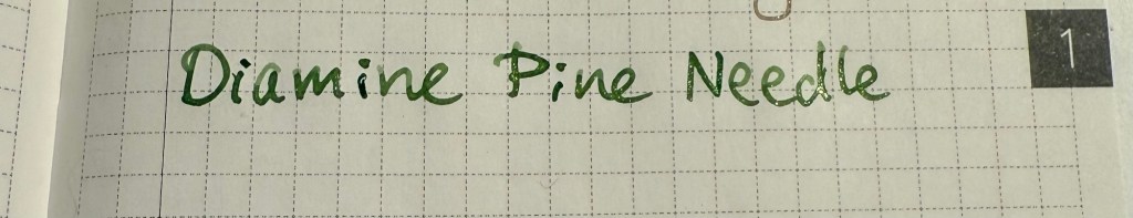
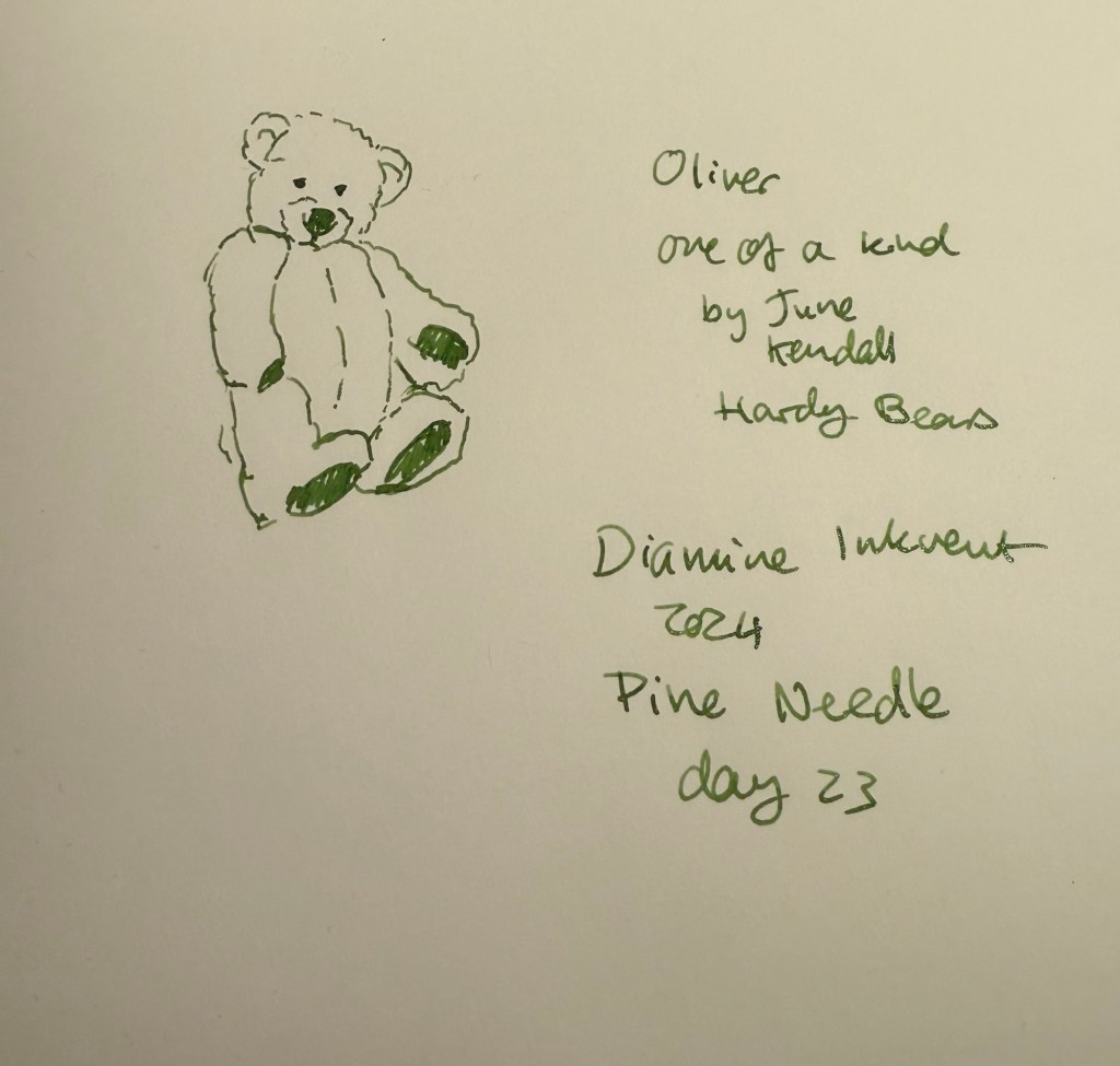
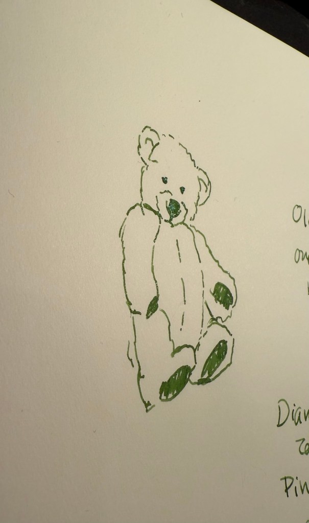
  • Three chameleon inks, Diamine Lemon & Lime, Diamine Mint Twist and Diamine Pine Needle. Lemon & Lime is unusable even in a wide and generous nib as it’s way too bright and light to be readable. Diamine Mint Twist is the standout ink in this group, the one with the most unique base ink colour. Pine Needle is nice enough, but there have been plenty of inks in this colour before.
  • One “Star Bright” ink, the only other one in the calendar, Diamine Noble Fir. It’s not as impressive as Diamine Chilly Nights because the base ink colour isn’t dark enough for the Star Bright effect to have the most impact. It’s a good, bright green ink though.
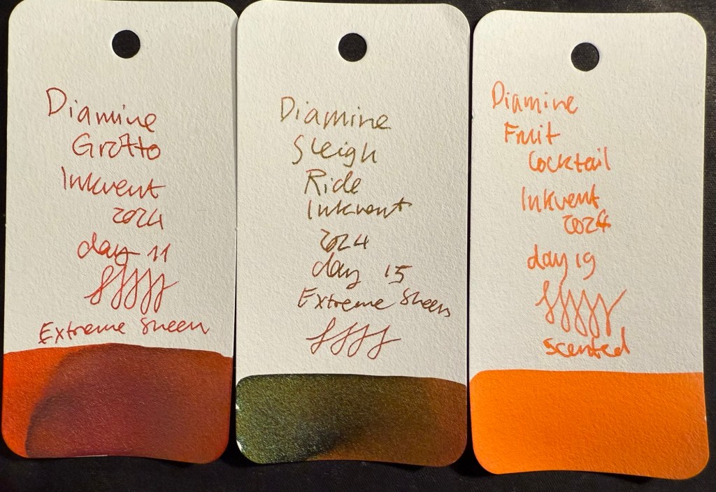
All the green Inkvent Col-O-Ring ink swabs

Oranges

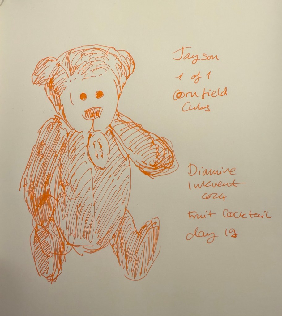
There are three oranges in this year’s Inkvent:

  • Two “Extreme Sheen” inks, Diamine Grotto and Diamine Sleigh Ride. Of the two Diamine Grotto is a great ink, and Sleigh Ride is poorly named and features a rather unattractive combination of an orange base and green-brown sheen. If you like rust effects you might enjoy it, otherwise, Diamine Grotto is the better choice.
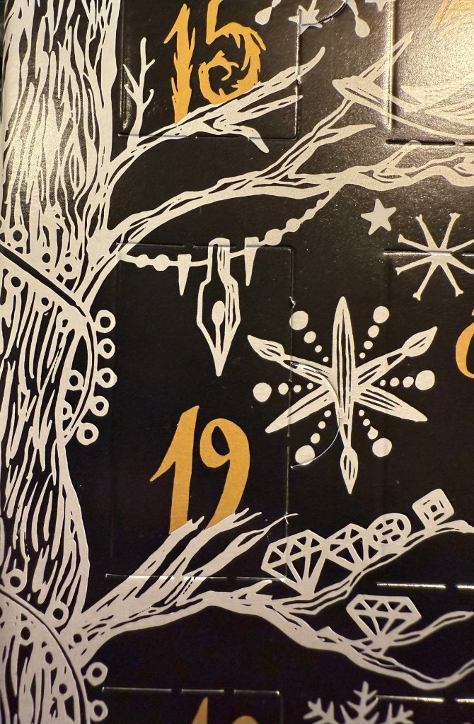
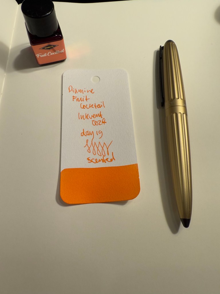
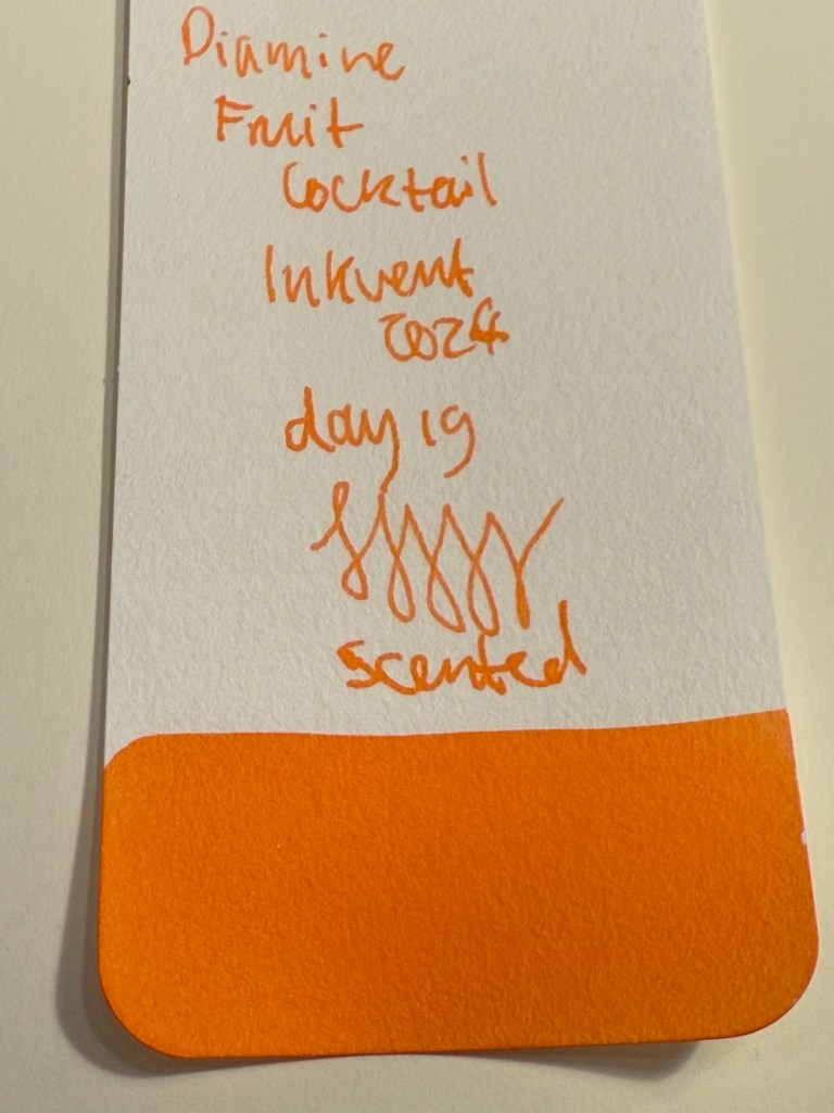
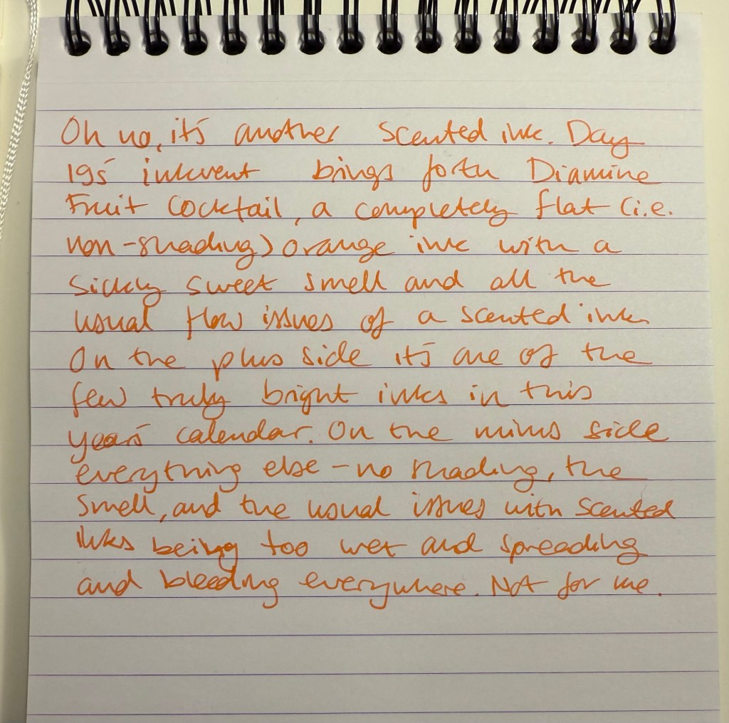
  • One scented ink, Diamine Fruit Cocktail. I think that this is the worst ink in this year’s calendar for having a combination of scent and zero shading.
All the orange Inkvent Col-O-Ring ink swabs

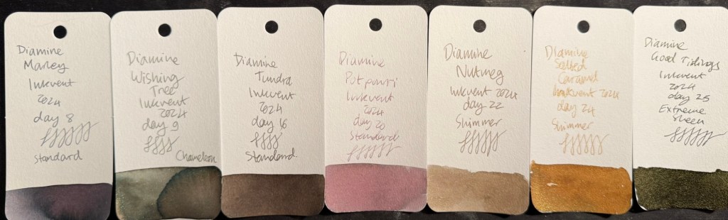
Darks – Greys, Browns, Blacks

There were seven (!) inks in this category in this year’s Inkvent:

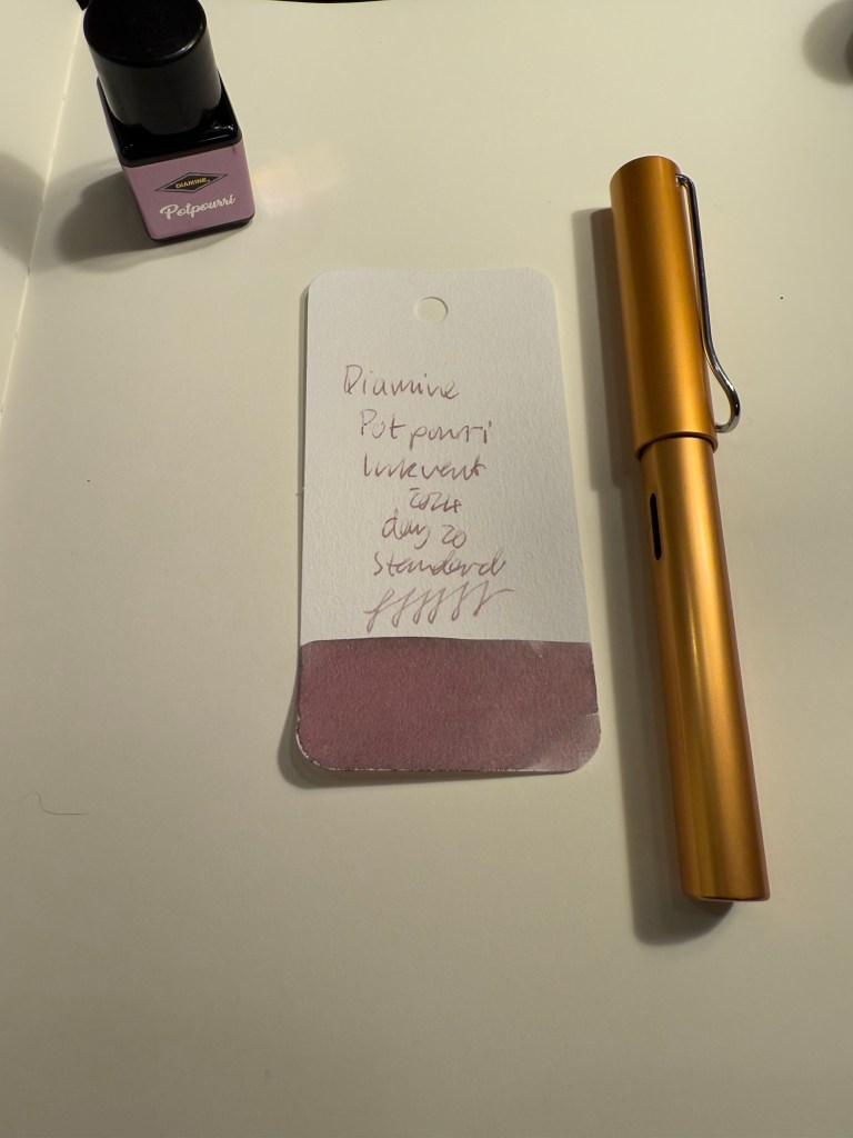
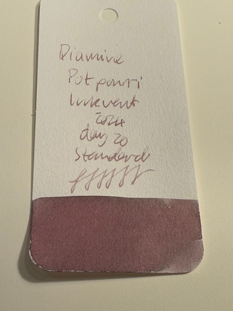
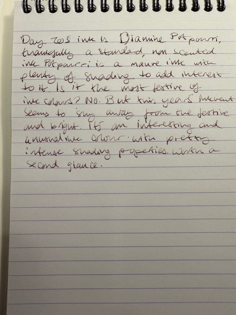
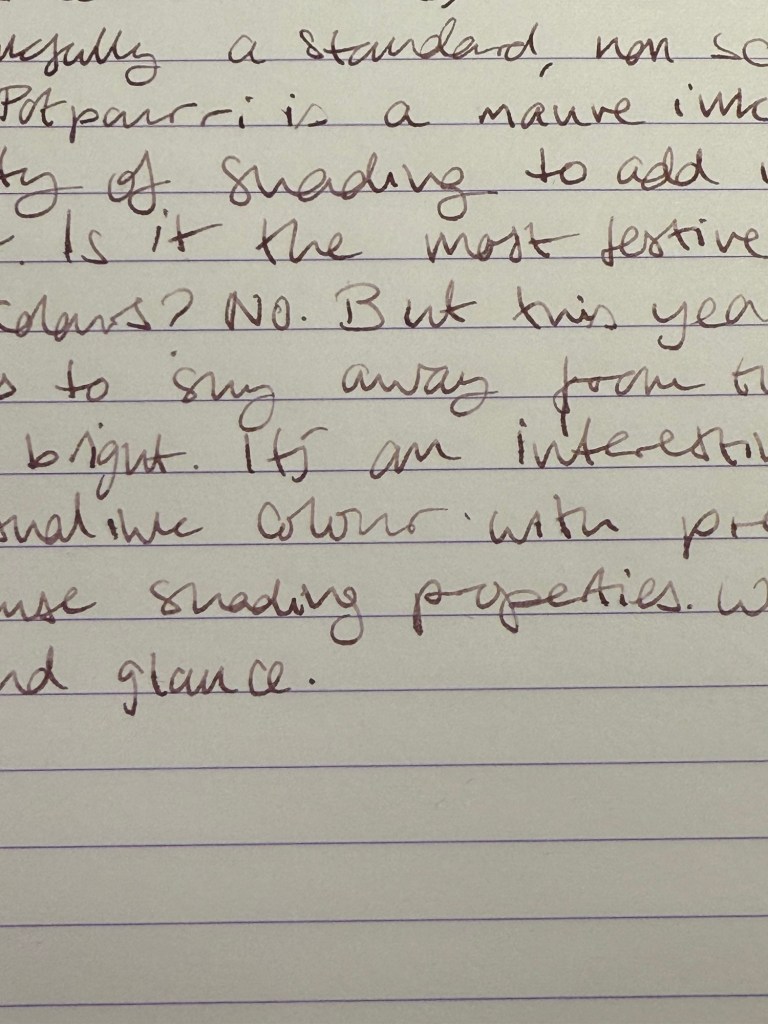
  • Three standard inks, Diamine Marley, Diamine Tundra, and Diamine Potpourri. Of the three Diamine Marley is by far the best, with Diamine Potpourri being too light to be readable (I could have placed this ink in the pinks category, but it’s so greyish and washed out that it felt more in place in this category), and Diamine Tundra being greyish brown, if you’re into that shade.
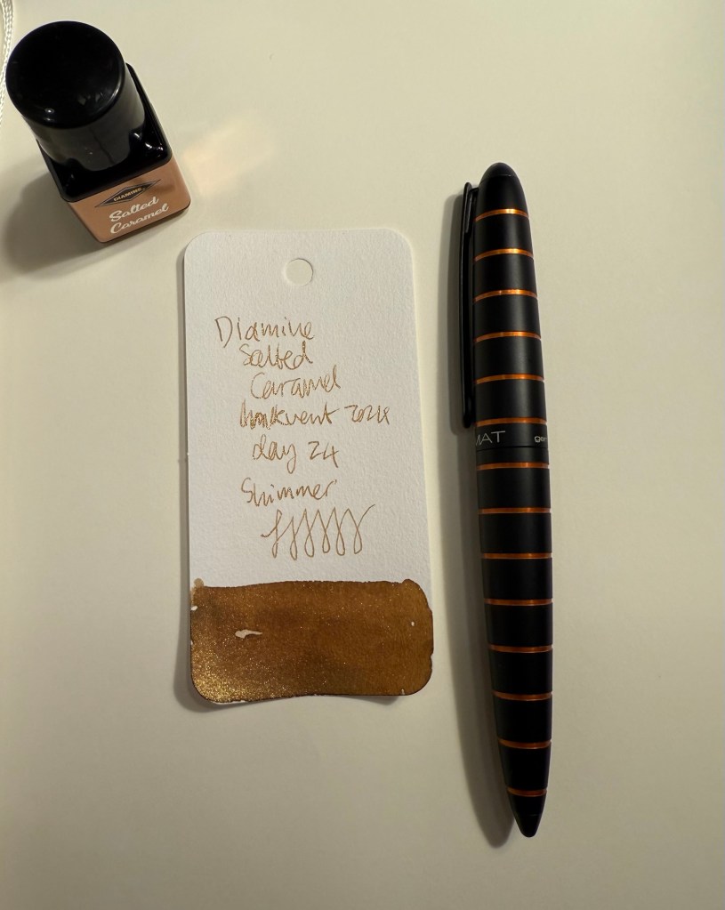
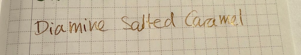
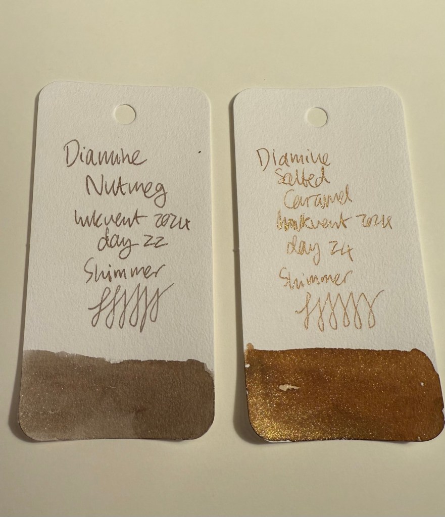
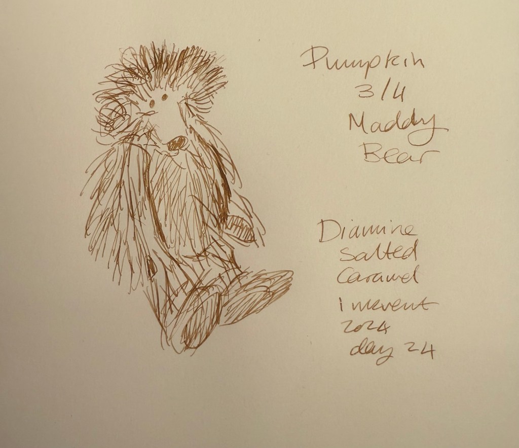
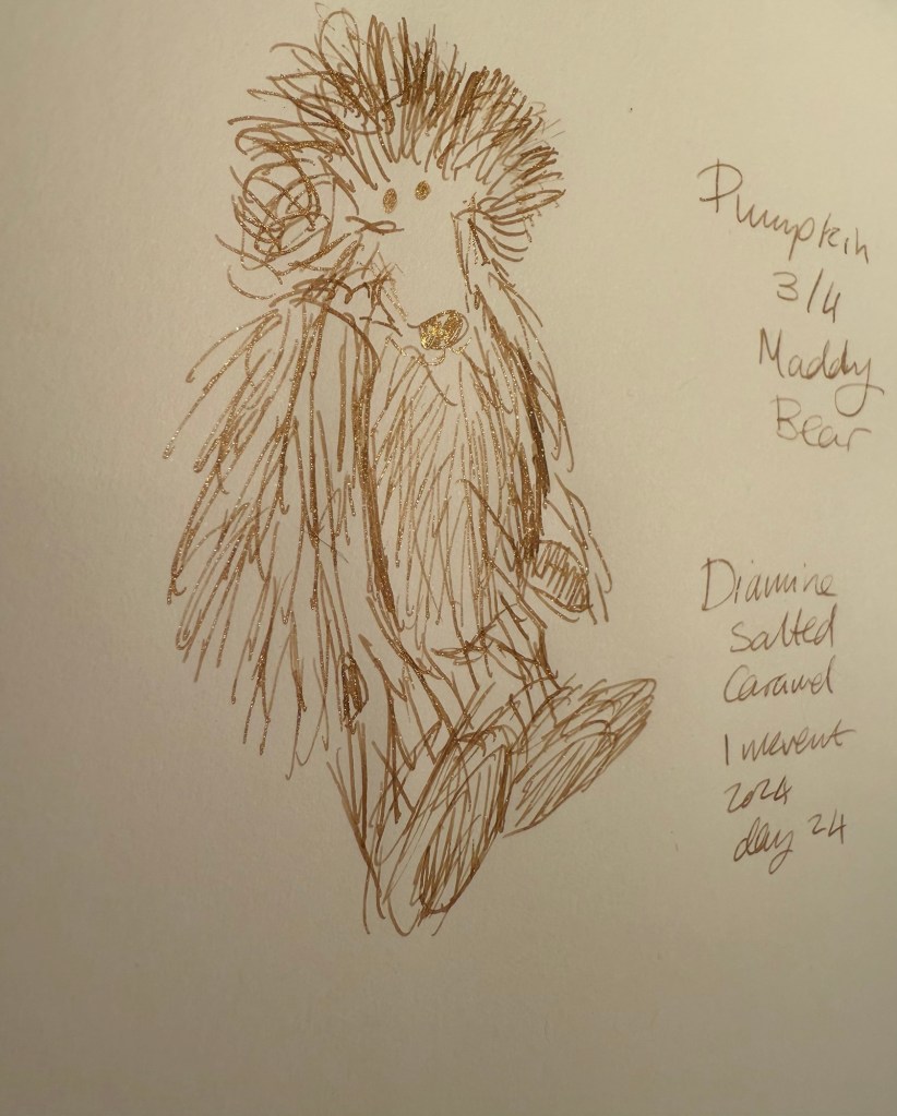
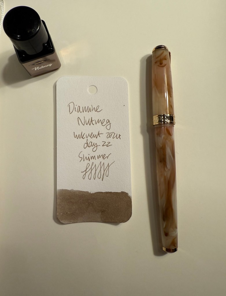
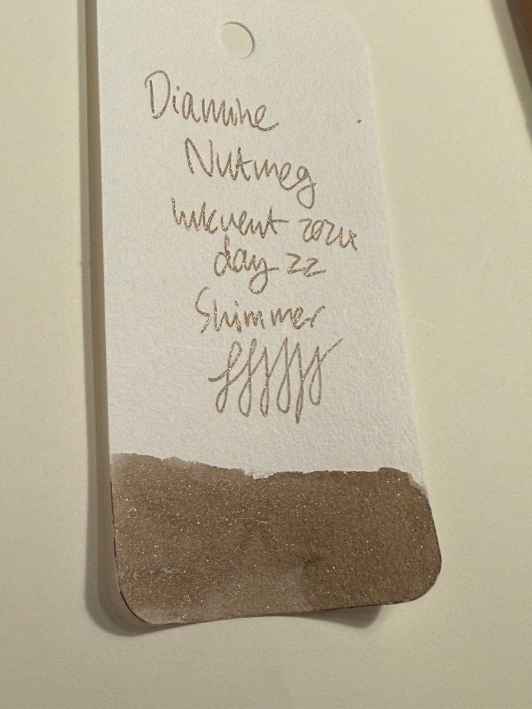
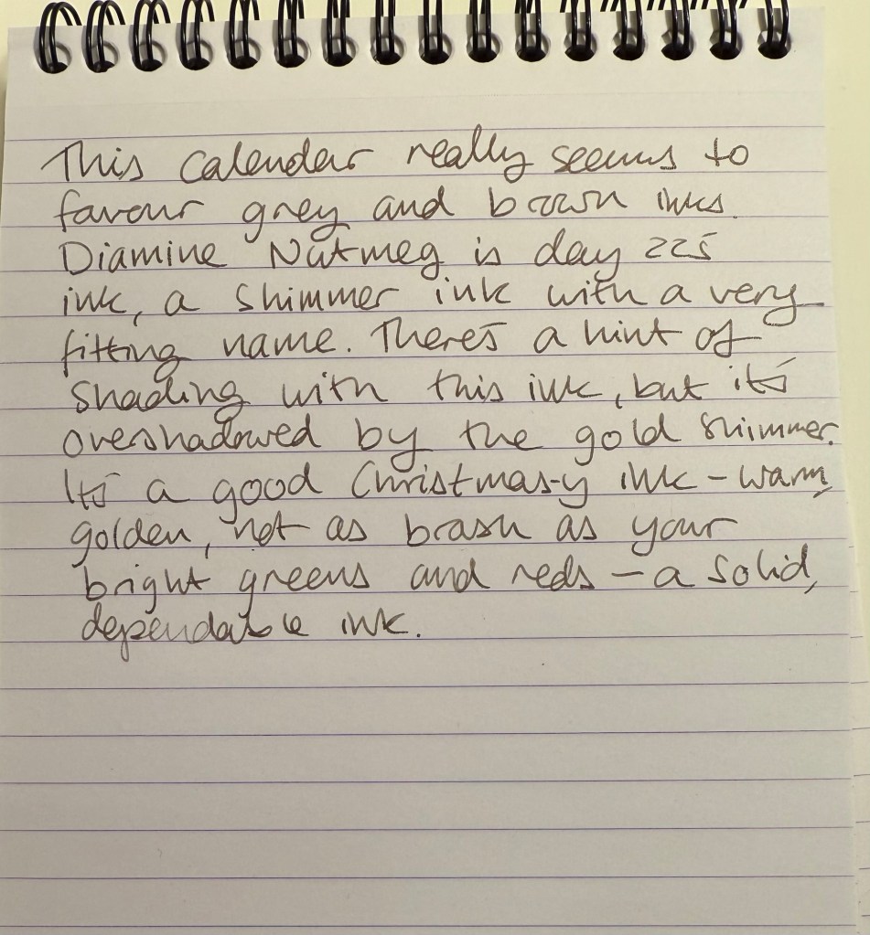
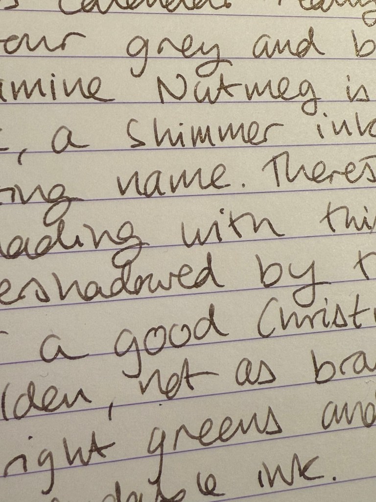
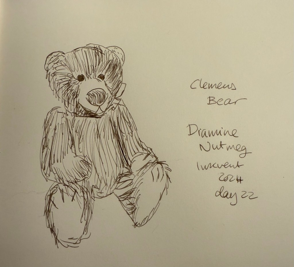
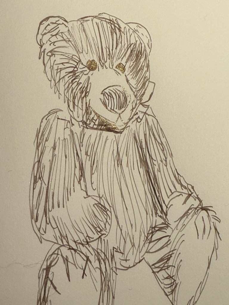
  • Two shimmer inks, Diamine Nutmeg and Diamine Salted Caramel. Of the two I prefer Diamine Salted Caramel, though there have been similar enough inks in previous Inkvents for you to feel free to skip this one.
  • One chameleon ink, Diamine Wishing Tree. The strongest ink in this group and one of the best inks of this year’s Inkvent, Wishing Tree has a great combination of a fantastic base ink colour and a lot of added interest from the chameleon effect.
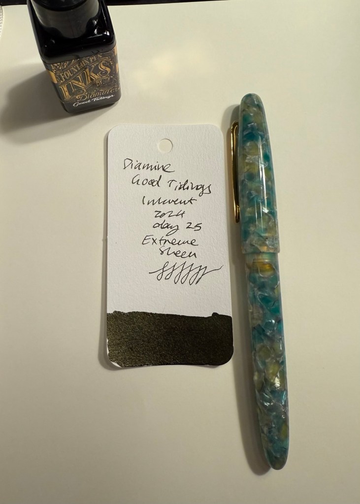
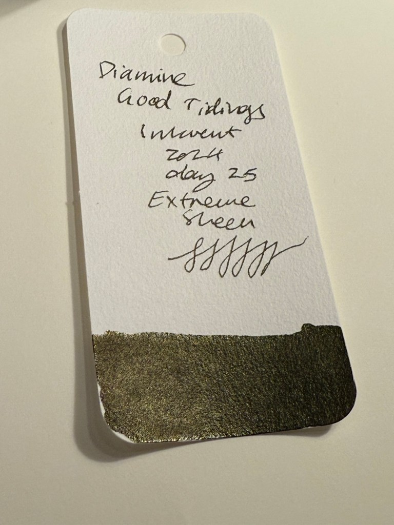
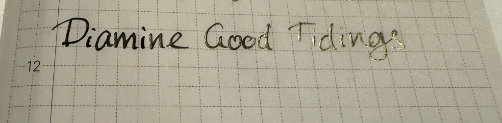
  • One “Extreme Sheen” ink that was supposed to be the highlight of this calendar, Diamine Good Tidings. I found it far from “extreme sheening” and the sheen effect was a very unattractive dirty yellow.
All the dark Inkvent Col-O-Ring ink swabs

Summary

So these are the inks that I would consider buying from this year’s calendar (with the addition of Diamine Winterberry if you see yourself needing a festive red ink): Diamine Marley (interesting duo-chrome ink), Diamine Wishing Tree (duo-chrome interesting base shade ink with great chameleon effect), Diamine Grotto (great base orange ink with attractive extreme sheen), Diamine Mint Twist (unique green with a chameleon effect), Diamine Vibe (attractive dark turquoise ink with great extreme sheen), and Diamine Cosmic Glow (great royal blue base ink and wild extreme sheen).

All the inks that I would consider buying Inkvent Col-O-Ring ink swabs

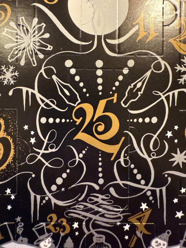
As a reminder, this year’s Inkvent wasn’t sold out, which means that if you’re interested in these inks and haven’t yet gotten the calendar you can expect it to be on sale in various places soon enough. It’s a great way to get a good amount of varied ink samples, and each little bottle is good for at least 2-3 fillings (plus there’s a big 30ml bottle in day 25).

Midyear, at around June or July, Diamine will come out with the “Black Edition” of these inks. These are 50ml editions of the Inkvent 2024 Black Edition inks, in gorgeous glass bottles. They make for great gifts, and are worth getting as they’re very well priced for the “premium ink” experience.

I have 20 fountain pens filled with Inkvent inks in rotation at the moment, and it will take me a while to work my way through them. Will I do Inkvent again next year? I don’t know. The price plus shipping has gotten steeper every year, and this year’s calendar was a pretty big disappointment in my opinion. When pre-orders start for next year’s Inkvent (if there will be one), I’ll have to really consider it.

What are your favourite inks from this year’s Inkvent? What did you think of the Inkvent Black Edition?

Diamine Inkvent 2024 Day 25

This is the Diamine Inkvent 2024 Day 25 door:

The door

Day 25’s ink is a full 30ml bottle of Diamine Good Tidings, a black ink with what is meant to be gold Extreme Sheen. I used an Esterbrook Estie with a Journal nib to test this ink out.

Col-O-Ring swab

I don’t think that I could be more disappointed in a “grand finale” Inkvent ink. Diamine Good Tidings would obviously need to be black because this is the Black Edition of the Inkvent calendar, but the choice to make it an “Extreme Sheen” ink was a poor one. I understand the logic behind this choice (“Extreme Sheen” is a new ink property for this year’s calendar, so of course the ultimate ink of the year needs to have this property), but the result is very underwhelming. The sheen is barely observable, and the result is just a deep black ink.

Different angle of Col-O-Ring swab

Even on original Tomoe River Paper you can barely see the sheen, and when it appears it makes Good Tidings a less attractive ink to behold, not a more attractive one. The choice of silver shimmer or a chameleon effect would have been better for this ink. When the sheen does appear it’s a sickly yellow colour, not the gold that Diamine were likely going for.

Writing sample on original Tomoe River paper

On Rhodia paper Good Tidings simply looks like a very saturated black ink, with no visible sheen. The drying times aren’t great, but if you’re looking for a solid black fountain pen ink Diamine Good Tidings is pretty good.

Writing sample on Rhodia paper

On Midori MD Cotton paper the sheen becomes more visible, but it’s far from what I would term “extreme sheen” and it mostly fades to the background. You can barely see hints of it in the writing in today’s bear sketch:

Bear sketch on Midori MD Cotton paper

Only at a sharp angle and close up you can see the yellowish gold where the ink pooled, such as in the eyes. The nib I used lays down a generous amount of ink, so I would have expected to see more of the sheen than actually appeared here:

Close up of the sketch on Midori MD Cotton paper

The final bear for this year is Tossi, designed by Margarete Nedballa, numbered 115 out of 399 and made by Clemens Bear (so he’s a German bear). I don’t normally like clothed bears, but I liked this fellow’s hat and the way that it matched his unusual nose, which is why I got him. He’s from a store in York called “Christmas Angels” which was wonderful and is now closed (it didn’t survive the pandemic). It was dedicated to Christmas toys and decorations all year round, and had a collectors’ teddy bear room on the top floor.

The bear

Diamine Good Tidings is a nice black ink that I will likely use quite a bit, but for the crowning glory of this year’s Inkvent it’s a bit of a disappointment. I was expecting something with more pizzazz, more of a wow effect.

That’s it for this year’s Inkvent. I will be posting a summary post with buying recommendations and an overview of all the inks over the weekend. In the meanwhile have a Merry Christmas, a Happy Hanukah, and peaceful holidays.

Diamine Inkvent 2024 Day 24

This is the Diamine Inkvent 2024 Day 24 door:

The door

Day 24’s ink is Diamine Salted Caramel, a caramel brown ink with bronze shimmer. I used a Diplomat Elox fountain pen with an extra fine nib to test out this ink.

Col-O-Ring swab

Diamine Salted Caramel is a raw sienna brown ink with a good amount of shading and a good amount of shimmer that shows through even with an extra fine nib. The bronze shimmer gives it a festive, golden sparkle.

Close up of Col-O-Ring swab

Here’s a closer look at the shimmer effect in this ink:

Different angle of Col-O-Ring swab

On original Tomoe River paper you can see both the shading and the shimmer quite significantly:

Writing sample on original Tomoe River paper

However, even on more absorbent Rhodia paper and with an extra fine nib the shimmer and shading are evident. As only the day before yesterday featured a brown ink with shimmer (Diamine Nutmeg), it was a bit surprising to see another brown ink with shimmer make its appearance. I like Salted Caramel more than Nutmeg, though, because it’s a warmer shade of brown.

Writing sample on Rhodia paper

Here’s another look at the Rhodia paper writing sample, where both shading and shimmering are apparent:

Different angle of writing sample on Rhodia paper

And here’s a comparison of Diamine Nutmeg to Diamine Salted Caramel:

Col-O-Ring swab comparison of Diamine Nutmeg to Diamine Salted Caramel

I enjoy sketching with brown inks, and Diamine Salted Caramel was no different. I did have some weird flow issues at start, but they passed so maybe it was a one time thing. Salted Caramel shades beautifully, and so it’s nice to loosely sketch with it.

Bear sketch on Midori MD Cotton paper

You can see where I had flow issues on the top right corner of Pumpkin’s head (the faded brown lines beneath the more prominent ones):

Close up of bear sketch on Midori MD Cotton paper

This tiny, tiny bear is called Pumpkin and she’s 3 of 4, made by Maddy Aldis, and is very, very heavy as she’s filled with lead shot. I love her wild look and her pastel rainbow colours, which is why I got her.

The bear

I would have liked to have seen a different shade of ink, one that isn’t brown, but having Salted Caramel make its appearance on day 24 isn’t the end of the world. It’s a nice, warm brown with lovely shading and shimmer, and it’s not its fault that Diamine Nutmeg was there two days before it. It’s a great festive ink to write greeting cards with, and I had fun sketching with it.

What do you think of Diamine Salted Caramel? Do you prefer it to Diamine Nutmeg?

Diamine Inkvent 2024 Day 23

This is the Diamine Inkvent 2024 Day 23 door:

The door

Day 23’s ink is Diamine Pine Needle, a sap green with chameleon shimmer in green and blue. I used a Lamy AL Star with a broad nib to test out this ink.

Col-O-Ring swab of Diamine Pine Needle

Here’s a close up of Diamine Pine Needle’s Col-O-Ring swab. There’s a bit of shading with this ink, and the chameleon shimmer adds interest to what otherwise would be not the most interesting shade of green.

Close up of Col-O-Ring swab of Diamine Pine Needle

Here’s the Col-O-Ring swab from a different angle, where you can better see the chameleon shimmer:

Different angle of Col-O-Ring swab of Diamine Pine Needle

Diamine Pine Needle is definitely one of the more festive inks in this year’s calendar, and it’s delightfully neither grey nor brown, which is an added bonus. I use sap green as the base green of my watercolour palette so it was nice to get to see it in a different context and with a bit of chameleon pizzazz added.

Writing sample on Rhodia paper

Here’s the chameleon effect on the Rhodia paper. You can also see that Diamine Pine Needle shades quite nicely:

Different angle of writing sample on Rhodia paper

You can see the shading more clearly on original Tomoe River paper:

Writing sample on original Tomoe River paper

Even without the chameleon shimmer Pine Needle would have been a nice ink, but with it it’s one of the best inks in this year’s Inkvent. Here’s today’s bear sketch on Midori MD Cotton paper:

Sketch on Midori MD Cotton paper

A different angle to show off the chameleon shimmer of Diamine Pine Needle:

Different angle of sketch on Midori MD Cotton paper

Today’s tiny bear is Oliver, a one of a kind handmade bear by June Kendall for Hardy Bears, a small English maker. His mohair is two toned and gorgeous and I love his classic teddy bear look in minuscule size.

The bear

Diamine Pine Needle isn’t really the blue green shade of pine needles, but I don’t care much. It’s a nice, festive ink with a good amount of shading and lovely chameleon shimmer, and it’s one of the brightest inks in this year’s Inkvent. It’s like a breath of fresh air after all of the drab and muted colours we’ve seen this year.

What do you think of Diamine Pine Needle? Do you like this shade of green?

Diamine Inkvent 2024 Day 22

This is the Diamine Inkvent 2024 Day 22 door:

The door

Day 22’s ink is Diamine Nutmeg, a greyish-brown ink with gold shimmer. I used a Levenger True Writer fountain pen with a fine nib to test out this ink.

Col-O-Ring swab of Diamine Nutmeg

Diamine Nutmeg has a mousy brown base colour with a good amount of shading, and with gold shimmer that saves this ink from being a bland, depressing disappointment.

Close up of Col-O-Ring swab of Diamine Nutmeg

The gold shimmer does two things for Diamine Nutmeg: it warms up what would otherwise be a “cold” brown, and it adds interest and life to this ink.

Different angle of Col-O-Ring swab of Diamine Nutmeg

This year’s Inkvent seems laden with grey, brown, and dark inks, and Diamine Nutmeg fits right in with this crowd. What “saves” it is the gold shimmer, because otherwise it would be the last sort of ink colour you’d want to see in a holiday themed calendar.

Writing sample on Rhodia paper

Here’s a close up on some of the shading and the glitter. This is a rare case where I would have actually welcomed more glitter:

Close up of writing sample on writing paper

On original Tomoe River paper you see more of the shading:

Writing sample on original Tomoe River Paper

The photo of today’s bear sketch came out weirdly dark, I don’t know why. In any case, Diamine Nutmeg is a nice enough ink to sketch with, and as I expected it shades even more on Midori MD Cotton paper than it does on Rhodia paper, but still I wouldn’t call it a very interesting ink.

Bear sketch on Midori MD Cotton paper

Here’s a close up of the shading and the shimmer:

Close up of bear sketch on Midori MD Cotton paper

Today’s bear is an unnumbered Clemens bear (so he’s a German bear). I love his solid squatness and his squashed face, which is why I got him.

The bear

I don’t know what made Diamine lean into the darker and more muted side of the ink colour spectrum this year, but the result isn’t inspiring or festive. Diamine Nutmeg is saved somewhat by its shimmer, and it most certainly fits its name, but I still don’t see myself wanting to use it with any regularity.

What do you think of the ink selection this year so far? Do you like Diamine Nutmeg?

Diamine Inkvent 2024 Day 21

This is the Diamine Inkvent 2024 Day 21 door:

The door

Day 21’s ink is Diamine Cosmic Glow, and Extreme Sheen ink that has a royal blue base colour and extreme pink sheen. I used a Lamy Safari fountain pen with a medium nib to test out this ink.

Col-O-Ring swab of Diamine Cosmic Glow

Diamine Cosmic Glow utterly earns its name and its Extreme Sheen designation. The base colour is a very rich, deep, saturated purplish blue, and the pink-purple sheen overlays much of it, literally making it glow.

Close up of Col-O-Ring swab

Here’s an angled view of the Col-O-Ring swab, where you can better see the extent of the sheen on this ink:

Different angle of the Col-O-Ring swab

Diamine Cosmic Glow sheens less than Diamine Vibe but it still shows a lot of sheen on every letter, even with fine nibs, even on relatively absorbent Rhodia paper:

Writing sample on Rhodia paper

Here’s an angled view of the writing sample where you can see the sheen:

Different angle of writing sample on Rhodia paper

On original Tomoe River paper the sheen is even more clear:

Writing sample on original Tomoe River paper

And you can see it well on Midori MD Cotton paper in today’s bear sketch:

Sketch on Midori MD Cotton paper

A closer look at the sheen on Midori MD Cotton paper (you’ll notice that since Diamine Cosmic Glow is a very saturated ink, there’s no shading visible with this ink):

Different angle of sketch on Midori MD Cotton paper

Today’s bear is very special and precious to me. I bought it a long time ago in a beautiful store in Greenwich, London that no longer exists. It was in the Greenwich market, part of an array of wonderful and unique shops that no longer exist in the market, and it sold doll houses and doll house things for collectors, and collector’s teddy bears. People who were trying to create doll houses that were period specific would go there and could find everything, from the house to the wallpaper, furniture, dolls, cutlery, stoves, etc. You could build a Victorian house, including servants and servant quarters, or a ’60s flat, all to the highest level of precision. Apart from that they had a stunning, large and wide selection of collectors’ teddy bears, and the patience to explain the ins and outs of hand made, limited edition teddy bears to a new collector like me. I purchased Midnight Micky (this bear’s name) because he was a black bear, and the only black bear in a store with hundreds of bears on display. The couple that ran the store explained that black bears are difficult to make, and so there’s very few of them. Midnight Micky is one of two bears made by hand by a small English maker, and I cherish him very much both because I love his looks and because he’s one of the few bears I have from that lovely shop, Greenwich Bears.

The bear

Diamine Cosmic Glow is likely going to be one of this Inkvent’s stars, and not only because so many of this year’s inks are on the darker or more muted side of things. Its rich and beautiful base royal blue colour in itself would make it pop, but with the added glow of extreme purple-pink sheen it really becomes a super-star. I wouldn’t trust this ink with a vintage fountain pen, and it takes a good long while to dry, but it’s a fabulous ink and one that I would consider buying a full bottle of.

What do you think of Diamine Cosmic Glow? How do you think it compares to Diamine Vibe?

Diamine Inkvent 2024 Day 20

This is the Diamine Inkvent 2024 Day 20 door:

The door

Day 20’s ink is Diamine Potpourri a standard mauve ink with plenty of shading. I used a Lamy AL Star fountain pen with a fine nib to test out this ink.

Col-O-Ring swab of Diamine Potpourri

There is an insane amount of shading with this ink, even with a fine nib. It’s a very dusky pink, not the most attractive or bright of colours but the shading makes it much more interesting.

Close up of Col-O-Ring swab of Diamine Potpourri

Even on Rhodia paper with a fine nib you can see the amount of shading you can get with Diamine Potpourri. Thankfully, despite the name, Diamine didn’t make this one a scented ink. As it is it’s an unusual colour with unusual shading, so it’s worth a second glance even though there have been other inks in similar shades in the past and even in this calendar (Diamine Masquerade, Diamine Wilted Rose, Diamine Harmony, Diamine Memory Lane come to mind).

Writing sample on Rhodia paper

Here’s a close up on the shading you get with this ink. It’s pretty significant even on Rhodia paper:

Close up of writing sample on Rhodia paper

Diamine Potpourri’s shading gets even more pronounced on original Tomoe River paper:

Writing sample on original Tomoe River paper

As I expected, Diamine Potpourri shades even better on Midori MD Cotton paper, and it’s a nice ink to sketch with. Beyond that there’s not much to say about it – it’s a standard, well behaved ink.

Bear sketch on Midori MD Cotton paper

Today’s bear is a Dean’s Rag Book company. He’s unusual in that he’s doesn’t have the regular Dean’s bear look. I bought him second hand in York, and he looks as good as new, and very classically “teddy bear” (apart from the blue mohair).

The bear

Diamine Potpourri isn’t a very holiday themed ink, but it is on the more practical side of the inks in this year’s Inkvent. It’s a standard ink, that’s clearly readable, has an unusual colour and an unusually prominent amount of shading. It is, however, a bit drab, so I do expect it to be somewhat divisive. At least it isn’t a scented ink…

Do you like Diamine Potpourri or is it too washed out and drab for you?

Diamine Inkvent 2024 Day 19

This is the Diamine Inkvent 2024 Day 19 door:

The door

Day 19’s is Diamine Fruit Cocktail, an almost neon orange ink with zero shading properties and… scent. Yes, this is another scented ink, again with a sickly sweet artificial smell and an overly wet and weird ink flow due to the addition of said stink (I hate scented inks, can you tell?). I used a Diplomat Aero fountain pen with a fine nib to test this ink.

Col-O-Ring swab of Diamine Fruit Cocktail

It is absolutely uncanny just how flat this ink is, especially considering how light and unsaturated it is. I would have expected such a “thin” light ink to have at least a little shading, but as you can see from the Col-O-Ring swab close up, Diamine Fruit Cocktail doesn’t shade at all:

Close up of the Col-O-Ring swab of Diamine Fruit Cocktail

It’s weird writing with this ink because you learn to expect certain things from fountain pen inks, and this ink doesn’t behave at all like you’d expect. It’s scented, so it does have the usual flow issues that scented inks have, but it’s much less pronounced with this ink: in fact, it’s almost negligible. There’s also an expectation of some amount of shading in an ink that isn’t a dark, super saturated ink, and that doesn’t happen here at all: it’s like writing with a gel ink pen. And you don’t expect this kind of neon-ish colour in a fountain pen ink, because it’s normally accompanied by some amount of colour variation or shading.

Writing sample on Rhodia paper

I was tired when I sketched this bear, so the proportions are a bit off. It was wild sketching with a fountain pen and getting the sort of results that I expect from a gel ink pen. Also, I really didn’t appreciate the addition of the sickly sweet smell to this ink.

Sketch on Midori MD Cotton paper

Today’s bear is Jayson, a one of a kind hand made bear from Cornfield Cubs, a small maker. I bought him in York because he’s got an usual look to him.

The bear

Putting aside the fact that Diamine Fruit Cocktail is a scented ink and I don’t like scented inks, I really don’t like this ink. There’s something about an ink that has none of the properties of a fountain pen ink that I find really off-putting. If I wanted flat colours I would use a gel ink or a felt tip pen. The whole point of using fountain pens, for me, is that they’re their own thing, and that includes the way that fountain pen inks look and behave. It doesn’t matter that I don’t really like Fruit Cocktail’s colour nor do I think that it’s thematically tied to the holiday season, what makes me dislike it most of all is that it doesn’t do what fountain pen inks do. If Fruit Cocktail had some interesting shading going on, I could almost ignore the smell and flow issues and rejoice in there being a bright and cheerful ink in what is shaping up to be a pretty dark Inkvent calendar this year.

What do you think? Do you see yourself using Diamine Fruit Cocktail? Does it bother you that this ink doesn’t shade or sheen or have any sort of interest beyond its scent?

Diamine Inkvent 2024 Day 18

This is the Diamine Inkvent 2024 Day 18 door:

The door

Day 18’s ink is Diamine Vibe, a dark turquoise ink with a pink “Extreme Sheen”. This is in fact the most extreme of all the Extreme Sheen inks so far – there’s so much sheen that you can barely see the base ink colour, even with the Lamy AL Star fine nibbed fountain pen that I used to test this ink.

Col-O-Ring swatch of Diamine Vibe

Tilting the Col-O-Ring swab just a little bit shows just how much magenta sheen there is: you can see the base in colour of Diamine Vibe in just the tips of certain letters and the edge of the ink swab. The rest is just glowing sheen.

Different angle of Col-O-Ring swatch of Diamine Vibe

Even in my Rhodia writing sample, on paper that’s relatively absorbent and with a fine nib you can see the deep magenta sheen. It’s wild to write with this ink: you put down words on the page in a gorgeous dark turquoise and watch them dry into a vibrant pink. It’s like a magic trick.

Writing sample on Rhodia paper

Unsurprisingly the sheen is even more extreme on original Tomoe River paper. You have to tilt the page away from the light source to even get a hint of the base ink colour of Diamine Vibe. You can see it here compared to another extreme sheen ink, Diamine Grotto.

Writing sample on Tomoe River paper

And here’s a closer look at these two extreme sheen inks on Tomoe River paper:

Close up of writing sample on Tomoe River paper

I tried to get a none sheening angle of today’s bear sketch, but U was only partially successful – you don’t get the sheen but the base ink looks much darker and almost black from the view I did get. The sketch was done on Midori MD Cotton paper, and as to be expected, Diamine Vibe was a sheen machine, and it took ages for it to dry.

Sketch on Midori MD Cotton paper

Here’s a look at the amount of sheen I got in this sketch:

Sketch on Midori MD Cotton paper

Here’s today’s bear, Finn from Charlie Bears. I bought him in York, and he’s cute but unnumbered.

The bear

I love the base colour of Diamine Vibe and the extreme sheen on it is WILD. I may find myself buying a full bottle of this ink just for the magical colour changing effect when the ink dries and sheen emerges. Is it practical? No. It takes forever to dry and I wouldn’t let it anywhere near my vintage pens. Is it holiday themed? Not really. But in the end, who cares – Diamine Vibe is a seriously cool ink with a big wow effect that is really fun.

Isn’t that something to celebrate?

Diamine Inkvent 2024 Day 17

This is the Diamine Inkvent 2024 Day 17 door:

The door

Day 17’s ink is Diamine Winterberry, a bright red ink with chameleon shimmer that ranges from pink through red to gold. I used a Lamy AL Star with an extra fine nib to test it out.

Col-O-Ring swab of Diamine Winterberry

After yesterday’s drab Diamine Tundra it’s very nice to a truly festive, joyous ink. Is Winterberry practical? No, but who cares: it will make you smile and brighten up your day. Sometimes that’s exactly what you need an ink to do.

Close up of Col-O-Ring swab of Diamine Winterberry

The chameleon effect on Diamine Winterberry makes the letters shimmer and glow, and also tones down the red colour. The effect is an impressive red that isn’t harsh thanks to the chameleon shimmer.

Different angle of Col-O-Ring swab of Diamine Winterberry

Diamine Winterberry is the perfect ink for anything holiday related, and it’s bound to impress, especially if you use it in a wide nib. Even with this fine nib you get the impact of the red colour with some of the impact of the chameleon shimmer:

Writing sample on Rhodia paper

Here’s a photo of the writing sample from a different angle, where you can see the chameleon effect better:

Different angle of writing sample on Rhodia paper

Diamine Winterberry is a relatively “flat” ink (there’s not much shading going on with it), which is why the chameleon shimmer compliments it so well. There’s something about this ink that wants you to write greeting cards full of Mariah Carey lyrics.

Bear sketch on Midori MD Cotton paper

Today’s bear is a small German bear in a very unusual green fur colour. He’s called Apfelino and is No 39 of 133. I bought him in York.

The bear

It’s nice to have a completely impractical, utterly joyous ink like Diamine Winterberry. Would I want an entire calendar full of inks like it? No. But after some of the greys and browns in this year’s Inkvent it’s nice to have an ink like Winterberry make its appearance.

What do you think of Diamine Winterberry? Do you see yourself using it regularly?