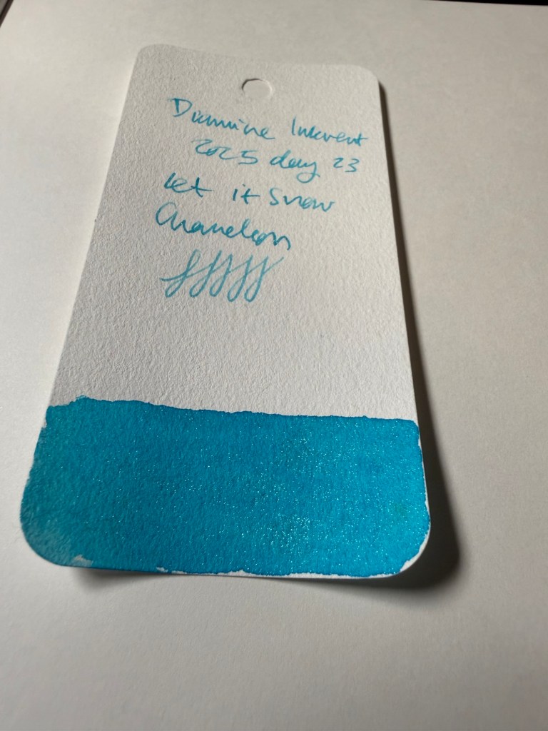
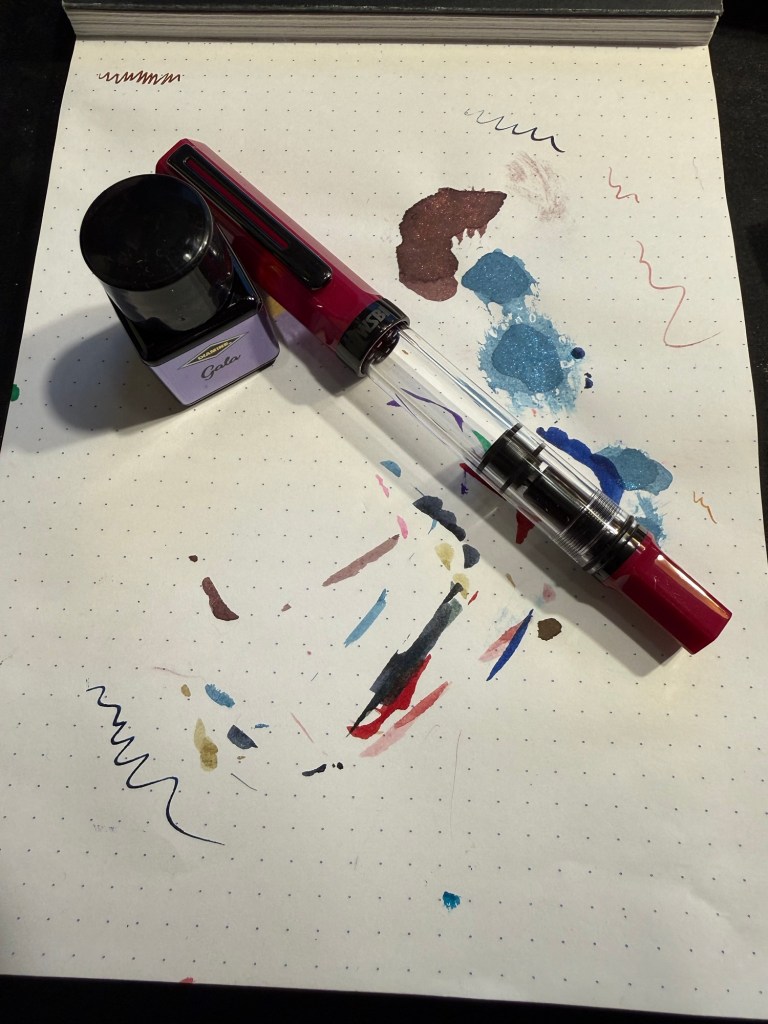
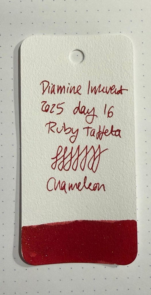
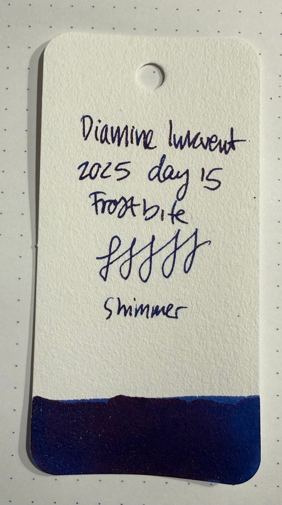
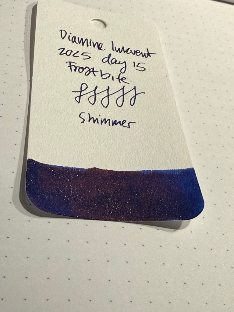
Diamine Inkvent 2025 Day 24
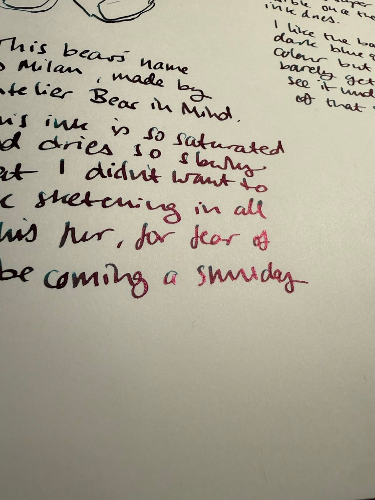
Day 24’s ink is Diamine Antler, a raw umber (i.e. brown) pigment ink. This is the perfect classic shade of ink for sketching, and I can’t wait to use it with my watercolours.
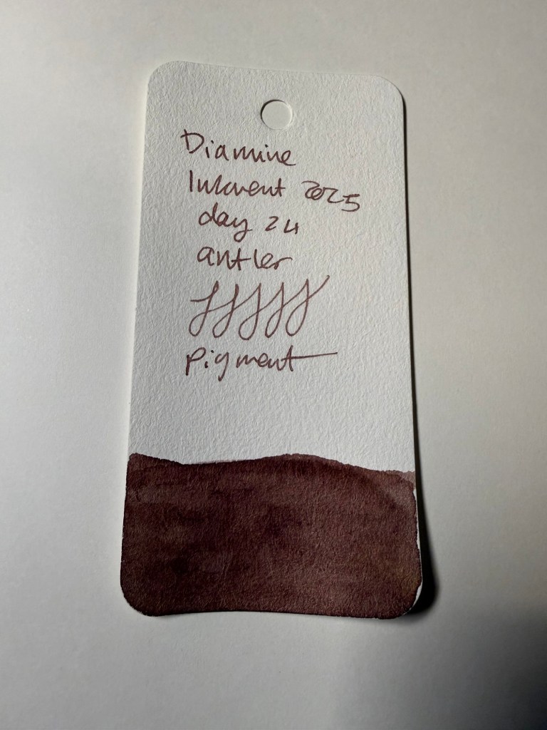
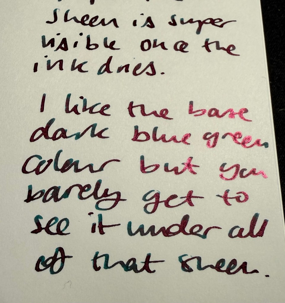
Diamine Antler won’t be a favourite for everyone, being a brown ink, but it’s a useful colour for sketching, and it’s an interesting brown. It’s “flat” in terms of shading (or in this case, lack thereof), but the colour itself has a hint of red in it, and yet isn’t a strictly warm colour. It’s hard to explain, but if you’ve used raw umber in sketching you’ll know what I mean.
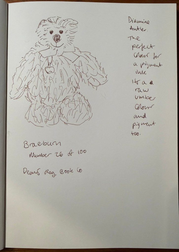
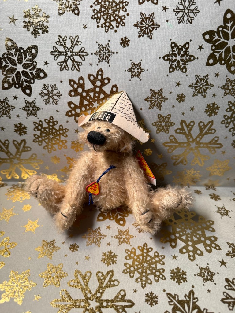
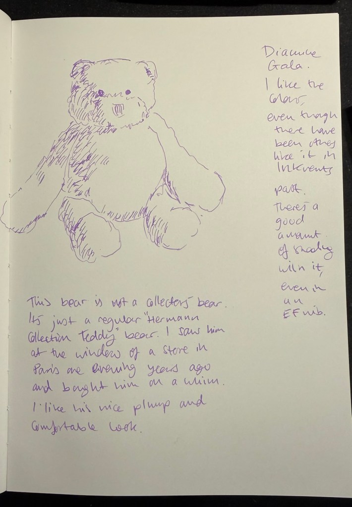
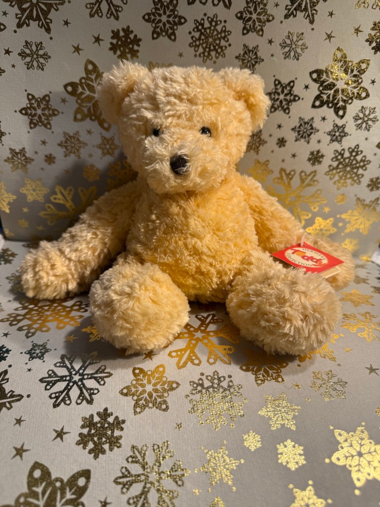
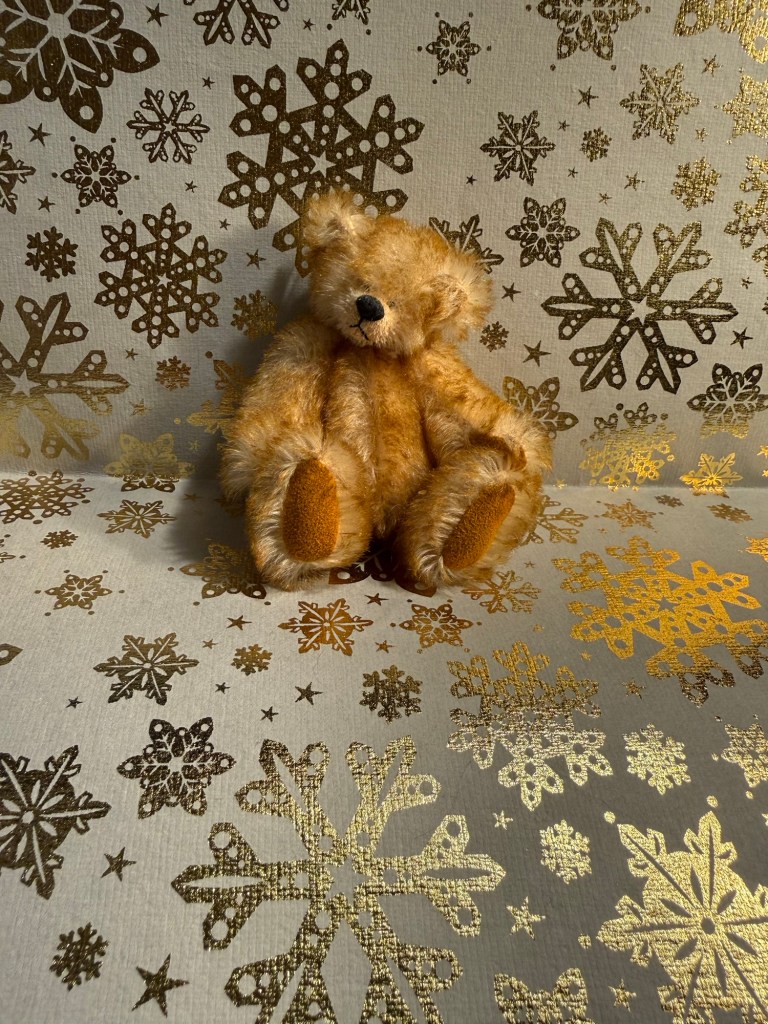
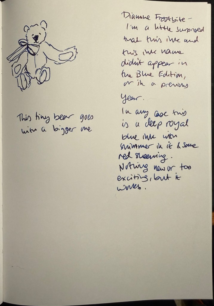
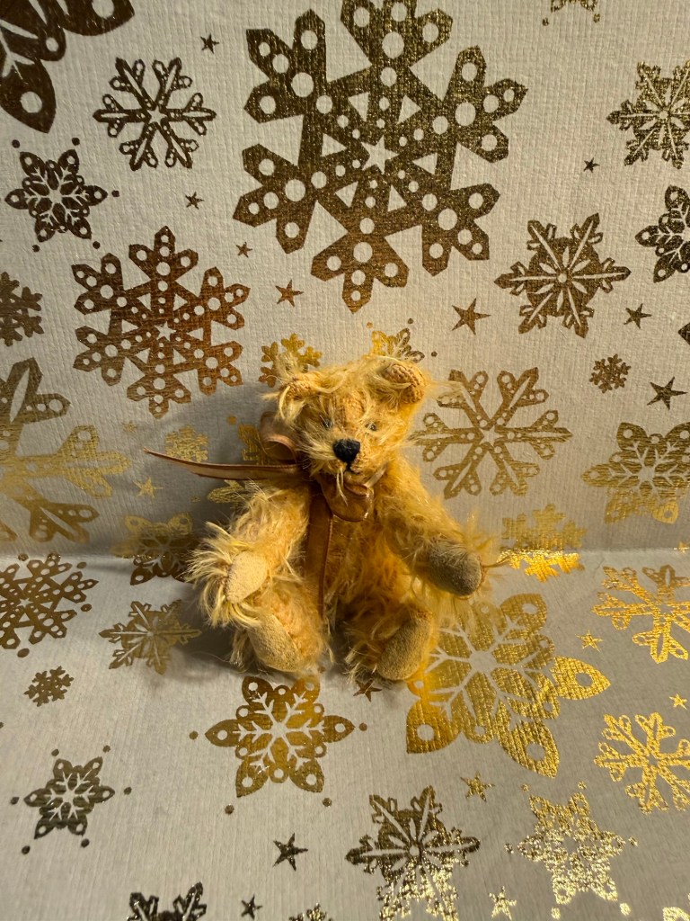
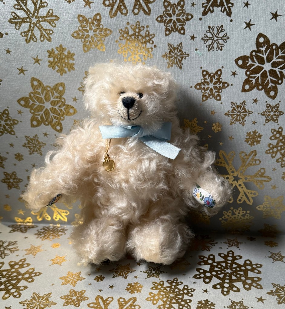
Today’s bear is Braeburn, the only bear that I’ve ever bought online. He was part of a limited edition series that Dean’s Rag Book Co (my favourite bear makes, now defunct) issued, with each bear themed around a species of apple. This fellow is Braeburn:
I will be testing out Diamine Antler with some watercolours. I think that it could be a good ink to have in rotation – provided I don’t already have a similar pigment ink on hand.
Did you like Diamine Antler or was it too boring and brown for you?