It’s day 18 in Diamine Inkvent. Exciting, I know 🙂
Door 18
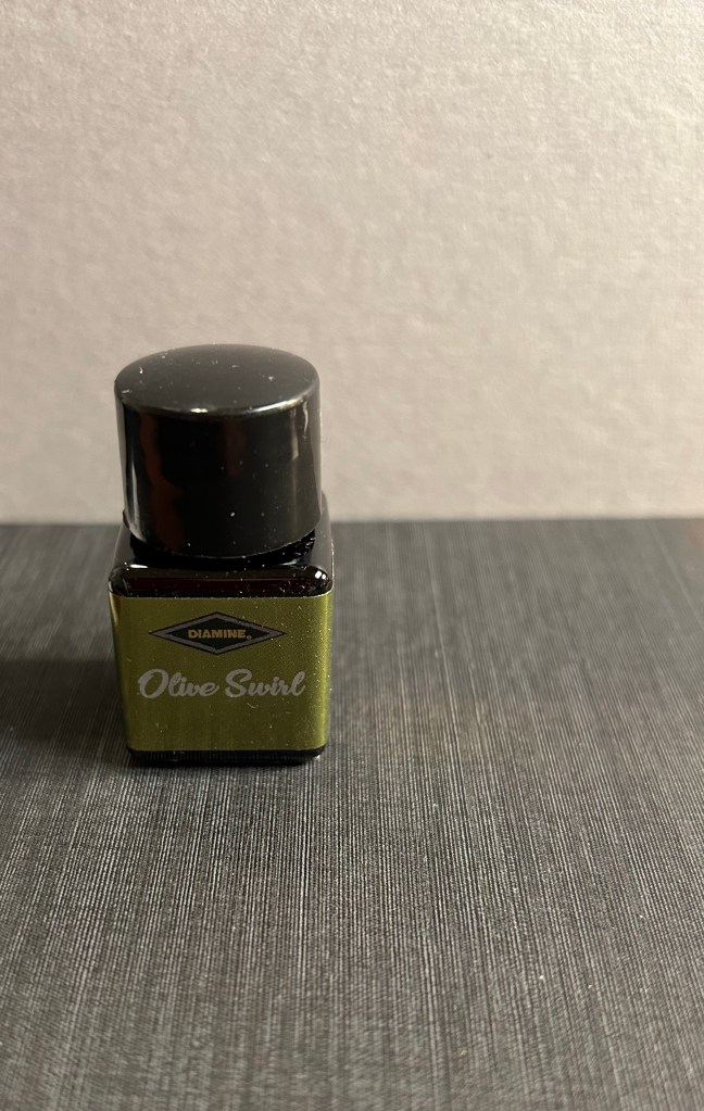
Day 18’s ink is Diamine Olive Swirl, an olive green chameleon ink with a good amount of shading and a whole lot of class.
Diamine Olive Swirl bottle
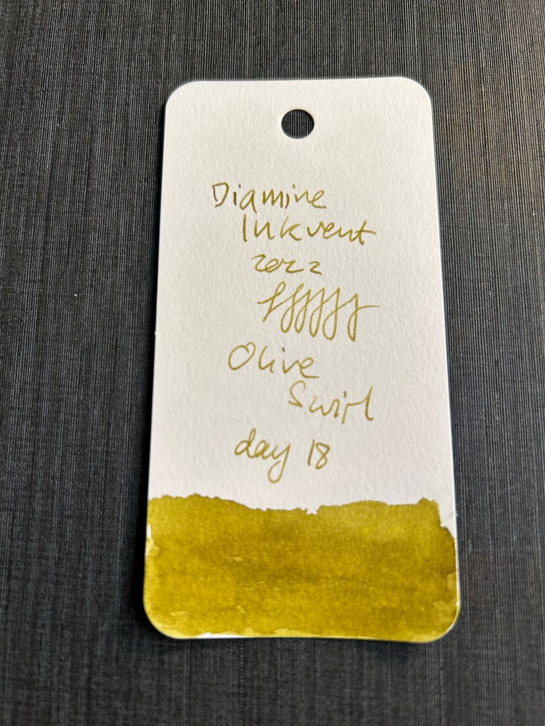
Diamine Olive Swirl is a very cool colour – a pretty vibrant olive green with the coolest chameleon effect. The shimmers here change from pinkish copper to green, and it is a very attractive combination with the base colour.
Diamine Olive Swirl swab on Col-o-Ring
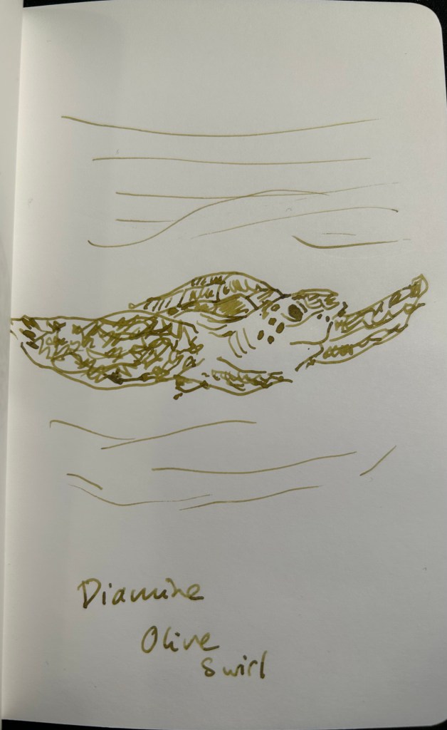
I like sketching with unusual colours every once in a while, and even though I don’t sketch with shimmer inks, I can see myself sketching with Olive Swirl. The base colour is so good and the chameleon shimmer is subtle and yet adds so much interest to it, that I really enjoyed sketching this sea turtle with it.
Sketch on 52gsm Tomoe River paper
Of the chameleon inks so far, Olive Swirl is by far my favourite. Green and pink are a classic combination, and the fact that you see the pink only in certain angles and so very subtly adds a lot to this ink’s charm. Definitely an ink I see myself purchasing in the future.
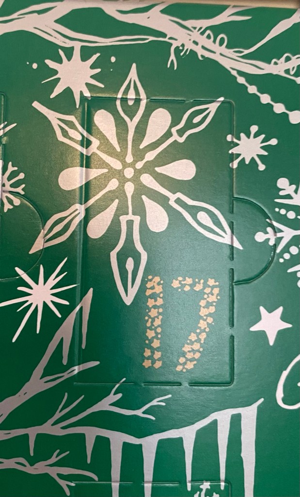
It’s day 17 in the Diamine Inkvent calendar, and check out that cool snowflake:
Door 17
Day 17’s ink is Diamine Flame, an orange standard ink. Yay for standard inks again!
Diamine Flame bottle
Diamine Flame is a bright orange with some shading and did I mention that it’s a standard ink? No shimmer, sheen, sparkles or scent. Nice for a change.
Diamine Flame on Col-o-Ring
I am continuing my animal theme for now, this time with a sketch of a clown fish. You can see Diamine Flame’s shading and outlining properties quite well here”
Diamine Flame on 52gsm Tomoe River paper
Diamine Flame is dark enough to be legible without losing its orange nature (it’s not too red, in other words). Will I buy a full bottle of this? Likely not, as I don’t normally use orange inks. It is, however, a well behaved, interesting enough orange ink for me to recommend it if you are looking for something in that shade and find Diamine more affordable/accessible than Robert Oster, Pilot Iroshizuku or Montblanc.
Day 16 of Diamine’s Inkvent. Let’s hope that we don’t get another scented ink soon…
Day 16 door
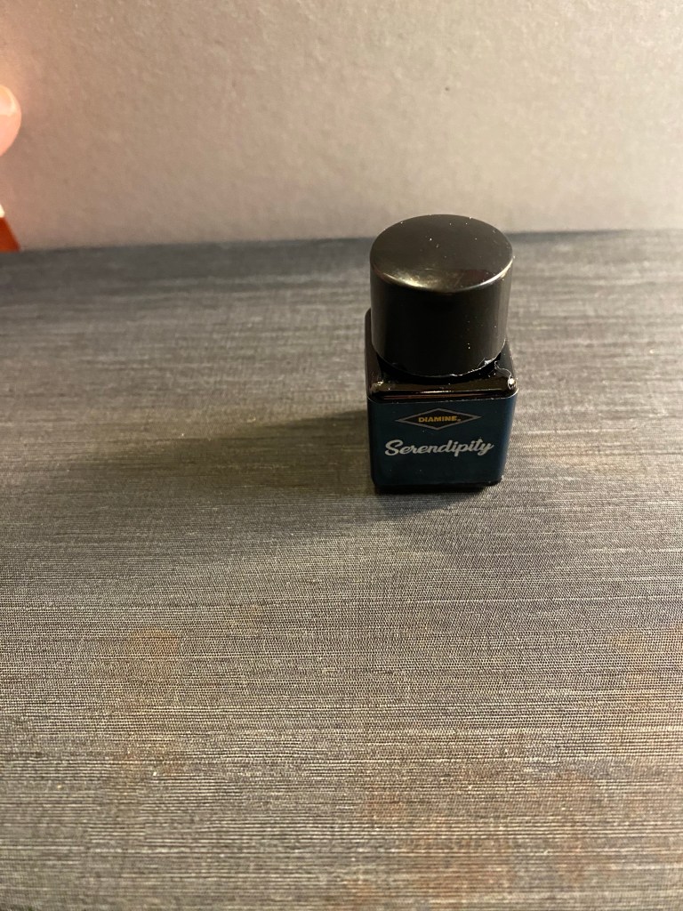
Day 16’s ink is Diamine Serendipity (quite a mouthful) – a shimmering and sheening dark blue ink.
Serendipity bottle
Diamine Serendipity has a red sheen (of course) and gold shimmer. In Diamine’s defence, the red sheen is closer to the purple/pink side of the spectrum, which is a nice change from the usual, and the gold shimmer does make it particularly festive.
Diamine Serendipity swab on a Col-o-Ring
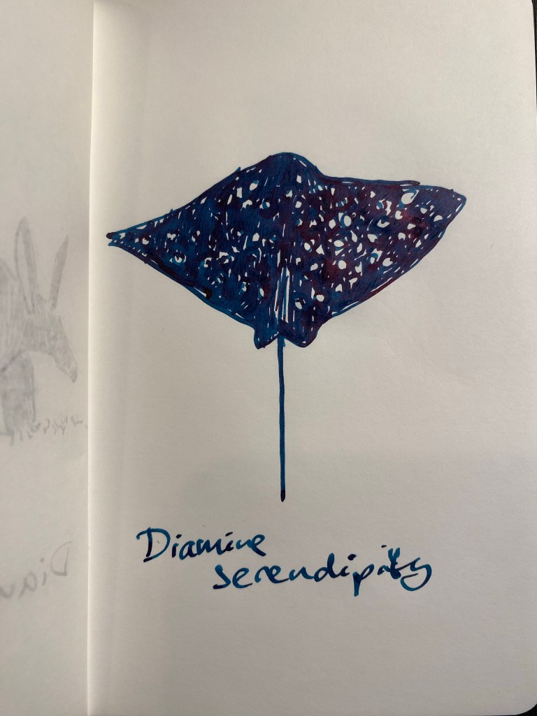
The base colour of this ink is interesting – despite being dark and saturated, there is some shading towards the teal end of the spectrum. As per my usual experience with inks that both shimmer and sheen, the sheen overpowers the shimmer in most viewing angles.
Sketch on 52gsm Tomoe River paper
I had another nib accident with a TWSBI Go here (a different pen, of course, but with the same issue – the nib and feed weren’t properly set in after a clean), so there’s a big smudge at the start of the writing sample. Diamine Serendipity is a nice enough ink, but not one that I see myself rushing out to buy, as there are so many inks in the same colour range and with the same properties, and I already have a good selection of them. I do like the deep, dark, bluish teal base colour of this ink very much though, and I’m glad that it is part of this year’s Inkvent.
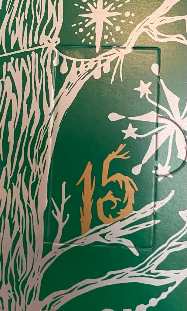
It’s day 15 of Diamine’s Inkvent, and it comes with another cool illustration on the door:
Day 15 door
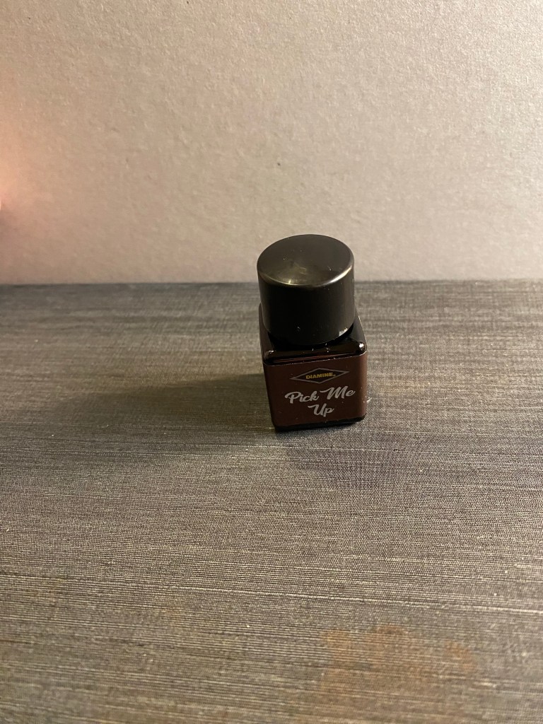
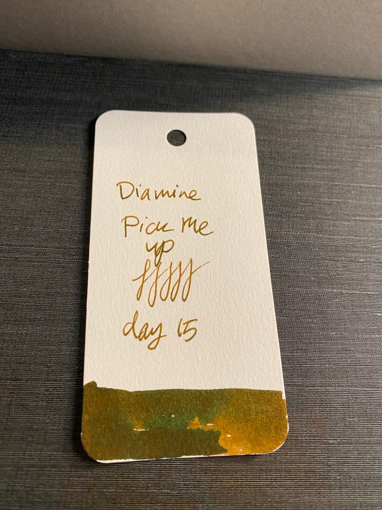
Oh no! Day 15 is another scented ink! Day 15’s ink is Diamine Pick Me Up, a scented and sheening chocolate brown ink, and it’s likely going to be one of my least favourite inks in this year’s Inkvent.
Diamine Pick Me Up bottle
The base ink itself is a warm, rich colour, with some shading and a greenish gold sheen which I could do without. It also has a strong artificial smell of either burnt chocolate or chocolate with coffee (but not the good kind of chocolate with coffee).
Swab on a Col-o-Ring
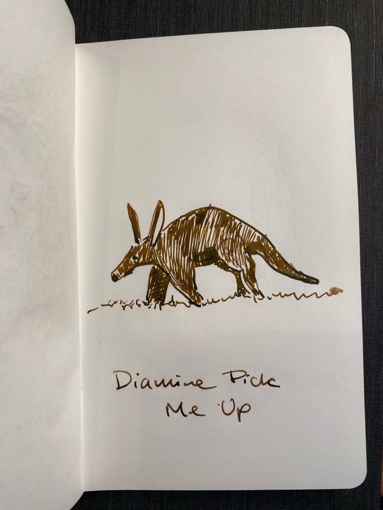
I enjoyed drawing this aardvark. I didn’t enjoy using this ink, largely because of the smell. I dumped out the previous scented ink, and this one looks to be following it down the drain.
Sketch on 52gsm Tomoe river paper
I used a Lamy AL Star fine nib to write and sketch this review, and I am going to clean it out thoroughly this weekend by the looks of it. I just can’t stand the smell, and the ink isn’t appealing enough for me to want to use it despite the scent and the sheen.
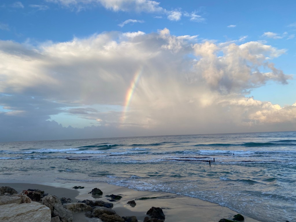
It was cold and dark outside this morning, with a chance of rain. My legs and body were sore from a combination of an intense gym session and standing/walking around at a conference yesterday. I didn’t feel like running. I went on a run anyway.
This was my reward:
Rainbow over the Mediterranean
I’ve never regretted a run yet, and today was no different.
Health
I started getting my post chemo treatment tests done, and while my lungs still aren’t 100% (but hopefully will someday get there), my heart and SVC got a clean bill of health. As both the tumour and the chemo slammed it, I’m very relieved that my ticker survived. Can I chalk it up to years of running? Maybe. It surely didn’t hurt.
Reading
I just finished reading “The Golden Enclaves” by Naomi Novik, the final book in the Scholomance trilogy.
It’s rare that I see an author really working out a new concept, a new kind of world building out of a tired trope, and doing it so well. It’s even rarer that the author in question is able to pull it off while still creating a readable and enjoyable story, and one so cohesive that it is clear at every point that this was constructed as a trilogy on purpose, from the start, with every piece of the narrative falling exactly into place in the end with elegance, and without calling attention to itself. This is a mechanically excellent piece of writing that doesn’t call attention to its mechanics.
Instead it calls attention to its characters, their relationships with each other, and in particular their relationship to the deep, inherent, and seemingly justified inequalities in their world. Inequalities and injustices that aren’t very hard to map onto many of those that exist in our world today.
Is the Scholomance trilogy perfect? Of course not. The characters don’t attain true depth because the cast is too large, the world needs building and that needs room, plus, these are teenagers after all. Many of them are still working out their personality. But despite its imperfections this is a very enjoyable trilogy that is worth reading, and won’t leave you feeling like you just consumed several hours of empty air. There’s substance here.
Other stuff
I’ve been creeping back to writing, albeit only adventure writing for D&D. I’m creating a new campaign, in a new world, something that I haven’t done for years.
I’m also looking into planning for next year. I have been really struggling with this mostly because of my cancer related PTSD. More on that maybe in later posts.
If you have Disney+, I recommend watching “The Magic of Animal Kingdom”. It made me smile.
It’s day 14 in the Invent calendar, and it’s time for one of my favourite door illustrations:
Door 14
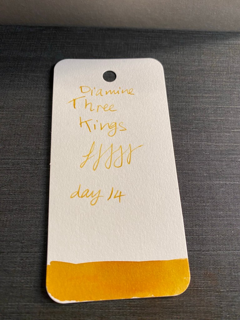
Day 14’s ink is Diamine Three Kings, a standard dark yellow ink. Yes, that’s not a mistake – there’s not a smidgen of sparkle in sight with this one, despite the ink’s shade and its name. I salute whomever had the restraint.
Diamine Three Kings bottle
What Three Kings does well is shade. The colour reminds of aged gold, a yellow with a good hint of dark orange to it.
Diamine Three Kings on a Col-o-Ring
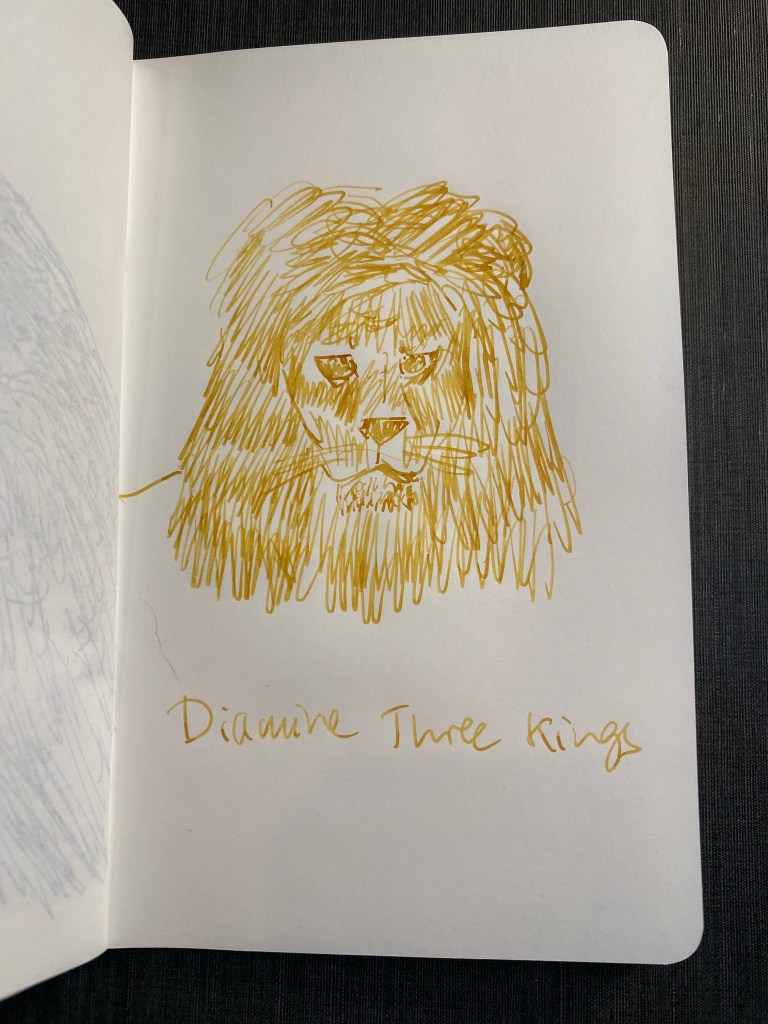
I drew a not very good sketch of a lion with Three Kings, and while I love the shading that it offers and it reminds me of yellow ochre (which I use a lot in my sketches) I don’t think that it’s the best shade for sketching. It won’t stand up to other colours, it isn’t waterproof so it won’t combine well with watercolours, and it’s a bit anaemic on its own. Maybe combined with other brown inks…
Diamine Three Kings on 52gsm Tomoe River paper
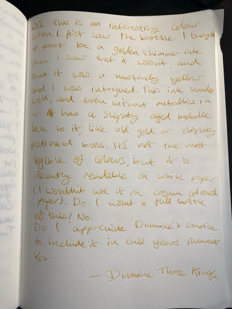
Diamine Three Kings is an interesting colour, mostly because it’s sort of a colour hybrid (like R&K’s Alt Goldrun in concept, if not in colour), and it isn’t a shimmer or chameleon ink. I don’t see a bottle of this ink in my future, but if you are looking for a yellow ochre ink, Three Kings may be the ink for you.
It’s day 13 of Diamine Inkvent, and I almost didn’t create this review because I had a late afternoon post cancer heart echocardiogram at the hospital and I was sure that I was in for at least a two hour wait. Thankfully my wait was much shorter (and even more thankfully my heart survived everything that cancer and chemo threw at it), so here’s today’s review.
Day 13
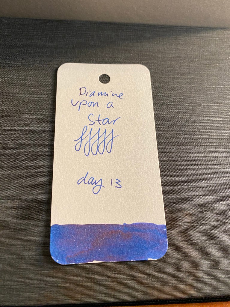
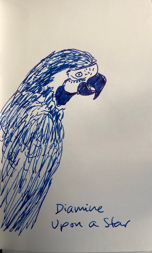
Day 13’s ink is another chameleon one: Diamine Upon a Star. Let’s all pause and acknowledge that this is just a beautiful name for an ink. Upon a Star is a royal blue ink with green, purple, blue chameleon shimmer that makes me think of peacock tail feathers.
Diamine Upon a Star bottle
Diamine Upon a Star is a saturated royal blue with a good amount of the somewhat tiresome but well know red sheen. The sheen can easily overshadow the chameleon glitter, and so the effect can sadly pretty easily be lost.
Diamine Upon a Star swab on a Col-o-Ring
I’m still watching Dinsey’s the Magic of Animal Kingdom (it’s very good, even if I’m not 100% in love with Josh Gad’s narrating style) and so I drew a macaw to test out this ink. I was using a Lamy Safari fine nibbed pen and the chameleon effect is almost entirely lost beneath the shimmer.
Diamine Upon a Star macaw sketch on 52gsm Tomoe River paper
I have too many inks in this shade of blue to even consider Diamine Upon a Star, especially considering that its chameleon effect just looks like red sheening or disappears under the red sheening most of the time. It’s a nice ink to have a little sample of, but not one that I plan on purchasing in the future.
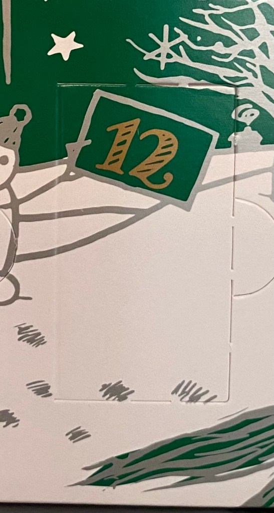
Day 12 of Inkvent is here! We are basically halfway through the calendar, and so far I am enjoying most of the inks. As is expected, not everyone will love every ink in this set, and not every ink is 100% unique (with the sheer amount of inks issued just by Diamine and Sailor in recent years that’s impossible), but Inkvent is a lovely idea well executed. It’s meant to be fun and festive, and I think that it fulfils the brief very well.
Door 12
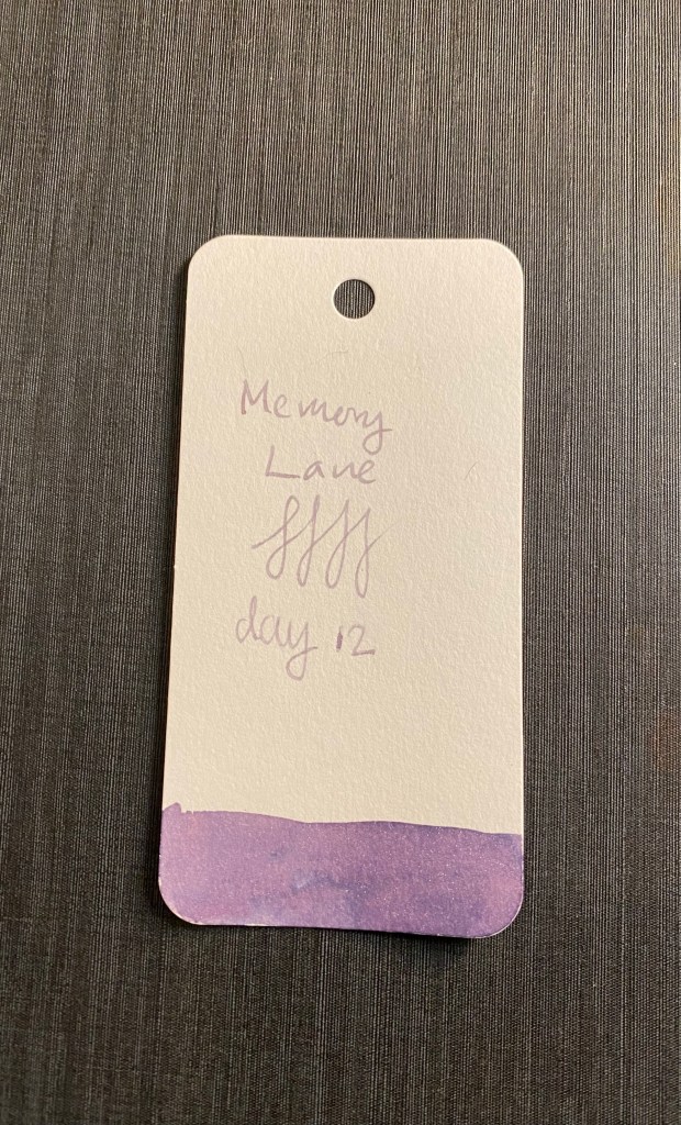
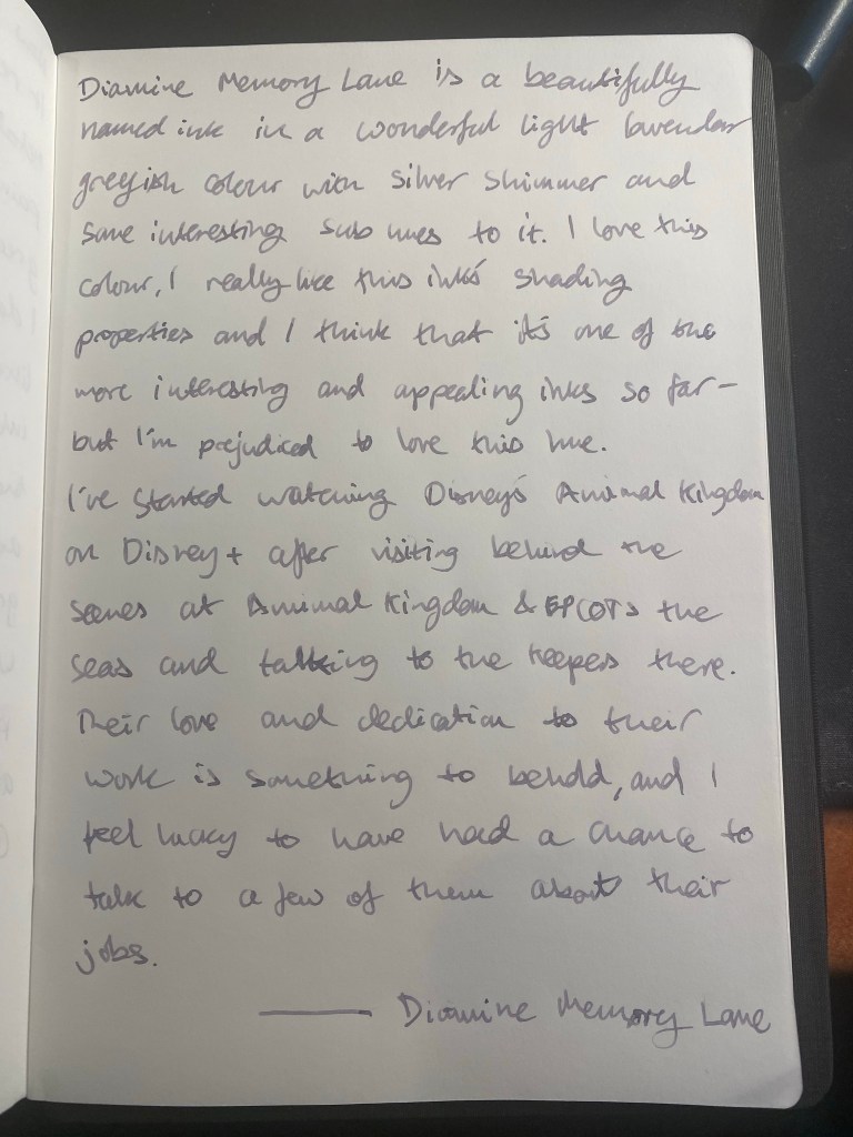
Day 12’s ink is Diamine Memory Lane, a lavender grey shimmer ink that shades very well, and is going straight into my shopping cart once Diamine issues their Green Edition full size bottle of it.
Diamine Memory Lane bottle
I love grey inks and I love purple inks, and this is a wonderful combination of them both. If you like bright and bold inks, this one isn’t for you, but if you appreciate the more muted part of the colour palette, you will likely love this one. The silver shimmer is subtle, and makes the ink look greyish in certain angles and the base lavender colour is calming and shades particularly well.
Col-o-Ring swab
Cameras have a difficult time with purple, and mine made this elephant look more grey than he is in the real sketch. His true colour looks more like the writing sample on the page, or the writing sample below.
Diamine Memory Lane sketch on 52gsm tomoe river paper
The writing and sketching were done with a Pelikan Pelikano with a medium nib, which is on the wide side. You can see the shading both in the sketch and the writing, and you can see how much variety and interest there is with this ink. A winner in my book, no doubt.
Diamine Memory Lane writing sample on 68gsm Tomoe River paper
It’s time for day 11 in Diamine’s Inkvent calendar.
Door 11
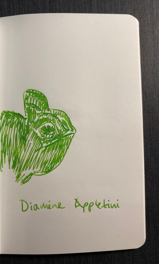
Day 11’s ink is Diamine Appletini. I’m not sure how much of a tie in that has to Christmas, but I guess a bright green ink is always welcome at this time of year.
Diamine Appletini bottle
Diamine Appletini is a bright grass green standard ink with some nice shading to it.
Appletini swab on Col-o-Ring
It’s not a chameleon ink, but Appletini’s colour really brought to mind chameleons and so I sketched one for testing purposes:
Sketch in 52gsm Tomoe River paper
I used a Kaweco Sport iridescent medium nibbed fountain pen to test Diamine Appletini and got a good amount of shading with it. It’s not the most practical of colours, but is a bright and cheerful one, which make it nice to use during the cold and dark winter months.
It’s day 10 of Inkvent, and interesting inks are upon us…
Day 10’s door
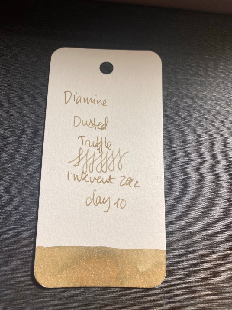
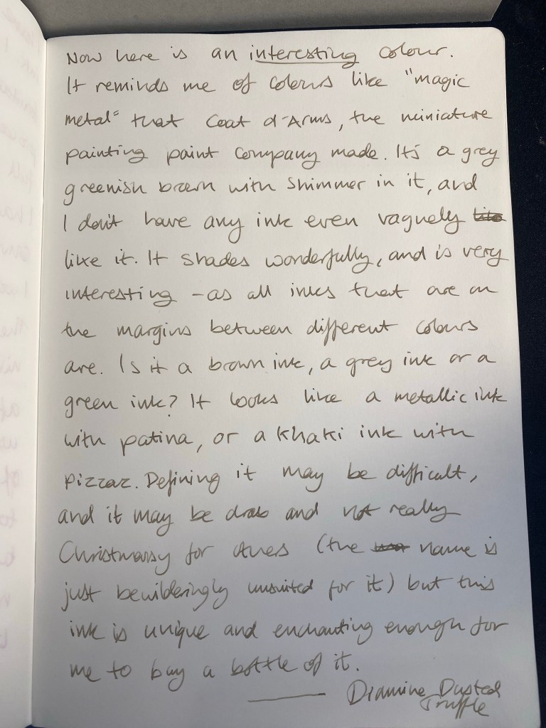
Day 10’s ink is Diamine Dusted Truffle a shimmer ink of an indescribable shade of on the cusp between light brown and grey.
Diamine Dusted Truffle bottle
I took a photo of the swab on an angle to try and show the colour of this ink. It’s a dusty golden brown in some angles, it has a greenish tinge in others, it’s very unique and chimeric.
Swab on a Col-o-Ring
You can see the more greyish tendencies of this ink in this quick truffle sketch. I don’t know if dusted truffle is the best name for this ink, but it certainly has a dustiness about it. It shades well, and there’s a silver shimmer to it, where you’d normally expect a golden one. Perhaps that gives it some of its unique shading.
Dusted Truffle on 52gsm Tomoe River paper
Will I buy a full bottle of this ink? Maybe. It’s certainly high on my list, as I have nothing remotely like it in my ink selection, and it is an intriguing colour. I can’t stop staring at it trying to define what it is and failing. What a wonderful addition to Diamine’s ink lineup.