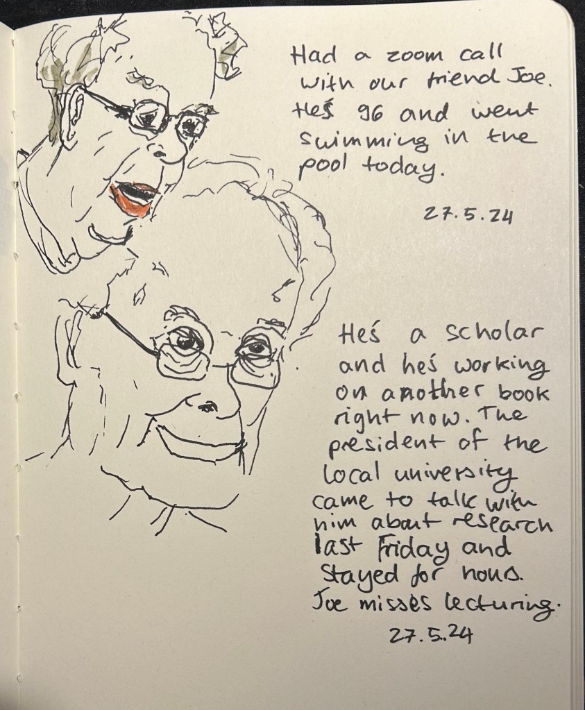
April was a travel month which meant that I cleaned out all of my fountain pens apart from the Big Idea Design Fountain EDC that I took with me on my travels. So in the beginning of May I inked up five more fountain pens, many of them with new inks that I bought during my trip.
The Big Idea Design Fountain EDC is still a troublesome writer, but I keep reaching for it, so it’s still in the rotation with its second cartridge of Diamine Autumn Oak. Diamine Autumn Oak is a reddish orange with a lot of shading and it’s dark enough to be readable even with a fine nibbed pen.
There are two Franklin Christophs currently in my rotation (I misspelled the brand name in the writing sample, my apologies), and I am using them to compare the Sailor Studio 123 ink to the 224 ink. 224 is slightly more bluish and has less of a pink tint to it, but both are so similar that if you’re looking for 123 and it’s out of stock, you could use 224 and likely not notice the difference. I’ve been using these pens so much that I wrote the Sparkling Rock dry already, and the Thomas Hall Tibaldi edition is well on its way to joining it.
The Momento Zero Mother of Pearl is a gorgeous pen with a gorgeous, springy nib, and a joy to write with. Sailor studio 162, which I purchased on a whim at Choosing Keeping in London, is now one of my favourite inks. It’s a very unique shade of green/teal that makes me want to fill the same pen with it the minute I write it dry.
The Lamy Safari Savannah has Pilot Iroshizuku Kosumosu ink in it because I wanted something bright after all the muted greys and greens. The issue is that previously the pen had a shimmer ink in it and I apparently didn’t clean out all the particles, so I now have a shimmer version of Kosumosu. The result is fetching so I don’t mind this accident, but I will have to properly dismantle the pen and give it a thorough cleaning once I write it dry. It’s about halfway full now.
I like Rohrer and Klingner inks so when I saw the limited edition Ebony iron gall ink at Choosing Keeping, I immediately bought it. It’s very well behaved for an iron gall ink, but it’s not really a saturated black. I prefer darker blacks, but I’m getting used to the shading that Ebony provides.
A slightly late addition to the flock is the Leondardo Momento Zero Grande 2.0 Galattica Universe fountain pen, which arrived just in time for my birthday. It’s a stunning pen, and this photo does not do it justice. I knew I wanted a turquoise ink in it, and I haven’t used Bungo Box’s June Bride Something Blue in a while, so that’s the ink I chose. It was difficult to fill the pen from the flat Sailor shaped bottle, and I didn’t get a full piston-full of ink in it because of the awkward shape of the bottle. Lesson learned for next time.
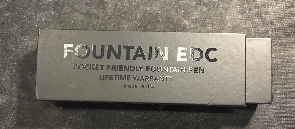
When they originally came out with the Fountain EDC, their first fountain pen offering, I decided to not purchase it. I don’t generally like metal fountain pens, and I rarely use pocket fountain pens because of the hassle of posting them every time you write.
Fountain EDC box
So how did I end up with a Fountain EDC?
I backed their kickstarter of course. Big Idea Design launch all of their products via kickstarter, and this one was no different: a kickstarter for an Ultem Fountain EDC made in the USA in their new machine shop there.
You got a sticker and a little badge if you backed the project. Very cool.
The ultem rage swept through the fountain pen community in recent years (? it could be months, time is meaningless to me since cancer and COVID), and left me cold. I found the material ugly, and the fact that it was touted as extra light and durable didn’t make it more attractive to me. It’s basically a plastic that’s available in black or a singularly ugly orangey-yellow, with certain chemical properties that aren’t very applicable to fountain pens (are you steaming your fountain pens or boiling them regularly? If so, ultem might be for you but fountain pens are clearly not). I’m being cynical, I know, but there’s a twist, I promise. It all works out in the end.
Tiny, light and ugly – the Ultem Fountain EDC
Big Idea Design generally work with titanium, so seeing them use another material was intriguing. It was also a material that is perfect for an EDC type of pen, as it’s both light and durable. The yellowish colour also works well with the matte grey of the titanium hardware that they selected for this pen, and unlike other ultem pens, the price of this one was reasonable. So I decided to try the ugly plastic and see what all the fuss was about.
Ultem Fountain EDC in all of its… glory?
So I backed the kickstarter and the pen arrived very quickly (Big Idea Design kickstarters work like that. They deliver on time, and fast). The box was the usual great Big Idea Design box that they’ve been using in recent years, and it came with a sticker and a tiny velcro rubber patch – very cool.
I was stunned by weight of the pen.
It’s a pocket pen, so it’s bound to be light, and I knew that ultem is supposed to be light, but it’s jarring how light it is. The ultem had a nice, matte finish, the ugly yellow did work well with the brushed titanium clip, but the entire weight of the pen is basically in that clip and the (Kaweco) nib.
The pen, posted as it is when you write with it.
This pen has to be used posted, it’s just too short to use it unposted, much like the Kaweco Sport. There’s a step in the back and an o-ring on the cap that make posting supposedly more secure, but you need to make sure you’re applying enough pressure when posting or the cap will go flying off. On the plus side, the cap is made of ultem so it will likely be unscathed, but it really isn’t the most convenient experience.
The Fountain EDC capped
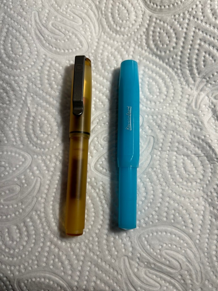
In terms of size it’s about the size of a Kaweco Sport, just a smidge longer, when capped:
Fountain EDC on the left and Kaweco Sport on the right
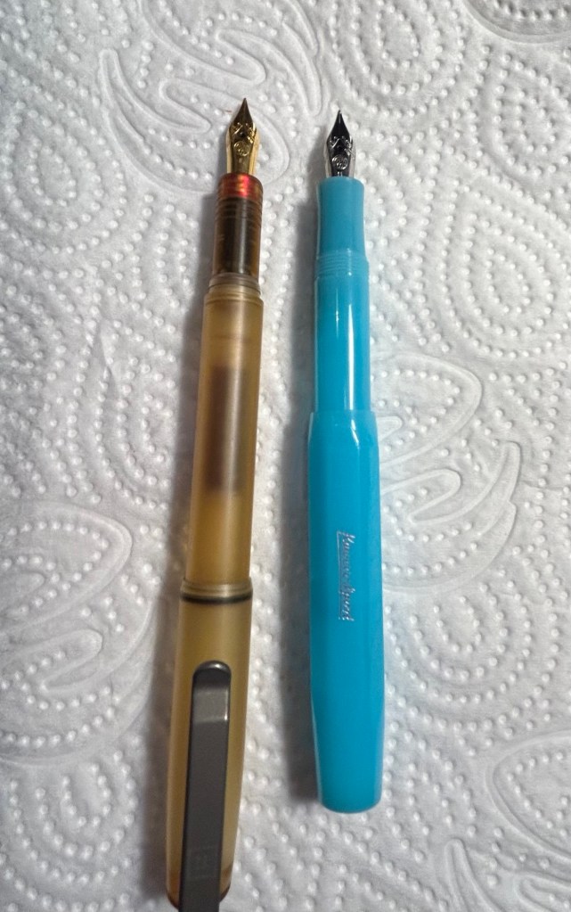
However, things are different when the pens are posted: the Fountain EDC is significantly longer than the Kaweco Sport. It would be much more comfortable for long writing sessions than the Kaweco Sport if not for two flaws in the design: the cap posting, and the ink flow.
I mentioned the cap becoming easily unposted before, but it’s worth mentioning again. The design of the pen is such that you really need to push the cap on to pen body and check that the o-ring is engaged, otherwise the slightest jarring will pop the cap off.
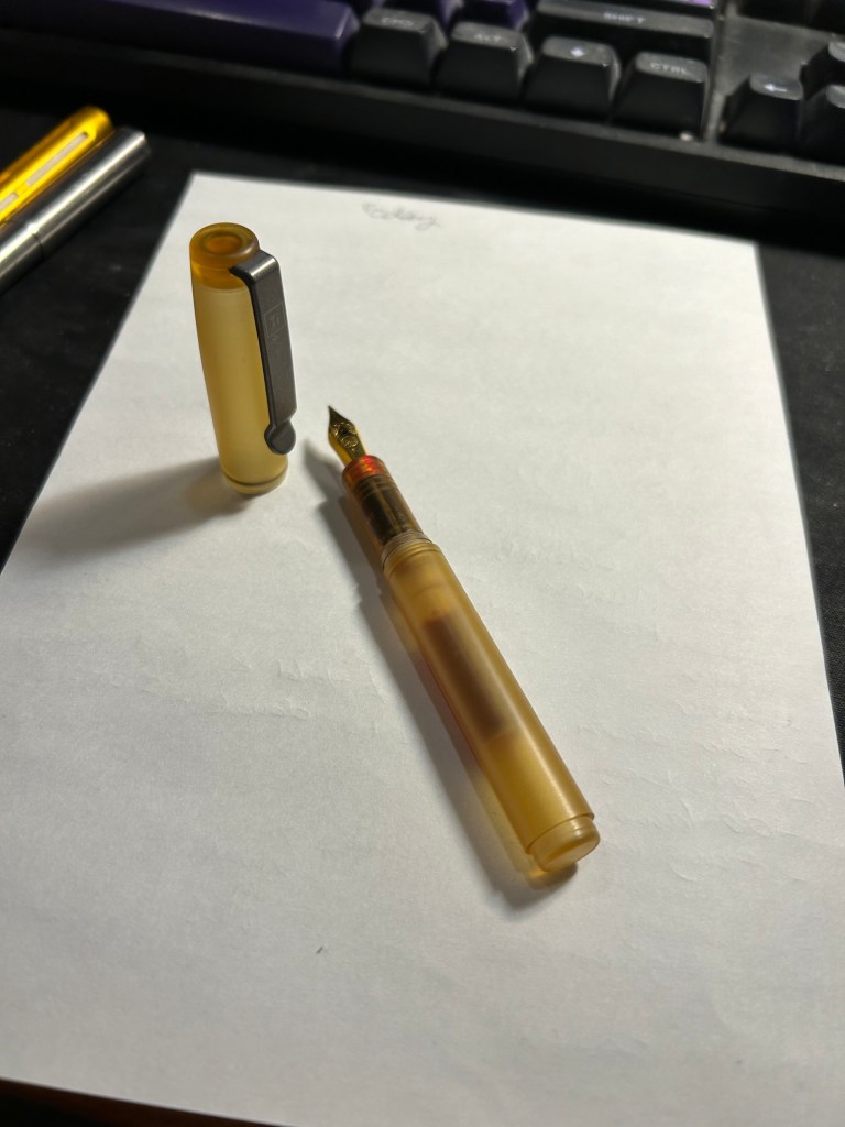
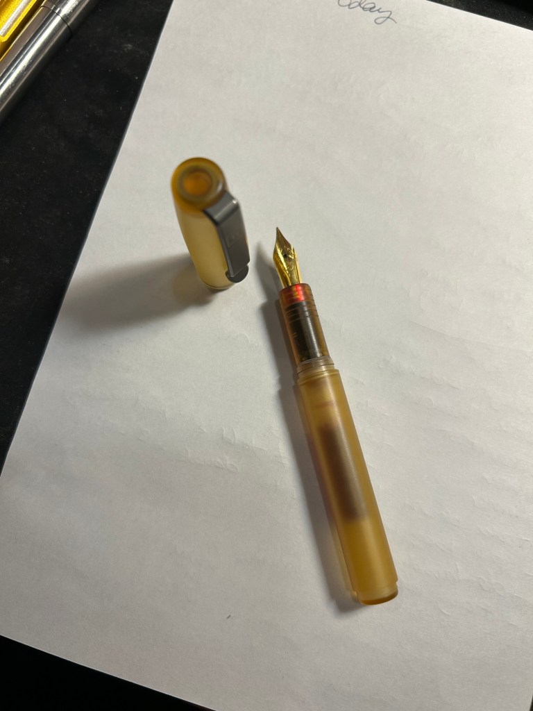
The second flaw is the most major one with this pen, and it’s a big enough deal that it makes me not recommend this pen until Big Idea Design solve it. The pen has a very, very hard time starting. It’s not related to the cartridges you choose to use, but rather to the design of the nipple that connects to the cartridge. Enough Kickstarter backers had this issue for Big Idea Design to post a YouTube video addressing it. They say that it’s the coating they put on that nipple, and that taking a pin and scraping that coating off should help. Well, I did the procedure more than once with various tools and it helped a bit, but the pen still requires literal shaking every paragraph or so to get the ink flowing again after it dries out.
Fountain EDC drying out sample
As this is the only fountain pen I used as I was travelling for three weeks, this was very frustrating. I love the feel of the pen, but the ink flow issue, the cap issue, and the weird balance with the ultra-light ultem material that makes this pen very back-weighted when posted makes this not a product that I would recommend.
The back-weighting and the cap posting issue should have been taken into account during the design process. The flow issue should have definitely been caught during production, especially as it’s a made in the USA pen (i.e. local to the Big Idea Design people, in a shop owned and operated by them).
So bottom line:
I really wanted to recommend the Fountain EDC but I really don’t. The pen needs to be redesigned to have better flow, better balance and better capping.
Ultem itself is as ugly as I thought it would be, but it’s a lightweight and durable material with a nice feel to it, so I get the hype a bit better now.
Product design is difficult, even for experienced designers.
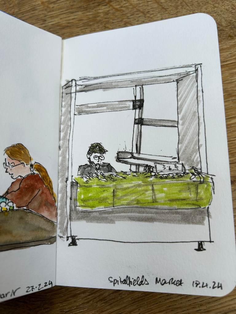
These two sketches were both done on the soft covered vegan Italian made Cass Art sketchbook. It has recycled paper inside which doesn’t look like or behave like recycled paper.
I sketched this in 3-4 minutes while sitting in the Phoenix Community Garden in London, and then took a lot of reference photos with my phone.
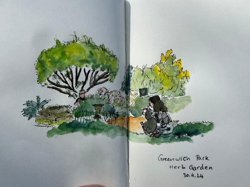
Later on I added watercolour to the sketch:
This is a 5-7 minute sketch of the stalls in Spitalfield market done with a sepia Faber Castell Pitt pen on the same Cass Art notebook.
I bought this sketchbook on a complete whim, because it was relatively inexpensive and I liked the look of it. I liked it so much I returned later on and bought a second sketchbook with a different cover colour.
What surprising and unexpectedly good products have you found lately?
Still travelling. This one is a 10 minute sketch of the herb garden in Greenwich park, London. Paper is a Cass Art notebook with non watercolour paper that held up surprisingly well.
With One Week 100 People I’ve been using my fountain pens much more to sketch with, and I fell in love with them again as sketching tools. There’s something about the expressiveness of the line that they bring in that reminds me of pencil more than of fineliner pens when it comes to sketching – a combination of their varying line width and the varying ink shade.
I’ve also purchased more fountain pens than I planned, buying two Franklin Christoph pens from the pen models that they’re retiring: A model 46 in Polar Ice with an extra fine nib and a pocket 66 Italian Ice with a flex extra fine nib. These two join the Leonardo Momento Zero Grande 2.0 Galattica that I purchased from Pen Chalet last month, and the Leonardo Momento Zero Nuvola rose gold that finally arrived this month after I purchased it from Fontoplumo and it was stolen during transit. Fontoplumo were wonderful, and replaced the pen immediately, so I intend to purchase from them again.
I haven’t purchased so many new fountain pens since before the pandemic, but the Leonardo Nuvola was a gift to myself to celebrate two years from chemo, and the Galattica was a gift to myself for surviving a hellish month with my father in hospital. The Franklin Christophs were unexpected purchases made only because they were retiring these models and I was curious about these materials (I already have an Antique Glass model 66 and I love it).
Writing samplesThe pens
So far the biggest success in terms of nib has been the flex extra fine Franklin Christoph Pocket 66 Italian Ice. The nib has only a slight springiness to it, and I wouldn’t call it a flexible nib in the true sense of the word, but it works well for both sketching and writing. Diamine Earl Grey is one of my favourite inks (a bluish grey with tons of character that is legible even with very fine nibbed pens), so I didn’t hesitate filling an eyedropper pen with it. As eyedroppers have such a tremendous ink capacity, you always need to take into account just how much you love the ink you use in them.
The Leonardo Momento Zero Nuvola was a surprise in terms of the resin on the pen body (I was already familiar with LMZs fantastic fine flex nibs, and great pen and converter design). I was expecting a light blue pen with white “cloud” blotches and black outlines. In reality the black outlines are in a semi transparent brown resin, the white is more off-white/cream, and there’s real depth to the design. A very unusual resin that is both classic and unexpectedly unique.
Caran d’Ache discontinued their ultra-expensive and ultra-sought-after ink series “Colours of the Earth” in 2013 and I managed to get a bottle of the entire series besides Carbon right after they announced they wouldn’t be making them (I had bottles of Amazon, Safron and Sunset before they were discontinued because those were the ones that interested me the most). These inks are well over 10 years old and still fantastic, though the Amazon (the green ink) has darkened a bit and so lost some of its depth. The Caran d’Ache bottles are both gorgeous to look at and terribly designed.
Diamine Coral is the most optimistic of inks, a brightly bright coral ink that glows on the page and works best in generous nibs. I felt like a pick-me-up so I filled the Woodshed pen with it.
I made some interesting eexperiments with notebooks and tried a few new pencils, but this post is getting a little out of hand and so I’ll write about those in a separate post.
Did you use any interesting stationery last month?
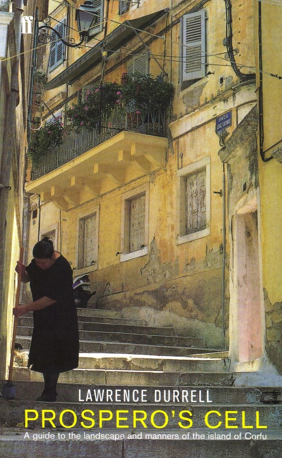
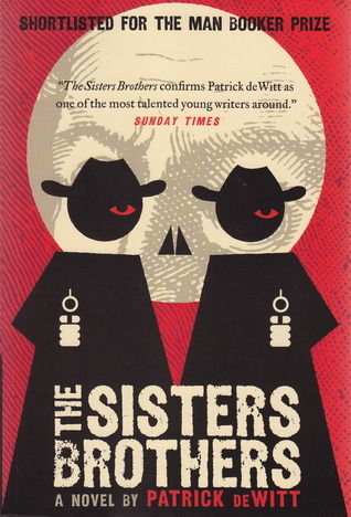
I read four books in March (and started reading Paul Auster’s mammoth of a book 4321). Three of them were very good (Prospero’s Cell, The Sisters Brothers and Blood) and one that was a bit of a disappointment (Slow Productivity) mostly because I was already familiar with the concepts in it. All in all not a bad reading record for the month.
Prospero’s Cell: A Guide to the Landscape and Manners of the Island of Corfu, Lawrence Durrell
This isn’t a guidebook, nor a travel book, nor purely a work of non-fiction. Durrell lived in Corfu for a few years before WWII (his brother, Gerald Durrell wrote several books about their time there, the most famous of which is the wonderful “My Family and Other Animals”. I’ve read that book so many times I know parts of it by heart) with his wife Nancy and a group of artistically minded friends. This book pretends to be a guide to the island only in its title and a few peculiar appendixes in the end. In reality it’s a stylized diary of a year and a half of Durrell’s time there, just before the war broke out. Durrell is a master of description, and for that alone the book is worth the read. It’s a sliver of a book that captures in a pile of amber words a time, a place and a community that now no longer exist. It was written while Durrell was exiled in Alexandria, and you can feel the melancholy and mourning for a golden age that was once his and is now lost.
The Sisters Brothers, Patrick deWitt
I’ve had this book for so long on my reading list I managed to buy both a digital and physical copy of it. The design of the paperback is wonderful, by the way, so I recommend getting it if you can (that’s the edition I ended up reading).
Charlie and Eli Sisters are brothers and professional killers in 1851 frontier America. They’ve been sent to California to kill an elusive prospector, Hermann Kermit Warm, at the request of their employer, the enigmatic, powerful and cruel Commodore. The novel is a sort of Noir Don Quixote/Cohen Brothers telling of the story of their trip there and back, from the point of view of Eli Sisters, the younger brother. Eli is a fascinating character, and much of the interest in the story is seeing him grow more self-aware and conscious of his life and choices. The novel manages to be funny and tragic, cruel and heartwarming at the same time. It has a lot to say about agency, morality, violence and the rush for gold vs quality of life, and it goes about it without preaching to the reader.
A truly original novel that is hard to put down, and manages to be both entertaining and illuminating. Well worth the read.
Slow Productivity:The Lost Art of Accomplishment Without Burnout, Cal Newport
I’ve read Newport’s Digital Minimalism and Deep Work, which I liked and utilized to great effect, and his So Good They Can’t Ignore You, which isn’t as good as the others. I also listen to his excellent podcast, Deep Questions, and so I pre-ordered this book the minute he started talking about it.
Herein lies the paradox of this book. If you’re a regular listener of Newport’s podcast there’s very little in this book for you beyond a few anecdotes. Newport has basically workshopped and talked about all the ideas in Slow Productivity for months on his podcast, going into much more depth and implementation specifics than he does in this book.
If you aren’t a listener of his podcast, AND you’re a knowledge worker with some level of control over your schedule and tasks, then Slow Productivity is worth reading. You’ll learn about pseudo-productivity, its origin and its breaking point, and you’ll learn about an alternative framework: slow productivity. “Do fewer things. Work at a natural pace. Obsess over quality”.
Where the book fails and podcast triumphs is in the implementation of these ideas. The book does give you a few ideas to try out, but through a much lengthier discussion in the podcast, plus real-world questions that listeners asked you get a better idea of how this would work in real life.
As I’ve been listening to the podcast for a few months, I already started implementing these ideas at my job (before the book was published). I work on only one project at a time, the rest stays in the backlog. I was told to cut corners and do a mediocre job on my current project in an attempt to rush it, but I deflected that request. Once I presented my initial results, the tune changed – this was high quality work! Totally worth the work and the wait, keep it up!
Bottom line: skip if you’re a podcast listener/viewer, read if you feel overwhelmed at your job and want an introduction to an alternative productivity framework that’s not as frenetic as the normal knowledge worker’s fare.
Blood: The Science, Medicine and Mythology of Menstruation, Dr Jen Gunter
Like many other readers that reviewed this book, I wish I had access to it when I started menstruating. Dr Gunter is as usual informative, caring and entertaining at the same time, which is quite an accomplishment. Complex medical processes are explained with great clarity and compassion, and the reader is left with a LOT of very useful information to use when making medical choices or advocating for themselves in medical settings. This and Dr Gunter’s The Menopause Manifesto are must reads and treasure mines of solid, well-researched and vetted medical information in a world full of medical disinformation and misinformation. There are a few pages here that would have saved me months of needless anguish during chemo.
An absolute gem of a book, one to read cover to cover and then reference in times of need.
Have you read anything good or interesting last month?