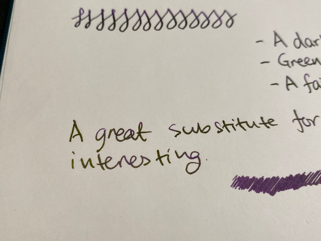
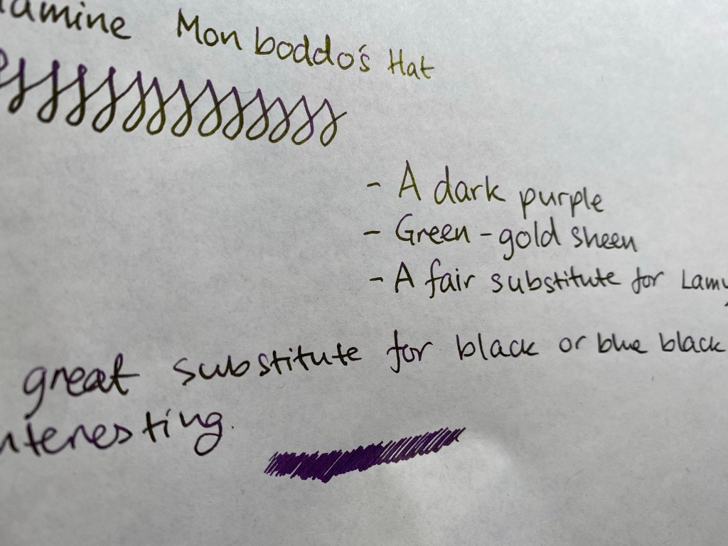
Schmincke Horadam Super-Granulating Watercolour Review

Schmincke recently came out with a new series of limited edition Horadam (artist grade) watercolour paints that are super-granulating.Granulation in watercolour is the an affect that is created when the pigments in the paint separate and settle in a diffused patten on the paper, oftentimes allowing other pigments that they are mixed with to show through. In my everyday watercolour palette Schmincke’s Ultramarine Finest (494) is a prime example of a granulating paint that I use both for its effect as an individual paint and when mixed with various browns and greens. The new 900 limited edition series of Horadam watercolours that Schmincke has issued is composed of 25 paints that are divided into five sets: Galaxy, Glacier, Deep Sea, Forest and Tundra. I decided to purchase all five sets out of curiosity, since limited editions in artist grade watercolours aren’t common, I already use Schmincke almost exclusively, and I’ve been embracing granulation more lately in my work.

The 5ml set boxes.

The paints can be purchased in individual 15ml tubes (which is a lot of watercolour paint), in fancy wooden boxed sets of 15ml tubes and in cardboard boxes of 5ml tubes, which is what was available at my local art supply shop and what suited me to buy anyway. 15ml of watercolour paint is a commitment, and artist grade watercolour in general and Schmincke in particular aren’t cheap. The paints aren’t sold in half pans, which I would have preferred over the tubes, and which means that you are going to need empty pans or a palette to use them.

Schmincke Galaxy set

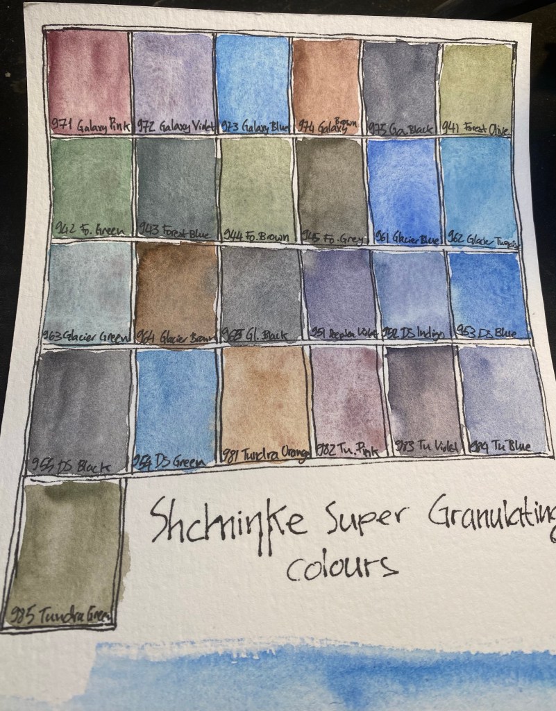
The Galaxy set includes Galaxy Pink, Violet, Blue, Brown and Black. There are some naming peculariaries in this entire series of paints, such as the fact that the paints are super-granulating but the set is called: Supergranulation on the box, and Super Granulation by the dealers. In any case, like all the colours in this set the paints in the Galaxy set have good lightfastness. They are all non-staining (which means that they can easily be lifted off the paper), the Violet and Blue are semi transparent, the Pink and Brown and Black are semi-opaque. This is the most vibrant of the sets, but don’t believe the photos on the package or in the various marketing materials, none of the colours in any of these sets really pops or is as vibrant as they appear to be. All these colours tend towards naturalistic, landscape painting tones.

Schmincke Forest set

The colours in the Forest Set are: Olive, Green, Blue, Brown and Grey. They are all extremely lightfast, the Olive and the Brown are semi transparent, the Blue and the Grey are semi opaque and the Green is opaque. I have no idea why the Forest Brown (944) is called Forest Brown as it’s not a brown at all, it’s more of a greyish green. Forest Blue is also a misnomer, as it’s also a green, this time one that looks like it was mixed with indigo. This is the most monotone of the sets, though if you are focused on landscapes, there are some interesting greens here.

Schmincke Glacier set

The Glacier set boasts the best paint in the series in my opinion, the Glacier Green which is just a delicious paint to have on your palette – a phenomenal and unique green with pronounced brown undertones. I can’t wait to use it in my work, and I’ll be buying a 15ml tube of this. The rest of the colours in this set are Glacier Blue, Turquoise, Brown and Black. Despite what the marketing material may say, there is very little difference between the various blacks in these sets, and if I could I would have skipped all of them and used the Forest Grey and the Tundra Violet instead. All the colours in this set rate in the 4-5 star lightfastness range and all apart from the Brown (which is semi-staining) are non-staining. The Blue is semi-transparent, the Turquoise, Green and Black are semi-opaque and the Brown is opaque.

Schmincke Deep Sea set

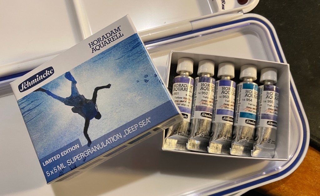
The Deep Sea set features the following colours: Violet, Indigo, Blue, Green and Black. The Green here is a misnomer, as it’s also a blue (with only the slightest green tinge) and the violet is greyish and flat compared to the Glaxy Violet (and in any case if you’re looking for a vibrant violet look elsewhere in Schmincke’s lineup). This is probably the most redundant set of the five, and you can pretty much skip the colours here without missing on much. Indigo, Blue and Green are semi-transparent, Violet and Black are semi-opaque. Lightfastness is very good to excellent and non of these are staining.

Schmincke Tundra set

The Tundra set contains Orange, Pink, Violet, Blue and Green. Tundra Violet is another misnomer as the paint is practically black with a tinge of purple. This is the most staining set (Violet and Green are staining, the rest are semi-staining), but also a pretty mixable one. Orange, Blue and Pink are transparent, Violet is semi-transparent and only Green is opaque. It’s also one of the most compelling greens in the set, with it’s olive like tones and its pinkish undertones it’s both unique and generally useful for landscapes.

Paints on my palette and in half-pans

Schmincke aren’t selling these in pans, which is pretty inconvenient if you just want to swap one or two of these into your existing palette.

The paints in the series on Stillman and Birn Alpha paper

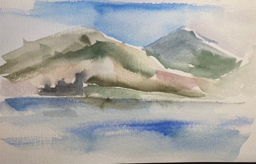
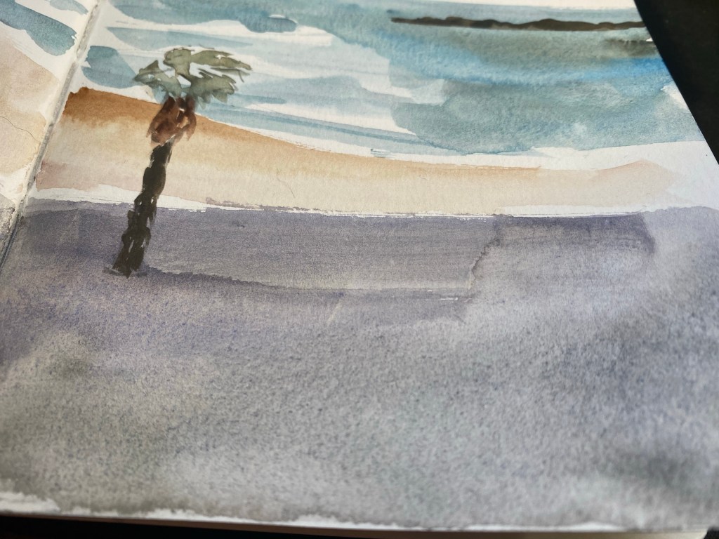
I first saw these paints on Schmincke’s Instagram and then on the Jackson’s Art blog. In both the paints are much more vibrant and with much more pronounced granulating, to the point of almost marbling, than what I got when I first created a the above reference drawing. I had a feeling that this was somewhat due to the extreme closeups that they took, and likely also the paper that they used.

Sketch on Stillman and Birn Alpha paper

In any case, since I and many others also use Stillman and Birn Alpha paper for watercolours, I decided to try and create a painting using these paints exclusively. In the end I also added Schmincke Indian Yellow (220) for the signs, but I didn’t mix it with anything else. As you can see, the granulation is still pretty pronounced throughout, but the colours, with the exception of the Glacier Blue aren’t exactly vibrant or saturated.

Paint samples on Magnani 1404 Toscana 100% cotton 300gsm rough cold press paper

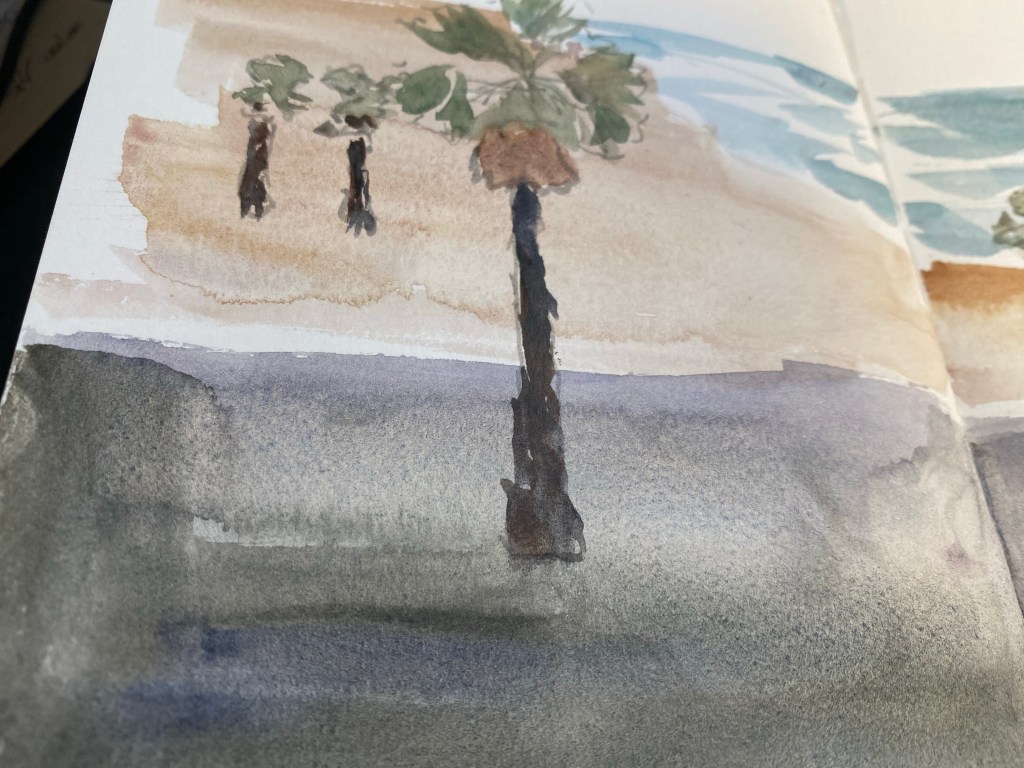
I then decided to break out the good paper, and tested the paints on 100% cotton 300gsm cold pressed rough watercolour paper. Here you can see the granulation at its best, and yes, as promised it is pronounced in all of these paints. Yet as I suspected the choice of paper does nothing to make these paints more vibrant, which means that I certainly won’t be using them to replace large swaths of my current palette or recommending that you use them exclusively (especially since there are no yellows here and the red selection is pretty poor).

Paint palette on Magnani 1404 Toscana 100% cotton 300gsm rough cold press paper

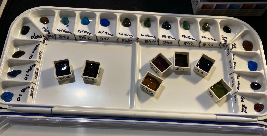
Here are the paints all labeled (I got the Deep Sea Black and Green swabs out of order).

Sketch on Magnani 1404 Toscana 100% cotton 300gsm rough cold press paper

Here’s a very quick sketch with these paints on the cold press paper. They are built for washes and wet on wet work, and so relish this paper.

Sketch on Stillman and Birn Beta paper

And here they are on Stillmand and Birn Beta paper, which is better watercolour paper than the Alpha but still not good watercolour paper. You still get much of their effect here, especially if you don’t much around too much with the paint. These aren’t the best for mixing on the palette but do work well with layering and working wet on wet on the page. If you like to put down paint in washes and see what it does, these paints are for you. If you like to work in a more controlled fashion, you likely aren’t a fan of granulating watercolours anyway.

Closeup of granulation on Stillman and Birn Beta paper

You can see the granulation here, and some of the best colours in this set at work (Tundra Orange, Glacier Green, Tundra Violet, Forest Green, Tundra Green and Glacier Brown).

Closeup of granulation on Stillman and Birn Beta paper

Again you can see the granulation at work and how the effect lets the whiteness of the page show through, bringing light to a dark patch.

So, would I recommend all 25 paints? Of course not. Of the paints in these sets here are the ones that seem worthwhile:

963 Glacier Green (the best of the bunch!)

983 Tundra Violet (a great replacement for black in your palette, if you have it)

952 Deep Sea Indigo (bonus points for a transparent indigo with reddish purple undertones!)

964 Glacier Brown (the best brown of the bunch and the most saturated of them, with dark black green undertones)

942 Forest Green (a saturated green in a natural but not easy to mix colour with reddish undertones)

985 Tundra Green (a natural greyish yellow green that is not easy to mix and has brown undertones)

981 Tundra Orange (because this is a transparent paint in a colour that is rarely otherwise granulating, with pinkish undertones and a good generally useful hue that will work well in mixing).

If you’re looking to buy sets, the Tundra set and the Glacier set are the best in my opinion, but it depends on what colours you use most often in your palette.

OneWeek100People 2021: Day 5

Day five of the One Week 100 People challenge, the final day of the challenge. I made it, using only pen and ink, and focusing on portraits the whole way through! It was tough but rewarding, and if I’d change one thing about it is get a better ink than Platinum Carbon. It kept drying up on me, and for the last four drawings I switched to a Lamy Safari fine with Noodler’s Black. That also wasn’t ideal, but it was better than the Platinum. I really want to test out the De Atramentis Document inks, but with shipping rates and reliability being what they are I’m stuck with three equally poor alternatives: Noodler’s Black, Platinum Carbon Ink and Rohrer and Klingner SketchINK. They all dry up in the nib and are hard starters, and the best of the bunch in terms of flow (Noodler’s) is the least waterproof of them all.

Anyway, I really recommend the One Week 100 People Challenge to anyone who wants to improve their people drawing skills, and I plan on doing it again next year.

Silver Needle Tea Seminar and Virtual Tea Seminar Review

Silver Needle Tea virtual seminar spread.

I drew this spread as part of Liz Steel‘s Sketching Now Sketchbook Design course, and it records my experiences from the final virtual tea seminar session that I had with Juyan from The Chinese Tea Company. I took all of the seminars that she offers, and I can see that she’s running a few of them again later this month and next month. I highly, highly recommend them (I’m not affiliated or paid to say this in any way, I’m just a happy longtime customer of her wonderful shop). Whether you are just starting out in Chinese tea or you’re well versed in Gong fu tea brewing, you’ll learn a lot about tea and tea tasting in her seminars, and have a lot of fun along the way. You get four tea samples that you drink while your in the seminar (and there’s enough left over for another brewing post seminar too), Juyan gives a presentation about the tea, the grower and the growing region, as well as tips on how to assess the leaves, brew them and taste them. The seminars are small and intimate, and are a wonderful way to spend an evening. If you’re starting out the Fundamentals of Oolongs and Green Tea Exploration (currently sold out) are phenomenal, the Wu Yi Rock tea seminar is a must – a gateway into understanding a complicated and elusive tea (as is the Phoenix Oolong seminar, if she gives it again). The Puer tea masterclass (also sold out) is just that, and a great way to get familiar with an easily misunderstood class of teas, and the Silver Needle White Tea seminar will take you by surprise. Until this seminar I thought that white tea in general and Silver Needle in particular is boring, but it’s anything but that.

TIMEX x DDC

I tried to get my hands on the Timex X DDC Scout watch designed by Aaron Draplin for three times before I managed to snag one. They are sold out so quickly that if you want one you really need to set an alarm and be quick with your keyboard and mouse. Then our local post office tried to do a vanishing act with my package, but finally, a month after I ordered it, I got my hands on this orange and black beauty. I only use analogue watches, usually Swatch watches (in recent years it was System 51 Swatch mechanical watches), but I’ve never owned such a heavy watch. It took me a day to get used to it, and since then it has been my constant companion. It is a beast of a MACHINE but an eye catching one, and I couldn’t be happier with my purchase. I highly recommend getting one, if you have any interest in watches.

This page was created as part of Liz Steel‘s Sketchbook Design course and is all about the white space.

comfort pasta

Comfort Pasta Sketchbook Page

I think that there’s nothing better than plain pasta or pasta with a little cheese if you’re not feeling your best: it’s perhaps the ultimate comfort food.
I created this page as part of my Sketchbook Design course with Liz Steel, and this one is all about exploring how to use text as part of my page design. Gave Rohrer & Kilngner Helianthus ink a spin, which is also something that I decided to experiment with. Like many yellow/orange inks it tends to crystallize on the nib and feed, so I’m “sacrificing” a Pelikan Pelikano for the effort. Pelikanos are great beginners pens that don’t get much love in the community probably because they are less ubiqutous than Lamy Safaris and their standard nib offering is a Pelikan medium which is very wide. If you’re an artist I recommend purchasing one (with a converter), as they have less tendency to dry out (with permanent inks) than Lamy Safaris and they indestructible workhorses that have very smooth (and wide) nibs.

Drawing made with Schmincke watercolours on a Stillman & Birn Beta which I’m still on the fence about. It’s better than the Alpha for watercolour washes, but it’s still not great, and it’s not great for pen and ink or fineliners. Also the glue connecting the sections isn’t the best, as it needs forcing apart once you hit a new section, and oftentimes leaves an unseemly tear in the middle. The sketchbooks are good, I just wish that the sections were sewn together and that the paper would lean into being watercolour paper more – so that they would be perfect. However, changes like these would mean a price increase, which would make them unappealing, since a large part of the Stillman & Birn softcover sketchbook appeal is their price. In the end it’s a nice sketchbook that I don’t feel too precious about, which is the main point, and is why I’ll continue using it.

Paper Mate SharpWriter Mechanical Pencil

If you follow any makers on YouTube you probably saw this ugly yet somehow charming little mechanical pencil in action. The Paper Mate SharpWriter is a strange beast, full of surprises. It’s a mechanical pencil with a twist mechanism in the tip instead of a click mechanism under the cap, it actually has a serviceable eraser, and it’s non-refillable. It’s as if Paper Mate saw the “Think Different” ad and said, “yes, but how can we apply that to a mechanical pencil?”

Paper Mate SharpWriter.

First of all, you can buy the Paper Mate SharpWriter in many different widths, as long as they’re all 0.7mm. This has the added value of saving Paper Mate the need to indicate the lead width on the pencil, because there’s only one width to rule them all. I can’t honestly fault them for that. It’s a pencil that’s meant for students and bills itself as having less lead breakage, and so 0.7mm is the way to go.

There are some interesting things going on with the business side of this pencil. First and foremost, that’s where the lead propelling mechanism is, which caught me by surprise. It’s a twist mechanism, and it’s pretty sophisticated as it allows you to easily extend and retract the lead to suit your needs. The second part is the “lead cushioning mechanism” which means that the lead springs up and down as you right, preventing you from breaking it if you exert too much pressure. It works, but I’m not a fan as it makes me feel as if the lead is broken inside and I have to extend it to get rid of the small broken piece and reach the “real” lead left inside. It’s going to take some time for me to get used to it.

Writing and erasing sample.

The eraser is downright phenomenal, as it actually erases things quite well, and doesn’t tear into the page. The lead itself is a solid HB 0.7mm lead that is smooth and on the slightly darker side of HB.

The Paper Mate SharpWriter isn’t a pretty of fancy mechanical pencil, but it’s comfortable to hold, lightweight, and has a playful colour scheme that recalls a woodcase pencil. And like a woodcase pencil, it’s disposable, which is where my only real beef with this pencil lies. Yes, this is a student pencil, and so it’s likely to get lost or somehow broken (it’s far from flimsy, but where there’s a will, there’s a way), and if the pencil won’t be lost, the leads will, and yet… The last thing the world needs is more plastic waste.

So, do I recommend the Paper Mate SharpWriter? No, and not because there’s anything wrong with the pencil, it’s just that there’s very little justification for a disposable mechanical pencil when there are cheap, good and even great refillable options to be had in the market.

But I do understand the makers who have fallen for this ugly duckling.

Uni Pro M9-552 Mechanical Pencil Review

First review of the year! I bought the Uni Pro M9-552 mechanical pencil a while ago in London, I believe. Never having heard of it before, and noting that it was an inexpensive drafting pencil, I decided to give it a try. I wasn’t disappointed: the Uni Pro M9-552 has a terrible name, but it’s a very good drafting pencil AND a very good mechanical pencil, which is not the same thing.

Illustration of the Uni Pro M90552 mechanical/drafting pencil.

The Uni Pro has a plastic body, a knurled aluminium grip and an aluminium cap and clip. This makes for a light pencil that is weighed towards the tip, which is what makes this a good mechanical pencil and not just a good drafting pencil. It’s very comfortable to hold and write or draw with, even for long periods of time, because of the weight distribution and the knurling on the grip. The knurling provides excellent grip without cutting into your hands.

Illustration of the Uni Pro M9-522 with the pencil itself.

Like all drafting pencils, it has a long lead sleeve and a lead grade indicator. I like the touch of colour that it provides to this otherwise very utilitarian design. The cap has the lead width, 0.9, engraved into it, and under it is the usual refillable eraser. It will do in a pinch, when you don’t have a block eraser around and have very little to erase.

This isn’t a lead review so I’m not posting a writing sample, but I will say this – if you haven’t tried writing or drawing with a 0.9 lead mechanical pencil, I recommend giving it a go. You get most of the line variation and expressiveness of a woodcase pencil, but without having to stop and sharpen it all the time.

Closeup of the knurling.

The Uni Pro M9-552 is a good choice of drafting pencil, with its light weight making it a good choice for people with small hands or those that are looking for a drafting pencil that can also serve as a mechanical pencil (i.e. a daily writer). The Uni Pro 552 series also includes a 0.5 pencil (with a red lead grade indicator), 0.7 pencil (blue indicator), 0.3 pencil (yellow indicator), and even a 0.4 pencil (orange indicator, at a rare lead width).

Diamine Monboddo’s Hat Ink Review

Diamine Monboddo’s Hat intrigued me from the moment I heard the name and saw the colour, but I have too much ink already, so it took a while before I caved in and bought a small bottle of it, and then a while more before I had the chance to use it.

Ever since Lamy Dark Lilac made its appearance a few years ago all dark purple inks have been judged against it, perhaps unfairly. There is more than one shade of dark purple in the world, and in any case unless you’re really set on trying to replicate Dark Lilac’s hue there’s really no need to create that comparison. Let inks stand for themselves first, and then let people know how close they are to an ink they may own or look to purchase.

Diamine Monboddo’s Hat has a delightful name and was made in collaboration with the Fountain Pens UK Facebook group. Diamine’s collaborations have all been interesting so far, and this one isn’t different. Monboddo’s Hat is a reddish leaning deep purple with a green gold sheen that can easily be slipped into office use rotation without anybody noticing. I have used Tomoe River paper to bring out the most of its sheen and shading, but even here it’s not a wild ink.

It’s hard to get the lighter hue of the ink to show while writing, but I made a quick sketch which shows the colour variation Monboddo’s Hat has:

Use Tomoe River paper and tilt it a bit to see the greenish-gold sheen this ink provides.

You can see the sheen on the top row here. Looking at the writing without tilting the paper makes them just look like an almost black purple.

It was fun doodling around with this ink. Here’s a closeup on all that Monboddo’s Hat has to offer:

The sketch was done using a Nakaya fine elastic nib. Where I put less pressure and moved the nib faster you see the lighter shades of purple and less sheen:

I used a fine brush to draw this flower, and a drop of water to show that Monboddo’s Hat isn’t waterproof or water resistant (nor does it claim to be):

Sheen on display:

Regardless of if it’s a good substitute for Lamy Dark Lilac or not, Monboddo’s Hat is a wonderful ink that is worth buying. The shade is dark but still vibrant, the sheen adds interest and pizzaz, and it’s a lot of fun to draw with if you have that inclination. Being a Diamine ink it’s also affordable and easily obtainable, with the added plus of being part of a welcome collaboration between a very old brand and a very modern community.

Moleskine Sakura Peanuts Pink Limited Edition

This is the second of the two Moleskine Sakura Peanuts limited edition notebooks, the pink version. To read about the white version click here.

The first three photos of this edition came out wonky, particularly the first one. I’m still waiting on a better light so that I can take better photos, but for now just look at the photo of the cover without the band to see this notebook’s true colour.

You can see how well Moleskine can design things when it tries, as the bellyband Sakura leaves align exactly with the print on the cover. This too is a fabric covered notebook with no 3D effect and a shiny, silky texture to the fabric. Moleskine seems to be letting the vibrant (ignore the colour in the photo below) pink of the cover to do the heavy lifting here, and I don’t think that’s warranted.

Front cover with band.

The back cover is a repeat of the white version back cover. The paper is 70gsm, but that’s not listed on the bellyband. It does state that it is acid-free and 240 pages, so I have no idea why the paper weight isn’t listed here but is listed on Moleskine’s site.

Back cover with band.

The spine is also plain, which is a shame. A nice Snoopy print on it would have made it much more appealing.

Spine with band.

So here we have the front cover, minus the bellyband, and in its true colour. I find this cover aggravating. Unlike the white version of this notebook there is no unifying colour scheme between Snoopy and the falling Sakura petals. Snoopy’s white fur doesn’t count here when he’s hugging a bright red heart, and not a pink one. Here there is no excuse for Woodstock not being on the cover (Snoopy’s heart already breaks the pink and white colour scheme). There’s also no real design here: there’s a bunch of falling petals and a Snoopy stuck on top.

Front Cover.

Incidentally you can see how well the fabric is attached to the covers by taking a look at this back cover. The notebook got dinged in shipping, which caused the cover to crinkle (bottom right corner of the photo). The fabric is still firmly attached, with no air bubbles or separation between it and the boards below. Impressive.

Back cover.

If the front and back endpapers of the pink edition would have been different from the white edition then this would have redeemed this notebook in my eyes. As it is they are exactly the same as their white counterpart, and as in the front cover the disconnect between the Sakura petals and the Peanuts characters is jarring.

Front endpaper.

That white page on the left of the back endpapers is just tragic.

Back endpaper.

I like the choice of pink in the ribbon and elastic, as it’s more vibrant and pops off the page.

Page layout and ribbon bookmark.

The B-side is a repeat of the white version. Again the theme of Sakura and Peanuts is side by side, with no real connection between them.

B-side of bellyband.

And the same rather depressing sticker selection as an added bonus to this edition. Rarely ahve stickers made me sad, but here they have.

Stickers.

The Moleskine Sakura Peanuts pink limited edition notebook makes me angry. This edition is a clear, phoned in, money grab. People pay a premium for Moleskine’s design, and this notebook wasn’t designed. It was cobbled together from a bunch of unrelated images, with no effort made to meld the two themes, to do something creative with them, or to even give the notebook user the feeling that someone put time and attention into this edition. Its highlight is the fabric on the cover, which is something that Moleskine nailed a few years ago. This edition will sell out, and I will use these notebooks, but I hope that this is not going to be the direction Moleskine chooses for its limited editions in the future.

Moleskine Peanuts Sakura White Limited Edition

I haven’t been able to find the fall/winter Moleskine 2020 catalog, so the Moleskine Peanuts Sakura edition caught me by surprise. The edition includes two cloth covered large lined notebooks, one in pink and one in white, each with the Sakura theme and the Peanuts theme combined.

I’ll start by reviewing the white cover edition of this notebook. First thing is first: Moleskine always nail the design details. The falling Sakura petals on the cover and on the band match:

Front cover with band and elastic.

The back cover is plain white with just the edges of the pale pink elastic in view, plus the Moleskine brand in a medium pink. Moleskine still don’t reveal their paper weight on the cover which is not cool, Moleskine, not cool. The catalog at least used to list that, but it was never made publicly available by Moleskine themselves (I got it through a Chronicle Books upload to scribd). Moleskine’s site does do a better job, listing the paper as 70 gsm so I have no idea why it’s still not listed on the back of the notebook’s bellyband.

Back cover with band and elastic and Moleskine branding.

There’s even a little Snoopy character on the bellyband spine, but not on the notebook itself, which is a shame. You can also see where the cover got dinged in shipping. I don’t mind, but if you do then you’ll probably do best to avoid the white covered notebook anyway. Unless you plan to write with gloves in a clean room this cover is not going to stay pristine. I personally believe that notebooks should show that they’ve been “lived in,” so that’s not going to be a problem for me.

Spine with band.

Here is the front cover without the bellyband. I like the clever colour combination of the Sakura petals, on the white background, Snoopy’s white fur and the pink heart on the card he’s holding. I wish Woodstock would have been on the cover and not just the bellyband, but that would have ruined the lovely black, white and pinks colour scheme.

Front cover.

The cover is cloth covered, with a synthetic shiny fabric that has a silky finish to it. Unlike the original Moleskine Sakura limited edition notebook the print is not raised above the notebook fabric so there’s no depth to the print at all. It would have been nice to get that here, but I have a feeling that the money that would have gone to create that effect went to the licensing part of the notebook.

Closeup of front cover texture.

The front endpaper has the falling Sakura petals and all the Peanuts gang together. It made me smile to see it, and will likely be a hit with the fans.

Front endpaper.

The back endpaper contains more falling Sakura petals and the classic Woodstock sitting on Snoopy lying on the roof of his doghouse setup. I’m a little disappointed that the design appears only on the notebook’s back pocket and isn’t spread across the actual notebook back endpaper. Also while both designs tick all the right fandom boxes, they are far from imaginative. Moleskine have done more interesting things with other franchises in the past.

Back endpaper. Can you see the Sakura petals falling on Snoopy’s doghouse?

There’s a set of stickers that come with this edition, and I find them underwhelming. The Sakura stickers are nice, but it looks like someone stuck three vaguely Peanuts themed stickers on the page. Again, not their best design work, and in this case it really looks like someone phoned it in.

Stickers.

Both Moleskine Sakura Peanuts limited edition notebooks come with lined pages, like most Moleskine limited editions. The ribbon bookmark here is a very pale pink that matches the elastic. It’s not my favourite colour and I wish they would have gone with a punchier pink for both.

Ribbon and ruling.

As usual in recent years the B-side of the bellyband comes with a little something extra, and this time it’s with an illustration of the Peanuts characters running with Sakura leaves on both sides. This is something nice to stick in your notebook, but I wish it was at least in bookmark shape. I still intend to make a bookmark out of it, but the characters will be running up the page in a weird way.

Bellyband B-side.

The Moleskine Sakura Peanuts limited edition notebooks will sell out in no time (they are already out of stock in some places), and the white edition of this notebook is an attractive notebook with a beautiful cover. Yet I have a feeling that the design itself was a bit of an afterthought, a money grab designed to mash together two of their most popular designs in the most obvious way possible. So while I am going to enjoy using this notebook, I can’t help but wonder what its design would look like if the Moleskine designers had been let a little more loose here.