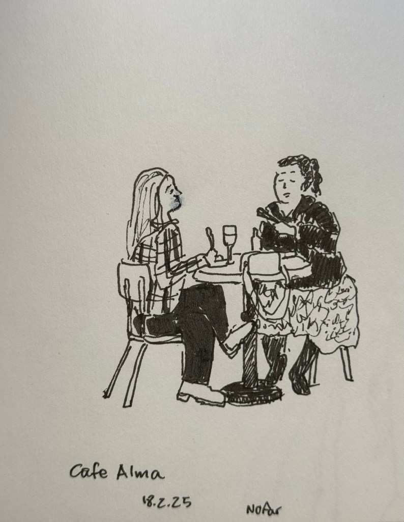
Earlier this week I went to a standup gig – a NY comedian was trying out new material, and it was an interesting (and funny) experience to see him work. Before the show I had about 5 minutes to sketch the people in a nearby cafe, so I sketched this couple using a Staedtler 0.5 Pigment Liner.
In terms of fountain pens the Parker Vacumatic is out of rotation, though I may give Diamine Writer’s Blood a try in another pen soon enough. I decided that I want to have the nib tuned on it, in terms of flow, though I don’t know who I’ll be able to find to do the tuning for me.
I also dumped out the Pilot Iroshizuku Yama Budo out of my Parker 51 as I couldn’t get it to not bleed and feather on practically any paper. I cleaned out the pen and refilled it with Waterman (Tender) Purple ink and it’s been wonderful to use since. Waterman inks are not only fantastically well behaved, beautiful, cheap and very, very easy to clean out of pens, they’re also dry inks. As Parker 51 generally have a generous ink flow, and this one is no different, a dry ink serves particularly well with this pen.
I’ve been reading Mrs Palfrey at the Claremont by Elizabeth Taylor (the British novelist, not the famous actress) and it’s a wonderful study of character, age and aging.
Next week is the Tel Aviv marathon, which is sold out for the very first time. There were no big local running events last year, and there’s clearly a hunger for them.
This week has been crushing from both a personal and a national perspective. I’ve taken solace in friends and in reading, but there have been times where it’s been a struggle. It’s at times like this when I need to remind myself to stop, take a breath, allow myself to feel what I need to feel, and only then pick myself up and move on.
Be kind to yourself and others, and have a great week.
I have finally written dry all of my Inkvent 2024 fountain pens, which means that after two months I get to write with a whole new set of fountain pens and inks. I normally don’t spend too much time selecting which pen and which inks I’ll use next, but this time I decided to use some criteria for the next pens in my rotation:
They need to include at least 50% vintage pens. I don’t use vintage pens with Inkvent inks, and vintage pens make up most of my pen collection.
All the pens need to be pens that I haven’t used in a long time (at least a year). It was time to mix things up.
The inks needed to be inks that are new to me, or that I haven’t used in years, and all of them need to be inks that I haven’t swabbed before. This was not only to mix things up, but to get me to use and swab more inks in my collection, instead of going again and again to a few select favourites.
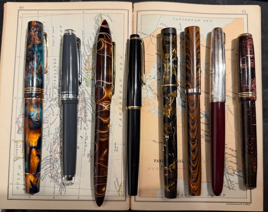
Here’s February’s fountain pen lineup:
The pens from left to right: Leonardo Momento Zero Bohemian Twilight, Sailor Pro Gear Slim Graphite Lighthouse, Edison Nouveau Premiere Cappuccino, Montblanc 32, Mabie Todd Swan L2 Leverless pen, Waterman 52, Parker 51, Parker Vacumatic Standard double striped jewel.
And here are ink swabs of the inks that I’ll be using:
Ink swabs on Col-o-Ring cards
The Vintage Pens
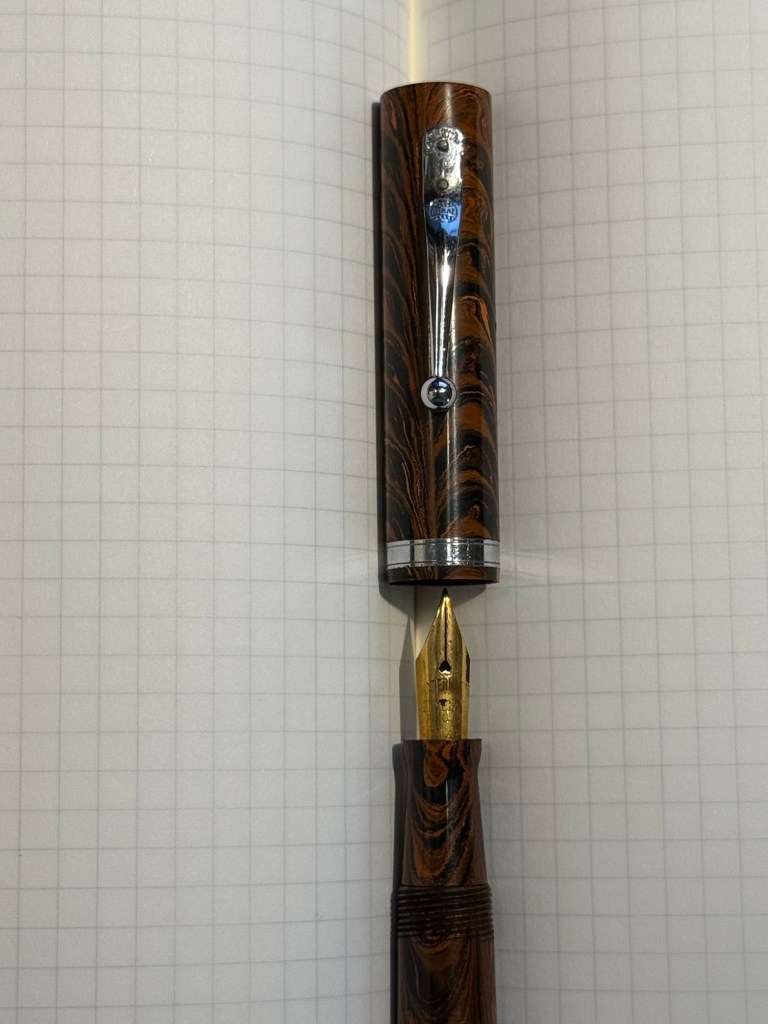
Parker Vacumatic 1st generation Laminated Burgundy Pearl Double Jewel (striped jewels, striped section) – I adore Parker Vacumatics and this is a “use the good china” pen. The grip section is also laminated (and not plain black), the body is transparent, and the nib is a sharp extra fine gold nib with a bit of character to it. It’s filled with a brand new ink for me, Diamine Writer’s Blood. I never use red inks, but this got raving reviews and seemed dark enough for me to try. I bought the ink in Oxford last year, and the pen years ago from the late Henry Simpole (Henry the Pen Man) in London. I don’t think I inked up this pen since I bought it, as it was too precious, and I still won’t let it leave the house, but I am looking forward to actually using it.
Parker Vacumatic first generation burgundy laminated grip sectionCloseup on the striped jewel and the grip section of the Parker Vacumatic
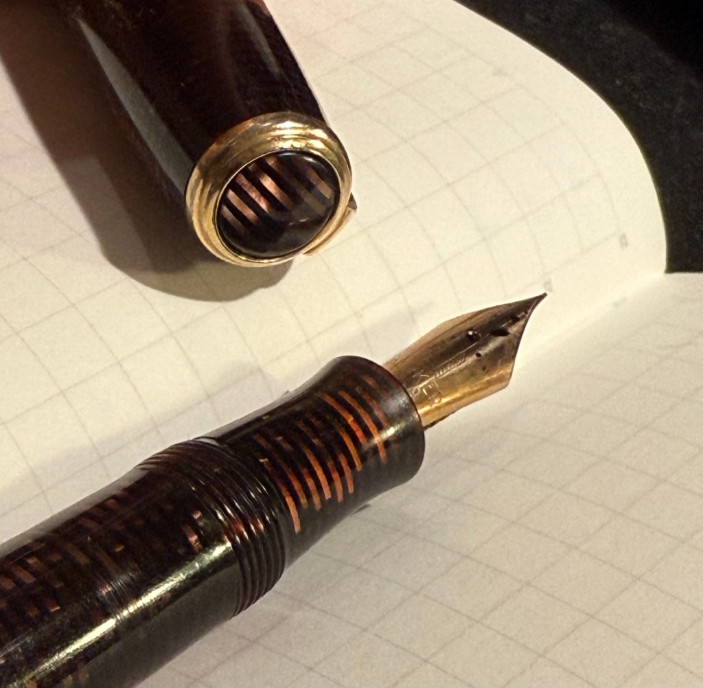
Parker 51 Burgundy aerometric with a silver cap and gold filled arrow clip. I love Parker 51s, they are my absolute favourite fountain pens. I believe this cap is on the rare side, though it’s far from pristine or attractive (it’s blackened in specks, and there are a few scratches and micro scratches on it). The nib is a generous fine, bordering on medium, and like all other 51s that I’ve used, it’s magic. I haven’t used this pen since I bought it, so it’s time to give it a whirl. It’s filled with Pilot Iroshizuku Yama Budo, which is a lovely, sheening burgundy ink, one of the more popular inks in the Iroshizuku lineup. In hindsight coupling this ink with this pen wasn’t the best choice, as the 51 has generous nibs and Iroshizuku inks are on the wet side. It just means that I’ll have to steer clear of cheap paper with this combination.
Parker 51 cap and nib closeup
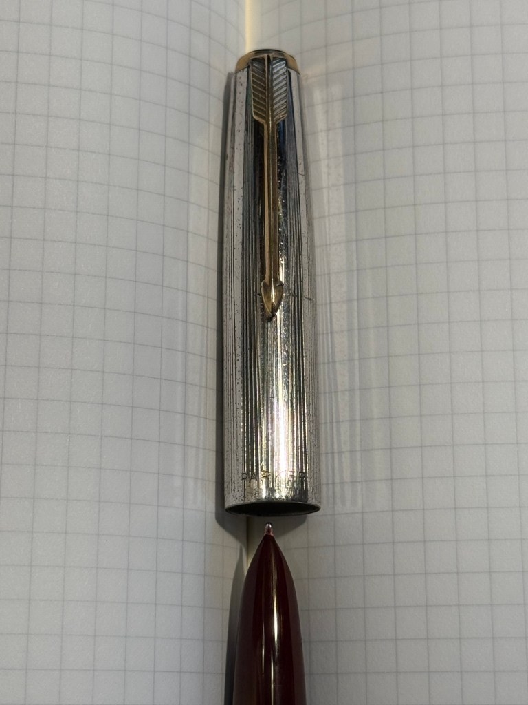
Waterman Ideal 52 Red Ripple fountain pen with a super flex extra fine nib – my word but this pen has the most glorious nib. The pen itself is elegant and pristine, and because of its age it doesn’t have the ebonite stink to it. The nib is why I bought this pen, and it effortlessly moves between extra fine and broad or double broad lines, with the feed easily keeping up with tines. Like all Waterman nibs that I’ve tried, there is some feedback, so if you like butter on hot pan nibs this one isn’t for you. This is the kind of nib that you can only get in a vintage pen, and it puts modern flex pens to shame. It’s only minus is that this is a lever filler, and I hate cleaning out lever fillers, which is why I rarely use them. This pen is filled with Diamine Autumn Oak, which I haven’t used yet (in bottle form at least – I have cartridges of it). I wanted a brighter ink in this lineup, so Autumn Oak was a perfect choice.
Waterman 52 cap and nib closeup. You know the nib is going to be fabulously flexy once you see that heart shaped breather hole and the slight bend down in the nib. Writing sample on Midori MD Paper. Notes written with a Platinum Preppy.
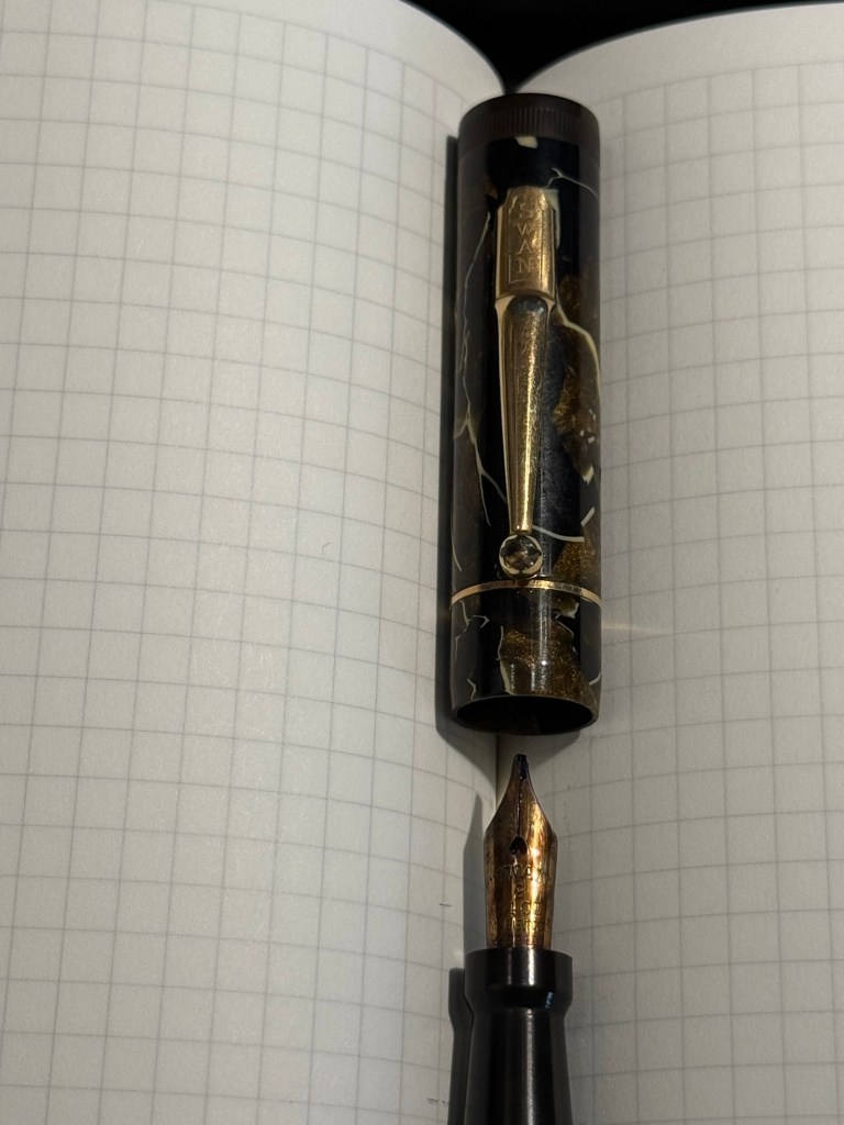
Mabie Todd Swan L2 Leverless L205/62? Not sure – Swan did a poor job labeling their pens, and I didn’t write down notes when I bought it. This is a lovely pen that I bought from Henry Simpole years ago because of the phenomenal Swan nib. It’s an oblique flexible nib with Swan’s gimmicky “Leverless” filling system (which is a lever system in disguise, but such were the ’30s – you needed a gimmick to sell pen). I haven’t used it at all since I bought it because I don’t remember the experience of cleaning it out very fondly – imagine all the bother of cleaning out a Lamy 2000, but with a piston that has just one twist of travel. I used Pilot Iroshizuku Asa Gao with this fountain pen, and it’s a gorgeous ink with a good amount of sheen with this nib. I love this shade of royal blue, and I haven’t used this ink in a while. Take a look at the Swan above – it’s almost 100 years old and works perfectly.
Closeup on the nib and cap of the Swan Leverless penWriting sample on Midori MD Paper. Notes written with a Platinum Preppy.
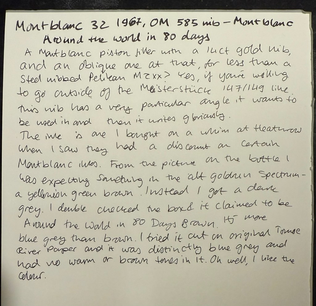
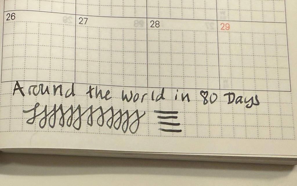
Montblanc 32 (1967) OM 585 nib – heavens, you can get a gold nibbed, piston filling original Montblanc with an Oblique Medium nib for less than a steel nibbed Pelian M2xx costs? Yes, you can. I love the design of this pen (you can read about it more here) and the nib is great… provided you write in the exact angle it expects. The Swan’s nib is generous in terms of the writing angles it accepts, and the Monblanc 32 is demanding: you will use the nib at the precise angle it is designed for, or it will not work at all! I only wish that the Montblanc Around the World in 80 Days ink was so exact. From the description and the illustration on the box I was expecting a brownish gold ink, maybe with a hint of green. In reality I got a dark, cold grey ink, with a hint of blue to it. No brown, no gold, nothing at all to do with the elephant illustration on the box. I had to double check just to make sure that I hadn’t landed on a bad bottle by chance.
Montblanc 32 semi hooded nib Writing sample on Midori MD Paper. Notes written with a Platinum Preppy.Writing sample on original Tomoe River Paper
Modern Fountain Pens
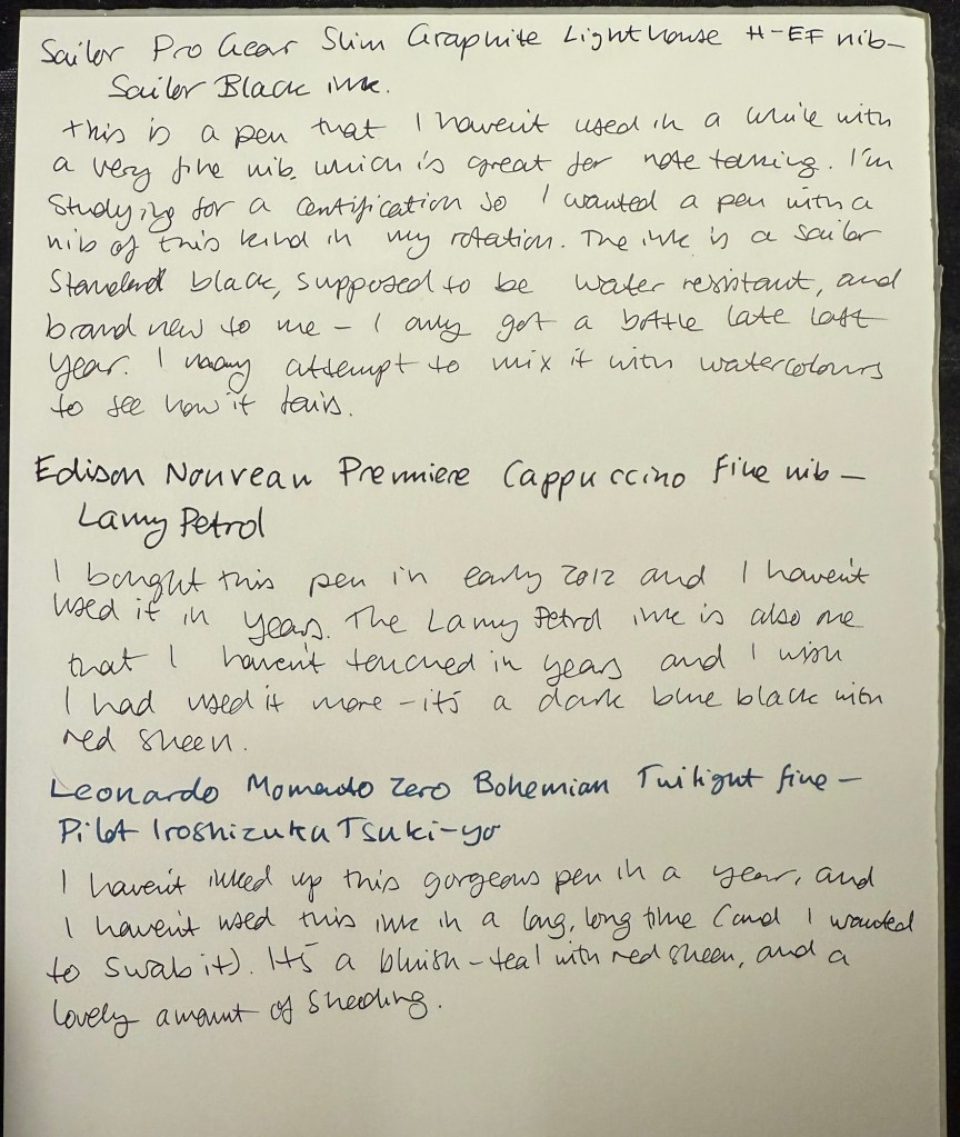
Sailor Pro Gear Slim Graphite Lighthouse H-EF nib – I haven’t used this pen in over a year, and I wanted a pen with a very fine nib, so that I can use it for note taking. It’s inked up with Sailor Black, a new ink for me and one that’s supposed to be water resistant. I’m using this combination for my certification study notes, and I may also try it out with some watercolours in a sketch, just to see if I can use Sailor Black ink as part of my sketching kit.
Edison Nouveau Premiere Cappuccino fine nib – I bought this pen in early 2012, before they did a run of seasonal limited editions of this pen design. I haven’t used in years, and the same goes for the ink in it: Lamy Petrol. This is a limited edition ink, one that Lamy issued with the Lamy Safari Petrol, and it’s a wonderful blue-black with red sheen.
Leonardo Momento Zero Bohemian Twilight fine nib – this pen has “only” been a year out of rotation, and it’s one of my favourite Leonardos. The colour of the resin is gorgeous, and it works very well with the Pilot Iroshizuku Tsuki-yo ink that it’s filled with. Tsuki-you is a bluish-teal with red sheen and a wet flow, and it suits the Leonardo’s fine nib.
I’m a big fan of Big Idea Design pens, ever since I bought their Ti Arto (still their most innovative and all around useful pen). I have their Ti Click EDC and liked it enough to buy the Cerakote version, their Ti Arto EDC, the Ti Mini (and the Mini Click and Mini Bolt), their Dual Side Click, their Fountain Pen EDC, their Bolt and Slim Bolt, Pocket Pro, some of them in several versions. I’m on their mailing list whenever they come out with a new Kickstarter (Big Idea Design use Kickstarter as a pre-order system, with very little risk to backers and a nice discount on whatever new product they’re working on), and I tend to back almost every new pen they come out with.
Base Line Bolt Action sketched on Moleskine paper with a Base Line Bolt Action
So when I got the email about the new Base Line Bolt Action titanium pen Kickstarter, I backed it. Unsurprisingly the Kickstarter was successful and the pen arrived in time. While the base price of the Base Line Bolt Action pen is $65 (including free world wide shipping), the Kickstarter price I paid was $55. I’m mentioning the price up front because this is one of the main selling points of this pen.
So what do you get for $65 all-inclusive? The Base Line Bolt is a short (116mm or 4.59 inch length, 11 mm or 0.435 width) full metal machined pen, with a titanium (or brass, or copper) body and clip, a Schmidt P900 ballpoint refill (it’s compatible with Parker style refills) and a bolt action mechanism that is smooth and fun to fidget with. As usual for Big Idea Design, the brass and copper versions cost the same as the titanium one.
You also get a decent enough package, one that is good enough to ship to someone as a gift. Even after our local post office mangled the package, it came out mostly intact with just a few dings. It’s a solid shrink wrap covered cardboard box, with the pen nestled inside on a foam insert.
The front of the box
The pertinent information about the pen is printed on the back of the box, with a reference to the Big Idea Design YouTube channel, where you can learn more about the pen.
The back of the box
The pen itself is well protected inside the box and comes wrapped in a plastic sheath. While I would have preferred a more environmentally friendly box, I appreciated the packaging because considering the shape that the padded envelope came in, I would have likely gotten a less than pristine pen without it.
The Base Line Bolt arrives well packaged.
Moving on to the pen itself, the Base Line Bolt is an interesting departure for Big Idea Design. Normally the pens that they make feature some sort of clever mechanism that allows for things like supporting every kind of pen refill there is, or having two kinds of click mechanisms on the same pen. The Base Line Bolt is instead focused on price point: when everyone else is raising their prices, can Big Idea Design make a good, affordable, machined metal bolt action pen?
The Base Line Bolt
The answer is “it depends”. Big Idea Design isn’t really inventing the wheel with the Base Line Bolt – the pen itself is a combination of the Ti Pocket Pro, and the Slim Bolt Action pen. It is, however, cheaper than both of these pens, which is again, the Base Line Bolt’s main selling point. As the name suggests – if you’re looking to get into your first machined pen, or you’re looking for a bread-and-butter EDC pen, the Base Line Bolt is what Big Idea Design expect you to buy. I largely agree with them, but more on that later.
The bolt mechanism, clip and finial of the pen, down to the T8 Torx screw and stepped machining, was first conceived with the Bolt Action pen. If you sliced off the business part of these two pens (and ignored the orange Cerakote on the Carryology pen), these two pens would be identical:
The Carryology version of the Bolt Action pen on top, and the Base Line Bolt on the bottom
Compare the Ti Pocket Pro with the Base Line Bolt and you can see what Big Idea Design were going for: they’re almost identical in length and in design (and they ship with the same refill), with the Base Line Bolt just being a slimmer, slightly longer version of the Pocket Pro, that supports less refill types. The difference here lies in the mechanism – the Ti Pocket Pro is a twist pen, and the Base Line Bolt is a bolt action pen. My guess is that the bolt action will be more popular because it looks good, works well, and is a fun fidget toy.
Ti Pocket Pro in metallic Cerakote blue on top, Base Line Bolt pen in the middle, black DLC with Damascus bolt and clip Bolt Action pen on the bottom
Another way to look at the Base Line Bolt is as an oversized Mini Bolt Action pen, but one way or another, this isn’t a pen that they had to factor in a lot of R&D time to design. They’ve done it before, and they know that it works. Thus the innovation in this pen lies mostly in its price point, which is also what Big Idea Design emphasizes in their marketing.
Mini Bolt in black DLC on top Base Line Bolt in the middle, Uniball Signo RT on the bottom
The Base Line Bolt is great as an everyday carry pen that you have in your bag or pocket and use to jot down a few words, maybe sign a document, or leave a note on someone’s desk. It’s too small and the Schmidt P900 ballpoint refill that it comes with is too frustrating to use in long writing sessions (the refill skips every once in a while). The choice of the design, the refill it comes with, and the refill compatibility (Parker style refills) is geared towards that – a pen used to write a paragraph or two at a time, not much more.
If you want a pen for longer writing sessions, you need to look at Big Idea Designs larger pens: the Ti Arto, the Bolt Action or Slim Bolt, the Click or Dual Click pens, etc. The Base Line Bolt is build to be the Ti Pocket Pro’s counterpart: the same pen with a bolt mechanism that supports only Parker refills, for a lower price.
Close up on the bolt and the finial
The biggest minus of the Base Line Bolt is that you need a separate tool to take the pen apart and change the refill. This isn’t the first Big Idea Design pen to require this, but I still don’t like this design choice. That being said, my assumption is that the audience for this pen (namely the EDC crowd) will have a way to deal with a T8 Torx screw. The pen ships with a decent enough refill (the Schmidt P900 costs around $1 retail, while the Parker costs $4-5, which explains why you won’t find pen sellers that use the Parker refills), and a ballpoint is the obvious choice for an EDC pen. Gel refills tend to deal poorly with temperature swings, and aren’t normally waterproof, which makes them less viable as an EDC pen refill choice.
Should you buy this pen? It depends:
If you’re looking for a gift pen for someone new to machined pens, this is a great choice that costs a fraction of what other machined pen manufacturers ask for titanium, copper or brass machined pens. The closest competitor in price and quality is Karas Kustoms, and you’re getting a different beast there (they make great pens, just not as compact).
If you’re new to machined pens and want a compact EDC pen, then the Base Line Bolt is a great choice for you.
If you’re curious about bolt action pens, or copper and brass machined pens, then this is likely the cheapest way you can try them out for yourself (using a high quality pen with great warranty and support).
If you’re looking for an EDC pen that is sleek and without the “tacticool” vibe of aggressive knurling or glass breakers, then the Base Line Bolt is a great choice.
If you are looking for a workhorse pen, one that you can write your next novel with, the Base Line Bolt isn’t for you.
If you already have a good selection of machined pens, particularly Big Idea Design pens, then you’ll likely not find the Base Line Bolt to be very exciting or particularly interesting. I’d skip this pen.
If you want to experiment with many refill types, pick the Ti Pocket pro or any one of the Big Idea Design’s full sized pens (the Ti Arto supports the most refills).
The Base Line Bolt is a solid addition to the Big Idea Design pen portfolio, and at $65 all-inclusive you get a lot of pen. Mine will reside permanently in my bag, as an “emergency pen” for those times where I need a pen but I haven’t brought my pen cases with me.
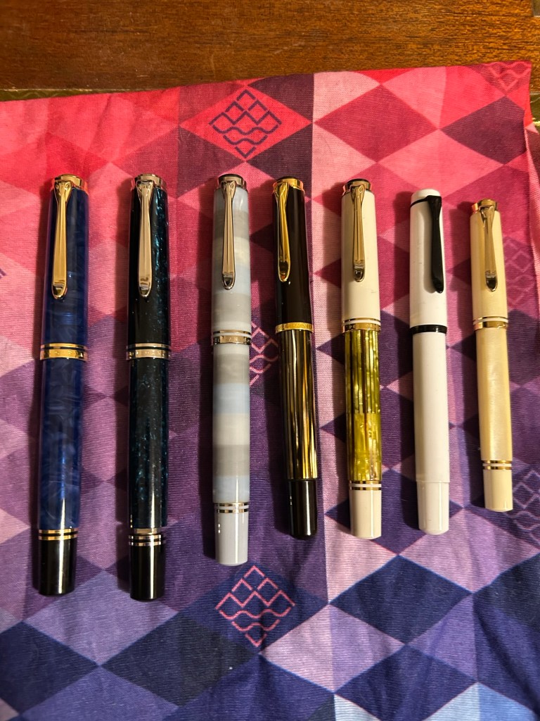
We just had the 2024 Pelikan Hubs event and I wanted to talk about which Pelikan fountain pens I brought with me to the event, and to note a few things that may be useful for those looking to get into Pelikan fountain pens.
This was my flock:
From left to right they are:
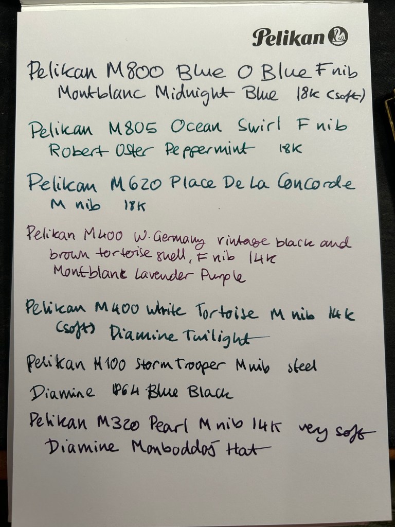
Pelikan M800 Blue O Blue – one of the most expensive pens in my collection, and one that I (partially) got as a gift for my birthday. This pen has an 18 Karat fine nib that is soft and springy. Note: Some of Pelikan’s gold nibs are softer than others, so it’s worth testing the pen out before you buy it, especially if you’re not used to Pelikan nibs. This pen has a semi transparent blue swirly body and a typical Pelikan wide and juicy nib.
Pelikan M805 Ocean Swirl – gorgeous, gorgeous pen that draws attention every time I use it. The depth and shade of the material is something else, and the palladium trim and rhodium plated 18k nib work very well with the turquoise and black shades of this pen’s body. This pen also has a fine 18k nib but this one is much firmer than the one in the Blue O Blue.
Pelikan M620 Place De La Concorde – so, so glad I got this pen though it was expensive for me at the time. This was part of Pelikan’s city series and the only Pelikan I have in the M600 size, which is just a shade longer than the M400. There’s marbling in this pen’s stripes, as is befitting its name, and the 18K M nib is wide and juicy and of a standard Pelikan nib firmness.
Pelikan M400 W. Germany vintage black and brown tortoise shell – I brought this pen so that people could compare the old tortoise shell design to its modern counterpart. There’s just one band on the cap, the bottom and top finials are more rounded and there’s the old Pelikan logo engraved (not screen printed) onto the finial. The nib design is also completely different, though it still feels like a standard fine 14k Pelikan nib (wide and on the firm side).
Pelikan M400 white tortoise shell – this is the modern counterpart of the previous pen, and it has a 14k medium nib that is on the soft side. Both the black and white tortoise shell pens have semi transparent pen bodies so you can easily see the pen level through them.
Pelikan M100 storm trooper – on the rarer side of Pelikans, this steel nibbed fountain pen has a medium nib that feels just as good as Pelikan’s gold nibs. While I understand why Pelikan didn’t want to continue making M100 still nibbed fountain pens, I kind of wish they would have. These could have been slightly higher end alternatives to Lamy’s Al Stars and Safaris – a step down from the M200.
Pelikan M320 Pearl – the rarest Pelikan in my flock, and always a crowd pleaser. This fountain pen is tiny, and came as part of a set with Pelikan brown ink and a nice presentation box. I bought it more than 10 years ago in Berlin, and nobody was interested in them because of the pen’s size. It’s a piston filler, a fantastically well made pen and it has a very soft 14k medium nib.
Here’s a writing sample for all these pens:
Writing sample on a Pelikan Hub 2022 notepad
Did you go to a Pelikan Hub this year? If so, which pens did you bring with you?
It’s a battered Moleskine pocket hardcover lined notebook, a limited edition Mickey Mouse one from years ago. There was a series gash in the spine, so I fixed it with some gaffer tape. I use a Zebra G-450 gel ink pen, and it lays down a bold, 0.7 black line.
I don’t use this notebook during every gym session, but when I’m trying out new things, when I’ve got a lot on my mind, or when I’m trying to solve a specific problem I take it with me. I don’t write details about my workout (rep numbers, weights, etc) as I have an app for that.
So what do I write in this notebook?
How things felt during the workout, particularly when I’m trying something new or if I’m recovering from an injury.
Notes on other gym goers bad behavior. I don’t want to confront them, but I do get frustrated when people don’t return weights, don’t use a towel or wipe down the equipment, and hoard equipment during the gym rush hour. Writing it down allows me to let off steam and focus on more productive things (like my workout, or returning equipment that I know is no longer in use back to its place, or on anything else).
Ideas or projects that I’m brainstorming at the moment. I oftentimes use a workout to think about something I’m considering or something I’m stuck on. I jot a few notes in between sets to not forget the ideas I came up with during that time.
Things I want to journal about later, in my “regular” journal. These are usually things that I forgot to journal about and want to get back to later in the day, when I have time to sit down and better process them.
The main point of this journal is to get me as much as possible off my phone. It’s tempting to check the news for the umpteenth time, or doom scroll various feeds, or play mindless games while you wait between sets. My goal is to bring these habits down to a minimum, and this journal is a useful tool in the search for less screen time.
Sample entry from last year. I write with gym gloves on, hence the atrocious handwriting.
I originally thought that it would be embarrassing to use a notebook in the gym, but I decided that “so what, who cares” is the attitude to take in this case. People do much more embarrassing things at the gym and nobody comments on it. I use an inconspicuous notebook that isn’t at all precious, and a hardy, inexpensive, inconspicuous gel ink pen to go with it. Both have survived falls and encounters with misplaced weights, so they are gym hardened, Don’t bring large, colourful notebooks with you, and don’t bring pens that look expensive or draw attention to themselves. You’re going for the “boring, not worth paying attention to” look here.
Would you consider taking a pen and notebook with you to the gym? If you already do, how do you use your gym notebook?
August is going to be a month of pens and inks that I haven’t used in a good long while. While I still have a small amount of ink in four of my July pens (the Kanelea, the TWSBI ECO-T Saffron, the Big I Design Fountain EDC and the Schon Design Faceted Pocket 6), they will all be written dry by the end of next week at the latest. It was time for a new lineup, and this is this month’s assortment:
Writing sample of August’s pens
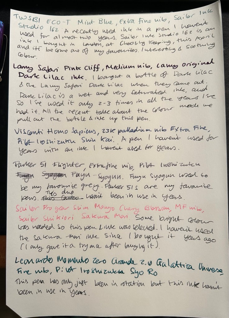
The TWSBI ECO-T is one of my favourite TWSBI designs, and so I have a few of them. The TWSBI ECO-T Mint Blue hasn’t been in use for about two years, so I decided to pull it out and use the Sailor Studio 162 with it, just for colour matching reasons. The 162 is an ink that I’ve used a few months ago but I really like it, so I felt like giving it another month in rotation.
The Lamy Safari Pink Cliff is a recent purchase that I made in Paris last April. I’ve only now inked it up as I wasn’t sure what ink to use with it — until all the discussion about the new (and not as great) Lamy Dark Lilac ink made me want to use the original Lamy Dark Lilac ink. I purchased a bottle of Dark Lilac and the Dark Lilac Safari back when they first came out, but I haven’t used the ink very much. It’s wet and very saturated and so it works best with only a handful of paper options that I have. Still, it’s a very attractive ink.
Visconti Homo Sapiens — this is the original Homo Sapiens, the one that created quite a splash when it came out. At the time it was my most expensive fountain pens, and it’s still one of my most precious pens. I bought it at Mora Stylos in Paris and had it customized with the special initial badges on the finial. I got Pilot Iroshizuku Shin Kai as a gift with my purchase, and though I love this ink I haven’t used it in a while simply because I misplaced it behind another rarely used ink.
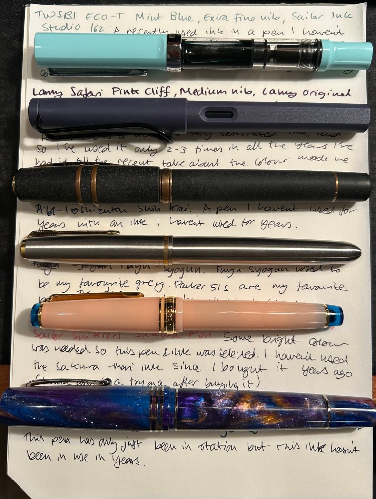
The pens from top to bottom- TWSBI ECO T Mint Blue, Lamy Safari Pink Cliff, Visconti Homo Sapiens, Parker 51 Flighter, Sailor Pro Gear Slim Manyo Cherry Blossom, Leonardo Momento Zero Grande 2,0 Galattica Universe
Vintage Parker 51 pens are my absolute favourites, to the point where I have a hard time seeing one in the wild and not buying it. This Parker 51 Flighter hasn’t been in use in years, but in the spirit of “use the good china” I’ve inked it up. Pilot Iroshizuku Fuyu Syogun used to be my favourite grey ink — and then Diamine came out with a series of excellent grey inks and Sailor came out with the 123. I haven’t used it in years, so I dusted off the bottle and decided to give it another try.
The Sailor Pro Gear Slim Many Cherry Blossom has been in rotation relatively recently, but the ink inside it, the Sailor Shikiori Sakura Mori, is one I haven’t used in years. I don’t have or use many pink inks, but I decided I needed something to brighten up this lineup, and the Sakura Mori ink is relatively readable. It also perfectly matches this pen, which is a nice bonus.
Leonardo Momento Zero Grande 2.0 Galattica Universe is also a relatively recently purchased pen that has been in rotation not too long ago. I just love the Momento Zero so much that I decided I wanted to ink one up, and so I chose the Pilot Iroshizuku Syo Ro to ink it up with. I haven’t used this inks in years, and I love teal inks so it was about time.
What have you got inked up for this month? Anything new? Old favourites or long forgotten pens or inks?
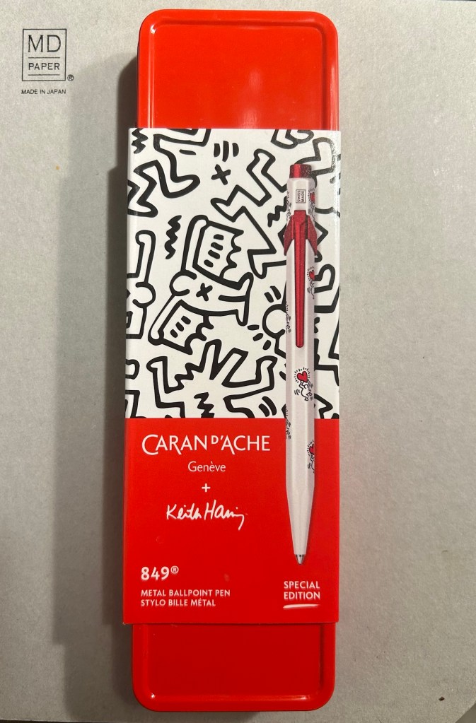
The Caran d’Ache 849 ballpoint is a classic which I have already reviewed in the past. While I rarely use ballpoints, I have several of these pens (all with gel refills that I have swapped instead of the Caran d’Ache Goliath ballpoint ones). Why? Because of their excellent limited edition designs.
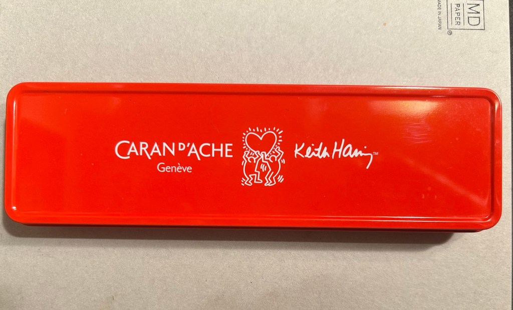
While I was in London in April I picked up two new limited edition 849s – The Keith Haring edition in red and white, and the latest 849 Nespresso collaboration.
The box
The Keith Haring edition comes in black and in red and white. I think that the red and white edition is nicer, and it appears that so do other 849 fans: the black edition is still widely available but most places have long sold out of the red and white edition.
The box is very nice, and makes for a nice gift pack.
Outer box
Inside the box you also get to see some of Haring’s work.
Inside the box
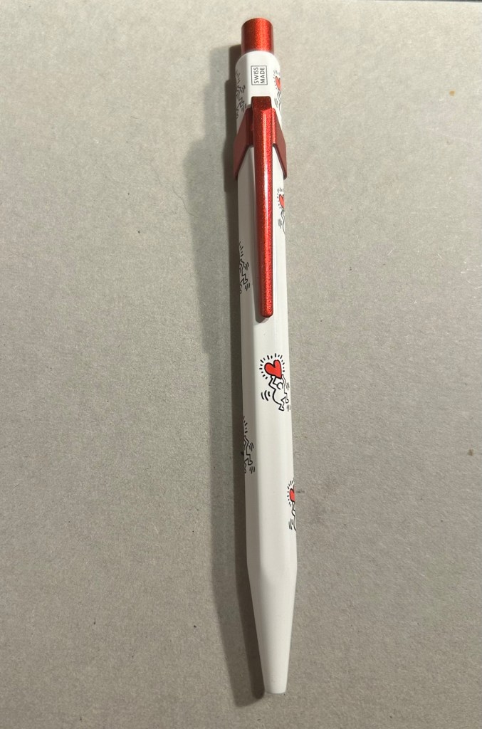
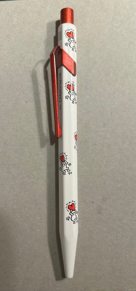
The pen itself is white, with a sparkly red knock and clip. The paint on these feels like lacquer, and the look is sleek and bold. There are dancing people holding red hearts all over the pen (so you get some Keith Haring artwork, but it’s not overcrowding the pen), and the pen body’s finish is the standard 849 glossy finish.
The Keith Haring 849
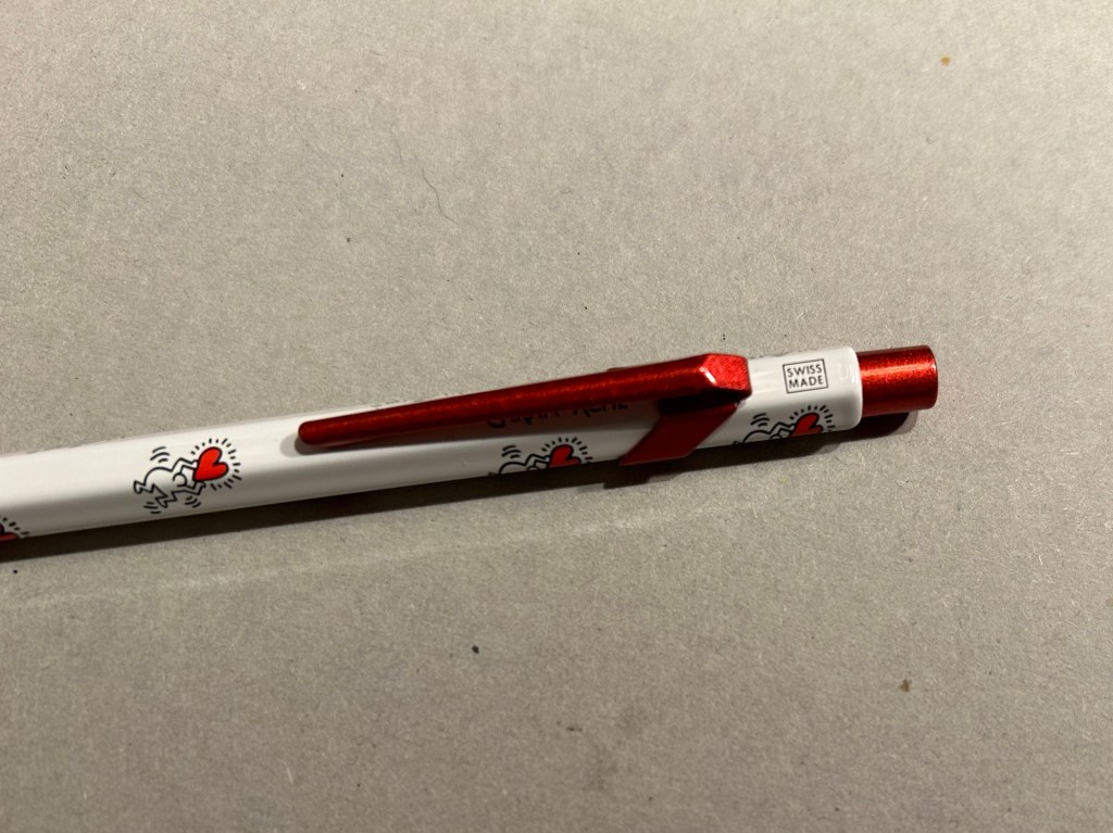
The knock and clip are probably the most striking thing about this pen. Surprisingly Caran d’Ache didn’t put any Haring branding on the pen, not even hidden with their branding under the clip.
You can see the branding on top.
The paint on the clip and knock look like someone poured them out of red glitter paint, and then waited until they set. All in all the result, together with the Keith Haring artwork and the included box, is one of the best 849 gift pens I have seen.
The Caran d’Ache Nespresso Kazaar edition, the 6th Caran d’Ache and Nespresso shared edition, is a bit different than previous editions. Unlike previous editions that featured a silver clip and knock, the Kazaar edition is monochrome. The dark blue pen has a clip and knock in matching colours, and the result is much better than previous pens in this series.
The Kazaar 849
As usual the pen is made at least in part from aluminium from Nespresso Capsules. The pen body has a bit of a matte texture to it, which makes it slightly easier to grip. It comes by default with the excellent Goliath refill, this time in black (the Keith Haring 849 also came with a black Goliath refill).
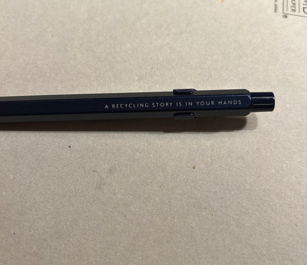
The pen touts its recycled origins.
The 849 Nespresso came in the same sort of recycled cardboard box that previouseditionscame in. It makes for a good gift pen, even though some may find the dark navy blue colour a bit… boring.
Swiss made. The colour matching on the knock, clip and pen body is superb.
If you like the idea of the 849 Nespresso but don’t much like the colour of the Kazaar one, I’d recommend waiting for the next edition. I have a feeling that it too will feature monochrome hardware, and it might be in a brighter colour as Nespresso are starting to run out of drab capsule colours.
The Goliath refill in action
Note to those who prefer gel ink refills and plan to swap the 849 refill out: the tolerances on these 849 pens are a bit weird. There are 849’s in which you can easily swap the refill for any Parker style refill with no issue, and those in which if you swap the refill you find that the knock won’t properly engage it. This is something worth taking into account if you plan on swapping the refill in the pen – there’s a risk that it won’t work with the specific pen you own. I’d recommend in this case to try swapping the refill before you purchase the pen if possible, or resign yourself to using a ballpoint. The Caran d’Ache Goliath refills are several cuts above what you get in a standard, disposable ballpoint, so the loss shouldn’t be too great.
What about you? Do you like the 849? Do you swap its refill?
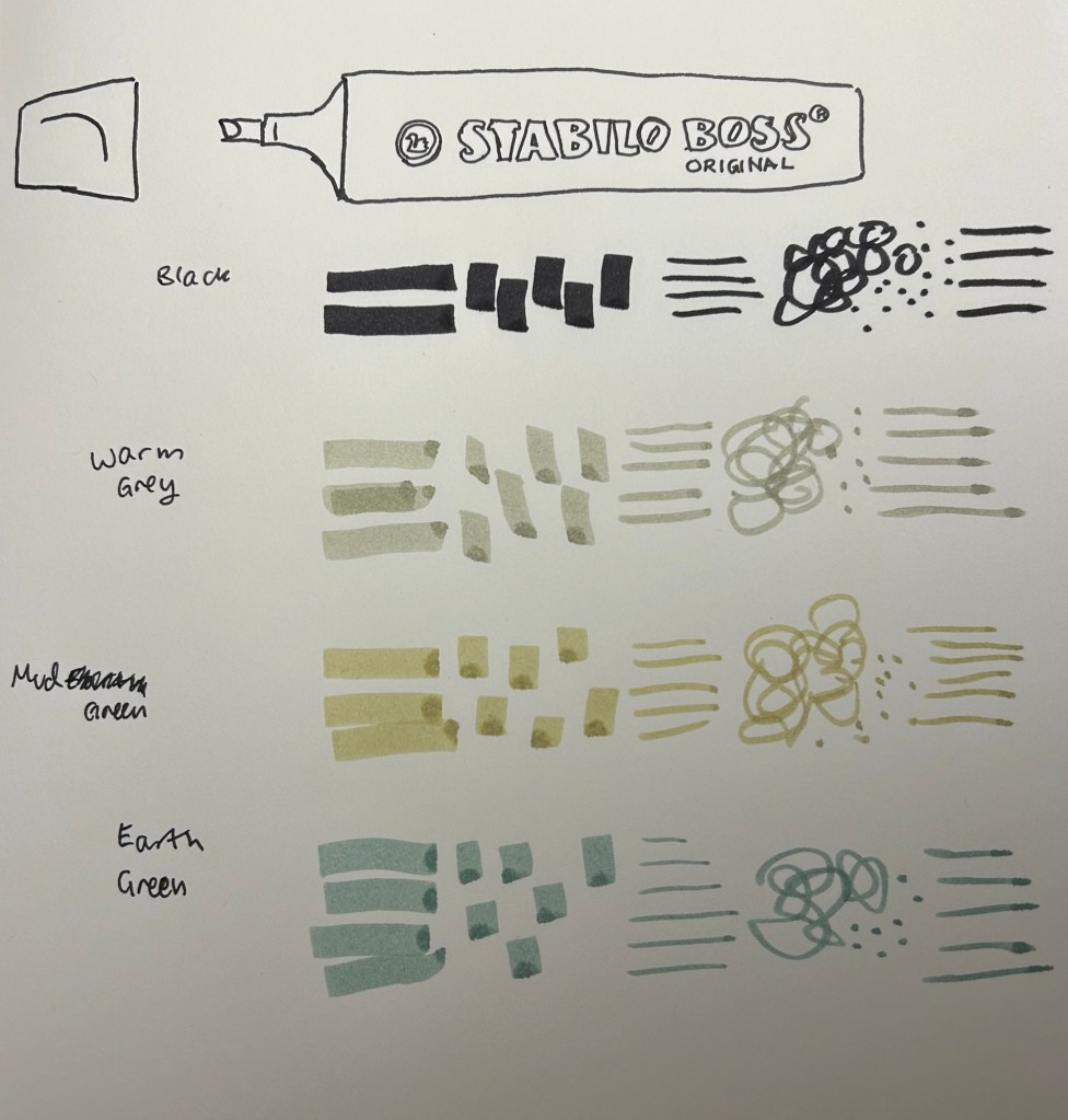
Stabilo make THE highlighters – Stabilo Boss – chunky, reliable, classic. Over the years they’ve added pastel colours to their original neon coloured highlighters, and just recently they’ve expanded their pastel highlighter lineup to include the NatureCOLORS. The NatureCOLORS lineup can be bought separately, or in a wallet of all 6 new colours, or a wallet of 8 that includes two black “marker” pen. The 6 new colours are Warm Grey, Earth Green, Mud Green, Beige, Umber and Sienna. The black “marker” is just an opaque black “highlighter”.
From top to bottom, black marker, warm grey, mud green, earth green.
I first saw these in a bookstore in Paris, and while I hardly ever use highlighters, the black marker and the natural tone of the other highlighters made me buy four of them to try out while sketching. As usual with Stabilo, there’s no indication on the pen body what colour it is beyond the colour of the pen body and a number that you have to look up on their site.
Testing the pens out
I used these pens for quick landscape thumbnails and sketches, and they work pretty well with a few caveats:
They bleed through everything but the thickest paper.
They spread on almost every paper.
They aren’t archival (so they will fade and discolour with time)
They are chunky, which means they aren’t the most portable of pens (even though they’re light)
They can be awkward to hold and manipulate at times.
Bleedthrough
They’re also not at all built for layering and mixing, which means that trying to create layers with them will just leave you with a soggy paper mess:
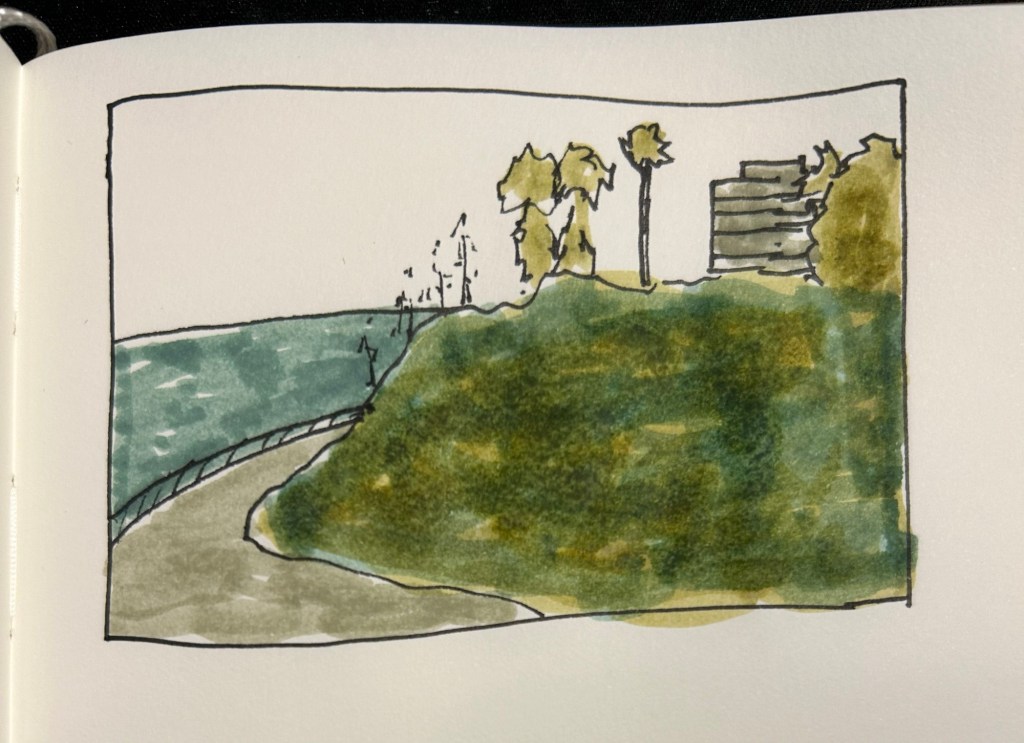
They don’t layer well, as evidenced by the grassy hill in this sketch.
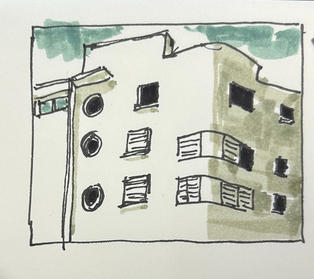
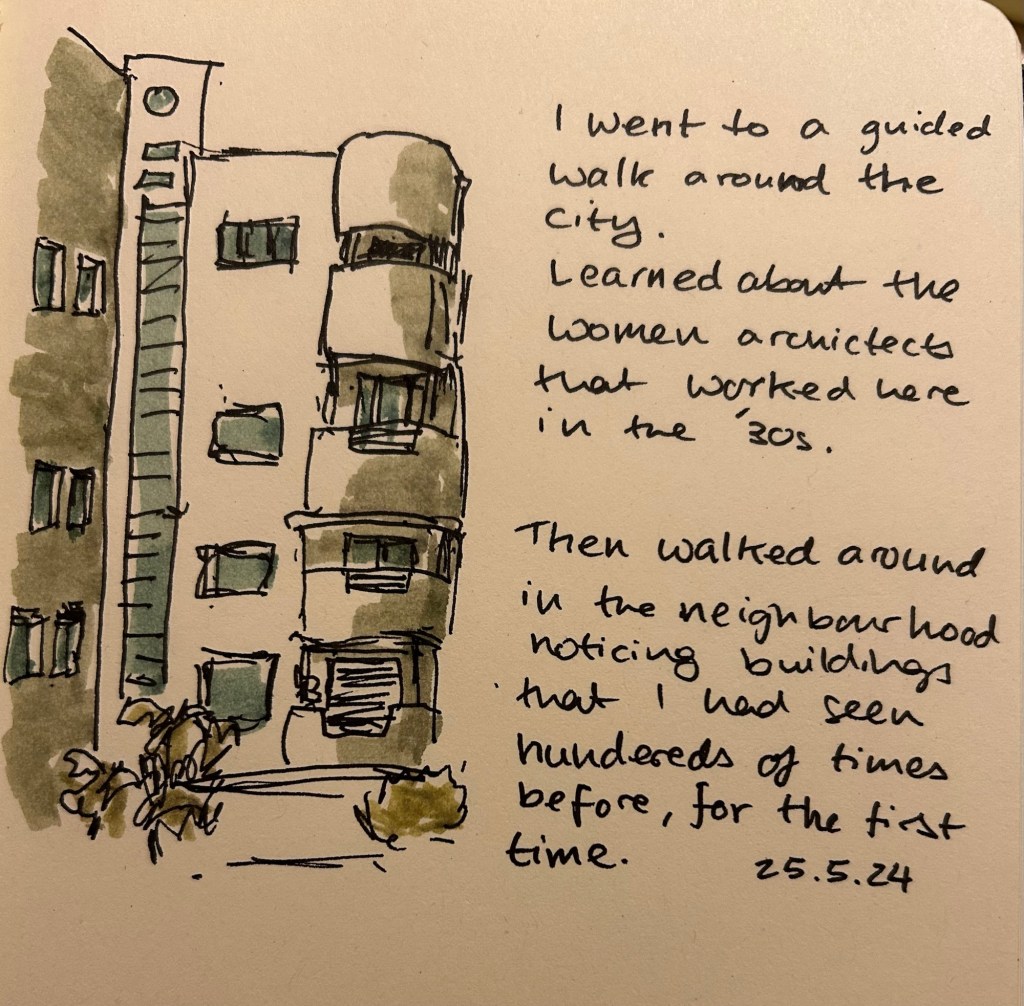
So what are they good for? They work well for quick impression sketches, particularly of buildings, where you can get shading and shadows down very quickly. I used them on an architecture walk to get an impression of the buildings and they worked very well.
What they’re good at – blocking the windows, shading the building, impression of a cloudy sky.
It’s difficult to be accurate with them, but in these sort of sketches I’m not looking for accuracy, just of an impression, a quick note of what I saw and what caught my eye. A photo is great, but it doesn’t highlight what made me stop and take a second look at a building.
They even work decently well on cream coloured paper.
Yes, copic markers could do the job, but they cost much, much more than a Stabilo Boss marker, they aren’t as readily available, and they dry out very quickly. Sometimes you need a cheap workhorse to get the job done, and for this new use I think the Stabilo Boss NatureCOLORS work just fine.
This month features a few new inks, and a lot of old favourites that I haven’t used for a while.
Big Idea Design’s Fountain EDC is far from perfect, and yet I’ve inked it up again. It’s the ultem and the ease of capping an uncapping it – it makes it a great EDC fountain pen even though it still has infuriating flow issues. This, however, is the last time I’m inking it for a while (after filling it three times in a row) as I have lost patience with getting it to work properly when I’m journalling. The Schneider Cognac is a new ink for me, a cartridge packet that I bought in London for a pretty steep discount. The colour is a nice orange brown with a good amount of shading and good flow.
Kanilea Pen Co Haleakala Silhouette is gorgeous and overpriced pen that I haven’t used in a while. Sailor studio 123 ink was also in my previous rotation, but I now have two bottles of this most gorgeous of grey inks, so I feel like I should give it more use.
Omas Bibliotheque Nationale is a pen that I bought about a decade ago at Mora Stylos in Paris. The nib is extraordinary, and I decided that I wanted to use it again. It lays a thick, juicy line of ink that works well with Diamine Earl Grey. Diamine Earl Grey is not only a great grey ink at a fraction of Sailor Studio 123’s cost, it also doesn’t bleed through to the other side of the paper in even the Omas’s generous ink. So I get a dark grey with plenty of shading and character, but I can also journal on the other side of the page.
Rotring Levenger 600 is a wonderful pen that Rotring needs to make more of, and Sailor Jentle Sky High is a discontinued ink that Sailor likely makes under a different name and a higher price now. I like the colour, even though it’s a blue and blue inks tend to be boring, and the Rotring works well in use for my office notes.
Writing sample part 1
Sailor Pro Gear Slim Graphite Lighthouse is one of the last Sailor pens that I bought, and it’s one of my favourites. The H-EF nib is extremely fine, and not for everyone. Sailor Jentle Epinard is a great discontinued dark green ink from Sailor, and they likely make something similar under a different name and higher price (or you can find a parallel Diamine ink for much cheaper). The Sailor Jentle ink’s discontinuation was when I bought this and the other Jentle inks in use here, and I kind of regret my shopping rush. There’s no point in buying discontinued ink, as you’ll likely easily find something else similar to that (something that doesn’t use the Jentle ink’s terrible flat bottle design), or something better.
Schon Design faceted pocket six patina is a great pocket pen, and the Schneider Bermuda Blue is a great teal ink. The shading on this ink is excellent, and if I get a chance to buy another box of cartridges when this one is empty, I will.
The TWSBI ECO T isn’t as interesting to me as the ink inside it. I’ve been wanting to try out Diamine Ancient Copper for a long time, and when I was in Oxford I managed to get a bottle. It does not disappoint – great flow, great shading, great rich burnt sienna colour.
Writing sample part 2
I haven’t used the Platinum 3776 in a while, and I almost forgot what a great workhorse of a pen it is. Sailor Jentle Ultramarine, a very bluish purple, long discontinued, is kind of on the boring side.
April was a travel month which meant that I cleaned out all of my fountain pens apart from the Big Idea Design Fountain EDC that I took with me on my travels. So in the beginning of May I inked up five more fountain pens, many of them with new inks that I bought during my trip.
The Big Idea Design Fountain EDC is still a troublesome writer, but I keep reaching for it, so it’s still in the rotation with its second cartridge of Diamine Autumn Oak. Diamine Autumn Oak is a reddish orange with a lot of shading and it’s dark enough to be readable even with a fine nibbed pen.
There are two Franklin Christophs currently in my rotation (I misspelled the brand name in the writing sample, my apologies), and I am using them to compare the Sailor Studio 123 ink to the 224 ink. 224 is slightly more bluish and has less of a pink tint to it, but both are so similar that if you’re looking for 123 and it’s out of stock, you could use 224 and likely not notice the difference. I’ve been using these pens so much that I wrote the Sparkling Rock dry already, and the Thomas Hall Tibaldi edition is well on its way to joining it.
The Momento Zero Mother of Pearl is a gorgeous pen with a gorgeous, springy nib, and a joy to write with. Sailor studio 162, which I purchased on a whim at Choosing Keeping in London, is now one of my favourite inks. It’s a very unique shade of green/teal that makes me want to fill the same pen with it the minute I write it dry.
The Lamy Safari Savannah has Pilot Iroshizuku Kosumosu ink in it because I wanted something bright after all the muted greys and greens. The issue is that previously the pen had a shimmer ink in it and I apparently didn’t clean out all the particles, so I now have a shimmer version of Kosumosu. The result is fetching so I don’t mind this accident, but I will have to properly dismantle the pen and give it a thorough cleaning once I write it dry. It’s about halfway full now.
I like Rohrer and Klingner inks so when I saw the limited edition Ebony iron gall ink at Choosing Keeping, I immediately bought it. It’s very well behaved for an iron gall ink, but it’s not really a saturated black. I prefer darker blacks, but I’m getting used to the shading that Ebony provides.
A slightly late addition to the flock is the Leondardo Momento Zero Grande 2.0 Galattica Universe fountain pen, which arrived just in time for my birthday. It’s a stunning pen, and this photo does not do it justice. I knew I wanted a turquoise ink in it, and I haven’t used Bungo Box’s June Bride Something Blue in a while, so that’s the ink I chose. It was difficult to fill the pen from the flat Sailor shaped bottle, and I didn’t get a full piston-full of ink in it because of the awkward shape of the bottle. Lesson learned for next time.