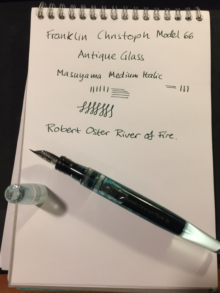
Franklin Christoph Antique Glass Model 66 and Robert Oster River of Fire Review

Every once in a while Franklin Christoph comes out with a batch of their pens in “Antique Glass”, a clear acrylic with a bit of a green tint to it that makes it look like an old coke bottle. The material is both minimalist and beautiful. It allows you to show off the ink that you’re using while still having a pen that has more character than a run-of-the-mill demonstrator. Franklin Christoph’s pens and the nibs that they use are excellent and very well priced. The result is that these limited runs having a waiting list (from which a 100 names are drawn), and there’s a good chance that you won’t be able to even get on that. I had to wait for two years until I was able to purchase mine.

The wait is worth it though.

img_0226

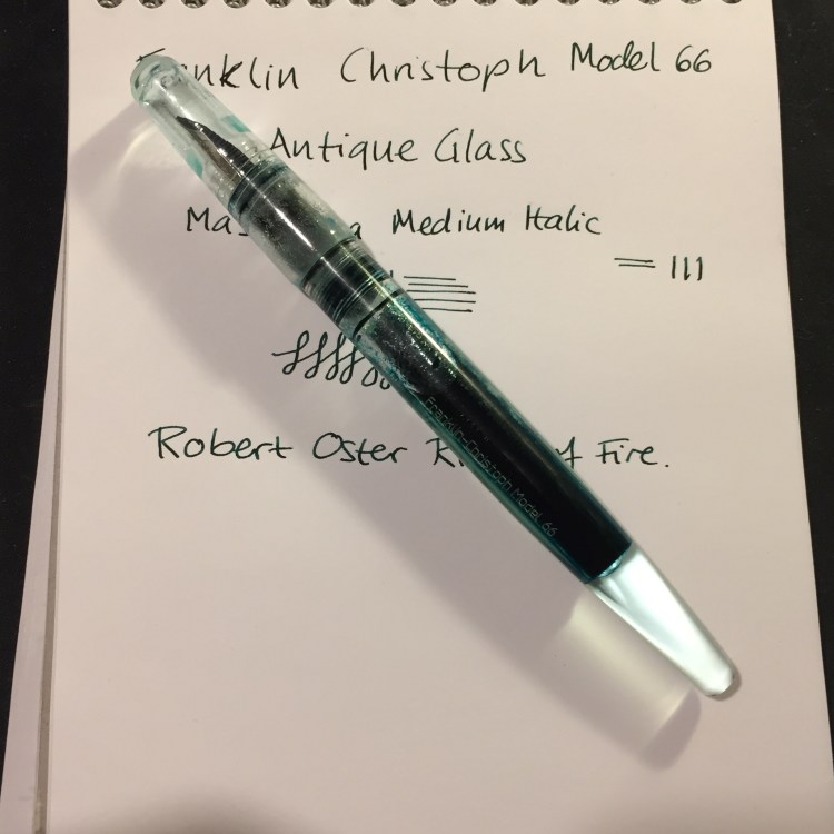
The Franklin Christoph Model 66 is a long and sleek pen that can’t be posted. The pen is light but still substantial, because of the extra acrylic in the finial. I was worried at first that it would be top heavy, but the Model 66 is perfectly balanced, and one of my favourite pens for long writing sessions.

img_0221

The Model 66 is a demonstrator pen that is built to be eye-droppered. Yes, you can use the supplied converter or cartridges, but what’s the point of having a pen that looks like this if not to eye dropper it? Franklin Christoph even supply the requisite o-rings and silicone grease, making it super easy to transform it into an eye dropper.

img_0224

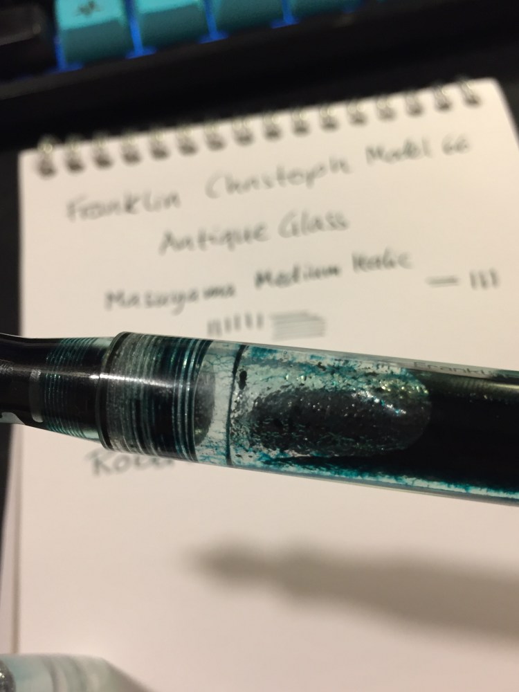
The pen body is made of smooth acrylic on the outside, but is pebble textured on the inside. The result shows off the ink colour and the pen colour even more, but it also means that staining inks have even more surface area to stain. I decided early on to use only turquoise, teal, blue and green inks in this pen, as even if they stained the pen it would work well with its “natural hue”.

img_0225

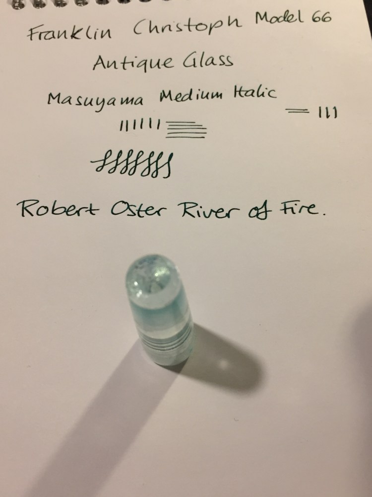
You can see the greenish “antique glass” tint best in the cap.

In terms of design, this is a desk pen and is designed as one, so it has one flat side which keeps it from rolling off the table even though it’s a clipless pen.

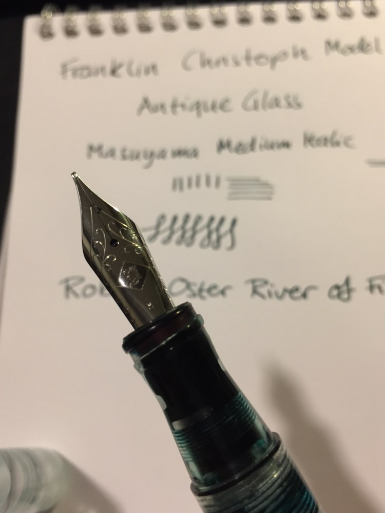
There’s a wide variety of Jowo nibs that you can order with your pen, and I decided to pay a little extra for a Mike Masuyama medium italic nib. The nib is buttery smooth, and the feed keeps up with flow. This italic isn’t super sharp, which is a plus for me, and together with the large ink capacity that an eye-dropper pen offers, it’s writing heaven.

img_0223

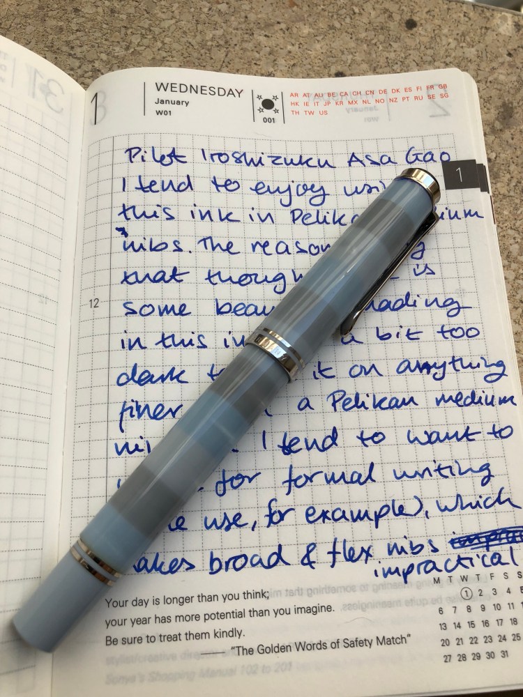
The Franklin Christoph Model 66 Antique Glass with a Mike Masuyama medium italic (what a mouthful) is build to show off interesting inks. Although I would never use shimmering inks in it, it’s great for inks that shade or sheen. And Robert Oster is the king of sheening inks.

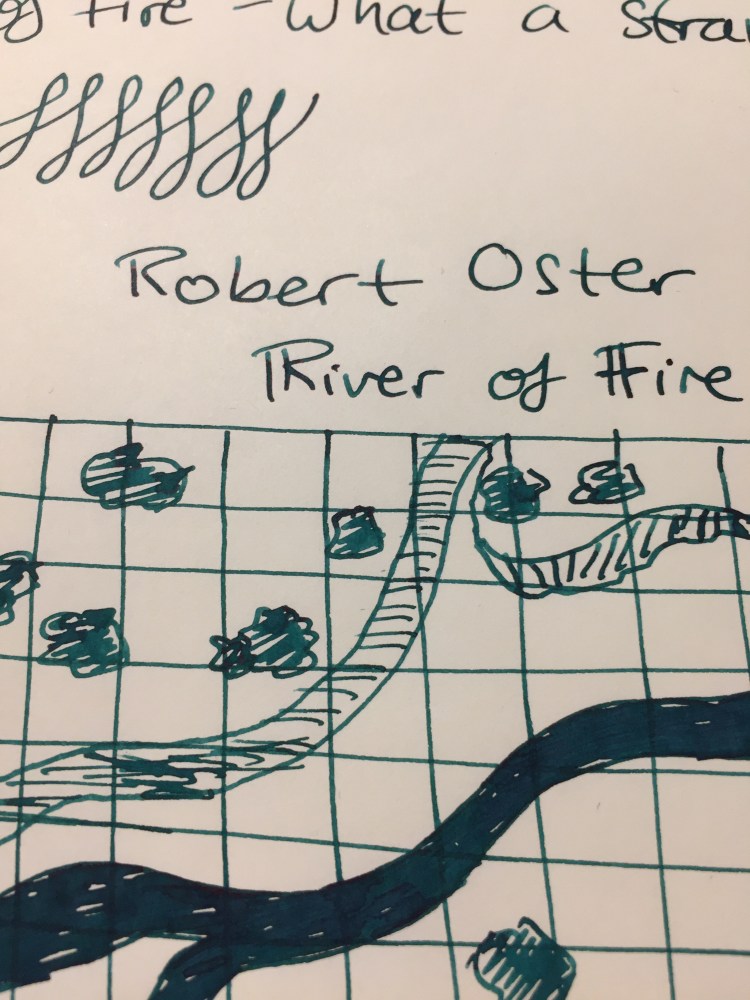
The River of Fire is a dark teal ink that has significant red sheen and a good amount of shading.

I felt like drawing a D&D map here, I don’t know why.

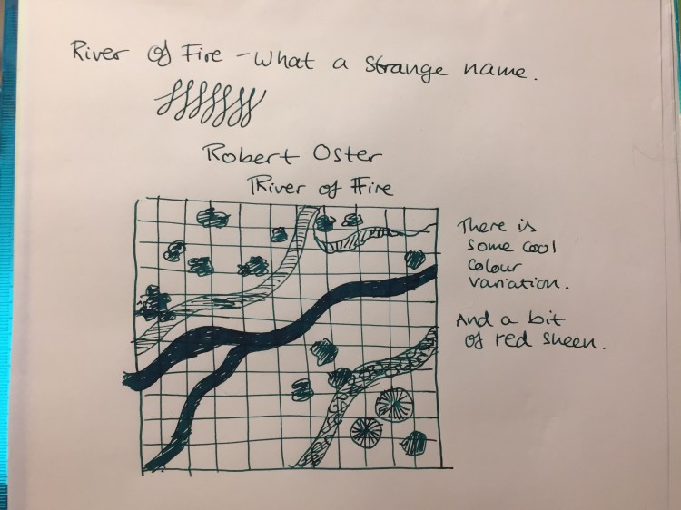
As usual with inks of this kind, the paper and nib affect how much sheen or shading you see. This nib is perfect for that, and the paper I used here is Tomoe River Paper, which brings out the best in every ink.

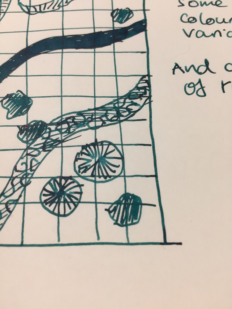
You can see a bit of the properties of the ink here, particularly the shading, but this ink really does have a lot of sheen. It’s just difficult to photograph, so you can only see a bit of the golden red that happens where the ink pools.

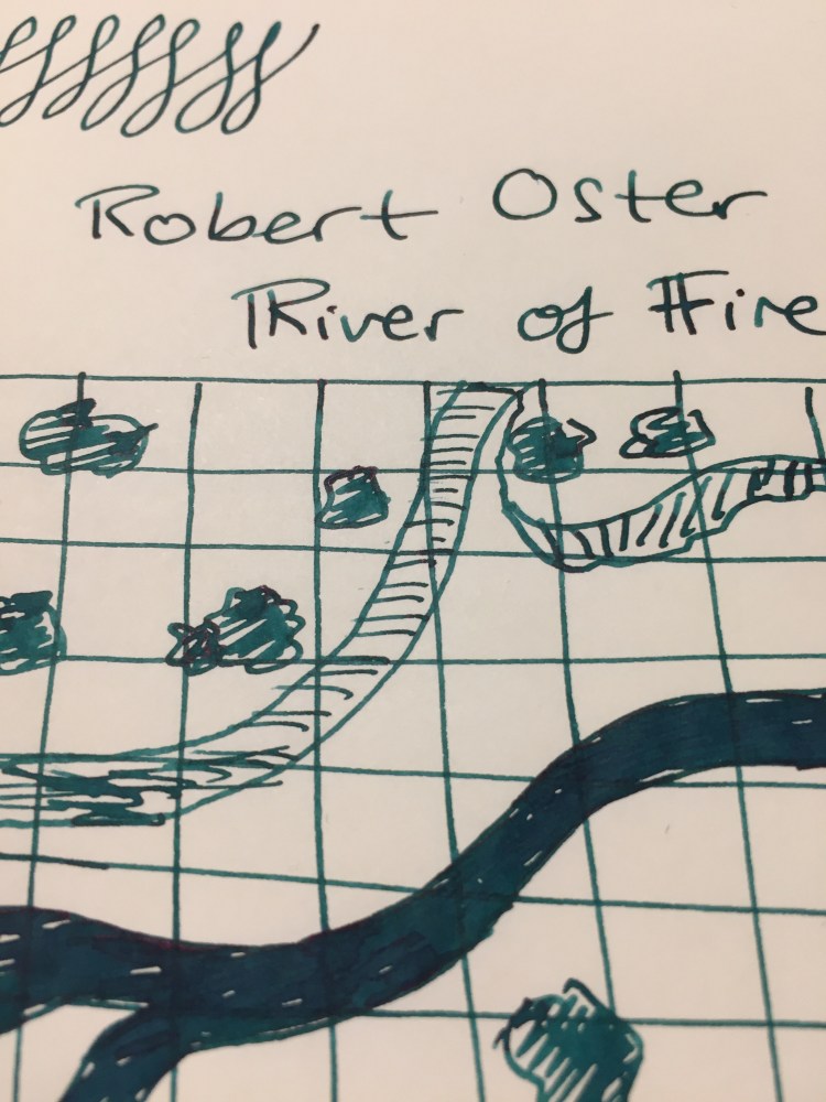
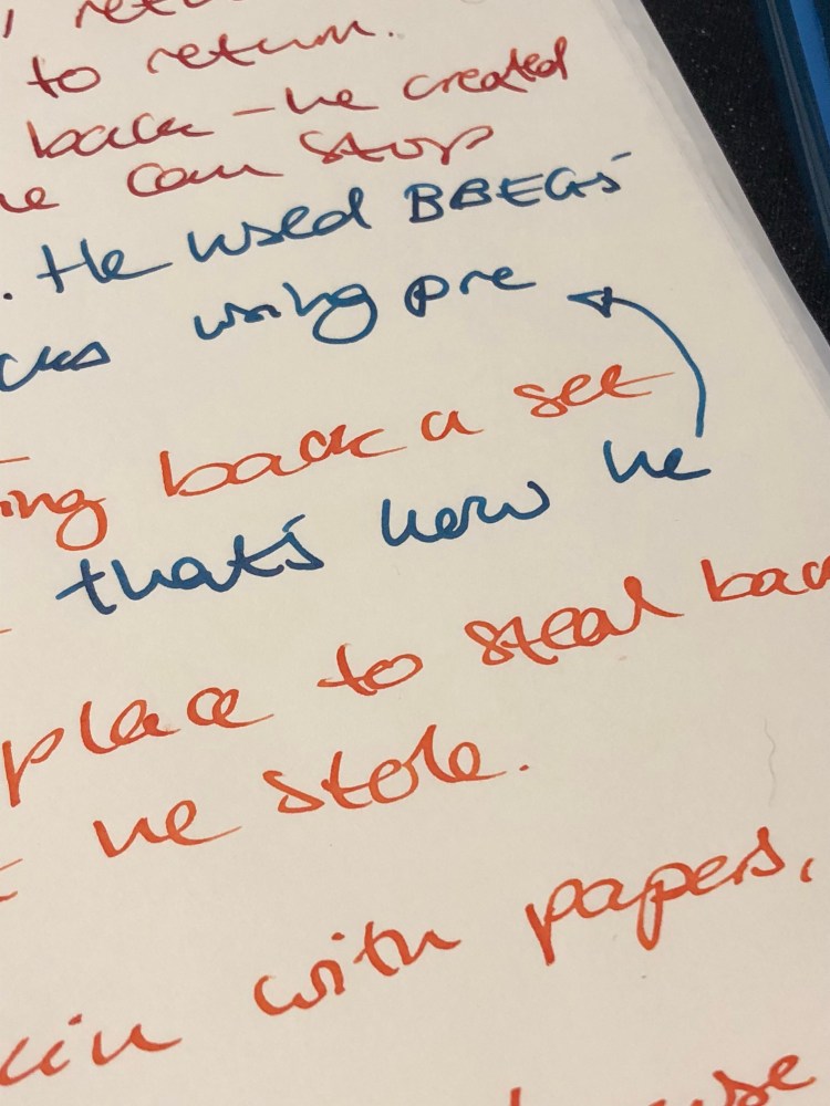
This is such a pretty ink. Look how much variation and interest it offers:

So, if you can get on one of the Franklin Christoph antique glass waiting lists, I highly recommend it. As for the Robert Oster River of Fire, I think that it’s a gorgeous ink, but it’s not unique enough in Robert Oster’s large ink offering. If you have something in the turquoise or teal shade in their lineup, then there’s probably no need to buy the River of Fire. If yo don’t then I recommend this ink since it’s wild and yet dark enough to “pass” in an office setting.


Montblanc The Beatles Psychedelic Purple Review

A few years ago I used to be really on the FOMO limited edition fountain pen ink band wagon, but over the last two years my ink purchases have petered out to nothing. At some point I realized that any limited edition ink that I buy is bound to be pretty damn close to an ink that I already own, and a person can only have too many inks (IMHO). How many inks can you use at one given time anyway?

The precious few new bottles of ink that I have have all been given to me as part of large (vintage) fountain pen purchases, and so I haven’t felt comfortable reviewing them. You don’t look a gift horse in the mouth, do you? Then again, the gift was from the store, not the ink maker, so here we are.

The Montblanc Beatles Psychedelic Purple limited edition ink comes in a very groovy box, that is very well designed. Normally I couldn’t care less about ink packaging (excepts as it pertains to price — looking at you Pilot Iroshizuku. You started the trend and you know it), but someone really put some thought in this.

The little ribbon tab helps open the box easily

Look at that design:

I’ve never seen an ink bottle’s cap protected before, but then again this is Montblanc:

The bottle itself is pretty conservatively designed, but classically pretty:

The ink itself is a rich, saturated purple with a good amount of shading (despite being pretty dark), and a very slow drying time. It’s one of the few cases where the actual ink matches the colour of the packaging. There’s some sheen to the ink, but I’ve seen it sheen only on Tomoe River Paper, and it’s super hard to photograph.

I love this ink’s shade of purple (it’s slightly more to the red side of purple than the blue), but this ink was a hot mess in terms of behaviour on various papers. This ink is usable only on Rhodia/Clairfontaine and Tomoe River Paper, it becomes a bleeding, spreading monster on everything else. It also takes a really long time to dry (not surprising, as it’s a very saturated ink), which means that it’s going to be a no-no for left handed users and you really have to take care where you put your hand when you write with the stuff.

And that’s the thing. This is an expensive, not readily available ink that is finicky and temperamental in a hue that’s not so rare as to be unobtainable. Why spend good money and time buying it if you can probably get a spot on match from Diamine? Montblanc Psychedelic Purple cost about $40 when it came out and $80 now for a 50ml bottle. Diamine Majestic Purple costs $15 for an 80ml bottle. You do the math.

If you enjoy hunting for limited edition inks as part of the hobby, that’s fine. Just don’t get swept away by the marketing and the hype. Remember: there’s a very good chance that that expensive limited edition ink is not very different from the ones that you already have and don’t use, or that you can get a similar hue for less than half the price from Diamine.

Ink Review: Pilot Iroshizuku Asa Gao

Though I’m a fan of the colour blue, I tend to shy away from blue inks, since they tend to be boring. That’s why I wouldn’t have splurged on a (pretty expensive) bottle of Pilot Iroshizuku Asa Gao myself – I got it as a gift with a pen purchase a few years ago.

Online pictures of this ink tend to give it a more purplish tint than it actually has. In reality it’s a slightly dark cobalt blue. It scanned a bit lighter than it looks like on the page:

Asa Gao

Here it is in natural light, for a bit of reference (this is bit darker than it actually is):

This is the pen I used for this review, a medium nib Pelikan M620 Place de la Concorde:

There’s some red sheen to it, but you’ll probably only see it on Tomoe River Paper, and then only if you look closely. The shading is a little less subtle, but not by much. You’ll see a bit of it using medium nibs and broader, again, particularly on Tomoe River Paper. It’s a “dirty little secret” ink – the kind that looks pedestrian to all but the knowledgable observer. A fun way to put a zing into office work, as it is totally appropriate for office writing.

As usual with Pilot Iroshizuku inks, the bottle and packaging is gorgeous, the ink is well behaved enough for vintage pens, and it cleans out pretty easily without staining. A good choice for a demonstrator pen, if you’re looking for something that will fly under the radar.

Narrative Trouble

Just discovered a giant plot hole that I somehow missed on my second draft. Now back to pen and paper to try to figure it out. At least I can use pens and ink and paper that I love…

The Ferris Wheel

Hair tie, Moleskine, Kuretake disposable pocket brush pen extra fine.

Purple Heart: An Ink Review

Purple Heart

Another selection from Noodler’s, Purple Heart is one of Nathan’s less imaginatively named colours (I mean the man has an ink called “Black Swan in Australian Roses” in this colour range, so “Purple Heart” is a bit on the dull side).

A dusky, reddish purple that shades nicely, this ink closely resembles the much better named Tyrian Purple from Diamine. Except it is about $2 cheaper. And shades less. And is harder to clean out of your pen. And is more difficult to obtain.

This is the kind of ink that you buy when you are trying to show your rebel side at work, after you have had your fill of the excitement that blue-blacks have to offer. Dark enough to not call too much attention to yourself, but unique enough to make your heart flutter, this would be a decent ink to pick up after you have a good selection of black, blue, blue-black, brown, dark green, grey and that cool-ink- with-the-sparkly-bits-in-it.

Properties-wise Purple Heart got the very short end of the stick  — it had nothing going for it except its tantalizing colour. It is not waterproof or water-resistant. It takes a long while to dry — meaning that it is not going to be a lefties favourite. It is not particularly Field Notes and Moleskine friendly (a lot of bleed through and show through, which makes the other side of the paper practically useless), nor does it have any earth shatteringly interesting properties. It is lubricated, which means that it flows well, and plays particularly well with piston fillers (until you have to clean them out, at least).

So why did I pick this ink over its Tyrian counterpart? Because I am stupid. This ink is a Goulet Pens exclusive, and at the time that was all it took to get me to bring out the space credits. I know — I am that silly. It is a nice enough ink for me to not feel too bad for having it (after all there is nothing more sustaining than using an offbeat ink during the most boring meeting in the world), but faced with a similar choice today, Diamine’s Tyrian Purple would get my vote. After all, that ink that was so good looking on the page that you could stare at it for hours, loses a lot of its lustre after you are forced to stare at it for hours going down the drain.


Bad Belted Kingfisher: an ink review

Bad Belted Kingfisher

This is Noodler’s Bad Belted Kingfisher.

Right off the bat it scores points for having a badass name. But if you were expecting it to be a kingfisher blue, you might be disappointed. Like its namesake, a bird that only American pen addicts are likely to be familiar with, this ink has less turquoise and teal tendencies, and more royal blue, even slightly blue-black ones.

Its depth of colour means that if you are looking a “shader”, then you will find better options around, although it does show some variation between deep, deep blue, and deep blue. On Tomoe River Paper. In bright light. With certain nibs. But the variation does exist.

The kingfisher, bad boy as he is, is not too picky when it comes to paper. Field notes, Moleskine — he’ll handle the lot of them, without feathering or too much bleed-through. So this ink is crappy paper certified, providing you forgo your gushing double broad italic fountain pen and stick to something more conservative, like a European fine nib, or a Japanese medium. There are limits, after all, to even the best of inks.

When it comes to the cool and oftentimes wacky Noodler’s properties, BBK did not get much love. It is not quick drying (but dries in a few seconds even on Rhodia paper, so not much to complain about there), freeze resistant, lubricated, fluorescent, sparkly, ghosty or scented. What it is water resistant, and part of the Warden series.

Now when it comes to water resistance and fountain pen inks it is important to remember:

  1. No  water resistance until the ink is not completely dry. That can take hours on certain types of paper.
  2. Water resistant is NOT waterproof. Rinsing it out with water will create a mess. Putting it in the washing machine will create a mess. Rubbing a wet finger to test if it is really waterproof (it isn’t) will create a mess.

Water resistant means that if you drop a few drops of water on it after the ink has dried, then you will still be able to read what you wrote after the water dried. That is the only thing promised on the tin (er… bottle).

So, about the Warden aspects of this ink… If you are interested, you are welcome to read about it here.

The ink was developed in the good old days of 2011, when the possibility of someone forging bank documents with ink was still a thing (?). These days, I’d just focus on BBK’s colour rather than its Warden superpowers.

So we are left with a middle of the road ink in terms of properties, with Noodler’s signature cheap price and good-looking bottle, with a colour that is nice, but is no Bungo Box 4B. There is no fun in it — no sheen, no hidden hue, no interesting shading, no cool property. In a field so crowded with great blue and blue-black inks, the kingfisher just doesn’t stand out.

Which is a shame, considering its name. Such a brightly-coloured bird deserves better treatment in ink, does it not?