Diamine Inkvent 2021 Day 4

Caveat: this year’s Inkvent appears to have elusive ink colours. I suggest reading my description of the inks and not going by the photos alone, and comparing my results with those of other reviewers. 

The Diamine Inkvent calendar is an advent calendar with 24 tiny (12ml) bottles of fountain pen ink behind 24 doors, and a larger, 30ml, bottle of ink behind the 25th door. All the inks are limited edition, and, at the moment, only available through this calendar.
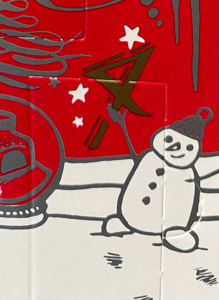
Day 4’s door.

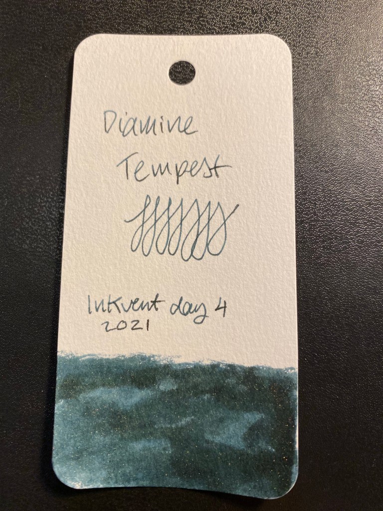
Day 4’s ink is Diamine Tempest. It’s a shimmering ink in an indigo/blue black colour with silver sparkles in it.

Diamine Tempest.

Here’s a Col-o-Ring swab of Diamine Tempest. It was photographed slightly lighter than it appears in real life. The basic colour is a gorgeous and rich Indigo or blue-black, and the shimmer is subdued enough to allow the ink’s shading to show through.

Col-o-Ring swab.

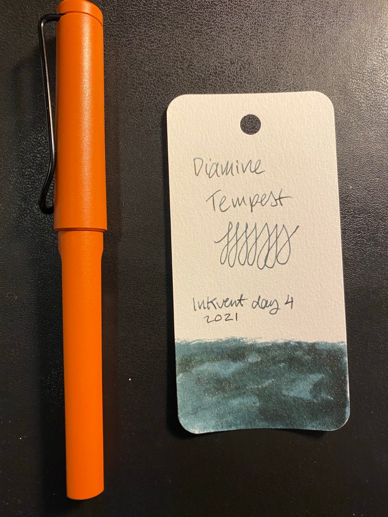
I used a Lamy Safari Terracotta with a fine nib to test this ink out.

Lamy Terracotta and Col-o-Ring swab.

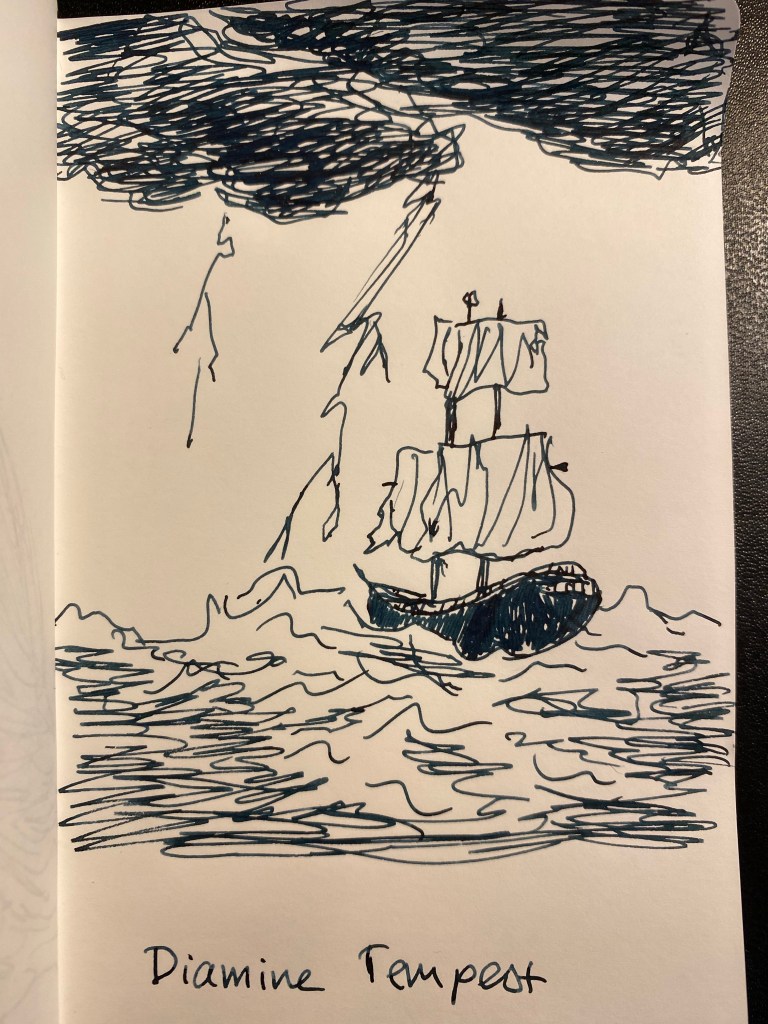
I had to draw a ship in a tempest to test out this ink. It’s quite a dark ink, and the shimmer isn’t in your face – it reminds me of last Inkvent’s Diamine Solstice.

Diamine Tempest on Tomoe River paper.

This was drawn on a Kanso Sasshi 3.5” x 5.5” Tomoe River Paper notebook (the notebooks I have were bought in 2016, and so they contain the old Tomoe River paper).

Finally, I wrote a page in my Midori Journal:
This is not a festive or cheery ink, but I still love it. Something about having such a dark and “serious” colour paired with a subtle shimmer really speaks to me, and I’m quite likely to buy a full bottle of Diamine Tempest should I get the opportunity to.

Diamine Inkvent 2021 Day 3

Caveat: this year’s Inkvent appears to have elusive ink colours. I suggest reading my description of the inks and not going by the photos alone, and comparing my results with those of other reviewers.

The Diamine Inkvent calendar is an advent calendar with 24 tiny (12ml) bottles of fountain pen ink behind 24 doors, and a larger, 30ml, bottle of ink behind the 25th door. All the inks are limited edition, and, at the moment, only available through this calendar.

Day 3’s door.

Day 3’s ink is Diamine Ash, a standard neutral to slightly warm grey. Another surprising choice in what looks to be a very surprising calendar. I’m really enjoying the diversity of colour in this year’s Inkvent compared to the 2019 one.

Diamine Ash.

Here’s a Col-o-Ring swab of Diamine Ash. The ink shades beautifully, and goes down with a distinctive green tone that largely vanishes once it dries.

Col-o-Ring swab.

I used a Lamy Safari Savannah with a medium nib to test this ink out.

Lamy Safari Savannah Col-o-Ring swab.

I thought an owl sketch would be appropriate for this ink. It shades wonderfully, and it’s definitely not too light a grey to be useful.

Sketch on Tomoe River paper.

This was drawn on a Kanso Sasshi 3.5” x 5.5” Tomoe River Paper notebook (the notebooks I have were bought in 2016, and so they contain the old Tomoe River paper).

Finally, I wrote a page in my Midori Journal:

I don’t have an ink in this shade of grey, even though I have a sizeable amount of grey ink bottles. The ink has a green hue to it that largely disappears once it dries, and I wonder if I applied a water wash to it if it would make its reappearance. Something for me to try out once I can use brushes again. As it is, Diamine Ash is an ink that I would consider buying a full bottle of.

Diamine Inkvent 2021 Day 2

The Diamine Inkvent calendar is an advent calendar with 24 tiny (12ml) bottles of fountain pen ink behind 24 doors, and a larger, 30ml, bottle of ink behind the 25th door. All the inks are limited edition, and, at the moment, only available through this calendar.

Day 2 door.

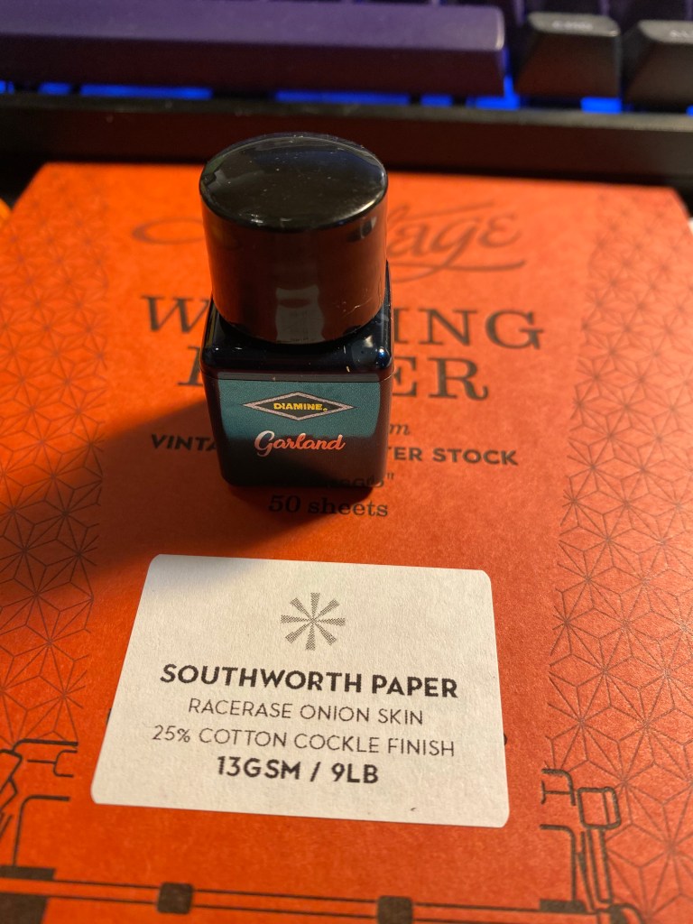
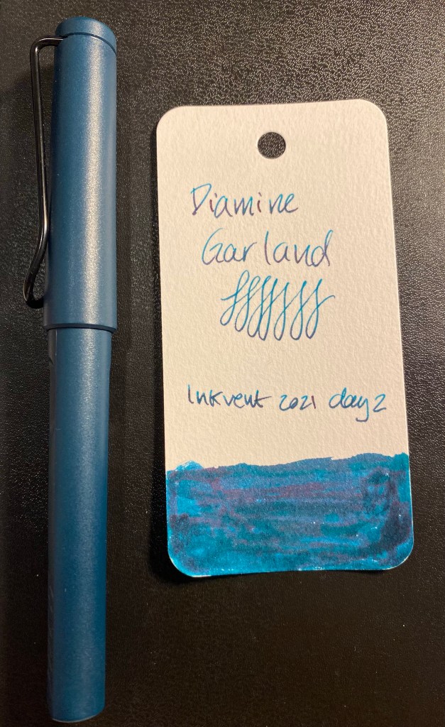
Day 2’s ink is Diamine Garland. It’s a shimmer and sheen ink, with a green-blue base, red sheen and green sparkles. As I guessed on day 1 of Inkvent, the label colour is meant to evoke the colour of the ink, though it’s far from a faithful reproduction of it.

Diamine Garland bottle.

Shimmer and sheen on the label:

It’s a shimmer and sheen ink!

Here’s a Col-o-Ring swab of it. The ink looks more blue than green here, but in reality it’s more of a green than a blue. If I had to compare the base colour to my Schmincke watercolours, it would be a Prussian green or a cobalt green turquoise.

Col-o-Ring swab.

I used a Lamy Safari Petrol fine nib to test this ink out. Again, cartridge converters for the win.

Lamy Petrol with Col-o-Ring swab.

I felt like sketching a cat, so I drew one lazing about on a yet to be hung garland. The photo doesn’t pick up the crazy amount of red sheen that Diamine Garland has. You can barely notice the shimmer with the sheen being so pronounced.

Sketch on Tomoe River paper.

This was drawn on a Kanso Sasshi 3.5” x 5.5” Tomoe River Paper notebook (the notebooks I have were bought in 2016, and so they contain the old Tomoe River paper).

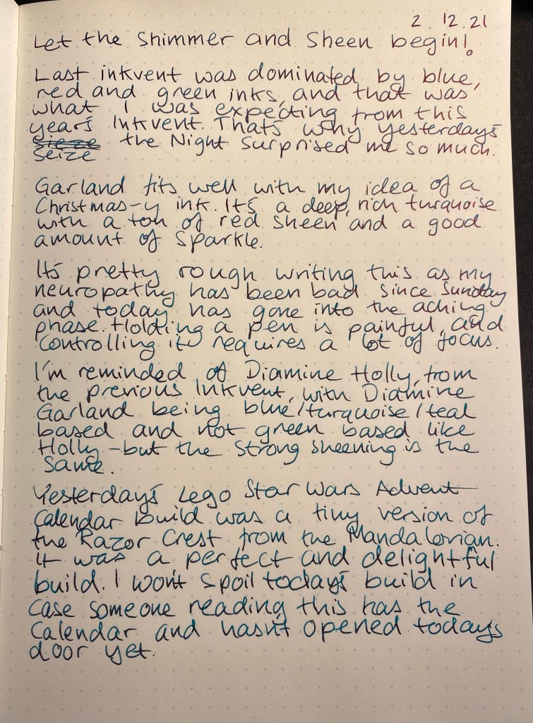
Finally, I wrote a page in my Midori Journal:

Diamine Garland looks a lot like someone took Diamine Holly from 2019’s Inkvent and added a splash of Prussian blue or indigo to it. I think that the shimmer gets a bit lost in this ink because of the strong sheen, and I’m not sure that the colour stands out enough from other inks in this colour range to justify ordering a bottle of it. It is Christmassy colour, and a pretty one, it’s just not one that is as unique as day 1‘s Seize the Night.

Diamine Inkvent Day 1

The Diamine Inkvent calendar is an advent calendar with 24 tiny (12ml) bottles of fountain pen ink behind 24 doors, and a larger, 30ml, bottle of ink behind the 25th door. All the inks are limited edition, and, at the moment, only available through this calendar.

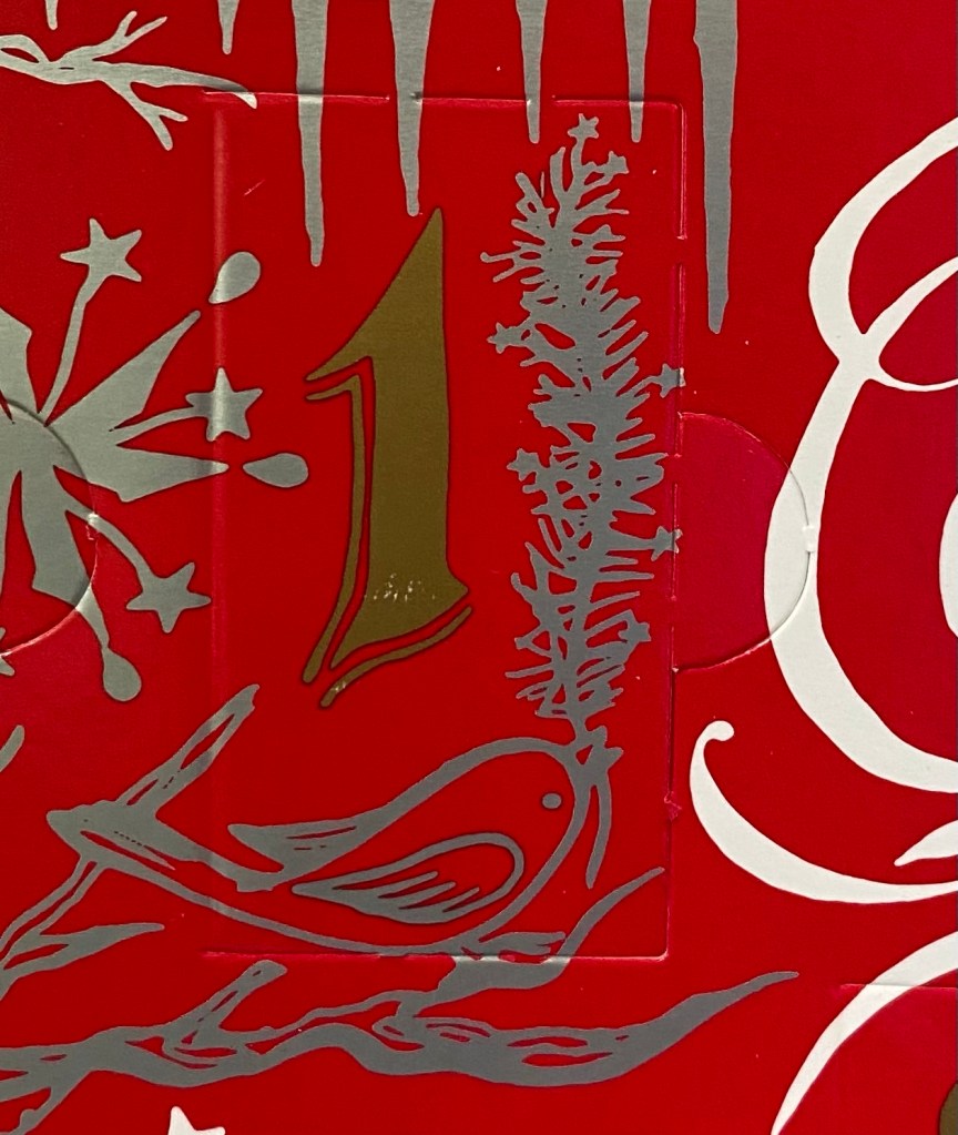
Day 1 door.

The first thing that caught me by surprise is the bottle. The 2019 Inkvent calendar had tiny, tall and circular glass bottles. This year’s Inkvent has plastic bottles that are square and squatter and have wider mouths. That makes them much easier to use, with less of a chance for accidental spills. I like the redesign, even though I would have liked glass bottles better. However, as glass is more expensive, I understand the reasoning for going for plastic this year.

New bottle on the left, 2019 bottle on the right.

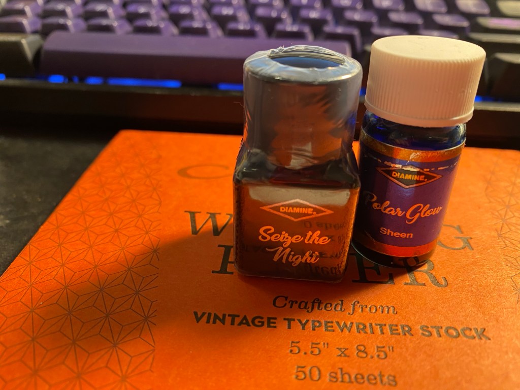
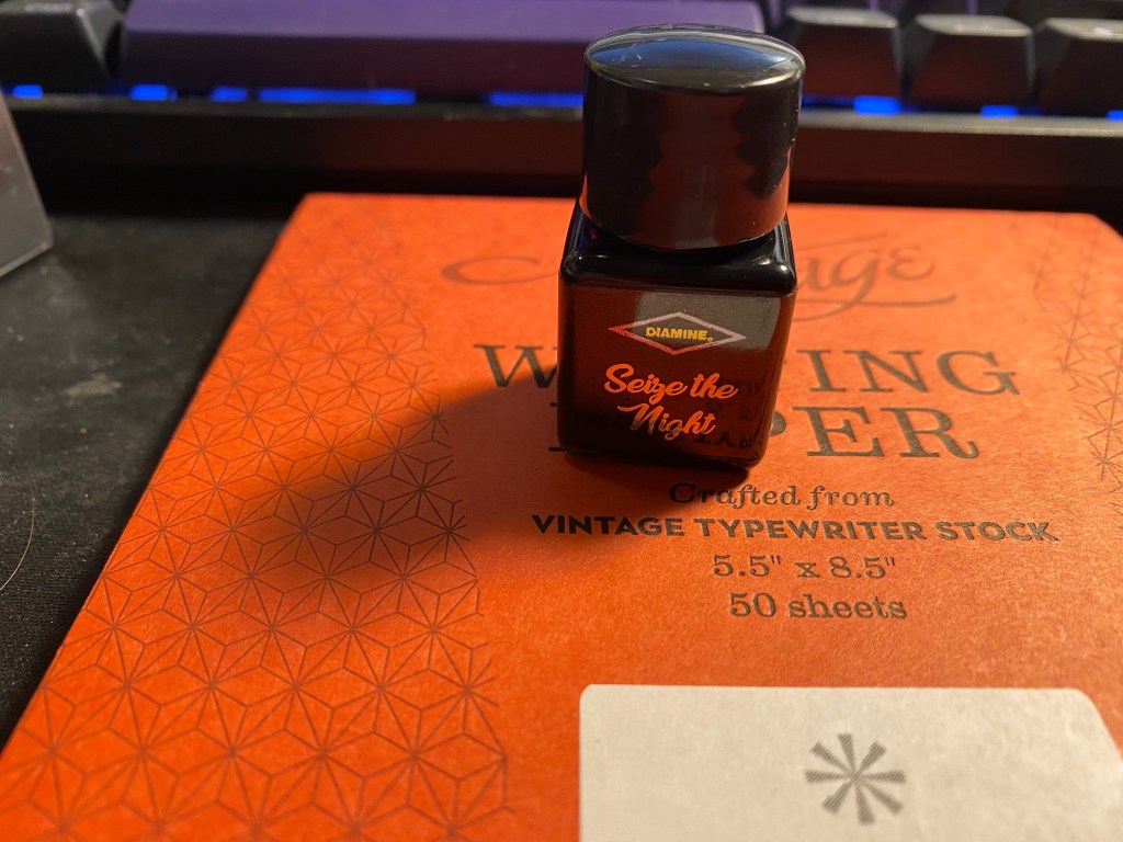
The day 1 ink is “Sieze the Night”. It’s a standard ink in a very non-standard colour. I’m not sure if the label on the bottle is meant to reflect the colour, as it did in the 2019 Inkvent, but if so they did a poor job of it.

Seize the Night.

The bottle comes wrapped in shrink wrap, likely to prevent leaks, and on the side of the label you can see what kind of ink it is (in this case standard). The plastic wrap is surprisingly difficult to open.

Label on the side marking it as a standard (i.e. not shimmer or sheening) ink.

So what’s the colour like? It’s a dusky purple that goes down on the page lighter and brighter than it dries. Seize the Night is a greyish-lavender ink with a good amount of shading and a slight golden sheen if you flood the page with it.

Here’s a Col-o-Ring swab of it. You can see the sheen on the swab, where the ink pooled.

Col-o-Ring swab of Diamine Seize the Night.

I used my Diplomat Elox Rings with an extra fine nib to test out this ink. A wider nib would have shown more shading, but even with this nib there’s a fair amount of shading going on, particularly on less absorbent paper.

Diplomat Elox Rings with the Diamine Seize the Night ink swab.

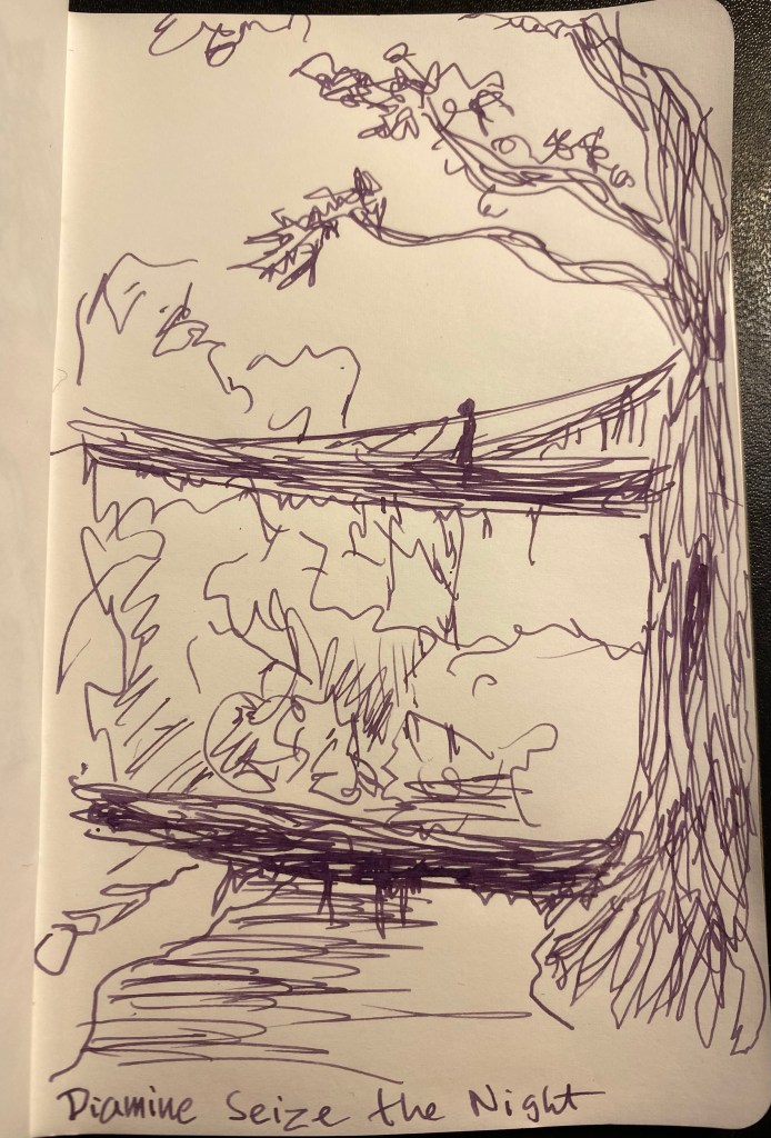
I read an article about villagers in India training the air roots of local trees into bridges across a local river, and decided to do a quick sketch of that scene to test the ink out.

Sketch on Tomoe River paper.

This was drawn on a Kanso Sasshi 3.5” x 5.5” Tomoe River Paper notebook (the notebooks I have were bought in 2016, and so they contain the old Tomoe River paper).

Finally, I wrote a page in my Midori Journal:

Diamine Seize the Night in a Midori A5 Journal.

I wasn’t expecting this ink shade at all in a Christmas themed ink sample set like the Inkvent. That being said, I love it. It’s a unique colour that is dark enough and muted enough to use in the office, but is also interesting and unique. From a distance it reads like a black/brown/grey until you take a closer look and its purple nature is revealed. It flows well, there’s plenty of shading to be had, and there’s a very good chance that I’ll be picking up a bottle of this should Diamine eventually offer them up for sale.

Diamine Inkvent 2021

It’s Diamine Inkvent time!
In 2019 Diamine came out with a fantastic fountain pen ink based advent calendar: the Inkvent Calendar. Behind each of the 25 doors was a tiny ink bottle (except for day 25, which got a larger bottle), each one of them was holiday themed and made specifically for the calendar. I created a review post a day for each any every one of those 25 inks. It was exhausting but worth it because it allowed me to select my favourites of the bunch . Eventually, as I’d hoped, Diamine reissued these inks in beautiful glass bottles, and so I was able to purchase full bottles of my favourites.

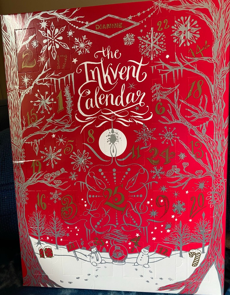
Front of the Inkvent calendar

This year Diamine came out with a new Inkvent calendar, this time also with 25 exclusive and thematically appropriate (at least by name) inks. I plan on posting a review of each one on the appropriate day. I’m not promising not to open some of the doors in advance. Due to my neuropathy and my treatments there will be days when I otherwise won’t be able to post.

This is meant to be a fun project, and I’m also hoping that Diamine comes out with larger ink bottles of the Inkvent line. So the reviews should help me select the few larger ink bottles that I may order.

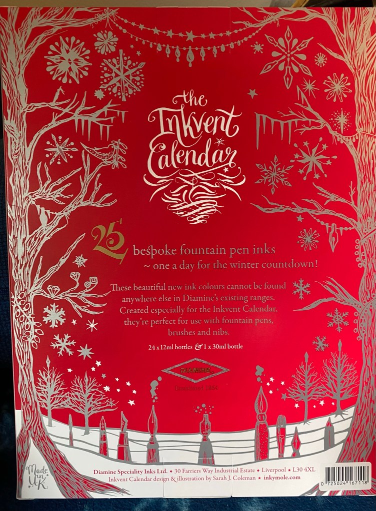
The back of the Diamine Inkvent calendar.

My plan is to use cartridge/converter fountain pens to test the inks. They’re less of a hassle to fill from tiny bottles, and they’re easy to clean. This calendar will contain inks with a lot of sparkles in them, so the cleaning aspect of the business is important.

So, expect a daily review, as we go out on an inkventure.

Weekly Update: Chemo and Klara and Ink, Oh My

I am trying something new here, to see if I can start using this blog to update on what’s going on with me plus as an accountability aid. Let’s see if it sticks.

Health

I spent the week recovering from Chemo number 8. I started the week with muscle aches and pretty strong neuropathy that made typing and writing a real pain, but by mid week the muscle aches subsided and the neuropathy, while still with me, is much less sever. Next week is Chemo number 9 out of 12. Getting into the home stretch, but the side effects are getting more pronounced. I no longer try to work on the day of the Chemo, and I may need to take a day off on the day after as well, but we’ll see. Next week I also finally get to see a psychologist at the cancer treatment centre. I’ve been on the waiting list for two months, so I really hope our appointment will go well.

Reading

I finished Kazuo Ishiguro’s fantastic “Klara and the Sun”. Not a breezy read and a very typical Ishiguro book, but I enjoyed his treatment of AI and humanity in this novel. It starts slow, and builds up a world and an atmosphere like few writers can. Highly recommended.

Started reading Hilary Mantel’s “Bring Up the Bodies” and will likely also start reading “Cibola Burn”, the 4th Expanse book by James S.A. Corey. Mantel is mesmerising as usual, but a bit too demanding to read during Chemo. That’s what “Cibola Burn” is for.

Writing

Got some writing done on my non fiction project, although not as much as I would have liked. I’m still writing in my notebook so I’m not counting words, but I estimate I got about 5 pages of writing in. Not great, but better than nothing, especially considering the material involved. I’m also considering picking up work on a novel that I stopped working on once the pandemic hit. I’ll have to rework the premise quite a bit, but I believe that the core of the story still works.

Currently Inked

I wrote my Diplomat Aero Champagne fine nib pen with Sailor Studio 123 dry this week. I really enjoyed the pen and the ink, so I think that they’ll be back in rotation pretty soon.

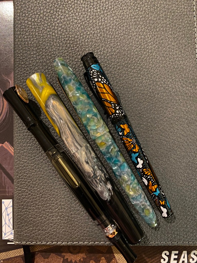
From left to right: PenBBS, Kanilea, Esterbrook, Retro 51

The PenBBS Year of the Ox pen and the Kanilea pen have been my journalling pens this week, with the first being filled with Pilot Iroshizuku Ina-Ho and the second with Diamine Earl Grey, both wonderful shading inks. The Retro 51 Monarch has a stub nib and is filled with Caran d’Ache Saffron, and the the Esterbrook Estie Sea Glass is filled with Diamine Jack Frost. Both are in use for my “Three Good Things” entries.

Diamine Monboddo’s Hat Ink Review

Diamine Monboddo’s Hat intrigued me from the moment I heard the name and saw the colour, but I have too much ink already, so it took a while before I caved in and bought a small bottle of it, and then a while more before I had the chance to use it.

Ever since Lamy Dark Lilac made its appearance a few years ago all dark purple inks have been judged against it, perhaps unfairly. There is more than one shade of dark purple in the world, and in any case unless you’re really set on trying to replicate Dark Lilac’s hue there’s really no need to create that comparison. Let inks stand for themselves first, and then let people know how close they are to an ink they may own or look to purchase.

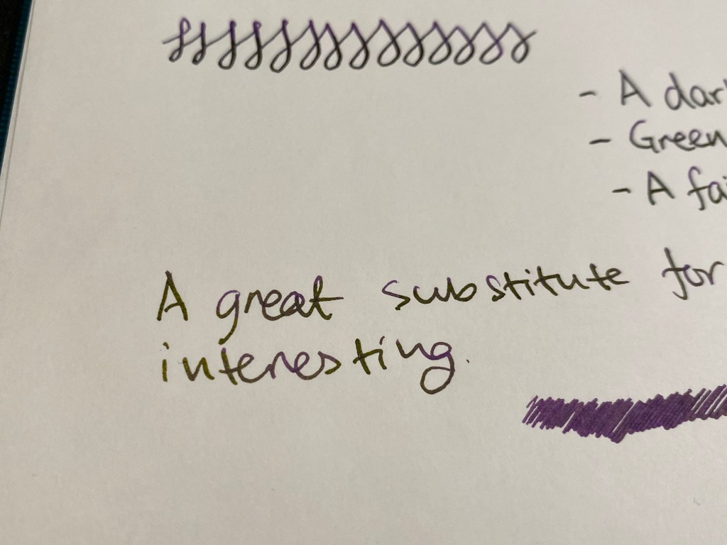
Diamine Monboddo’s Hat has a delightful name and was made in collaboration with the Fountain Pens UK Facebook group. Diamine’s collaborations have all been interesting so far, and this one isn’t different. Monboddo’s Hat is a reddish leaning deep purple with a green gold sheen that can easily be slipped into office use rotation without anybody noticing. I have used Tomoe River paper to bring out the most of its sheen and shading, but even here it’s not a wild ink.

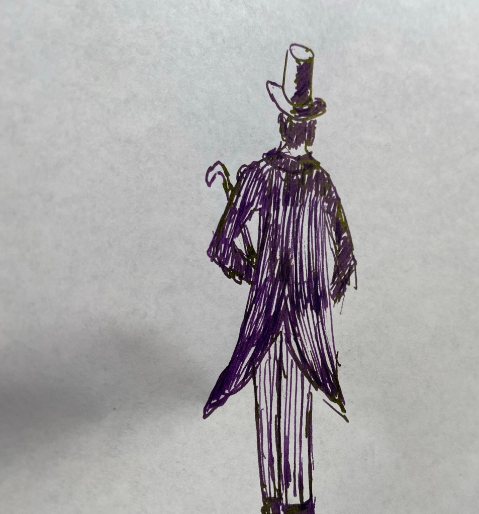
It’s hard to get the lighter hue of the ink to show while writing, but I made a quick sketch which shows the colour variation Monboddo’s Hat has:

Use Tomoe River paper and tilt it a bit to see the greenish-gold sheen this ink provides.

You can see the sheen on the top row here. Looking at the writing without tilting the paper makes them just look like an almost black purple.
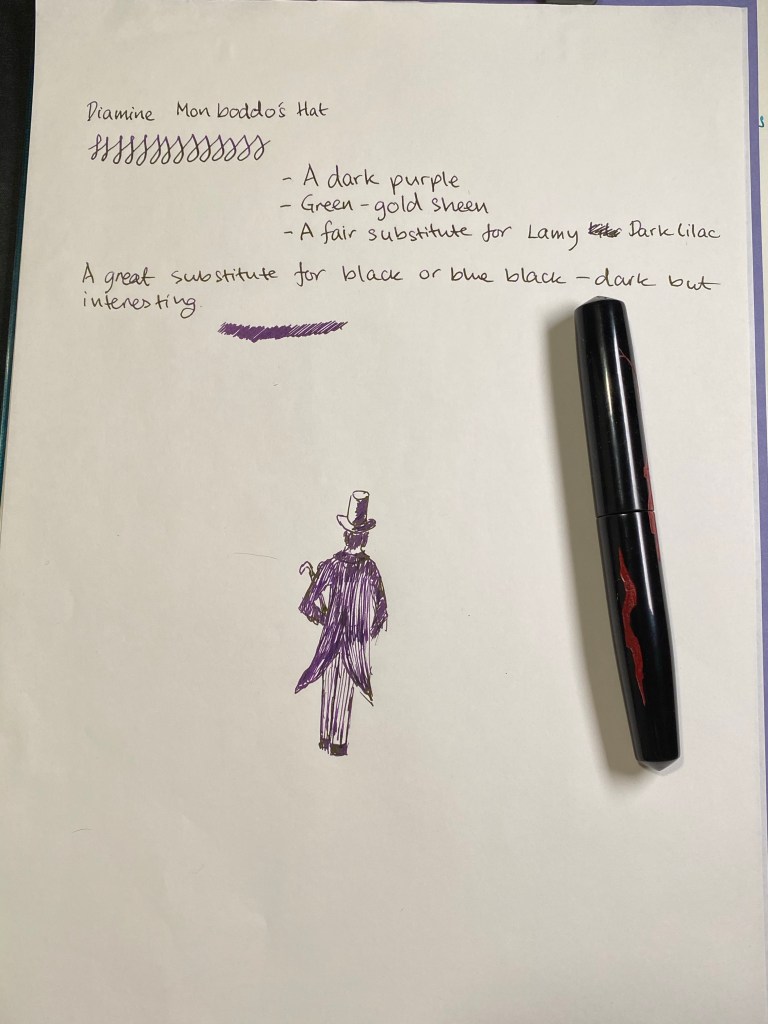
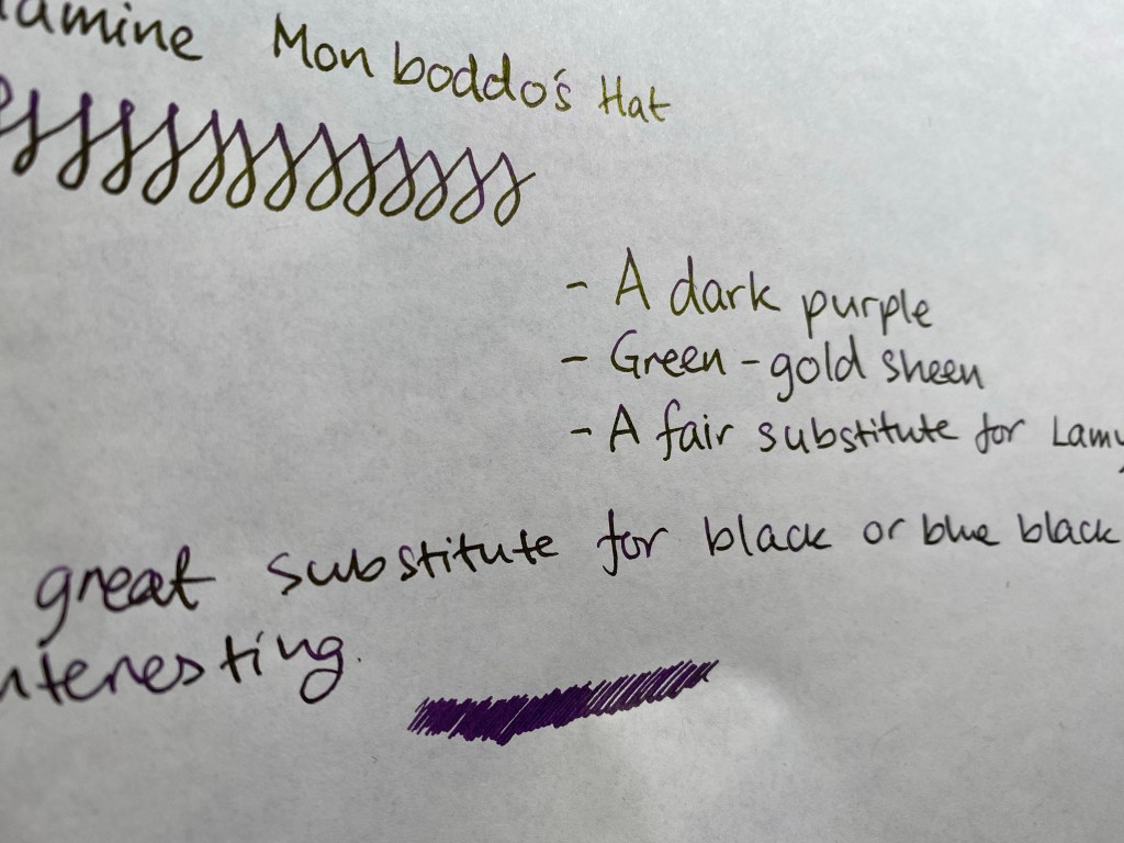
It was fun doodling around with this ink. Here’s a closeup on all that Monboddo’s Hat has to offer:

The sketch was done using a Nakaya fine elastic nib. Where I put less pressure and moved the nib faster you see the lighter shades of purple and less sheen:

I used a fine brush to draw this flower, and a drop of water to show that Monboddo’s Hat isn’t waterproof or water resistant (nor does it claim to be):

Sheen on display:

Regardless of if it’s a good substitute for Lamy Dark Lilac or not, Monboddo’s Hat is a wonderful ink that is worth buying. The shade is dark but still vibrant, the sheen adds interest and pizzaz, and it’s a lot of fun to draw with if you have that inclination. Being a Diamine ink it’s also affordable and easily obtainable, with the added plus of being part of a welcome collaboration between a very old brand and a very modern community.

Urban Sketchers Tel Aviv: Dubnov Garden

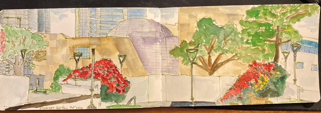
We haven’t had an Urban Sketchers sketchwalk in Tel Aviv since June due to Covid-19. We met today and drew, socially distanced and with masks, for three hours in Dubnov garden, which is not far from Rabin Square and is just behind the Tel Aviv Museum of Art.

The first drawing, focusing on the strange rock sunken sculpture in the middle of the garden, was drawn on a Stillman and Birn Pocket Alpha, with a TWSBI ECO 1.1 stub filled with Rohrer and Klingner Emma SketchINK and Schminke watercolours.

The second drawing is a panorama of the architecture near the park, and it was drawn on a Moleskine Large Watercolour notebook, with the same materials and the drawing above.

My drawing challenge has allowed me to streamline my process and bring in much fewer art supplies to the sketchwalk without feeling that I’m missing out. It was also the first time I brought my Walkit sketchbag to a sketchcrawl and it worked very well. I’ll write a review of it later on, once I’ve finalized the kit I put in it.

Diamine Aurora Borealis Ink

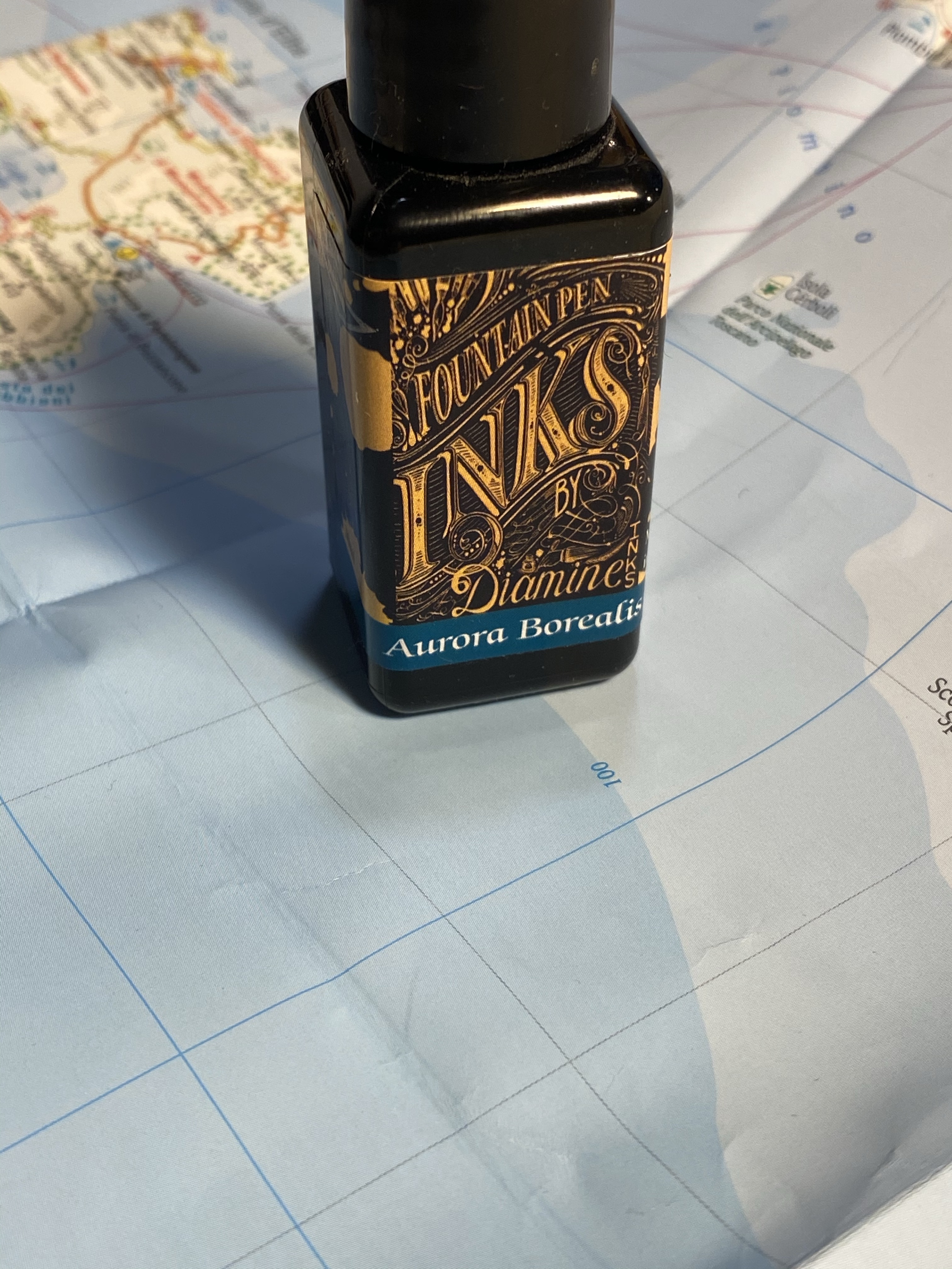
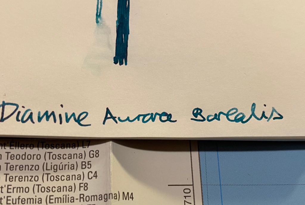
Diamine Aurora Borealis fountain pen ink was created by Diamine in collaboration with the /r/fountainpens reddit community, who chose the colour. I love teal inks, but at first I thought that I had enough inks that are close enough in colour to skip this one. I have no recollection of how it landed in my basket during my last Cult Pens purchase 🙂

Beautifully designed label.

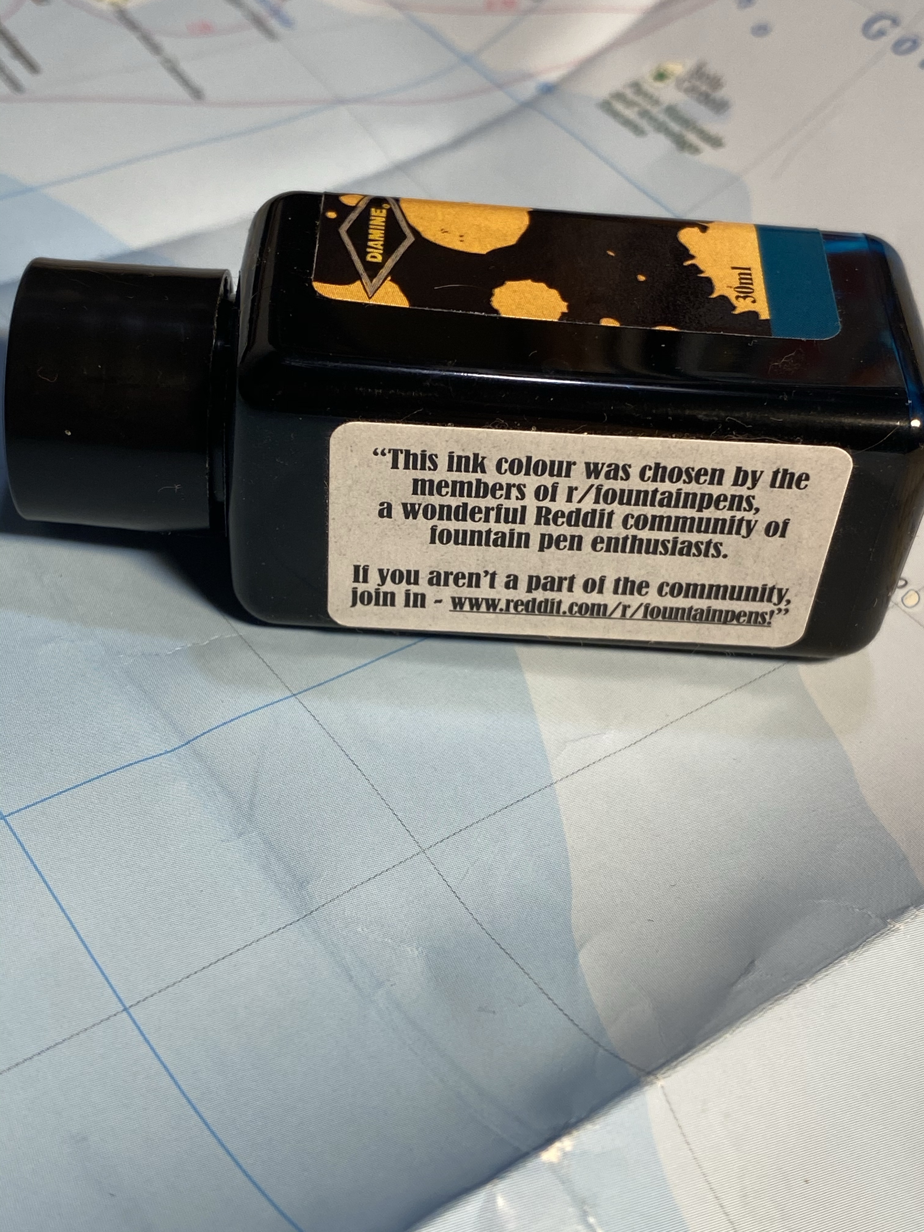
I don’t normally spend much time on the packaging, but Diamine’s 30ml plastic bottles are deep and wide enough to allow for filling even chunky pens, and their (relatively new) label design is splendid. This bottle is unique in that it has another label, crediting the /r/fountainpens community with selecting the ink colour:

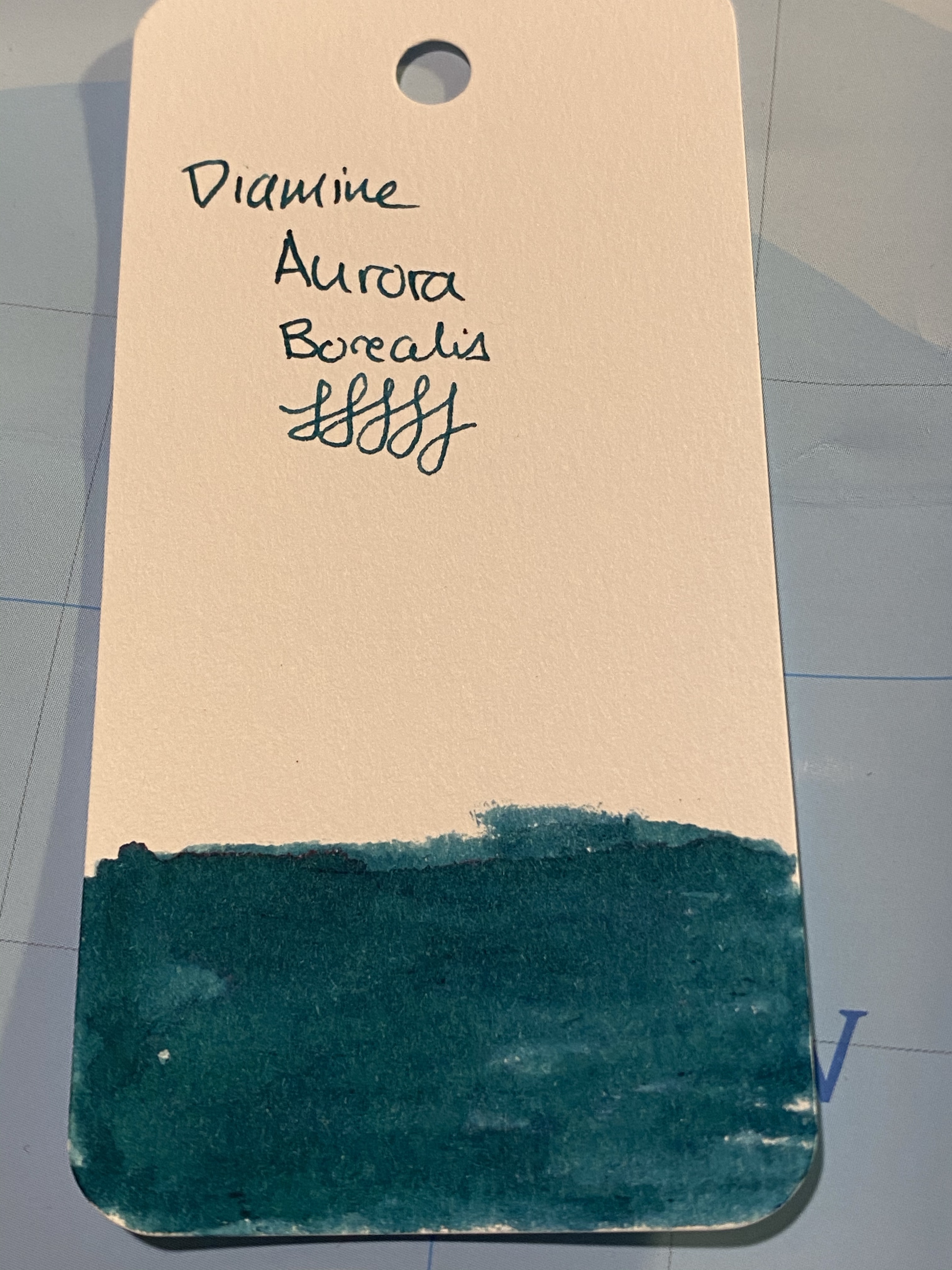
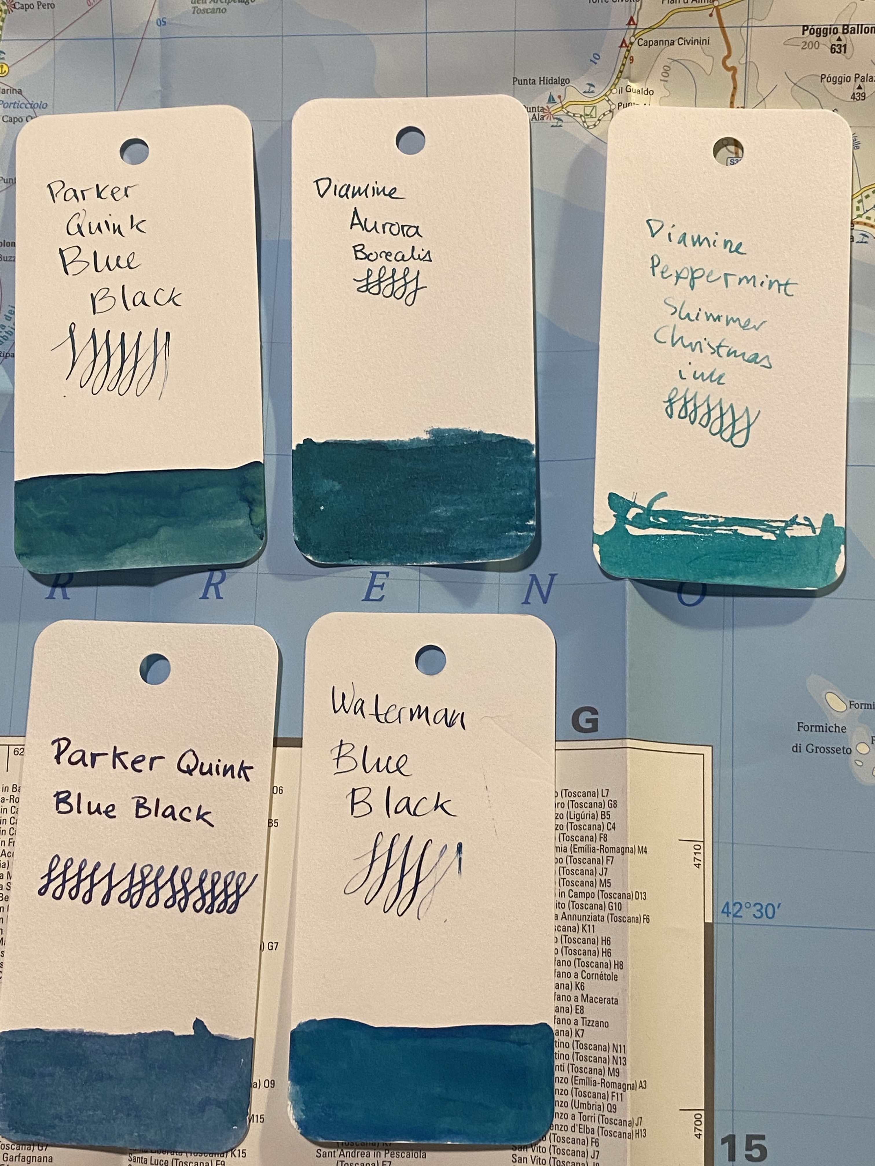
Aurora Borealis is a dark teal with some red sheening, and a good amount of shading for such a saturated ink. It also dries surprising fast for such a saturated ink (although I wouldn’t call it a fast drying ink).

Swab on a col-o-ring card.

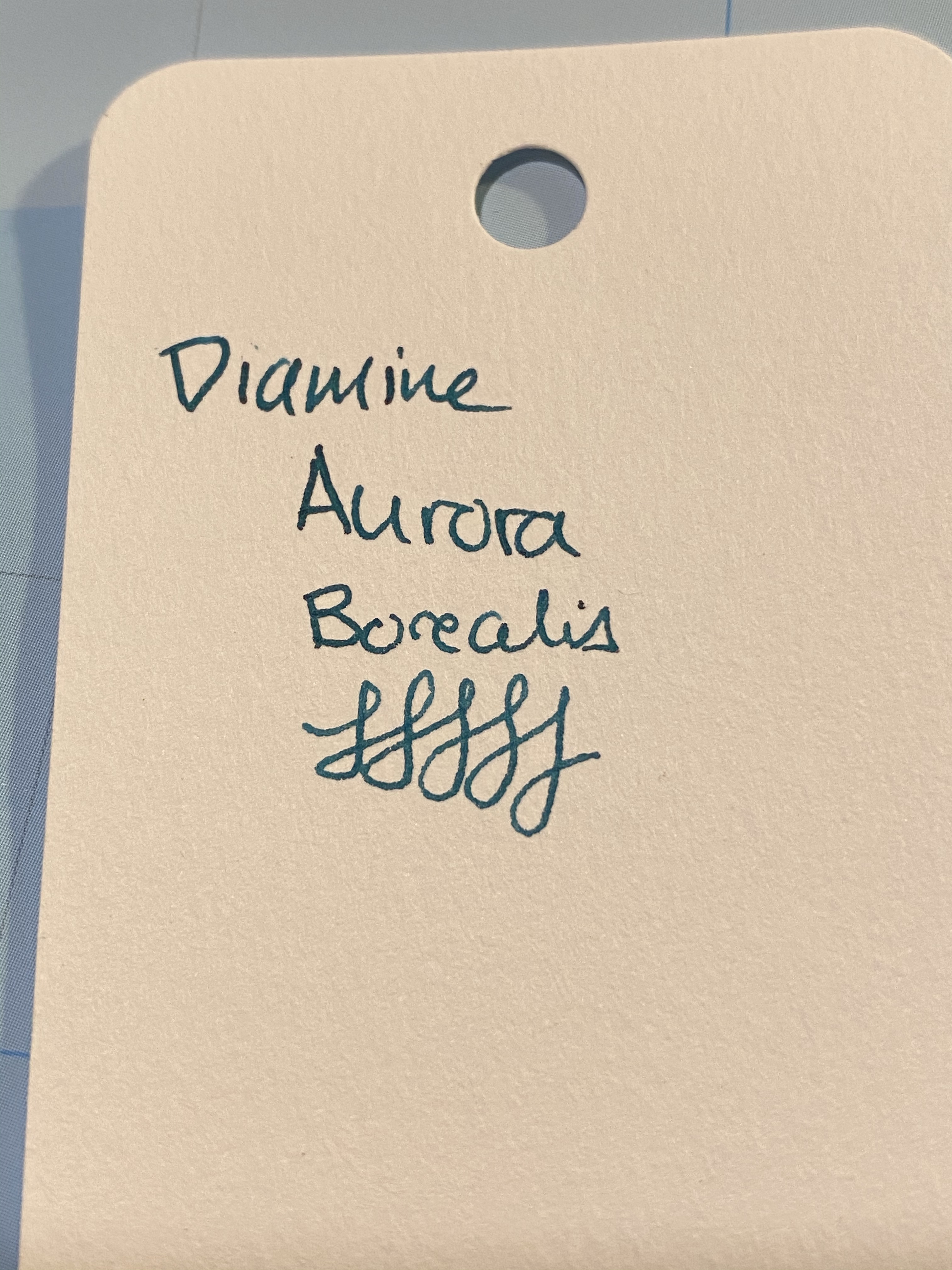
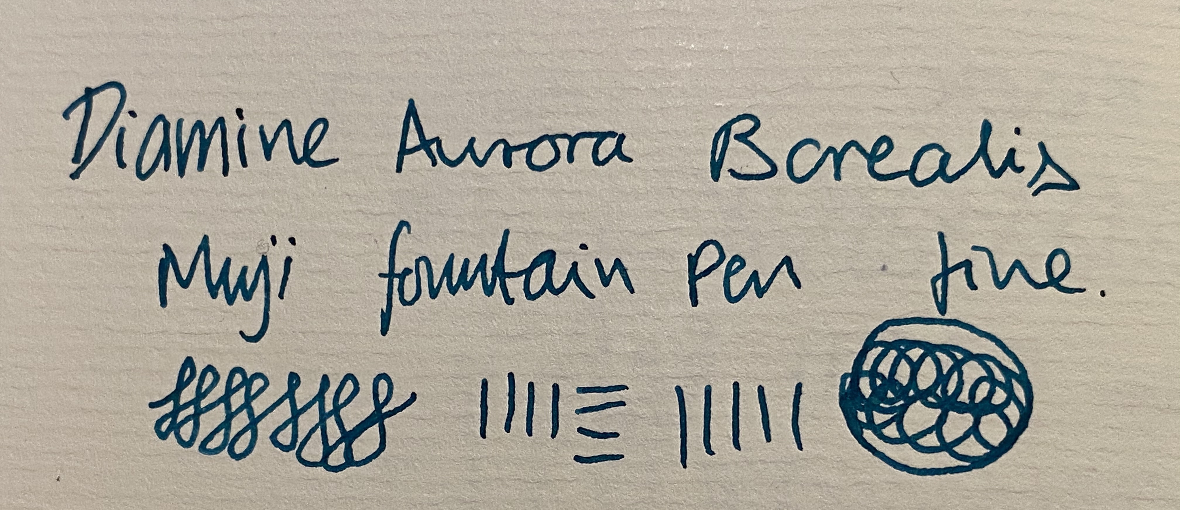
You can see a bit of the red sheen here, on the top of the “A” in aurora:

I a few inks that are in the region fo Diamine Aurora Borealis, but not many of them are swabbed. I will say that the ink is dark enough to be fine for office use, and that is still shows plenty of interest and character:

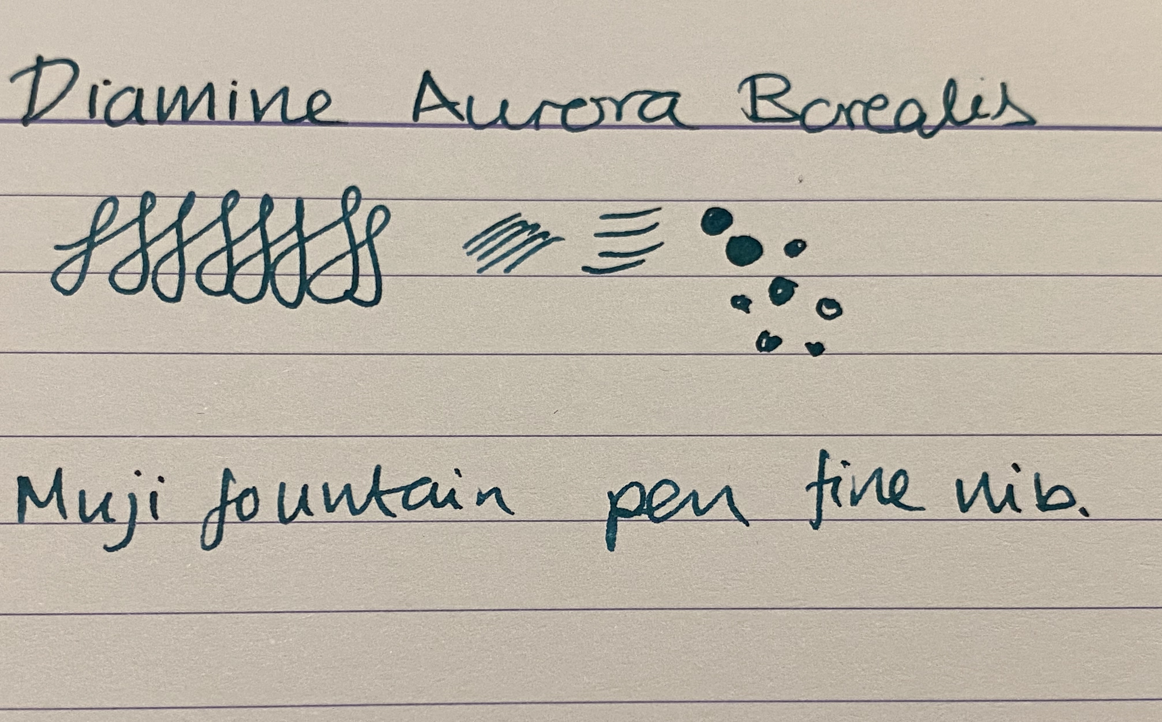
I tried it also on Paperblanks paper, and on Rhodia paper. In both cases the ink dried darker than it looked when I was writing with it, although the photos picked up less colour than it originally had. The best colour reproduction is in the final photos of Tomoe River Paper, further below. It is worth pointing out though that if you have a wet nib, you’re going to see darker results than you’d expect from the swabs.

Paperblanks

In any case Aurora Borealis came out much darker than it appears on Goulet Pens site, for instance, although not as dark as it appears here:

Rhodia

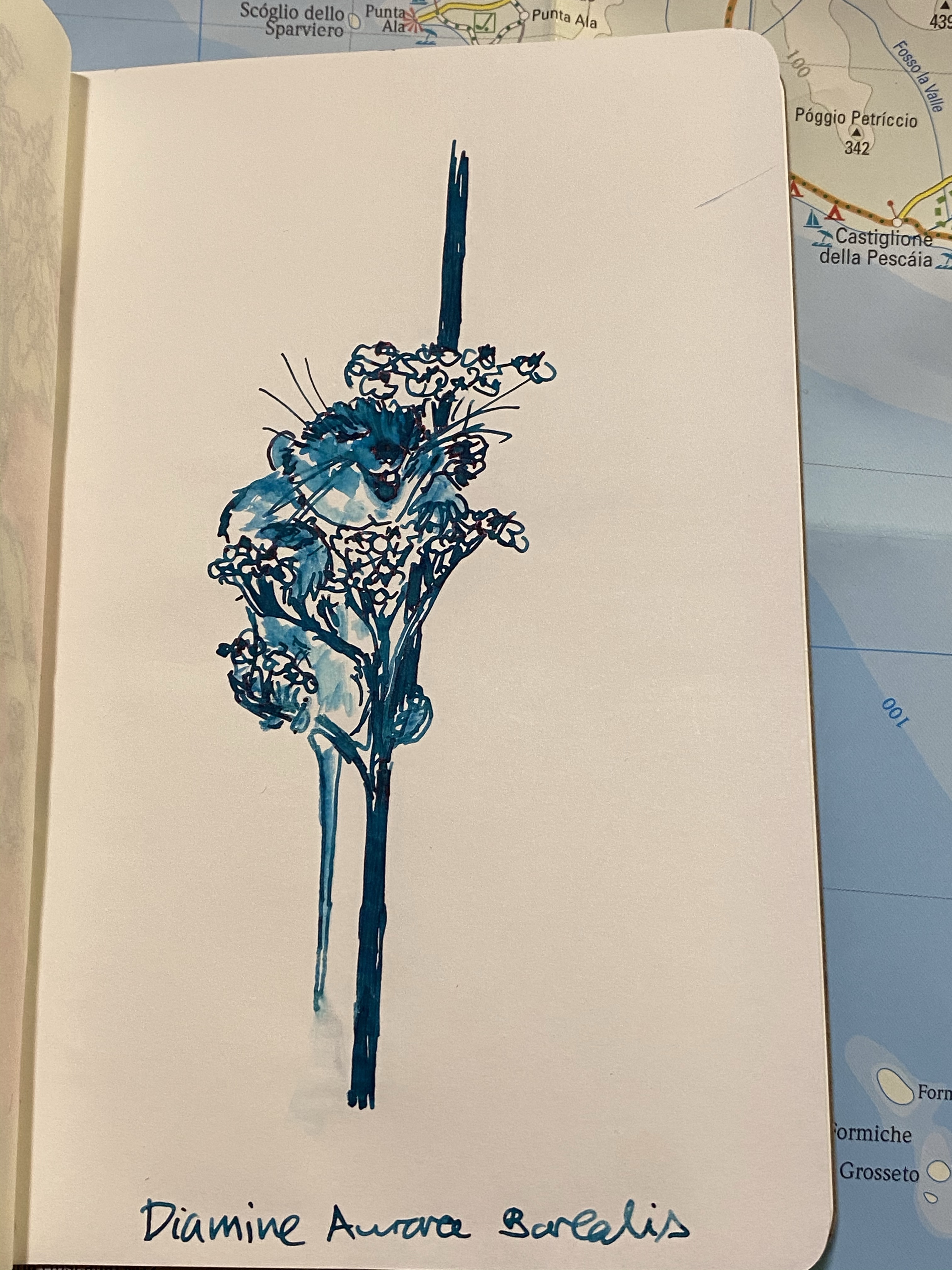
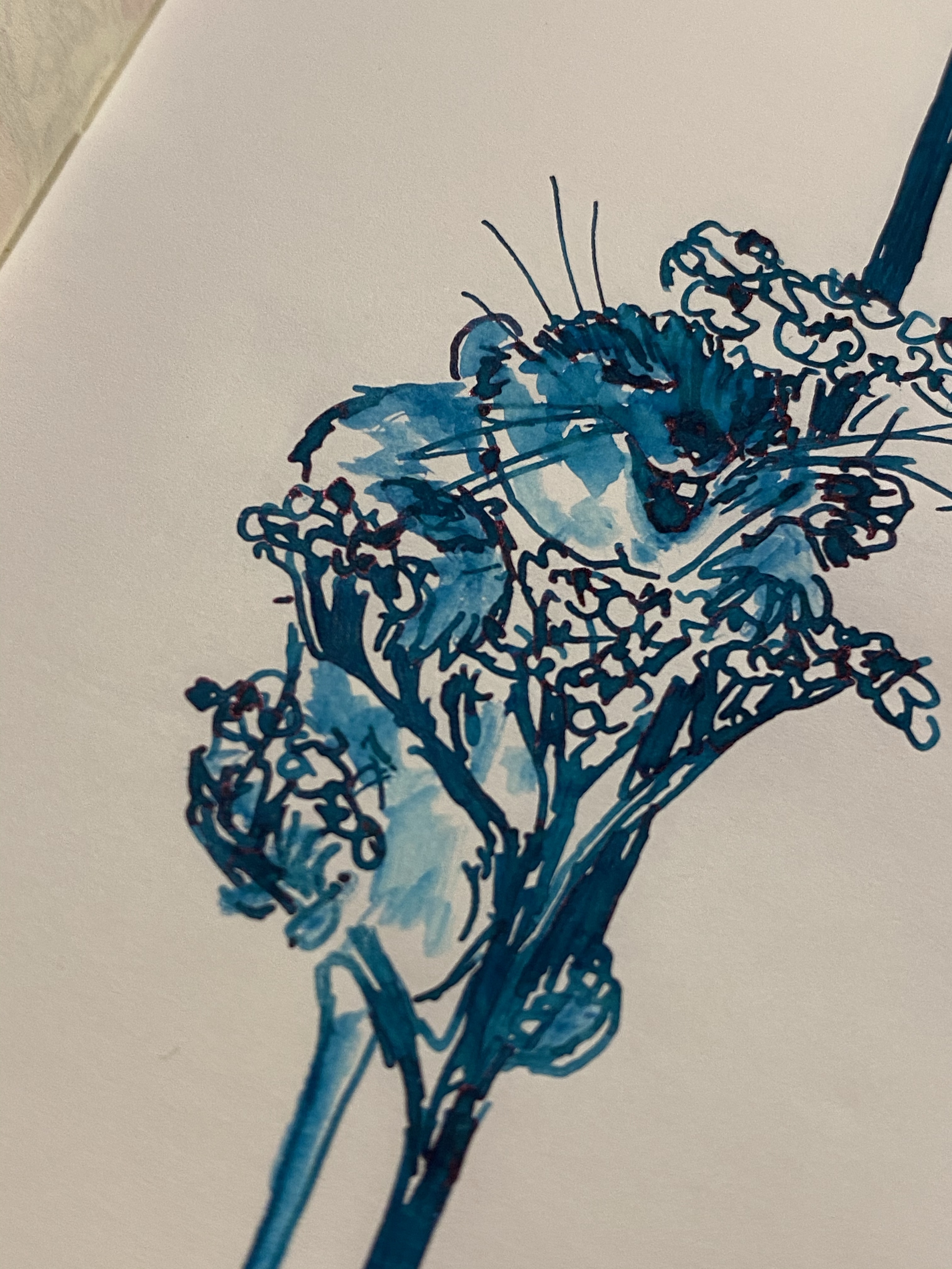
I gave the ink a spin on some (old) Tomoe River paper, and “opened” it up with some water and a fine brush. As is the case with most Diamine inks, Aurora Borealis isn’t waterproof or water resistant, and doesn’t market itself as such. It is, however, a lot of fun to draw with:

You can see red sheening on the happy little dormouse’s nose, as well as on the flowers. You can also see the shading in the flowers:

This is the best sample of all the properties of this ink: the relatively dark colour, the shading, and the slightly red sheen:

Diamine Aurora Borealis is fun dark teal ink that will likely appeal to anyone who likes teal/turquoise inks. It’s inexpensive and unassuming, and so you can take an interesting ink for a spin without spending Sailor or Iroshizuku money.

Cult Pens Iridescink by Diamine: Diamine Robert

When Cult Pens and Diamine came out with their first two “Iridescink” shimmering inks together they turned to the fountain pen community to name them, jokingly suggesting Robert and Maureen as possible names. The fountain pen community duly said “challenge accepted” and voted that the inks be called “Robert” and “Maureen”. I thought that this was a charming anecdote until I actually purchased three of the now four Cult Pens/Diamine Iridescink inks and realized that I with names like Robert, Maureen and Christine I would never be able to tell which ink is which.

This, of course, is a minor problem for an otherwise solid addition to the world of fountain pen inks. These inks are super sheening and generally well behaved, with a good solid base colour and an interesting sheen hue on top of it.

Robert, a purple ink with a green sheen (I will forever have to consult a guide when trying to remember which ink is called what), is one of the most attractive inks in the bunch. It features a reddish purple somewhat reminiscent of Diamine Amaranth, and a gorgeous green gold sheen.

On Rhodia paper with a Lamy fine nib you can see the green sheen on almost every downstroke. It’s also well featured in the swap I took in my Col-o-ring.

For the biggest sheen effect, of course there’s nothing like tomoe river paper. Here’s a quick sketch that I did on a Kanso Sasshi tomoe river booklet. As you can see the ink isn’t waterproof or water resistant (not that Cult Pens or Diamine claim that it is), and you can barely see the base colour in most places because of the heavy green sheen.

So why did I say that Diamine Robert is “generally well behaved” and not just “well behaved”? Because if you leave it unused in a pen for a day or two you may find that you need to “prime” the pen for a bit to get it to start to write. Once it gets going the ink flows well, but this is the sort of behaviour that makes me wary of using this ink in vintage pens. Your milage may vary, as ink flow changes with altitude and weather, but for now this gorgeous ink is relegated to “just” my modern pens. That’s more than good enough for me.