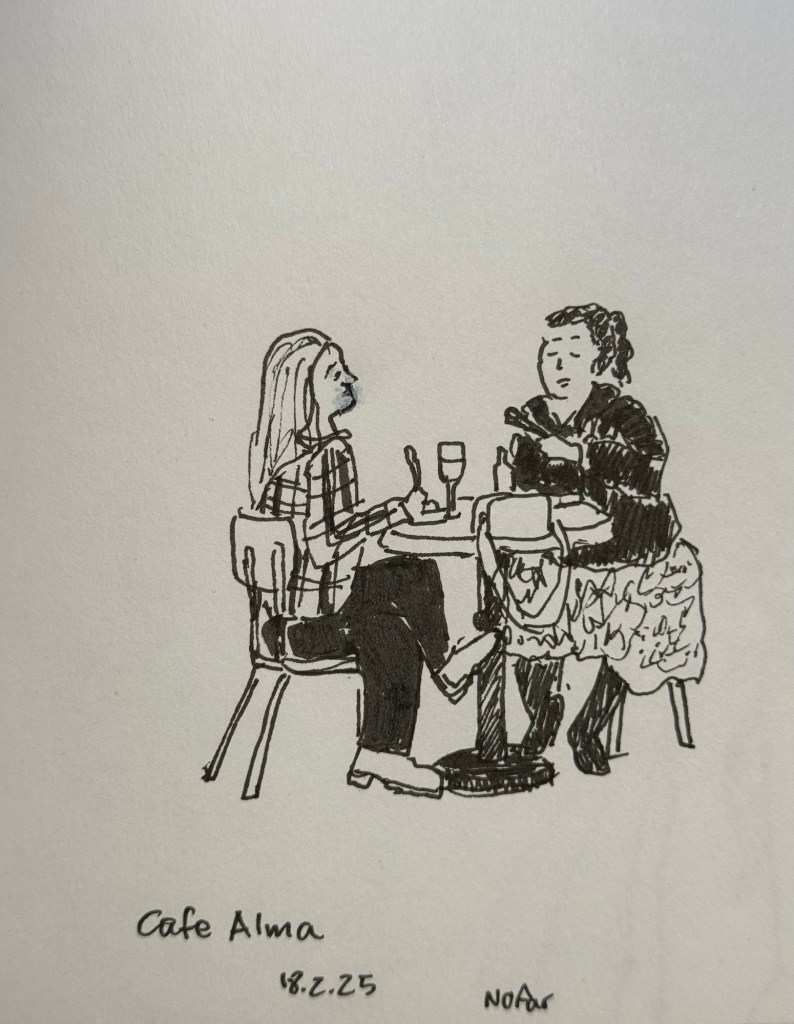
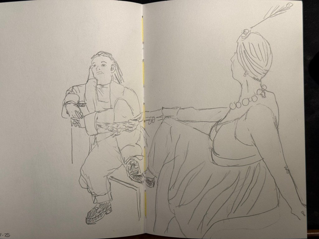
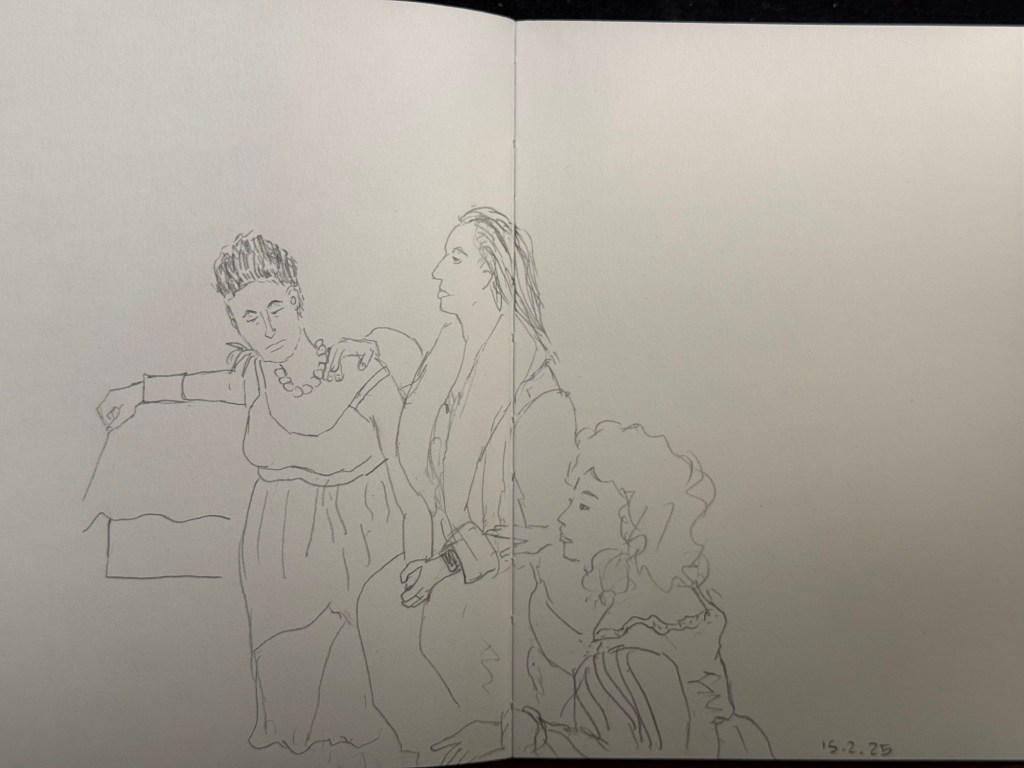
Earlier this week I went to a standup gig – a NY comedian was trying out new material, and it was an interesting (and funny) experience to see him work. Before the show I had about 5 minutes to sketch the people in a nearby cafe, so I sketched this couple using a Staedtler 0.5 Pigment Liner.
In terms of fountain pens the Parker Vacumatic is out of rotation, though I may give Diamine Writer’s Blood a try in another pen soon enough. I decided that I want to have the nib tuned on it, in terms of flow, though I don’t know who I’ll be able to find to do the tuning for me.
I also dumped out the Pilot Iroshizuku Yama Budo out of my Parker 51 as I couldn’t get it to not bleed and feather on practically any paper. I cleaned out the pen and refilled it with Waterman (Tender) Purple ink and it’s been wonderful to use since. Waterman inks are not only fantastically well behaved, beautiful, cheap and very, very easy to clean out of pens, they’re also dry inks. As Parker 51 generally have a generous ink flow, and this one is no different, a dry ink serves particularly well with this pen.
I’ve been reading Mrs Palfrey at the Claremont by Elizabeth Taylor (the British novelist, not the famous actress) and it’s a wonderful study of character, age and aging.
Next week is the Tel Aviv marathon, which is sold out for the very first time. There were no big local running events last year, and there’s clearly a hunger for them.
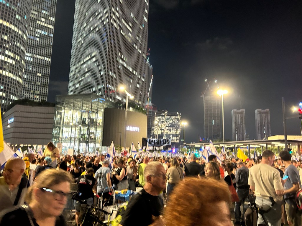
This week has been crushing from both a personal and a national perspective. I’ve taken solace in friends and in reading, but there have been times where it’s been a struggle. It’s at times like this when I need to remind myself to stop, take a breath, allow myself to feel what I need to feel, and only then pick myself up and move on.
Be kind to yourself and others, and have a great week.
It’s nice to have new pens and inks in rotation. I’m enjoying Diamine’s Writer’s Blood more than I expected, Diamine Autumn Oak is fantastic with a Waterman superflex nib, and Pilot Iroshizuku Tsuki-yo is becoming one of my favourite inks.
Liz Steel and Marc Taro Holmes are hosting the OneWeek100People challenge again this year, and I intend to participate again. The challenge starts on the 3rd of March and officially lasts 5 days. I normally sketch from photos, but this time I want to see if I can do the entire challenge from observation only. It may take me more than 5 days, but I’m OK with that. Are you planning on joining the challenge?
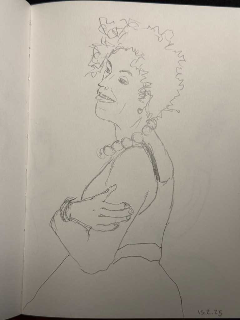
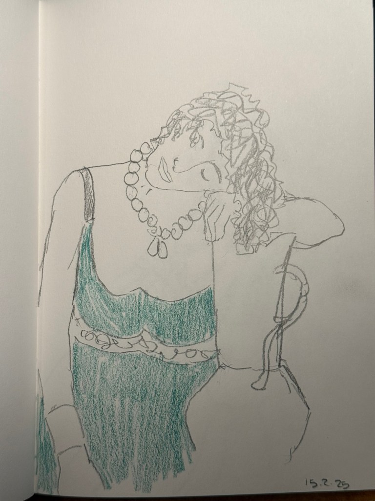
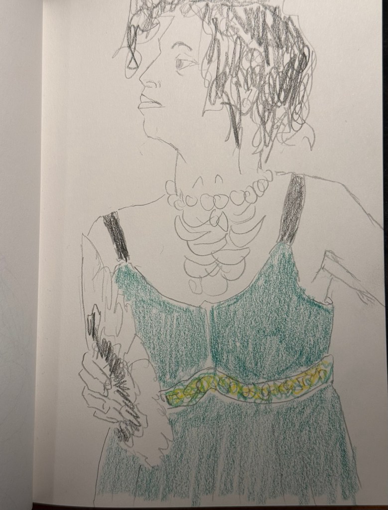
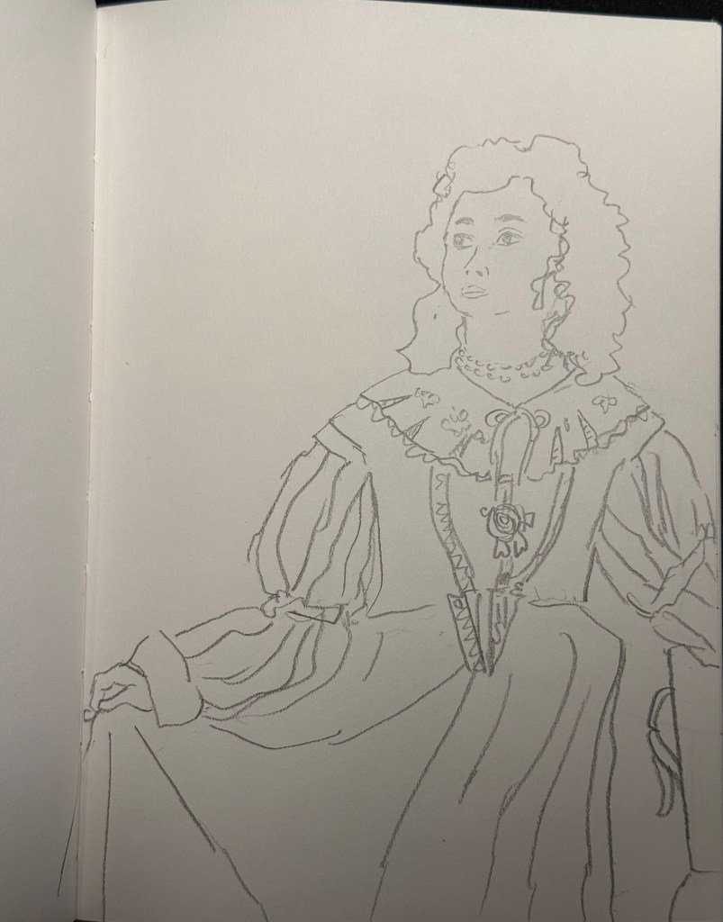
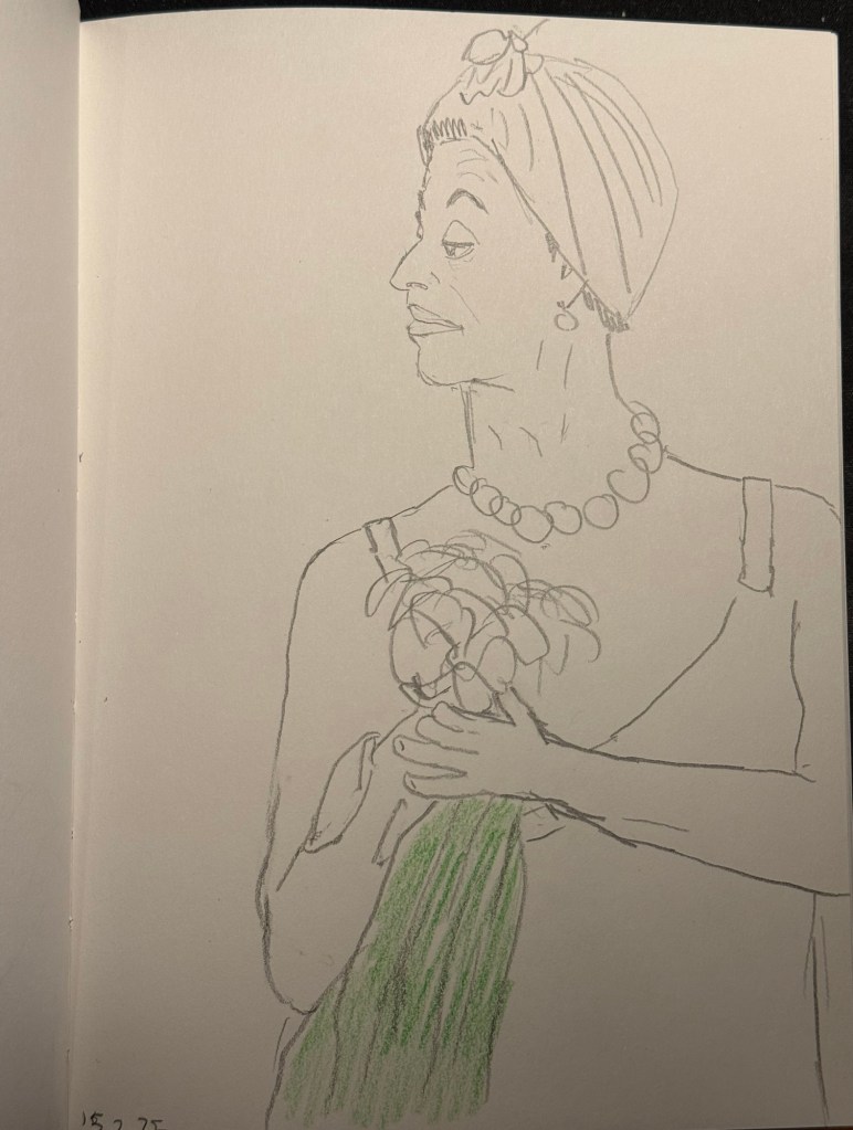
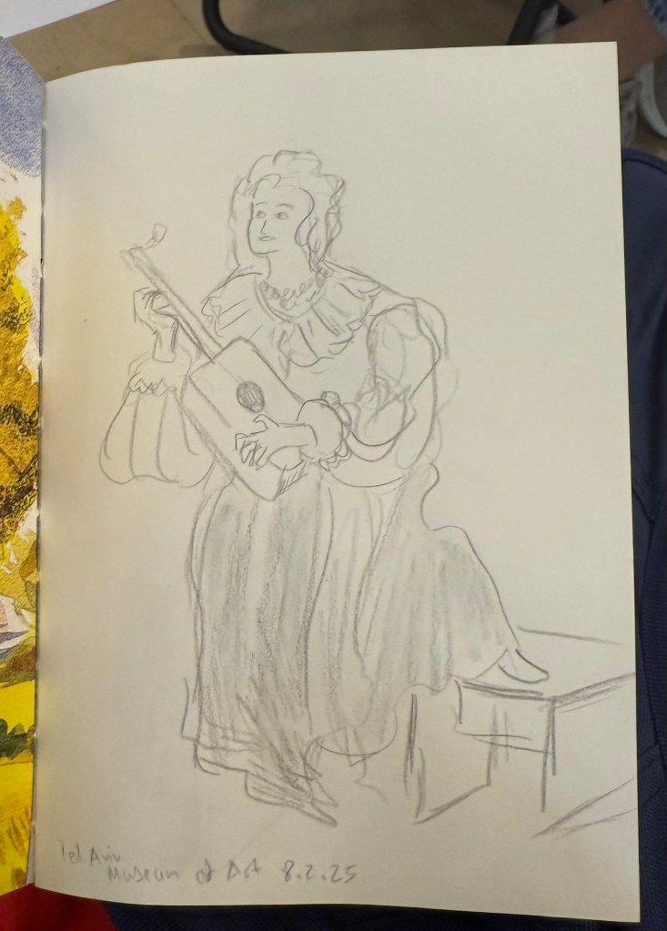
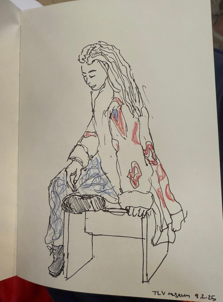
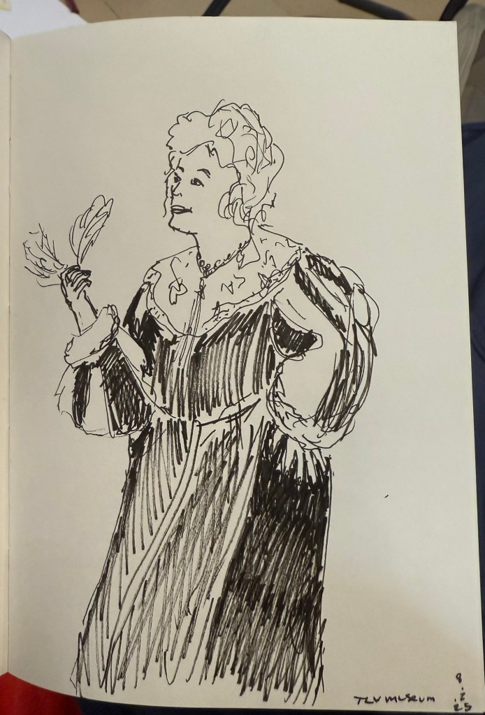
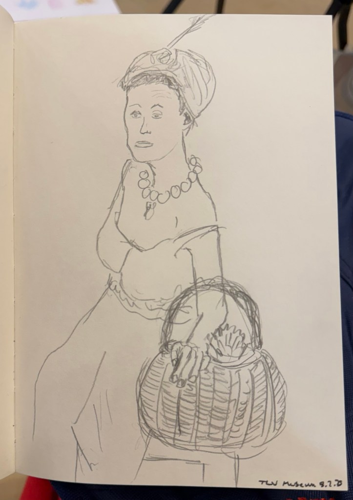
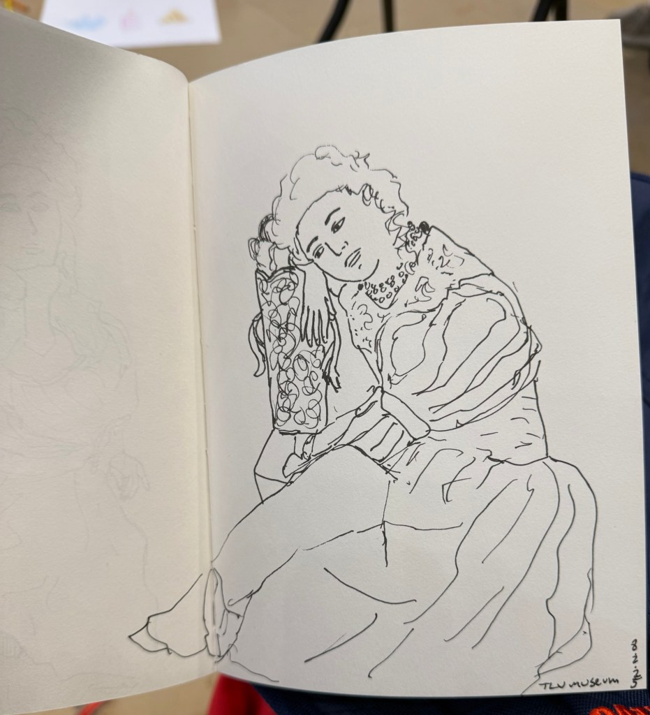
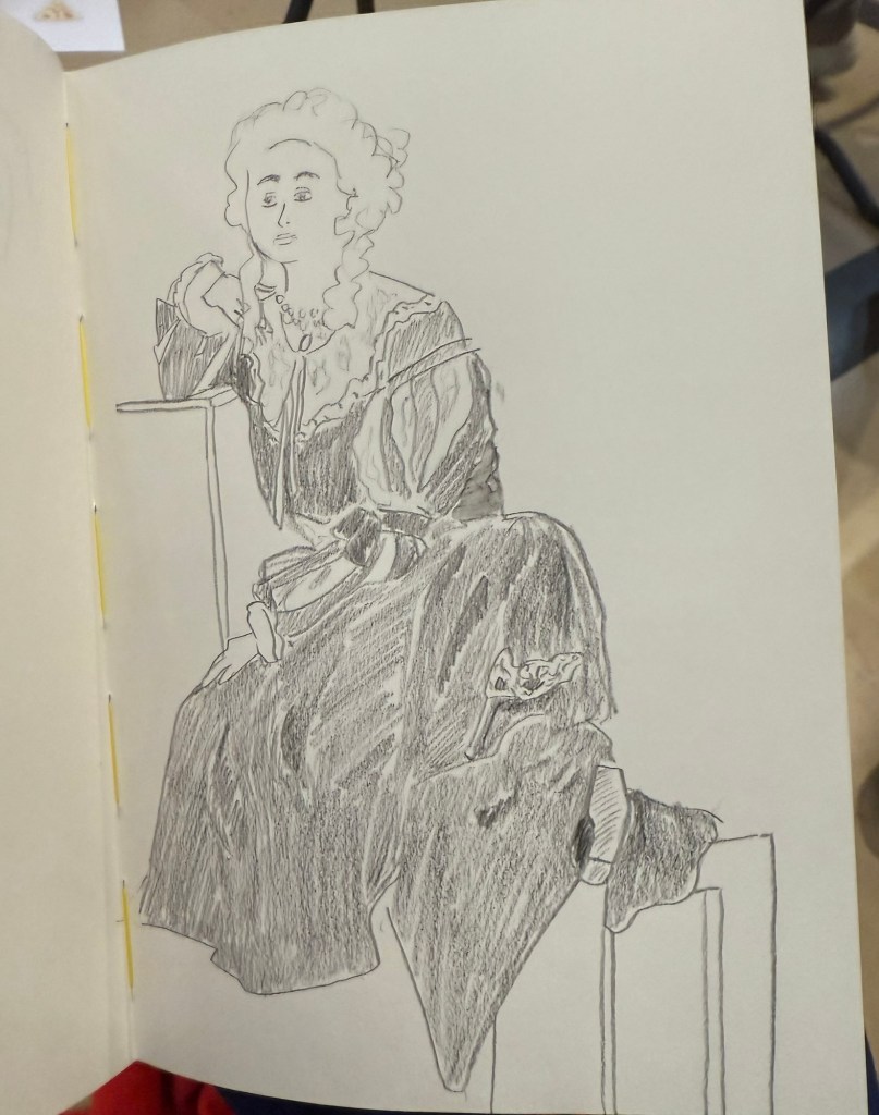
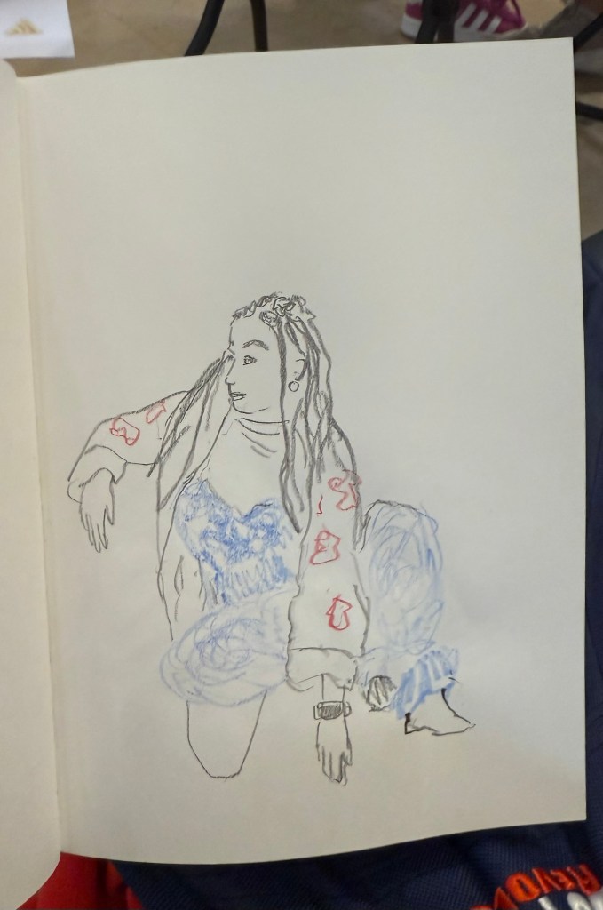
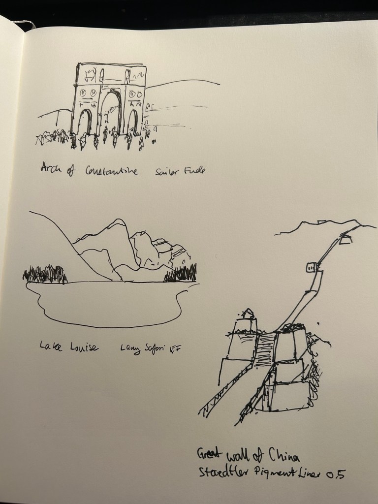
I went to the local art museum again this week, to sketch models in the museum. This was the last time this event was run, and the place was packed with sketchers. I didn’t have the best of locations, but I made the most of it. I sketched with Faber Castell 9000 2B and 3B pencils mostly, and added a touch of colour with Faber Castell Polychromos. The ink sketches were done with a Staedtler Pigment Liner 0.5. The sketchbook I used was once again the French Pascale Éditions. The models did fewer 20 minute poses and more 10 minute ones, which meant scrambling a lot. I wanted to visit the museum after the event, but I was so tired from 3 hours of non-stop sketching that I just went home.
Harman Photo just came out with a brand new colour film, Harman Red. It’s a red-scale film, and I’m curious enough to try and buy a roll or two and test them out. I love the wild, wild results I got with Harman Phoenix and the Harman Red is basically Phoenix pushed even more into red-scale.
Here are the sketches from today, and I hope that you have a great week!
10 minute pose.10 minute pose.10 minute pose.10 minute pose – the hardest pose to draw because of the angle of the head. Had a false start on this one, so had only about 8 minutes for this. 10 minute pose – Staedtler 0.5 pigment liner10 minute pose10 minute pose10 minute poseThe three models. The pose started with just the two top models, and then the third one joined, and it was a 10 minute pose.A challenging composition, 20 minute pose10 minute pose. I like the composition on this one – I placed her on the side of the page to give her room for thought. Final pose, 20 minutes
It’s been a hectic week as my team at work is basically crumbling: our new senior member is leaving after just two months, the team lead is leaving after a bit more than a year, and the other team member is on holiday until the end of the month. That just leaves me with two trainees to hold the fort for a while, and it’s far from ideal. As I’m also working my way through an intense certification course, posts on this blog have taken (and will likely continue to take) a bit of a hit.
Reading
I’ve finished reading Looking for a Ship by John McPhee and I’ve reviewed it here. It’s a fascinating narrative of a now extinct world, that of the American Merchant Marine. I’ve now started reading Oliver Burkeman’s Four Thousand Weeks as well as Legends and Lattes by Travis Baldree.
Stationery
My Field Notes order has arrived, as has the 2024 Hobonichi Techo (yes, 2024) that I bought with a Black Friday discount. The Hobonichi will be used to supplement my 2014 Hobonichi when it comes to testing out inks. The 2024 Techo has’s got paper that is close enough to original Tomoe River Paper that’s in my 2014 Techo, though from my understanding the 2025 Hobonuchi’s have worse paper than the 2024 ones, so take that into account if you’re considering buying one. I have posts planned for both purchases, and hopefully I’ll get the time to write them.
Model Sketching
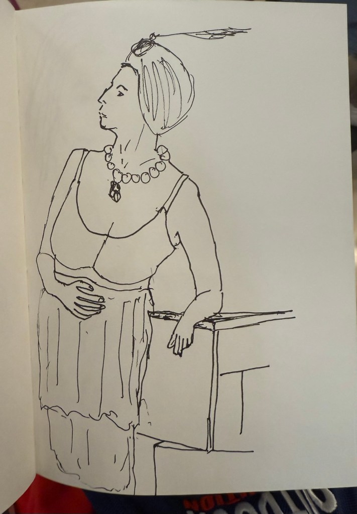
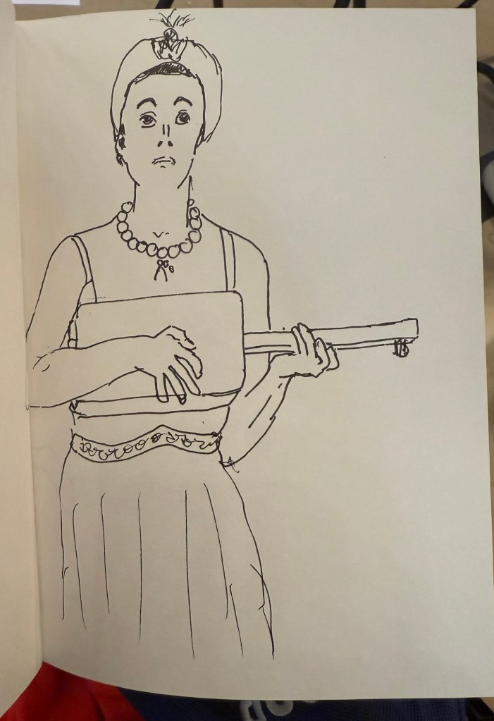
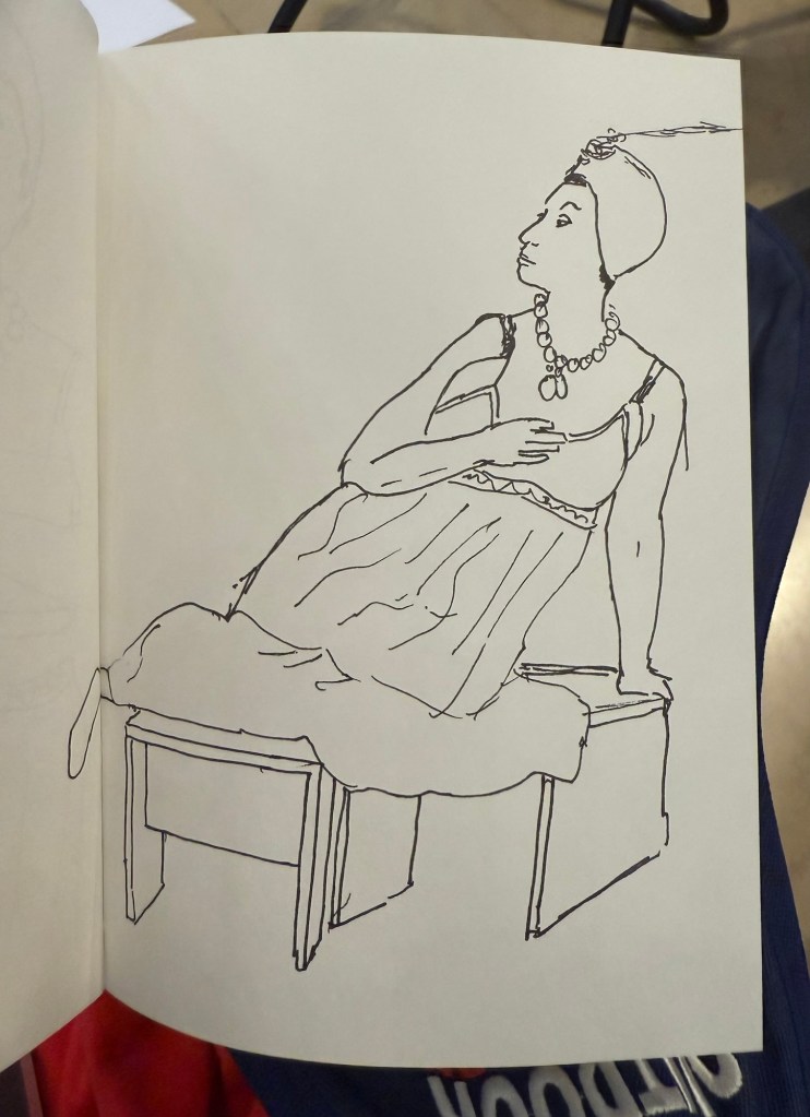
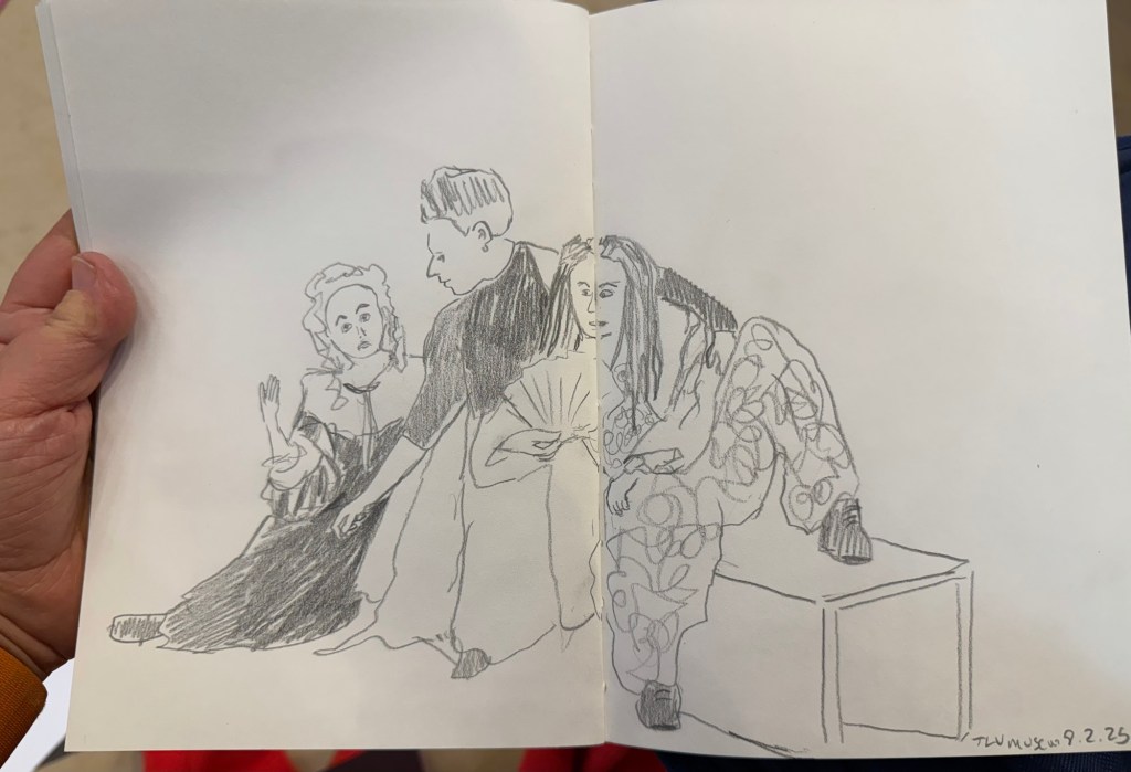
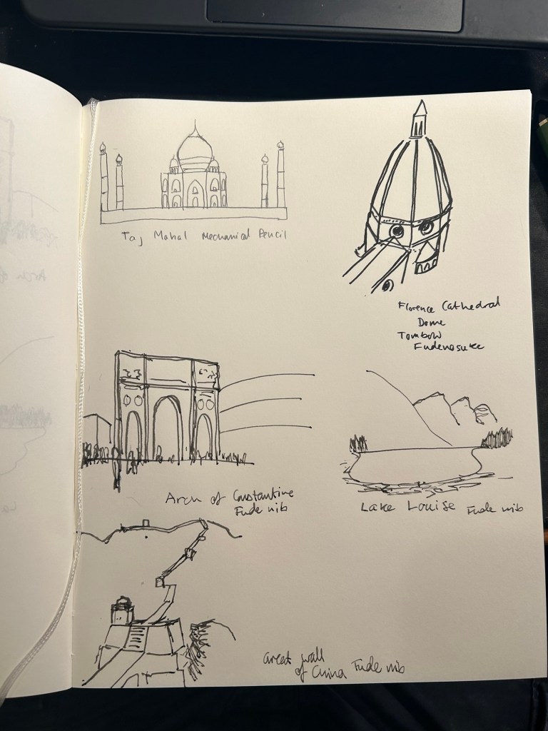
I went to the Tel Aviv Museum of Art today for a special sketching event that they organized: three models dressed in clothing that reflected some of the artwork in the collection, posing for sketches for 3 hours. These were mostly 10 minute sketches, with the last two poses being 20 minute ones. The last pose was a rare treat – a group pose, which is something you don’t get to sketch a lot.
In general when sketching models, whether clothed or not, you have one model that poses. Here there were three, and they switched places, so wherever you sat you got to sketch all three (and you could always sketch a model that was a bit further than the one right in front of you). The museum was busy, and there were children’s plays being shown in the auditorium, and so a lot of kids were around us, sketching on bits of paper with coloured pencils, with parents and grandparents cooing with delight and hovering around. It was wonderful to see how joyously kids took to sketching, whether it was the ladies in the dresses before them, or just anything that came into their imagination.
Here are the sketches I made throughout the event. The sketchbook I used was by French maker Pascale Éditions (it was lovely), and I used a Faber Castell 9000 2B pencil, a Faber Castell 4B Graphite Aquarelle pencil, various Faber Castel Albrecht Dürer watercolour pencils, a Tombow brush pen, and a 0.5 Staedtler Pigment Liner (this was my most used sketching tool).
First sketch. Warming up, so trying to keep it as loose as possible. 20 minute sketch, so I had time for some shading. The only sketch where I wet the paper slightly with a waterbrush before sketching20 minute final group posePotato quality photo of the three models
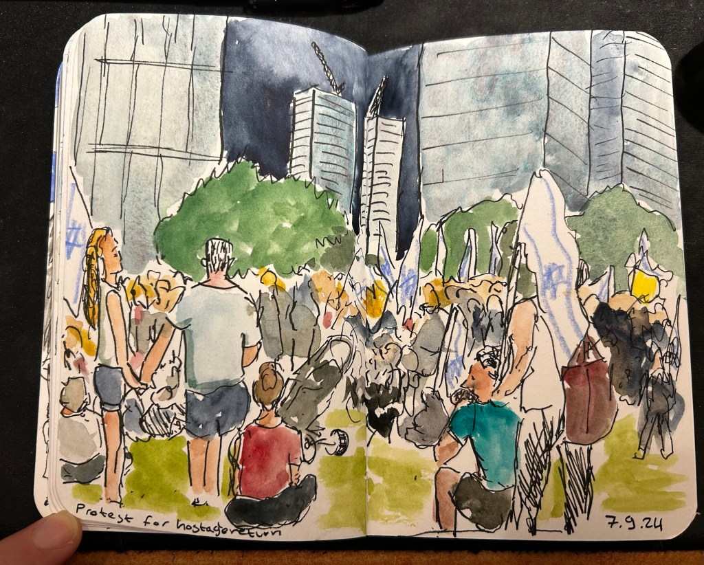
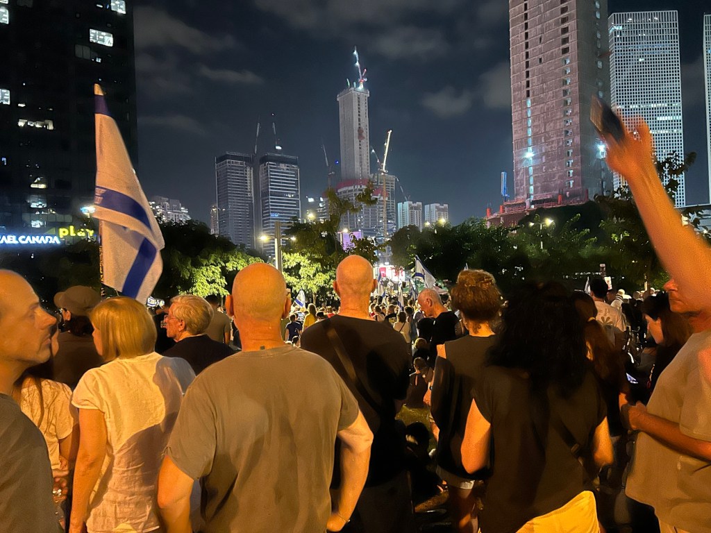
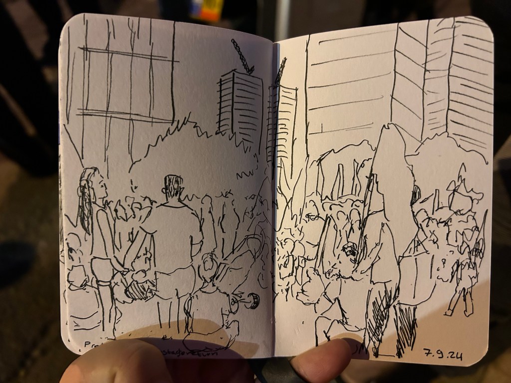
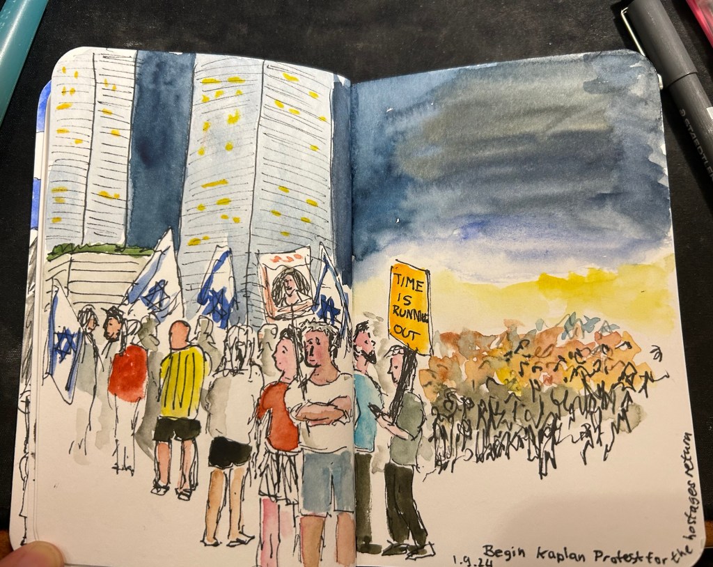
Shana Tova to all who celebrate the Jewish New Year. The passing year has been an extremely tough one on a personal and national level. I sincerely hope that the coming year will be better in every possible way, that the hostages will return and we will have some much needed peace in our region.
I’ve had a lot of the worst kind of upheaval at work during the past two weeks and so I haven’t been keeping up with all the comings and goings in the stationery-sphere. There has been drama of the ugly kind, which I don’t intend to get into. I will just say that this blog is LGBTQIA+ friendly (I am a member of the community myself), and anyone equating homosexuality to murder is both extremely wrong and very hateful person.
I have had to take a break in the SketchingNow Travel Sketching course but am now returning to it and will be making a post about the second week of classes (Shapes).
I will not be participating in Inktober this year. I just don’t have the time for it, and I want to focus on working through the Travel Sketching course instead, as I have some travel planned for later this month and I’m hoping to incorporate what I learned into my travels.
So I just finished the first week of Liz Steel’s SketchingNow Travel Sketching course. I wrote about my material list for this course here and about the beginning of the first week here.
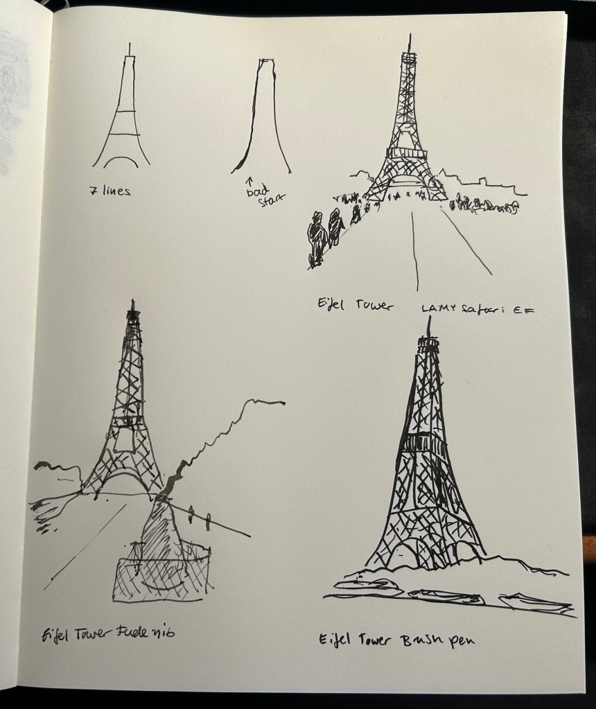
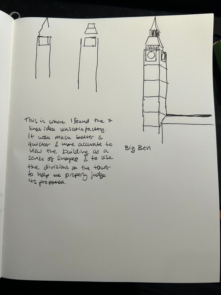
Liz started the week by suggesting that we approach sketching while travelling using a 7 lines principle: sketch the scene in 7 lines, which you can then flesh out to a full sketch. While I managed to do this for the first three Eiffel Tower sketches, I started to struggle once we got to complex buildings like the Big Ben.
This went well – Eiffel Tower with 7 lines as a start.
Here’s my two initial attempts with 7 lines, and then where I moved to my usual approach, which is trying to break a scene down to simple shapes (square, circle, triangle, etc).
Where things went wrong.
I then sketched the next assigned subjects using my own approach:
At which point I realised several things:
I wasn’t really learning anything new this way.
I hadn’t given the new approach enough of a chance before giving up on it.
The 7 lines rule isn’t rigid. It’s an artificial limitation that’s supposed to encourage observation and decision making up front, not to have me counting every pencil or pen mark.
So with that in mind, I made two decisions:
I can use continuous/complex/compound lines as part of the 7 lines. Liz uses them herself, and as they are quick to sketch and require acute observation they remain in the spirit of the rule.
I can use up to 10 lines if I felt that it was necessary to convey perspective or complicated shapes.
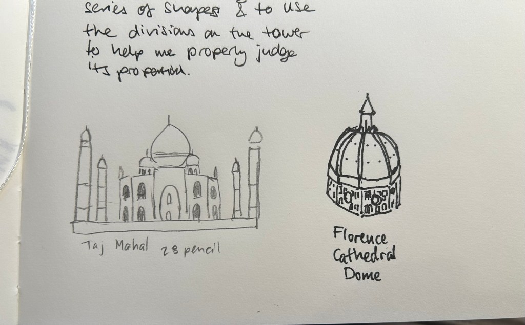
Then I went back and sketched the following using this approach:
These came out much better than in the first attempt.
Then I sketched two Melbourne scenes:
The Auction Rooms came out particularly effective- 7 lines allowed me to outline the main interest point of the scene (the roof line), and also to outline a car, so I have a feel for the scale of the buildings.
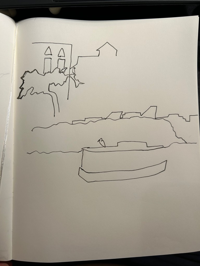
I then sketched two local scenes. The top left scene was of two little egrets waiting to be fed by the local fishmonger. I got the tree, the egrets, the buildings and with two extra lines, the windows.
The bottom sketch was of a heron on a boat in the river. I got the river, the boat, the heron, and the buildings behind the tree line. I would have been very comfortable finishing both sketches either on location or from reference photos with this strong starting point.
The final sketch was of a very complicated building in Paris. I added a few more lines just for reference for where the columns are. Like the rest of these sketches it’s not 100% accurate, and there are slightly wonky bits, but I’m looking for speed and to capture the essence of a scene when I’m travel sketching, not for photorealistic reproduction.
I really struggled with the 7 lines idea at first, but then I allowed myself a bit more freedom within this framework and I found it to be very useful and also an easy idea to carry around with me as I look for interesting things to sketch. If I can envision the scene in 7 lines and it looks interesting with just those lines, then it’s likely worth sketching.
Coming up next is shapes, where we start to work with colour. I’m curious to see what the results will be.
So the first week of actual lessons in Liz Steel’s Sketching Now Travel Sketching course started and already there’s been a slight change of materials.
As this week will be entirely focused on line drawings, I’m switching to a non-watercolour sketchbook. For the first part of this week’s exercise, which includes working from reference photos, I’m using the Midori MD Cotton notebook in A4. It’s neither a proper sketchbook nor the A5 size format that Liz recommended, but as she also requested to upload as few photos as possible to this week’s gallery (and no more than 6) and as we have quite a bit of work to do, I decided to at least use a large notebook so I can fit more than one or two sketches on a page and thus avoid the need to stitch photos.
Eiffel Tower
We have several scenes we need to sketch as quickly as possible, starting with just 7 lines to define the scene. The 7 lines idea worked quite well with the Eiffel Tower but broke down completely for me once we got into a complex building like the Big Ben. That’s when I decided to just work with shapes and let the architecture details on the building help me determine its length and proportions.
Big Ben
Generic rules like “start with just 7 lines” are nice ideas on paper, but they oftentimes break down when we’re faced with reality. I think that the 7 lines idea would actually slow me down when sketching on location (it slowed me considerably while I was at home, and it failed completely with the Big Ben), but the basics of contour, shapes, perspective, proportion hints work no matter what.
I will try the 7 lines for the rest of the week, to see if it’s just a matter of practice, but I suspect that it isn’t.
I travel a few times a year and while I already sketch during my travels, I want to improve my speed and gain enough confidence to sketch in less than ideal conditions. I rarely sketch standing up, and I don’t feel comfortable sketching while I’m waiting in line, for instance, and these are useful skills to have if you plan to sketch while on a trip that isn’t dedicated to sketching.
As usual with Liz Steel’s excellent courses, the first part is an introduction which includes an overview of the course, setting personal goals for the course, materials list/discussion and a review of where you are starting from.
I have decided to take a different approach to the materials requirements for this course. I have a pretty compact and set travel sketching set of materials, but I’m allowing myself to expand on it and change it a bit to experiment with some new techniques.
The first big change is the sketchbook I’m using. It’s a Hahnemühle A5 Watercolour Book, which includes 200gsm fine grain paper. I’ve never used it before, but as I regularly use the Stillman and Birn Alpha that Liz is using for the course and I’m not a huge fan of it, I decided to give this paper a spin instead. If it works it would be ideal for travel sketching, as it’s thin and lightweight, the paper takes watercolour washes much better than the Alpha, and I appreciate the elastic closure and hard covers. They are very convenient additions that should help me sketch while standing, and keep the sketches safe while I carry the notebook in my bag.
Hahnemühle A5 Watercolour Book
I’ve also changed my watercolour palette somewhat (it’s the bottom palette, not the top one). As I’m still not certain about it, I’m not fully documenting it at the moment. This course isn’t geared heavily towards watercolour, but I tend to like to sketch as quickly as possible on location when travelling, take a few reference photos and complete the sketch with watercolours later that evening.
The palette I’m using is the bottom one, with 24 colours, both Schmincke and Daniel Smith.
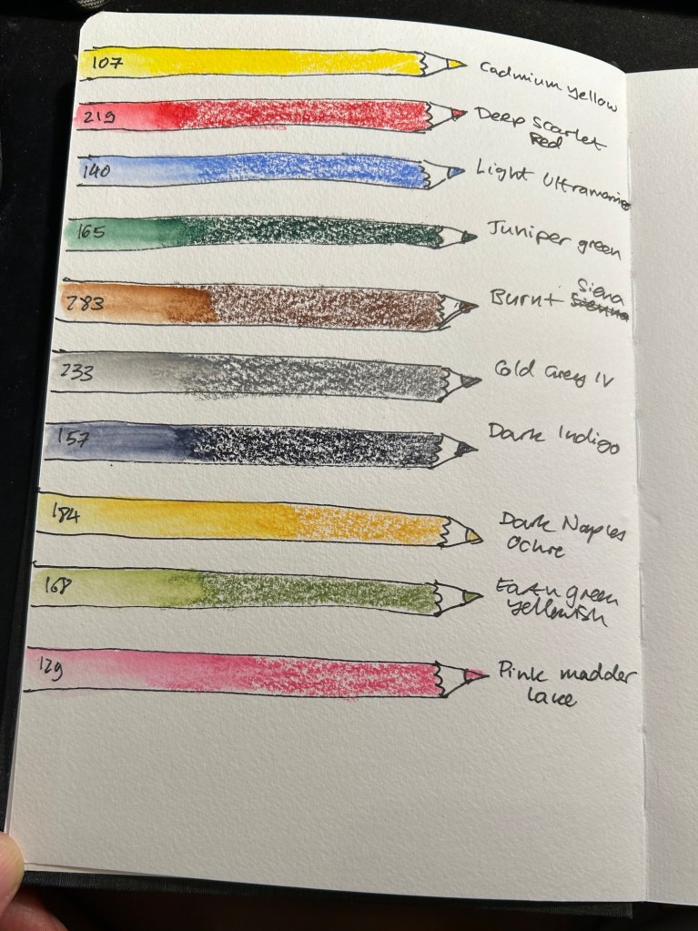
For the first time I’m adding watercolour pencils to my travel sketching kit. As Liz recommended I have a triad (yellow, red, blue), a green, a brown, a grey, a dark, and while she recommended having two lights, I have three. Why? Because having quickly available greens is very useful, the pink is useful for skin tones, and the ochre is too generally useful to be left out. All of these pencils are Faber-Castell Albrecht Durer.
Watercolour pencils.
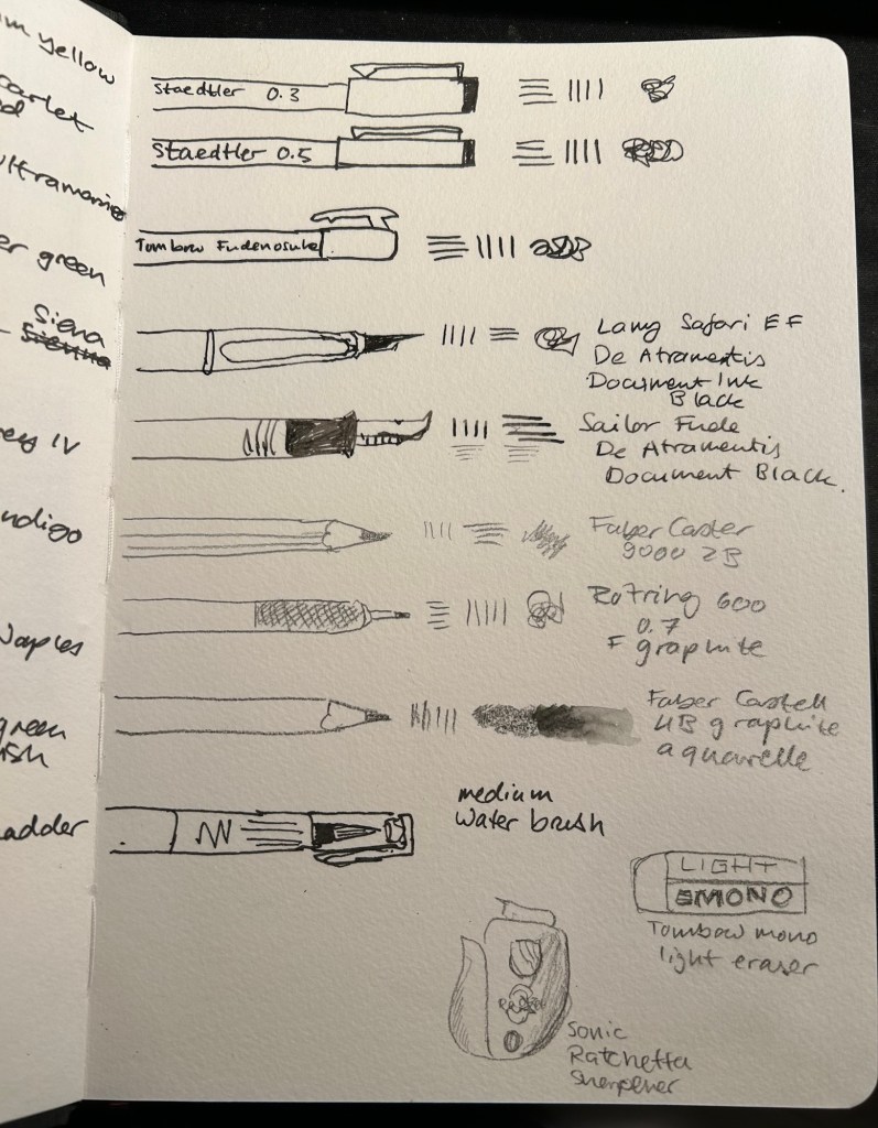
Dry media is also more than double what I normally carry on me. Here the point is to experiment, and it’s very likely that I will say goodbye to several of these tools during the course. I normally use only Staedler Pigment Liners in 0.3, 0.5 and sometimes 0.8 when I sketch, but here I’ll be adding a Tomboq Fudenosuke brush pen to the mix, two fountain pens (a Lamy Safari and a Sailor Fude both with De Atramentis Document Black), three pencils (Faber Catelll 9000 2B, Rotring 600 0.7 and for the first time ever, Faber Castell 4B graphite aquarelle), an eraser and a pencil sharpener. I’ll also be using a medium waterbrush instead of my usual fine one.
Sketching media.
All of these tools will be carried in a Nock Co case, with the exception of the watercolour tin and rag, and a brush case.
Nock Co case, watercolour tin and rag.
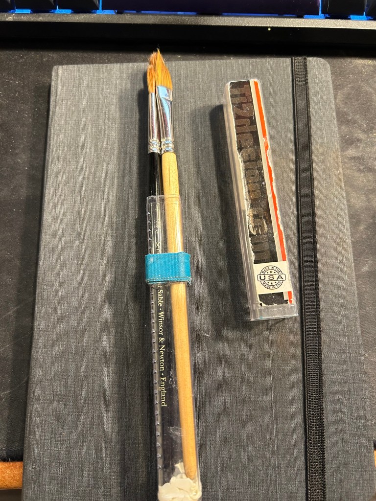
I don’t think that I’ll be using these too much during this course, but these are my travel ready brushes. I keep them in a Ti2 design tube with glue tac at the bottom to prevent the brushes from moving. The brushes are Windsor Newton Series 7 numbers 4 and 7 and Rosemary & Co dagger brush 772.
Brushes
That’s the whole kit, and now it just remains to try it out and see what works and what doesn’t.
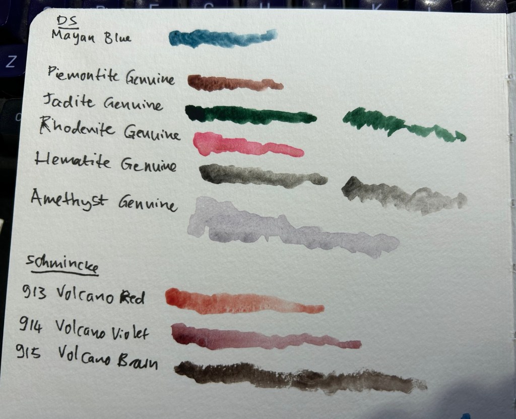
I’ve been unhappy with my watercolour palette lately, and so I’ve been experimenting with new colours instead of some of the old ones. I usually swap out one colour at a time, try out the new colour for a while, and then either keep it or swap it out for something else. This time I’m doing my usual swap procedure, and also building a completely new palette on the side. The idea is to speed up the new colour discovery process, as there are 5-6 colours that I want to replace in my current palette, and that’s a lot.
The first colour to leave was Daniel Smith Cerulean Blue Chromium. I have too many similar blues and it’s slowing me down having to decide between them every time I need a blue. In its place I swapped Daniel Smith Rhodenite Genuine, which is a bright pink.
Samples of some of the colours I considered swapping in. Amethyst Genuine was a genuine disappointment – I don’t think I’ve seen such a bland, pale, washed out purple anywhere.
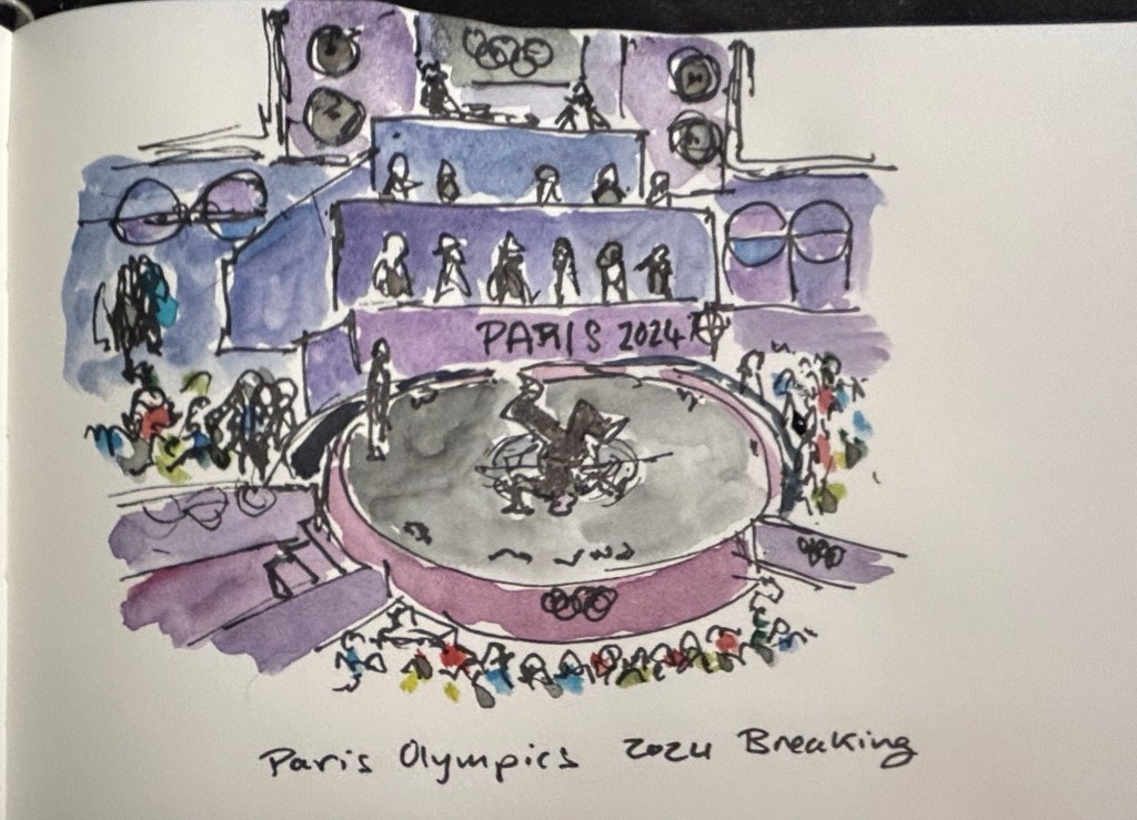
I then sketched one of the scenes from the 2024 Paris Olympics Breaking final, which I was going to see in person before I had to cancel my trip. Luckily my brother was there and sent me photos and videos, which I had fun sketching from. There was a lot of purple in this scene, so I had fun mixing Rhodenite with blues and purples on my palette.
Quick Paris Olympics Breaking sketch
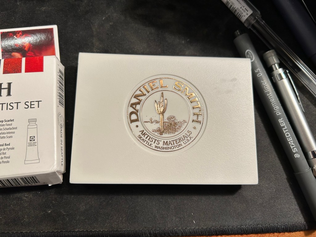
The new palette is something I’m building in a Daniel Smith plastic paintbox. It’s not a box that I’d regularly use (it doesn’t have enough mixing space for me), but it’s useful for the testing I want to do.
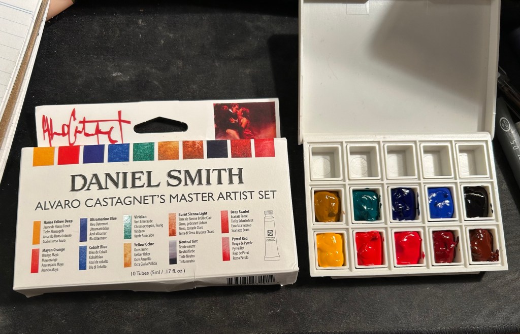
This box came as part of a set of two, one of which had paints in it.
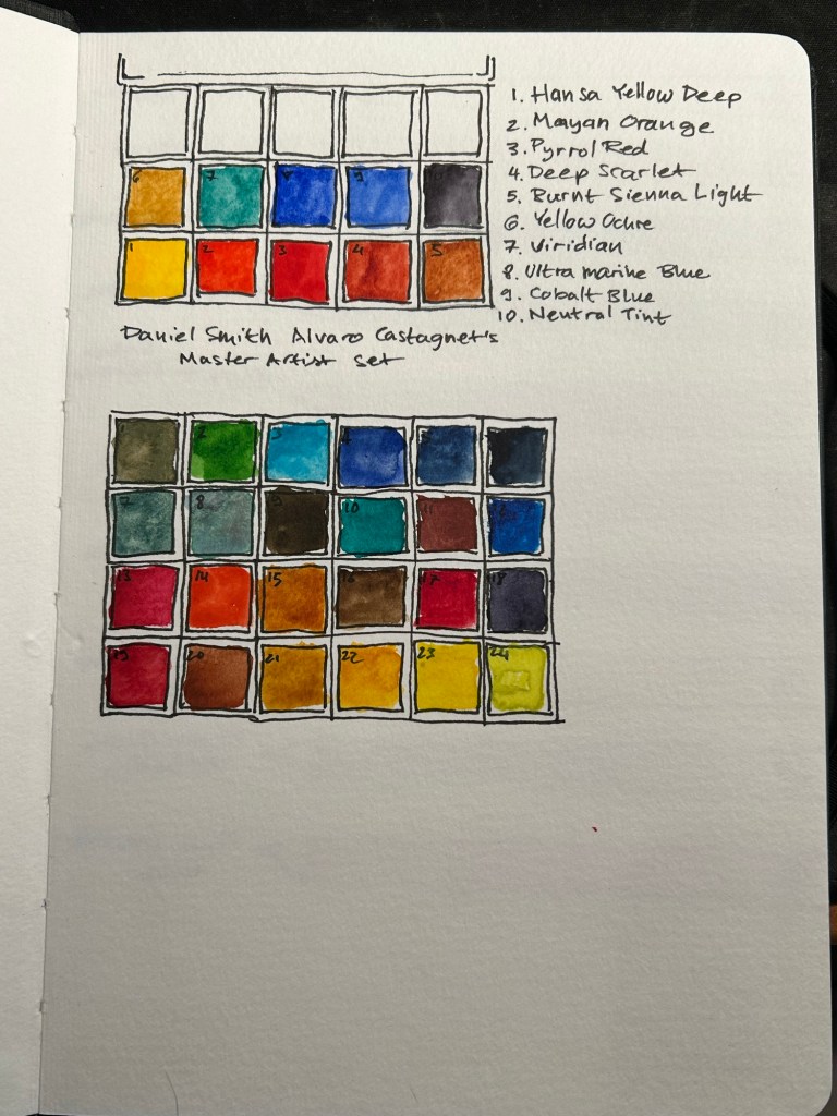
I then set up a legend in my sketchbook:
Next I broke ou the Alvaro Catagnet Daniel Smith Master Artist set and filled the pans with paint. I’ll give them 2-3 days to completely dry out before finishing the legend and trying them out. I would never have built a palette which is so heavily skewed towards reds, but this is part of the experiment – after a heavily blue skewed palette it’s time to try something new.
I can’t wait to give these new paints a try. I’ve worked with the Schmincke versions of Yellow Ochre (I no longer use it because of its opacity), Viridian (way to artificial a green for my tastes), Ultramarine Blue and Cobalt Blue, but it will be interesting to see Daniel Smith’s take on these colours.