Inktober 2: Disney Ducks

Drawn from a photo taken in Disneyland Paris.
A blog about writing, sketching, running and other things
Drawn from a photo taken in Disneyland Paris.

Drawn on location, using a Pentel GFKP sepia brush pen and a 0.5 Uni pin sepia fineliner on a Leuchtturm1917 sketchbook.
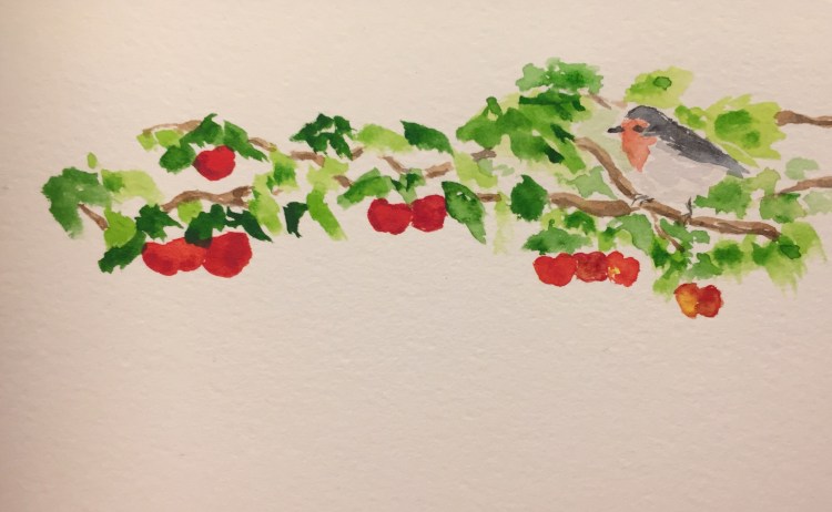
Shana Tova!
Watercolour on Moleskine watercolour notebook with Cass Art watercolours and no preliminary sketch.
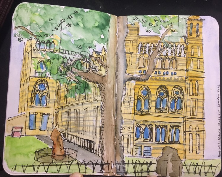
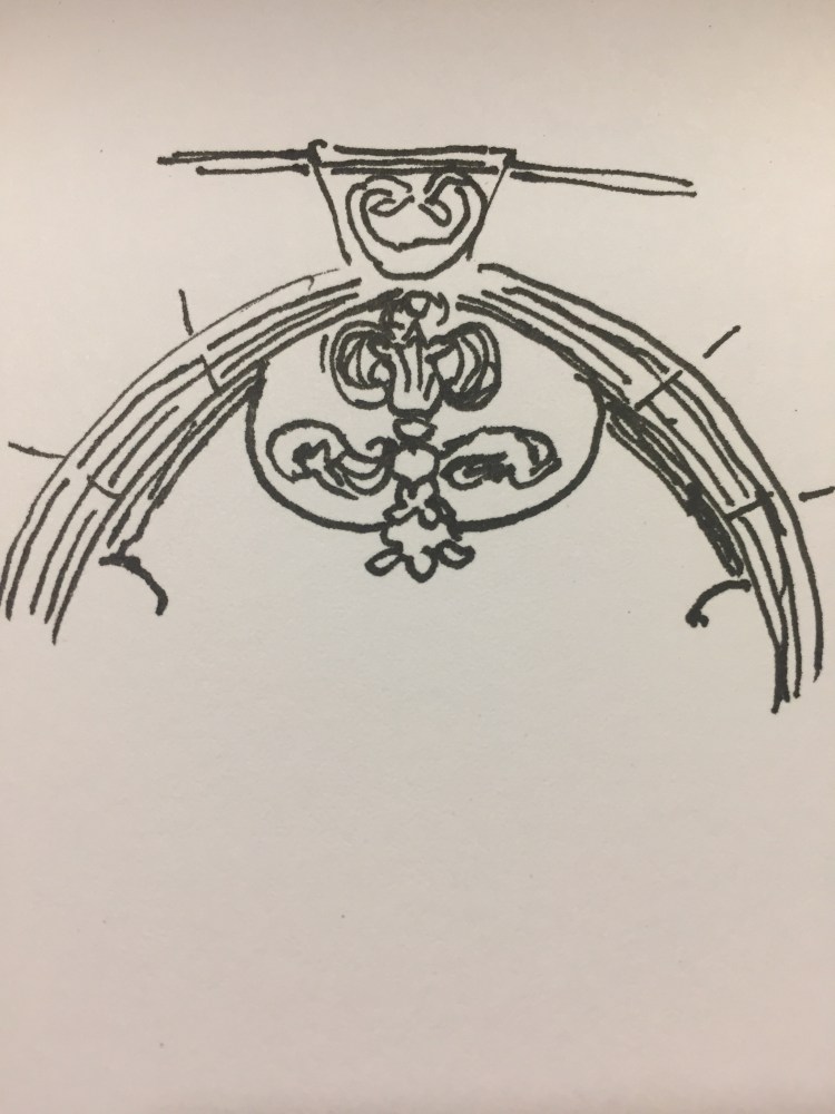
Pen sketch done in situ, watercolour completed later on, from photo studies. An insanely elaborate building, and one of my favourites on Exhibition Road. It almost looks like the fossils it houses.
I’m travelling a lot this month (hence no posts), and I’m enjoying my time offline.
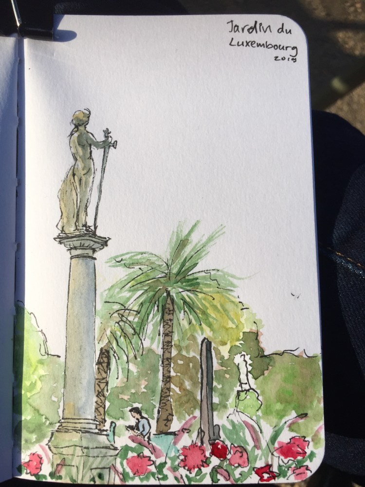
Here’s a quick sketch from Luxembourg Gardens, Paris, France.
Have a great week!
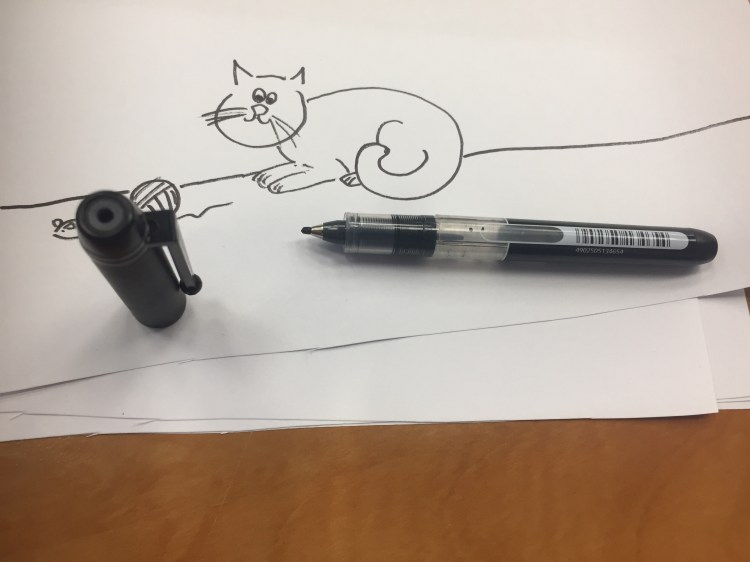
The end of summer is upon us and my services as creator of kids’ colouring pages are now in high demand in the office, as desperate parents bring their kids to work for a few hours in lieu of camp or a sitter. After ruining several brush pens on these drawings I’ve settled on the best pen for this purpose: the Pilot V Sign Pen.
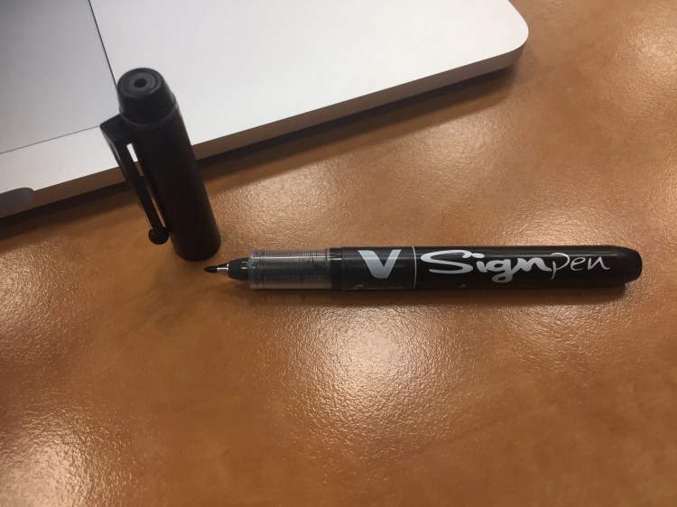
The Pilot V Sign Pen is a liquid ink pen with 2.0 mm bullet tip that creates the consistent kind of lines that kids seem to prefer.

The V Sign has a cheap looking plastic body, complete with ugly barcode printed on the barrel. It’s pretty ergonomic though, with a relatively wide barrel and a light weight body.
I just replaced my old V Sign Pen as it has run out of ink, and as you can see above and below, the tip does get worn down with use, though compared to most plastic tipped pens it’s super durable.
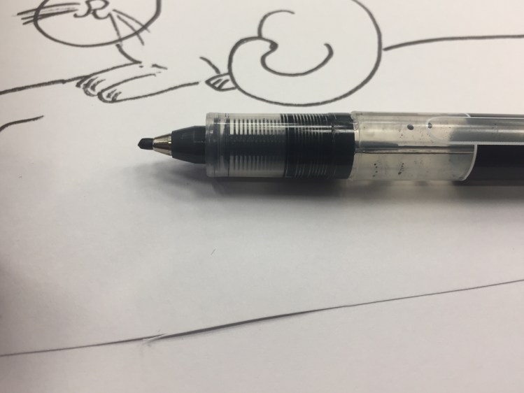
This V Sign works on cheap copier paper with a little bleed through and a lot of show through. It’s non-waterproof, and I’m pretty sure it’s not archival. It is, however, a lot of fun to use. For office doodles of this kind, it’s absolutely perfect; For anything else, I’d recommend something archival and waterproof instead.
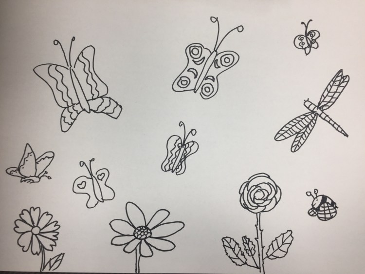
To all those parents out there, here are some colouring pages that I’ve drawn. Feel free to print them out for your own personal use, and gain a few minutes of peaceful bliss.


I have too many pencils which I don’t take the time to use. Inspired by this episode of the Pen Addict podcast I decided to literally do a random draw: I randomly drew a pencil from the pile, and then I randomly drew something with it. Today’s pencil: the General’s Pacific 365 #2.
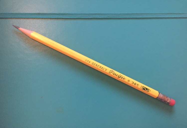
It’s a classic looking #2 (or HB) pencil, with for some reason three or four fonts on the barrel, depending how you count the numerals. It’s made in the USA, out of California incense cedar, and has a little red thing on the top that looks like an eraser, but trust me, I wouldn’t try to use it as one.
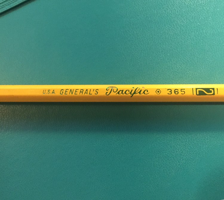
The green foil imprint quality is not great, with the “Pacific” imprint chipping the pencil’s coating. The coating itself is pretty thinly layered, but the core is perfectly centred and sharpens like a charm.
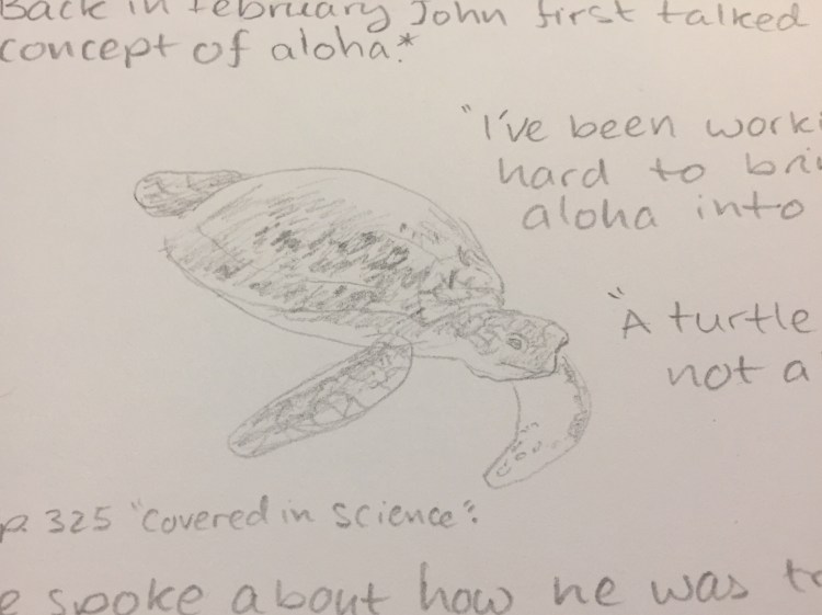
You can see the available shades that the General’s Pacific is capable of producing in the closeup of the sea turtle above. If you’re looking for a #2 writing pencil that could do for a quick sketch in a pinch, the Pacific ought to do the job. It doesn’t smudge and holds a point very well.
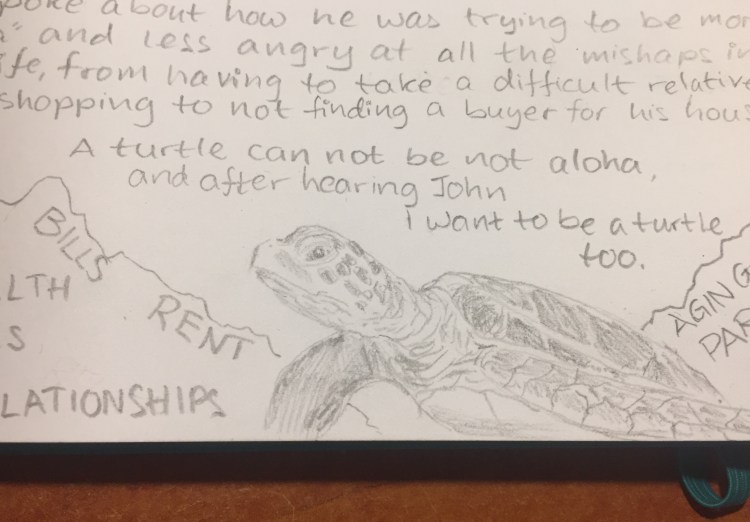
I erased a word between the “S” and the “LATIONSHIPS” on the left side of the closeup above. It erased out pretty well, even though the writing was dark and done with some pressure.
The phone above shows you the maximum darkness I was able to produce with the General’s Pacific. It’s not bad, considering that this is clearly not a pencil made for drawing, but one made primarily for writing.
If you’re buying from CW Pencils and are looking to add a workhorse cedar pencil with a fondness for fonts to your order, the General’s Pacific is a pretty good choice.
May we all be more turtle.
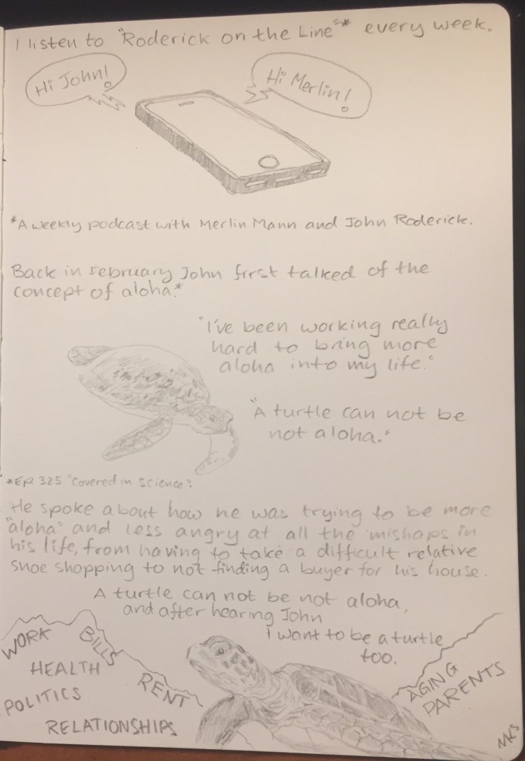
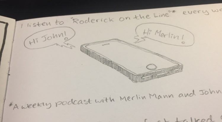
Roderick on the Line podcast episodes referenced:
Leuchtturm1917 sketchbook, Kuretake Zig Mangaka pens, Deleter Neopiko-Line-3 pens, Caran d’Ache Pablo coloured pencils, Faber Castell Albrecht Dürer coloured pencils.
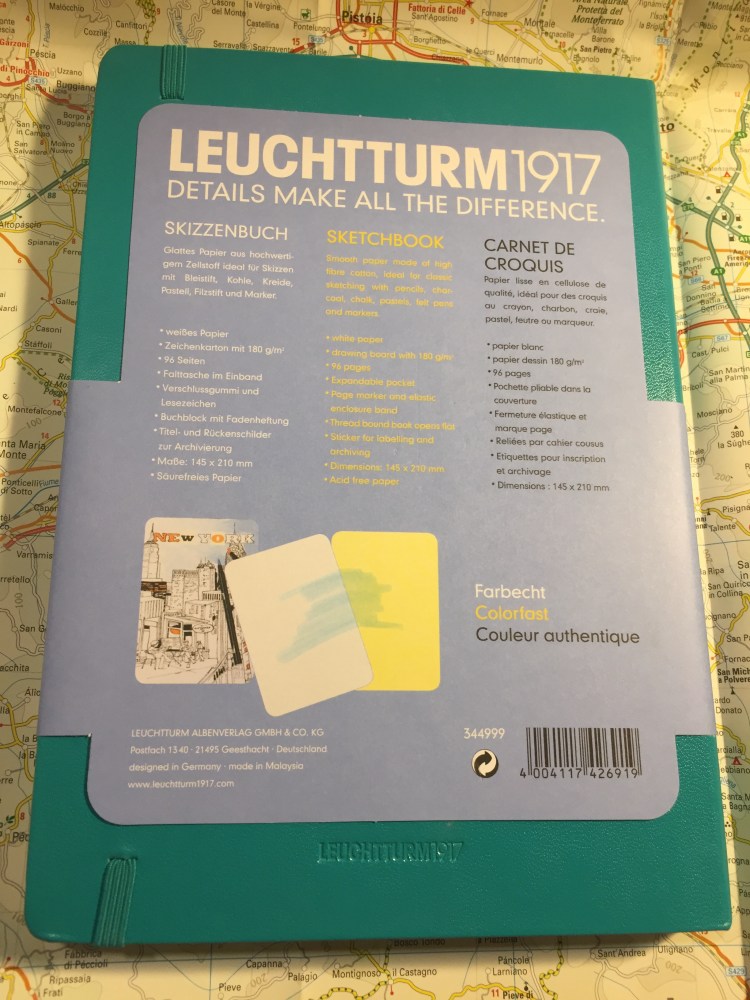
Leuchtturm1917 entered the busy sketchbook market about a year or two ago, with a lineup of A6, A5 and A4 sketchbooks with white 180 gsm paper.
The covers of the Leuchtturm1917 sketchbooks come in a wide variety of colours, which is a rarity in this market. Usually you find sketchbooks in black, or maybe one or two other colours, but Leuchtturm has decided to offer these in all the colour options available in their regular lineup.

The sketchbook contains 96 pages of acid free 180 gsm paper, and it opens flat. There’s a note in the back packaging that says that the paper is colourfast, and shows a sketch made with a fineliner and markers. More on that later.
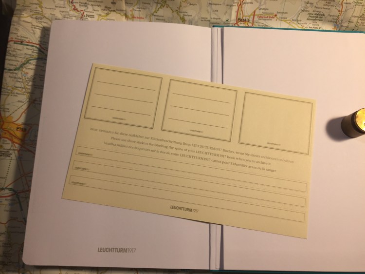
There’s a place to write your name and address on the front cover. I recommend writing your name and email address instead. It’s more practical, and more secure.
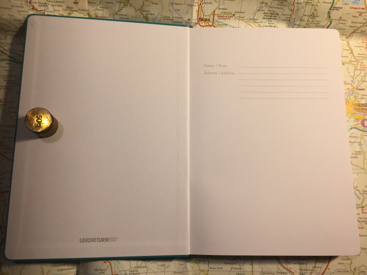
There is a back pocket. I don’t really think that it’s necessary in a sketchbook, but it’s nice to have.
Leuchtturm offers two unique things with its sketchbook. One is the offer to personalize it with an embossing of your choice. During last year’s Urban Sketchers they personalized the sketchbooks that they gave away as part of the symposium’s package, and the result is very nice.
Now for the heart of the notebook, it’s paper. The pages lie flat with a bit of coaxing, and are thick and substantial. You have to really layer down markers for them to bleed through, and there’s no show through, meaning you can use each page on both sides.
So how does the paper behave? It depends on the medium. This sketchbook excels at dry media (pencils, couloured pencils, conte crayons, etc).
It’s pretty horrible with wet media, including fountain pen ink, watercolour washes, and ink washes. The paper buckles, shows off colour poorly, turns into a grainy mess, and and the ink feathers and spreads. I wouldn’t recommend it even for the lightest washes. All the vibrancy of my schminke watercolours turned into a muddy mess here (the sketch was done with a medium nibbed fountain pen and R&K Emma SketchINK):
Even with fineliners you’re going to have spread. If you like sharp lines, find a different sketchbook.
Again, even from a bit of a distance you can see the spread. That’s just a shame, because if the paper was a little less absorbent then this would be an excellent sketchbook.
This brings me to my frustration with the picture on the back end of the paper band, the one showing a tiny marker and fineliner drawing. This is my experience using markers and fineliners on this notebook:
There’s no option to layer or blend the markers, but that’s OK. This isn’t marker specific paper after all. But even for casual use, or just for use with fineliners/brush pens this paper isn’t great.
So do I recommend this sketchbook? It depends. If the way it looks makes you want to use it, then yes, it’s a notebook for you. I’ve been using this sketchbook for my journal comics mainly to test it out. Will I continue using it? Only because I already have a body of work in it. Otherwise, there are better options out there, ones that aren’t only pencil great, but also work with pen, ink and light watercolour washes (the Stillman and Birn Alpha sketchbooks come to mind).
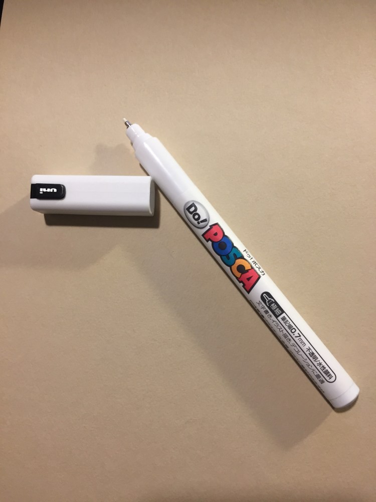
I am on a quest in search for a white, waterproof pen that reliably lays down a thin, opaque line. You’d think that this wouldn’t be so hard to find, but this combination (opaque-and-thin-and-waterproof-and-reliable) has so far proven to be elusive. The closest so far has been the Uni-ball Signo Broad UMR-153 white gel ink pen, but it tends to dry out and blob, so it is far from perfect.
The Uni Do! Posca paint marker in white, extra fine (0.7) is a welcome addition to the white pen field. It’s waterproof, water-based (so not smelly like other paint markers), lightfast, and can be used on a multitude of surfaces. I’m going to focus its use on paper, but if you’re looking for a way to label a dark coloured object, this may be the pen for you.
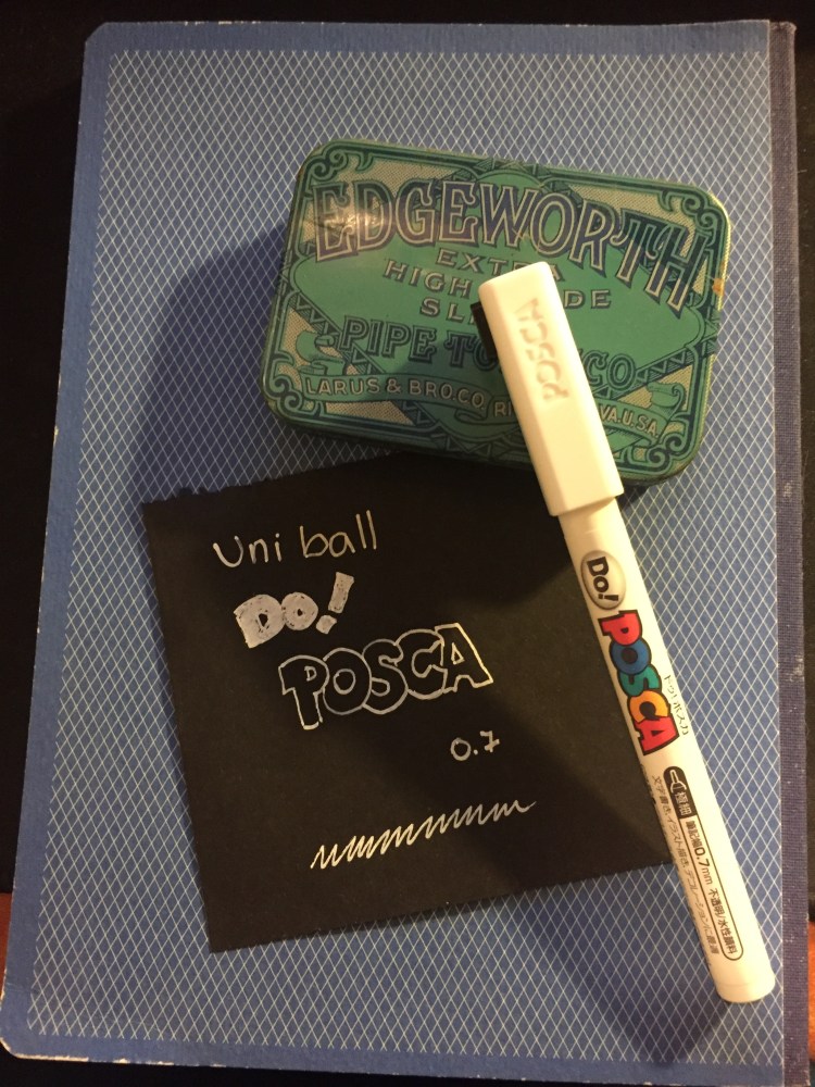
The Do! Posca’s design is pretty well designed. The pen is narrow enough in diameter for you to comfortably use it like a regular pen, and the square cap keeps the pen from rolling off the table, and looks great. The pen body is much too busy for my liking, but that’s a minor quibble.
There’s a tiny metal ball inside the pen, and you need to shake it well before use to get the paint ink flowing. When you use the Do! Posca for the first time you need to prime it by shaking the pen thoroughly and then pressing the plastic tip in several times until the white paint flows. I had no problem getting the pen to start up after a good shake, but I’d recommend keeping it horizontally and cap it immediately after use.
The Uni Do! Posca doesn’t blob, and it’s excellent for small details. I wouldn’t use it to fill in large expanses of white, as it offers pretty poor coverage and doesn’t layer well. If you’re looking to use it for highlights, correction or detail work, this is the pen for you.
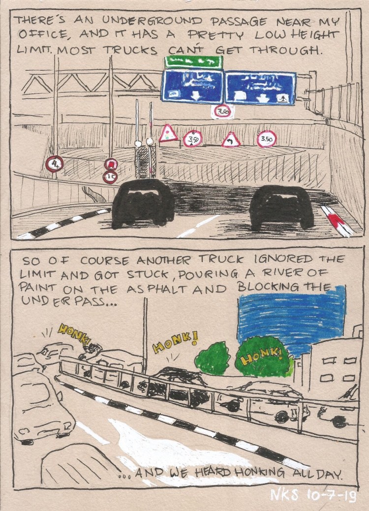
I drew this journal comic on a Clairefontaine Paint On Naturel A5 pad.
The Uni Do! Posca extra fine paint marker in white was available for a time at Jetpens, but now you can find it easily enough on eBay. If you’re looking for an opaque, extra fine, waterproof white pen, I highly recommend it.
