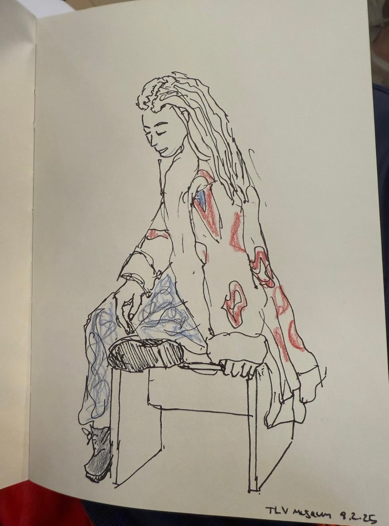
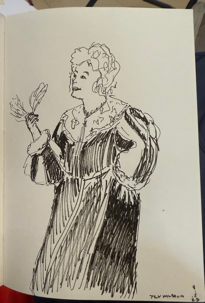
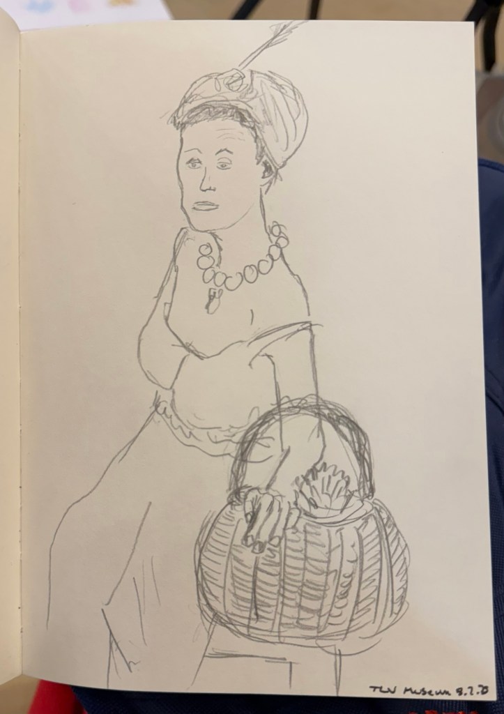
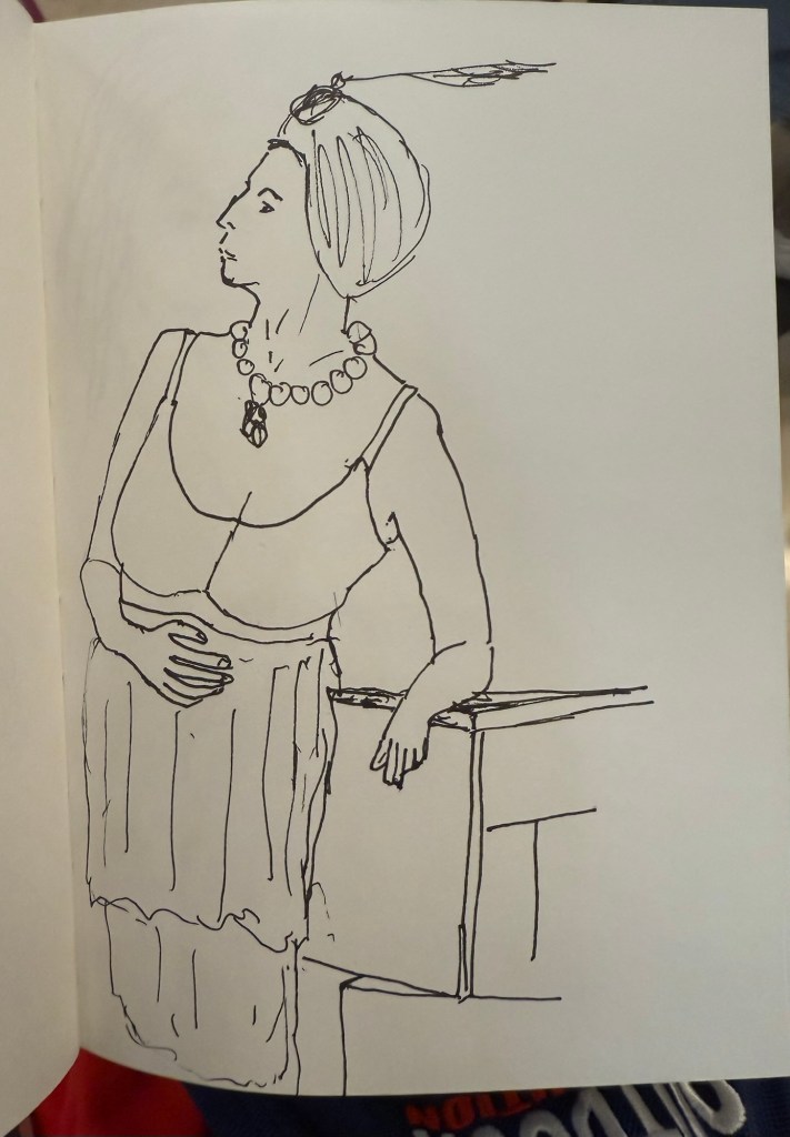
Weekly Update: One Week 100 People, Newly Inked Pens and Preparing for a Doctor’s Visit
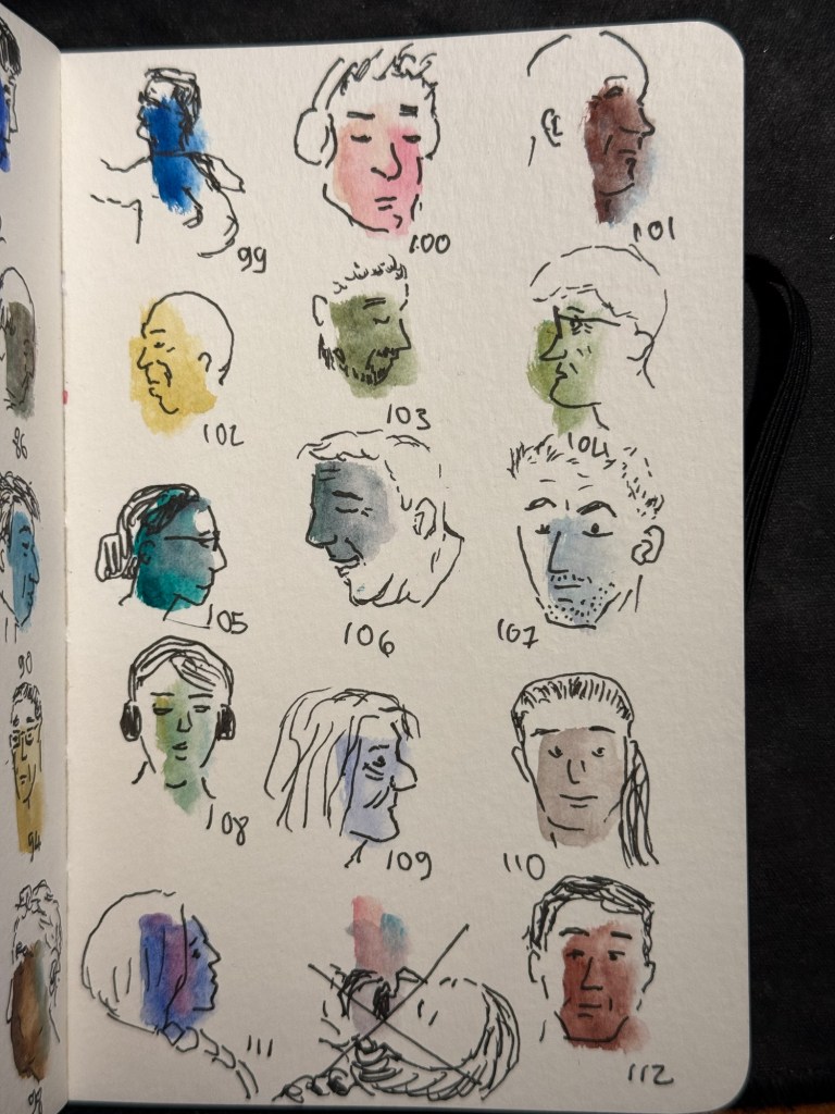
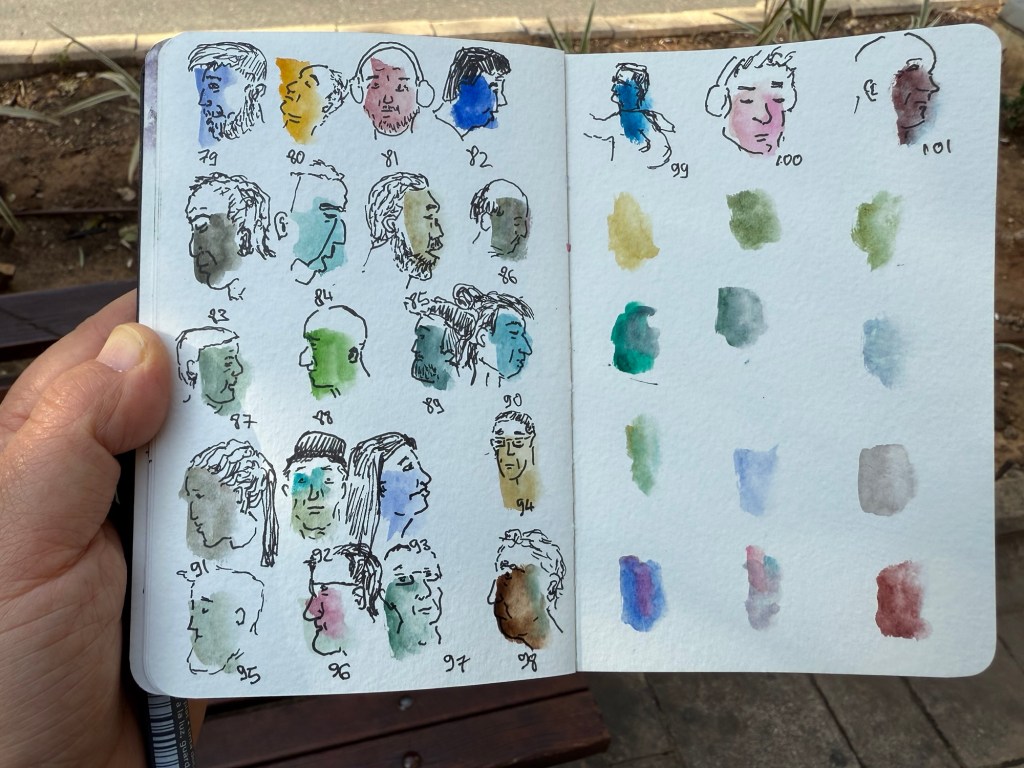
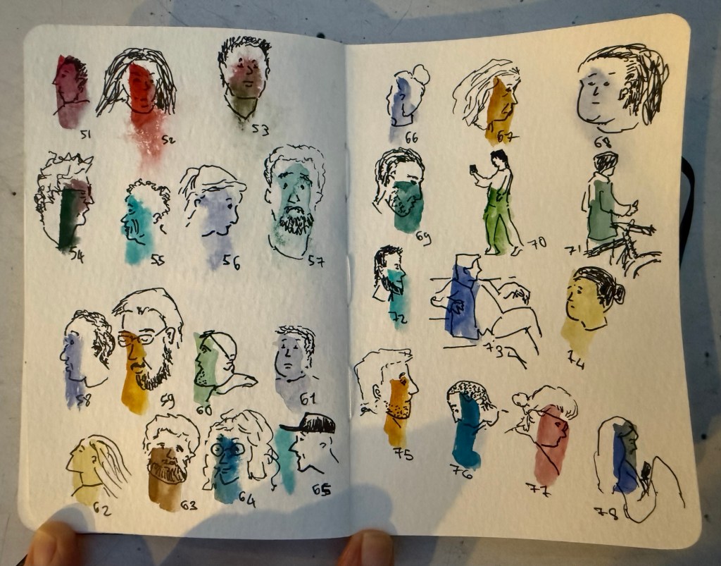
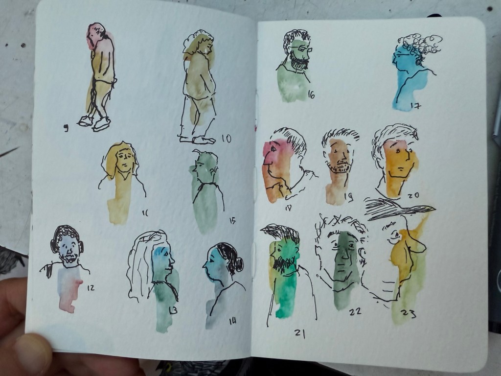
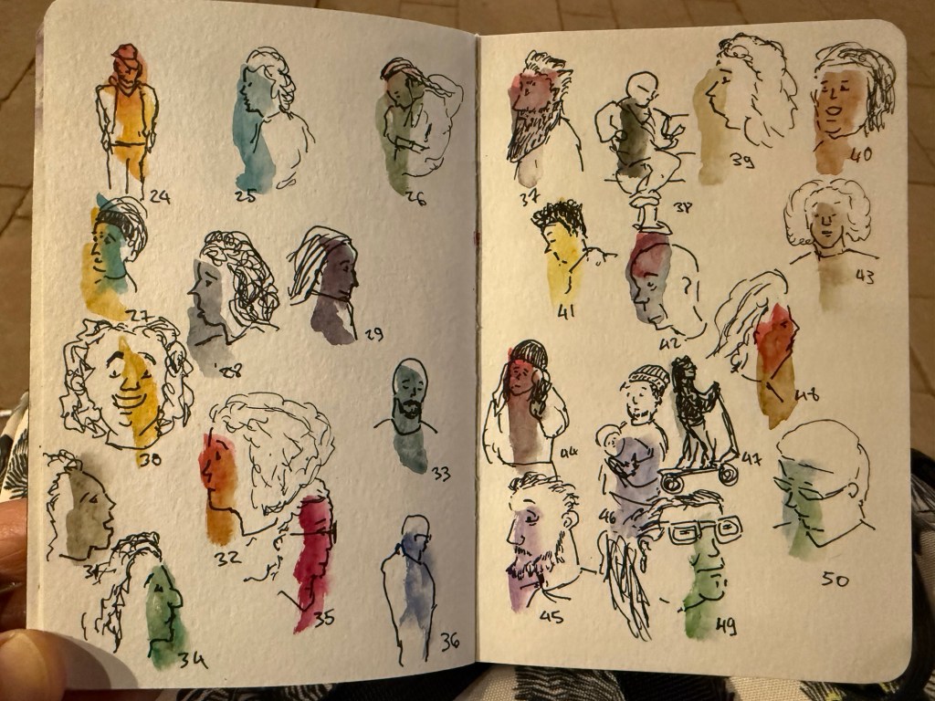
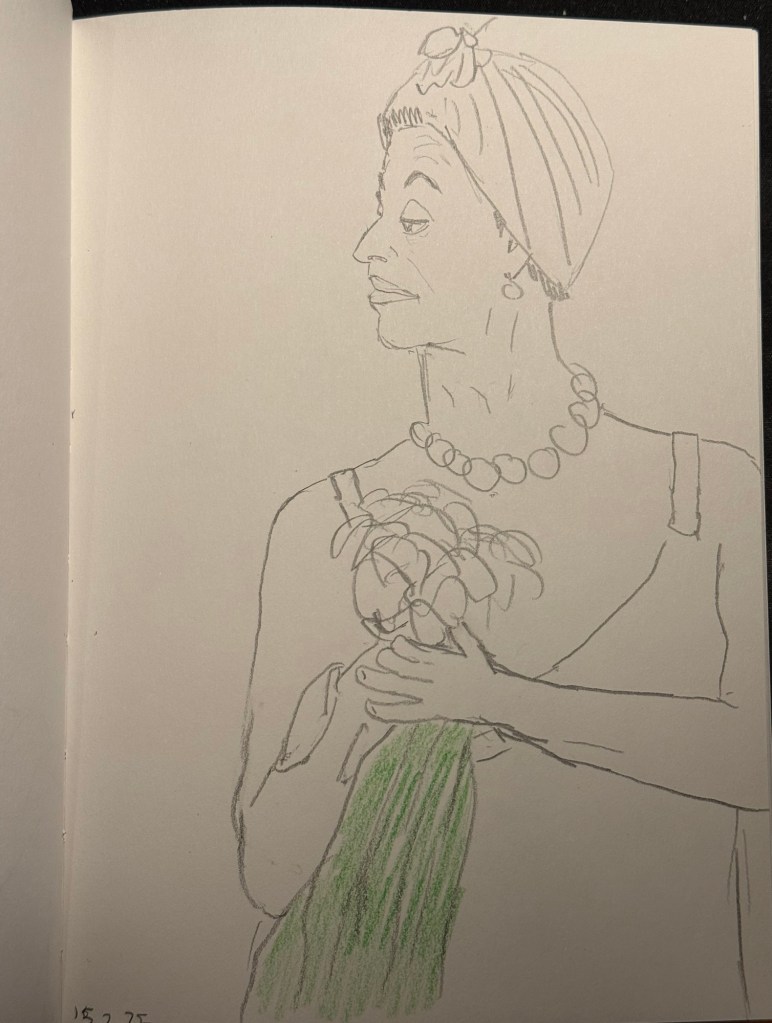
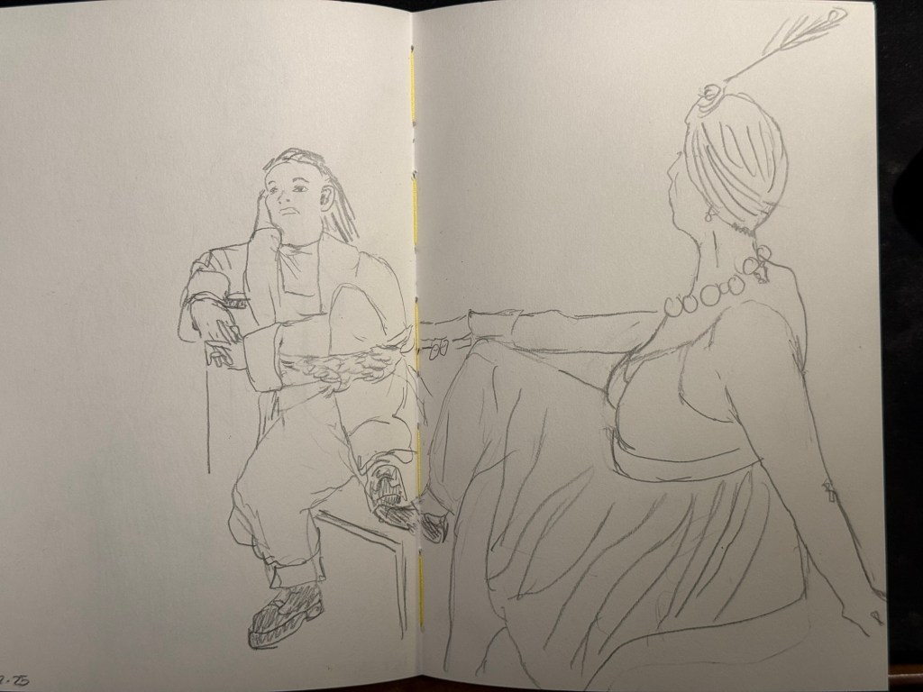
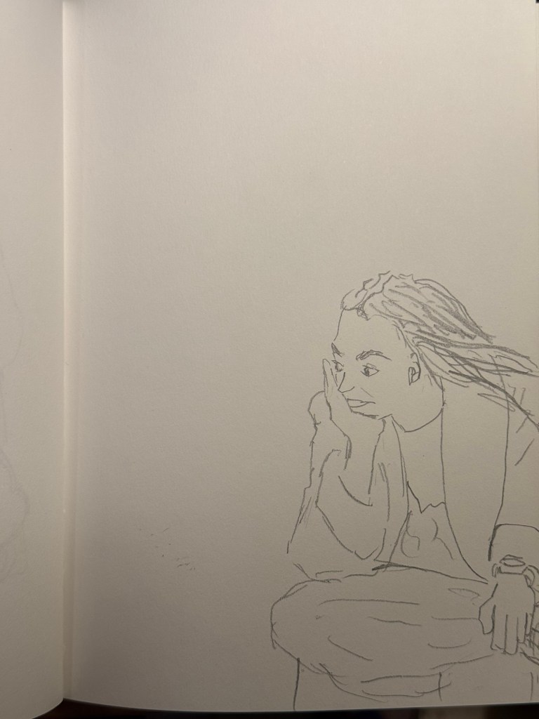
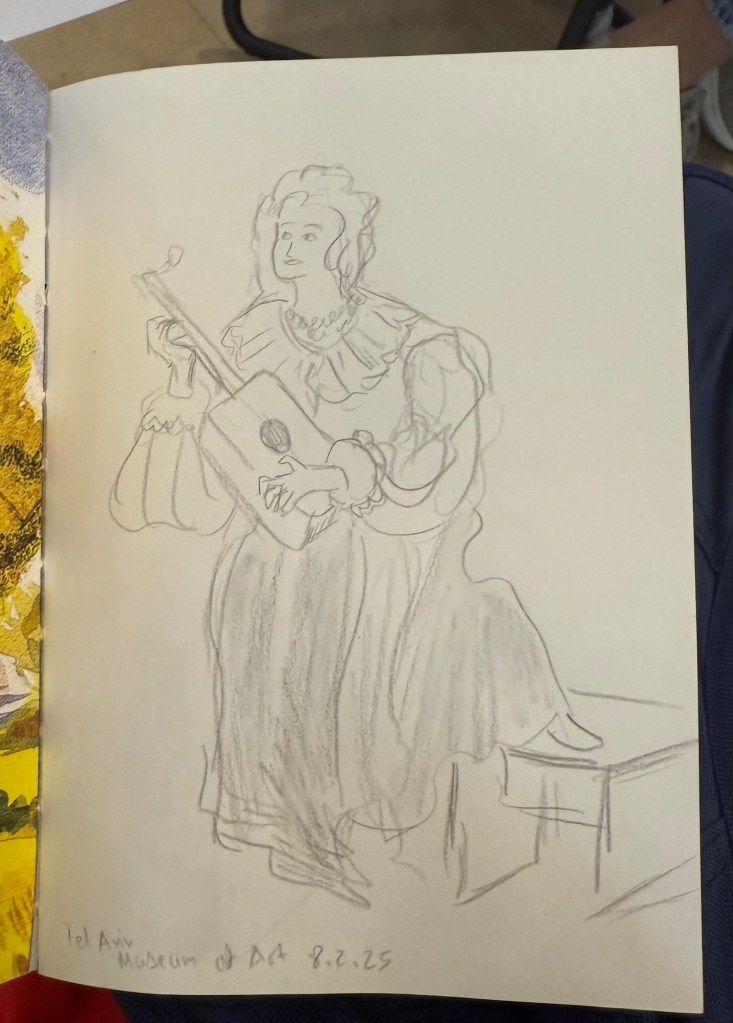
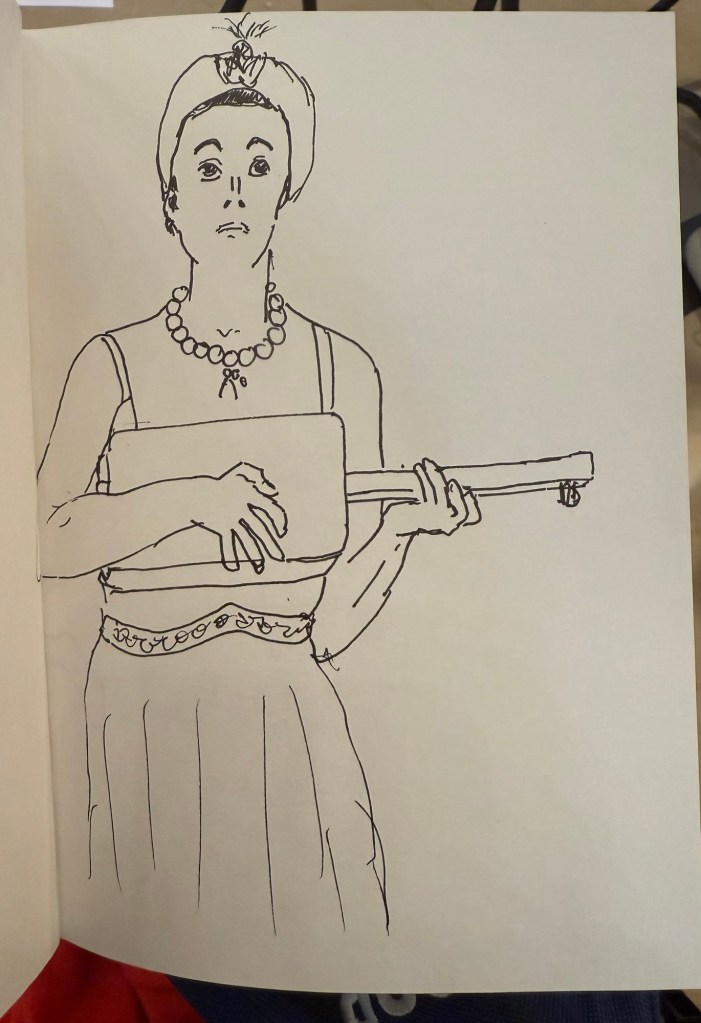
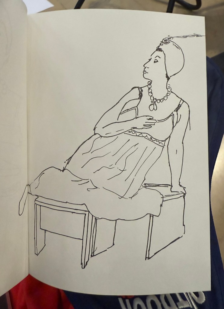
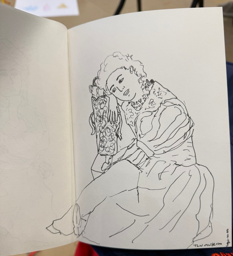
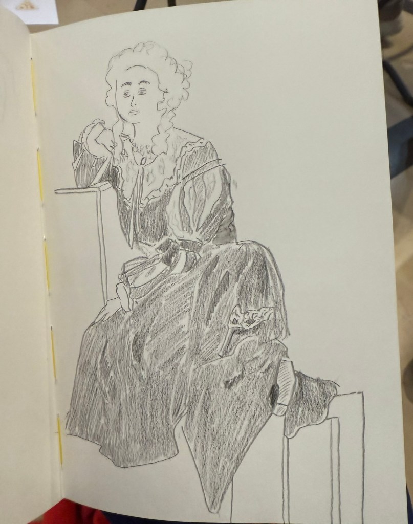
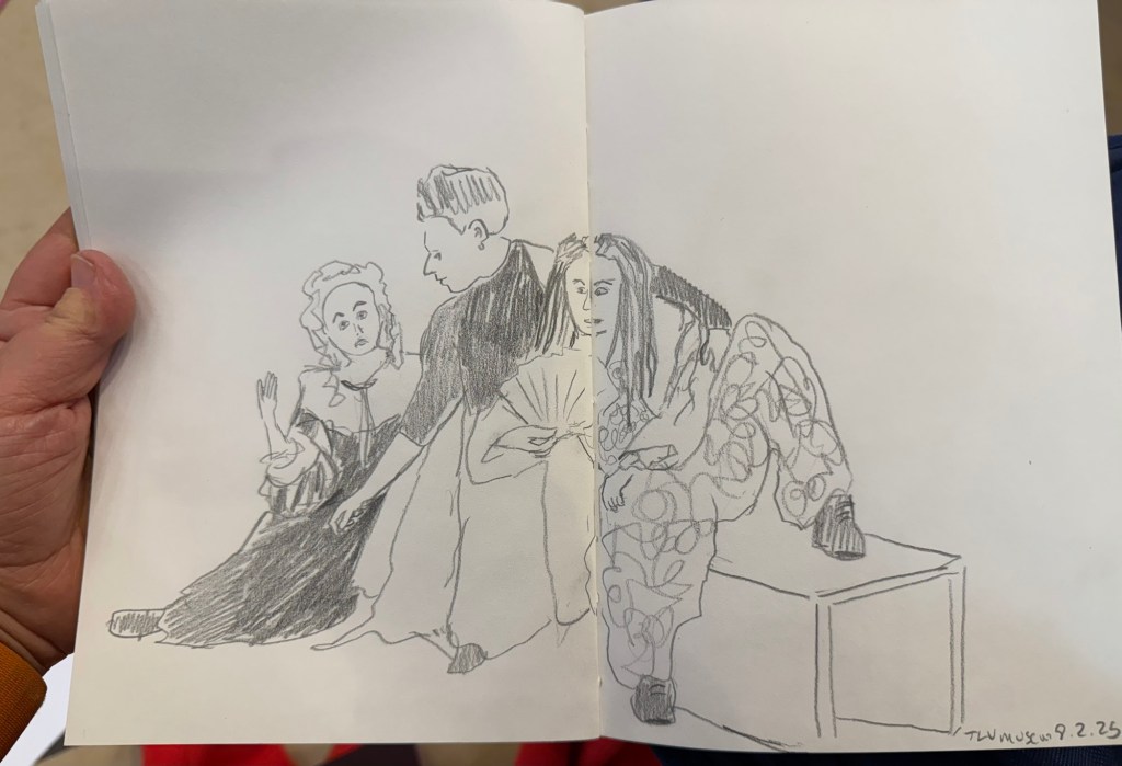
I finished the One Week 100 People challenge on day 4, but kept going for day 5 (which was yesterday) and added a few sketches on day 6 (even though the official challenge is 5 days long). It was the first time that I sketched only live subjects and not from photos, and it really pushed me to find ways to work fast.
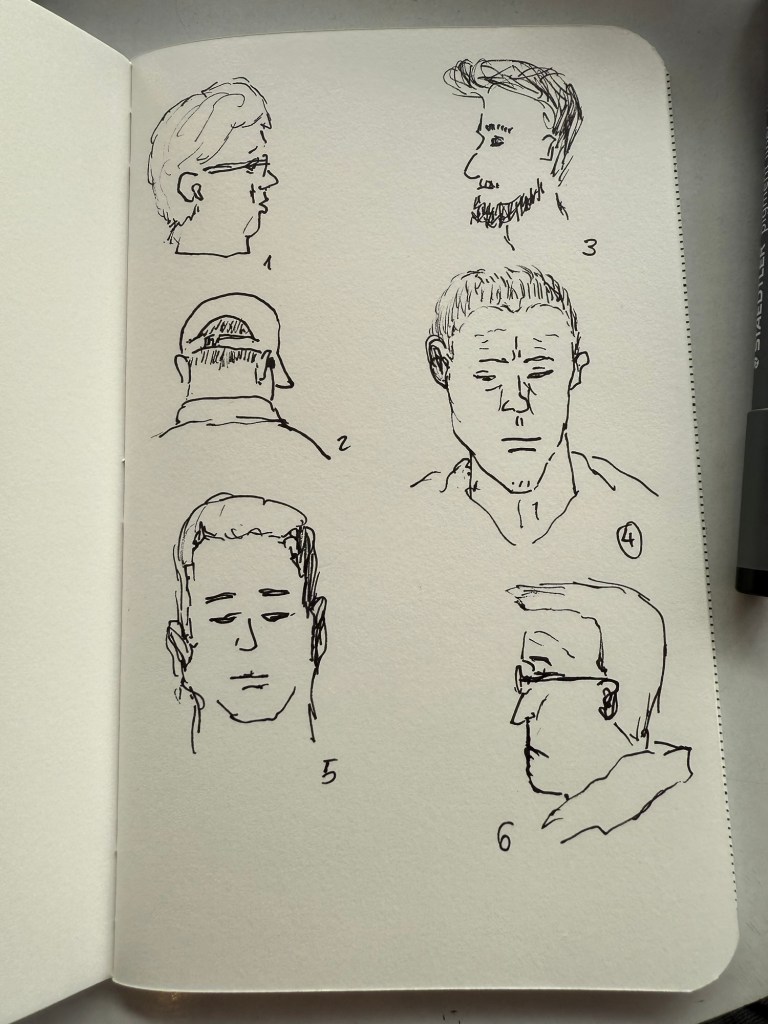
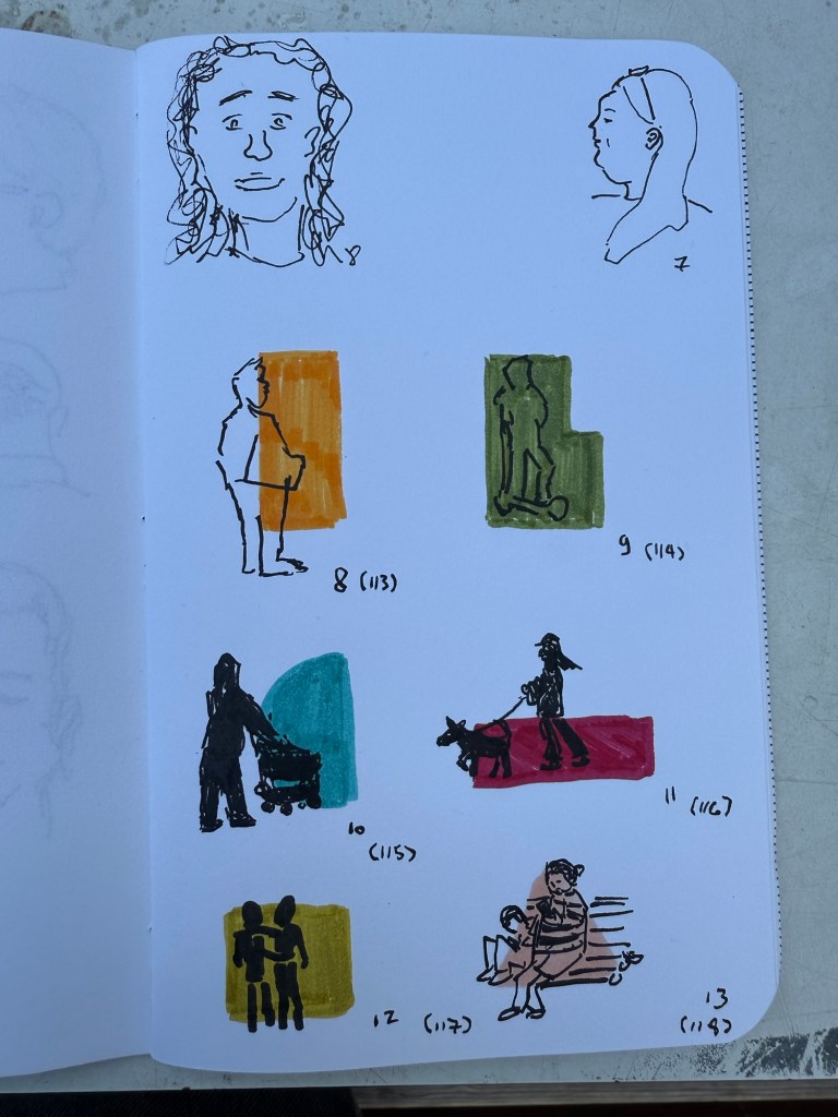
Today I added a few final sketches to my Field Notes sketchbook, this time using Faber Castell Pitt brush pens for blocks of colour and a Pilot brush pen for the sketches themselves. I was trying to work mainly with silhouettes and capture people in movement. It took me longer than I thought to capture a mere 6 subjects, mostly because what people do when they walk around nowadays is stare at their phones.
As I wrote two fountain pens dry this week, I filled six new fountain pens, bringing my rotation up to nine pens. Next week I’ll write a post about the pens and inks that I chose, but I will say that there are some pretty rare ones in the rotation this time.
Next week is pretty stressful as I have some tests and a checkup coming up with my hemato-oncologist (that’s a cancer doctor that specializes in blood cancers, which is the kind of cancer that I’m in remission from). I will give out one important tip for anyone who is going to see a doctor for any reason:
Write down ahead of time whatever it is that is bothering you/you need help with, and make sure that it’s in order of importance. There’s a good chance that if you won’t do this you will forget things, or you’ll focus on the least important thing, or you’ll have trouble articulating the issue. A doctor’s office is a stressful location, so you want to take the time and prepare this list in advance when you are sitting calmly at home. Make sure that the first 2-3 items on that list are really the most important things that you want to focus on because there’s a good chance that you’ll only get to focus on these items (your time in there is going to be limited). Reference the list when in the doctor’s office (don’t be embarrassed, there’s nothing embarrassing about being prepared). Be clear and specific, and insist on getting all your questions answered when it comes to these things. Double check before you leave that all the medications you discussed and tests that the doctor ordered were properly documented. Doctors are people too and the electronic medical record systems they work with aren’t the best, so it’s worth checking that everything is in order before you leave (even if you do the check with the medical secretary, just so long as you’re still in the doctor’s office and any errors and omissions can be fixed).
Take care of yourself and have a great week!