Have a happy new year! Here’s hoping that 2026 will be much better than 2025 was.
Here are a few recent sketches (mostly) from my Stillman and Birn pocket beta notebook.
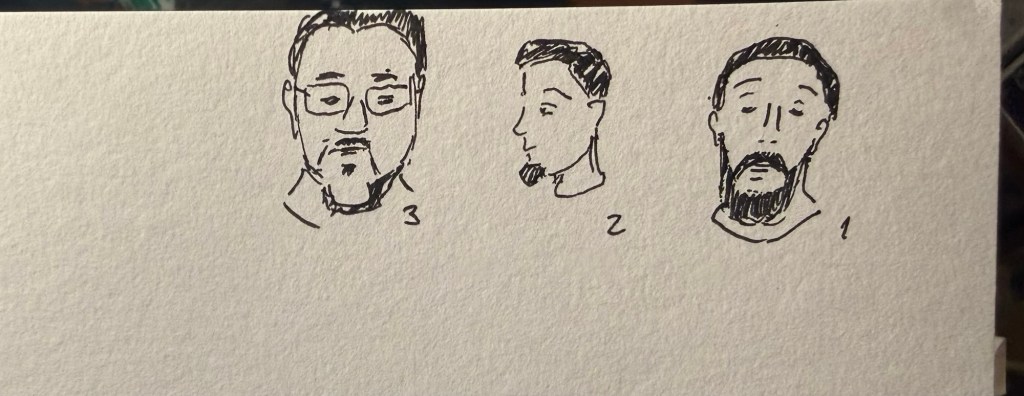
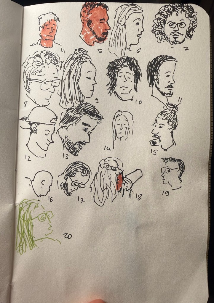
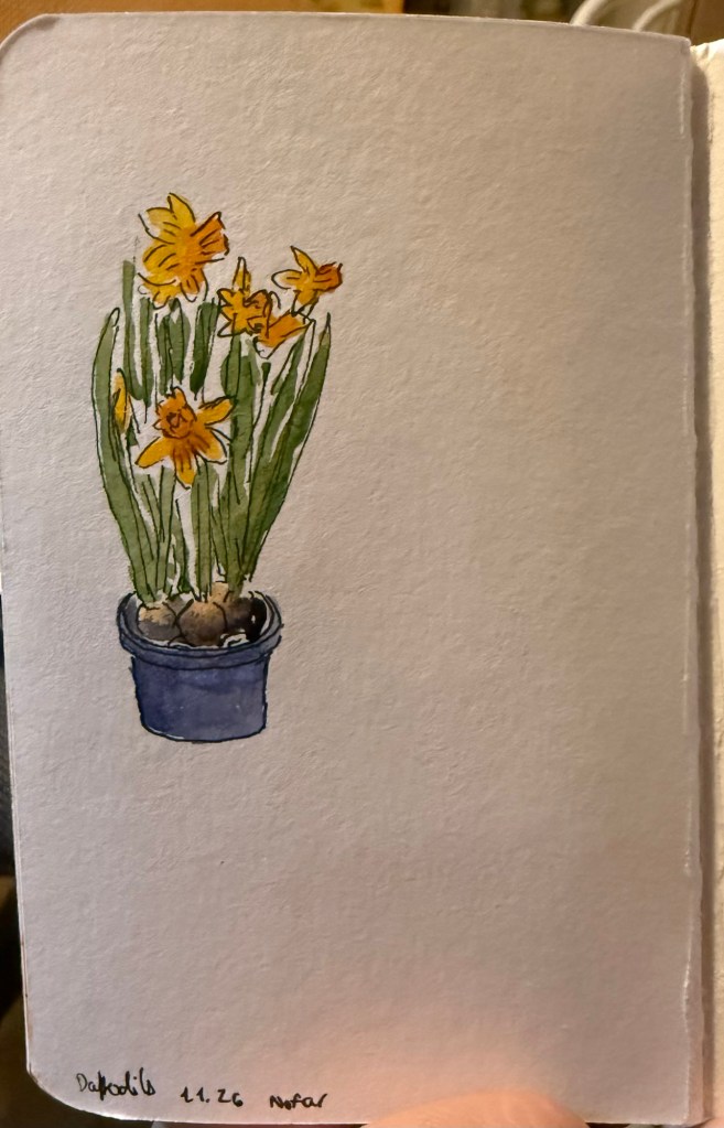
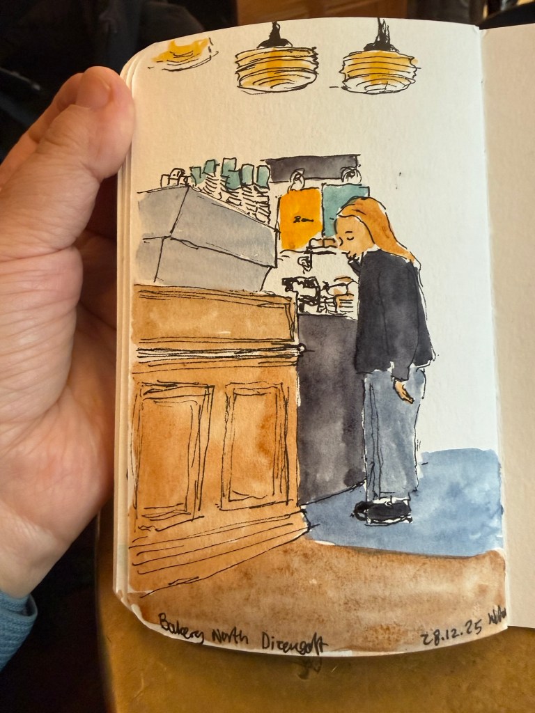
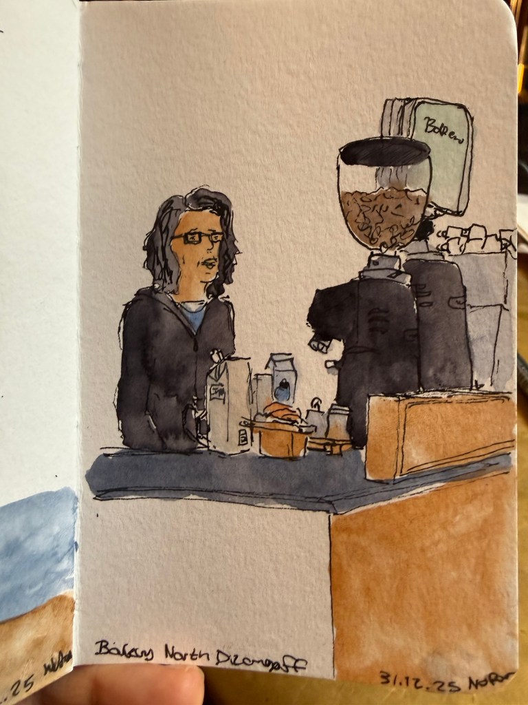
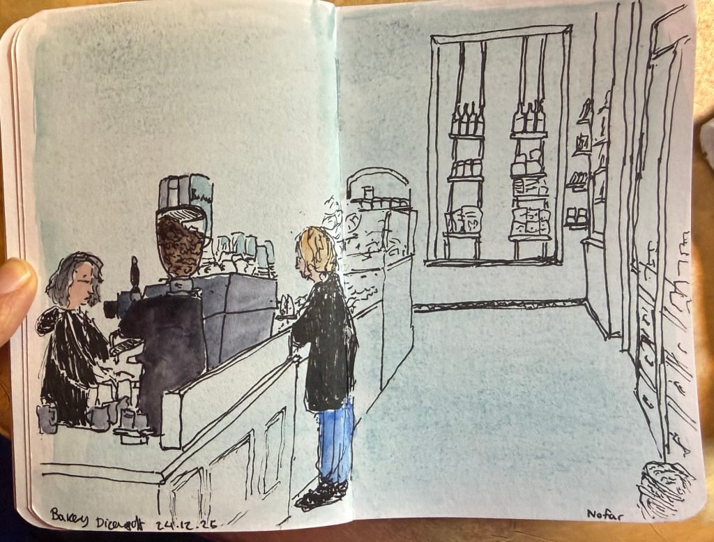
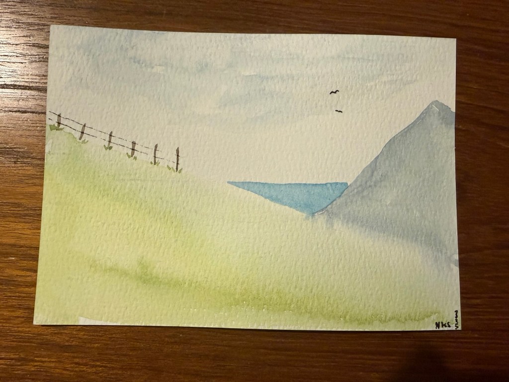
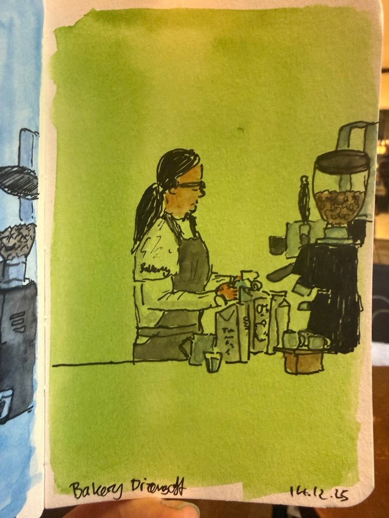
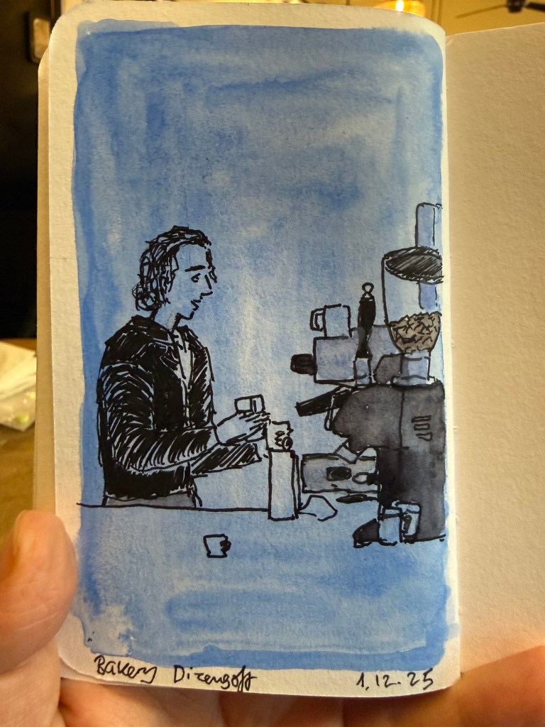
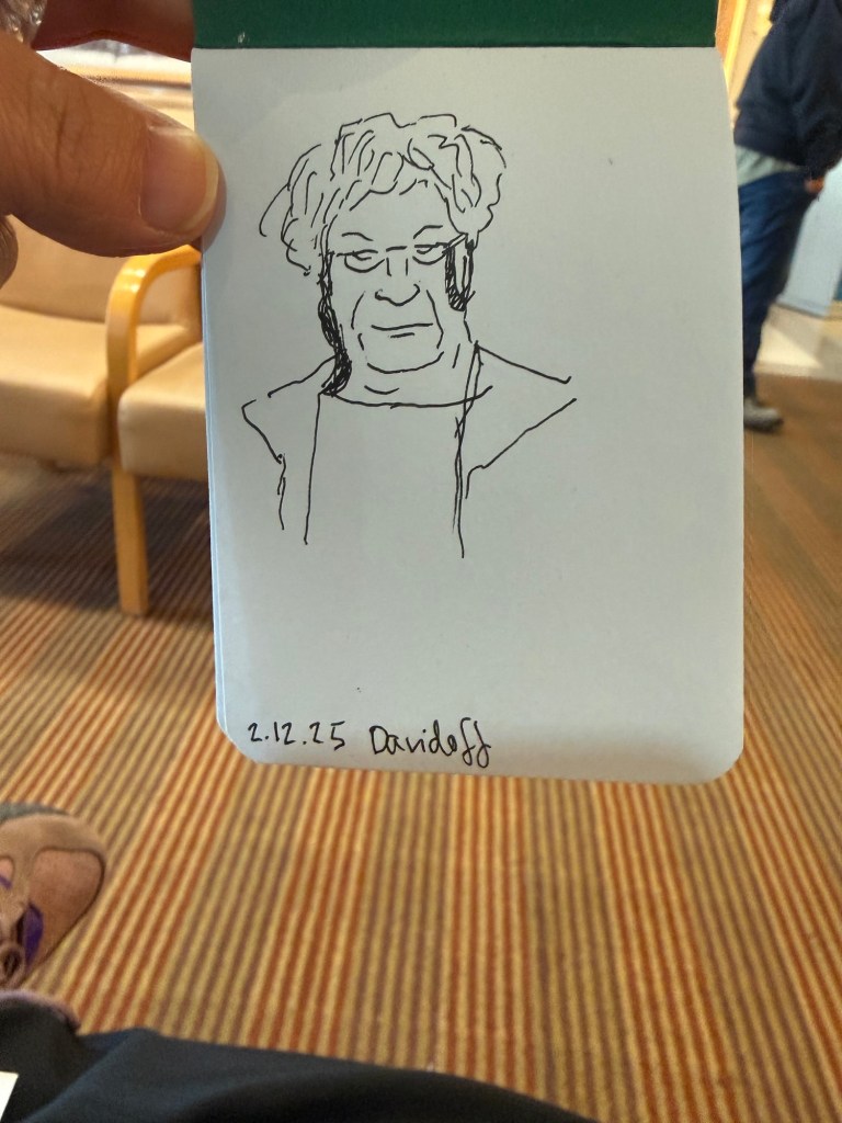
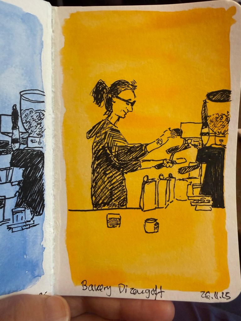
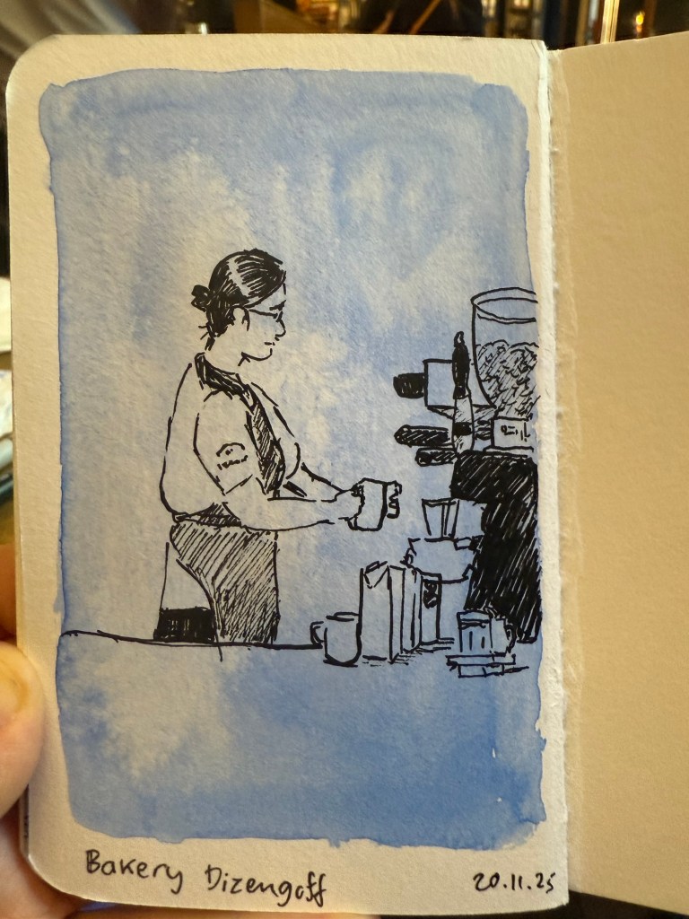
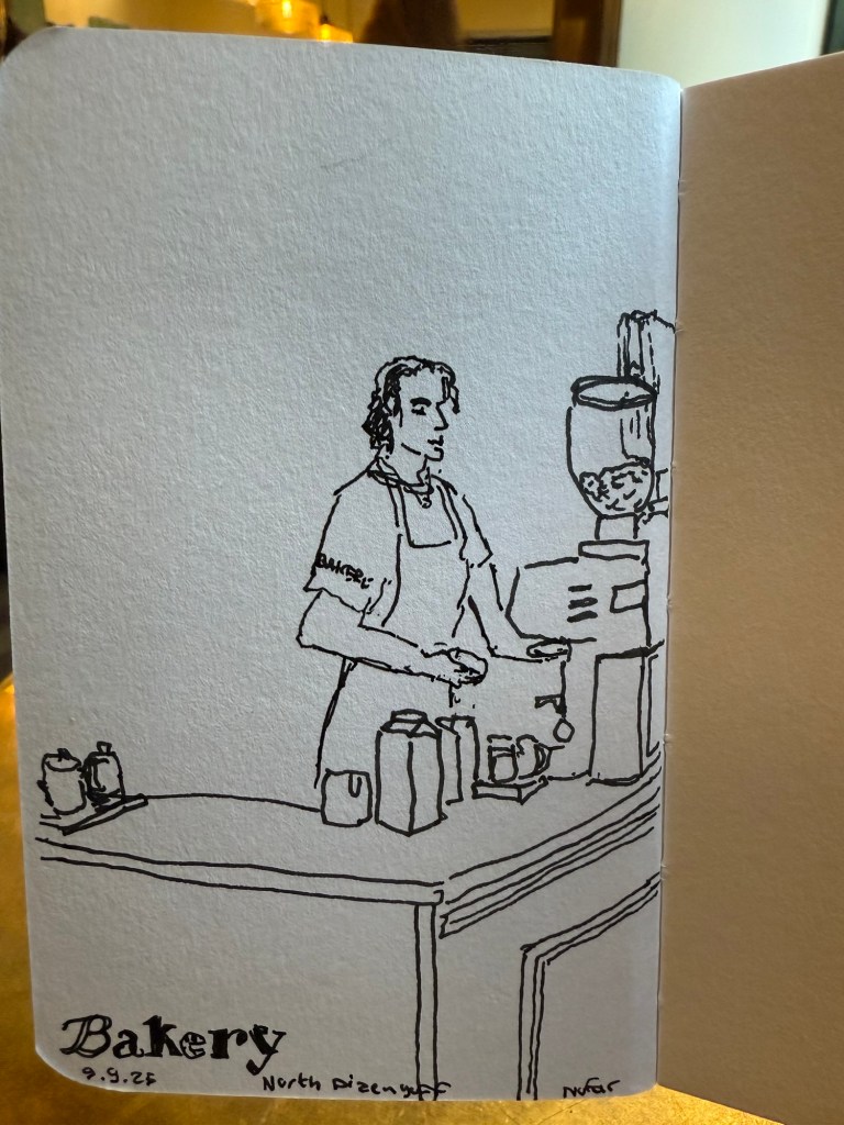
Daffodils What to choose? Cafe sketchBarista at work (very fast sketch)Favourite cafe spreadTiny landscape (not from my sketchbook- drawn on a card as a gift)Barista sketch on green background Barista sketch on blue background Sketch in a doctor’s waiting office (not on Stillman and Birn)Barista sketch on a yellow background Barista sketch on a blue background
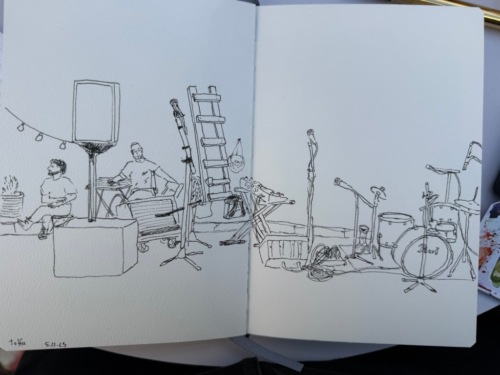
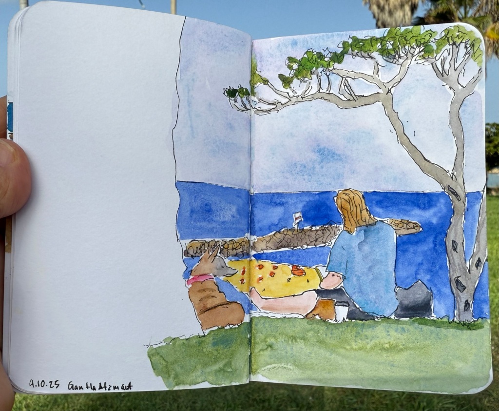
On Friday we went to an Urban Sketchers outing in Jaffa. It was celebrating local designers, and there were street performances as well as open studios and an arts and crafts market. The weather was hot and sunny, and the place was pretty packed with people and full of interesting old buildings. The main trouble I had was focusing on what to draw, as there were so many subjects.
I took a new sketchbook, a Pith Oroblanco in A4 size, and an A5 portrait Etchr Labs 100% cotton watercolour sketchbook. I don’t normally work in such a large format, but I decided to challenge myself to use the Oroblanco as much as possible. The 170gsm paper is identical to the one in the smaller Pith Kabosu, and so is great for mixed media and light washes. The Etchr Labs sketchbook is the best watercolour sketchbook that I’ve ever used – the paper works wonderfully with washes, and is very forgiving for mistakes and reworking.
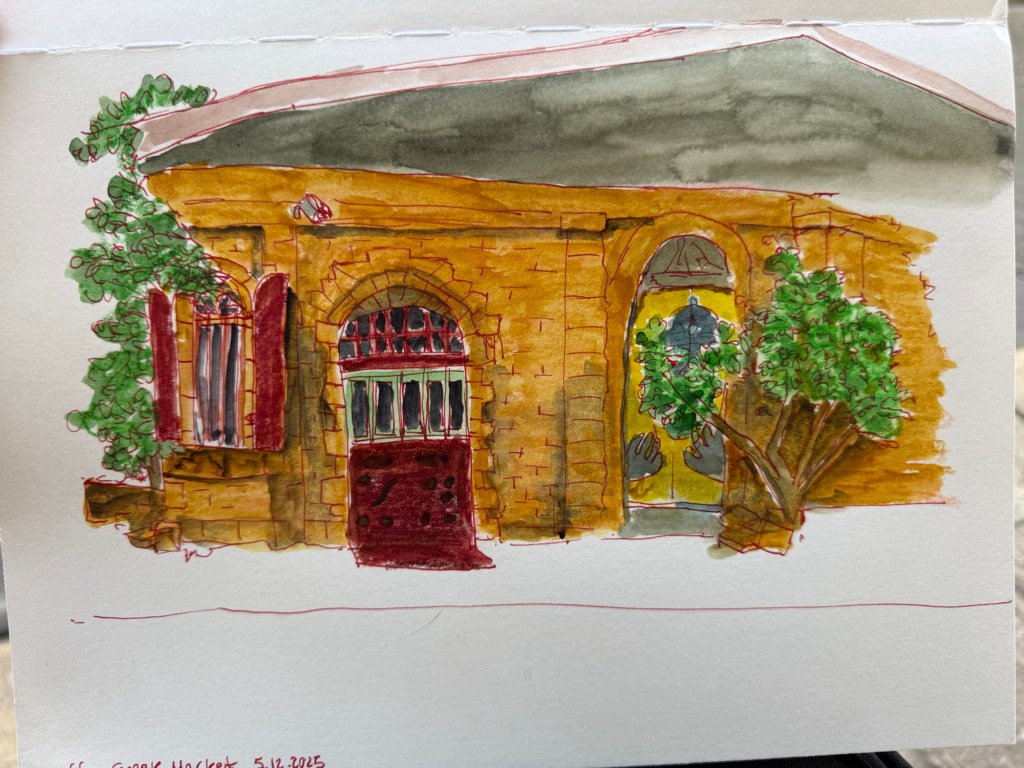
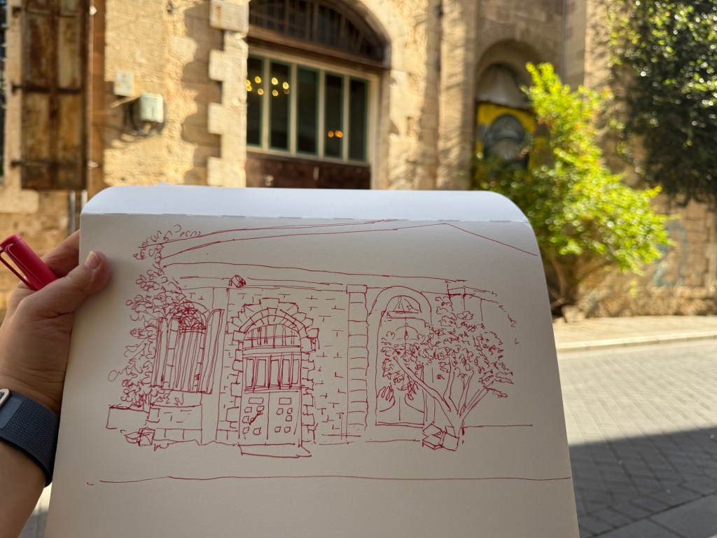
I started out 30 minutes before the official start time, and sketched a local building. I liked the combination of the beautiful old stone building together with the graffiti and the semi wild trees and shrubs. Inspired by Liz Steel’s Patreon sketching community (I just joined it) and December’s theme of “Red” I selected to sketch this building with Diamine Inkvent 2025 Day 3’s Carousel – a red ink – and to highlight the rust colour in the shutters and door. I had enough time to finish the line sketch before going to say hello to Marina, our local chapter head and the organizer of this sketchwalk (a wonderful person and artist). I took reference photos just in case, and then returned and quickly finished the sketch:
First sketch on a Pith Oroblanco
To avoid having to lay down a large wash I used Caran d’Ache Neocolor II to lay in most of the base colour – except for the roof bit (where you can see why laying down a large wash on this paper was problematic).
Initial sketch.
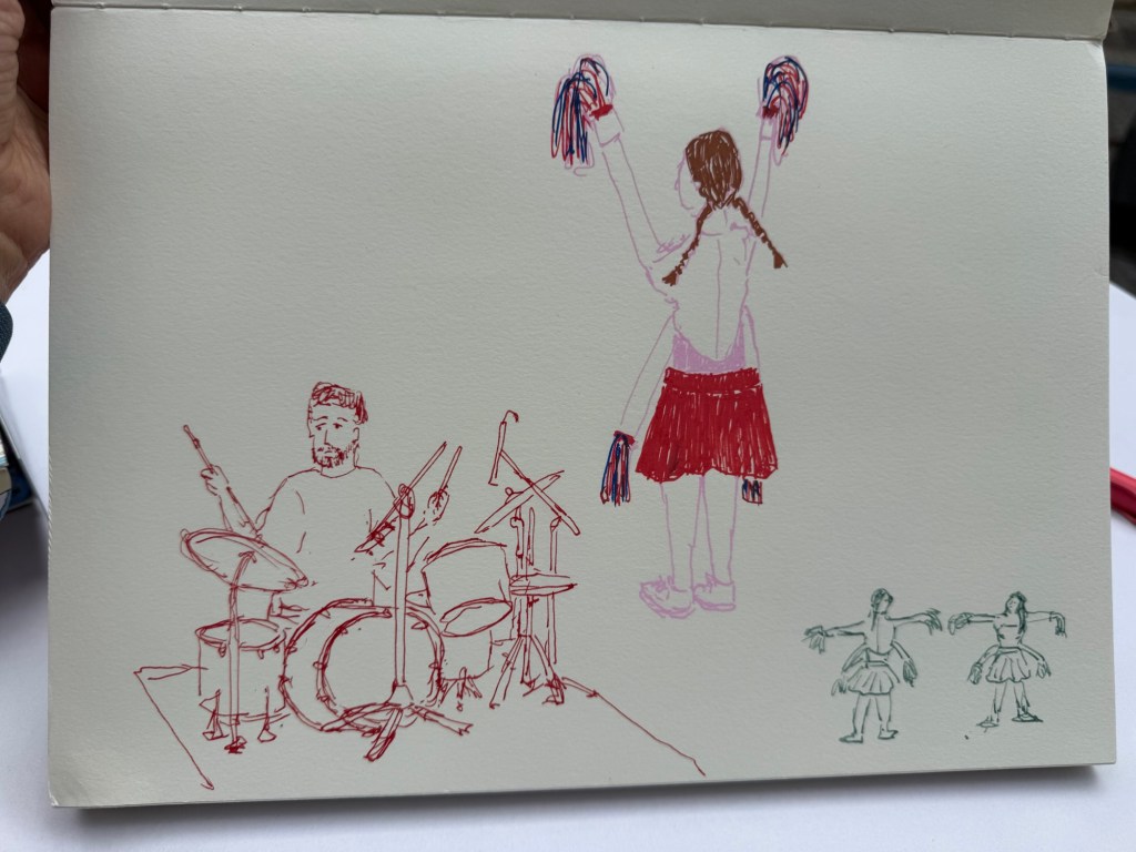
I then went in search for the music performance that was supposed to take place in an adjacent street. I managed to sketch the drummer as he was doing a sound check, but then he left and two girls in peculiar 4 armed cheerleader outfits came out and did a sort of otherworldly dance-march. They kept moving but I did manage to capture them. I used Diamine Carousel in a Lamy Safari medium nib for the drummer, and Posca markers for the cheerleader. The tiny cheerleader thumbnail was sketched with a TWSBI Eco 1.1 fountain pen and De Atramentis Document Ink Green Grey.
Quick, loose sketches
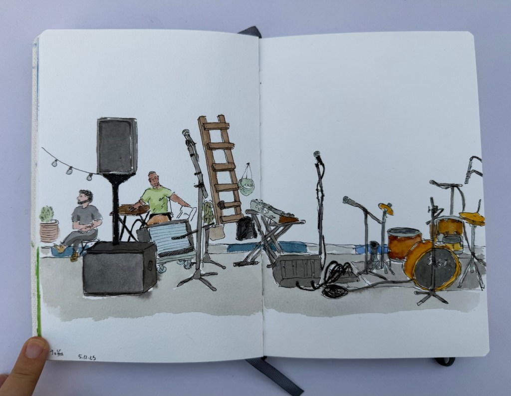
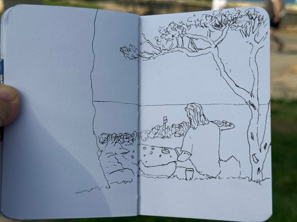
I then settled in to prepare to sketch the musicians when they returned. There was a Flamenco dancer in a nearby stage, but the place was too crowded for me to get a good viewing angle of her dancing so I spent the time creating a detailed fountain pen and watercolour sketch of the location where the musicians were supposed to play in. I was hoping to add them in once they started, but their show was delayed and i had to get back to the throwdown. I did get a sketch of their instruments and some local viewers, but I rushed in the end and didn’t get a chance to get proper shadows in. Oh well.
Watercolour sketch
The line work was done with a Platinum Preppy 0.3 filled with De Atramentis Document Ink Black on an Etchr sketchbook:
Ink sketch
There was a lady there that was clearly on her first every Sketchwalk, and my heart went to her. Seeing her struggle made me realize that there are so many things that are obvious to me as a seasoned “sketchwalker” that aren’t obvious to people going out with an Urban Sketchers chapter for the first time. Here are a few useful tips:
Say hello. Sketchwalks start at a meeting point and usually end in the same one. Come a few minutes early and talk to people – they’re usually nice and friendly and share many of your interests. Say hello and introduce yourself to the organizers, and thank them for organizing the walk – it’s a lot of work! If there’s a local special event that’s taking place during the walk, be sure to get the details of the time and place and be there. Even if you don’t end up sketching the event, there is bound to be something else interesting going on, and you’ll help represent the chapter. If you come in late and miss the initial gathering, find a sketcher in the area and politely ask when and where the end meeting is. It’s usually posted in advance, but it is worth double checking.
There’s a throwdown in the end of sketchwalk, and group photo. Even if you don’t like your picture taken, bring your sketches to the throwdown. It’s a great way to see great sketches in a large range of styles, and get inspiration from wonderful artists. Do not compare your work to others. Be generous and specific with complements (“The way you caught the energy between the dancers is amazing!”, “The colour choices are phenomenal – that building really comes to life!” is better than “that’s so pretty!” Although, of course saying a sketch is beautiful is also nice). Take photos not just of your work, but of other’s work that inspires you, especially of those that do work in a style that’s far from your own. Learning and experimentation is part of the Urban Sketchers experience.
Thank the organizers. I know I said that before, it’s worth repeating.
Never ever critique another artist’s work. It’s not that kind of an artistic gathering.
Bring less. We all fail at this (I did too, of course), but the less stuff you bring the more fun you’ll have. Choose one or two sketchbooks, at least one in a size and format you are comfortable with. Bring only the supplies you know you’ll use, not those that you might need. It’s OK to bring something new with you, but if you do I suggest that you force yourself to actually use it, and start the first sketch with it.
Do not bring an easel, particularly not to your first sketchwalk. You want to be mobile and flexible. The best way to get the most out of a sketchwalk is to change locations at least 2-3 times. The idea is to work quickly and loosely and to capture a location from several angles and with different focuses (that’s why it’s called a sketch walk). There will be those that choose to stick to one location, but having an easel tends to force you into a single location, as does having too much gear.
Bring a stool. It doesn’t have to be the most comfortable one in the world, but it does have to be portable. That will allow you to sketch wherever you like, and not just where there’s a free bench or table.
Take reference photos, in case you don’t get to finish a sketch or the lighting changes, or a white van decides to park in front of the building that you were just sketching.
Talk to people. Share art supplies. Ask questions about their process – unless you see that are too absorbed in their work to answer. But people usually are kind and enjoy sharing information and tools with other sketchers. That being said, bring all the gear that you’ll actually need.
If you’re just starting out sketchwalking, use smaller formats (no larger than A5), sketchbooks and not loose paper, and supplies that are portable and well known to you. That will allow you to work faster, and it will give you a chance to get more comfortable with working on location.
Sketchwalks usually last 3 hours. That’s both a lot of time and not enough time. Keep an eye on the clock, take into account that it takes time to warm up, and be kind to yourself, especially during the first 30 minutes. I usually take the first hour to work very quickly and loosely, and leave the last hour, hour and a half to work on a more detailed, well composed piece. Take breaks – sketchwalks are in urban environments so there’s usually a place to grab a coffee and snack (which you can and should sketch – it’s an Urban Sketcher’s tradition!). It’s not a race – the point is to enjoy yourself. I usually take a few minutes to stroll around, getting a feel for the location and the options before I settle in and get to work.
Bring water and weather appropriate gear. Be a responsible adult and check the weather before you go. Bring a hat and sunscreen, coat, umbrella, etc depending on the weather.
Post to social media, and tag your local chapter. There’s usually a Facebook group, and an Instagram account for the USK chapter. If the sketchwalk involved a local business, museum or organization, be sure to tag them too. You are an ambassador to the community now. Represent this wonderful organization with pride.
If you go on Urban Sketcher Sketchwalks and have tips for newcomers, I would love it if you could reply with them.
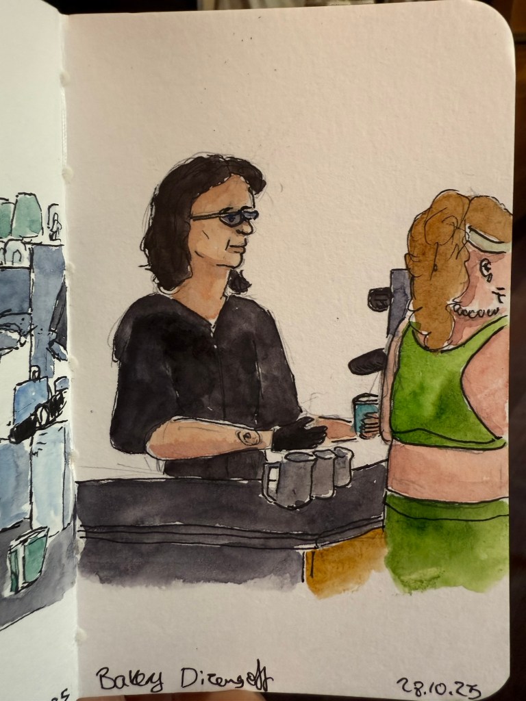
I went to see a local production of Singer, a play by Peter Flannery. It was phenomenal but it kept me up at night, which meant that the following morning I headed straight to my local cafe. I sketched the barista but something didn’t work in terms of getting her face right – she turned out sadder than she is. Sketching tired is rough.
Sketch on Stillman and Birn pocket Beta
Here’s the rather messy pencil and pen sketch. I can tell just by the line quality that I was very, very tired.
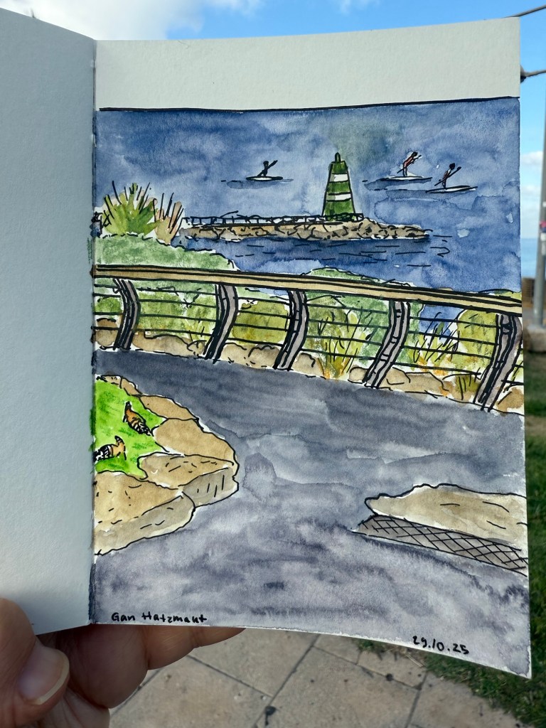
A day later I went to sketch at the nearby park and you can see the difference in the line quality in this sketch:
Sketch on a Pith Kabosu sketchbook
Initial sketch:
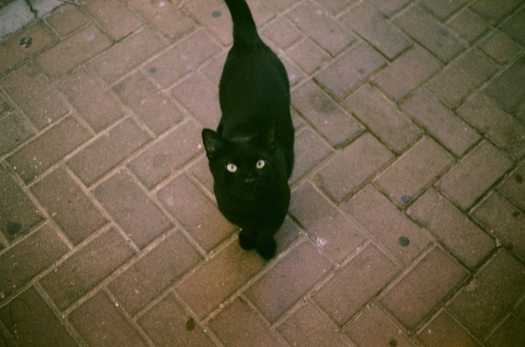
Later that week the film photographs that I’d had developed were returned to me. Here are a few of my favourites:
The local community cat that I feed twice a day coming to say hi
I love the atmosphere that the film gives this simple photo:
Ramat Hanadiv rose garden
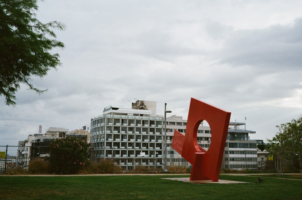
All of these photos are unedited. I’ll likely clean them up later on.
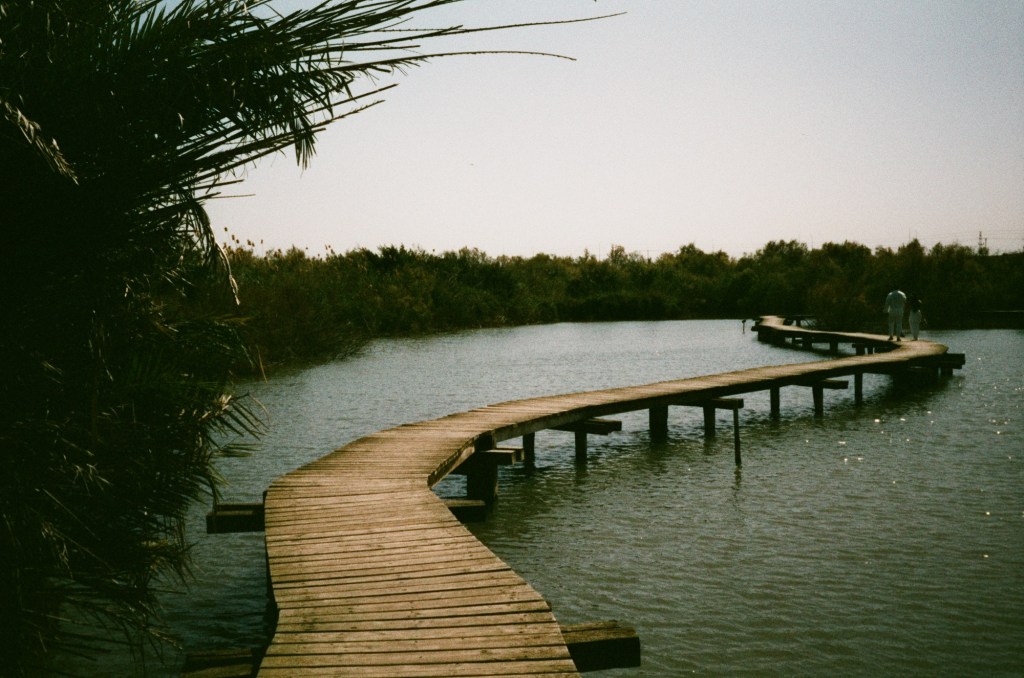
Bridge over water at a nature reserve near Haifa
There was a fire on the roof of a nearby hotel. I took this photo a day after the fire, and you can see the damage:
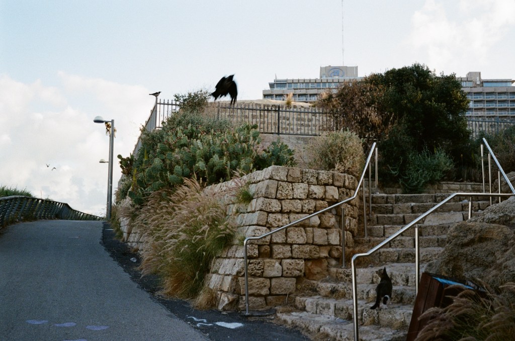
Cat failing to hunt a crow:
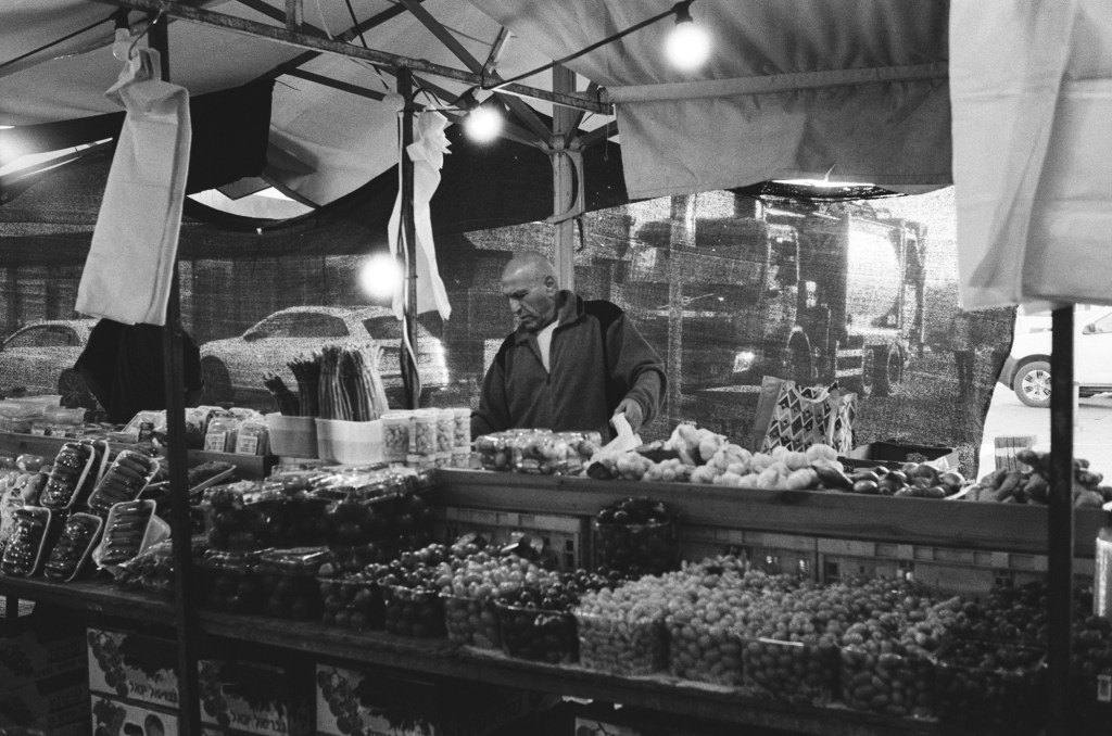
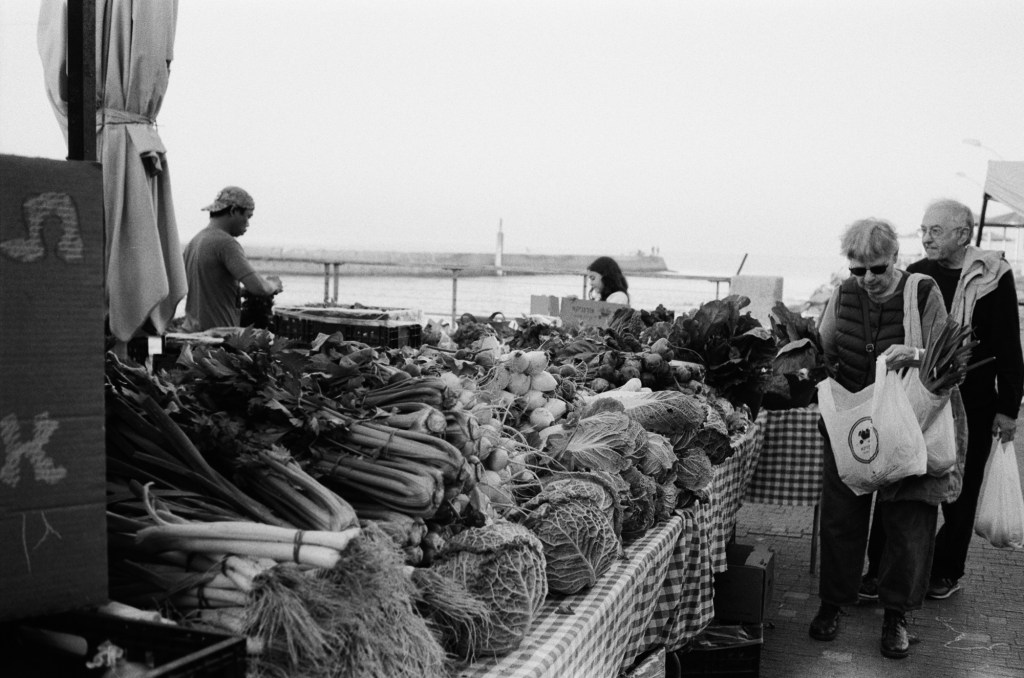
A stall at the local farmer’s market:
A stall at the local farmer’s market. You can see the see in the background.
I was supposed to run at a 10k night race on Wednesday, but I wasn’t feeling too good and I was apprehensive about dealing with the crowds so I ran the distance by myself a few hours before the official race start. It was a good decision as I was really struggling during the first 3k – but I did manage to finish, and finish strong.
I finished reading “Helmet for My Pillow” by Robert Leckie (a powerful narrative, but not as punchy as “With the Old Breed”), read “Death of a Nurse” by M.C. Beaton as a palate cleanser, and I’ve now started “The Shattering Peace”, John Scalzi’s long awaited sequel to his Old Man’s War series.
I’ve been overwhelmed with the responses to my Pelikan Hubs post. Thank you all for your kindness and for the thought and effort you put into your comments. I read them all, I just wasn’t able to respond to all of them this week.
Speaking of the Hubs, all of my pre-hubs inked pens have been written dry, which means that I currently have a 100% Pelikan rotation, plus some Platinum Preppy’s that I use for sketching.
In September I traveled to Paris and London.See part 1 of my travelogue here and part 2 here.
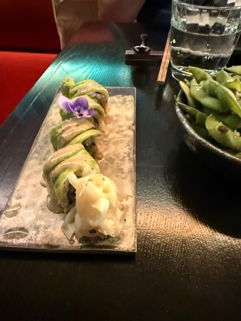
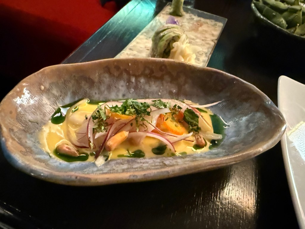
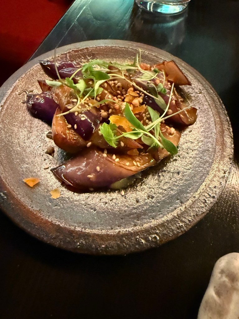
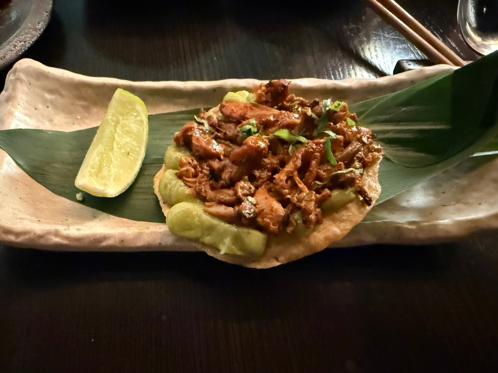
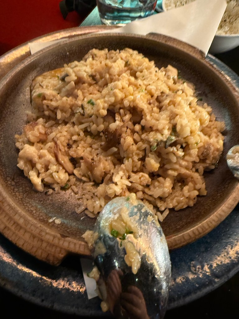
I met up with a dear friend for a pre-theatre tasting meal at Chotto-Matte, a trendy restaurant that combines Mexican and Japanese cuisines. I am not a foodie, and I will now confess that this was the first time that I’ve had sushi (I hate the smell and taste of fish and seaweed and everything that comes from the sea and so I’ve avoided it), and I really enjoyed it. It was the best meal that I had in London, and the company, the weird design and the very attentive service added to it.
I had the vegetarian pre-theatre menu, which meant that mine had no fish, seafood, meat or chicken in it. It was phenomenal.
On the right is the Edamame, which we shared and was good, and in the centre is Truffled Avocado Roll – Cucumber, sesame seeds, yuzu truffle soy. It was light and refreshing.Lychee Ceviche – Leche de tigre, chive oil, sweet potato, Peruvian corn, coriander. One of the biggest surprises of the meal. Delicious, zingy and the textures were phenomenal. Yasai Miso Crispy Sushi – Picante miso vegetables, takuan, shiso cress. Sticky but very good.Nasu Miso – Aubergine miso, apricot, puffed soba, sesame seeds. Aubergine like I’ve never tasted it before. Again, a lot of great textures here and a ton of deep flavours.King Oyster Mushroom Tostada – Pulled mushroom, smoked aji panca chilli, guacamole, lime, coriander. I’m not normally a mushroom fan, but this was smoky, “meaty” and satisfying. Truffled Mushroom Rice – Sweet corn & queso fresco dip, jalapeño, coriander, corn tostadas. This was a rice heavy meal, and at this point I could eat no longer. I had about three spoonfuls and no more. It was a good dish, but it lacked the depth of flavour and the uniqueness of the rest of the dishes.Milk Soft Serve Ice Cream with toasted almonds, chocolate sauce. It’s ice cream, it was good, but we had to rush to the theatre so we didn’t get to finish it. It wasn’t a particularly interesting desert though.
This is definitely a place that I’d return to for a special occasion.
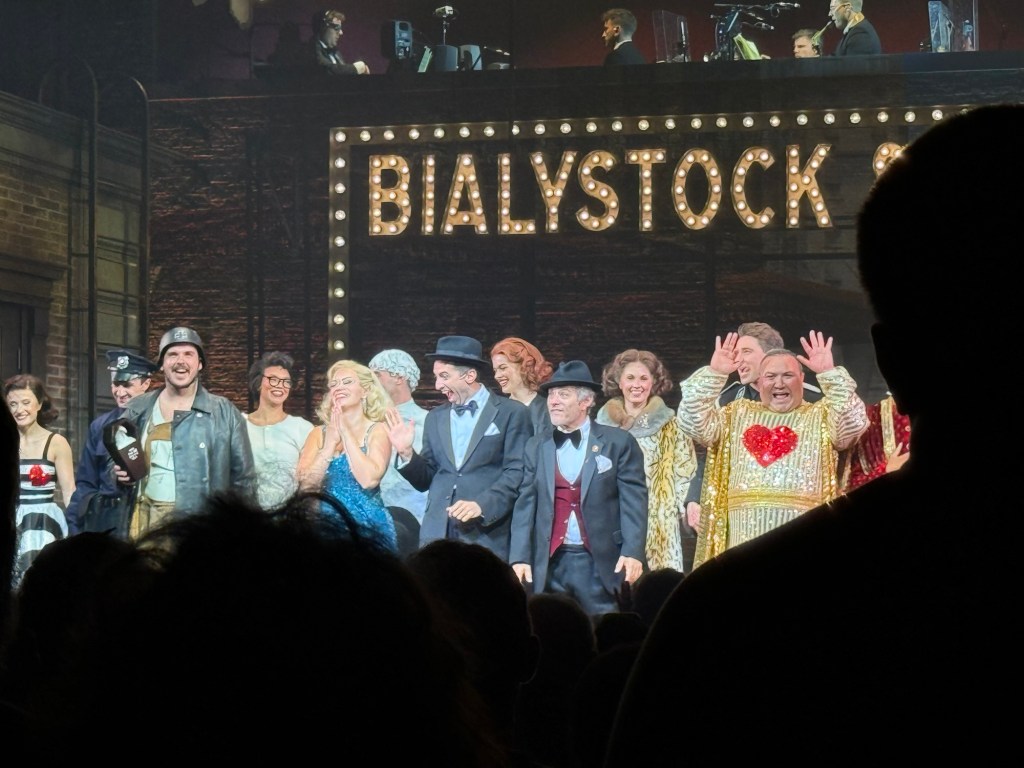
We then went to see the classic musical, “The Producers”, and it was excellent. The cast was brilliant, and it’s a very good musical with some great (if disturbing) songs. Mel Brooks is a comedy genius, and this musical still packs a punch.
The Producers
We also went to Spitalfields market, which meant that I could sketch this guy:
Sketch of a statue of a goat in Spitalfields market.
This was my very first sketch in the new Pith Kabosu sketchbook that I purchased at Cass Art. I debated whether to buy this sketchbook or not, as it had smooth, 200gsm paper and it opened flat, but I wasn’t sure it would work with watercolours. The great sellers at Cass Art told me it would, as they use it themselves, and they were right. It’s now my “daily driver” having replaced the Stillman and Birn pocket beta. The beta has thicker and more textured paper but the Pith Kabosu is slightly larger, has a more durable cover, and opens flat much better than the Stillman and Birn does. I later returned and purchased two more of these sketchbooks, they were so good.
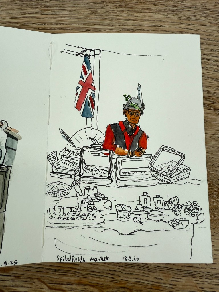
I later sketched this seller in his stall, after purchasing an old set of folding rulers from his stall. I decided to paint him and the flag but left the rest of the stall as line drawings.
Spitalfields market
The Pith Kabosu is also cheaper than the Stillman and Birn and as it has smoother paper, works better for ink sketches and dry medium (pencils of various kinds, for example). It means that I’m more inclined to bring it out and make quick sketches in it, even if I don’t get to adding watercolour to them.
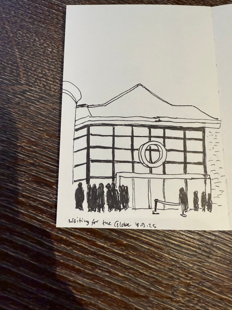
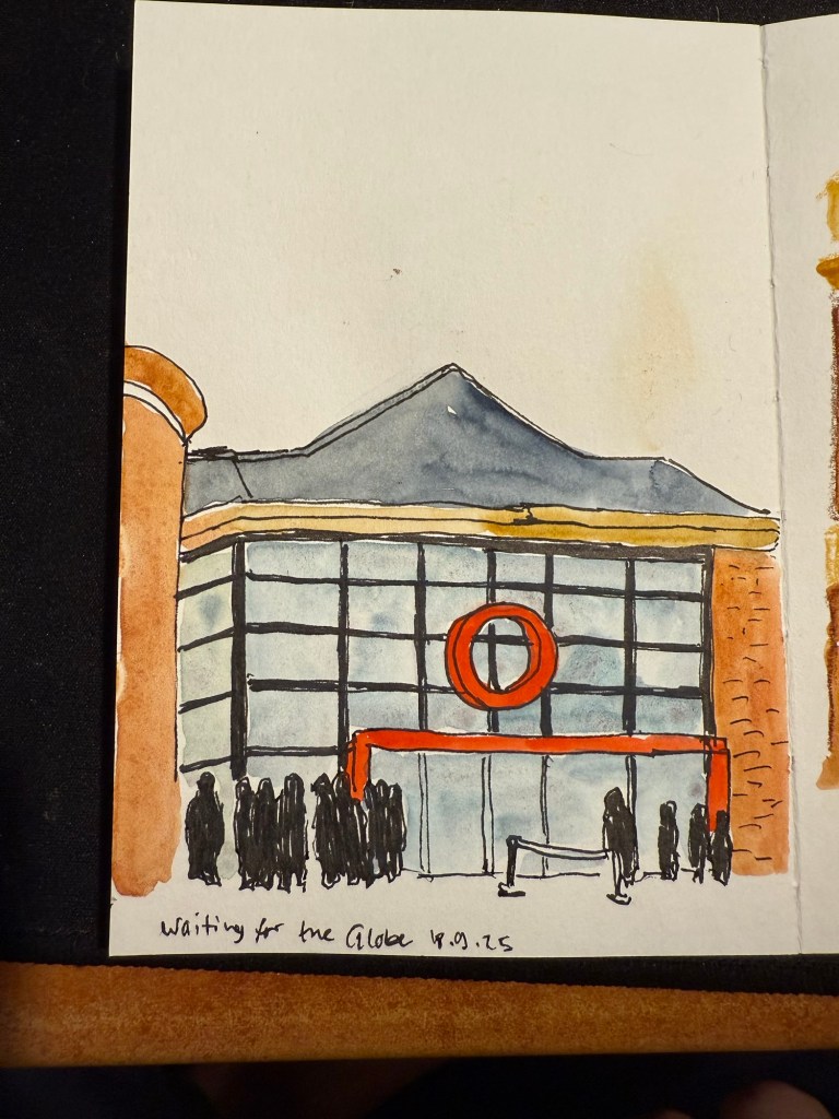
We then went to the second play at The Globe – Shakespeare’s Twelfth Night. We arrived early so I sat in the Starbucks across the entrance and sketched the place:
I originally didn’t have time to add colour to this. I just bashed out this 5 minute sketch and then added watercolour later, from reference photos.
I later added colour to the sketch. In hindsight I would have gone for a looser sketch, but I was still unsure what this paper could and couldn’t do. The answer is – practically everything. Only very heavy washes make the page buckle.
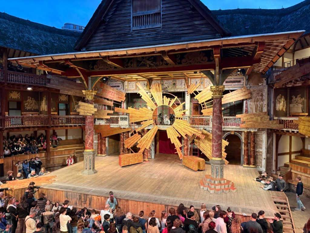
This was a regular Shakespeare play, and so there was some set design. this is the stage:
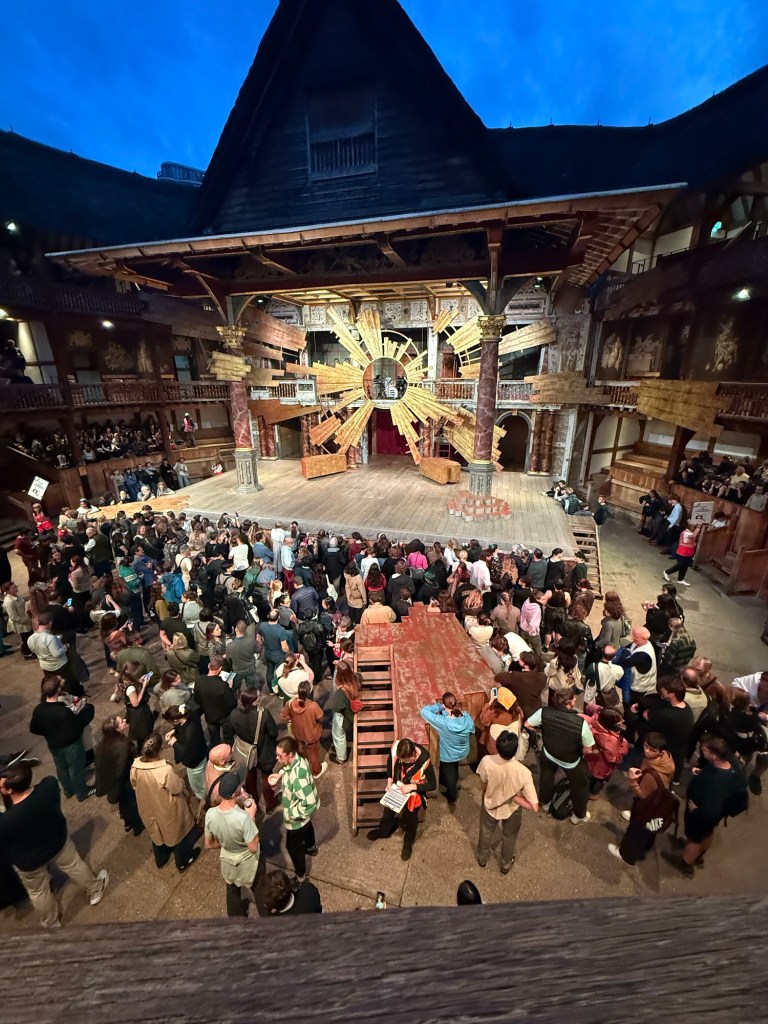
And in the yard where the groundlings are you can see another bit of the stage that isn’t normally there, but was used to represent the beach and other locales in the play.
I enjoyed the play a lot, and would recommend seeing plays at the Globe if you can tolerate the extremely uncomfortable seats (yes, even with the cushions).
We went to the Cartier exhibition at the Victoria and Albert museum. The exhibition is sold out, and it’s well considered, but we found it a bit dull compared to the Marie Antoinette exhibition at the same museum.
This is the Patiala necklace that was part of the exhibition. It was made by Jacques Cartier for the Maharaja of Nawanagar in 1928. He also made the Maharaja of Nawanagar’s necklace, later named the Jeanne Toussaint in the “Ocean’s 8” movie (it was a recreation made by Cartier for the movie).
My favourite parts were the film where they showed how a Cartier leopard is made, and the famous mystery clocks. There was a whole room dedicated to them, and it was fabulous.
Next post will be the last in the series. You can read it here.
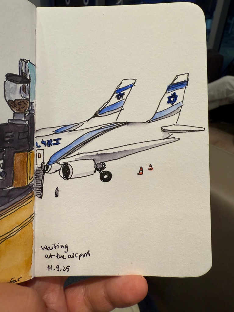
I recently returned from a pretty long trip to Paris and London with my family. I ended up sketching a lot more than I normally do during trips, largely thanks to things that I learned during the Urban Sketchers Symposium in Poznan (more on that in a later post). Here is part 1 of some highlights from my trip.
Quick sketch in a Stillman & Birn pocket beta while I was waiting for my flight
Centre Pompidou, my favourite museum in the world, was closing down until 2030 (!) so I went to pay it a last visit. Already parts of the colourful outside facade have been repainted white, and I’ve never seen the area around the museum so deserted.
The iconic Pompidou facade
The library was the only area still accessible, and it had been turned into a giant project playground for German photographer Wolfgang Tillmans to work with. It was something that only Pompidou could do, and it was breathtaking, thought provoking, fun, interesting, and unique. I wish I could have spent hours there, but at this point in my trip I became badly ill and for the entire Paris leg of the trip I was struggling.
The Pompidou library transformed.
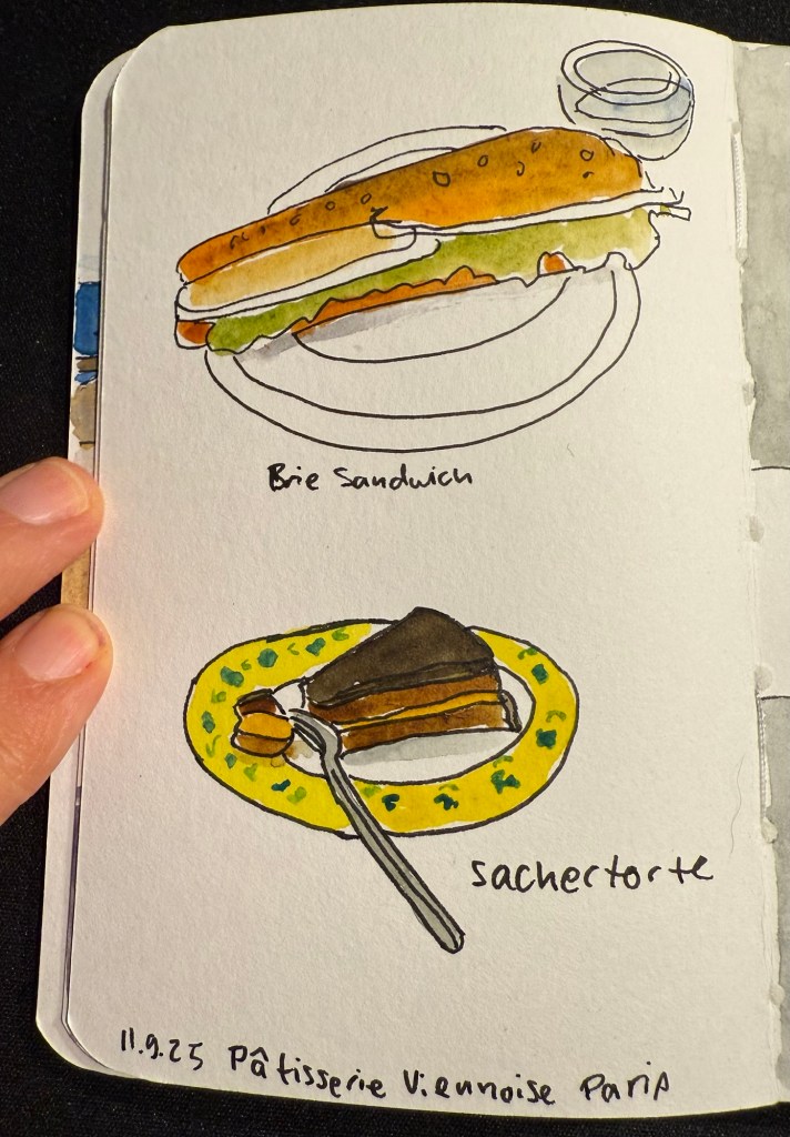
I ended up largely not eating in Paris, but this was my first meal there – in the fantastic Patisserie Viennoise in the Latin Quarter.
Stillman and Birn pocket alpha watercolour sketch
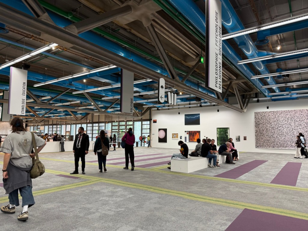
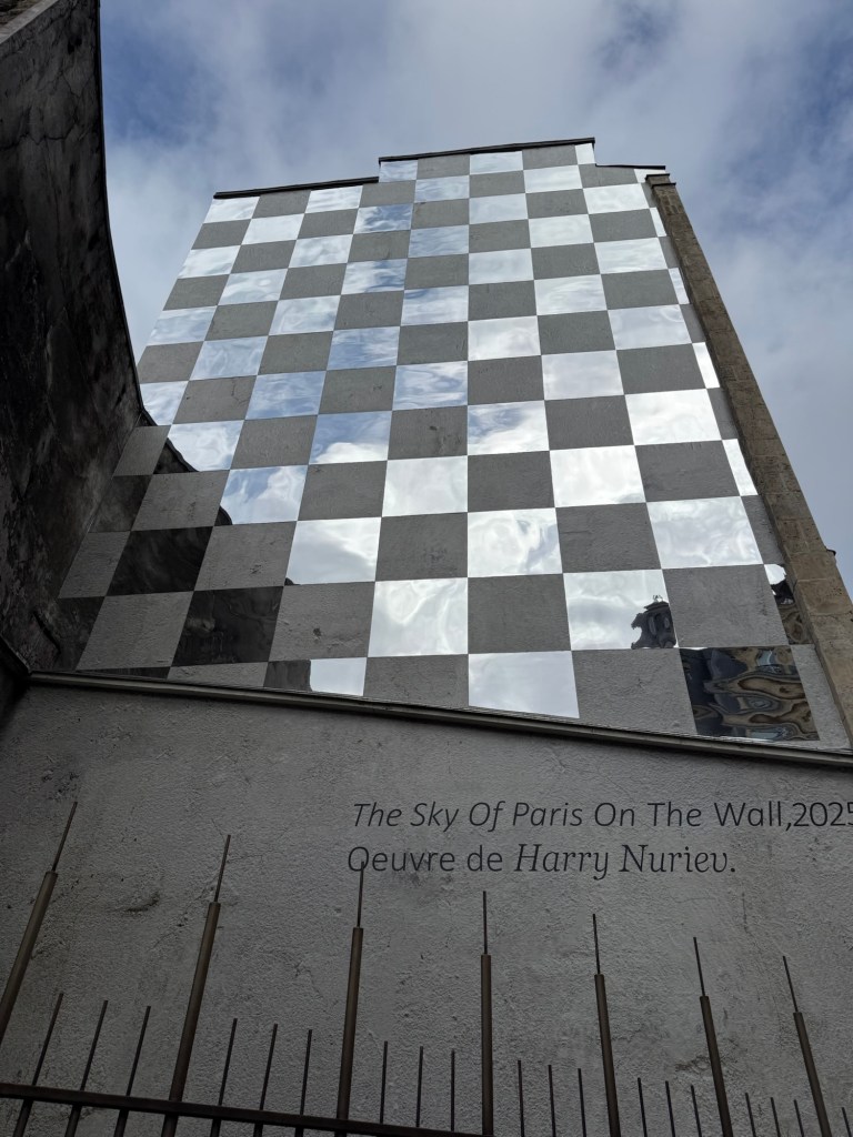
We also went to a new museum, the Bourse de Commerce and I saw this great artwork on the way there:
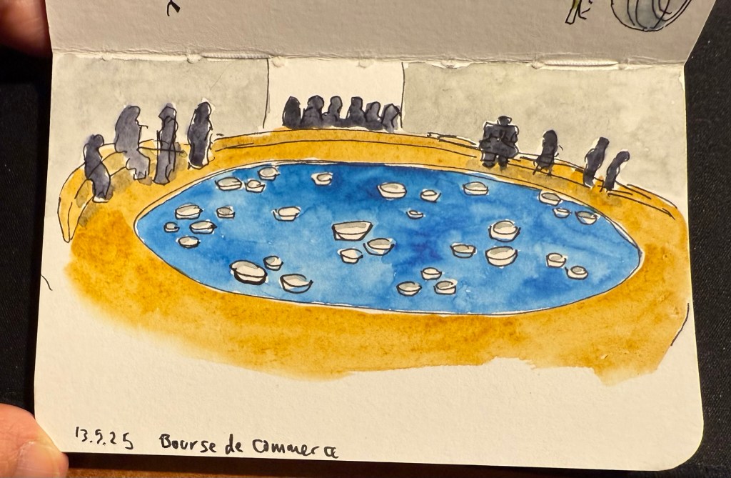
The museum was in between putting up exhibitions, so while a large part of it was closed we managed to view some great and moving art pieces with relatively few crowds and at a discounted price. I did a VERY quick sketch while I was there:
Stillman and Birn pocket alpha watercolour sketch
This is the artwork that I was sketching.
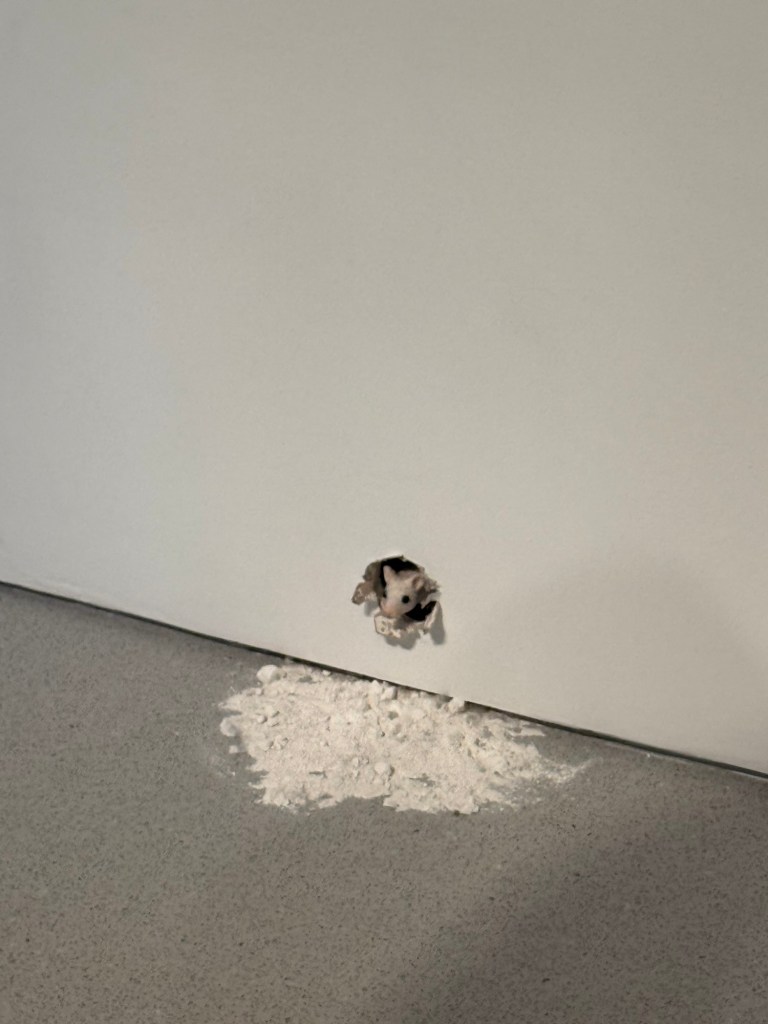
And this little fellow is also part of the art exhibits there:
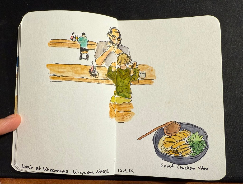
We then took the Eurostar to London. This is where I switched sketchbooks – this sketch of a boy and his father having lunch at a table across from me at Wagamama is the last sketch I created in my Stillman and Birn pocket beta. The beta has decent watercolour paper but it’s not half as good as the paper in my Etchr labs watercolour sketchbook, and the glued in pages make it a struggle to create full page spread sketches, as you can see here:
Last trip sketch in the Stillman and Birn pocket beta.
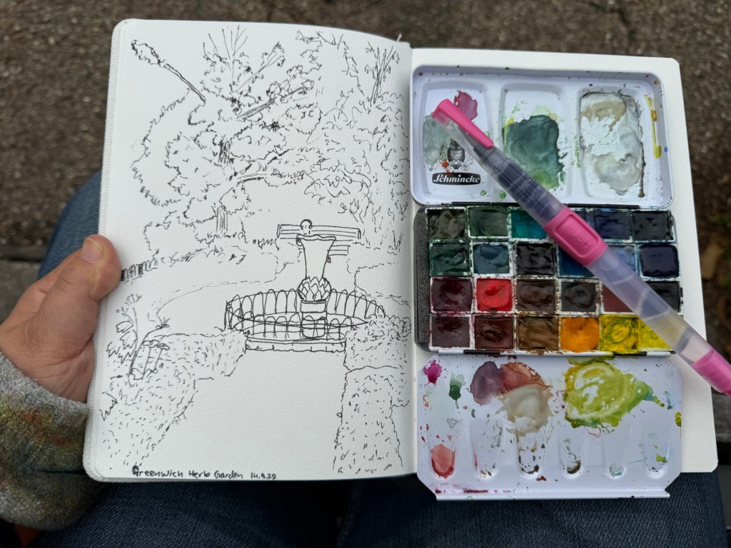
I created my first sketch in an Etchr lab cold pressed watercolour notebook while in the Greenwich Park herb garden and the paper is astonishingly good. Here’s the ink sketch (my tree sketches have gotten so much better thanks to a workshop I took in Poznan):
Etchr lab watercolour sketchbook sketch
And here is the watercolour:
The paper not only makes the colours pop, it actually allowed me ample time and space to work with the washes, adding layers of well blended colours that gave depth and life to the scene. Never have I ever seen the importance of good quality watercolour paper demonstrated so well. I have about half a dozen sketches of this garden throughout the years and this is by far the best one.
That’s it for part 1, I’ll try and upload part 2 later this week.
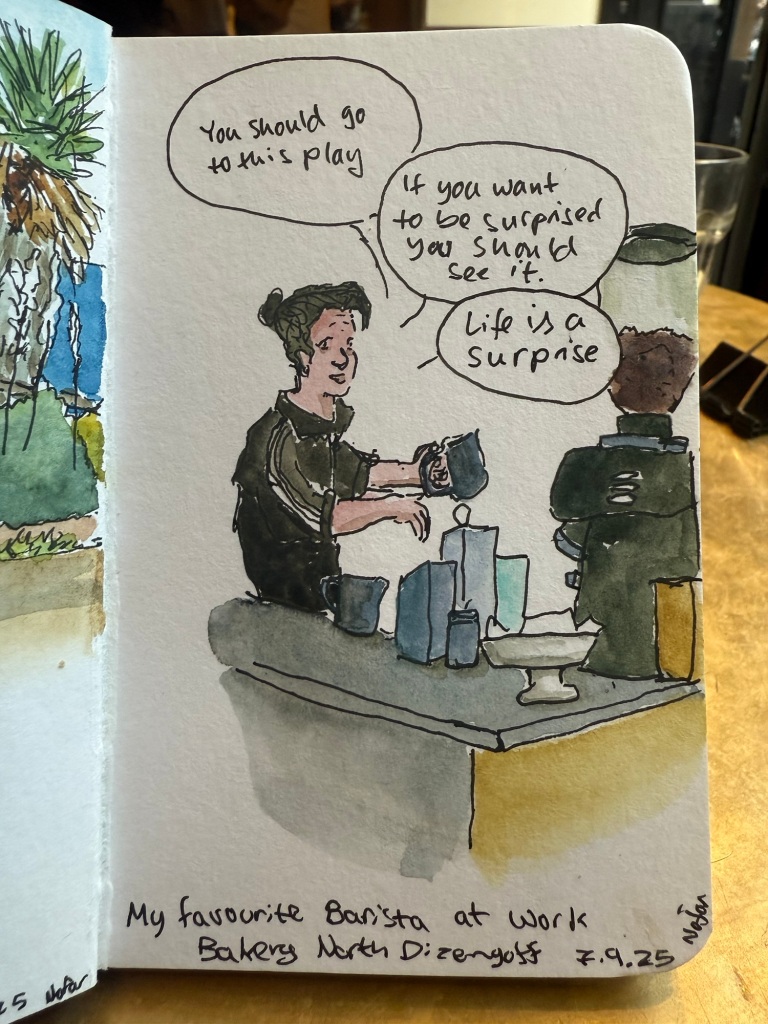
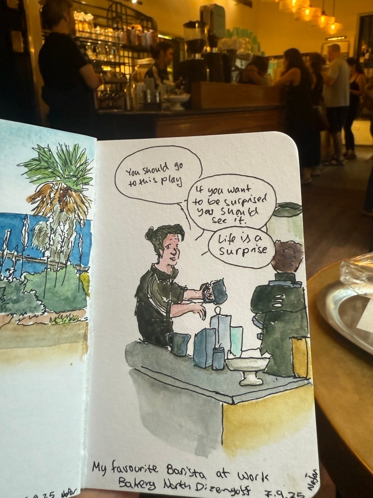
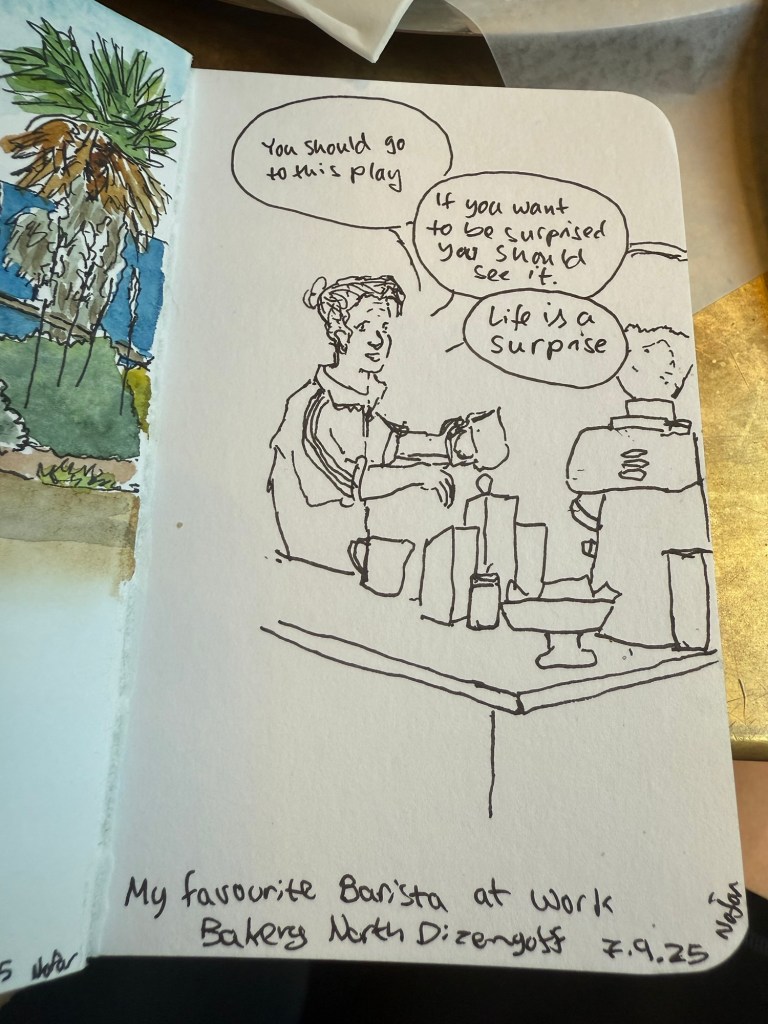
Went on a 5k run and then went to my favourite cafe and did a quick sketch of the barista. Had more time this morning than last time so this sketch is more detailed.