The Lone Tower
A blog about writing, sketching, running and other things
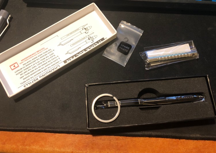
I am a big fan of Big Idea Design’s pens (the Ti Arto is my daily carry pen), and so of course I joined the Kickstarter for the Ti Click EDC Pen. Since I hadn’t tried their black anodised pens before, that’s the finish I opted for. It arrived yesterday, and even though I’ve been using it exclusively all day, I’l be the first to admit that these are only my preliminary thoughts on it. (See updates in the end for more detailed thoughts on this pen).
The packaging, as usual with BIGiDESIGN, is compact and neat. The pen comes with everything you need to fix it, should you need to (I’ve never needed to), and in a pretty nifty box.
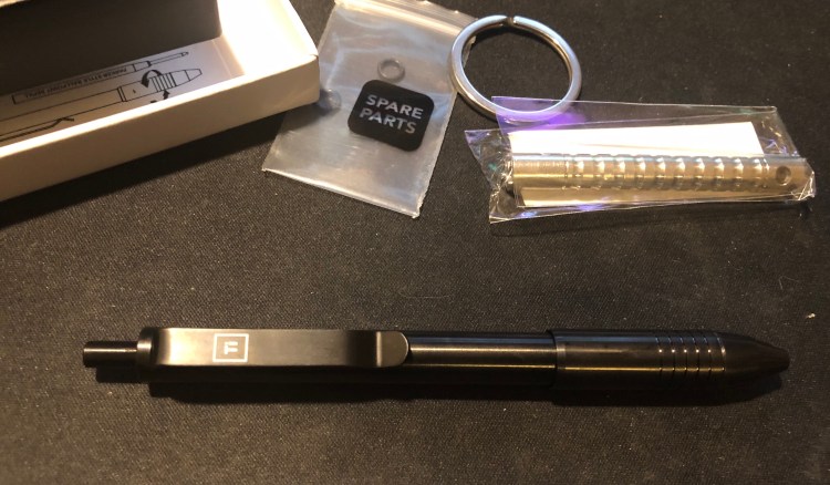
The finish on this pen is shiny and black, but it’s surprisingly not a fingerprint magnet, as I would have imagined:
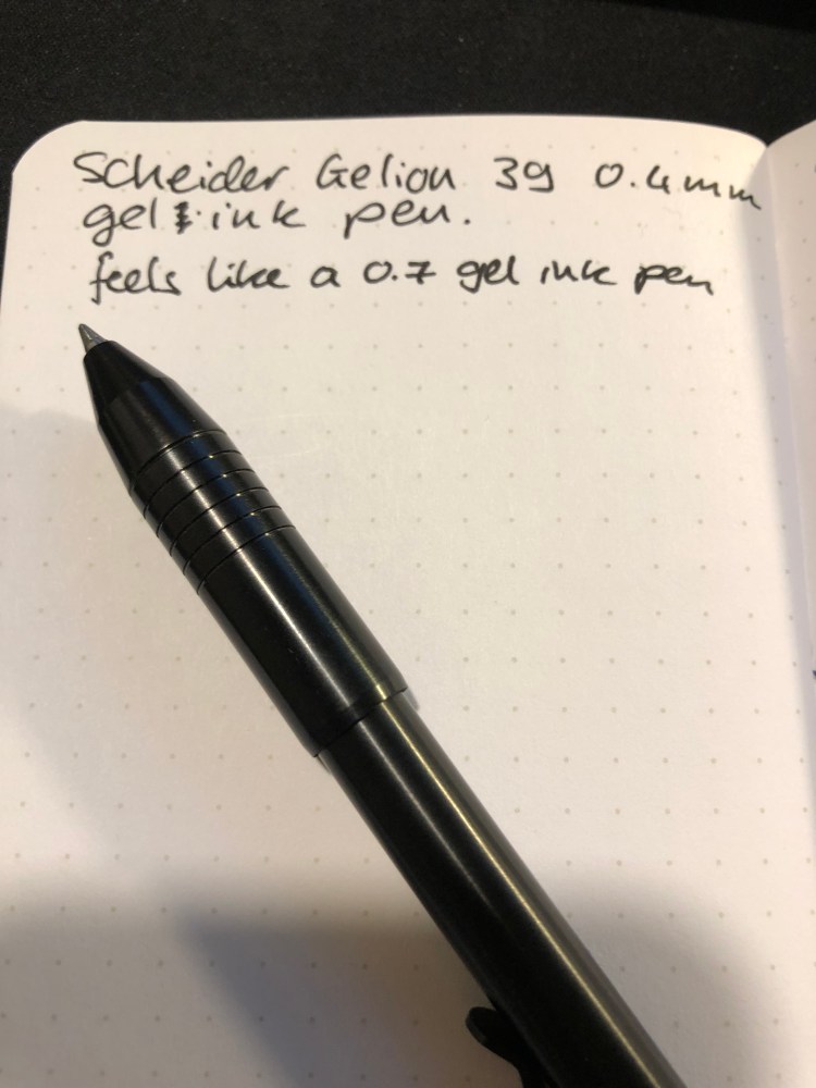
The pen came with a Scheider Gelion 39 0.4 mm gel ink refill. This is a new refill for me, and I can’t say I’m a fan. It’s as wide as a 0.7-0.8 mm refill, and I much prefer the Uni-Ball Signo UMR-85N refill that the BIGiDESIGN pens used to be shipped with (it’s me favourite gel refill).
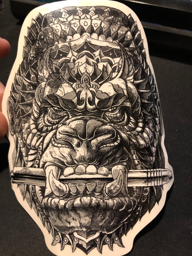
As part of the kickstarter, the pen came with a cool Bioworkz sticker, which you can see below:
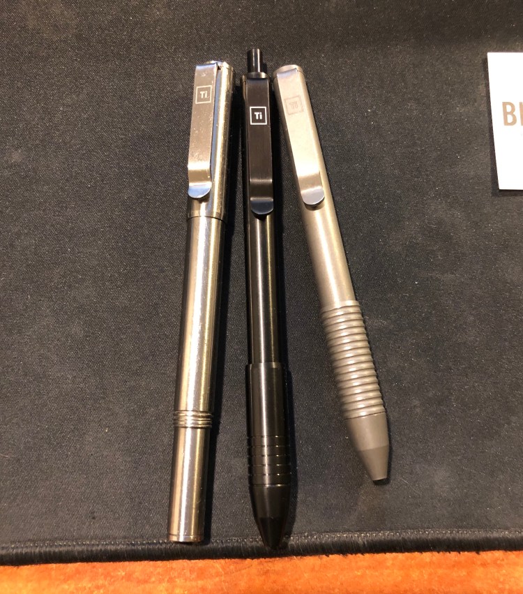
The pen itself is about the length of the Ti Arto, when the Ti Arto is capped, but the grip is much wider, about the size of the Ti Pocket Pro. That’s a bit large for an EDC pen, and it’s definitely not a pocket pen. The grip feels weird at first, but it’s very comfortable and well designed. You can see how the Ti Click EDC compares to the Ti Arto (on the left) and the Ti Pocket Pro (on the right) in the various finish options that the Ti pens come in (machined raw, midnight black, and stonewashed). My machined raw Ti Arto shows scratches much more than my stonewashed Ti Pocket Pro, but I’ve no idea yet how the midnight black finish wears.
This brings me to the only minus that the Ti Click EDC has – the click mechanism. It’s silent (no satisfying click), which will probably turn off those planning on using it as a fidget toy, and it doesn’t always engage properly. It’s especially prone to not engaging after you replace the refill. Make sure that you use the provided instructions to switch refills (and like other BIGiDESIGN pens this one accepts dozens of refills without using any spacers or requiring any special hacks), and take into account that you might have to fiddle with the grip a bit until most clicks work. This is not a minor drawback, as the whole point of the pen is its click mechanism. It should work 100% of the time and feel satisfying, not “soft” as it feels now.
For the price of the Ti Click EDC you could buy a Ti Arto (still their best pen), or a Ti Pocket Pro (if portability is super important to you), have some change for a bunch of refills and get a much better pen. I love supporting BIGiDESIGN and I’m glad that I got to try this pen, but for now it looks like the Ti Arto will continue to reign supreme in my rotation.
Update: After using this pen almost exclusively for a week, I stand by my first impressions. It’s slightly more comfortable to use in long form writing, but the click mechanism is garbage.
Update 2: The BIGiDESIGN guys contacted me and it turns out that you can significantly improve the click mechanism with some silicone grease. Using the clip fixing kit that came with the pen and their simple instructional video on how to use it you can get to the click mechanism, and then apply some silicone grease, which you can buy at Goulet Pens for example. I happened to have grease around, so I had no problem trying this out, and it fixes the problem of the click mechanism not engaging properly.
The click is now solid, but it’s still not much fun to use – there’s no satisfying click or solid feedback once the thing is engaged. You just push past a point, and then the mechanism partially bounces back. It’s a disappointment because most $2-3 pens have more satisfying click mechanisms and even Karas Kustoms EDK pen, which has a similar click mechanism, offers more feedback and an audible click once it’s engaged.
I don’t know how many Ti Click EDC pens were affected by this problem, and I’m glad that I have at least a “mostly OK” click mechanism for my pen now, but I stand by my initial review, that for a pen that advertises its click mechanism so prominently, this is not a great buy. Spend your money on the Ti Arto, it’s a pen worth having, or go for the Ti Pocket Pro if you’re looking for an EDC pen. Those are truly great pens, while the Ti Click EDC is OK to “sort of good” at best.
I got these notebooks because I like Field Notes more minimalist designs, and this is most certainly one of them. I’m not a fan of dot grid though, so I’m not sure whether I’ll actually enjoy using it.
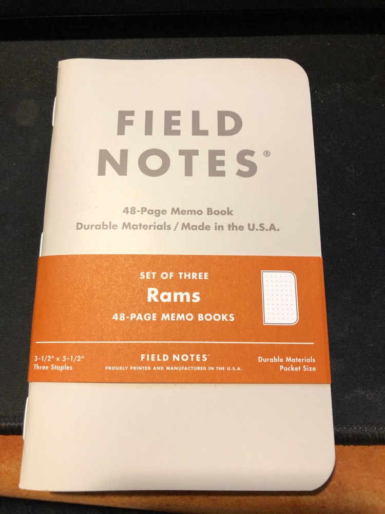
The orange highlights go well with the cream coloured covers and the grey type.
White staples, to complement the covers: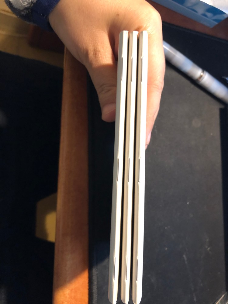
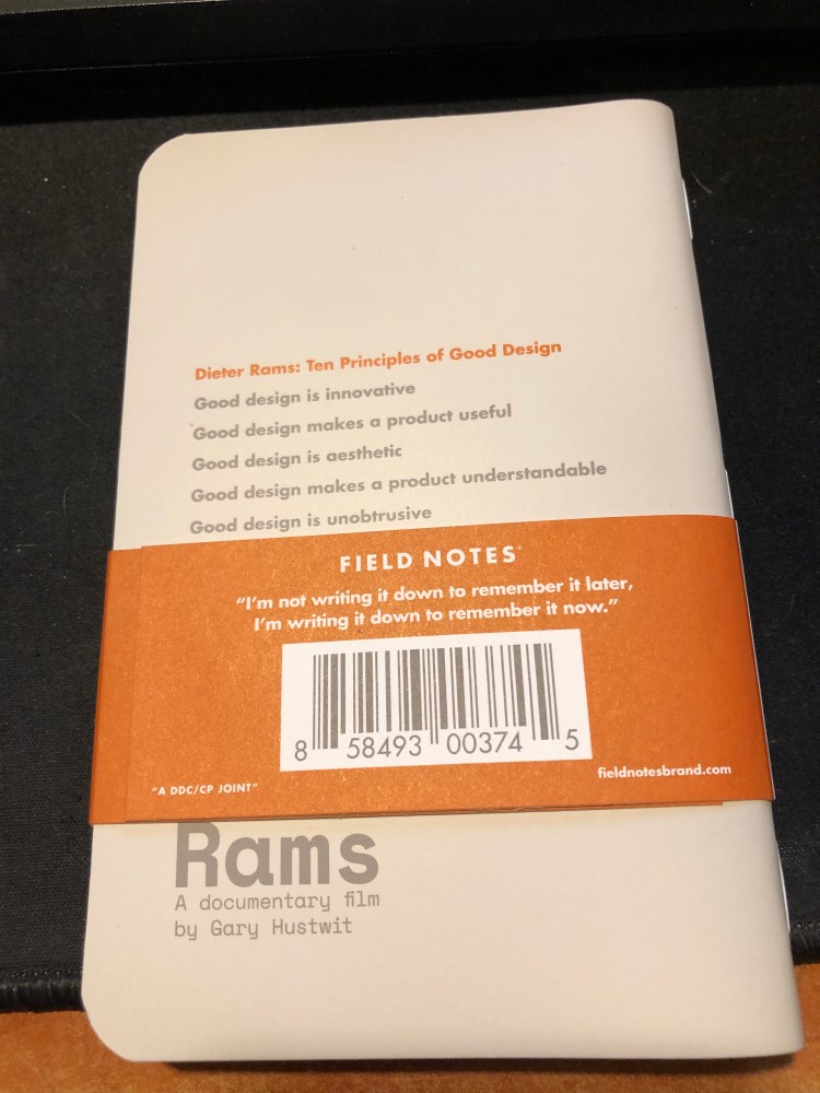
The best part of this notebook, Dieter Rams Ten Principles of Good Design: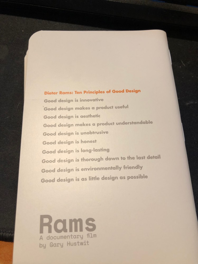
Testing the pages a bit:

The reverse side of the page:
The Field Notes Rams edition is a utilitarian notebook that would be perfect with a Lamy 2000, provided that you’d fill the pen with something like Noodler’s Black. As it is, because of the dot grid, I have no idea when and how this edition will get into my rotation. If you prefer dot grid notebooks, this notebook is definitely worth checking out. Otherwise, the more colourful Three Missions or the more interesting Clandestine would probably be a better purchase.
A few more insights into how I got back to reading, beyond using a reading journal, as it has come up in conversations lately (people are gearing up for 2019 resolutions, I guess):
This has been my journey back into reading. Take from it what you wish, but if I can distill them they’d look like this:
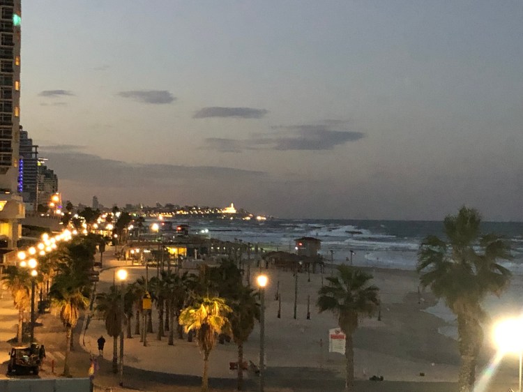
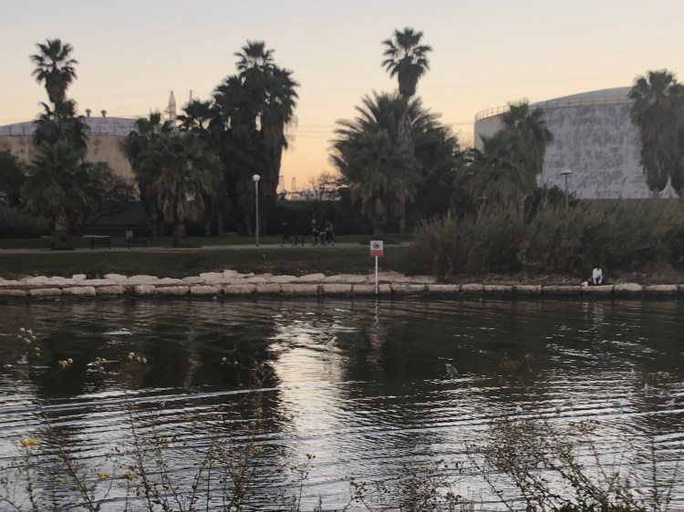
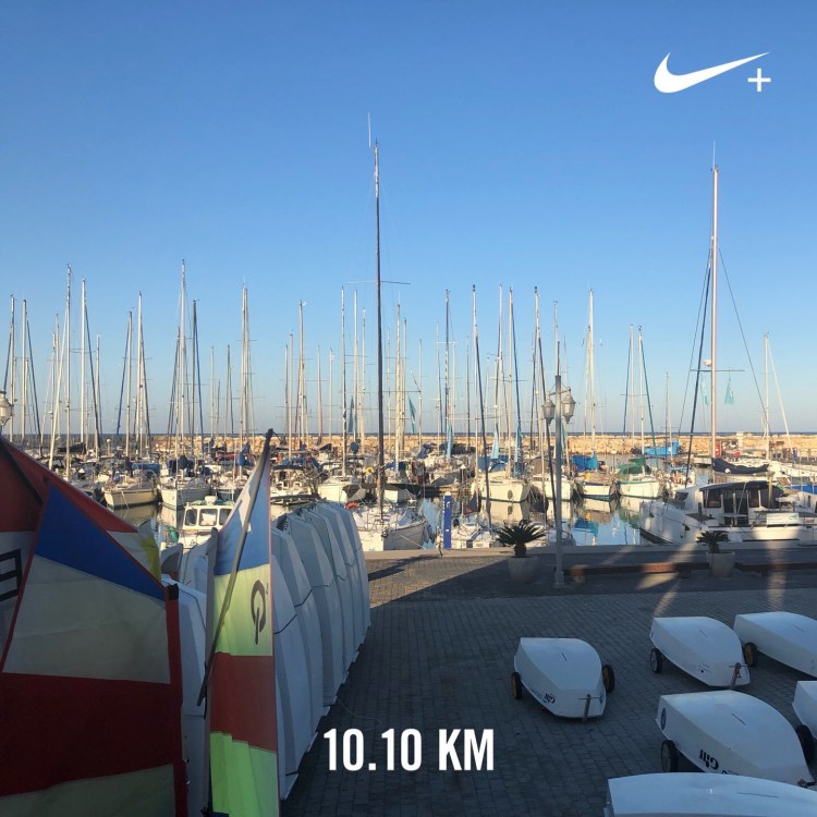
Last week’s long run was cancelled due to horrific weather conditions, but this one was run in almost perfect conditions, as if to compensate.
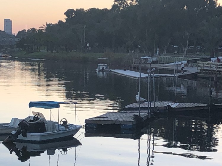
Check out this great bittern all camouflaged away waiting for some unsuspecting fish to come along. He’s in the water, on the right centre side of the photo:
Geese and gulls in the sunrise:
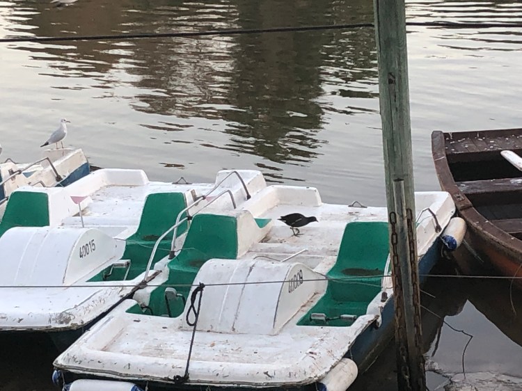
This little coot climbed on board the peddle boat and started nosing around for something good to eat. They’re pretty shy, so it was cool seeing him so relatively clearly:

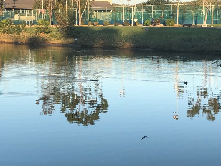
A cormorant swimming in the middle of the river:
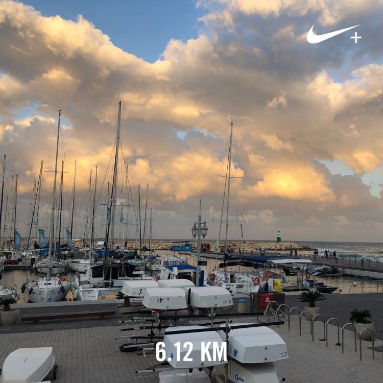
10km done and dusted.
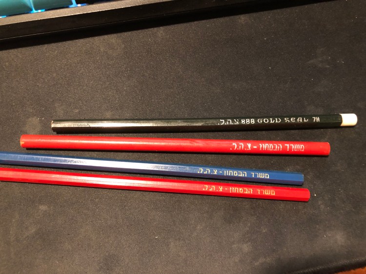
A lucky find in the Jaffa flea market, three pencils and one coloured pencil made by Jerusalem Pencils, likely in the 70s or maybe the 80s, for the IDF.
This year’s filled up Field Notes notebooks all piled up:
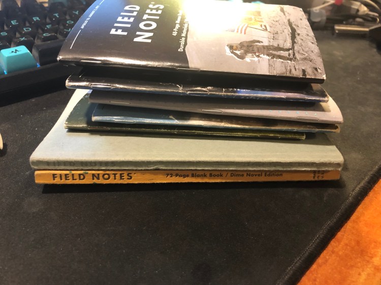
And spread out:
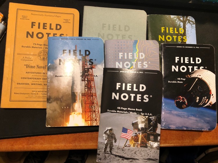
I use them mostly for to do lists, quick capture and tracking of various short term goals. The Signature Sketchbook is full of doodles, inktober drawings and rough sketches. My favourite by far has been “Dime Novel”. My least favourite has been surprisingly “Costal”. The cover and design are gorgeous but the reticle grid is just too dark to make it enjoyable to use.
Ironically enough, by the time I finished with my MA in English Literature a few years ago I had “lost” the habit of reading. From someone who used to read at every available (and not so available) moment I had turned into a non-reader almost entirely. This bothered me so I set up to rectify it by “gamifying” reading until I had tricked myself back into the habit again.
Field Notes had just come out with their Arts and Sciences, the perfect format for my plans. The idea wasn’t only to create a journal where I would log my thoughts on each book as I read it, but create a little set of “achievements” that I could unlock for each book as I read it. For each quarter of the book I read, I got an achievement, a little logo that symbolized the book which I drew on a separate page. The accumulation of those silly little symbols was enough to push me forward as I learned to enjoy reading again. I kept that up for three Field Notes Arts books and then when I ran out of them, I simplified the format and moved to the Moleskine Two-Go, which had just come out. The Field Notes Arts notebook wasn’t fountain pen friendly so I used a Karas Kustoms Render K, a Blackwing pencil and the Caran d’Ache Bicolor 999 double sided coloured pencil.
On the first year that I tried using this system (from March 2016) I got from not reading any new books (just my old familiar favourites) to reading almost 20 new books. On the second year (2017) I got up to 42 books. This year to date I’m at 58 books, and I’ll probably read 60-61 books by the end of the year. I no longer need to spend time drawing little “achievement badges” as my reading habit is back here to stay. I do, however, still keep a book journal even though I’ve started using Goodreads since 2017. It’s a satisfying way to keep track of my reading and organize my thoughts on the books that I’ve read.
You can check out the format of the entries for fiction and non-fiction below. The unlined left side of the spread (verso) is where I do a little doodle that reminds me of something central in the book, and explain the star rating that I gave the book in each category. I really recommend that if you choose to create your own analog reading journal, you create your format yourself. Mine has changed over time, particularly for non-fiction, and it works with my reading goals for the year.


This is the index, which is useful for reference later on and is a good way to check my reading progress throughout the year.

Ever since I’ve read the book “Triggers” by Marshall Goldsmith about six months ago I’ve been searching for ways to track the progress of my Daily Questions (“Did I do my best to…”). I tried using my journal for several months, then used a Google Sheet for two months, and in both cases something was missing. The Google Sheet was great for statistics and tracking, but not as satisfying and meaningful as writing my daily scores down (and I didn’t really find the statistics useful). The journal was much better, but as my goals changed it was time consuming to create a new table each time, and I needed a way to for me to justify my daily scores.
Enter tracking system number three: a Moleskine pocket Peter Pan limited edition notebook and an index card. Let’s start with the notebook:
The Peter Pan Moleskine limited editions showcase some of Moleskine’s best design work in recent years. Both the colourful covers, the drawing and the lettering evoke the spirit of Peter Pan without resorting to Disney-esque tropes. They’re naive without being childish, colourful without being brash, and the quotes on the covers are brilliantly selected.
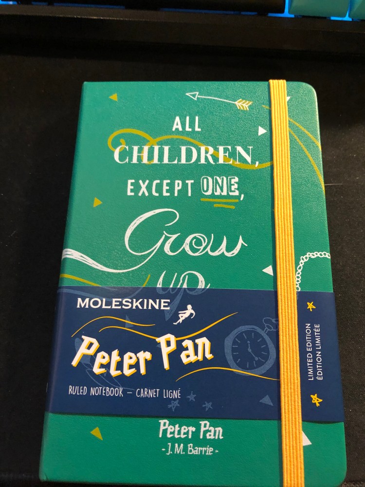


Inside the covers are more illustrations in the same vein and even the famous “In case of loss” is set in a hand lettering like font. The palate of the entire Peter Pan line is limited (navy, orangey-yellow, green and white) but it never feels that way.

The back cover. Again, extra points for aligning the design so well with the back pocket. It almost seems like they’re flying into it:

This edition comes with stickers that are a lot of fun and well drawn in a naive style:

And the B-Side of the sleeve instructs you on how to build paper planes and also uses quotes from the books or that reference the book:

So that’s the review of the notebook itself. I highly recommend all of the Moleskine Peter Pan notebooks — they rank alongside the Denim and some of the Harry Potter limited edition notebooks as my favourites of recent years. I didn’t buy it specifically to try to use it as a Triggers Daily Questions tracker, but it was languishing in my “to use” pile and a used notebook is better than an unused notebook, so I decided to give it a spin.
The idea of writing down my Daily Questions each time was what made me stop using my journal for this purpose in the first place, so I decided to write them down once on an index card (which I would slip in the notebook’s back pocket), and then number each question, and date the card. Every day I would write down a score for each daily question, and a very short justification for the score. The justification is short to make it easy to write them down (if it’s a hassle I’ll have a hard time sticking with it), and that’s why I chose the pocket notebook (it’s also light and easy to carry around). When I feel like I need to change the questions up, I’ll create a new index card, put an end date on the old index card and archive it in the notebook’s back pocket. Every day will be dated in the notebook, and I use the appropriate index card if I really want to reference that particular day in the future. This may seem a little clunky for reference purposes, but as I learned over time, I don’t really go back to reference my past answers, so that’s not a meaningful setback.


I’ll check in a few months and document how it goes, but judging by my previous experience, this looks like a pretty good setup for now.
There’s not much to say about this run except that I really needed it and really enjoyed it. So many bad things are going on in my life right now, it’s good to have running as a way of letting out some steam and escaping for a while.