Vengeful Fortress Part 4: The Well

What would you have done?
A blog about writing, sketching, running and other things
What would you have done?
So back in the beginning of February I published a post about how I use my notebooks to manage my “New Year’s Resolutions” (i.e. yearly goals) in the hope that it will help people craft SMART goals for themselves that they can actually achieve. I explained in that post that I use a “stretch goal system” that allows me to hit my goals if I put in some basic regular effort into them, and then push myself gradually as I see how the year develops. For each “stretchable” goal I tailor the stretch goals based on my performance in previous years, and based on where I want to put more effort in any given year.
I wrote these goals at the end of 2019, and then, by the end of February and the beginning of March Covid-19 turned my life upside down. More and more restrictive “stay at home” directives have been issued, my travel plans were cancelled, I cancelled my participation in one 10k race, and my participation in the Disneyworld Star Wars Rival Run 5k and 10k races was cancelled, my dentist cancelled my yearly checkup appointment, I started working from home, the last few weeks of my DevOps course moved to remote Zoom lessons, and my planned move to a DevOps team required a bigger struggle than I anticipated. Also, unrelated bad things happened in my family, because that’s how life is.
Never have my stretch goals or resolution planning been tested to such an extreme, and that includes the annus horribilis of 2018. So how did my resolutions fare?
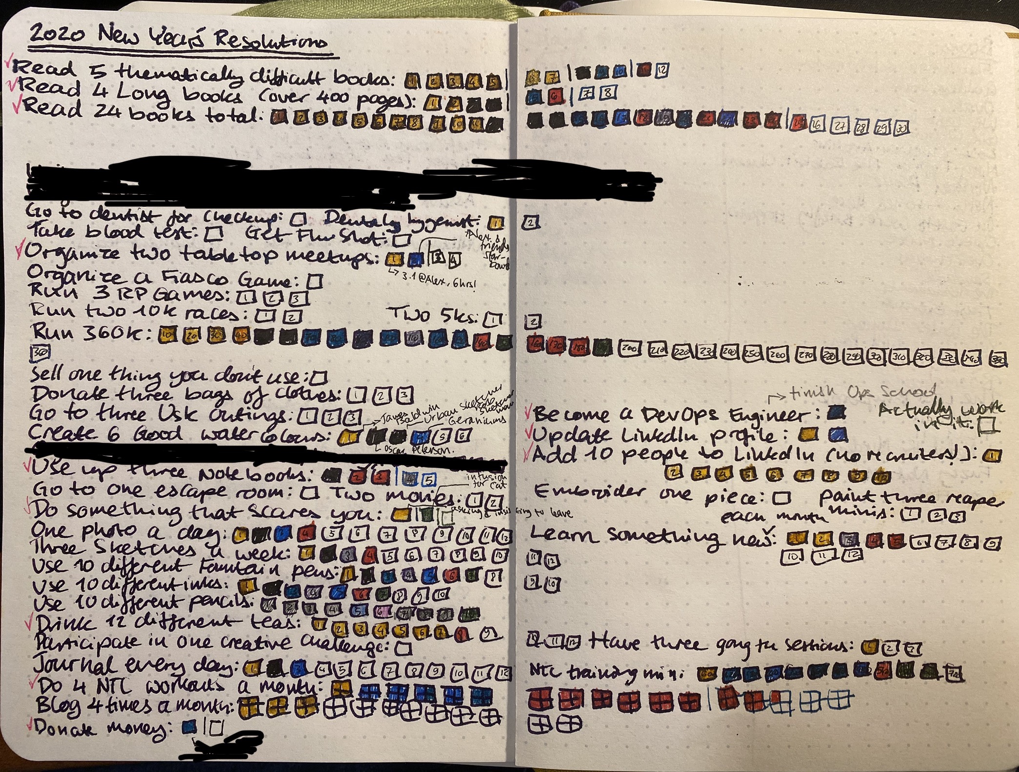
Overall, better than I expected. Here’s the breakdown and some (hopefully helpful) thoughts:
Exercise goals: These were a mixed bag, but they could have been much worse. All my races were cancelled and it appears that there won’t be any races this year. This just means that I had to get back into Virtual Races, and I’ve enrolled into the Disney one (so expensive, but I decided to splurge because it looks like I’ll be saving a lot on racing fees). That will take care of some of my race goals, and I’ll just have to figure out one or two more to take care of the rest. My running at first really hit a snag because of the restrictive lockdown, so I had to learn to run in really tight circles. The plus side? I managed to break my 5k record, and I’m challenging myself to run hills more. My NTC workouts got a huge boost because I’ve been staying at home and Nike has been killing it with some great workouts lately. After the first two weeks of lockdown depression, alone and away from my family, I realized that not exercising was practically killing me. So I’m running and training every single day now, no matter what. I highly recommend the NTC app: it’s free, has great workouts, and a super friendly design.
Writing goals: These took the biggest hit, because of the terribleness of things around here and in the world, and because until April I was swamped with DevOps course work. I’m forcing myself back to writing, and it has been slow, but hopefully it will pick up.
Reading goals: I’ve managed these the best, despite everything, and it’s mostly because reading has been a blessed escape during my darkest hours. I can still completely disappear into a book, and even terrible books give me things other than current affairs to be mad about.
Drawing goals: These also initially took a hit, but I’ve put some effort into them, and with ideas like my “Vengeful Fortress” one I get a drawing, writing and a somewhat D&D-esque game all in one. My drawing classes have been on hiatus since March, and I have no idea when they’ll return.
“Using my stuff” goals: In March and April things got worrying job-wise, so I put shopping on hiatus, and I’m even now careful about stationery shopping sprees. My notebook use needed some rethinking as I started working from home, but I’m back on track now, and using a lot more of the stuff that I’ve purchased. The only downside is that some of my stuff is at work, and right now I have no way of getting to it.
Journaling goals: This has been a rollercoaster in April and this month as well, partly because I was swamped and partly because I was too depressed to write. Trying to get back on track and deal with the feelings of those days that I’ve missed now.
Social goals: These are the only goals that I’m going to utterly have to rethink. Some of them have moved online (board games, meetups), others will just have to be postponed to later this year or to next year.
I’m trying not to be too hard one myself, but also challenge myself to get things done. Past me thought these goals were important, and present me still thinks most of them are. Where an extra effort or some extra creativity needs to happen I’m trying to make that more conscious effort. I’ll see by the end of summer where things shape out and re-tailor everything for what looks to be a difficult winter.
Keep moving, keep looking ahead, take care of yourself and your loved ones, stay at home, and be kind to yourself.

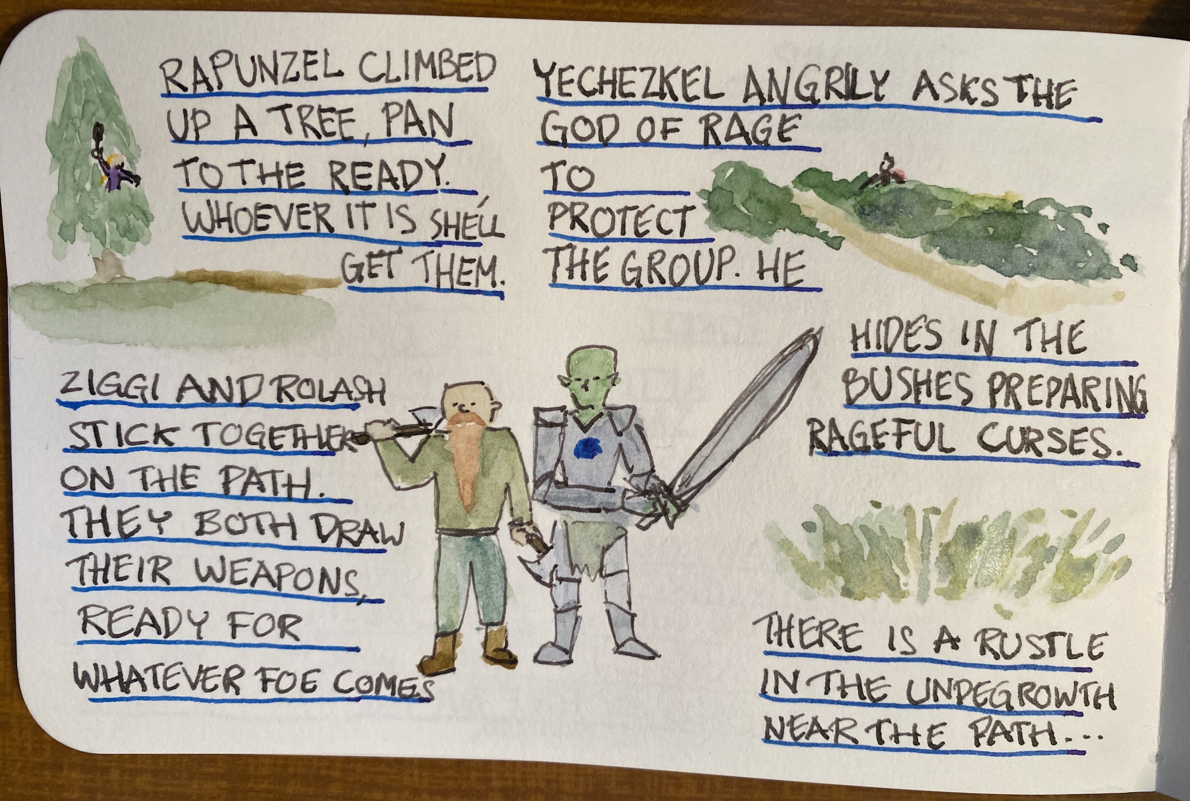
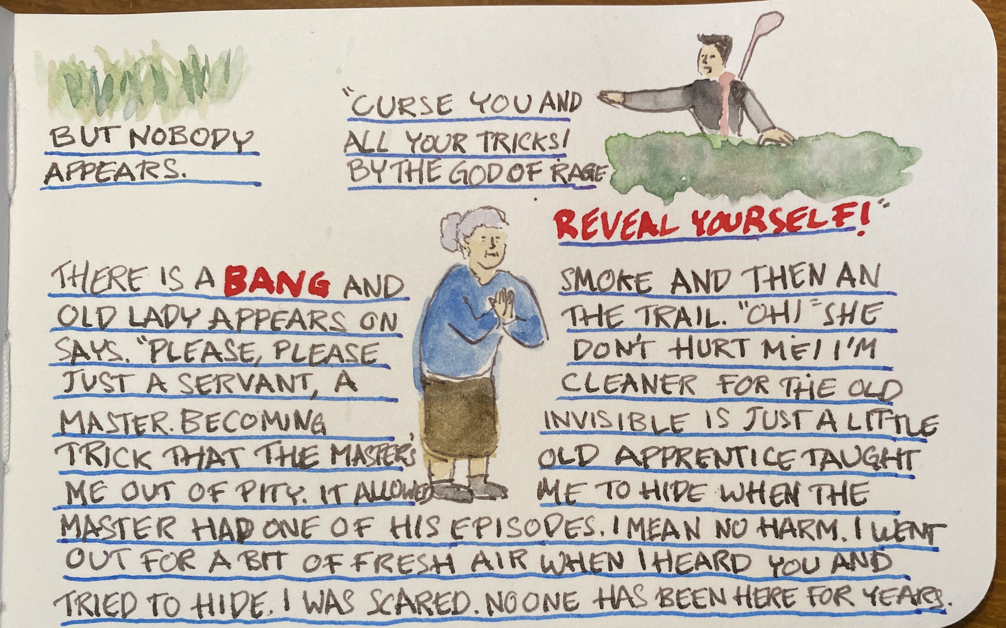
Welcome back to Vengeful Fortress, a fantasy roleplaying game that I’m drawing in ink and watercolour (no pencil underdrawing, to save time) as I’m running it for my group of players. We’re now in Part 3, and here are Part 1and Part 2 (which also include a review of the sketchbook I’m using, the Stillman and Birn Epsilon).
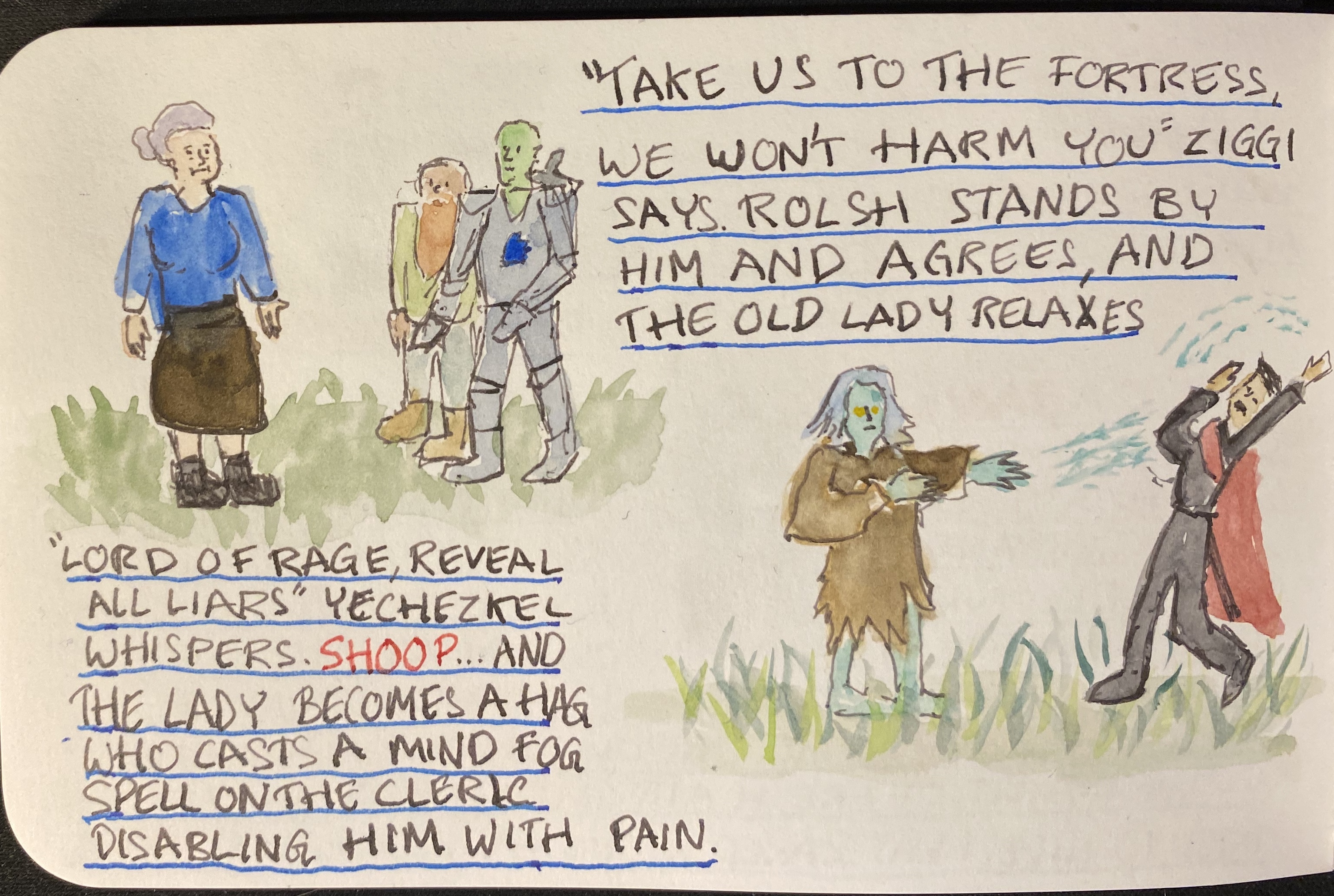
As you can see, things are starting to heat up. I’m using a TWSBI Diamond 540 fountain pen with a fine nib, filled with Rohrer and Klingner SketchINK Lotte. SketchINK Lotte is a black pigmented and waterproof fountain pen ink. It’s not a saturated ink, and you can see the grey shading quite clearly here in the lettering and the line work. R&K SketchINK Lotte is also a hard starter, so while it does flow well enough when you get it primed up with a few preliminary scribbles, if you put the pen down for even a few minutes, you’re going to have to prime it again. It is, however, waterproof and relatively fast drying, which makes it worth my time using it. In case you’re wondering if “hard starting” is just an issue with this pen or this nib, I have tried R&K SketchINK Emma and Lotte in a Lamy Safari and a Super5 pen and they are hard starters in all cases. It seems to be a property of the ink, perhaps because it dries to relatively quickly, or because of the particular waterproof formula R&K are using here.
So know that you can trust the Rohrer and Klingner SketchINKs with your watercolours, and know that they’re great for when you’re in a rush and don’t want to wait for the ink to dry, but also have a bit of scrap paper for the first few seconds before you use them .

You can find part 1 here. You can see that there is a slight bit of show through with the Stillman and Birn Epsilon, but at only 150 gsm that’s to be expected.
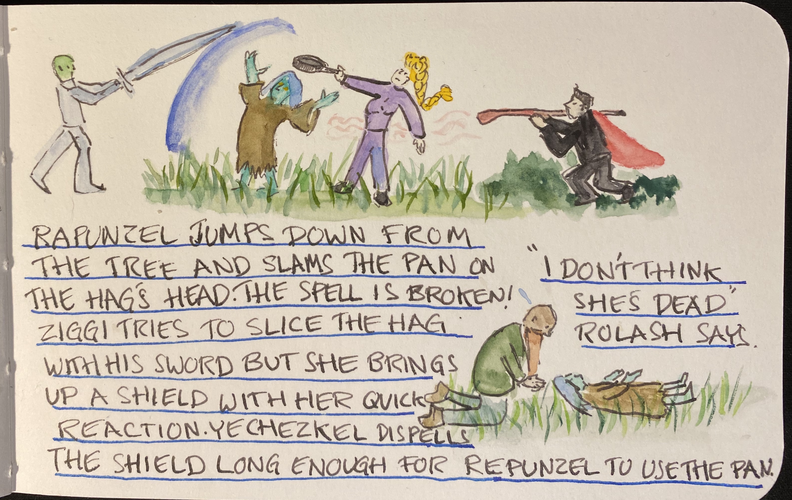
I decided to play a bit more with ink colours and wider nibs here, so that’s a Sailor medium stub nib and Diamine Inkvent Blue Edition Candy Cane ink for spells and effects:
There’s no show through for the ink, and though it may not seem that way, there was no spreading. Also, if you like granulating watercolour effects, the Stillman and Birn Epsilon paper seems to be a champ for that.

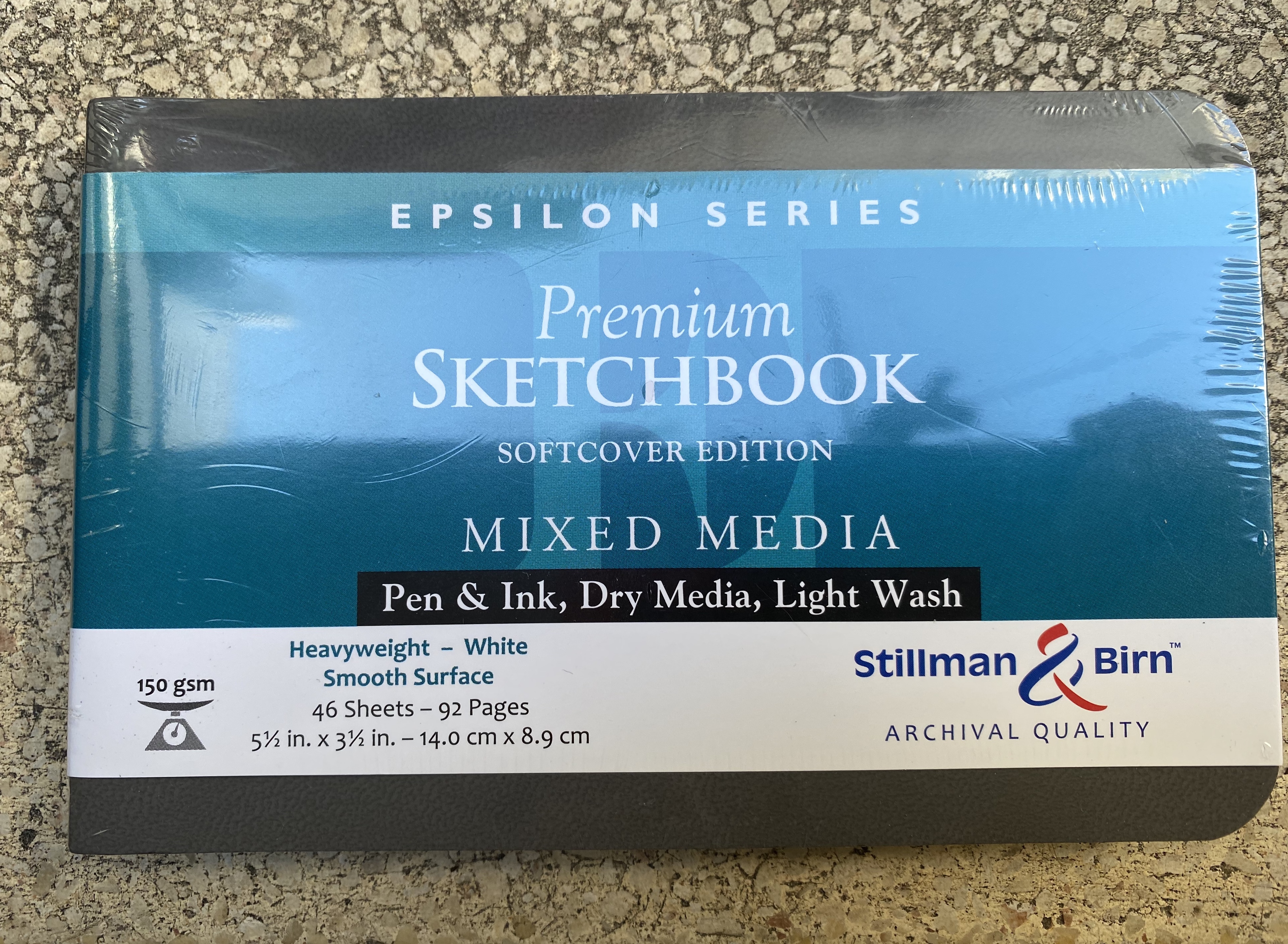
A while ago a local art supply shop started stocking a wider variety of Stillman and Birn sketchbooks. I currently use the Stillman and Birn pocket Alpha as my daily sketchbook, but I decided to give the pocket Epsilon a try. The Epsilon features smooth, white 150 gsm pages which should work for pen, ink, dry media and light washes.
This sketchbook is in landscape format, which is what I normally prefer. I was planning to use it once I’ve finished with my current Alpha, but weeks stretched to months and meanwhile this sketchbook has been languishing away, unused.
So when I saw Liz Steel going on a virtual sketch tour in Italy, I was inspired to grab this notebook and fill it with a sketch tour of my own. I initially planned to sketch out my cancelled London trip, and I may yet do that, but something inspired me to take this idea to a completely new direction.
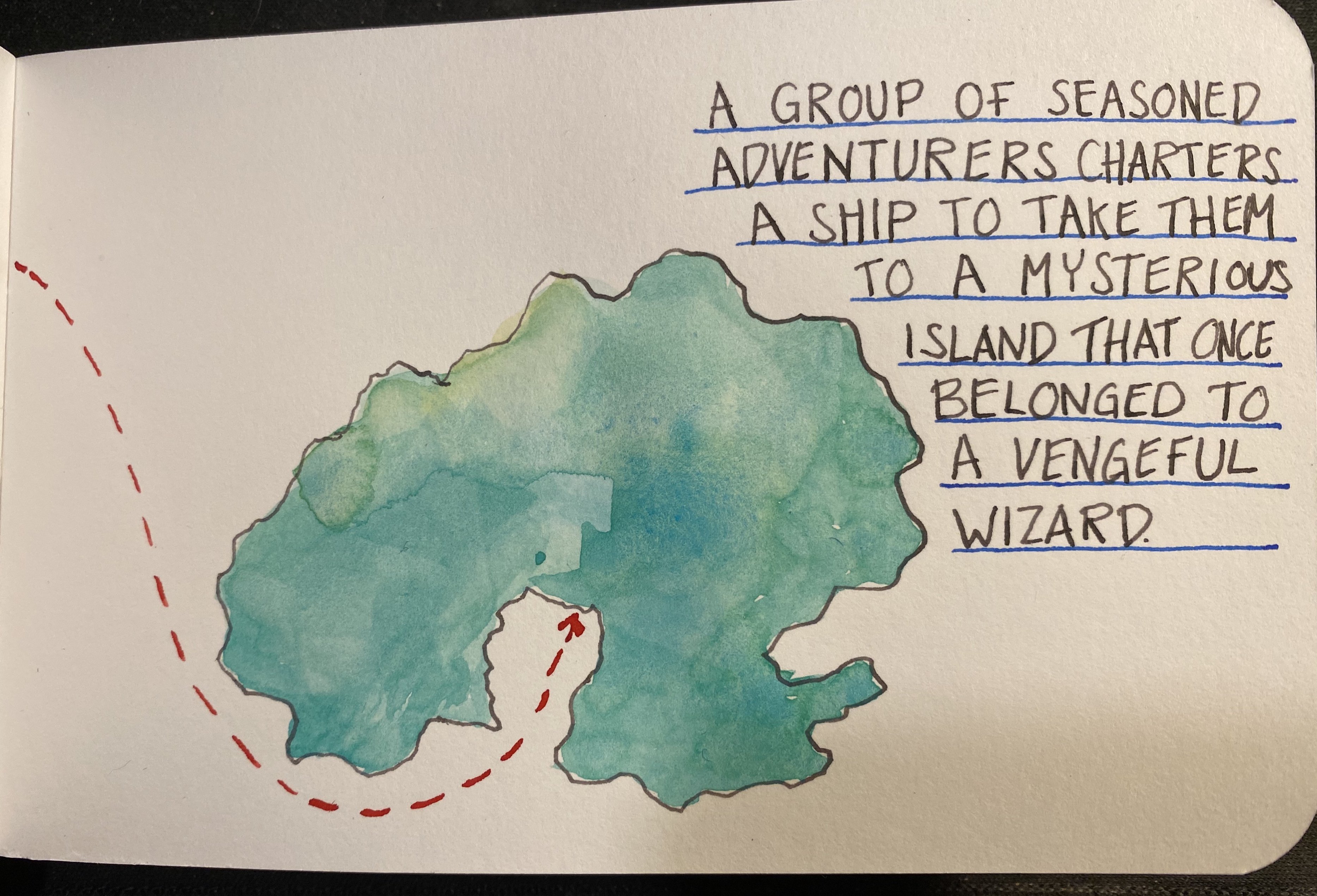
I’m going to sketch out a freeform fantasy roleplaying adventure for my regular D&D group, and use that as a way to test out this sketchbook, and to make good use of my fountain pens.
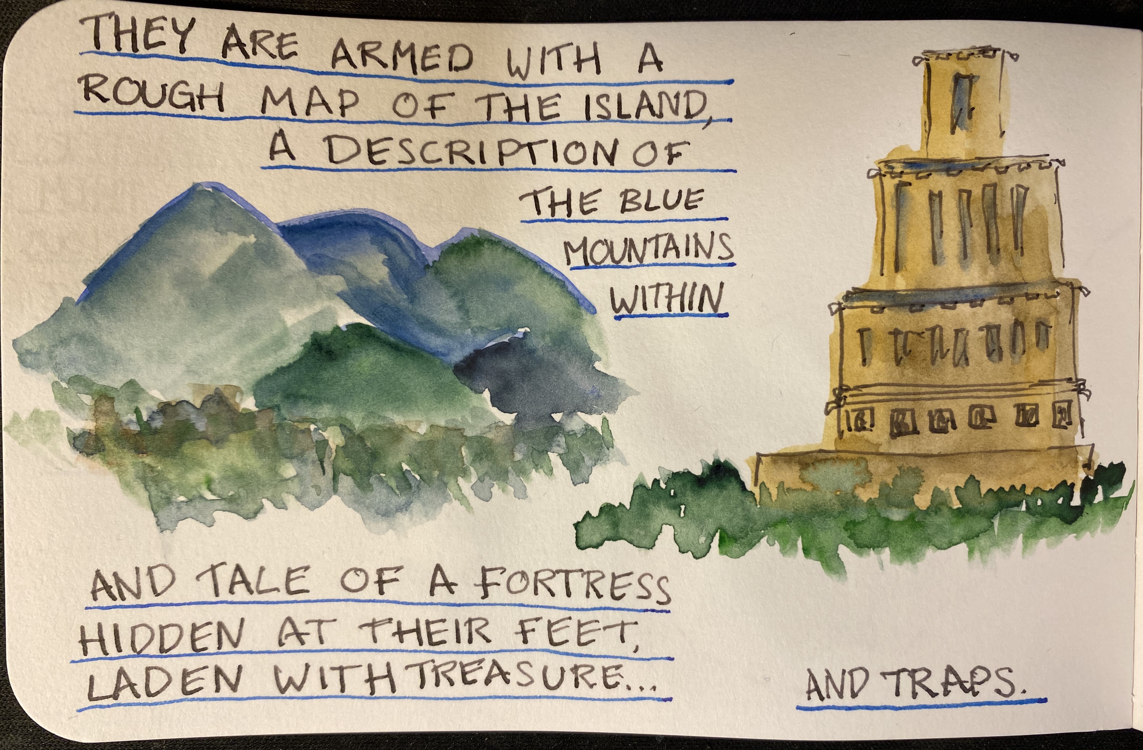
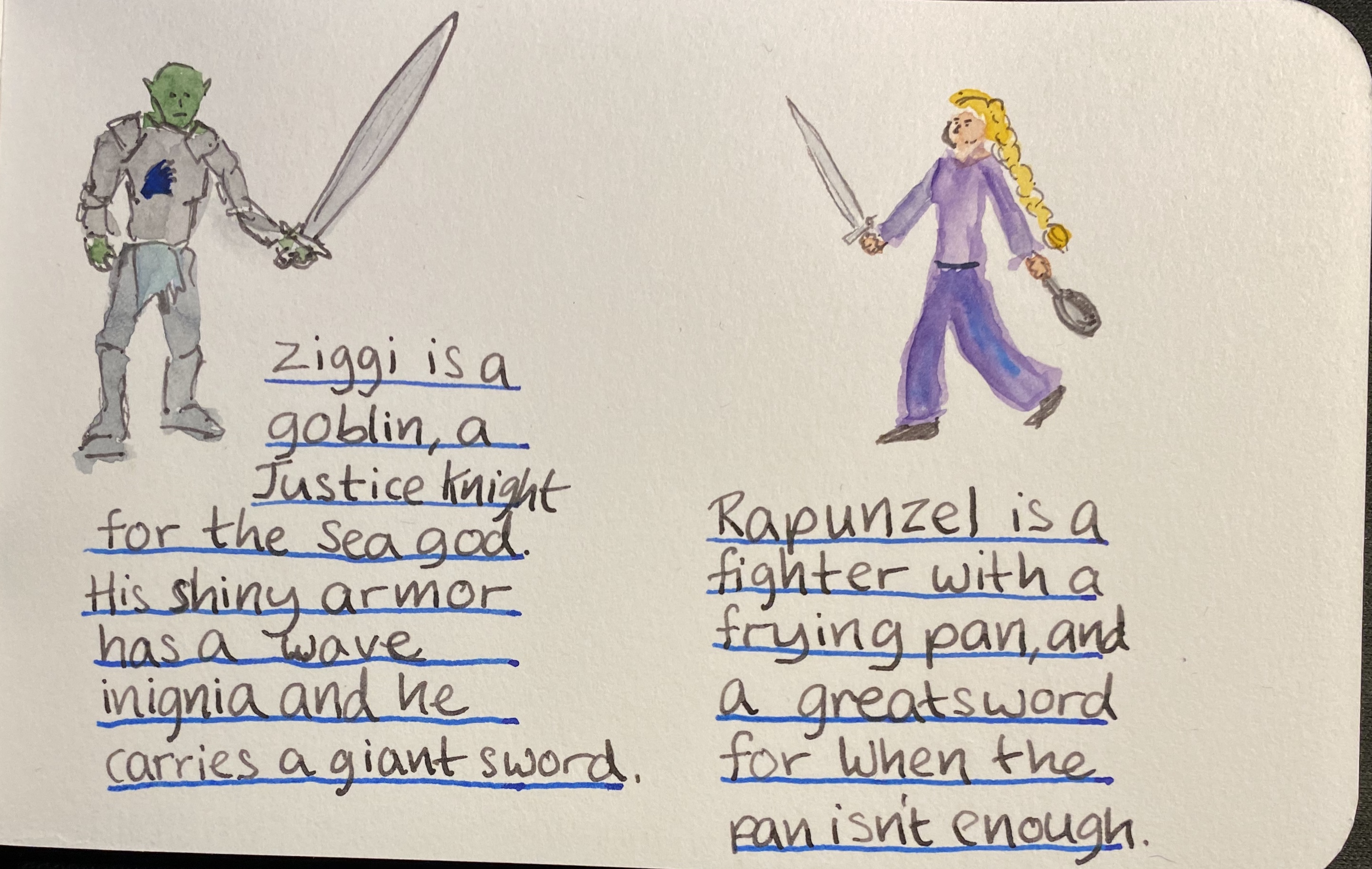
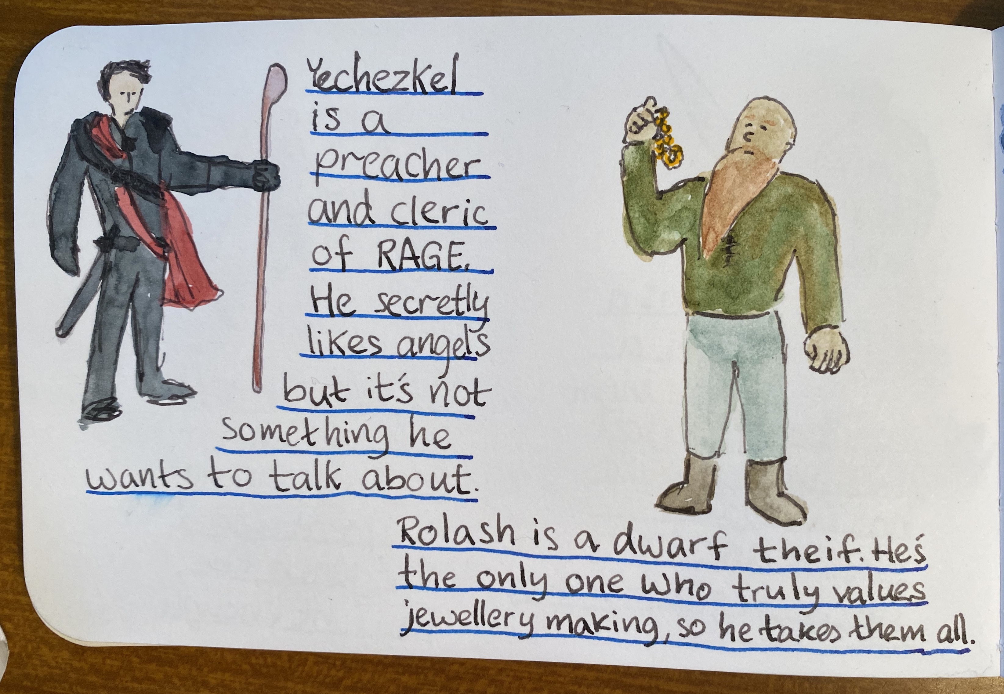
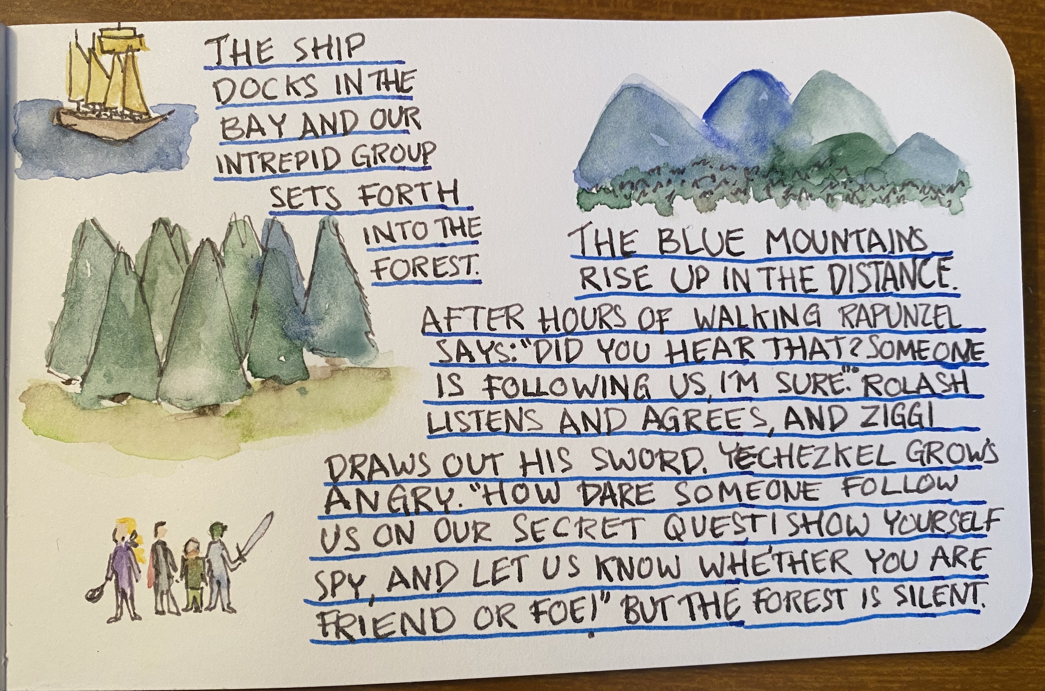
So without further ado: Vengeful Forest, a fantasy freeform adventure.
The watercolours are Schminke and I used a Windsor and Newton Series 7 number 2 brush and a Rosemary and Co 772 brush
I’ll continue posting as the adventure progresses, but so far this has been a lot of fun, and the players seem to be enjoying it too. The Stillman and Birn Epsilon has been an absolute champ: it takes light washes beautifully, with very little buckling, allowing me to use both sides of each page. It also works well with fountain pens, especially fine nibbed ones, which are commonly used for sketching. The white paper makes everything pop, and even though 150 gsm isn’t much when it comes to watercolour, it did allow for some layering and reworking without turning into a messy paper pulp. This is a sketchbook that I’m definitely going to purchase again.
I’ve had a rough week, hence the lack of posts. Here are some cat cartoons I created for your enjoyment while I get ready for more substantial updates.

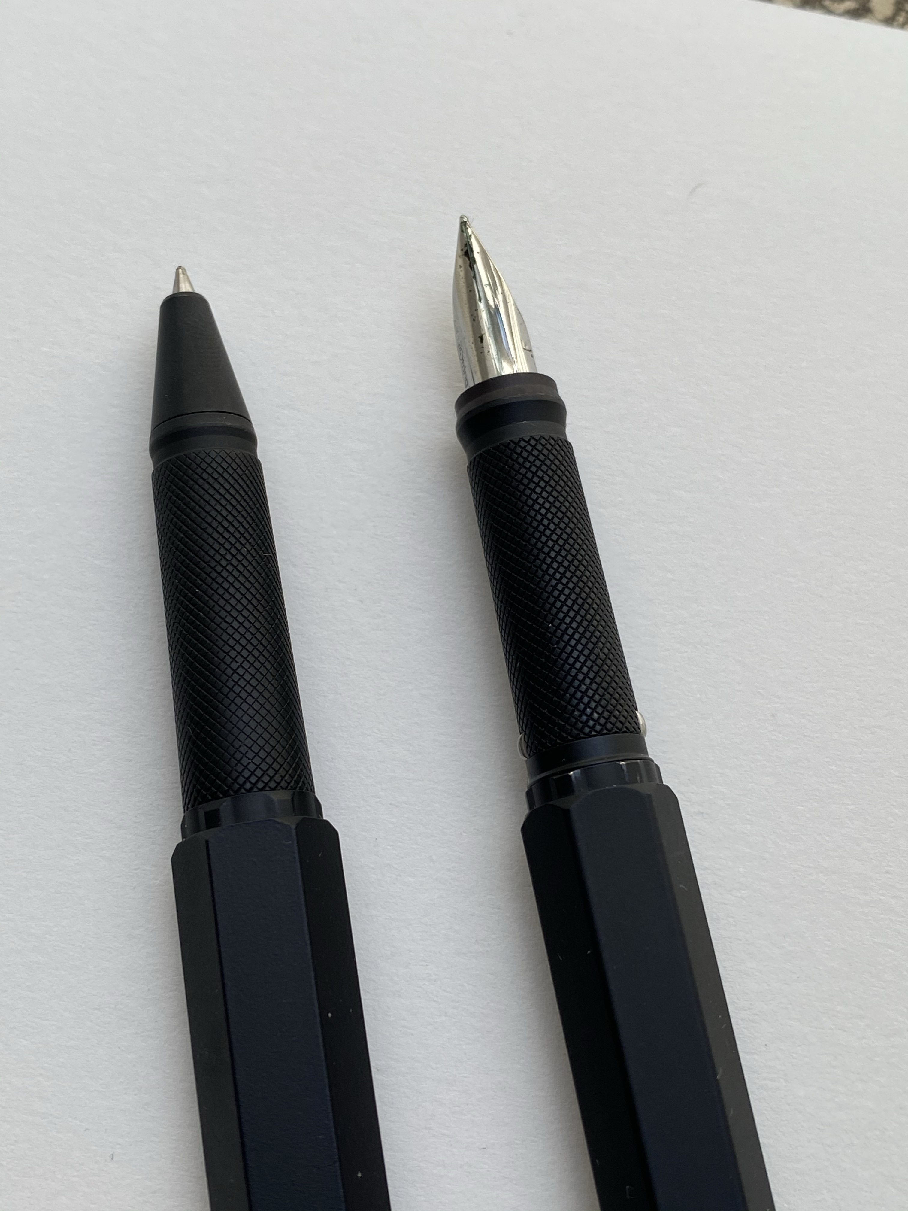
I haven’t bought a fountain pen on eBay in years, but when I decided to celebrate completing a six month intensive DevOps course, I headed out to eBay in search for the Rotring 600 Levenger rollerball. Yes, you read that correctly, I was looking for the Rotring 600 rollerball, not the fountain pen. I love the design of the Rotring 600 Levenger pens, but I thought that there was zero chance that I’ll manage to snag a good quality fountain pen, not to mention a fountain pen and rollerball set, so I decided to focus on the cheaper to obtain rollerball. As it turned out, I landed on an estate sale Rotring 600 set, and managed to get a Rotring 600 Levenger fountain pen and rollerball in great condition for a pretty good price.
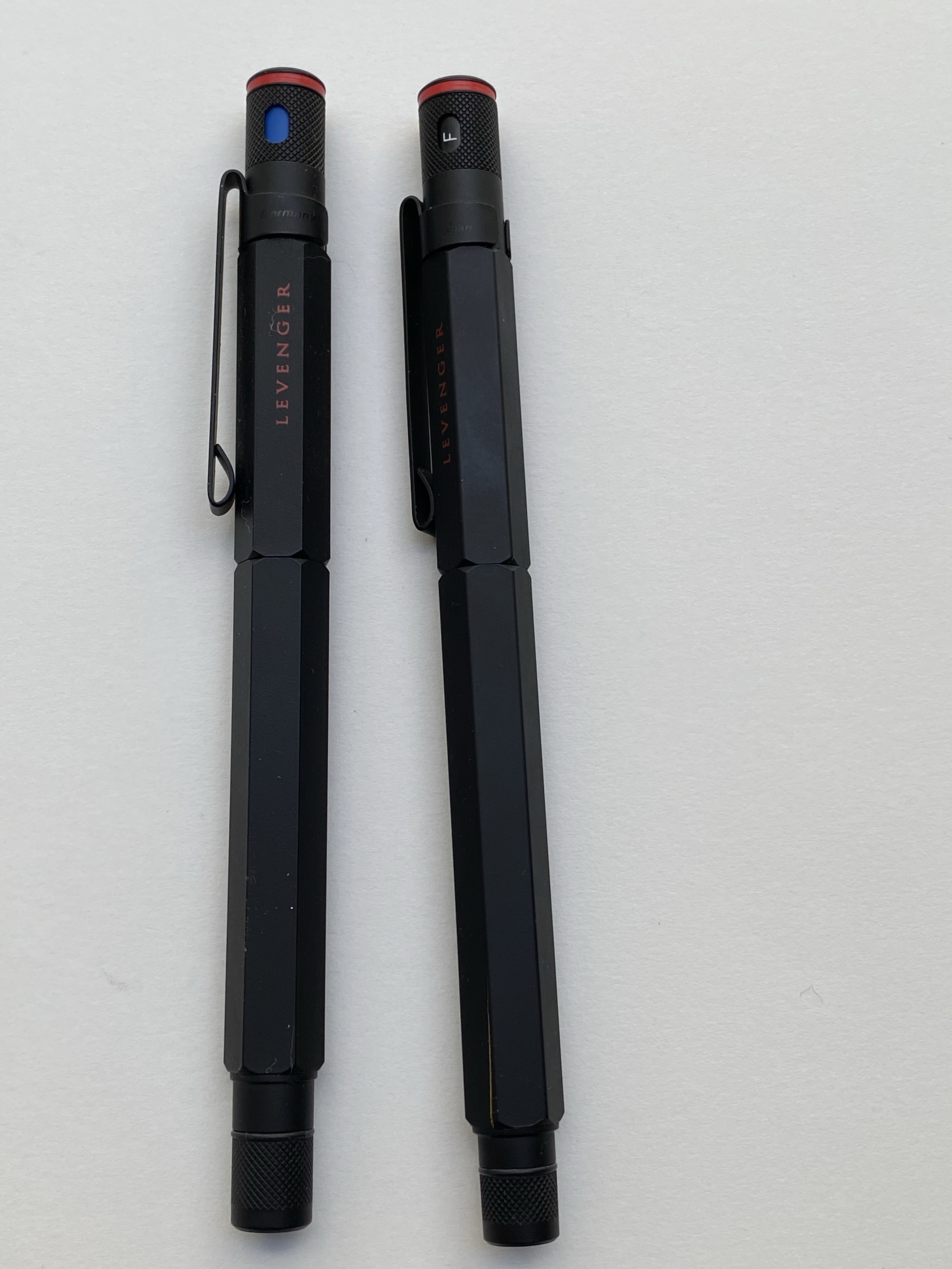
The Rotring 600 Levenger pens aren’t flashy. They both have metal hexagon bodies with knurled ends and the classic Rotring red rings on the cap ends. The cap ends and the grip and the pen finial and round, and the pen body and cap are hexagonal, and somehow the transition between these two shapes is perfect and seamless. Industrial design at its best.
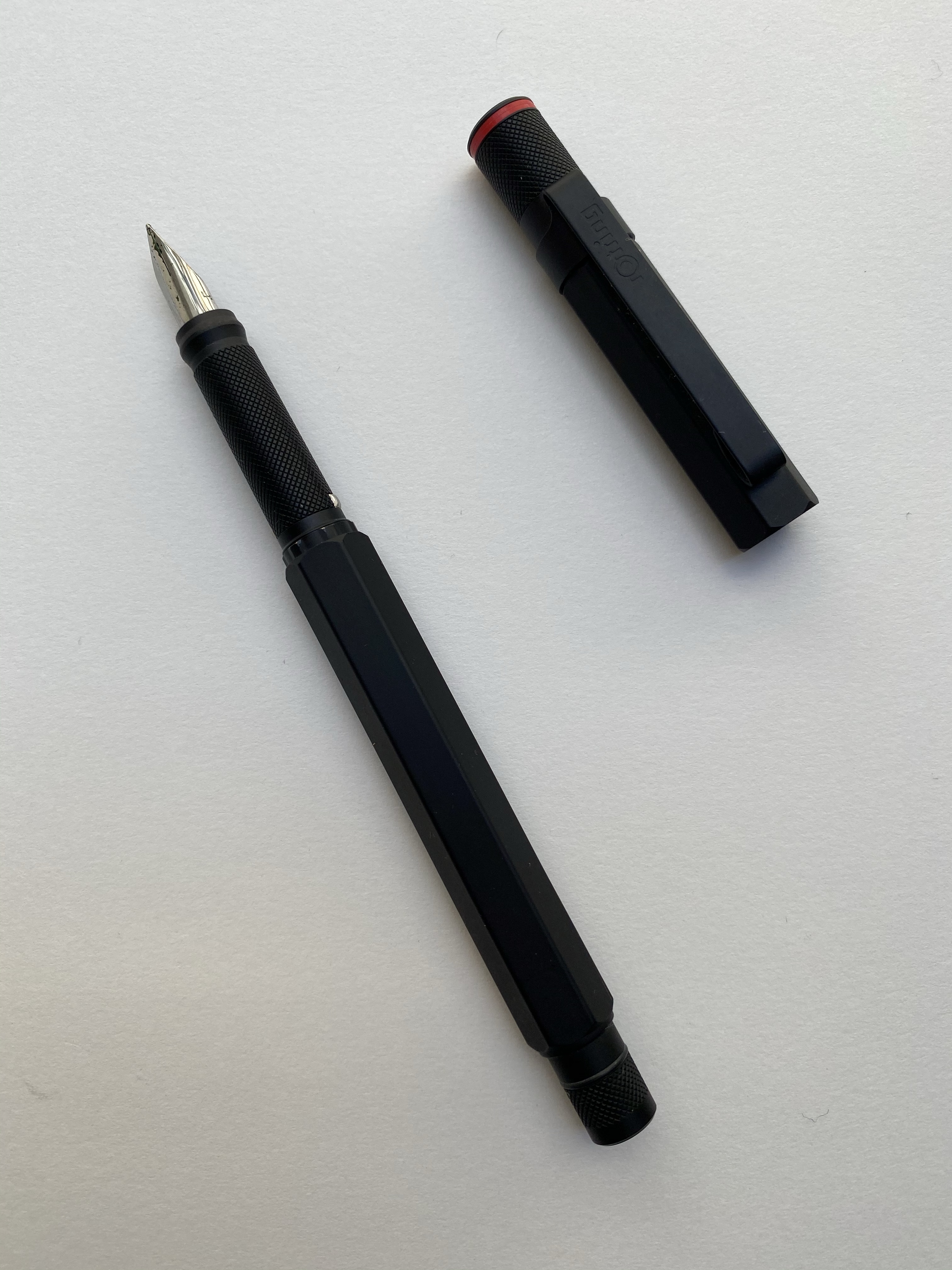
The fountain pen cap snaps into place with the help of the two silver protrusions on the knurled grip section. These protrusions don’t get in the way while writing, no matter how weird your pen grip is, and the section itself is very comfortable to hold. The knurling isn’t as dense as on the Rotring 600 mechanical pencil, and it is smoothed over so it doesn’t dig into your fingers. It provides a secure grip, while giving the pen the traditional Rotring look.

Because of the silver protrusions the pen cap snaps very securely into place. The fountain pen came with no converter, just unbranded short international cartridges, but it was easy enough to take the converter off my Super5 pen and use it here. The nib grade is indicated on the pen cap, which is what you’d expect on a drafting pencil. I like that oh so Rotring touch.
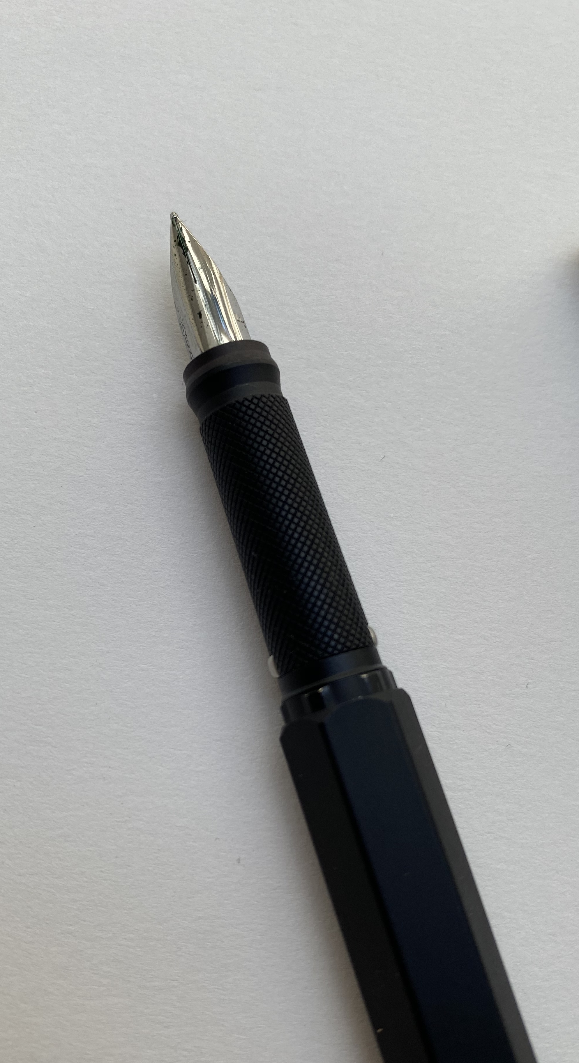
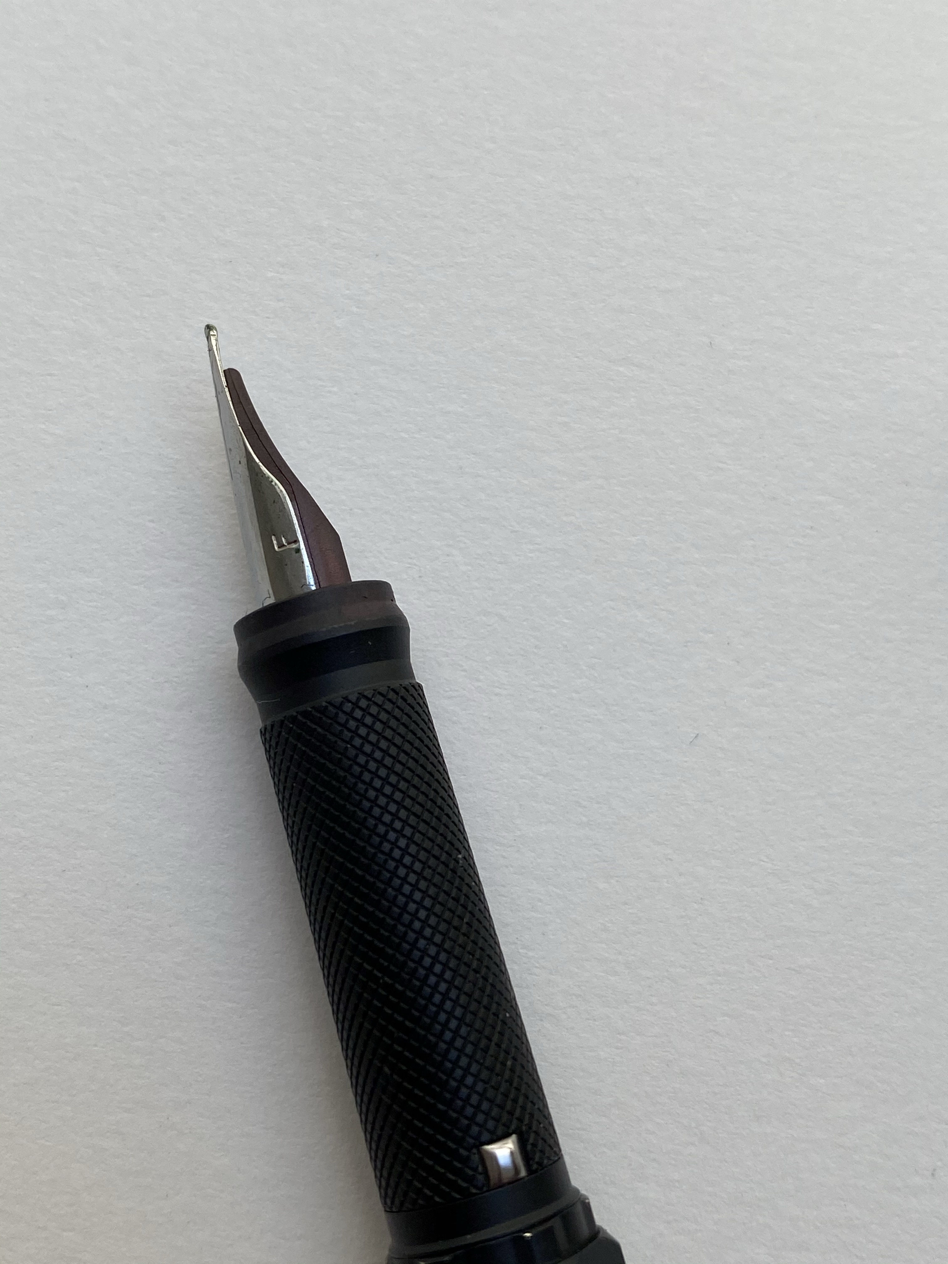
The Rotring 600 fountain pen comes with a steel nib that’s shaped a lot like a Lamy Safari nib. It’s stamped with Rotring’s logo on one side, and the nib grade on the other.
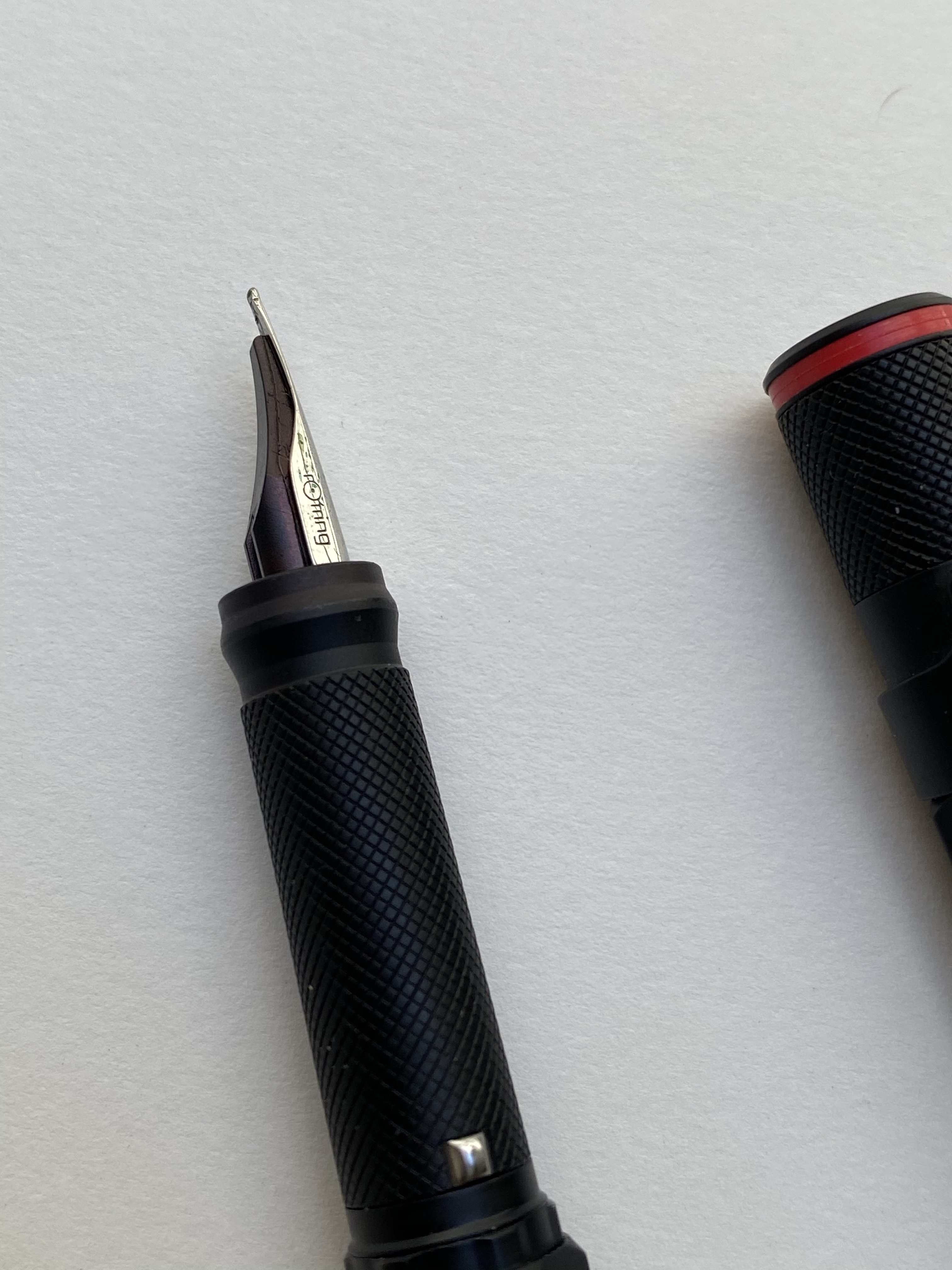
The nib is smooth and a lot of fun to write with, but it’s on the wider (European) side of fine. A 0.7 mm width line. Check out that grip section design:
The rollerball has a blue indicator, presumably for the colour of the ink refill inside. By the time I got it the refill had dried out, and so I replaced it with my favourite refill, the Uni-ball UMR-85N gel ink refill. This is the reason I bought the set and I couldn’t be happier with my purchase. Just look at it:

That’s so sleek and so clever, and I have no idea why they stopped producing them. Side by side you can see that the knurling on the fountain pen is slightly more pronounced. You can hardly feel the difference when in use, but I thought that it’s worth pointing out.
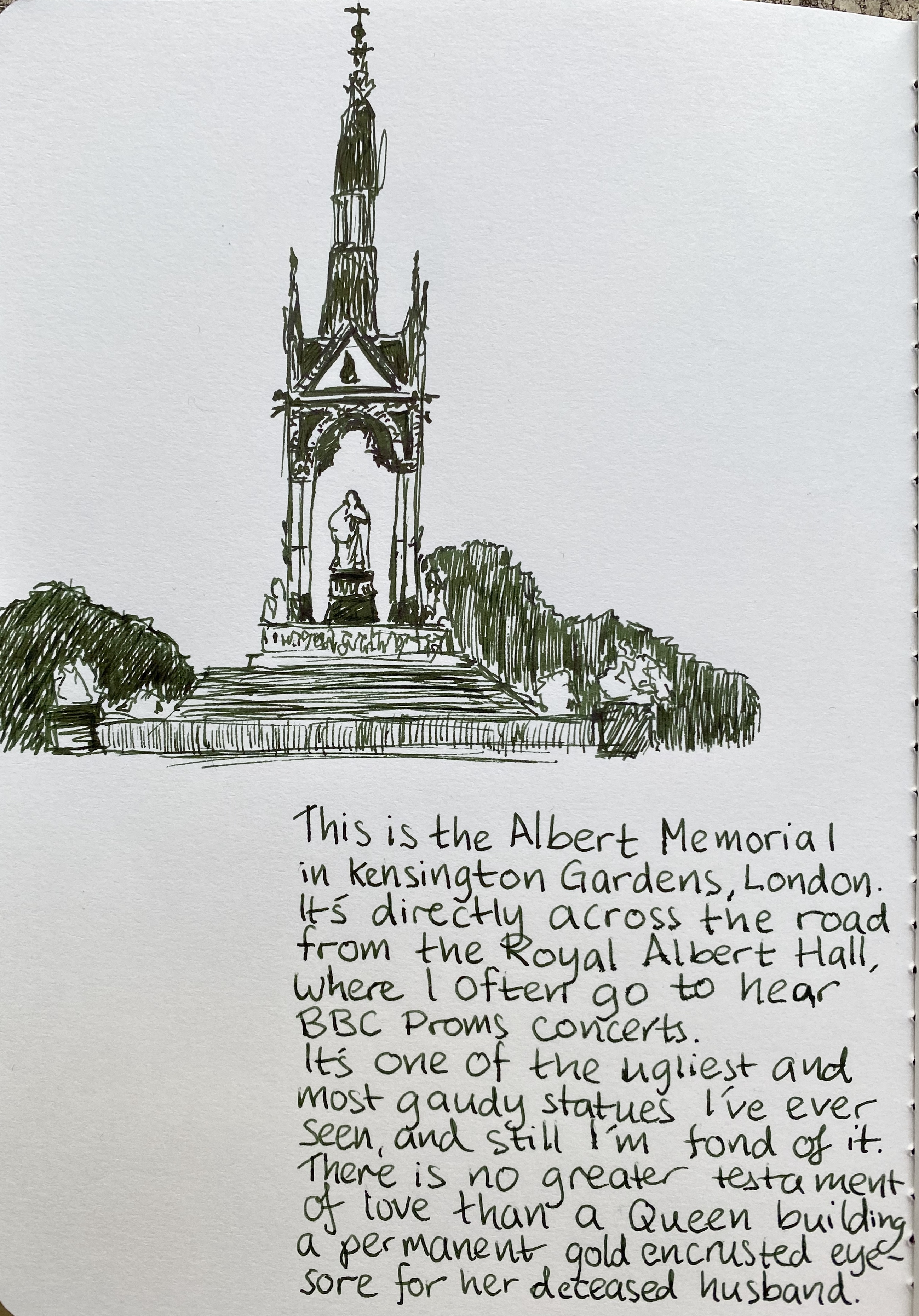
And here is that glorious nib in use, with a quick sketch of the Albert Memorial in London. The ink is Sailor Jentle Ink Epinard, which is a fun ink to sketch with an a green ink dark enough that you can sneak it into office use (not that anyone would notice or care right now).
It’s been a tough time, and a long and challenging six months course, but I couldn’t be happier with my “reward” for finishing it. If you run across a Rotring 600 rollerball or fountain pen at a reasonable price, by all means, buy them. The design on these pens is the kind that belongs in museums it’s so good, and they are a lot of fun to use too.
Rotring, if you’re listening, bring these back!

The Retro 51 Blue Acrylic is the last Retro 51 that I have yet to review as part of my Retro 51 challenge (minus the Retro 51 Flower and Retro 51 Coffee which are quarantined in my office). I bought this pen years ago in the Latin Quarter in Paris, in a little store on Boulevard Saint-Michel. The store had a few Retro 51 tornados in their dusty window display, and after some hemming and hawing I went in and asked about the pens. The proprietor had no idea what I wanted to buy from, but after some pointing he brought out his Retro 51 tray. The moment I saw this pen, I knew that I had to have it:
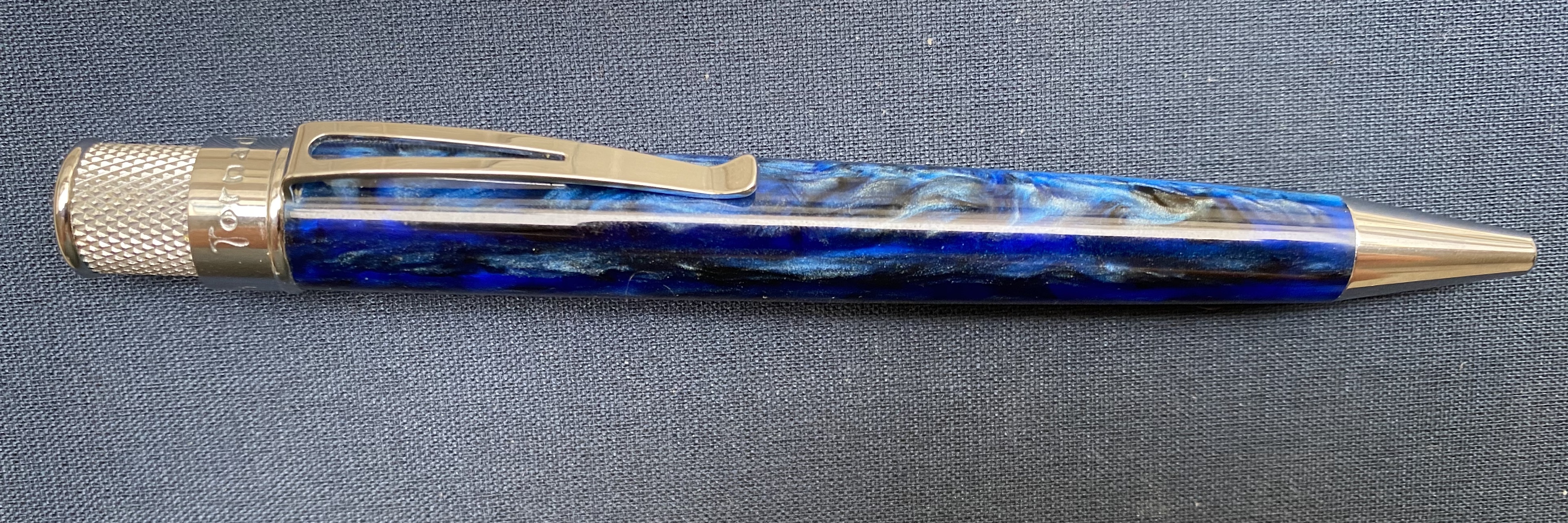
The Retro 51 Blue Acrylic features chatoyant acrylic swirls in blue and navy, and it’s somewhat transparent, which means that you can see glints of the metal refill tube below the material. Like the Pelikan M800 Ocean Swirl there’s a dark side to the material, and a light side.

The hardware is chrome, and so very bright. This works well with the overall colour scheme. The acrylic body does pick up lint in a way that Retro 51’s metal-bodied pens do not. I’m not sure this would make for a good pocket carry pen because of that.

Weight wise it doesn’t feel significantly lighter than Retro 51’s metal-bodied pens. If that’s you’re draw to this pen, then you’ll be disappointed. But how can you be disappointed in a pen that looks like this?

The finial features a dark navy blue, almost black, disc. I kind of wish that Retro 51 had made the finial out of the swirly acrylic material, but I guess that would have hiked up the price significantly.

I changed out the refill for my favourite Ohto FlashDry refill, mostly because the old refill dried out. I used to use the semi-dried out old Schmidt refill for sketching, as it was pretty perfect for that.
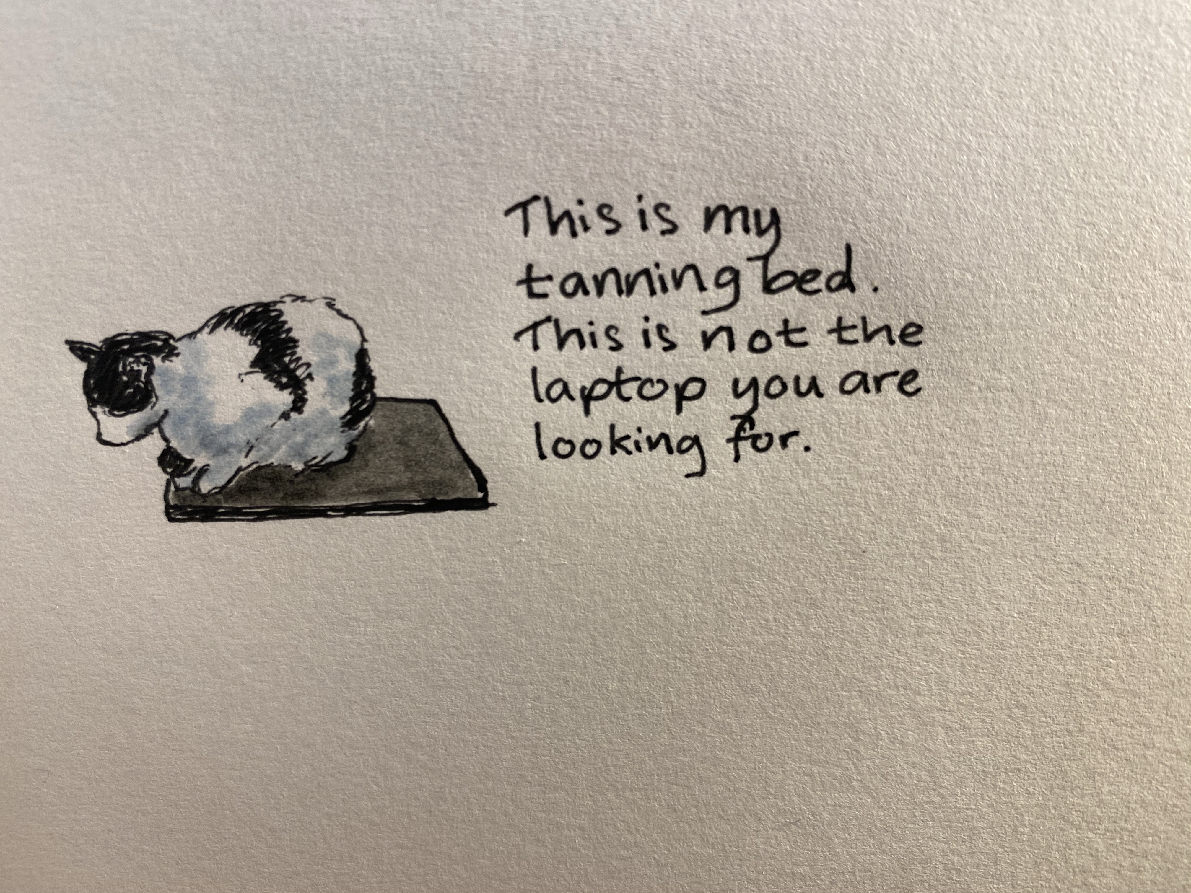
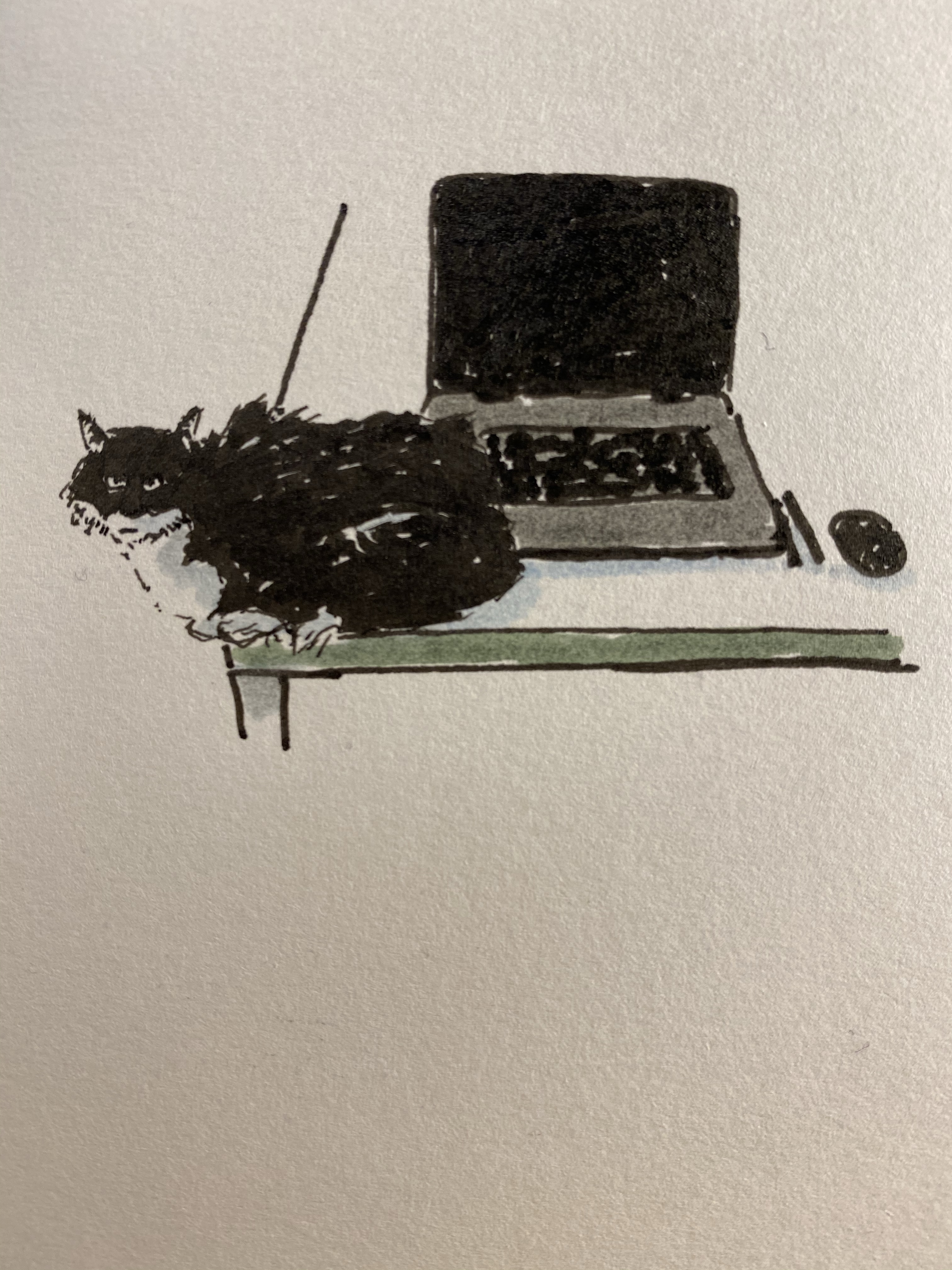
The above drawing was drawn with the Retro 51 Blue Acrylic and the Ohto FlashDry 0.5 gel ink refill, plus some Faber-Castell PITT brush pens. My parents’ cats have ideas about my dad’s laptop that don’t coincide with his.
If you stumble upon one of these Retro 51 Acrylic Tornado pens, snap them up. They’re gorgeous, and life is too short to carry an ugly pen.

The quarantine distracted me from reviewing the two final Retro 51 pens that I have on hand (the Coffee and Flower edition are regrettable locked away at work), and the first of these two is the original Retro 51 Pen Addict limited edition tornado.
The Pen Addict Retro 51 was the first pen that Brad Dowdy had made for his shop, and it embodies both the Pen Addict aesthetic and the Retro 51 motto: “Life is too short to carry an ugly pen”.
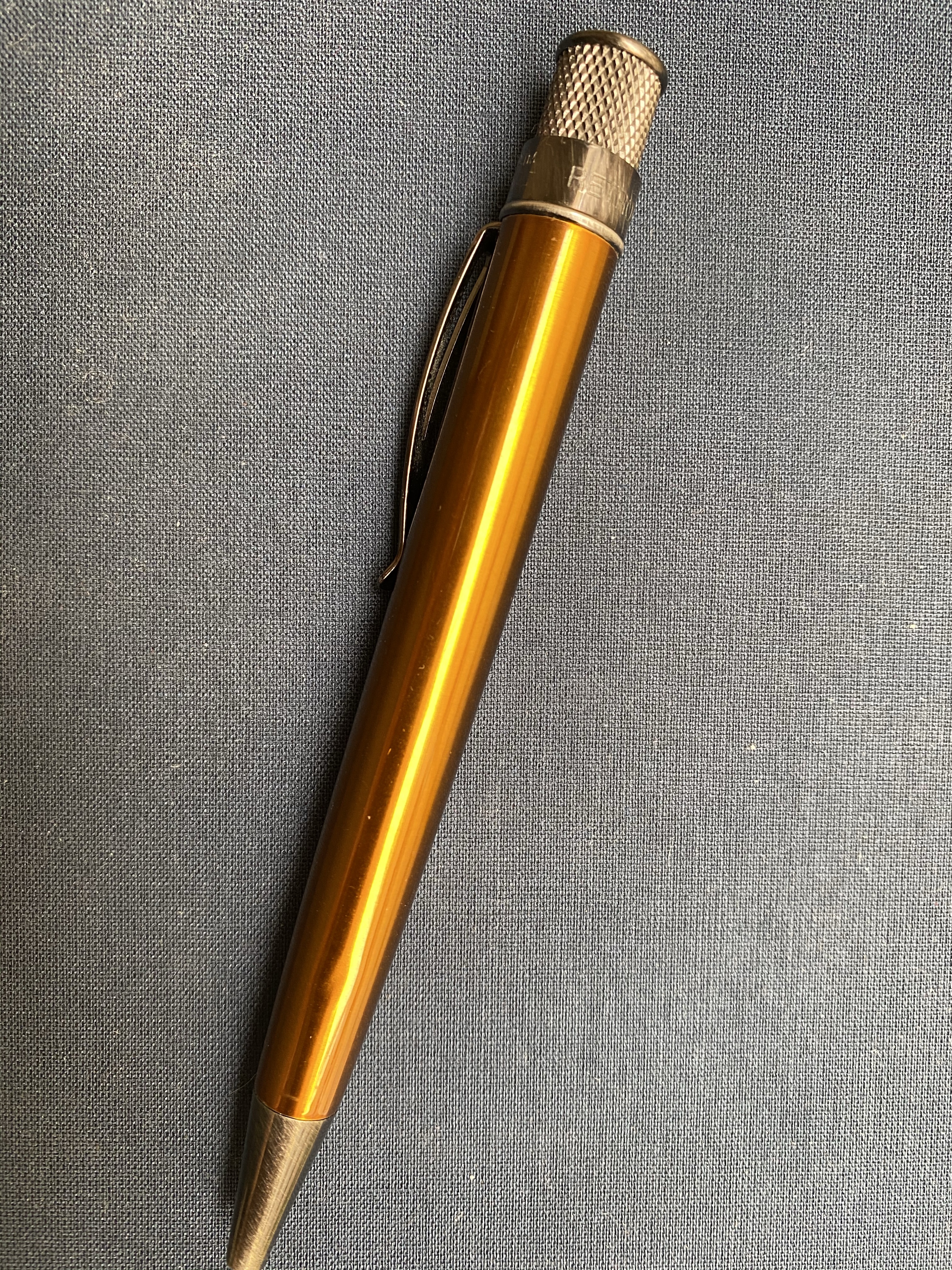
This is not an ugly pen. Orange isn’t my favourite colour, but it totally works on this pen, both because of the specific metallic orange hue used here, and because of the dark hardware. The Pen Addict Retro 51 just glows:

It also is a numbered edition (I have number 77) and has one of the best Retro 51 top discs/finials: the Pen Addict logo.
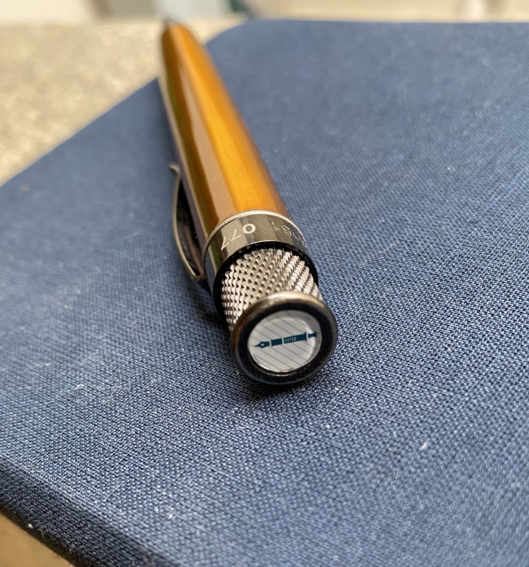
This is one of the few Retro 51s that I own that still have the Schmidt refill installed. I’m not a fan of this refill, but there are times when I’m looking for big, bold lines and it just fits the spot. This is the first time I used it for drawing:
The Retro 51 Pen Addict original limited edition is still a great, classic Retro 51 tornado design. It’s no longer offered for sale on the Pen Addict shop, but if you find it reasonably priced on the secondary market, it’s totally worth buying.
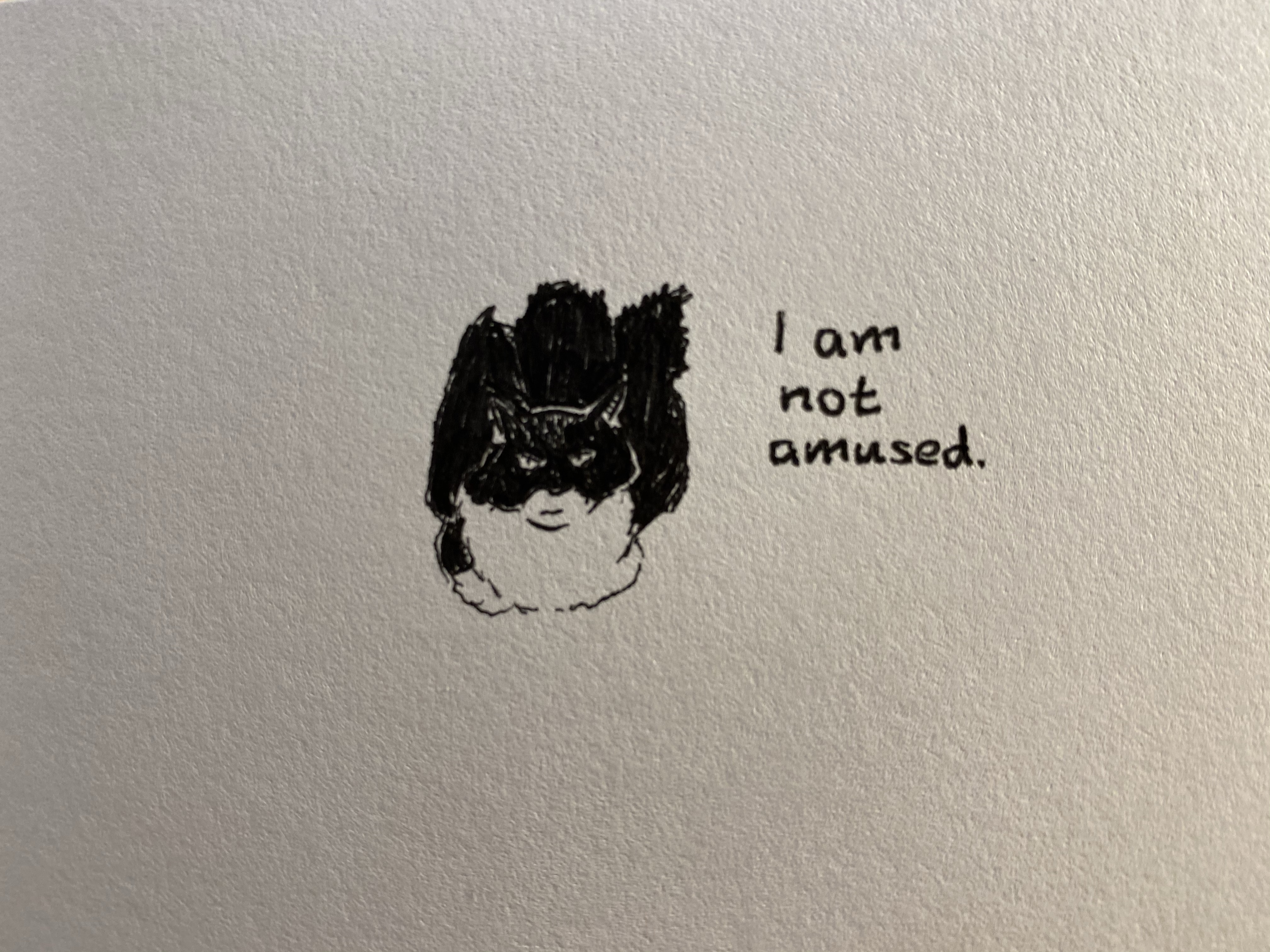
I’m in the process of testing out a set of Uni-ball Pin fineliners and I thought that I’d share a few test runs with the pens. The linework is done with the Ubi-ball Pin fineliners (0.1, 0.3 and 0.5 in black and grey) and the rest is with Deleter Neopiko-Line-3 pens (2.0 and a brush pen) and Faber-Castell Pitt brush pens.

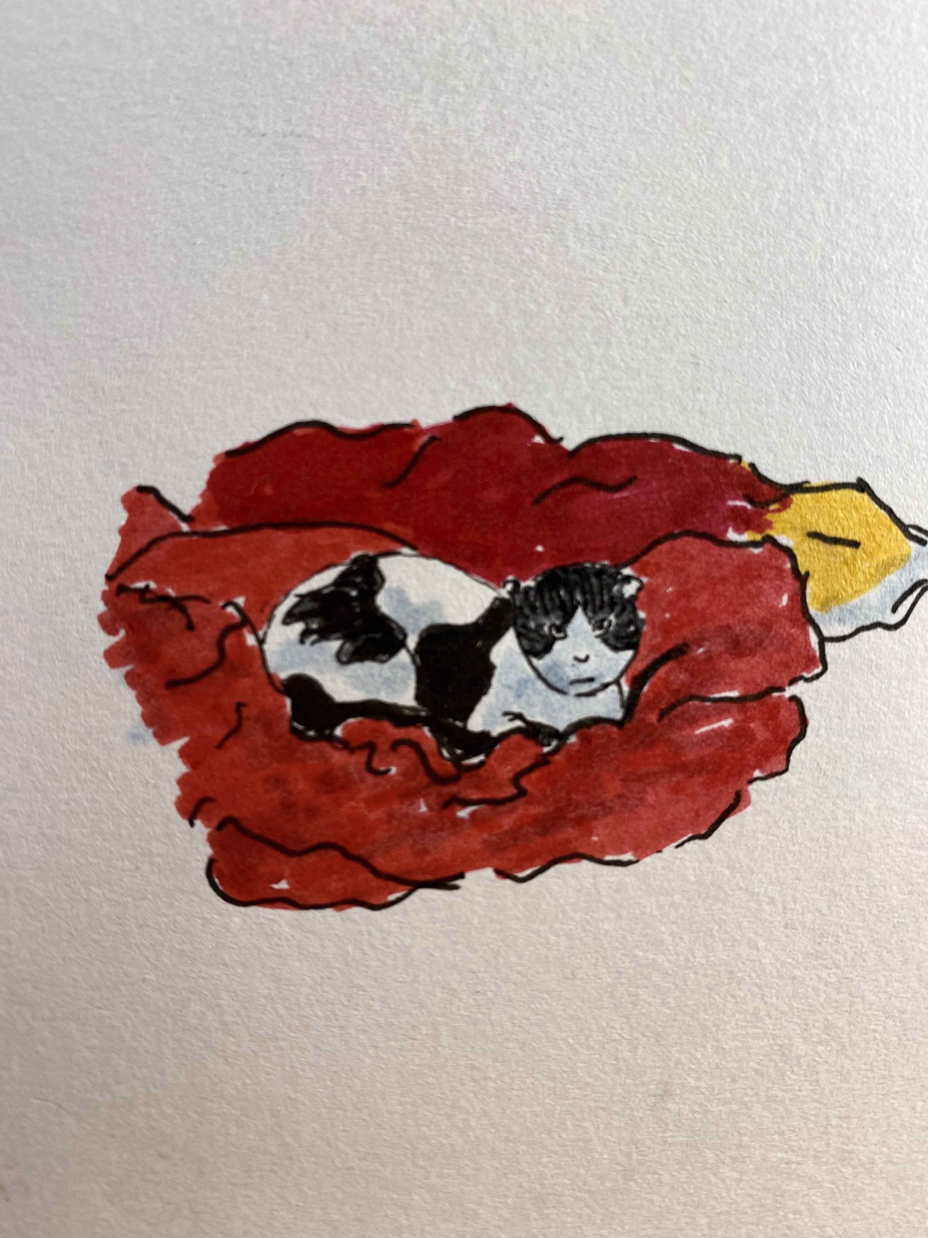
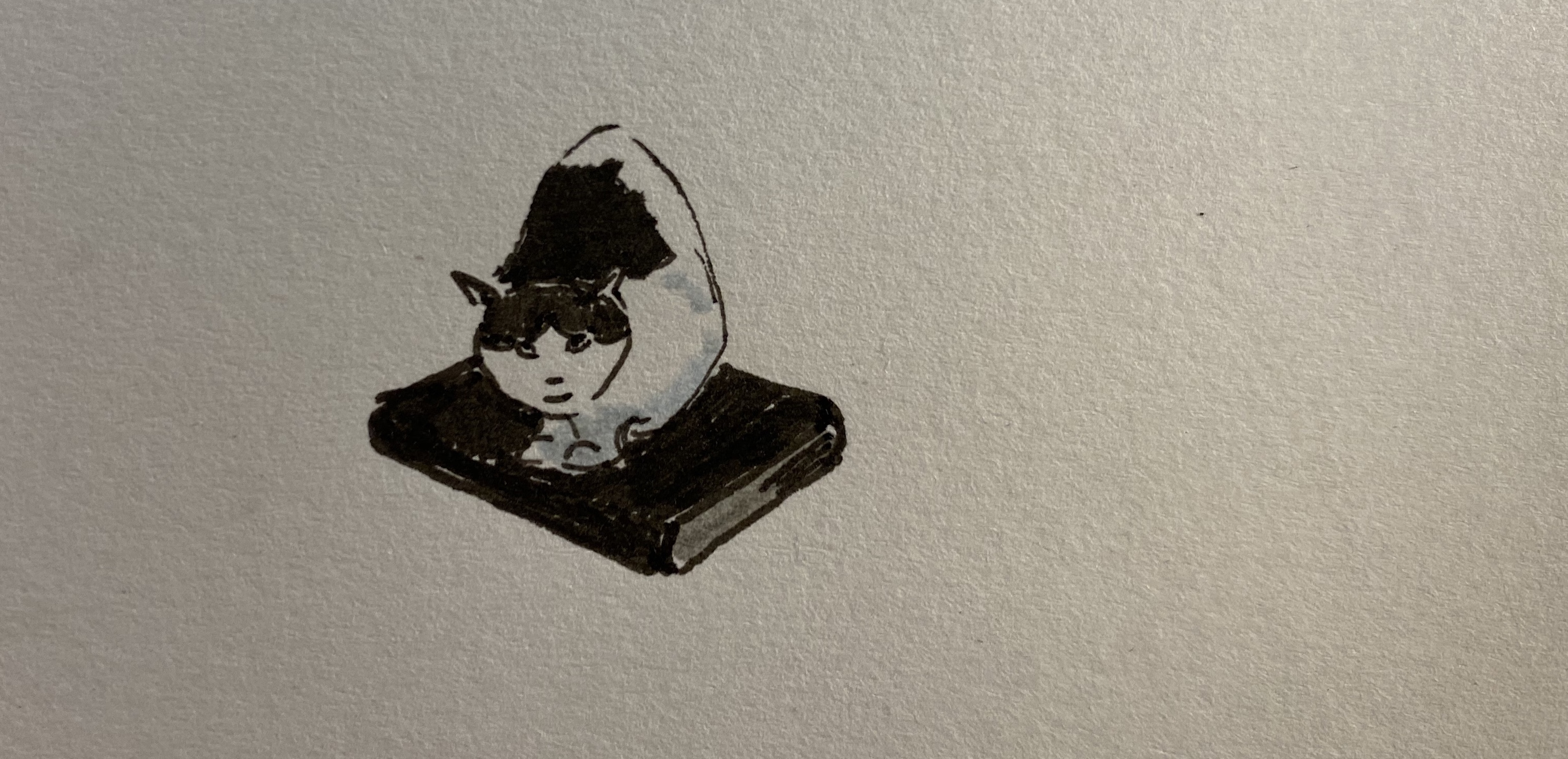
My parents’ cats are very expressive and fun to draw. The cat above is super mellow, and the cat below is gorgeous but not happy to see you.

