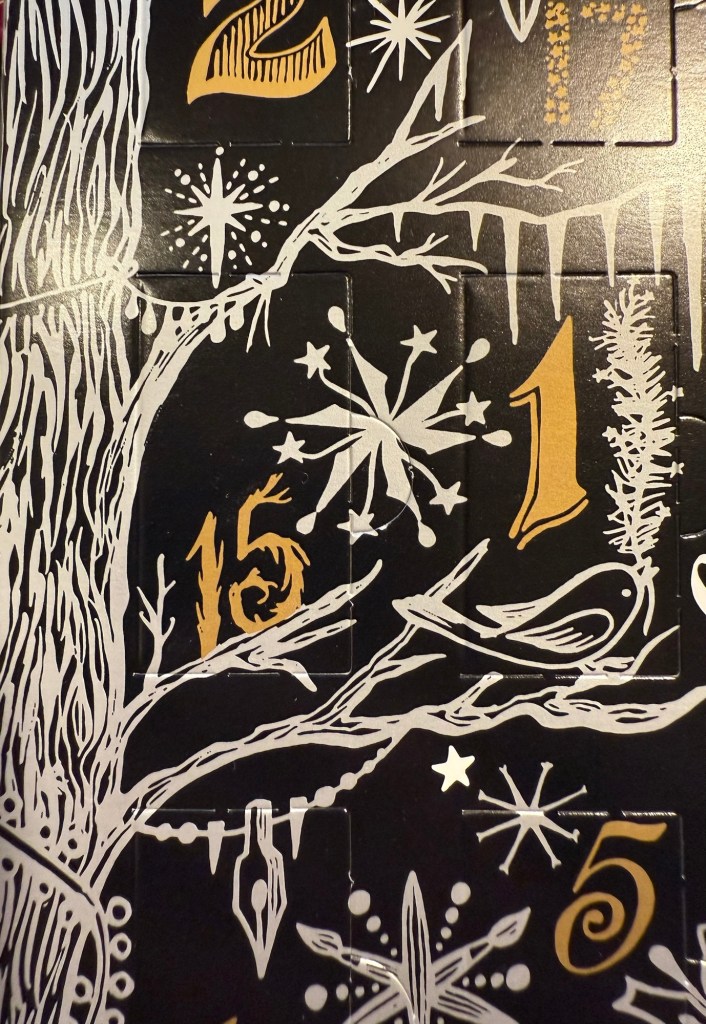
Diamine Inkvent 2024 Day 15
This is the Diamine Inkvent 2024 Day 15 door:
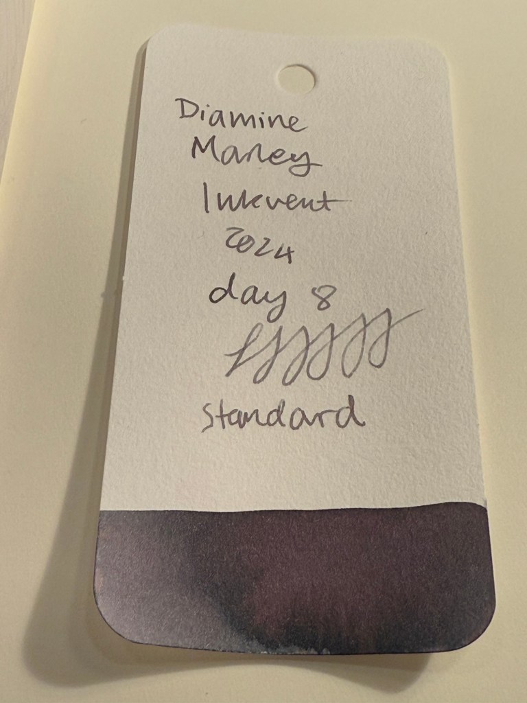
Day 15’s ink is Diamine Sleigh Ride, a burnt sienna (i.e. reddish brown) “Extreme Sheen” ink. In this case the sheen is more pronounced than the last “Extreme Sheen” ink, Diamine Grotto. You can see in the Col-O-Ring swab just how prominent the green sheen on this ink is, at times completely obscuring the reddish-brown ink beneath it. I used a Diplomat Aero with an extra fine nib to test out this ink.
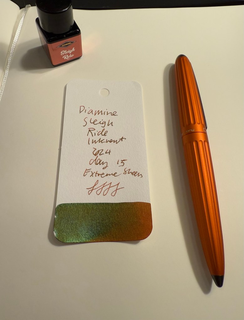
Here’s a closeup of the Diamine Sleigh Ride Col-O-Ring swab. It’s a testament to the amount of sheen in this ink that you can see the green sheen on every letter even though I used an extra fine nib with this ink.

On original Tomoe River Paper the sheening is even more pronounced:

Depending on your viewing angle you can see the sheen as shading (as it appears in the word “Diamine” in the photo below) or as sheening (as you can see the same word in the photo above). Drying time, as is to be expected, was also “extreme”.

On Rhodia paper you see less sheen and more of the shading, as it’s more absorbent:

But on Kokuyo paper you can see the sheening very well (the camera had issues focusing here, I suspect because of the high reflection from the sheen).

Here’s a close up of the writing sample on Kokuyo paper:

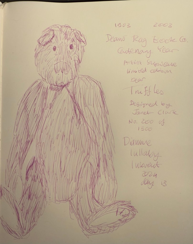
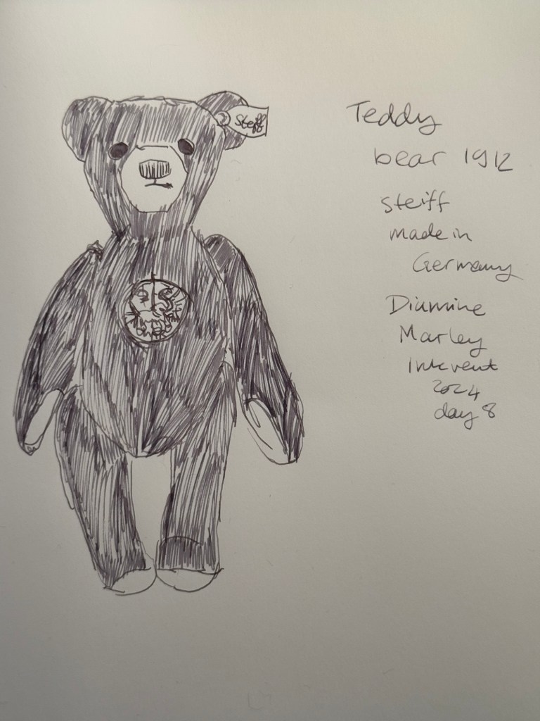
On Midori MD Cotton paper the sheening is also extremely visible. You can see it clearly in the writing sample on this paper and in the closeup of the bear sketch later on:

Here’s a close up of the bear sketch. It looks like I was sketching with a green-brown ink at points because the ink sheens at every opportunity:

Today’s bear is another Dean’s Rag Book Company bear (they’re my favourite bear maker). Franz is a small bear that I bought second hand recently in York. He’s a delightful little fellow with the classic Dean’s look:

If you don’t like sheen on your ink, then Diamine Sleigh Ride is definitely not for you. Personally I think the effect here is striking, even though I wouldn’t necessarily have chosen a brown-green combination for a Christmas themed ink, and I most certainly wouldn’t have thought to call it “Sleigh Ride”. I don’t see myself adding this ink to my collection, but if you’re looking for unusual brown inks, this may be the ink for you.
What do you think of Diamine Sleigh Ride? How do you think it compares to Diamine Grotto, the other “Extreme Sheen” ink?