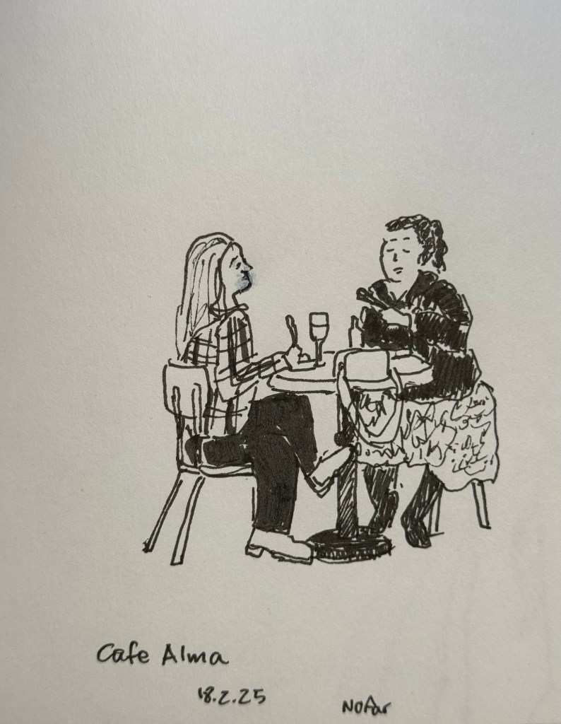
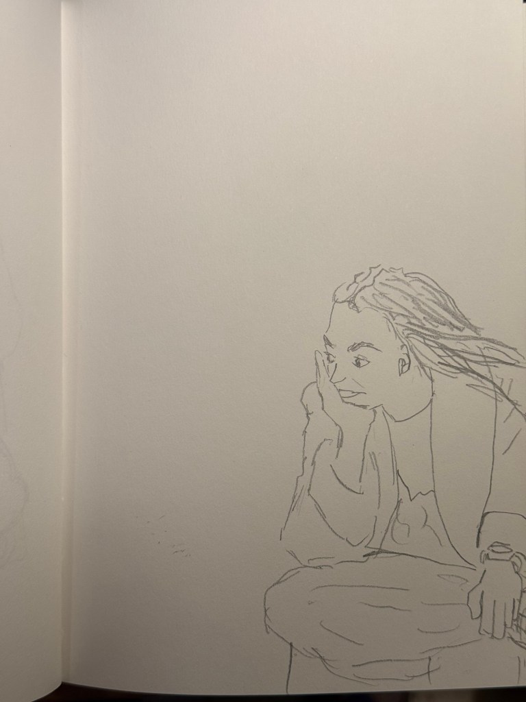
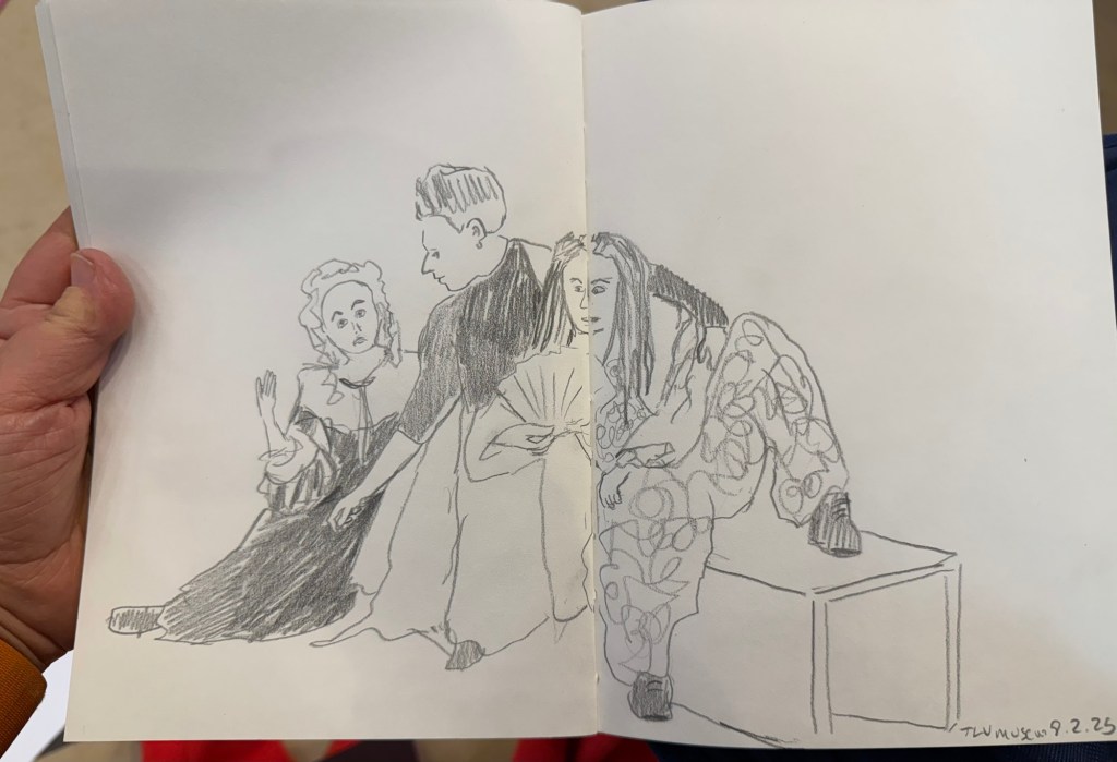
Earlier this week I went to a standup gig – a NY comedian was trying out new material, and it was an interesting (and funny) experience to see him work. Before the show I had about 5 minutes to sketch the people in a nearby cafe, so I sketched this couple using a Staedtler 0.5 Pigment Liner.
In terms of fountain pens the Parker Vacumatic is out of rotation, though I may give Diamine Writer’s Blood a try in another pen soon enough. I decided that I want to have the nib tuned on it, in terms of flow, though I don’t know who I’ll be able to find to do the tuning for me.
I also dumped out the Pilot Iroshizuku Yama Budo out of my Parker 51 as I couldn’t get it to not bleed and feather on practically any paper. I cleaned out the pen and refilled it with Waterman (Tender) Purple ink and it’s been wonderful to use since. Waterman inks are not only fantastically well behaved, beautiful, cheap and very, very easy to clean out of pens, they’re also dry inks. As Parker 51 generally have a generous ink flow, and this one is no different, a dry ink serves particularly well with this pen.
I’ve been reading Mrs Palfrey at the Claremont by Elizabeth Taylor (the British novelist, not the famous actress) and it’s a wonderful study of character, age and aging.
Next week is the Tel Aviv marathon, which is sold out for the very first time. There were no big local running events last year, and there’s clearly a hunger for them.
This week has been crushing from both a personal and a national perspective. I’ve taken solace in friends and in reading, but there have been times where it’s been a struggle. It’s at times like this when I need to remind myself to stop, take a breath, allow myself to feel what I need to feel, and only then pick myself up and move on.
Be kind to yourself and others, and have a great week.
I used to be a heavy Twitter use. I discovered the service pretty early on through webcomic artists like Scott Kurtz, and I found the challenge of crafting short tweets to be a fun writing exercise. Yes, I was among those disappointed when they raised the character limit – half the fun of the service was trying to be as clear and concise as possible.
When Twitter stopped supporting third-party clients like Tweetbot, and started becoming an unpleasant place to hang out, I left. It hasn’t gotten better in the interim years and as I have largely cut social media out of my life so I have no plans of ever going back. However, while I don’t miss Twitter (not as it is, not even as it used to be) I do miss the challenge of crafting short and punchy snippets of text: the haiku like nature of tweets. I also have a large pile of unused Field Notes pocket notebooks, and a not insignificant stock of really cool gel ink pens, rollerballs and ballpoints that are all seeing very little use.
Could I put these together to achieve an analog version of what I enjoyed most about Twitter?
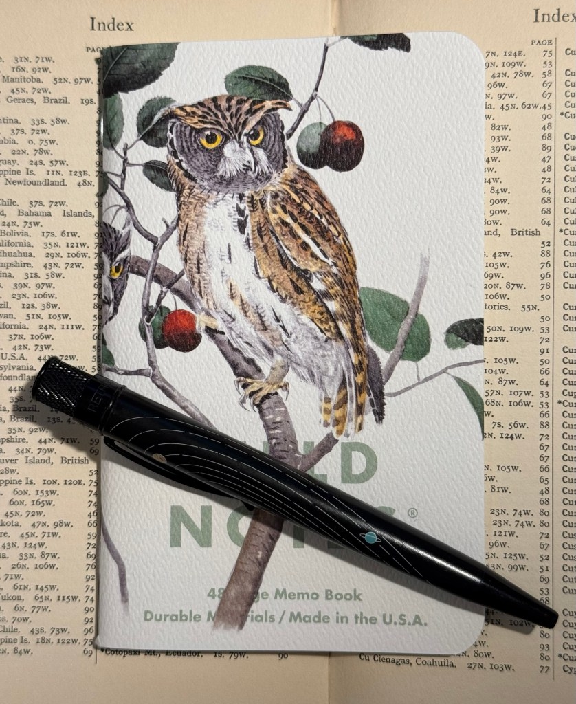
The Birds and Trees of North America, Fall 2024 seasonal edition of Field Notes.
Yes, I could and I did and it has been glorious.
I selected a Field Notes notebook out of the the Fall 2024 “Birds and Trees of North America” edition because it’s a beautiful edition, it has lined paper (which I rarely have use for in pocket notebooks), and it seemed appropriate. I randomly selected a Retro 51 Tornado – The System limited edition one which has Uniball Jetstream SXR-600-05 hybrid ballpoint refill in it instead of the original Schmidt refill which I don’t like. Then I started writing down “tweets” in it throughout the day.
Rocky Mountain and Mexican Screech Owls Field Notes notebook (illustrated by Rex Brasher) and Retro 51 Tornado The System limited edition pen
I’m not dating them, I’m not counting characters, I’m just limiting myself to a few rows for each entry, and I’m writing them as if I would be publishing them. The writing style is therefore different than what I would write in my journal, and so far it’s also focused exclusively on things that I don’t write about in my journal (mainly reactions to things I did or saw or read). I have no intention of ever publishing anything in this notebook, but I do enjoy the challenge of writing it as if it would be something that I would post somewhere.
So I get to practice my writing skill in a new way, I get to use some of my wonderful Field Notes stash, and I get to use some of my great standard pens. All this without filling the pockets of various billionaires with my work, and without encountering the bots and the foaming hordes of professional haters and rabble rousers online.
I highly recommend this practice, whether you do it with a fancy Field Notes or just any pocket notebook you have on hand. Using a notebook of this size will remind you to keep your entries short, and it’s something that you can easily carry with you and use in waiting rooms, boring meetings, or when you need a little break between tasks throughout the day.
It’s nice to have new pens and inks in rotation. I’m enjoying Diamine’s Writer’s Blood more than I expected, Diamine Autumn Oak is fantastic with a Waterman superflex nib, and Pilot Iroshizuku Tsuki-yo is becoming one of my favourite inks.
Liz Steel and Marc Taro Holmes are hosting the OneWeek100People challenge again this year, and I intend to participate again. The challenge starts on the 3rd of March and officially lasts 5 days. I normally sketch from photos, but this time I want to see if I can do the entire challenge from observation only. It may take me more than 5 days, but I’m OK with that. Are you planning on joining the challenge?
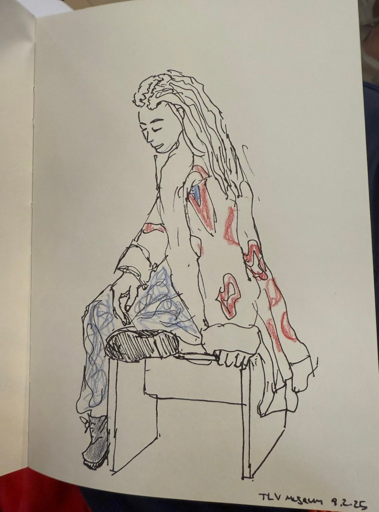
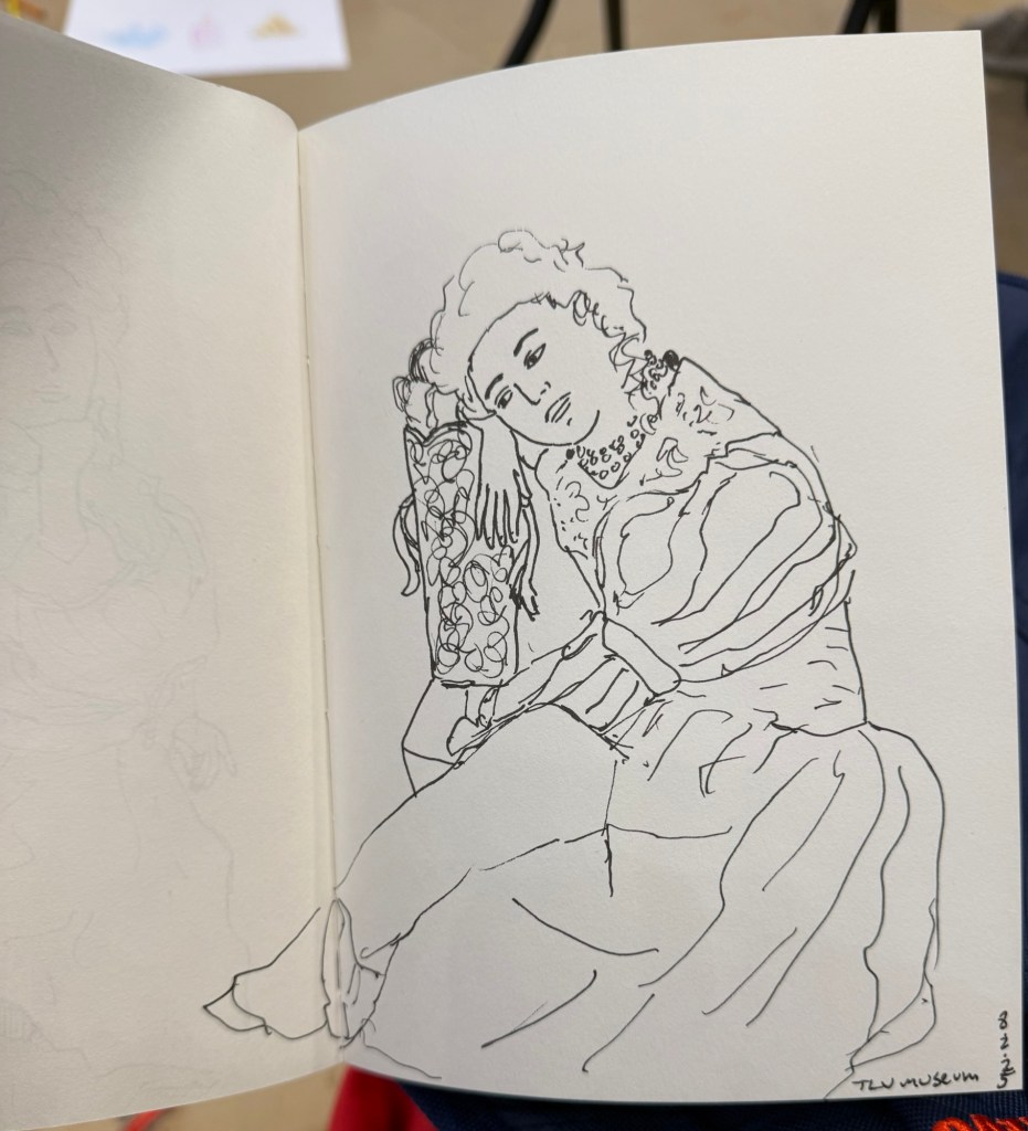
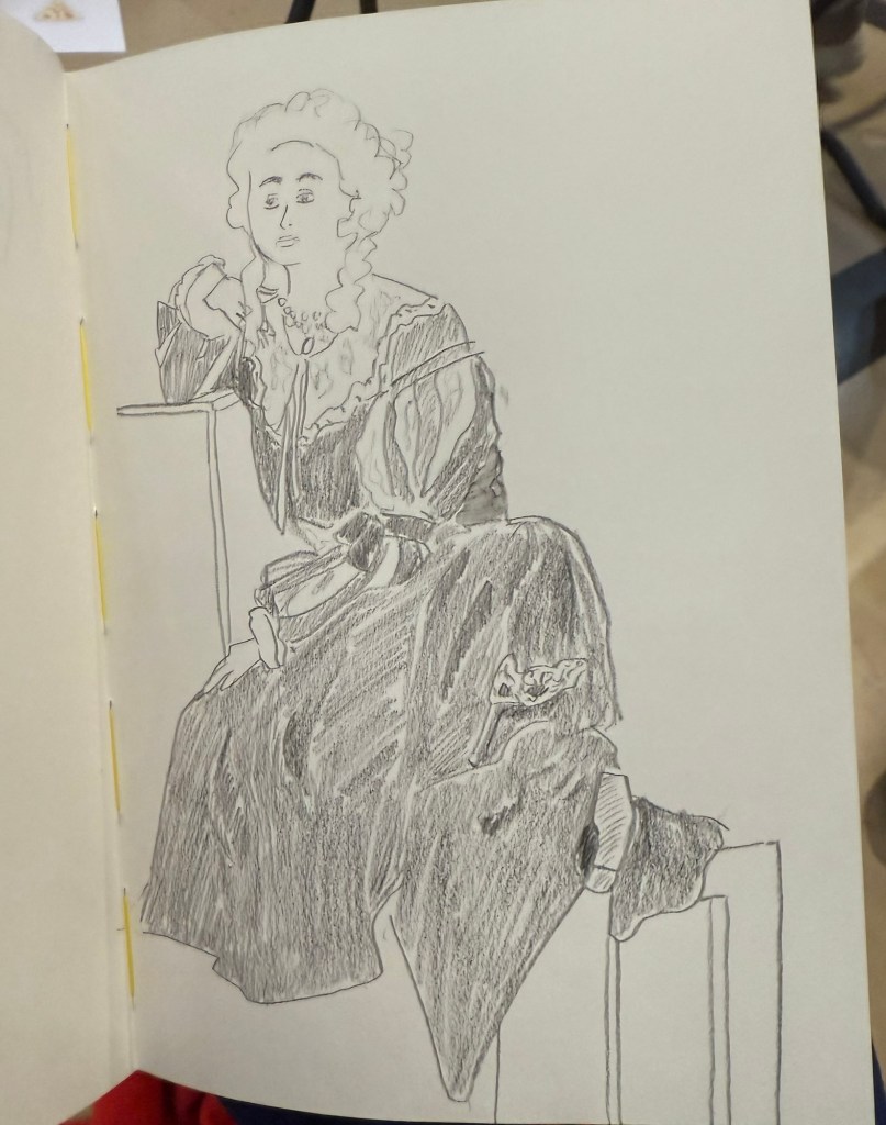
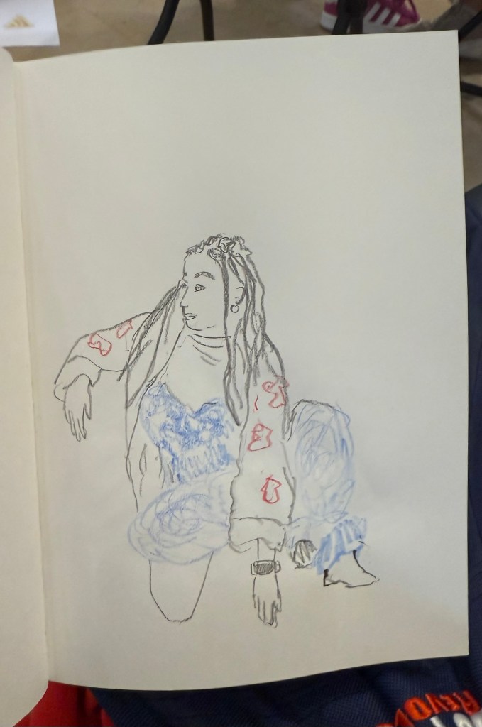
I went to the local art museum again this week, to sketch models in the museum. This was the last time this event was run, and the place was packed with sketchers. I didn’t have the best of locations, but I made the most of it. I sketched with Faber Castell 9000 2B and 3B pencils mostly, and added a touch of colour with Faber Castell Polychromos. The ink sketches were done with a Staedtler Pigment Liner 0.5. The sketchbook I used was once again the French Pascale Éditions. The models did fewer 20 minute poses and more 10 minute ones, which meant scrambling a lot. I wanted to visit the museum after the event, but I was so tired from 3 hours of non-stop sketching that I just went home.
Harman Photo just came out with a brand new colour film, Harman Red. It’s a red-scale film, and I’m curious enough to try and buy a roll or two and test them out. I love the wild, wild results I got with Harman Phoenix and the Harman Red is basically Phoenix pushed even more into red-scale.
Here are the sketches from today, and I hope that you have a great week!
10 minute pose.10 minute pose.10 minute pose.10 minute pose – the hardest pose to draw because of the angle of the head. Had a false start on this one, so had only about 8 minutes for this. 10 minute pose – Staedtler 0.5 pigment liner10 minute pose10 minute pose10 minute poseThe three models. The pose started with just the two top models, and then the third one joined, and it was a 10 minute pose.A challenging composition, 20 minute pose10 minute pose. I like the composition on this one – I placed her on the side of the page to give her room for thought. Final pose, 20 minutes
I have finally written dry all of my Inkvent 2024 fountain pens, which means that after two months I get to write with a whole new set of fountain pens and inks. I normally don’t spend too much time selecting which pen and which inks I’ll use next, but this time I decided to use some criteria for the next pens in my rotation:
They need to include at least 50% vintage pens. I don’t use vintage pens with Inkvent inks, and vintage pens make up most of my pen collection.
All the pens need to be pens that I haven’t used in a long time (at least a year). It was time to mix things up.
The inks needed to be inks that are new to me, or that I haven’t used in years, and all of them need to be inks that I haven’t swabbed before. This was not only to mix things up, but to get me to use and swab more inks in my collection, instead of going again and again to a few select favourites.
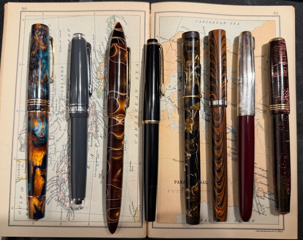
Here’s February’s fountain pen lineup:
The pens from left to right: Leonardo Momento Zero Bohemian Twilight, Sailor Pro Gear Slim Graphite Lighthouse, Edison Nouveau Premiere Cappuccino, Montblanc 32, Mabie Todd Swan L2 Leverless pen, Waterman 52, Parker 51, Parker Vacumatic Standard double striped jewel.
And here are ink swabs of the inks that I’ll be using:
Ink swabs on Col-o-Ring cards
The Vintage Pens
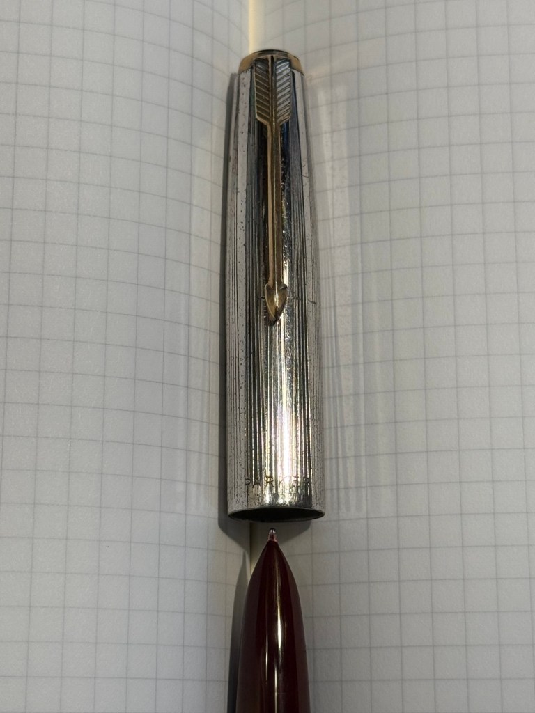
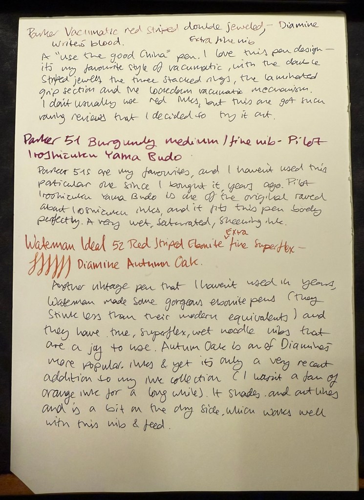
Parker Vacumatic 1st generation Laminated Burgundy Pearl Double Jewel (striped jewels, striped section) – I adore Parker Vacumatics and this is a “use the good china” pen. The grip section is also laminated (and not plain black), the body is transparent, and the nib is a sharp extra fine gold nib with a bit of character to it. It’s filled with a brand new ink for me, Diamine Writer’s Blood. I never use red inks, but this got raving reviews and seemed dark enough for me to try. I bought the ink in Oxford last year, and the pen years ago from the late Henry Simpole (Henry the Pen Man) in London. I don’t think I inked up this pen since I bought it, as it was too precious, and I still won’t let it leave the house, but I am looking forward to actually using it.
Parker Vacumatic first generation burgundy laminated grip sectionCloseup on the striped jewel and the grip section of the Parker Vacumatic
Parker 51 Burgundy aerometric with a silver cap and gold filled arrow clip. I love Parker 51s, they are my absolute favourite fountain pens. I believe this cap is on the rare side, though it’s far from pristine or attractive (it’s blackened in specks, and there are a few scratches and micro scratches on it). The nib is a generous fine, bordering on medium, and like all other 51s that I’ve used, it’s magic. I haven’t used this pen since I bought it, so it’s time to give it a whirl. It’s filled with Pilot Iroshizuku Yama Budo, which is a lovely, sheening burgundy ink, one of the more popular inks in the Iroshizuku lineup. In hindsight coupling this ink with this pen wasn’t the best choice, as the 51 has generous nibs and Iroshizuku inks are on the wet side. It just means that I’ll have to steer clear of cheap paper with this combination.
Parker 51 cap and nib closeup
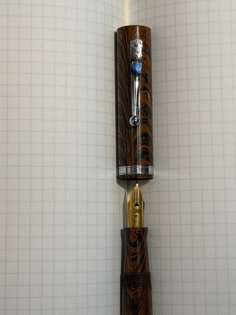
Waterman Ideal 52 Red Ripple fountain pen with a super flex extra fine nib – my word but this pen has the most glorious nib. The pen itself is elegant and pristine, and because of its age it doesn’t have the ebonite stink to it. The nib is why I bought this pen, and it effortlessly moves between extra fine and broad or double broad lines, with the feed easily keeping up with tines. Like all Waterman nibs that I’ve tried, there is some feedback, so if you like butter on hot pan nibs this one isn’t for you. This is the kind of nib that you can only get in a vintage pen, and it puts modern flex pens to shame. It’s only minus is that this is a lever filler, and I hate cleaning out lever fillers, which is why I rarely use them. This pen is filled with Diamine Autumn Oak, which I haven’t used yet (in bottle form at least – I have cartridges of it). I wanted a brighter ink in this lineup, so Autumn Oak was a perfect choice.
Waterman 52 cap and nib closeup. You know the nib is going to be fabulously flexy once you see that heart shaped breather hole and the slight bend down in the nib. Writing sample on Midori MD Paper. Notes written with a Platinum Preppy.
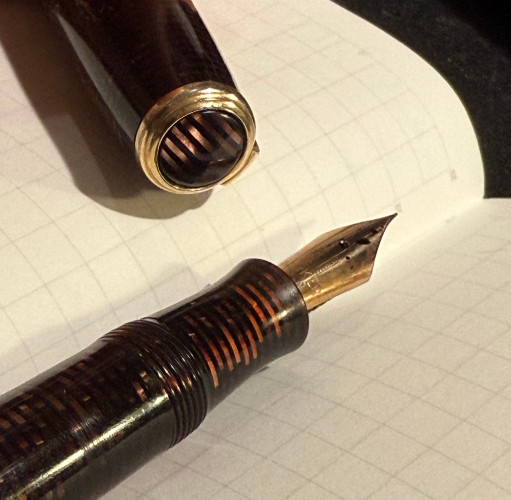
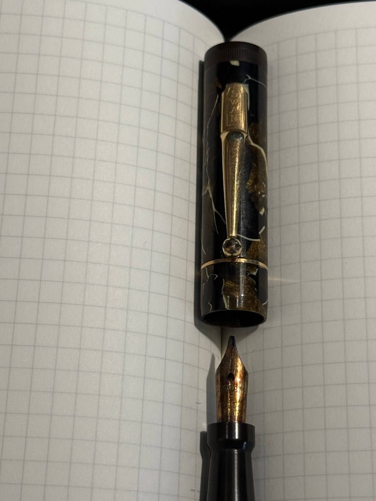
Mabie Todd Swan L2 Leverless L205/62? Not sure – Swan did a poor job labeling their pens, and I didn’t write down notes when I bought it. This is a lovely pen that I bought from Henry Simpole years ago because of the phenomenal Swan nib. It’s an oblique flexible nib with Swan’s gimmicky “Leverless” filling system (which is a lever system in disguise, but such were the ’30s – you needed a gimmick to sell pen). I haven’t used it at all since I bought it because I don’t remember the experience of cleaning it out very fondly – imagine all the bother of cleaning out a Lamy 2000, but with a piston that has just one twist of travel. I used Pilot Iroshizuku Asa Gao with this fountain pen, and it’s a gorgeous ink with a good amount of sheen with this nib. I love this shade of royal blue, and I haven’t used this ink in a while. Take a look at the Swan above – it’s almost 100 years old and works perfectly.
Closeup on the nib and cap of the Swan Leverless penWriting sample on Midori MD Paper. Notes written with a Platinum Preppy.
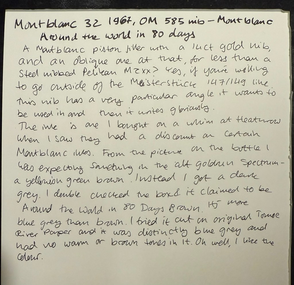
Montblanc 32 (1967) OM 585 nib – heavens, you can get a gold nibbed, piston filling original Montblanc with an Oblique Medium nib for less than a steel nibbed Pelian M2xx costs? Yes, you can. I love the design of this pen (you can read about it more here) and the nib is great… provided you write in the exact angle it expects. The Swan’s nib is generous in terms of the writing angles it accepts, and the Monblanc 32 is demanding: you will use the nib at the precise angle it is designed for, or it will not work at all! I only wish that the Montblanc Around the World in 80 Days ink was so exact. From the description and the illustration on the box I was expecting a brownish gold ink, maybe with a hint of green. In reality I got a dark, cold grey ink, with a hint of blue to it. No brown, no gold, nothing at all to do with the elephant illustration on the box. I had to double check just to make sure that I hadn’t landed on a bad bottle by chance.
Montblanc 32 semi hooded nib Writing sample on Midori MD Paper. Notes written with a Platinum Preppy.Writing sample on original Tomoe River Paper
Modern Fountain Pens
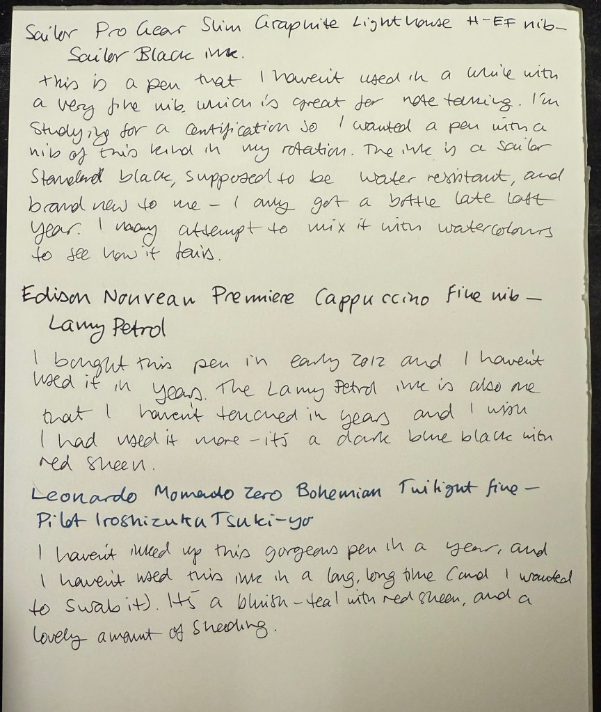
Sailor Pro Gear Slim Graphite Lighthouse H-EF nib – I haven’t used this pen in over a year, and I wanted a pen with a very fine nib, so that I can use it for note taking. It’s inked up with Sailor Black, a new ink for me and one that’s supposed to be water resistant. I’m using this combination for my certification study notes, and I may also try it out with some watercolours in a sketch, just to see if I can use Sailor Black ink as part of my sketching kit.
Edison Nouveau Premiere Cappuccino fine nib – I bought this pen in early 2012, before they did a run of seasonal limited editions of this pen design. I haven’t used in years, and the same goes for the ink in it: Lamy Petrol. This is a limited edition ink, one that Lamy issued with the Lamy Safari Petrol, and it’s a wonderful blue-black with red sheen.
Leonardo Momento Zero Bohemian Twilight fine nib – this pen has “only” been a year out of rotation, and it’s one of my favourite Leonardos. The colour of the resin is gorgeous, and it works very well with the Pilot Iroshizuku Tsuki-yo ink that it’s filled with. Tsuki-you is a bluish-teal with red sheen and a wet flow, and it suits the Leonardo’s fine nib.
It’s been a hectic week as my team at work is basically crumbling: our new senior member is leaving after just two months, the team lead is leaving after a bit more than a year, and the other team member is on holiday until the end of the month. That just leaves me with two trainees to hold the fort for a while, and it’s far from ideal. As I’m also working my way through an intense certification course, posts on this blog have taken (and will likely continue to take) a bit of a hit.
Reading
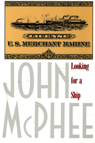
I’ve finished reading Looking for a Ship by John McPhee and I’ve reviewed it here. It’s a fascinating narrative of a now extinct world, that of the American Merchant Marine. I’ve now started reading Oliver Burkeman’s Four Thousand Weeks as well as Legends and Lattes by Travis Baldree.
Stationery
My Field Notes order has arrived, as has the 2024 Hobonichi Techo (yes, 2024) that I bought with a Black Friday discount. The Hobonichi will be used to supplement my 2014 Hobonichi when it comes to testing out inks. The 2024 Techo has’s got paper that is close enough to original Tomoe River Paper that’s in my 2014 Techo, though from my understanding the 2025 Hobonuchi’s have worse paper than the 2024 ones, so take that into account if you’re considering buying one. I have posts planned for both purchases, and hopefully I’ll get the time to write them.
Model Sketching
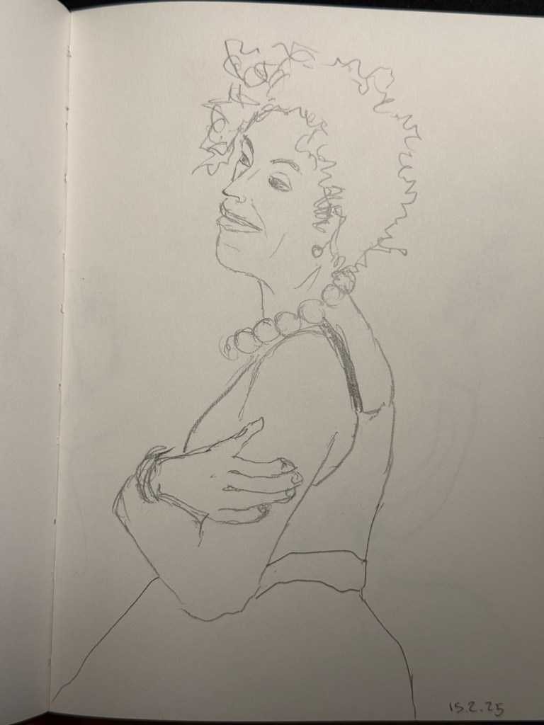
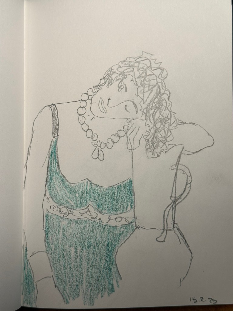
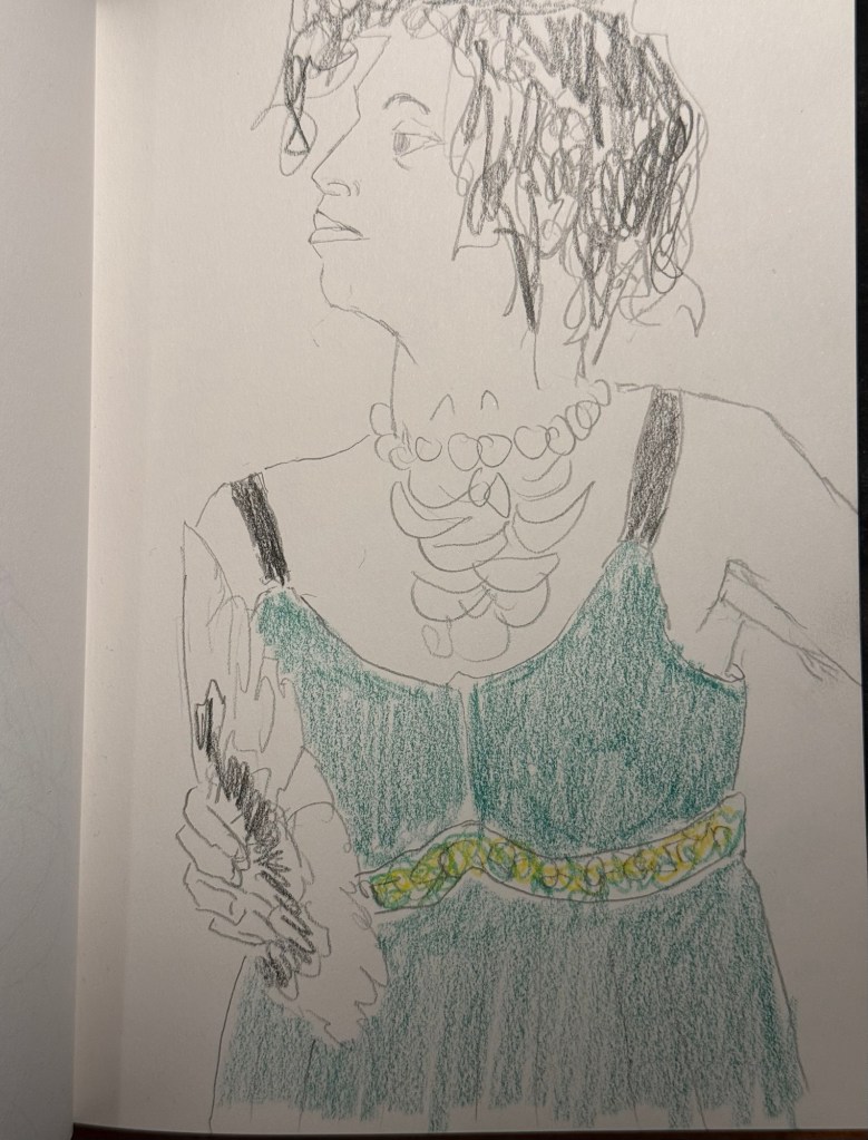
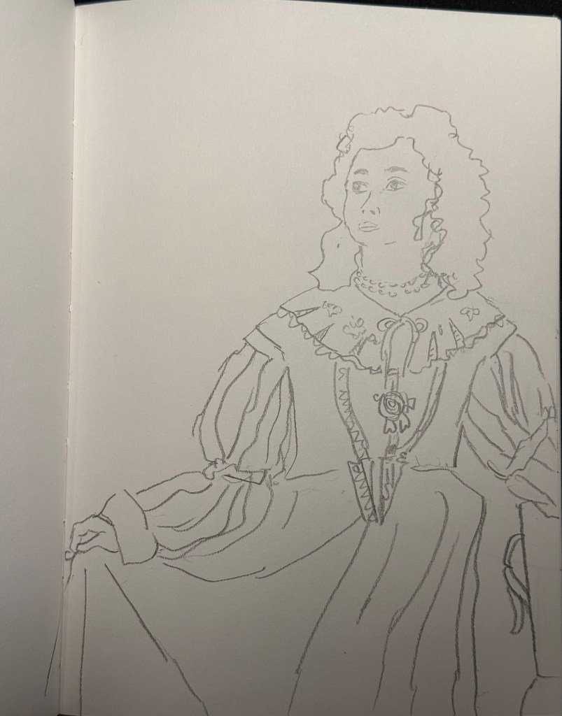
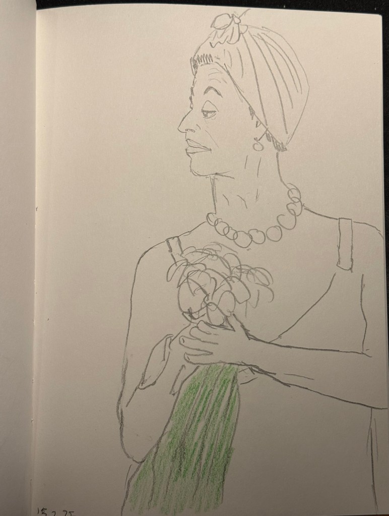
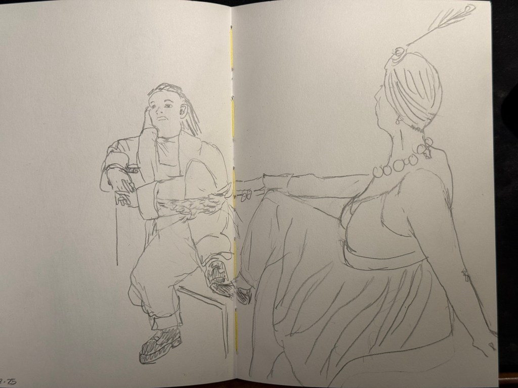
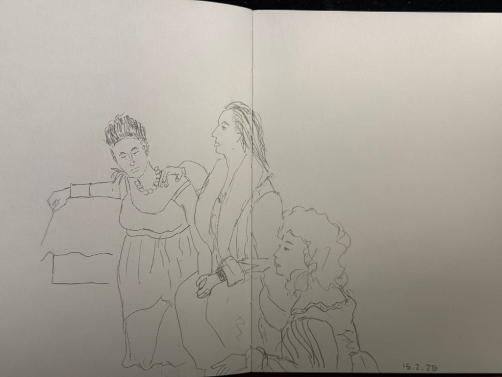
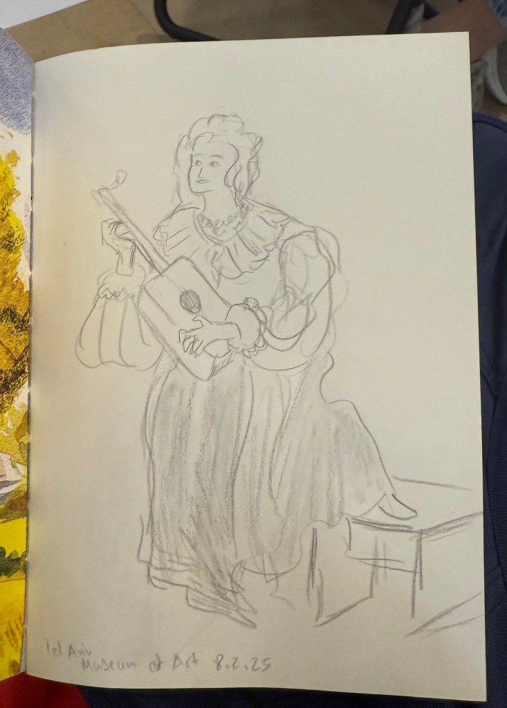
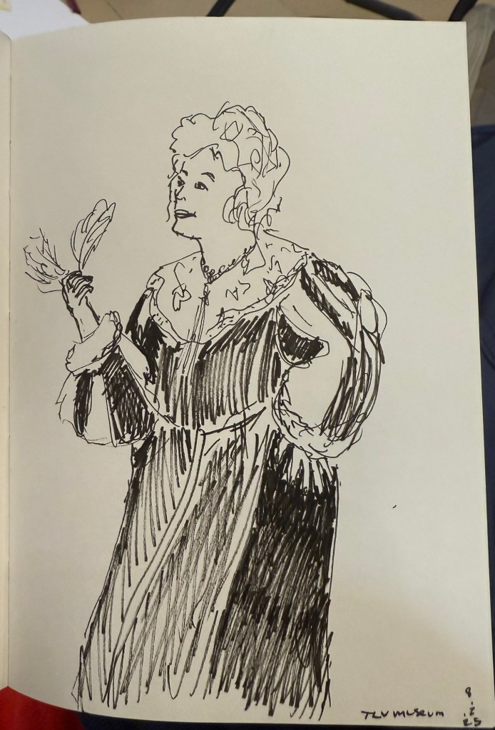
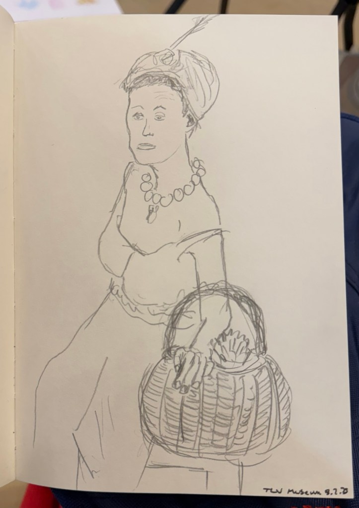
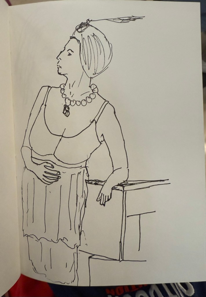
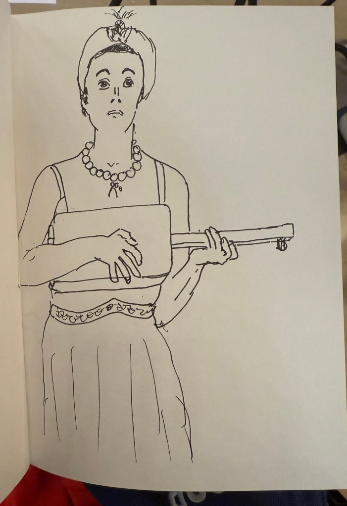
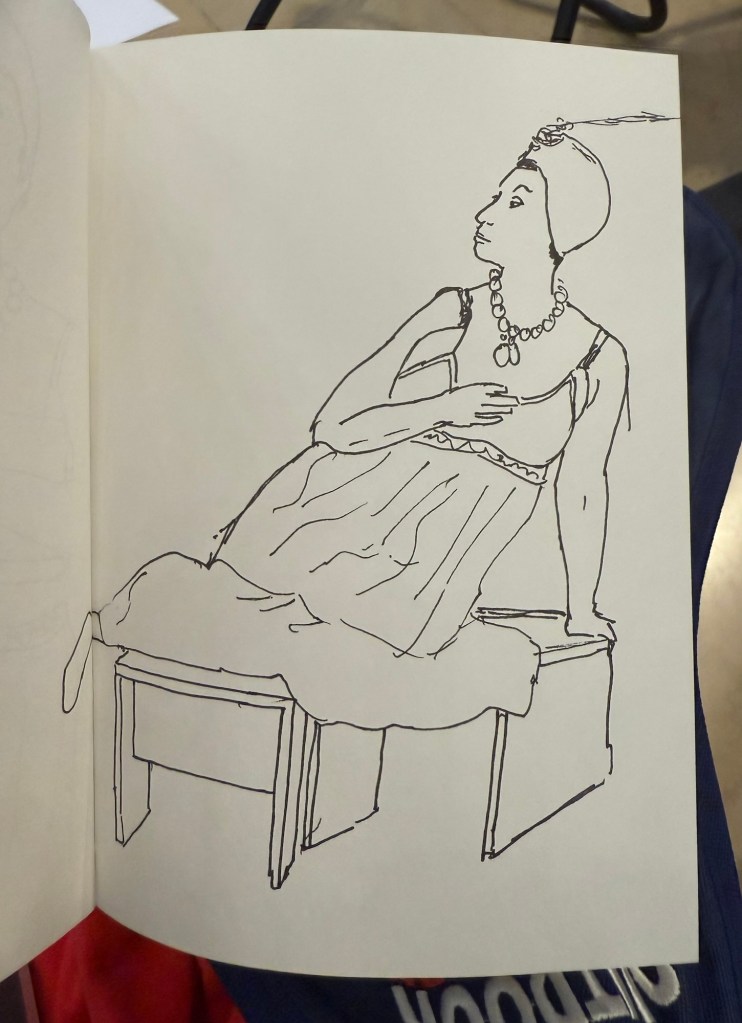
I went to the Tel Aviv Museum of Art today for a special sketching event that they organized: three models dressed in clothing that reflected some of the artwork in the collection, posing for sketches for 3 hours. These were mostly 10 minute sketches, with the last two poses being 20 minute ones. The last pose was a rare treat – a group pose, which is something you don’t get to sketch a lot.
In general when sketching models, whether clothed or not, you have one model that poses. Here there were three, and they switched places, so wherever you sat you got to sketch all three (and you could always sketch a model that was a bit further than the one right in front of you). The museum was busy, and there were children’s plays being shown in the auditorium, and so a lot of kids were around us, sketching on bits of paper with coloured pencils, with parents and grandparents cooing with delight and hovering around. It was wonderful to see how joyously kids took to sketching, whether it was the ladies in the dresses before them, or just anything that came into their imagination.
Here are the sketches I made throughout the event. The sketchbook I used was by French maker Pascale Éditions (it was lovely), and I used a Faber Castell 9000 2B pencil, a Faber Castell 4B Graphite Aquarelle pencil, various Faber Castel Albrecht Dürer watercolour pencils, a Tombow brush pen, and a 0.5 Staedtler Pigment Liner (this was my most used sketching tool).
First sketch. Warming up, so trying to keep it as loose as possible. 20 minute sketch, so I had time for some shading. The only sketch where I wet the paper slightly with a waterbrush before sketching20 minute final group posePotato quality photo of the three models
John McPhee is a master writer, and Looking for a Ship is a master narrative. Accompanying second mate Andy Chase during the dying days of the American Merchant Marine in the late ’80s, McPhee crafts a spellbinding tale of ships, sailors and the seas they travel on. There are a stories of bravery and skill, incompetence and foolishness, piracy and prostitutes, bureaucracy and bananas, shipwrecks and storms, and containers full of everything you can imagine and many things you can’t.
Every character is memorably portrayed, and the characters, the people, are all phenomenally interesting. Their struggles and triumphs, little moments of boredom and humanity, are all worth reading about (and nobody describes moustaches like McPhee). These people are masters at their craft, they work extensive and intensive hours, and their jobs are disappearing as they work. McPhee shows the tragedy of this process without eliciting unnecessary pity for the men who work on these ships with pride. He is an observer, but one that makes even the most dull minutiae of the world of the Merchant Marine come to life. Never have container manifests been so interesting.
While Andy Chase is an intriguing character, it is his captain, Paul McHenry Washburn, that shines in this story. Washburn is a man so fascinating, leading a life so rich, that he alone could be the hero of a book series, or even a summer blockbuster.
Looking for a Ship is a treasure of a book, an excellent story about people, craftsmanship, skill, the sea and those that make their living shipping our purchases across it. A highly recommended book for all who read.
I previously discussed how I plan my quarter, my week and my days, but there’s another side to planning: reviewing. The goal isn’t to set out a plan, then attempt to follow it and disregard any successes or failures in the process, but rather to take the time to figure out what tweaks and changes need to take place for your plan to work better for you. And remember – the plan works for you, you don’t work for the plan.
I’ve tried various review formats over the years, some were more successful than others, but here’s what I’ve come to realize: the weekly review is more crucial to the success of a quarterly plan (a 13 week year) than a quarterly review. I still perform a review of the previous quarter before planning the next one, but the weekly review is where the keys to happiness lie.
After a good amount of trials and errors, here’s the weekly review format that I’ve been using over the past few months and that has been working:
The weekly review format
What Worked – this is where I write down things that I did differently (first priority), consistently (second priority) and well (third priority) during the past week. The focus is things that I can learn from to take with me to the next week and to weeks following it. An example from the past week: I changed my running form, and had a faster series of runs that also felt better. This change required effort, but the results mean that it’s something I want to keep doing. The effort was worth it and it’s something that I want to emphasize for next week’s plan.
What Didn’t Work – this isn’t an opportunity for me to beat myself up. The point is to notice where my plans were too ambitious and need refactoring, where the context changed and my plan lacked enough flexibility to account for that, and where I need more infrastructure. What’s infrastructure? It’s the things you do ahead of time to help you build up consistent success: plan the next day every day, put reminders for everything, set out clothes for tomorrow (particularly exercise clothes). Have present you help future you make the decisions you want them to make. An example from the past week: I did not do well with my social connection goals. I didn’t take into account the fact that I had several busy evenings that week, and so ended up not making the calls that I wanted to make. I was more careful to add time for morning phone calls and visits into my schedule, and I cut down on the number of calls that I planned on making, which made this week much better. Context is crucial when planning. (Yes, you need to schedule these things and not do them spontaneously because otherwise you won’t do them. You’ll tell yourself that the Like on the Instagram post counts as staying in touch with your friends. It doesn’t. It counts for a billionaire’s bottom line.)
One Win – this may seem redundant, as the “what worked” is there, but I still think that this is important. We don’t take the time to celebrate our wins, even tiny ones, and then we feel depressed and go on shopping sprees, social media binges, etc to get a bit of a dopamine hit. Even if your week sucked, there was something in it worth celebrating. I try where possible to make it something that I did, but sometimes its something that happened to me. An example from the past week: I had a tough conversation with someone at work that ended up in us reaching a compromise that is much better than I thought that I could achieve. We both felt better after that conversation, even though neither of us wanted to have it.
One Challenge – this is something that I learned this week that is worth gearing up and preparing for. It’s a chance for the “anxiety” character in your mind to be productive in a safe environment. I don’t always fill this in, but I want it to be there to let me have space for this if I need to. An example can be feeling like you’re about to be come sick or are maybe are on the verge of an explosive situation at work or at home. This is a chance to note it, figure out if it’s a real challenge or an imagined one, and prepare to avoid it or deal with it. A past example: I felt a shoulder strain coming on, so I changed my training days and exercises around. Another example: I talked to my boss about my need to have a bit more variety in my work after I realized that I was getting progressively bored with the tasks that I was given.
People of the Week – so important – this is for people that made your week or that you want to particularly remember after the week you’ve had. They can be friends that came to your rescue, colleagues that made your day, family members that were there for you, or mentors and heroes that helped motivate you. I try to make it people that I know personally and not figures from the news or celebrities. No examples here, as this is too personal.
I write this review on Friday or Saturday in my regular journal, longhand. I then check if my weekly plan needs to change due to it. It takes me about 30 minutes, because I spend time thinking about it. Focusing on the wins and positive people in my life, working to continue with the successes and mitigate the failures, and looking with clear eyes and a level head to the challenges ahead helps make me happy. That’s the point of these reviews, and that’s why I do them.
Do you do a weekly review? What format do you use?
Dealing with Difficult People is part of a series of small booklets on the topic of emotional intelligence that the Harvard Business Review published. It’s a collection of essays, each of them short, well-written, and contains useful and practical information on different aspects of dealing with difficult people in workplace settings: colleagues, bosses, reports and even how do you avoid being a difficult person to work with yourself.
The articles in this collection include “To Resolve a Conflict, First Is It Hot or Cold?” by Mark Gerzon; “Taking the Stress Out of Stressful Conversations,” by Holly Weeks; “The Secret to Dealing with Difficult It’s About You,” by Tony Schwartz; “How to Deal with a Mean Colleague,” by Amy Gallo; “How To Deal with a Passive-Aggressive Colleague,” by Amy Gallo; “How to Work with Someone Who’s Always Stressed Out,” by Rebecca Knight; “How to Manage Someone Who Thinks Everything Is Urgent,” by Liz Kislik; and “Do You Hate Your Boss?” by Manfred F. R. Kets de Vries.
The essays are all interesting and make their points well and concisely. Many of them offer relatively realistic scenarios that you can encounter when dealing with a certain type of difficult person, and then walk you through how to best deal with each scenario. Because all the essays are short the ratio of actionable advice to lines of text in the articles is excellent – there’s no padding or fluff here. There is a good range of tools that you can add to your “people wrangling” toolbox, and that’s always a plus.
Where this booklet falls short is precisely in its brevity. Complex scenarios are breezed through, things are solved relatively easily and on the first try. In reality dealing with difficult people in the workplace is a “superpower” that requires a lot of consistent effort and skill. You will never reach a tolerable equilibrium on the first try – indeed there’s a chance that you will never reach it at all. There is no book, let alone a slim booklet, that can teach you all that it takes in one fell swoop. You’ll need to deal with every situation and person as they occur, and what books of this kind can do is provide you with tools and approaches to do that.
If you are dealing with difficult people in the workplace, then this is book is a good place to start from. Just take into account that it’s going to be a long and hard process, and one little book isn’t going to solve all your problems and give you everything you need. Set your expectations accordingly and you won’t be disappointed.
I haven’t done a watercolour sketch in a while, so I broke out the trusty Moleskine Watercolour sketchbook, my Staedtler Pigment Liners (0.3 and 0.5) and my Schmincke and Daniel Smith watercolours and made this quick sketch:
Prickly pear watercolour sketch
It was fun and it took me less time than I thought, so I should do it more often.
This was a big ink week, as I wrote many of my Inkvent fountain pens dry: Wishing Tree, Snow Globe, Winterberry, Salted Caramel, Pine Needle, Nutmeg, and Wilted Rose. I also dumped Sleigh Ride as I found the ink colour depressing. This leaves me with 9 Inkvent inks still inked in my pens, with most of them half or quarter full. I doubt that I’ll be able to write them all dry by the end of the month, but hopefully I’ll get as close to that as possible. In any case I’ll reassess in the beginning of February if I want to keep using my Diamine Inkvent inks or if I’ll just dump out and clean up whatever I still have inked at the time and start fresh.
I finished reading “The New York Trilogy” and it’s a very Paul Auster book. Next week I’ll start on “The Last Kashmiri Rose” by Barbara Cleverly and finish “The Comfort Crisis” by Michael Easter.
Have a great week full of pens, books and good news.
I’m a big fan of Big Idea Design pens, ever since I bought their Ti Arto (still their most innovative and all around useful pen). I have their Ti Click EDC and liked it enough to buy the Cerakote version, their Ti Arto EDC, the Ti Mini (and the Mini Click and Mini Bolt), their Dual Side Click, their Fountain Pen EDC, their Bolt and Slim Bolt, Pocket Pro, some of them in several versions. I’m on their mailing list whenever they come out with a new Kickstarter (Big Idea Design use Kickstarter as a pre-order system, with very little risk to backers and a nice discount on whatever new product they’re working on), and I tend to back almost every new pen they come out with.
Base Line Bolt Action sketched on Moleskine paper with a Base Line Bolt Action
So when I got the email about the new Base Line Bolt Action titanium pen Kickstarter, I backed it. Unsurprisingly the Kickstarter was successful and the pen arrived in time. While the base price of the Base Line Bolt Action pen is $65 (including free world wide shipping), the Kickstarter price I paid was $55. I’m mentioning the price up front because this is one of the main selling points of this pen.
So what do you get for $65 all-inclusive? The Base Line Bolt is a short (116mm or 4.59 inch length, 11 mm or 0.435 width) full metal machined pen, with a titanium (or brass, or copper) body and clip, a Schmidt P900 ballpoint refill (it’s compatible with Parker style refills) and a bolt action mechanism that is smooth and fun to fidget with. As usual for Big Idea Design, the brass and copper versions cost the same as the titanium one.
You also get a decent enough package, one that is good enough to ship to someone as a gift. Even after our local post office mangled the package, it came out mostly intact with just a few dings. It’s a solid shrink wrap covered cardboard box, with the pen nestled inside on a foam insert.
The front of the box
The pertinent information about the pen is printed on the back of the box, with a reference to the Big Idea Design YouTube channel, where you can learn more about the pen.
The back of the box
The pen itself is well protected inside the box and comes wrapped in a plastic sheath. While I would have preferred a more environmentally friendly box, I appreciated the packaging because considering the shape that the padded envelope came in, I would have likely gotten a less than pristine pen without it.
The Base Line Bolt arrives well packaged.
Moving on to the pen itself, the Base Line Bolt is an interesting departure for Big Idea Design. Normally the pens that they make feature some sort of clever mechanism that allows for things like supporting every kind of pen refill there is, or having two kinds of click mechanisms on the same pen. The Base Line Bolt is instead focused on price point: when everyone else is raising their prices, can Big Idea Design make a good, affordable, machined metal bolt action pen?
The Base Line Bolt
The answer is “it depends”. Big Idea Design isn’t really inventing the wheel with the Base Line Bolt – the pen itself is a combination of the Ti Pocket Pro, and the Slim Bolt Action pen. It is, however, cheaper than both of these pens, which is again, the Base Line Bolt’s main selling point. As the name suggests – if you’re looking to get into your first machined pen, or you’re looking for a bread-and-butter EDC pen, the Base Line Bolt is what Big Idea Design expect you to buy. I largely agree with them, but more on that later.
The bolt mechanism, clip and finial of the pen, down to the T8 Torx screw and stepped machining, was first conceived with the Bolt Action pen. If you sliced off the business part of these two pens (and ignored the orange Cerakote on the Carryology pen), these two pens would be identical:
The Carryology version of the Bolt Action pen on top, and the Base Line Bolt on the bottom
Compare the Ti Pocket Pro with the Base Line Bolt and you can see what Big Idea Design were going for: they’re almost identical in length and in design (and they ship with the same refill), with the Base Line Bolt just being a slimmer, slightly longer version of the Pocket Pro, that supports less refill types. The difference here lies in the mechanism – the Ti Pocket Pro is a twist pen, and the Base Line Bolt is a bolt action pen. My guess is that the bolt action will be more popular because it looks good, works well, and is a fun fidget toy.
Ti Pocket Pro in metallic Cerakote blue on top, Base Line Bolt pen in the middle, black DLC with Damascus bolt and clip Bolt Action pen on the bottom
Another way to look at the Base Line Bolt is as an oversized Mini Bolt Action pen, but one way or another, this isn’t a pen that they had to factor in a lot of R&D time to design. They’ve done it before, and they know that it works. Thus the innovation in this pen lies mostly in its price point, which is also what Big Idea Design emphasizes in their marketing.
Mini Bolt in black DLC on top Base Line Bolt in the middle, Uniball Signo RT on the bottom
The Base Line Bolt is great as an everyday carry pen that you have in your bag or pocket and use to jot down a few words, maybe sign a document, or leave a note on someone’s desk. It’s too small and the Schmidt P900 ballpoint refill that it comes with is too frustrating to use in long writing sessions (the refill skips every once in a while). The choice of the design, the refill it comes with, and the refill compatibility (Parker style refills) is geared towards that – a pen used to write a paragraph or two at a time, not much more.
If you want a pen for longer writing sessions, you need to look at Big Idea Designs larger pens: the Ti Arto, the Bolt Action or Slim Bolt, the Click or Dual Click pens, etc. The Base Line Bolt is build to be the Ti Pocket Pro’s counterpart: the same pen with a bolt mechanism that supports only Parker refills, for a lower price.
Close up on the bolt and the finial
The biggest minus of the Base Line Bolt is that you need a separate tool to take the pen apart and change the refill. This isn’t the first Big Idea Design pen to require this, but I still don’t like this design choice. That being said, my assumption is that the audience for this pen (namely the EDC crowd) will have a way to deal with a T8 Torx screw. The pen ships with a decent enough refill (the Schmidt P900 costs around $1 retail, while the Parker costs $4-5, which explains why you won’t find pen sellers that use the Parker refills), and a ballpoint is the obvious choice for an EDC pen. Gel refills tend to deal poorly with temperature swings, and aren’t normally waterproof, which makes them less viable as an EDC pen refill choice.
Should you buy this pen? It depends:
If you’re looking for a gift pen for someone new to machined pens, this is a great choice that costs a fraction of what other machined pen manufacturers ask for titanium, copper or brass machined pens. The closest competitor in price and quality is Karas Kustoms, and you’re getting a different beast there (they make great pens, just not as compact).
If you’re new to machined pens and want a compact EDC pen, then the Base Line Bolt is a great choice for you.
If you’re curious about bolt action pens, or copper and brass machined pens, then this is likely the cheapest way you can try them out for yourself (using a high quality pen with great warranty and support).
If you’re looking for an EDC pen that is sleek and without the “tacticool” vibe of aggressive knurling or glass breakers, then the Base Line Bolt is a great choice.
If you are looking for a workhorse pen, one that you can write your next novel with, the Base Line Bolt isn’t for you.
If you already have a good selection of machined pens, particularly Big Idea Design pens, then you’ll likely not find the Base Line Bolt to be very exciting or particularly interesting. I’d skip this pen.
If you want to experiment with many refill types, pick the Ti Pocket pro or any one of the Big Idea Design’s full sized pens (the Ti Arto supports the most refills).
The Base Line Bolt is a solid addition to the Big Idea Design pen portfolio, and at $65 all-inclusive you get a lot of pen. Mine will reside permanently in my bag, as an “emergency pen” for those times where I need a pen but I haven’t brought my pen cases with me.