Book Review: Orbital: A Novel – Samantha Harvey

This book won the Booker award, the 2024 Booker award, and for the life of me I don’t know why.

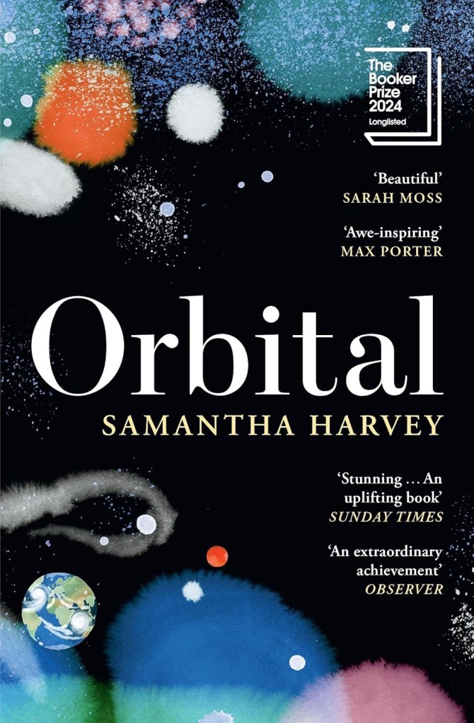
Though the book’s subtitle is “a novel”, at 137 pages Orbital is basically a novella. Mostly it’s a book about nothing, involving six people that you are guaranteed to not care much about, set in the International Space Station. Garnish the whole thing with a mountain of purple prose, and that’s Orbital for you.

Could Harvey have come up with a more interesting premise involving the International Space Station (ISS)? Of course she could. What if Orbital would have been set during the pandemic, with astronauts basically stranded up there, worried about their families and friends, worried about their resupply or how to get back home (see also the eight day space mission that will last for nine months). What if one of the astronauts that was meant to return from orbit refused to return? (It happened in the past). There’s no end to the interesting dramatic situations that being in orbit in the ISS offers. Harvey will have none of that.

The astronauts themselves are a dull lot, that you learn very little about. There’s a religious guy with a postcard that’s supposed to be profound but isn’t; there’s an Italian guy that went scuba diving on his honey moon; there’s a Japanese woman who’s mother dies of old age (spoiler: that’s the drama in the novel); there’s a woman that’s possibly Irish, possibly British that has a peculiar non-relationship with her husband, but don’t worry we don’t get to explore that. And there are two Russian guys. That’s the extent of the characters in Orbital, and that’s how well you get to know them or care about them.

The novella takes place during 16 orbits of the ISS around earth, and there’s a giant typhoon that takes place during a few of these orbits. There’s a weird “white saviour” bit, but without the “saviour” part of it with the Italian astronaut and a poor fisherman’s family that he met during his honeymoon and we’re to believe they kept in close touch with for years until the story takes place. Don’t worry – Harvey doesn’t want drama anywhere near her work, so there is none even at this point.

What there is a lot of is self-involved, bloated purple prose about the beauty and fragility of our planet, space and humanity. None of it is earned, none of it is attached to the narrative, all of it could have been cut out – but then there would be no Orbital.

I rarely review books that I dislike, and I should have given up on Orbital a quarter of the way through, like I originally wanted, but I didn’t. So let this be a warning to you: not all Booker award winners are worth reading.

Weekly Update: Impressionism, Cal Newport and Inkvent End

Inkvent

I’m finally done with reviewing the Diamine Inkvent 2024 Black Edition calendar and it’s been exhausting. I haven’t been able to get a proper buffer for the even this year, which meant that I was chasing every post every day.

On the plus side, it was nice to dust off 25 bears and sketch them. My sketching and my blogging had been in a rut recently and this event kickstarted them, so I am grateful for that. I also got some lovely comments from people, which is always wonderful to read.

Wild sunset today

Cal Newport

The latest episode of Cal Newport’s Deep Questions podcast was excellent, and in the final segment Cal discussed his new approach to making a quarterly plan. It’s worth listening to, but basically his idea of pillars and foundations and focusing on a certain pillar at a time really resonated with me. My next quarter will be focused on craft as a pillar, as I want to earn a professional certification and work towards a deeper understanding and more hands on experience with certain more obscure aspects of my job.

Reading

I finished reading the HBR “Dealing with Difficult People” book, and started reading Paul Auster’s “The New York Trilogy”. So far it’s a very Paul Auster book, for good and for bad.

Impressionism

I went to see an Impressionist exhibition, celebrating 150 years to the movement, at the local art museum. The exhibition itself was nice enough, but a bit thin in terms of the artwork on display. There was also a nice print exhibition, and an excellent retrospective exhibition dedicated to Moi Ver. It was wonderful seeing a master photographer at work, and his design work is also worth seeing.

Ci-Contre Moi Ver
Ci-Contre Moi Ver

I went to the museum store later and went a little wild, purchasing a handmade ceramic cup made by a local artist, three postcards (which I wrote on and will give away), and a Leuchtturm1917 A5 dotted notebook that I didn’t need but I wanted anyway. I bought a Leuchtturm notebook the last time I was in that store, and it’s now my work daily driver notebook, so I assume I’ll find use for this notebook soon enough. The paper isn’t perfect, but it’s good enough for me for daily fountain pen use.

Have a great week!

Diamine Inkvent 2024 Summary

For the introduction post to 2024’s Inkvent, see this post.

Diamine Inkvent 2024 Black Edition is the fifth edition of their Inkvent calendars, and I’m sorry to say that it’s by far the worst. Partly it’s 2023’s Inkvent Purple Edition’s fault, as it’s the strongest of the Inkvent calendars to date and so it created high expectations for the Black Edition. But there were several things that went wrong with this year’s calendar that made it an overall disappointing experience:

  • There are four previous Inkvent calendars, and there’s only so many ink shades in the world. The black edition featured a lot of inks that were pretty similar to ones seen in earlier Inkvent calendars.
  • This year’s “special effect” was “Extreme Sheen” and it just doesn’t have the same impact as effects like Chameleon and Star Bright that we saw in previous calendars.
  • The “Extreme Sheen” effect didn’t improve all the inks it was applied to.
  • Almost a third of the inks in this calendar were in the “dark and bland” range: grey, brown, black. There’s only so much joy a brown ink can spark.
  • There were very few bright inks and not all the bright were great (see Lemon & Lime and Fruit Cocktail discussed below).
  • A good number of the inks had very little festive appeal. This wouldn’t have been a big deal if Diamine hadn’t set the festive bar so high: they deliberately name their inks for festive or wintery things. Previous Inkvent calendars did much better in this regard (the first ones, the Blue Edition and Red Edition took this a bit too far), so it’s hard not to be disappointed in the Black Edition’s performance on this front.

Here’s all this year’s inks in order (read further on for a breakdown of each group and buying recommendations):

All the 2024 Inkvent Col-O-Ring ink swabs

Blues

There were six blue inks in this year’s Inkvent:

  • Two shimmer inks, Diamine Baltic Breeze and Diamine Icy Lilac. These are nice inks that are very similar to one another and similar to previous blue shimmer inks from past Inkvents. These go into the “nice but not exciting” category, and score decently on festive appeal.
  • Two “Extreme Sheen” inks, Diamine Vibe and Diamine Cosmic Glow. These feature the new effect for this year’s Inkvent and feature it well. Overall these are two of the strongest inks in this year’s calendar in terms of “wow” effect, even though they’re not exactly holiday themed.
  • One chameleon ink, Diamine Snow Globe. The chameleon effect is always nice and interesting, but the base blue ink is nothing new, and it also goes into the “nice by not exciting” category.
  • One Star Bright ink, one of only two Star Bright inks in the calendar, Diamine Chilly Nights. The fact that there are only two Star Bright inks in this calendar contributed to this year’s Inkvent being so underwhelming. There is no greater wow effect than a Star Bright ink on a dark ink, and Diamine Chilly Nights really delivers on that front. The base blue black is very nice, and if you enjoy using shimmer inks then Diamine Chilly Nights is definitely an ink to consider.

All in all the blues in this year’s Inkvent were the strongest overall group by far.

All the blue Inkvent Col-O-Ring ink swabs

Pinks and Reds

There were five pink and red inks in this year’s Inkvent:

  • Three standard inks, Diamine Wilted Rose, Diamine Cranberry and Diamine Lullaby. Diamine Wilted Rose is a nice and interesting “antique” rose colour, Cranberry is a decent but not overly unique ink, and Diamine Lullaby is on the “barely readable” spectrum. Of these three the standout ink is Diamine Wilted Rose, and it’s not a “star” ink by any measure.
  • One scented ink, Diamine Forest Gateau. I loath scented inks so I won’t elaborate on this one.
  • One chameleon ink, Diamine Winterberry. This is the standout ink in this group, one of the few bright and festive inks in this calendar, and a great ink to buy if you’re looking for a “Christmas greeting cards” ink. A breath of fresh air among the washed out and dark colours of this year’s calendar.
All the red and pink Inkvent Col-O-Ring ink swabs

Greens

There were only four greens in this year’s Inkvent:

  • Three chameleon inks, Diamine Lemon & Lime, Diamine Mint Twist and Diamine Pine Needle. Lemon & Lime is unusable even in a wide and generous nib as it’s way too bright and light to be readable. Diamine Mint Twist is the standout ink in this group, the one with the most unique base ink colour. Pine Needle is nice enough, but there have been plenty of inks in this colour before.
  • One “Star Bright” ink, the only other one in the calendar, Diamine Noble Fir. It’s not as impressive as Diamine Chilly Nights because the base ink colour isn’t dark enough for the Star Bright effect to have the most impact. It’s a good, bright green ink though.
All the green Inkvent Col-O-Ring ink swabs

Oranges

There are three oranges in this year’s Inkvent:

  • Two “Extreme Sheen” inks, Diamine Grotto and Diamine Sleigh Ride. Of the two Diamine Grotto is a great ink, and Sleigh Ride is poorly named and features a rather unattractive combination of an orange base and green-brown sheen. If you like rust effects you might enjoy it, otherwise, Diamine Grotto is the better choice.
  • One scented ink, Diamine Fruit Cocktail. I think that this is the worst ink in this year’s calendar for having a combination of scent and zero shading.
All the orange Inkvent Col-O-Ring ink swabs

Darks – Greys, Browns, Blacks

There were seven (!) inks in this category in this year’s Inkvent:

  • Three standard inks, Diamine Marley, Diamine Tundra, and Diamine Potpourri. Of the three Diamine Marley is by far the best, with Diamine Potpourri being too light to be readable (I could have placed this ink in the pinks category, but it’s so greyish and washed out that it felt more in place in this category), and Diamine Tundra being greyish brown, if you’re into that shade.
  • Two shimmer inks, Diamine Nutmeg and Diamine Salted Caramel. Of the two I prefer Diamine Salted Caramel, though there have been similar enough inks in previous Inkvents for you to feel free to skip this one.
  • One chameleon ink, Diamine Wishing Tree. The strongest ink in this group and one of the best inks of this year’s Inkvent, Wishing Tree has a great combination of a fantastic base ink colour and a lot of added interest from the chameleon effect.
  • One “Extreme Sheen” ink that was supposed to be the highlight of this calendar, Diamine Good Tidings. I found it far from “extreme sheening” and the sheen effect was a very unattractive dirty yellow.
All the dark Inkvent Col-O-Ring ink swabs

Summary

So these are the inks that I would consider buying from this year’s calendar (with the addition of Diamine Winterberry if you see yourself needing a festive red ink): Diamine Marley (interesting duo-chrome ink), Diamine Wishing Tree (duo-chrome interesting base shade ink with great chameleon effect), Diamine Grotto (great base orange ink with attractive extreme sheen), Diamine Mint Twist (unique green with a chameleon effect), Diamine Vibe (attractive dark turquoise ink with great extreme sheen), and Diamine Cosmic Glow (great royal blue base ink and wild extreme sheen).

All the inks that I would consider buying Inkvent Col-O-Ring ink swabs

As a reminder, this year’s Inkvent wasn’t sold out, which means that if you’re interested in these inks and haven’t yet gotten the calendar you can expect it to be on sale in various places soon enough. It’s a great way to get a good amount of varied ink samples, and each little bottle is good for at least 2-3 fillings (plus there’s a big 30ml bottle in day 25).

Midyear, at around June or July, Diamine will come out with the “Black Edition” of these inks. These are 50ml editions of the Inkvent 2024 Black Edition inks, in gorgeous glass bottles. They make for great gifts, and are worth getting as they’re very well priced for the “premium ink” experience.

I have 20 fountain pens filled with Inkvent inks in rotation at the moment, and it will take me a while to work my way through them. Will I do Inkvent again next year? I don’t know. The price plus shipping has gotten steeper every year, and this year’s calendar was a pretty big disappointment in my opinion. When pre-orders start for next year’s Inkvent (if there will be one), I’ll have to really consider it.

What are your favourite inks from this year’s Inkvent? What did you think of the Inkvent Black Edition?

Diamine Inkvent 2024 Day 25

This is the Diamine Inkvent 2024 Day 25 door:

The door

Day 25’s ink is a full 30ml bottle of Diamine Good Tidings, a black ink with what is meant to be gold Extreme Sheen. I used an Esterbrook Estie with a Journal nib to test this ink out.

Col-O-Ring swab

I don’t think that I could be more disappointed in a “grand finale” Inkvent ink. Diamine Good Tidings would obviously need to be black because this is the Black Edition of the Inkvent calendar, but the choice to make it an “Extreme Sheen” ink was a poor one. I understand the logic behind this choice (“Extreme Sheen” is a new ink property for this year’s calendar, so of course the ultimate ink of the year needs to have this property), but the result is very underwhelming. The sheen is barely observable, and the result is just a deep black ink.

Different angle of Col-O-Ring swab

Even on original Tomoe River Paper you can barely see the sheen, and when it appears it makes Good Tidings a less attractive ink to behold, not a more attractive one. The choice of silver shimmer or a chameleon effect would have been better for this ink. When the sheen does appear it’s a sickly yellow colour, not the gold that Diamine were likely going for.

Writing sample on original Tomoe River paper

On Rhodia paper Good Tidings simply looks like a very saturated black ink, with no visible sheen. The drying times aren’t great, but if you’re looking for a solid black fountain pen ink Diamine Good Tidings is pretty good.

Writing sample on Rhodia paper

On Midori MD Cotton paper the sheen becomes more visible, but it’s far from what I would term “extreme sheen” and it mostly fades to the background. You can barely see hints of it in the writing in today’s bear sketch:

Bear sketch on Midori MD Cotton paper

Only at a sharp angle and close up you can see the yellowish gold where the ink pooled, such as in the eyes. The nib I used lays down a generous amount of ink, so I would have expected to see more of the sheen than actually appeared here:

Close up of the sketch on Midori MD Cotton paper

The final bear for this year is Tossi, designed by Margarete Nedballa, numbered 115 out of 399 and made by Clemens Bear (so he’s a German bear). I don’t normally like clothed bears, but I liked this fellow’s hat and the way that it matched his unusual nose, which is why I got him. He’s from a store in York called “Christmas Angels” which was wonderful and is now closed (it didn’t survive the pandemic). It was dedicated to Christmas toys and decorations all year round, and had a collectors’ teddy bear room on the top floor.

The bear

Diamine Good Tidings is a nice black ink that I will likely use quite a bit, but for the crowning glory of this year’s Inkvent it’s a bit of a disappointment. I was expecting something with more pizzazz, more of a wow effect.

That’s it for this year’s Inkvent. I will be posting a summary post with buying recommendations and an overview of all the inks over the weekend. In the meanwhile have a Merry Christmas, a Happy Hanukah, and peaceful holidays.

Diamine Inkvent 2024 Day 24

This is the Diamine Inkvent 2024 Day 24 door:

The door

Day 24’s ink is Diamine Salted Caramel, a caramel brown ink with bronze shimmer. I used a Diplomat Elox fountain pen with an extra fine nib to test out this ink.

Col-O-Ring swab

Diamine Salted Caramel is a raw sienna brown ink with a good amount of shading and a good amount of shimmer that shows through even with an extra fine nib. The bronze shimmer gives it a festive, golden sparkle.

Close up of Col-O-Ring swab

Here’s a closer look at the shimmer effect in this ink:

Different angle of Col-O-Ring swab

On original Tomoe River paper you can see both the shading and the shimmer quite significantly:

Writing sample on original Tomoe River paper

However, even on more absorbent Rhodia paper and with an extra fine nib the shimmer and shading are evident. As only the day before yesterday featured a brown ink with shimmer (Diamine Nutmeg), it was a bit surprising to see another brown ink with shimmer make its appearance. I like Salted Caramel more than Nutmeg, though, because it’s a warmer shade of brown.

Writing sample on Rhodia paper

Here’s another look at the Rhodia paper writing sample, where both shading and shimmering are apparent:

Different angle of writing sample on Rhodia paper

And here’s a comparison of Diamine Nutmeg to Diamine Salted Caramel:

Col-O-Ring swab comparison of Diamine Nutmeg to Diamine Salted Caramel

I enjoy sketching with brown inks, and Diamine Salted Caramel was no different. I did have some weird flow issues at start, but they passed so maybe it was a one time thing. Salted Caramel shades beautifully, and so it’s nice to loosely sketch with it.

Bear sketch on Midori MD Cotton paper

You can see where I had flow issues on the top right corner of Pumpkin’s head (the faded brown lines beneath the more prominent ones):

Close up of bear sketch on Midori MD Cotton paper

This tiny, tiny bear is called Pumpkin and she’s 3 of 4, made by Maddy Aldis, and is very, very heavy as she’s filled with lead shot. I love her wild look and her pastel rainbow colours, which is why I got her.

The bear

I would have liked to have seen a different shade of ink, one that isn’t brown, but having Salted Caramel make its appearance on day 24 isn’t the end of the world. It’s a nice, warm brown with lovely shading and shimmer, and it’s not its fault that Diamine Nutmeg was there two days before it. It’s a great festive ink to write greeting cards with, and I had fun sketching with it.

What do you think of Diamine Salted Caramel? Do you prefer it to Diamine Nutmeg?

Diamine Inkvent 2024 Day 23

This is the Diamine Inkvent 2024 Day 23 door:

The door

Day 23’s ink is Diamine Pine Needle, a sap green with chameleon shimmer in green and blue. I used a Lamy AL Star with a broad nib to test out this ink.

Col-O-Ring swab of Diamine Pine Needle

Here’s a close up of Diamine Pine Needle’s Col-O-Ring swab. There’s a bit of shading with this ink, and the chameleon shimmer adds interest to what otherwise would be not the most interesting shade of green.

Close up of Col-O-Ring swab of Diamine Pine Needle

Here’s the Col-O-Ring swab from a different angle, where you can better see the chameleon shimmer:

Different angle of Col-O-Ring swab of Diamine Pine Needle

Diamine Pine Needle is definitely one of the more festive inks in this year’s calendar, and it’s delightfully neither grey nor brown, which is an added bonus. I use sap green as the base green of my watercolour palette so it was nice to get to see it in a different context and with a bit of chameleon pizzazz added.

Writing sample on Rhodia paper

Here’s the chameleon effect on the Rhodia paper. You can also see that Diamine Pine Needle shades quite nicely:

Different angle of writing sample on Rhodia paper

You can see the shading more clearly on original Tomoe River paper:

Writing sample on original Tomoe River paper

Even without the chameleon shimmer Pine Needle would have been a nice ink, but with it it’s one of the best inks in this year’s Inkvent. Here’s today’s bear sketch on Midori MD Cotton paper:

Sketch on Midori MD Cotton paper

A different angle to show off the chameleon shimmer of Diamine Pine Needle:

Different angle of sketch on Midori MD Cotton paper

Today’s tiny bear is Oliver, a one of a kind handmade bear by June Kendall for Hardy Bears, a small English maker. His mohair is two toned and gorgeous and I love his classic teddy bear look in minuscule size.

The bear

Diamine Pine Needle isn’t really the blue green shade of pine needles, but I don’t care much. It’s a nice, festive ink with a good amount of shading and lovely chameleon shimmer, and it’s one of the brightest inks in this year’s Inkvent. It’s like a breath of fresh air after all of the drab and muted colours we’ve seen this year.

What do you think of Diamine Pine Needle? Do you like this shade of green?

Diamine Inkvent 2024 Day 22

This is the Diamine Inkvent 2024 Day 22 door:

The door

Day 22’s ink is Diamine Nutmeg, a greyish-brown ink with gold shimmer. I used a Levenger True Writer fountain pen with a fine nib to test out this ink.

Col-O-Ring swab of Diamine Nutmeg

Diamine Nutmeg has a mousy brown base colour with a good amount of shading, and with gold shimmer that saves this ink from being a bland, depressing disappointment.

Close up of Col-O-Ring swab of Diamine Nutmeg

The gold shimmer does two things for Diamine Nutmeg: it warms up what would otherwise be a “cold” brown, and it adds interest and life to this ink.

Different angle of Col-O-Ring swab of Diamine Nutmeg

This year’s Inkvent seems laden with grey, brown, and dark inks, and Diamine Nutmeg fits right in with this crowd. What “saves” it is the gold shimmer, because otherwise it would be the last sort of ink colour you’d want to see in a holiday themed calendar.

Writing sample on Rhodia paper

Here’s a close up on some of the shading and the glitter. This is a rare case where I would have actually welcomed more glitter:

Close up of writing sample on writing paper

On original Tomoe River paper you see more of the shading:

Writing sample on original Tomoe River Paper

The photo of today’s bear sketch came out weirdly dark, I don’t know why. In any case, Diamine Nutmeg is a nice enough ink to sketch with, and as I expected it shades even more on Midori MD Cotton paper than it does on Rhodia paper, but still I wouldn’t call it a very interesting ink.

Bear sketch on Midori MD Cotton paper

Here’s a close up of the shading and the shimmer:

Close up of bear sketch on Midori MD Cotton paper

Today’s bear is an unnumbered Clemens bear (so he’s a German bear). I love his solid squatness and his squashed face, which is why I got him.

The bear

I don’t know what made Diamine lean into the darker and more muted side of the ink colour spectrum this year, but the result isn’t inspiring or festive. Diamine Nutmeg is saved somewhat by its shimmer, and it most certainly fits its name, but I still don’t see myself wanting to use it with any regularity.

What do you think of the ink selection this year so far? Do you like Diamine Nutmeg?

Weekly Update: 3 year chemo-versary

It’s been three years today since I finished my chemotherapy and have been in remission. I spent the day celebrating with my family, I’ll have another celebration next week, and I’m about to watch Mischief Movie Night In to finish a very nice day indeed.

Having dealt with cancer at a relatively young age sets certain priorities very straight in life. Health, family, friends are above all. I start my journaling every day with a 4-5 things that I’m grateful for. I’m constantly aware that everything in life is fleeting, everything can be taken away from you at any time, so it’s really important to take the time and appreciate everything that you have, even if it’s not always everything that you’ve wanted.

Teddy bears getting ready to be photographed for Inkvent

Reading

I have finished two books this week, Cal Newport’s “How to Become a Straight A Student” and Samantha Harvey’s “Orbital”. Newport’s book was excellent and I plan on using the advice within it to help me prepare for a big certification exam that I’m taking this year. Harvey’s “Orbital” won this year’s Booker prize, which is why I read it, and it’s a complete waste of time. It’s around 140 pages of bloated, purple description, with no plot, no interesting or fleshed out characters, and nothing but platitudes to say about humanity, humankind or the planet. I have no idea why it won, and it was so bad that it completely put me off of trying to read Booker award winning books.

Inkvent

I’ve managed to build a small buffer, which will come in useful as I have to write this year’s Inkvent summary post and I’m still not sure how I’ll tackle it. This year’s calendar isn’t like the ones previous, and so I will need a fresh approach to this summary post this time.

Planning

I’m gearing up to switch planning notebooks after next week, and to start a new quarter. My plan for next quarter is largely ready, and is a little different this time. I’ve pared things down, and I might even streamline them more. I have a week to hammer out the final details, and I’ll likely be dedicating a post to the process in the end.

Have a great week and remember to count your blessings.

Diamine Inkvent 2024 Day 21

This is the Diamine Inkvent 2024 Day 21 door:

The door

Day 21’s ink is Diamine Cosmic Glow, and Extreme Sheen ink that has a royal blue base colour and extreme pink sheen. I used a Lamy Safari fountain pen with a medium nib to test out this ink.

Col-O-Ring swab of Diamine Cosmic Glow

Diamine Cosmic Glow utterly earns its name and its Extreme Sheen designation. The base colour is a very rich, deep, saturated purplish blue, and the pink-purple sheen overlays much of it, literally making it glow.

Close up of Col-O-Ring swab

Here’s an angled view of the Col-O-Ring swab, where you can better see the extent of the sheen on this ink:

Different angle of the Col-O-Ring swab

Diamine Cosmic Glow sheens less than Diamine Vibe but it still shows a lot of sheen on every letter, even with fine nibs, even on relatively absorbent Rhodia paper:

Writing sample on Rhodia paper

Here’s an angled view of the writing sample where you can see the sheen:

Different angle of writing sample on Rhodia paper

On original Tomoe River paper the sheen is even more clear:

Writing sample on original Tomoe River paper

And you can see it well on Midori MD Cotton paper in today’s bear sketch:

Sketch on Midori MD Cotton paper

A closer look at the sheen on Midori MD Cotton paper (you’ll notice that since Diamine Cosmic Glow is a very saturated ink, there’s no shading visible with this ink):

Different angle of sketch on Midori MD Cotton paper

Today’s bear is very special and precious to me. I bought it a long time ago in a beautiful store in Greenwich, London that no longer exists. It was in the Greenwich market, part of an array of wonderful and unique shops that no longer exist in the market, and it sold doll houses and doll house things for collectors, and collector’s teddy bears. People who were trying to create doll houses that were period specific would go there and could find everything, from the house to the wallpaper, furniture, dolls, cutlery, stoves, etc. You could build a Victorian house, including servants and servant quarters, or a ’60s flat, all to the highest level of precision. Apart from that they had a stunning, large and wide selection of collectors’ teddy bears, and the patience to explain the ins and outs of hand made, limited edition teddy bears to a new collector like me. I purchased Midnight Micky (this bear’s name) because he was a black bear, and the only black bear in a store with hundreds of bears on display. The couple that ran the store explained that black bears are difficult to make, and so there’s very few of them. Midnight Micky is one of two bears made by hand by a small English maker, and I cherish him very much both because I love his looks and because he’s one of the few bears I have from that lovely shop, Greenwich Bears.

The bear

Diamine Cosmic Glow is likely going to be one of this Inkvent’s stars, and not only because so many of this year’s inks are on the darker or more muted side of things. Its rich and beautiful base royal blue colour in itself would make it pop, but with the added glow of extreme purple-pink sheen it really becomes a super-star. I wouldn’t trust this ink with a vintage fountain pen, and it takes a good long while to dry, but it’s a fabulous ink and one that I would consider buying a full bottle of.

What do you think of Diamine Cosmic Glow? How do you think it compares to Diamine Vibe?

Diamine Inkvent 2024 Day 20

This is the Diamine Inkvent 2024 Day 20 door:

The door

Day 20’s ink is Diamine Potpourri a standard mauve ink with plenty of shading. I used a Lamy AL Star fountain pen with a fine nib to test out this ink.

Col-O-Ring swab of Diamine Potpourri

There is an insane amount of shading with this ink, even with a fine nib. It’s a very dusky pink, not the most attractive or bright of colours but the shading makes it much more interesting.

Close up of Col-O-Ring swab of Diamine Potpourri

Even on Rhodia paper with a fine nib you can see the amount of shading you can get with Diamine Potpourri. Thankfully, despite the name, Diamine didn’t make this one a scented ink. As it is it’s an unusual colour with unusual shading, so it’s worth a second glance even though there have been other inks in similar shades in the past and even in this calendar (Diamine Masquerade, Diamine Wilted Rose, Diamine Harmony, Diamine Memory Lane come to mind).

Writing sample on Rhodia paper

Here’s a close up on the shading you get with this ink. It’s pretty significant even on Rhodia paper:

Close up of writing sample on Rhodia paper

Diamine Potpourri’s shading gets even more pronounced on original Tomoe River paper:

Writing sample on original Tomoe River paper

As I expected, Diamine Potpourri shades even better on Midori MD Cotton paper, and it’s a nice ink to sketch with. Beyond that there’s not much to say about it – it’s a standard, well behaved ink.

Bear sketch on Midori MD Cotton paper

Today’s bear is a Dean’s Rag Book company. He’s unusual in that he’s doesn’t have the regular Dean’s bear look. I bought him second hand in York, and he looks as good as new, and very classically “teddy bear” (apart from the blue mohair).

The bear

Diamine Potpourri isn’t a very holiday themed ink, but it is on the more practical side of the inks in this year’s Inkvent. It’s a standard ink, that’s clearly readable, has an unusual colour and an unusually prominent amount of shading. It is, however, a bit drab, so I do expect it to be somewhat divisive. At least it isn’t a scented ink…

Do you like Diamine Potpourri or is it too washed out and drab for you?