How I Use Pencils in Watercolour Portraits

Continuing my “how I use the stuff I haveposts, I thought that I’d show how I use pencils when I’m working on a series of portraits of the same person.

Since I work in watercolour which is notoriously not great for correcting and changing your mind mid painting, when there’s a face that I know that I’ll want to explore I usually create a “construction” sketch which I transfer to paper several times. I can then paint the portrait in different tones, or focus on a certain aspect that interests me, or take it to really wild places without spending too much time on the technicalities of the preliminary sketch.

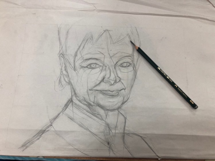
I start the “construction” sketch on newsprint paper. It’s much more detailed and “searching” than it needs to be, but that doesn’t matter much. Ultimately only the lines that will help me construct the face and note where the major light and dark transitions are will remain. I draw this with a Faber Castell 9000 2B or 3B pencil that’s sharpened with a pocket knife to allow me to use it without having to pause for sharpening. Newsprint paper is pretty transparent and also generally too fragile for regular erasers, so I use a kneaded eraser to lift off unnecessary lines, or simply ignore them.

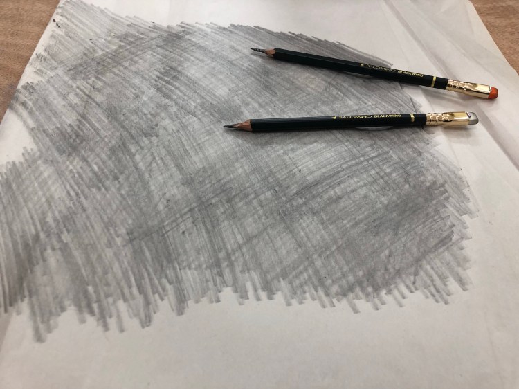
Once I’m done with that, I flip the page to the other side and scribble on it with a Faber Castell 9000 6B or Palomino Blackwing MMX. These are again sharpened with a pocket knife, and the point is to get as much coverage as possible. If I’m doing a lot of transfers then I might have to repeat this process, adding more graphite to the back of the sketch.

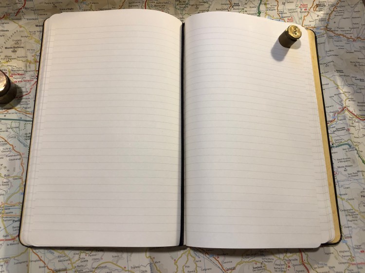
I then transfer the most important lines in my sketch on to a piece of watercolour paper. This is done by placing the newsprint paper with the sketch over the watercolour paper and going over the lines in the sketch with a 2H pencil (I use a Faber Castell 9000 2H, but this isn’t that important). The pencil needs to be a hard pencil for the lines to transfer to the paper below, but it can’t be too hard or too sharp or it will rip the newsprint paper. It’s also important to put just enough pressure when you’re tracing so the graphite on the underside of the sketch transfers to the paper, but not too much to bruise the watercolour paper. Using a 300 gsm watercolour paper helps protect it, but it’s mostly a matter of practice. When you’re done you get something like this:

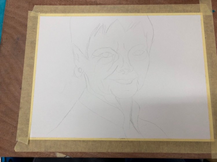
The lines are pretty faint, which is great when working with watercolour, because they don’t distract too much from the figure once you start working.

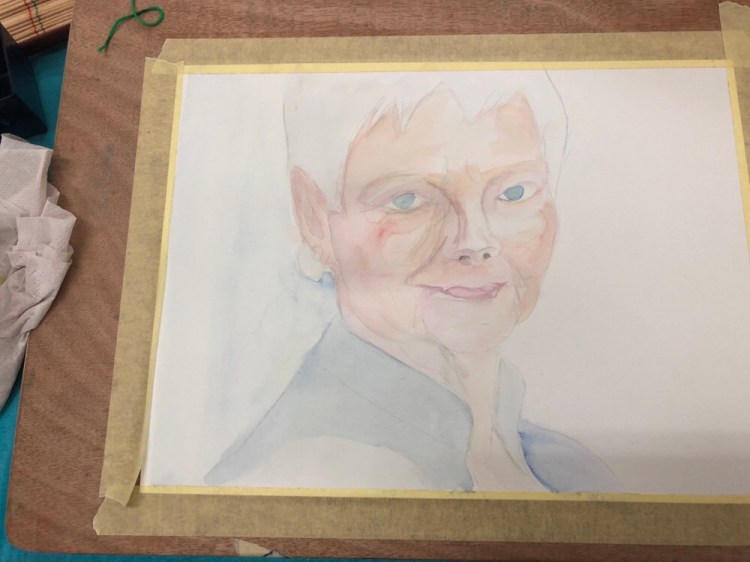
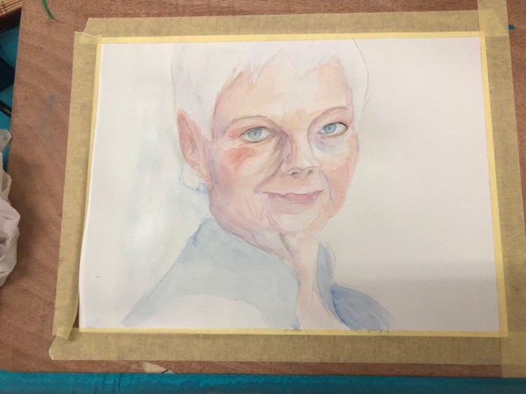
I created about five watercolour portraits of Dame Judi Dench from this sketch so far, and there’s a good chance that I’ll go explore her some more in the future.

The latest books to arrive

The latest books to arrive today:

The House of Broken Angels by Luis Alberto Urrea, which is the last Tournament of Books 2019 book that I still haven’t read.

Provenance by Ann Leckie, which ties into her masterful and award winning Imperial Radch trilogy.

Spring by Ali Smith, which is the third in her season’s project. I loved Autumn and Winter and I can’t wait to dig into this one.

I’m in the middle of Lies Sleeping the latest Ben Aaronovitch Rivers of London book and it’s difficult to put it down, but I’ve decided to put it on hold and finish with the Tournament of Books as I originally planned.

Moleskine Basquiat Limited Edition Notebook Review

It is rare that I start using a notebook the moment I unwrap it, but the Basquiat Moleskine limited edition had that effect on me even though I originally didn’t plan to buy it.

The colour of the cover is what drew me to this notebook. It’s a purplish blue that contrasts beautifully with the orange elastic closure. I didn’t even pause to take a picture of notebook when it was still wrapped. That periwinkle cover makes Basquiat’s handwriting and art just pop. You can see the character in each line and it really does inspire you to grab a pen and write and draw and doodle.

The back cover (a little smudged from my enthusiastic use, but nothing that a wet-wipe can’t remove) is understated, with just the Basquiat signature. I think that I’d prefer the Moleskine logo to just be debossed in, like they did in several other recent editions, but it’s not a dealbreaker for me that it’s boldly there.

The front endpage echoes the front cover, with the addition of a pretty fitting Basquiat quote. I had already filled in the “In case of loss” details, so I hid them.

Look at that back endpaper. Is it not well designed? I like that they let the piece “breath”.

Unlike most Moleskine limited editions that come in lined paper, this notebook comes with blank pages. I like the choice, as it frees you to do whatever you want with the notebook: drawings and words will feel equally welcome here. Also, there’s an orange ribbon bookmark. What’s not to love about that?

The stickers are a bit of a disappointment in my opinion in terms of colour choice. I would have liked it better if they kept to the orange and periwinkle colour theme. As it is, they clash a bit with the rest of the notebook.

The B-Side of the paper band gives a little background on Basquiat, who he was and how he worked. It’s a nice little add on.

There are times when a notebook just makes you want to start using it, start writing and scribbling in it, start creating. The Basquiat Moleskine did that for me, and it is a fantastic addition to the Moleskine limited edition lineup for the year, and definitely a notebook that I recommend that you try.


Field Notes Rooster 2019 Limited Edition Notebook Review

Field Notes is a major sponsor of the Morning News’ Tournament of Books, and every year they celebrate the tournament by creating a specially themed notebook for the occasion. The notebooks are sold as singles and 100% of the proceeds from them are donated to the 826 National, which provides free educational programs to under-resourced youth. This year, the Rooster Book looks like this:

The party is all in the back, with this year’s ToB Rooster logo:

I really feel like colouring it in crazy psychedelic colours.

The notebook is lined, and the craft front cover is pretty standard for a Field Notes:

Again the back is where it’s at, with a list of this year’s Tournament of Books contenders.

You can check off the books that you’ve read, and I admit it was pretty fun checking almost all of them off.

This is a cool little edition that helps out two wonderful causes. The only thing I would change about it is its publication date. If Field Notes would have issued it at the time the list of contenders was announced then you could really use this notebook to follow along with the tournament. But I bought a few notebooks as a memento of my plan to read all the books in the tournament this year, and excellent for that.


Moleskine Pokémon Pikachu Limited Edition Notebook Review

Pikachu! I choose you!

This is the final large format Moleskine Pokémon limited edition notebook that I haven’t reviewed, and I think that it’s the one that Pokémon fans will most gravitate towards. Why? Because it’s Pikachu, and because it is so well designed.

Like the Charmander edition cover, the Pikachu notebook front cover shows Pikachu dreaming of when he’ll be all grown up and kicking ass as Raichu. It’s a lovely, cute design.

I would have liked the elastic closure to be yellow, but it works in black too, and I guess that black is more pragmatic in that it doesn’t show dirt that much.

Pikachu is super skipping happy on the front endpapers, and the background of banana coloured Pikachus works really well. You can’t have enough Pikachus after all, as any Pokémon GO player will tell you.

The back endpaper has the same background, and Pikachu resting from jumping around and fighting I guess. They probably posed him like this so you can see his stripes and tails, but I would have preferred him an an action pose with lightning maybe. Then again, it’s cute, and Pikachu is all about the cute. For those wondering, the background print is aligned on the back pocket of the notebook, and the webbing on the side of the back pocket is black.

The pages are lined (I love Moleskine’s lined notebook line width, as it’s perfect for my handwriting size) and the ribbon bookmark is black, which works, but I would have liked a yellow one instead.

As in the Pokéball edition and the Charmander edition you get cardboard bookmarks instead of stickers as the little add-on in the notebook’s back pocket. These are really well designed and I’m going to hazard a guess that Moleskine would have preferred to make stickers for these editions, but they were limited by their contract with Nintendo. Nintendo sells a lot of Pokémon branded merchandise, and there’s probably a contract somewhere that gives some sticker company rights for the Pokémon brand.

I accidentally tore the paper sleeve, and so the b-side on this one is pretty much ruined, but like the Charmander edition it’s Pikachu in all his evolutions: Pichu, Pikachu and Raichu.

Should you get this for the Pokémon fan in your life? Yes you should. All three notebooks in this series (and the pocket notebooks which I will not review) are excellent. This would be a great way to get someone to consider journalling, or keeping notes on a trip or during an interesting or difficult time in their life. These are now pretty heavily discounted all over the place, so they’re also kind of a nice little treat to buy for yourself.

Pika! Pika!

Field Notes: Out and In (Campfire and Fire Spotter)

Out: Campfire Night. I loved using this notebook despite my initial apprehensions about the orange grid and the photo covers (my favourite Field Notes Colours edition is “Balsam Fir”). The covers wear really well, and the orange grid isn’t as distracting as I thought it would be. I’ll still use this one for a while, until I finish reading the Tournament of Books books, as it has my logs in it.

In: Fire Spotter. I’ve started this notebook before, filled in two pages and abandoned it (I’m not a fan of dot grid). Decided to start using up the Field Notes notebooks that I started using and haven’t finished because it’s just a shame not to. Firespotter is a great edition if you like dot grid, and I love the debossing on the back cover.

This week’s long run: baby geese

I went for a long run yesterday, the first after a week an a half of hiatus due to muscle inflammation. It was good to be back, even if only for 8k, and even if this run was slower than my usual pace.

Caught the sun rising just over the river at ebb. The clouds made it particularly beautiful.

A little bittern and a night heron were fishing next to two fishermen as the sun rose:

I encountered a family of Egyptian geese both on my out and on my way back. The baby geese run out front and their parents follow, keeping an eye on them at a more sedentary pace:

The female is the lighter coloured goose, and the male is all decked out:

A little bittern was out hunting during the ebb tide:

Look at that sunrise. Is it not worth getting up early and going out for a run for that?

Lamy Studio Terracotta Fountain Pen Review

I’ve been eyeing the Lamy Studio for years now, but until now I haven’t purchased one because I found the available colours kind of boring and drab. Then they came out with the Terracotta limited edition, and I decided to give it a go.

The Lamy Studio Terracotta is a full metal bodied pen, and so it has some heft to it, although it’s nothing close to the weight of a Karas Kustoms Ink. Even if you have a small hand, the weight of this pen shouldn’t be an issue.

The colour of the pen is vibrant, and the matt finish on the pen practically glows in the light.

This fountain pen is famous for its propeller-like clip design, and it’s nice and functional but not something you notice after a little while. The Lamy 2000 and the Lamy Safari have much more striking designs.

The Lamy Studio uses the same nib units that the Lamy Safari uses, and the same converters too. The pen arrives in a beautiful, super sized box that makes for great gift packaging, complete with an ink cartridge and a converter.

The main issue with this pen is its grip. As you can see from the photos, it’s a shiny, slippery metal grip. That’s a problem, especially if you tend to sweat, or if you use hand cream. It’s not that the pen slipped when I wrote with it, but as my fingers had no real purchase on the grip, the pen felt insecure in my hand. Like it was going to fly out of my grip at any moment. That doesn’t make for an enjoyable writing experience.

As I was taking photos to try and get the colour of this pen, it rolled away (uncapped) and fell to the floor. The nib got slightly dinged, but I straightened it pretty easily. Even if it would have been badly damaged it would have been no big deal as I have plenty of Lamy Safari nibs to choose from to replace this one. That’s a big plus for this pen, since if you’ve invested in a few Safari or AL-Star or Vista Lamy fountain pens, you can swap the nibs around very easily.

I filled the Lamy Studio Terracotta with the Diamine Terracotta 150th Anniversary ink, and they go fabulously together. The Diamine Terracotta (and the Diamine Safari) are my favourites of the Diamine 150th anniversary inks, as it’s such a unique colour, with some nice shading, but it isn’t super saturated. This means that it can be used safely with vintage fountain pens, and that it can add a little va-va-voom to your office work without drawing too much attention to itself. It almost looks like a boring brown, but it very much isn’t. I love that in an ink.

A close up on the shading, that goes from a lighter reddish brown to a darker reddish brown on the ends of downstrokes even in a fine nib pen.

So, what’s the verdict? If the Lamy Studio had a different grip then it would be a five star pen. As it is, I don’t recommend it. The Diamine Terracotta though is an ink worth having, especially if you’re just starting out with exploring brown ink, or if you want an interesting ink to use in vintage fountain pens.

Mark One and Ohto Flash Dry Review

After waiting for over two months, my Mark One (purchased post Kickstarter) finally arrived. The pen, by Studio Neat, is made of aluminium and features a ceramic finish and a custom click mechanism. It also comes with a Schmidt P8126 rollerball refill (the same kind that Retro51 uses in their pens), which is absolutely horrible, so I switched it with an OhtoFlash Dry 0.5 gel ink refill instead.


The pen comes in a cork box that is very pretty, but not really functional. If you have tons of spare room on your desk you can reuse it as a pen tray for the Mark One, but as I don’t the box will just go to recycling. I would have preferred a simpler box, of the kind that TWSBI or Lamy uses, but this is a great box if you plan to give someone the Mark One as a gift.

The Mark One box is held closed by a piece of cardboard that doubles as an instruction sheet for the pen. That’s a nice idea, and the sheet is well designed and clear.

The box without the sheet doesn’t have a sealing mechanism (it’s just two pieces of cork), so it’s not really built to be a pen case, just a pen tray.

I chose the white and copper Mark One, which is very popular based on the waiting times on the Studio Neat website.

The pen is very comfortable to hold and use for long periods of time. It looks heavy but is super light, and the ceramic finish makes it very grippy. The wide barrel helps ensure that you don’t slip into “death grip” mode even if you have a tendency to.

The click mechanism is excellent and very solid and satisfying to use. It’s also very far from silent. The pen tip doesn’t rattle, and the pen looks as gorgeous as the pictures make it appear.

The Ohto Flash Dry 0.5 gel ink refill (PG-105NP)  is a needle point, parker refill that dries in a flash. It’s very dark and produces a line that is slightly wider than the Uniball 0.5 gel ink refills, but it somehow doesn’t smudge. Even on Moleskine, Rhodia and Tomoe River paper the OHTO Flash Dry dries almost instantaneously. It’s a left hand writer’s dream, and an excellent gel ink refill in and of itself. I have no idea why this refill hasn’t gotten more reviews, since there are so few parker style gel ink refills to begin with, not to mention good ones or ones that dry in a second or less. Maybe it’s because I don’t think it’s the kind of refill that’s widely available. It is, however, totally worth the price and effort.

Here’s a sample from my journal (which is a Moleskine). New Moleskines don’t have the spidering problem that they used to have, and there is no spreading or smudging with this pen/ink combo. The show through is a more significant than with a Uniball UMR-85 refill (the Signo 207), but the line is also wider and a good deal darker.

Here’s a writing sample on a Field Notes, where the first line (“Mark One”) was written with the original refill, and the rest with the Ohto Flash Dry.

Here’s the refill, which is available at JetPens and CultPens (I am not an affiliate of either):

I highly recommend the Mark One, as it’s a beautiful pen that’s just a joy to use. I would recommend switching the Schmidt refill out for the Ohto Flash Dry 0.5, or just using the Flash Dry in any parker compatible pen that you’ve got. It’s one of the best refills out there, especially if you’re left handed or tend to smudge your writing.