My Reading Journal, or How I Taught Myself To Enjoy Reading Again

Ironically enough, by the time I finished with my MA in English Literature a few years ago I had “lost” the habit of reading. From someone who used to read at every available (and not so available) moment I had turned into a non-reader almost entirely. This bothered me so I set up to rectify it by “gamifying” reading until I had tricked myself back into the habit again.

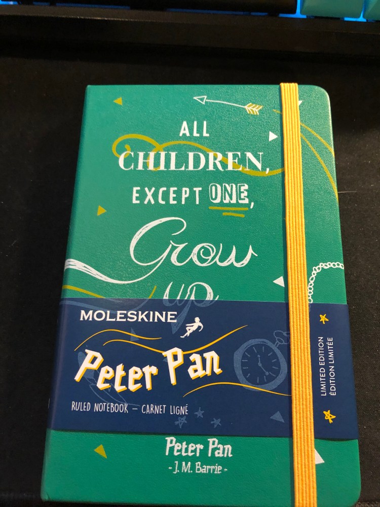
Field Notes had just come out with their Arts and Sciences, the perfect format for my plans. The idea wasn’t only to create a journal where I would log my thoughts on each book as I read it, but create a little set of “achievements” that I could unlock for each book as I read it. For each quarter of the book I read, I got an achievement, a little logo that symbolized the book which I drew on a separate page. The accumulation of those silly little symbols was enough to push me forward as I learned to enjoy reading again. I kept that up for three Field Notes Arts books and then when I ran out of them, I simplified the format and moved to the Moleskine Two-Go, which had just come out. The Field Notes Arts notebook wasn’t fountain pen friendly so I used a Karas Kustoms Render K, a Blackwing pencil and the Caran d’Ache Bicolor 999 double sided coloured pencil.

On the first year that I tried using this system (from March 2016) I got from not reading any new books (just my old familiar favourites) to reading almost 20 new books. On the second year (2017) I got up to 42 books. This year to date I’m at 58 books, and I’ll probably read 60-61 books by the end of the year. I no longer need to spend time drawing little “achievement badges” as my reading habit is back here to stay. I do, however, still keep a book journal even though I’ve started using Goodreads since 2017. It’s a satisfying way to keep track of my reading and organize my thoughts on the books that I’ve read.

You can check out the format of the entries for fiction and non-fiction below. The unlined left side of the spread (verso) is where I do a little doodle that reminds me of something central in the book, and explain the star rating that I gave the book in each category. I really recommend that if you choose to create your own analog reading journal, you create your format yourself. Mine has changed over time, particularly for non-fiction, and it works with my reading goals for the year.

This is the index, which is useful for reference later on and is a good way to check my reading progress throughout the year.

“Triggers” Daily Questions and a Moleskine Pocket Peter Pan Limited Edition review: All Children, Except One, Grow Up.

Ever since I’ve read the book “Triggers” by Marshall Goldsmith about six months ago I’ve been searching for ways to track the progress of my Daily Questions (“Did I do my best to…”). I tried using my journal for several months, then used a Google Sheet for two months, and in both cases something was missing. The Google Sheet was great for statistics and tracking, but not as satisfying and meaningful as writing my daily scores down (and I didn’t really find the statistics useful). The journal was much better, but as my goals changed it was time consuming to create a new table each time, and I needed a way to for me to justify my daily scores.

Enter tracking system number three: a Moleskine pocket Peter Pan limited edition notebook and an index card. Let’s start with the notebook:

The Peter Pan Moleskine limited editions showcase some of Moleskine’s best design work in recent years. Both the colourful covers, the drawing and the lettering evoke the spirit of Peter Pan without resorting to Disney-esque tropes. They’re naive without being childish, colourful without being brash, and the quotes on the covers are brilliantly selected.

Inside the covers are more illustrations in the same vein and even the famous “In case of loss” is set in a hand lettering like font. The palate of the entire Peter Pan line is limited (navy, orangey-yellow, green and white) but it never feels that way.

The back cover. Again, extra points for aligning the design so well with the back pocket. It almost seems like they’re flying into it:

This edition comes with stickers that are a lot of fun and well drawn in a naive style:

And the B-Side of the sleeve instructs you on how to build paper planes and also uses quotes from the books or that reference the book:

So that’s the review of the notebook itself. I highly recommend all of the Moleskine Peter Pan notebooks — they rank alongside the Denim and some of the Harry Potter limited edition notebooks as my favourites of recent years. I didn’t buy it specifically to try to use it as a Triggers Daily Questions tracker, but it was languishing in my “to use” pile and a used notebook is better than an unused notebook, so I decided to give it a spin.

The idea of writing down my Daily Questions each time was what made me stop using my journal for this purpose in the first place, so I decided to write them down once on an index card (which I would slip in the notebook’s back pocket), and then number each question, and date the card. Every day I would write down a score for each daily question, and a very short justification for the score. The justification is short to make it easy to write them down (if it’s a hassle I’ll have a hard time sticking with it), and that’s why I chose the pocket notebook (it’s also light and easy to carry around). When I feel like I need to change the questions up, I’ll create a new index card, put an end date on the old index card and archive it in the notebook’s back pocket. Every day will be dated in the notebook, and I use the appropriate index card if I really want to reference that particular day in the future. This may seem a little clunky for reference purposes, but as I learned over time, I don’t really go back to reference my past answers, so that’s not a meaningful setback.

I’ll check in a few months and document how it goes, but judging by my previous experience, this looks like a pretty good setup for now.

Early morning run: sunrise over the marina

There’s not much to say about this run except that I really needed it and really enjoyed it. So many bad things are going on in my life right now, it’s good to have running as a way of letting out some steam and escaping for a while.

Kaweco AC Sport Carbon Fountain Pen Review

After reviewing the Moleskine James Bond Carbon it was only natural to review my recently acquired Kaweco AC Sport Carbon fountain pen, so here you have it:

I’m not a huge Kaweco fan, mainly because their practically non existent filling system makes using them something of a pain. Cartridges are sometimes very useful (especially when traveling), but I generally prefer a cartridge based pen to accept converters as well and Kaweco’s Sport converters are a joke. They are difficult to fill and hold less than a drop of ink, and oftentimes come loose, so they’re basically terrible. Kaweco seems to be aware of that because they also make them difficult to obtain. You really have to want the pain to experience it (and believe me, you don’t. Save your money and buy yourself several cups of coffee).

So what possessed me to buy this pen? It’s pretty. There, I said it. That red, that carbon fibre — this pen is basically a Ferrari in pen shape: gorgeous and not very practical.

Look how pretty it is!

The nib is smooth and I was luck enough that it worked well out of the box. I’ve had mixed success with Kaweco nibs, so unless you’re comfortable dealing with baby bottom or flow issues I’d test the pen before buying.

The nib is also pretty handsome, and in this case a Fine, which is closer to a Japanese Medium. I got this pen on a closeout sale in a local art supply store so I lucked out on the nib, since you usually find Medium nibs in non-specialist stores.

I had a bunch of Diamine ink cartridges lying around, so I popped one in and gave it a spin. Here it is with Diamine Woodland Green, a very nice, well behaved ink with some shading:

The pen has a metal body but is not heavy. It can only be used capped (I have tiny hands so trust me when I say this), and despite its pocket size and rugged build, I’d never trust it, or any other fountain pen, in my trouser pocket. That way horror stories of stained pants lie.

Would you enjoy this pen? If you like the aesthetic, and are willing to compromise on ink cartridges, a steel nib and the price, then yes. If you’re looking for a daily workhorse or a practical pen, buy several Pilot Metropolitans, Lamy Safari’s, TWISBI ECOs or even a Lamy AL Star. This is a Ferrari pen — beautiful, frivolous and fun.

Moleskine James Bond Carbon Limited Edition

Dun da da da dun, dun dun dun, dun da da da dun, dun dun dun, DA DA, dun dun dun!

It’s the Moleskine James Bond Carbon Limited Edition and it is charming, it is sophisticated, it is elegant, it is everything you know James Bond has to be.

The cover has a carbon fibre like pattern and texture to it, and this time it’s all over the cover.

Moleksine went all in on the understated look this time, and just embossed the 007 logo on the cover, instead of gold foiling it. It’s the right choice in my opinion, and works well with their own embossed logo on the back.

So much texture…

The Moleskine logo isn’t as deeply embossed as the 007, which makes it half disappear in the texture of the cover, another good design choice on their part.

The endpapers, sleeve and stickers are exactly the same as the Moleskine James Bond Titles Limited Edition, but they’re slick, so I’ll photograph them anyway.

Front endpaper with the world map which I love so much:

Back endpaper with the titles design, another win, and yes, the back pocket print is aligned with the back cover print, so extra brownie points for that Moleskine:

The stickers:

And the B-side of the sleeve:

The only flaw in this edition seems to be in the spine, which creased because of the texture of the Carbon design. It’s far from a deal breaker and I would normally not even mention it, but there is a possibility that it may break there over use. Only time will tell if it’s just a slight aesthetic thing, or if it’s a real design flaw.

So, should you buy this notebook? Yes, even if you aren’t a die hard James Bond fan. There’s no notebook I know of that managed to pull of such a cool texture without making it feel super cheap and plastic-y. It’s a notebook that you can carry at work and will look completely professional, and also one that will be fun to use as a personal journal, a travel journal, a project notebook, or on your next secret mission to outer space.

This week’s long run: running rainbows

This morning’s long run was a race against the rain (spoiler alert — I lost at the last kilometre). Started out at 5:30, one of my earliest runs yet, and I could see the dark rain clouds come in over the sea. I would have loved to take a picture of them and the giant waves, but I prioritized getting my run over with before I got completely drenched, so I pushed forward instead.

I did stop to take a picture of this heron (there’s a better picture of him on the way back) because he looked so majestic against the backdrop of the river and the rising sun.

You can’t see him particularly well, but this is a pied kingfisher atop a pole. I saw him there last week too, so maybe that’s his spot. Later on during the morning seagulls take over the area and no kingfishers are to be found.

These pair of Egyptian geese were out grazing and the male really didn’t approve of me taking photos of his wife. They are large and pretty fearless birds, so once he started complaining at me I made sure to give him plenty of space.

And the heron from earlier, enjoying a cold morning dip:

A little egret paced along the temporary beach created by the low tide. He looked busy and preoccupied.

Just after I took this photo in a light drizzle on the last 900 meters of my run, torrential rain started, coupled by cold winds. Arrived home drenched and freezing, but elated. Running in the rain is a wild experience that everyone should try at least once.