April-May’s Currently Inked Fountain Pens

In the middle of April I inked up a bunch of new fountain pens, and at the end of the month I added two new fountain pens to this rotation. At the rate I’m writing with them I assume that this pen rotation will be with me until around the end of May, when I’ll be putting more “summery” inks into use.

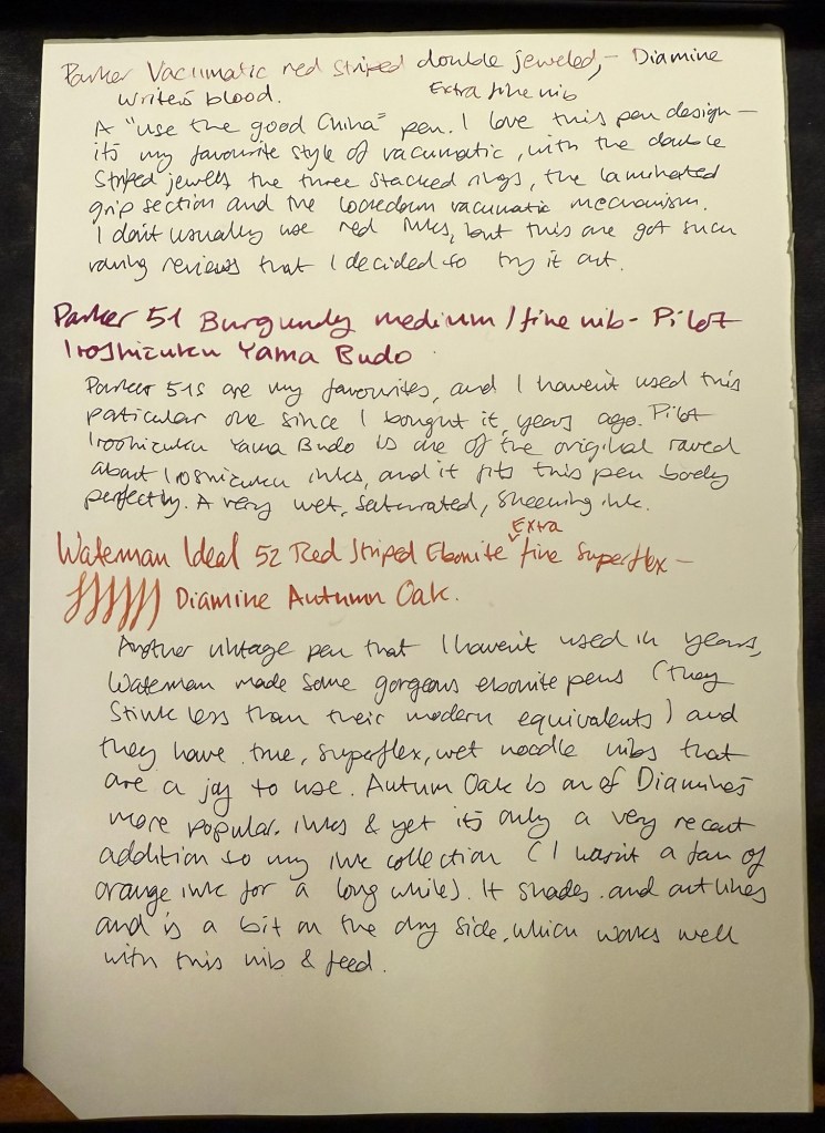
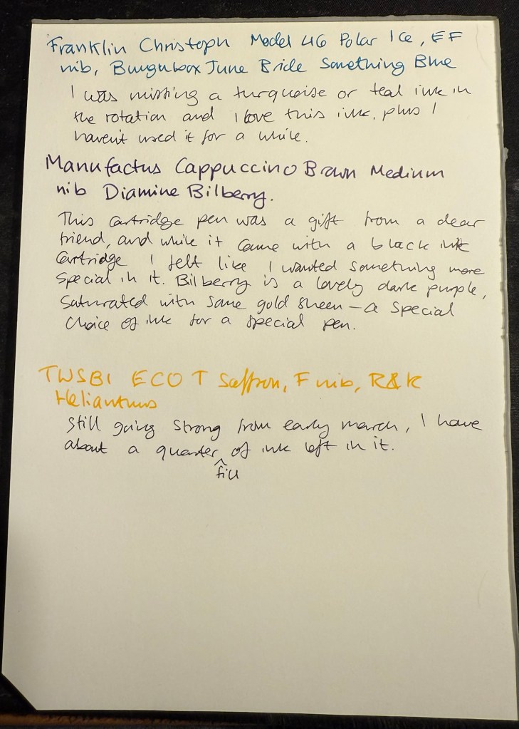
This is a rather eclectic group of pens and inks, but I was mostly looking for inks that I haven’t used for a long time or I haven’t used at all. Here they all are (I was in a rush when I created the writing samples so they’re messy, but life isn’t Instagram, so messy it is):
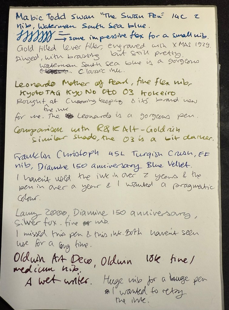
Messy Writing Sample #1
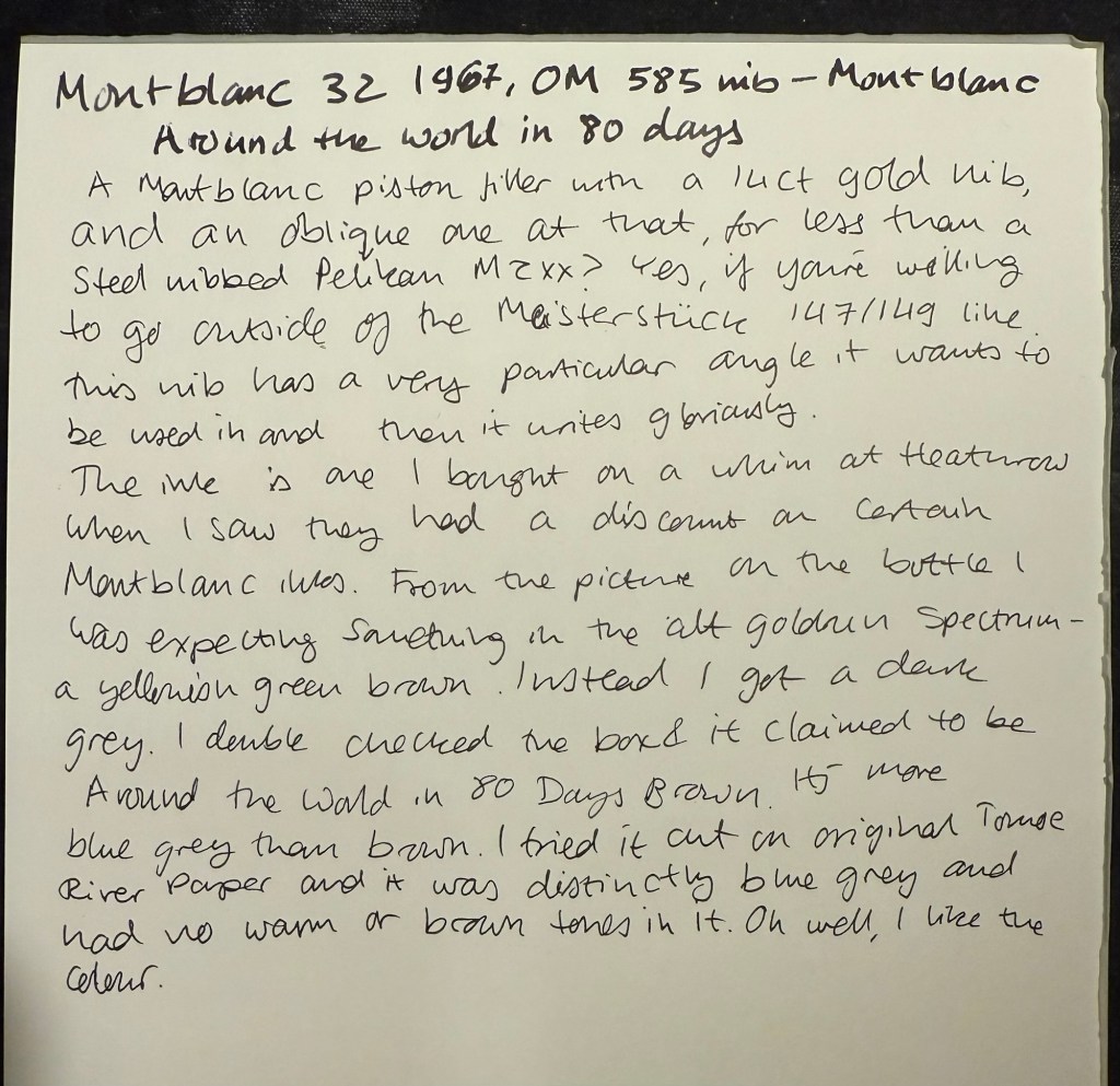
Messy Writing Sample #2

Mabie Todd Swan “The Swan Pen” 2 nib with Waterman South Sea Blue – a vintage gold plated lever filler pen, this is one of two vintage gold plated pens that I bought in Paris in Mora Stylos years ago. I don’t usually like the bling of gold plated pens, but I was drawn by the fantastic, very wet, flexible swan gold nib, and by the engraving on the pen body.
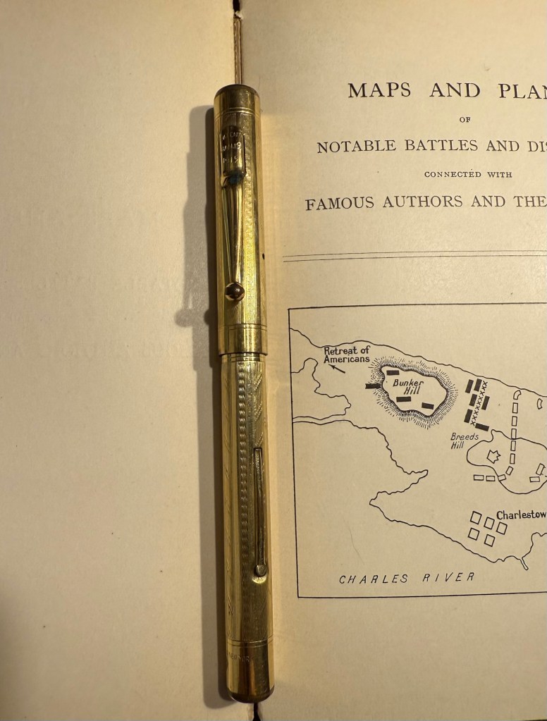
The Swan Pen

Normally engravings lower the value of a vintage fountain pen, but this one added value for me – I find it endlessly intriguing. This was clearly a Christmas gift, in 1929, and it was likely a lady’s pen, given its size and general level of decoration. I can stare at this pen and spin dozens of stories from that engraving, and this is one of the main reasons I prefer vintage pens. This one is “use grade” – the engraving, the dings on the body, the brassing on the clip, and the multitude of microscratches on it make it so – but I don’t care. It’s a treasure of a pen with a fantastic nib that I got at a very good price and gives me much joy. What else does one need?
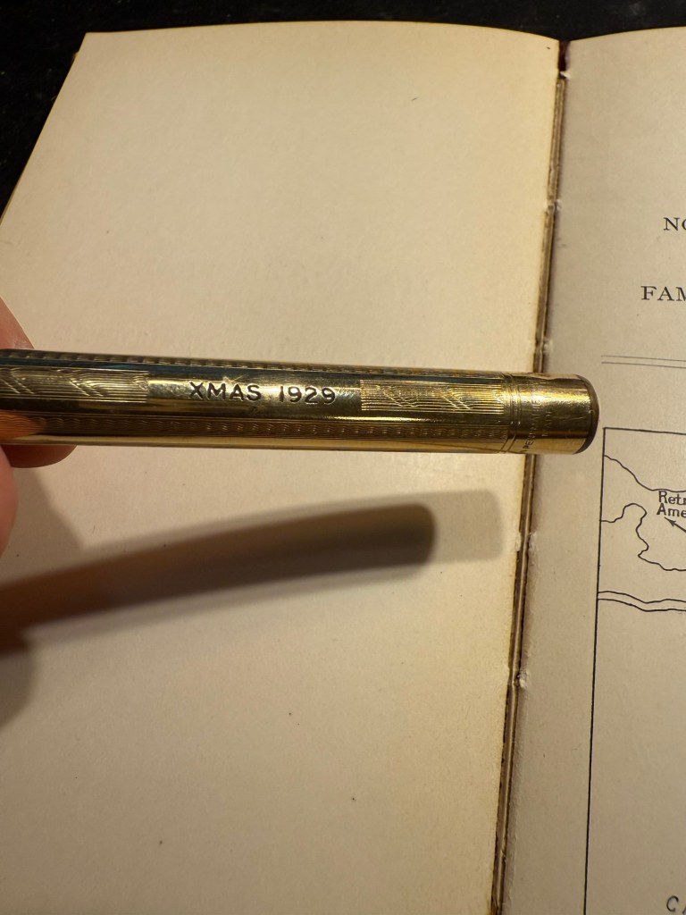
Closeup of the inscription XMAS 1929

I chose a Waterman ink for it because they’re the best inks for vintage fountain pens – very gentle, very easy to clean out of a pen, non-staining, and on the dry side (though not as dry as Pelikan 4001 inks) which works well with this very generous nib.
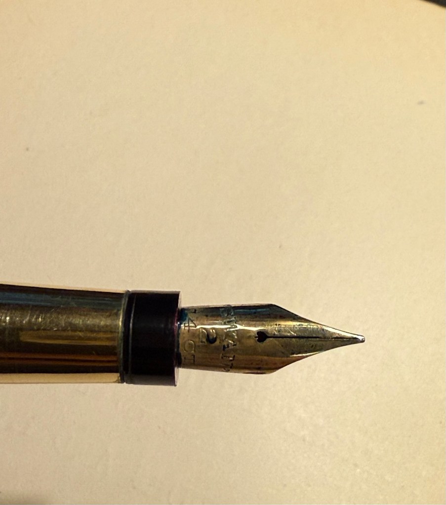
Swan 2 nib with heart shaped breather hole

Leonardo Mother of Pearl fine elastic nib with Kyoto TAG Kyo No Oto 03 Kokeiro ink – I wanted a Leonardo pen in rotation (I love them) and I wanted to try this new ink, and compare it to the Rohrer and Klingner Alt-Goldrün ink that I still had going at the time from March’s rotation. The inks are practically identical, with Alt-Goldrün being perhaps a shade lighter than the 03.

Leonardo Momento Mother of Pearl fountain pen

The Leondardo’s elastic or “flex” nib has cutouts in the nib shoulders to provide it a bit of give. It’s a nice nib that offers some line variation, but is nowhere near what you can get in vintage flex or super-flex nibs (particularly Swan and Waterman).
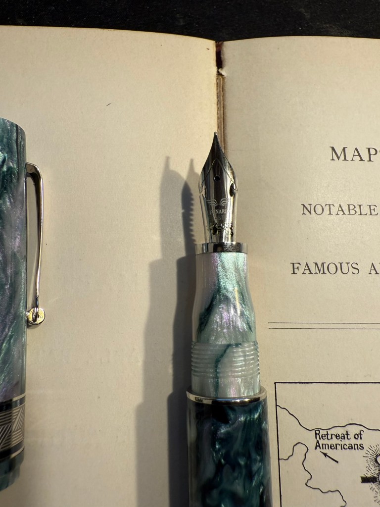
Closeup of the elastic nib with the cutouts in nib shoulders

Lamy 2000 fine nib with Diamine 150 anniversary Silver Fox ink – this is one of two Lamy 2000s that I have, and I really like this pens as workhorses. Silver Fox was part of the original collection of 150 anniversary inks that Diamine issued and it’s a nice mid grey that is very readable.

Franklin Christoph Model 46 Polar Ice extra fine nib with Bungunox June Bride Something Blue – I filled this pen about a week after the others since I wanted a teal ink that wasn’t in as wet a nib as the Swan. I got this ink as a gift from the Pen Addict Membership back in 2016.

Franklin Christoph Model 45L Turqish Crush extra fine nib with Diamine 150 anniversary Blue Velvet – another original 150 anniversary ink (Diamine later issued a second and perhaps also a third line of inks in this series, I don’t remember). This one is a nice royal blue, and another ink that I had used in years.
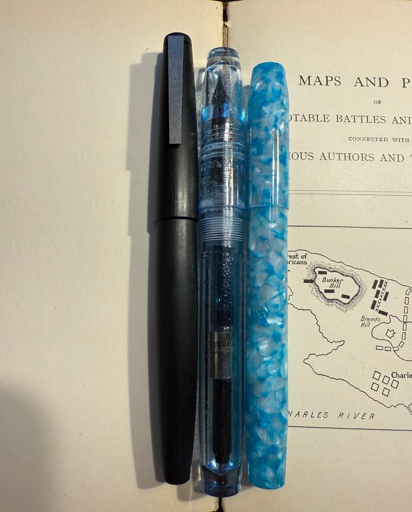
From left to right: Lamy 2000, Franklin Christoph Model 46 Polar Ice, Franklin Christoph Model 45L Turqish Crush

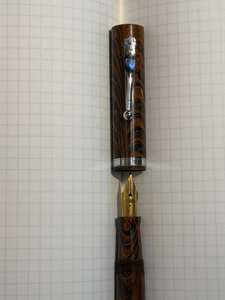
Oldwin Art Deco red and black striped ebonite, 18k medium nib with Diamine Writer’s Blood – as I’m writing this I have written this pen dry, mostly because it has a very wet and hungry nib and a standard sized converter. I bought this Oldwin from Mr Mora at Mora Stylos in Paris, and it’s a huge and surprisingly light pen.
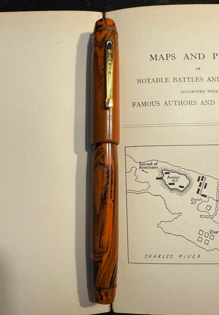
Oldwin Art Deco red and black ebonite

The nib is also a very large nib (size 8 and not size 6), and the pen is surprisingly not smelly for an ebonite pen. The feel of the material is fantastic – ebonite is such a warm material – and I like it enough to consider refilling it instead of cleaning it out. Diamine Writer’s Blood has been in rotation recently, but it’s a new ink to me and I’m still trying to figure it out. Having it in this pen made me appreciate it more, as it really showed off its unique colour properties and shading plus sheen.
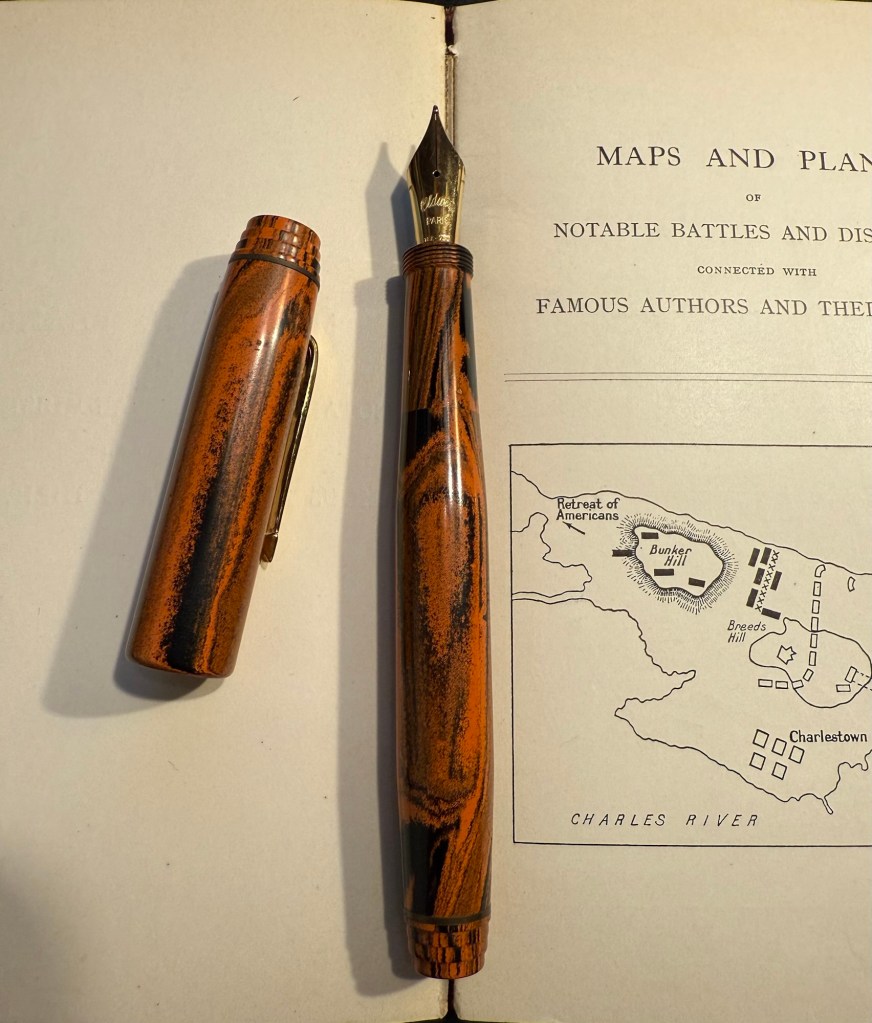
Oldwin nib

Manufactus Cappuccino Brown medium nib with Diamine Bilberry cartridge – this was a gift that I received from a dear friend who was just back from Italy and bought this (and a wonderful leather bound personalized journal) in the Manufactus store in Rome. The photo doesn’t do justice to the richness of the resin on this pen.
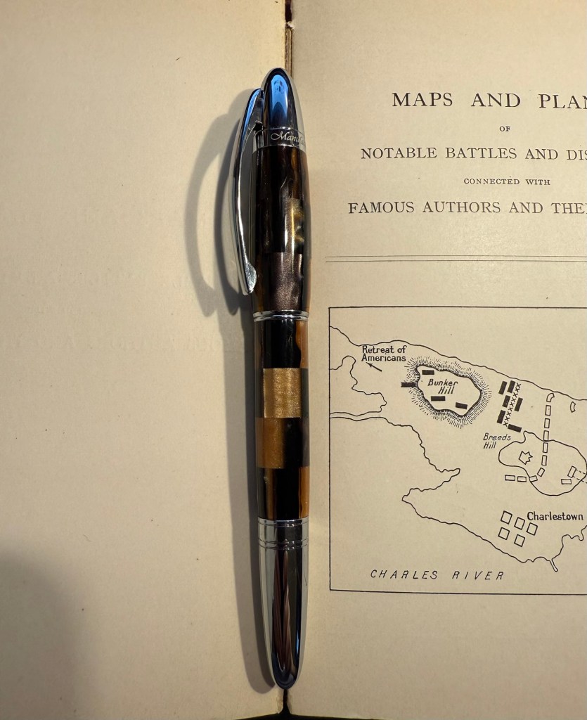
Manufactus Cappuccino Brown

The Manufactus has some heft to it, due to the metal body and trim, and while it states that it’s a medium nib, it runs closer to a fine nib in terms of line width. Diamine Bilberry is an interesting ink that I had in cartridge form, and I wanted a more unique ink than the standard black cartridge that came with this pen. Bilberry is saturated enough to pass as black at a cursory glance, but it’s a gorgeous rich purple with gold sheen that works well in this pen.
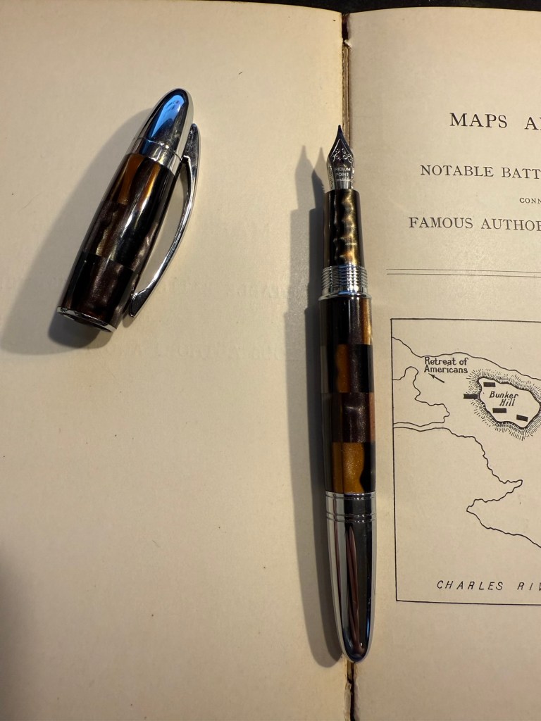
Manufactus Cappuccino Brown nib

Apart from these pens I still have about a quarter fill of ink in my TWSBI ECO T Saffron fine nib with Rohrer and Klingner Helianthus going from March’s ink rotation.

Which of these pens interest you the most?
Weekly Update: Ink Swaps and Quick Sketches

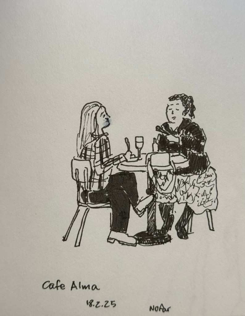
Earlier this week I went to a standup gig – a NY comedian was trying out new material, and it was an interesting (and funny) experience to see him work. Before the show I had about 5 minutes to sketch the people in a nearby cafe, so I sketched this couple using a Staedtler 0.5 Pigment Liner.

In terms of fountain pens the Parker Vacumatic is out of rotation, though I may give Diamine Writer’s Blood a try in another pen soon enough. I decided that I want to have the nib tuned on it, in terms of flow, though I don’t know who I’ll be able to find to do the tuning for me.

I also dumped out the Pilot Iroshizuku Yama Budo out of my Parker 51 as I couldn’t get it to not bleed and feather on practically any paper. I cleaned out the pen and refilled it with Waterman (Tender) Purple ink and it’s been wonderful to use since. Waterman inks are not only fantastically well behaved, beautiful, cheap and very, very easy to clean out of pens, they’re also dry inks. As Parker 51 generally have a generous ink flow, and this one is no different, a dry ink serves particularly well with this pen.

I’ve been reading Mrs Palfrey at the Claremont by Elizabeth Taylor (the British novelist, not the famous actress) and it’s a wonderful study of character, age and aging.

Next week is the Tel Aviv marathon, which is sold out for the very first time. There were no big local running events last year, and there’s clearly a hunger for them.

This week has been crushing from both a personal and a national perspective. I’ve taken solace in friends and in reading, but there have been times where it’s been a struggle. It’s at times like this when I need to remind myself to stop, take a breath, allow myself to feel what I need to feel, and only then pick myself up and move on.

Be kind to yourself and others, and have a great week.

February 2025 Currently Inked Pens

I have finally written dry all of my Inkvent 2024 fountain pens, which means that after two months I get to write with a whole new set of fountain pens and inks. I normally don’t spend too much time selecting which pen and which inks I’ll use next, but this time I decided to use some criteria for the next pens in my rotation:

  • They need to include at least 50% vintage pens. I don’t use vintage pens with Inkvent inks, and vintage pens make up most of my pen collection.
  • All the pens need to be pens that I haven’t used in a long time (at least a year). It was time to mix things up.
  • The inks needed to be inks that are new to me, or that I haven’t used in years, and all of them need to be inks that I haven’t swabbed before. This was not only to mix things up, but to get me to use and swab more inks in my collection, instead of going again and again to a few select favourites.

Here’s February’s fountain pen lineup:

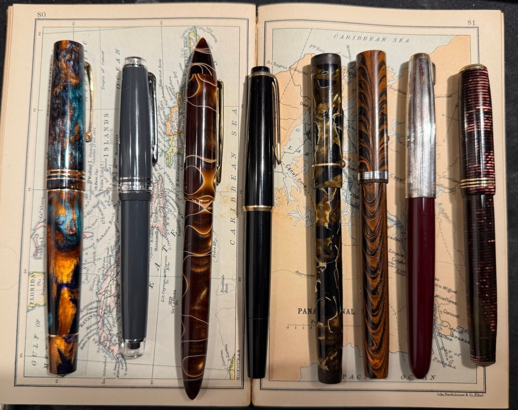
The pens from left to right: Leonardo Momento Zero Bohemian Twilight, Sailor Pro Gear Slim Graphite Lighthouse, Edison Nouveau Premiere Cappuccino, Montblanc 32, Mabie Todd Swan L2 Leverless pen, Waterman 52, Parker 51, Parker Vacumatic Standard double striped jewel.

And here are ink swabs of the inks that I’ll be using:

Ink swabs on Col-o-Ring cards

The Vintage Pens

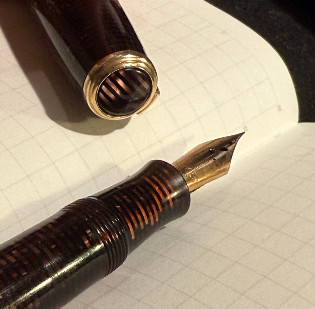
  • Parker Vacumatic 1st generation Laminated Burgundy Pearl Double Jewel (striped jewels, striped section) – I adore Parker Vacumatics and this is a “use the good china” pen. The grip section is also laminated (and not plain black), the body is transparent, and the nib is a sharp extra fine gold nib with a bit of character to it. It’s filled with a brand new ink for me, Diamine Writer’s Blood. I never use red inks, but this got raving reviews and seemed dark enough for me to try. I bought the ink in Oxford last year, and the pen years ago from the late Henry Simpole (Henry the Pen Man) in London. I don’t think I inked up this pen since I bought it, as it was too precious, and I still won’t let it leave the house, but I am looking forward to actually using it.
Parker Vacumatic first generation burgundy laminated grip section
Closeup on the striped jewel and the grip section of the Parker Vacumatic
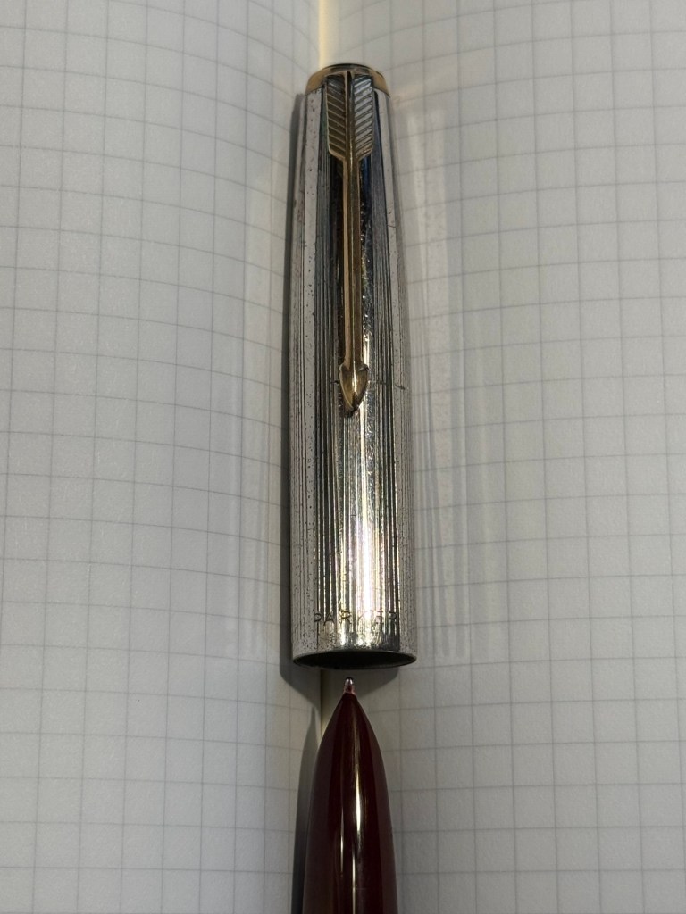
  • Parker 51 Burgundy aerometric with a silver cap and gold filled arrow clip. I love Parker 51s, they are my absolute favourite fountain pens. I believe this cap is on the rare side, though it’s far from pristine or attractive (it’s blackened in specks, and there are a few scratches and micro scratches on it). The nib is a generous fine, bordering on medium, and like all other 51s that I’ve used, it’s magic. I haven’t used this pen since I bought it, so it’s time to give it a whirl. It’s filled with Pilot Iroshizuku Yama Budo, which is a lovely, sheening burgundy ink, one of the more popular inks in the Iroshizuku lineup. In hindsight coupling this ink with this pen wasn’t the best choice, as the 51 has generous nibs and Iroshizuku inks are on the wet side. It just means that I’ll have to steer clear of cheap paper with this combination.
Parker 51 cap and nib closeup
  • Waterman Ideal 52 Red Ripple fountain pen with a super flex extra fine nib – my word but this pen has the most glorious nib. The pen itself is elegant and pristine, and because of its age it doesn’t have the ebonite stink to it. The nib is why I bought this pen, and it effortlessly moves between extra fine and broad or double broad lines, with the feed easily keeping up with tines. Like all Waterman nibs that I’ve tried, there is some feedback, so if you like butter on hot pan nibs this one isn’t for you. This is the kind of nib that you can only get in a vintage pen, and it puts modern flex pens to shame. It’s only minus is that this is a lever filler, and I hate cleaning out lever fillers, which is why I rarely use them. This pen is filled with Diamine Autumn Oak, which I haven’t used yet (in bottle form at least – I have cartridges of it). I wanted a brighter ink in this lineup, so Autumn Oak was a perfect choice.
Waterman 52 cap and nib closeup. You know the nib is going to be fabulously flexy once you see that heart shaped breather hole and the slight bend down in the nib.
Writing sample on Midori MD Paper. Notes written with a Platinum Preppy.
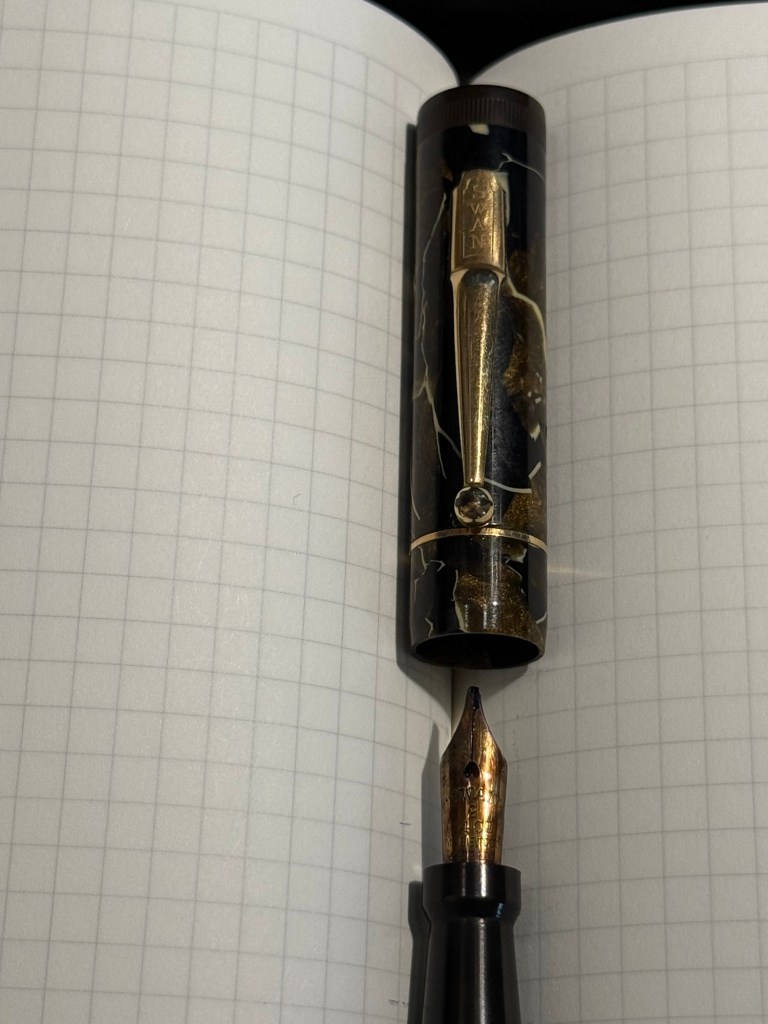
  • Mabie Todd Swan L2 Leverless L205/62? Not sure – Swan did a poor job labeling their pens, and I didn’t write down notes when I bought it. This is a lovely pen that I bought from Henry Simpole years ago because of the phenomenal Swan nib. It’s an oblique flexible nib with Swan’s gimmicky “Leverless” filling system (which is a lever system in disguise, but such were the ’30s – you needed a gimmick to sell pen). I haven’t used it at all since I bought it because I don’t remember the experience of cleaning it out very fondly – imagine all the bother of cleaning out a Lamy 2000, but with a piston that has just one twist of travel. I used Pilot Iroshizuku Asa Gao with this fountain pen, and it’s a gorgeous ink with a good amount of sheen with this nib. I love this shade of royal blue, and I haven’t used this ink in a while. Take a look at the Swan above – it’s almost 100 years old and works perfectly.
Closeup on the nib and cap of the Swan Leverless pen
Writing sample on Midori MD Paper. Notes written with a Platinum Preppy.
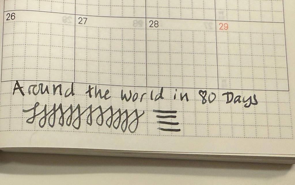
  • Montblanc 32 (1967) OM 585 nib – heavens, you can get a gold nibbed, piston filling original Montblanc with an Oblique Medium nib for less than a steel nibbed Pelian M2xx costs? Yes, you can. I love the design of this pen (you can read about it more here) and the nib is great… provided you write in the exact angle it expects. The Swan’s nib is generous in terms of the writing angles it accepts, and the Monblanc 32 is demanding: you will use the nib at the precise angle it is designed for, or it will not work at all! I only wish that the Montblanc Around the World in 80 Days ink was so exact. From the description and the illustration on the box I was expecting a brownish gold ink, maybe with a hint of green. In reality I got a dark, cold grey ink, with a hint of blue to it. No brown, no gold, nothing at all to do with the elephant illustration on the box. I had to double check just to make sure that I hadn’t landed on a bad bottle by chance.
Montblanc 32 semi hooded nib
Writing sample on Midori MD Paper. Notes written with a Platinum Preppy.
Writing sample on original Tomoe River Paper

Modern Fountain Pens

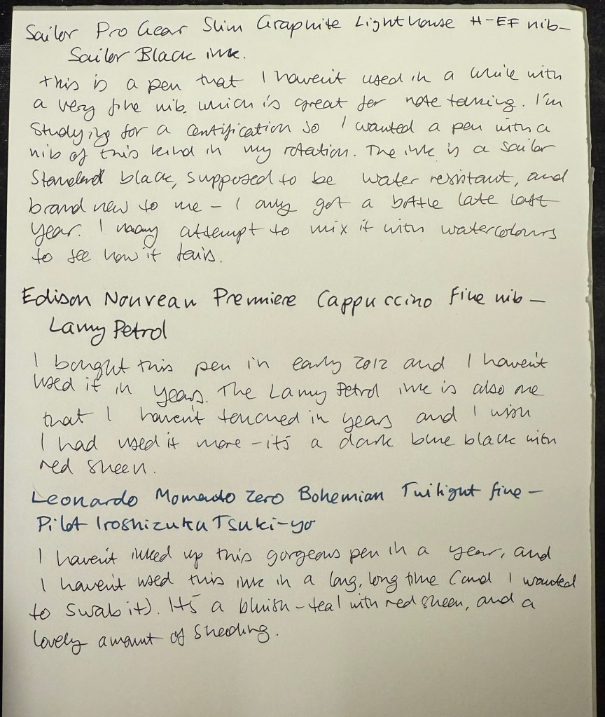
  • Sailor Pro Gear Slim Graphite Lighthouse H-EF nib – I haven’t used this pen in over a year, and I wanted a pen with a very fine nib, so that I can use it for note taking. It’s inked up with Sailor Black, a new ink for me and one that’s supposed to be water resistant. I’m using this combination for my certification study notes, and I may also try it out with some watercolours in a sketch, just to see if I can use Sailor Black ink as part of my sketching kit.
  • Edison Nouveau Premiere Cappuccino fine nib – I bought this pen in early 2012, before they did a run of seasonal limited editions of this pen design. I haven’t used in years, and the same goes for the ink in it: Lamy Petrol. This is a limited edition ink, one that Lamy issued with the Lamy Safari Petrol, and it’s a wonderful blue-black with red sheen.
  • Leonardo Momento Zero Bohemian Twilight fine nib – this pen has “only” been a year out of rotation, and it’s one of my favourite Leonardos. The colour of the resin is gorgeous, and it works very well with the Pilot Iroshizuku Tsuki-yo ink that it’s filled with. Tsuki-you is a bluish-teal with red sheen and a wet flow, and it suits the Leonardo’s fine nib.
Modern pens writing sample on Midori MD paper.

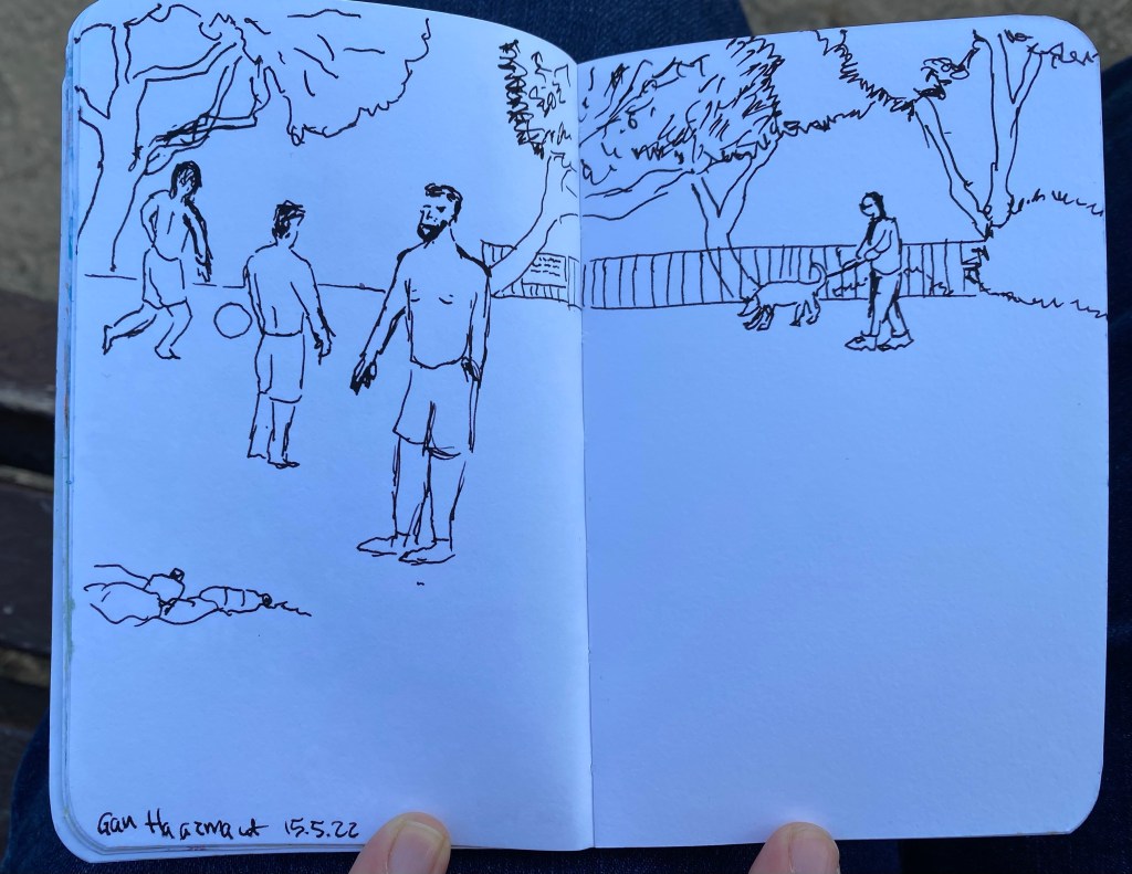
Soccer Players

A quick fountain pen sketch with my vintage Waterman 52 fountain pen and Waterman Havana Brown ink (now called absolute brown) on a Stillman and Birn pocket Alpha.

Today’s Fountain Pen

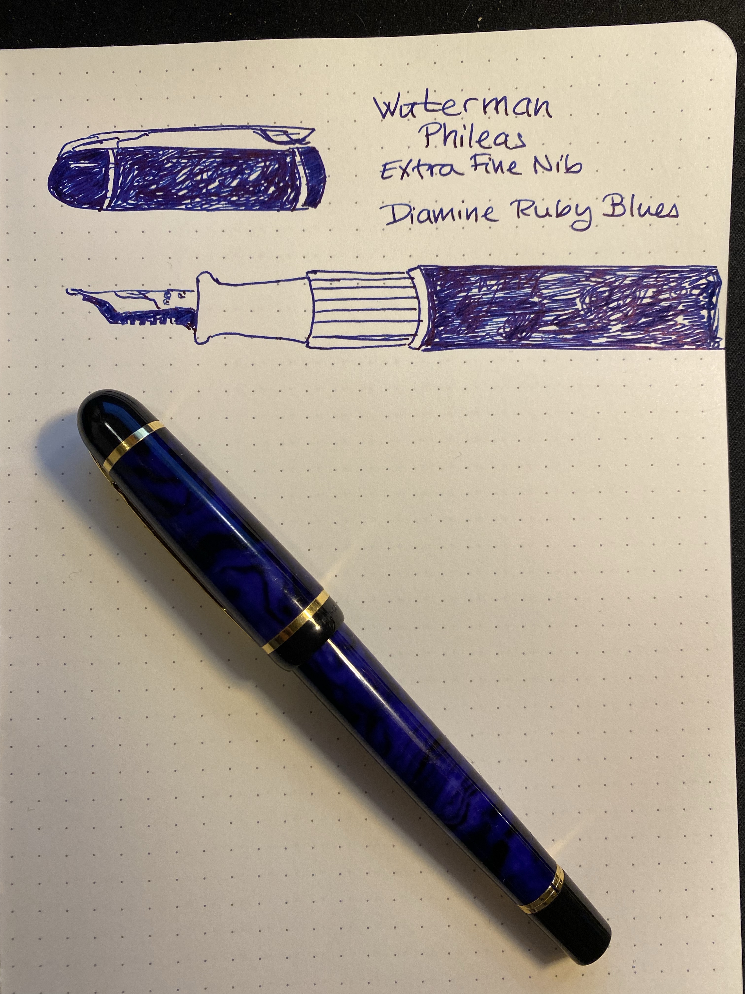
Today’s fountain pen is also my first fountain pen, the wonderful Waterman Phileas. It’s filled with Diamine Ruby Blues from the Diamine Inkvent 2021 calendar.

My hands have been an utter nightmare this week and I’m only now starting to feel a slight improvement in my neuropathy. This is the most that I’ve been able to draw and type all week.

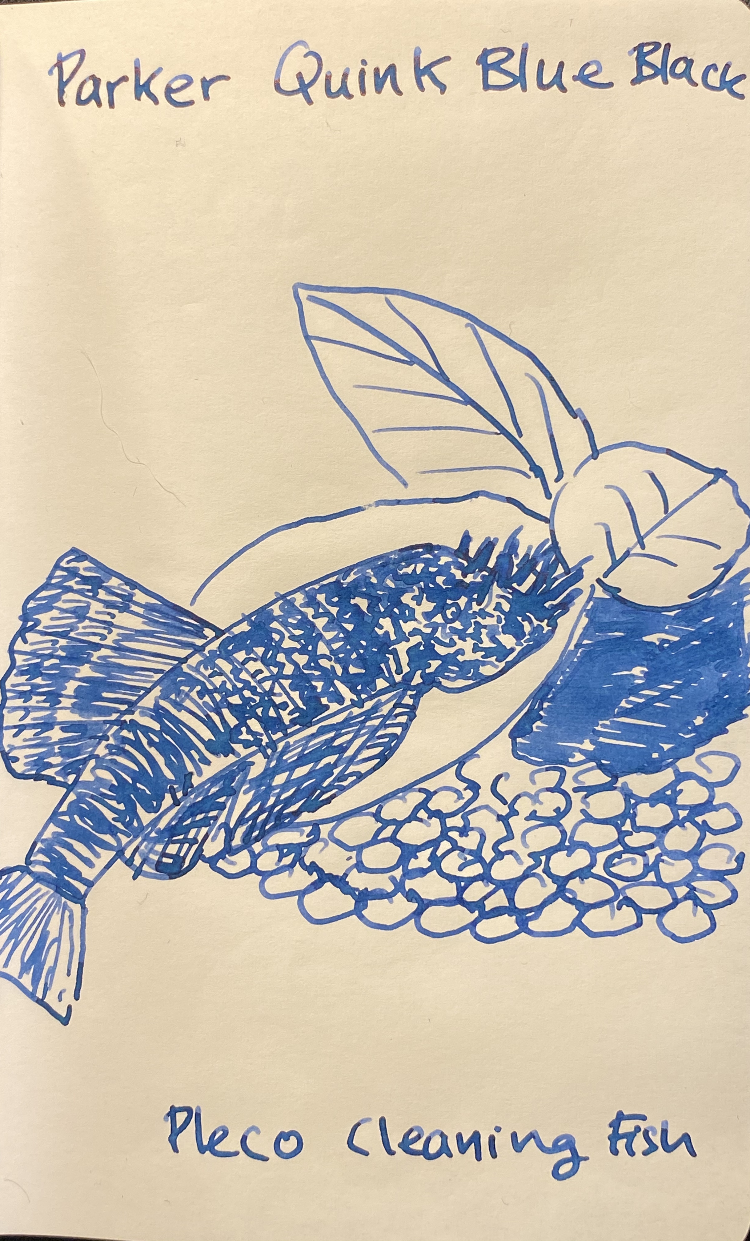
Parker Quink Blue Black Ink Review

Parker Quink Blue Black is far from a new ink on the market: it’s been produced and in use for decades. So why bother to write a review about it now?now

Because Covid-19 happened, and it’s turned shipping and shopping into a challenge, and so I have found myself seriously contemplating a “desert island” kind of question:

If the only ink you can buy is ink commonly found in brick and mortar shops, which ink should you buy?

The obvious answer for me is anything Waterman, but specifically Waterman Blue Black, now renamed to “Waterman Mysterious Blue”. But Parker Quink Blue Black is just as readily available, and just as cheaply priced (more or less), and also a workhorse, utilitarian ink that packs a few surprises. So why is it not my go to ink? I’ll get to that near the end, I promise.

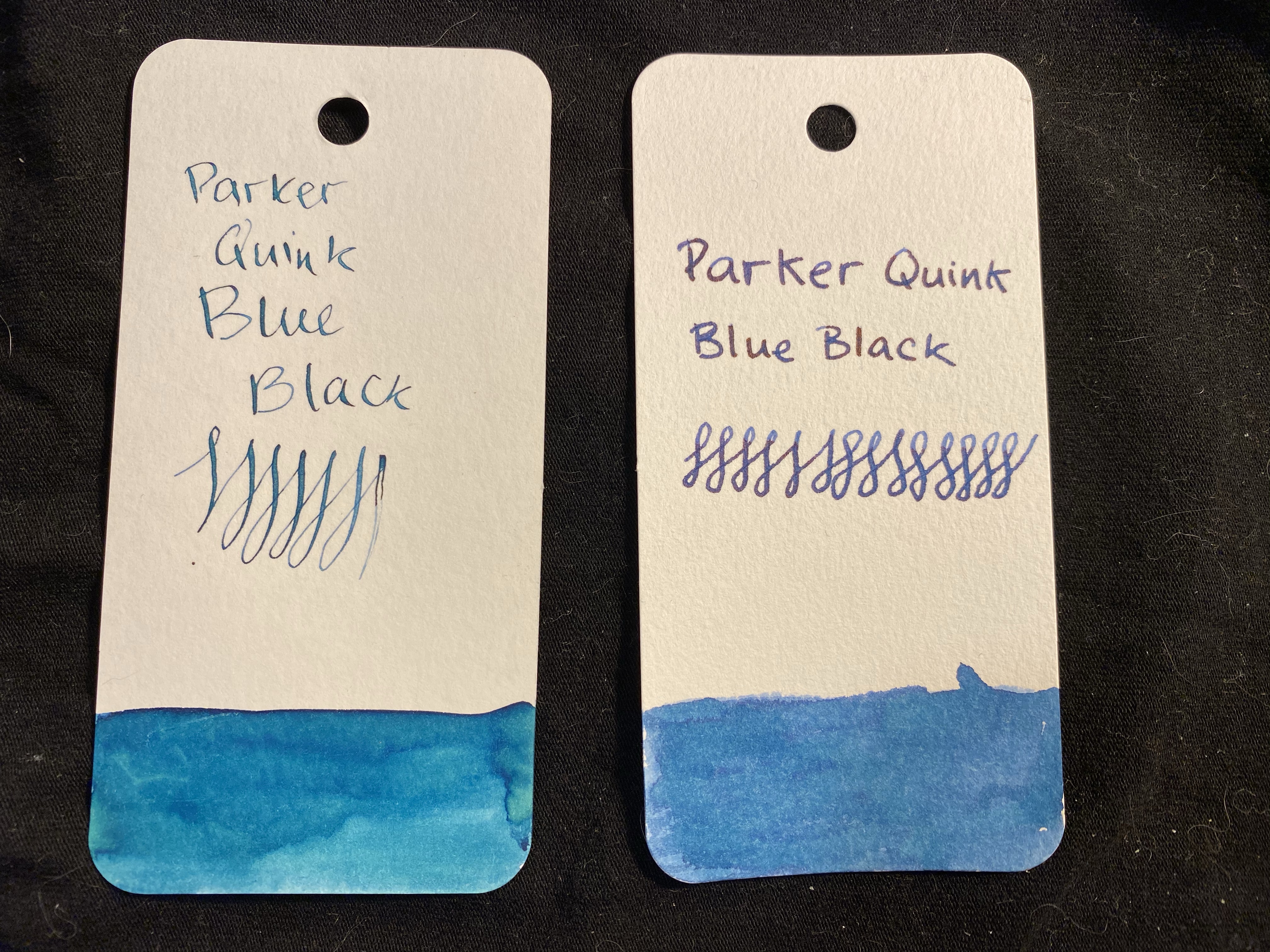
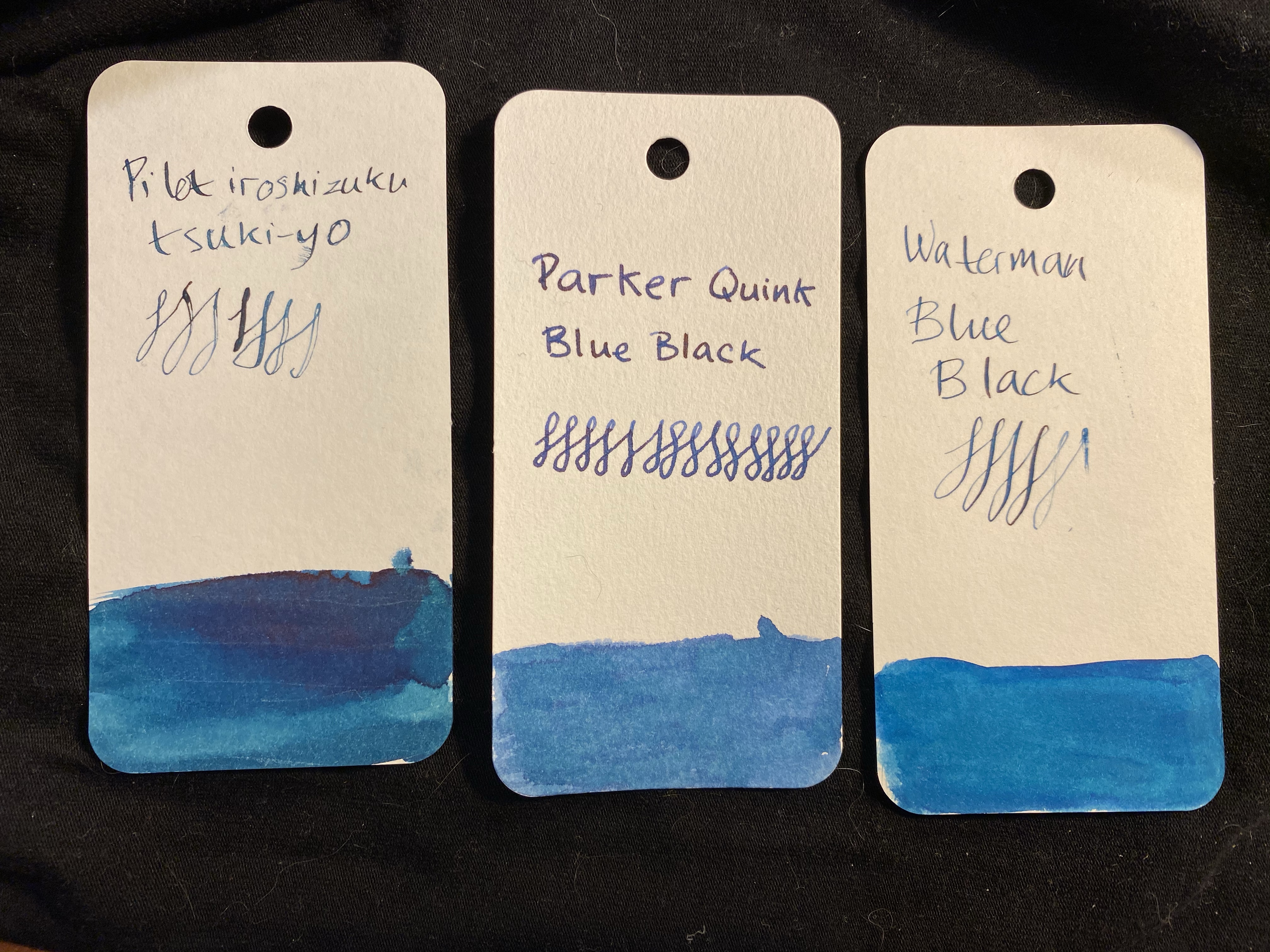
Two swabs of the same ink: how are they so different?

I took two swabs and writing samples of the Parker Quink Blue Black, mainly because I thought that the first swab didn’t show off the correct colour of the ink. The left hand writing sample was done with a dip pen, and the swab was done with a brush. The right side was done with Henry Simpole’s Jasmin pen and a Conway Stewart medium nib, with the swab being done with a q-tip. The right hand sample is truer to the colour of the ink, although you can get a more teal/turquoise colour out of the ink in certain nibs (as is true with Waterman Mysterious Blue). This changeability is part of the charm of blue-black inks.

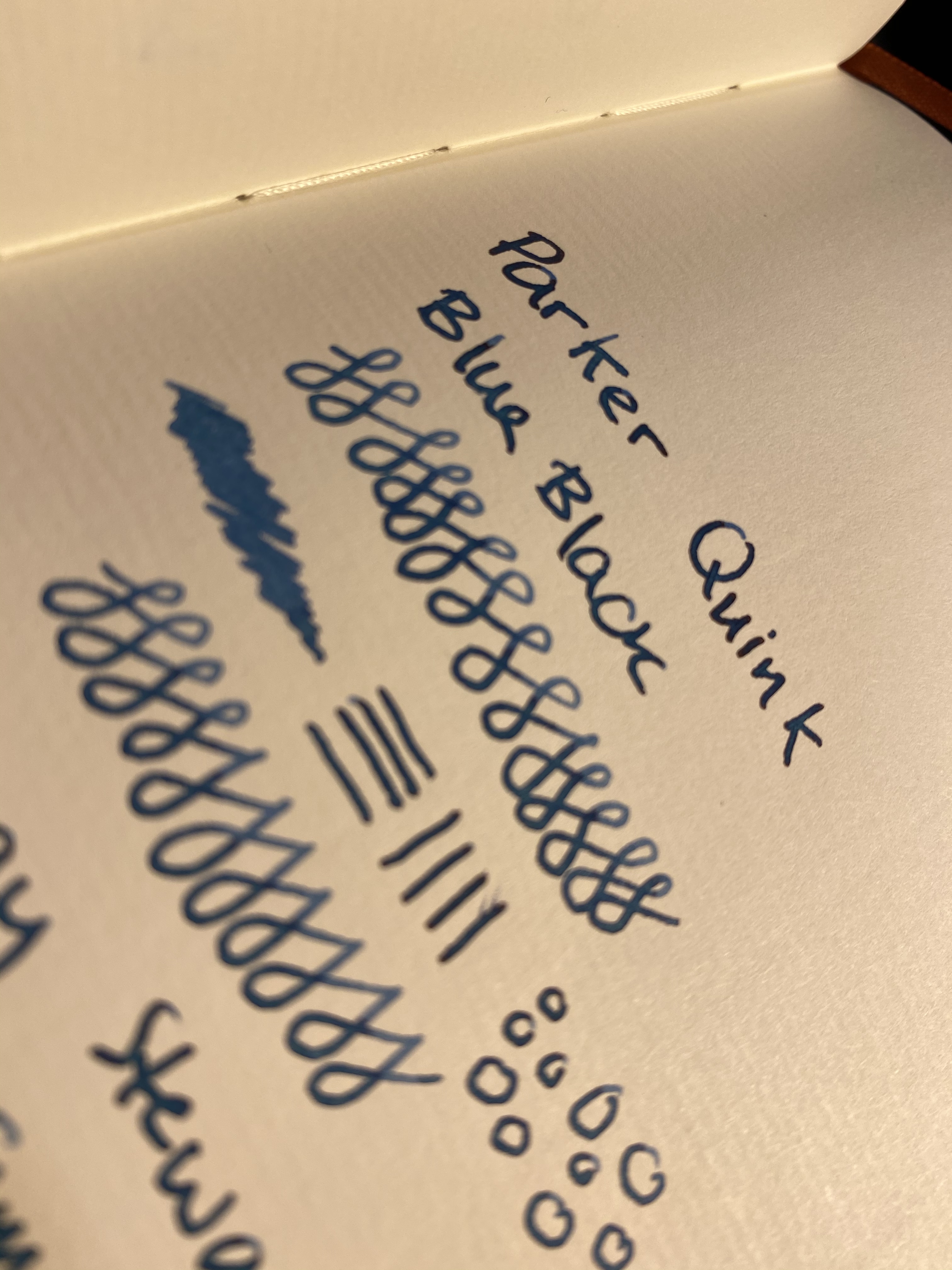
It’s also worth noting that Parker Quink Blue Black both shades and has a red sheen, so it’s far from a bog standard, boring ink. Here’s an ink that can be fun at the same time as it makes you look serious.

Comparison swabs.

Waterman Mysterious Blue leans a bit more into the teal/turquoise side of things, but it doesn’t sheen as much as Parker Quink Blue Black. Here’s the ink on Paperblanks paper (I snagged a fountain pen friendly Paperblanks a few years back and have been using it to test inks ever since):

You can see the shading particularly in my swirls.

There’s a red sheen even on the Paperblanks paper, in every spot where the ink pooled (so the bottom half of these letters for instance):

If you can’t see the red sheen, look at the sample below.

And here it is on Tomoe River paper, showing off shading and sheen. The photo came out a shade lighter than in reality, but that was the only way that I could show some of that sheen off.

Parker Quink Blue Black is neither waterproof or water resistant, just like Waterman Mysterious Blue. Yet it takes a bit more time and effort to clean the Parker ink out of pens than the Waterman’s (my gold standard for easy cleaning ink). It’s vintage pen safe, and an excellent staple ink, available practically everywhere that sells stationery or art supplies. In times where shipping prices have skyrocketed and many places no longer offer shipping to all destinations, it’s good to know that there are still good, cheap and widely available ink options out there.

Stay safe and stay as much as possible at home.

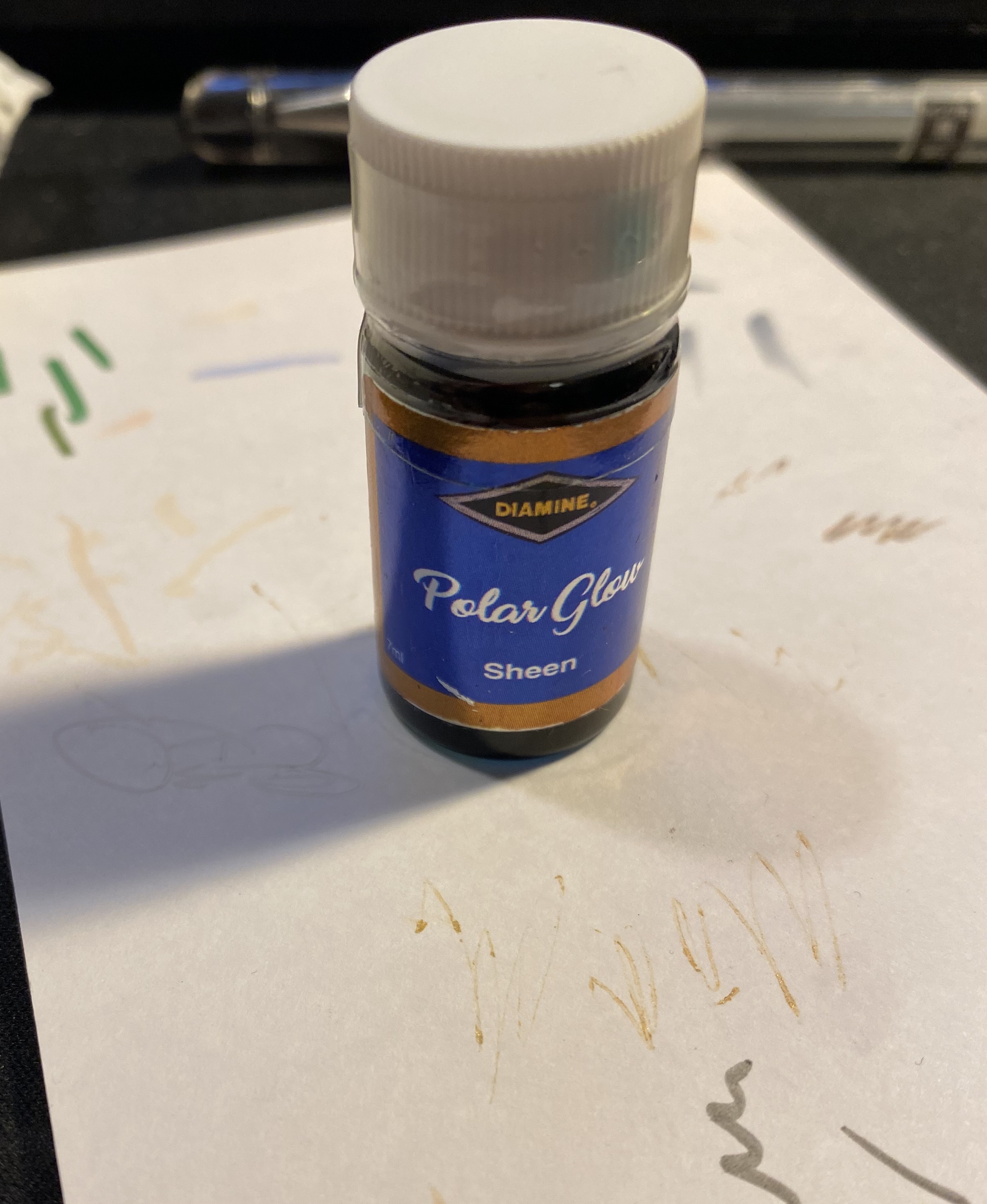
Diamine Inkvent Calendar Day 4

Diamine Inkvent Calendar is an advent calendar with a tiny (7ml) bottle of ink behind 24 windows, and a larger, 30ml, bottle of ink behind the 25th window. All the inks are limited edition, and only available through this calendar. You can read more about the calendar here.

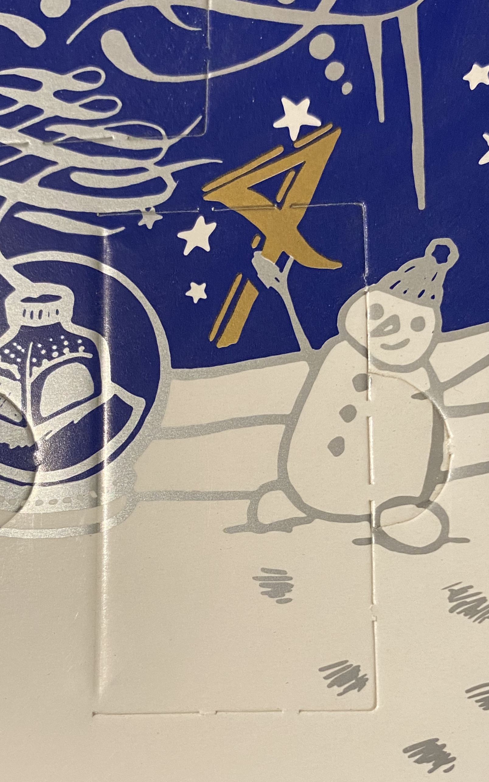
Day 4’s window isn’t exactly aligned with the printing, but you get a cute snowman with it, so who cares?

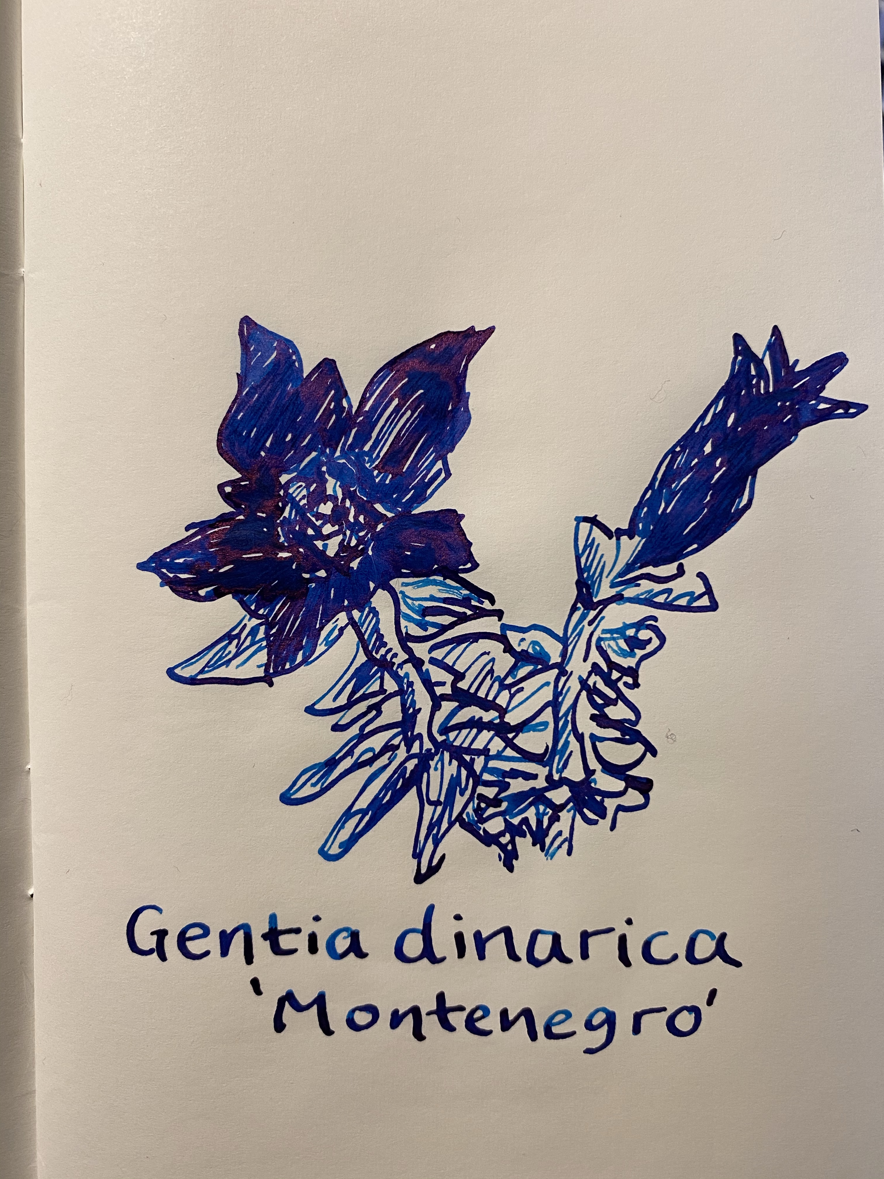
The day 4 ink is Diamine Polar Glow, which is a royal blue ink that has sheen. How much sheen you ask? Well…

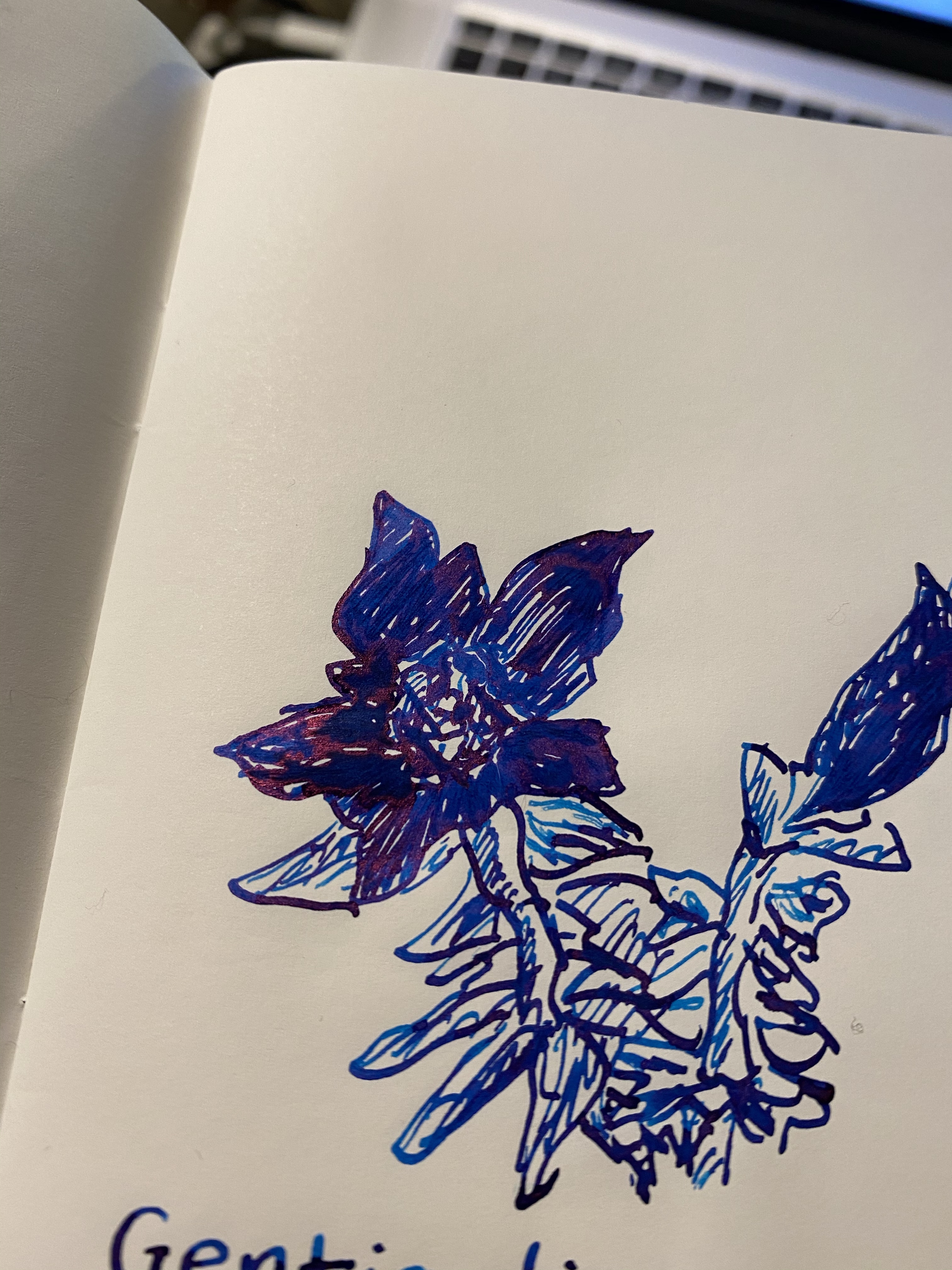
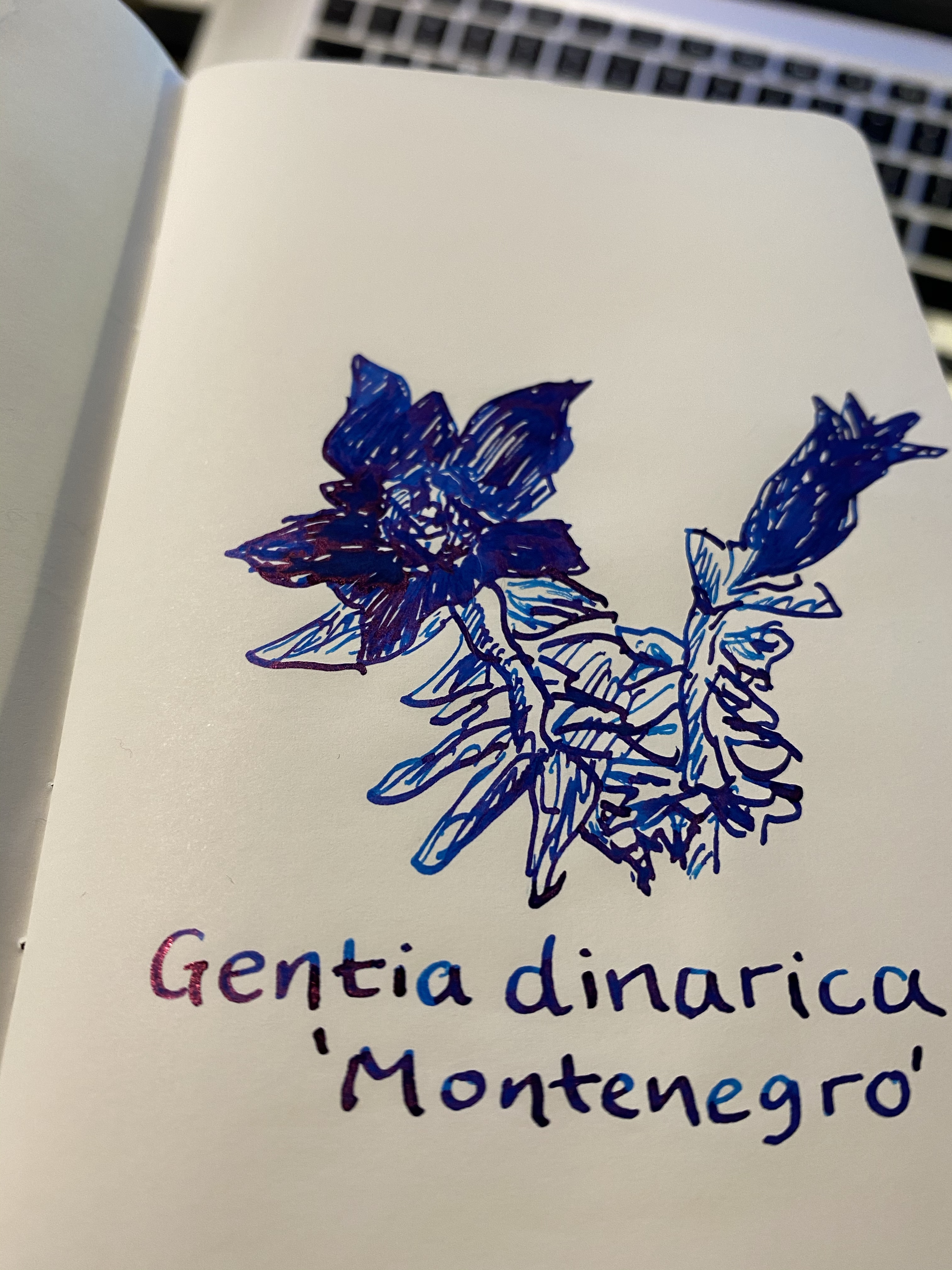
There’s so much red in that gloriously rich blue. I used a vintage italic Waterman ideal nib, and this was drawn on a Kanso Sasshi 3.5” x 5.5” Tomoe River Paper notebook, so this is probably close to maximum sheen, but still, it’s impressive.

Even as a standard ink, Diamine Polar Glow pops. The blue is deep, rich, and yet shades a lot, from cyan to royal blue (you can see it in the leaves in the drawing above). The red sheen just adds a little extra zing to it, without overshadowing the already good qualities of the ink.

This is an ink designed for wide, broad, italic, flex nibs that lay down a lot of ink. It really shows it’s best properties on Tomoe River paper, but even on Rhodia/Clairefontaine paper I could see sheen in every letter (using the same broad italic nib).

Would I buy a bottle of this, if Diamine offered it? Probably yes, since it’s dark enough for office use, but is also more interesting and appealing than a run-of-the-mill dark blue.

Waterman Phileas Review, or Why, Waterman, Why?

The Waterman Phileas was my first fountain pen, one that I bought after careful research on eBay, shortly after they were discontinued. It cost me £15 at the time, a small fortune for me, and the most I had ever spent on a pen. My RSI was at its worst, and I had to take a lot of notes (I was still in the university), so I splurged mostly out of desperation. Internet research brought up fountain pens as something that could possibly help with my RSI, and so I decided to give it a try. I found the Fountain Pen Network and combed the boards for information about fountain pens for newbies like me. Two pens kept coming up as good first fountain pens to buy: the Lamy Safari, and the Waterman Phileas. It was relatively newly discontinued by Waterman, and so I could find it easily and buy it NOS from a reputable seller. It’s been over 11 years since I bought it, and it’s still one of my favourite pens, and one of my most frequently used ones.

IMG_3546
Look how pretty this pen is! 

The Waterman Phileas is named after Phileas Fogg, Jules Verne’s “Around the World in 80 Days” protagonist. It comes in blue, green, red and black, and is cartridge converter pen with a large two-tone steel nib. The nib and pen have an art deco look to them, and the pen is also designed to look somewhat like a cigar. It’s a classic “fountain pen” look that makes it appear more expensive than it is, and it’s part of the reason why you’ll see it popping up in various commercials, even to this day. It’s a very beautiful and elegant pen that just looks classy.

Unlike it’s cheaper sibling, the Waterman Kultur, the Phileas has a brass insert in the body, which means that it has got some heft to it, weighing (filled, with a converter) 24g, as opposed to the Lamy AL-Star’s 22g (filled, with a converter). The weight is perfectly balanced for writing, especially for beginners, since it encourages you to lay off putting pressure on the pen. The pen let you feel that it’s putting the pressure on for you.

The look of the Phileas is phenomenal, especially for the price, but it’s the nib that made me fall in love with it specifically and with fountain pens in general. I chose the extra fine nib, and it is nothing short of magical. Take a look for yourself:

IMG_3541
From hairline to European fine – the Phileas line variation at work.

Yes, that’s line variation. No, it doesn’t come from applying pressure to the nib. It works like a less extreme Sailor Zoom nib: vary your writing angle just a bit and it will go from 0.4 mm lines to 0.7 mm ones. The nib is also smooth, but gives a little feedback, which reminds me a little of the feedback you get from using a really good pencil. Couple that with the fact that the Phileas is a cartridge converter (with a sizeable converter), and so very easy to clean, and you’ll understand why this is still my favourite sketching fountain pen.

IMG_2315
Drawn with a Phileas, except for the witch’s cloak and hat.

The Phileas accepts long international cartridges, and Waterman is one of the few makers that make those cartridges. They excellent (especially the blue-black) and very convenient when travelling with your fountain pen.

img_3545.jpg
Look at that nib! It’s hard to photograph, but it’s such a great design.

Which brings me back to the beginning of my story. It’s 2019 and I have a substantial collection of fountain pens, most of them costing well over 10 times what the Waterman Phileas cost me. None of them are 10 times the Phileas as a pen. I could have stopped here, but the Phileas has proven to be a gateway into fountain pen madness for many people over the years. It’s a pen to fall in love with, in a way that I haven’t ever fallen in love with my Lamy’s, good-though-they-are. Its design is classic and timeless, and its quality is unparalleled for the price (yes, even today).

SO WHY HAS WATERMAN DISCONTINUED IT? WHY? WHY?

This should have been their Lamy Safari, TWSBI Eco or Pilot Metropolitan  – a more classic version of the beginner’s fountain pen, as opposed to the other’s more modern design. It boggles my mind that they not only discontinued the Phileas, but also it’s cheaper cousin, the Kultur. What on earth are they doing over there? Do they not want new people to fall in love with their pens? It’s the same weird move with their ink line (their refusal to jump on the limited edition/shimmer/sheen ink bandwagon), but even more baffling. YOU WOULD SELL THESE WATERMAN!

So frustrating.

Anyway – if you can get your hands on a Waterman Phileas for a reasonable price, I highly recommend it. It’s a charming pen that will never go out of style.

Inktober 31: Happy Halloween!

IMG_2315.JPG

The outline and cat were drawn with a Waterman Phileas (EF nib) and Noodler’s Heart of Darkness (which I haven’t used in years, no idea why), and the hat and clothes were filled in with a Tombow Fudenosuke dual sided brush pen.

It was a fun challenge, and I really pushed myself this year to try new and different things. Can’t wait for next year’s Inktober!