Phoenix Garden Take 2
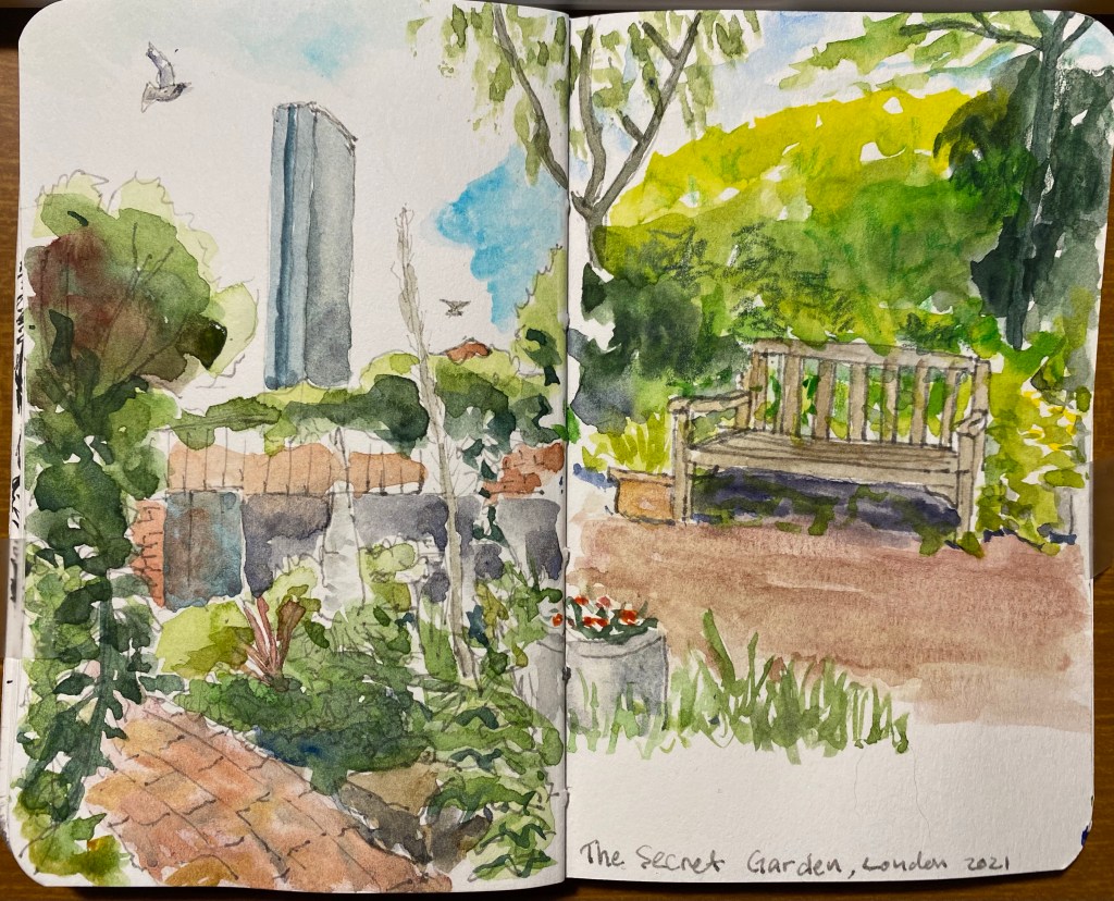
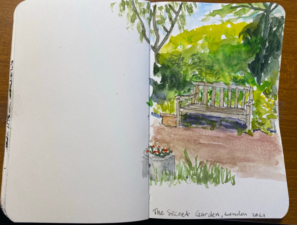
I finished the spread that I started here, drawing another view of the Phoenix Garden in London’s West End.
A blog about writing, sketching, running and other things
I finished the spread that I started here, drawing another view of the Phoenix Garden in London’s West End.
In the middle of London’s West End there’s a beautiful secret garden, the Phoenix Garden. Ever since I accidentally discovered it, it has been my number one favourite place in London. There’s something about the green and the peaceful quiet in the middle of one of London’s busiest areas that is mesmerizing. During the rough parts of my latest hospitalizations I shut my eyes and transported myself to my favourite bench there.
So I decided to create a very quick sketch of one of the benches there, and try to work on my plant textures. This is clearly something that I still need to work on, but it’s good to know where I started.
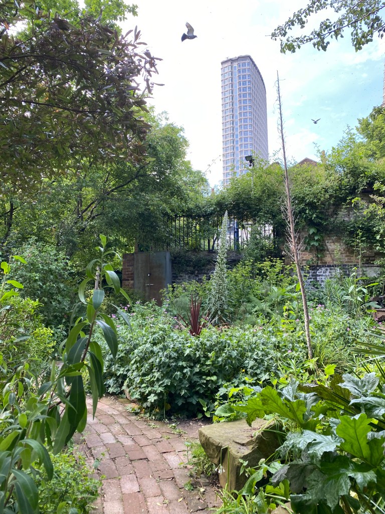
Here’s a photo of this magical place:
When I visited London in June Greenwich ended up being one of the biggest disappointments of the trip. The place was hard hit by the pandemic, and everything that made it so special to me seemed to have been wiped out because of it. There was no vintage and antique market next to the movie theatre. There were no grandmas selling baked goods for charity in the movie theatre foyer. Nauticalia, the maritime themed shop on zero longitude, had shut down. A good third of the stores around the Greenwich Market were permanently closed, and there was a general dismal aura around the place. The Maritime Museum required pre-booking an entrance, and so not many people visited it. Greenwich is a place that needs tourists to thrive, and with a pandemic and pandemic restrictions it felt deflated, a shadow of its former, sparkling self.
What still is vibrant and lovely is the place itself, and to remind myself of its potential and of my potential to visit it again someday in better times I created a quick sketch of the road leading to the Cutty Sark.
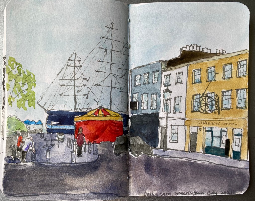
Schminke and Daniel Smith watercolours, Noodler’s Lexington Grey ink, Stillman and Birn Pocket Alpha.
I really like how the two watercolours on this page “melt” together, and in general this is one of my favourite sketchbook spreads created as part of the Sketchbook Design course.
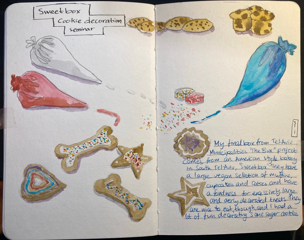
Catching up on some more sketchbook pages from my Sketchbook Design course as I’m working on giving my palette the largest overhaul it’s had since I started painting with watercolours. This page was inspired by the final box I got from the Tel Aviv muncipality’s “The Box” project, created to support local businesses during the lockdown.
Schmincke recently came out with a new series of limited edition Horadam (artist grade) watercolour paints that are super-granulating.Granulation in watercolour is the an affect that is created when the pigments in the paint separate and settle in a diffused patten on the paper, oftentimes allowing other pigments that they are mixed with to show through. In my everyday watercolour palette Schmincke’s Ultramarine Finest (494) is a prime example of a granulating paint that I use both for its effect as an individual paint and when mixed with various browns and greens. The new 900 limited edition series of Horadam watercolours that Schmincke has issued is composed of 25 paints that are divided into five sets: Galaxy, Glacier, Deep Sea, Forest and Tundra. I decided to purchase all five sets out of curiosity, since limited editions in artist grade watercolours aren’t common, I already use Schmincke almost exclusively, and I’ve been embracing granulation more lately in my work.

The paints can be purchased in individual 15ml tubes (which is a lot of watercolour paint), in fancy wooden boxed sets of 15ml tubes and in cardboard boxes of 5ml tubes, which is what was available at my local art supply shop and what suited me to buy anyway. 15ml of watercolour paint is a commitment, and artist grade watercolour in general and Schmincke in particular aren’t cheap. The paints aren’t sold in half pans, which I would have preferred over the tubes, and which means that you are going to need empty pans or a palette to use them.

The Galaxy set includes Galaxy Pink, Violet, Blue, Brown and Black. There are some naming peculariaries in this entire series of paints, such as the fact that the paints are super-granulating but the set is called: Supergranulation on the box, and Super Granulation by the dealers. In any case, like all the colours in this set the paints in the Galaxy set have good lightfastness. They are all non-staining (which means that they can easily be lifted off the paper), the Violet and Blue are semi transparent, the Pink and Brown and Black are semi-opaque. This is the most vibrant of the sets, but don’t believe the photos on the package or in the various marketing materials, none of the colours in any of these sets really pops or is as vibrant as they appear to be. All these colours tend towards naturalistic, landscape painting tones.

The colours in the Forest Set are: Olive, Green, Blue, Brown and Grey. They are all extremely lightfast, the Olive and the Brown are semi transparent, the Blue and the Grey are semi opaque and the Green is opaque. I have no idea why the Forest Brown (944) is called Forest Brown as it’s not a brown at all, it’s more of a greyish green. Forest Blue is also a misnomer, as it’s also a green, this time one that looks like it was mixed with indigo. This is the most monotone of the sets, though if you are focused on landscapes, there are some interesting greens here.

The Glacier set boasts the best paint in the series in my opinion, the Glacier Green which is just a delicious paint to have on your palette – a phenomenal and unique green with pronounced brown undertones. I can’t wait to use it in my work, and I’ll be buying a 15ml tube of this. The rest of the colours in this set are Glacier Blue, Turquoise, Brown and Black. Despite what the marketing material may say, there is very little difference between the various blacks in these sets, and if I could I would have skipped all of them and used the Forest Grey and the Tundra Violet instead. All the colours in this set rate in the 4-5 star lightfastness range and all apart from the Brown (which is semi-staining) are non-staining. The Blue is semi-transparent, the Turquoise, Green and Black are semi-opaque and the Brown is opaque.
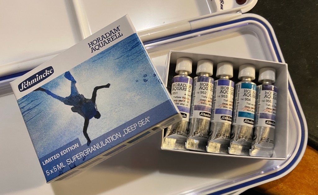
The Deep Sea set features the following colours: Violet, Indigo, Blue, Green and Black. The Green here is a misnomer, as it’s also a blue (with only the slightest green tinge) and the violet is greyish and flat compared to the Glaxy Violet (and in any case if you’re looking for a vibrant violet look elsewhere in Schmincke’s lineup). This is probably the most redundant set of the five, and you can pretty much skip the colours here without missing on much. Indigo, Blue and Green are semi-transparent, Violet and Black are semi-opaque. Lightfastness is very good to excellent and non of these are staining.

The Tundra set contains Orange, Pink, Violet, Blue and Green. Tundra Violet is another misnomer as the paint is practically black with a tinge of purple. This is the most staining set (Violet and Green are staining, the rest are semi-staining), but also a pretty mixable one. Orange, Blue and Pink are transparent, Violet is semi-transparent and only Green is opaque. It’s also one of the most compelling greens in the set, with it’s olive like tones and its pinkish undertones it’s both unique and generally useful for landscapes.
Schmincke aren’t selling these in pans, which is pretty inconvenient if you just want to swap one or two of these into your existing palette.

I first saw these paints on Schmincke’s Instagram and then on the Jackson’s Art blog. In both the paints are much more vibrant and with much more pronounced granulating, to the point of almost marbling, than what I got when I first created a the above reference drawing. I had a feeling that this was somewhat due to the extreme closeups that they took, and likely also the paper that they used.

In any case, since I and many others also use Stillman and Birn Alpha paper for watercolours, I decided to try and create a painting using these paints exclusively. In the end I also added Schmincke Indian Yellow (220) for the signs, but I didn’t mix it with anything else. As you can see, the granulation is still pretty pronounced throughout, but the colours, with the exception of the Glacier Blue aren’t exactly vibrant or saturated.

I then decided to break out the good paper, and tested the paints on 100% cotton 300gsm cold pressed rough watercolour paper. Here you can see the granulation at its best, and yes, as promised it is pronounced in all of these paints. Yet as I suspected the choice of paper does nothing to make these paints more vibrant, which means that I certainly won’t be using them to replace large swaths of my current palette or recommending that you use them exclusively (especially since there are no yellows here and the red selection is pretty poor).
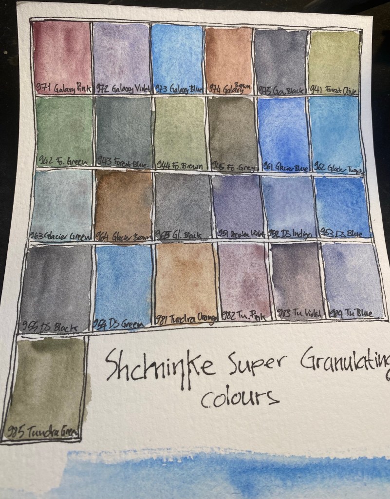
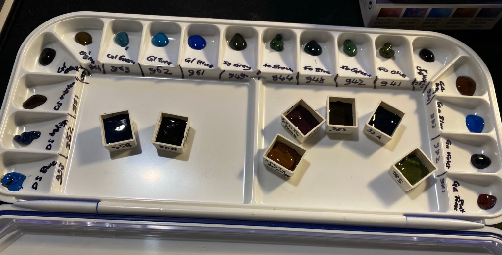
Here are the paints all labeled (I got the Deep Sea Black and Green swabs out of order).
Here’s a very quick sketch with these paints on the cold press paper. They are built for washes and wet on wet work, and so relish this paper.

And here they are on Stillmand and Birn Beta paper, which is better watercolour paper than the Alpha but still not good watercolour paper. You still get much of their effect here, especially if you don’t much around too much with the paint. These aren’t the best for mixing on the palette but do work well with layering and working wet on wet on the page. If you like to put down paint in washes and see what it does, these paints are for you. If you like to work in a more controlled fashion, you likely aren’t a fan of granulating watercolours anyway.
You can see the granulation here, and some of the best colours in this set at work (Tundra Orange, Glacier Green, Tundra Violet, Forest Green, Tundra Green and Glacier Brown).
Again you can see the granulation at work and how the effect lets the whiteness of the page show through, bringing light to a dark patch.
So, would I recommend all 25 paints? Of course not. Of the paints in these sets here are the ones that seem worthwhile:
963 Glacier Green (the best of the bunch!)
983 Tundra Violet (a great replacement for black in your palette, if you have it)
952 Deep Sea Indigo (bonus points for a transparent indigo with reddish purple undertones!)
964 Glacier Brown (the best brown of the bunch and the most saturated of them, with dark black green undertones)
942 Forest Green (a saturated green in a natural but not easy to mix colour with reddish undertones)
985 Tundra Green (a natural greyish yellow green that is not easy to mix and has brown undertones)
981 Tundra Orange (because this is a transparent paint in a colour that is rarely otherwise granulating, with pinkish undertones and a good generally useful hue that will work well in mixing).
If you’re looking to buy sets, the Tundra set and the Glacier set are the best in my opinion, but it depends on what colours you use most often in your palette.

A drawing of a decrepit, old building in central Tel Aviv. Painted only using the new Schmincke super-granulating watercolours (Galaxy, Glacier, Deep Sea, Forest and Tundra). The only exception is the yellow, which doesn’t exist in this range.
My review of these colours will probably be up this weekend.
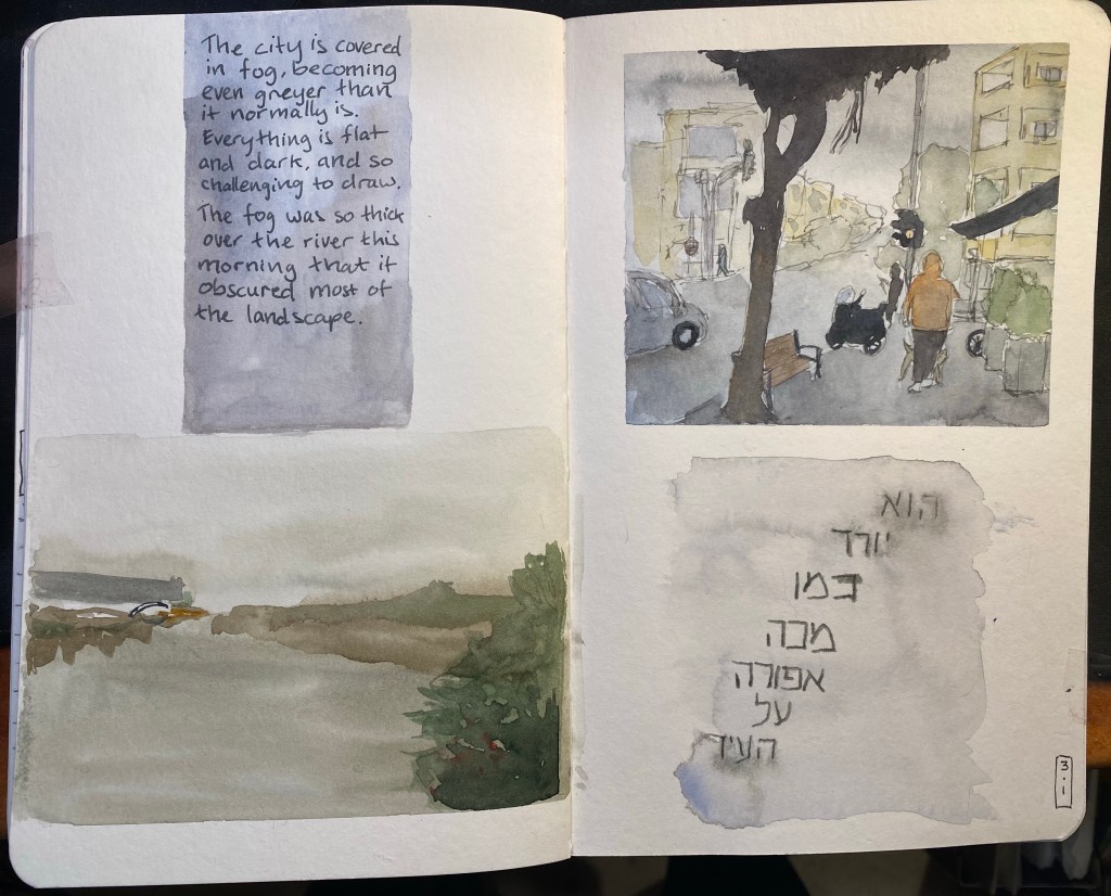
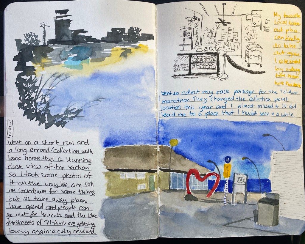
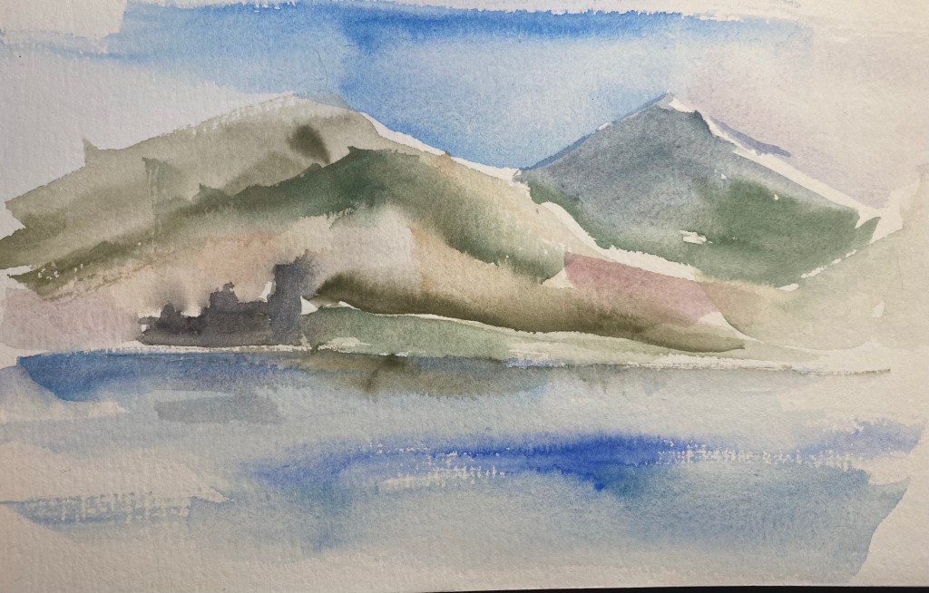
In early January we had a bout of very foggy days and I took photos of various city scenes in the lockdown and the fog thinking that I’d later draw them. I thought that drawing fog in watercolour would be pretty straightforward, because what is easier than just drawing wet on wet and letting the watercolour do its thing? But after looking more closely at the photos I realized that fog isn’t just grey sky melting into the landscape, it’s also a muting of colours, a flattening of the landscape, the lack of shadow. In the end I drew two small landscapes, one urban and one of the park, and although they were challenging I enjoyed drawing them enough to want to have the same experience with the text. The grey writing in Hebrew in the bottom right corner is a line out of a well known rock song that embodies a lot of the spirit of Tel Aviv. It was written using Diamine Silver Fox on a semi-wet background, to facilitate ink spread.
These drawing also showcase a shift I have made in my palette and my mixing over the past few weeks. Once things settle down I’ll probably post about my new palette.
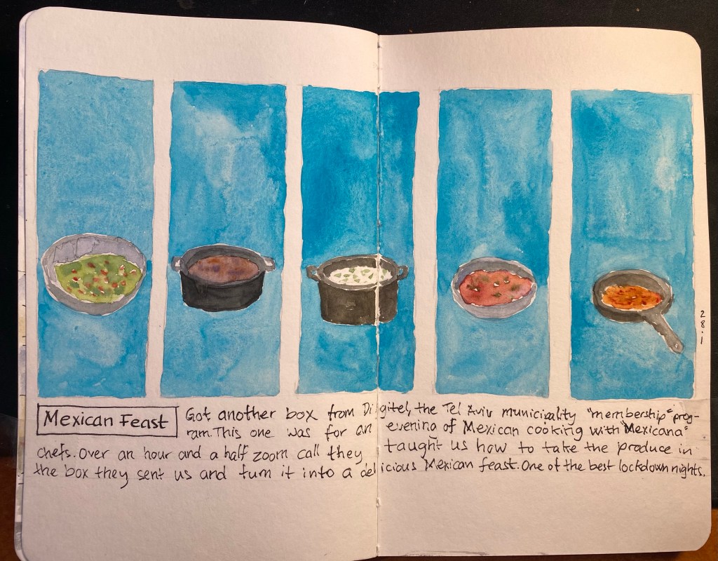
This is the first time I’ve used colour blocks to design a page in this way, with vertical drawings and horizontal text. This page was created as a contained composition for Liz Steel’s Sketchbook Design course (highly recommended, especially if you have a basic handle on drawing and sketching already). I normally would have just done an overlapped jumble of all the things that we cooked that evening, to convey a bit of the chaos of cooking so much in just an hour and a half, but I forced myself to think of a way of creating some of that night’s feeling using a contained composition. The vibrant turquoise was what brought this page to life for me: a joyful colour that connects me with what I learned about Mexico during that evening, and the happiness of cooking my way through a small part of the wonderful Mexican cuisine.
BTW – I just noticed that Jenny Mason from The Finer Point also took the Sketchbook Design course. I love the vibrant spreads that she’s created. Go check them out.
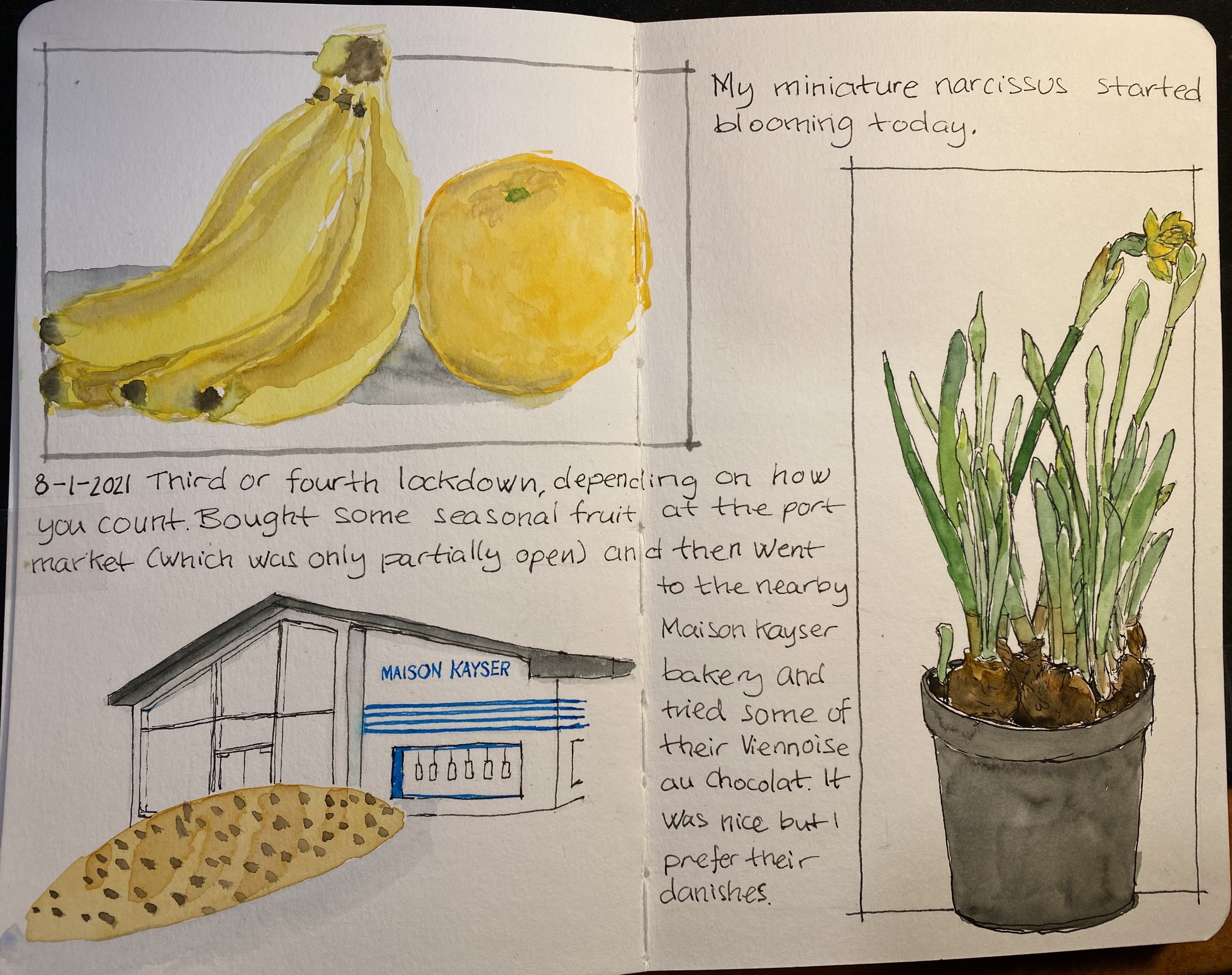
This page, created for Liz Steel‘s Sketchbook Design course, is about secondary sketches and borders, and has a little hidden colour block in it. The original spread was a little lacklustre and disjointed. The Viennoise in the corner looked particularly sad. Adding a secondary sketch of the Maison Kayser bakery (where I bought it), with a touch of blue and bluish grey to the background really brought it to life.
The bananas and orange got a shadow which serves more as a grey colour block, making their warm colours more prominent. Adding borders in Noodler’s Lexington Grey (to the bananas and orange watercolour) and Noodler’s Black (to the narcissus) was the final touch that pulled this page together.
I’m enjoying the course very much, even though the past two weeks have been personally hectic. I’ve been working on a short story to submit to a competition (got it done in time and accepted), and some bad news regarding the health of a family member have meant less sketching time than I would have liked. Hopefully the coming weeks will be better.
By the way, the local branch of Maison Kayser, in Tel Aviv’s port (I haven’t visited the Rothschild one yet), is excellent. Their vanilla chocolate chip danish, sandwiches, and baguettes are sublime, and it’s a fun place to visit. They had the misfortune of opening after the pandemic started, but they seem to be managing well, so I think we’ll be seeing them around for a good while yet.
Drawn on a Stillman & Birn Beta, with Lamy fountain pens, Noodler’s ink and Schminke watercolours.
