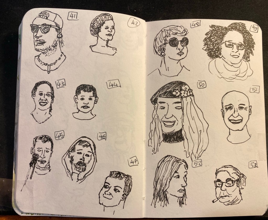
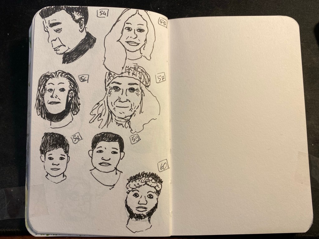
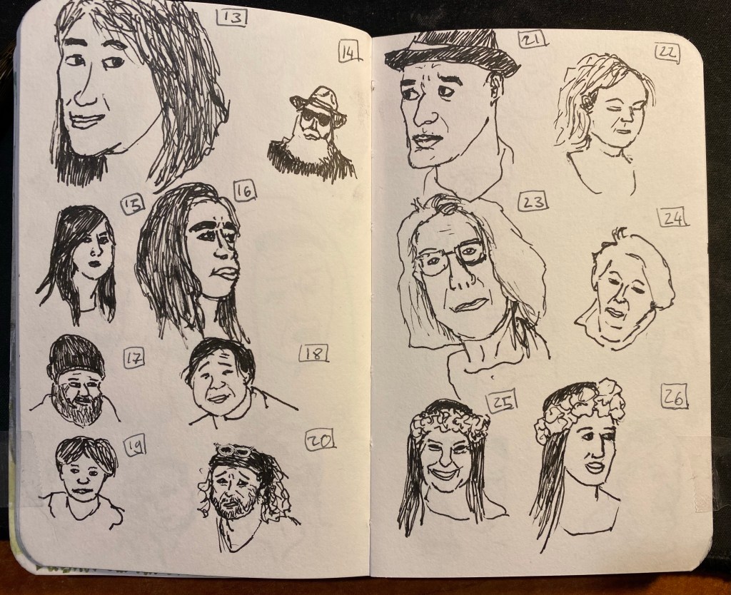
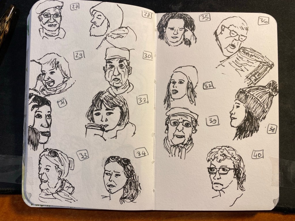
OneWeek100People 2021: Day 5

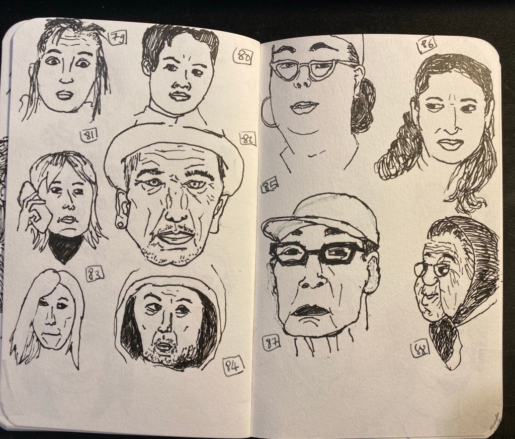
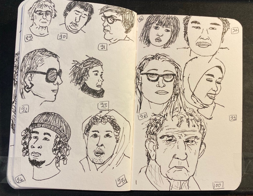
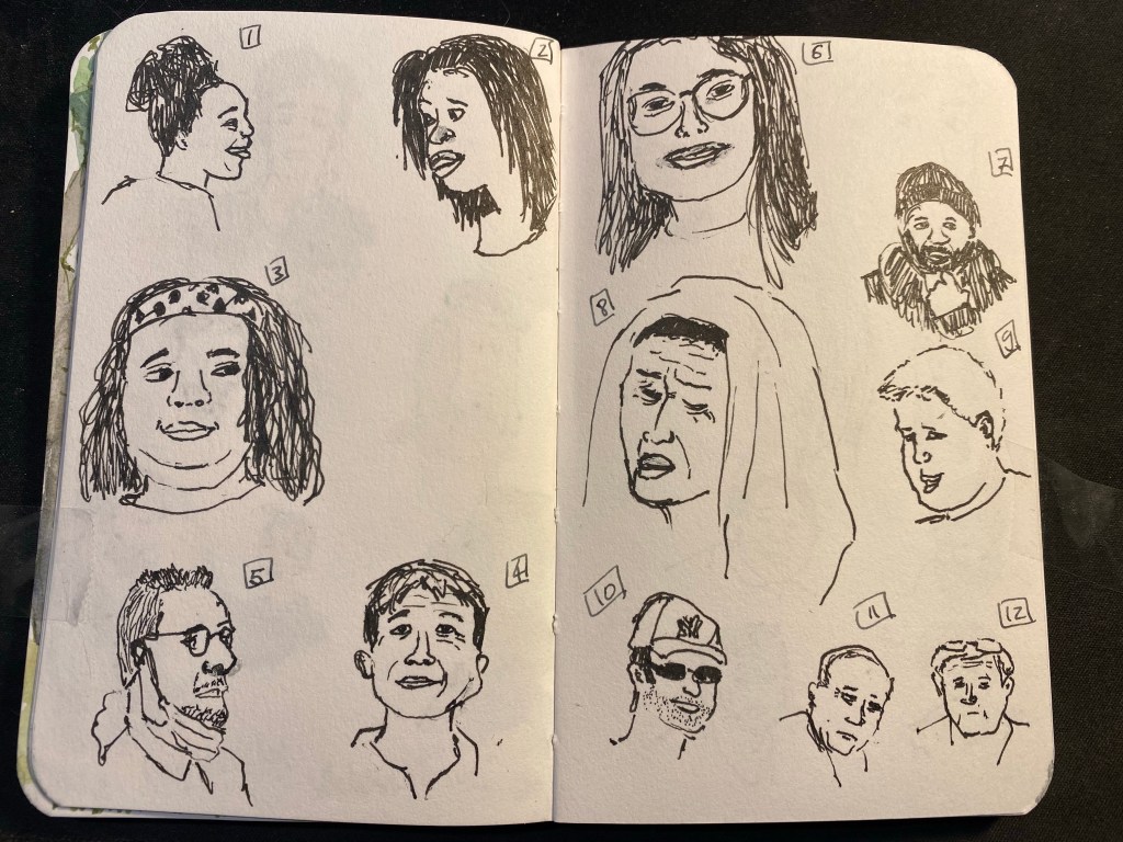
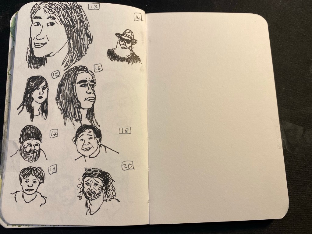
Day five of the One Week 100 People challenge, the final day of the challenge. I made it, using only pen and ink, and focusing on portraits the whole way through! It was tough but rewarding, and if I’d change one thing about it is get a better ink than Platinum Carbon. It kept drying up on me, and for the last four drawings I switched to a Lamy Safari fine with Noodler’s Black. That also wasn’t ideal, but it was better than the Platinum. I really want to test out the De Atramentis Document inks, but with shipping rates and reliability being what they are I’m stuck with three equally poor alternatives: Noodler’s Black, Platinum Carbon Ink and Rohrer and Klingner SketchINK. They all dry up in the nib and are hard starters, and the best of the bunch in terms of flow (Noodler’s) is the least waterproof of them all.

Anyway, I really recommend the One Week 100 People Challenge to anyone who wants to improve their people drawing skills, and I plan on doing it again next year.

OneWeek100People 2021: Day 3

Day three of the One Week 100 People challenge. It appears that the street photographers aren’t exactly catering to sketchers, or they’d take more profile pictures than they currently do 🙂
I’m getting into a pretty good rhythm, and more importantly I’m getting better at figuring out where to start each portrait. Many start with a general outline, others start with the hair, or the nose->eyes->lips. Every day it gets a little easier to draw people, and though 20 people a day is still far from easy, I do feel like I’m getting the most out of this challenge this year because of my choice to work directly in pen and with no shading or paint.

OneWeek100People 2021: Day 2

Day two of the One Week 100 People challenge and today was more challenging than yesterday, mainly because I started late and had trouble finding decent photographs. Photographers apparently love photographing blurry people, masked people, people with their backs to them, other photographers (while they are taking photographs and their face is half covered by the camera), or people from a large distance. Some of them also love photoshopping their subjects to death, so I’m now able to find a half decent subject only every five or six photographs. Thankfully the pool is huge and varied, with people in all ages and from all over the world, so while things are slowing down a bit, I’m still grateful for the the opportunity to enjoy the work published in this wonderful group. Even if I can’t use all of the photos there, I am thoroughly enjoying perusing through all of them.

OneWeek100people 2021: Day 1

I’m doing the One Week 100 People challenge again this year (I skipped it last year but I have done it before). It’s a challenge that I find difficult but very rewarding, and this year perhaps more so than in the past. I’ve decided to work from Flickr photos, to challenge myself to draw every clear face that I see in the photo pool that I’m using, to work fast and directly in pen and ink. I’m also not hiding behind watercolour at the moment, but we’ll see for how long my resolve holds. These all took a minute or two each, and were drawn with a TWSBI Vac 700 with an EF nib and Platinum Carbon ink on a Stillman and Birn pocket softcover Alpha. There’s some feathering and spread with this ink, which I’m not enjoying, so I may switch to Staedtler Pigment Liner pens later this week.

City in Grey

A5 Stillman and Birn sketchbook spread with two watercolour drawings, one on the lower left side and one on the upper right side (with ink), and two text blocks, one in Hebrew on the lower right side and one in English on the upper left side. The palette is grey and muted.

In early January we had a bout of very foggy days and I took photos of various city scenes in the lockdown and the fog thinking that I’d later draw them. I thought that drawing fog in watercolour would be pretty straightforward, because what is easier than just drawing wet on wet and letting the watercolour do its thing? But after looking more closely at the photos I realized that fog isn’t just grey sky melting into the landscape, it’s also a muting of colours, a flattening of the landscape, the lack of shadow. In the end I drew two small landscapes, one urban and one of the park, and although they were challenging I enjoyed drawing them enough to want to have the same experience with the text. The grey writing in Hebrew in the bottom right corner is a line out of a well known rock song that embodies a lot of the spirit of Tel Aviv. It was written using Diamine Silver Fox on a semi-wet background, to facilitate ink spread.

These drawing also showcase a shift I have made in my palette and my mixing over the past few weeks. Once things settle down I’ll probably post about my new palette.

Build a Plant Holder

Sketchbook spread with two wooden X shaped plant holders, a screwdriver and some tiny paint pots. There's a sticker with the Molet logo on the right.

Tel Aviv Municipality has come up with a great way to support local businesses during the lockdown. Once a day at 11:00 they open the option for around 30-40 people to purchase a box from a local business. The box costs 50 NIS, and comes with a zoom session with the store owner, where you learn about their business and make something together. There was a beer box, a sushi box, a stationery box, a magic shop box, a cocktail box, a pickles box, and more. The boxes proved to be more popular than city hall envisioned, so after a few days they limited it to one box per resident. Luckily I managed to get three boxes before the limit took place, and this was the first one. We learned how to make two plant holders out of reclaimed pallet wood from a lovely design studio in Jaffa called Molet. They create kits and give workshops using wood pallets and the results are charming and fun. My dad had a workshop with them before the pandemic and really enjoyed it, and I’ll try and get the people at work to go to a workshop there once we can.

This sketchbook page was created as part of Liz Steel‘s Sketchbook Design course and explores using collage and colour blocks as design elements.

Morning Run And Grey Heron

Map of my run, ramen bowl, woman in boat rowing over the Yarkon river while a grey heron is in the reeds, and closeup on a grey heron.

I don’t often get to see grey herons during my runs, so I decided to make a hero of this sketchbook page. Drew a map for the first time in my sketchbook and it was hard and took longer than I expected.Drawing the ramen bowl was also challenging, but I really like the results. I like this spread even though at the beginning I thought that I’d have to trash it, because some terrible masking tape that I used tore into the right page quite badly. Glad that I stuck with it.

This page was created as part of Liz Steel‘s Sketchbook Design course and explores using maps in your sketchbook.

TIMEX x DDC

I tried to get my hands on the Timex X DDC Scout watch designed by Aaron Draplin for three times before I managed to snag one. They are sold out so quickly that if you want one you really need to set an alarm and be quick with your keyboard and mouse. Then our local post office tried to do a vanishing act with my package, but finally, a month after I ordered it, I got my hands on this orange and black beauty. I only use analogue watches, usually Swatch watches (in recent years it was System 51 Swatch mechanical watches), but I’ve never owned such a heavy watch. It took me a day to get used to it, and since then it has been my constant companion. It is a beast of a MACHINE but an eye catching one, and I couldn’t be happier with my purchase. I highly recommend getting one, if you have any interest in watches.

This page was created as part of Liz Steel‘s Sketchbook Design course and is all about the white space.

Swingin’ The Dream

Another page from my sketchbook, created as part of Liz Steel‘s excellent Sketchbook Design course. Went on a run and saw a makeshift outdoors synagogue in the park. Prayers take place outside now, as we’re in lockdown number three.

Saw an RSC and Young Vic production about “Swingin’ the Dream” a 1939 musical that had a star studded cast and seemingly checked all the boxes for success (jazz musicals and Shakespeare were popular at the time, so why not create a mashup of the two?), yet tanked and was canned after only 13 performances. What is fascinating isn’t just the failure itself, but that there is so little evidence of the musical ever existing. A musical number and a Pyramus and Thesbe scene are all that is left. The evening I saw was a one off, but it piqued my curiosity enough for me to want to learn more and see more about it. You can read more about the production here and here.

Material list: Stillman & Birn A5 Beta, Schminke watercolours, Lamy Safari (medium and fine nibs), Lamy Joy 1.1 nib, Noodler’s Lexington Grey and Noodler’s Black.

Oranges, Bananas and maison kayser

A sketch of an orange, a banana, a narcissus flowering, Maison Kayser and a Viennoise au Chocolat
Bananas, orange, narcissus and Viennoise – an eclectic page

This page, created for Liz Steel‘s Sketchbook Design course, is about secondary sketches and borders, and has a little hidden colour block in it. The original spread was a little lacklustre and disjointed. The Viennoise in the corner looked particularly sad. Adding a secondary sketch of the Maison Kayser bakery (where I bought it), with a touch of blue and bluish grey to the background really brought it to life.

The bananas and orange got a shadow which serves more as a grey colour block, making their warm colours more prominent. Adding borders in Noodler’s Lexington Grey (to the bananas and orange watercolour) and Noodler’s Black (to the narcissus) was the final touch that pulled this page together.

I’m enjoying the course very much, even though the past two weeks have been personally hectic. I’ve been working on a short story to submit to a competition (got it done in time and accepted), and some bad news regarding the health of a family member have meant less sketching time than I would have liked. Hopefully the coming weeks will be better.

By the way, the local branch of Maison Kayser, in Tel Aviv’s port (I haven’t visited the Rothschild one yet), is excellent. Their vanilla chocolate chip danish, sandwiches, and baguettes are sublime, and it’s a fun place to visit. They had the misfortune of opening after the pandemic started, but they seem to be managing well, so I think we’ll be seeing them around for a good while yet.

Drawn on a Stillman & Birn Beta, with Lamy fountain pens, Noodler’s ink and Schminke watercolours.