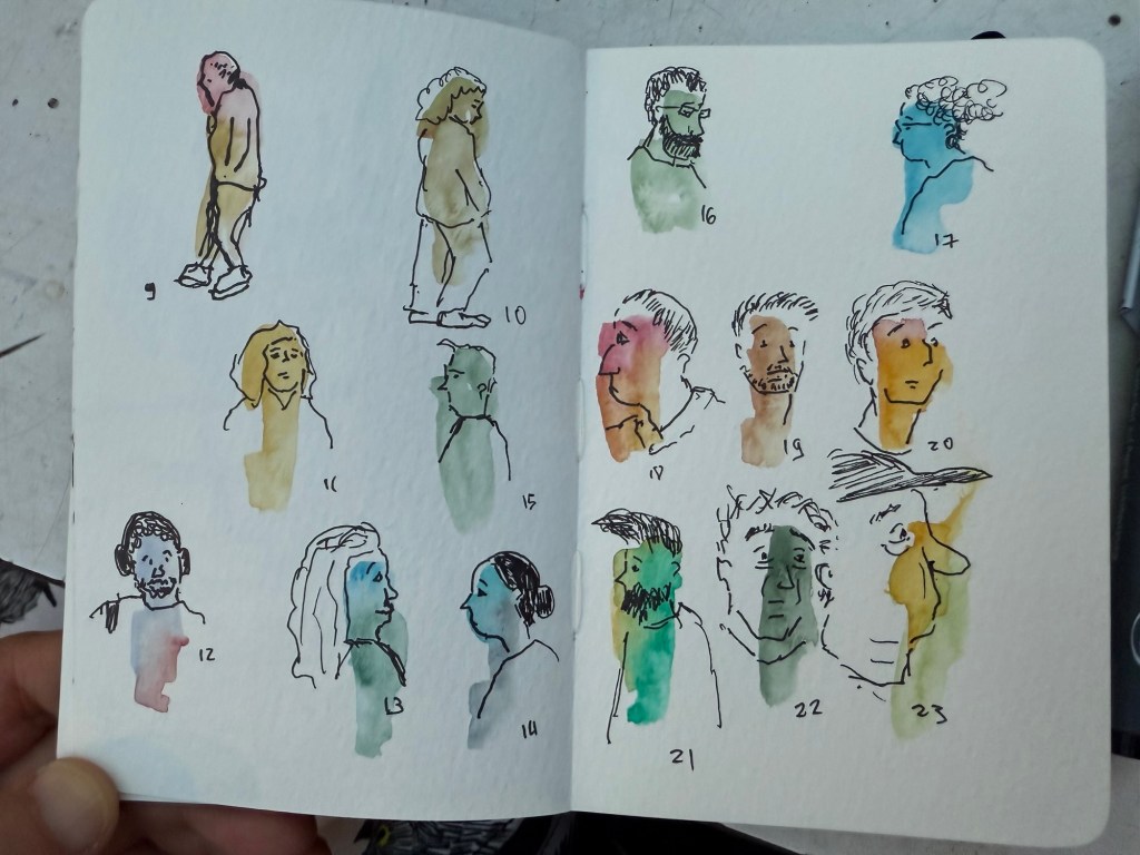
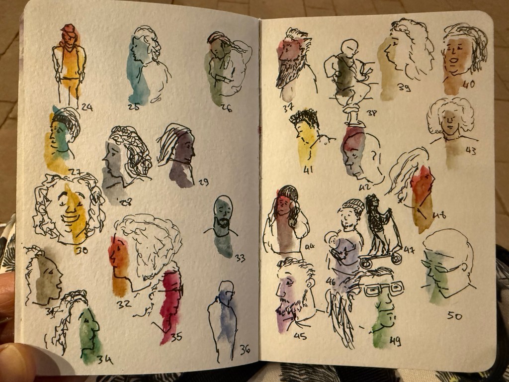
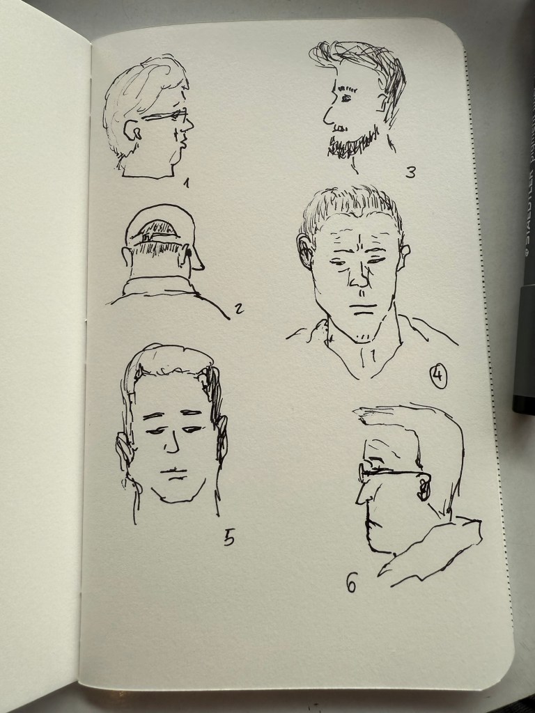
I went out for 45 minutes after work and sketched all of these as fast as I could. I only stopped when it got too dark outside. Yesterday’s sketches were done with a Staedtler 0.5 pigment liner on a Field Notes sketchbook. Today’s sketches were done on a pocket Moleskine watercolour sketchbook using a 0.3 Staedtler pigment liner, a water brush and watercolour.
First batch when it was still light outside
People moved by in the street so I had seconds to capture each figure (the more detailed ones stopped for a minute or two). As this is what normally happens when you urban sketch, I found this exercise to be very useful.
I didn’t have much time to sketch today so I only got 8 sketches done, but I’m more concerned with getting the sketches done from observation than with getting them done in time.
Another busy week at work coupled with a packed weekend means that this update will be bullet-point style:
I ran my first race of the year, a 10K in what turned out to be surprisingly warm weather. I’ve been using the Nike Running Club App’s 10k race plan, for both this race and the one I ran in Disney World last October and it’s proven to be fantastic. I wish I could say the same about the app, which has lately had annoying audio issues that have made it downright unusable at times.
In preparation for next week’s One Week 100 People challenge I’ve been using a Field Notes Sketchbook, and I’ve grown to appreciate its portability. It’s not suited for wet media, but for pen, ink and pencil it works well. All the sketch photos here were done on a Field Notes Sketchbook, and I’ll be reviewing it sometime in the future.
I’m down to only five inked fountain pens, and I’ll likely write one or two of them dry next week. I’ll be updating my pen rotation sometime late next week, possibly looking to add some more spring-time ink colours to the darker inks I currently have in use.
I’ve finished reading Legends and Lattes by Travis Baldree, bringing my February book count to three. The book was just the sort of cozy, light read that I needed at the time, and I enjoyed it enough to immediately buy the sequel (which is actually a prequel) Bookshops and Bonedust.
I spent an annoyingly long time downloading all of my kindle books to my laptop before Amazon locked that option out. I’ve also moved to using Kobo to buy eBooks. I will admit that it’s not as convenient as buying ebooks from Amazon, but I’m angry enough at them for the change to put in the extra effort required. I bought Bookshops and Bonedust on Kobo and then used the Amazon “Send to Kindle” website to transfer my purchase (it was easy because Travis Baldree, bless him, demanded that the book be DRM free). I also bought another book (a bit on that in the next bullet) that had DRM applied, so I had to do some Calibre work to strip it of DRM before sending it to my Kindle. Next time the whole process should take only a minute or two extra beyond the usual Kindle book purchasing process, and again, for me it’s worth it.
After listening to Oxford poetry professor Tara Stubbs’s wonderful Demystifying Poetry podcast (Apple Podcasts, Spotify) I bought my first poetry book in years, the anthology “Staying Alive”. Even if you’re not a poetry lover, give the podcast a listen. It’s well worth your time.
I mostly use fountain pens when I write. If not fountain pens then gel ink pens. I rarely write in pencil, but I often sketch with pencils, and sometimes when I plan, I pencil things in. Pencil is great for writing impermanence, even though pencil marks last longer than pen ones – unless erased.
Yet there’s always a ballpoint on my desk and in my bag. I don’t like writing with ballpoint – the lines are as dark as I prefer, even with hybrid ballpoints like Uniball Jetstreams, and they oftentimes streak and blob. So why do I have a ballpoint at hand at all times?
Because ballpoint pens are a useful tool. The ink is waterproof , they’re good for signing things, and they’re robust enough to handle being tossed into a bag or a pocket. Ballpoint pens are also good for sketching – you can get a decent amount of shading and character with them (providing you don’t use a Jetstream).
One of the best bang for your buck ballpoints is this pen:
Zebra 301A BP
So why do I like the Zebra 301 A BP 0.7?
It’s made from aluminium, so it’s light and ultra durable. It also wears really well.
I love the pen body design and colour.
The grip and click mechanism are good: well designed and well made. You get a decisive click from this pen, and the plastic grip has enough texture to it to make writing as comfortable as possible without all the lint gathering, stickiness and durability issues of softer grips.
No tip wiggle.
It comes with a good, dependable, black refill that is replaceable.
Clip and click mechanism
I like the Zebra 301 A BP enough that I bought a large box of them and I frequently give them away as gifts. People like getting nice pens and if you’re used to cheap, plasticky, disposable ballpoints it’s nice getting a pen that’s a grade or two above what you find in the office supply cabinet.
Grip
Here’s a quick sketch done with a Zebra 301A BP 0.7 on a Field Notes Sketchbook. Ballpoint pen sketching isn’t my favourite technique, but it is a very useful technique for quick urban sketching.
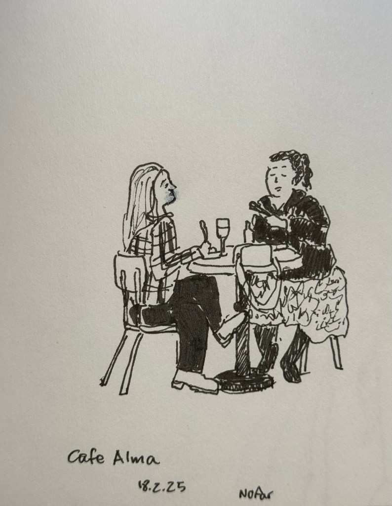
Earlier this week I went to a standup gig – a NY comedian was trying out new material, and it was an interesting (and funny) experience to see him work. Before the show I had about 5 minutes to sketch the people in a nearby cafe, so I sketched this couple using a Staedtler 0.5 Pigment Liner.
In terms of fountain pens the Parker Vacumatic is out of rotation, though I may give Diamine Writer’s Blood a try in another pen soon enough. I decided that I want to have the nib tuned on it, in terms of flow, though I don’t know who I’ll be able to find to do the tuning for me.
I also dumped out the Pilot Iroshizuku Yama Budo out of my Parker 51 as I couldn’t get it to not bleed and feather on practically any paper. I cleaned out the pen and refilled it with Waterman (Tender) Purple ink and it’s been wonderful to use since. Waterman inks are not only fantastically well behaved, beautiful, cheap and very, very easy to clean out of pens, they’re also dry inks. As Parker 51 generally have a generous ink flow, and this one is no different, a dry ink serves particularly well with this pen.
I’ve been reading Mrs Palfrey at the Claremont by Elizabeth Taylor (the British novelist, not the famous actress) and it’s a wonderful study of character, age and aging.
Next week is the Tel Aviv marathon, which is sold out for the very first time. There were no big local running events last year, and there’s clearly a hunger for them.
This week has been crushing from both a personal and a national perspective. I’ve taken solace in friends and in reading, but there have been times where it’s been a struggle. It’s at times like this when I need to remind myself to stop, take a breath, allow myself to feel what I need to feel, and only then pick myself up and move on.
Be kind to yourself and others, and have a great week.
It’s nice to have new pens and inks in rotation. I’m enjoying Diamine’s Writer’s Blood more than I expected, Diamine Autumn Oak is fantastic with a Waterman superflex nib, and Pilot Iroshizuku Tsuki-yo is becoming one of my favourite inks.
Liz Steel and Marc Taro Holmes are hosting the OneWeek100People challenge again this year, and I intend to participate again. The challenge starts on the 3rd of March and officially lasts 5 days. I normally sketch from photos, but this time I want to see if I can do the entire challenge from observation only. It may take me more than 5 days, but I’m OK with that. Are you planning on joining the challenge?
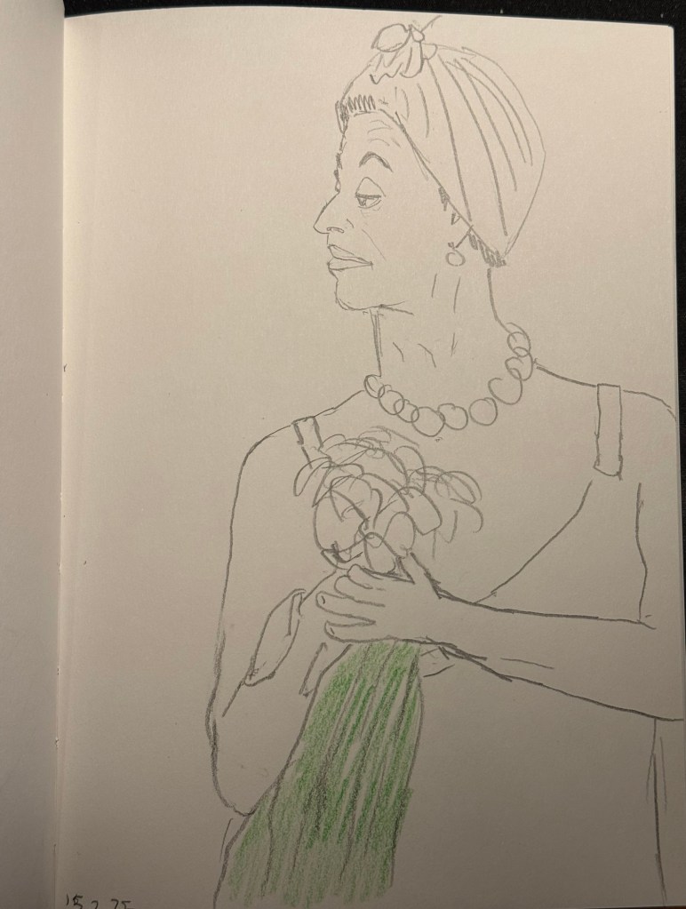
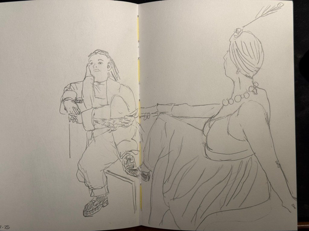
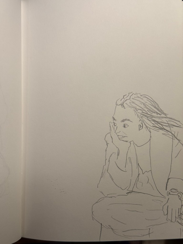
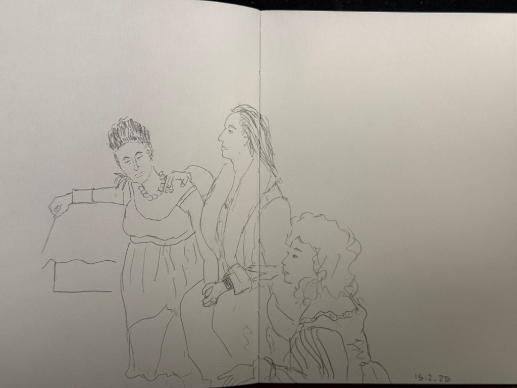
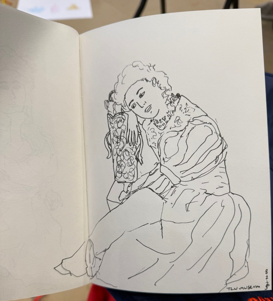
I went to the local art museum again this week, to sketch models in the museum. This was the last time this event was run, and the place was packed with sketchers. I didn’t have the best of locations, but I made the most of it. I sketched with Faber Castell 9000 2B and 3B pencils mostly, and added a touch of colour with Faber Castell Polychromos. The ink sketches were done with a Staedtler Pigment Liner 0.5. The sketchbook I used was once again the French Pascale Éditions. The models did fewer 20 minute poses and more 10 minute ones, which meant scrambling a lot. I wanted to visit the museum after the event, but I was so tired from 3 hours of non-stop sketching that I just went home.
Harman Photo just came out with a brand new colour film, Harman Red. It’s a red-scale film, and I’m curious enough to try and buy a roll or two and test them out. I love the wild, wild results I got with Harman Phoenix and the Harman Red is basically Phoenix pushed even more into red-scale.
Here are the sketches from today, and I hope that you have a great week!
10 minute pose.10 minute pose.10 minute pose.10 minute pose – the hardest pose to draw because of the angle of the head. Had a false start on this one, so had only about 8 minutes for this. 10 minute pose – Staedtler 0.5 pigment liner10 minute pose10 minute pose10 minute poseThe three models. The pose started with just the two top models, and then the third one joined, and it was a 10 minute pose.A challenging composition, 20 minute pose10 minute pose. I like the composition on this one – I placed her on the side of the page to give her room for thought. Final pose, 20 minutes
It’s been a hectic week as my team at work is basically crumbling: our new senior member is leaving after just two months, the team lead is leaving after a bit more than a year, and the other team member is on holiday until the end of the month. That just leaves me with two trainees to hold the fort for a while, and it’s far from ideal. As I’m also working my way through an intense certification course, posts on this blog have taken (and will likely continue to take) a bit of a hit.
Reading
I’ve finished reading Looking for a Ship by John McPhee and I’ve reviewed it here. It’s a fascinating narrative of a now extinct world, that of the American Merchant Marine. I’ve now started reading Oliver Burkeman’s Four Thousand Weeks as well as Legends and Lattes by Travis Baldree.
Stationery
My Field Notes order has arrived, as has the 2024 Hobonichi Techo (yes, 2024) that I bought with a Black Friday discount. The Hobonichi will be used to supplement my 2014 Hobonichi when it comes to testing out inks. The 2024 Techo has’s got paper that is close enough to original Tomoe River Paper that’s in my 2014 Techo, though from my understanding the 2025 Hobonuchi’s have worse paper than the 2024 ones, so take that into account if you’re considering buying one. I have posts planned for both purchases, and hopefully I’ll get the time to write them.
Model Sketching
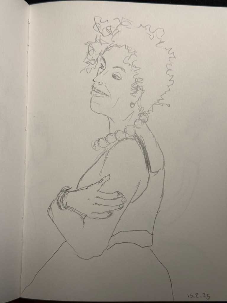
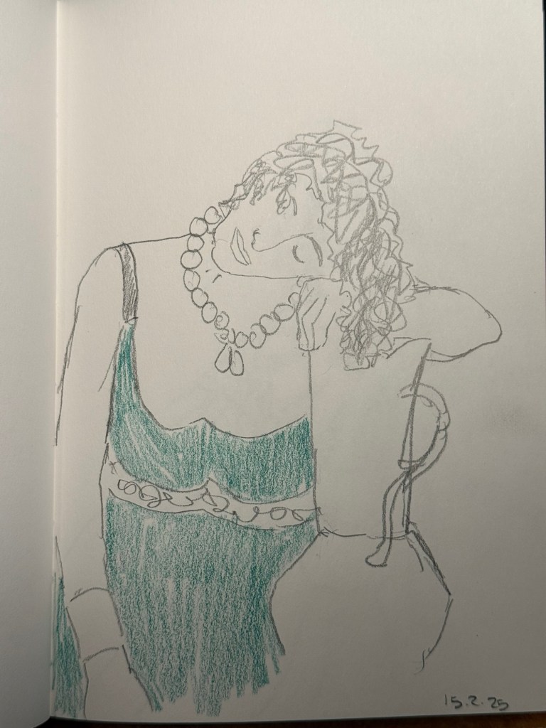
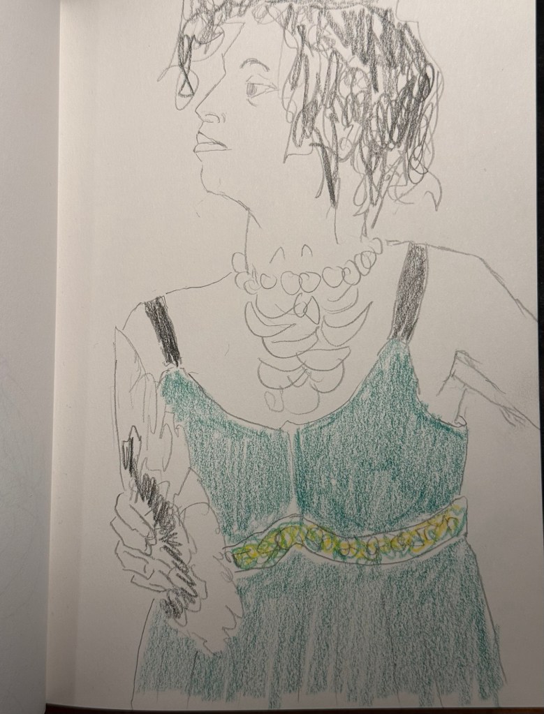
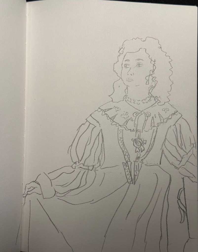
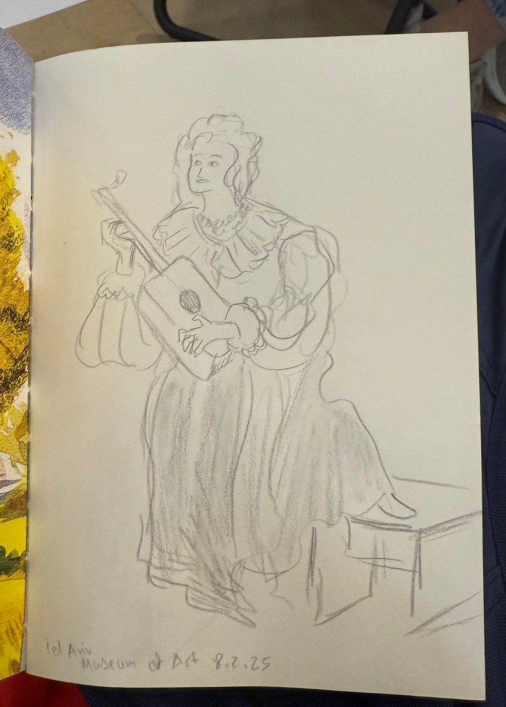
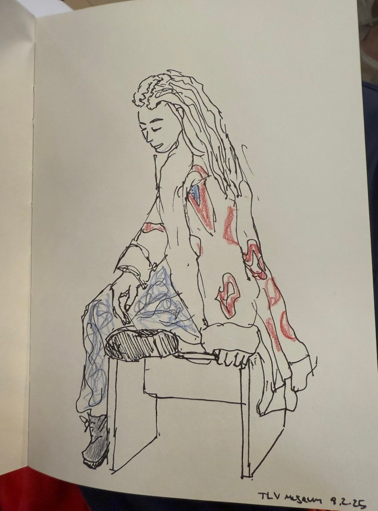
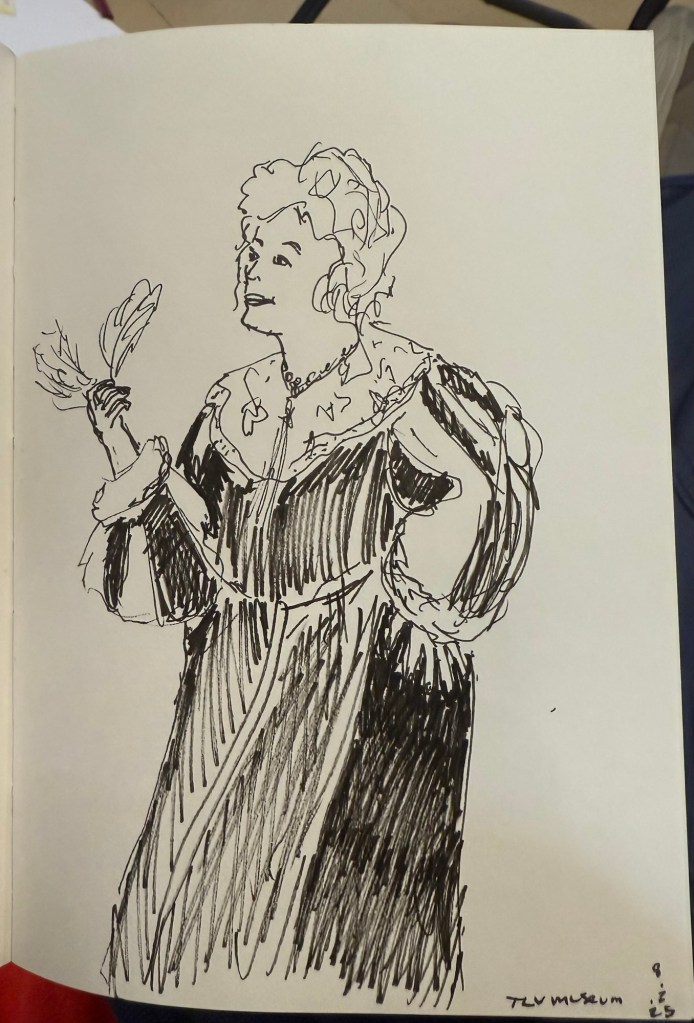
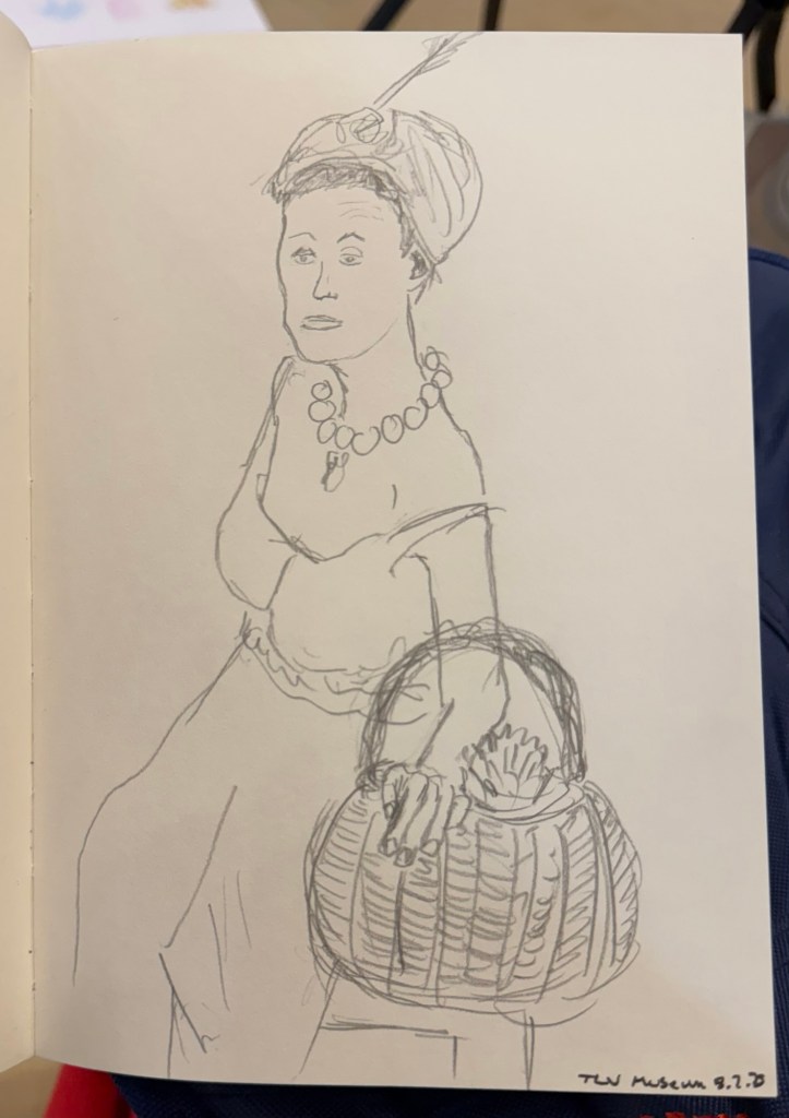
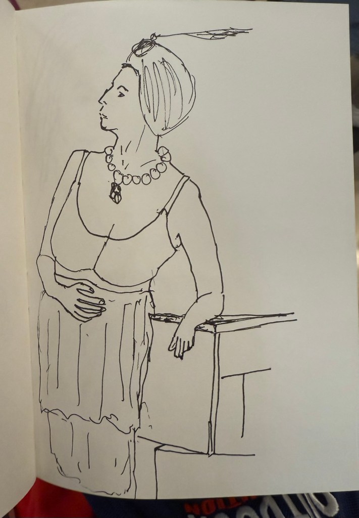
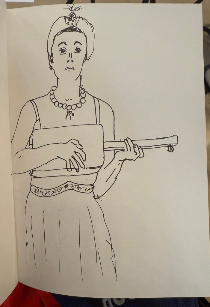
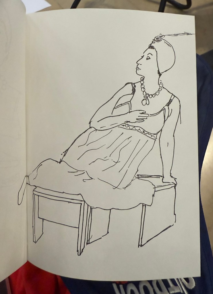
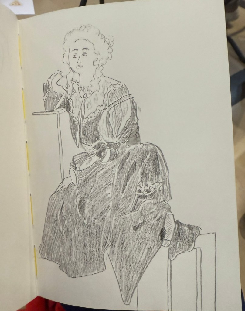
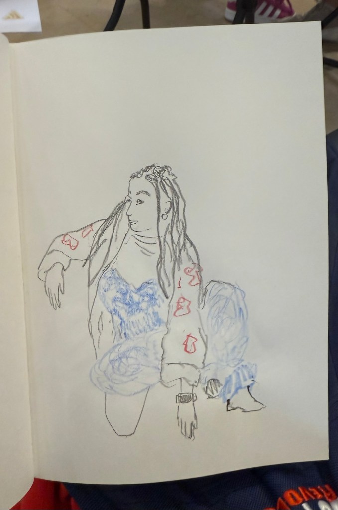
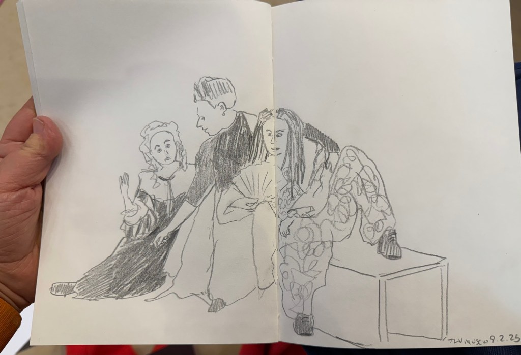
I went to the Tel Aviv Museum of Art today for a special sketching event that they organized: three models dressed in clothing that reflected some of the artwork in the collection, posing for sketches for 3 hours. These were mostly 10 minute sketches, with the last two poses being 20 minute ones. The last pose was a rare treat – a group pose, which is something you don’t get to sketch a lot.
In general when sketching models, whether clothed or not, you have one model that poses. Here there were three, and they switched places, so wherever you sat you got to sketch all three (and you could always sketch a model that was a bit further than the one right in front of you). The museum was busy, and there were children’s plays being shown in the auditorium, and so a lot of kids were around us, sketching on bits of paper with coloured pencils, with parents and grandparents cooing with delight and hovering around. It was wonderful to see how joyously kids took to sketching, whether it was the ladies in the dresses before them, or just anything that came into their imagination.
Here are the sketches I made throughout the event. The sketchbook I used was by French maker Pascale Éditions (it was lovely), and I used a Faber Castell 9000 2B pencil, a Faber Castell 4B Graphite Aquarelle pencil, various Faber Castel Albrecht Dürer watercolour pencils, a Tombow brush pen, and a 0.5 Staedtler Pigment Liner (this was my most used sketching tool).
First sketch. Warming up, so trying to keep it as loose as possible. 20 minute sketch, so I had time for some shading. The only sketch where I wet the paper slightly with a waterbrush before sketching20 minute final group posePotato quality photo of the three models
I haven’t done a watercolour sketch in a while, so I broke out the trusty Moleskine Watercolour sketchbook, my Staedtler Pigment Liners (0.3 and 0.5) and my Schmincke and Daniel Smith watercolours and made this quick sketch:
Prickly pear watercolour sketch
It was fun and it took me less time than I thought, so I should do it more often.
This was a big ink week, as I wrote many of my Inkvent fountain pens dry: Wishing Tree, Snow Globe, Winterberry, Salted Caramel, Pine Needle, Nutmeg, and Wilted Rose. I also dumped Sleigh Ride as I found the ink colour depressing. This leaves me with 9 Inkvent inks still inked in my pens, with most of them half or quarter full. I doubt that I’ll be able to write them all dry by the end of the month, but hopefully I’ll get as close to that as possible. In any case I’ll reassess in the beginning of February if I want to keep using my Diamine Inkvent inks or if I’ll just dump out and clean up whatever I still have inked at the time and start fresh.
I finished reading “The New York Trilogy” and it’s a very Paul Auster book. Next week I’ll start on “The Last Kashmiri Rose” by Barbara Cleverly and finish “The Comfort Crisis” by Michael Easter.
Have a great week full of pens, books and good news.
I’m a week away from getting back to a 10k long run, and the running weather has been pretty perfect so far. I ran a 30 minute hilly recovery run today and for the first time ever I ran it without headphones. I normally run with earbuds and listen to podcasts or music, except during races where I leave my earbuds at home for safety reasons (and to get the full race experience). It was relatively early and the trail I was running through was deserted, so it was quite the experience listening just to birds and the sound of my feet and my breath. This is definitely something that I plan on adding to my running routine.
Reading
I’m two thirds into “The New York Trilogy” by Paul Auster and I’m dreading starting the 3rd and final story. The writing is excellent, but it’s like reading through version after version of Bartleby the Scrivener – not something that you particularly want to do. I’ve come so far that I will finish the book at this point, but after reading several Auster books it’s clear to me that while he’s a very good writer, his books are not for me.
Meanwhile I’ve started on “The Comfort Crisis” by Michael Easter, and though it is clear that it suffers from many of the same problems that books of this kind suffer from (cherry picking or hand waving “research” over complex and nuanced topics), there are some interesting ideas within.
Fountain Pens
I’ve decided to sketch more with my Inkvent ink filled fountain pens to try and run them dry more quickly, so here’s a motorcycle sketch done with a Levenger True Writer Cappuccino with a fine nib and Diamine Nutmeg.
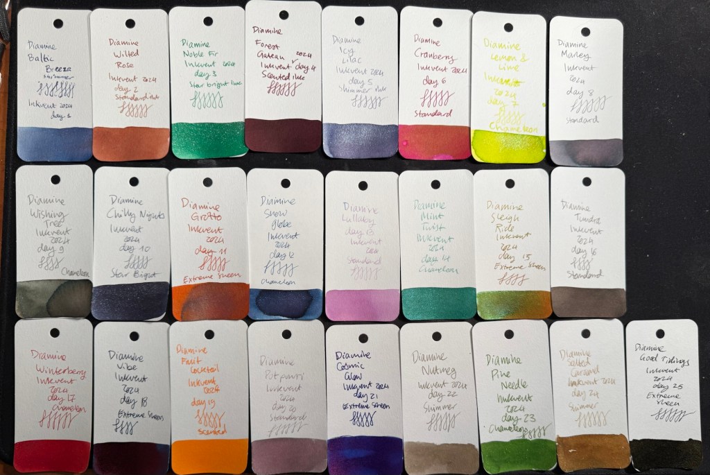
For the introduction post to 2024’s Inkvent, see this post.
Diamine Inkvent 2024 Black Edition is the fifth edition of their Inkvent calendars, and I’m sorry to say that it’s by far the worst. Partly it’s 2023’s Inkvent Purple Edition’s fault, as it’s the strongest of the Inkvent calendars to date and so it created high expectations for the Black Edition. But there were several things that went wrong with this year’s calendar that made it an overall disappointing experience:
There are four previous Inkvent calendars, and there’s only so many ink shades in the world. The black edition featured a lot of inks that were pretty similar to ones seen in earlier Inkvent calendars.
This year’s “special effect” was “Extreme Sheen” and it just doesn’t have the same impact as effects like Chameleon and Star Bright that we saw in previous calendars.
The “Extreme Sheen” effect didn’t improve all the inks it was applied to.
Almost a third of the inks in this calendar were in the “dark and bland” range: grey, brown, black. There’s only so much joy a brown ink can spark.
There were very few bright inks and not all the bright were great (see Lemon & Lime and Fruit Cocktail discussed below).
A good number of the inks had very little festive appeal. This wouldn’t have been a big deal if Diamine hadn’t set the festive bar so high: they deliberately name their inks for festive or wintery things. Previous Inkvent calendars did much better in this regard (the first ones, the Blue Edition and Red Edition took this a bit too far), so it’s hard not to be disappointed in the Black Edition’s performance on this front.
Here’s all this year’s inks in order (read further on for a breakdown of each group and buying recommendations):
All the 2024 Inkvent Col-O-Ring ink swabs
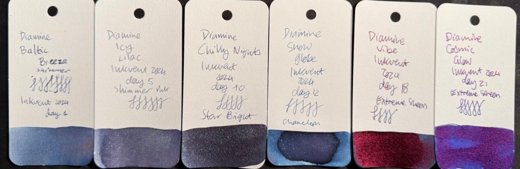
Blues
There were six blue inks in this year’s Inkvent:
Two shimmer inks, Diamine Baltic Breeze and Diamine Icy Lilac. These are nice inks that are very similar to one another and similar to previous blue shimmer inks from past Inkvents. These go into the “nice but not exciting” category, and score decently on festive appeal.
Two “Extreme Sheen” inks, Diamine Vibe and Diamine Cosmic Glow. These feature the new effect for this year’s Inkvent and feature it well. Overall these are two of the strongest inks in this year’s calendar in terms of “wow” effect, even though they’re not exactly holiday themed.
One chameleon ink, Diamine Snow Globe. The chameleon effect is always nice and interesting, but the base blue ink is nothing new, and it also goes into the “nice by not exciting” category.
One Star Bright ink, one of only two Star Bright inks in the calendar, Diamine Chilly Nights. The fact that there are only two Star Bright inks in this calendar contributed to this year’s Inkvent being so underwhelming. There is no greater wow effect than a Star Bright ink on a dark ink, and Diamine Chilly Nights really delivers on that front. The base blue black is very nice, and if you enjoy using shimmer inks then Diamine Chilly Nights is definitely an ink to consider.
All in all the blues in this year’s Inkvent were the strongest overall group by far.
All the blue Inkvent Col-O-Ring ink swabs
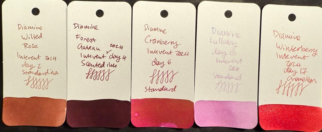
Pinks and Reds
There were five pink and red inks in this year’s Inkvent:
Three standard inks, Diamine Wilted Rose, Diamine Cranberry and Diamine Lullaby. Diamine Wilted Rose is a nice and interesting “antique” rose colour, Cranberry is a decent but not overly unique ink, and Diamine Lullaby is on the “barely readable” spectrum. Of these three the standout ink is Diamine Wilted Rose, and it’s not a “star” ink by any measure.
One scented ink, Diamine Forest Gateau. I loath scented inks so I won’t elaborate on this one.
One chameleon ink, Diamine Winterberry. This is the standout ink in this group, one of the few bright and festive inks in this calendar, and a great ink to buy if you’re looking for a “Christmas greeting cards” ink. A breath of fresh air among the washed out and dark colours of this year’s calendar.
All the red and pink Inkvent Col-O-Ring ink swabs
Greens
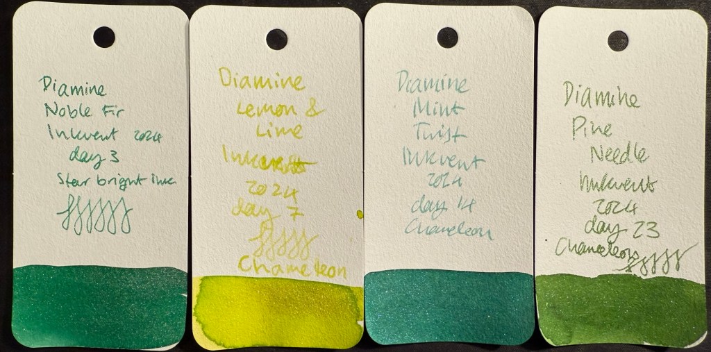
There were only four greens in this year’s Inkvent:
Three chameleon inks, Diamine Lemon & Lime, Diamine Mint Twist and Diamine Pine Needle. Lemon & Lime is unusable even in a wide and generous nib as it’s way too bright and light to be readable. Diamine Mint Twist is the standout ink in this group, the one with the most unique base ink colour. Pine Needle is nice enough, but there have been plenty of inks in this colour before.
One “Star Bright” ink, the only other one in the calendar, Diamine Noble Fir. It’s not as impressive as Diamine Chilly Nights because the base ink colour isn’t dark enough for the Star Bright effect to have the most impact. It’s a good, bright green ink though.
All the green Inkvent Col-O-Ring ink swabs
Oranges
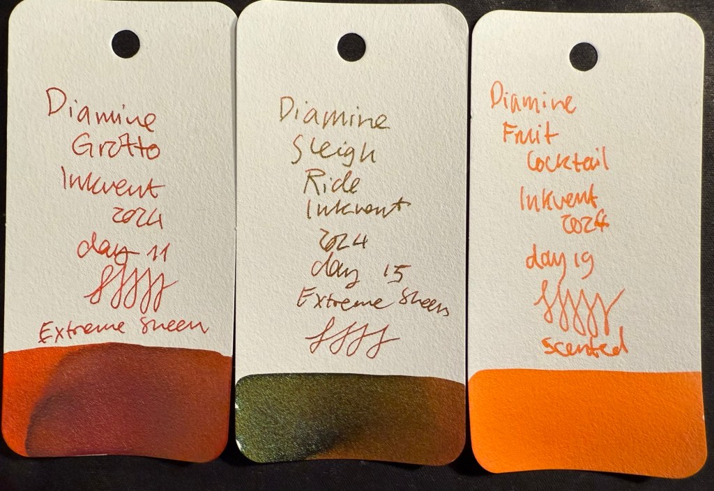
There are three oranges in this year’s Inkvent:
Two “Extreme Sheen” inks, Diamine Grotto and Diamine Sleigh Ride. Of the two Diamine Grotto is a great ink, and Sleigh Ride is poorly named and features a rather unattractive combination of an orange base and green-brown sheen. If you like rust effects you might enjoy it, otherwise, Diamine Grotto is the better choice.
One scented ink, Diamine Fruit Cocktail. I think that this is the worst ink in this year’s calendar for having a combination of scent and zero shading.
All the orange Inkvent Col-O-Ring ink swabs
Darks – Greys, Browns, Blacks
There were seven (!) inks in this category in this year’s Inkvent:
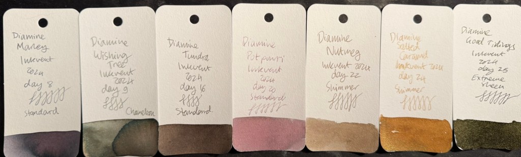
Three standard inks, Diamine Marley, Diamine Tundra, and Diamine Potpourri. Of the three Diamine Marley is by far the best, with Diamine Potpourri being too light to be readable (I could have placed this ink in the pinks category, but it’s so greyish and washed out that it felt more in place in this category), and Diamine Tundra being greyish brown, if you’re into that shade.
Two shimmer inks, Diamine Nutmeg and Diamine Salted Caramel. Of the two I prefer Diamine Salted Caramel, though there have been similar enough inks in previous Inkvents for you to feel free to skip this one.
One chameleon ink, Diamine Wishing Tree. The strongest ink in this group and one of the best inks of this year’s Inkvent, Wishing Tree has a great combination of a fantastic base ink colour and a lot of added interest from the chameleon effect.
One “Extreme Sheen” ink that was supposed to be the highlight of this calendar, Diamine Good Tidings. I found it far from “extreme sheening” and the sheen effect was a very unattractive dirty yellow.
All the dark Inkvent Col-O-Ring ink swabs
Summary
So these are the inks that I would consider buying from this year’s calendar (with the addition of Diamine Winterberry if you see yourself needing a festive red ink): Diamine Marley (interesting duo-chrome ink), Diamine Wishing Tree (duo-chrome interesting base shade ink with great chameleon effect), Diamine Grotto (great base orange ink with attractive extreme sheen), Diamine Mint Twist (unique green with a chameleon effect), Diamine Vibe (attractive dark turquoise ink with great extreme sheen), and Diamine Cosmic Glow (great royal blue base ink and wild extreme sheen).
All the inks that I would consider buying Inkvent Col-O-Ring ink swabs
As a reminder, this year’s Inkvent wasn’t sold out, which means that if you’re interested in these inks and haven’t yet gotten the calendar you can expect it to be on sale in various places soon enough. It’s a great way to get a good amount of varied ink samples, and each little bottle is good for at least 2-3 fillings (plus there’s a big 30ml bottle in day 25).
Midyear, at around June or July, Diamine will come out with the “Black Edition” of these inks. These are 50ml editions of the Inkvent 2024 Black Edition inks, in gorgeous glass bottles. They make for great gifts, and are worth getting as they’re very well priced for the “premium ink” experience.
I have 20 fountain pens filled with Inkvent inks in rotation at the moment, and it will take me a while to work my way through them. Will I do Inkvent again next year? I don’t know. The price plus shipping has gotten steeper every year, and this year’s calendar was a pretty big disappointment in my opinion. When pre-orders start for next year’s Inkvent (if there will be one), I’ll have to really consider it.
What are your favourite inks from this year’s Inkvent? What did you think of the Inkvent Black Edition?