Ti Click EDC Pen Review

I am a big fan of Big Idea Design’s pens (the Ti Arto is my daily carry pen), and so of course I joined the Kickstarter for the Ti Click EDC Pen. Since I hadn’t tried their black anodised pens before, that’s the finish I opted for. It arrived yesterday, and even though I’ve been using it exclusively all day, I’l be the first to admit that these are only my preliminary thoughts on it. (See updates in the end for more detailed thoughts on this pen).

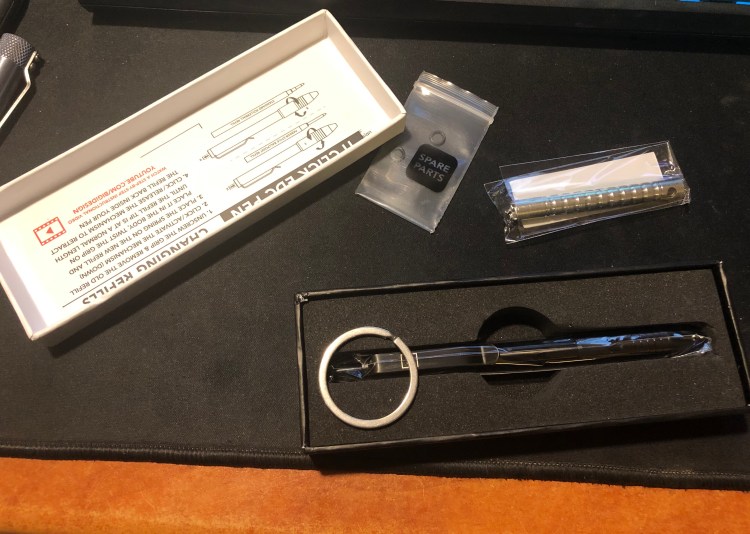
The packaging, as usual with BIGiDESIGN, is compact and neat. The pen comes with everything you need to fix it, should you need to (I’ve never needed to), and in a pretty nifty box.

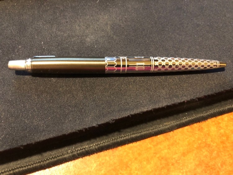
The finish on this pen is shiny and black, but it’s surprisingly not a fingerprint magnet, as I would have imagined:

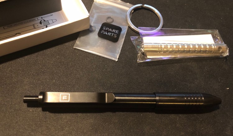
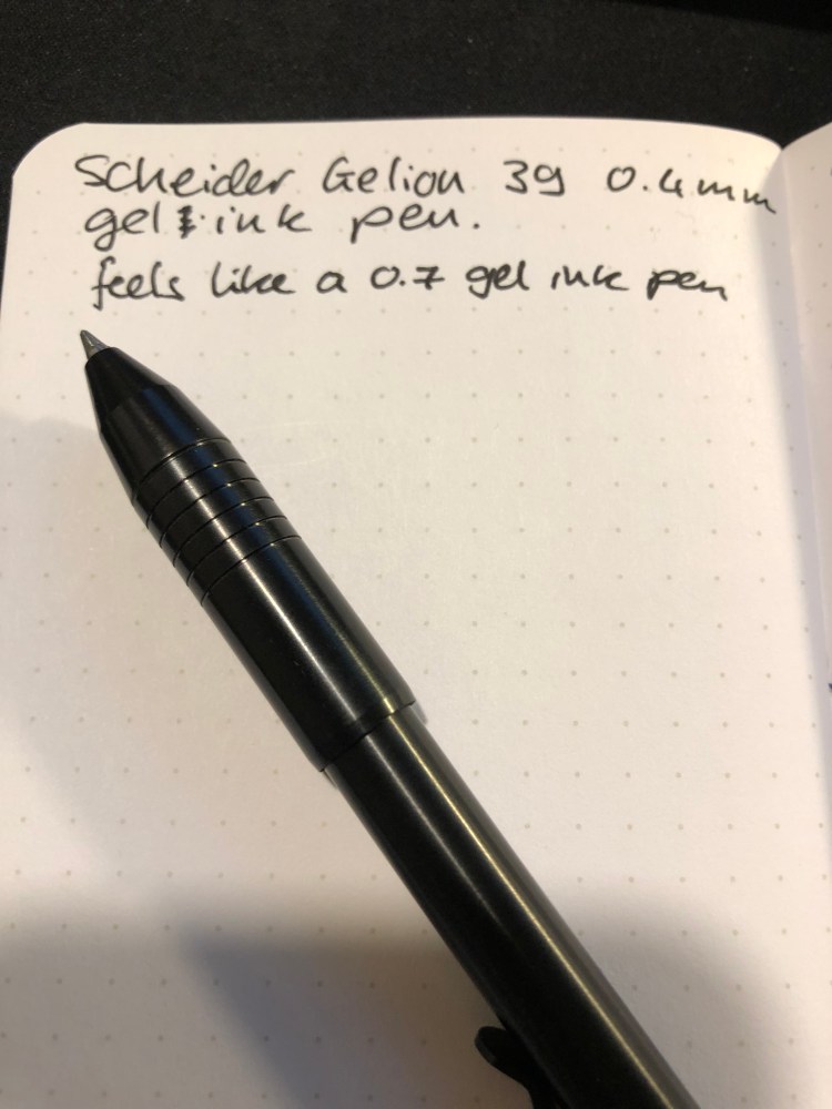
The pen came with a Scheider Gelion 39 0.4 mm gel ink refill. This is a new refill for me, and I can’t say I’m a fan. It’s as wide as a 0.7-0.8 mm refill, and I much prefer the Uni-Ball Signo UMR-85N refill that the BIGiDESIGN pens used to be shipped with (it’s me favourite gel refill).

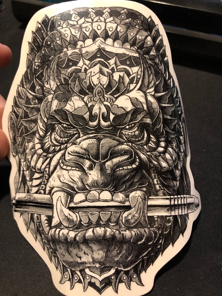
As part of the kickstarter, the pen came with a cool Bioworkz sticker, which you can see below:

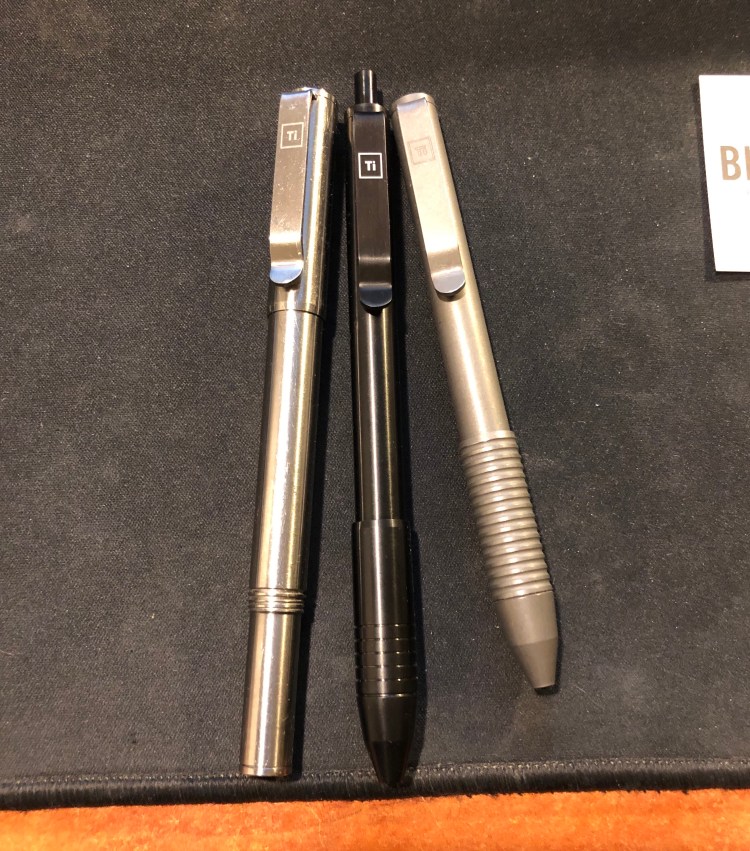
The pen itself is about the length of the Ti Arto, when the Ti Arto is capped, but the grip is much wider, about the size of the Ti Pocket Pro. That’s a bit large for an EDC pen, and it’s definitely not a pocket pen. The grip feels weird at first, but it’s very comfortable and well designed. You can see how the Ti Click EDC compares to the Ti Arto (on the left) and the Ti Pocket Pro (on the right) in the various finish options that the Ti pens come in (machined raw, midnight black, and stonewashed). My machined raw Ti Arto shows scratches much more than my stonewashed Ti Pocket Pro, but I’ve no idea yet how the midnight black finish wears.

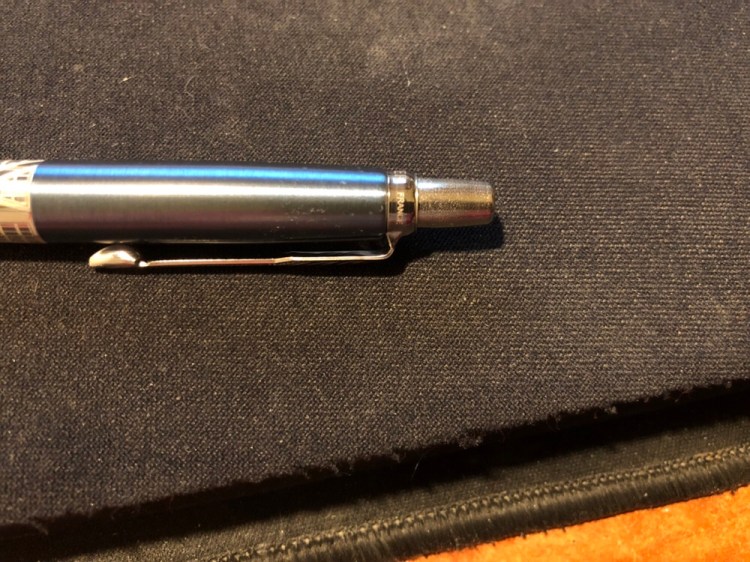
This brings me to the only minus that the Ti Click EDC has – the click mechanism. It’s silent (no satisfying click), which will probably turn off those planning on using it as a fidget toy, and it doesn’t always engage properly. It’s especially prone to not engaging after you replace the refill. Make sure that you use the provided instructions to switch refills (and like other BIGiDESIGN pens this one accepts dozens of refills without using any spacers or requiring any special hacks), and take into account that you might have to fiddle with the grip a bit until most clicks work. This is not a minor drawback, as the whole point of the pen is its click mechanism. It should work 100% of the time and feel satisfying, not “soft” as it feels now.

For the price of the Ti Click EDC you could buy a Ti Arto (still their best pen), or a Ti Pocket Pro (if portability is super important to you), have some change for a bunch of refills and get a much better pen. I love supporting BIGiDESIGN and I’m glad that I got to try this pen, but for now it looks like the Ti Arto will continue to reign supreme in my rotation.

Update: After using this pen almost exclusively for a week, I stand by my first impressions. It’s slightly more comfortable to use in long form writing, but the click mechanism is garbage.

Update 2: The BIGiDESIGN guys contacted me and it turns out that you can significantly improve the click mechanism with some silicone grease. Using the clip fixing kit that came with the pen and their simple instructional video on how to use it you can get to the click mechanism, and then apply some silicone grease, which you can buy at Goulet Pens for example. I happened to have grease around, so I had no problem trying this out, and it fixes the problem of the click mechanism not engaging properly.

The click is now solid, but it’s still not much fun to use – there’s no satisfying click or solid feedback once the thing is engaged. You just push past a point, and then the mechanism partially bounces back. It’s a disappointment because most $2-3 pens have more satisfying click mechanisms and even Karas Kustoms EDK pen, which has a similar click mechanism, offers more feedback and an audible click once it’s engaged.

I don’t know how many Ti Click EDC pens were affected by this problem, and I’m glad that I have at least a “mostly OK” click mechanism for my pen now, but I stand by my initial review, that for a pen that advertises its click mechanism so prominently, this is not a great buy. Spend your money on the Ti Arto, it’s a pen worth having, or go for the Ti Pocket Pro if you’re looking for an EDC pen. Those are truly great pens, while the Ti Click EDC is OK to “sort of good” at best.

Kaweco AC Sport Carbon Fountain Pen Review

After reviewing the Moleskine James Bond Carbon it was only natural to review my recently acquired Kaweco AC Sport Carbon fountain pen, so here you have it:

I’m not a huge Kaweco fan, mainly because their practically non existent filling system makes using them something of a pain. Cartridges are sometimes very useful (especially when traveling), but I generally prefer a cartridge based pen to accept converters as well and Kaweco’s Sport converters are a joke. They are difficult to fill and hold less than a drop of ink, and oftentimes come loose, so they’re basically terrible. Kaweco seems to be aware of that because they also make them difficult to obtain. You really have to want the pain to experience it (and believe me, you don’t. Save your money and buy yourself several cups of coffee).

So what possessed me to buy this pen? It’s pretty. There, I said it. That red, that carbon fibre — this pen is basically a Ferrari in pen shape: gorgeous and not very practical.

Look how pretty it is!

The nib is smooth and I was luck enough that it worked well out of the box. I’ve had mixed success with Kaweco nibs, so unless you’re comfortable dealing with baby bottom or flow issues I’d test the pen before buying.

The nib is also pretty handsome, and in this case a Fine, which is closer to a Japanese Medium. I got this pen on a closeout sale in a local art supply store so I lucked out on the nib, since you usually find Medium nibs in non-specialist stores.

I had a bunch of Diamine ink cartridges lying around, so I popped one in and gave it a spin. Here it is with Diamine Woodland Green, a very nice, well behaved ink with some shading:

The pen has a metal body but is not heavy. It can only be used capped (I have tiny hands so trust me when I say this), and despite its pocket size and rugged build, I’d never trust it, or any other fountain pen, in my trouser pocket. That way horror stories of stained pants lie.

Would you enjoy this pen? If you like the aesthetic, and are willing to compromise on ink cartridges, a steel nib and the price, then yes. If you’re looking for a daily workhorse or a practical pen, buy several Pilot Metropolitans, Lamy Safari’s, TWISBI ECOs or even a Lamy AL Star. This is a Ferrari pen — beautiful, frivolous and fun.

Moleskine James Bond Carbon Limited Edition

Dun da da da dun, dun dun dun, dun da da da dun, dun dun dun, DA DA, dun dun dun!

It’s the Moleskine James Bond Carbon Limited Edition and it is charming, it is sophisticated, it is elegant, it is everything you know James Bond has to be.

The cover has a carbon fibre like pattern and texture to it, and this time it’s all over the cover.

Moleksine went all in on the understated look this time, and just embossed the 007 logo on the cover, instead of gold foiling it. It’s the right choice in my opinion, and works well with their own embossed logo on the back.

So much texture…

The Moleskine logo isn’t as deeply embossed as the 007, which makes it half disappear in the texture of the cover, another good design choice on their part.

The endpapers, sleeve and stickers are exactly the same as the Moleskine James Bond Titles Limited Edition, but they’re slick, so I’ll photograph them anyway.

Front endpaper with the world map which I love so much:

Back endpaper with the titles design, another win, and yes, the back pocket print is aligned with the back cover print, so extra brownie points for that Moleskine:

The stickers:

And the B-side of the sleeve:

The only flaw in this edition seems to be in the spine, which creased because of the texture of the Carbon design. It’s far from a deal breaker and I would normally not even mention it, but there is a possibility that it may break there over use. Only time will tell if it’s just a slight aesthetic thing, or if it’s a real design flaw.

So, should you buy this notebook? Yes, even if you aren’t a die hard James Bond fan. There’s no notebook I know of that managed to pull of such a cool texture without making it feel super cheap and plastic-y. It’s a notebook that you can carry at work and will look completely professional, and also one that will be fun to use as a personal journal, a travel journal, a project notebook, or on your next secret mission to outer space.

Moleskine James Bond Titles Limited Edition

Moleskine recently came out with three James Bond themed limited edition notebooks, and after a bit of scrambling, two orders that were cancelled on me, and a bit of trouble with the post office I finally got them. To be honest, if I had that much trouble getting any other recent Moleskine limited edition, I would have probably given up already, but this one is special, for two reasons. The first and main one is my dad. He introduced me to James Bond, we watched all the movies together (some on TV, the later ones in the theatre), and it’s our “thing”. The second one is that I have a thing for maps, and once I saw the map on the endpaper, I knew I had to have them.

All three large notebooks are pretty great, but the Titles edition is probably the weakest among them. The front cover (and only the front cover) has a print of shiny black on the usual matt black of all the James Bond title logos. It’s so interesting seeing them together, with their various fonts and embellishments . It’s also hard to photograph because the gold 007 embossed on the cover of all three editions reflects so much light. Shiny!

But there are two minuses here: one, the design doesn’t wrap around the notebook, it’s only on the front cover, and two, the titles only appear to be embossed, in reality they add no real texture to the notebook. This is such a shame because the other two notebooks in the series, the Carbon and the Box Set are so very tactile. It takes this notebook down several pegs, from the “great” to the “just OK”. It’s on par with the Star Wars Ships and Lightsaber Duel editions for me. Another very good edition that missed becoming excellent by so little that it becomes mediocre.

Everything else about this edition is stunning. I love the map, and the idea of having it there and tying it to globetrotter Bond through the B-side of the paper sleeve around the notebook (keep reading, I’ll explain it all later on). You could easily use a white pen to mark your own travels if you are planning to use this as a travel journal.

The back end paper is also great, with the titles cover design printed on it. Can you imagine now how much better this notebook would have looked like if it had this design on the spine and back cover too? Embrace the typeface, embrace the titles Moleskine!

They do get extra browny points for aligning the pocket with the type on the endcover. That is not something trivial to do, and it gives it all a nice touch.

Like most Moleskine limited editions, this one comes with stickers which are pretty understated, and would probably come in handy if you’re planning to use this notebook as a personal or a travel journal.

Remember the map on the front endcover? Well if you’re a huge James Bond fan, you can mark his travels on that map using the B-side of the sleeve. It has a list of James Bond film titles printed on it, with the date it came out on and the places the movie takes place in printed on it.

So, should you get this notebook?

If you’re a James Bond fan, then yes. If you’re looking for an interesting travel journal or a gift for a cool dad, then also yes. If you’re just looking for an alternative with a twist for your run-of-the-mill Moleskine large hardcover notebook, then I’d recommend the James Bond Carbon for a more understated but unique look, or one of the more colourful limited editions that Moleskine has issued lately.

Wait, what about the paper? It’s the same Moleskine fair of recent years. Expect significant ghosting and some bleed through to the other side of the page, no spreading but a little bit of spidering when using fountain pens, and a very smooth surface that may cause darker pencils to smear. It’s great for ballpoint, gel pens, highlighters (no spreading!), and certain kinds of fountain pen ink (Noodler’s black, Waterman Blue and Blue Black, and too many Diamine inks to list. Avoid J. Herbin and other watery inks like the plague) with medium or finer nibs. I don’t mind the ghosting (it’s the same as on Tomoe River Paper) and use both sides of the page, but that’s obviously up to you.


Moleskine Denim 12 Months 2019 Pocket Weekly Planner review

The Moleskine Denim 12 Months 2019 Pocket Weekly Planner arrived today, and it is a beauty.

I’m not a big planner user, but over the past year I’ve used a weekly planner just to get a better idea of how my week looks like and how to plan ahead accordingly. The slim, minimalist setup of the Moleskine Pocket Weekly planners is perfect for this.

Beyond the regular planner editions, Moleskine offers a wide variety of planners in their various limited edition designs (Harry Potter, Star Wars, Peanuts, Le Petit Prince and more), among them in their Denim collection, which is one of my favourites.

The covers are covered in Denim fabric, with jeans-like labels on them. The craft sleeve around the planner turns with a few minutes of work into bookmarks perfectly sized for the planner:

The endpapers are really nicely designed to evoke various denim labels, and the red elastic closure is echoed in the small back pocket:

As usual with Moleskine limited editions, it comes with a little something extra in the back pocket, this time stickers:

As for the internals, it’s the same as other Moleskine weekly planners, with a weekly schedule on the left side of the spread and a ruler page on the right, monthly calendars and information pages at the beginning of the planner, and a few general planning pages.

If you’re looking for a pocket weekly planner that’s beautiful, lightweight and not overly structured, I highly recommend this planner.

Deep Sea Adventure board game review

I bought this game at Jeux Descartes while I was in Paris, as an interesting looking short game with simple rules that can be played as an interstitial game during a longer game night. I highly recommend going to Jeux Descartes shop if you’re in Paris and checking out their fantastic board game and mini selection. Don’t be daunted by the French, as board games include rules in multiple languages out of the box, and Board Game Geek lists which games are language dependent and which aren’t.

Technical details about the game can be found here, and this is not yet a full review, as I’ve only had the chance to play it with two players, and the game is definitely better with more players.

The rules are simple and easy to learn, but take the time to read them carefully, as there are a few important nuances there that make the gameplay more interesting and strategic than what it would seem.

Visually the game is stunning, and a lot of fun to set up. It takes about 5 minutes to spread out all the tiles, shuffle and organize them, and the game itself from start to finish takes about 30 minutes, as written on the box.

The concept is original: you’re a group of poor deep sea treasure hunters trying to get as much treasure as possible with as high a value as possible, while being forced to share valuable oxygen amongst each other. You either move forward or backwards with your delightfully designed meeple (a choice that you can make only once per round, so there’ not much room for cautious play here — you’re an adventurer after all), and as you pick up treasure it becomes more difficult for you to move and oxygen runs out of your sub — and with it the time for the round.

There are three rounds, each one with several turns that are played very quickly, as even though there’s quite a bit of hidden strategy in the game, there isn’t a lot of choices each player can dawdle with. You either move forward or back, pick up a treasure tile or don’t, and in rare cases, drop a treasure tile. The more players there are the faster you can move deeper down the sea, because you skip other players’ tiles, and the line grows shorter the more treasure is picked up in a round. The deeper you go, the more valuable the treasure is, but if you don’t return back to the sub by the end of the turn, you drop your tiles at the end of the line in very nifty little piles of three. And here is where the real genius of the game comes in, because each of those piles of treasure counts as only one treasure in terms of oxygen and weight, so you can pick up much more treasure and move much faster that way. A strategy of picking valuable tiles up on the first round so that you can drop them and pick them up on the second and third rounds becomes pretty enticing. As you can organize your dropped tiles in whatever order you like, and other players will want to try for that strategy too, not to mention that there’s an element of chance to dice controlled movement makes for a very interesting game. Plus, players closer to the sub can play to deliberately shorten the game by picking up lower value treasure to run the oxygen timer up.

All this makes for a very interesting short game that is a lot of fun to play and is pure eye candy to look at. I highly recommend it.

Ink Review: Pilot Iroshizuku Asa Gao

Though I’m a fan of the colour blue, I tend to shy away from blue inks, since they tend to be boring. That’s why I wouldn’t have splurged on a (pretty expensive) bottle of Pilot Iroshizuku Asa Gao myself – I got it as a gift with a pen purchase a few years ago.

Online pictures of this ink tend to give it a more purplish tint than it actually has. In reality it’s a slightly dark cobalt blue. It scanned a bit lighter than it looks like on the page:

Asa Gao

Here it is in natural light, for a bit of reference (this is bit darker than it actually is):

This is the pen I used for this review, a medium nib Pelikan M620 Place de la Concorde:

There’s some red sheen to it, but you’ll probably only see it on Tomoe River Paper, and then only if you look closely. The shading is a little less subtle, but not by much. You’ll see a bit of it using medium nibs and broader, again, particularly on Tomoe River Paper. It’s a “dirty little secret” ink – the kind that looks pedestrian to all but the knowledgable observer. A fun way to put a zing into office work, as it is totally appropriate for office writing.

As usual with Pilot Iroshizuku inks, the bottle and packaging is gorgeous, the ink is well behaved enough for vintage pens, and it cleans out pretty easily without staining. A good choice for a demonstrator pen, if you’re looking for something that will fly under the radar.

Pen Review: Staedler 308 Orange and Purple Pigment Liners

A first look at the new Staedler 308 colour pigment liners. The standard black ones are my fineliner of choice, since their barrel is more comfortable than the Sakura Pigma Micron or the Faber-Castell ones (Copics are overpriced, and I’ve had bad luck with them drying out).

I made a quick sketch of the vintage Parker ink bottle promo pen cup that I got at the local flea market. The ink spread a little, as most ink does on the Lebuchtterm sketchbook. Strangely enough that doesn’t bother me, and I still am a fan of these notebooks. The Staedler pigment liners are a joy to use, and their colours pop off the page:

Scanned in, you can see the ink spread, but also how vibrant the colours are.

Bottle of Ink Sketch 1

All in all, I’ll probably pick up a few more of these once I get the chance.

Review: Parker Jotter London Architecture

Before I got into fountain pens and gel ink pens became available in the market, I used to use ballpoint pens for taking notes, and the Parker Jotter was my favourite. It was the first pen I invested “real money” into when I was still in high school, and I still have that purple pen knocking about somewhere in the house. The refills were always a problem, with blobbing, streaking and hard starts something common to all ballpoints, even the Jotter with its “Quinkflow” refills, but you could shade with the pen, which meant that you could doodle in your notebook while bored — a big plus for me.

I switched to fountain pens when I started my BA and my wrist pains got worst than ever, because I was practically carving the words into the page. Since then, gel pens and fountain pens have ruled the roost on my desk, with only a Kara’s Kustoms Render K with a Schmidt easyflow 9000 M in black filling my few ballpoint needs. When they don’t blob, ballpoints are great after all, especially if you want to jot something down and not have to wait for the ink to dry.

But when Jet Pens added four limited edition Parker Jotters, each one celebrating a different London architectural icon (Bronze for Big Ben, Red for Buckingham Palace, Sky Blue for the Shard, and Black for the Gherkin), I knew I had to reopen the ballpoint chapter in my life.

The packaging is stunning, as you can see for yourself:

Not many pens at this price level come in such nice boxes, which makes them perfect gifts (I bought all four pens and intend to give away three of them as gifts).

Ballpoints aren’t much fun for me to write with, because I have RSI problems and they require pressure to use, but they are fun to sketch and doodle with. So much shading with one pen:

The etching on the pen makes it very easy to grip once you start writing or sketching, but it does feel a bit rough on the fingers when you just pick the pen up or fiddle with it. The click mechanism and clip are Parker solid, and colours and design of these pens are fantastic:

The minus is of course the refill, which is smooth with no railroading, but does blob a bit, mostly when you sketch, not so much when you just write with it.

The funniest thing about these pens that celebrate such very British icons, is that they are made in France (until 2011 Parker pens were made in the UK).

If you enjoy ballpoint pens and don’t have a Parker Jotter or like the look of these pens, I recommend these. They are tough workhorses and good looking pens.

If you love London as much as I do, I recommend these.

If you’re looking for a nice gift for someone, particularly an architecture or design student, I recommend these.

For me personally, gel pens and fountain pens will continue to rule the roost.

Olive Traveler’s Notebook

My new Traveler's Notebook arrived yesterday, the Olive limited edition, and I took some time tonight to customise it.

That's my favourite part of starting a new Traveler's Notebook – setting it up, making it my own – and the main reason I enjoy them so much. This is my fourth TN. I have a Camel limited edition from their 5 year anniversary, a black one, and a pocket one. The camel is my most used
one.
First I decorated the notebook it came with, using Windsor Newton gouache. I love ivy and the greenish tinge if the cover inspired me.

I added a leaf charm to the bookmark and slotted in another notebook — an old Midori sketchbook I had laying around.

That's it, now all that remains is to use it.

P.S. I read a review in some site that these TNs have a suede like feeling to them, but they feel like a normal TN to me.
P. P. S. These covers don't stay pristine for long (and that's their charm), so if you're precious about your things, these aren't for you.