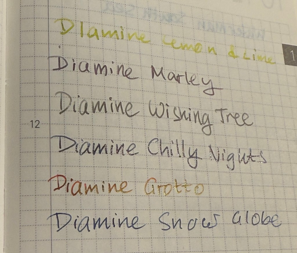
Day 16’s ink is Diamine Tundra, a standard grey brown ink with a good amount of shading. I used a Lamy LX fountain pen with a fine nib to test out this ink.
Col-O-Ring swab
Diamine Tundra really brings out the drab in this year’s calendar, because what’s Christmas without a mousy brown ink?
Close up of the Col-O-Ring swab
I had the same reaction to Diamine Tundra as I had when seeing 2025’s Pantone colour of the year: but why?
Writing sample on Rhodia paper
Diamine Tundra is a pale raw umber colour so it work well for sketching, especially with its shading properties. That’s one of the few things it has going for it.
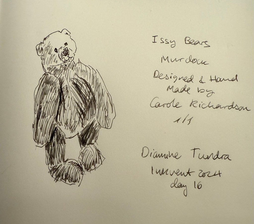
Bear sketch on Midori MD Cotton
Today’s bear is tiny (not much larger than the size of your hand) and is a one of a kind British bear called Murdock. I bought him in York and he’s designed and made by Carole Richardson.
The bear
I have no idea what made Diamine think that including Tundra in this year’s calendar was a good idea. Was there a need for a depressing colour? Did someone lose a bet? In any case I’m not going to purchase a full bottle of this ink, even though I often use my fountain pens for sketching and it’s a decent colour for that.
What do you think about Diamine Tundra? Do you like it?
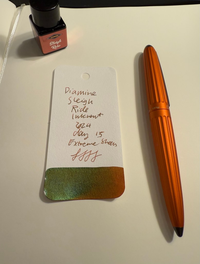
Day 15’s ink is Diamine Sleigh Ride, a burnt sienna (i.e. reddish brown) “Extreme Sheen” ink. In this case the sheen is more pronounced than the last “Extreme Sheen” ink, Diamine Grotto. You can see in the Col-O-Ring swab just how prominent the green sheen on this ink is, at times completely obscuring the reddish-brown ink beneath it. I used a Diplomat Aero with an extra fine nib to test out this ink.
Col-O-Ring swab of Diamine Sleigh Ride
Here’s a closeup of the Diamine Sleigh Ride Col-O-Ring swab. It’s a testament to the amount of sheen in this ink that you can see the green sheen on every letter even though I used an extra fine nib with this ink.
Close up of Col-O-Ring swab
On original Tomoe River Paper the sheening is even more pronounced:
Writing sample on original Tomoe River Paper
Depending on your viewing angle you can see the sheen as shading (as it appears in the word “Diamine” in the photo below) or as sheening (as you can see the same word in the photo above). Drying time, as is to be expected, was also “extreme”.
Different angle of writing sample on original Tomoe River Paper
On Rhodia paper you see less sheen and more of the shading, as it’s more absorbent:
Writing sample on Rhodia paper
But on Kokuyo paper you can see the sheening very well (the camera had issues focusing here, I suspect because of the high reflection from the sheen).
Writing sample on Kokuyo paper
Here’s a close up of the writing sample on Kokuyo paper:
Close up of writing sample on Kokuyo paper
On Midori MD Cotton paper the sheening is also extremely visible. You can see it clearly in the writing sample on this paper and in the closeup of the bear sketch later on:
Bear sketch on Midori MD Cotton paper
Here’s a close up of the bear sketch. It looks like I was sketching with a green-brown ink at points because the ink sheens at every opportunity:
Closeup of the sheen on Midori MD Cotton paper
Today’s bear is another Dean’s Rag Book Company bear (they’re my favourite bear maker). Franz is a small bear that I bought second hand recently in York. He’s a delightful little fellow with the classic Dean’s look:
The bear
If you don’t like sheen on your ink, then Diamine Sleigh Ride is definitely not for you. Personally I think the effect here is striking, even though I wouldn’t necessarily have chosen a brown-green combination for a Christmas themed ink, and I most certainly wouldn’t have thought to call it “Sleigh Ride”. I don’t see myself adding this ink to my collection, but if you’re looking for unusual brown inks, this may be the ink for you.
What do you think of Diamine Sleigh Ride? How do you think it compares to Diamine Grotto, the other “Extreme Sheen” ink?
Day 14’s ink is Diamine Mint Twist. It’s a dark Eau de Nil or light viridian green coloured ink with some shading and chameleon shimmer that goes from green to blue. I used a Pilot Metropolitan with a CM (Calligraphy Medium) nib. This nib is weird one – it lays down a wide line but somehow it’s also a dry nib.
Col-O-Ring swab of Diamine Mint Twist
The chameleon effect on Diamine Mint Twist is less impressive than on other chameleon inks. The base colour itself is a nice artificial pastel-y green.
Close up of Col-O-Ring swab
Here’s a close up of the chameleon effect. I think an additional colour here – a pink for example – would have punched it up a bit.
Different angle of Col-O-Ring swab
Here’s a writing sample on original Tomoe River Paper. You can see the shading, which is there but isn’t very pronounced, and some of the chameleon effect.
Writing sample on original Tomoe River Paper
Every Diamine Inkvent has to have its share of green inks, and this year’s calendar isn’t an exception. Diamine Mint Twist isn’t the first or even the second shade of green you’d think of when “Christmas” comes to mind, but it is a nice, calming shade of green with the addition of some shading and a bit of chameleon effect to add interest to it. It really reminds me of the green that Fortnum and Mason uses, and as I love F&M that’s a bonus for me.
Writing sample on Rhodia paper
I had trouble sketching today’s teddy bear. The first sketch came out wonky because I was distracted while sketching out the initial proportions, so I made a second sketch further down on the page. That’s when I discovered that I had managed to write the pen dry (I purposely don’t fill the Inkvent testing pens full). That meant that when it was time to write the name of the ink used for the sketch I was writing on ink fumes.
Bear sketches on Midori MD Cotton paper
Today’s teddy bear is a German Hermann teddy bear, numbered but not named. I bought him in York, mostly for his unusual eyes.
The bear
Diamine Mint Twist isn’t the most festive of green inks not the most dazzling ink in Diamine’s lineup (or indeed in this year’s Inkvent calendar). It is somehow in the “also ran” category of Inkvent inks for me, likely because it isn’t very practical due to the chameleon shimmer, yet it also doesn’t have much of the wow effect that the chameleon shimmer usually adds. I’ll be skipping a full bottle of this one, though I have some fondness to the base Eau de Nil colour.
Would you have changed Diamine Mint Twist’s chameleon effect? Do you see yourself using it?
Diamine day 13’s ink is Diamine Lullaby a standard lilac/purplish-pink with a nice amount of shading. I used a Waterman Phileas fountain pen with an extra fine nib to test out this ink.
Col-O-Ring swab
Diamine Lullaby is a light and unsaturated ink, and so you get a lot of shading even with a very fine nib.
Close up of the Col-O-Ring swab
It’s difficult to photograph inks on the purple spectrum but Diamine Lullaby is about halfway between Diamine Memory Lane and Diamine Harmony. It’s pinker than Memory Lane and bluer than Harmony.
Col-O-Ring swab comparison with Memory Lane and Harmony
You can really see the shading you can get with Lullaby in this original Tomoe River Paper writing sample:
Original Tomoe River Paper writing sample
Diamine Lullaby is a readable lilac ink – but only just. It shades nicely, and has a nice and interesting colour variation between pink and light purple. Would I use it as a daily writer? Likely only in a wider nib or if it was a shade darker. As it is there’s something about it that feels a bit washed out. Here’s a writing sample on Rhodia paper:
Writing sample on Rhodia paper
And here’s today’s bear sketch on Midori MD Cotton paper. You can see how pale Diamine Lullaby is, especially in a true to size extra fine nib like the Waterman Phileas (which is one of my favourite pens to use for sketching).
Sketch on Midori Cotton MD paper
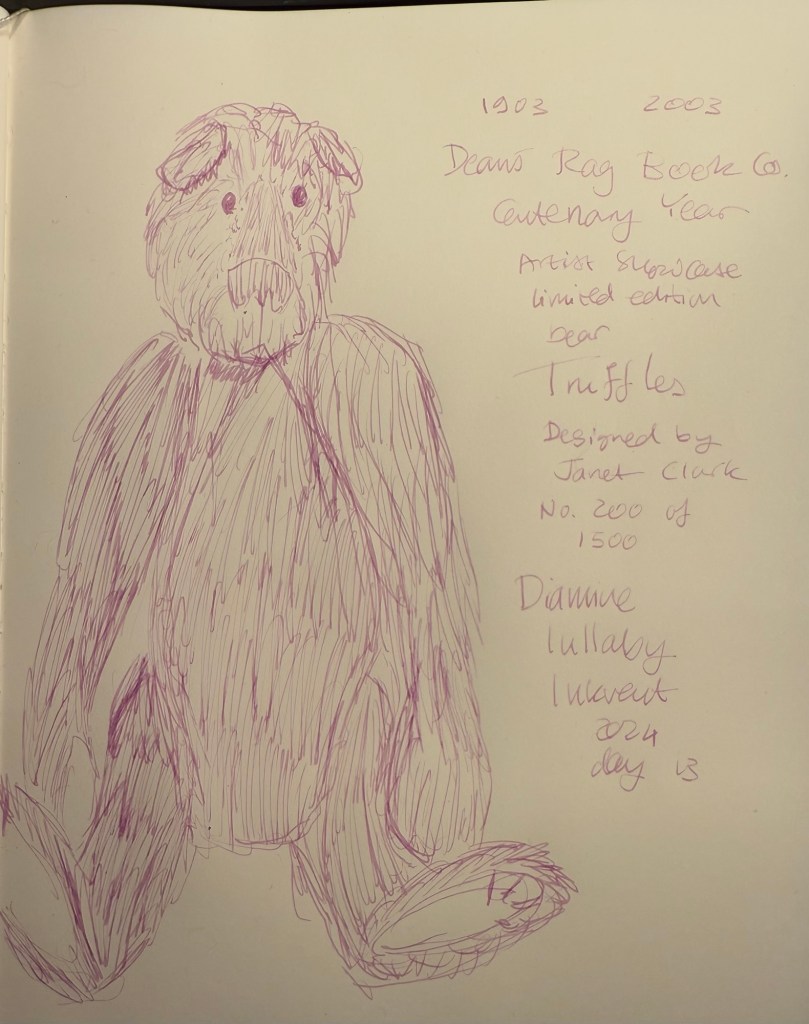
Here’s today’s bear, Dean’s Rag Book Company Centenary Bear, Truffles:
The bear
Diamine Lullaby doesn’t really say “Christmas” to me, and in terms of practicality it scores low because it’s not very readable (even though it is a standard, non saturated ink so I’d feel comfortable using it in a vintage fountain pen). The colour is nice enough and you can’t have all the inks in the calendar fit perfectly with the theme, so I’m fine with Diamine Lullaby being included, though I won’t be buying a bottle of it.
Do you like Diamine Lullaby? Would you name it differently?
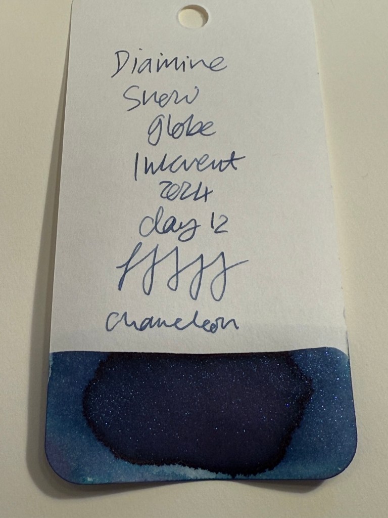
Day 12’s ink is Diamine Snow Globe, a dark blue ink with Chameleon shimmer in blue, silver, pink and purple. I used a Pelikan M205 fountain pen with an extra fine nib, that like most Pelikan nibs writes on the wider side.
Col-O-Ring swab of Diamine Snow Globe
Diamine Snow Globe is a lovely, shading dark blue ink and the chameleon effect gives it interest. The resulting ink is a nice, festive, readable blue that would work well on greeting cards.
Closeup of the Col-O-Ring swab
On original Tomoe River Paper you can see the shading of Diamine Snow Globe quite well. It’s a also clear that it’s a lighter blue than Diamine Chilly Nights and the shimmer effect of the chameleon is much less pronounced than the star bright shimmer effect.
Original Tomoe River Paper writing sample
Diamine Snow Globe is perfect if you want a more subtle “wow” effect than Diamine Chilly Nights provides. You can see it in this angled photo of the original Tomoe River Paper writing samples:
Different angle of Tomoe River Paper writing sample
If Diamine Chilly Nights is the marching band of shimmer on dark blue inks, then Diamine Snow Globe is the jazz quartet. The chameleon shimmer is finer, less visible, and changes colour constantly in different lighting conditions and in different angles. Of the two Diamine Chilly Nights is more impressive, but Diamine Snow Globe is more classy and would never be mistaken for a gel ink.
Writing sample on Rhodia paper
Today’s bear is Beezy, a one of a kind bear made by June Whitehead. The sketch is angled because this bear isn’t really designed for standing, and I didn’t want to sketch him seated because I’ve sketched too many seated bears lately.
Bear sketch on Midori MD Cotton paper
I couldn’t get a decent photo of the chameleon effect, but here’s a photo that better shows off the shading properties of this ink and hint of chameleon sparkle:
Different angle of Midori MD Cotton sketch
Here’s Beezy the bear. I love his face, it’s so unusual for a teddy bear.
The bear
Diamine Snow Globe is slightly more practical than Diamine Chilly Nights because chameleon shimmer will be easier to clean out than star bright shimmer. It’s also less impressive, so if you’re looking for a dark blue inks with some kind of shimmer effect you might opt for Chilly Nights over Snow Globe if you’re going for the wow effect. Personally I don’t see a need for either of them in my ink collection, so I won’t be buying a full bottle of this ink.
What do you think? Do you prefer Diamine Chilly Nights or Diamine Snow Globe?
Day 11’s ink is Diamine Grotto, an “Extreme Sheen” reddish-orange ink. “Extreme Sheen” is a new ink property added to the calendar this year, and Diamine believe in truth in advertising: there’s an astonishing amount of sheen in this ink. I used Lamy Safari with a fine nib to test out Diamine Grotto and even with a fine nib the sheen came through on ever letter.
Diamine Grotto Col-O-Ring swab
The base ink colour for Diamine Grotto is a deep, rich reddish orange, and it would have been welcome even without the extreme sheen, after all the grays and blues we’ve had.
Close up of Diamine Grotto Col-O-Ring swab
The sheen, a golden green sheen, glows on every letter, making them pop almost as much as “Star Bright” glitter does. There’s a bit of shading with this ink, but it’s hard to see with all the sheen going around.
Close up of the shading and the extreme sheen on a Col-O-Ring swab
I compared Diamine Grotto with Diamine Fireside Snug, one of my favourite and most used inks from last year’s Inkvent, and Diamine Grotto is more saturated and tends a bit more to the red than Diamine Fireside Snug. It also has a lot of sheen, of course, which Fireside Snug doesn’t have.
Comparison of Diamine Grotto and Diamine Fireside Snug
If you prefer shading to sheen, you’d like Fireside Snug more. If you like a punchier ink, then Diamine Grotto is for you.
Closer comparison of Diamine Grotto and Diamine Fireside Snug
Here’s a writing sample on Rhodia paper. This Rhodia pad is fairly absorbent and so normally wouldn’t show much sheen, especially with a fine nib fountain pen, but even on this paper the sheen was obvious. However, because there was less sheen than on less absorbent paper you can see the base orange colour better here:
Writing sample on Rhodia paper
Angle the paper a bit and the sheen is immediately apparent. All the places that appear to glitter have the sheen effect on them:
Sheening on Rhodia paper
Here’s a writing sample on original Tomoe River Paper, angled so that the light catches the masses of sheen here:
Sheening on Tomoe River paper
And here’s today’s sketch of one of my favourite bears, “Mud Pie”, on Midori MD Cotton paper. This ink is really warm and lovely and works well with the colour of his mohair.
Sketch on Midori Cotton MD paper
And this is Mud Pie. He’s small and very cute and cuddly.
The bear
Diamine Grotto is a bright and warm ink with eye-catching golden green sheen that makes every letter glow. It’s not an ink I’d use in a vintage pen, but it’s still a fairly practical and fairly seasonal ink and a nice break away from the grays and blues we’ve seen in previous days. I have a bottle of Fireside Snug and so I doubt that I’d get a bottle of Grotto, but if you’re in the market for a reddish orange ink Diamine Grotto might be the ink you’re looking for.
Do you like sheening inks? Do you see yourself using Diamine Grotto? What do you think of the “Extreme Sheen” effect?
Day 10’s in is Diamine Chilly Nights, a blue-black “Star Bright” ink, which means shimmer, a lot of shimmer. I used a Lamy AL Star fine nibbed pen to test out this ink.
Col-O-Ring swab of Diamine Chilly Nights
The base ink offers some nice shading, though you can barely see it because there’s so much silver shimmer going on. Here’s a close up of the Col-O-Ring swab:
Close up of the Col-O-Ring-Swab
It looks like there’s a hint of red sheen to this ink, which isn’t surprising as it’s a dark and pretty saturated ink, but again – the masses of silver shimmer mask all other properties of the ink. However, that’s not necessarily a bad thing: Diamine Chilly Nights definitely has a wow effect to it, and it’s a stunningly beautiful ink.
Writing sample on Rhodia pad
You can see the letters glowing with shimmer here:
Another angle of the writing sample on Rhodia paper.
Here’s a writing sample on original Tomoe River Paper. You can see a hint of shading and sheening here:
Writing sample on Tomoe River Paper
And from a different angle you can see the dazzle of the shimmer effect. Compare it to yesterday’s Diamine Wishing Tree directly above it – that one’s a Chameleon ink. You can barely see the shimmer effect on Wishing Tree and you absolutely can’t miss it on Diamine Chilly Nights.
Another angle of the Tomoe River Paper writing sample
I flipped the nib around for the fine lines on today’s bear sketch. Teaberry is an unusually shaped bear but there are quite a few Charlie Bears that come in this style. I had to shade the lamp to get a decent photo due to the glint from all the glitter.
Bear sketch on Midori Cotton MD paper
This is Teaberry the bear. If you watched the “Wicked” movie you’d understand me when I say that she would fit perfectly on Glinda’s bed.
The bear
Diamine Chilly Nights is a stunning, if impractical ink. It’s perfect for the season: a readable ink with a big wow effect, which makes it perfect for greeting cards. I don’t see myself using it regularly, but it definitely works as a “special occasion” ink.
What do you think of Teaberry, today’s bear? And would you buy a full bottle of Diamine Chilly Nights?
Day 9’s ink is Diamine Wishing Tree, a grey green ink with chameleon shimmer in it that is silver, green, blue and copper coloured. I used a Lamy AL Star with a fine nib to test out this ink.
Col-O-Ring swab of Diamine Wishing Tree
Here’s a close up of the col-o-ring swab. You can see the shading on the ink itself (like Diamine Marley there’s a lot going on here in terms of shade), and a bit of the chameleon effect.
Close up on the Col-O-Ring swab of Diamine Wishing Tree
Here is a writing sample on original Tomoe River Paper. It mainl shows off the shading properties of Diamine Wishing Tree.
Diamine Wishing Tree on original Tomoe River Paper
Diamine Wishing Tree is a greener and cooler toned ink than Diamine Marley, but it’s still very similar to it in terms of its general properties and tonal family. The chameleon effect is much subtler than regular shimmer, and it adds a mystique to this ink that is befitting its name.
Writing sample on Rhodia paper
You can see some of the shading and chameleon shimmer from this angle:
Different angle of writing sample
On Midori Cotton MD paper Diamine Wishing Tree’s shading properties are even more pronounced:
Sketch on Midori MD Cotton paper
You can better see the shading and a bit of the chameleon shimmer here:
Different angle of the Midori MD Cotton sketch
Today’s bear is Hogarth from Dean’s Rag Book Company. He’s a membership bear from 2007, and is a black bear, a relative rarity in the collectable bear world (it’s harder to see the seams and sew black bears properly and so there’s fewer of them).
The bear
If Diamine Marley wasn’t part of this year’s Inkvent, then I would have found Diamine Wishing Tree more impressive. As it is, it’s a very good grey toned ink with a lot of interest. It’s not the most practical (because of the chameleon shimmer) or the most festive (though the shimmer does add here), but it’s a solid entry for this year’s Inkvent.
Which of the two do you prefer: Diamine Marley or Diamine Wishing Tree?
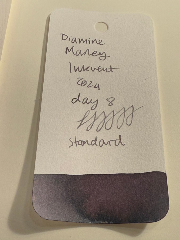
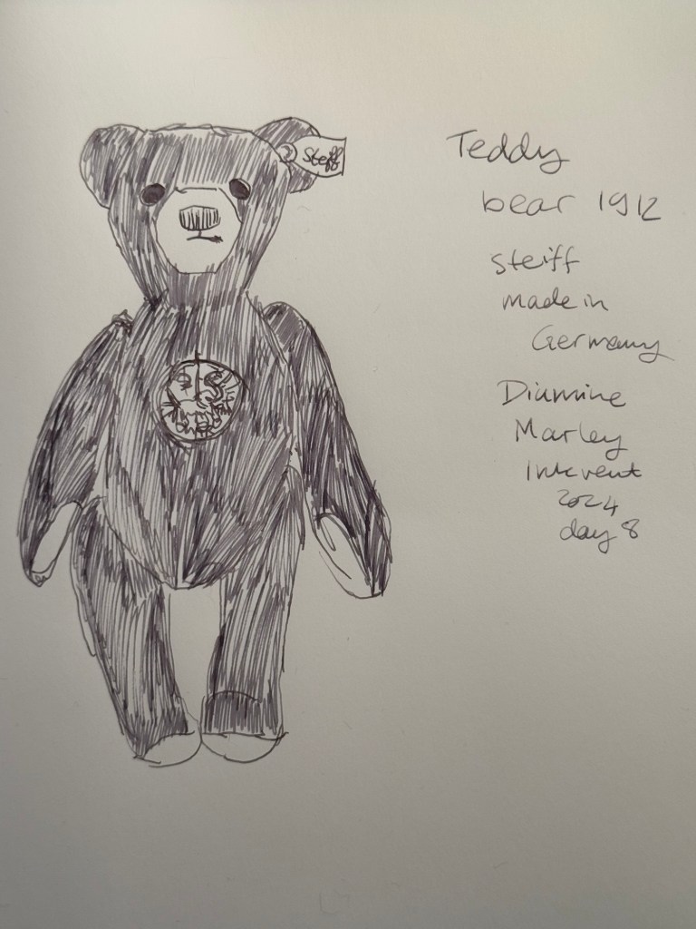
Day 8’s ink is Diamine Marley, a purple grey standard ink that is actually multi chromatic, like some of the Sailor Studio inks. I used a Lamy Safari with a Fine nib to test out this ink.
Col-O-Ring swab of Diamine Marley
Here’s a close up of the Col-O-Ring swab. You can see that Diamine Marley shades a lot, but in the swab itself it’s easy to see just how many shades of colour are in this ink: grey, pink, purple, turquoise, green.
Col-O-Ring swab close up
Here’s a writing sample of Diamine Marley on Rhodia paper. It writes like a Sailor Studio ink, but it’s a Diamine ink, so it will be a fraction of the price. It didn’t photograph very well, but this is far from a bland warm grey. You want to just keep exploring this ink as you write with it.
Writing sample on Rhodia paper
Here’s a writing sample on original Tomoe River Paper. I wasn’t able to capture the full magic of the different shades of colour in this ink, but it’s there. It may not be the full Sailor Studio experience, but it’s close enough.
Tomoe River Paper sample
Here’s today’s teddy bear sketch. Diamine Marley has a good flow and excellent shading properties, and it’s a lot of fun to sketch with this ink. Is it grey? Is it purple? Was there a hint of blue there? And a hint of pink? This ink keeps you guessing.
Sketch on Midori MD Cotton paper
This bear is one of my only Steiff bears (I don’t like the Steiff look), and one of the few bears in my collection that is unnumbered (though he’s more expensive than a good number of my one of a kind artist bears). It’s also a black bear, which is uncommon, and is a replica of the first black bear that Steiff ever made. It’s called “Teddy bear 1912” and it has an interesting story. From Steiff’s site:
After the dramatic sinking of the “Titanic” in 1912, Steiff produced black Teddy bears for the very first time to reflect the mood of the grieving nation of Great Britain. These “mourning bears” have remained in the memory of many people to this day . This beautiful black bear with its copper-backed, “red-cried” eyes honours the memory of the people aboard the “Titanic”, but also looks to the future with hope.
The bear
Diamine Marley is the first ink of this calendar that I will be purchasing. I like grey inks, and this one is a more accessible and affordable Sailor Studio style ink. It scores high on the pragmatic side for me, as it’s a standard ink that’s not overly saturated and yet remains readable and conventional enough to use in many settings. By calling it “Marley” Diamine tied it to the Christmas theme, while in reality it’s not the most festive of colours. It is a nice wintery colour though, and a very attractive ink.
What do you think of Diamine Marley? Do you write with grey inks?
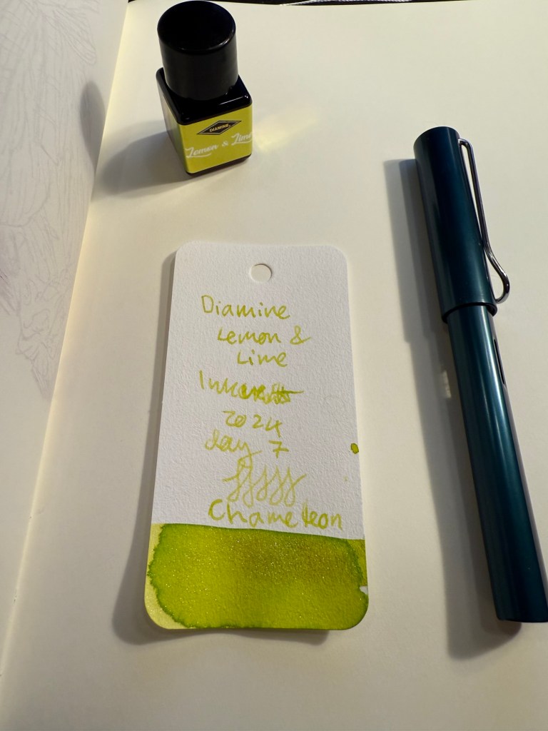
Day 7’s ink is Diamine Lemon and Lime – a light lime green ink with green to gold chameleon shimmer. I used a Lamy AL Star broad nibbed fountain pen to test this ink out.
Col-O-Ring swab of Diamine Lemon & Lime
Here’s another angle of the swab, where you see a bit more of the chameleon ink in effect:
Different angle photo of the Col-O-Ring swab of Diamine Lemon & Lime
And a closer look at the swab that also shows some of the shading in this ink:
Closer look of the Col-O-Ring swab of Diamine Lemon & Lime
Here’s Diamine Lemon & Lime on the original Tomoe River Paper, which really shows off the shading properties of this ink:
Original Tomoe River Paper writing sample
Here’s Diamine Lemon & Lime on a Rhodia paper notepad. This ink dries a bit darker than it writes, but is still pretty unreadable because it’s so light. The photo darkened this writing sample a bit and this pen lays down a good amount of ink, which also helped a bit with legibility. It’s an interesting ink and a unique one, due to the combination of the base ink colour and the chameleon effect.
Writing sample on Rhodia pad.
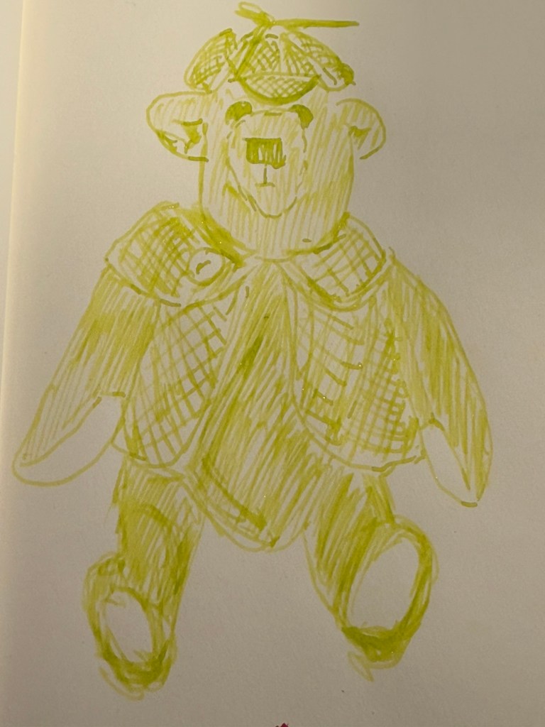
Here’s a close up of today’s bear sketch, made on Midori MD Cotton paper. You can see the shading properties of this ink and a bit of the chameleon shimmer. I laid down a lot of ink but as it’s a very light, unsaturated ink there was no bleeding or show-through.
Close up of the bear sketch done on Midori MD Cotton paper
Here’s a look at the full sketch. If you look at the writing sample you can see how hard it is to make the writing out because there’s so little contrast between the Lemon & Lime ink and the white page.
Sketch on Midori MD Cotton paper. The red mark below the bear is where Diamine Cranberry bleed through the page.
Today’s bear is one of the few that I have that have clothes. His name is, unsurprisingly, Sherlock, and I purchased him in York. He’s a Canterbury Bear, designed and made in England by Maude and John Blacktown.
The bear.
Diamine Lemon & Lime may add some interest and bright cheeriness to this year’s Inkvent, but it’s a completely impractical ink because it’s too light to be legible and it has the chameleon shimmer added to it, which makes it harder to clean out of a pen. It’s somewhat appropriate thematically, but I still don’t ever see myself using it, let alone buying a full bottle of it. I will actually be dumping it out of the pen and cleaning it the minute this review has been posted.
What do you think of Diamine Lemon & Lime? Do you see yourself using it? Do you use yellow or very light green inks?