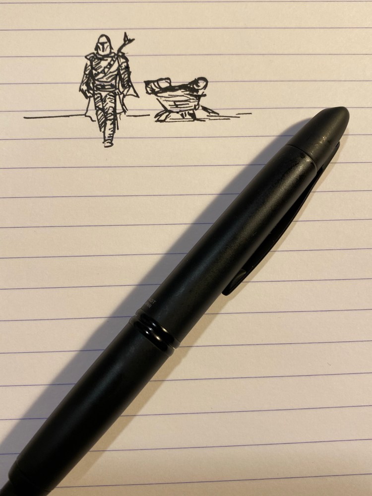
One month in

A blog about writing, sketching, running and other things

Diamine came out with the very successful Inkvent advent calendar last year, and now they are bringing out all of the inks in the calendar in a special “Blue Edition” box and bottle. Cult Pens had them first in stock, and had a nice 10% discount on them, so I decided to splurge on some ink bottles (after not buying any for years).

The Inkvent Blue Edition boxes evoke the beautiful design of the Inkvent calendar, which makes them great gift inks to give. Everything about the boxes, the labels and the bottles is of the highest quality, and is well thought out. These are pretty enough to keep on your desk, whether they are in their blue box or not.

The bottles themselves, of course, are the main design event. They are glass bottles with thick legs, and an ingenious design. They look gorgeous, but they’re also very practical. The cap is large enough to allow the widest nibs in, and the actual part of the bottle that holds the ink is built so that there won’t be any awkward corners that your pen can’t get into. The bottles are tall enough to allow for larger pens to be filled with ease.

Did I mention that they look stunning?
You can see the design of the legs and the ink reservoir here:
The bottles of shimmer ink (and shimmer and sheen ink) come with this handy little insert:

The bottles of sheen ink come with this insert:

This is more proof of the amount of thought that went into designing this edition. I don’t know if Diamine planned on issuing the Blue Edition ahead of time or only once it saw the success of its Inkvent calendar, but either way, this isn’t some hastily dashed out ink edition.
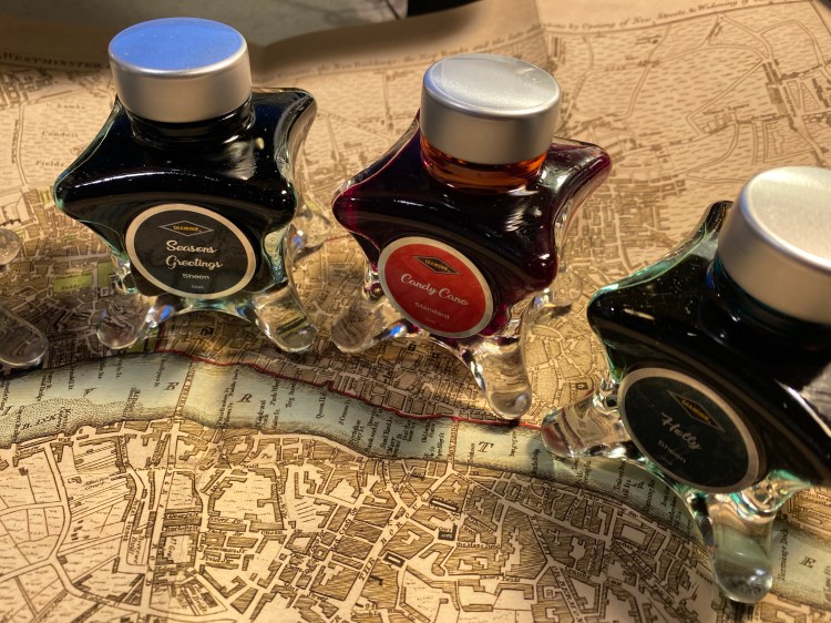
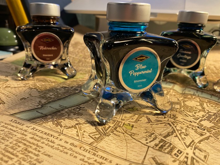
When it came to selecting the inks that I wanted to buy, I ended up surprising myself with my selection. I expected to buy the Solstice, but I ended up buying theBlue Peppermint instead. I love turquoise inks, and I don’t yet have one that shades and shimmers. I never thought that I’d buy Candy Cane, but not only did I buy it (I wanted something to brighten up my life a bit right now), but it’s the first ink that I used in the set.
Holly was also not an obvious choice, but it’s an interesting ink and I don’t have many green inks on hand. Seasons Greetings was wild enough and unique enough for me to add it first to my cart. Nutcracker is here because I think that it will be a great (albeit not waterproof) drawing ink.
If money and space weren’t an issue, I’d probably add Solstice, Snow Storm, and Polar Glow to my shopping cart. Maybe I will, in the future. For now I’m tremendously happy with the Diamine Blue Edition inks that I bought, and if you’re looking for a small pick me up or an inexpensive gift for the pen addict in your life, I highly recommend these.

After a long wait my PenBBS 500 Summer finally arrived earlier last month. The PenBBS 500 is a piston filler with a new and rather elaborate filling mechanism for the shockingly low price of $29.99. At that price it can’t be very good, right?

While the PenBBS 500 is far from a perfect pen, it is much better than the price tag would have you believe. It’s a heavy pen, made with beautiful acrylic that is both partly translucent and chatoyant, with swirls in pearlescent white, turquoise and royal blue.

The hardware isn’t to my tasting, as there’s too much of it, and it ends up cheapening the pen’s look. The finial has a nice art deco look to it, but when it comes to its functional design it could use some improvement. To fill the pen you twist the small circle in the centre of the finial until it pops out and you can access the spring/piston mechanism to fill the pen. It’s not very convenient to twist open on the one hand, and on the other hand if you’re not careful you can accidentally twist it open while carrying it.

I like the clip design, but the cap band and the top of the cap hardware are much too pronounce for my taste, and they add a weight to the pen. The pen itself is top heavy, but not the point where it’s uncomfortable or awkward to write with.

As the ink colour partially shows through this pen, I decided to use Sailor Sky High in it. I’ve had a bottle laying around since the days when Sailor discontinued it and I rushed out to buy some. That was a silly move, but in those days I didn’t know any better. There’s always going to be another ink, people. No point in chasing the discontinued ones only to have the reissued in a few years, or to discover that another brand as the same hue for a fraction of the price.

Sailor’s inks are fun to draw with, particularly with a water brush, as they are utterly non-waterproof, and yet remain true to colour when wet. As I’m staying at home I drew my “nasturtiums,” which I just learned were called Tropaeolums and come from South America originally. They are very easy to grow from seed and offer a lot of interest even when not in flower.
This PenBBS 500 Summer has a fine nib, which skews slightly wider than Japanese fine nibs, and closer to European ones. Sailor Sky High shades enough for it to show with this nib size, and on Tomoe River paper the shading is more pronounced and a red sheen appears.

On Tomoe River paper wherever the ink pools, there’s a red sheen, but if you write fast enough, you won’t see it, and the ink will skew lighter:

The red sheen slightly appears on Rhodia and Canson paper, but not as much as on Tomoe River paper.
So, would I recommend the PenBBS 500 as a first piston filler for a newcomer to fountain pens? Probably not. It’s too finicky for that. But at such a low price and with such a good, workhorse nib this is the perfect pen for artists and users that want to experiment with various finicky or troublesome inks. Like the TWSBI GO, this is a pen that’s fun to use and your heart won’t break if you accidentally ruin it.

There’s something about black fountain pens and black ink that make them popular beyond what common sense would dictate. The blacker they are the more popular they are, especially if you add the word “stealth” somewhere in their name or the copy. Apparently everyone wants to be a ninja.
Colorverse Selectron is a pigmented ink that I obtained as part of the Electron/Selectron Multiverse box. Colorverse have lately started to sell some of these paired inks as individual bottles, and so if orange isn’t your thing (Electron is orange, don’t ask me why) you may be able to obtain just Selectron soon enough.
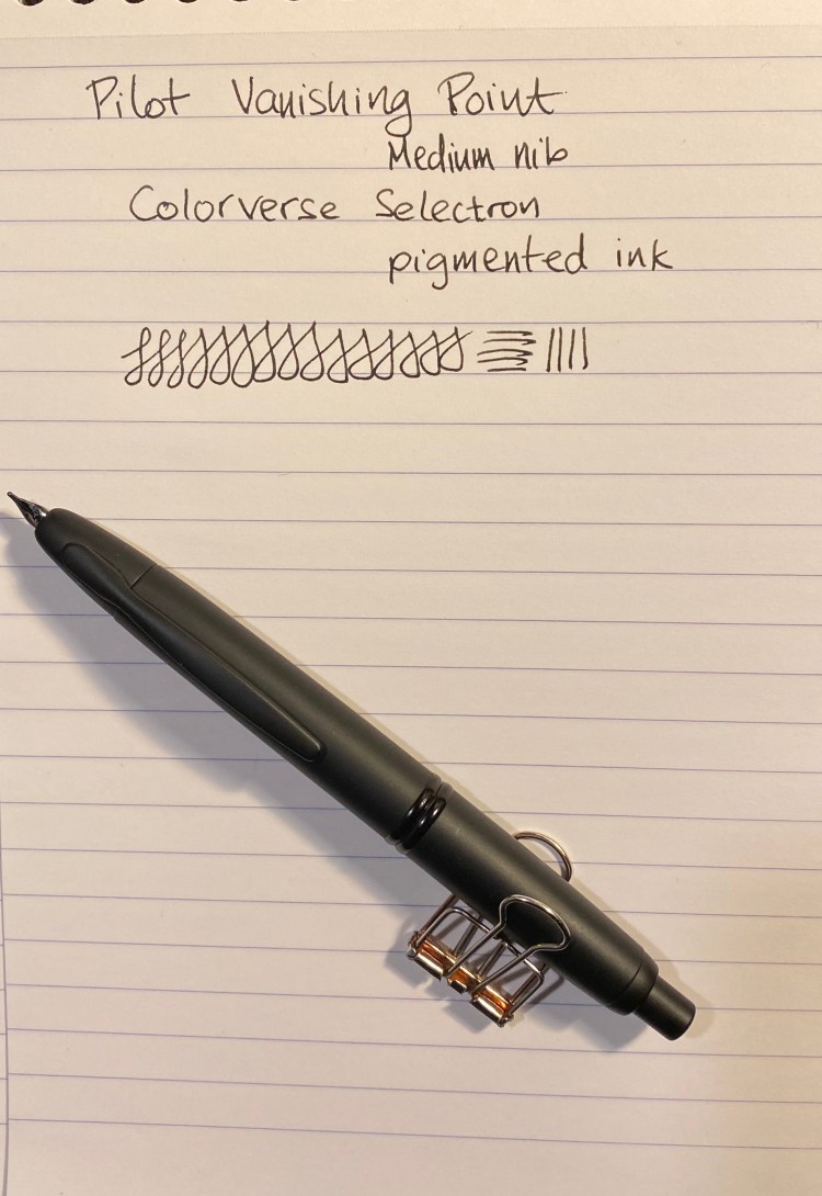
I bought this Matte Black Vanishing Point from Goulet Pens in 2013 I think, but it hasn’t seen much use in recent years. As part of my move to both use my fountain pens more and see if there are any that I might want to part with I dusted this one off and filled it with an “appropriately” coloured ink.
I’ve written about Colorverse Selectron before as part of other reviews. I initially thought that it would be a perfect drawing ink, as it’s pigmented and fountain pen friendly I was hoping that it was also waterproof. As you’ll see later on, it is not.
In terms of the ink itself, there’s nothing remarkable about it. It’s a solid black with some sheen when layered and no variation, which is what you usually want from a black ink.

The Matte Black Pilot Vanishing Point is a VP like all VPs: a pen with a great nib, a body design that you either love or can’t use (depending on how you grip your pen) and a solid click mechanism. It still has a converter that holds about a drop and a half of ink and is annoying to fill, and it still suffers from nib creep.
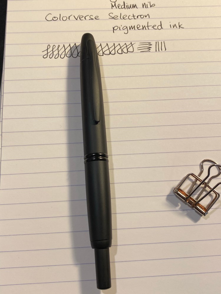
The novelty here is in the matte finish, which is both very nice and not very durable. I hardly used this pen and already the coating is becoming glossy where I usually grip it. It’s a shame because the coating feels great and looks great when it’s unblemished, as in the body of the pen:

Like some other pigmented inks, the Colorverse Selectron is Moleksine friendly: there’s no feathering, spreading and bleed-through with fine/medium nibs (show through is going to be there no matter what). It’s also a fun ink to draw with:
And here are the results of the waterproof test:
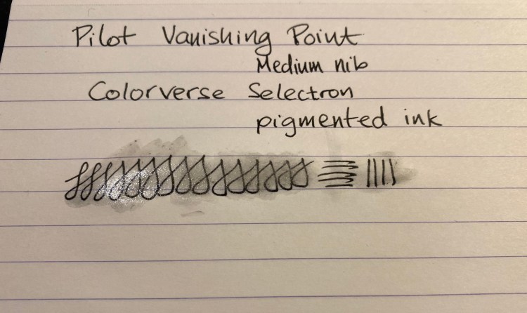
Matte coated pens are difficult to do well, and Pilot haven’t done a stellar job with this Vanishing Point. Black fountain pen inks are a dime a dozen, and Colorverse haven’t done much beyond packaging and copy to create one that stands out. If I could have tested these in person they would have probably both remained on their respective shelves, but the online hype of the time swept me away. I’m much more wary of it and FOMO in general over the past two years.
Invest in things that will stand out and stand the test of time. And take care of yourselves (and your pens) in these troubling days.

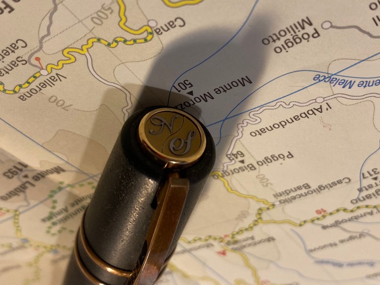
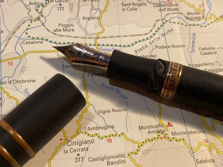
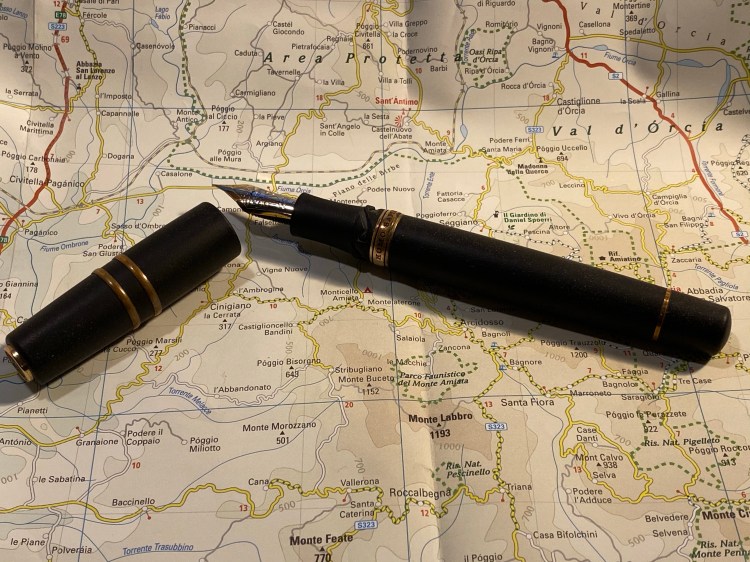
In late 2014 I visited the wonderful Mora Stylos in Paris, France. I was there to buy a pen. A specific pen. One that had made a buzz in the pen world the moment it came out. The Visconti Homo Sapiens:
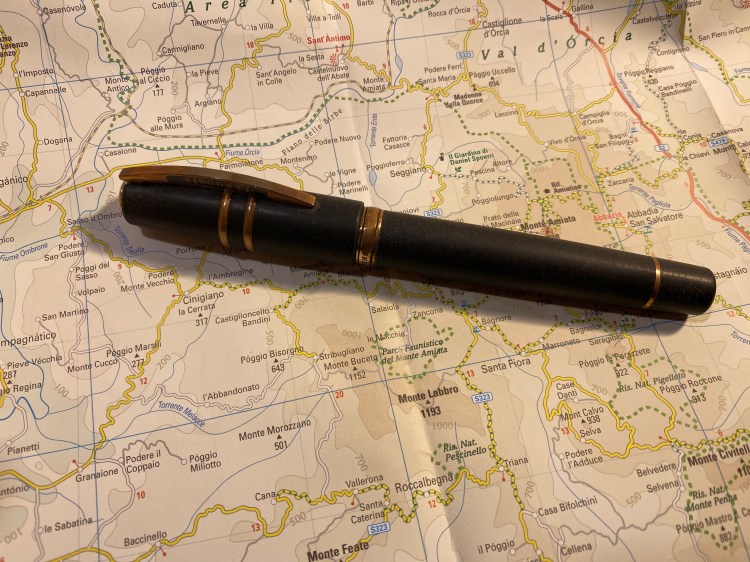
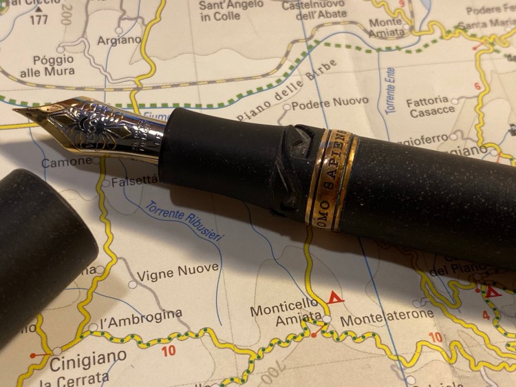
There are dozens of Visconti Homo Sapiens reviews out there, and so I wasn’t planning on reviewing this pen. Yes, it’s beautiful. Yes, it has a satisfying heft to it, the material feels amazing to the touch, the nib has some delightful springiness to it, and did I mention that it’s a hulking large, beautiful pen?
It’s also a very, very expensive one. It was the most expensive pen I had purchased until then, and since then only three other pens in my collection have come close to it in price (my Nakaya, my Henry Simpole Silver Overlay Conway Stewart, and my Oldwin).
I remember spending a lot of time in that store, holding the pen (it’s large and I have tiny hands), trying out the nib (I bought an Extra Fine. Today I would have gone for something broader), debating the price of pen.
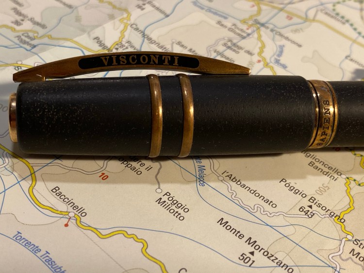
In the end I liked the aesthetics, the nib, the unique filling mechanism, and the story around the pen enough to buy it. As I bought it from Mora Stylos, it was customized with my initials on the finial. This made the pen even more special and precious to me.
I got home and I couldn’t get enough out of just looking at this pen, this piece of art that looked like it belonged in a museum.
Who would want to sully this with ink, right? I could accidentally drop it or something.
But I forced myself to fill it and try using it, if only at my desk at home. I loved writing with it. It’s truly a joyous pen to write with, especially if you have a light touch. The nib is something else, comparable to my Nakaya in terms of feel.
But then I had to clean it out. And that was an absolute nightmare that took ages and ages. The filling mechanism was great to use, but terrible to fully flush out. Who has the time for that, especially for a pen that I daren’t carry with me at all times?
So over the past 5 years I’ve used my Visconti Homo Sapiens a grand total of three (!) times. It stands to reason I should sell it and let someone else enjoy it. Yet I can’t bring myself to do that. Why?
You see, I’ve grown lazy in my fountain pen use over the years, and this pen was one of the turning points. Fountain pens require effort. They have always had. That’s why people moved to ballpoints the moment they were a semi viable substitution. Fountain pens can be messy. They need filling and cleaning, and care during use and storage and while cleaning them out. You don’t use them for convenience, you use them because they bring you joy.
I’ve lost touch of that, just as I’ve lost touch with the joy of playing around with various inks. My pen usage has fallen into a rut of mostly easy to clean inexpensive cartridge-converters or TWSBI pens filled with easy to clean inks.

It has taken me a while to realize that. As I was building my goals for 2020 the realization that I’ve stopped actually enjoying my pens and ink dawned on me, and I’ve decided to see if I can’t change that.
So I filled my gorgeous Visconti Homo Sapiens, and I actually carried it with me in my bag (the skies haven’t fallen yet and the pen is OK), and I’m thoroughly enjoying using it. And I dusted off my beloved Diamine Denim, one of my favourite blue-black inks and previously one of my favourite inks that has seen absolutely no use over the past two years, and I’m giving it a spin. It’s as richly delightful as it ever was. There’s no sparkle or sheen to it, and not much shading to speak of, and yet I still love it. Diamine Denim is just a very good blue-black ink period.
So, who knows what the future holds, but I hope that this pen that does so much to evoke humanity’s past will get me interested again in my fountain pen future.

Diamine Inkvent Calendar is an advent calendar with a tiny (7ml) bottle of ink behind 24 windows, and a larger, 30ml, bottle of ink behind the 25th window. All the inks are limited edition, and only available through this calendar. You can read more about the calendar here.
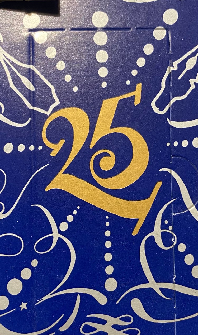
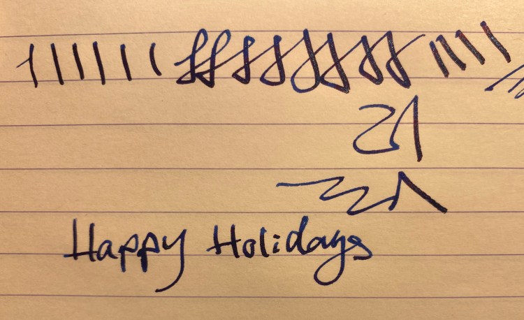
It’s the final day of the Diamine Inkvent calendar, and there’s a full 30ml bottle of ink behind today’s door. I guessed that today’s ink will probably be a shimmer and sheen ink, perhaps in the same shade of blue of the calendar. Then again, from the ink name there was a chance that it would be a green or a red, which I find less useful.
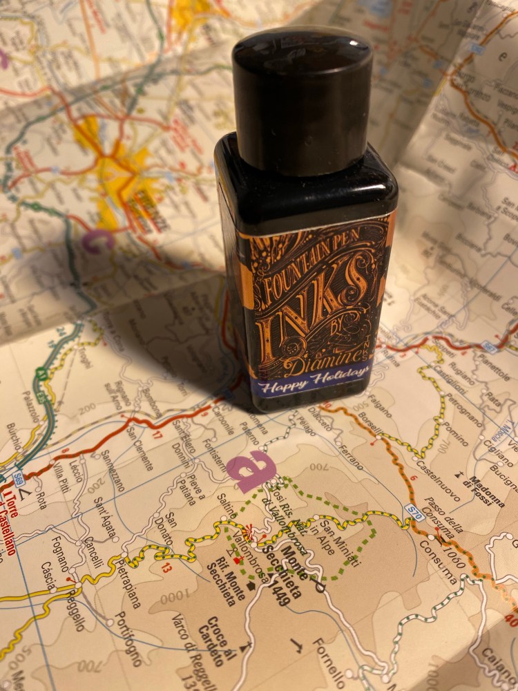
Turns out that my first guess was right. Day 25’s ink is Diamine Happy Holidays, and it’s a sheen and shimmer rich royal blue, just like the Inkvent calendar. The blue they chose is beautiful, dark but not so dark that it becomes black. It shades well, even though it’s saturated, and has a red sheen and light blue glitter in it.
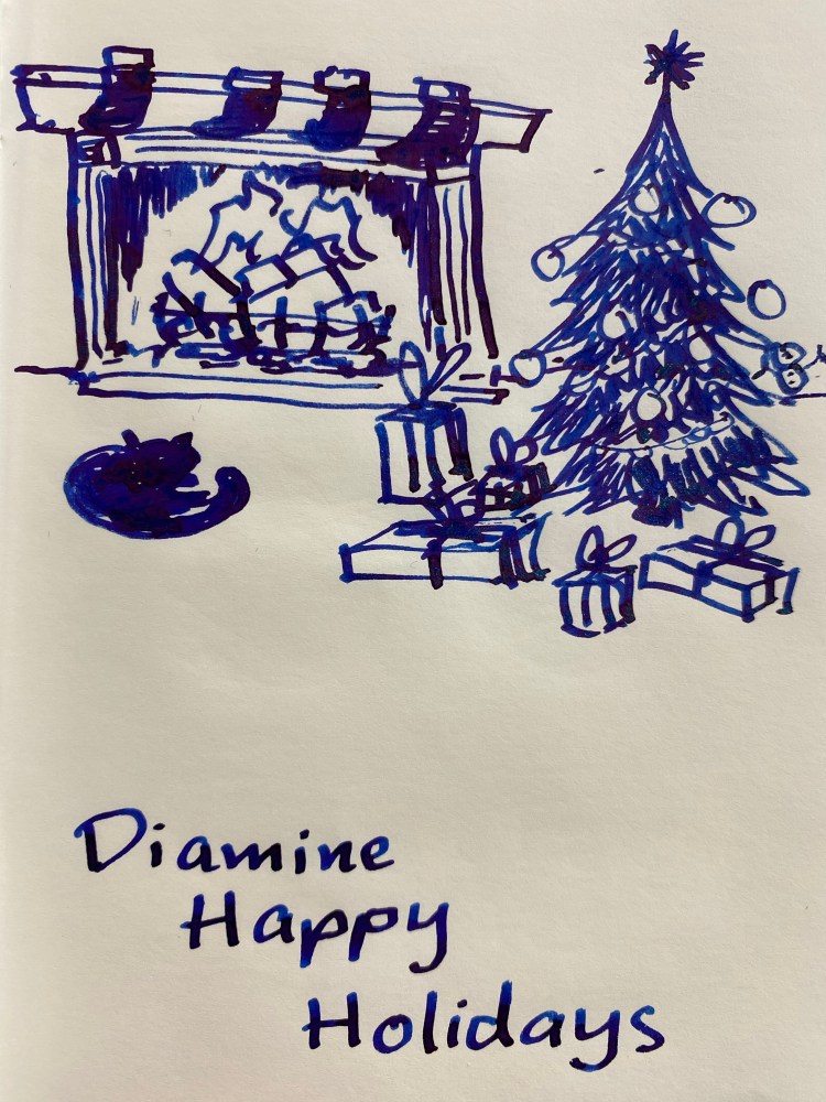
You can see the shading. Where the ink pools there’s sheen, and if you shake the ink well before use (including in the pen) you’ll see a good amount of shimmer. I filled a TWSBI Go 1.1 stub with this ink and on Tomoe river paper this ink shines.
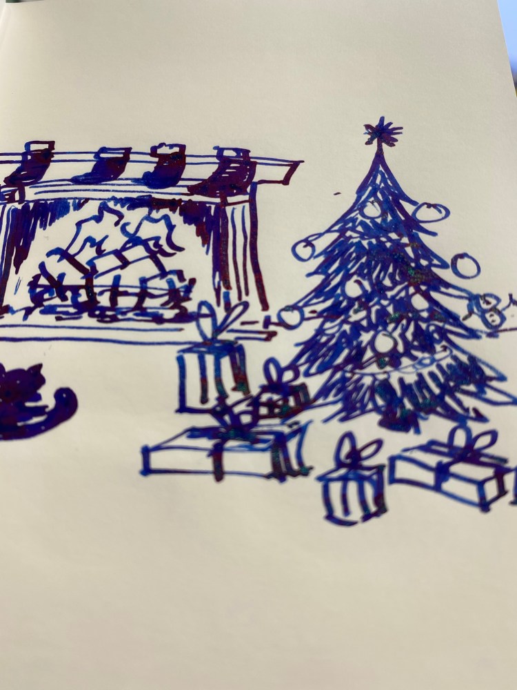
You can see the sheen and shimmer best when you tilt the paper slightly.
Even on Rhodia paper you can see the shimmer and sheen:
Diamine Happy Holidays is a lovely ink, and I’m glad that I now have a 30ml bottle of it. Is it the most unique colour in the calendar? No, it’s pretty close to the other four dark blues. However, looking over all of the other colours in the calendar, I don’t think that they could have selected a better ink for the last day.
I loved almost all of the inks in the Diamine Inkvent calendar (apart from Diamine Triple Chocolate). The calendar itself is a beautiful and well designed objects, the tiny bottles were charming (some of the labels had minor flaking problems, but who cares), and the sheer amount of unique inks produced for this is astounding. I know that Diamine said that these inks were made only for the calendar, but I would be glad to see some of them re-issued in larger bottles. If Diamine issue another calendar next year I will definitely buy it, probably even if it has the exact same ink colours. The Diamine Inkvent calendar is one of the best stationery products of the year, and certainly one of the most entertaining ones.

Diamine Inkvent Calendar is an advent calendar with a tiny (7ml) bottle of ink behind 24 windows, and a larger, 30ml, bottle of ink behind the 25th window. All the inks are limited edition, and only available through this calendar. You can read more about the calendar here.
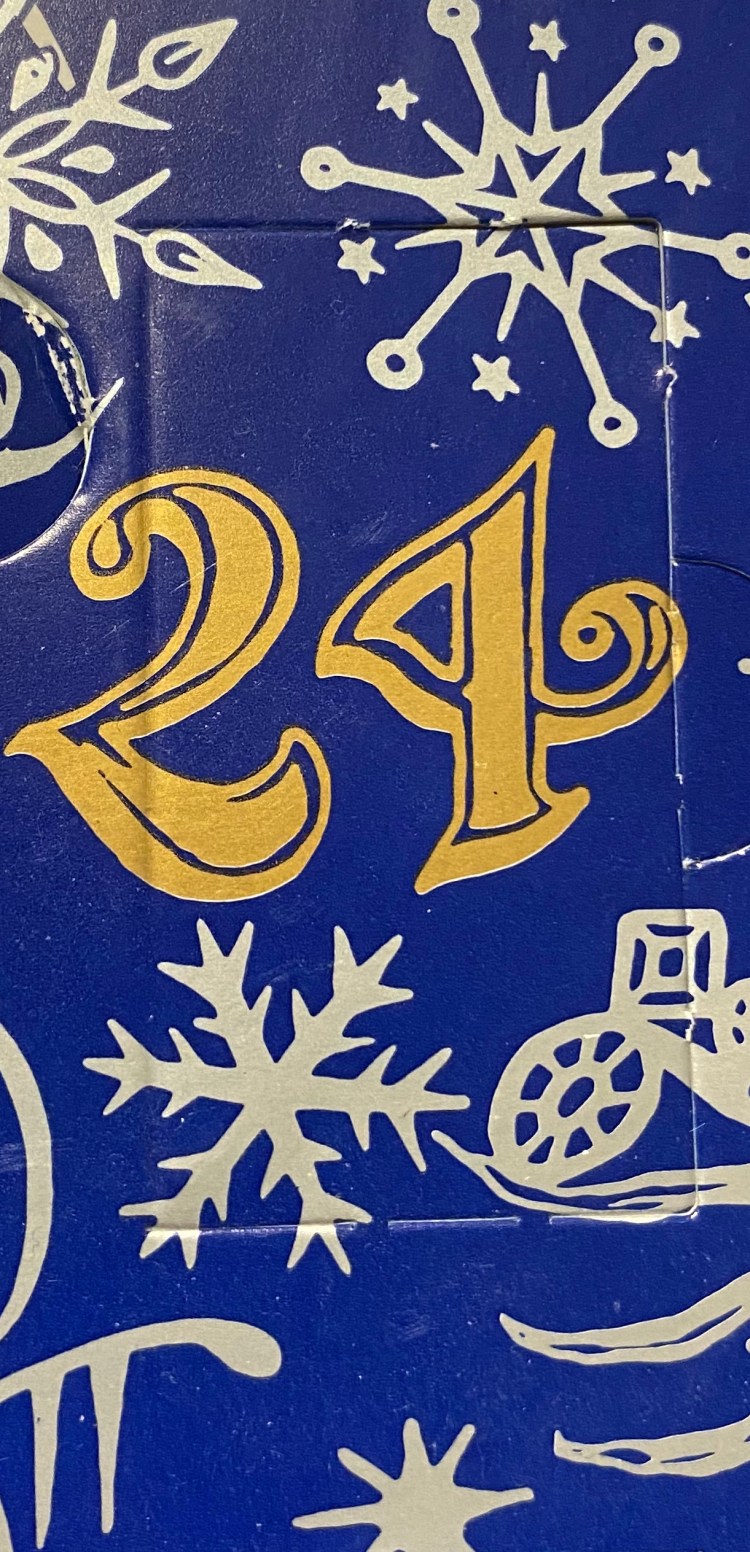
It’s day 24 on the Diamine Inkvent calendar, which means that it’s Christmas Eve. Merry Christmas to all who celebrate!
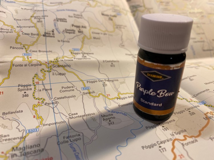
Day 24’s ink is Diamine Purple Bow, a “standard” dark purple. After dip testing this ink I filled a Pilot Metropolitan (medium nib) with it just to make sure that what I was seeing wasn’t a result of the dip test. It wasn’t. This ink has a lot of sheen, and should have been labeled a “sheen” ink.
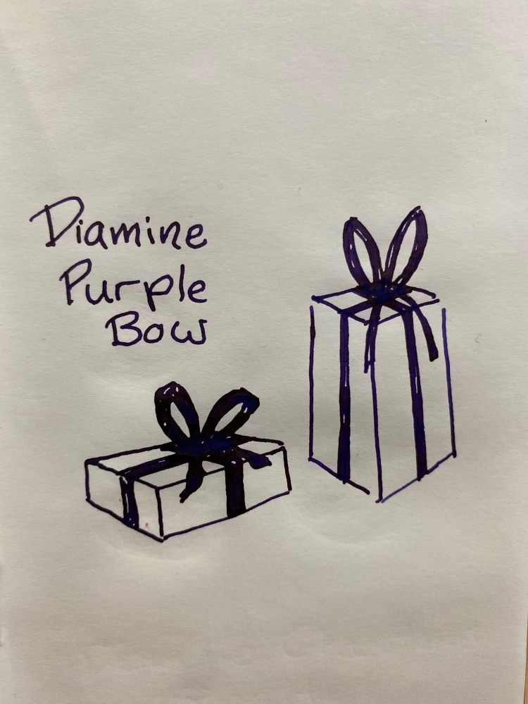
Diamine Purple Bow is a deeply saturated, very dark purple ink that’s almost black. The magic is when you tilt the page and look at the sheen:

The golden sheen is especially visable on Tomer river paper, but it’s also noticable on Rhodia paper. I have no idea why Diamine Purple Bow wasn’t labeled as a sheen ink but it should have been. As it is, it’s an interesting ink that is dark enough to pass as a standard black on a cursory glance.

Diamine Inkvent Calendar is an advent calendar with a tiny (7ml) bottle of ink behind 24 windows, and a larger, 30ml, bottle of ink behind the 25th window. All the inks are limited edition, and only available through this calendar. You can read more about the calendar here.
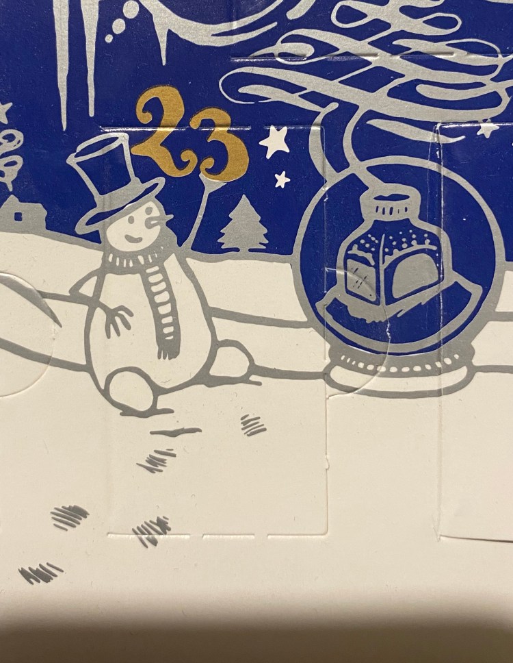
It’s day 23 on the Diamine Inkvent calendar, and I love both the snowman and the inkwell snow-globe on today’s door.
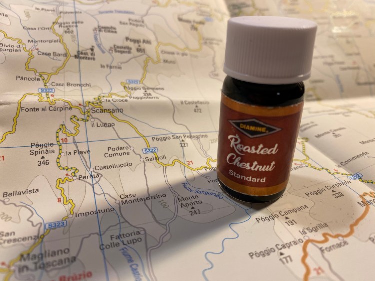
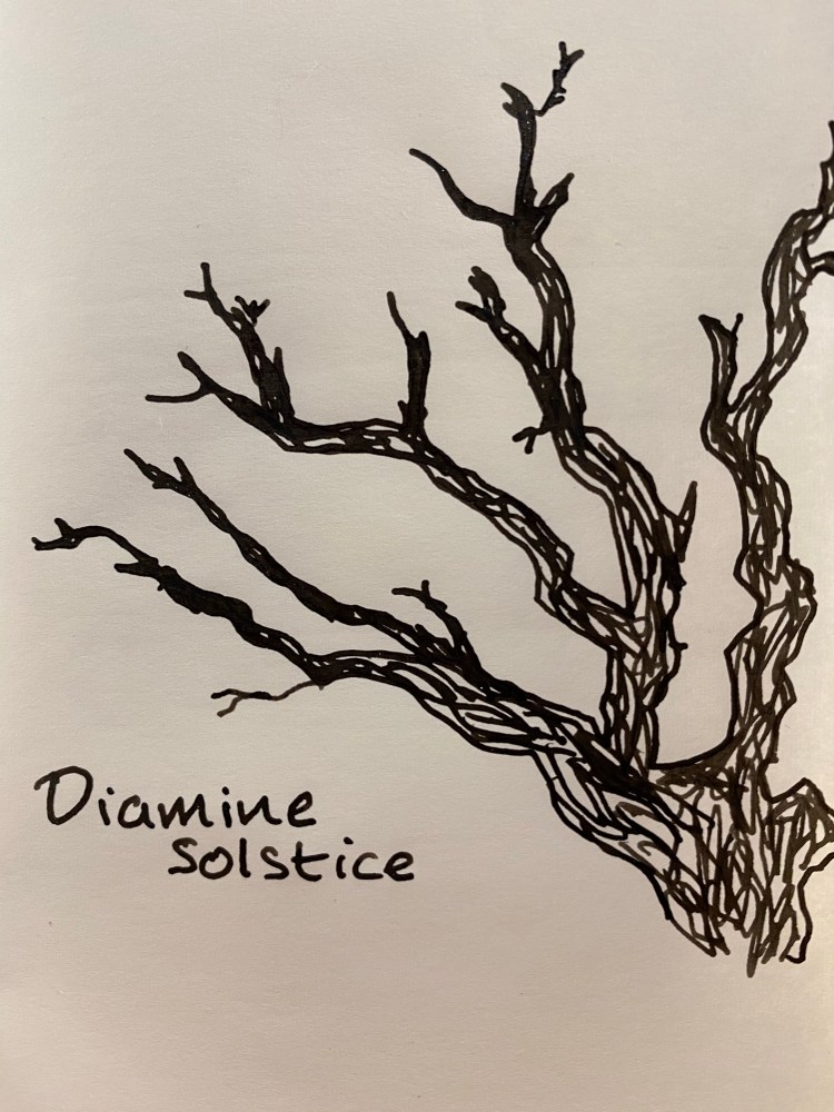
Day 23’s ink is Diamine Roasted Chestnut, a standard sienna brown with a good amount of shading. It’s more reddish than the yellow ochre leaning Diamine Gingerbread and pretty close to Diamine Nutcracker, but a tad lighter and less red.
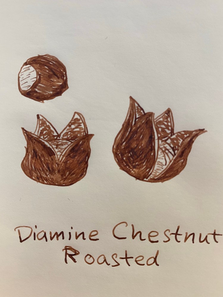
I love the shading and the colour of this ink, but I wish that Diamine had called it Chestnuts Roasted 🙂

Diamine Inkvent Calendar is an advent calendar with a tiny (7ml) bottle of ink behind 24 windows, and a larger, 30ml, bottle of ink behind the 25th window. All the inks are limited edition, and only available through this calendar. You can read more about the calendar here.
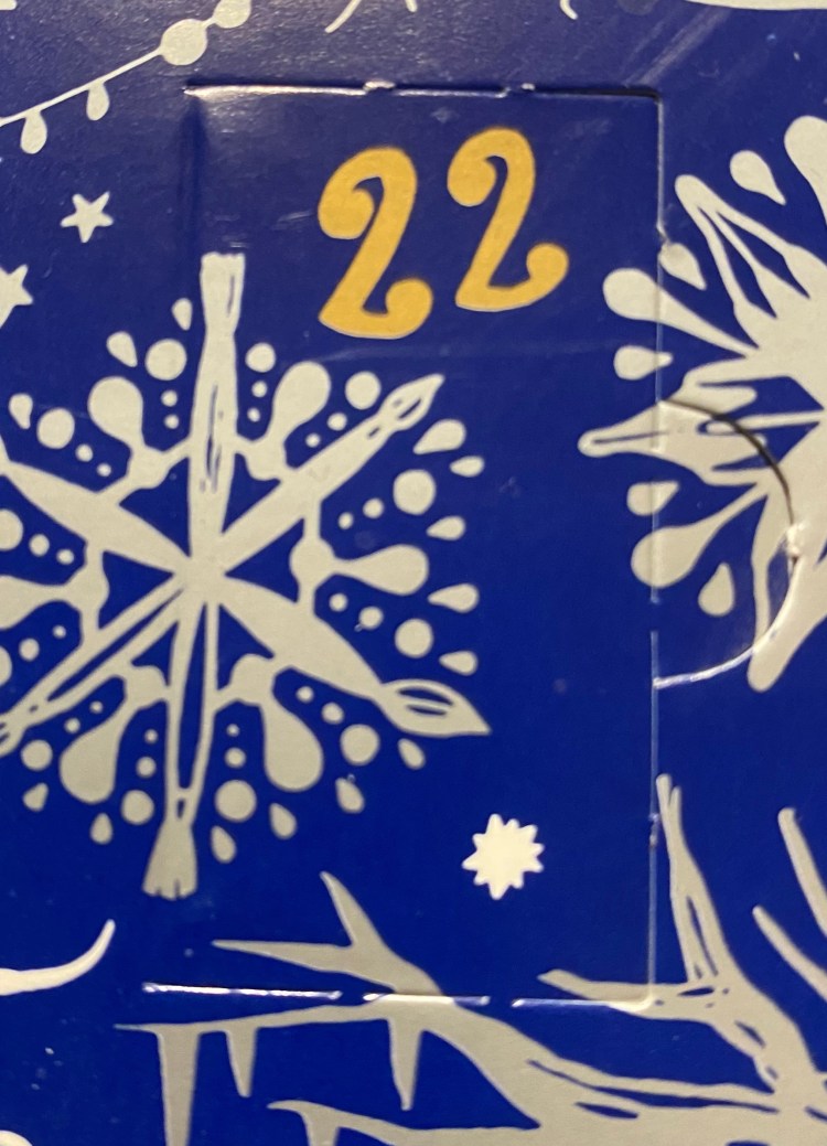
Only 3 days left to the Diamine Inkvent calendar, and after yesterday’s wonderful Fire Embers I can’t wait to see what’s behind door 22.

Day 22 is Diamine Solstice a black ink with green shimmer. This is a charming combination, as the basic black ink is deep and saturated, and the green shimmer makes it come to life.
This looks like a fairly normal black, but tilt the page a bit and…

Party time! Subtle yet satisfying.
Here it is on Clairefontaine paper:
I love the combination, and I hope that Diamine will offer Solstice as part of their regular lineup.

Diamine Inkvent Calendar is an advent calendar with a tiny (7ml) bottle of ink behind 24 windows, and a larger, 30ml, bottle of ink behind the 25th window. All the inks are limited edition, and only available through this calendar. You can read more about the calendar here.

It’s day 21 in the Diamine Inkvent calendar and we’re down to the final five. Today’s door didn’t look promising but…
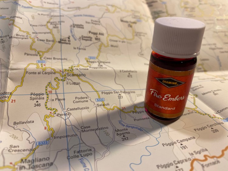
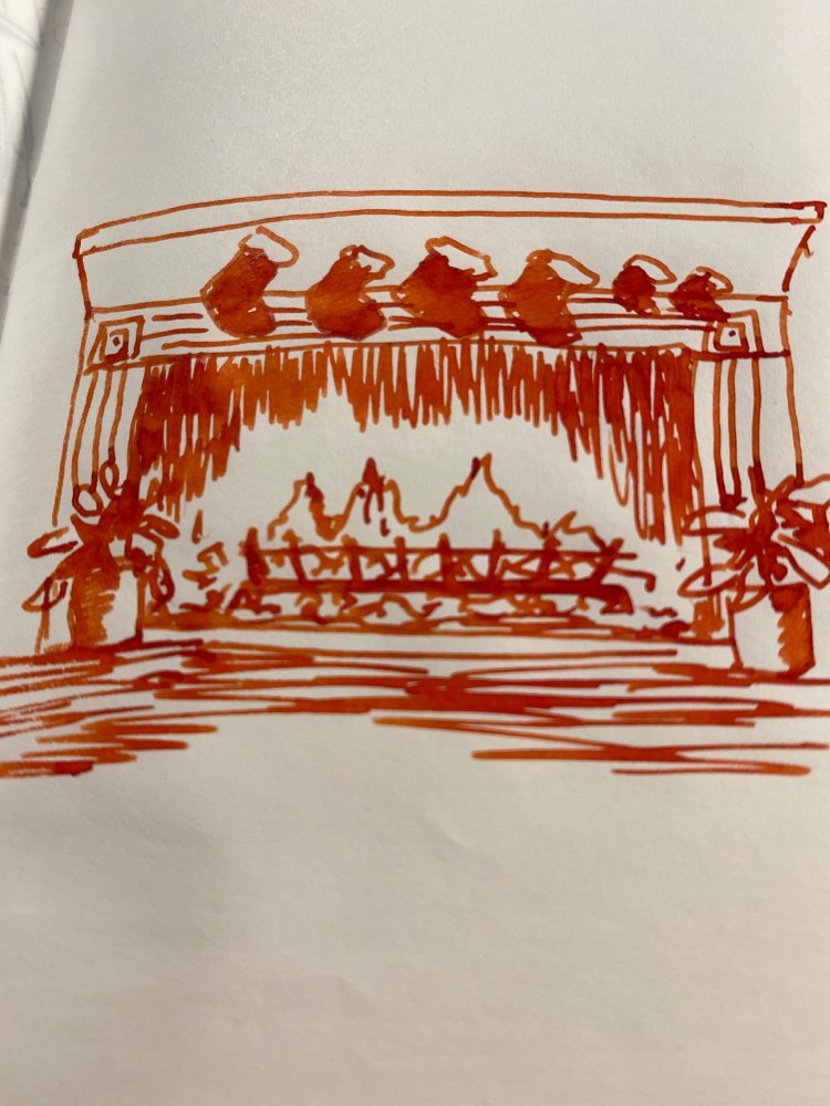
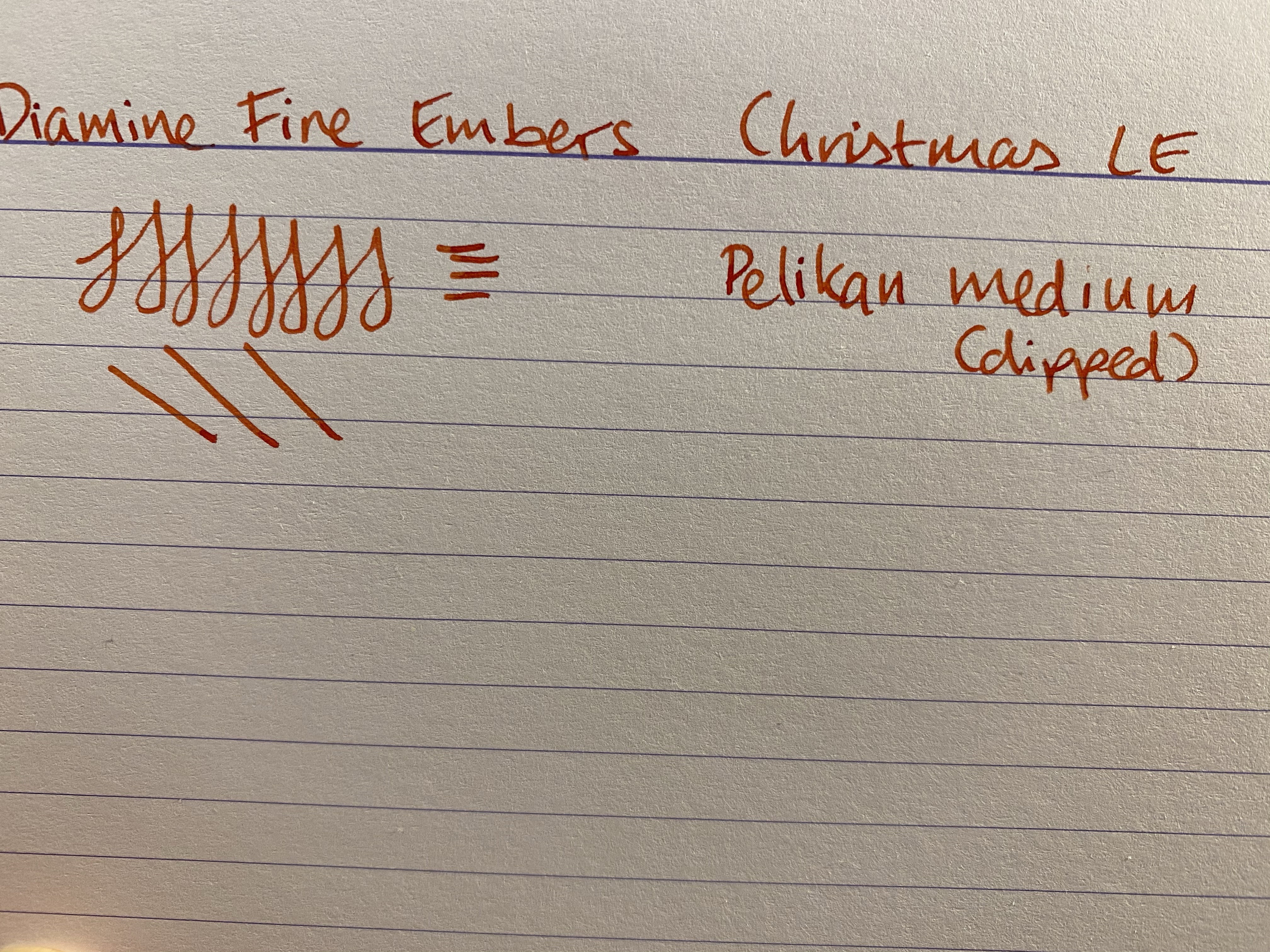
…day 21’s ink is not a blue, or a red, or a green! It’s Diamine Fire Embers, the orange I’ve been waiting for for the past 20 days, and one of the best and most practical oranges I’ve ever seen. How dare you call it “standard”, Diamine? This ink is exceptional!
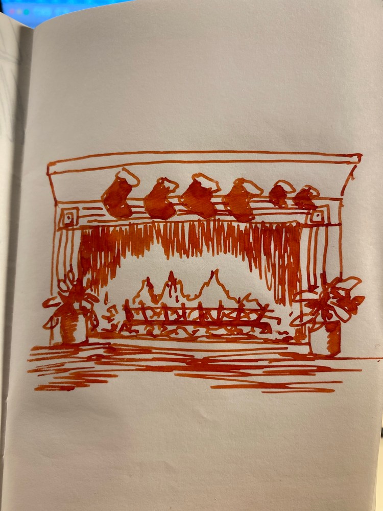
Diamine Fire Embers is a dark, reddish orange that glows on the page, and dries dark enough to make it practical (i.e. readable). There’s a significant amount of shading while the ink is still wet, but it tones down a bit as the ink dries.
On the Tomoe river paper above the shading is much more pronounced than on the Clairefontaine paper below, but that’s to be expected.
Diamine Fire Embers is one of the better inks in the calendar in my opinion, and I’m not even a fan of orange ink. It’s so cheerful and vibrant, it’s bound to make you smile as you use it, whether for letter writing or for cards.
