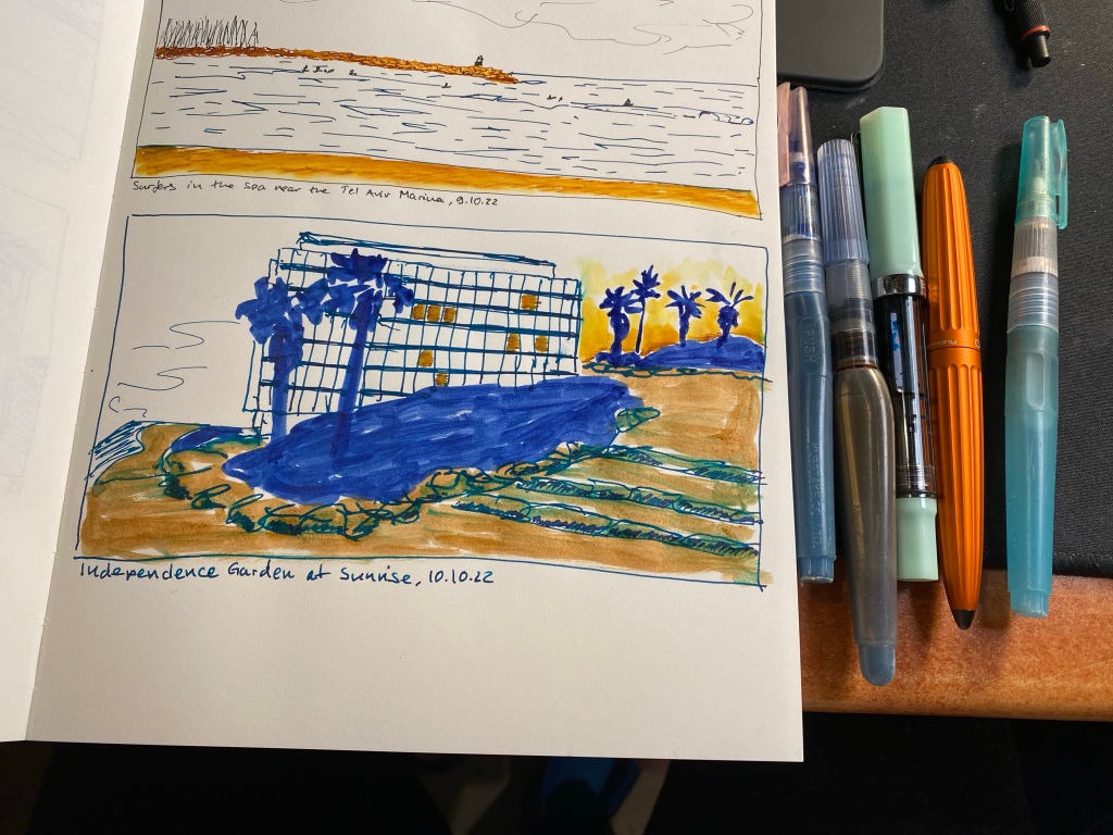
Had an unusual start to the day, with an early morning walk before my usual morning run. I’m embracing the spirit of experimentation with these, so this one was sketched using diluted Sennelier shellac based ink (non fountain pen friendly) in waterbrushes, paired with a fine nibbed TWSBI ECO filled with J. Herbin Emerald of Chivor, and a Diplomat Aero with a fine nib filled with Colorverse Golden Record. The Midori MD Cotton paper does not take nicely to any amount of moisture and there was bleed through (and of course see through) to the other side of the page, but in general it held up much better than I expected.
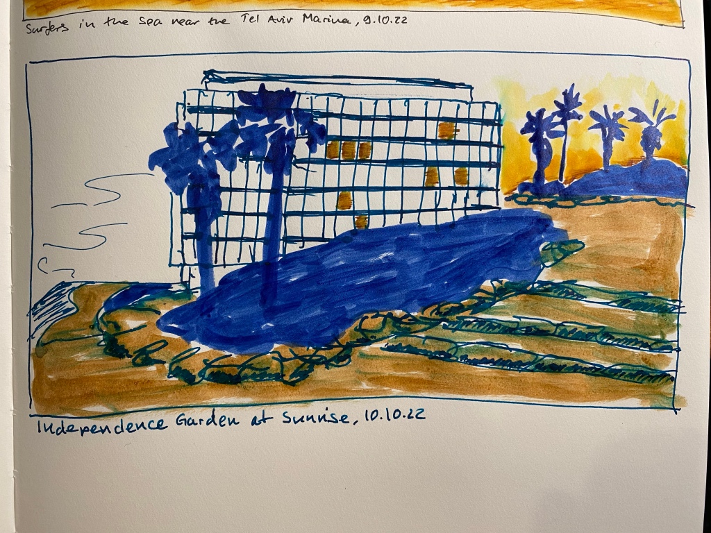
Independence Garden at Sunrise. Playing about with various kinds of inks.
Here are all the tools used for this quick sketch:
From left to right: waterbrush filled with blue in, waterbrush filled with sepia ink, TWSBI ECO, Diplomat Aero and a waterbrush filled with water.
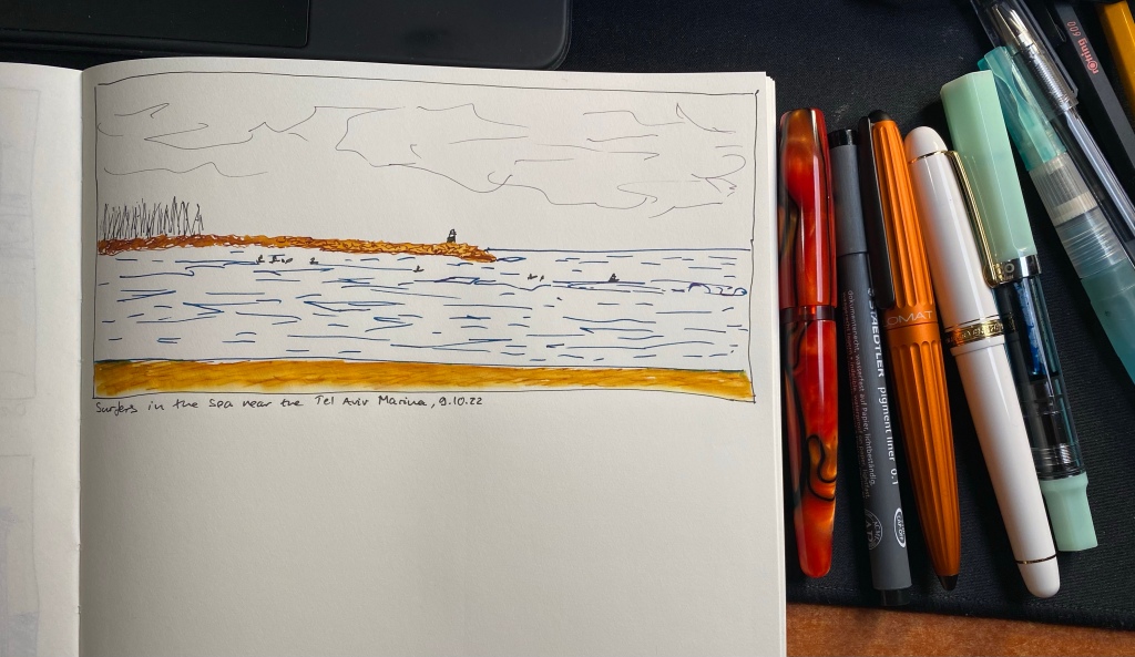
Today’s sketch includes a frame and characters drawn with a Staedtler pigment fineliner 0.1 pen, a sky drawn with a Vertex and kyo no oto Sakuranezumi ink, a sea drawn with a TWSBI ECO filled with J. Herbin Emerald of Chivor, a lighthouse sketch with a Platinum 3776 UEF nib filled with Sailor Epinard, and a beach and breaker sketch done with a Diplomat Aero and Colorverse Golden Record (plus a waterbrush).
Here’s the whole pen lineup used to create this page:
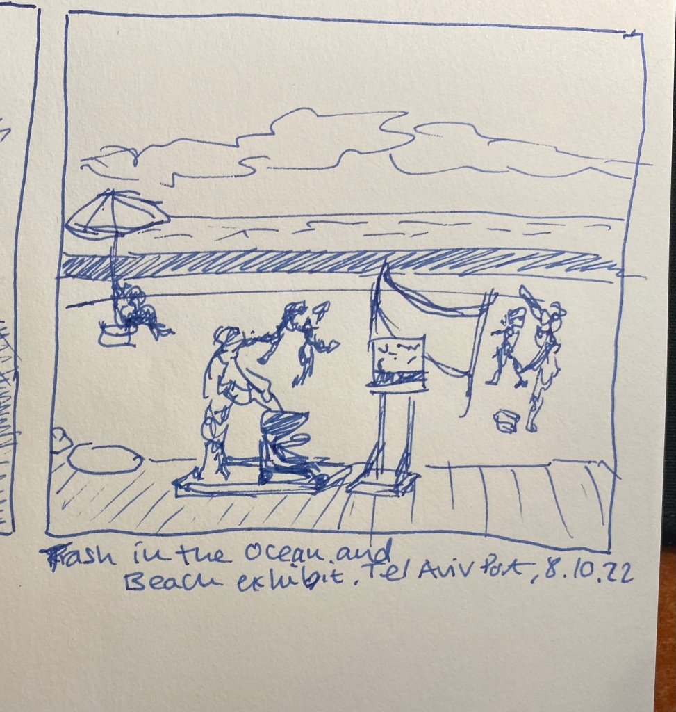
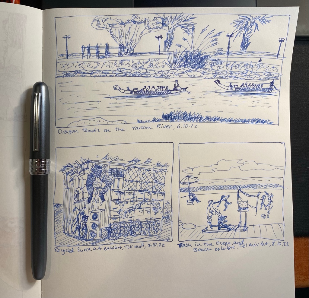
Very, very quick sketch of an exhibit of people playing beach volleyball and lounging on the the beach – all made out of plastic trash recovered from the sea. It’s quite sobering to see it all displayed like that in the Tel Aviv port. We need to be much better stewards of our oceans and planet. Drawn with a Platinum Plaisir fountain pen on a Midori MD Cotton A4 notebook.
Here is the full page spread together with the infamous Platinum Plaisir:
There’s a wild succah exhibit near the TLV mall in Tel Aviv, and it’s a lot of fun to walk around it and try and guess what everything was originally. This succah is made out of discarded bits of “junk”, you see, and the point is to make a point about recycling and sustainability. In any case it was challenging for a very quick little sketch (I’m working very fast and loose with these), and as I mentioned before, the Platinum Plaisir fountain pen I used here isn’t the most fun pen to use. The Midori MD Cotton paper deserves better.
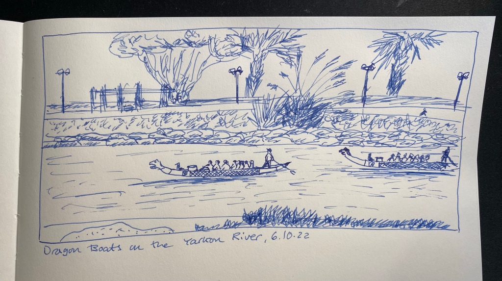
I run practically the same route every day, and yet it never gets boring, especially since the sea, the river and the park are constantly changing. Today it was dragon boats that were out in force on the river. I’ll probably do a watercolour sketch of the scene later on. In any case, this page will be sketched with a Platinum Plaisir filled with the cartridge it came with. It was supposed to highlight the fact that you can sketch with even the cheapest of fountain pens, but I have to say that I don’t recommend the Plaisir. The nib doesn’t flip well, the ink cartridge it comes with is proprietary and the ink inside is in a depressingly dull blue, and there are better pens to be had for a little more or a lot less.
It’s time for a wash, and this time it’s just water over Colorverse Golden Record ink. The sketch was done with a Diplomat Aero fine nibbed pen, which you can see at the bottom of this post, and on A4 Midori MD Cotton paper, which is not built for washes. It buckles almost immediately.
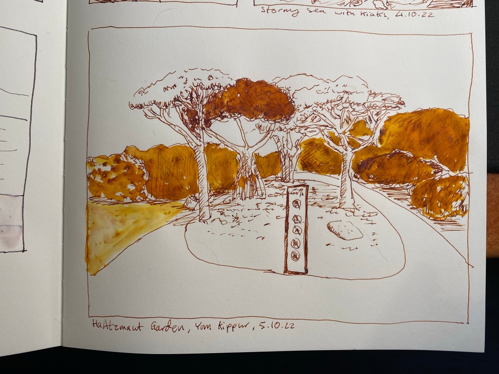
One of my favourite places in Tel Aviv, Independence Garden (Gan HaAztmaut).
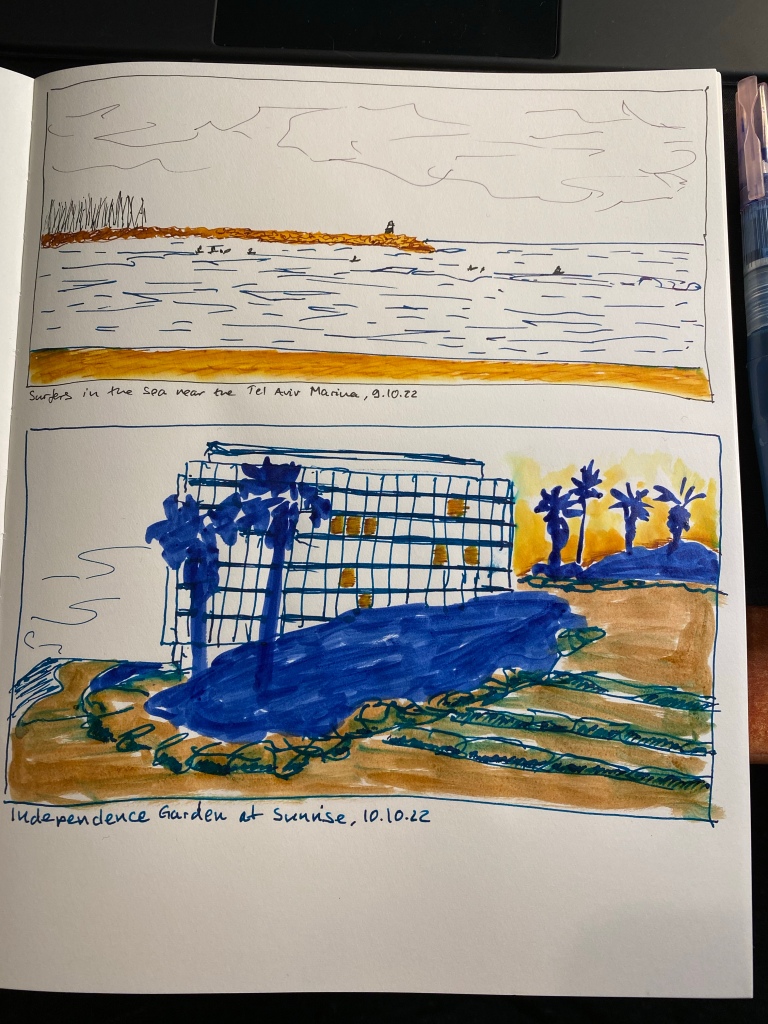
Here’s the complete page:
I like the comics like effect of it.
And here’s the pen that I used to sketch it all, the wonderful and highly recommended Diplomat Aero (in this case in orange, but it comes in a myriad of colours). The Colorverse Golden Record ink was part of a set, and I don’t recommend it.
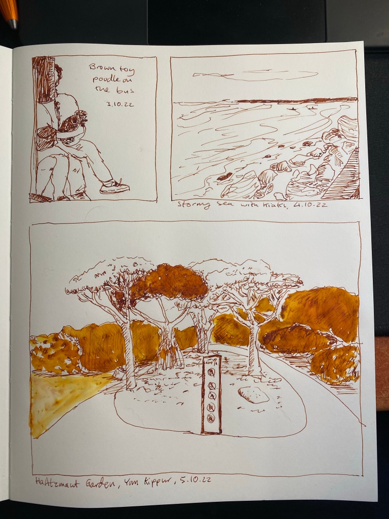
I’m going for a page of sketches with this pen and ink combo, so here’s another small one, of two kayakers braving the stormy sea. Diplomat Aero fine nibbed fountain pen with Colorverse Golden Record on an A5 Midori MD Cotton notebook.
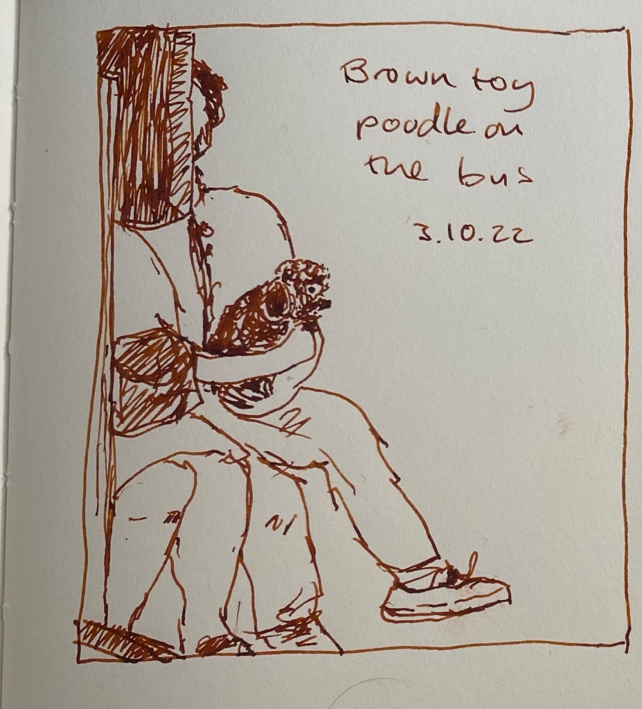
I had a busy day, so it was a very quick sketch this time, of a brown toy poodle sitting on her owner’s lap on the bus. She was quite the attraction, and reminded me of my old dog in the pure joy she took from everything around her.
Drawn on an A5 Midori MD Cotton notebook with a Diplomat Aero fine nibbed pen filled with Colorverse Golden Record. This ink has a tendency to dry out in pens, and it becomes darker in the pen after a day or two.
Today’s sketch was also done with a fine nibbed Karas Kustoms Velys Ignem Vertex and Kyo No Oto Sakuranezumi ink on a Midori MD Cotton A4 notebook. It’s a very quick sketch, done in less than 10 minutes, and I later on made the mistake of applying a wash on the sand, and pretty much ruined that part of the sketch.
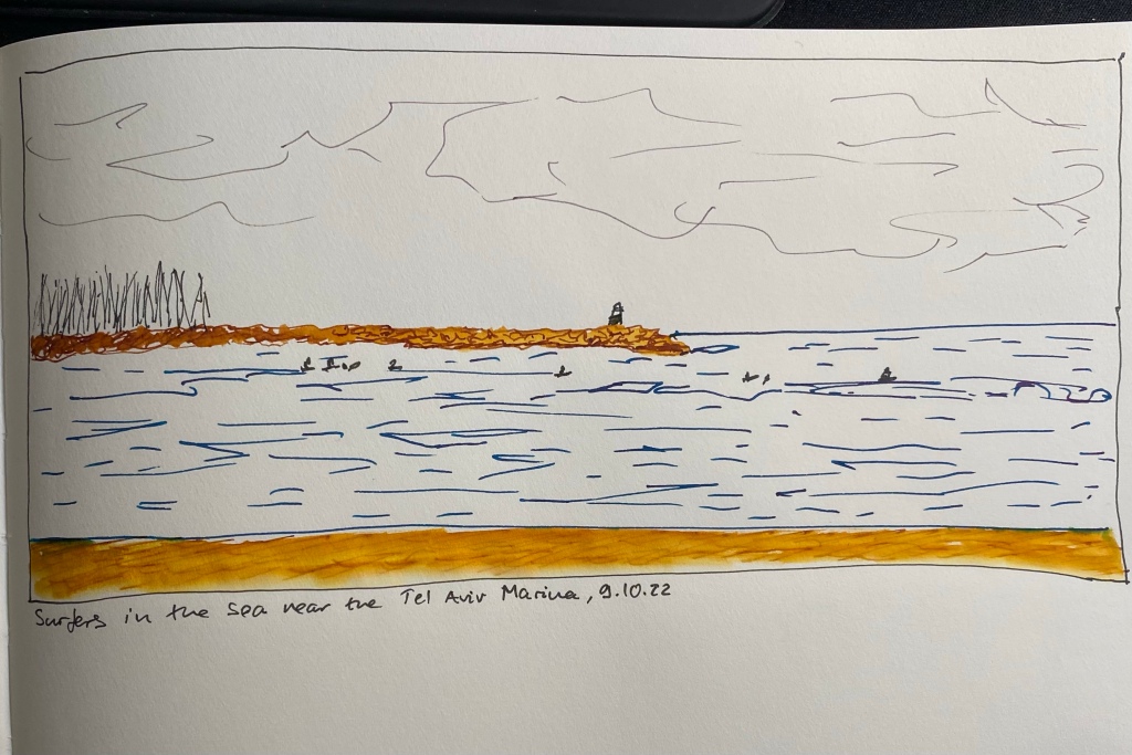
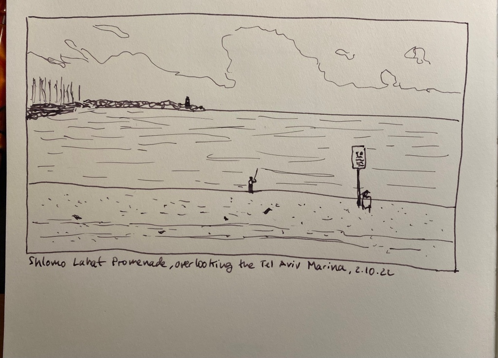
View of the sea from next to the Tel Aviv Marina
Here are the two sketches together on a complete page (before I destroyed the bottom one).
It’s Inktober again, and after a few days of hemming and hawing I decided to join it this year. Once again I’m not following the very Halloween themed prompts, but instead just sketching with fountain pens (for the most part) and ink. I’m sketching directly on paper (no pencil underdrawing), and I’m using an A4 Midori Cotton notebook for these sketches.
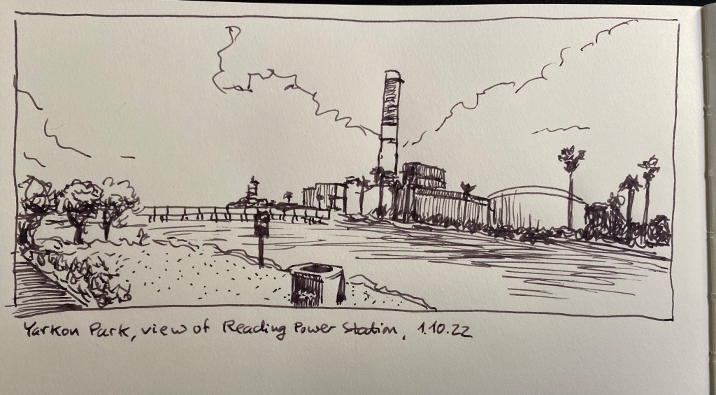
Yarkon Park, view of Reading power station.
This is a 10 minute sketch, done with a Karas Kustoms Vertex Velys Ignem fountain pen with a fine nib, filled with Kyo No Oto Sakuranezumi ink.
Vertex Velys Ignem.
This is my first Karas Kustoms fountain pen, and I really enjoy using it (I’ll be posting a full review once I’ve had more time with it). I used the nib on both sides (flipping it over for extra fine dots and lines), and it is smooth and well performing.
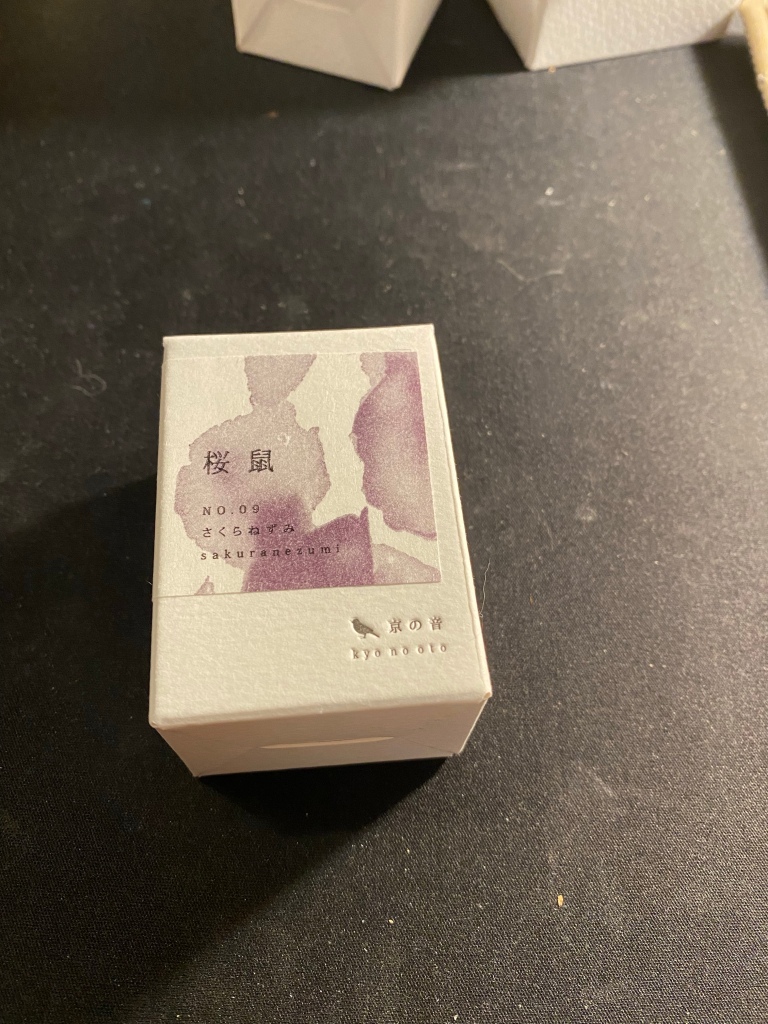
Kyo No Oto Sakuranezumi box.
For some reason I got the ink brand name mixed up in my head and I’ve been calling it kyo no iro. Embarrassing. In any case, I bought this ink on an ink shopping spree in Choosing Keeping in London during my latest trip there. It’s a dusky purple/mauve colour that reminded me of Diamine Harmony (and costs significantly more).
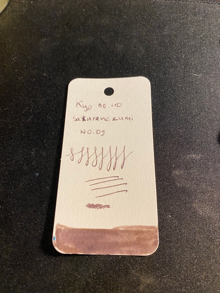
Ink sample on Col-o-ring tab.
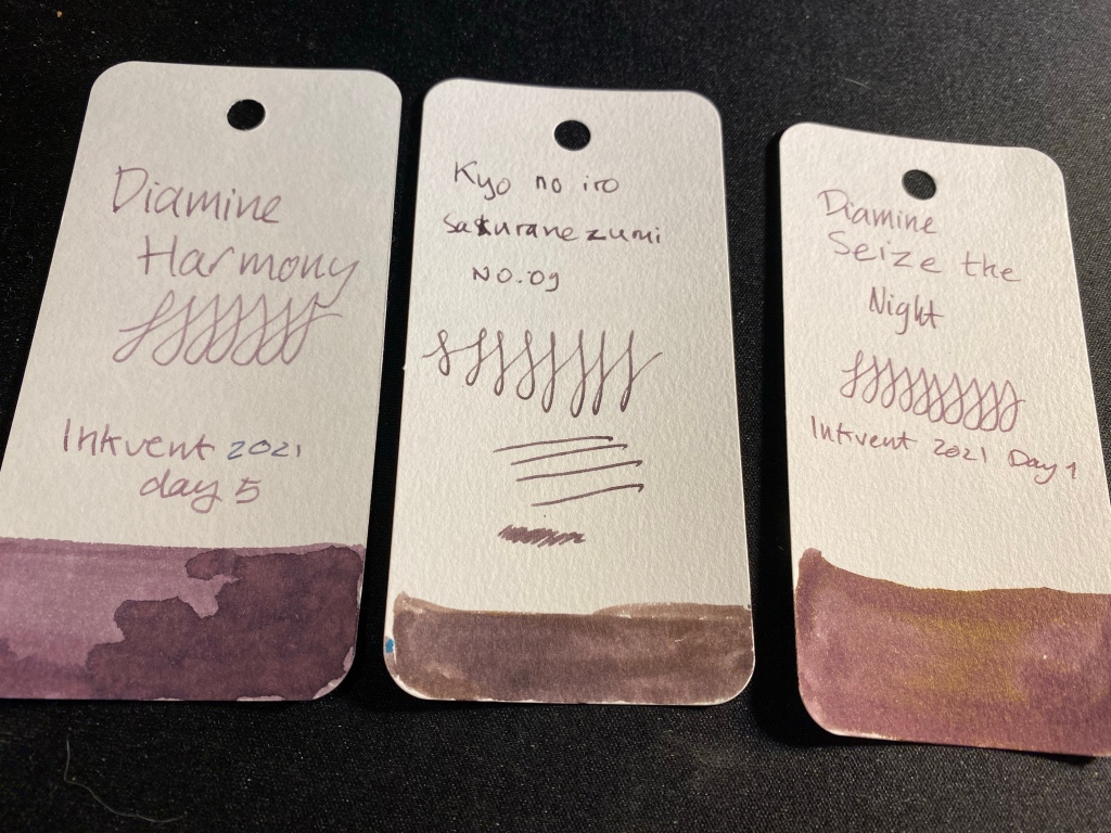
Sakuranezumi is a purple with yellowish undertones that is darker than Diamine Harmony or Diamine Seize the Night, and shades significantly less than the other two. In a fine pen it is dark enough to be acceptable in office use, and I enjoy its dusky mystique. If you do wet the ink, the yellow undertones really become prominent, so take that into account if you plan to use it for ink washes, etc.
If you are looking for a mauve ink and you want something subdued and dark, Sakuranezumi would work for you. I personally find Diamine’s offerings to be more interesting, plus they are easier to obtain and significantly cheaper. Harmony shades more, and if you are looking for yellow undertones, then Seize the Night has the sheen for you.