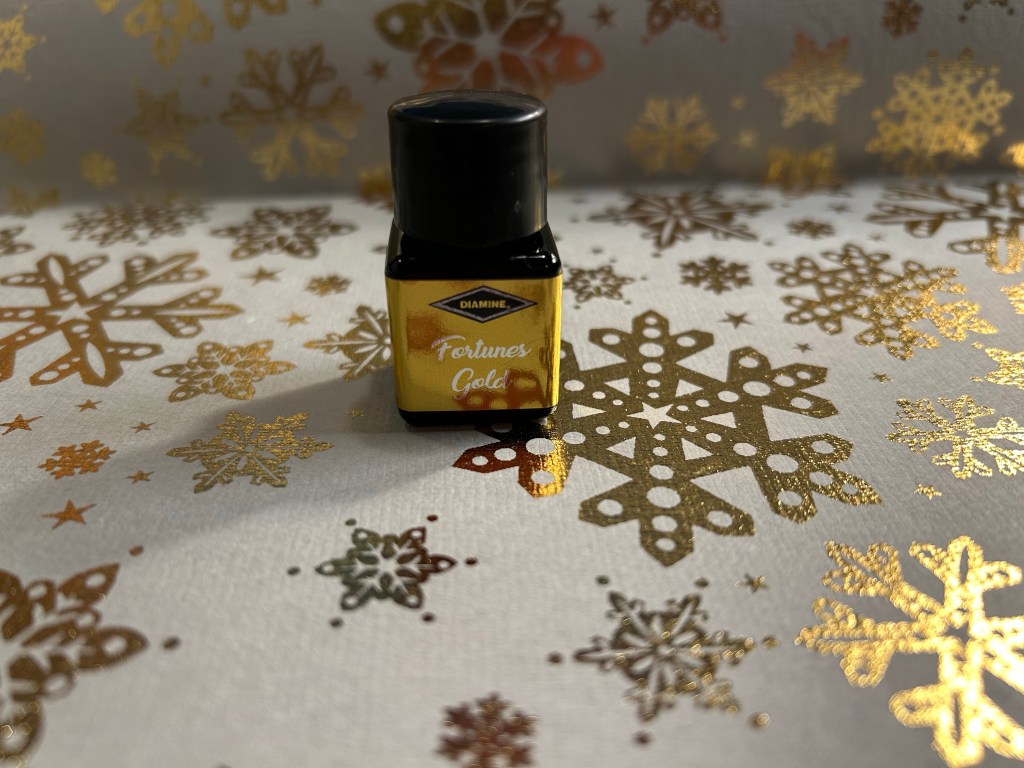
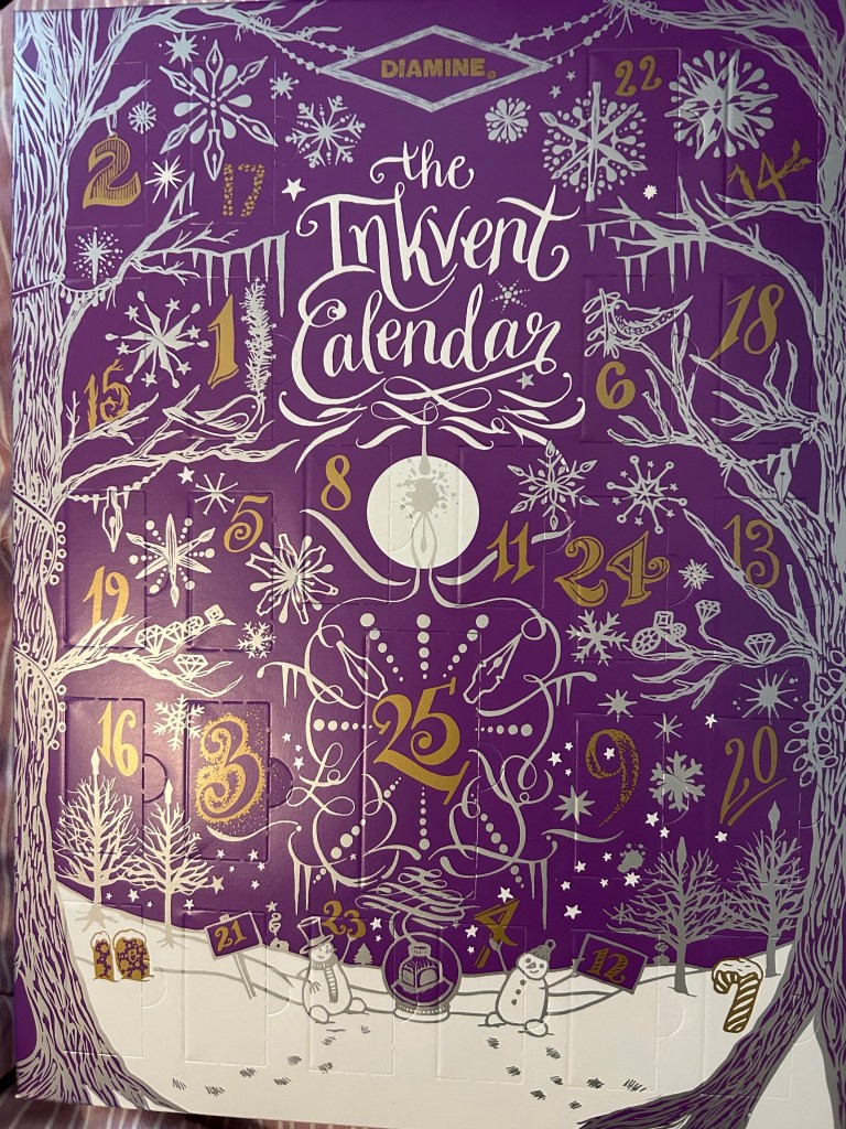
Diamine Inkvent 2023 Day 4
This is the Diamine Inkvent 2023 day 4 door:

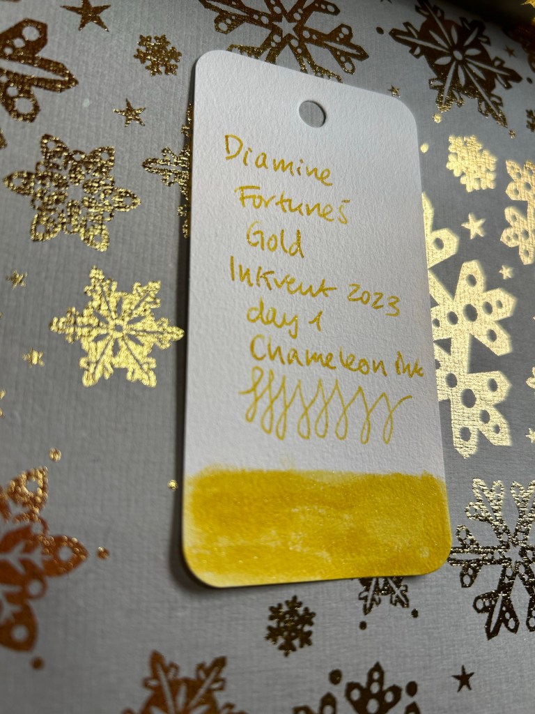
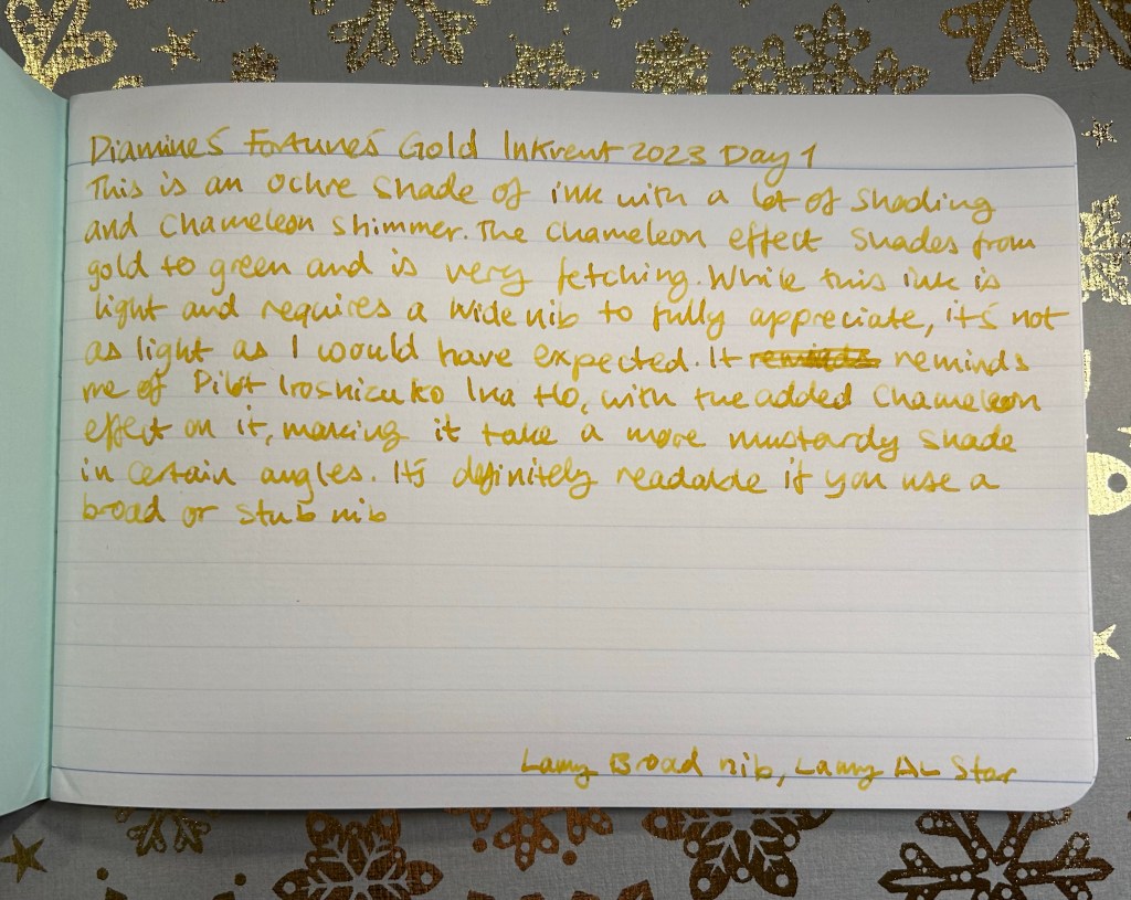
Day 4’s ink is Diamine Masquerade. It’s a shimmer ink.

Diamine’s Masquerade is a duskier, browner leaning pink than day 2’s Diamine Cashemere Rose. You can imagine a papier-mâché carnival mask made in this colour. The copper shimmer in it is pronounced, and adds to its somewhat kitschy appeal.

I think Masquerade would work well on cream coloured paper, and I’m pretty sure that there will be many fans of this ink. It would work well as a journaling ink, as the colour is calming, and it has both shading and shimmer, and so plenty of interest.

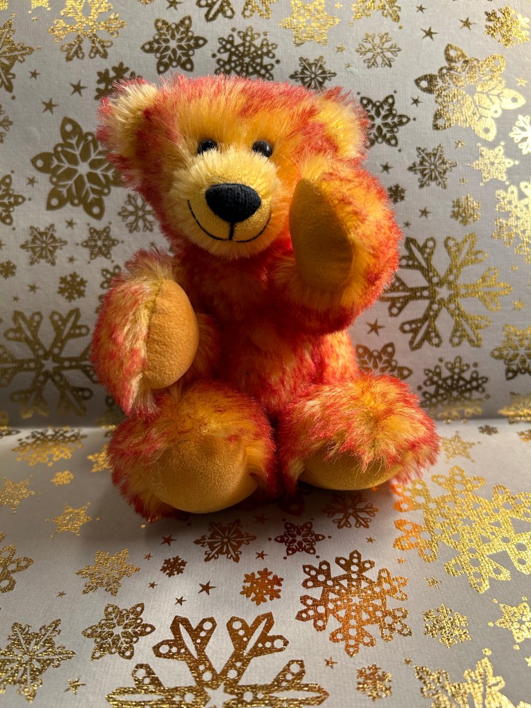
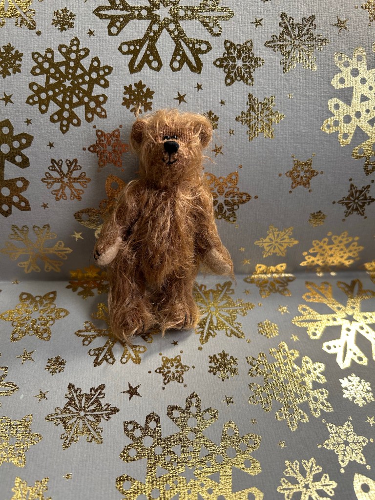
I think I have two, maybe three pink teddy bears in my collection, and Candy is the smallest of the bunch. I like her kind of forlorn look.

Here’s the original bear:

Between Diamine Cashmere Rose and Diamine Masquerade, I prefer Cashmere Rose and not only because it’s much lower maintenance than Masquerade, as it’s a standard ink. Masquerade is just a bit too much for me, but I’m sure many people would prefer it to Cashmere Rose. Which one would you see yourself using more?