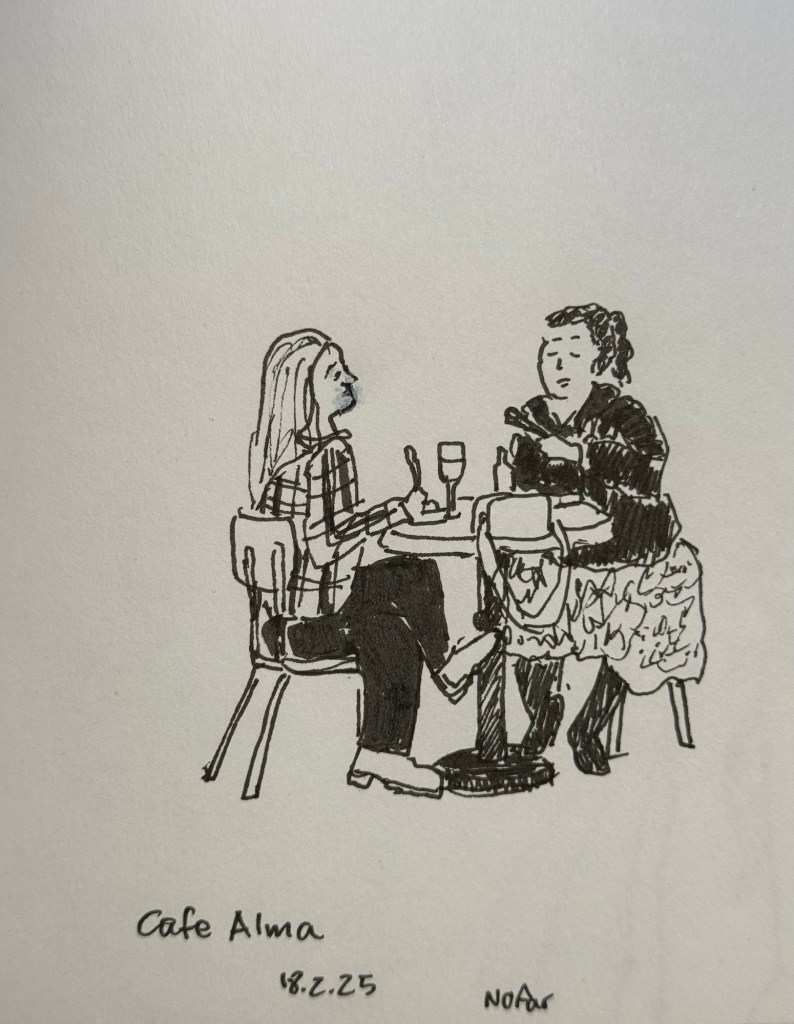
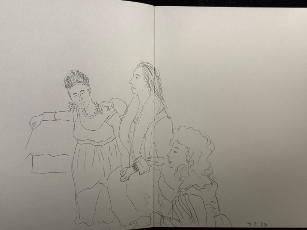
Earlier this week I went to a standup gig – a NY comedian was trying out new material, and it was an interesting (and funny) experience to see him work. Before the show I had about 5 minutes to sketch the people in a nearby cafe, so I sketched this couple using a Staedtler 0.5 Pigment Liner.
In terms of fountain pens the Parker Vacumatic is out of rotation, though I may give Diamine Writer’s Blood a try in another pen soon enough. I decided that I want to have the nib tuned on it, in terms of flow, though I don’t know who I’ll be able to find to do the tuning for me.
I also dumped out the Pilot Iroshizuku Yama Budo out of my Parker 51 as I couldn’t get it to not bleed and feather on practically any paper. I cleaned out the pen and refilled it with Waterman (Tender) Purple ink and it’s been wonderful to use since. Waterman inks are not only fantastically well behaved, beautiful, cheap and very, very easy to clean out of pens, they’re also dry inks. As Parker 51 generally have a generous ink flow, and this one is no different, a dry ink serves particularly well with this pen.
I’ve been reading Mrs Palfrey at the Claremont by Elizabeth Taylor (the British novelist, not the famous actress) and it’s a wonderful study of character, age and aging.
Next week is the Tel Aviv marathon, which is sold out for the very first time. There were no big local running events last year, and there’s clearly a hunger for them.
This week has been crushing from both a personal and a national perspective. I’ve taken solace in friends and in reading, but there have been times where it’s been a struggle. It’s at times like this when I need to remind myself to stop, take a breath, allow myself to feel what I need to feel, and only then pick myself up and move on.
Be kind to yourself and others, and have a great week.
It’s nice to have new pens and inks in rotation. I’m enjoying Diamine’s Writer’s Blood more than I expected, Diamine Autumn Oak is fantastic with a Waterman superflex nib, and Pilot Iroshizuku Tsuki-yo is becoming one of my favourite inks.
Liz Steel and Marc Taro Holmes are hosting the OneWeek100People challenge again this year, and I intend to participate again. The challenge starts on the 3rd of March and officially lasts 5 days. I normally sketch from photos, but this time I want to see if I can do the entire challenge from observation only. It may take me more than 5 days, but I’m OK with that. Are you planning on joining the challenge?
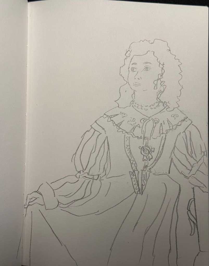
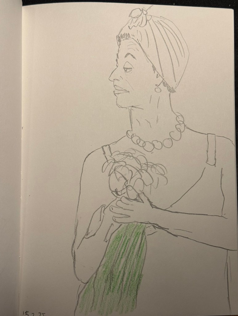
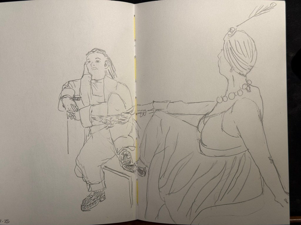
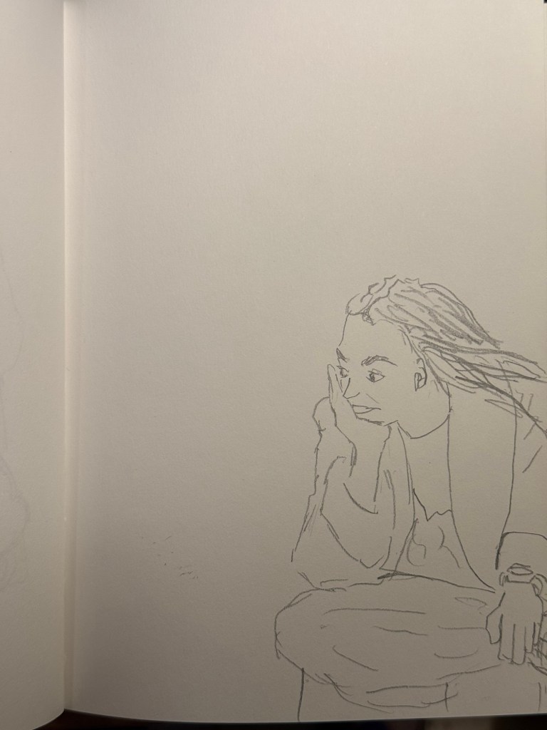
I went to the local art museum again this week, to sketch models in the museum. This was the last time this event was run, and the place was packed with sketchers. I didn’t have the best of locations, but I made the most of it. I sketched with Faber Castell 9000 2B and 3B pencils mostly, and added a touch of colour with Faber Castell Polychromos. The ink sketches were done with a Staedtler Pigment Liner 0.5. The sketchbook I used was once again the French Pascale Éditions. The models did fewer 20 minute poses and more 10 minute ones, which meant scrambling a lot. I wanted to visit the museum after the event, but I was so tired from 3 hours of non-stop sketching that I just went home.
Harman Photo just came out with a brand new colour film, Harman Red. It’s a red-scale film, and I’m curious enough to try and buy a roll or two and test them out. I love the wild, wild results I got with Harman Phoenix and the Harman Red is basically Phoenix pushed even more into red-scale.
Here are the sketches from today, and I hope that you have a great week!
10 minute pose.10 minute pose.10 minute pose.10 minute pose – the hardest pose to draw because of the angle of the head. Had a false start on this one, so had only about 8 minutes for this. 10 minute pose – Staedtler 0.5 pigment liner10 minute pose10 minute pose10 minute poseThe three models. The pose started with just the two top models, and then the third one joined, and it was a 10 minute pose.A challenging composition, 20 minute pose10 minute pose. I like the composition on this one – I placed her on the side of the page to give her room for thought. Final pose, 20 minutes
I have finally written dry all of my Inkvent 2024 fountain pens, which means that after two months I get to write with a whole new set of fountain pens and inks. I normally don’t spend too much time selecting which pen and which inks I’ll use next, but this time I decided to use some criteria for the next pens in my rotation:
They need to include at least 50% vintage pens. I don’t use vintage pens with Inkvent inks, and vintage pens make up most of my pen collection.
All the pens need to be pens that I haven’t used in a long time (at least a year). It was time to mix things up.
The inks needed to be inks that are new to me, or that I haven’t used in years, and all of them need to be inks that I haven’t swabbed before. This was not only to mix things up, but to get me to use and swab more inks in my collection, instead of going again and again to a few select favourites.
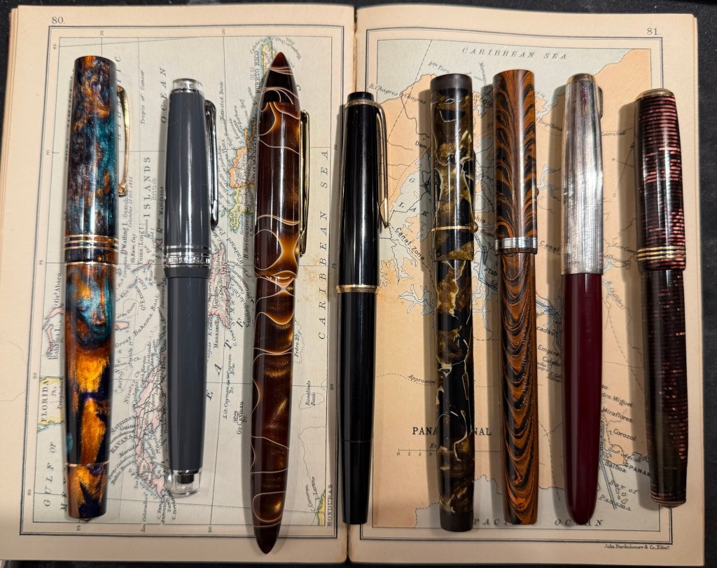
Here’s February’s fountain pen lineup:
The pens from left to right: Leonardo Momento Zero Bohemian Twilight, Sailor Pro Gear Slim Graphite Lighthouse, Edison Nouveau Premiere Cappuccino, Montblanc 32, Mabie Todd Swan L2 Leverless pen, Waterman 52, Parker 51, Parker Vacumatic Standard double striped jewel.
And here are ink swabs of the inks that I’ll be using:
Ink swabs on Col-o-Ring cards
The Vintage Pens
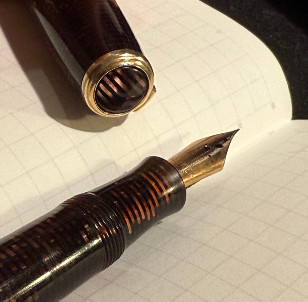
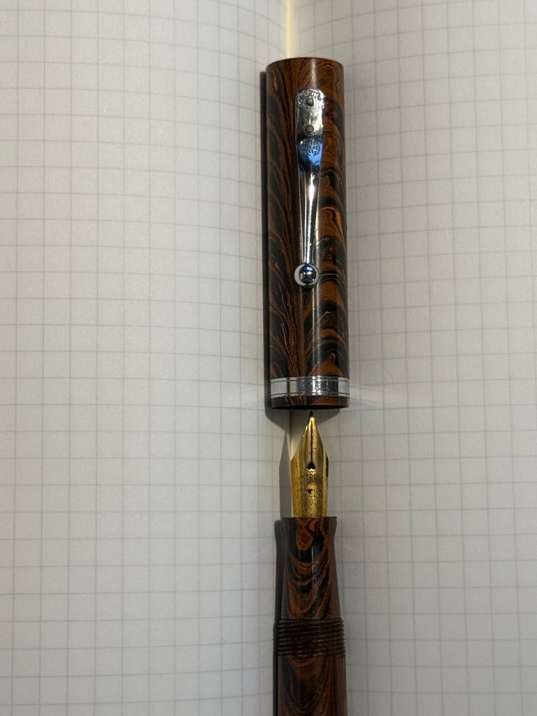
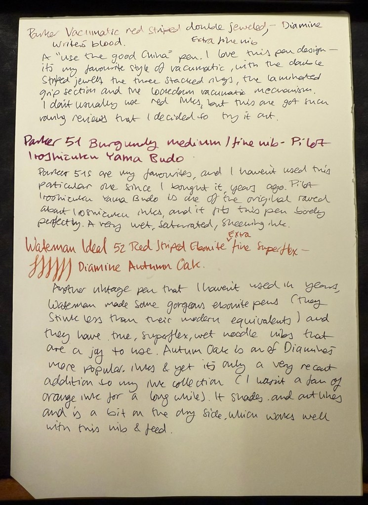
Parker Vacumatic 1st generation Laminated Burgundy Pearl Double Jewel (striped jewels, striped section) – I adore Parker Vacumatics and this is a “use the good china” pen. The grip section is also laminated (and not plain black), the body is transparent, and the nib is a sharp extra fine gold nib with a bit of character to it. It’s filled with a brand new ink for me, Diamine Writer’s Blood. I never use red inks, but this got raving reviews and seemed dark enough for me to try. I bought the ink in Oxford last year, and the pen years ago from the late Henry Simpole (Henry the Pen Man) in London. I don’t think I inked up this pen since I bought it, as it was too precious, and I still won’t let it leave the house, but I am looking forward to actually using it.
Parker Vacumatic first generation burgundy laminated grip sectionCloseup on the striped jewel and the grip section of the Parker Vacumatic
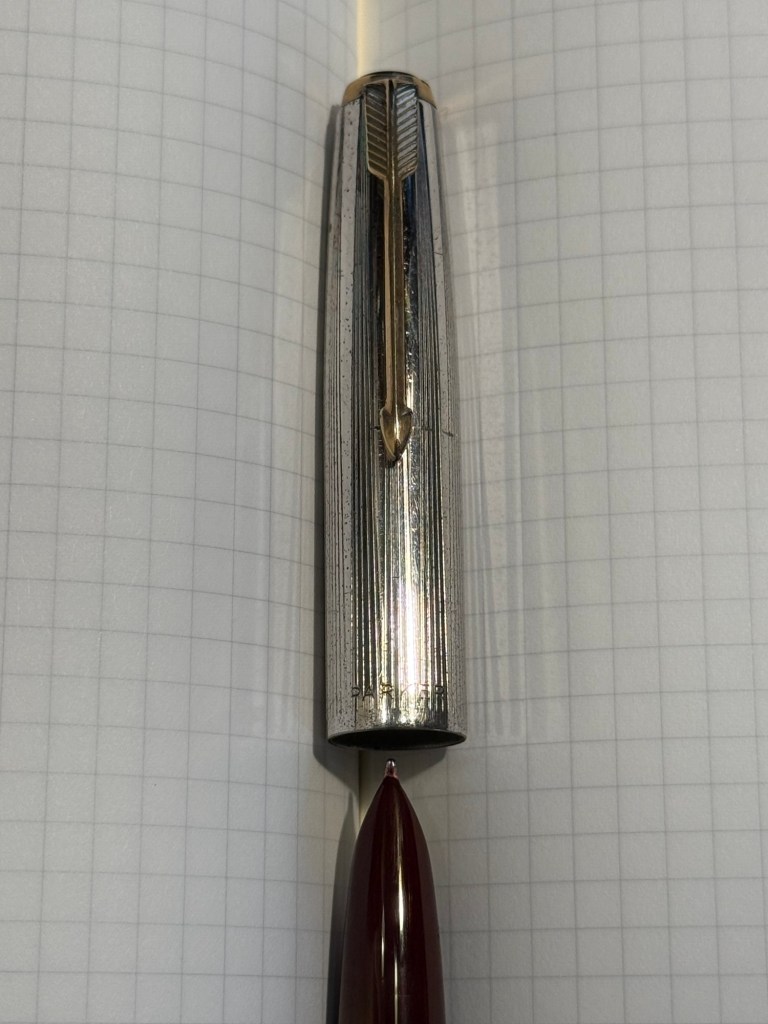
Parker 51 Burgundy aerometric with a silver cap and gold filled arrow clip. I love Parker 51s, they are my absolute favourite fountain pens. I believe this cap is on the rare side, though it’s far from pristine or attractive (it’s blackened in specks, and there are a few scratches and micro scratches on it). The nib is a generous fine, bordering on medium, and like all other 51s that I’ve used, it’s magic. I haven’t used this pen since I bought it, so it’s time to give it a whirl. It’s filled with Pilot Iroshizuku Yama Budo, which is a lovely, sheening burgundy ink, one of the more popular inks in the Iroshizuku lineup. In hindsight coupling this ink with this pen wasn’t the best choice, as the 51 has generous nibs and Iroshizuku inks are on the wet side. It just means that I’ll have to steer clear of cheap paper with this combination.
Parker 51 cap and nib closeup
Waterman Ideal 52 Red Ripple fountain pen with a super flex extra fine nib – my word but this pen has the most glorious nib. The pen itself is elegant and pristine, and because of its age it doesn’t have the ebonite stink to it. The nib is why I bought this pen, and it effortlessly moves between extra fine and broad or double broad lines, with the feed easily keeping up with tines. Like all Waterman nibs that I’ve tried, there is some feedback, so if you like butter on hot pan nibs this one isn’t for you. This is the kind of nib that you can only get in a vintage pen, and it puts modern flex pens to shame. It’s only minus is that this is a lever filler, and I hate cleaning out lever fillers, which is why I rarely use them. This pen is filled with Diamine Autumn Oak, which I haven’t used yet (in bottle form at least – I have cartridges of it). I wanted a brighter ink in this lineup, so Autumn Oak was a perfect choice.
Waterman 52 cap and nib closeup. You know the nib is going to be fabulously flexy once you see that heart shaped breather hole and the slight bend down in the nib. Writing sample on Midori MD Paper. Notes written with a Platinum Preppy.
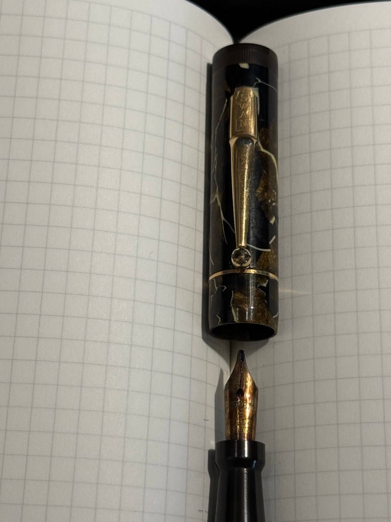
Mabie Todd Swan L2 Leverless L205/62? Not sure – Swan did a poor job labeling their pens, and I didn’t write down notes when I bought it. This is a lovely pen that I bought from Henry Simpole years ago because of the phenomenal Swan nib. It’s an oblique flexible nib with Swan’s gimmicky “Leverless” filling system (which is a lever system in disguise, but such were the ’30s – you needed a gimmick to sell pen). I haven’t used it at all since I bought it because I don’t remember the experience of cleaning it out very fondly – imagine all the bother of cleaning out a Lamy 2000, but with a piston that has just one twist of travel. I used Pilot Iroshizuku Asa Gao with this fountain pen, and it’s a gorgeous ink with a good amount of sheen with this nib. I love this shade of royal blue, and I haven’t used this ink in a while. Take a look at the Swan above – it’s almost 100 years old and works perfectly.
Closeup on the nib and cap of the Swan Leverless penWriting sample on Midori MD Paper. Notes written with a Platinum Preppy.
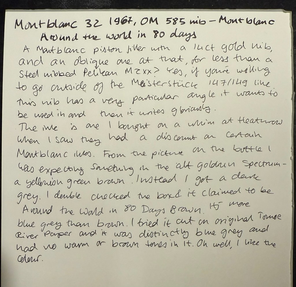
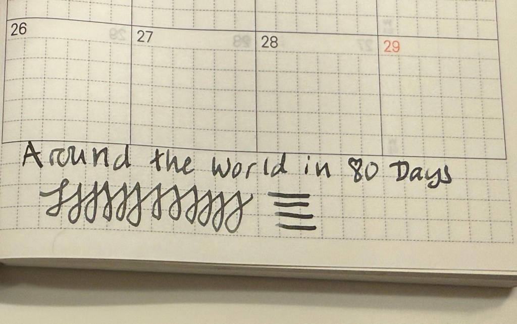
Montblanc 32 (1967) OM 585 nib – heavens, you can get a gold nibbed, piston filling original Montblanc with an Oblique Medium nib for less than a steel nibbed Pelian M2xx costs? Yes, you can. I love the design of this pen (you can read about it more here) and the nib is great… provided you write in the exact angle it expects. The Swan’s nib is generous in terms of the writing angles it accepts, and the Monblanc 32 is demanding: you will use the nib at the precise angle it is designed for, or it will not work at all! I only wish that the Montblanc Around the World in 80 Days ink was so exact. From the description and the illustration on the box I was expecting a brownish gold ink, maybe with a hint of green. In reality I got a dark, cold grey ink, with a hint of blue to it. No brown, no gold, nothing at all to do with the elephant illustration on the box. I had to double check just to make sure that I hadn’t landed on a bad bottle by chance.
Montblanc 32 semi hooded nib Writing sample on Midori MD Paper. Notes written with a Platinum Preppy.Writing sample on original Tomoe River Paper
Modern Fountain Pens
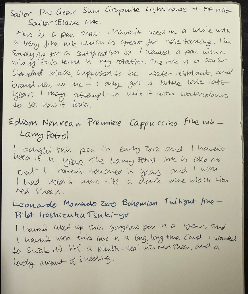
Sailor Pro Gear Slim Graphite Lighthouse H-EF nib – I haven’t used this pen in over a year, and I wanted a pen with a very fine nib, so that I can use it for note taking. It’s inked up with Sailor Black, a new ink for me and one that’s supposed to be water resistant. I’m using this combination for my certification study notes, and I may also try it out with some watercolours in a sketch, just to see if I can use Sailor Black ink as part of my sketching kit.
Edison Nouveau Premiere Cappuccino fine nib – I bought this pen in early 2012, before they did a run of seasonal limited editions of this pen design. I haven’t used in years, and the same goes for the ink in it: Lamy Petrol. This is a limited edition ink, one that Lamy issued with the Lamy Safari Petrol, and it’s a wonderful blue-black with red sheen.
Leonardo Momento Zero Bohemian Twilight fine nib – this pen has “only” been a year out of rotation, and it’s one of my favourite Leonardos. The colour of the resin is gorgeous, and it works very well with the Pilot Iroshizuku Tsuki-yo ink that it’s filled with. Tsuki-you is a bluish-teal with red sheen and a wet flow, and it suits the Leonardo’s fine nib.
I haven’t done a watercolour sketch in a while, so I broke out the trusty Moleskine Watercolour sketchbook, my Staedtler Pigment Liners (0.3 and 0.5) and my Schmincke and Daniel Smith watercolours and made this quick sketch:
Prickly pear watercolour sketch
It was fun and it took me less time than I thought, so I should do it more often.
This was a big ink week, as I wrote many of my Inkvent fountain pens dry: Wishing Tree, Snow Globe, Winterberry, Salted Caramel, Pine Needle, Nutmeg, and Wilted Rose. I also dumped Sleigh Ride as I found the ink colour depressing. This leaves me with 9 Inkvent inks still inked in my pens, with most of them half or quarter full. I doubt that I’ll be able to write them all dry by the end of the month, but hopefully I’ll get as close to that as possible. In any case I’ll reassess in the beginning of February if I want to keep using my Diamine Inkvent inks or if I’ll just dump out and clean up whatever I still have inked at the time and start fresh.
I finished reading “The New York Trilogy” and it’s a very Paul Auster book. Next week I’ll start on “The Last Kashmiri Rose” by Barbara Cleverly and finish “The Comfort Crisis” by Michael Easter.
Have a great week full of pens, books and good news.
I’m a week away from getting back to a 10k long run, and the running weather has been pretty perfect so far. I ran a 30 minute hilly recovery run today and for the first time ever I ran it without headphones. I normally run with earbuds and listen to podcasts or music, except during races where I leave my earbuds at home for safety reasons (and to get the full race experience). It was relatively early and the trail I was running through was deserted, so it was quite the experience listening just to birds and the sound of my feet and my breath. This is definitely something that I plan on adding to my running routine.
Reading
I’m two thirds into “The New York Trilogy” by Paul Auster and I’m dreading starting the 3rd and final story. The writing is excellent, but it’s like reading through version after version of Bartleby the Scrivener – not something that you particularly want to do. I’ve come so far that I will finish the book at this point, but after reading several Auster books it’s clear to me that while he’s a very good writer, his books are not for me.
Meanwhile I’ve started on “The Comfort Crisis” by Michael Easter, and though it is clear that it suffers from many of the same problems that books of this kind suffer from (cherry picking or hand waving “research” over complex and nuanced topics), there are some interesting ideas within.
Fountain Pens
I’ve decided to sketch more with my Inkvent ink filled fountain pens to try and run them dry more quickly, so here’s a motorcycle sketch done with a Levenger True Writer Cappuccino with a fine nib and Diamine Nutmeg.
It’s the beginning of 2025, so it’s time to go over my full planner setup for both work and home. None of this setup is truly new, as I’ve used much of it during part or all of 2024, but there are a few tweaks and minor adjustments that I’ll highlight. As I use a 13 week year (or a quarter) in my planner, I started Q1 of 2025 on the 29th of December and not the 1st of January.
The heart of the system is my weekly planner. I started a new one in 2025, and after some deliberation I decided to splurge on a Leuchtturm1917 Bullet Journal and not just the 120gsm edition because I like the endpapers and it was only a few dollars more.
The setup of this planner is divided into two parts:
Lists
I crossed out all the bullet journal related headers and created list pages of my own from page 3 to (potentially) page 75. Currently they include: Unread Books on My Kindle, Mindful Consuming (a list of things that I actually want to watch, not algorithmically recommended), Conversations not Connections (A list of people that I want to invest time in, not just like their Facebook posts. This makes sure that I don’t fall out of touch with people, but actively initiate phone calls, meetups or skype/zoom calls for those that are abroad), List of Courses that I’ve Enrolled To (I started this list during Covid, and it tracks which online courses I’ve enrolled to and need to complete), Things from Abroad (a running list of packages that I’m expecting. Yes, I know there are apps for this, but writing it down helps me be more aware and careful with what I’m buying and how much), Blog Post Ideas (self explanatory), Books to Review (self explanatory), Medium Post Planning (as part of my focus on work, I decided to make my work more visible by writing more Medium posts this year). I will be adding to these lists over the next year, and copying them over to the next notebook once I finish with this one.
Quarterly and Weekly Planning
Starting at page 76, this section will include four quarterly plans and four 13 week double spreads. Each quarterly plan can take up to four pages (Q1’s plan takes 2.5 out of the 4 currently, but that’s OK. The extra is in case something major happens and I need to work out a pivot or significant change into my plans), and is divided into various subsections. I’ll write a separate post about my Q1 plan and how I worked on it, but you can read about the process here.
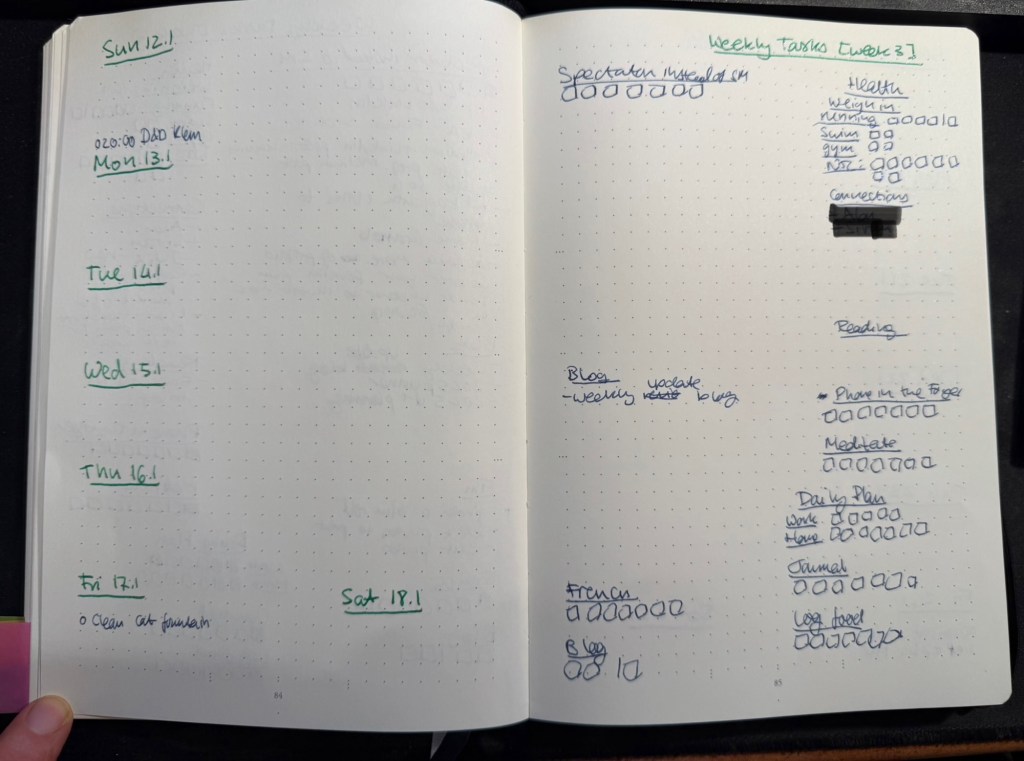
Then come 13 weekly spreads, each one taking two pages. The left side of the page has the weekly calendar, with events on it plus my exercise plan for the week. It’s also where I note things that I want to remember that need to happen on a certain day that week. Every week on Friday or Saturday evening I plan the next week, and for this side of the weekly plan I mark significant weather events, plan my running, swimming and gym schedule, transfer important events and meetings from my calendar (these are all things that I need to prepare for actively), and set reminders (like clean the cats’ water fountain on Friday, or replace filters on things, etc).
The left side of the page is taken mostly by various trackers, and by my weekly goals (they go in the empty spot in the middle) which I select from my quarterly goals each week. Any goals that can be managed by trackers are managed by trackers – either trackers in my planner, or trackers in the Streaks app. The reason I don’t track everything in an app, is to make sure that I have to reference this planner at least once, likely twice a day, every day. That helps keep the weekly goals, which are tied to the quarterly goals, top-of-mind.
I use two different colours of ink for these pages – when I plan the quarter I create 13 weekly spreads with just the dates and the “Weekly Tasks” title with the week number. Then I work everything else in on a week by week basis with whatever fountain pen I am using at the time. That helps keep things clearer for me without me having to spend a lot of time “prettifying” my planner.
Weekly page in my home planner
Daily Plan
Every day I take a sheet of A5 Kokuyo KB paper and write the day and the date on top. Then I write a running list of tasks that I want to complete that day. This includes chores, daily routines, and tasks that I’ve pulled from my weekly planner. I cross them off as I go along, and at the end of the day either I flip the page and create another daily planner for the next day on the other side of the page, or I crumple the page up (if it’s used on both sides) and throw it into the recycling bin. I don’t keep these pages, since anything important in them is already in my journal.
I recently started tracking if I prepare a daily plan for every day at work and at home, and the reason is that I’ve discovered time and again that if I don’t have a plan, I am liable to just get back from work and veg out with a book or silly YouTube videos.
Monthly Plan
The monthly planner is tiny, and its only goal is to give me a better feel for how my month looks, and what major events lay ahead. It also tracks some things – books (which I track on a monthly basis), running (I track this twice because I also want to get a feel for my monthly load), swimming (the same – tracked on both weekly and monthly basis to get a better feel for my training load), gym (which doesn’t appear in the photo below because I haven’t finished creating the page), blog (how many blog posts I’ve written this month), and there’s usually an Apple challenge tracker.
Monthly planner
What About Projects/Backlog Items?
Most of my long term projects are tracked as part of the quarterly plan. For instance, I’m working on getting a certain professional certification this quarter, so I have that certification listed under my professional goals. The breakdown of this headline to individual tasks is something I do in the project specific notebook that I’m using for my study notes, tips that I’ve collected about the exam, etc. I then can just reference the headline task (the certification name in this case) in my weekly and daily plans, and reference what exactly I’m supposed to be working on next in my project notebook. It saves having to copy a lot of things over and over.
As for general “backlog” items (shopping lists, packing lists, travel plans, things I want to get to sometime in the future but aren’t part of my quarterly plan, recurring tasks tied to various medical checkups, etc) – these are all managed in the Things app. It’s easier to manage recurring and long term tasks like these in an app, and when it comes time to actually do them I reference them (or sometimes copy them) into my weekly and daily plans. I have very few tasks in Things, and sweep of the tasks there once or twice a week is enough to ensure that I haven’t forgotten anything.
Work Planner Setup
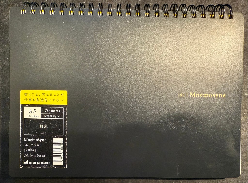
This consists of a Leuchtturm1917 dotted A5 hardcover notebook that I bought at the local art museum, and Maruman Mnemosyne A5 with blank paper (though I also use the squared paper Mnemosyne indiscriminately, if that happens to be what’s available). As I work 3 days a week from an office and 2 days a week from home I needed a setup that’s as simple and as light to carry as possible, and after some trial and error this is what I’ve been using for over a year.
My work planner and a piece of blotting paper – a must with this paper
The work planner, my Leuchtturm, is a daily planner, with each day divided into three parts. The top of the page has the day and the date, and the upper third part of every page is for the tasks I plan on working on that day. I deliberately make sure that less than half of the A5 page is left for tasks, because otherwise I’ll just jam in much more than I can do in a day and then feel bad at the end of the day for no good reason.
The last thing I do before signing out at work is to fill in the next day’s page. That includes pulling out the next tasks I plan on working on from Jira (we use Jira to plan tasks and projects at work), and leaving about half of the task area open for things that will pop up during the day. The nature of my job is that I’m constantly working on about 50% unplanned things, so I have to leave myself enough room to take that into account.
Next come the meetings, which I track under a separate heading. I set them apart so that they don’t disappear into my ever changing task list. This is also useful for me to reference when I’m planning my day, both in terms of how many tasks I think I can get to, and in terms of preparing for certain meetings.
The Notes section is where I write down things that I need to take into account or remember that day. If a team member is taking a day off I note it here to remind myself not to message them. If I am on “on call” duty I note it here so that I can significantly reduce the number of tasks I’m working on that day. I also look ahead a bit, and if I see a project deadline looming, I’ll note it in the notes section, so that I remember to prioritize my tasks accordingly.
Daily spread in my work planner
The Mnemosyne serves as my “dashboard” and catch all. If I’m working on a project, this is where I’ll plan out the project before inputting whatever relevant tasks there are into Jira. I reference and work with this page while I’m working on the project, and that’s why I view this notebook as the “dashboard” for my current work.
The Mnemosyne is also where I keep a running list of things I want to get to. All of these things will have to be formalized into Jira tasks before I can work on them, but it’s useful for me to have them down on paper first because I think better on paper.
Maruman Mnemosyne “Dashboard”
I don’t use scrap paper at work as I want to be able to reference these things in the future, and as a rule I don’t journal about my work tasks.
That’s my full planner setup for 2025, and as all of it has been in use throughout 2024 with great success I doubt that it will see much change.
I’m finally done with reviewing the Diamine Inkvent 2024 Black Edition calendar and it’s been exhausting. I haven’t been able to get a proper buffer for the even this year, which meant that I was chasing every post every day.
On the plus side, it was nice to dust off 25 bears and sketch them. My sketching and my blogging had been in a rut recently and this event kickstarted them, so I am grateful for that. I also got some lovely comments from people, which is always wonderful to read.
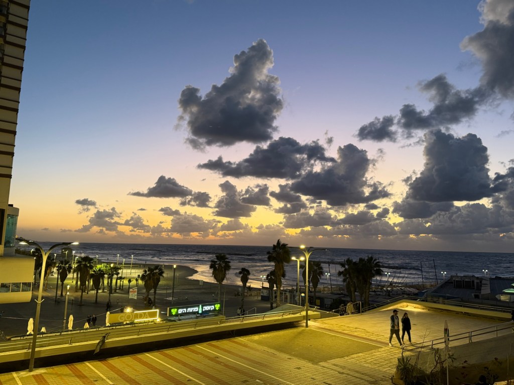
Wild sunset today
Cal Newport
The latest episode of Cal Newport’s Deep Questions podcast was excellent, and in the final segment Cal discussed his new approach to making a quarterly plan. It’s worth listening to, but basically his idea of pillars and foundations and focusing on a certain pillar at a time really resonated with me. My next quarter will be focused on craft as a pillar, as I want to earn a professional certification and work towards a deeper understanding and more hands on experience with certain more obscure aspects of my job.
Reading
I finished reading the HBR “Dealing with Difficult People” book, and started reading Paul Auster’s “The New York Trilogy”. So far it’s a very Paul Auster book, for good and for bad.
Impressionism
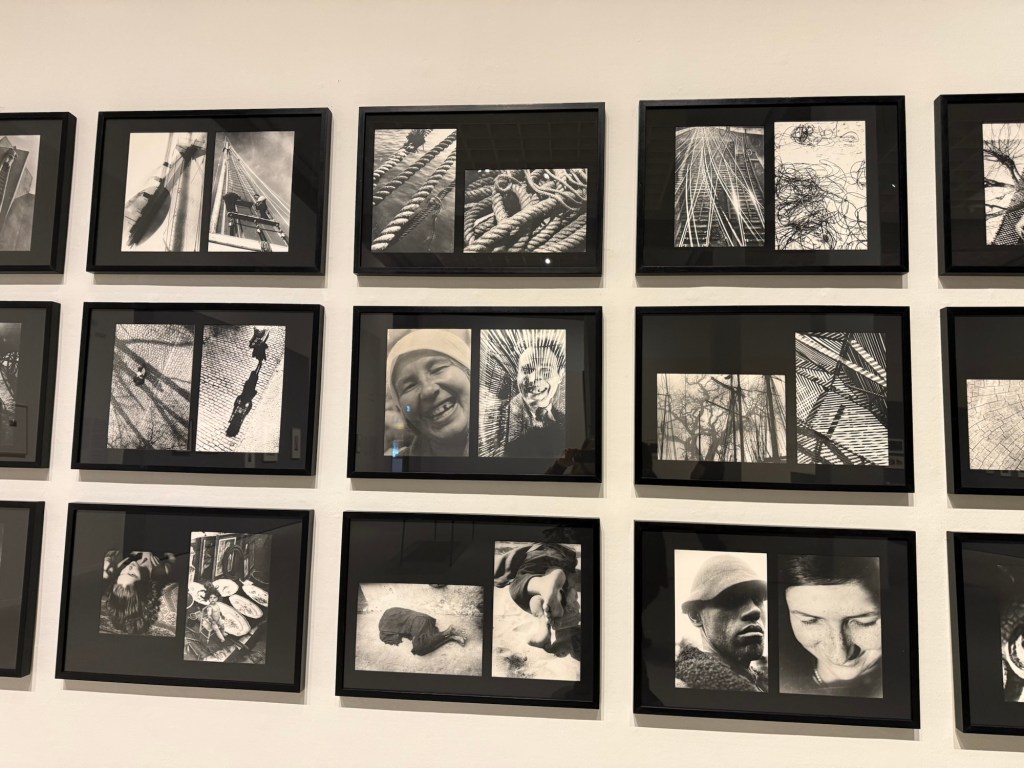
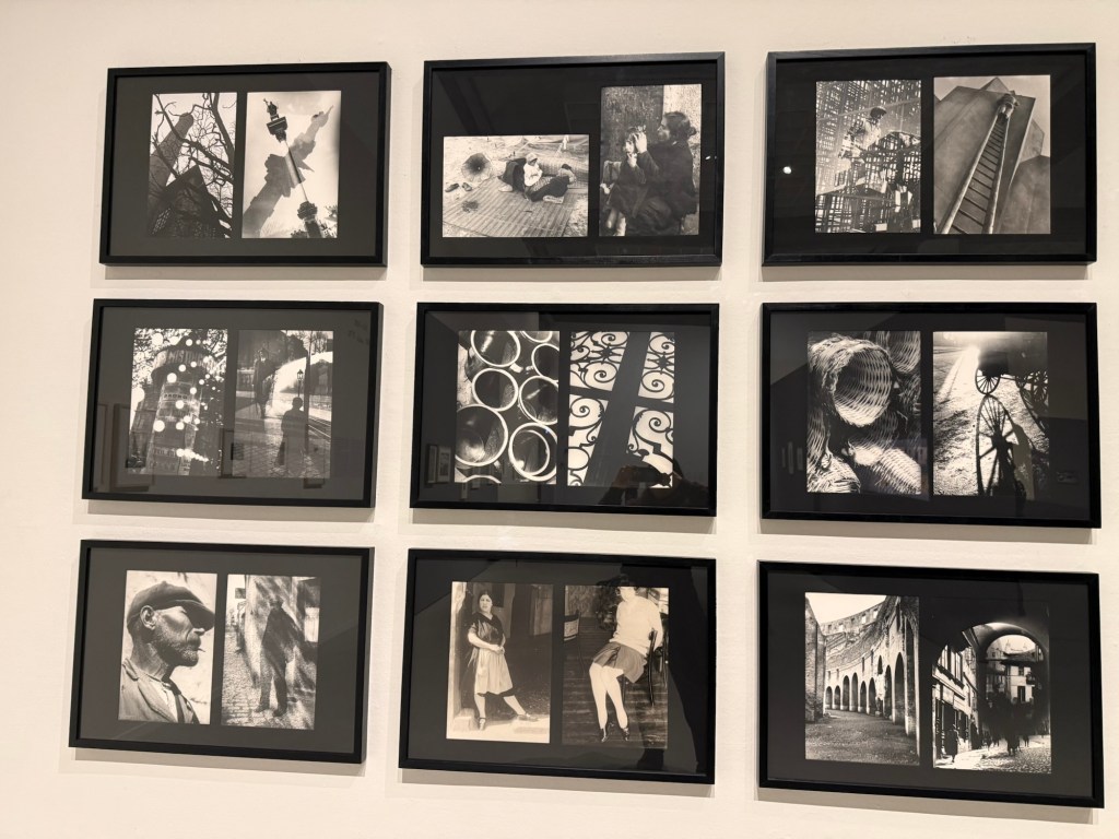
I went to see an Impressionist exhibition, celebrating 150 years to the movement, at the local art museum. The exhibition itself was nice enough, but a bit thin in terms of the artwork on display. There was also a nice print exhibition, and an excellent retrospective exhibition dedicated to Moi Ver. It was wonderful seeing a master photographer at work, and his design work is also worth seeing.
Ci-Contre Moi VerCi-Contre Moi Ver
I went to the museum store later and went a little wild, purchasing a handmade ceramic cup made by a local artist, three postcards (which I wrote on and will give away), and a Leuchtturm1917 A5 dotted notebook that I didn’t need but I wanted anyway. I bought a Leuchtturm notebook the last time I was in that store, and it’s now my work daily driver notebook, so I assume I’ll find use for this notebook soon enough. The paper isn’t perfect, but it’s good enough for me for daily fountain pen use.
For the introduction post to 2024’s Inkvent, see this post.
Diamine Inkvent 2024 Black Edition is the fifth edition of their Inkvent calendars, and I’m sorry to say that it’s by far the worst. Partly it’s 2023’s Inkvent Purple Edition’s fault, as it’s the strongest of the Inkvent calendars to date and so it created high expectations for the Black Edition. But there were several things that went wrong with this year’s calendar that made it an overall disappointing experience:
There are four previous Inkvent calendars, and there’s only so many ink shades in the world. The black edition featured a lot of inks that were pretty similar to ones seen in earlier Inkvent calendars.
This year’s “special effect” was “Extreme Sheen” and it just doesn’t have the same impact as effects like Chameleon and Star Bright that we saw in previous calendars.
The “Extreme Sheen” effect didn’t improve all the inks it was applied to.
Almost a third of the inks in this calendar were in the “dark and bland” range: grey, brown, black. There’s only so much joy a brown ink can spark.
There were very few bright inks and not all the bright were great (see Lemon & Lime and Fruit Cocktail discussed below).
A good number of the inks had very little festive appeal. This wouldn’t have been a big deal if Diamine hadn’t set the festive bar so high: they deliberately name their inks for festive or wintery things. Previous Inkvent calendars did much better in this regard (the first ones, the Blue Edition and Red Edition took this a bit too far), so it’s hard not to be disappointed in the Black Edition’s performance on this front.
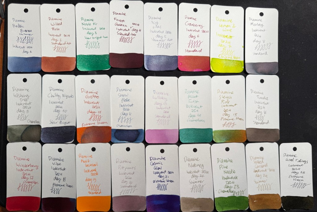
Here’s all this year’s inks in order (read further on for a breakdown of each group and buying recommendations):
All the 2024 Inkvent Col-O-Ring ink swabs
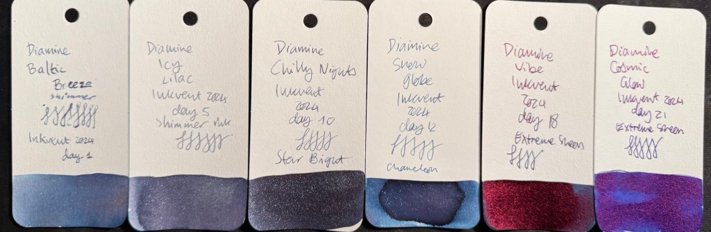
Blues
There were six blue inks in this year’s Inkvent:
Two shimmer inks, Diamine Baltic Breeze and Diamine Icy Lilac. These are nice inks that are very similar to one another and similar to previous blue shimmer inks from past Inkvents. These go into the “nice but not exciting” category, and score decently on festive appeal.
Two “Extreme Sheen” inks, Diamine Vibe and Diamine Cosmic Glow. These feature the new effect for this year’s Inkvent and feature it well. Overall these are two of the strongest inks in this year’s calendar in terms of “wow” effect, even though they’re not exactly holiday themed.
One chameleon ink, Diamine Snow Globe. The chameleon effect is always nice and interesting, but the base blue ink is nothing new, and it also goes into the “nice by not exciting” category.
One Star Bright ink, one of only two Star Bright inks in the calendar, Diamine Chilly Nights. The fact that there are only two Star Bright inks in this calendar contributed to this year’s Inkvent being so underwhelming. There is no greater wow effect than a Star Bright ink on a dark ink, and Diamine Chilly Nights really delivers on that front. The base blue black is very nice, and if you enjoy using shimmer inks then Diamine Chilly Nights is definitely an ink to consider.
All in all the blues in this year’s Inkvent were the strongest overall group by far.
All the blue Inkvent Col-O-Ring ink swabs
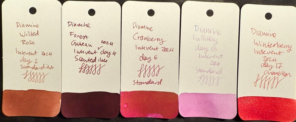
Pinks and Reds
There were five pink and red inks in this year’s Inkvent:
Three standard inks, Diamine Wilted Rose, Diamine Cranberry and Diamine Lullaby. Diamine Wilted Rose is a nice and interesting “antique” rose colour, Cranberry is a decent but not overly unique ink, and Diamine Lullaby is on the “barely readable” spectrum. Of these three the standout ink is Diamine Wilted Rose, and it’s not a “star” ink by any measure.
One scented ink, Diamine Forest Gateau. I loath scented inks so I won’t elaborate on this one.
One chameleon ink, Diamine Winterberry. This is the standout ink in this group, one of the few bright and festive inks in this calendar, and a great ink to buy if you’re looking for a “Christmas greeting cards” ink. A breath of fresh air among the washed out and dark colours of this year’s calendar.
All the red and pink Inkvent Col-O-Ring ink swabs
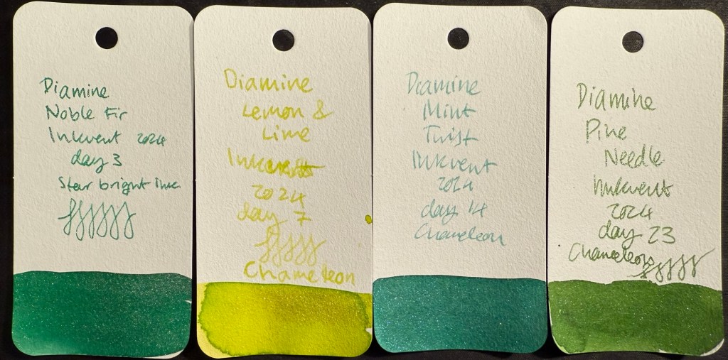
Greens
There were only four greens in this year’s Inkvent:
Three chameleon inks, Diamine Lemon & Lime, Diamine Mint Twist and Diamine Pine Needle. Lemon & Lime is unusable even in a wide and generous nib as it’s way too bright and light to be readable. Diamine Mint Twist is the standout ink in this group, the one with the most unique base ink colour. Pine Needle is nice enough, but there have been plenty of inks in this colour before.
One “Star Bright” ink, the only other one in the calendar, Diamine Noble Fir. It’s not as impressive as Diamine Chilly Nights because the base ink colour isn’t dark enough for the Star Bright effect to have the most impact. It’s a good, bright green ink though.
All the green Inkvent Col-O-Ring ink swabs
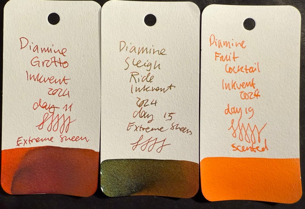
Oranges
There are three oranges in this year’s Inkvent:
Two “Extreme Sheen” inks, Diamine Grotto and Diamine Sleigh Ride. Of the two Diamine Grotto is a great ink, and Sleigh Ride is poorly named and features a rather unattractive combination of an orange base and green-brown sheen. If you like rust effects you might enjoy it, otherwise, Diamine Grotto is the better choice.
One scented ink, Diamine Fruit Cocktail. I think that this is the worst ink in this year’s calendar for having a combination of scent and zero shading.
All the orange Inkvent Col-O-Ring ink swabs
Darks – Greys, Browns, Blacks
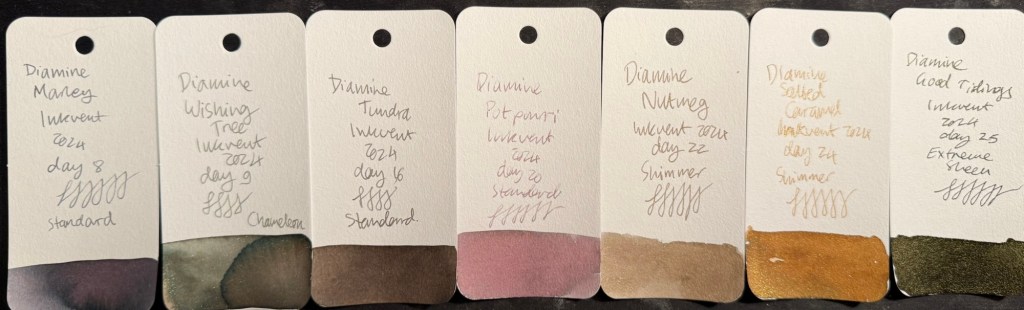
There were seven (!) inks in this category in this year’s Inkvent:
Three standard inks, Diamine Marley, Diamine Tundra, and Diamine Potpourri. Of the three Diamine Marley is by far the best, with Diamine Potpourri being too light to be readable (I could have placed this ink in the pinks category, but it’s so greyish and washed out that it felt more in place in this category), and Diamine Tundra being greyish brown, if you’re into that shade.
Two shimmer inks, Diamine Nutmeg and Diamine Salted Caramel. Of the two I prefer Diamine Salted Caramel, though there have been similar enough inks in previous Inkvents for you to feel free to skip this one.
One chameleon ink, Diamine Wishing Tree. The strongest ink in this group and one of the best inks of this year’s Inkvent, Wishing Tree has a great combination of a fantastic base ink colour and a lot of added interest from the chameleon effect.
One “Extreme Sheen” ink that was supposed to be the highlight of this calendar, Diamine Good Tidings. I found it far from “extreme sheening” and the sheen effect was a very unattractive dirty yellow.
All the dark Inkvent Col-O-Ring ink swabs
Summary
So these are the inks that I would consider buying from this year’s calendar (with the addition of Diamine Winterberry if you see yourself needing a festive red ink): Diamine Marley (interesting duo-chrome ink), Diamine Wishing Tree (duo-chrome interesting base shade ink with great chameleon effect), Diamine Grotto (great base orange ink with attractive extreme sheen), Diamine Mint Twist (unique green with a chameleon effect), Diamine Vibe (attractive dark turquoise ink with great extreme sheen), and Diamine Cosmic Glow (great royal blue base ink and wild extreme sheen).
All the inks that I would consider buying Inkvent Col-O-Ring ink swabs
As a reminder, this year’s Inkvent wasn’t sold out, which means that if you’re interested in these inks and haven’t yet gotten the calendar you can expect it to be on sale in various places soon enough. It’s a great way to get a good amount of varied ink samples, and each little bottle is good for at least 2-3 fillings (plus there’s a big 30ml bottle in day 25).
Midyear, at around June or July, Diamine will come out with the “Black Edition” of these inks. These are 50ml editions of the Inkvent 2024 Black Edition inks, in gorgeous glass bottles. They make for great gifts, and are worth getting as they’re very well priced for the “premium ink” experience.
I have 20 fountain pens filled with Inkvent inks in rotation at the moment, and it will take me a while to work my way through them. Will I do Inkvent again next year? I don’t know. The price plus shipping has gotten steeper every year, and this year’s calendar was a pretty big disappointment in my opinion. When pre-orders start for next year’s Inkvent (if there will be one), I’ll have to really consider it.
What are your favourite inks from this year’s Inkvent? What did you think of the Inkvent Black Edition?
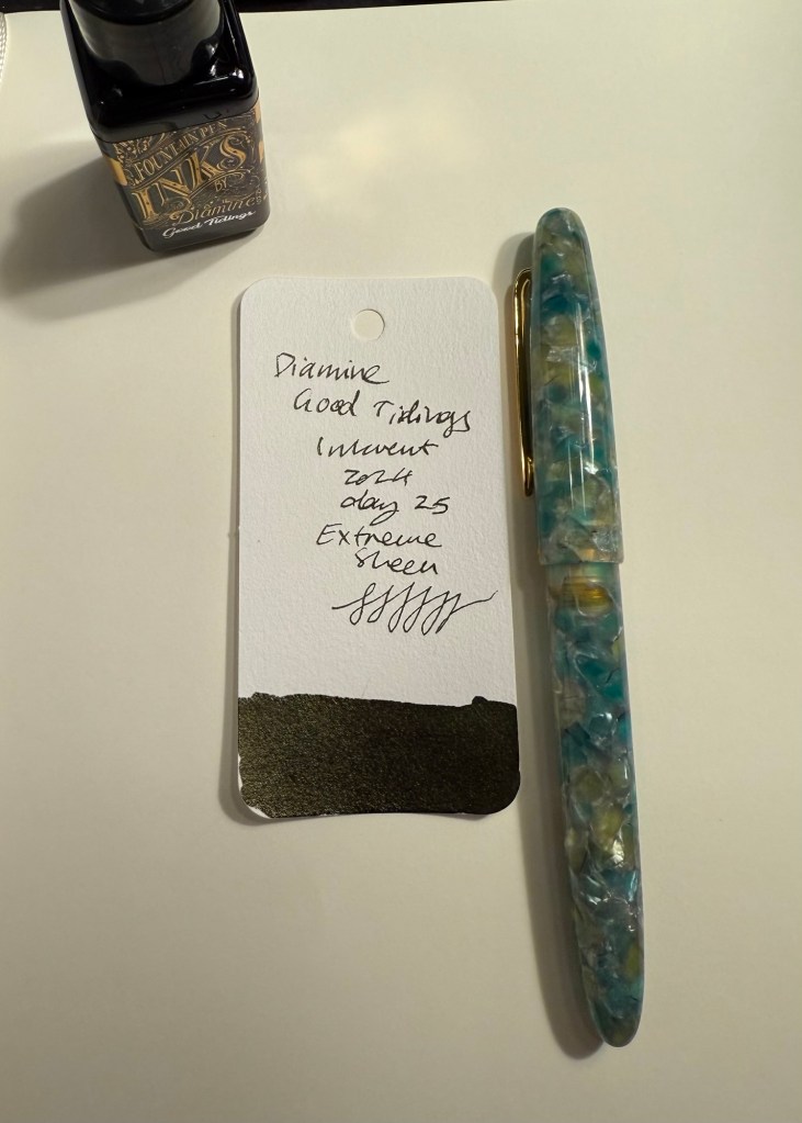
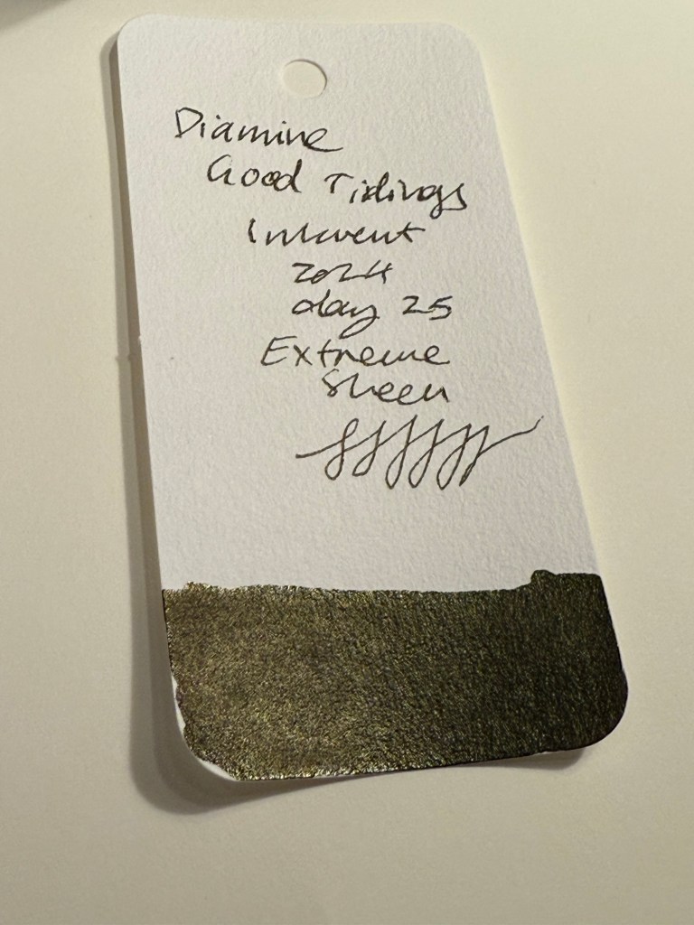
Day 25’s ink is a full 30ml bottle of Diamine Good Tidings, a black ink with what is meant to be gold Extreme Sheen. I used an Esterbrook Estie with a Journal nib to test this ink out.
Col-O-Ring swab
I don’t think that I could be more disappointed in a “grand finale” Inkvent ink. Diamine Good Tidings would obviously need to be black because this is the Black Edition of the Inkvent calendar, but the choice to make it an “Extreme Sheen” ink was a poor one. I understand the logic behind this choice (“Extreme Sheen” is a new ink property for this year’s calendar, so of course the ultimate ink of the year needs to have this property), but the result is very underwhelming. The sheen is barely observable, and the result is just a deep black ink.
Different angle of Col-O-Ring swab
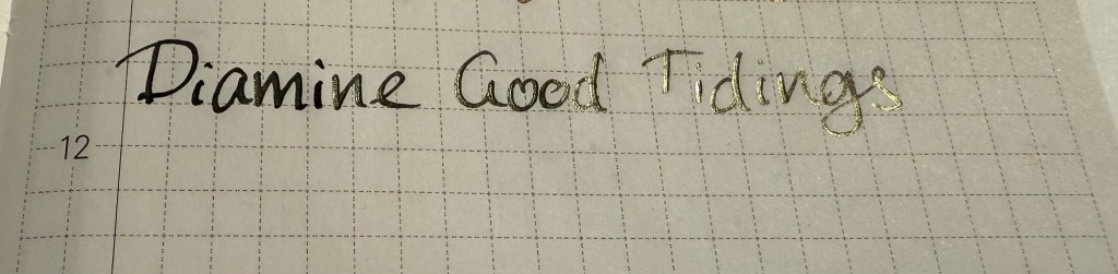
Even on original Tomoe River Paper you can barely see the sheen, and when it appears it makes Good Tidings a less attractive ink to behold, not a more attractive one. The choice of silver shimmer or a chameleon effect would have been better for this ink. When the sheen does appear it’s a sickly yellow colour, not the gold that Diamine were likely going for.
Writing sample on original Tomoe River paper
On Rhodia paper Good Tidings simply looks like a very saturated black ink, with no visible sheen. The drying times aren’t great, but if you’re looking for a solid black fountain pen ink Diamine Good Tidings is pretty good.
Writing sample on Rhodia paper
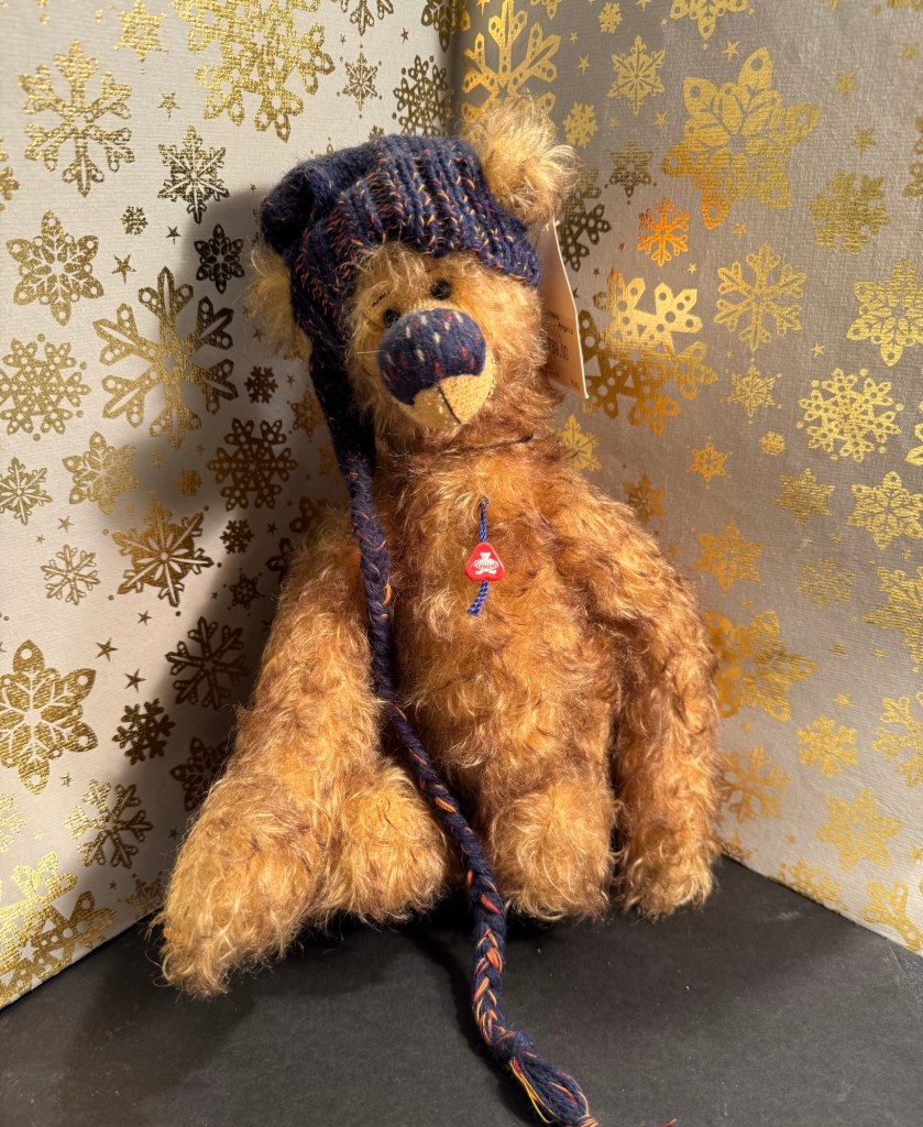
On Midori MD Cotton paper the sheen becomes more visible, but it’s far from what I would term “extreme sheen” and it mostly fades to the background. You can barely see hints of it in the writing in today’s bear sketch:
Bear sketch on Midori MD Cotton paper
Only at a sharp angle and close up you can see the yellowish gold where the ink pooled, such as in the eyes. The nib I used lays down a generous amount of ink, so I would have expected to see more of the sheen than actually appeared here:
Close up of the sketch on Midori MD Cotton paper
The final bear for this year is Tossi, designed by Margarete Nedballa, numbered 115 out of 399 and made by Clemens Bear (so he’s a German bear). I don’t normally like clothed bears, but I liked this fellow’s hat and the way that it matched his unusual nose, which is why I got him. He’s from a store in York called “Christmas Angels” which was wonderful and is now closed (it didn’t survive the pandemic). It was dedicated to Christmas toys and decorations all year round, and had a collectors’ teddy bear room on the top floor.
The bear
Diamine Good Tidings is a nice black ink that I will likely use quite a bit, but for the crowning glory of this year’s Inkvent it’s a bit of a disappointment. I was expecting something with more pizzazz, more of a wow effect.
That’s it for this year’s Inkvent. I will be posting a summary post with buying recommendations and an overview of all the inks over the weekend. In the meanwhile have a Merry Christmas, a Happy Hanukah, and peaceful holidays.
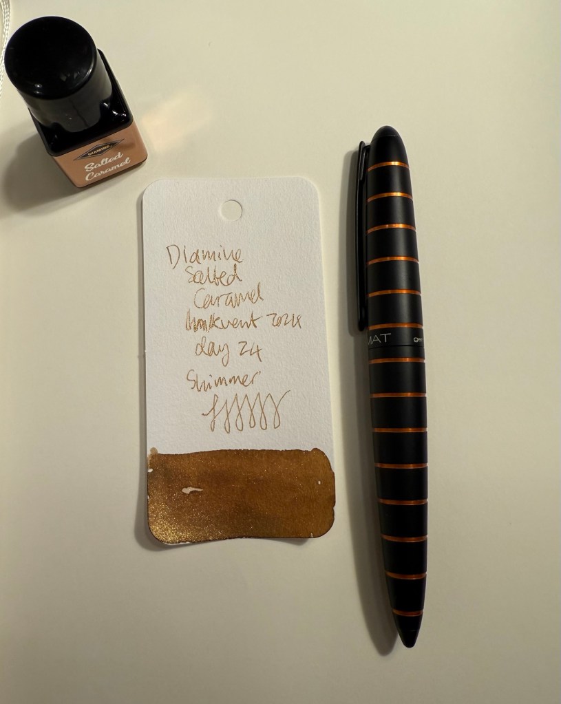
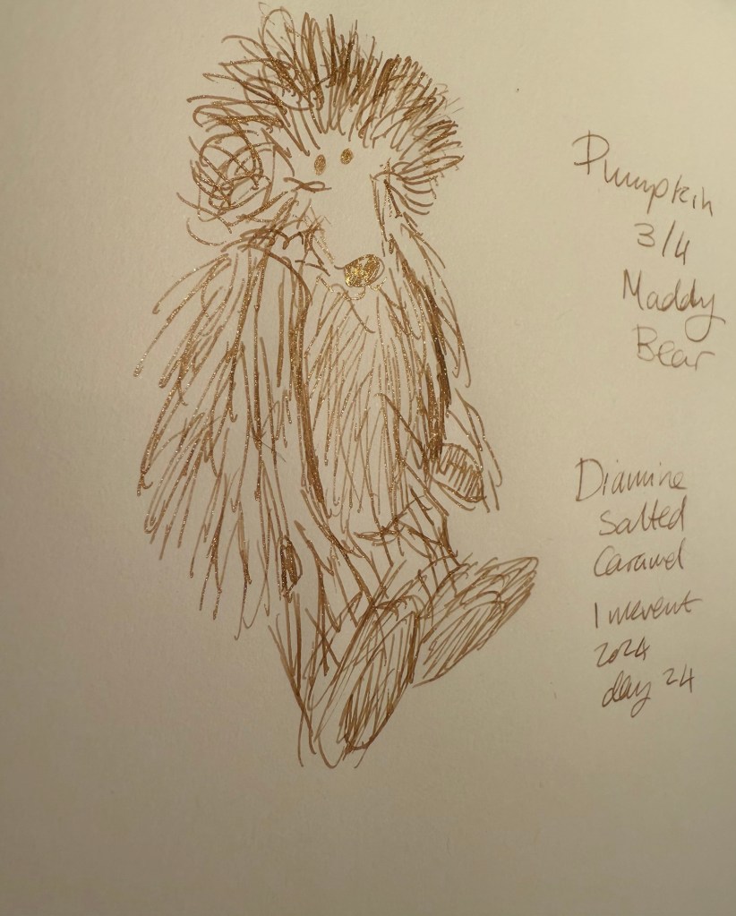
Day 24’s ink is Diamine Salted Caramel, a caramel brown ink with bronze shimmer. I used a Diplomat Elox fountain pen with an extra fine nib to test out this ink.
Col-O-Ring swab
Diamine Salted Caramel is a raw sienna brown ink with a good amount of shading and a good amount of shimmer that shows through even with an extra fine nib. The bronze shimmer gives it a festive, golden sparkle.
Close up of Col-O-Ring swab
Here’s a closer look at the shimmer effect in this ink:
Different angle of Col-O-Ring swab
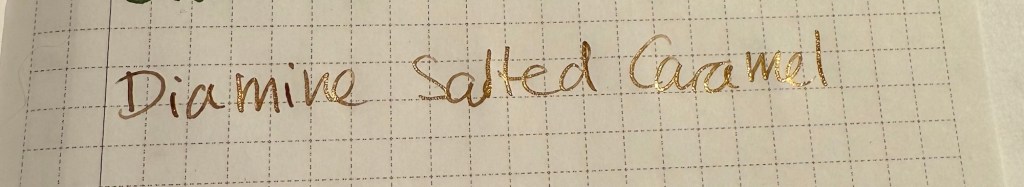
On original Tomoe River paper you can see both the shading and the shimmer quite significantly:
Writing sample on original Tomoe River paper
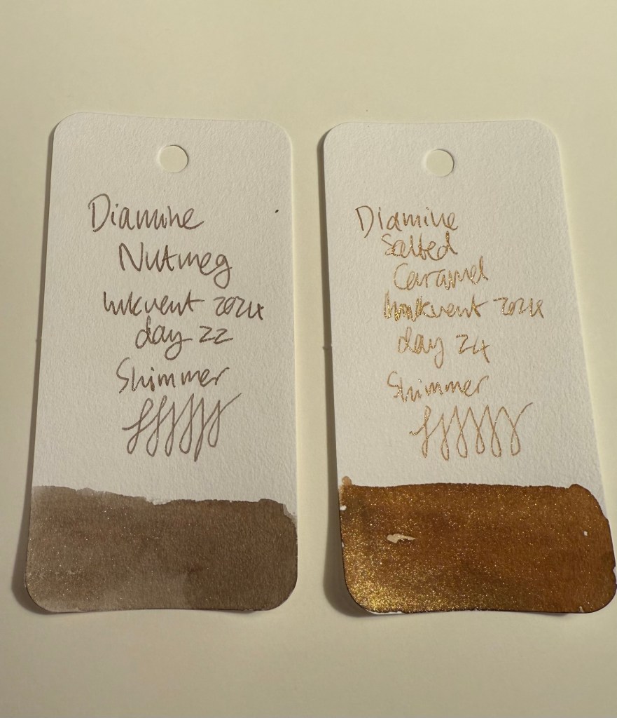
However, even on more absorbent Rhodia paper and with an extra fine nib the shimmer and shading are evident. As only the day before yesterday featured a brown ink with shimmer (Diamine Nutmeg), it was a bit surprising to see another brown ink with shimmer make its appearance. I like Salted Caramel more than Nutmeg, though, because it’s a warmer shade of brown.
Writing sample on Rhodia paper
Here’s another look at the Rhodia paper writing sample, where both shading and shimmering are apparent:
Different angle of writing sample on Rhodia paper
And here’s a comparison of Diamine Nutmeg to Diamine Salted Caramel:
Col-O-Ring swab comparison of Diamine Nutmeg to Diamine Salted Caramel
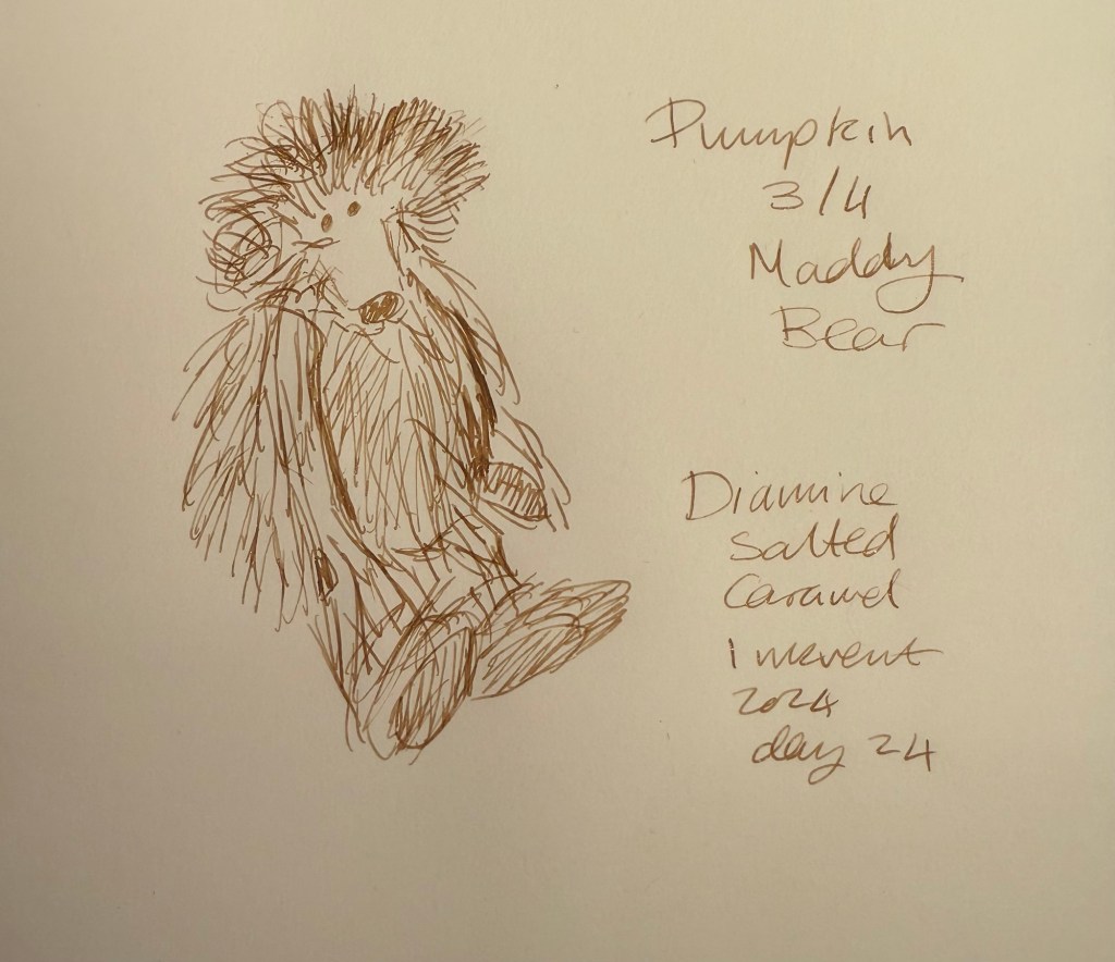
I enjoy sketching with brown inks, and Diamine Salted Caramel was no different. I did have some weird flow issues at start, but they passed so maybe it was a one time thing. Salted Caramel shades beautifully, and so it’s nice to loosely sketch with it.
Bear sketch on Midori MD Cotton paper
You can see where I had flow issues on the top right corner of Pumpkin’s head (the faded brown lines beneath the more prominent ones):
Close up of bear sketch on Midori MD Cotton paper
This tiny, tiny bear is called Pumpkin and she’s 3 of 4, made by Maddy Aldis, and is very, very heavy as she’s filled with lead shot. I love her wild look and her pastel rainbow colours, which is why I got her.
The bear
I would have liked to have seen a different shade of ink, one that isn’t brown, but having Salted Caramel make its appearance on day 24 isn’t the end of the world. It’s a nice, warm brown with lovely shading and shimmer, and it’s not its fault that Diamine Nutmeg was there two days before it. It’s a great festive ink to write greeting cards with, and I had fun sketching with it.
What do you think of Diamine Salted Caramel? Do you prefer it to Diamine Nutmeg?