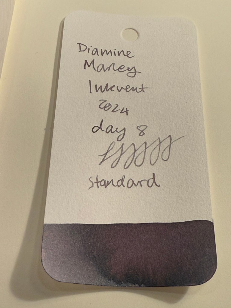
Diamine Inkvent 2024 Day 9
This is the Diamine Inkvent 2024 Day 9 door:

Day 9’s ink is Diamine Wishing Tree, a grey green ink with chameleon shimmer in it that is silver, green, blue and copper coloured. I used a Lamy AL Star with a fine nib to test out this ink.

Here’s a close up of the col-o-ring swab. You can see the shading on the ink itself (like Diamine Marley there’s a lot going on here in terms of shade), and a bit of the chameleon effect.

Here is a writing sample on original Tomoe River Paper. It mainl shows off the shading properties of Diamine Wishing Tree.

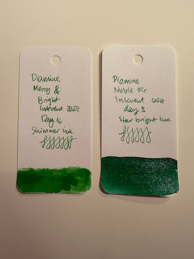
Diamine Wishing Tree is a greener and cooler toned ink than Diamine Marley, but it’s still very similar to it in terms of its general properties and tonal family. The chameleon effect is much subtler than regular shimmer, and it adds a mystique to this ink that is befitting its name.

You can see some of the shading and chameleon shimmer from this angle:

On Midori Cotton MD paper Diamine Wishing Tree’s shading properties are even more pronounced:

You can better see the shading and a bit of the chameleon shimmer here:

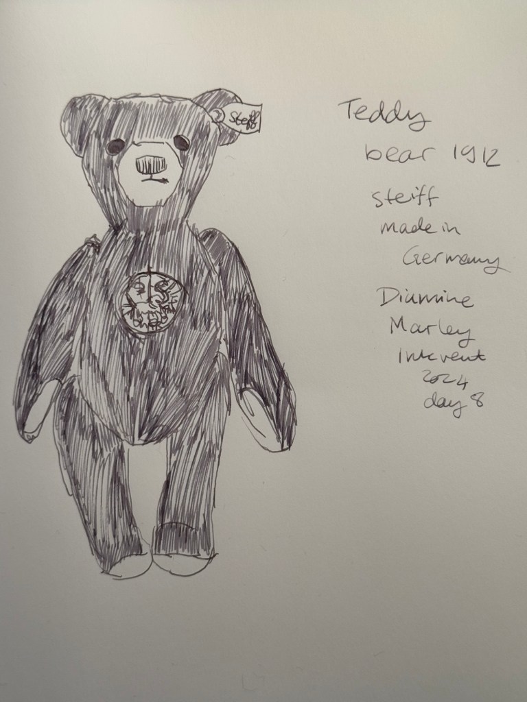
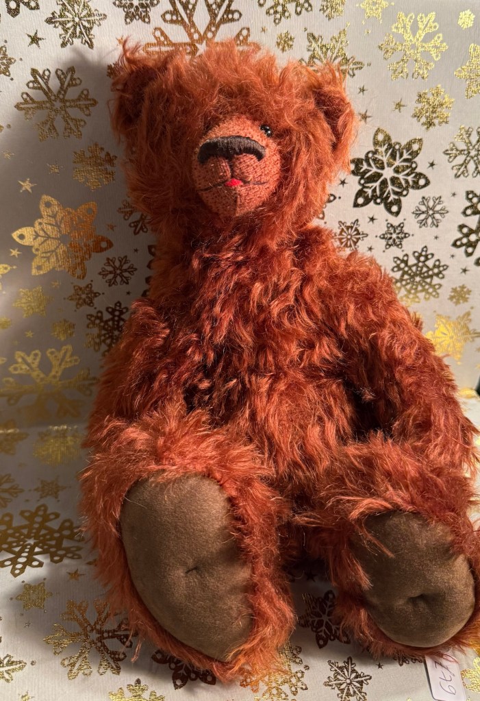
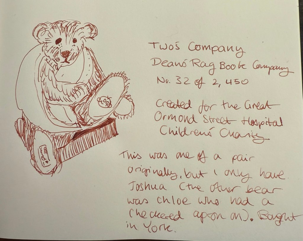
Today’s bear is Hogarth from Dean’s Rag Book Company. He’s a membership bear from 2007, and is a black bear, a relative rarity in the collectable bear world (it’s harder to see the seams and sew black bears properly and so there’s fewer of them).

If Diamine Marley wasn’t part of this year’s Inkvent, then I would have found Diamine Wishing Tree more impressive. As it is, it’s a very good grey toned ink with a lot of interest. It’s not the most practical (because of the chameleon shimmer) or the most festive (though the shimmer does add here), but it’s a solid entry for this year’s Inkvent.
Which of the two do you prefer: Diamine Marley or Diamine Wishing Tree?