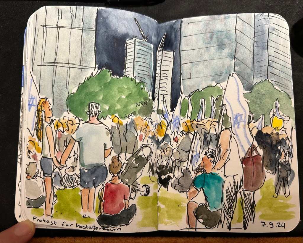
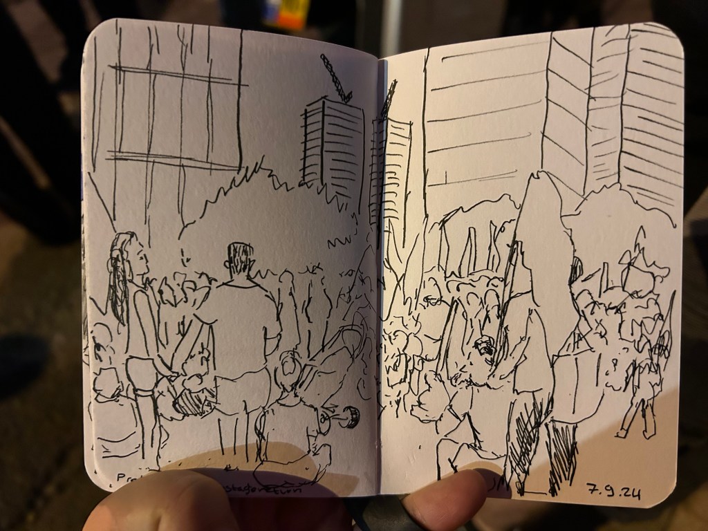
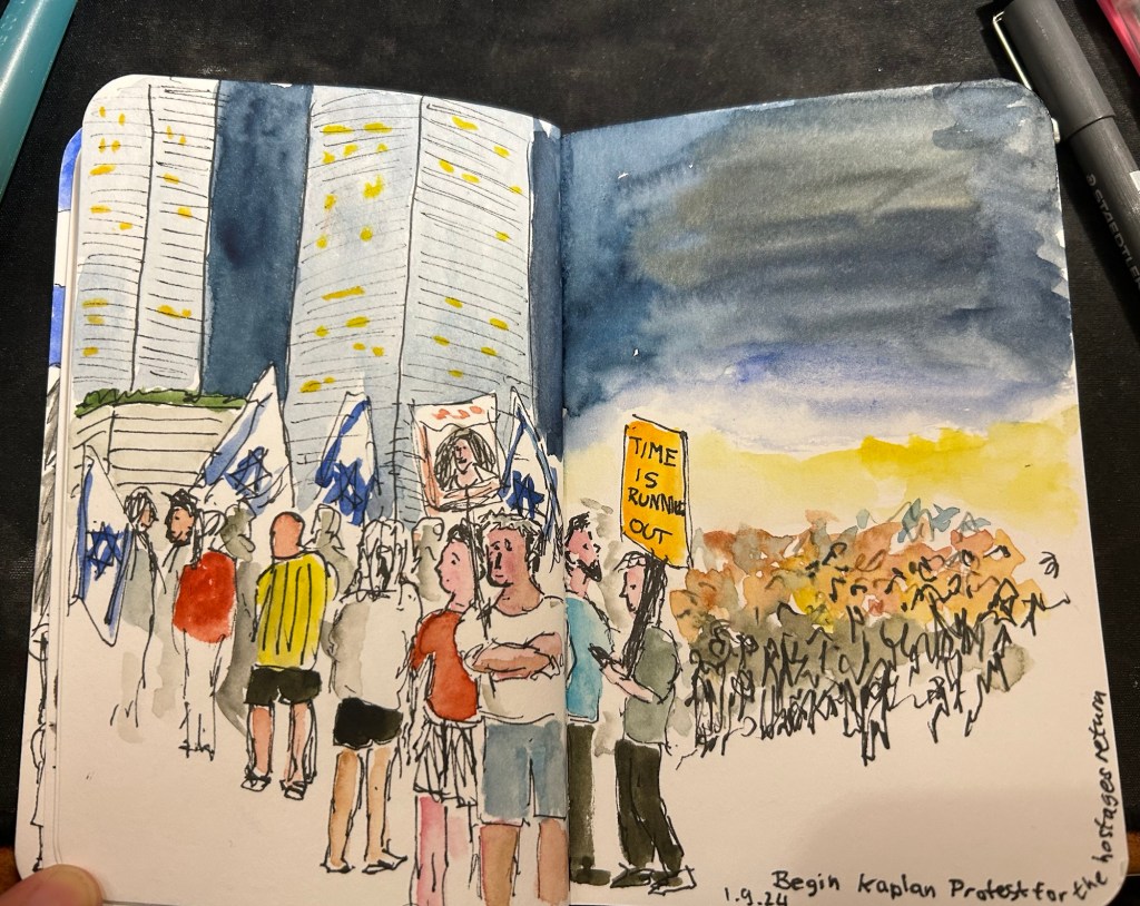
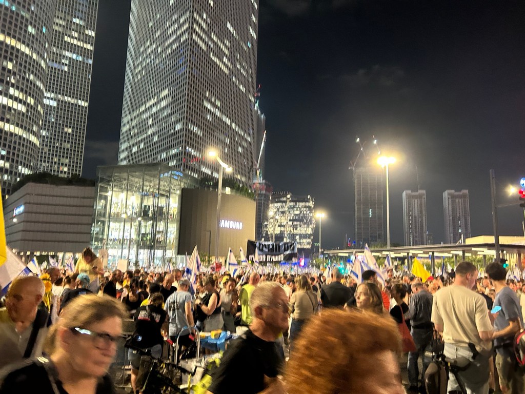
Shana Tova to all who celebrate the Jewish New Year. The passing year has been an extremely tough one on a personal and national level. I sincerely hope that the coming year will be better in every possible way, that the hostages will return and we will have some much needed peace in our region.
I’ve had a lot of the worst kind of upheaval at work during the past two weeks and so I haven’t been keeping up with all the comings and goings in the stationery-sphere. There has been drama of the ugly kind, which I don’t intend to get into. I will just say that this blog is LGBTQIA+ friendly (I am a member of the community myself), and anyone equating homosexuality to murder is both extremely wrong and very hateful person.
I have had to take a break in the SketchingNow Travel Sketching course but am now returning to it and will be making a post about the second week of classes (Shapes).
I will not be participating in Inktober this year. I just don’t have the time for it, and I want to focus on working through the Travel Sketching course instead, as I have some travel planned for later this month and I’m hoping to incorporate what I learned into my travels.
So I just finished the first week of Liz Steel’s SketchingNow Travel Sketching course. I wrote about my material list for this course here and about the beginning of the first week here.
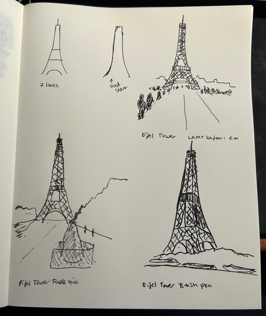
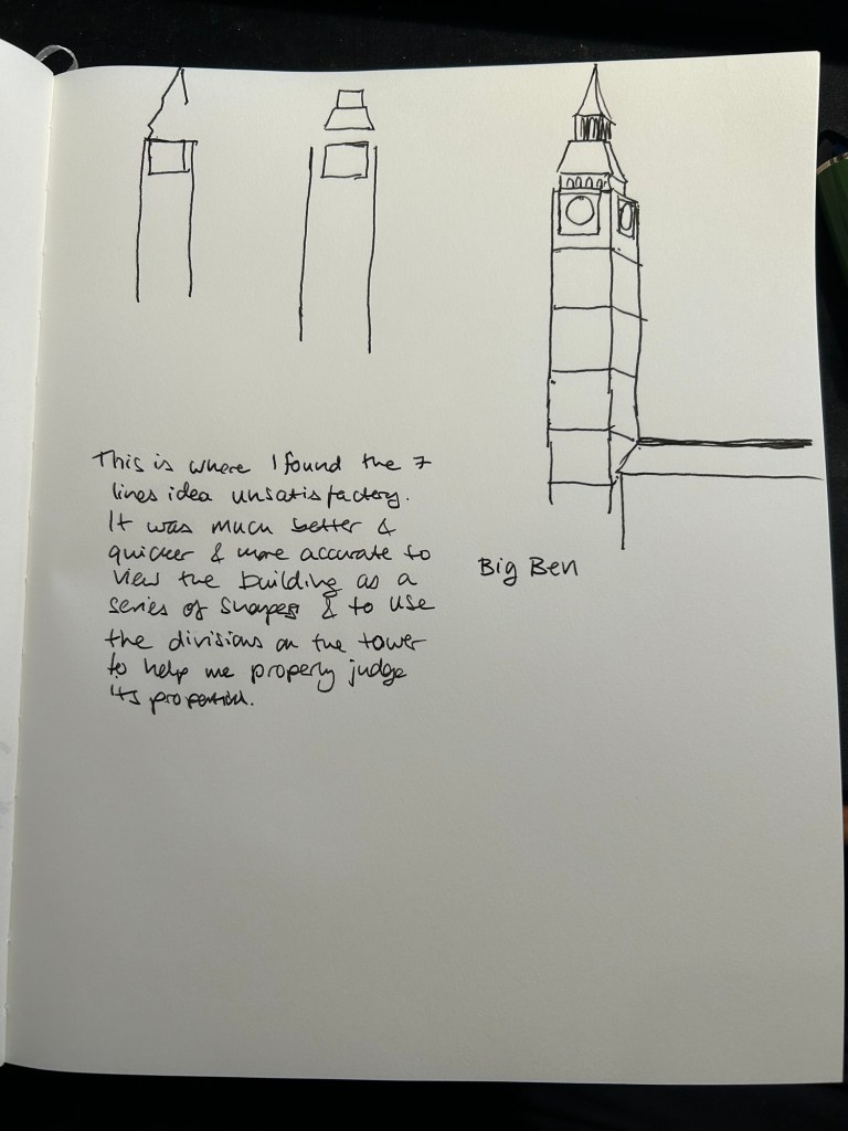
Liz started the week by suggesting that we approach sketching while travelling using a 7 lines principle: sketch the scene in 7 lines, which you can then flesh out to a full sketch. While I managed to do this for the first three Eiffel Tower sketches, I started to struggle once we got to complex buildings like the Big Ben.
This went well – Eiffel Tower with 7 lines as a start.
Here’s my two initial attempts with 7 lines, and then where I moved to my usual approach, which is trying to break a scene down to simple shapes (square, circle, triangle, etc).
Where things went wrong.
I then sketched the next assigned subjects using my own approach:
At which point I realised several things:
I wasn’t really learning anything new this way.
I hadn’t given the new approach enough of a chance before giving up on it.
The 7 lines rule isn’t rigid. It’s an artificial limitation that’s supposed to encourage observation and decision making up front, not to have me counting every pencil or pen mark.
So with that in mind, I made two decisions:
I can use continuous/complex/compound lines as part of the 7 lines. Liz uses them herself, and as they are quick to sketch and require acute observation they remain in the spirit of the rule.
I can use up to 10 lines if I felt that it was necessary to convey perspective or complicated shapes.
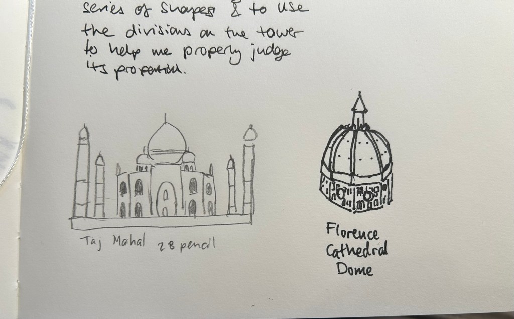
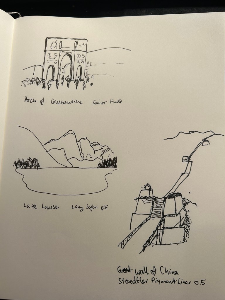
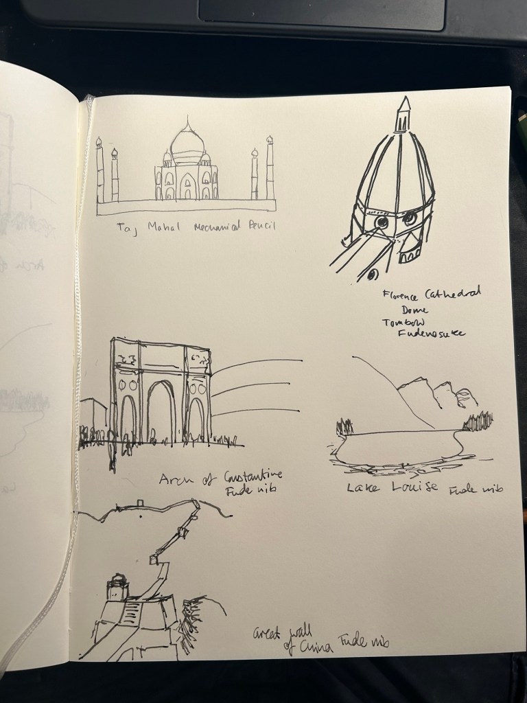
Then I went back and sketched the following using this approach:
These came out much better than in the first attempt.
Then I sketched two Melbourne scenes:
The Auction Rooms came out particularly effective- 7 lines allowed me to outline the main interest point of the scene (the roof line), and also to outline a car, so I have a feel for the scale of the buildings.
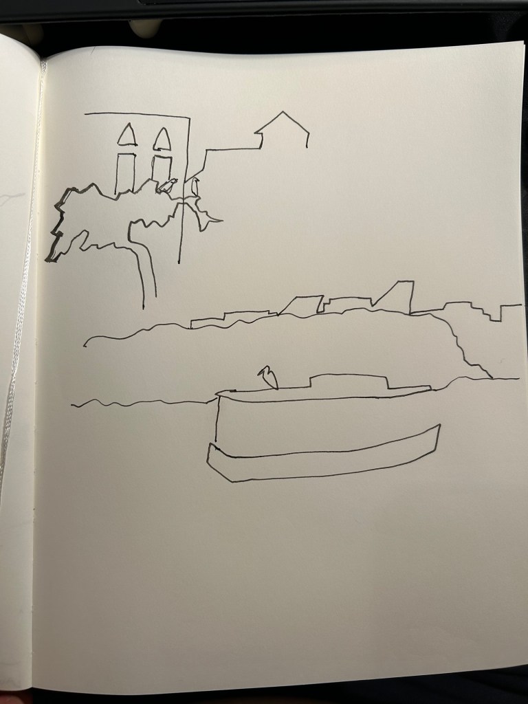
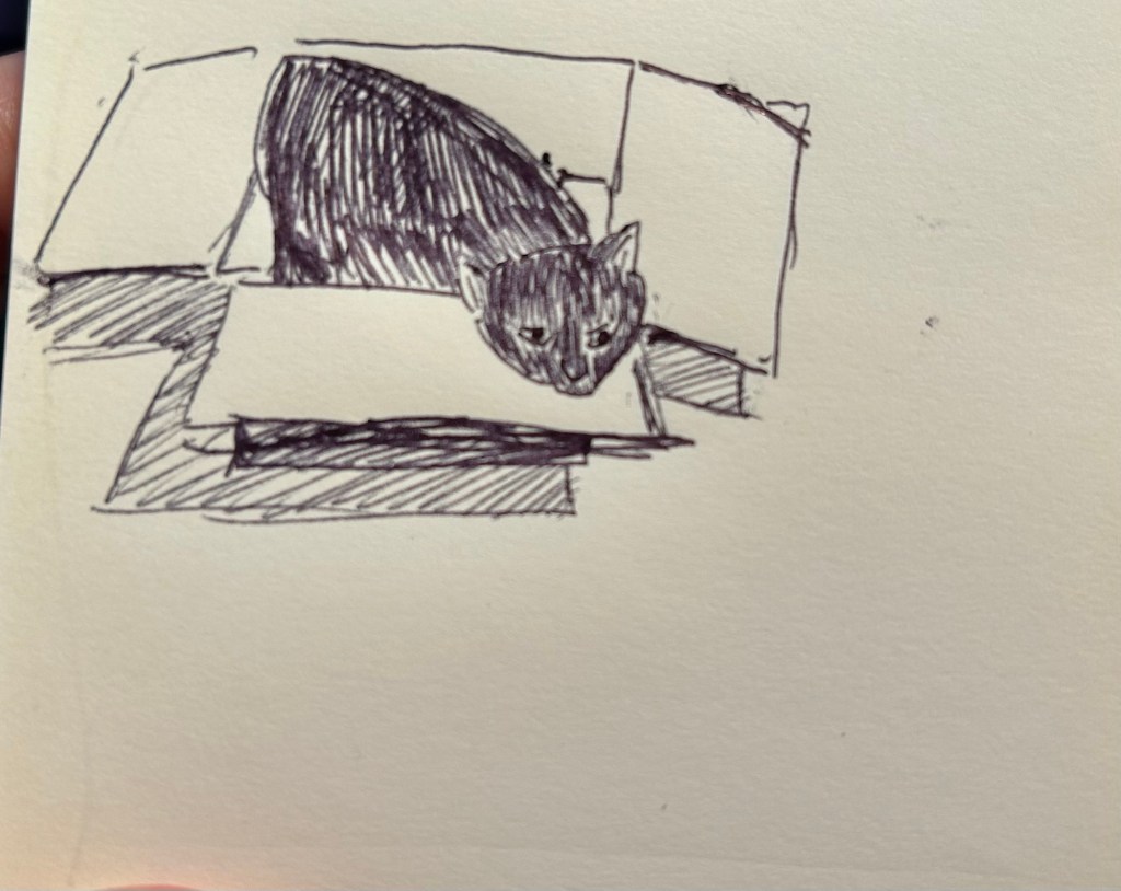
I then sketched two local scenes. The top left scene was of two little egrets waiting to be fed by the local fishmonger. I got the tree, the egrets, the buildings and with two extra lines, the windows.
The bottom sketch was of a heron on a boat in the river. I got the river, the boat, the heron, and the buildings behind the tree line. I would have been very comfortable finishing both sketches either on location or from reference photos with this strong starting point.
The final sketch was of a very complicated building in Paris. I added a few more lines just for reference for where the columns are. Like the rest of these sketches it’s not 100% accurate, and there are slightly wonky bits, but I’m looking for speed and to capture the essence of a scene when I’m travel sketching, not for photorealistic reproduction.
I really struggled with the 7 lines idea at first, but then I allowed myself a bit more freedom within this framework and I found it to be very useful and also an easy idea to carry around with me as I look for interesting things to sketch. If I can envision the scene in 7 lines and it looks interesting with just those lines, then it’s likely worth sketching.
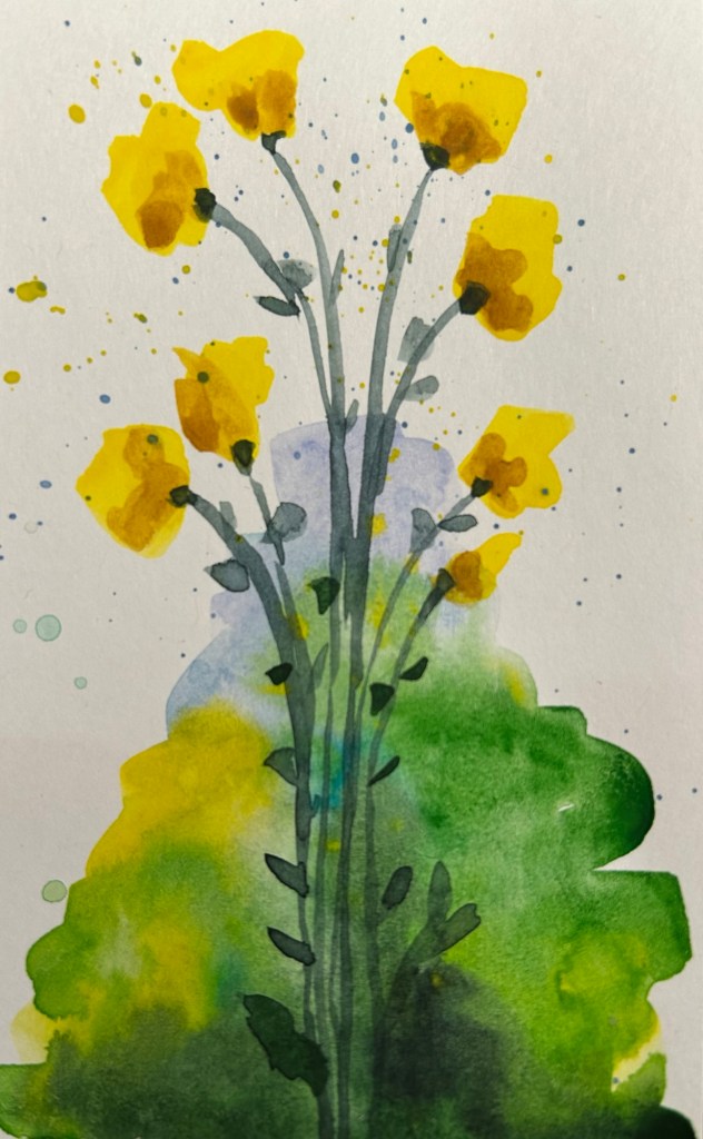
Coming up next is shapes, where we start to work with colour. I’m curious to see what the results will be.
So the first week of actual lessons in Liz Steel’s Sketching Now Travel Sketching course started and already there’s been a slight change of materials.
As this week will be entirely focused on line drawings, I’m switching to a non-watercolour sketchbook. For the first part of this week’s exercise, which includes working from reference photos, I’m using the Midori MD Cotton notebook in A4. It’s neither a proper sketchbook nor the A5 size format that Liz recommended, but as she also requested to upload as few photos as possible to this week’s gallery (and no more than 6) and as we have quite a bit of work to do, I decided to at least use a large notebook so I can fit more than one or two sketches on a page and thus avoid the need to stitch photos.
Eiffel Tower
We have several scenes we need to sketch as quickly as possible, starting with just 7 lines to define the scene. The 7 lines idea worked quite well with the Eiffel Tower but broke down completely for me once we got into a complex building like the Big Ben. That’s when I decided to just work with shapes and let the architecture details on the building help me determine its length and proportions.
Big Ben
Generic rules like “start with just 7 lines” are nice ideas on paper, but they oftentimes break down when we’re faced with reality. I think that the 7 lines idea would actually slow me down when sketching on location (it slowed me considerably while I was at home, and it failed completely with the Big Ben), but the basics of contour, shapes, perspective, proportion hints work no matter what.
I will try the 7 lines for the rest of the week, to see if it’s just a matter of practice, but I suspect that it isn’t.
I travel a few times a year and while I already sketch during my travels, I want to improve my speed and gain enough confidence to sketch in less than ideal conditions. I rarely sketch standing up, and I don’t feel comfortable sketching while I’m waiting in line, for instance, and these are useful skills to have if you plan to sketch while on a trip that isn’t dedicated to sketching.
As usual with Liz Steel’s excellent courses, the first part is an introduction which includes an overview of the course, setting personal goals for the course, materials list/discussion and a review of where you are starting from.
I have decided to take a different approach to the materials requirements for this course. I have a pretty compact and set travel sketching set of materials, but I’m allowing myself to expand on it and change it a bit to experiment with some new techniques.
The first big change is the sketchbook I’m using. It’s a Hahnemühle A5 Watercolour Book, which includes 200gsm fine grain paper. I’ve never used it before, but as I regularly use the Stillman and Birn Alpha that Liz is using for the course and I’m not a huge fan of it, I decided to give this paper a spin instead. If it works it would be ideal for travel sketching, as it’s thin and lightweight, the paper takes watercolour washes much better than the Alpha, and I appreciate the elastic closure and hard covers. They are very convenient additions that should help me sketch while standing, and keep the sketches safe while I carry the notebook in my bag.
Hahnemühle A5 Watercolour Book
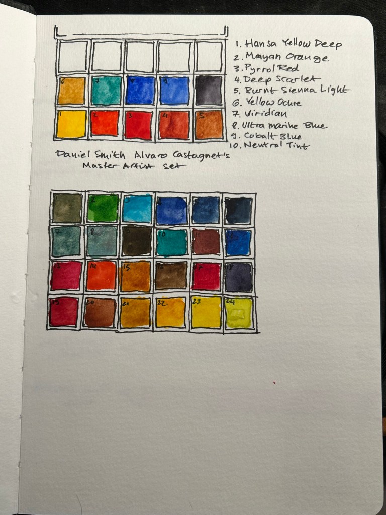
I’ve also changed my watercolour palette somewhat (it’s the bottom palette, not the top one). As I’m still not certain about it, I’m not fully documenting it at the moment. This course isn’t geared heavily towards watercolour, but I tend to like to sketch as quickly as possible on location when travelling, take a few reference photos and complete the sketch with watercolours later that evening.
The palette I’m using is the bottom one, with 24 colours, both Schmincke and Daniel Smith.
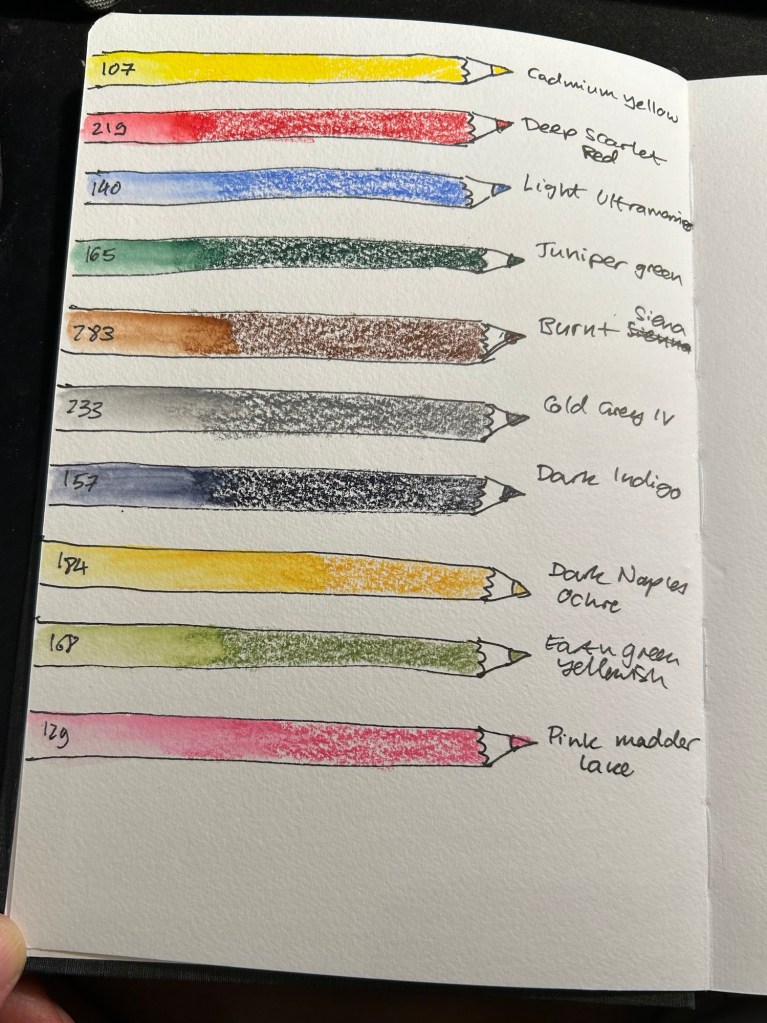
For the first time I’m adding watercolour pencils to my travel sketching kit. As Liz recommended I have a triad (yellow, red, blue), a green, a brown, a grey, a dark, and while she recommended having two lights, I have three. Why? Because having quickly available greens is very useful, the pink is useful for skin tones, and the ochre is too generally useful to be left out. All of these pencils are Faber-Castell Albrecht Durer.
Watercolour pencils.
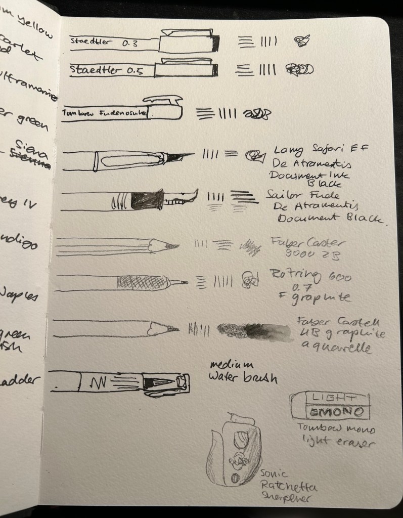
Dry media is also more than double what I normally carry on me. Here the point is to experiment, and it’s very likely that I will say goodbye to several of these tools during the course. I normally use only Staedler Pigment Liners in 0.3, 0.5 and sometimes 0.8 when I sketch, but here I’ll be adding a Tomboq Fudenosuke brush pen to the mix, two fountain pens (a Lamy Safari and a Sailor Fude both with De Atramentis Document Black), three pencils (Faber Catelll 9000 2B, Rotring 600 0.7 and for the first time ever, Faber Castell 4B graphite aquarelle), an eraser and a pencil sharpener. I’ll also be using a medium waterbrush instead of my usual fine one.
Sketching media.
All of these tools will be carried in a Nock Co case, with the exception of the watercolour tin and rag, and a brush case.
Nock Co case, watercolour tin and rag.
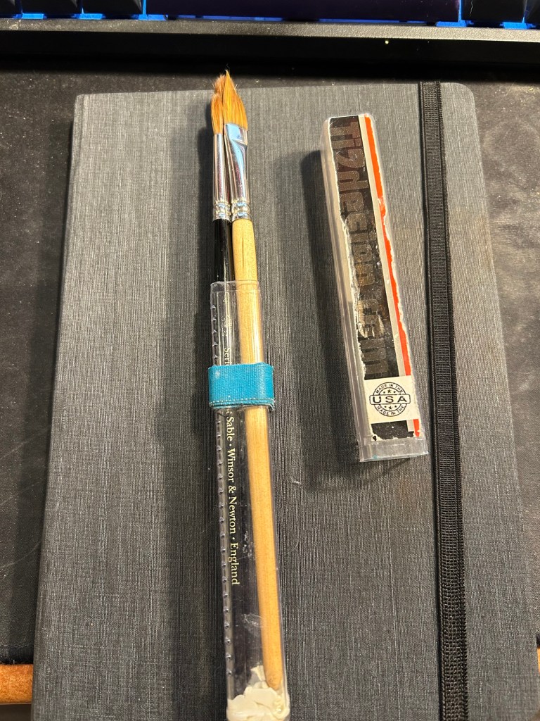
I don’t think that I’ll be using these too much during this course, but these are my travel ready brushes. I keep them in a Ti2 design tube with glue tac at the bottom to prevent the brushes from moving. The brushes are Windsor Newton Series 7 numbers 4 and 7 and Rosemary & Co dagger brush 772.
Brushes
That’s the whole kit, and now it just remains to try it out and see what works and what doesn’t.
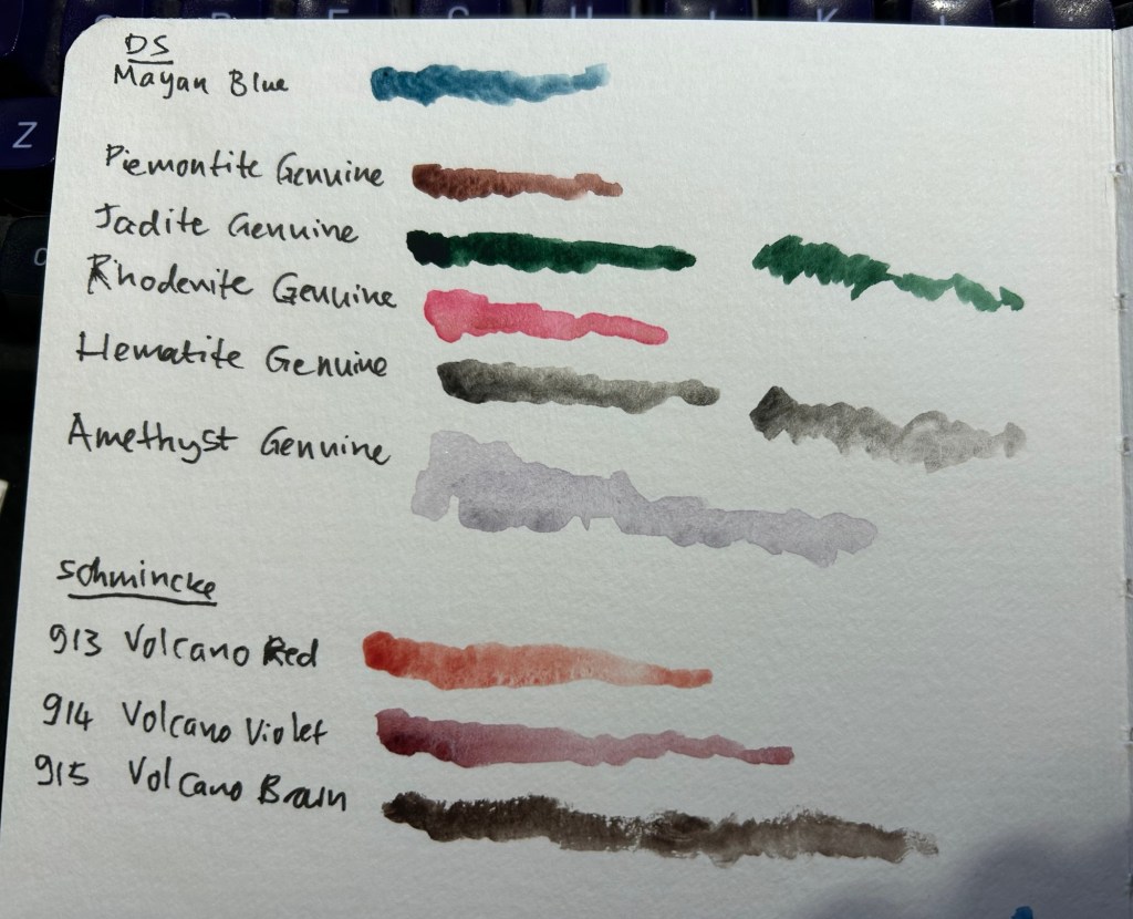
I’ve been unhappy with my watercolour palette lately, and so I’ve been experimenting with new colours instead of some of the old ones. I usually swap out one colour at a time, try out the new colour for a while, and then either keep it or swap it out for something else. This time I’m doing my usual swap procedure, and also building a completely new palette on the side. The idea is to speed up the new colour discovery process, as there are 5-6 colours that I want to replace in my current palette, and that’s a lot.
The first colour to leave was Daniel Smith Cerulean Blue Chromium. I have too many similar blues and it’s slowing me down having to decide between them every time I need a blue. In its place I swapped Daniel Smith Rhodenite Genuine, which is a bright pink.
Samples of some of the colours I considered swapping in. Amethyst Genuine was a genuine disappointment – I don’t think I’ve seen such a bland, pale, washed out purple anywhere.
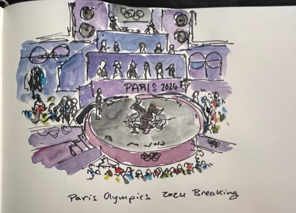
I then sketched one of the scenes from the 2024 Paris Olympics Breaking final, which I was going to see in person before I had to cancel my trip. Luckily my brother was there and sent me photos and videos, which I had fun sketching from. There was a lot of purple in this scene, so I had fun mixing Rhodenite with blues and purples on my palette.
Quick Paris Olympics Breaking sketch
The new palette is something I’m building in a Daniel Smith plastic paintbox. It’s not a box that I’d regularly use (it doesn’t have enough mixing space for me), but it’s useful for the testing I want to do.
This box came as part of a set of two, one of which had paints in it.
I then set up a legend in my sketchbook:
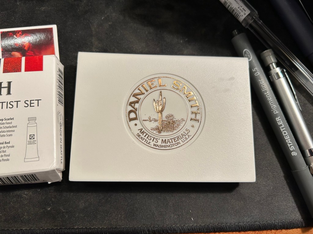
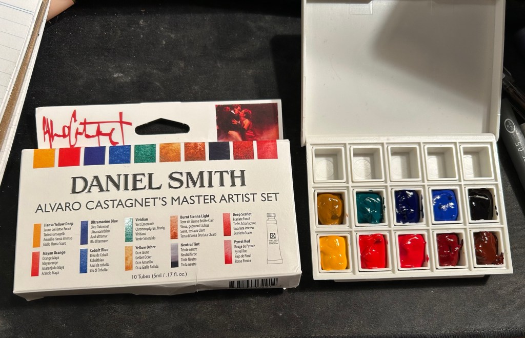
Next I broke ou the Alvaro Catagnet Daniel Smith Master Artist set and filled the pans with paint. I’ll give them 2-3 days to completely dry out before finishing the legend and trying them out. I would never have built a palette which is so heavily skewed towards reds, but this is part of the experiment – after a heavily blue skewed palette it’s time to try something new.
I can’t wait to give these new paints a try. I’ve worked with the Schmincke versions of Yellow Ochre (I no longer use it because of its opacity), Viridian (way to artificial a green for my tastes), Ultramarine Blue and Cobalt Blue, but it will be interesting to see Daniel Smith’s take on these colours.
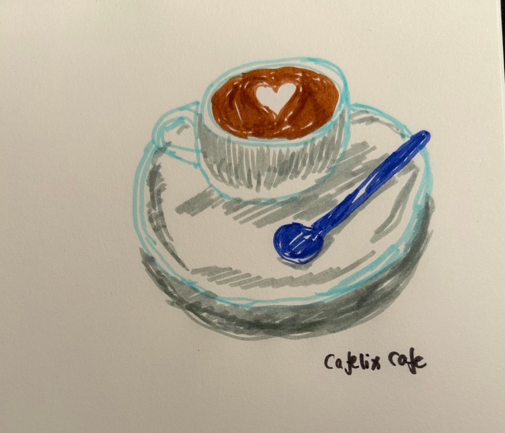
I got a set of Bic Kids markers and decided to sketch today’s coffee with them. You don’t need expensive drawing supplies to draw, and not every sketch needs yo be perfect.
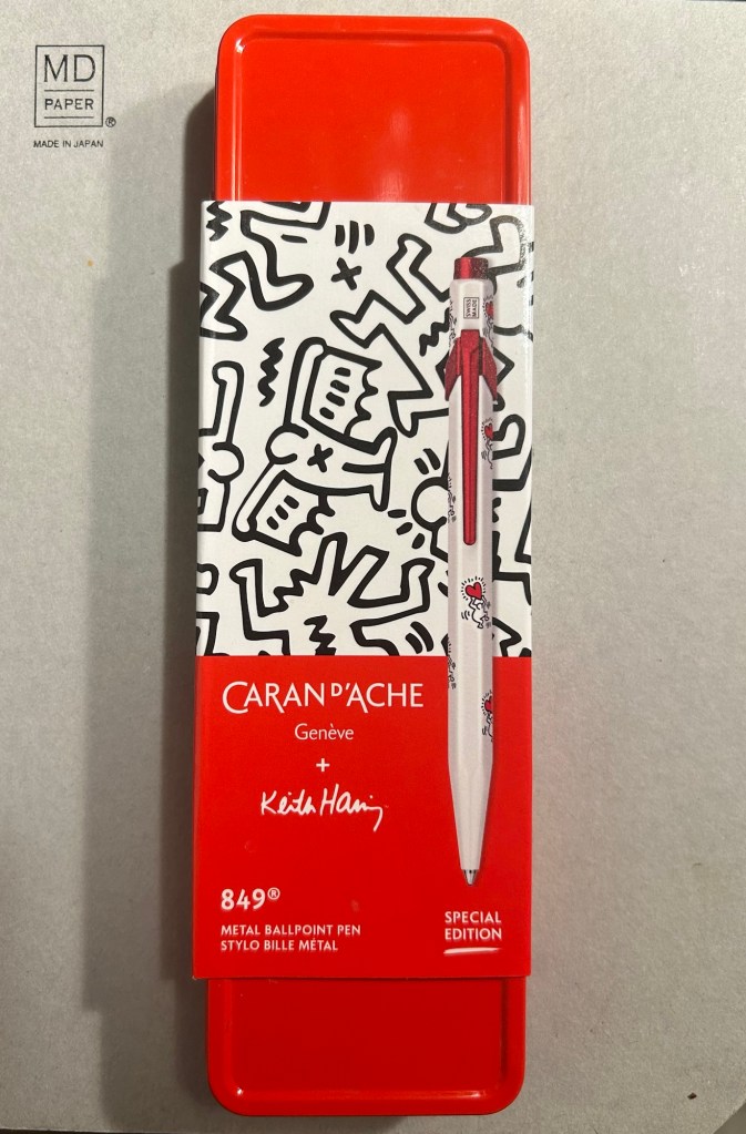
The Caran d’Ache 849 ballpoint is a classic which I have already reviewed in the past. While I rarely use ballpoints, I have several of these pens (all with gel refills that I have swapped instead of the Caran d’Ache Goliath ballpoint ones). Why? Because of their excellent limited edition designs.
While I was in London in April I picked up two new limited edition 849s – The Keith Haring edition in red and white, and the latest 849 Nespresso collaboration.
The box
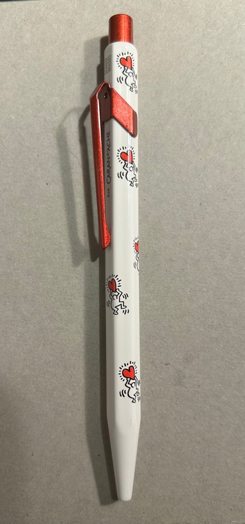
The Keith Haring edition comes in black and in red and white. I think that the red and white edition is nicer, and it appears that so do other 849 fans: the black edition is still widely available but most places have long sold out of the red and white edition.
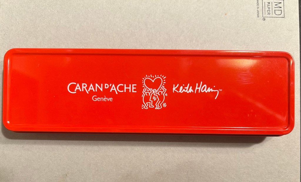
The box is very nice, and makes for a nice gift pack.
Outer box
Inside the box you also get to see some of Haring’s work.
Inside the box
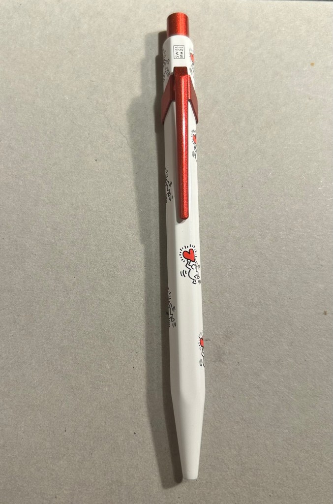
The pen itself is white, with a sparkly red knock and clip. The paint on these feels like lacquer, and the look is sleek and bold. There are dancing people holding red hearts all over the pen (so you get some Keith Haring artwork, but it’s not overcrowding the pen), and the pen body’s finish is the standard 849 glossy finish.
The Keith Haring 849
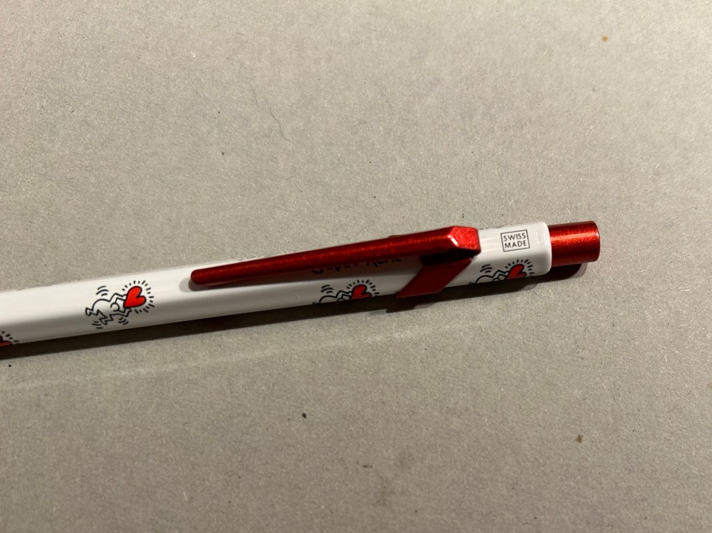
The knock and clip are probably the most striking thing about this pen. Surprisingly Caran d’Ache didn’t put any Haring branding on the pen, not even hidden with their branding under the clip.
You can see the branding on top.
The paint on the clip and knock look like someone poured them out of red glitter paint, and then waited until they set. All in all the result, together with the Keith Haring artwork and the included box, is one of the best 849 gift pens I have seen.
The Caran d’Ache Nespresso Kazaar edition, the 6th Caran d’Ache and Nespresso shared edition, is a bit different than previous editions. Unlike previous editions that featured a silver clip and knock, the Kazaar edition is monochrome. The dark blue pen has a clip and knock in matching colours, and the result is much better than previous pens in this series.
The Kazaar 849
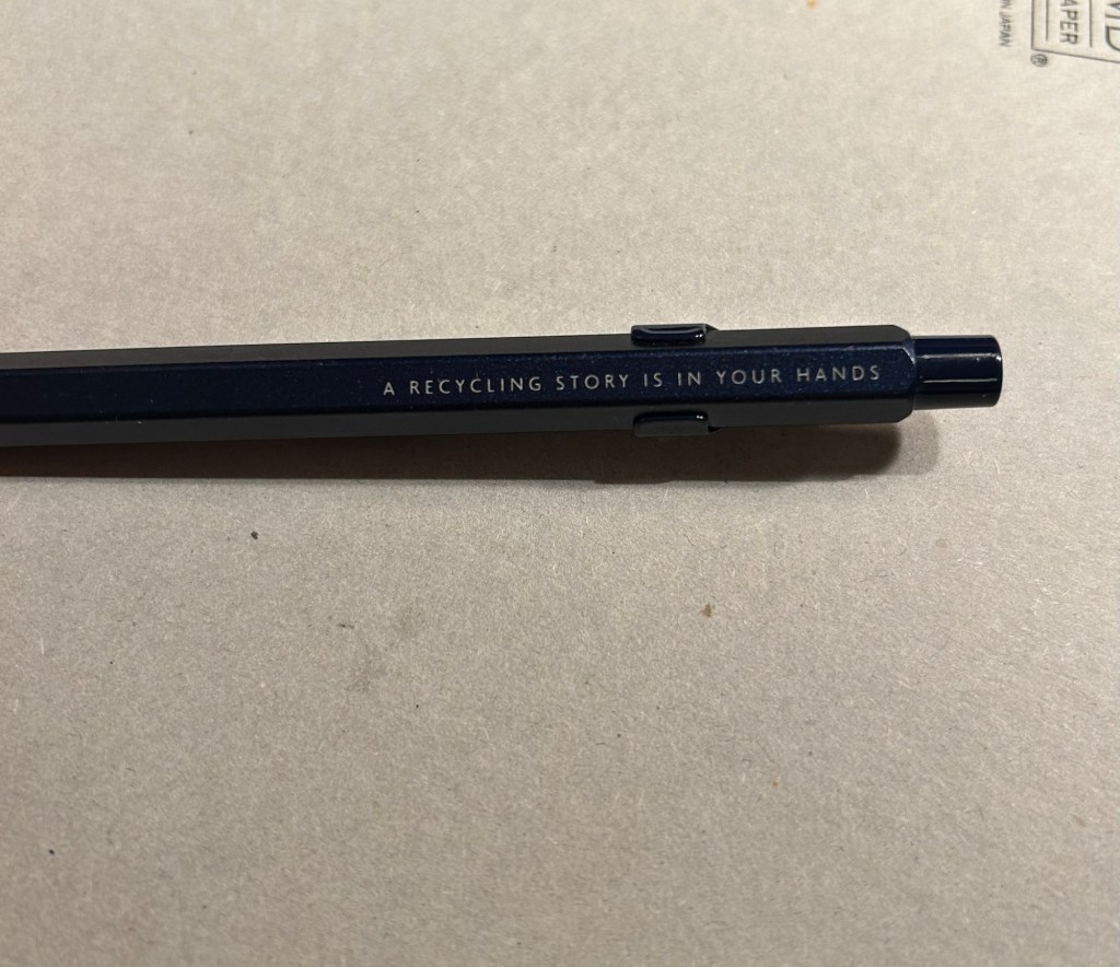
As usual the pen is made at least in part from aluminium from Nespresso Capsules. The pen body has a bit of a matte texture to it, which makes it slightly easier to grip. It comes by default with the excellent Goliath refill, this time in black (the Keith Haring 849 also came with a black Goliath refill).
The pen touts its recycled origins.
The 849 Nespresso came in the same sort of recycled cardboard box that previouseditionscame in. It makes for a good gift pen, even though some may find the dark navy blue colour a bit… boring.
Swiss made. The colour matching on the knock, clip and pen body is superb.
If you like the idea of the 849 Nespresso but don’t much like the colour of the Kazaar one, I’d recommend waiting for the next edition. I have a feeling that it too will feature monochrome hardware, and it might be in a brighter colour as Nespresso are starting to run out of drab capsule colours.
The Goliath refill in action
Note to those who prefer gel ink refills and plan to swap the 849 refill out: the tolerances on these 849 pens are a bit weird. There are 849’s in which you can easily swap the refill for any Parker style refill with no issue, and those in which if you swap the refill you find that the knock won’t properly engage it. This is something worth taking into account if you plan on swapping the refill in the pen – there’s a risk that it won’t work with the specific pen you own. I’d recommend in this case to try swapping the refill before you purchase the pen if possible, or resign yourself to using a ballpoint. The Caran d’Ache Goliath refills are several cuts above what you get in a standard, disposable ballpoint, so the loss shouldn’t be too great.
What about you? Do you like the 849? Do you swap its refill?
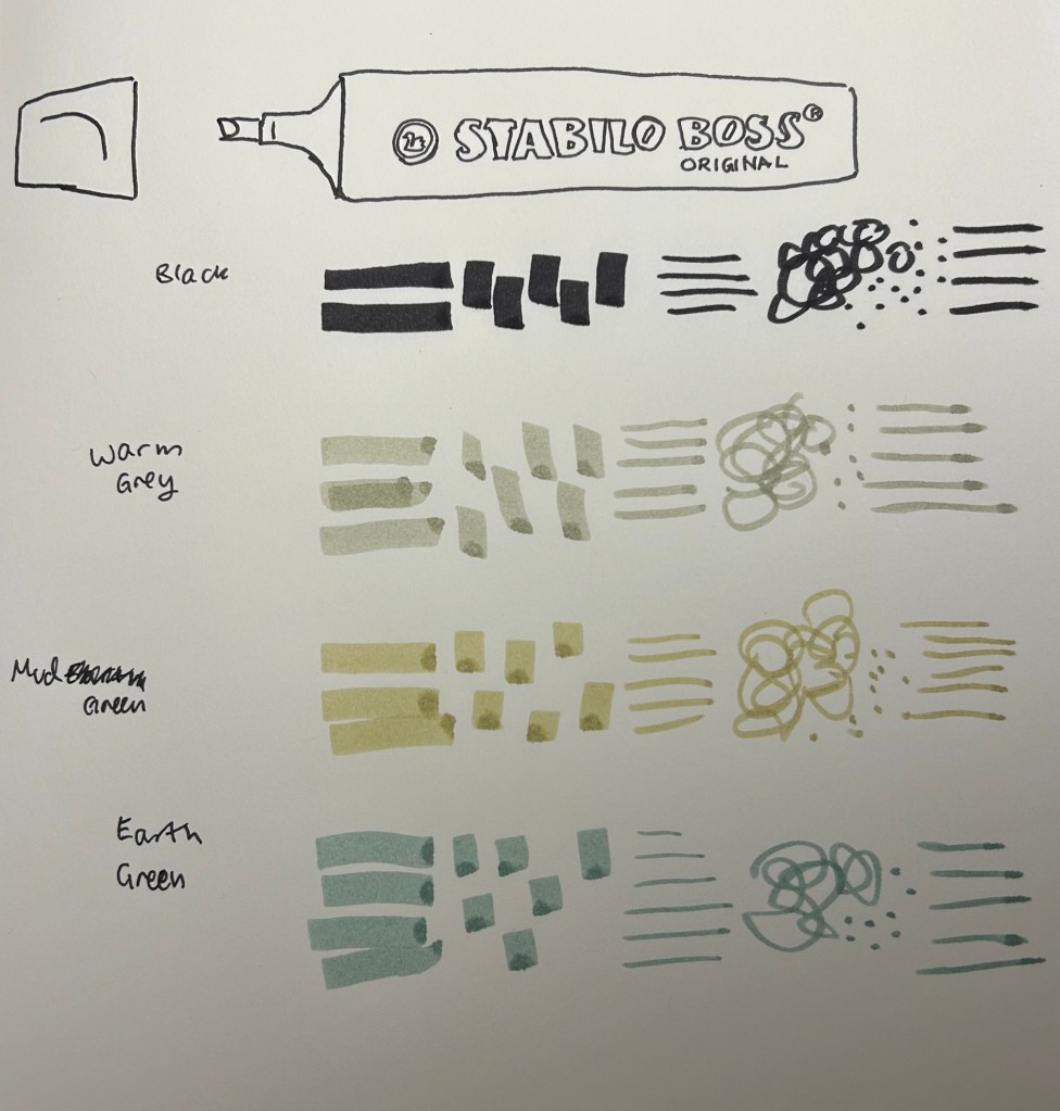
Stabilo make THE highlighters – Stabilo Boss – chunky, reliable, classic. Over the years they’ve added pastel colours to their original neon coloured highlighters, and just recently they’ve expanded their pastel highlighter lineup to include the NatureCOLORS. The NatureCOLORS lineup can be bought separately, or in a wallet of all 6 new colours, or a wallet of 8 that includes two black “marker” pen. The 6 new colours are Warm Grey, Earth Green, Mud Green, Beige, Umber and Sienna. The black “marker” is just an opaque black “highlighter”.
From top to bottom, black marker, warm grey, mud green, earth green.
I first saw these in a bookstore in Paris, and while I hardly ever use highlighters, the black marker and the natural tone of the other highlighters made me buy four of them to try out while sketching. As usual with Stabilo, there’s no indication on the pen body what colour it is beyond the colour of the pen body and a number that you have to look up on their site.
Testing the pens out
I used these pens for quick landscape thumbnails and sketches, and they work pretty well with a few caveats:
They bleed through everything but the thickest paper.
They spread on almost every paper.
They aren’t archival (so they will fade and discolour with time)
They are chunky, which means they aren’t the most portable of pens (even though they’re light)
They can be awkward to hold and manipulate at times.
Bleedthrough
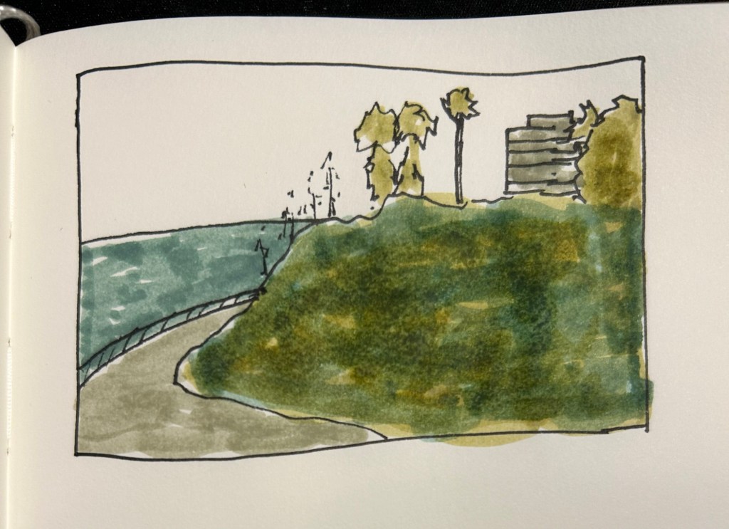
They’re also not at all built for layering and mixing, which means that trying to create layers with them will just leave you with a soggy paper mess:
They don’t layer well, as evidenced by the grassy hill in this sketch.
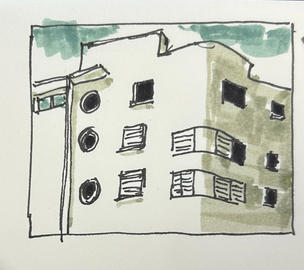
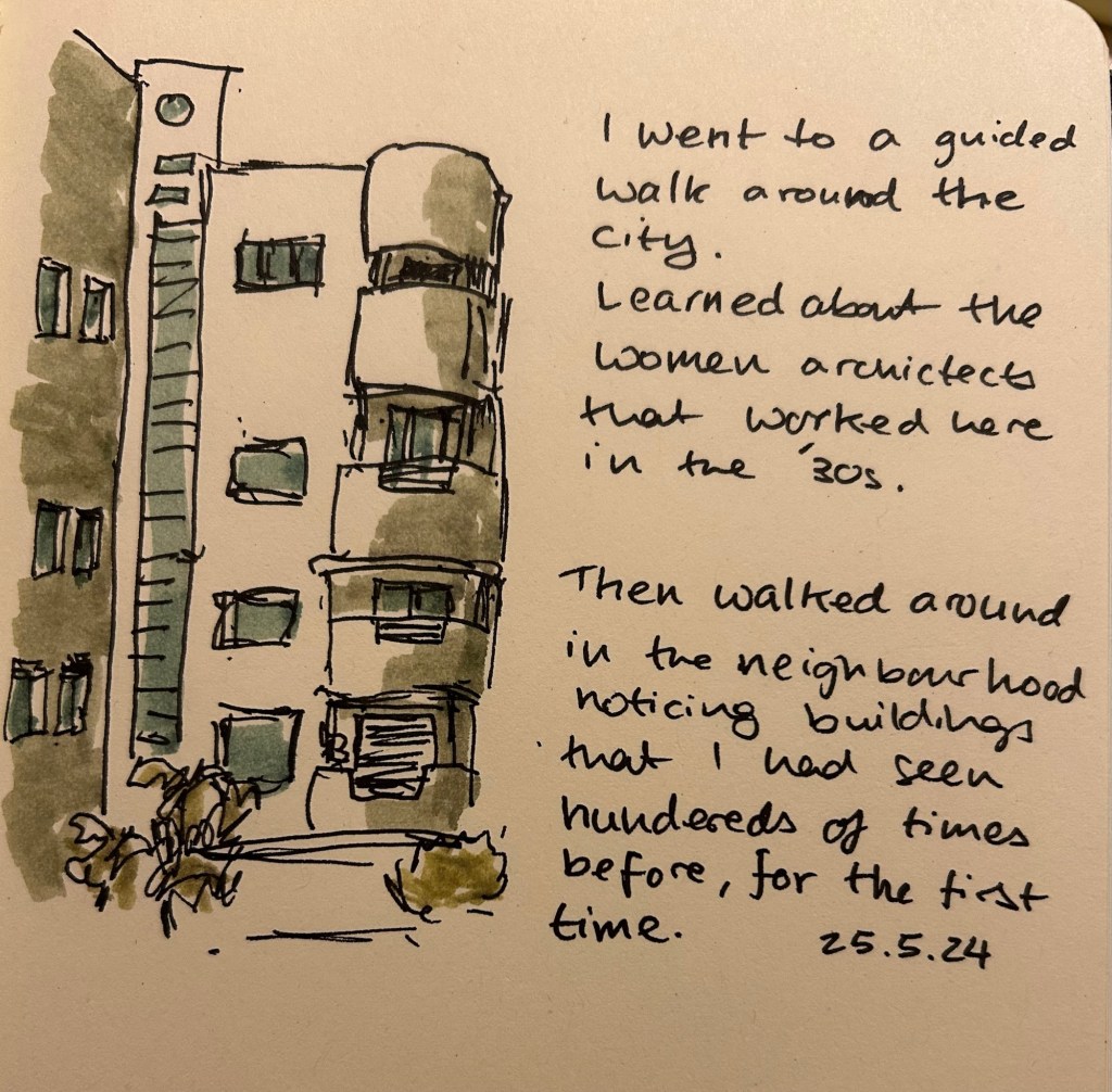
So what are they good for? They work well for quick impression sketches, particularly of buildings, where you can get shading and shadows down very quickly. I used them on an architecture walk to get an impression of the buildings and they worked very well.
What they’re good at – blocking the windows, shading the building, impression of a cloudy sky.
It’s difficult to be accurate with them, but in these sort of sketches I’m not looking for accuracy, just of an impression, a quick note of what I saw and what caught my eye. A photo is great, but it doesn’t highlight what made me stop and take a second look at a building.
They even work decently well on cream coloured paper.
Yes, copic markers could do the job, but they cost much, much more than a Stabilo Boss marker, they aren’t as readily available, and they dry out very quickly. Sometimes you need a cheap workhorse to get the job done, and for this new use I think the Stabilo Boss NatureCOLORS work just fine.