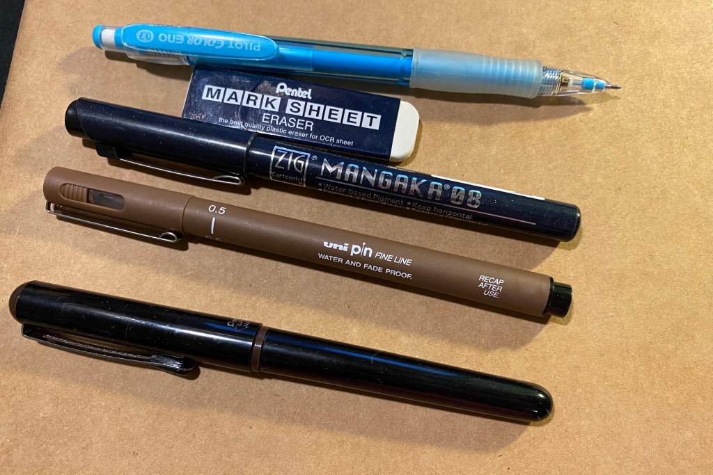
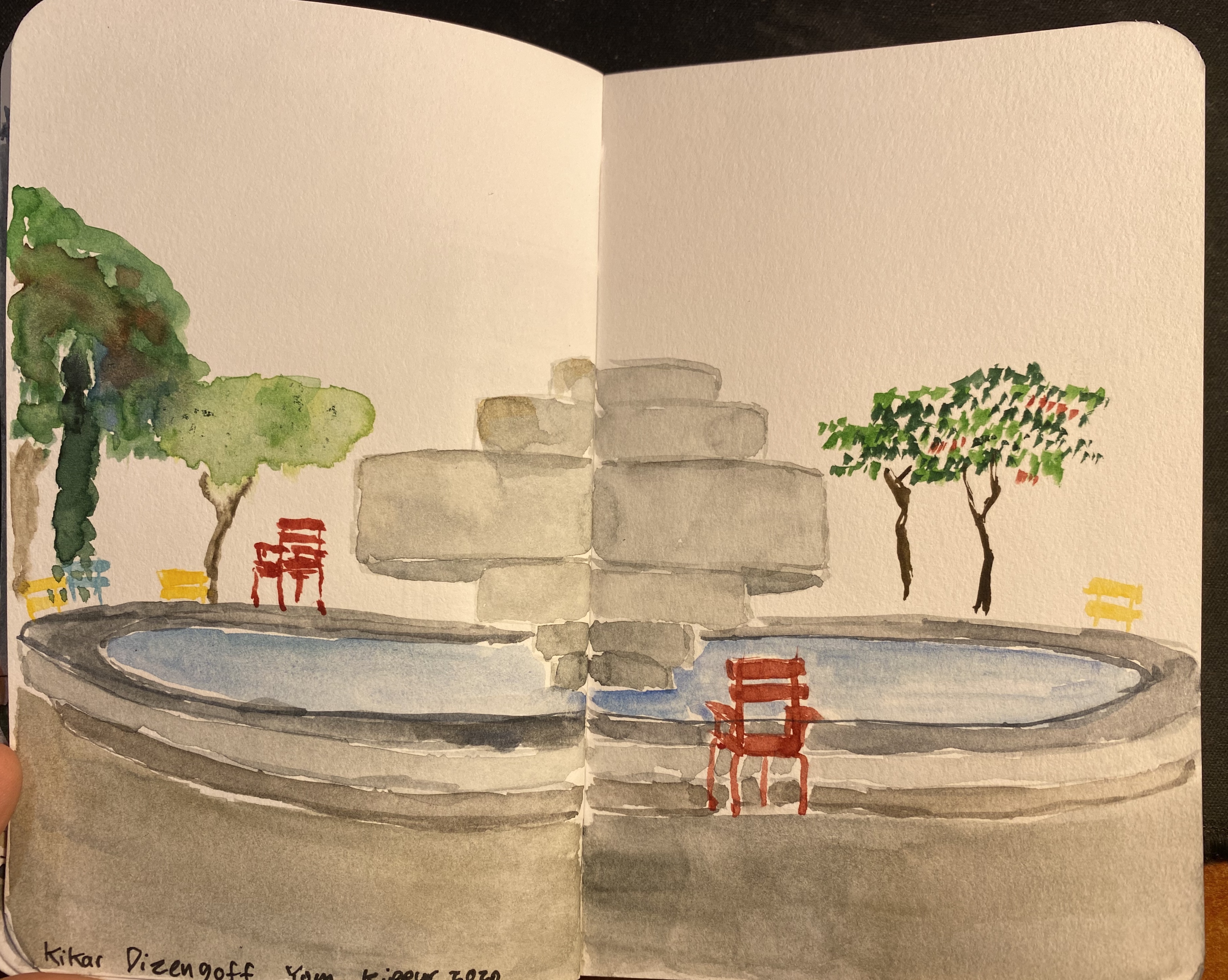
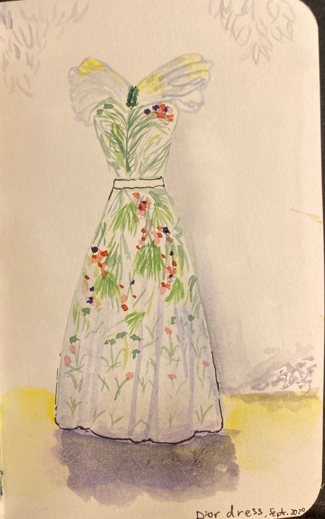
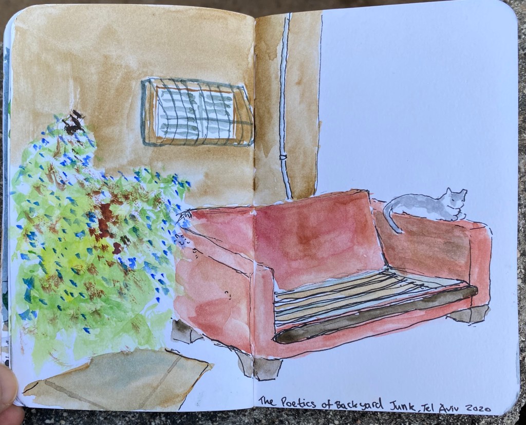
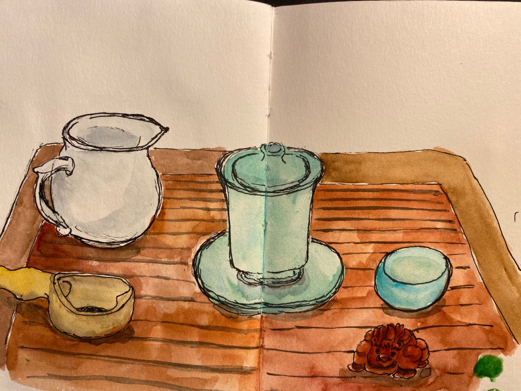
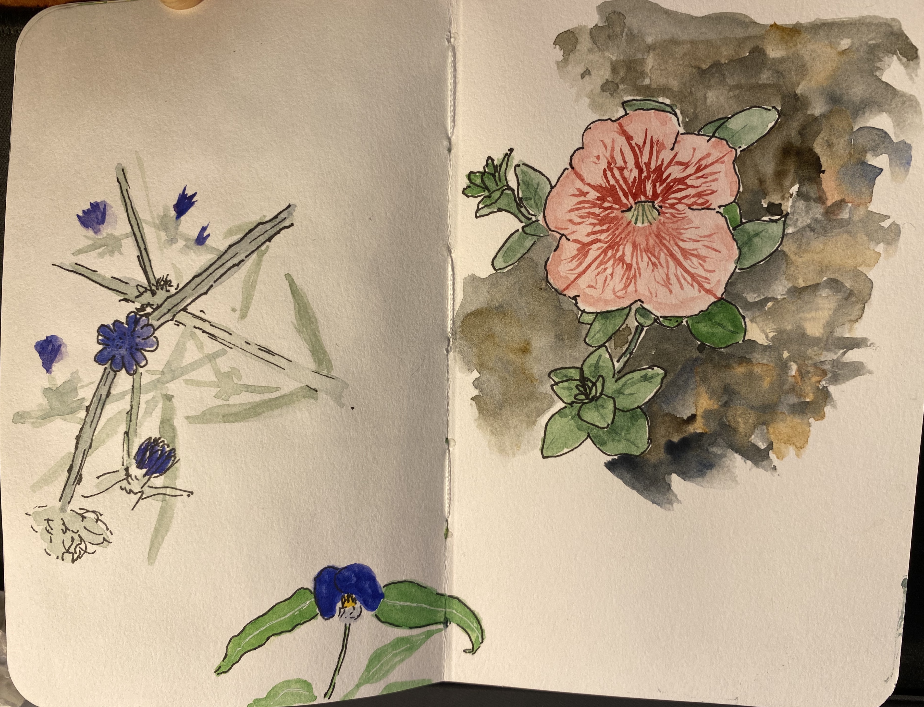
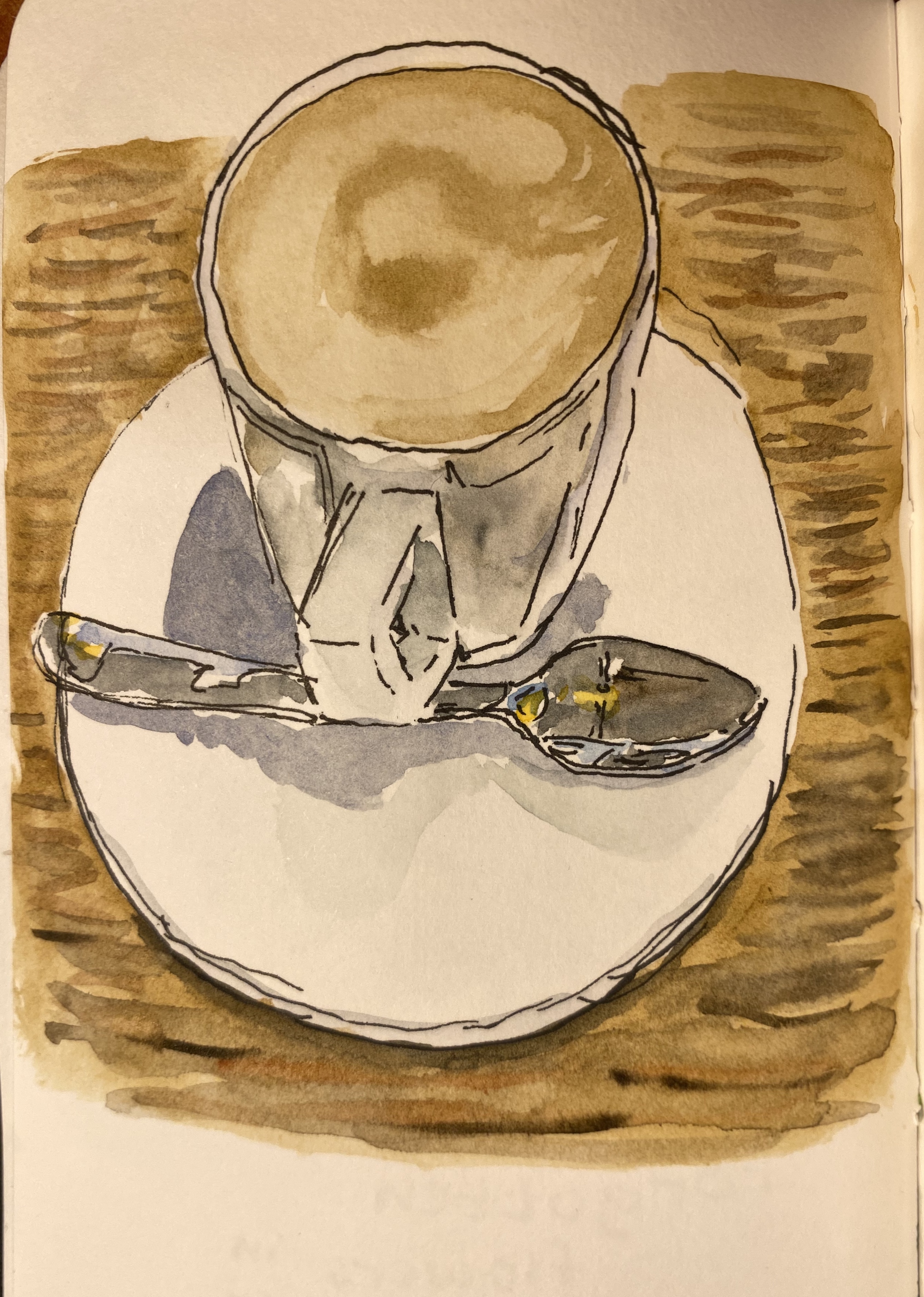
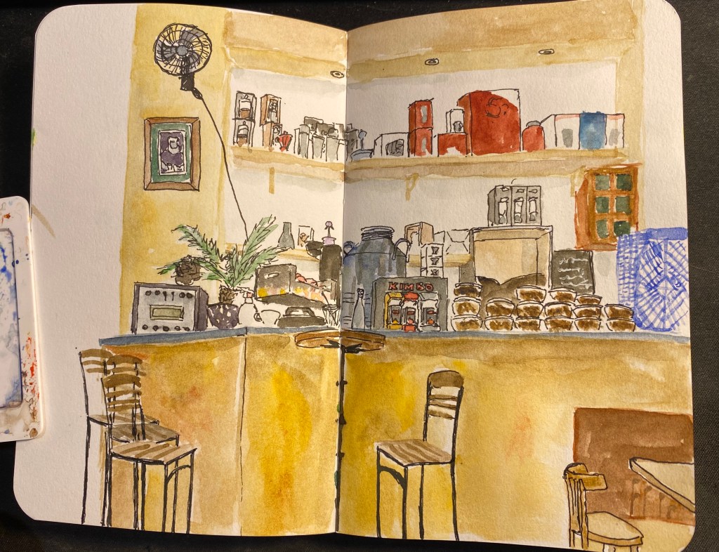
Four Watercolour Tips

Four quick tips for those using watercolours:

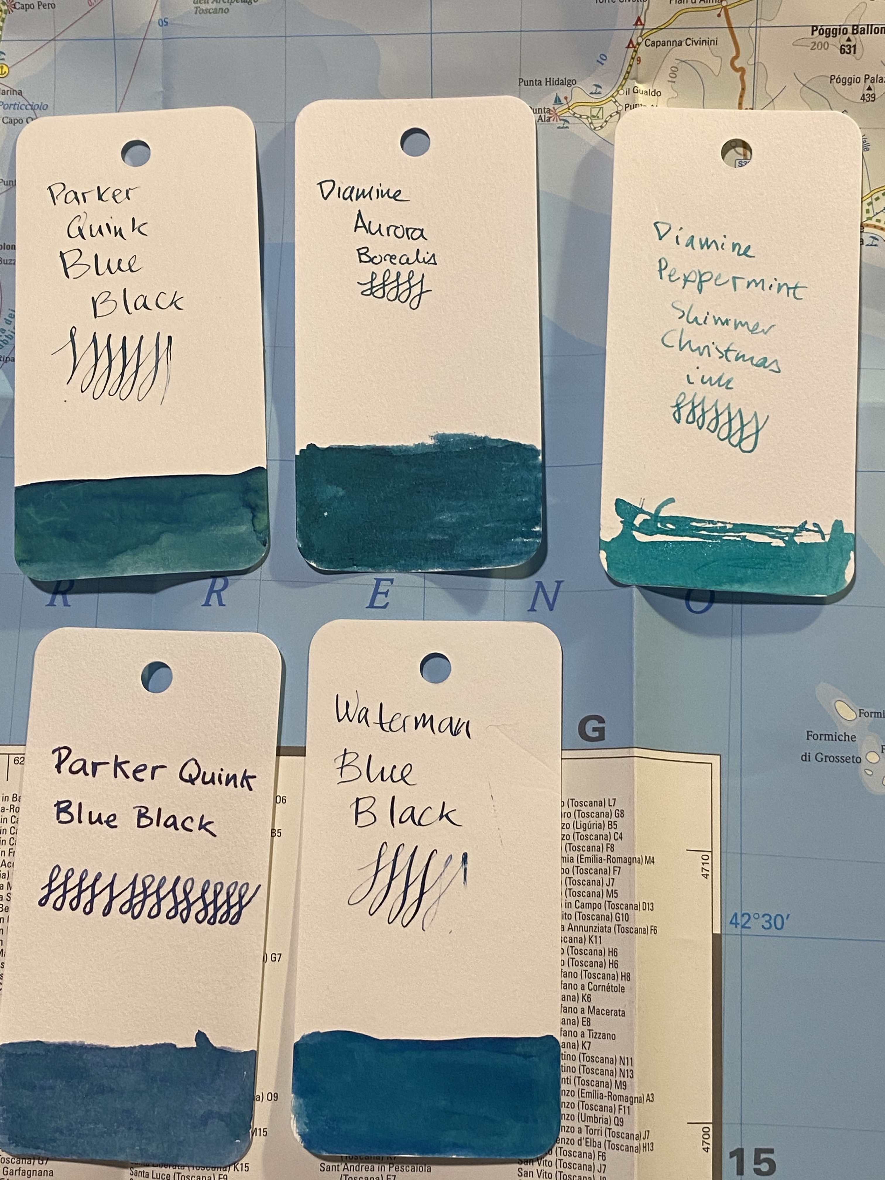
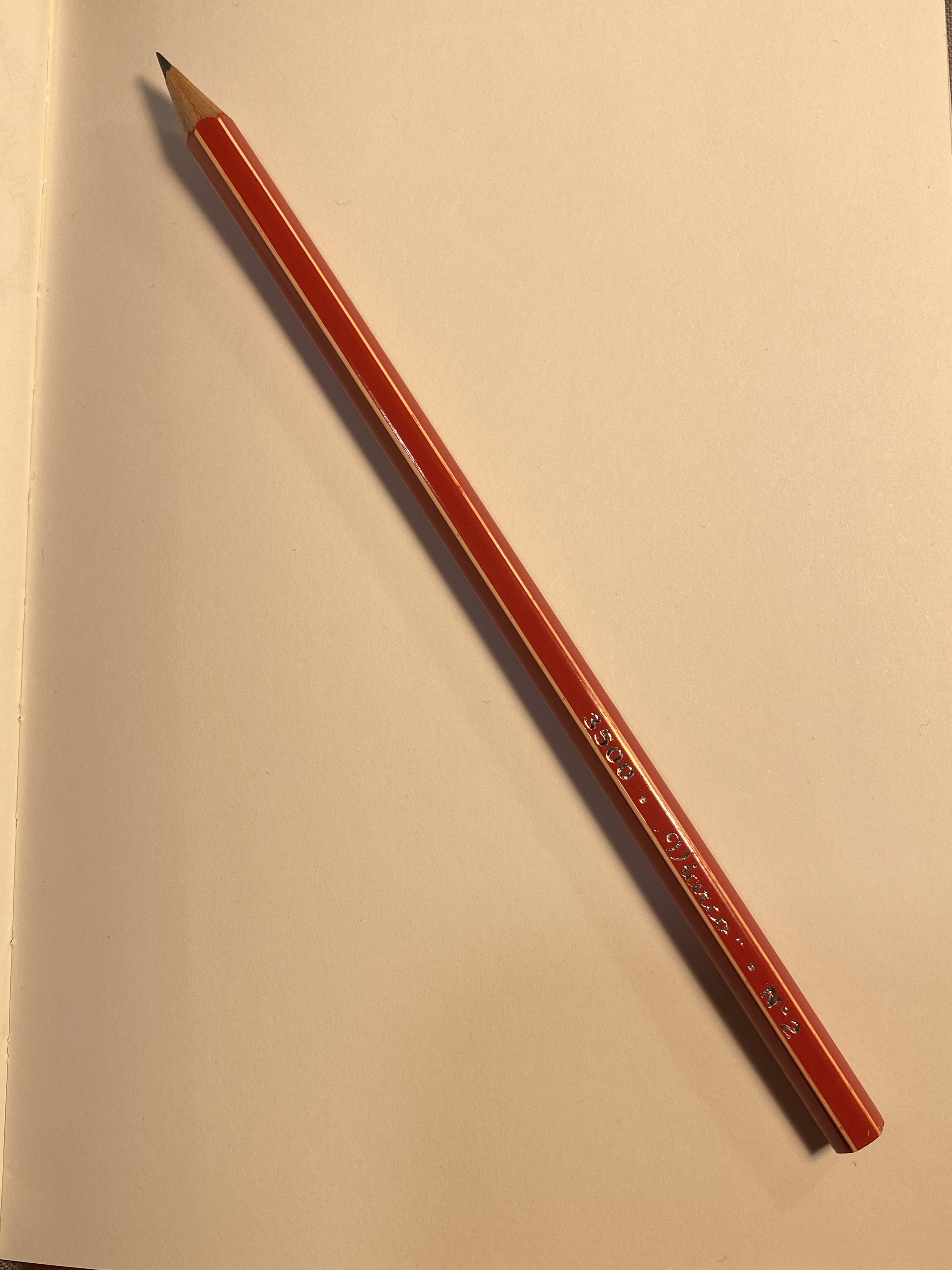
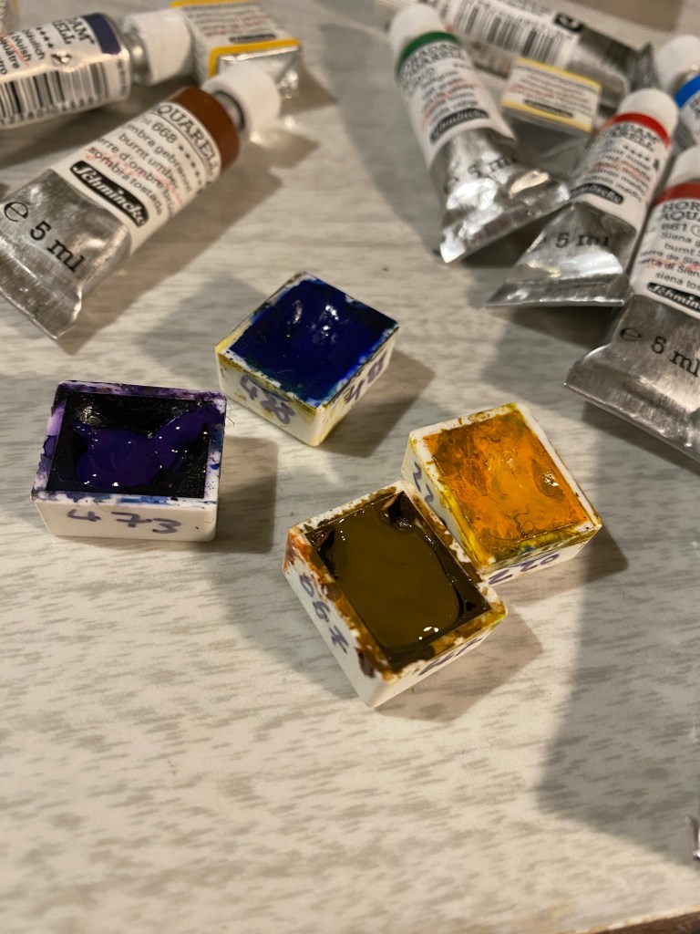
  • Write the colour number on the pan with a Sharpie (or a similar) pen. Inevitably the sticker or stamp with the watercolour’s number will fade away or peel off and you’ll be left trying to guess what it was when it’s time to replace it. If you mix watercolours by different makers then also give an indication of the maker on the pan.
  • Replace unused paint with something else that you may actually use. This is important particularly if you’re working with a small portable palette. If you see a pan with paint that hasn’t got a dent in it, consider replacing it with something else that you may use. Ask yourself why it’s just sitting there (it’s too opaque and hard to mix? You don’t need it much because of the subjects you draw?), and replace it with something that will better fit your needs. Palettes evolve with time, and yours should evolve to better fit your needs and drawing goals.
  • Buy tubes of paint to refill well used paint pans. When your starting out and still building up your palette and skills, work with pre-filled half-pans (the small square pans of paint). After a while you’ll start to see a few colours that you use more heavily than others, and for those paints you can either go for full pans, or buy paint tubes and refill them, giving them some time to set. It’s much more economical, with the caveat that you need to look up the paint maker that you’re using to see if there’s any difference between the paint in the pans and the paint in tubes. I use Schminke Horadam and there is none, so I’ve been refilling my pans for a few years now.
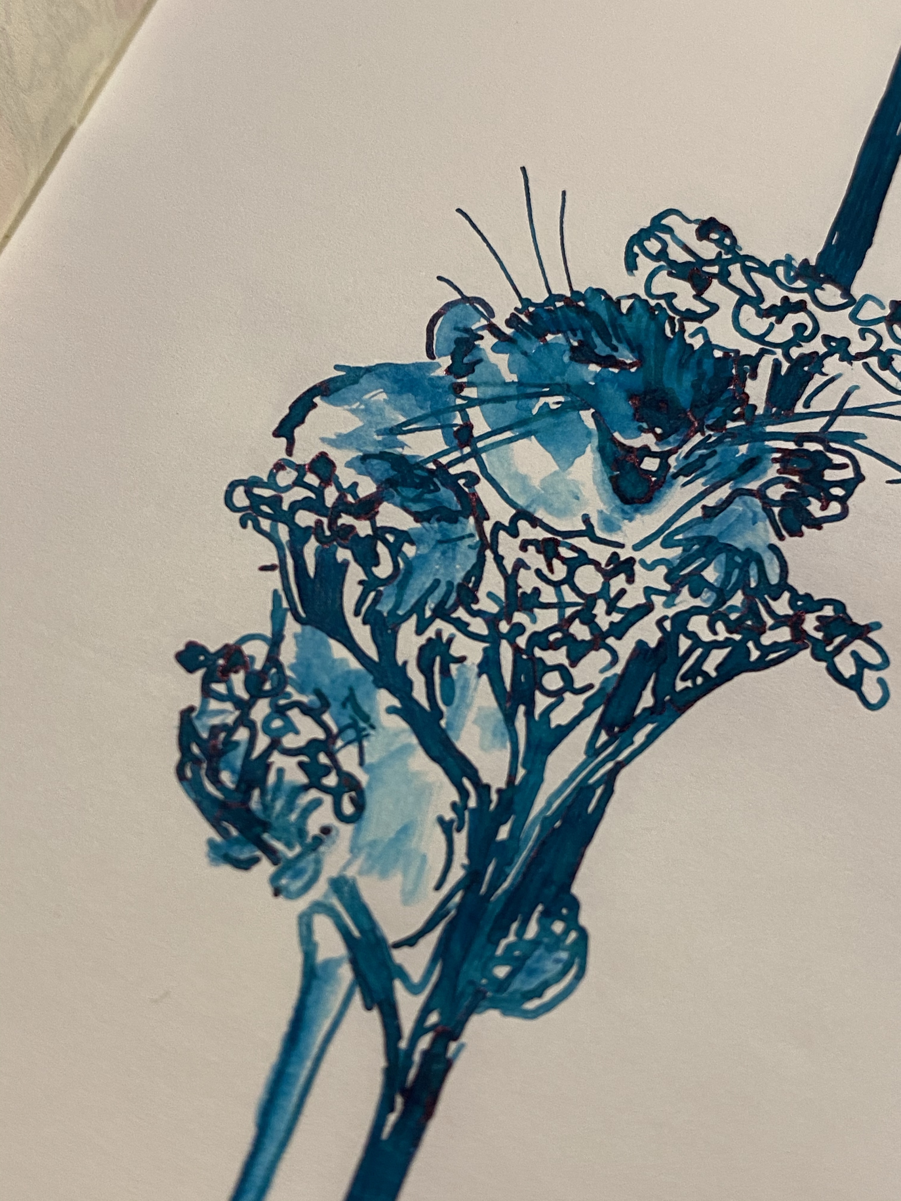
  • Check transparency and staining before selecting a paint. This is particularly important if you plan on mixing paint or lifting paint (using a brush to remove paint from the paper while it’s still wet or flooding the paper to remove paint). Paint that is opaque will not mix well with other paints (you’ll get a muddy effect), and you need to be aware of it while drawing. Transparent paints may not be as vibrant as their opaque counterparts, but they work very well with others. Staining paints will stain your paper, leaving a shadow of themselves as you try to lift them. These are not bad things in and of themselves, these are just things that you need to be aware about before adding a paint to your palette.

We are not amused

My brother’s cat was not amused when he tried to take his laptop back from her.

Sketched with a non-photo blue Pilot Color Eno 0.7 mechanical pencil and inked with a Pentel GFKP Sepia, Uni pin 0.5 sepia fineliner and Zig Mangaka 0.8 fineliner (for the writing) on an Artcoe Frisk Sketch Book. Could have done it all with one pen and no underdrawing but I’m experimenting with my setup at the moment.

How I Journal: A Sample

I decided to upload the pages from my journal entry today, as a sample and perhaps an inspiration for anyone wondering what to journal about. There’s nothing big or grand here, no deep felt angst, just small observations about my day that will bring it back to life later on. I made an effort to make my handwriting neater than it usually is, and I cut out a page of what happened later in the afternoon as it involved a family member suffering an injury and getting hospitalized, and I want to protect their privacy. Otherwise it’s a fairly standard entry. What’s missing is a title (added after the entry is completed and in this case not something I want to share) that summarizes the day. Oftentimes I glue things in instead of drawing something, and sometimes I just write in a rush and the page is just dense, messy handwriting.

I use a Moleskine Large hardcover, in some limited edition or another (in this case Pokemon Charmander), and a gel pen of some kind or another. Today it was the Karas Kustoms Ink v2 rollerball with Uniball UMR-85, my favourite refill. I don’t mind the show through, it helps me get through the fear of the blank page, and there’s no other notebook that has the Moleskine cover and internal design, so after years of futilely trying to replace it with something else, I just shut out the voices of the detractors and allowed myself to enjoy what I love and what works for me. Please do the same.

Urban Sketchers Tel Aviv: Dubnov Garden

We haven’t had an Urban Sketchers sketchwalk in Tel Aviv since June due to Covid-19. We met today and drew, socially distanced and with masks, for three hours in Dubnov garden, which is not far from Rabin Square and is just behind the Tel Aviv Museum of Art.

The first drawing, focusing on the strange rock sunken sculpture in the middle of the garden, was drawn on a Stillman and Birn Pocket Alpha, with a TWSBI ECO 1.1 stub filled with Rohrer and Klingner Emma SketchINK and Schminke watercolours.

The second drawing is a panorama of the architecture near the park, and it was drawn on a Moleskine Large Watercolour notebook, with the same materials and the drawing above.

My drawing challenge has allowed me to streamline my process and bring in much fewer art supplies to the sketchwalk without feeling that I’m missing out. It was also the first time I brought my Walkit sketchbag to a sketchcrawl and it worked very well. I’ll write a review of it later on, once I’ve finalized the kit I put in it.

Work in Progress

This one is taking more time than I anticipated. People plus architecture, it figures.

Diamine Aurora Borealis Ink

Diamine Aurora Borealis fountain pen ink was created by Diamine in collaboration with the /r/fountainpens reddit community, who chose the colour. I love teal inks, but at first I thought that I had enough inks that are close enough in colour to skip this one. I have no recollection of how it landed in my basket during my last Cult Pens purchase 🙂

Beautifully designed label.

I don’t normally spend much time on the packaging, but Diamine’s 30ml plastic bottles are deep and wide enough to allow for filling even chunky pens, and their (relatively new) label design is splendid. This bottle is unique in that it has another label, crediting the /r/fountainpens community with selecting the ink colour:

Aurora Borealis is a dark teal with some red sheening, and a good amount of shading for such a saturated ink. It also dries surprising fast for such a saturated ink (although I wouldn’t call it a fast drying ink).

Swab on a col-o-ring card.

You can see a bit of the red sheen here, on the top of the “A” in aurora:

I a few inks that are in the region fo Diamine Aurora Borealis, but not many of them are swabbed. I will say that the ink is dark enough to be fine for office use, and that is still shows plenty of interest and character:

I tried it also on Paperblanks paper, and on Rhodia paper. In both cases the ink dried darker than it looked when I was writing with it, although the photos picked up less colour than it originally had. The best colour reproduction is in the final photos of Tomoe River Paper, further below. It is worth pointing out though that if you have a wet nib, you’re going to see darker results than you’d expect from the swabs.

Paperblanks

In any case Aurora Borealis came out much darker than it appears on Goulet Pens site, for instance, although not as dark as it appears here:

Rhodia

I gave the ink a spin on some (old) Tomoe River paper, and “opened” it up with some water and a fine brush. As is the case with most Diamine inks, Aurora Borealis isn’t waterproof or water resistant, and doesn’t market itself as such. It is, however, a lot of fun to draw with:

You can see red sheening on the happy little dormouse’s nose, as well as on the flowers. You can also see the shading in the flowers:

This is the best sample of all the properties of this ink: the relatively dark colour, the shading, and the slightly red sheen:

Diamine Aurora Borealis is fun dark teal ink that will likely appeal to anyone who likes teal/turquoise inks. It’s inexpensive and unassuming, and so you can take an interesting ink for a spin without spending Sailor or Iroshizuku money.

30 Days of Drawing: Days 11-15

I decided not to take part in Inktober this year. Instead I’ll be drawing at least one page a day in my Stillman and Birn Pocket Alphas. You can see days 1-5 here, days 6-10 here.

It was Yom Kippur when I drew these, and a very strange Yom Kippur it was. The country was under lockdown, and so some of the prayers were set outside, including this one in Kikar Atarim:

The streets were more deserted than usual during Yom Kippur. There are no cars around, and everything is closed, but the pandemic added another eerie aspect to it all:

I woke up early in the morning to draw Kikar Dizengoff utterly deserted. The Agam fountain in its centre is still colourless, but I actually think that it works. I love how the multicoloured chairs around the fountain just grab your eye:

I was searching for some flowers to draw, when this came up: a Dior dress from the exhibition we saw over a year ago. I’m not very happy with the wild highlight and shadowing choices that I made, and you can see that the Alpha paper doesn’t allow for multiple washes, but you learn from your mistakes more than from your successes:

I went for a stroll looking for things to draw and found this abandoned couch lorded over by a local cat. I had to juggle all of my art supplies on my hands, so that was a challenge, but I like how the cat and couch came out. I may later on touch up the bush on the left, but as Stillman and Birn Alpha paper doesn’t take too well to reworking, I may just leave it as it is:

30 Days of Drawing: Days 6-10

I decided not to take part in Inktober this year. Instead I’ll be drawing at least one page a day in my Stillman and Birn Pocket Alphas. You can see days 1-5 here.

I had some failures and some successes with my drawings this week. I did a very quick and not very accurate drawing of my gong fu table, and with that finished my first Stillman and Birn Pocket Alpha.

The green spot in the right corner is a nasturtium leaf test that I did for another drawing earlier in the sketchbook.

I’ll probably write a post about the Pocket Alpha, maybe later this week. In any case, the sketch above didn’t come out great and I considered not even investing in painting it, but then I figured out that while I learned from my mistakes in sketching the gaiwan proportions (I’m not using a pencil under drawing because I’m trying to speed up my process), I wouldn’t get a chance to improve my watercolour skills if I didn’t watercolour it. So the result was an OK watercolour, and another proof that paint can cover a multitude of sketching sins.

The next sketch took my two days, mostly because I was busy. It’s a “flowers of the urban desert” spread, and I created the top left sketch on day 2 and the rest on day 3. I’m trying to get myself used to composing pages, and this one will probably get some text added to it later.

We’ve just entered our second lockdown, and I got nostalgic to the office and to our little escapes to our excellent local coffee shop. Found a photo of this latte from one of my final pre-Covid visits there and decided to draw it.

This drawing, of the excellent Paul’s Café in Jaffa, took me the longest to draw, and that’s after I edited out a ton of details. It was fun to do and reminded me of better times. I hope that they pull through and I’ll be able to go back there someday soon.

Drawing Insights and the Viarco 3500

I was going to write a blog post reviewing the Viarco 3500, and so I started writing a page of notes in my usual pencil review notebook (the Baron Fig Confidant). Once I started writing I realized two things:

  1. The Viarco 3500 is a good looking but boring pencil. It’s an HB/No. 2 pencil that’s slightly gritty, slightly dark and soft and not much different than other branded pencils of its kind, like the Ticonderoga or the Palomino Golden Bear.
  2. I wanted to reflect about the difficulties of drawing.
Pretty but dull, the Viarco 3500 No. 2 pencil.

So here’s my page of notes on the Viarco turned into reflections on the drawing process:

This isn’t a “woe is me” post. It’s a “embrace the suck and take courage” post. Perspective is HARD. But it’s worth learning. And learning again. And learning again. And boy is it worth practicing. Why? Because while nobody is born knowing how to draw in perfect perspective, practically everybody can tell when the perspective is “off”. You can tell yourself that it’s an “aesthetic choice,” however, I do believe that you are cheating yourself out of something when you don’t even try to get the basics down. I know, I tried to do that for literally years. I have good enough hand-eye coordination that I could cheat some people some of the time. Then I tried learning it from books. I drew the boxes, the shaded ball, the room with the door and window, and I told myself that since I copied them so well, I now “knew perspective”. Hah. The minute a teacher sat me down and told me to draw the corner of a room, a still life of some boxes and a vase, and an old shoe the truth was all too apparent. I didn’t grok the principles behind those boxes and skylines and spheres and so I couldn’t extrapolate from them to the real world. I now have 11 plus years of knowing groking those principles and I still tell you that it’s hard.

Can you catch the perspective mistakes here? This is from 2009 and it makes me cringe.

You can cheat, and I did and sometime do cheat, the eye with colour and crosshatching, but it doesn’t take an art critic to point out that something is “off” in the drawing. The same goes for poor composition choices, muddy pigment mixtures, colours that unintentionally clash and cause unease. These are all very technical skills that require a good amount of studying and a great amount of practice to master. It doesn’t help that most of them are difficult to learn from books and tutorials and are still best taught in a live art class. It’s also frustrating that you usually work and work and work with little or no progress for some time and then suddenly your hand and eye and mind click and you jump forward a level or two. It’s so easy to give up before that. I have several times in the past. Then I found a new teacher and I got back to the grind.

Why do it? You don’t have to. Instagram and Facebook likes are independent of your drawing skills, and more related to tags, followers and how colourful and eye catching your work is. If you’re doing it for that, then there’s no point in doing it. But mastering the basics allows you to advance all your drawing skills at once, with great leaps and bounds. Every breakthrough I had with the basics allowed me to draw better, faster, with more confidence and to tackle subjects and locations that I otherwise would have avoided.

So, the Viarco 3500… It’s a good looking pencil to have around. Perspective, colour theory and composition? If you have any interest in drawing I highly recommend investing in mastering them.

Shana Tova!

Shana Tova! May the coming year be a thousand times better than the past one.