Musgrave Tennessee Red Pencil Review

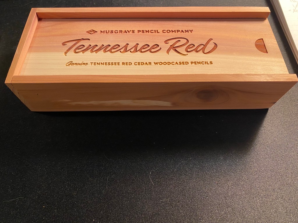
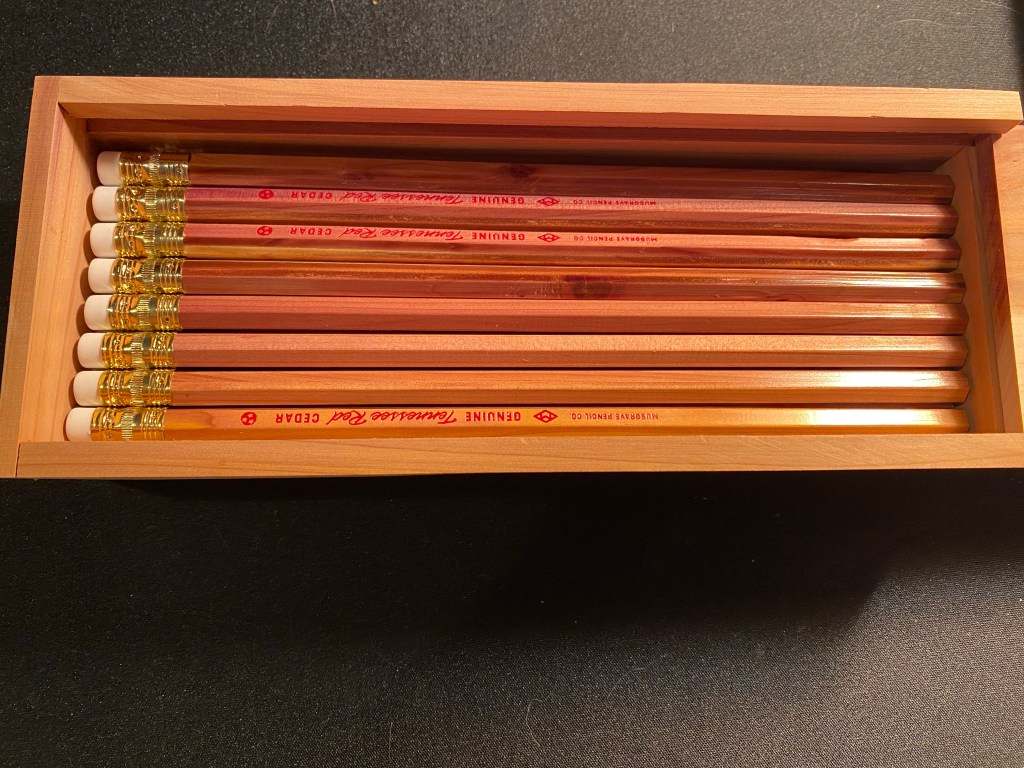
This is the Musgrave Tennessee Red pencil presentation box:

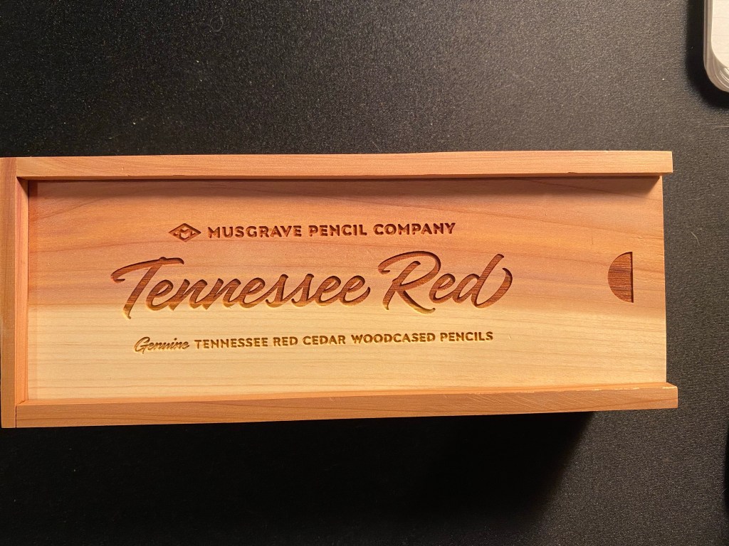
Gorgeous, isn’t it? Just look at that reddish and golden timber. It glows:

The pencils inside are equally beautiful. They’re made of Eastern Red Cedar, in the USA, and this is the 24 pencil presentation box. I have two of these, as well as a paper box that has 12 pencils. I’ve had them for a few months, but I haven’t had the nerve to sharpen them until earlier this week. They were just too good looking to sharpen.

24 Tennessee Red pencils in a cedar presentation box.

Now this isn’t to say that these pencils are perfect. Musgrave points out on their site that these pencils can have modest visible wear due to the soft nature of the wood, and the core may be slightly off centre. A rummage through the pencils that I have proves that these warnings are justified. But it still is a gorgeous pencil:

Just look at it.

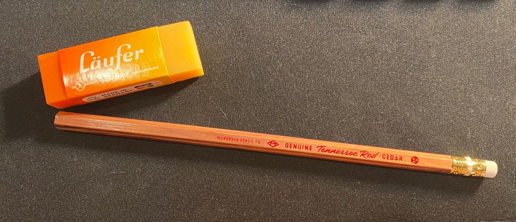
The pencil is lacquered which does protect the wood somewhat, and a lot of thought and care went into designing the imprint on the barrel (text, colour, font, symbols) – and a lot of restraint too. The imprint, ferrule, and eraser don’t call attention to themselves. This is a pencil that’s all about its beautiful, sweet smelling wood.

See how the imprint and everything else fade out of sight? An beautiful and understated pencil.

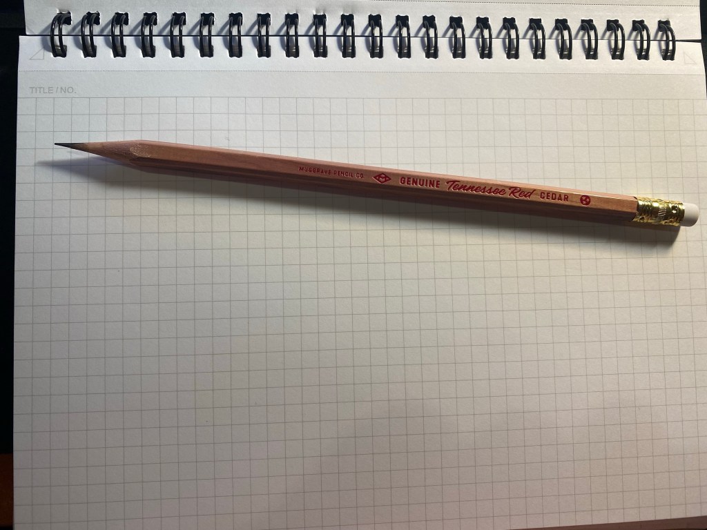
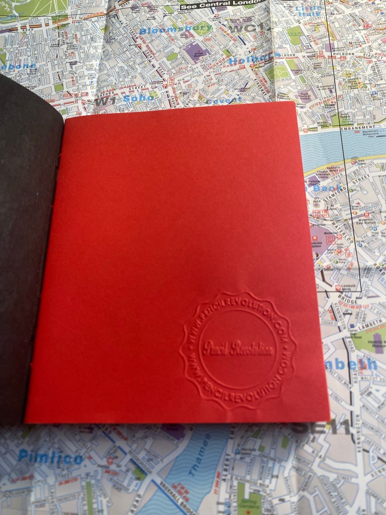
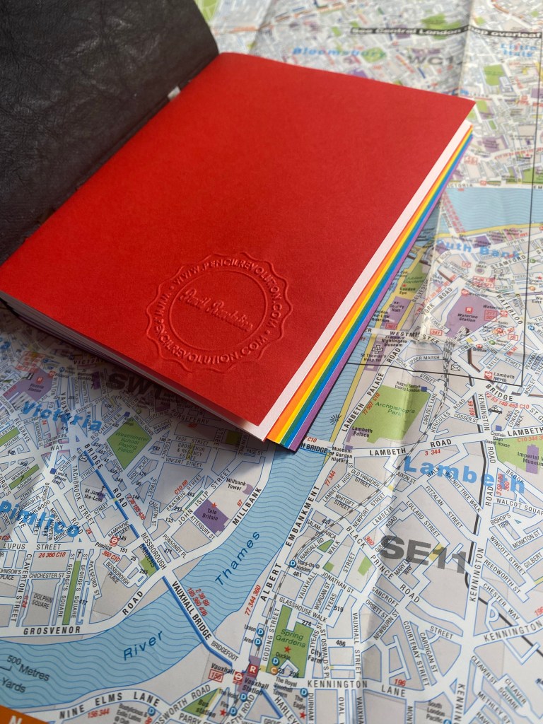
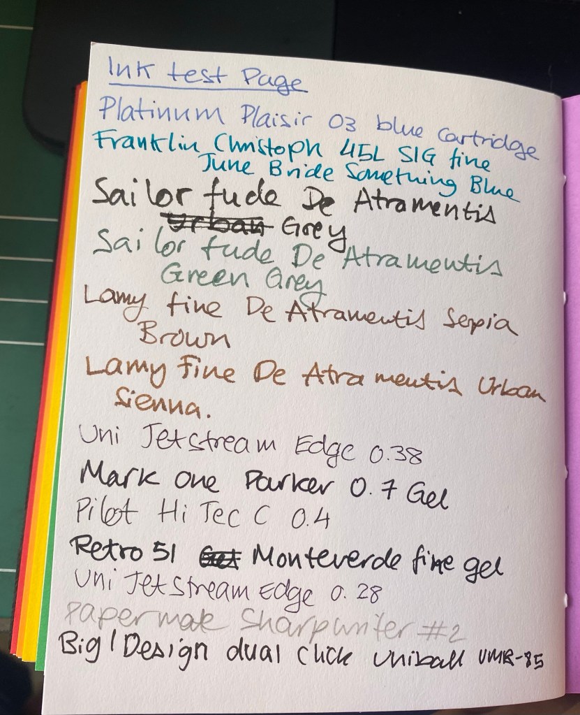
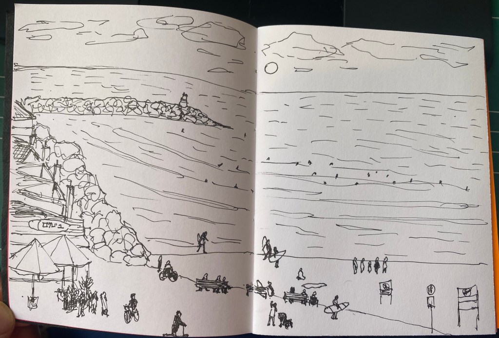
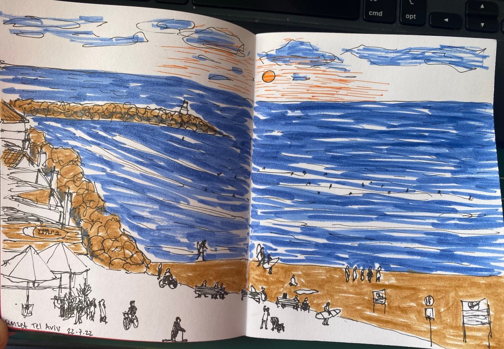
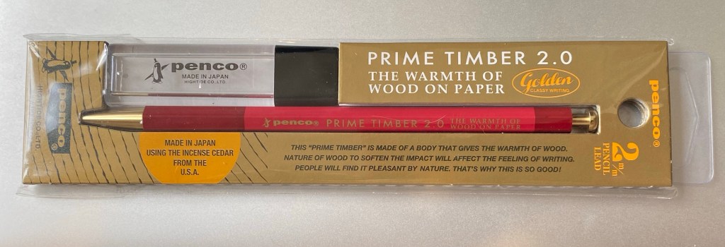
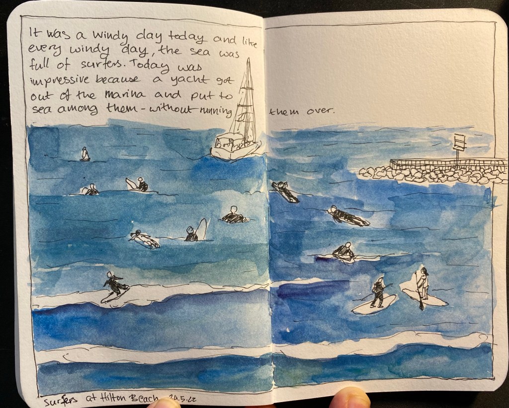
The Tennessee Red is a joy to sharpen. The cedar smell is intoxicating, and if the pencil wasn’t such a good one I may have just sharpened it all away. But it comes with a smooth, dark lead that feels and behaves like a B grade despite being a #2 (or HB) pencil. It’ll be a delight to sketch with this beauty. You can see it in action below, on a Baron Fig Confidant.

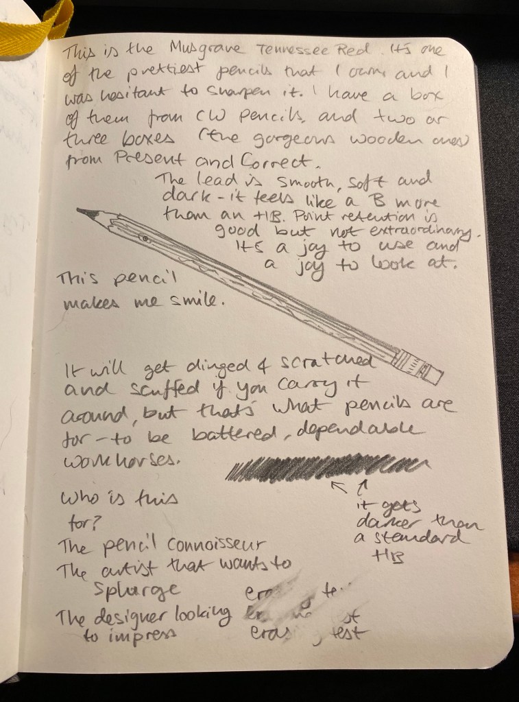
These aren’t cheap or widely available, and if you are outside the US they are even less cheap and more hard to come by. They are, however, worth the price and worth making an effort to find, and not because they are the best pencils in the world, but because it is clear that someone made an effort to make a modern American pencil that doesn’t shame its Eagle and Eberhard Faber vintage counterparts. It’s a beautiful, sweet smelling, wonderful woodcased pencil that is a joy to use and would make any stationery lover smile.
And who can’t use a reason to smile these days?

Pencil Revolution Handmade Peekaboo Pride Notebook

In my sizeable collection of notebooks and sketchbooks I have maybe one or two handmade ones. I tend to not buy handmade notebooks because the paper quality is oftentimes sacrificed in favour of cool covers or bindings. However, when I saw the Peekaboo Pride notebook on Pencil Revolution’s Etsy store, I couldn’t help but give it a try. The binding looked amazing, and I trust Johnny Gamber when he says that the paper inside is good.

I love this cover band. It made me smile.

The notebook is small, 10cm x 12.5cm, and beautifully made. Every little detail is well designed, starting from the band that the notebook came wrapped in. You see the care and character in every part of this little notebook, which is precisely why you’d want to buy a handmade notebook in the first place.

Back of the band.

The cover is made of “Kraft-Tex” which is a textured, durable, flexible, card-stock like paper. It’s ripe for customisation if you enjoy customising your notebooks.

The cover.

The spine is where the notebook really shines, and it’s what gives the notebook it’s “peekaboo” name. The notebook is made of six signatures the colour of the pride flag, and the cutouts in the spine allows you to see their colours. The threads used for binding are also pride coloured, and the result is stunning:

Peekaboo spine with pride signatures and threads showing.

The cover of the first signature has a Pencil Evolution stamp embossed on it. That, together with a label inside the inside of the back cover is the only branding on the notebook. Very subtle and tasteful.

Pencil Revolution stamp.

I just love the back label. There’s such pride of craftsmanship here:

Back label.

Here’s a look at the colourful signatures from inside. Everything about this little notebook is perfect, and makes me smile:

Pride colours on show.

And inside each signature you get glimpses of the multicoloured thread used to bind this notebook.

You can see the thread change colour on the top.

I was worried that the paper wouldn’t be fountain pen friendly, but I had nothing to worry about. The Neenah’s Astrobrights paper is very fountain pen friendly, despite not being coated paper. That means that inks dry quickly on the page, and it means that you can use this little notebook for pen and ink wash sketches.

Testing various inks and pens.

There’s no bleed through, even with the Sailor Fude nibs that lay down a lot of ink, and there’s very little show through.

Very well behaved paper.

The paper was so well behaved that I decided to see how well it would take to an ink and wash sketch. Here’s the basic sketch, done with a Staedtler 0.1 pigment liner.

Initial sketch.

Then I laid down ink washes, and the paper behaved beautifully. It didn’t deteriorate, the colours popped on it, and it was fun to use.

Sketch of the Tel Aviv beach on the paper.

Here’s the other side of the paper. It’s amazing that there’s no bleed through and very little show through. This paper behaves better than my Stillman and Birn Alpha with ink washes.

Back side of the sketch.

The Peekaboo Pride notebook is phenomenally well made, with excellent paper, and it’s just a joy to use. I’m close to finishing my pocket Stillman and Birn Alpha, and this little notebook will be the next sketchbook in line to replace it. I won’t be using it for watercolour (no paper this thin has a chance of handling watercolour washes), but it’s great for pen and ink sketches, and for ink washes.

Ink Wash Sketches

Inspired by Gabi Campanario I’ve taken some waterbrushes and filled them with diluted shellac based ink from Sennelier. At first I only had Burnt Sienna ink that I bought years ago from Cornelissen and Son (one of my favourite art supply shops in London), but I purchased a bottle of Prussian Blue and Cobalt Blue to add to it. The bottles have pipettes which make using them to fill a waterbrush convenient, unless the brush has a valve on the body, in which case you’ll need to dip it inside the bottle, and you’ll have issues filling it fully.

Here are some sketches done with the Burnt Sienna. The first one was done with a fountain pen and a single waterbrush filled with pretty diluted Burnt Sienna and was drawn on a Stillman and Birn Pocket Alpha. This was when I discovered that the ink dried lighter than I thought, and that layering it on this paper isn’t really an option. I didn’t get enough of a gradient, and it didn’t take long for the paper to start to disintegrate from the ink. Note also that the ink dries fast, and getting perfect washes with a waterbrush is practically impossible, even in such a small format. But I liked the result enough to experiment with it some more.

First try with ink in a waterbrush.

I then filled another waterbrush with a much less diluted Burn Sienna and water solution. Here’s the same Stillman and Birn Pocket notebook but a sketch with a little more gradient because I used two different ink/water ratios. I like the result better, especially on the trunk.

Second try, more contrast.

Then I got the Sennelier Prussian Blue that I ordered, and I filled two brushes with it, one diluted with water at about a 50/50 ratio, and another practically undiluted. I had enough of the Alpha paper, so I switched to 300 gsm cold press watercolour paper from Clairefontaine. Here’s the sketch, done with a Staedtler 0.1 pigment liner (I didn’t want the lines to distract from the wash):

Sketch done with Staedtler pigment liner of a fisherman in the sea.

And here is the result with the ink washes applied:

Result with ink wash.

I used the dark blue for the shadows on the rocks, and this time I could actually work with the ink (due to the quality of the paper) and blend between the Burnt Sienna and the Prussian Blue.

I loved this result enough to give these ink washes more tries. I will say that there have been some issues with them so far:

  • Many of my waterbrushes (most of my Pentel ones) didn’t allow the ink to flow to the brush bristles.
  • Some of my brushes leaked, and so I won’t be carrying them around in my bag without a ziploc bag to protect my bag contents from them.
  • The Cobalt Blue ink that I bought contains copper. It came with a warning label, and I’m not going to use it before I make sure I have a leak proof brush for it.
  • The behaviour of the ink is entirely dependent on the quality of the paper, more than any medium I’ve used before (including watercolour).
  • Waterbrush bristles deteriorate pretty quickly, and make fine detail work and brush control more difficult.

All that being said, I enjoyed using them enough in my sketches to continue using them for a while, and I recommend giving shellac (calligraphy) ink in a waterbrush a spin.

PS – these inks are NOT FOUNTAIN PEN FRIENDLY!
If you put them in your fountain pen they will ruin it.

Staedtler Pigment Liner Review

I somehow managed to not review my favourite pigment/fine liner, despite it being one of the sketching tools that I use the most. While I know that the pigment liner from Sakura is more popular is stationery blogger circles, and Copic is thought to be the elite offering (it sure is in terms of price), Staedler’s pigment liners have been my go to pigment liners since I was a teenager, and they have always been the ones I compare all others to.

Pigment liner set bought at Cass Art in London

All pigment liners are expensive to purchase here, and Staedler is no different, which means that I always stock up on them when I go to Cass Art in London. This 6 pen set is always on sale, and you get a useful selection of pen widths. However, if you are just starting out, don’t buy a set – buy a 0.3 and a 0.5 and if you want to splurge add the 0.1 and the 0.8.

The full set: Calligraphy, 0.8, 0.5, 0.3, 0.1, 0.05

Whether you use Staedler pigment liners or ones from another brand (Sakura, Faber Castell, Copic, Uni-ball, etc), the 0.3 or 0.5 will likely be your base, bread and butter pen. I generally use the 0.3, unless I’m feeling shaky, I’m in a hurry and want to churn out sketches/illustrations, or I want to go for a dramatic effect, in which case I go for the 0.5 or the 0.8. The 0.1 is a pen that I use for the opposite effect – when I plan to use watercolour or an ink wash and I want the colour or wash to take precedent. The 0.05 is a pen that I used to use when I was younger and drew comics (it’s excellent for fine details), but I hardly ever reach for it now, unless it’s to work in small format with a colour wash of some sort following. It’s a fragile pen, so if you tend to lean on your pens, this one is not for you. How can you tell if you put a lot of pressure on your pens? Write a page with a gel ink pen and check the back of the page. Does it feel like braille lettering? Does your wrist hurt? Then you’re putting to much pressure to use this pen without ruining the tip, and you may have issues with the 0.1 tip as well. I used to write like that and it took some practice for me to be able to use these ultra fine tipped pens.

Line samples on a Moleskine pocket sketchpad.

So, why do I love the Staedtler pigment liner so much?

  • It puts down a consistent, black line. This seems obvious, but I’ve tried more than one pigment liner that puts down a dark grey or washed out black line and it’s always disappointing.
  • It’s a rock solid pen that won’t dry out, and has a robust tip. I’ve had terrible luck with Faber Castel and other makers where a capped (mind you, capped) pigment liner stopped writing reliably after a month or two. This has never happened with my Staedler’s, and I’ve had some for years.
  • The pen body. This is what makes the Staedler’s the best of the best in my personal opinion.
The Staedtler pigment liner’s pen body.

So, what makes the Staedler pen body so great? It’s a whole lot of small things that just add up. It’s light weight but doesn’t feel flimsy, and it has a matte finish with a subtle lined texture all around, so its easy to grip. It’s also a bit wider than many of its competitors, and unlike many of them, it has the pen width clearly marked on both the pen body and the pen cap. It also doesn’t have any sharp edges, which you’d think would be an obvious in pen design, but sadly isn’t. Finally, it caps and posts and uncaps with a solid click, and without having to apply a lot of pressure. You know the pen is capped and the pen is uncapped when you need it. And if you so care to uncap it with one hand, you can.

Here’s the 0.1 Staedtler in action. There’s a photo of the sketch I made after applying an ink wash (Sennelier Burn Sienna India Ink diluted in water and applied with a brush pen), and one of the same sketch after I applied blue watercolour.

Staedtler 0.1 pigment liner, and ink wash.
Staedtler pigment liner 0.1, ink wash and watercolour.

During a private tour of Nazareth last year (a present from my wonderful family in between chemo treatments), I met the guide’s young boy. His father told me that he wanted to be a clothing designer when he grew up, so I broke out my sketching kit and gave him every Staedler pigment liner that I had on me. His eyes lit up once his father explained what these pens were. If you have a budding artist, designer, sketcher, doodler in your life and you’re wondering which gift to give them, two or three Staedler pigment liners will always be welcome.

Weekly Update: New Job

There’s been a dearth of new posts this week because I just started a new job, and while it has been great so far, I still haven’t adjusted to it. After being a recluse (out of necessity) for the past year or so, it was a bit of a shock to the system to meet so many new people face to face. I’m not sure yet how my posting schedule or content will change in the coming days and weeks, but I’m hoping that it won’t change too much.

I’ve started the SketchingNow Watercolour course, and I’ve done the first week of classes. This week is all about washes, so I created a grid of all the colours in my palette, showing how each one looks as a watery wash, a juicy wash and a pasty wash (what Mark Taro Holmes terms tea, milk and honey). This was a lot of work, but it did give me a better feel for the potential of the paints in my palette.

There was also an exercise that involved sketching vegetables with a set of juicy washes. Here’s the sketch in progress:

And after it was done:

This was a pretty simple exercise, but nevertheless a lot of fun.

Reading

My reading has been quite eclectic lately. I finished reading “Our Country Friends” by Gary Shteyngart and it turned me off the Tournament of Books list for this year. I’ve got very little patience for the plights of unlikable privileged characters that potter about a story with zero plot except having sex or trying to have sex with each other, and whining about their lives all the time.
I’ve read “Drive” by James S.A.Corey , the first short story in “The Expanse”. It’s completely skippable, so don’t feel the need to read it if you want to get into the series. Also, please don’t start “The Expanse” from this story – it may be chronologically first, but it’s their worst piece of writing so far.
I’ve started reading Ali Smith’s “Companion Piece,” which is a companion piece to her fantastic seasonal quartet of novels. I like her writing so much that I bothered to get a signed hardcover of this book. So far it’s shaping up as an interesting read.

Finally, I’ve plunged back into Henry IIIV’s England with “The Mirror and the Light” by Hillary Mantel. Her writing is mesmerizing and she really brings Cromwell, his peers, family, rivals and the entire period to life.

I’m experimenting with various kinds of new sketchbooks and sketching materials (as well as pens and ink) and I have thoughts about them. I just need to find some time to organize them into something coherent and write it all down. Meanwhile, here’s a quick sketch that I did on a paper bag during a zoom call, using a new brush pen that I’m trying out.

Have a great week!

SketchingNow Watercolour Course Introduction

I’m starting Liz Steel’s SketchingNow Watercolour course next week, and so I spent the weekend completing the three intro lessons to the course. It was nice practicing a bit of brush control after such a long time (for over 6 months I haven’t been able to properly hold and control a brush because of my peripheral neuropathy), and I cleaned my palette after a long time.

Metal watercolour tin filled with half pans of paint.
Clean palette
A sketch of the paints in my palette with a legend.
Intro lesson 1 exercise

My palette is large and I still have 3-4 colours on it that I’m still not sure about. This is the first page of a brand new Moleskine Large Watercolour Sketchbook, the new one in portrait format. Drawing your palette is a great way to start your sketchbook and get over the initial fear of “ruining it”.

Intro 2 exercise – testing the brush

The brush is a Rosemary & Co Kolinsky Sanle one, and I haven’t used it before.

Intro 3: testing the paper. Check out the granulation on the ultramarine.

Overall these were good intro lessons to watercolour sketching and good warmup exercises.

Weekly Update: Open House at the Municipal Nursery

The past two weeks were a bit hectic, with various social gatherings (I’m not used to meeting people after being isolated for so long due to Covid and chemo) and getting ready to leave my old job and start my new one. The weather is still pretty good, and I’ve been relishing it: running, walking, and sketching a lot. As I’ve gotten used to writing and sketching with this level of neuropathy, I’m trying to take advantage of the pre-summer-heatwave weather to get as much outdoor on location sketching done as possible. I also have a backlog of London and Paris sketches to go through, complete where necessary and post.

I’m back at the gym (I had to freeze my membership during treatments), and enjoying getting back to lifting weights. And I went to see a movie for the first time in more than two years. “Dr. Strange and the Multiverse of Madness” was pretty good, but it had a few too many horror elements for my liking. Another first after a very long time was an evening out at an escape room with my friends. It was a lot of fun, and something that I really missed.

Yesterday I went an Open House Tel Aviv event at the municipal plant nursery. I learned that the nursery serves a wide variety of organizations and gardens all over the city, that urban environments, and particularly seaside urban environments are rough on plants, that the nursery is one of the few of its kind in Israel, and it has been around for 100 years. We saw plants grown from cuttings, talked about plants that can survive the salt and sand and harsh sunlight of beachfront gardens, as well as plants that can thrive in the shade. We saw plants that are pollinator friendly, and talked about local plants vs. imported and invasive plants in the city. It was fascinating, and I could have spent the entire day there. The nursery isn’t normally open to the public, so visiting it and getting such a wonderful insight into it was a real treat.

A sketch of a lady in black work clothes and purple hair, a shaded set of growing tables and a patch of nasturtiums.

Here’s a closeup of Liat, who manages the nursery and was our fantastic tour guide for the day.

A close up of the lady in black work clothes and purple hair from the sketch above.

I’m 3/4ths done with “Our Country Friends” by Gary Shteyngart and I’m probably going to give up on the Tournament of Books reading list once I’m done. I have so many good books that I want to read, that I don’t feel like chancing another tiresome one. What will come next is Ali Smith’s “Companion Piece”, and then “The Mirror and the Light”. There are a few classics that I want to catch up on, and some very good sci fi that’s waiting for me, so as much as I’ve discovered some fantastic books through “The Tournament of Books”, I think that this is where our ways will part, at least for a while. Oh, and Agatha Christie is an excellent writer, and very addictive. I may return to her books in the near future.

I’m exploring various ways to manage my projects, and so far I’m unhappy with all of them. When I was in London I picked up this Penco leadholder and some leads (I have another one in shades of green that part of a sketching kit that I don’t want to break up), and I’m giving the good old PigPogPDA another try while I work things out. This is always my “palate cleanser” system, something that I use while I tweak other, more complex systems into relative perfection. I’ll be using this leadholder and a Moleskine plain pocket reporter.

The Penco Prime Timber 2.0 leadholder in red with brass hardware.

I’ve enrolled to Liz Steel’s Watercolour course. It’s starting a runt through on the 8th of June, and as I’ve had such a long sketching break while my hands were bad, I thought that it would be a good way to refresh my skills and pick up a few tips and techniques along the way. I like Liz’s loose, non standard watercolour style, and her courses are excellent.

Next week on Tuesday is my last day in my old job, and the week after that I start my new job. Exciting times 🙂

Cocktail Party

Quick sketch of people making cocktails in the dark. Uni-ball Jetstream Edge 0.38 on a Stillman and Birn pocket Alpha.

Surfers in the Sea

I went on a walk this morning, and as the wind was up, the surfers were out in full force. I decided to take a quick break and sketch them in my pocket Stillman & Birn Alpha sketchbook, and I used a Staedler 0.05 fineliner for a change. I used to love the 0.05 for the fine line it gave, but I haven’t used it for years, and while my neuropathy was bad I couldn’t have used it. As my neuropathy is improving with the weather, I decided to give the 0.05 a spin.
This was sketched on location and painted later on.

A sketch of surfers and a yacht in the sea, enclosed in a drawn frame and with a bit of text describing the scene on the top left corner.

The sketch as it was on location:

Surfers and yacht sketch as above, minus the text and with the sea not painted in blue.

And the original scene once I finished sketching:

A photo of a yacht in the distance and surfers in the sea