Majohn Q1 Bent Nib Fude Fountain Pen Review
First thing’s first: if you are looking for a writing pen, then the Majohn Q1 mini fountain pen is likely not for you. While you can purchase it with an extra-fine, fine or medium nib, it’s weird body shape would likely make it uncomfortable for long writing session, and as it’s an eyedropper filler, it’s designed to have a giant ink capacity, normally suitable for long writing sessions.
If, on the other hand, you are looking for a fountain pen to sketch with, the Majohn Q1 may be a very worthy addition to your kit.
I purchased the Majohn Q1 bent nib fountain pen after seeing Paul Heaston use it in one of his sketches. “What is THAT?!” I asked, and immediately set out on getting one. This weird looking fountain pen reminded me of the Tombow Egg pen (google it. I’ll wait), which I always wanted and never got because I couldn’t afford one at the time. The Majohn Q1 appears to have almost the exact same design as the Tombow Egg, with a few minor details in the trim and molding of the grip section. I purchased mine on Amazon for $22.
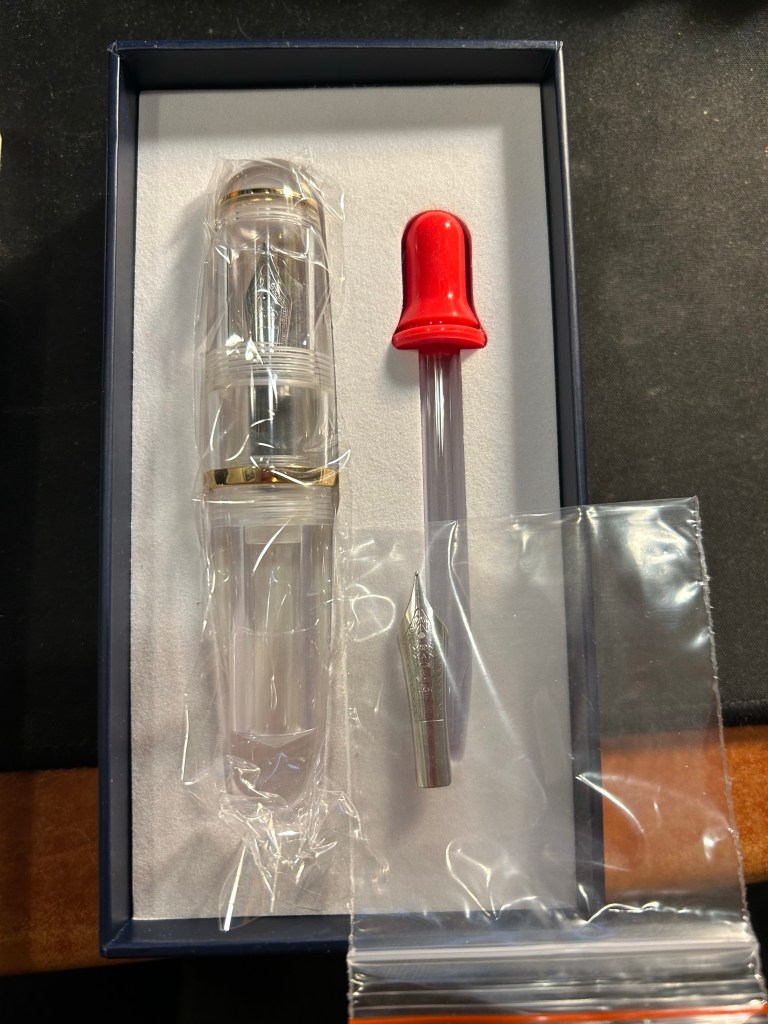
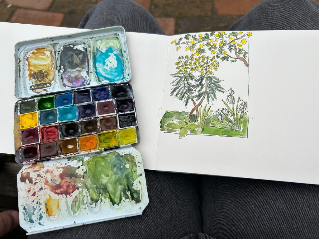
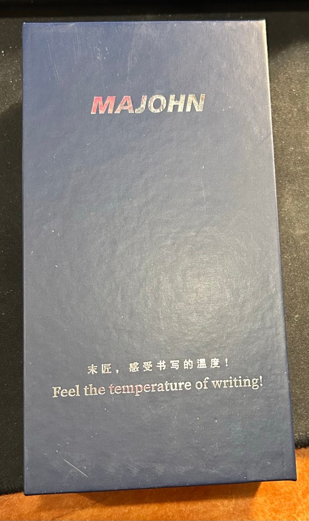
The box the Majohn Q1 arrives in is good looking enough to gift someone. Inside there’s the pen with the Fude/bent nib installed, a spare medium nib (the bent nib is an “aftermarket” installation) and a glass eyedropper that you can use to fill the pen with. The pen itself comes installed with an o-ring so that it can safely be eyedroppered. I filled mine with De Atramentis Black Document ink, which is waterproof when dry.
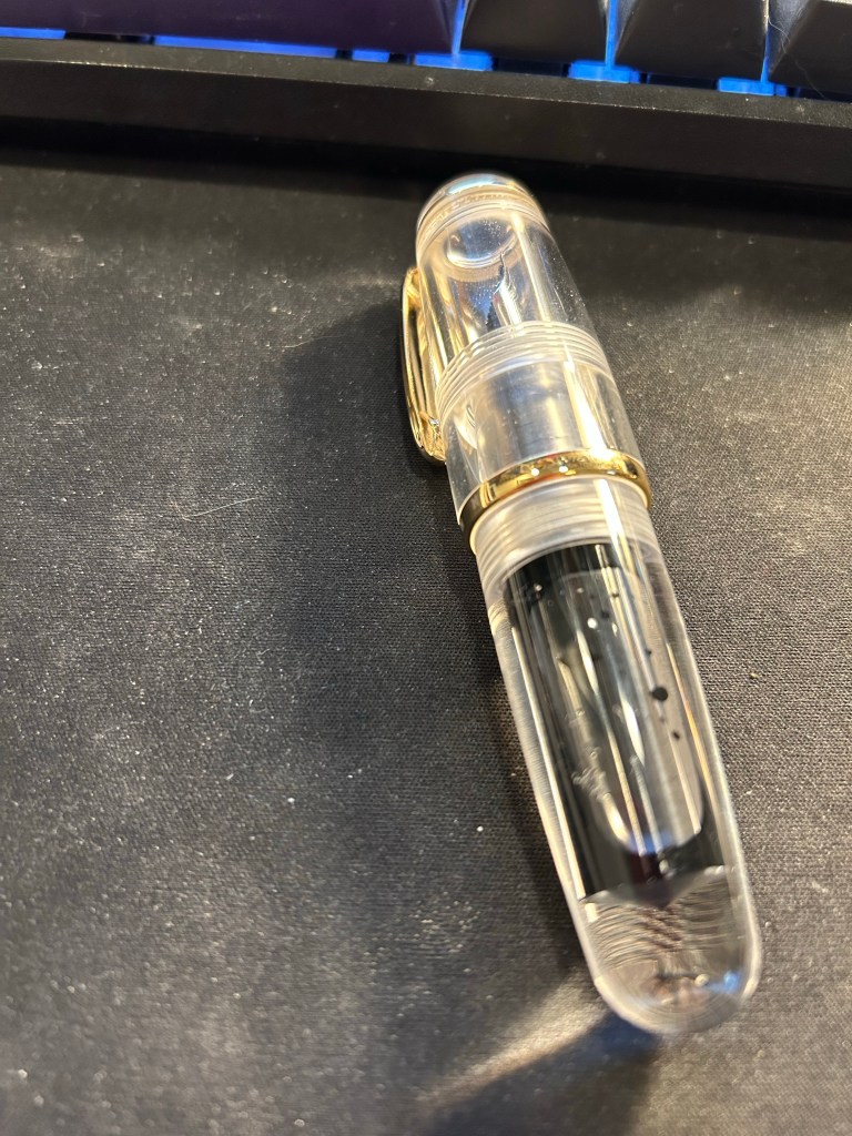
Now the Majohn Q1 is a very small pen, that holds a very, very large amount of ink. That’s why I was interested in it, as I thought that it would be a perfect fountain pen to add to my urban sketching kit. I currently use a Sailor Fude DE Mannen fountain pen for my urban sketching, and it’s a favourite among urban sketchers for the expressive, painterly lines it creates. It is, however, very long and pretty unwieldy: difficult to pack, and sometimes awkward to hold. Here are the Majohn Q1, a Lamy AL Star and a Sailor Fude pen laid next to each other, for size comparison:
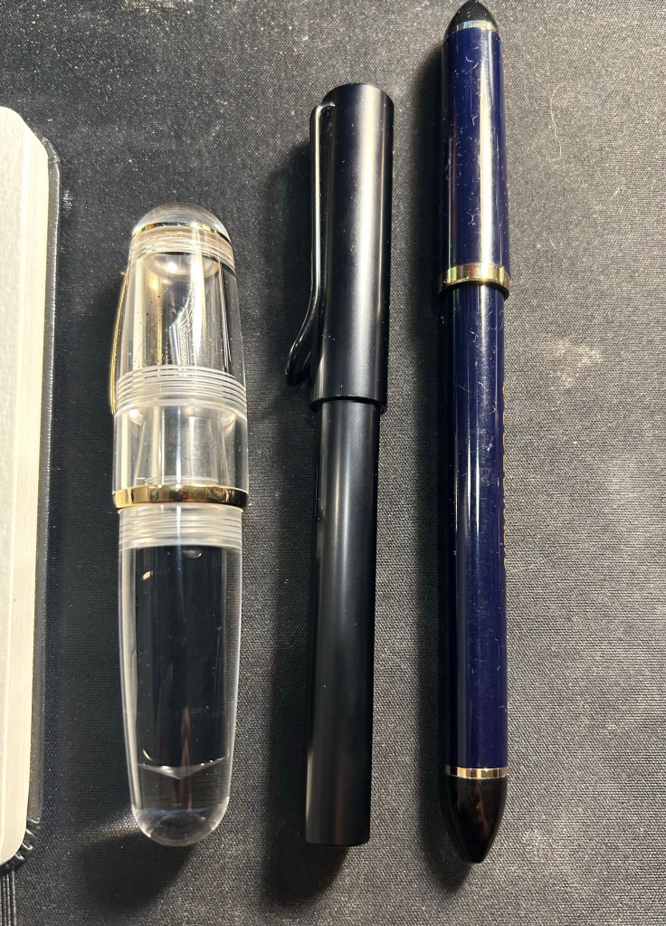
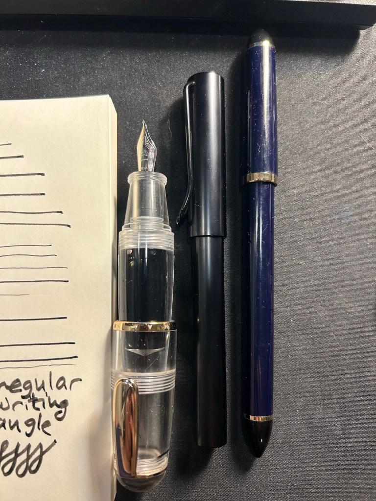
As you can see, the Majohn Q1 is pocket pen sized in length, and very, very wide. It can’t be used unposted, as is to be expected with pocket pens, but once it’s posted, it just becomes an extra wide standard length fountain pen:
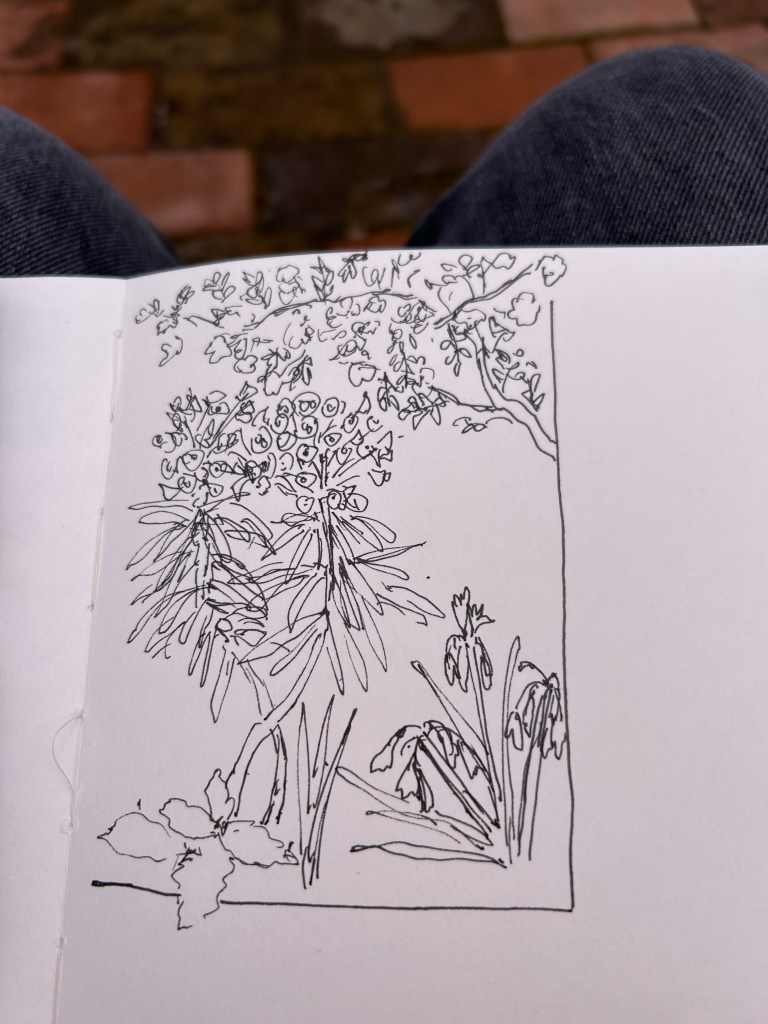
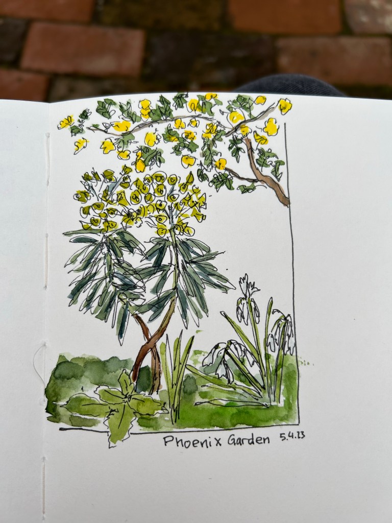
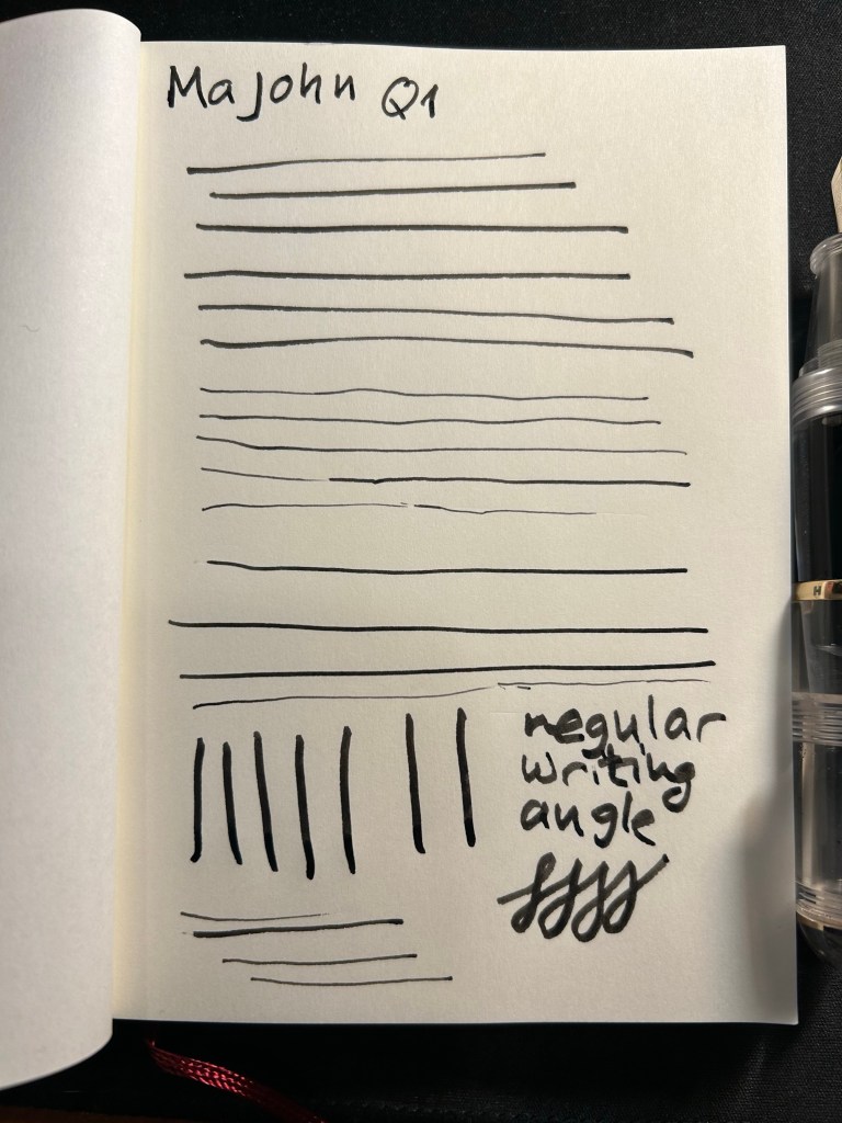
The point of this pen is the bent/Fude nib, so here it is, in all the different line widths it can create:
And here’s the Sailor Fude for comparison:

The Majohn Q1 offers much more line width control and consistency than the Sailor Fude, but you sacrifice some of the painterly quality and dynamism of the Sailor Fude to achieve that control.
The Majohn, like the Sailor, isn’t perfect in terms of gripping experience. While it’s much easier to grip the Majohn in a variety of different angles to get a variety of different lines, there’s a pretty pronounced step between the pen body and the grip section that can be uncomfortable if that’s where your fingers naturally land on. For me, I grasp the pen either closer to the nib, or not on the section at all but rather on the pen body. I’d recommend trying it out first, but for $22, it might be worth it just to buy the pen and try it out for a while.
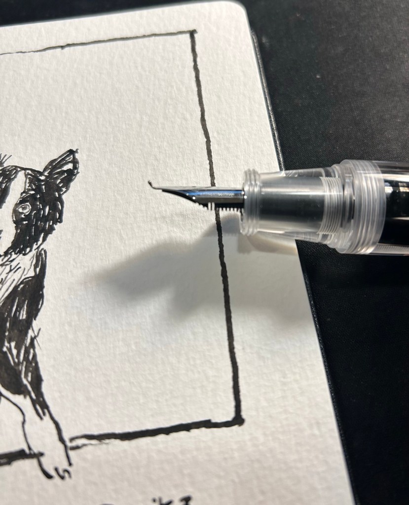
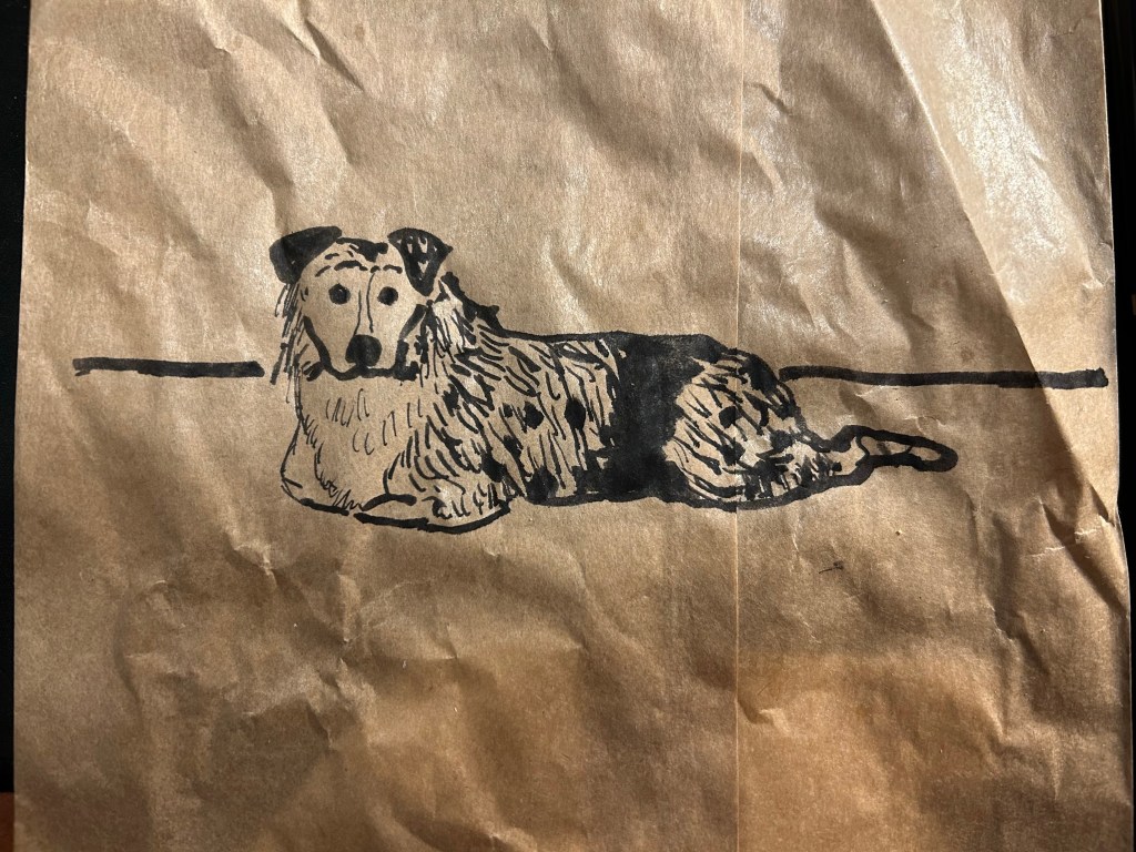
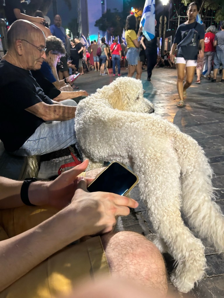
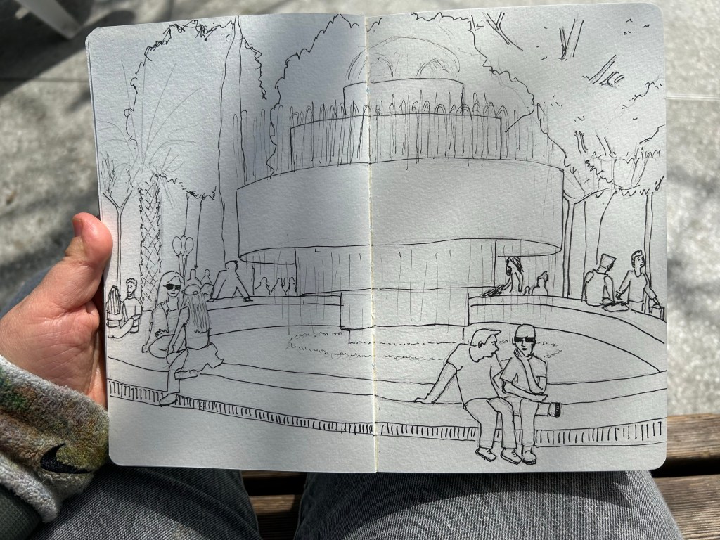
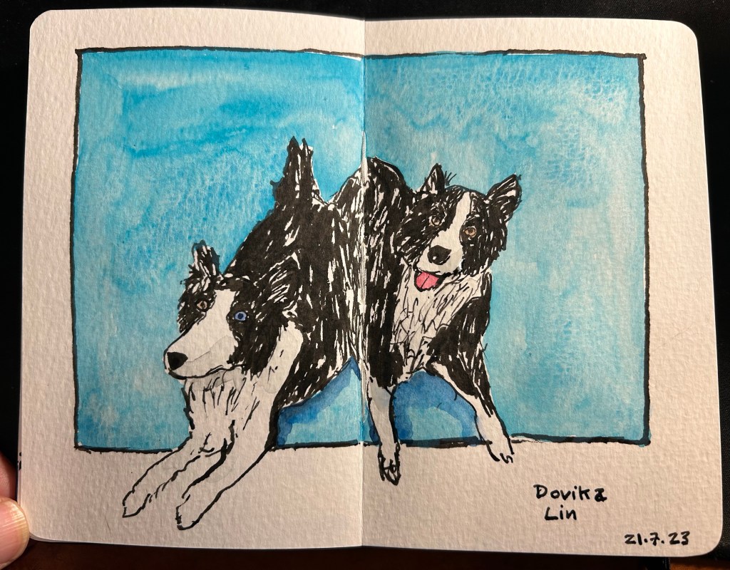
Here’s a sketch of a friend’s border collies sketched with the Majohn. As you can see, it’s relatively easy to get both a good level of control with this pen, a lot of line variation, and some of that painterly quality to the line that makes it more interesting and expressive.
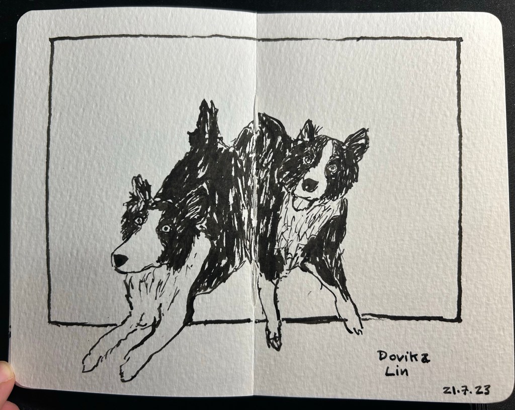
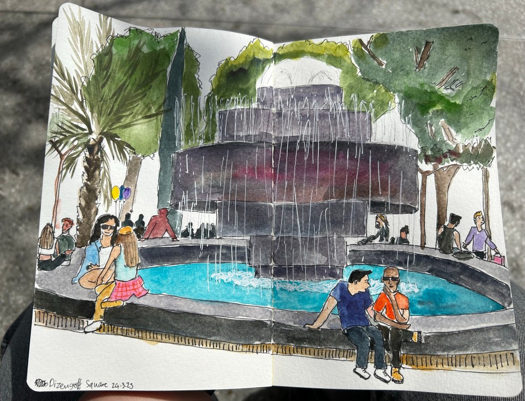
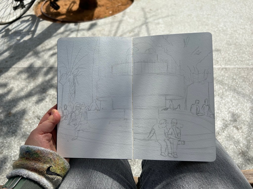
Here’s the complete sketch, just for fun:
If you’re at all interested in fountain pen sketching, and especially if you are an urban sketcher, I recommend giving the Majohn Q1 bent nib fountain pen a try. It’s easier to control and to transport that a Sailor Fude, and holds a much larger ink capacity, which is great for long sketching sessions or when you need to block out a large section with ink. For such a low price you get quite a lot, and the learning curve is much less steep than with a Sailor Fude DE Mannen fountain pen. I don’t do calligraphy, but I assume that it could be worth a try for calligraphy as well, especially if you are looking for a travel friendly solution. And who knows, maybe you’ll get to feel the temperature of writing while using it…