It’s October and that means Inktober time. This year I’ve decided to participate in the challenge but to do it a bit differently than I did in previous years:
It’s still 30 ink sketches in 30 days. I’m using fountain pens for the entire challenge.
I’ve limited myself to the Traveller’s Notebook airlines edition insert. I’ll post a review of it later this month, but the idea was to deliberately use a notebook that I thought was too precious to use before.
I’m not following the official prompts (as usual). I never liked them, and this year’s prompts are no different.
I’m not posting these to social media. At all. I’ll be posting them here and here only.
Now without further ado, here’s Inktober day 1’s sketch:
Pink giraffes laying down to chew their cud, Animal Kingdom Lodge, Florida.
The giraffes aren’t originally pink, of course, but I sketched them with Pilot Iroshizuku Kosumosu ink and a Franklin Christoph 03 Iterum Sedona Spa fountain pen with a Nagahara fine cursive italic. It’s a beautiful combo, and fine cursive italics are great for getting interesting line variations while sketching with pen and ink.
Traveller’s Notebook and fountain pen.
Giraffes rarely sit down in the wild, as that’s way to risky for them (it takes to much time to get up and run, should they need to). In captivity they will sit down if they feel safe and comfortable, and it’s quite a sight. We saw these two during a night time safari at Animal Kingdom Lodge in Walt Disney World, Florida. Giraffes are suffering from poaching, from habitat fragmentation and from habitat lost, and many giraffe sub-species have only a few hundred individuals left. If you want to help them, the giraffe conservation fund focuses on these elegant and fascinating creatures: https://giraffeconservation.org
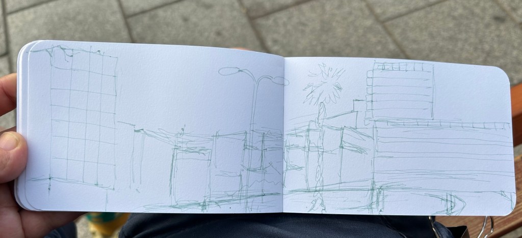
It was Yom Kippur today, a day when no cars drive around in Israel. I took the chance to go outside and sketch one of the most iconic buildings in the area.
I used my Pelikan 140 KEF fountain pen with De Atramentis Green Grey Document ink as an under sketch:
Sketch on Stillman and Birn Epsilon 51/2 X 3 1/2 in. sketchbook
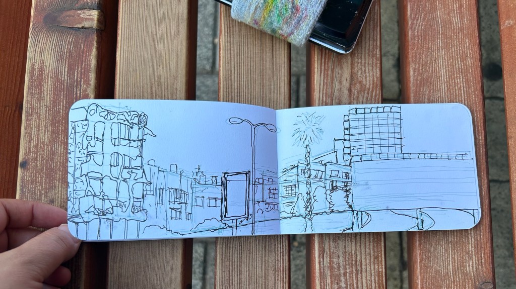
I then drew the line work with a Lamy Safari F nib and Platinum Carbon Black. The ink takes a while to dry, and it smudged a few times.
Line sketch.
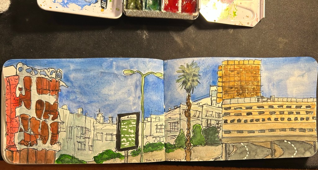
It was getting hot, so I finished the watercolour at home:
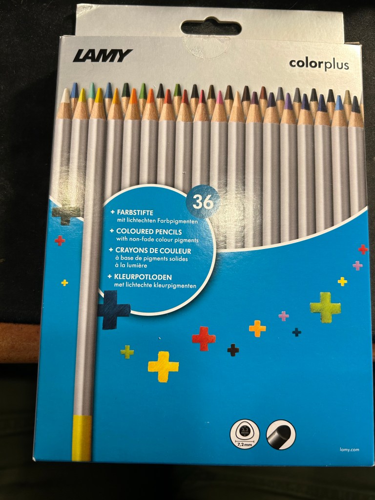
I rarely write reviews that trash products— because I tend not to waste my time and money on products that could potentially be bad. However, I was stuck in Tampa’s airport on a very long connection due to inclement weather and so I browsed their bookstore and found this:
Lamy ColorPlus 36 coloured pencils
Well it says Lamy on the box, so it can’t be bad, right? And it was just $15 for 36 pencils…
This is where the red flags should have popped up, but they didn’t. I bought the pencils.
When I got home and opened the box, my heart sank. The leads were broken on almost all of the pencils. Now the box was in my trolley, well protected from dropping or crushing, so there was really no reason for this amount of damage. I checked the back of the box:
“Highly resistant to breakage” it is not.
The pencils are triangular shaped, which is supposed to make them ergonomic. It makes them more unpleasant to sharpen, as there’s a steep “bump” whenever you turn the pencil to another side.
Triangular pencils
The colour selection is weird — there are a lot of various shades of brown, but no ochre. The browns themselves are nothing like the colours that you’d expect from their labelling. I use the term “labelling” loosely here, because there’s no colour labelling on the pencils, just a dip of colour that is vaguely similar to the actual pencil colour produced.
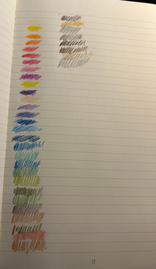
Pencil samples
The 36 shades chosen are wild – way to many similar brown, not enough greens, too many purples and blues, and of course utterly useless white and the bewildering gold and silver which are neither gold nor silver. Obviously the pencils crumbled while creating these samples so there are some duplicates here.
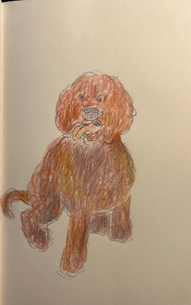
The pencils are very waxy, which means after 2-3 layers maximum the paper will be clogged and subsequent layers won’t be registered. The pencils also crumble easily —- even with very light pressure applied. Creating this sketch with them was nightmarish, as the leads kept crumbling, and I couldn’t get the shades that I wanted to the layering that I was trying to achieve.
Quick dog sketch
I honestly don’t understand why this product exists. It’s too expensive and not robust enough for children’s use, it’s definitely not artist grade (poor pigment, layering and no labelling), and even student grade pencils are properly labelled these days. In any case, save your money to buy better pencils. You deserve them.
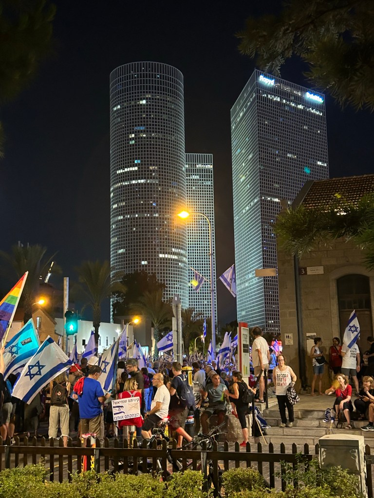
I had a tough week, hence the delay in some posts. I did go to the weekly central protest tonight, despite the terrorist attack earlier this evening in Tel Aviv.
Sketched this very quickly in the dark. Them took a photo of it in the dark, and decided that it captures the moment well.
Have a great week, and if you live in a democracy, don’t take it for granted.
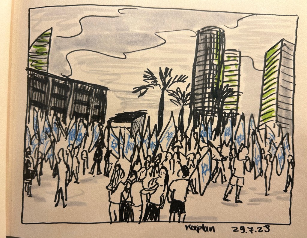
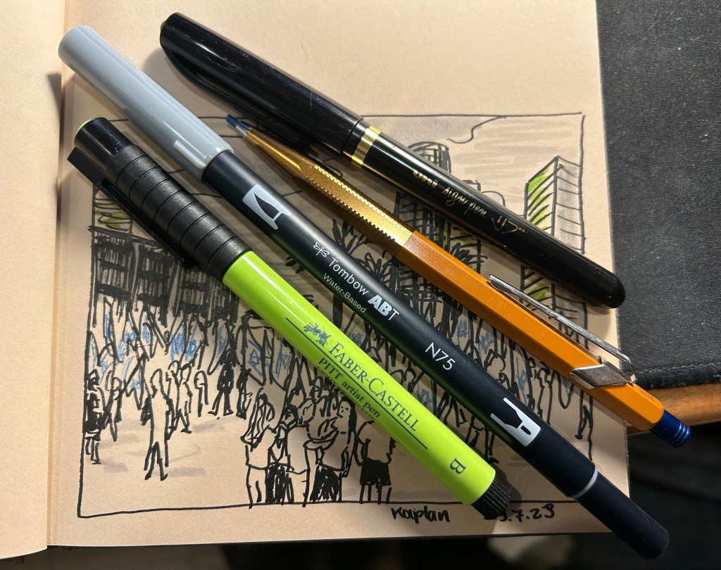
I went “shopping” in my stationery and art supply stash again, and this time used a Hahnemule Cappuccino sketchbook, a uni-ball sign pen, a Faber Castell PITT artist brush pen in light green (171), a Tombow ABT water based dual brush pen (I only used the brush side not the felt tip pen side) in light grey (cool grey 3 – N75), and a Caran d’Ache + Alfredo Haberli Fixpencil with a blue 2mm lead.
protest sketch
I used them all to draw the protest scene from this Saturday, using a photo I took during the protests. It was intensely hot and humid, and I went to the protests right after running a Dungeon World game at a small local tabletop roleplaying convention. With no art supplies on me, the best I could do was try and capture the scene to sketch later. When I was pulling things out to try out with this sketch, I decided to veer away from my comfort zone: I used tinted paper, a sign pen, mixed media, and an unusual colour. I like the result – for a quick sketch it captures the energy of the moment well.
tools used.
I like the Hahnemule Cappuccino sketchbook. The paper is smooth but has a touch of grain to it that makes it work for pencils as well. It’s way too thin for wet media, but works great for brush pens, pencils, markers, etc.
My main sketching tool was the Uni Sign Pen. This is the first time I’ve used a sign pen for “serious” sketching, as I normally only use them for illustrations that I gift to friends’ kids. I like it – it has relatively little line variation, but on the other hand offers more control, and a good bold line. If you are dipping your toes into brush pens for sketching for the first time, this might be a good place to start to get a feel for the kind of thick lines these kinds of pens create.
The Faber-Castell PITT brush pen is a classic, one that I’ve used many times before in sketches. I’d love to say that they don’t disappoint, but like most soft and medium soft brush pens, the tip doesn’t last for long. They do come in lots of great colours and if you cap them they last much more than many other markers and brush pens in the market. They’re also waterproof, which is a bonus if you’re mixing them with wet media.
The Tombow dual brush pen is completely new to me, and I liked it enough to want to add it to my current sketching setup. It works well for quick shading (and shading and colour make sketches pop).
The Caran d’Ache + Alfredo Haberli Fixpencil… This is something that I want to properly review sometime in the future, so it’s been waiting on my desk for a while. For now I’ll just say that it did the job, although I have other pens and pencils that would have done the job better.
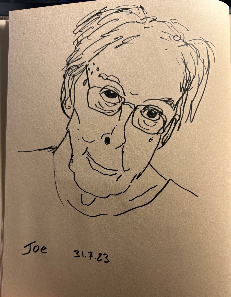
I also sketched our friend Joe during our weekly Zoom meeting, also on the Hahnemule Cappuccino and using the Uni Sign Pen. This was a very quick sketch, done it 2-3 minutes, and the sign pen does well with expressive lines.
Our friend Joe.
Now go rummage in your stationery/art supply stash and find something new to play with. It’s guaranteed to make you smile.
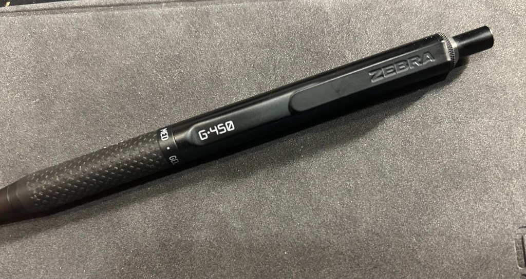
Never have I ever fallen in love with a standard pen faster than the Zebra G-450. Even the Uni-ball Signo RT 0.5 took a bit of time until it became my favourite, and I had much less experience with gel ink pens at the time. I liked the Zebra G-450 so much that after writing a few pages with it, I put in an order for two more packs, just so I’ll have backups and multiples of it.
So, what’s so special about this pen?
Zebra G-450
First of all, the Zebra G-450 looks like it was designed to be a prop in the Jason Bourne movies. It doesn’t have the “I’M A TACTICAL PEN, LOOK AT ALL THE WEAPON LIKE APPLICATIONS YOU CAN GET WITH ME” look of tactical pens. I find that look childish, and I find that it makes for very uncomfortable to write with pens. The G-450 is nothing like that: it’s sleek, features a durable and hefty-without-being-heavy brass body, knurling on the top, a very well designed rubber grip, and very Jason Bourne like fonts.
G-450
The G-450 has a well designed and solid clip, with a step down/cutout right in front of it that adds interest to the pen silhouette and makes it easier to clip onto things.
Step down, clip and fonts
I love the console like fonts in white, and I really love the grip. It isn’t mushy like a silicon grip, but it is softer than the pen body, and with the raised pattern on it, gives you a rock solid grip on the pen. The ring on top of the grip announces that this is gel pen, with a medium (0.7) tip. The pen cone has an extra small taper towards the tip, adding interest and perhaps also helping stabilize the refill. There’s no clicking, jiggling or noise from the tip as you write with the G-450.
Grip closeup.
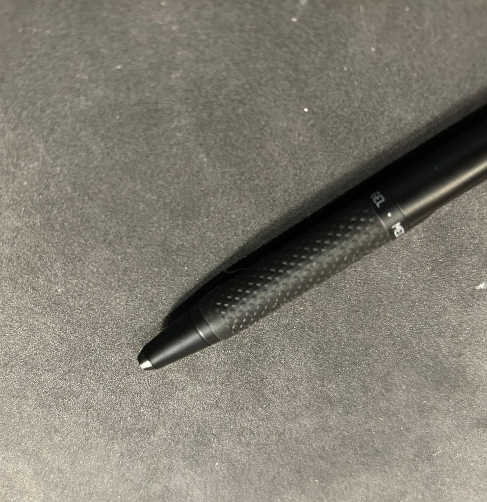
The click mechanism is solid. The clicker (is it called that? let’s assume it is) stays extended at all times, even when the tip is engaged, and it has a very satisfying click. There’s a red jewel with Japanese writing in silver on the end cap, and it adds a nice and subtle splash of colour to the pen.
end-cap closeup
All this is wonderful, but it’s the refill that makes it all sing. It’s dark, super smooth, and it dries almost instantly. Yes, even on Stalogy paper, even on Rhodia and other fountain pen friendly paper, it just dries as soon as you write with it. This is a perfect lefty pen (I’m not a lefty) and it’s perfect for jotting things down in a rush. It will write a bold, clear line, and not smudge.
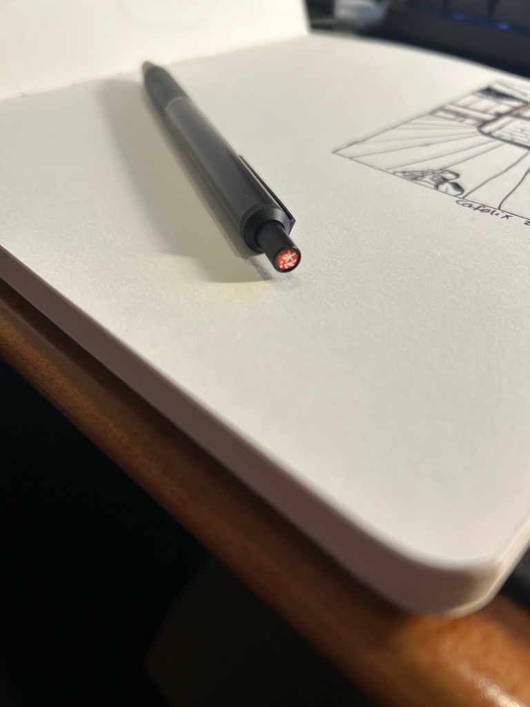
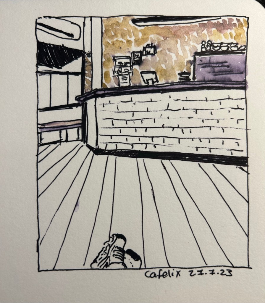
I sketched a local cafe with the Zebra G-450, on Stillman and Birn Alpha paper. I then “opened” up the lines using a waterbrush, as the the Zebra G-450’s fast drying refill isn’t waterproof (as is to be expected with gel ink pens). The result was a nice greyish purple that you can see on the coffee machine on the right. The coloured graphite was provided by the Derwent Inktense paint set, but that’s a review for a different day. Suffice to say that while the Zebra G-450 isn’t a sketching pen, it will work well as one in a pinch, as long as you like thick lines, and don’t mind it not being waterproof.
Rarely have I encountered a pen that I wholly like after just a day of use. I love the G-450’s aesthetic, its refill and its feel in the hand enough to immediately add it to my daily carry. I used Zebra’s wonderful G-301 pen daily for years, and I can see the G-450 easily replace it on merits of the refill alone. Sometimes a pen just ticks all the boxes for you, and this one clearly does for me. I recommend giving it a try if you possibly can. Who knows, maybe it will become a new favourite for you as well.
First thing’s first: if you are looking for a writing pen, then the Majohn Q1 mini fountain pen is likely not for you. While you can purchase it with an extra-fine, fine or medium nib, it’s weird body shape would likely make it uncomfortable for long writing session, and as it’s an eyedropper filler, it’s designed to have a giant ink capacity, normally suitable for long writing sessions.
If, on the other hand, you are looking for a fountain pen to sketch with, the Majohn Q1 may be a very worthy addition to your kit.
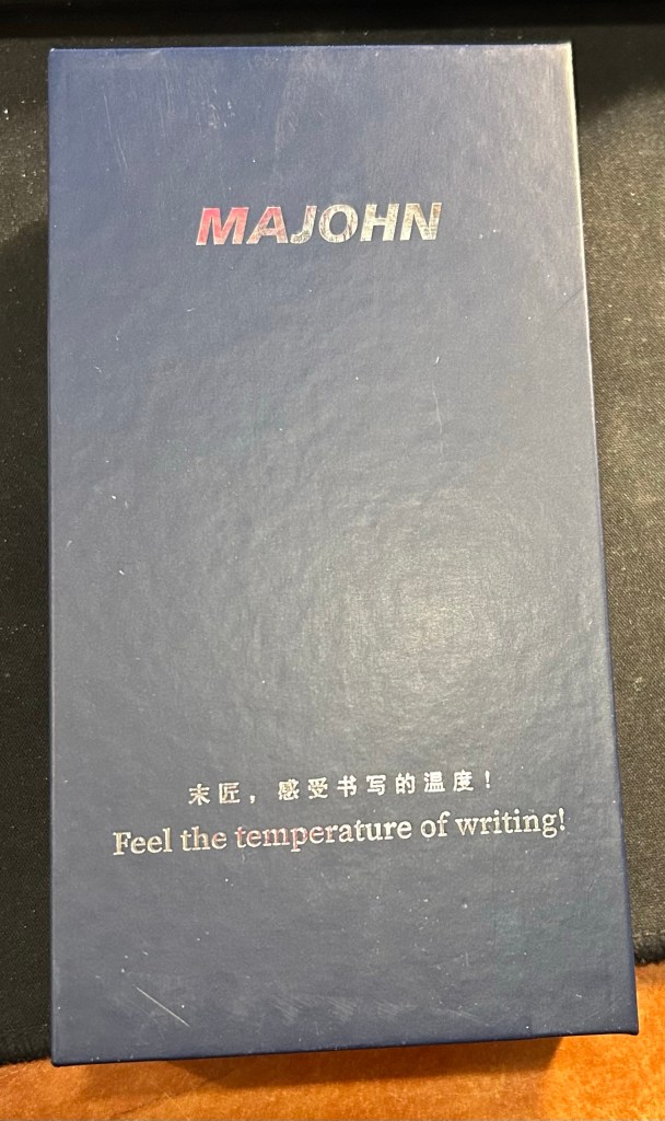
The box. I love the “Feel the temperature of writing!” inscription on it.
I purchased the Majohn Q1 bent nib fountain pen after seeing Paul Heaston use it in one of his sketches. “What is THAT?!” I asked, and immediately set out on getting one. This weird looking fountain pen reminded me of the Tombow Egg pen (google it. I’ll wait), which I always wanted and never got because I couldn’t afford one at the time. The Majohn Q1 appears to have almost the exact same design as the Tombow Egg, with a few minor details in the trim and molding of the grip section. I purchased mine on Amazon for $22.
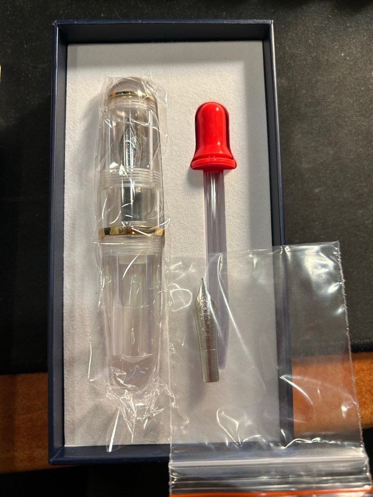
What’s in the box: fountain pen with bent nib installed, eyedropper, and a spare medium nib.
The box the Majohn Q1 arrives in is good looking enough to gift someone. Inside there’s the pen with the Fude/bent nib installed, a spare medium nib (the bent nib is an “aftermarket” installation) and a glass eyedropper that you can use to fill the pen with. The pen itself comes installed with an o-ring so that it can safely be eyedroppered. I filled mine with De Atramentis Black Document ink, which is waterproof when dry.
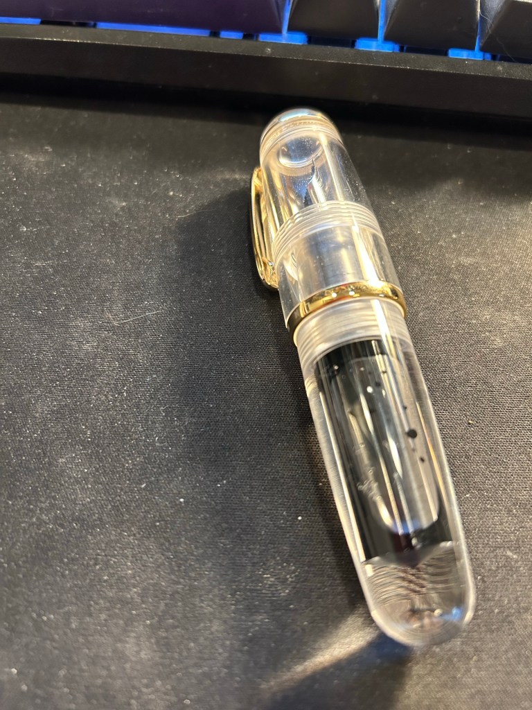
I filled the pen only to 3/4 and still it holds a tremendous amount of ink, especially for such a small pen.
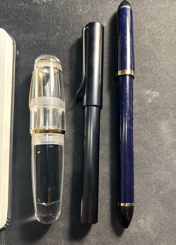
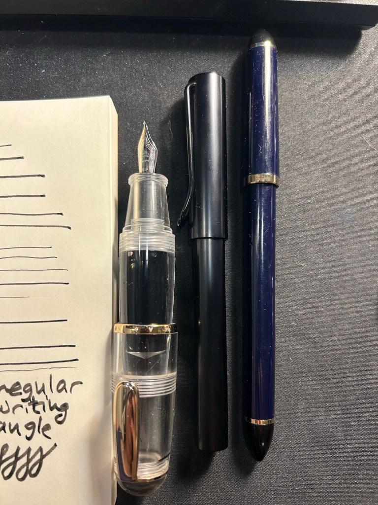
Now the Majohn Q1 is a very small pen, that holds a very, very large amount of ink. That’s why I was interested in it, as I thought that it would be a perfect fountain pen to add to my urban sketching kit. I currently use a Sailor Fude DE Mannen fountain pen for my urban sketching, and it’s a favourite among urban sketchers for the expressive, painterly lines it creates. It is, however, very long and pretty unwieldy: difficult to pack, and sometimes awkward to hold. Here are the Majohn Q1, a Lamy AL Star and a Sailor Fude pen laid next to each other, for size comparison:
As you can see, the Majohn Q1 is pocket pen sized in length, and very, very wide. It can’t be used unposted, as is to be expected with pocket pens, but once it’s posted, it just becomes an extra wide standard length fountain pen:
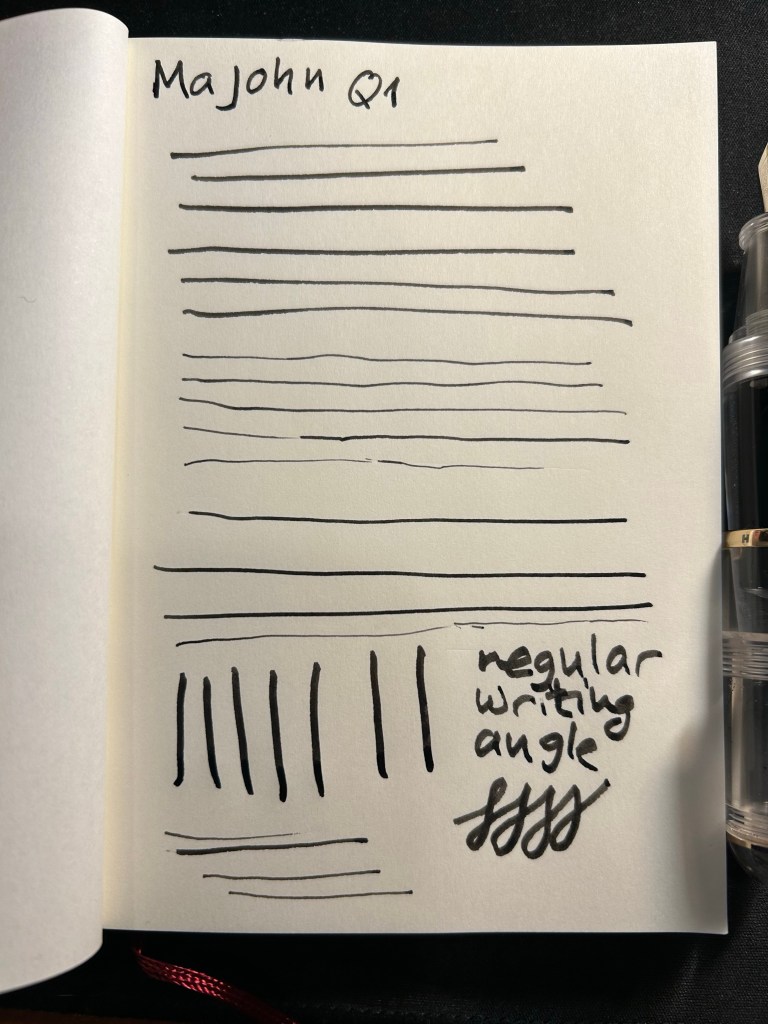
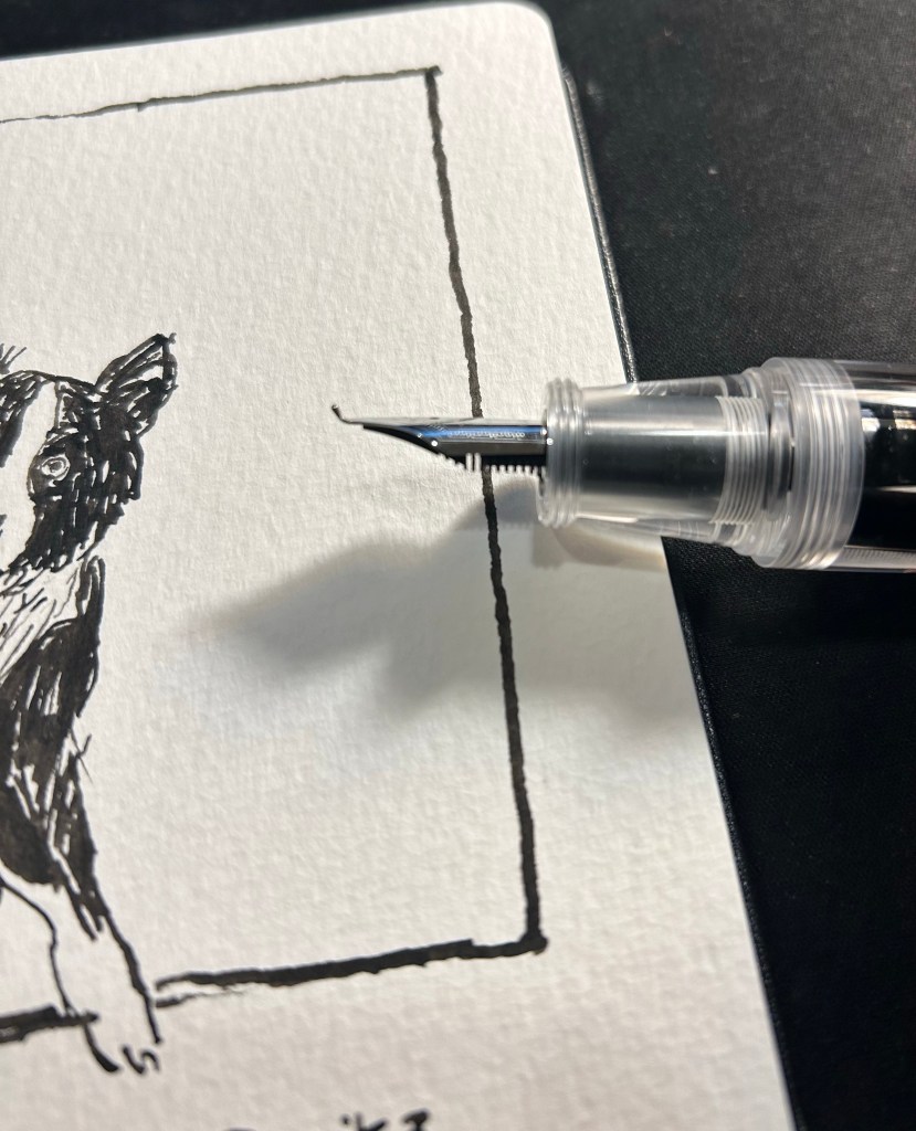
The point of this pen is the bent/Fude nib, so here it is, in all the different line widths it can create:
And here’s the Sailor Fude for comparison:
The Majohn Q1 offers much more line width control and consistency than the Sailor Fude, but you sacrifice some of the painterly quality and dynamism of the Sailor Fude to achieve that control.
The Majohn, like the Sailor, isn’t perfect in terms of gripping experience. While it’s much easier to grip the Majohn in a variety of different angles to get a variety of different lines, there’s a pretty pronounced step between the pen body and the grip section that can be uncomfortable if that’s where your fingers naturally land on. For me, I grasp the pen either closer to the nib, or not on the section at all but rather on the pen body. I’d recommend trying it out first, but for $22, it might be worth it just to buy the pen and try it out for a while.
Bent nib and grip section closeup.
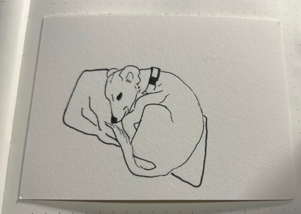
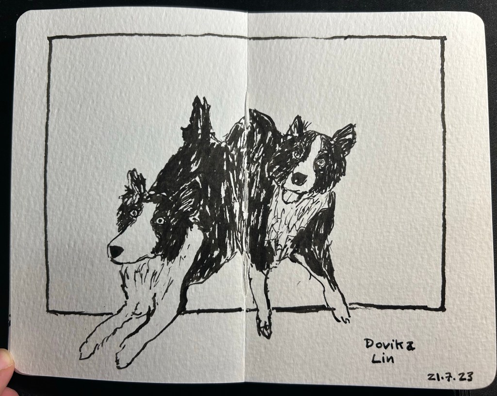
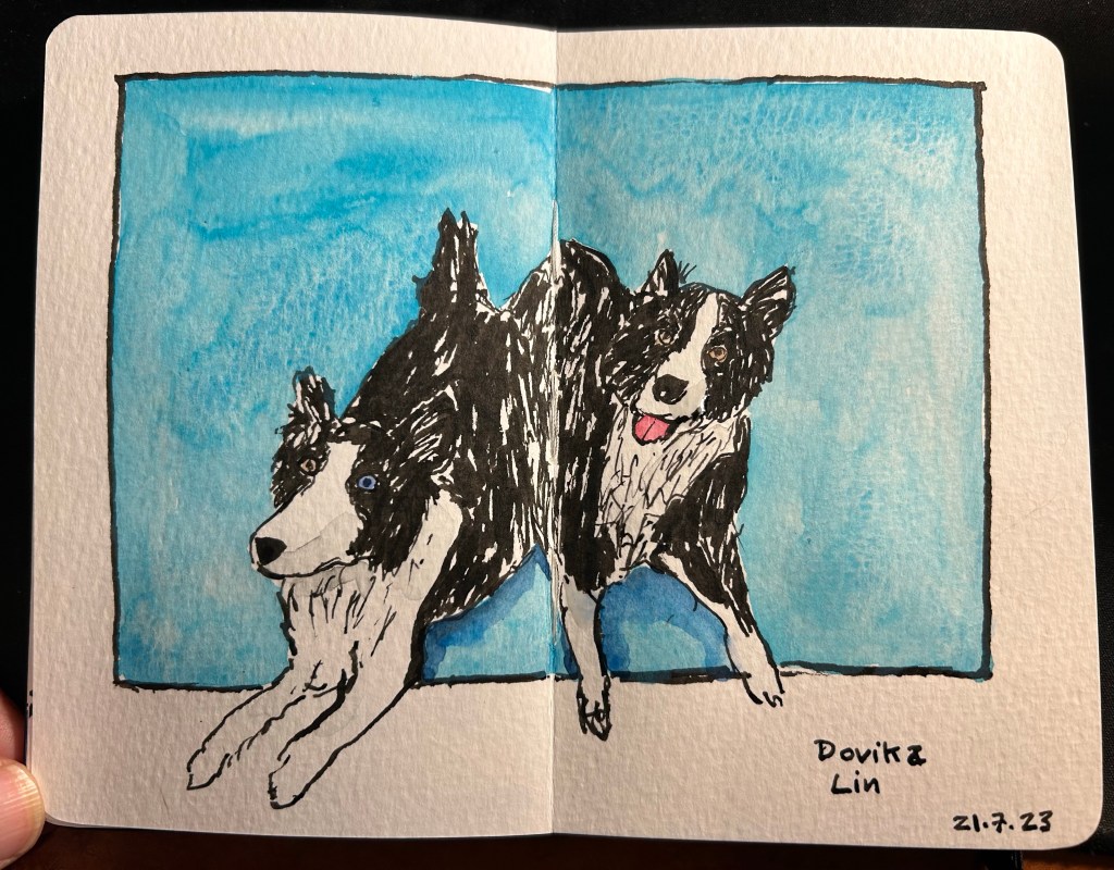
Here’s a sketch of a friend’s border collies sketched with the Majohn. As you can see, it’s relatively easy to get both a good level of control with this pen, a lot of line variation, and some of that painterly quality to the line that makes it more interesting and expressive.
Majohn Q1 bent nib, De Atramentis Document Ink Black, Moleskine Pocket Watercolour notebook.
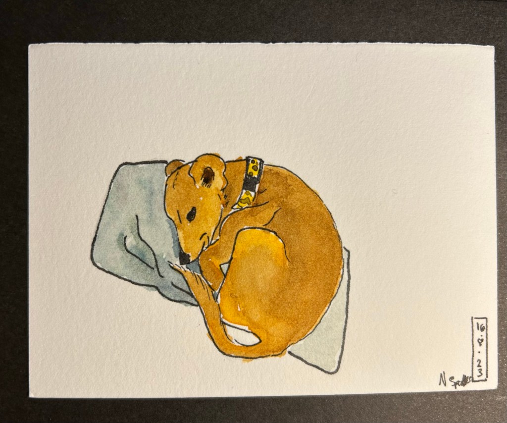
Here’s the complete sketch, just for fun:
Schmincke watercolours added.
If you’re at all interested in fountain pen sketching, and especially if you are an urban sketcher, I recommend giving the Majohn Q1 bent nib fountain pen a try. It’s easier to control and to transport that a Sailor Fude, and holds a much larger ink capacity, which is great for long sketching sessions or when you need to block out a large section with ink. For such a low price you get quite a lot, and the learning curve is much less steep than with a Sailor Fude DE Mannen fountain pen. I don’t do calligraphy, but I assume that it could be worth a try for calligraphy as well, especially if you are looking for a travel friendly solution. And who knows, maybe you’ll get to feel the temperature of writing while using it…