Stabilo Boss NatureCOLORS Review – Can Highlighers Be Used for Sketching

Stabilo make THE highlighters – Stabilo Boss – chunky, reliable, classic. Over the years they’ve added pastel colours to their original neon coloured highlighters, and just recently they’ve expanded their pastel highlighter lineup to include the NatureCOLORS. The NatureCOLORS lineup can be bought separately, or in a wallet of all 6 new colours, or a wallet of 8 that includes two black “marker” pen. The 6 new colours are Warm Grey, Earth Green, Mud Green, Beige, Umber and Sienna. The black “marker” is just an opaque black “highlighter”.

From top to bottom, black marker, warm grey, mud green, earth green.

I first saw these in a bookstore in Paris, and while I hardly ever use highlighters, the black marker and the natural tone of the other highlighters made me buy four of them to try out while sketching. As usual with Stabilo, there’s no indication on the pen body what colour it is beyond the colour of the pen body and a number that you have to look up on their site.
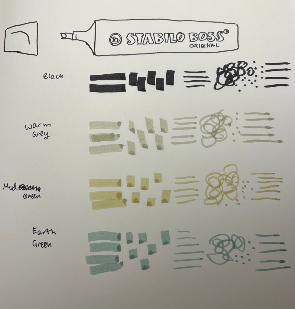
Testing the pens out

I used these pens for quick landscape thumbnails and sketches, and they work pretty well with a few caveats:

  1. They bleed through everything but the thickest paper.
  2. They spread on almost every paper.
  3. They aren’t archival (so they will fade and discolour with time)
  4. They are chunky, which means they aren’t the most portable of pens (even though they’re light)
  5. They can be awkward to hold and manipulate at times.
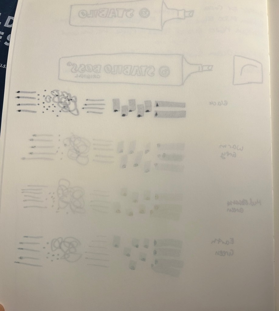
Bleedthrough

They’re also not at all built for layering and mixing, which means that trying to create layers with them will just leave you with a soggy paper mess:
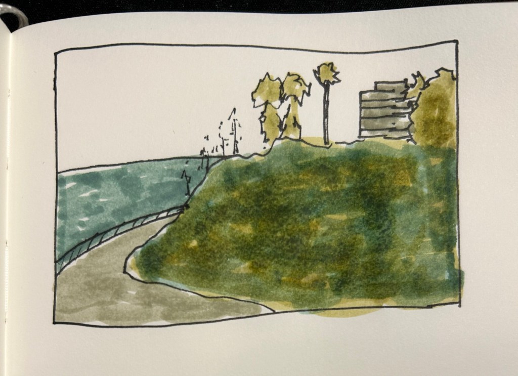
They don’t layer well, as evidenced by the grassy hill in this sketch.

So what are they good for? They work well for quick impression sketches, particularly of buildings, where you can get shading and shadows down very quickly. I used them on an architecture walk to get an impression of the buildings and they worked very well.
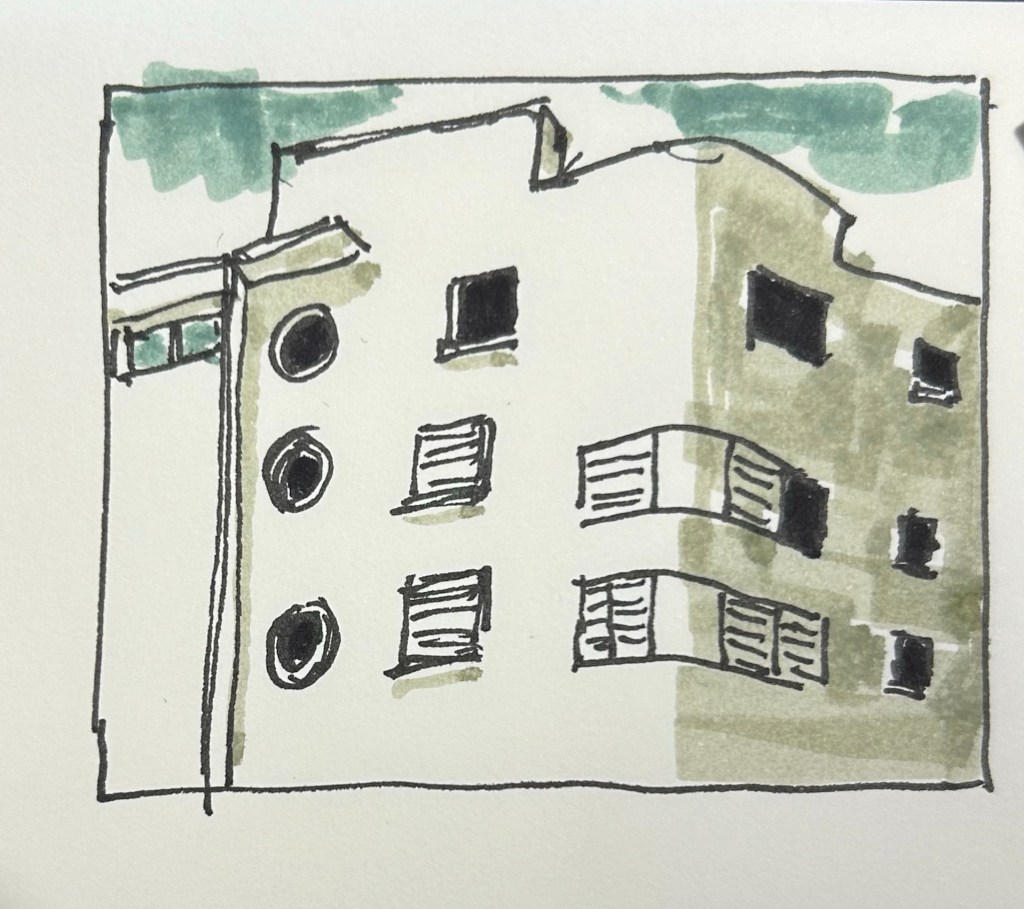
What they’re good at – blocking the windows, shading the building, impression of a cloudy sky.

It’s difficult to be accurate with them, but in these sort of sketches I’m not looking for accuracy, just of an impression, a quick note of what I saw and what caught my eye. A photo is great, but it doesn’t highlight what made me stop and take a second look at a building.
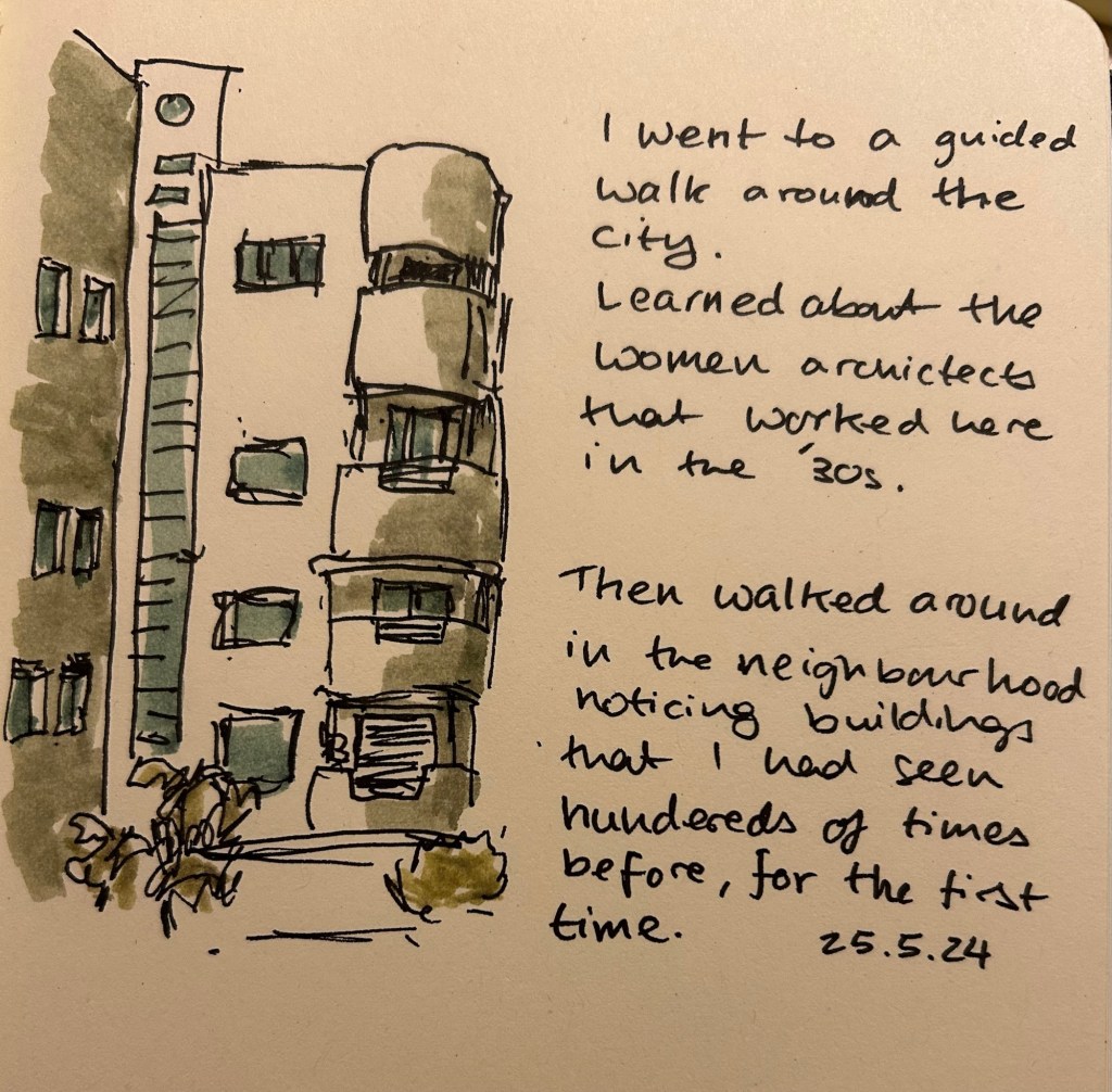
They even work decently well on cream coloured paper.

Yes, copic markers could do the job, but they cost much, much more than a Stabilo Boss marker, they aren’t as readily available, and they dry out very quickly. Sometimes you need a cheap workhorse to get the job done, and for this new use I think the Stabilo Boss NatureCOLORS work just fine.
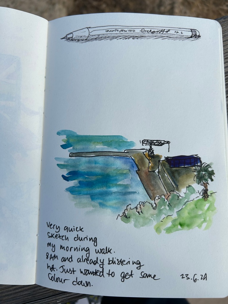
Sketching with Iron Gall Fountain Pen Ink: Rohrer and Kilngner Ebony

I have recently purchased the Rohrer and Klingner limited edition Ebony iron gall ink, and I’ve filled one of my Lamy Safaris with it. While iron gall fountain pen ink can be corrosive to pens, and it does change colour over time, it does have a pretty nifty trait: it’s waterproof when dry.

So I made this quick sketch with my Lamy Safari extra fine nibbed fountain pen on a Cass Art recycled paper sketchbook:

And then I added some watercolour to the sketches (note that although this isn’t watercolour paper, the paper in this sketchbook does take light watercolour washes):

As expected, it worked pretty well. Note two things about the combination of iron gall ink and watercolour:

1. The ink must be dry before applying the watercolour.

2. As the water causes the paper fibers to expand, your ink lines may “spread” or display soft edges if you apply watercolour over them. You can see this in both sketches. Different paper will lead to different results, of course.

This was a fun little experiment, and a great way to test out this ink a bit more.

Full sketching kit.

Have you ever used iron gall ink with watercolour in your sketches?

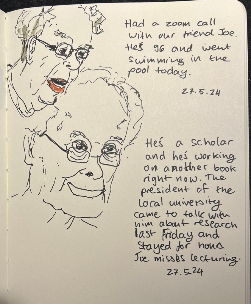
Quick sketch: Joe

I want to live like him if I ever get to live to my 90s.

Uni-ball pin 0.8 fineliner

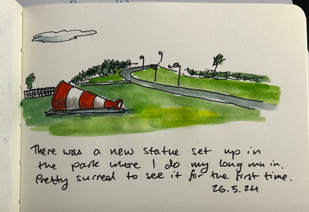
Quick sketch: New sculpture

Am I starting a new sketch journaling habit? Too early to tell. Meanwhile, I’m having fun teaching myself to sketch fast and loose.

Cheap Cass Art sketchbook, Uniball Pin 0.8 and watercolours
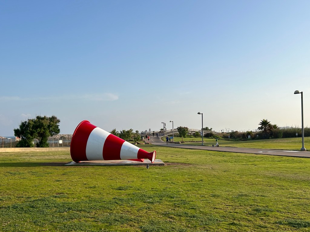
The original

Quick sketch: Guided architecture walk

Used a Uniball pin 0.8 fineliner and three Stabilo Boss highlighters in their new colour range on a Cass Art recycled paper sketchbook.

Yes the paper is ivory and the highlighters are weird.

London sketches

These two sketches were both done on the soft covered vegan Italian made Cass Art sketchbook. It has recycled paper inside which doesn’t look like or behave like recycled paper.

I sketched this in 3-4 minutes while sitting in the Phoenix Community Garden in London, and then took a lot of reference photos with my phone.

Later on I added watercolour to the sketch:

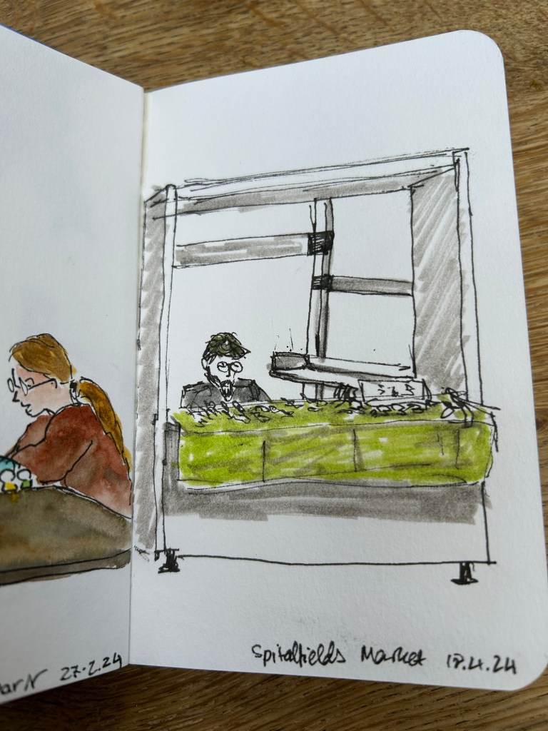
This is a 5-7 minute sketch of the stalls in Spitalfield market done with a sepia Faber Castell Pitt pen on the same Cass Art notebook.

I bought this sketchbook on a complete whim, because it was relatively inexpensive and I liked the look of it. I liked it so much I returned later on and bought a second sketchbook with a different cover colour.

What surprising and unexpectedly good products have you found lately?

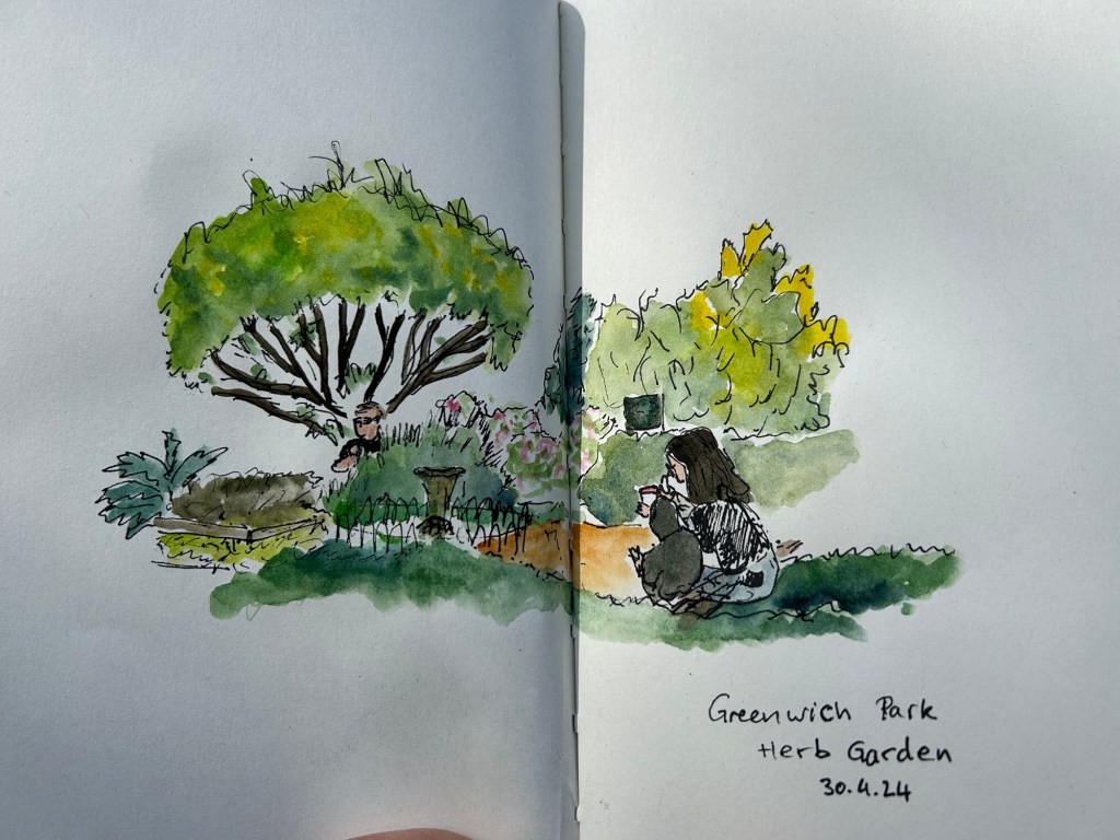
Quick Greenwich Sketch

Still travelling. This one is a 10 minute sketch of the herb garden in Greenwich park, London. Paper is a Cass Art notebook with non watercolour paper that held up surprisingly well.

March 2024 in Pens and Paper

With One Week 100 People I’ve been using my fountain pens much more to sketch with, and I fell in love with them again as sketching tools. There’s something about the expressiveness of the line that they bring in that reminds me of pencil more than of fineliner pens when it comes to sketching – a combination of their varying line width and the varying ink shade.

I’ve also purchased more fountain pens than I planned, buying two Franklin Christoph pens from the pen models that they’re retiring: A model 46 in Polar Ice with an extra fine nib and a pocket 66 Italian Ice with a flex extra fine nib. These two join the Leonardo Momento Zero Grande 2.0 Galattica that I purchased from Pen Chalet last month, and the Leonardo Momento Zero Nuvola rose gold that finally arrived this month after I purchased it from Fontoplumo and it was stolen during transit. Fontoplumo were wonderful, and replaced the pen immediately, so I intend to purchase from them again.

I haven’t purchased so many new fountain pens since before the pandemic, but the Leonardo Nuvola was a gift to myself to celebrate two years from chemo, and the Galattica was a gift to myself for surviving a hellish month with my father in hospital. The Franklin Christophs were unexpected purchases made only because they were retiring these models and I was curious about these materials (I already have an Antique Glass model 66 and I love it).

Writing samples
The pens

So far the biggest success in terms of nib has been the flex extra fine Franklin Christoph Pocket 66 Italian Ice. The nib has only a slight springiness to it, and I wouldn’t call it a flexible nib in the true sense of the word, but it works well for both sketching and writing. Diamine Earl Grey is one of my favourite inks (a bluish grey with tons of character that is legible even with very fine nibbed pens), so I didn’t hesitate filling an eyedropper pen with it. As eyedroppers have such a tremendous ink capacity, you always need to take into account just how much you love the ink you use in them.

The Leonardo Momento Zero Nuvola was a surprise in terms of the resin on the pen body (I was already familiar with LMZs fantastic fine flex nibs, and great pen and converter design). I was expecting a light blue pen with white “cloud” blotches and black outlines. In reality the black outlines are in a semi transparent brown resin, the white is more off-white/cream, and there’s real depth to the design. A very unusual resin that is both classic and unexpectedly unique.

Caran d’Ache discontinued their ultra-expensive and ultra-sought-after ink series “Colours of the Earth” in 2013 and I managed to get a bottle of the entire series besides Carbon right after they announced they wouldn’t be making them (I had bottles of Amazon, Safron and Sunset before they were discontinued because those were the ones that interested me the most). These inks are well over 10 years old and still fantastic, though the Amazon (the green ink) has darkened a bit and so lost some of its depth. The Caran d’Ache bottles are both gorgeous to look at and terribly designed.

Diamine Coral is the most optimistic of inks, a brightly bright coral ink that glows on the page and works best in generous nibs. I felt like a pick-me-up so I filled the Woodshed pen with it.

I made some interesting eexperiments with notebooks and tried a few new pencils, but this post is getting a little out of hand and so I’ll write about those in a separate post.

Did you use any interesting stationery last month?