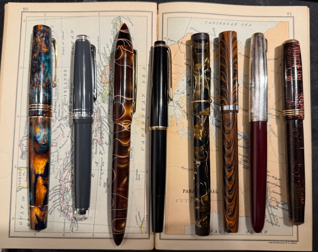
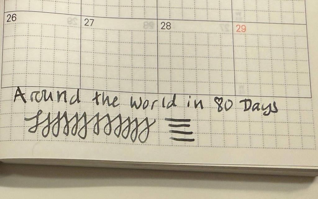
July’s Currently Inked Fountain Pens

A mixture of some pens left over from last month, coupled with a slew of new pens in mostly long unused inks characterizes this month’s lineup.

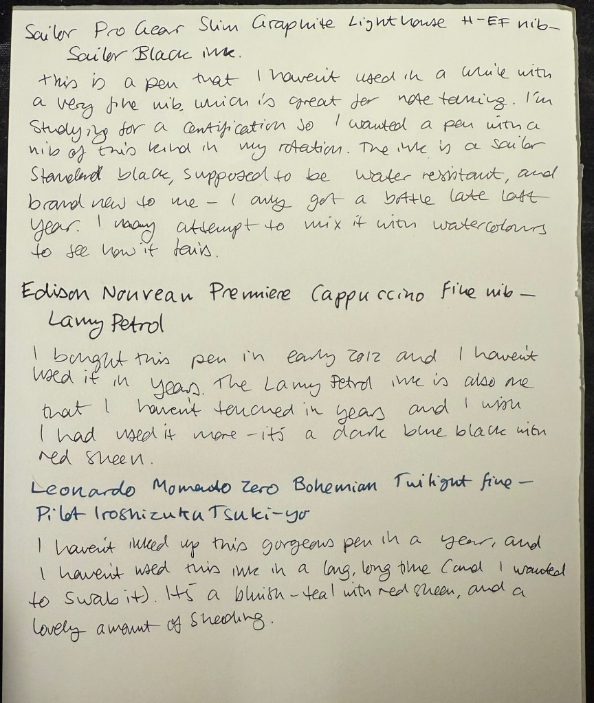
The paper is Hobonichi Techo 2024 this time (I bought it on Black Friday, to compare with the original Tomoe River Paper in my 2014 Hobonichi). The paper in it is almost as good as the original Tomoe River Paper for showing off ink properties.

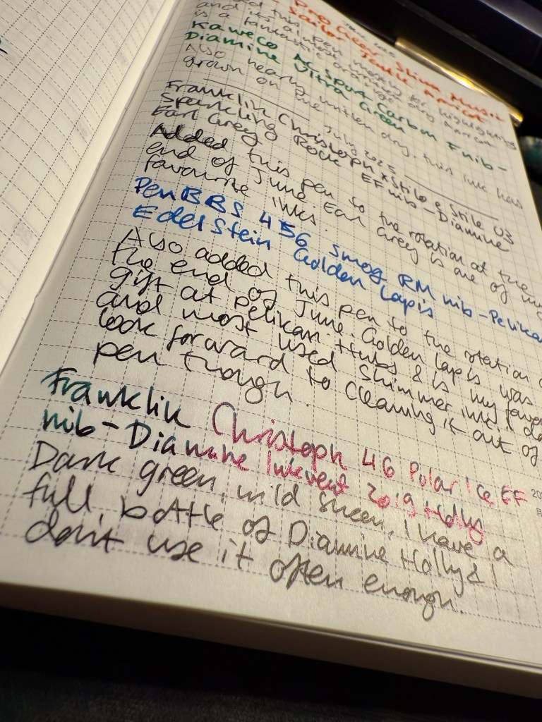
From June’s rotation I only have:

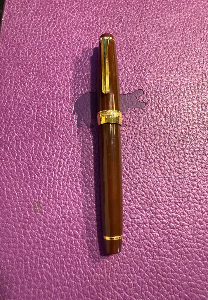
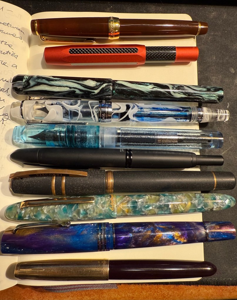
The mauve Sailor Pro Gear Slim with a music nib and delightful yet discontinued Sailor Jentle Apricot. A readable reddish orange ink with generous shading.

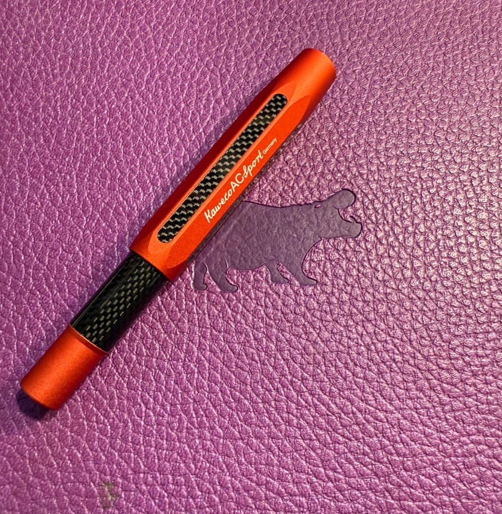
Kaweco AC Sport Carbon fine nib with Diamine Ultra Green. It’s almost written dry but has seen less use than I planned since I’m not in love with the ink colour. It is growing on me though.

Writing sample on Hobonichi 2024 paper

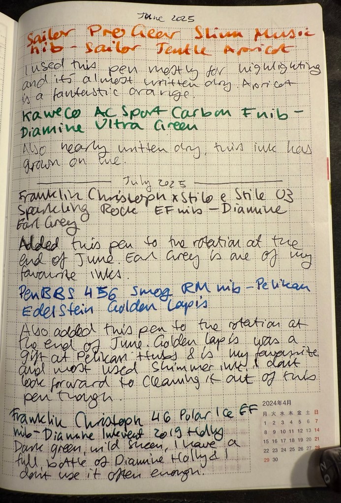
In the end of June I added two new pens into the rotation:

Franklin Christoph x Stilo x Stile 03 Sparkling Rock EF nib with Diamine Earl Grey. Earl Grey is still one of my favourite inks and if you want a readable, interesting grey I highly recommend it.

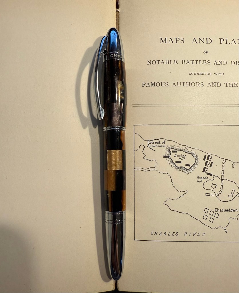
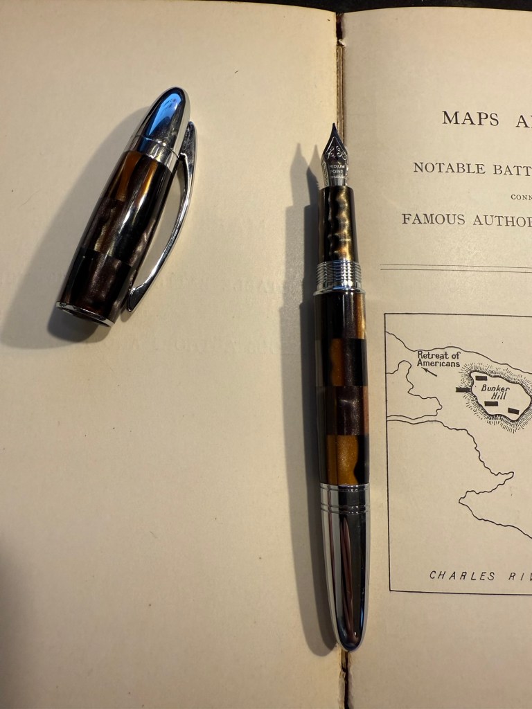
PenBBS 456 Smog with a RM nib and Pelikan Edelstein Golden Lapis ink. I have no idea what possessed me to fill a vacuum filler with this ink, but I’ll pay for that later. Golden Lapis was a gift from the Pelikan Hubs and has turned out to be my favourite shimmer ink.

Closeup on the sheen on Diamine Holly

The proper July inked pens are:

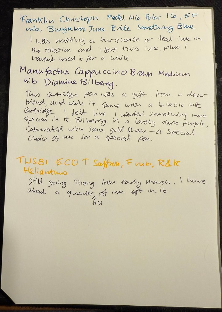
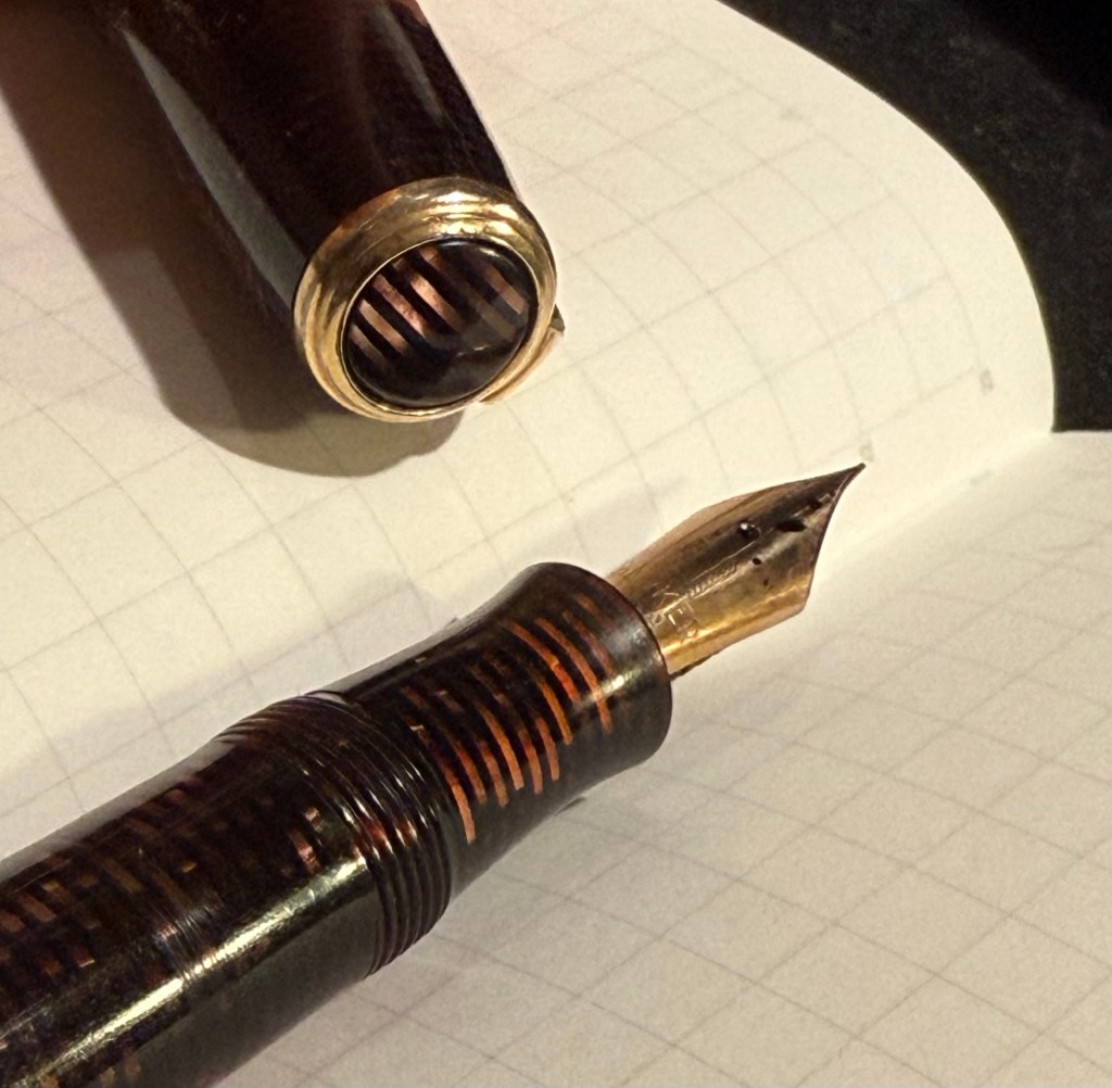
Franklin Christoph 46 Polar Ice EF nib with Diamine Inkvent 2019 Holly. I reviewed this ink here and I liked it enough to purchase a full bottle of it, though I have rarely used it since. Holly is a dark blue green with a wild red sheen and is saturated enough to pass as a serious businesslike black at a cursory glance, so you can sneak it into office use 🙂

Pilot VP Matte Black M nib with Pilot Iroshizuku Chiku-rin ink. I used to use my VPs a lot more, especially to take notes in meetings, but now I rarely use them because they have a tiny ink capacity and are a bit of a pain to clean out. They do have beautiful nibs, and I wanted a cheerful green ink so the pairing works well.

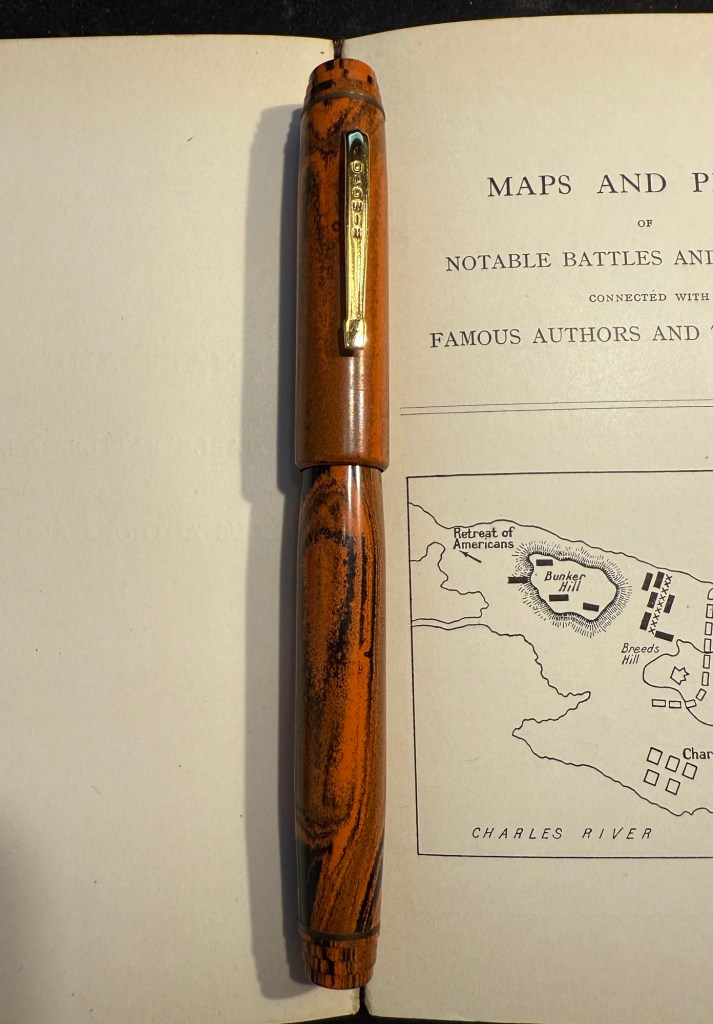
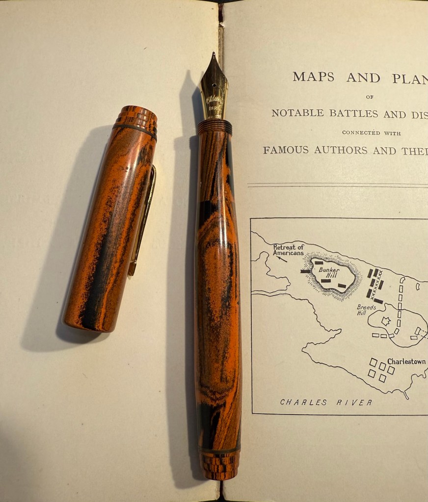
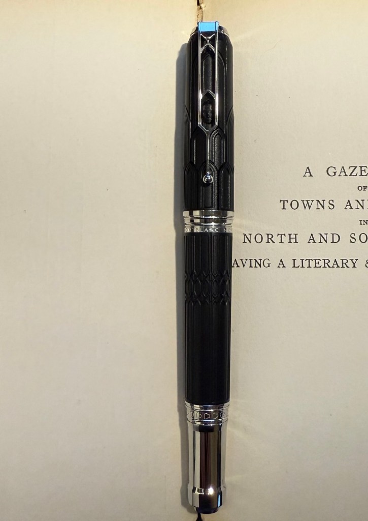
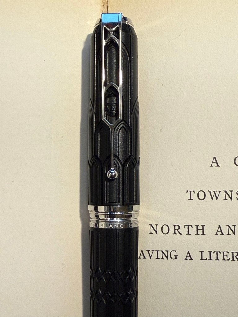
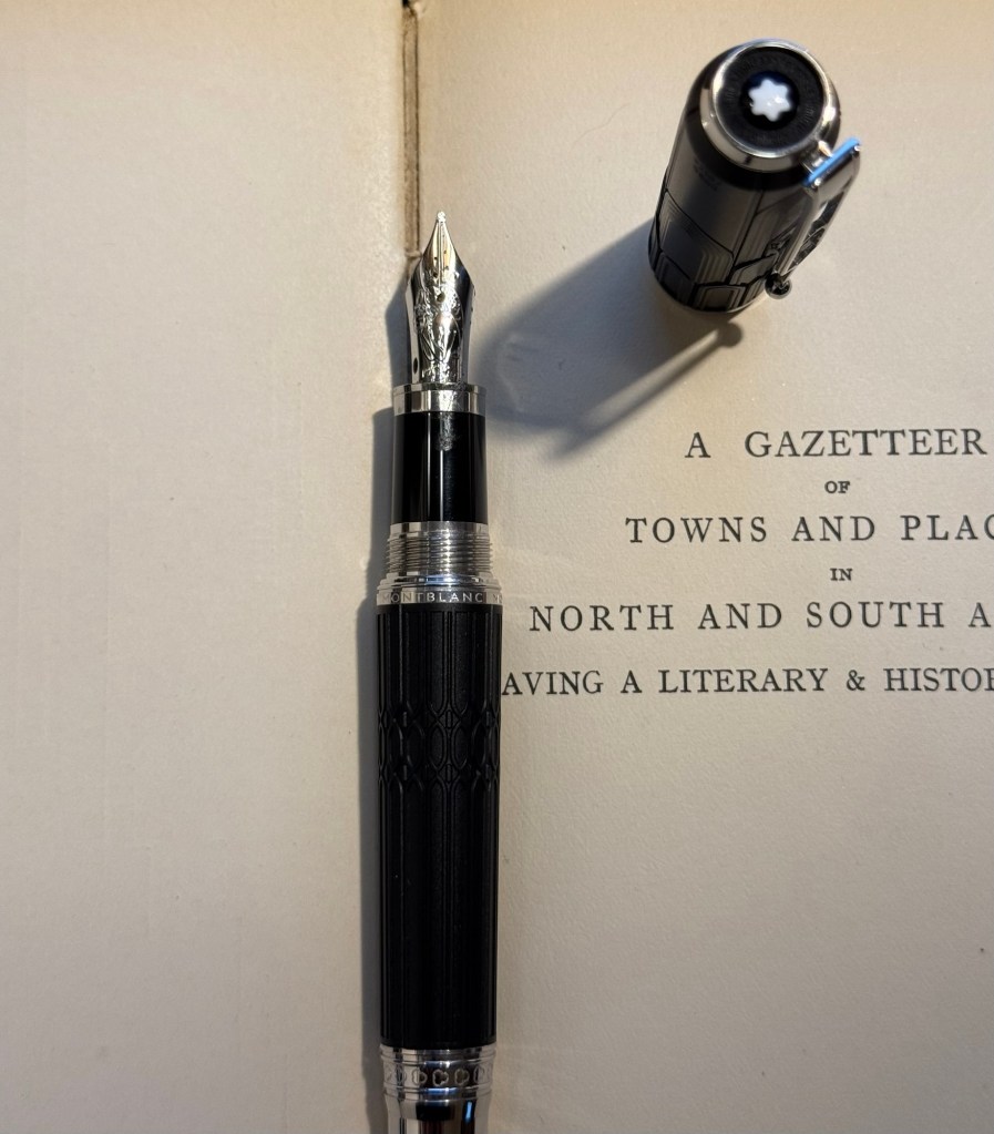
Visconti Homo Sapiens Lava black EF with Sailor Shikiori Yama Dori – this is the original Homo Sapiens pen, before Visconti did dozens of versions of it, when it took the pen world by storm. I bought mine at Mora Stylos, and they customized the finial with my initials. Yama Dori is a peacock blue with red sheen, and is a wonderful ink in Sailor’s annoying flat Jentle ink bottles.It was almost impossible to fill this pen due to the bottle shape.

Writing sample on Hobnonichi 2024 paper

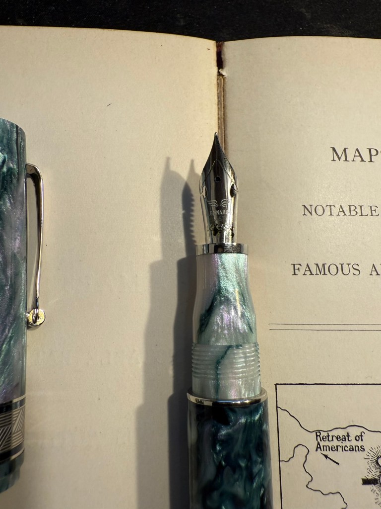
Esterbrook Estie Sea Glass Journal nib with Diamine Aurora Borealis. I love the Journal nib, and it really shows off the gorgeous teal of Aurora Borealis. There’s some shading with this ink and a hint of red sheen. This ink is one of the few I own in both bottle and cartridge format.

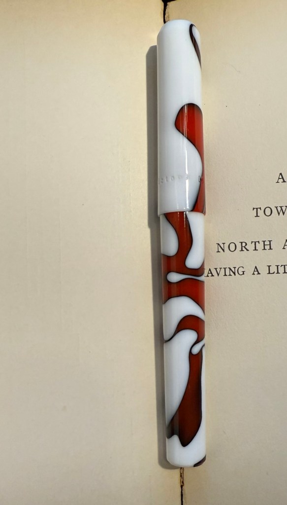
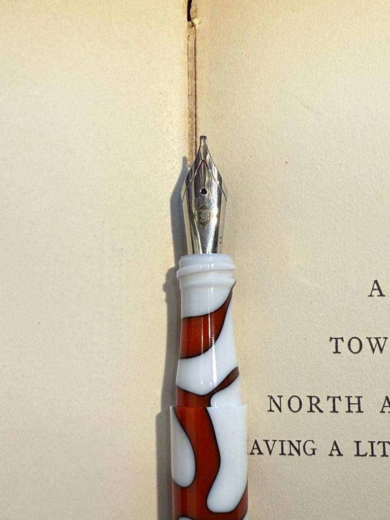
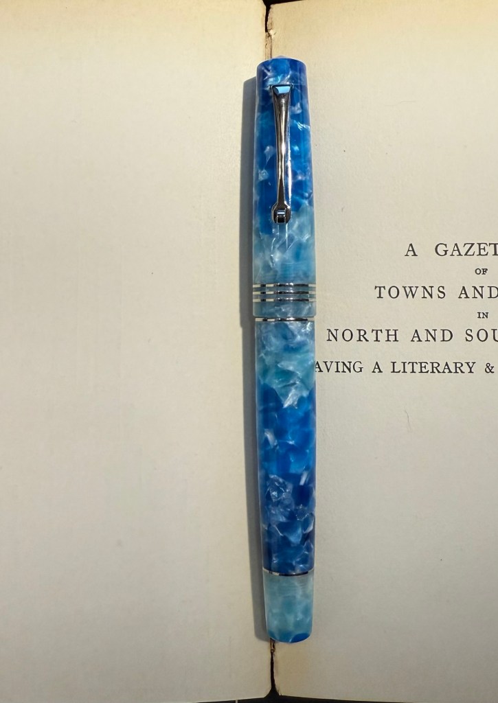
Leonardo Momento Zero Grande 2.0 Galattica Universe F nib filled with Montblanc The Beatles Psychedelic Purple. A wild pen and a wild ink that have wildly jumped in price over the past year or two. I have a handful of Montblanc inks, but I’ve been priced out of the brand now. Leonardo makes great pens, but I no longer feel the need to buy every limited edition they come out with. The Beatles purple is a wonderful PURPLE – bright, not muddy and perfectly midway between red and blue.

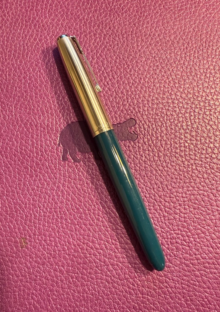
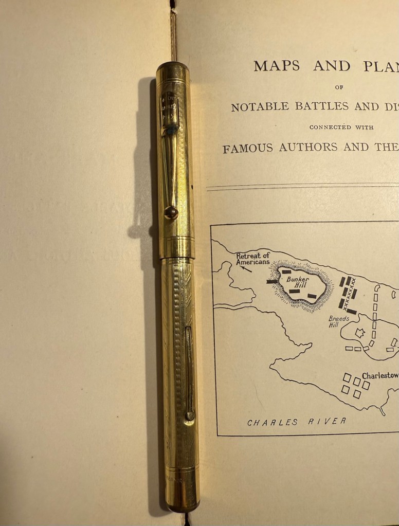
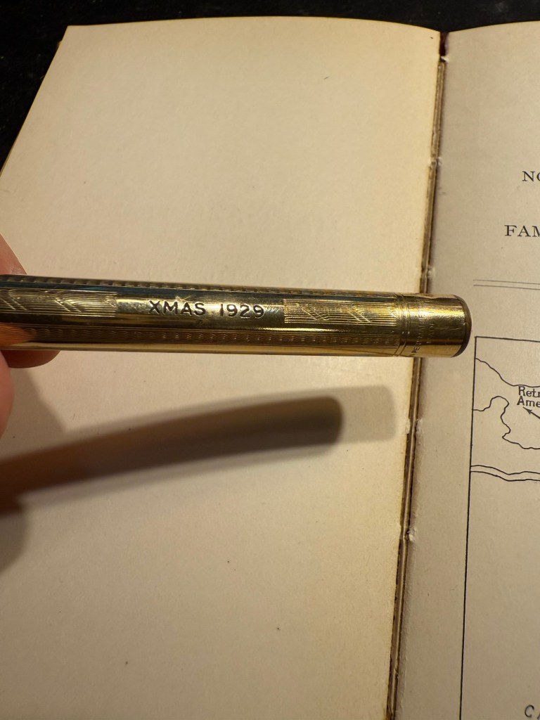
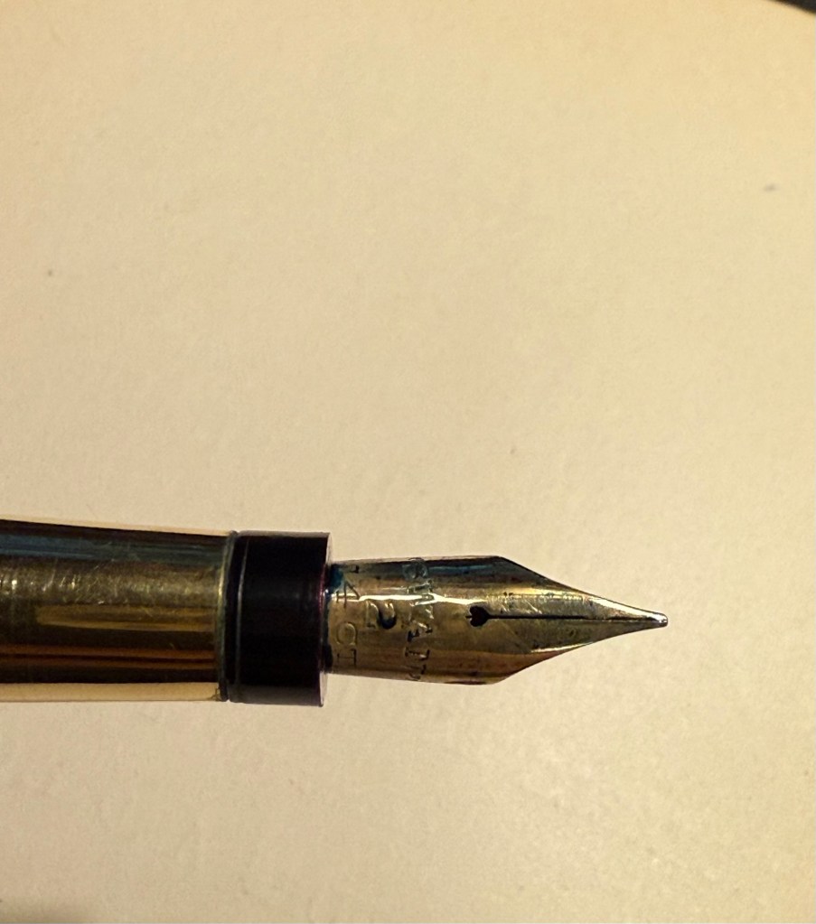
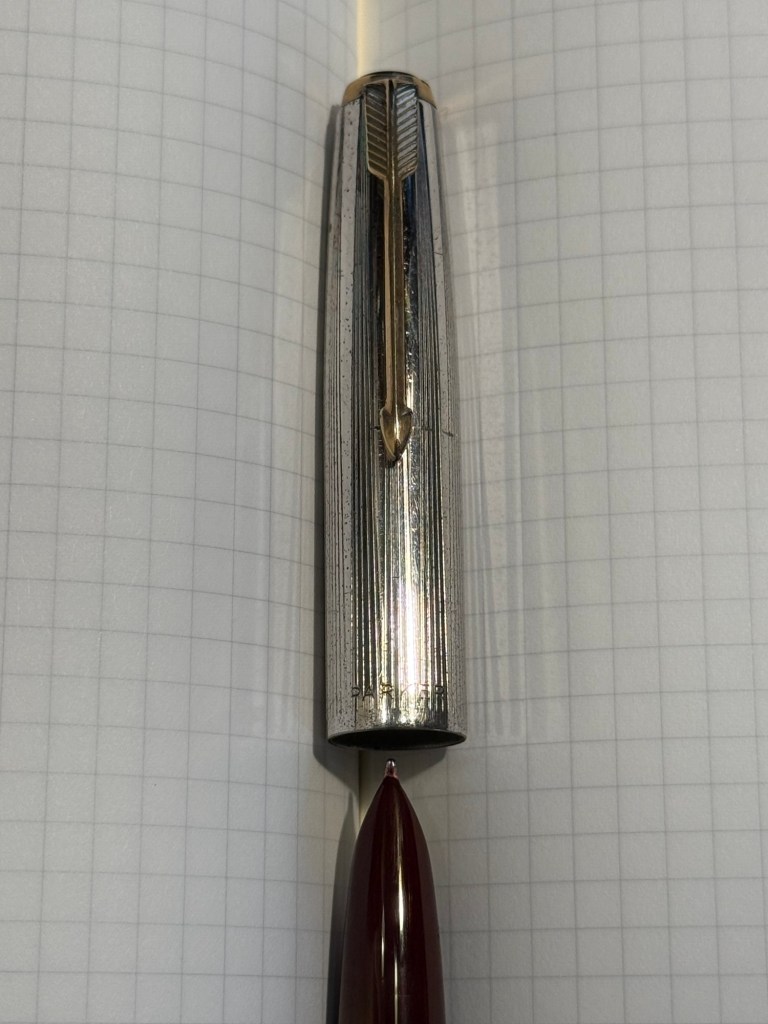
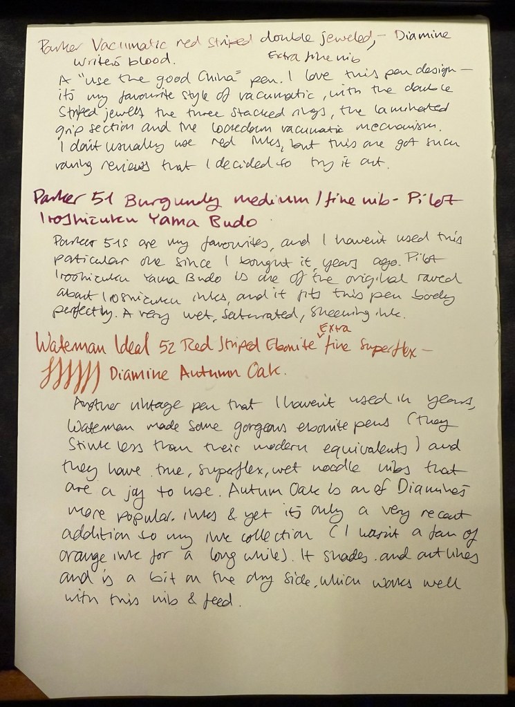
Last but very far from least Parker 51 Plum F nib with Sailor Jentle Peche. A rare 51 and a long discontinued ink coupled together to make sure that I use the good china. Parker 51 pens are my favourites, and this one is a gold capped aerometric with a fantastic nib.

The pens in order of appearance here, from top to bottom.

What have you got in your pens this month?

June’s Currently Inked Fountain Pens

A new month means a new set of inked pens. From my previous rotation I still have the Lamy 2000 inked with Diamine Silver Fox, the TWSBI ECO Saffron inked with R&K Helianthus (and just about to run dry) and the Manufactus Cappuccino Brown filled with a Diamine Bilberry cartridge, also just about to run dry.

This time I chose the ink hues and inks before I matched them with pens (I usually do it the other way around). I wanted a blue-black, an orange, a pink, a teal and a bright green. The only ink that was completely unknown to me was the green – Diamine Ultra Green in a cartridge. It was also the only ink that I’m unhappy with, and one that I had issues with, but more on that later.

This is the lineup:

Writing sample with all of the inks and pens. The notes were written using a Platinum Preppy 02 with black ink. The paper is a Rhodia dot pad.

Parker 51 Aerometric Teal with a Lustraloy cap and generous fine-medium nib filled with Diamine Denim – vintage Parker 51s are my absolute favourite fountain pens, both for their look and feel and for the way they make my handwriting look. I haven’t used this specific one in years, and I like the pen body colour but I specifically chose to fill it with the blue-black and not the teal, to mix things up a bit. Diamine Denim is one of my favourite go to blue-black inks, and I love it because it’s well behaved, dark and offers some shading.

Parker 51 Aerometric Teal with a Lustraloy cap

Kaweco AC Sport Carbon fine nib Diamine Ultra Green cartridge – I wanted to try Diamine Ultra Green as I thought that it would fit the bill as the bright green that I wanted, but it didn’t. Two things happened – I flipped the pen upside down for a few minutes to get the cartridge going and I left it that way for too long, which meant that I got a mess. You can see it in the first writing sample and you can see it in the green ink splotch on the left of the page above. That would have been OK if the ink colour was to my taste, but it isn’t. Diamine Ultra Green is a viridian green, which is an unnatural shade of green that isn’t what I was looking for. In retrospect it looks like Diamine Kelly Green (which I don’t have) is closer to what I was looking for. The Kaweco AC Sport is nice but overpriced and I wouldn’t recommend it over an other Kaweco Sport. I got mine at a steep discount when an art supply store was closing down and looking to liquidate its stock.

Kaweco AC Sport Carbon

Sailor 1911 Pro Gear Slim Maroon music nib filled with Sailor Jentle Apricot – kids these days will turn up their nose on this pen body colour, but at the time it was the only Sailor that you could get that wasn’t black. I was into fountain pen nibs and didn’t really care what the pen body looked like, so long as I got to try the fabled Sailor music nib – a rare music nib that had only one slit and two tines instead of the usual two slits and three tines that other brand’s music nibs had. It still is a gorgeous nib that works very well with the long discontinued Sailor Jentle Apricot. You really see the shading with this pen and ink combination.

Sailor 1911 Pro Gear Slim Maroon

The magical Sailor music nib (yes, the ink flow is fantastic even with one slit):

Closeup of the Sailor Music nib

Franklin-Christoph Model 66 Antique Glass medium nib filled with Diamine Yuletide – this pen is now unavailable through Franklin-Christoph and only through second-hand resellers. It was one of my first Franklin-Christoph pens and one that I couldn’t wait to eyedropper (it’s built for that). The pen has a body that isn’t completely clear – beyond the slight fogging in the material (which is to be expected) the antique glass finish means that it has a blue-green tint, like a vintage coke bottle. It works exceptionally well with teal and turquoise inks, which is why I have only ever filled it up with teal and turquoise inks. In this case the ink of choice was Diamine Yuletide from the 2021 Diamine Inkvent calendar. I like this ink, but I’m still on the fence about buying a full bottle of it as I have a few other inks in a similar tone, some of them even Diamine inks. If you’re wondering how I eyedroppered this pen, it came with an o-ring and I have a tiny vial of silicone grease which I applied generously to the threads when filling it. So far no leaks, though as always with an eyedroppered pen, be careful with how you store it.

Franklin-Christoph Model 66 antique glass

Sailor Pro Gear Slim Manyo Cherry Blossom Medium-Fine nib filled with Pilot Iroshizuku Kosumosu – I was planning on using an orange OR a pink ink, but eventually decided to use both. The Sailor Manyo Cherry Blossom is my nicest looking Sailor pen, one that I bought a few years ago at Choosing Keeping in London mostly because it had an MF nib and I wanted to try one of those. Sailor has been dazzling the fountain pen community with a plethora of mix and match pen body colours, but I remember the brand as an innovator and artisan in fountain pen nibs (which is why I rarely buy Sailors these days and most of my Sailor pens are black). The nib is, of course, perfect, and the ink works well with it. Kosumosu is practically bubblegum coloured, very bright, very cheerful and surprisingly readable.

Sailor Pro Gear Slim Manyo Cherry Blossom

Which fountain pen and ink in this rotation caught your eye? What are you using this month?

April-May’s Currently Inked Fountain Pens

In the middle of April I inked up a bunch of new fountain pens, and at the end of the month I added two new fountain pens to this rotation. At the rate I’m writing with them I assume that this pen rotation will be with me until around the end of May, when I’ll be putting more “summery” inks into use.

This is a rather eclectic group of pens and inks, but I was mostly looking for inks that I haven’t used for a long time or I haven’t used at all. Here they all are (I was in a rush when I created the writing samples so they’re messy, but life isn’t Instagram, so messy it is):

Messy Writing Sample #1
Messy Writing Sample #2

Mabie Todd Swan “The Swan Pen” 2 nib with Waterman South Sea Blue – a vintage gold plated lever filler pen, this is one of two vintage gold plated pens that I bought in Paris in Mora Stylos years ago. I don’t usually like the bling of gold plated pens, but I was drawn by the fantastic, very wet, flexible swan gold nib, and by the engraving on the pen body.

The Swan Pen

Normally engravings lower the value of a vintage fountain pen, but this one added value for me – I find it endlessly intriguing. This was clearly a Christmas gift, in 1929, and it was likely a lady’s pen, given its size and general level of decoration. I can stare at this pen and spin dozens of stories from that engraving, and this is one of the main reasons I prefer vintage pens. This one is “use grade” – the engraving, the dings on the body, the brassing on the clip, and the multitude of microscratches on it make it so – but I don’t care. It’s a treasure of a pen with a fantastic nib that I got at a very good price and gives me much joy. What else does one need?

Closeup of the inscription XMAS 1929

I chose a Waterman ink for it because they’re the best inks for vintage fountain pens – very gentle, very easy to clean out of a pen, non-staining, and on the dry side (though not as dry as Pelikan 4001 inks) which works well with this very generous nib.

Swan 2 nib with heart shaped breather hole

Leonardo Mother of Pearl fine elastic nib with Kyoto TAG Kyo No Oto 03 Kokeiro ink – I wanted a Leonardo pen in rotation (I love them) and I wanted to try this new ink, and compare it to the Rohrer and Klingner Alt-Goldrün ink that I still had going at the time from March’s rotation. The inks are practically identical, with Alt-Goldrün being perhaps a shade lighter than the 03.

Leonardo Momento Mother of Pearl fountain pen

The Leondardo’s elastic or “flex” nib has cutouts in the nib shoulders to provide it a bit of give. It’s a nice nib that offers some line variation, but is nowhere near what you can get in vintage flex or super-flex nibs (particularly Swan and Waterman).

Closeup of the elastic nib with the cutouts in nib shoulders

Lamy 2000 fine nib with Diamine 150 anniversary Silver Fox ink – this is one of two Lamy 2000s that I have, and I really like this pens as workhorses. Silver Fox was part of the original collection of 150 anniversary inks that Diamine issued and it’s a nice mid grey that is very readable.

Franklin Christoph Model 46 Polar Ice extra fine nib with Bungunox June Bride Something Blue – I filled this pen about a week after the others since I wanted a teal ink that wasn’t in as wet a nib as the Swan. I got this ink as a gift from the Pen Addict Membership back in 2016.

Franklin Christoph Model 45L Turqish Crush extra fine nib with Diamine 150 anniversary Blue Velvet – another original 150 anniversary ink (Diamine later issued a second and perhaps also a third line of inks in this series, I don’t remember). This one is a nice royal blue, and another ink that I had used in years.

From left to right: Lamy 2000, Franklin Christoph Model 46 Polar Ice, Franklin Christoph Model 45L Turqish Crush

Oldwin Art Deco red and black striped ebonite, 18k medium nib with Diamine Writer’s Blood – as I’m writing this I have written this pen dry, mostly because it has a very wet and hungry nib and a standard sized converter. I bought this Oldwin from Mr Mora at Mora Stylos in Paris, and it’s a huge and surprisingly light pen.

Oldwin Art Deco red and black ebonite

The nib is also a very large nib (size 8 and not size 6), and the pen is surprisingly not smelly for an ebonite pen. The feel of the material is fantastic – ebonite is such a warm material – and I like it enough to consider refilling it instead of cleaning it out. Diamine Writer’s Blood has been in rotation recently, but it’s a new ink to me and I’m still trying to figure it out. Having it in this pen made me appreciate it more, as it really showed off its unique colour properties and shading plus sheen.

Oldwin nib

Manufactus Cappuccino Brown medium nib with Diamine Bilberry cartridge – this was a gift that I received from a dear friend who was just back from Italy and bought this (and a wonderful leather bound personalized journal) in the Manufactus store in Rome. The photo doesn’t do justice to the richness of the resin on this pen.

Manufactus Cappuccino Brown

The Manufactus has some heft to it, due to the metal body and trim, and while it states that it’s a medium nib, it runs closer to a fine nib in terms of line width. Diamine Bilberry is an interesting ink that I had in cartridge form, and I wanted a more unique ink than the standard black cartridge that came with this pen. Bilberry is saturated enough to pass as black at a cursory glance, but it’s a gorgeous rich purple with gold sheen that works well in this pen.

Manufactus Cappuccino Brown nib

Apart from these pens I still have about a quarter fill of ink in my TWSBI ECO T Saffron fine nib with Rohrer and Klingner Helianthus going from March’s ink rotation.

Which of these pens interest you the most?

Currently Inked Pens March 2025

Of February’s pen lineup only two pens remain inked, the Parker 51 with Waterman Purple, and the Leonardo Momento Zero Bohemian Twilight with Pilot Iroshizuku Tsuki-yo. As they’re both running low on ink, it’s time for a new pen lineup, with a slightly different theme than last month’s one:

  • All the pens are modern (last time I had more vintage pens than modern ones in rotation) and ones that I haven’t inked in years.
  • All the inks are ones that I haven’t used in years or ever, apart from one that was in the last rotation but I still haven’t figured out so it got another go.
  • The ink colours are much brighter than those that I used in February.

Here’s March’s rotation:

Writing sample on Midori MD Cotton paper

Here’s a bit more about every pen and ink combo:

  • Franklin Christoph 03 modified prototype- Red/White/Black motion with a 1.1 HPSteel cursive calligraphy nib. This is a new pen that I bought last year as my chemo anniversary pen (I buy myself a present every year to mark the occasion). I love the unusual resin colour and pattern, and I like FC’s HPSteel 1.1 nibs. They are just wide enough to really show off the ink without becoming a nightmare to use because it takes ages for the ink to dry.
    As nice as the pen is (and it is), the ink is the star in this one in terms of interest: it’s the ORIGINAL J.Herbin 1670 Rouge Hematite, which means that it has NO GLITTER and NO SHEEN. It’s just a deep, bright red with some nice shading and good outlining, but it isn’t full of gold glitter and sheen to the point where you can’t see the base colour. Yes, this is also the bottle that had the problematic crumbly wax cover on the cap, but I really think that I prefer this version to the one they issued later (I have both). I don’t normally use red inks, but this one was perfect for this pen.
The FC 03
The HPSteel 1.1 nib
Original Rouge Hematite compared to Cosmic Glow on original Tomoe River paper. Note the lack of sheen or shimmer.
  • TWSBI ECO Saffron fine nib filled with Rohrer & Klingner Helianthus ink. I use yellow inks even less often that I use red inks, but this ink is fairly readable for a yellow ink. It is, however, not going anywhere near a vintage pen as it has a tendency to crust over (as many yellow inks do). I wanted something bright, cheerful and different, and this ink checked all three. The TWSBI ECO is a phenomenal pen for those starting out with bottled fountain pen ink, and I can’t recommend it enough.
TWSBI ECO Saffron
  • Aurora Ipsilon medium nib with Rohrer & Klingner Alt-Goldrün ink. This is my one and only Aurora pen, which I bought years ago in Florence, Italy. Aurora nibs are nice enough, but the pens are priced well above what I believe that they are worth, so I have steered clear of them over the years. The Ipsilon is small pen, but you can’t post it, which is annoying for such a small pen. R&K Alt-Goldrün is a fantastic ink colour – a non standard green with plenty of shading and character – and the only reason I haven’t used it more is because it was tucked away behind two rows of other ink bottles. If you are just starting out with green inks, give Alt-Goldrün a try.
Aurora Ipsilon
The Ipsilon nib looks ridiculously small but it’s just the design of the section that makes it appear that way. Comparison photo to a TWSBI ECO nib.
  • Leonardo Momento Zero Blue Hawaii Fine nib with Diamine Steel Blue ink. I have used this pen fairly recently compared to some of the others in this rotation, but the ink has been one that I actually forgot that I have. I love teal and turquoise inks, and Diamine Steel is a beautiful member of this group. There’s a hint of shading with it, and it just pops off the page so nicely. If you want a different take on “boring blue” inks, I highly recommend it.
Leonardo Momento Zero Hawaii
  • Montblanc Writer’s Edition Victor Hugo medium nib with Montblanc Around the World in 80 Days ink. I bought this pen in Mora Stylos in Paris before they closed mainly because I adore the Notre Dame de Paris cathedral and it’s featured on this pen. Hugo has the honour of being the saviour of this extraordinary cathedral, and though I shy away from Montblanc limited editions (talk about overpriced) I thought this one was worth purchasing. The ink was last in rotation, in a vintage Montblanc, last month. I just can’t get over how unrelated it is to the green-gold elephant on the box, and I’m not sure what to make of it. I was expecting it to be more like Alt-Goldrün than like the bluish-grey (Payne’s Grey really) that it is.
The Montblanc Writer’s Edition Victor Hugo
The Victor Hugo death mask on the cap
The nib, which features Victor Hugo
  • Finally, speaking of a pen and ink combo that have gotten “lost” in my collection: the Stipula Model T marbled grey pen was also an Italian purchase, and it has a very peculiar fine “flexy” titanium nib. I would characterize the nib as springy, and as my other titanium nib Stipula does, it squeaks sometimes as you write with it. The ink is one that I bought in 2013 in Fahrney’s pen store in Washington DC. Since then I haven’t opened it and used it, mainly because Fahrney’s Tempest Blue is a blue ink, and I don’t use blue inks often. It shades nicely, but other than that it looks close enough to my benchmark blue, Waterman Florida Blue (now renamed to Waterman Serenity Blue), for me not to bother using it often. Waterman Serenity Blue is a best-in-class blue in my opinion because it’s so well behaved, gentle and easy to clean out of pens that you can safely use it in any pen that you have, particularly vintage ones.
The Stipula Model T. A very sleek design.
The Model T titanium nib.

Weekly Update: Model Sketches Take 2

It’s nice to have new pens and inks in rotation. I’m enjoying Diamine’s Writer’s Blood more than I expected, Diamine Autumn Oak is fantastic with a Waterman superflex nib, and Pilot Iroshizuku Tsuki-yo is becoming one of my favourite inks.

Liz Steel and Marc Taro Holmes are hosting the OneWeek100People challenge again this year, and I intend to participate again. The challenge starts on the 3rd of March and officially lasts 5 days. I normally sketch from photos, but this time I want to see if I can do the entire challenge from observation only. It may take me more than 5 days, but I’m OK with that. Are you planning on joining the challenge?

I went to the local art museum again this week, to sketch models in the museum. This was the last time this event was run, and the place was packed with sketchers. I didn’t have the best of locations, but I made the most of it. I sketched with Faber Castell 9000 2B and 3B pencils mostly, and added a touch of colour with Faber Castell Polychromos. The ink sketches were done with a Staedtler Pigment Liner 0.5. The sketchbook I used was once again the French Pascale Éditions. The models did fewer 20 minute poses and more 10 minute ones, which meant scrambling a lot. I wanted to visit the museum after the event, but I was so tired from 3 hours of non-stop sketching that I just went home.

Harman Photo just came out with a brand new colour film, Harman Red. It’s a red-scale film, and I’m curious enough to try and buy a roll or two and test them out. I love the wild, wild results I got with Harman Phoenix and the Harman Red is basically Phoenix pushed even more into red-scale.

Here are the sketches from today, and I hope that you have a great week!

10 minute pose.
10 minute pose.
10 minute pose.
10 minute pose – the hardest pose to draw because of the angle of the head. Had a false start on this one, so had only about 8 minutes for this.
10 minute pose – Staedtler 0.5 pigment liner
10 minute pose
10 minute pose
10 minute pose
The three models. The pose started with just the two top models, and then the third one joined, and it was a 10 minute pose.
A challenging composition, 20 minute pose
10 minute pose. I like the composition on this one – I placed her on the side of the page to give her room for thought.
Final pose, 20 minutes

February 2025 Currently Inked Pens

I have finally written dry all of my Inkvent 2024 fountain pens, which means that after two months I get to write with a whole new set of fountain pens and inks. I normally don’t spend too much time selecting which pen and which inks I’ll use next, but this time I decided to use some criteria for the next pens in my rotation:

  • They need to include at least 50% vintage pens. I don’t use vintage pens with Inkvent inks, and vintage pens make up most of my pen collection.
  • All the pens need to be pens that I haven’t used in a long time (at least a year). It was time to mix things up.
  • The inks needed to be inks that are new to me, or that I haven’t used in years, and all of them need to be inks that I haven’t swabbed before. This was not only to mix things up, but to get me to use and swab more inks in my collection, instead of going again and again to a few select favourites.

Here’s February’s fountain pen lineup:

The pens from left to right: Leonardo Momento Zero Bohemian Twilight, Sailor Pro Gear Slim Graphite Lighthouse, Edison Nouveau Premiere Cappuccino, Montblanc 32, Mabie Todd Swan L2 Leverless pen, Waterman 52, Parker 51, Parker Vacumatic Standard double striped jewel.

And here are ink swabs of the inks that I’ll be using:

Ink swabs on Col-o-Ring cards

The Vintage Pens

  • Parker Vacumatic 1st generation Laminated Burgundy Pearl Double Jewel (striped jewels, striped section) – I adore Parker Vacumatics and this is a “use the good china” pen. The grip section is also laminated (and not plain black), the body is transparent, and the nib is a sharp extra fine gold nib with a bit of character to it. It’s filled with a brand new ink for me, Diamine Writer’s Blood. I never use red inks, but this got raving reviews and seemed dark enough for me to try. I bought the ink in Oxford last year, and the pen years ago from the late Henry Simpole (Henry the Pen Man) in London. I don’t think I inked up this pen since I bought it, as it was too precious, and I still won’t let it leave the house, but I am looking forward to actually using it.
Parker Vacumatic first generation burgundy laminated grip section
Closeup on the striped jewel and the grip section of the Parker Vacumatic
  • Parker 51 Burgundy aerometric with a silver cap and gold filled arrow clip. I love Parker 51s, they are my absolute favourite fountain pens. I believe this cap is on the rare side, though it’s far from pristine or attractive (it’s blackened in specks, and there are a few scratches and micro scratches on it). The nib is a generous fine, bordering on medium, and like all other 51s that I’ve used, it’s magic. I haven’t used this pen since I bought it, so it’s time to give it a whirl. It’s filled with Pilot Iroshizuku Yama Budo, which is a lovely, sheening burgundy ink, one of the more popular inks in the Iroshizuku lineup. In hindsight coupling this ink with this pen wasn’t the best choice, as the 51 has generous nibs and Iroshizuku inks are on the wet side. It just means that I’ll have to steer clear of cheap paper with this combination.
Parker 51 cap and nib closeup
  • Waterman Ideal 52 Red Ripple fountain pen with a super flex extra fine nib – my word but this pen has the most glorious nib. The pen itself is elegant and pristine, and because of its age it doesn’t have the ebonite stink to it. The nib is why I bought this pen, and it effortlessly moves between extra fine and broad or double broad lines, with the feed easily keeping up with tines. Like all Waterman nibs that I’ve tried, there is some feedback, so if you like butter on hot pan nibs this one isn’t for you. This is the kind of nib that you can only get in a vintage pen, and it puts modern flex pens to shame. It’s only minus is that this is a lever filler, and I hate cleaning out lever fillers, which is why I rarely use them. This pen is filled with Diamine Autumn Oak, which I haven’t used yet (in bottle form at least – I have cartridges of it). I wanted a brighter ink in this lineup, so Autumn Oak was a perfect choice.
Waterman 52 cap and nib closeup. You know the nib is going to be fabulously flexy once you see that heart shaped breather hole and the slight bend down in the nib.
Writing sample on Midori MD Paper. Notes written with a Platinum Preppy.
  • Mabie Todd Swan L2 Leverless L205/62? Not sure – Swan did a poor job labeling their pens, and I didn’t write down notes when I bought it. This is a lovely pen that I bought from Henry Simpole years ago because of the phenomenal Swan nib. It’s an oblique flexible nib with Swan’s gimmicky “Leverless” filling system (which is a lever system in disguise, but such were the ’30s – you needed a gimmick to sell pen). I haven’t used it at all since I bought it because I don’t remember the experience of cleaning it out very fondly – imagine all the bother of cleaning out a Lamy 2000, but with a piston that has just one twist of travel. I used Pilot Iroshizuku Asa Gao with this fountain pen, and it’s a gorgeous ink with a good amount of sheen with this nib. I love this shade of royal blue, and I haven’t used this ink in a while. Take a look at the Swan above – it’s almost 100 years old and works perfectly.
Closeup on the nib and cap of the Swan Leverless pen
Writing sample on Midori MD Paper. Notes written with a Platinum Preppy.
  • Montblanc 32 (1967) OM 585 nib – heavens, you can get a gold nibbed, piston filling original Montblanc with an Oblique Medium nib for less than a steel nibbed Pelian M2xx costs? Yes, you can. I love the design of this pen (you can read about it more here) and the nib is great… provided you write in the exact angle it expects. The Swan’s nib is generous in terms of the writing angles it accepts, and the Monblanc 32 is demanding: you will use the nib at the precise angle it is designed for, or it will not work at all! I only wish that the Montblanc Around the World in 80 Days ink was so exact. From the description and the illustration on the box I was expecting a brownish gold ink, maybe with a hint of green. In reality I got a dark, cold grey ink, with a hint of blue to it. No brown, no gold, nothing at all to do with the elephant illustration on the box. I had to double check just to make sure that I hadn’t landed on a bad bottle by chance.
Montblanc 32 semi hooded nib
Writing sample on Midori MD Paper. Notes written with a Platinum Preppy.
Writing sample on original Tomoe River Paper

Modern Fountain Pens

  • Sailor Pro Gear Slim Graphite Lighthouse H-EF nib – I haven’t used this pen in over a year, and I wanted a pen with a very fine nib, so that I can use it for note taking. It’s inked up with Sailor Black, a new ink for me and one that’s supposed to be water resistant. I’m using this combination for my certification study notes, and I may also try it out with some watercolours in a sketch, just to see if I can use Sailor Black ink as part of my sketching kit.
  • Edison Nouveau Premiere Cappuccino fine nib – I bought this pen in early 2012, before they did a run of seasonal limited editions of this pen design. I haven’t used in years, and the same goes for the ink in it: Lamy Petrol. This is a limited edition ink, one that Lamy issued with the Lamy Safari Petrol, and it’s a wonderful blue-black with red sheen.
  • Leonardo Momento Zero Bohemian Twilight fine nib – this pen has “only” been a year out of rotation, and it’s one of my favourite Leonardos. The colour of the resin is gorgeous, and it works very well with the Pilot Iroshizuku Tsuki-yo ink that it’s filled with. Tsuki-you is a bluish-teal with red sheen and a wet flow, and it suits the Leonardo’s fine nib.
Modern pens writing sample on Midori MD paper.

Weekly Update: Ink and Prickly Pears

I haven’t done a watercolour sketch in a while, so I broke out the trusty Moleskine Watercolour sketchbook, my Staedtler Pigment Liners (0.3 and 0.5) and my Schmincke and Daniel Smith watercolours and made this quick sketch:

Prickly pear watercolour sketch

It was fun and it took me less time than I thought, so I should do it more often.

This was a big ink week, as I wrote many of my Inkvent fountain pens dry: Wishing Tree, Snow Globe, Winterberry, Salted Caramel, Pine Needle, Nutmeg, and Wilted Rose. I also dumped Sleigh Ride as I found the ink colour depressing. This leaves me with 9 Inkvent inks still inked in my pens, with most of them half or quarter full. I doubt that I’ll be able to write them all dry by the end of the month, but hopefully I’ll get as close to that as possible. In any case I’ll reassess in the beginning of February if I want to keep using my Diamine Inkvent inks or if I’ll just dump out and clean up whatever I still have inked at the time and start fresh.

I finished reading “The New York Trilogy” and it’s a very Paul Auster book. Next week I’ll start on “The Last Kashmiri Rose” by Barbara Cleverly and finish “The Comfort Crisis” by Michael Easter.

Have a great week full of pens, books and good news.

Weekly Update: Motorcycle Sketch

Running

I’m a week away from getting back to a 10k long run, and the running weather has been pretty perfect so far. I ran a 30 minute hilly recovery run today and for the first time ever I ran it without headphones. I normally run with earbuds and listen to podcasts or music, except during races where I leave my earbuds at home for safety reasons (and to get the full race experience). It was relatively early and the trail I was running through was deserted, so it was quite the experience listening just to birds and the sound of my feet and my breath. This is definitely something that I plan on adding to my running routine.

Reading

I’m two thirds into “The New York Trilogy” by Paul Auster and I’m dreading starting the 3rd and final story. The writing is excellent, but it’s like reading through version after version of Bartleby the Scrivener – not something that you particularly want to do. I’ve come so far that I will finish the book at this point, but after reading several Auster books it’s clear to me that while he’s a very good writer, his books are not for me.

Meanwhile I’ve started on “The Comfort Crisis” by Michael Easter, and though it is clear that it suffers from many of the same problems that books of this kind suffer from (cherry picking or hand waving “research” over complex and nuanced topics), there are some interesting ideas within.

Fountain Pens

I’ve decided to sketch more with my Inkvent ink filled fountain pens to try and run them dry more quickly, so here’s a motorcycle sketch done with a Levenger True Writer Cappuccino with a fine nib and Diamine Nutmeg.

Motorcycle Sketch on Midori MD Cotton paper

Have a nice and peaceful week.

Weekly Update: Impressionism, Cal Newport and Inkvent End

Inkvent

I’m finally done with reviewing the Diamine Inkvent 2024 Black Edition calendar and it’s been exhausting. I haven’t been able to get a proper buffer for the even this year, which meant that I was chasing every post every day.

On the plus side, it was nice to dust off 25 bears and sketch them. My sketching and my blogging had been in a rut recently and this event kickstarted them, so I am grateful for that. I also got some lovely comments from people, which is always wonderful to read.

Wild sunset today

Cal Newport

The latest episode of Cal Newport’s Deep Questions podcast was excellent, and in the final segment Cal discussed his new approach to making a quarterly plan. It’s worth listening to, but basically his idea of pillars and foundations and focusing on a certain pillar at a time really resonated with me. My next quarter will be focused on craft as a pillar, as I want to earn a professional certification and work towards a deeper understanding and more hands on experience with certain more obscure aspects of my job.

Reading

I finished reading the HBR “Dealing with Difficult People” book, and started reading Paul Auster’s “The New York Trilogy”. So far it’s a very Paul Auster book, for good and for bad.

Impressionism

I went to see an Impressionist exhibition, celebrating 150 years to the movement, at the local art museum. The exhibition itself was nice enough, but a bit thin in terms of the artwork on display. There was also a nice print exhibition, and an excellent retrospective exhibition dedicated to Moi Ver. It was wonderful seeing a master photographer at work, and his design work is also worth seeing.

Ci-Contre Moi Ver
Ci-Contre Moi Ver

I went to the museum store later and went a little wild, purchasing a handmade ceramic cup made by a local artist, three postcards (which I wrote on and will give away), and a Leuchtturm1917 A5 dotted notebook that I didn’t need but I wanted anyway. I bought a Leuchtturm notebook the last time I was in that store, and it’s now my work daily driver notebook, so I assume I’ll find use for this notebook soon enough. The paper isn’t perfect, but it’s good enough for me for daily fountain pen use.

Have a great week!

Diamine Inkvent 2024 Summary

For the introduction post to 2024’s Inkvent, see this post.

Diamine Inkvent 2024 Black Edition is the fifth edition of their Inkvent calendars, and I’m sorry to say that it’s by far the worst. Partly it’s 2023’s Inkvent Purple Edition’s fault, as it’s the strongest of the Inkvent calendars to date and so it created high expectations for the Black Edition. But there were several things that went wrong with this year’s calendar that made it an overall disappointing experience:

  • There are four previous Inkvent calendars, and there’s only so many ink shades in the world. The black edition featured a lot of inks that were pretty similar to ones seen in earlier Inkvent calendars.
  • This year’s “special effect” was “Extreme Sheen” and it just doesn’t have the same impact as effects like Chameleon and Star Bright that we saw in previous calendars.
  • The “Extreme Sheen” effect didn’t improve all the inks it was applied to.
  • Almost a third of the inks in this calendar were in the “dark and bland” range: grey, brown, black. There’s only so much joy a brown ink can spark.
  • There were very few bright inks and not all the bright were great (see Lemon & Lime and Fruit Cocktail discussed below).
  • A good number of the inks had very little festive appeal. This wouldn’t have been a big deal if Diamine hadn’t set the festive bar so high: they deliberately name their inks for festive or wintery things. Previous Inkvent calendars did much better in this regard (the first ones, the Blue Edition and Red Edition took this a bit too far), so it’s hard not to be disappointed in the Black Edition’s performance on this front.

Here’s all this year’s inks in order (read further on for a breakdown of each group and buying recommendations):

All the 2024 Inkvent Col-O-Ring ink swabs

Blues

There were six blue inks in this year’s Inkvent:

  • Two shimmer inks, Diamine Baltic Breeze and Diamine Icy Lilac. These are nice inks that are very similar to one another and similar to previous blue shimmer inks from past Inkvents. These go into the “nice but not exciting” category, and score decently on festive appeal.
  • Two “Extreme Sheen” inks, Diamine Vibe and Diamine Cosmic Glow. These feature the new effect for this year’s Inkvent and feature it well. Overall these are two of the strongest inks in this year’s calendar in terms of “wow” effect, even though they’re not exactly holiday themed.
  • One chameleon ink, Diamine Snow Globe. The chameleon effect is always nice and interesting, but the base blue ink is nothing new, and it also goes into the “nice by not exciting” category.
  • One Star Bright ink, one of only two Star Bright inks in the calendar, Diamine Chilly Nights. The fact that there are only two Star Bright inks in this calendar contributed to this year’s Inkvent being so underwhelming. There is no greater wow effect than a Star Bright ink on a dark ink, and Diamine Chilly Nights really delivers on that front. The base blue black is very nice, and if you enjoy using shimmer inks then Diamine Chilly Nights is definitely an ink to consider.

All in all the blues in this year’s Inkvent were the strongest overall group by far.

All the blue Inkvent Col-O-Ring ink swabs

Pinks and Reds

There were five pink and red inks in this year’s Inkvent:

  • Three standard inks, Diamine Wilted Rose, Diamine Cranberry and Diamine Lullaby. Diamine Wilted Rose is a nice and interesting “antique” rose colour, Cranberry is a decent but not overly unique ink, and Diamine Lullaby is on the “barely readable” spectrum. Of these three the standout ink is Diamine Wilted Rose, and it’s not a “star” ink by any measure.
  • One scented ink, Diamine Forest Gateau. I loath scented inks so I won’t elaborate on this one.
  • One chameleon ink, Diamine Winterberry. This is the standout ink in this group, one of the few bright and festive inks in this calendar, and a great ink to buy if you’re looking for a “Christmas greeting cards” ink. A breath of fresh air among the washed out and dark colours of this year’s calendar.
All the red and pink Inkvent Col-O-Ring ink swabs

Greens

There were only four greens in this year’s Inkvent:

  • Three chameleon inks, Diamine Lemon & Lime, Diamine Mint Twist and Diamine Pine Needle. Lemon & Lime is unusable even in a wide and generous nib as it’s way too bright and light to be readable. Diamine Mint Twist is the standout ink in this group, the one with the most unique base ink colour. Pine Needle is nice enough, but there have been plenty of inks in this colour before.
  • One “Star Bright” ink, the only other one in the calendar, Diamine Noble Fir. It’s not as impressive as Diamine Chilly Nights because the base ink colour isn’t dark enough for the Star Bright effect to have the most impact. It’s a good, bright green ink though.
All the green Inkvent Col-O-Ring ink swabs

Oranges

There are three oranges in this year’s Inkvent:

  • Two “Extreme Sheen” inks, Diamine Grotto and Diamine Sleigh Ride. Of the two Diamine Grotto is a great ink, and Sleigh Ride is poorly named and features a rather unattractive combination of an orange base and green-brown sheen. If you like rust effects you might enjoy it, otherwise, Diamine Grotto is the better choice.
  • One scented ink, Diamine Fruit Cocktail. I think that this is the worst ink in this year’s calendar for having a combination of scent and zero shading.
All the orange Inkvent Col-O-Ring ink swabs

Darks – Greys, Browns, Blacks

There were seven (!) inks in this category in this year’s Inkvent:

  • Three standard inks, Diamine Marley, Diamine Tundra, and Diamine Potpourri. Of the three Diamine Marley is by far the best, with Diamine Potpourri being too light to be readable (I could have placed this ink in the pinks category, but it’s so greyish and washed out that it felt more in place in this category), and Diamine Tundra being greyish brown, if you’re into that shade.
  • Two shimmer inks, Diamine Nutmeg and Diamine Salted Caramel. Of the two I prefer Diamine Salted Caramel, though there have been similar enough inks in previous Inkvents for you to feel free to skip this one.
  • One chameleon ink, Diamine Wishing Tree. The strongest ink in this group and one of the best inks of this year’s Inkvent, Wishing Tree has a great combination of a fantastic base ink colour and a lot of added interest from the chameleon effect.
  • One “Extreme Sheen” ink that was supposed to be the highlight of this calendar, Diamine Good Tidings. I found it far from “extreme sheening” and the sheen effect was a very unattractive dirty yellow.
All the dark Inkvent Col-O-Ring ink swabs

Summary

So these are the inks that I would consider buying from this year’s calendar (with the addition of Diamine Winterberry if you see yourself needing a festive red ink): Diamine Marley (interesting duo-chrome ink), Diamine Wishing Tree (duo-chrome interesting base shade ink with great chameleon effect), Diamine Grotto (great base orange ink with attractive extreme sheen), Diamine Mint Twist (unique green with a chameleon effect), Diamine Vibe (attractive dark turquoise ink with great extreme sheen), and Diamine Cosmic Glow (great royal blue base ink and wild extreme sheen).

All the inks that I would consider buying Inkvent Col-O-Ring ink swabs

As a reminder, this year’s Inkvent wasn’t sold out, which means that if you’re interested in these inks and haven’t yet gotten the calendar you can expect it to be on sale in various places soon enough. It’s a great way to get a good amount of varied ink samples, and each little bottle is good for at least 2-3 fillings (plus there’s a big 30ml bottle in day 25).

Midyear, at around June or July, Diamine will come out with the “Black Edition” of these inks. These are 50ml editions of the Inkvent 2024 Black Edition inks, in gorgeous glass bottles. They make for great gifts, and are worth getting as they’re very well priced for the “premium ink” experience.

I have 20 fountain pens filled with Inkvent inks in rotation at the moment, and it will take me a while to work my way through them. Will I do Inkvent again next year? I don’t know. The price plus shipping has gotten steeper every year, and this year’s calendar was a pretty big disappointment in my opinion. When pre-orders start for next year’s Inkvent (if there will be one), I’ll have to really consider it.

What are your favourite inks from this year’s Inkvent? What did you think of the Inkvent Black Edition?